Quantcast
Channel: Envato Tuts+ Design & Illustration
Viewing all 8649 articles
Browse latest View live

Quick Tip: Create a Set of Embossed Player Buttons

$
0
0


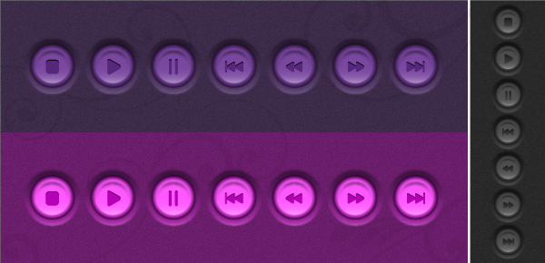
Follow this new quick tip and learn how to draw a set of player buttons, purple and pink style this time because gray and black may be a bit boring sometimes. They are easy to make and we will use effects like Outer Glow, Gaussian Blur, Transform and the Blend Tool.


Step 1

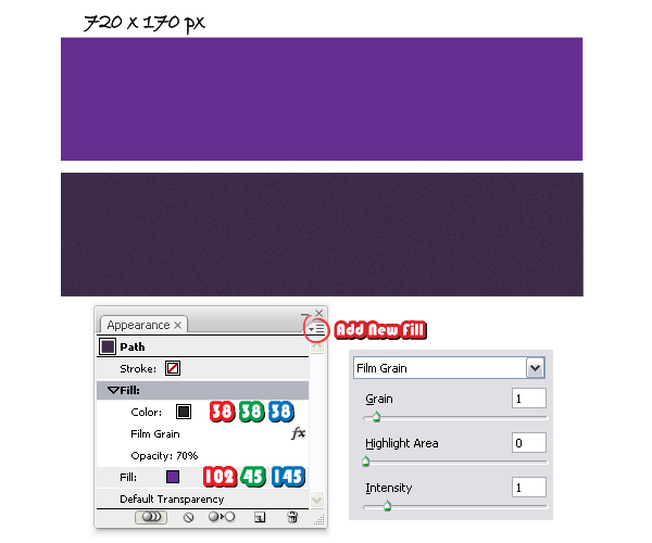
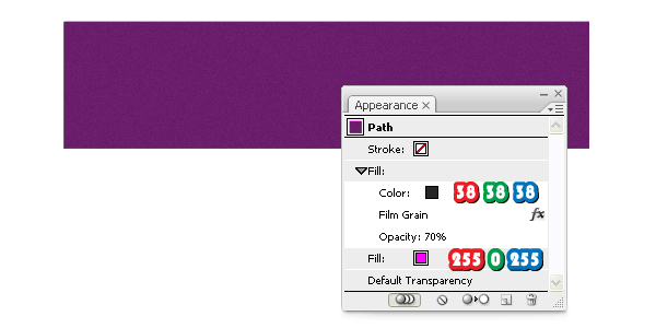
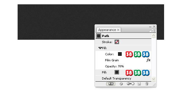
Open a new web document. The outer circle of the buttons is semi-transparent so the background is important this time. Take the Rectangle Tool (M) and draw a 720 x 170 px rectangle then select purple as the fill color. Go to the Appearance Panel and from the fly-out menu choose Add New Fill. Change this second fill color to dark gray (85% black) then go to Effect menu > Artistic and apply the Film Grain effect. Lower the Opacity to 70% and the background is ready.

Step 2

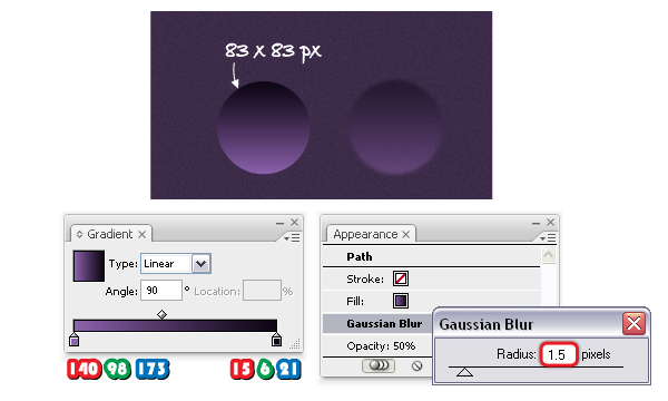
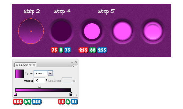
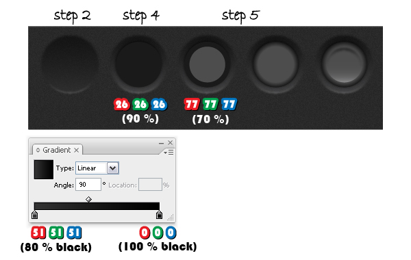
Take the Ellipse Tool (L) and draw an 83 x 83 px circle. Fill it with the linear gradient shown and change the angle value to 90 degrees. Next, go to Effect menu > Blur > Gaussian Blur and apply a 1.5 px Radius. Reduce the Opacity to 50% to make the circle semi-transparent.


Step 3

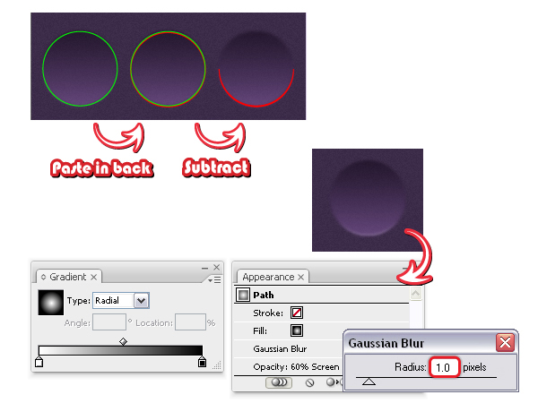
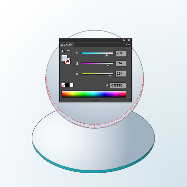
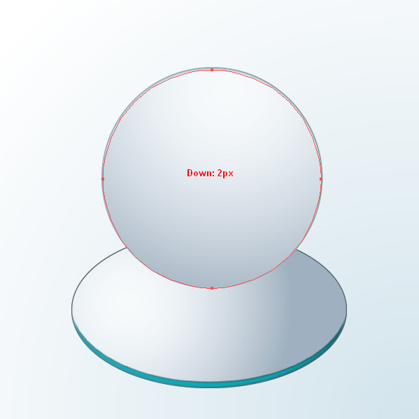
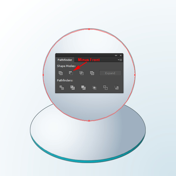
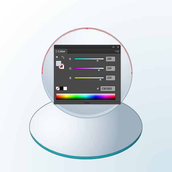
Copy and Paste in front the first circle and remove the existing appearances. Copy and Paste in back the new circle (green) to get another circle (red). Before you continue, go to Edit menu > Preferences > General and set the Keyboard Increment to 0.5 px. Now, select the red circle and move it a bit by pressing two times the Down Arrow key on your keyboard. Select both circles and click Subtract from shape area > Expand from the Pathfinder Panel.

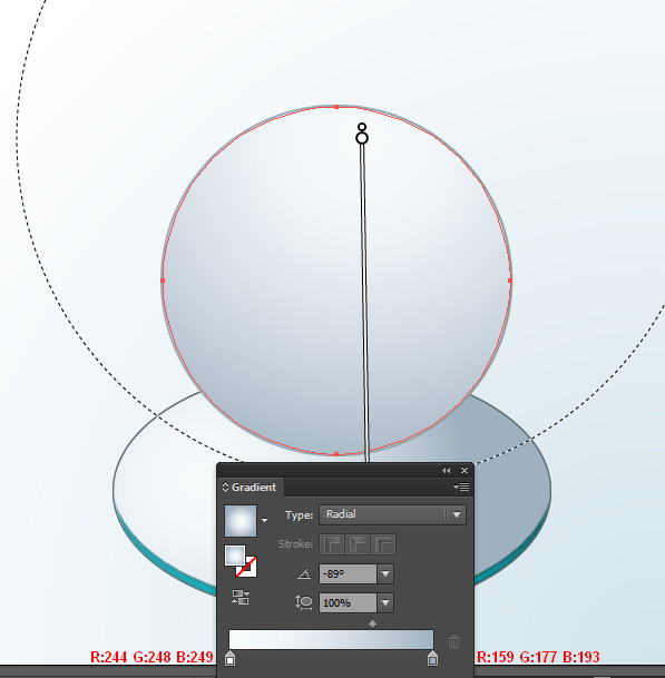
Send the resulting shape in back and fill it with a radial gradient from white to black. Next, go to Effect menu > Blur > Gaussian Blur and apply a 1 px Radius then change the Blending mode to Screen (black becomes transparent). Reduce the Opacity to 60%.


Step 4

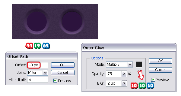
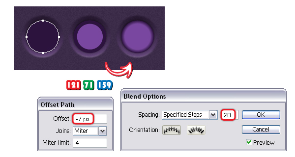
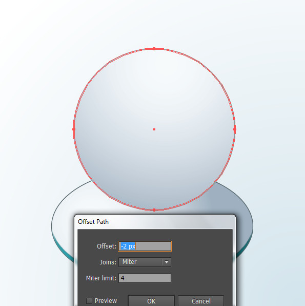
Having the first circle selected, go to Object menu > Path > Offset Path and apply a -8 px Offset value to obtain the smaller circle. Remove the existing appearances and fill it with the purple shade indicated. Go to Effect menu > Stylize and apply the Outer Glow effect using the settings shown. This way you will obtain a discrete shadow around this second circle.


Step 5

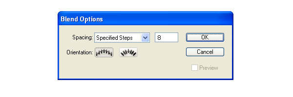
Copy and Paste in front the second circle, keep the fill color but remove the Outer Glow effect from the Appearance Panel. Having this new circle selected, go to Object menu > Path > Offset Path and apply a -7 px Offset value to obtain a smaller circle again. Change the fill color to purple. Now select both circles obtained at this step, go to Object menu > Blend > Blend Options and choose 20 Specified Steps then go back to Object menu > Blend and select Make.


Step 6

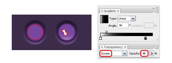
Next, go to the Layers panel and select the smaller purple circle from the Blend group and Copy and Paste it in front but drag it outside the Blend group because we don’t want it there. Fill the new circle (red) with a linear gradient from white to black and change the angle value to 90 degrees. Change the Blending mode to Screen (black becomes transparent) and lower the Opacity to 40%.


Step 7

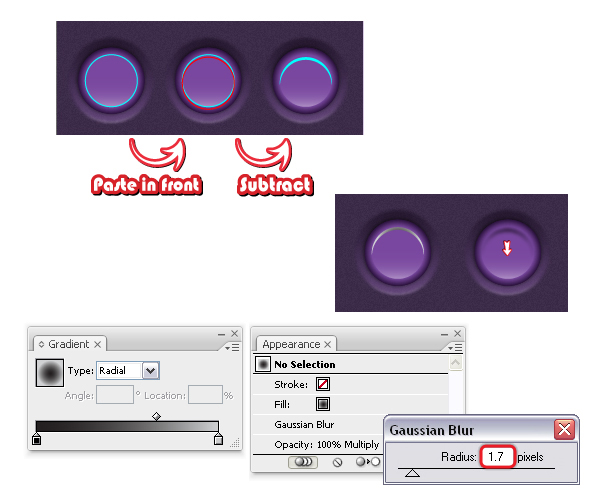
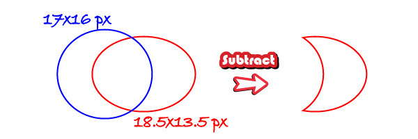
Copy and Paste in front the last circle and just give it a blue stroke. Now, Copy and Paste in front the blue circle to obtain the red circle then move it by pressing the Down Arrow key on your keyboard five times (the keyboard Increment is still set to 0.5 px). Having both circles selected, press Subtract from shape area > Expand from the Pathfinder Panel then fill the resulting shape with a radial gradient from black to gray. Next, go to Effect menu > Blur > Gaussian Blur and apply a 1.7 px Radius then change the Blending mode to Multiply. Press two or three times the Down Arrow key on your keyboard to move this moon-shape a little below.


Step 8

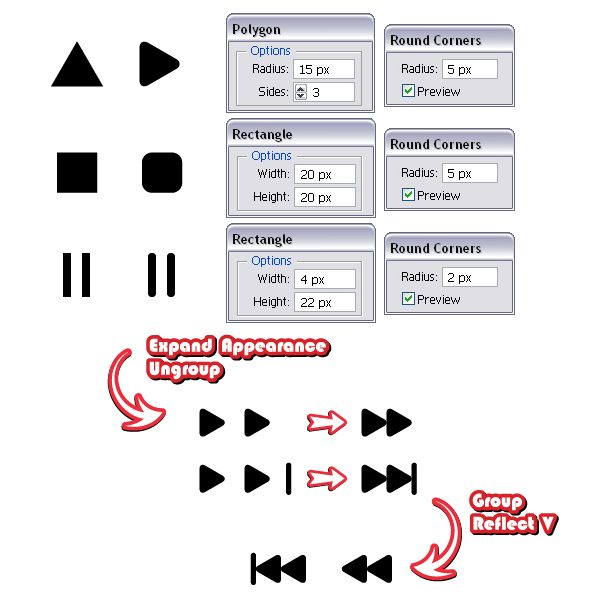
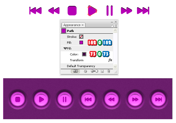
Let’s continue with the player’s symbols. For the Play symbol take the Polygon Tool, click on your artboard and enter the values shown to obtain a triangle. Rotate it minus 90 degrees then go to Effect menu > Stylize > Round Corners and apply a 5 px Radius. For the Stop symbol draw a 20×20 px square using the Rectangle Tool (M) then apply again the Round Corners effect. The Pause symbol is made from two thin rectangles (4×22 px) and this time select a 2 px Radius when you apply the Round Corners effect.

Next, select the Play, Stop and Pause symbols and from the Object menu select Expand Appearance then Ungroup. Scale and multiply the Play symbol and use it along with the Pause symbol to create the Play Faster and Play Next symbols as shown below. When they are done, group the shapes that compose them then go to Object menu > Transform > Reflect, select Vertical and press Copy. This way you will get the symbols Play Slower and Play Previous.


Step 9

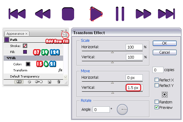
Fill the Play symbol with the purple shade indicated then go to the Appearance Panel and from the fly-out menu choose Add New Fill. Change the second fill color with the one shown then go to Effect menu > Distort&Transform > Transform effect and in the Move section, Vertical select 1.5 px. Do the same thing for the rest of the symbols.


Step 10

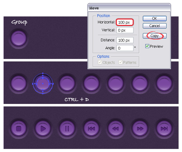
Let’s go back to the button from step 7. Group all the shapes that compose it then go to Object menu > Transform > Move. Choose to move the button 100 px horizontally then press Copy. Now, press Command +D (Transform Again) to repeat this action five times. All that is left to do is to arrange the symbols and you are done.


Step 11

The background behind the pink buttons is the same as the purple background. You can simply make a copy then replace the two fill colors with the ones indicated.

To create the pink buttons all you have to do is to replace the purple shades with pink shades. In the image below you can see the main steps and the colors that you have to change. If other colors or gradients are not mentioned here means that they remain the same.

Also change the two fill colors for the symbols as indicated. Now repeat the step 10 and the pink symbols are ready.


Step 12

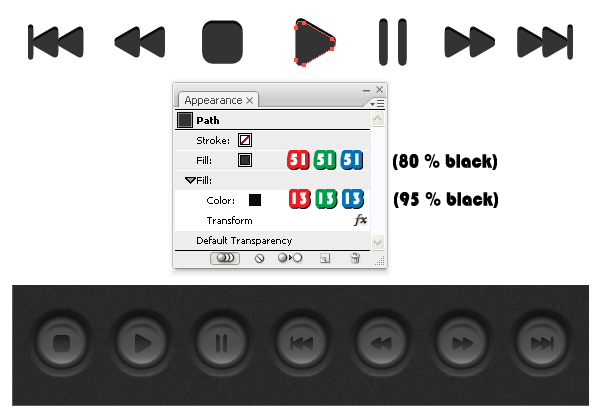
If you don’t like girlish colors you can create the black version. Start with the background and replace the fill colors…

….then replace the purple shades of the buttons with gray shades as indicated below.

Also replace the two fill colors for the symbols then place them on top of the buttons and you are done.


Final Image

Here is the final image. I dare you to create these buttons using other colors that you like and then let me know how they turned out. Just make sure you match the buttons with the background color since the bigger circle is semi-transparent. Also, if you want to scale these buttons remember to expand all the effects used before you do this.


70+ Free Graphics: Vintage Vector Flowers and Floral Ornament Sets

$
0
0


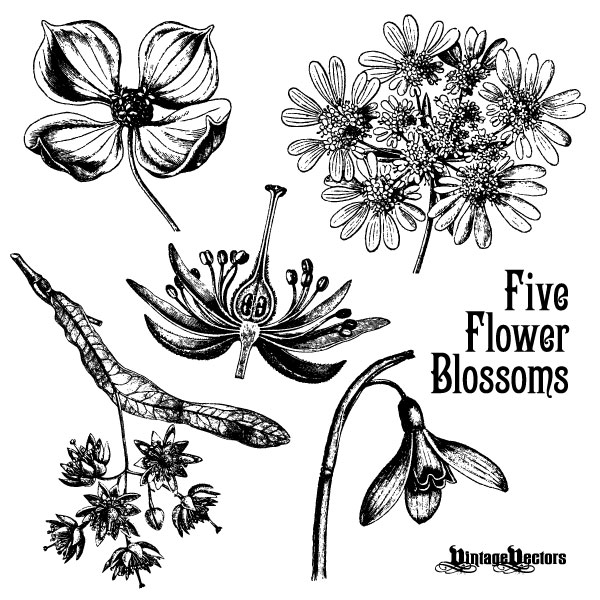
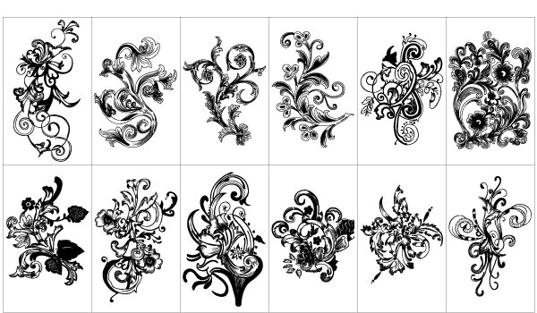
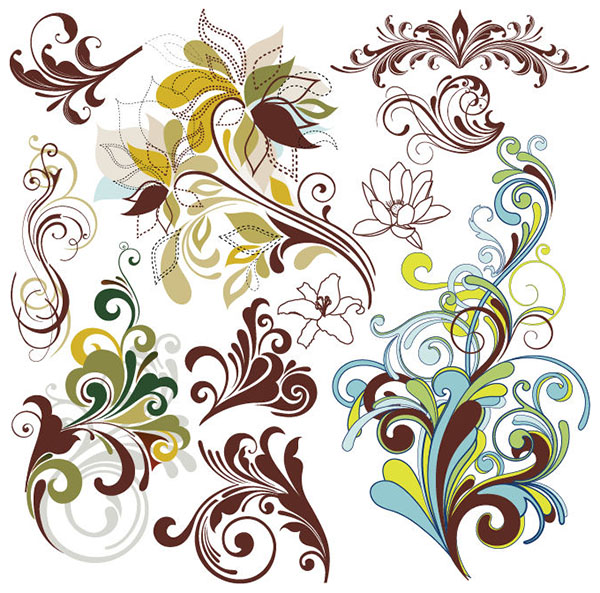
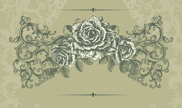
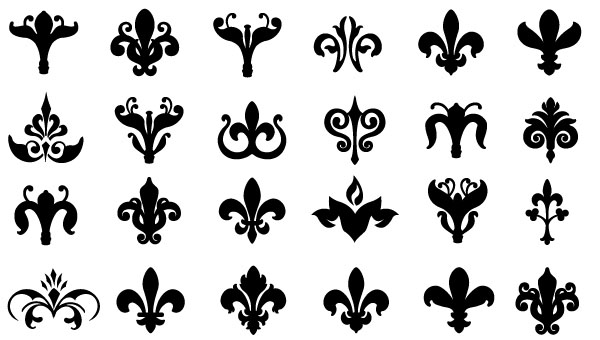
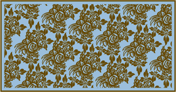
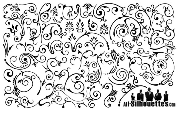
Have the need for free summer vector graphics, specifically free vector flowers and floral ornaments, then you’ve found a compilation worth downloading. There are numerous vintage flower illustrations, as well as sets of ornaments, useful for many design project purposes, from weddings to special summer events. Step into this stockpile of retro vector floral graphics, which are all available for free download.

Many of these free vector graphics are available for commercial use, as well as personal use. Some may have stronger restrictions though, so as always check the usage rights before using.


Using Vintage Vector Flowers and Floral Ornament Sets in Your Work

These vector flower and floral graphics give you numerous options for creating unique thank you cards, decorative invitations to summer gatherings, or any design that is looking to have a festive, vintage design feel. Using distressed floral artwork will your design a timeless appeal. Add an organic theme and soft, classic touch to your next project with free vector floral graphics.

Creating Vector Flowers and Floral Graphics

Here is a supply of tutorials that will teach you how to create flower art in vector format. You’ll learn how to create each shape of a floral graphic, from stem to petal, as well as discover how to give your vector flowers a retro style.

Download Individual Vector Flower Illustrations and Full Sets of Floral Graphics for Free Right Now

If you’re in a hurry, then download one of the free files below, and put them to use right now in your current design or illustration project. We’ve assembled a large collection of useful vector floral graphics, which includes floral silhouette sets, individual retro flower illustrations, free vector art flowers, such as worn roses and pale summer flowers, and more.

Grab an assortment of vintage vector flower and floral graphic freebies to add to your files, which are available in EPS, CSH, AI and other vector formats for free download. Whether you use Adobe Illustrator, Inkscape, or prefer another vector software package. There are plenty of options to fit just the need your project has right now.


Free Vector Flower Graphics

We’ve put together a collection of free vector clipart flower graphics, free vector floral illustrations, and vector flower patterns, all with vintage vector appeal. There are nineteen sets, which make up over seventy free vector graphics, to download here.

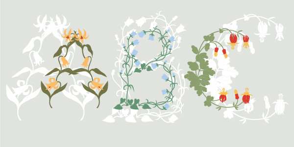
Many of these flower illustrations have a vintage vector feel. There are a few clean vector silhouettes that are always easy to work into virtually any design. There are also retro vector flower backgrounds, a handful of uniquely drawn antique florals, and colorful timeless patterns as well. Each can add a unique summer feel to your vector design work.

Antique Flower Blossom Illustrations

1

Vintage Floral Background

2

Free Floral Vector Pack

3

Natural, Free Floral Ornaments Pack

4

Free Vector Flowers with Butterflies

5

Free Retro Floral Illustration

6

Flowers ABC

7

Flower Ornaments

8

Free Flowers and Butterflies Vector Seamless Pattern

9

Vintage Floral Design Elements in Vector

10

Vintage Floral Background

11

Vintage Floral Illustration

12

Free Vector Floral Flower Silhouettes

13

Shield and Floral Vector Element

14

Free Floral Vector Art Pattern

15

Free Vector Flower Design

16

Vector Classical, Elegant Floral Background

17

Vector Elegant Floral Ornaments

18

Vintage Floral Design Vector Graphic

19

More Large Collections of Free Vector Downloads

Quick Tip: How to Create a Seamless Vector Texture

$
0
0


Today we will take a closer look at the creation of a seamless texture using Adobe Photoshop and Adobe Illustrator. It can be done much easier than it seems at the first glance. All you need to do is to follow the steps from this tutorial. Let’s start!


Step 1

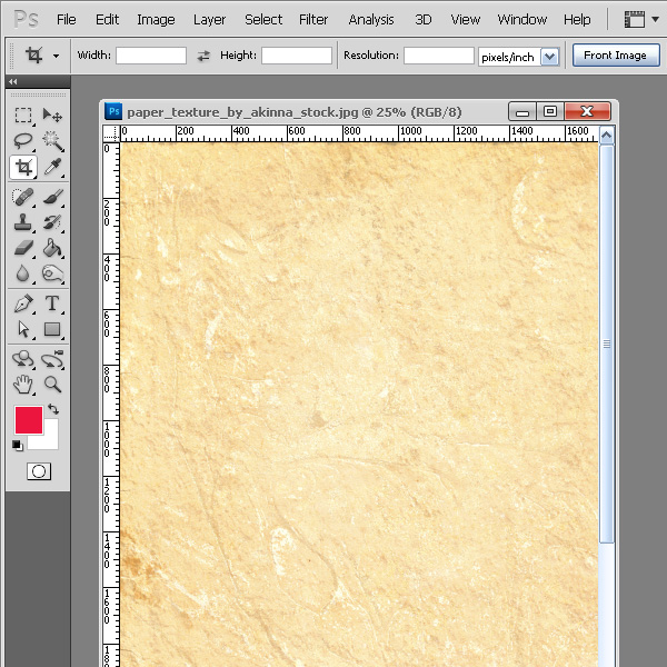
We are going to create the seamless vector texture based on the raster image. That’s why the first steps of this tutorial will be made in Adobe Photoshop. The paper photo texture will be used for the texture. You can download them here (credit to deviantART user ~akinna-stock). Open this image in Photoshop.


Step 2

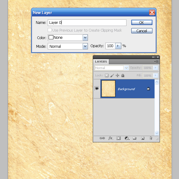
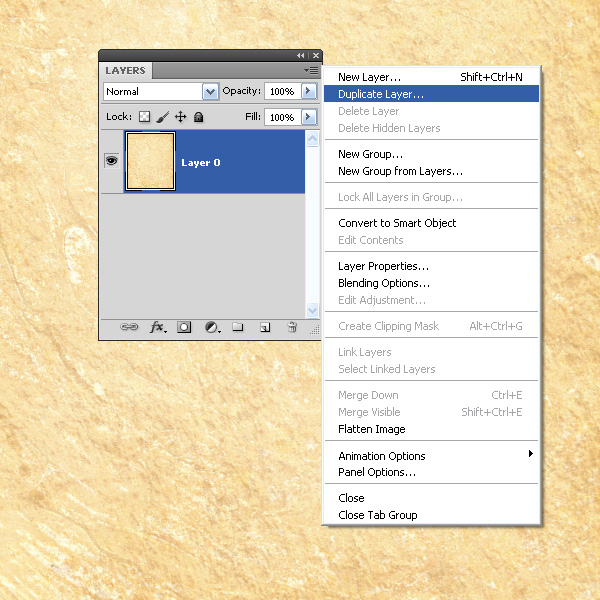
There are a couple of ways of creating a seamless textures in Photoshop. We will take a closer look at one the seamless textures, which, I think, fits best to our texture. Convert the Background layer into the regular layer – click twice on it in the layers panel and click on the OK button in the opened dialog box.

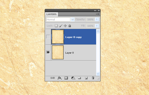
Duplicate this layer while selecting the appropriate item in the Layers menu.

Turn off the visibility of the upper layer.


Step 3

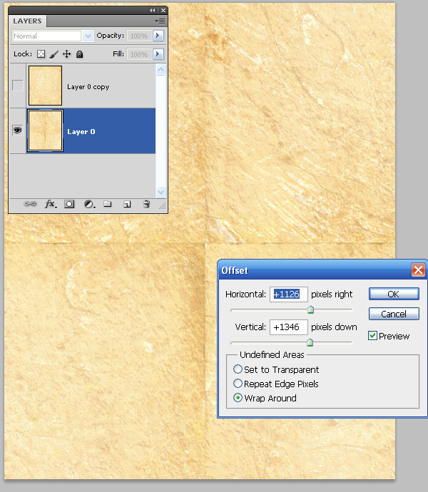
Select the lower layer, go to the Filter > Other > Offset and set the value of the horizontal and vertical displacement in such a way, that the matching point of the image would be placed somewhere in the center of the artboards.

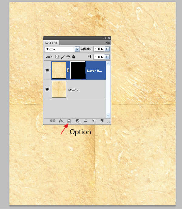
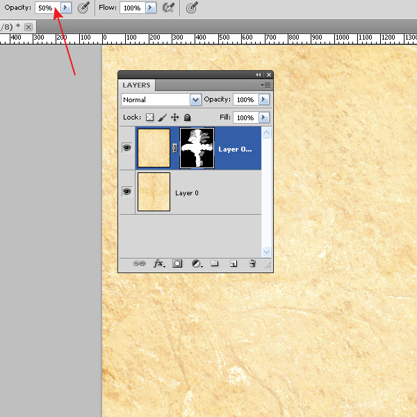
Turn on the visibility of the upper layer and create the black mask for it. To do so, click on the Add Mask button in the lower part of the Layers panel while holding the Option key.


Step 4

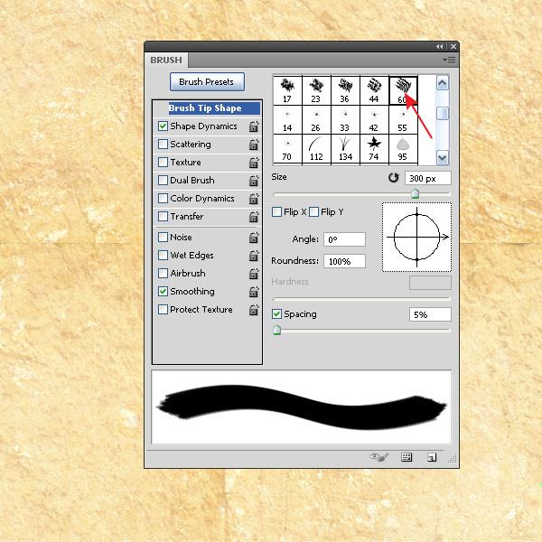
Take the Brush Tool (B) and open the Brush panel (F5). Choose the brush with jagged edges and set the white color for the Foreground.

Note, if you want to change the size of the brush, use the "Left Square Bracket" and the "Right Square Bracket"
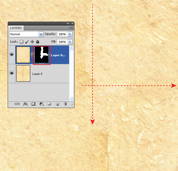
keys. Now make some brush strokes on the joints leveling the transition between the edges of the image (there should be chosen the black mask of the upper layer in the Layers panel).

You can also change the transparency of the brush to give a more uniform outlook to the whole texture.

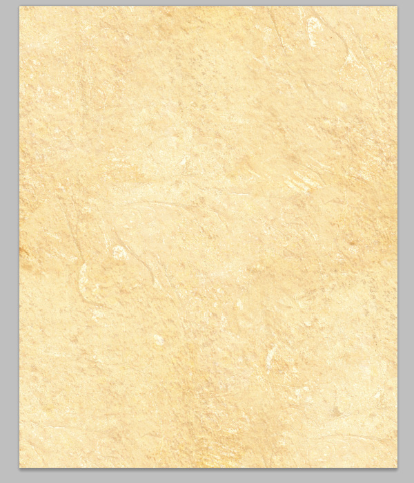
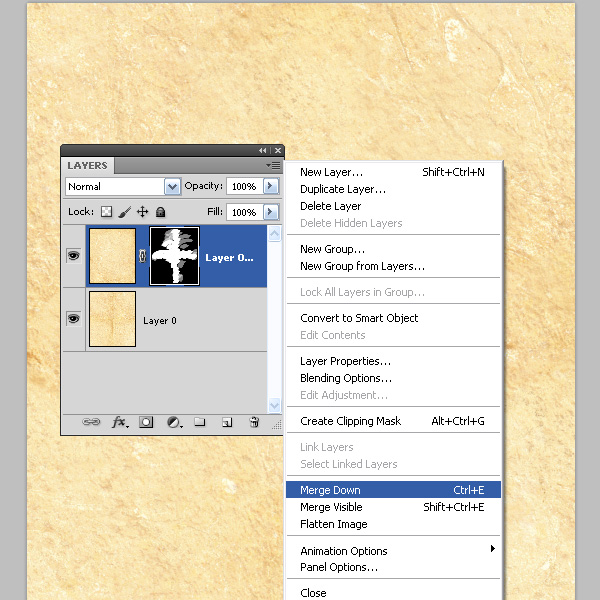
Now merge the layers.


Step 5

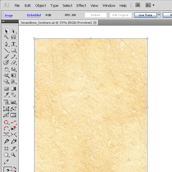
Start Adobe Illustrator and create a new document. Now drag the texture from Photoshop into Adobe Illustrator.

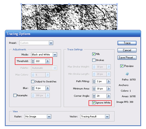
Convert the raster image into the vector objects. Keep the texture selected and go to the Object > Live Trace > Trace Options and set the parameters which are indicated on the picture below.


Step 6

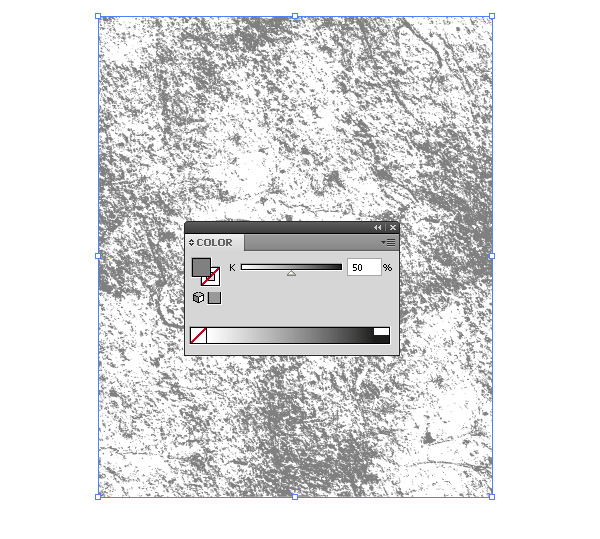
Now go to the Object > Expand and color the elements of the texture into the neutral grey color.

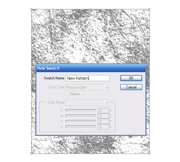
Let’s check whether we have really created the seamless texture. Go Edit > Define Pattern.

A new pattern in the Swatches panel was created with this action.


Step 7

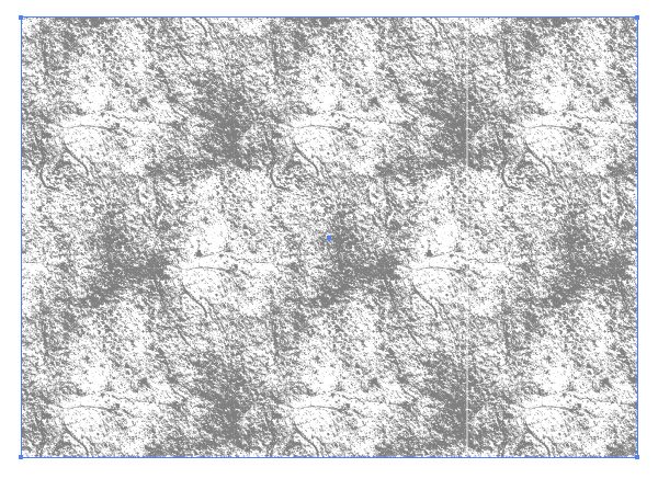
Let’s create a rectangle, size of which is bigger than the size of the texture; apply the pattern, which was created in the previous step, to it.

As you can see, the texture is seamless.


Step 8

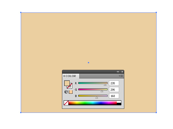
Now let’s check out how you can use the created seamless texture in your projects. Create a rectangle with the necessary color fill with the help of the Rectangle Tool (M).

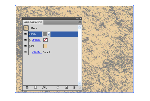
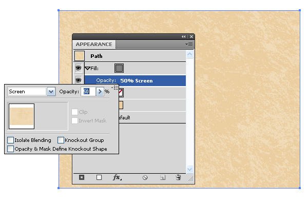
Add the new fill into the Appearance panel and apply the seamless pattern to it.


Step 9

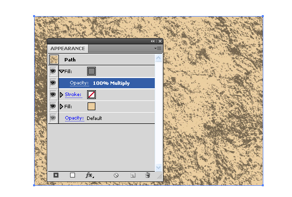
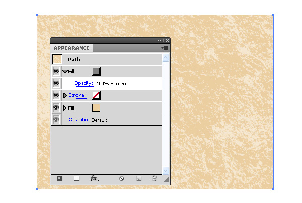
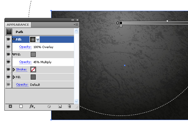
Change the Blending Mode of the texture into the Screen or the Multiply depending on what results you are trying to reach.

You can also edit the intensity of the texture while changing the opacity of this fill.


Step 10

You can get interesting effects while using the gradient fills and different Blending modes in the Appearance panel.


Conclusion

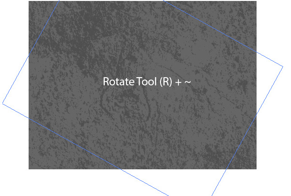
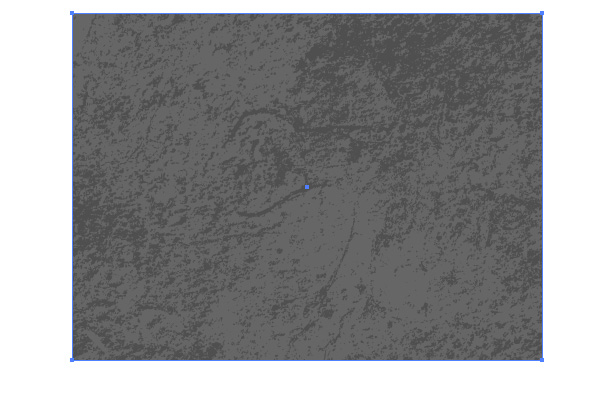
As a conclusion, I would like to give you a small tip on how to edit the patterns. You can transform them with the Direct Selection Tool (A), the Rotate Tool (R) or with any other tools of transformation. If the button ~ is held, while the one of these tools is applied, then the transformation will be made only with them. The object, to which the pattern was applied, will stay unchanged.

Getting Started With Scalable Vector Graphics (SVG)

$
0
0


If you have an interested in how vector works on the web, then we have an excellent tutorial for you. As a web designer it’s high time you knew how to implement SVG (Scalable Vector Graphics) into your websites. Let’s now take a look at the basics of SVG, as well as more complex designs such as logos or icons. Jump over to our sister site Webdesigntuts+ to learn more.

Workshop: Vector Critique #16

$
0
0


Vectortuts+ is all about helping people turbo charge their skills, and today we have another special community post that will help our readers take their images to the next level. The best thing is, you can be part of it too! Find out more at the jump.

How to Participate:

  • This workshop contributor has offered a piece of work that they would like help with, please keep this in mind when you share your thoughts. The images are not perfect, but they can be with the right advice and some friendly encouragement. (Vectortuts+ reserves the right to delete any rude comments)
  • If you’re better with pictures (let’s face it, most of us are) feel free to take a screenshot of the image using Little Snapper, Skitch or a similar program and paste a link to the annotated image in the comments section with an explanation of the tweaks.

If you want to take part in the next Vectortuts+ Workshop:

Add your work to our facebook photo gallery or submit it via the Tuts+ Workshop form, with a description about the piece and the help/advice you’re looking for. We will chose one to be published on our site as part of the next Vectortuts+ Workshop, if you’re not chosen straight away – don’t worry – your work will be chosen for a future session.


Image Category: Typography

Details:

Designer: Tauseef Nadeem

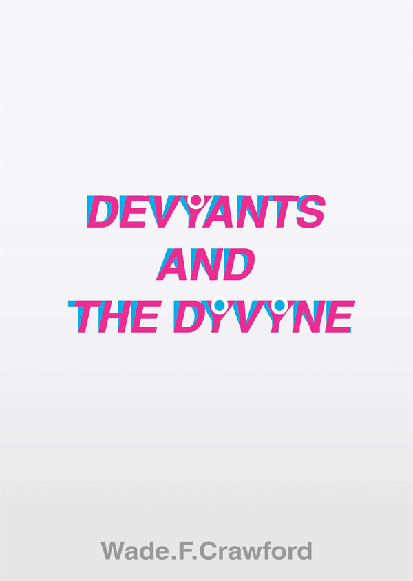
Details: "what do you think of this book cover?"


Feedback

What are your thoughts on the work above? Critiquing work helps the artist see new possibilities, and it also helps you learn to evaluate art, which will help you take that same analysis and apply it to your own work. Participate in the comments below with your opinions on how to improve the work above.

Tuts+ Premium Pack – Victorian Style Seamless Patterns

$
0
0


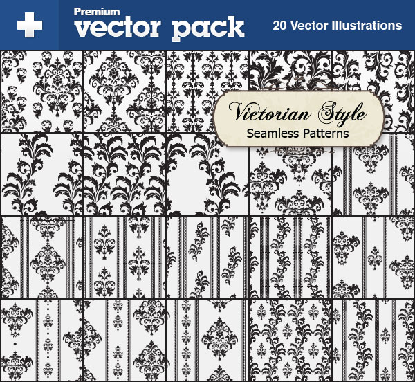
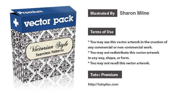
Today we have a unique Tuts+ Premium Pack, which is created in Illustrator by Sharon Milne. It’s filled with 20 retro seamless patterns, much like those you’d find on victorian wallpapers. Each is completely vector, available in AI and EPS formats. Log in or Join Now to get this exclusive download. Learn more at the jump!

New Tuts+ Premium Pack

There are 20 vector seamless victorian style patterns in this pack. Be sure to check the swatches panel when you open the file, as that is where each of these unique patterns are located. The license allows you to use these vectors in your designs, see the download file for details. They can be scaled to any size and colored any way you choose, as these are all vector (in EPS and AI formats)!

sample

This new Vector Premium Pack is created by Sharon Milne. She’s written numerous high quality vector tutorials for us and we’re excited to partner up with her on this exclusive Tuts+ Premium Pack release!

pack

Tuts+ Premium Members can login now for instant access to this tutorial. Membership to Tuts+ Premium gets you access to hundreds of exclusive premium tutorials, top selling ebooks, in-depth courses, member forums, and much more. To learn more about Tuts+ Premium, Take the Tour or Join Today.

How to Create a Promotional Website Infographic in Adobe Illustrator

$
0
0


In this tutorial, we will learn how to collect and process statistical data, then visualize it using Adobe Illustrator. You will also learn how the various vector elements of this project were created, as well as how to save the project in PDF format, edit it, add hyperlinks, and place navigation between pages. This is a detailed infographic tutorial and you can follow along at the jump.

A Primer on Infographics

Information graphics or infographics are graphic visual representations of information, data or knowledge. These graphics present complex information quickly and clearly, such as in signs, maps, journalism, technical writing, and education. With an information graphic, computer scientists, mathematicians, and statisticians develop and communicate concepts using a single symbol to process information (Wiki).

Information presented only in numbers may look awkward and people may not be interested in it. Our task is to send the message to the audience that may consist of your customers, visitors or potential sponsors.

Today we are going to create website promotional infographics. Our goal is to provide exact numbers to show the dynamics of its development, demographic composition of visitors, and include references to the document that may lead to audience growth.

Step 1 – Working with the Sources of Data

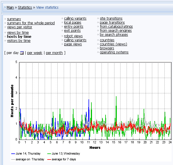
Data collection for this project should be easy. Modern content management systems (CMS) such as WordPress allow you to create websites that have statistics modules. My website was created by the UCOZ CMS, the picture below shows the statistics module in this system.

In addition your website contains information that can be collected, analyzed and presented in graphical form. For example, amount of posts, amount of comments on them, the most popular publications, etc. There are also external data sources. The most popular ones of these resources, for sure, is Google Analytics and Alexa.

These are the sources I will be using in this project.


Step 2

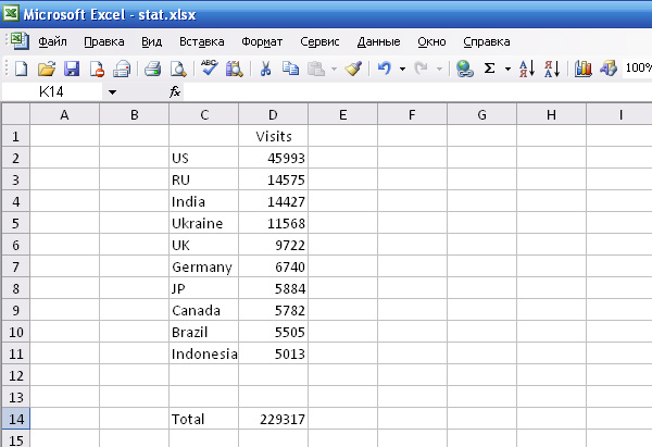
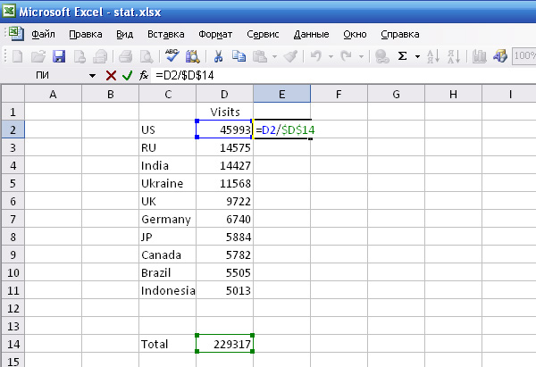
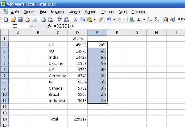
After data has been collected, you probably need to process it. For example, the information is presented in digital values, and you want to present it only in percentage form. You can use a spreadsheet such as Microsoft Excel for data processing.

These applications allow you to use formulas for calculations and process large amount of data.

So, I decided to show the following data: Audiences Location – Top 10, Demographics Age and Gender, Traffic Sources, some dynamic statistic data, as well as Top Content and Advertising information.

Step 3 – The Overall Design

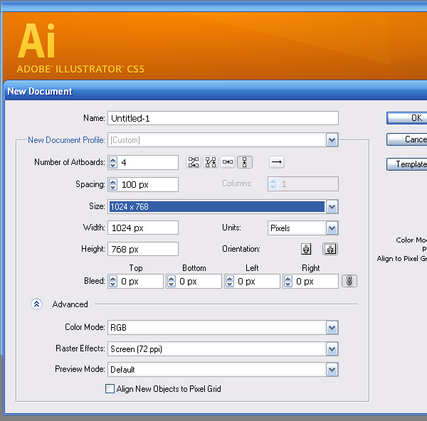
After some thinking I decided to present website infographics in the form of a multipage document. Recent releases of Adobe Illustrator allow you to create this kind of documents. Run the application and set the number of artboards and their sizes in the New Document dialog window.

Multipage documents allow you to work more efficiently switching between the artboards, rather than opening multiple files. This allows you to save time and memory resources on your computer.

In addition, the document has a bunch of advantages about which you will find out in the end of this tutorial. I chose 1024 by 768 px artboard. That is the exact size of an iPad screen. Mobil Devices are very popular right now, that is why I decided to create this infographic project to be viewed on them.


Step 4

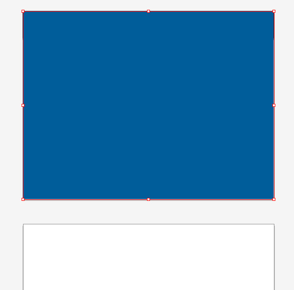
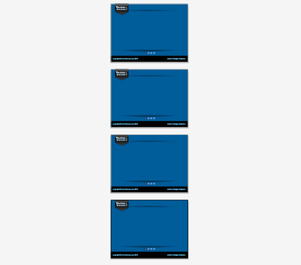
Now we’ll work on creating the design of our first artboard. Take the Rectangle Tool (M) and create a rectangle with a blue fill. The rectangle is set at the size of the artboard.

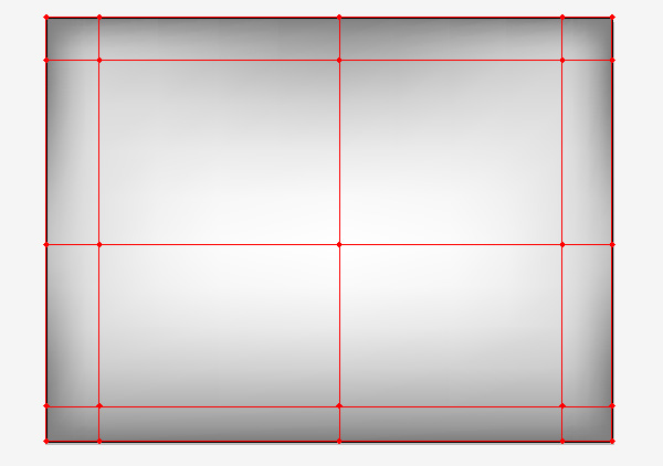
Copy and paste the rectangle in front (Command + C; Command + F). Let’s create a simple gradient mesh using the Mesh Tool (U), then select the nodes of this grid with the help of the Direct Selection Tool (A) and color them in different shades of gray color. The central node is white, the further we move away from the center, the darker the shades of gray color become.

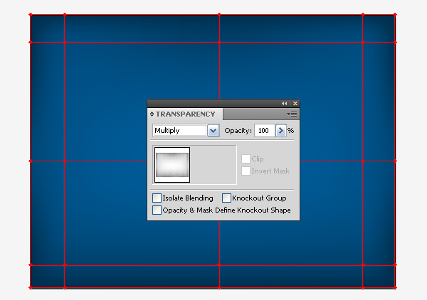
Now select the entire gradient mesh and apply to it the Multiply Blending mode in the Transparency panel.


Step 5

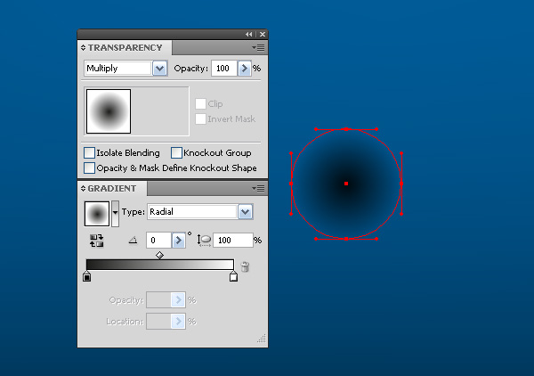
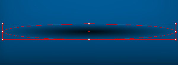
Restrict the area where the information will be located. Create a circle using the Ellipse Tool (L). Fill the circle with a radial gradient from black to white and apply the Multiply Blending mode.

Take the Selection Tool (V), and stretch the Bounding Box in a horizontal direction while holding down the Option key.


Step 6

Using the Rectangle Tool (M) create a rectangle as shown below:

Select the ellipse and the rectangle, then go to Object > Clipping Mask > Make, or use the shortcuts Command + 7.

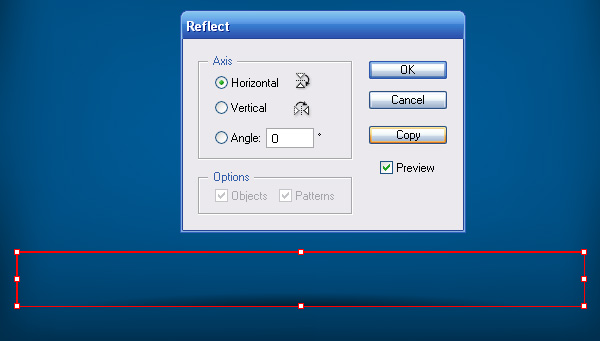
Select the achieved group and go to Object > Transform > Reflect…, then click on the Copy button in the dialog window.

Place the resulting group at the top of the artboard.


Step 7

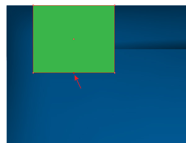
In the top right of the artboard, I decided to place the logo of my website. First, let’s create a ribbon on which it will be located. Create a rectangle, then using the Pen Tool (P) add a new point to its lower side.

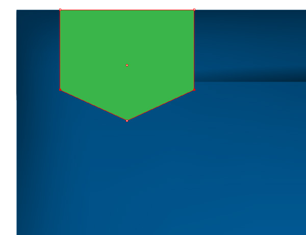
With the help of the Direct Selection Tool select the bottom corners of the rectangle and move them straight up.


Step 8

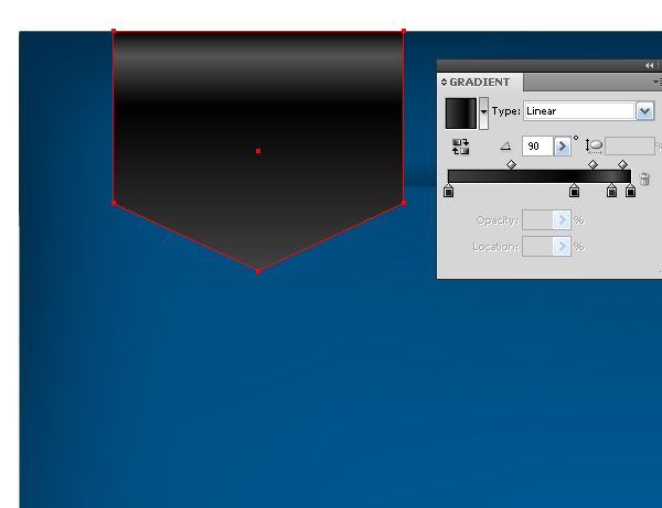
Fill the ribbon with a linear gradient which consists of different shades of a dark gray color.

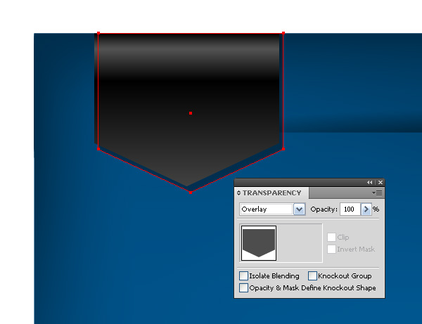
Now we’ll create a shadow from the ribbon. Copy its shape and paste it back (Command + C; Command + B). Fill the new shape with a gray color and move it a little bit to the right and down. Apply the Overlay Blending mode to the shadow. Move the upper corners of the shadow shape so that they lay on the edge of the artboard.

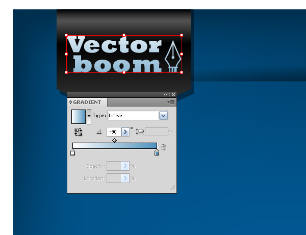
Now I pasted the logo and filled it with a linear gradient from blue to white, so that it does not look flat and matches with the overall color scheme of the composition.


Step 9

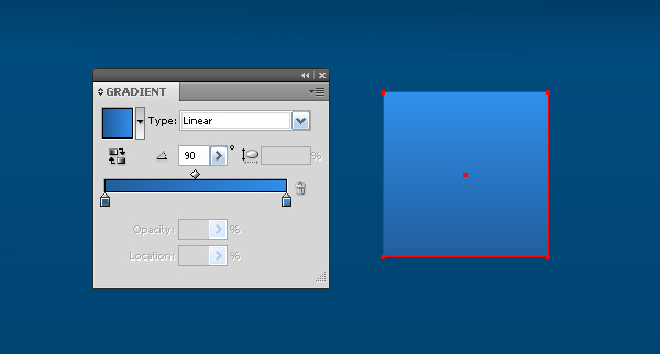
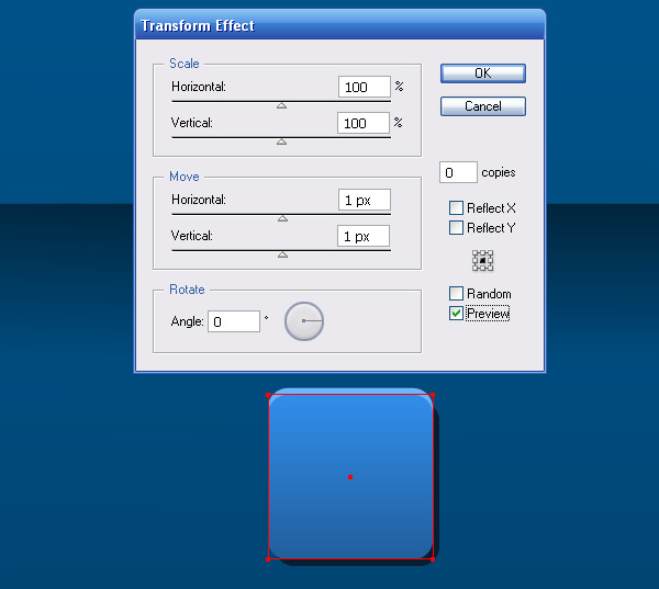
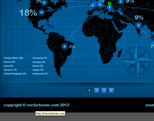
Since my document consists of several pages, it would be appropriate to create a navigation between the pages. Proceed to the creation of the pagination. Using the Rectangle Tool (M) create a square 25 by 25 px with a linear gradient fill, which consists of two shades of blue color.

Keep the rectangle selected, go to Effect > Stylize > Round Corners… and set the radius of rounded corners.


Step 10

Add a new fill to the object in the Appearance panel. Change the color of the gradient’s slider of the bottom fill to a lighter shade of blue.

Keeping the bottom fill selected, go to Effect > Distort & Transform… and set the vertical offset value.


Step 11

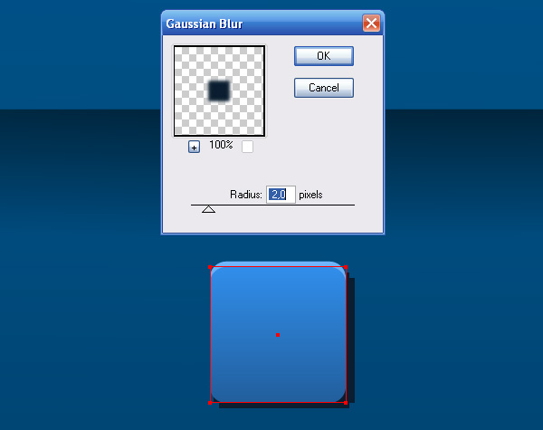
Add one more fill to the Appearance panel, place it below other fills and replace its color with a dark blue.

Keep this fill selected, go to Effect > Distort & Transform… and set the vertical and horizontal offset value.

Now go to Effect > Blur > Gaussian Blur… and set the radius in the dialog window.


Step 12

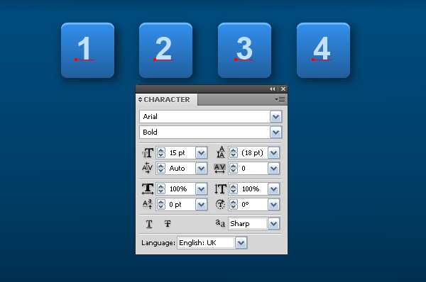
Duplicate the created button three times.

Take the Type Tool (T) and create the numbers on the buttons.

Copy the numbers and paste them back. Fill them with a dark blue color and move them 1 px down.


Step 13

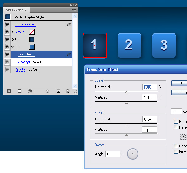
Let’s create a button that corresponds with the first page pressed down. Delete one of the fills in the Appearance panel, replace the gradient of the second fill and change the transformation parameters of the third one.


Step 14

Create a black rectangle in the bottom of the artboard. With the help of the Type Tool (T) create text indicating the authorship and information source.

Group up all the created elements, copy and paste it to the rest of the pages of our document (Command + C; Command + V).

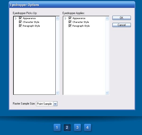
Pages should only differ in the appearance of the active button in the pagination. You can quickly change the look of the button with the help of the Eyedropper Tool (I) with the settings shown in the picture below.

Step 15 – Data Visualization

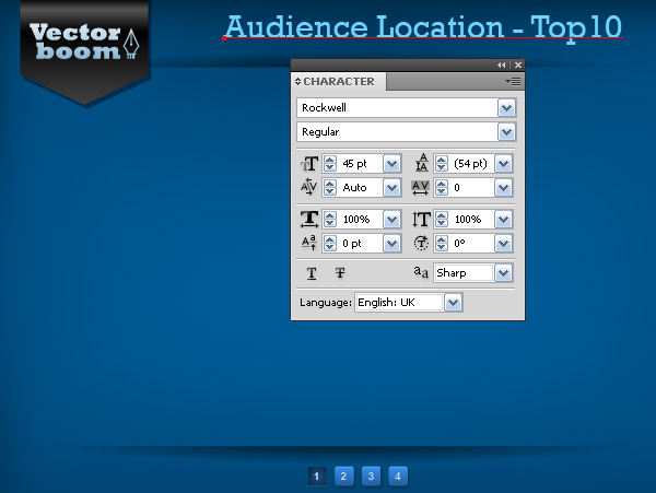
Create titles on the pages according to the information which will be placed on them. For the titles I decided to use the same font that I used earlier, which is Rockwell Regular.


Step 16

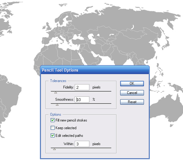
Information on audience location is usually shown on a world map. You can download this vector map by clicking on the following link. Or you can create a map yourself, as I did. To do this, you have find the right map, then add a custom outline with the help of the Pencil Tool (N). The Pencil Tool (N) settings are shown below:


Step 17

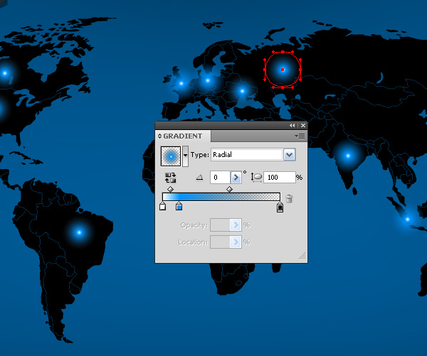
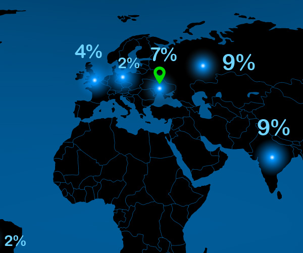
Now mark the countries that correspond with the highest number of visitors with circles filled with a radial gradient. The gradient consists of three colors: white, blue and black, with the black slider set at 0% Opacity.

Now place the data. The greater the number of visitors, the larger the font size. There is no direct quantitative dependence between the size of the font and percentage value, though eyeballing size differences will highlight greater value numbers just fine.


Step 18

The source of the content, that is me, is located in Ukraine. So I marked the place of my location with the Map Sign.

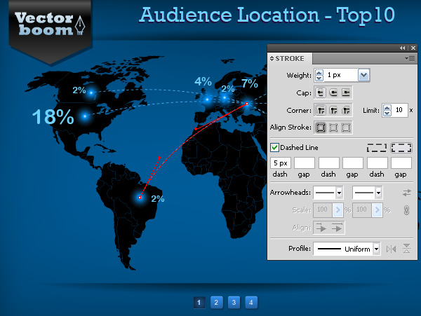
Connect Ukraine with other traffic sources with the help of dotted curved segments, which should be created using the Pen Tool ℗.

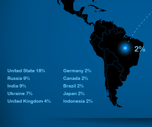
Note that here the information was interpreted unambiguously, I decided to put the graph legend at the bottom right part of the page.


Step 19

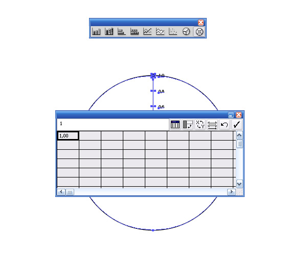
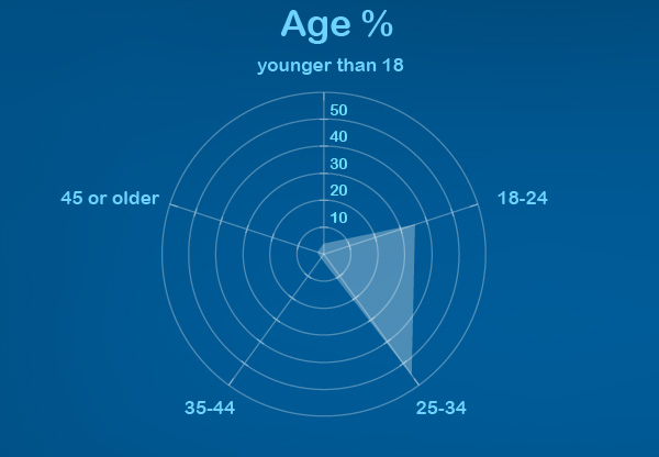
Now we’ll proceed to the second page. We will be visualizing the information on this page using Adobe Illustrator tools. We’ll present the information about the age groups of visitors in Radar Graph form. Take the Radar Graph Tool and create a marquee selection.

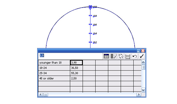
As a result of these actions a primary graph is created and a Graph Data window opens where we will be keying in the data.

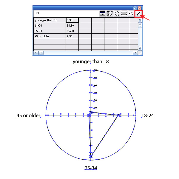
Select the cells and key in the Category labels and Data labels into the Entry text box.

Click on the Apply button in the Graph Data window, as a result we get the Radar Graph.


Step 20

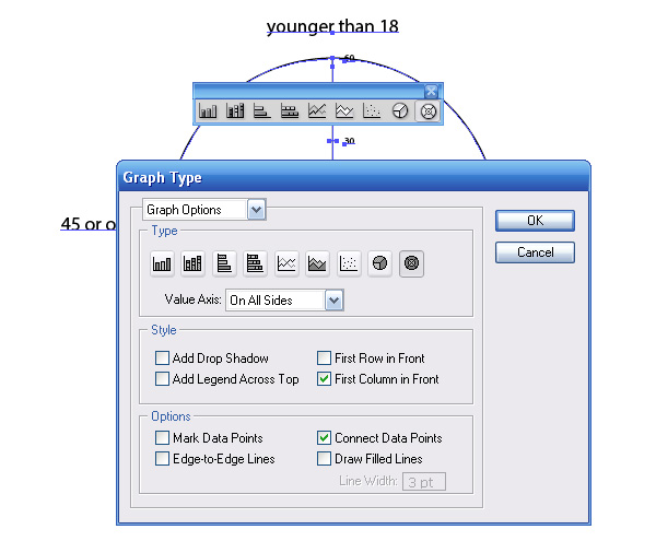
You can choose graph style after its creation. Double-click on the tool icon on the toolbar, and choose the necessary options in the Graph Type dialog window.

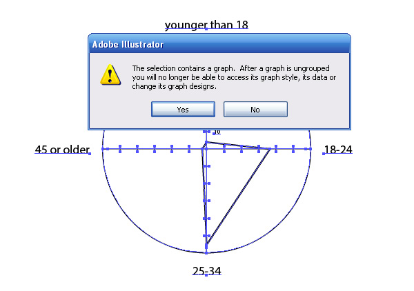
In order to work with the elements of the graph, as with simple vector objects, you need to ungroup it. To do this, close the Graph Data window and go to Object > Ungroup. After this operation, we can no longer manage the graph style using the Graph Style dialog window, and change data in the Graph Data window. At this point, a warning window will open and tell us about that.

Now place the graph on the page and choose objects colors that match the overall design of the project.


Step 21

To create the graph on the next page, I used the collected data and the Column, Bar and Pie Graph Tools.

The principles of working with these instruments are not different from those of working with the Radar Graph Tool. For more information on working with graphs in Adobe Illustrator visit the following link.


Step 22

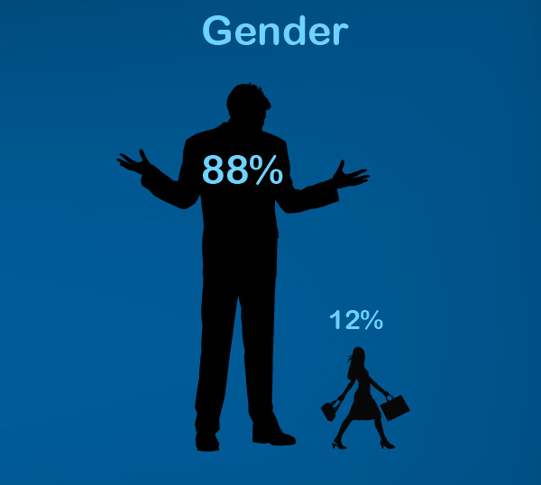
The map of the world on the first page has a silhouette look, so I decided to provide information on the gender composition of visitors in the form of silhouettes as well, this set is of a man and woman. My website is visited by 88% men and only 12% women. I am somehow surprised by this fact. So I decided to use the silhouettes shown in the picture below.

To ensure that all the pages of the project are created in the same style, I placed people silhouettes on other pages as well.

The last page contains only text information about the most popular content and advertising details. In this work, I used free vector silhouettes that you can find by clicking on the following link. You could of course create your own following the process outline in the this tutorial on creating a vector silhouette.

Step 23 – Saving and Editing the Project

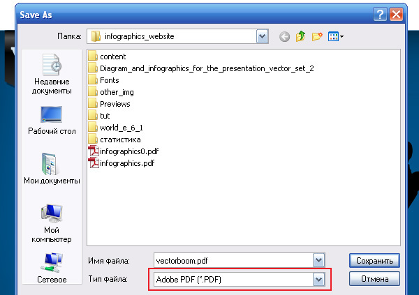
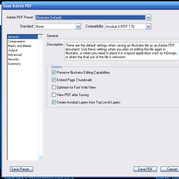
We’re going to save our project in PDF format, so it’s easy to distribute when needed. To do this, go to File > Save as… and select the appropriate options in the opened dialog windows.

Saving the file in PDF format gives us a number of advantages. I list only some of them:

  1. Users will be able to view your project without having Adobe Illustrator.
  2. You do not have to use the Create outlines command for text. The user will see the text as you see them, even if the fonts that were used in this project are not installed. This allows you to keep text editable.
  3. You can insert hyperlinks into a document and create an internal navigation between the pages.
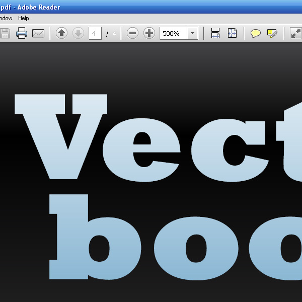
  4. Zooming image view will not affect its quality. Graphs will remain sharp and clear as when zooming in Adobe Illustrator, since it is based on vector objects.

Step 24

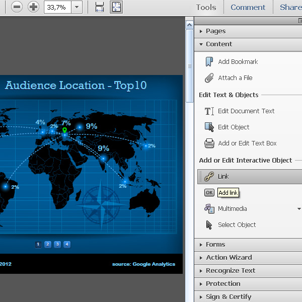
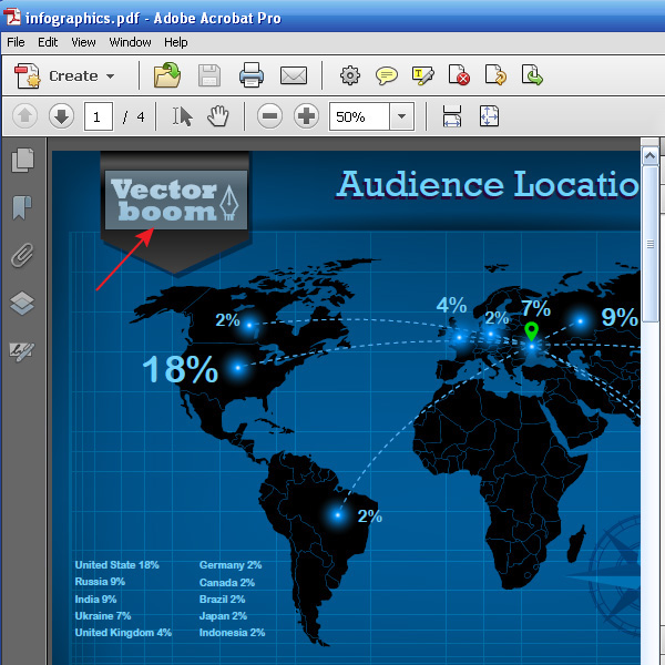
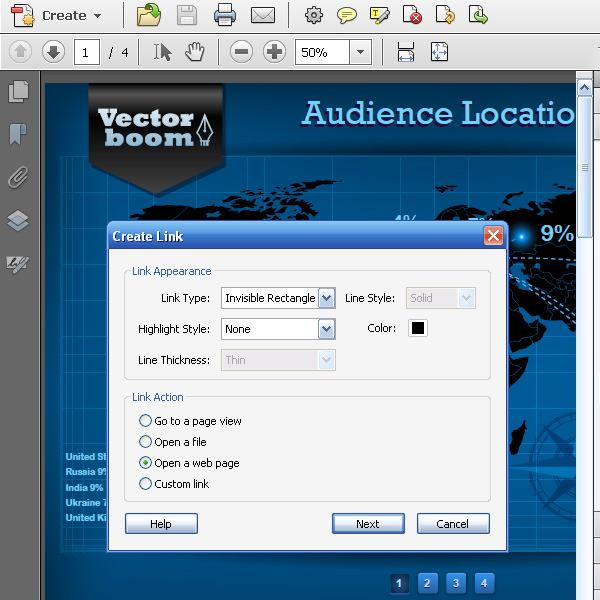
Let’s take a closer look at how to insert a hyperlink into the document and create an internal navigation in it. To edit a PDF file, I suggest you use Adobe Acrobat Pro. So, open the file in this application, then open the Content tab and click on Link button.

Now create a marquee selection over the object where you want the hyperlink to be located.

In the open dialog box, select the options shown in the picture below, and then press the Next button.

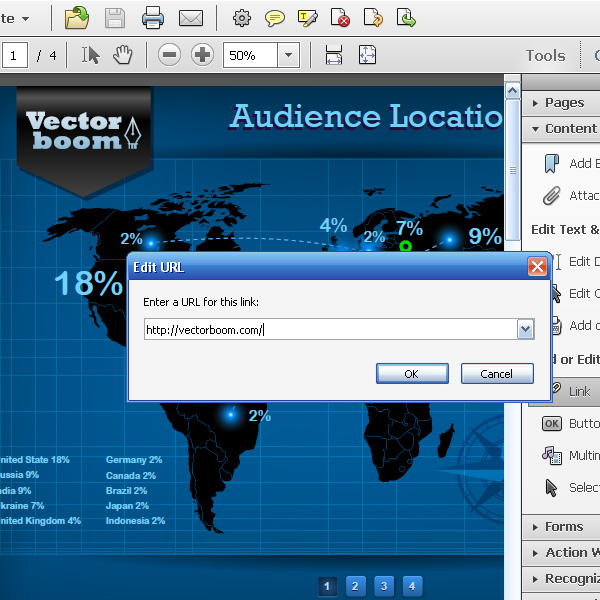
Paste the link and click on the OK button.


Step 25

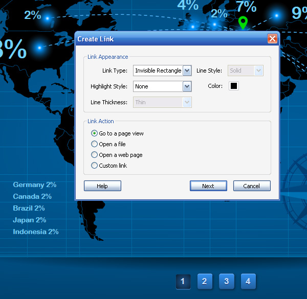
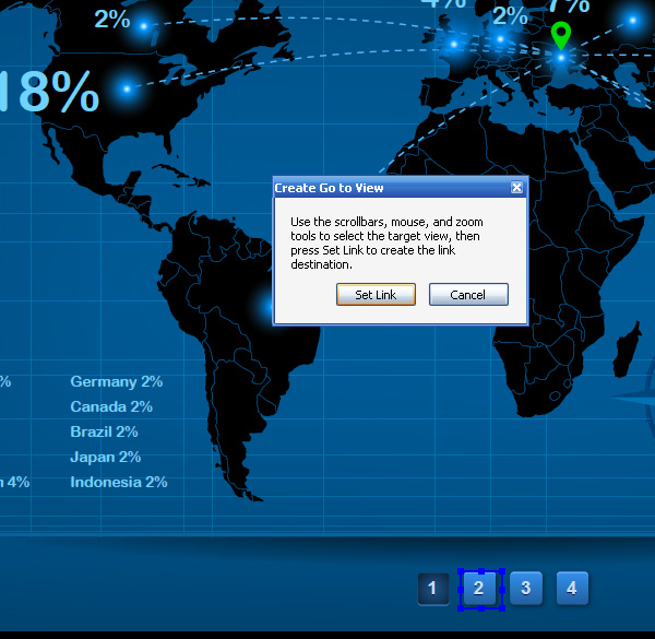
To create an internal navigation, use the same Link tool. Create a marquee selection on top of one of the buttons. Select ‘Go to a page view’ in the dialog window and click Next, then click on the Set Link.

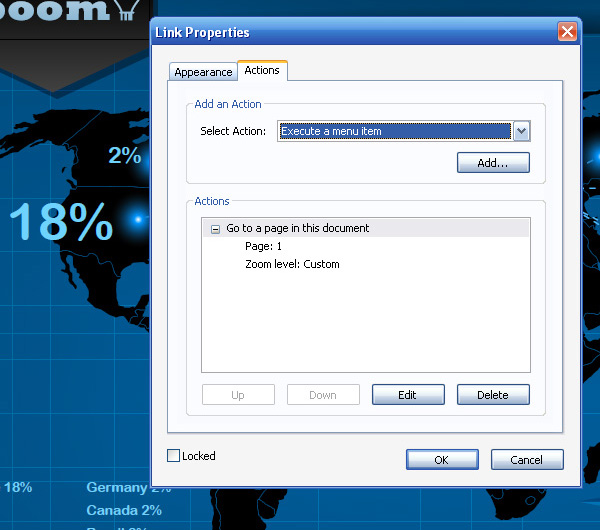
Now Double-click inside the bounding box of the button. Then in the open dialog window go to the Actions tab.

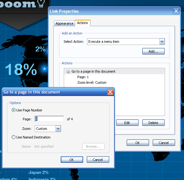
Choose Action, click on the Edit button and enter the required page number.

Using the described technique, paste all the necessary links into our document.


Final Image Preview

That’s it! You’ve just learned how to create an infographics for your website. If you run your own blog and are looking to attract advertisers, this can be a powerful tool. And of course with these skills in hand, there are plenty of potential clients that have a need for this kind of information graphic based business document.

Quick Tip: The New Image Trace Panel in Illustrator CS6

$
0
0


The new Image Trace function in Adobe Illustrator CS6 has some major improvements and some major headaches. In this Quick Tip you can see it in action!


Tuts+ Community Meetup in New York!

$
0
0


We’re excited to announce that we will be holding a Tuts+ community meetup on the 19th of July in New York City! Are you interested in meeting your fellow Tuts+ fans as well as some of the staff who make the sites tick? This is your chance!


The New York Meetup

We’re looking to hold a small, informal meetup in an easily accessible location in Manhattan, New York on the evening of the 19th of July.

Staff attendees will include:

  • Jeffrey Way
  • Mark Hammonds
  • Sean Hodge
  • Cameron Knight
  • Josh Johnson
  • Adam E. Miller
  • Grant Friedman
  • David Appleyard and
  • Mark Brodhuber (from the Envato Marketplaces)

This will be a great chance to meet some of the team behind the Tuts+ sites and other members of the community in an informal environment. There should be some Tuts+ t-shirts there too along with some limited food and drink!


We’d Love to See You There!

We’re still figuring out the specifics, including venue and capacity but are looking to get expressions of interest now.

If you can or would like to attend, please let us know by filling out this form to register your interest!

We will provide more information as it becomes available, but do let us know if you have any questions!

How to Create a Vector Binders Illustration

$
0
0


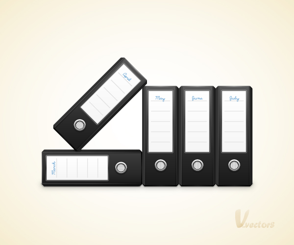
In the following tutorial, you will learn how to create a binders illustration. We’ll use basic illustrator shape creation tools and Illustrator’s Pathfinder tool to cut the shapes you need. Then we’ll color in details using gradients and control how lighting effects our illustration. We’ll use additional Illustrator tools along the way and work to pixel precision.


Step 1

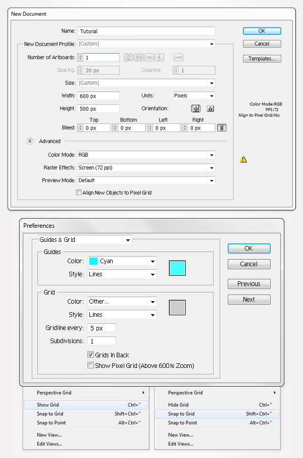
Hit Command + N to create a new document. Enter 600 in the width box and 500 in the height box, then click on the Advanced button. Select RGB, Screen (72ppi) and make sure that the "Align New Objects to Pixel Grid " box is unchecked before your click OK.

Enable the Grid (View > Show Grid) and the Snap to Grid (View > Snap to Grid). Next, you’ll need a grid every 5px. Go to Edit > Preferences > Guides & Grid, enter 5 in the Gridline every box and 1 in the Subdivisions box.

You can also open the Info panel (Window > Info) for a live preview with the size and position of your shapes. Do not forget to replace the unit of measurement to pixels from Edit > Preferences > Unit > General. All these options will significantly increase your work speed.


Step 2

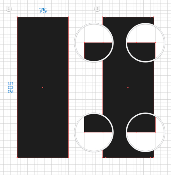
Pick the Rectangle Tool (M), create a 75 by 205px shape, and fill it with a random color. Select this rectangle and grab the Add Anchor Point Tool (+). First, focus on the top side and add two new anchor points as shown in the second image. Move to the bottom side and do the same thing. The Snap to Grid will ease your work.


Step 3

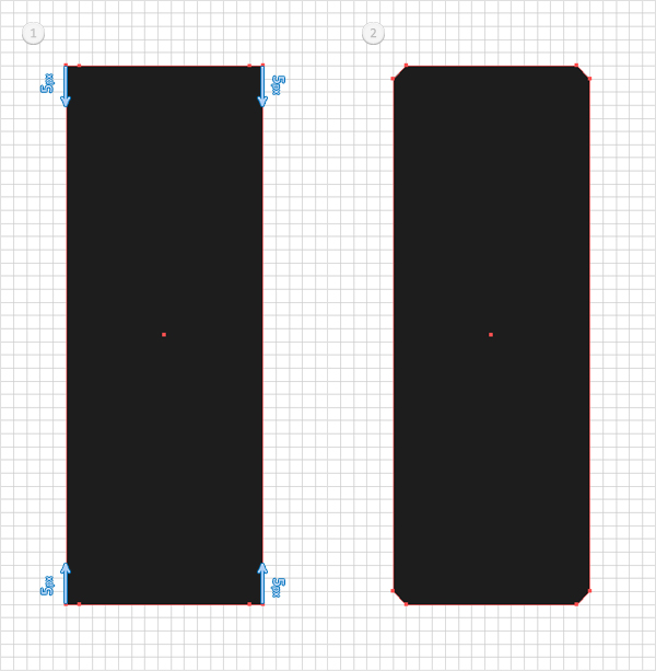
Make sure that the shape created in the previous step is still selected and pick the Direct Selection Tool (A). Select the top, left and right anchor points, then drag them 5px down. Move to the bottom side, select the bottom, left and right anchor points, then drag them 5px up. Again, the Snap to Grid will ease your work. In the end, your shape should look like the second image shown.


Step 4

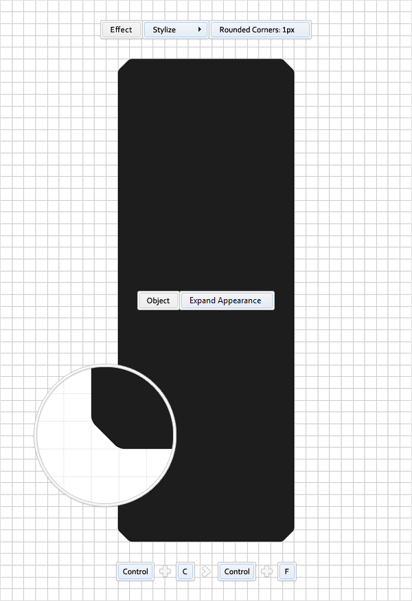
Reselect the shape edited in the previous step and go to Effect > Stylize > Rounded Corners. Enter a 1px radius, click OK, and apply Object > Expand Appearance. Select the resulting shape and make a copy in front (Command + C > Command + F). You’ll need it for the next step.


Step 5

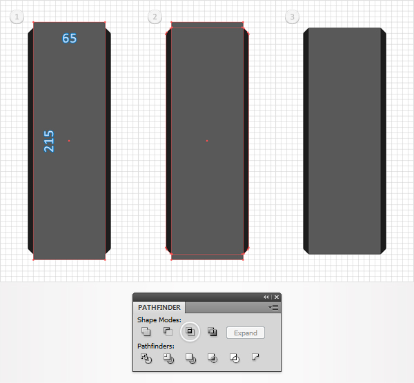
Pick the Rectangle Tool (M), create a 65 by 215px shape, fill it with a random color, and place it as shown in the first image. Select it, along with the copy created in the result of the previous step, open the Pathfinder panel, and click on the Intersect button.


Step 6

Reselect the shape created in the previous step and fill it with the linear gradient shown in the following image. The white number from the gradient image stands for location percentage.


Step 7

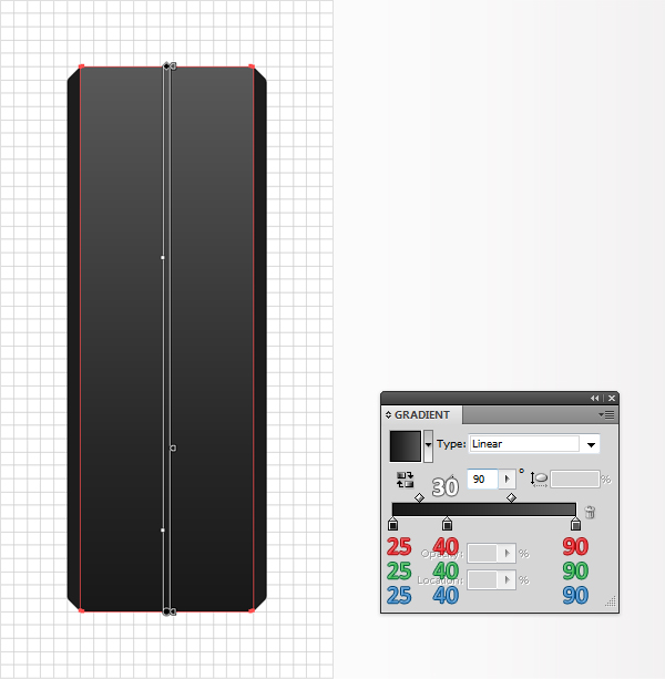
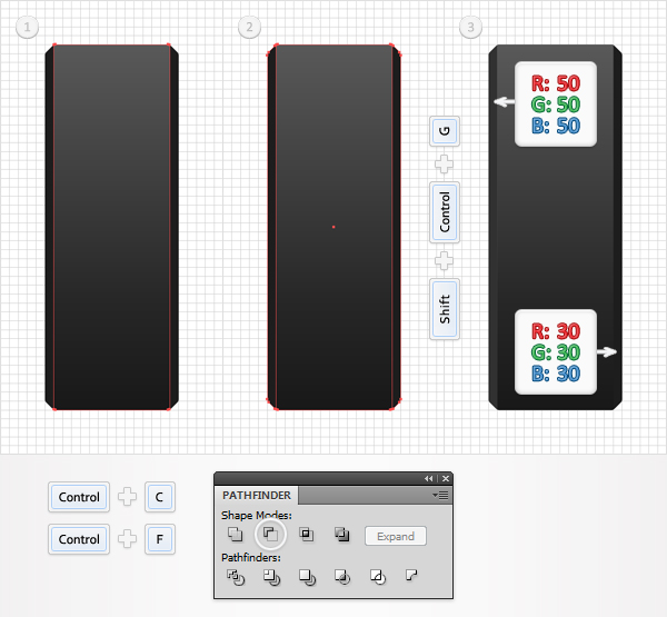
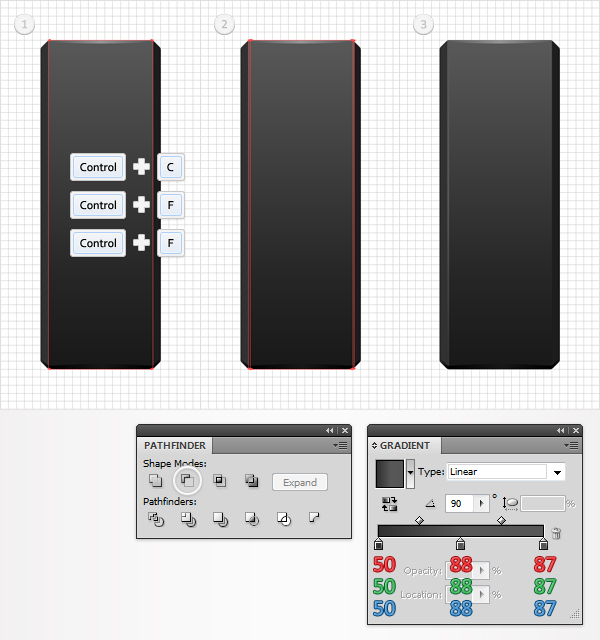
Reselect the shape edited in the previous step and make a copy in front (Command + C > Command + F). Select it, along with the shape created in the first steps, and click on the Minus Front button from the Pathfinder panel. Move to the Layers panel and you will find a new group with two simple shapes. Ungroup them (Shift + Command + G). Fill the left shape with R=50 G=50 B=50 and the right shape with R=30 G=30 B=30.


Step 8

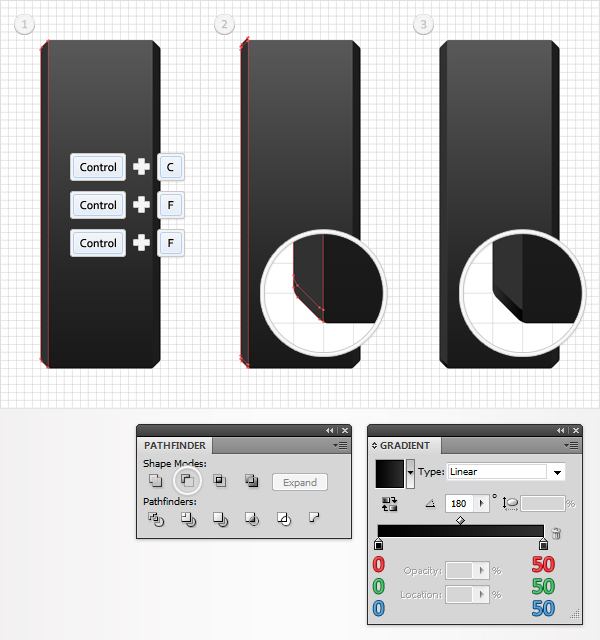
Disable the Snap to Grid (View > Snap to Grid), then go to Edit > Preferences > General, and make sure that the Keyboard Increment is set at 1px. Reselect the left shape created in the previous step and make two copies in front (Command + C > Command + F > Command + F). Select the top copy and move it 2px up. Reselect both copies and click on the Minus Front button from the Pathfinder panel. Fill the resulting shape with the linear gradient shown in the following image.


Step 9

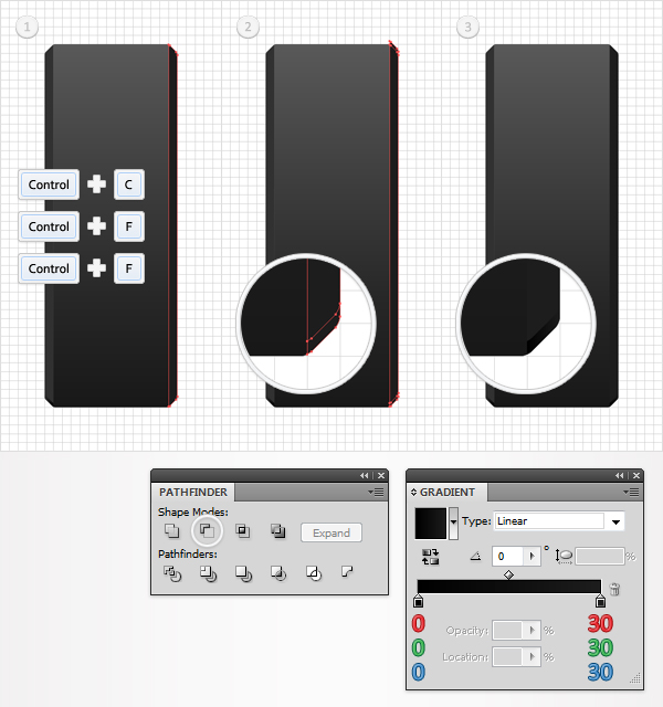
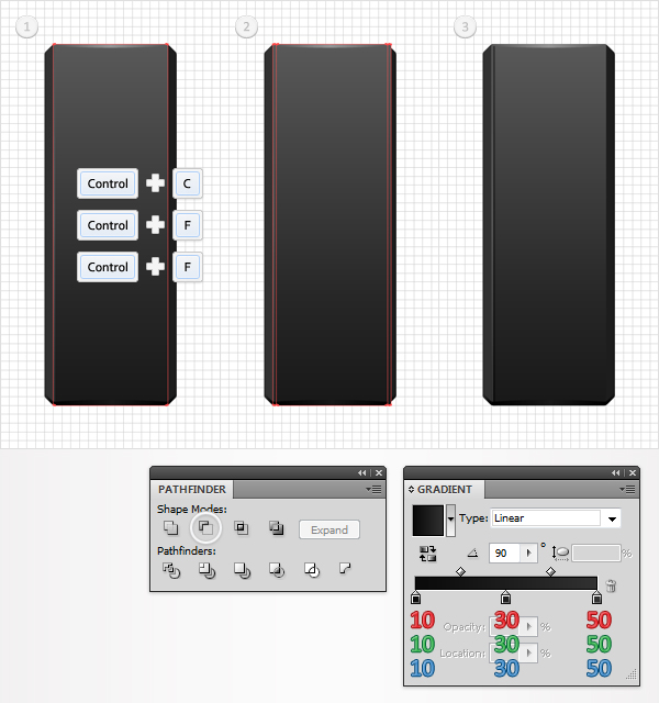
Reselect the right shape created in the seventh step and make two new copies in front (Command + C > Command + F > Command + F). Select the top copy and move it 2px up. Reselect both copies and click on the Minus Front button from the Pathfinder panel. Fill the resulting shape with the linear gradient shown in the following image.


Step 10

Let’s get back to the main shape created in the fifth step. Select it and make two copies in front (Command + C > Command + F > Command + F). Select the top copy and move it 1px down. Reselect both copies and click on the Minus Front button from the Pathfinder panel.

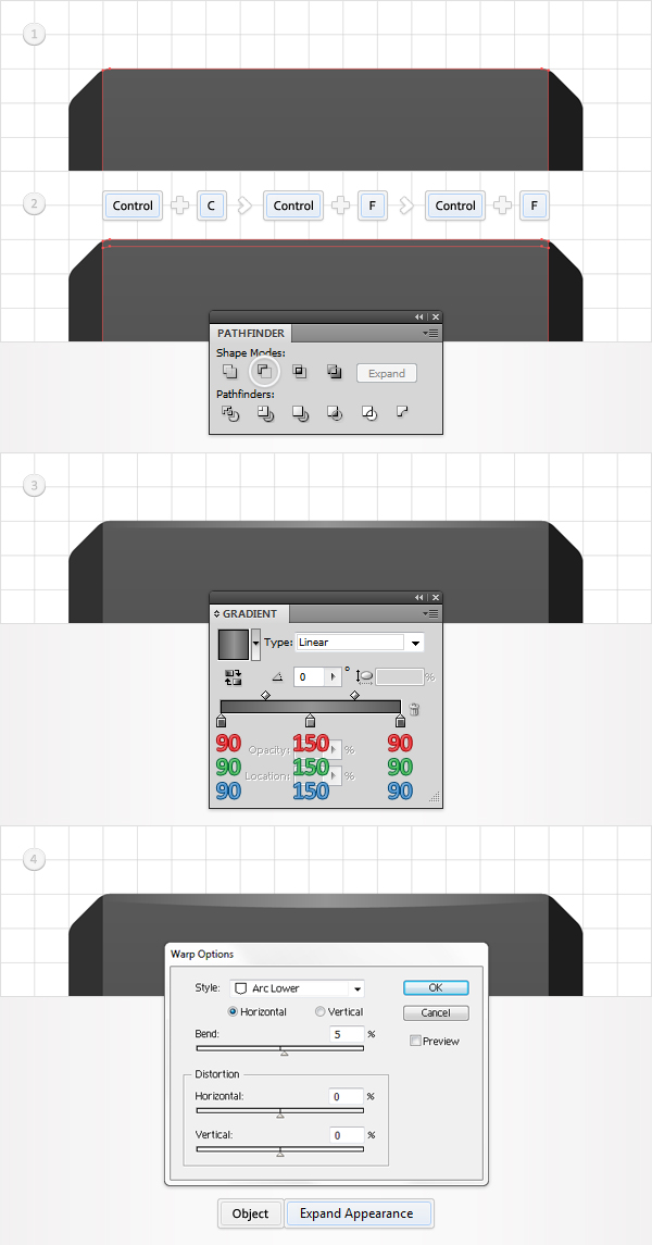
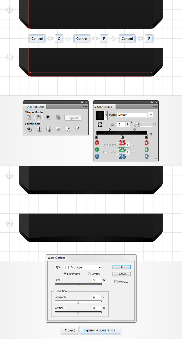
Fill the resulting shape with the linear gradient shown below and go to Effect > Warp > Arc Lower. Enter the data shown in the following image, click OK and go to Object > Expand Appearance.


Step 11

Reselect the main shape and make two new copies in front (Command + C > Command + F > Command + F). Select the top copy and move it 1px up. Reselect both copies and click on the Minus Front button from the Pathfinder panel. Fill the resulting shape with the linear gradient shown below and go to Effect > Warp > Arc Lower. Enter the data shown in the following image, click OK and apply Object > Expand Appearance.


Step 12

Reselect the main shape and make two new copies in front (Command + C > Command + F > Command + F). Select the top copy and move it 1px to the right. Reselect both copies and click on the Minus Front button from the Pathfinder panel. Fill the resulting shape with the linear gradient shown below.


Step 13

Reselect the main shape and make two new copies in front (Command + C > Command + F > Command + F). Select the top copy and move it 2px to the right. Reselect both copies and click on the Minus Front button from the Pathfinder panel. Fill the resulting shape with the linear gradient shown below.


Step 14

Reselect the main shape and make two new copies in front (Command + C > Command + F > Command + F). Select the top copy and move it 1px to the left. Reselect both copies and click on the Minus Front button from the Pathfinder panel. Fill the resulting shape with the linear gradient shown below.


Step 15

Reselect the main shape and make two new copies in front (Command + C > Command + F > Command + F). Select the top copy and move it 2px to the left. Reselect both copies and click on the Minus Front button from the Pathfinder panel. Fill the resulting shape with the linear gradient shown below.


Step 16

Enable the Snap to Grid (View > Snap to Grid). For the next steps you will need a grid every 1px. So, go to Edit > Preferences > Guides & Grid, then enter 1 in the Gridline every box.

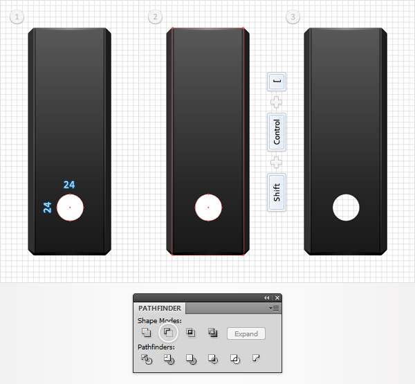
Pick the Ellipse Tool (L), create a 24px circle, fill it with a random color and place it as shown in the first image. Select it, along with the main shape, and click on the Minus Front button from the Pathfinder panel. Send the resulting shape to back (Shift + Command + [ ).


Step 17

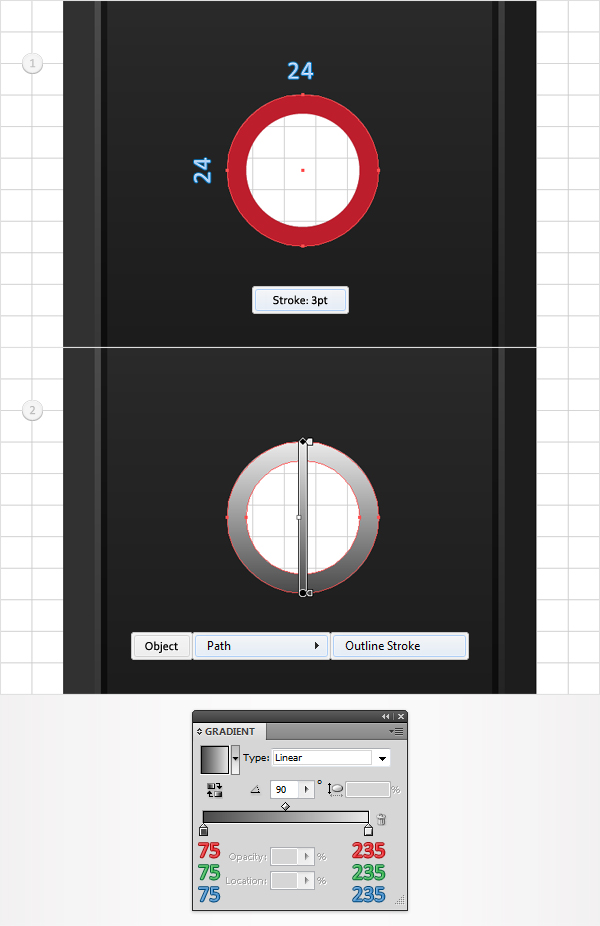
Reselect the Ellipse Tool (L), create a new 24px circle, and place it above the hole created in the previous step. Fill it with none but add a 3pt stroke. Pick a random color for the stroke, align it to inside, then go to Object > Path > Outline Stroke. Fill the resulting path with the linear gradient shown below:


Step 18

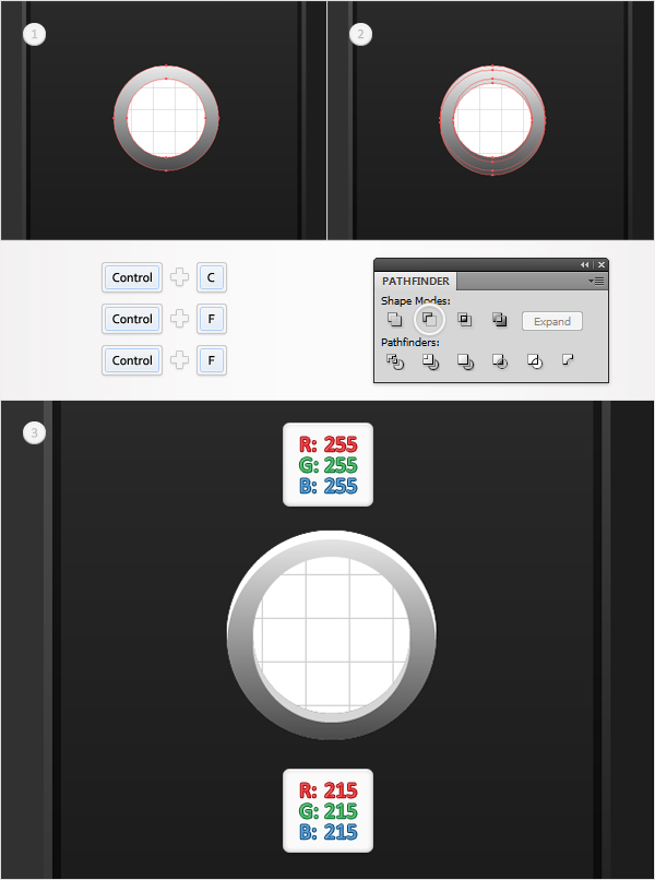
Reselect the shape created in the previous step and make two copies in front (Command + C > Command + F > Command + F). Select the top copy and move it 1px down. Reselect both copies and click on the Minus Front button from the Pathfinder panel. Select the top, resulting shape and fill it with white, then select the bottom shape and fill it with R=215 G=215 B=215.


Step 19

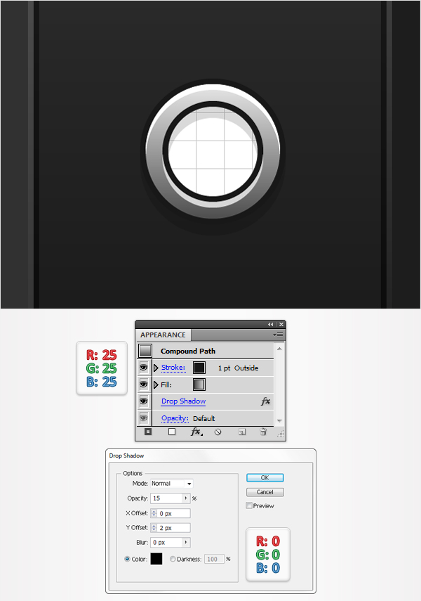
Reselect the shape created in the seventeenth step, then go to Effect > Stylize > Drop Shadow. Enter the data shown in the following image and click OK. Keep focusing on this shape and add a 1pt stroke. Set its color at R=25 G=25 B=25 and align it to outside.


Step 20

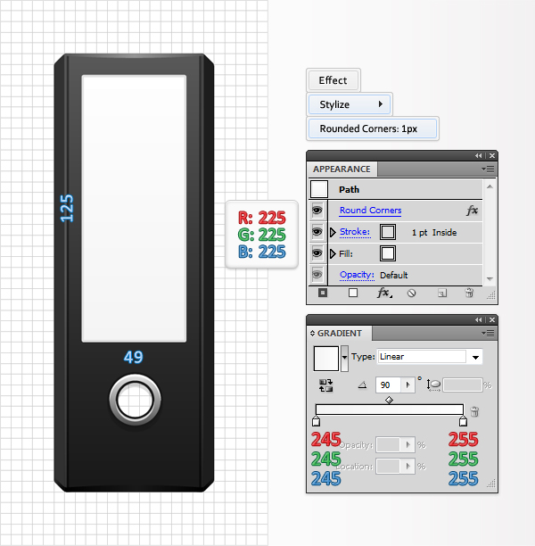
Pick the Rectangle Tool (M), create a 49 by 125px shape, fill it with the linear gradient shown below, and place it as shown in the following image. Add a 1pt stroke for this shape, set its color at R=225 G=225 B=225, and align it to inside. Make sure that this new shape is still selected and go to Effect > Stylize > Rounded Corners. Enter a 1px radius and click OK.


Step 21

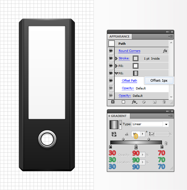
Reselect the shape created in the previous step, focus on the Appearance panel, and add a second fill using the Add New Fill button. It’s the little white square icon located at the bottom of the Appearance panel.

Select this new fill, drag it to the bottom of the Appearance panel, use the linear gradient shown below, then go to Effect > Path > Offset Path. Enter a 1px Offset and click OK. The yellow zero from the gradient image stands for opacity percentage.


Step 22

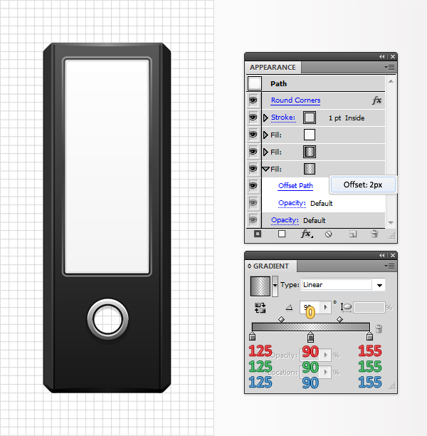
Keep focusing on the shape edited in the previous steps and add a third fill. Select it, drag it to the bottom of the Appearance panel, use the linear gradient shown below, then go to Effect > Path > Offset Path. Enter a 2px Offset and click OK.


Step 23

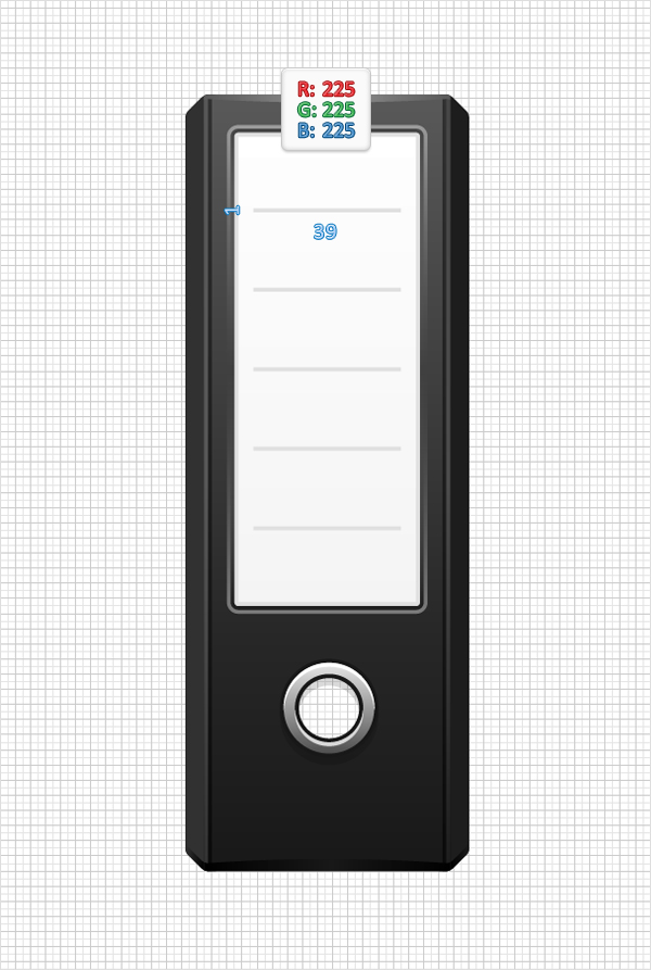
Pick the Rectangle Tool (M) and create five, 39 by 1px shapes. Fill them with R=225 G=225 B=225 and place them as shown in the following image.


Step 24

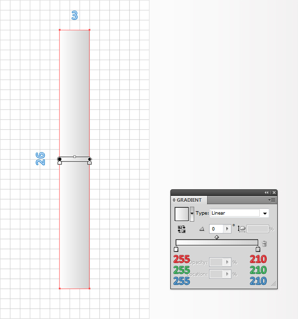
Pick the Rectangle Tool (M), create a 3 by 26px shape, and fill it with the linear gradient shown below.


Step 25

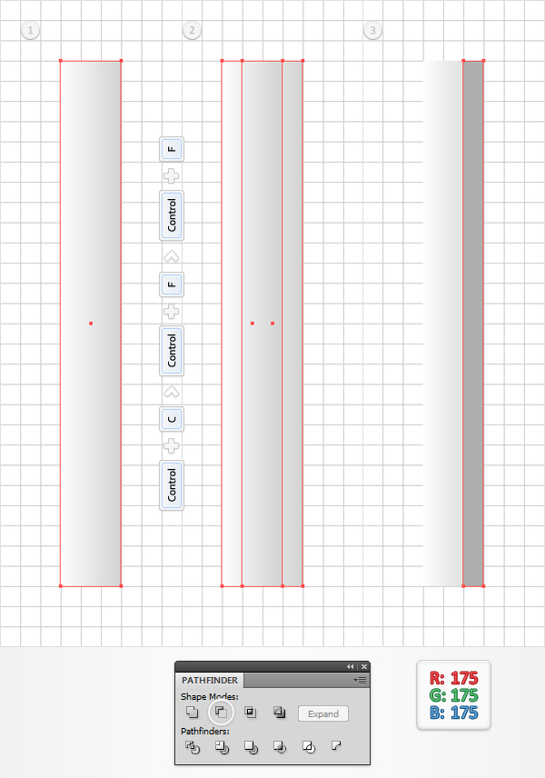
Reselect the shape created in the previous step and make two copies in front (Command + C > Command + F > Command + F). Select the top copy and move it 1px to the left. Reselect both copies and click on the Minus Front button from the Pathfinder panel. Fill the resulting shape with R=175 G=175 B=175.


Step 26

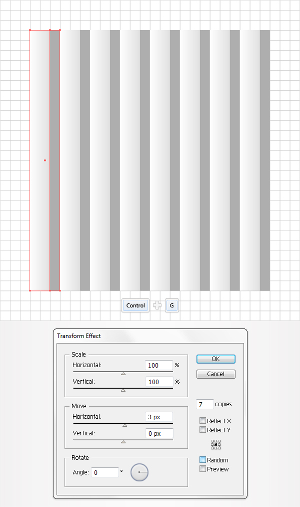
Reselect the two rectangles created in the last two steps and group them (Command + G). Select this new group and go to Effect > Distort & Transform > Transform. Enter the data shown in the following image and click OK.


Step 27

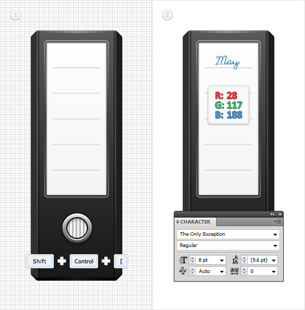
Reselect the group created in the previous step, send it to back (Shift + Command + [ ), and place it as shown in the first image. Finally, pick the Type Tool (T) and add some simple text as shown in the second image.


Conclusion

Now your work is done. Here is how it should look.

Workshop: Matryoshka Doll Project

$
0
0


Vectortuts+ loves Illustration and discovering new talent, so today we are proud to be launching a new community project that combines both, the Vectortuts+ Matryoshka Doll Project. The best thing is, you can be a part of it! Find out how to get involved, at the jump.


Design a Vectortuts+ Matryoshka Doll!

I’m excited to announce that today we’re launching the Vectortuts+ Matryoshka Doll Project! This project aims to spark your imagination and showcase the work of our extremely talented community. Fire up your imagination and let’s get started!

All you need to do for this project is download the design template and customize the Vectortuts+ Character in any style and theme that takes your fancy. Add your work to the Vectortuts+ Facebook Group and show us what you think a custom Vectortuts+ character would look like. We will showcase a selection of the entries on our blog.

We can’t wait to see what you come up with!


How to Get Involved!

Would you like to participate in the Vectortuts+ Matryoshka Doll Project? It’s easy, all you need to do is Download the Template, join the Vectortuts+ Facebook Group and get creative!


How to Make a Vectortuts+ Matryoshka Doll:

  1. Download the Design Template
  2. Draw your image onto the template, you can be as creative as you like, feel free to alter any or all of the illustration. We want to see creative and fun projects so go crazy!
  3. Upload your design to the Vectortuts+ Facebook Group with a short description of the design and what kind of character it is.

Guidelines:

  • Artwork can be any style or theme as long as it’s vector and 100% your own work.
  • You don’t have to spend hours and hours on your piece, the project’s aim is to be fun, fast and individual.
  • You may submit more than one design
  • When you publish your work on Facebook, please include one or two paragraphs about yourself and/or your work and a link to your website / online portfolio.
  • Have Fun!

Interview with Orlando Arocena

$
0
0


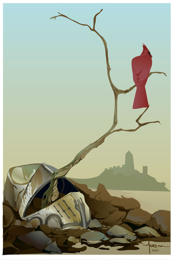
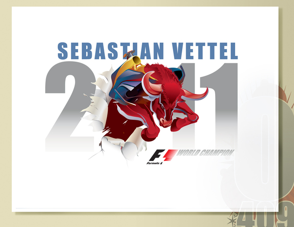
Our guest today, Orlando Arocena, is a great designer and creative consultant for Brand and Shopper initiatives. “I hate erasing, and would rather try to make my ‘mistakes’ work in my favor. It’s my golden rule.” – he says. Learn more about Orlando and his illustrations after the jump.

Q Hello Orlando, welcome to Vectortuts+! Tell us a little about yourself. Where are you from? Do you have a basic design education? When and why did you get carried away with vector graphics?

Hi and thank you very much for this opportunity! I’m a first generation Mexican-Cuban-American, who grew up in the Bronx, with a passion for art and design. I had the honor to be the first person in my family to attend college and graduated from Pratt Institute in 1994 with a Bachelors in Communication Design. Back then, there was only one lonely apple computer, for the whole college…so ruby lith sliced fingers and photo developer bleach stains on my clothing was a daily rite of passage.

I took jobs that would satiate my curiosity, but were still within the realms of art and design. Animation Gallery Curator for Warner Bros. Studio Stores, a security guard at the Metropolitan Museum of Art, starting up “Uptown Arts”, with a focus on representing local urban artists, to just name a few. I wanted to learn more about how people interact and appreciate art and apply that to my own creative endeavors – with the goal of being like an N.C. Wyeth, Howard Pyle or even a Maxfield Parrish – artists that I respect for bridging the gap between the commercial and the fine arts.

Then in 1997 I was presented with teaching art in Mexico or accepting the offer letter to a real design job. At the time I had saved enough to invest in my first computer and decided to take the path of commercial design, with a promise to myself to pursue personal art in the future.

I was first introduced to vector while working at TROMA Entertainment, the guys famous for the Toxic Avenger. Back then my art director, now one of my best friends, showed me the production value of illustrator.

At the same time, I was very much a big fan of Manga, and wanted to emulate the 3 tier tone technique used on their hand-painted production cels. After teaching myself more about the program and becoming more comfortable with it, I found it to be very fulfilling. The overall look and the instant gratification allowed me see my ideas take shape quickly.

I’m still experimenting with it, finding new ways to achieve airbrush-like fades with simple gradients, that in itself is one on my favorite attributes of illustrator – the ability to adjust opacities within the gradient color bar! Adjusting transparencies is another beneficial feature that I use sparingly and try not to abuse. Overall, I enjoy being a bit traditional with vector, plotting and drawing rather than relying on filters.

Q Today, you hold the position of Creative Consultant for Brand and Shopper initiatives. Tell us what is in the scope of your responsibilities, do you continue creating design?

My responsibilities often consist of collaborating with both the creative departments and marketing/sales teams to build brand awareness. Unlike freelancing as a designer, I actually get to offer up strategic ideas that then get implemented and executed throughout many consumer touch points. I also get a chance to contribute exploratory Hero designs.

Q What is your comfort zone in design, do you accept jobs beyond their scope?

I’m most comfortable with designing/illustrating key art for the promotion of any brand. I have a history of working on promoting sports and entertainment as well as consumer packaged goods. At the moment I’m also trying to create a portfolio dedicated to sci-fi and fantasy art, an area that has always intrigued me but never seriously considered pursuing it up until now.

As for accepting work beyond the their scope – I try not to over promise. I’d rather stay grounded with what the client’s expectations are, especially if the initiative is supported by a brief that I can use as a filter for gauging my ideas.

Q You have a lot of experience in advertising, brand building and promotion. Has it ever happened to you when thanks to your design solutions clients achieved unprecedented growth? On the other hand, have you experienced an obvious failure in your practice? If so, what conclusions have you made?

Yeah, a little of both. What mattered most, regardless of success or failure, is always the learning experience. That in itself is always rewarding, getting a deeper understanding about client expectations, reactions from the consumer groups and how it all plays a vital role with future ideas.

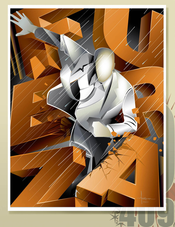
The 2012 New York International Auto Show is a recent opportunity that I will cherish, as both an automobile enthusiast and long time fan of the NYIAS.

I decided to offer up a design that would be appreciated by both the mature world-class collector of fine automobiles, to the boy who adorns his bookshelf with a spectrum of toy cars and portraits of popular race car drivers. I drew insights from this level of dedicated fandom with the intent to deliver a key signage that everyone would want to own.

The key visual leveraged the Statue of Liberty (who celebrated a 125th anniversary) in an iconic classic hood ornament pose, with art deco cues implying style and speed, as well as reinforcing NYC’s history as the host for the event.

Q It has often been said that advertising contains elements that have subconscious effect on the audience. Do you use these techniques?

The speculation of subliminal advertising has always made me laugh. It’s simply just a hoax. Sure there will always be people who perceive more than what is present within any advertising composition. Some designers might try to include something as personal as a practical joke, but in all honesty, what the audience tends to forget is the process of quality control. Before any piece of design is allowed to be released, it is thoroughly checked by the agencies quality control department, ensuring the work is valid and free of any inconsistencies.

Q Can you tell in a few words what does a good brand building mean for a small design firm, for example?

“Good Brand building” is about smart ideas that help reinforce the brand personality and the consumer benefit. This all derives from collecting data from many areas: competitive landscape, consumer feed back and also understanding the brand’s history, to name just a few. These are the elements that fuel the building of ideas that are relevant to the target consumer. Relevancy is vital for brand growth.

A small design firm that is able to deliver upon this principal demonstrates to the client that big ideas aren’t just limited to the larger, global agencies. What’s important is how the smaller agency continues to understand and reinforce brand equity to develop brand muscle.

Q You have previously worked as a freelancer, what are the major advantages and disadvantages of this type of work?

As an in-house consultant, I get to collaborate and offer insights towards building ideas and solutions. These ideas then result in possible tactics for the general market to gain awareness of the Brand. Often at times a write up and a design exploratory is needed to help support the idea.

For me taking on freelance work is more about being selected to deliver an idea through a unique design, and not collaborating upon the many possible tactics that will engage the consumers. Personally, there are several advantages of freelancing:

  • I really enjoy starting a new job, it gives me the opportunity to build new relationships and get to know different personalities – this applies for both people and brands.
  • The second is about quality of life. Being able to share time with family and friends, but also time to recharge and pursue personal interests. For me it’s a healthier way of exploring and leveraging what influences me and how I can incorporate it later.

Disadvantages: besides the lack of a benefits package, it would have to be the isolation.

I have no problem with being accountable for my work as an individual, but I also enjoy interacting with people, sharing ideas and inspiration towards a common goal.

Q I consider your artworks to be highly artistic and very expressive. At the same time you use a minimum of techniques. I noticed that you focus the attention of the visitors of your online galleries on the fact that you do not use raster effects, gradient mesh and plug-ins. Most likely, you tentatively can be referred to the group of the followers of clean vector. Why don’t you use these techniques and plug-ins? It can significantly speed up the process of creating a design.

Wow! Thanks for the compliment. I enjoy a challenge, and lets face it – vector art is so unforgiving!

I’m a traditionalist and enjoy keeping things native to just clean vector. In my opinion combining raster images into a vector layout, turns the composition into a mixed digital medium and no longer a “vector” illustration. Sure I have done work like this in the past, but I wouldn’t solely call them “vector illustrations”. I enjoy keeping my rasters and vectors separate. I guess its all dependent on the overall look that I choose to create.

Mesh gradients, can deliver very impressive results but are also very time consuming, but cheers to all of you that play with this feature – your work is amazing!

Filters are probably the only pet peeve I have. Okay, I sometimes use the bevel and warp for text, but decide to stay away from plug-in effects. Personally, plug-in effects just take all the fun out of exploring the possibilities of creating unique things from scratch.

I think that’s the underlying benefit of what makes a majority of my illustrations unique without relying on outside sources.

Q Tell us about your “Philosophy of ballpoint”. Does this philosophy only apply to creativity or is it a philosophy of life? Do you stick to this philosophy in the process of creation of vector artworks, in other words, do you use shortcuts Cmd + Z?

I remember being enthralled by the surrealists and their “automatic drawing” technique, at the same time I was really into Buddhist and Taoist philosophy.

And developed this game of sketching with ballpoint, sumi brushes, magic marker – basically any drawing tool that prevented me from erasing. It allowed me to observe and then react, and at times having to find a viable solution to turning what could be perceived as a “mistake” to an actual benefit to the sketch. Now, I feel comfortable enough to “Look and simultaneously react”.

Do I use this in my everyday life and vector/digital art?…Yes and no. I’ve adopted a version of this “Ball Point philosophy” into my personal everyday life. I think its always insightful to “turn the tide” on what could be perceived as a personal mistake, but modifying that same mistake into a positive.

With my vector/design work, I initially play with a conscious idea, do a bit of sketching and then move forward with evolving the visual composition. For vector sketching, working with either the brush tool or pencil has its immediate rewards, especially when a stroke is combined with a gradient fill-in. Cmd + Z is used very frequently along the creative path (no pun intended) only because at this point, I’m working on finalizing a composition and not just trying to quickly capture the essence of the subject matter.

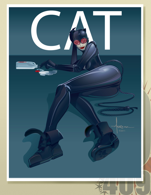
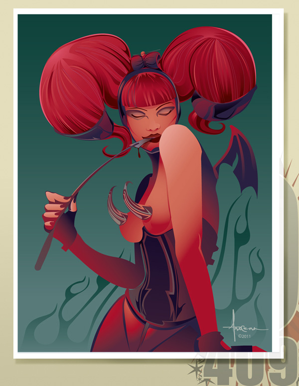
Q I think women that you create have demonic nature. Is this how you see women? What kind of images do you create, what do you want to tell the viewer in these artworks?

Just like any artist, I’m subject to explore and illustrate different subject matter, especially those that may derive from my interests whether it be sci-fi, fantasy, cultural arts or even fashion. This particular inspiration fuels my imagination and creativity, allowing me to explore new techniques within vector that I can later implement on a future job.

For me, often at times when designing and illustrating, I leverage some of my agency tactics, one of them being to understand that there’s an audience for everything, even one that appreciates a thematic based on “bombastic–attitude totting–death defying–attractive–never say “die” women. I just add my own ingredients to spice it up a bit.

My own personal perspective on women? I think women are awesome, I love them. They are the embodiment of strength and sensuality. But please don’t judge me as thinking that all woman are evil, based on the theme of a few of my illustrations.

Q Orlando, thank you very much for the interview. What would you like to wish people who are only making their first steps in vector graphics?

For those of you that are considering exploring vector art, it’s a very technical way to illustrate. It will definitely feel foreign and mechanical-but definitely explore it. Include what you know about traditional drawing, and develop an understanding about plotting out paths and anchor points. Just remember one important thing… have fun with it.

Thank You for this opportunity, I really appreciate your support.

Orlando Arocena on the Web

Quick Tip: How to Create Glowing Progress Bars

$
0
0


Follow this quick tip and learn how to create a glowing progress bar. We will take advantage of the Appearance Panel and use multiple attributes plus plenty of effects: Outer Glow, Inner Glow, Feather, Drop Shadow, Gaussian Blur and Radial Blur. Let’s begin!.


Step 1

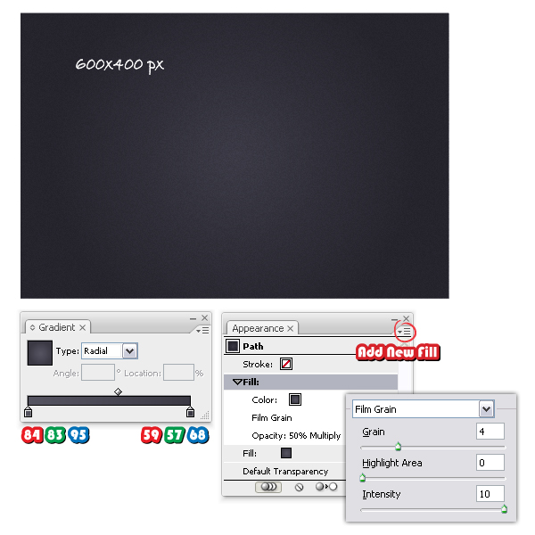
Open a new web document and let’s start with the background first. Take the Rectangle Tool (M) and draw a 600 x 400 px rectangle then fill it with the radial gradient shown. From the Appearance Panel open the fly-out menu and choose Add New Fill. Keep the same gradient then go to Effect menu > Artistic and apply the Film Grain effect. Set the Blending mode to Multiply and lower the Opacity to 50%.


Step 2

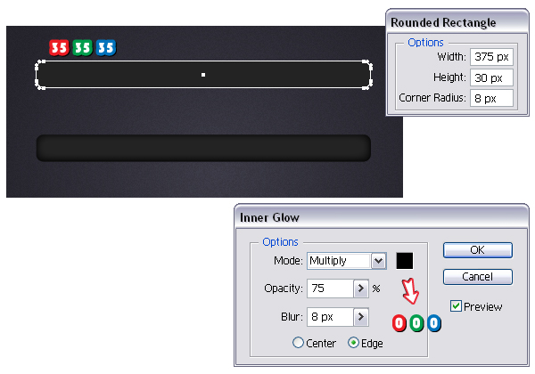
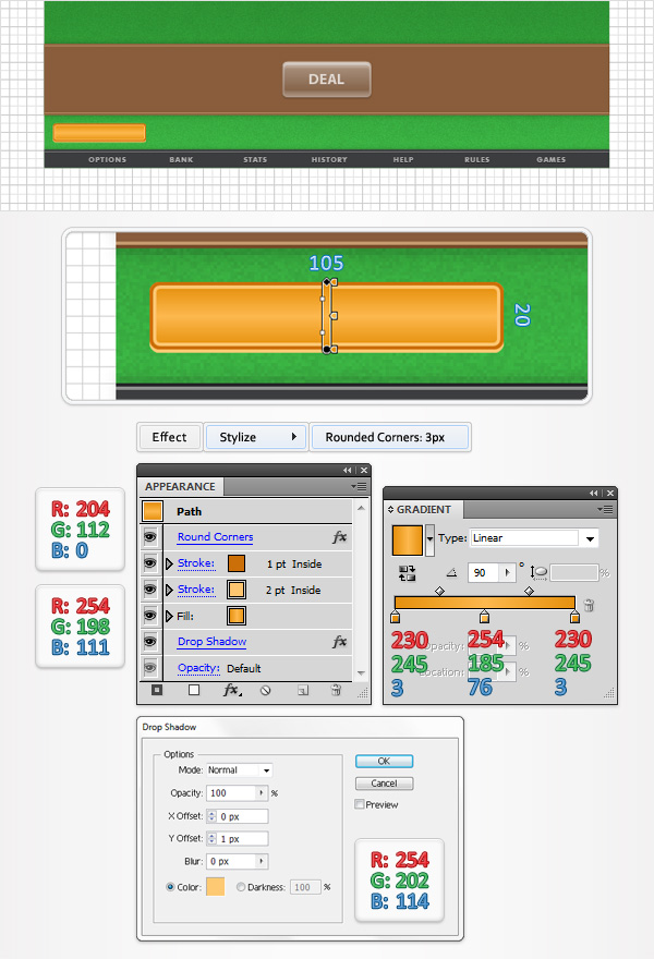
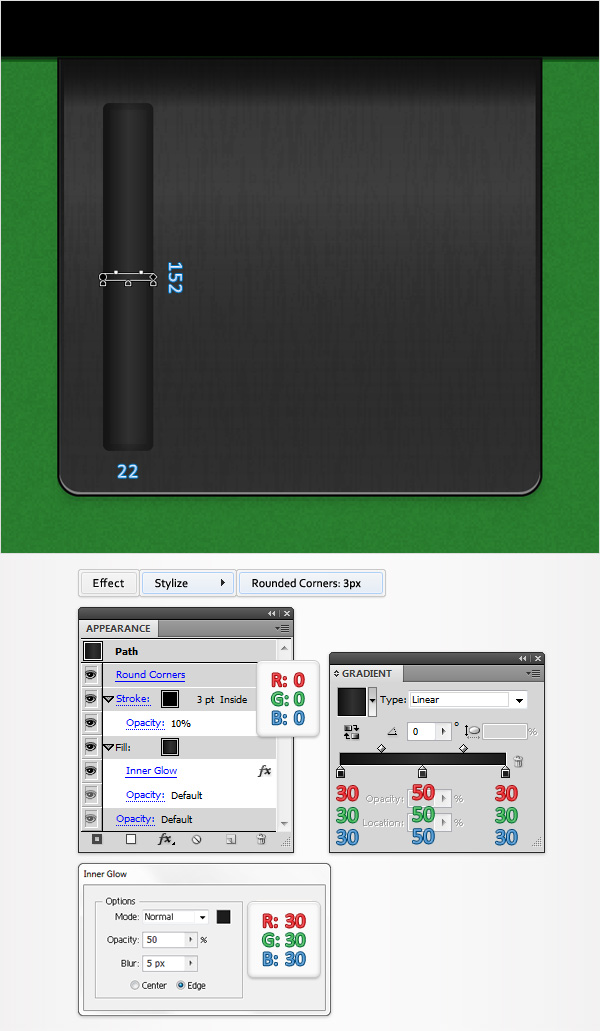
Now, take the Rounded Rectangle Tool, click on your artboard and enter the values shown. Fill the rounded rectangle with the color indicated then go to Effect menu > Stylize and apply the Inner Glow effect using the settings from below.


Step 3

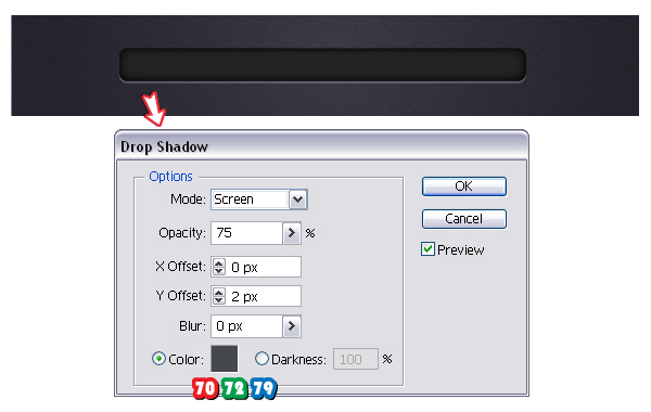
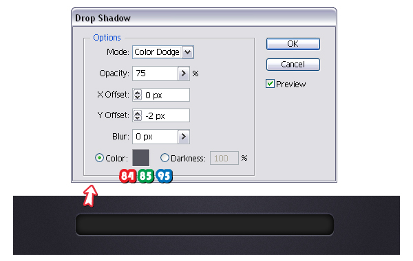
Having the rectangle selected, go to Effect menu > Stylize > Drop Shadow and set the values as shown. You will obtain a thin highlight at the bottom.

For the discrete highlight at the top, go back to Effect menu > Stylize and apply again the Drop Shadow effect. You will receive a warning message but go ahead and choose Add New Effect then set the values as shown.


Step 4

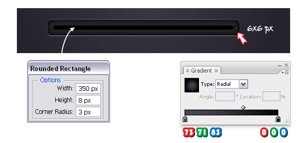
Next take the Rounded Rectangle Tool, click on your artboard and enter the values indicated. Fill the new rectangle with black then select them both and choose Horizontal Align Center and Vertical Align Center from the Align Panel (Window menu > Align).

Now, take the Ellipse Tool (L) and draw a tiny circle. Fill it with the radial gradient shown then place it on the right side of the smaller rectangle. This is just for decoration.


Step 5

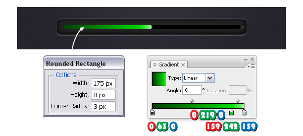
Take again the Rounded Rectangle Tool and draw another rectangle. Align it in the left side of the smaller rectangle and fill it with the linear gradient shown. I will call this shape from now on-the loading rectangle.


Step 6

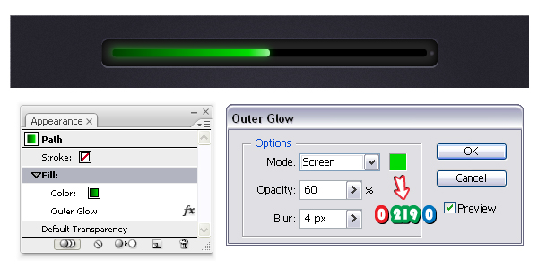
Next, with the loading rectangle’s Fill attribute selected in the Appearance Panel, go to Effect menu > Stylize and apply the Outer Glow effect using the settings shown.


Step 7

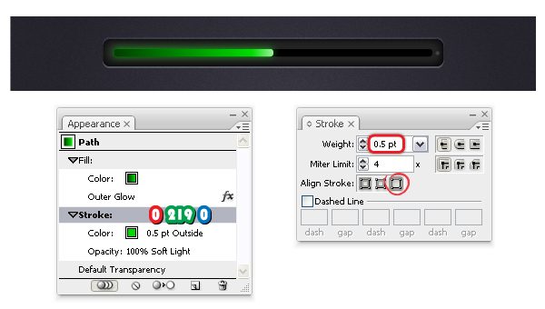
Stroke the loading rectangle with green then set the weight to 0.5 pt and select Align Stroke to Outside in the Stroke Panel. Change the Blending mode to Soft Light but only for the Stroke attribute and drag it below the Fill attribute.


Step 8

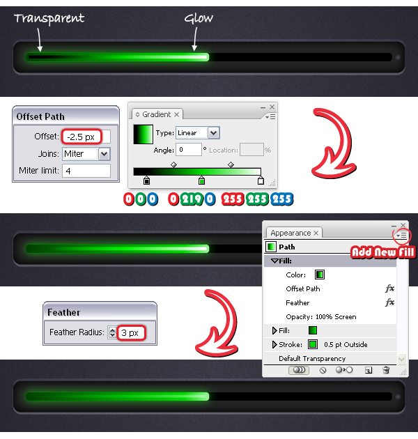
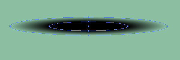
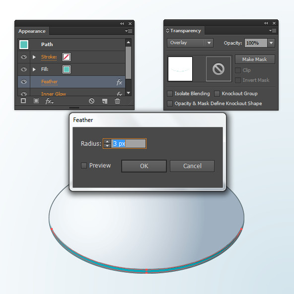
Having the loading rectangle selected, in the Appearance Panel open the fly-out menu and choose Add New Fill. Use the gradient shown then go to Effect menu > Path > Offset Path and apply a minus 2.5 px Offset value. Set the Blending mode for this Fill attribute to Screen because in this way black becomes transparent. Next, with this Fill attribute still selected in the Appearance Panel, go to Effect menu > Stylize > Feather and apply a 3 px Radius.


Step 9

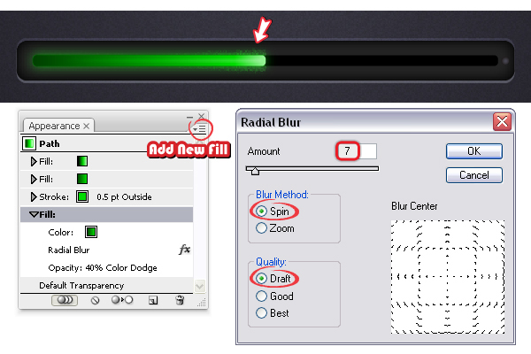
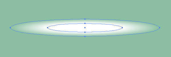
Select again Add New Fill and use the gradient from step 5. With this new Fill attribute selected in the Appearance Panel, go to Effect menu > Blur and apply the Radial Blur effect using the settings shown below. Set the Blending mode to Color Dodge and lower the Opacity to 40%. Finally, drag this last Fill attribute at the bottom of the Appearance Panel and you are done with the loading rectangle.


Step 10

Now, take the Ellipse Tool (L) and draw the two oval shapes having the dimensions shown. Arrange them as in the image with the blue ellipse being on top then select them both and click Subtract from shape area > Expand from the Pathfinder Panel.

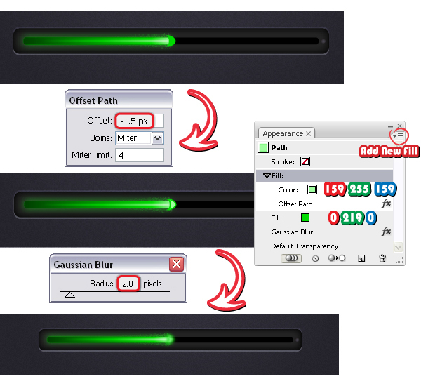
Place the resulting shape at the right end of the loading rectangle and fill it with green. Add a new fill above and change the fill color to light green then go to Effect menu > Path > Offset Path and apply a minus 1.5 px Offset value. The last thing to do at this step is to go to Effect menu > Blur > Gaussian Blur and apply a 2 px Radius.


Step 11

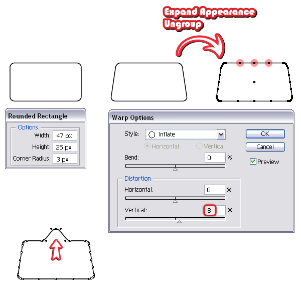
Let’s continue with the loading slider. Take the Rounded Rectangle Tool and draw a rectangle having the dimensions shown. Next, go to Effect menu > Warp > Inflate and apply an 8% Vertical Distortion then from the Object menu choose Expand Appearance and Ungroup. Now, go back to Object menu > Path and use the Add Anchor Points option twice to get the three points at the top. Select using the Direct Selection Tool (A) only the point from the middle and move it up as in the image.

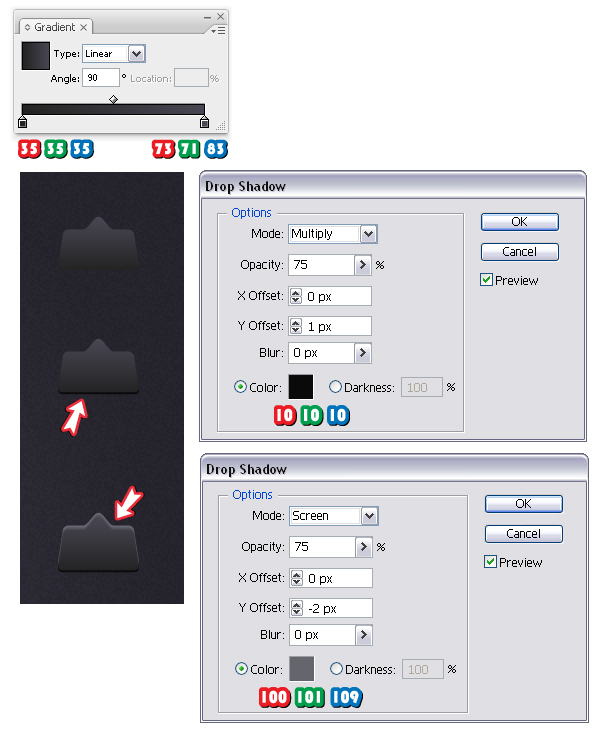
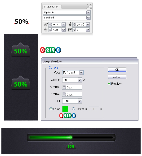
Fill the shape obtained with the linear gradient shown and set the angle value to 90 degrees. Go to Effect menu > Stylize and apply the Drop Shadow effect to obtain the black shadow at the bottom. For the highlight at the top, apply again the Drop Shadow effect using the other settings shown.

Take the Type Tool (T) and type "50%" using Myriad Pro Semibold, size of 15 pt. From the Object menu choose Expand then select green as the fill color. Next, go to Effect menu > Stylize and apply the Drop Shadow effect using the settings shown and the same green color. Finally, place the loading slider under the tip of the loading rectangle and the progress bar is ready.


Step 12

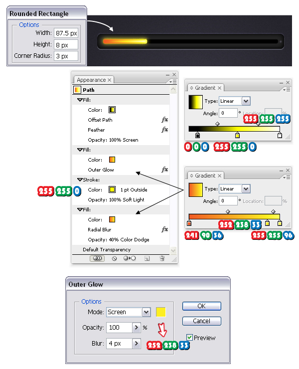
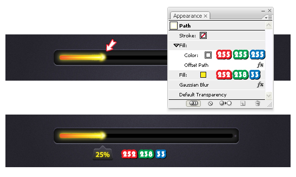
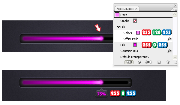
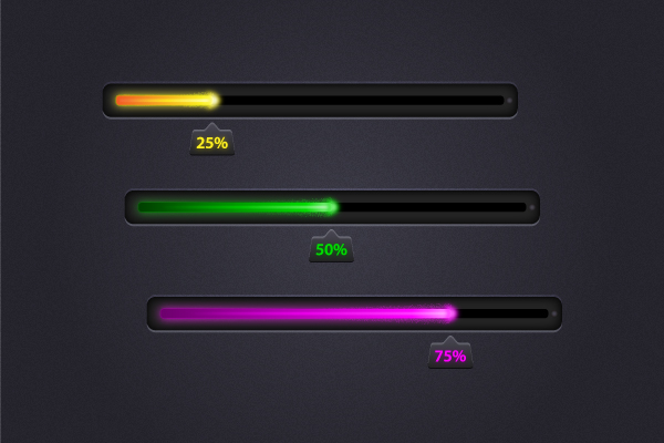
You can create other progress bars by simply choosing other color shades plus some minor adjustments. Start with a smaller loading rectangle (25%) then follow again the previous steps because all the settings remain the same, only change the three gradients and the stroke color. Also, depending on the chosen color for the Outer Glow effect (in this case yellow and the next case pink) the Opacity value might vary. Here is set to 100%.

For the tip of the loading rectangle, you can make a copy of the one already made and simply change the colors as shown. This time type "25%" then follow again the step 11 to finish the loading slider. Use the color yellow indicated as the fill color and also for the Drop Shadow effect.


Step 13

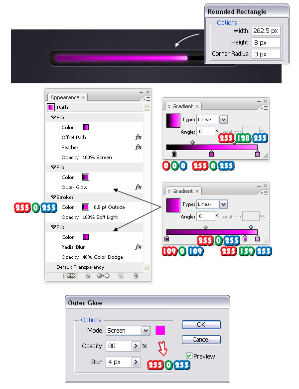
This is the pink version. Change the gradients and the colors as shown for the loading rectangle.

For the tip of the loading rectangle then for the loading slider and the pink progress bar is ready.


Final Image

Here is the final image:

Create a Steam Punk Inspired Portrait in Illustrator CS6 – Tuts+ Premium Tutorial

$
0
0


In this Tuts+ Premium tutorial, I’m going to show you how I’ve created this Steam Punk inspired portrait of a friend using Illustrator CS6. I’m going to show you the whole process from sketching with the Blob Brush Tool, to drawing the many shapes and then the coloring. You’re learn how to follow a professional vector illustration workflow to create this stylized, aged work. If you are looking to take your skills to the next level then Log in or Join Now to get started!

View the Tutorial

Tuts+ Premium Members can login now for instant access to this tutorial. Membership to Tuts+ Premium gets you access to hundreds of exclusive premium tutorials, top selling ebooks, in-depth courses, member forums, and much more. To learn more about Tuts+ Premium, Take the Tour or Join Today.

Best of Tuts+ in June 2012

$
0
0


Each month, we bring together a selection of the best tutorials and articles from across the whole Tuts+ network. Whether you’d like to read the top posts from your favourite site, or would like to start learning something completely new, this is the best place to start!


Psdtuts+ — Photoshop Tutorials


Nettuts+ — Web Development Tutorials

  • Easy Package Management With Composer

    Easy Package Management With Composer

    Let’s face it: PHP has had a rocky history with package management, and as a result, it is pretty rare to find a developer who actively uses systems like PEAR. Instead, most developers have chosen their favorite framework, which has code specifically written for it to handle various things, like DB interaction, ORM's, OAuth, Amazon S3 integration, etc.

    Visit Article

  • Building Web Applications from Scratch with Laravel

    Building Web Applications from Scratch with Laravel

    In this Nettuts+ mini-series, we’ll build a web application from scratch, while diving into a great new PHP framework that’s rapidly picking up steam, called Laravel — a simple and elegant PHP 5.3 framework.

    Visit Article

  • So You Want to Accept Credit Cards Online?

    So You Want to Accept Credit Cards Online?

    Until recently, accepting credit cards on a website was expensive and complicated. But that was before Stripe: a radically different and insanely awesome credit card processing company. Today, I’ll show you how to start accepting cards in 30 minutes or less – without spending a dime.

    Visit Article


Vectortuts+ — Illustrator Tutorials


Webdesigntuts+ — Web Design Tutorials

  • A Beginner’s Guide to Wireframing

    A Beginner’s Guide to Wireframing

    Wireframing is an important step in any screen design process. It primarily allows you to define the information hierarchy of your design, making it easier for you to plan the layout according to how you want your user to process the information. If you’ve yet to use wireframing, it’s time to get your feet wet..

    Visit Article

  • Life Beyond 960px: Designing for Large Screens

    Life Beyond 960px: Designing for Large Screens

    The premise behind a responsive web isn’t purely that websites be built in a mobile-friendly way. It’s about setting our content free so that it can be experienced by whatever means necessary – and that includes at large scale. Let’s take a look at the design considerations behind the often neglected huge desktop screen.

    Visit Article

  • Create a Parallax Scrolling Website Using Stellar.js

    Create a Parallax Scrolling Website Using Stellar.js

    One of the biggest trends in recent modern web design is use of parallax scrolling effects. In this tutorial I’m going to show you how you can create the effect on your own website, with a bit of imagination and a little help from Stellar.js.

    Visit Article


Phototuts+ — Photography Tutorials


Cgtuts+ — Computer Graphics Tutorials

  • Modeling Tips & Tricks For New Artists

    Modeling Tips & Tricks For New Artists

    Today we’re bringing you something a little different. Rather then a tutorial covering a specific topic, we have a series of short videos covering various modeling tips from author Shaun Keenan. These videos are aimed at users who are relatively new to modeling or CG in general, and cover a wide range of topics ranging from breaking down facial geometry and cutting holes in meshes, to the importance of reference, and the benefits of developing your own asset library. If you’re new to CG or just want to improve your personal workflow, this is a great opportunity to get valuable tips from a CG professional!

    Visit Article

  • Sculpt, Pose and PolyPaint a Cartoon Squid in ZBrush

    Sculpt, Pose and PolyPaint a Cartoon Squid in ZBrush

    We’re kicking the week off with a great new ZBrush tutorial from Shaun Keenan. This tutorial will show you how to create a toon style Squid character from scratch in ZBrush. You’ll learn how to quickly block out the character’s base mesh using the awesomeness that is ZSpheres, and further refine and detail the character using various brushes and alphas. Finally you’ll paint everything up and make it look sexy with ZBrush’s polypainting tools!

    Visit Article

  • Create A Cool Animated Disco Ball with Cinema 4D & After Effects

    Create A Cool Animated Disco Ball with Cinema 4D & After Effects

    In this tutorial we are going to create a disco ball inside cinema 4D with a few clicks using simple yet powerful tools. After that we are going to render out the disco ball and look at how to composite it in After Effects, add some nice light rays and glows to make it look really great.

    Visit Article


Aetuts+ — After Effects Tutorials

  • Crash Dummy Character Rigging Using Newton

    Crash Dummy Character Rigging Using Newton

    In this tutorial, we’re going to take the Newton plugin created by Motion Boutique and use it to create a rigid body character in After Effects. Newton is a 2D physics simulator that allows users to apply various simulations like gravity, collision, and bounce to their layers in After Effects.

    We’ll start with the basic principles of how Newton works and how to setup a character rig using it, then dive into various case studies demonstrating ways to use the character rig.

    Visit Article

  • How To Create An Artistic Time Offset Effect

    How To Create An Artistic Time Offset Effect

    In this tutorial we will have a look at offsetting a video in time through a grid. To achieve this we will use an expression controlled by a slider. I used this technique on the music video “Big Pink – Hit the ground” Directed by Tim Brown, Post-Production by Mainframe. Hope you enjoy it.

    Visit Article

  • A Focused Look Motion Blur In After Effects

    A Focused Look Motion Blur In After Effects

    In this tutorial we will be discussing ways to fake motion blur using After Effects’ default Motion Blur feature, Force Motion Blur plug-ins, Radial Blurs, and Motion Vectors. We’re going to move quickly so hopefully everything stays clear. :)

    Visit Article


Audiotuts+ — Audio & Production Tutorials

  • Reverb For A Better Tomorrow

    Reverb For A Better Tomorrow

    Here is something to try if you want to spice up your reverb. I’ve become very interested recently in finding ways to make computer/MIDI based productions sound organic and create some of the nonlinear feel that live recordings and real instruments have. Whether you feel this is a worthwhile detail to add is up to you, but it only takes a few minutes to set up and is a good example of ‘thinking outside the box’ that will hopefully promote your having some creative ideas of your own.

    Visit Article

  • How To Produce Dynamic Top Loops

    How To Produce Dynamic Top Loops

    Sometimes your basic drum pattern just needs some extra spice to bring it up to speed. Adding programmed percussion, or even percussion loops can often be a great solution. Personally I like to mix contrasting drum loops and patterns to get interesting cross rhythms.

    Visit Article

  • Critique: Green’s the Color of Winter

    Critique: Green’s the Color of Winter

    Here in the United States, this song would fall under the category of Americana/folk and it fits well into the category. It is the kind of song that lends itself to a simple and acoustic production. I enjoyed the evocative and wintery feeling of the piece. My opinions are based on countless meetings with music publishers, A and R people, co-writing experiences, and just a lot of years writing professionally in Nashville.

    Visit Article


Activetuts+ — Flash, Flex & ActionScript Tutorials

  • Using the Kongregate API in Your Flash Games

    Using the Kongregate API in Your Flash Games

    Kongregate is one of the largest Flash game portals on the net, and has its own API that can be integrated into your games (for which Kongregate even rewards you financially). In this tutorial, I’ll show you how to implement the Kongregate API into your games, and also go into detail about what the API is capable of and why you should use it.

    Visit Article

  • Getting Started With Unity – Finishing Our Game With a Menu

    Getting Started With Unity – Finishing Our Game With a Menu

    There are several methods used to produce menus within Unity, the main two being the built in GUI system and using GameObjects with Colliders that respond to interactions with the mouse. Unity’s GUI system can be tricky to work with so we’re going to use the GameObject approach which I think is also a bit more fun for what we’re trying to achieve here.

    Visit Article

  • Drawing Activetuts+ to a Close

    Drawing Activetuts+ to a Close

    Activetuts+ launched in 2009 with the aim of teaching how to build websites, apps, animations, and interfaces in Flash. Much has changed in the industry over the past few years, and Activetuts+ has evolved several times to continue teaching relevant content.

    Visit Article


Wptuts+ — WordPress Tutorials


Mobiletuts+ — Mobile Development Tutorials

  • Build an Exercise Tracking App: Geolocation & Tracking

    Build an Exercise Tracking App: Geolocation & Tracking

    Want to learn how to write a complete mobile application using PhoneGap, but don’t know how to get started? Follow this two-part tutorial series and I’ll show you how to build a mobile app that tracks, records, and maps your exercise route using the GPS features on your phone!

    Visit Article

  • Reading & Displaying PDF Documents

    Reading & Displaying PDF Documents

    Working with raw PDF documents can be a time consuming and frustrating task. This tutorial will teach you how to use the VFR Library to quickly access, display, and browse PDF documents within your own applications!

    Visit Article

  • Android SDK: Build a Speak and Repeat App

    Android SDK: Build a Speak and Repeat App

    The Android platform provides support for both speech recognition and speech synthesis. In this tutorial, we will create a simple Android app which allows the user to speak, attempts to recognize what they say, and then repeats what was recognized back to them using the Text To Speech engine.

    Visit Article


How to Illustrate a Vector, Street Bench

$
0
0


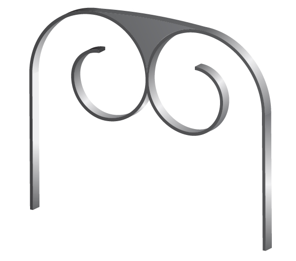
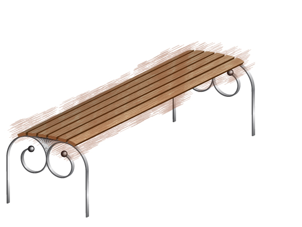
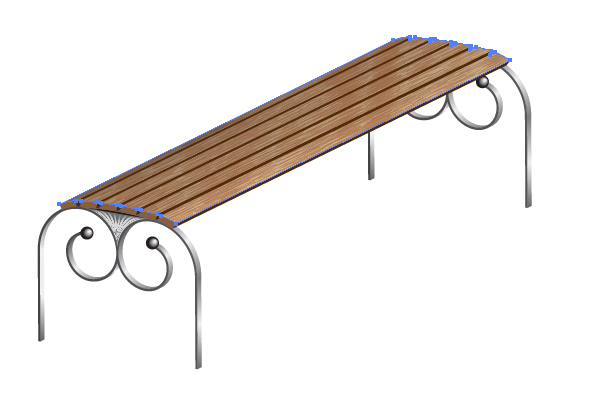
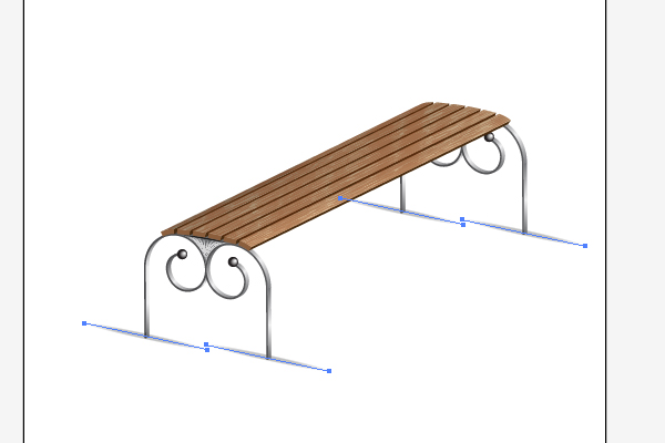
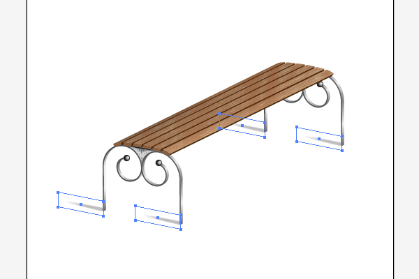
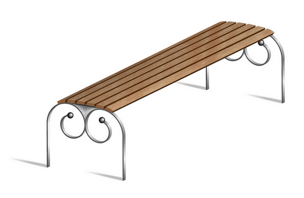
We will construct a vector model of a wooden street bench, which is usually found in our small towns and quaint cities. It’s important to develop your artistic eye as you work through it and study the important techniques of Adobe Illustrator. Let’s have a good time while reading the tutorial and creating your own outstanding artworks!


Step 1

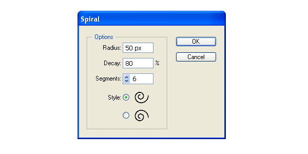
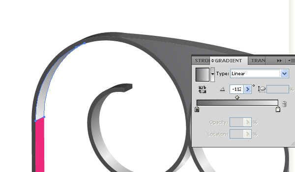
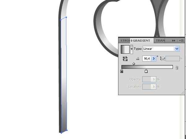
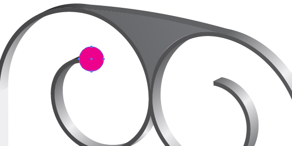
Take the Spiral Tool and click in your artwork area. Specify the tool options as shown in the figure below.

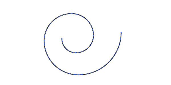
You will receive the following result:

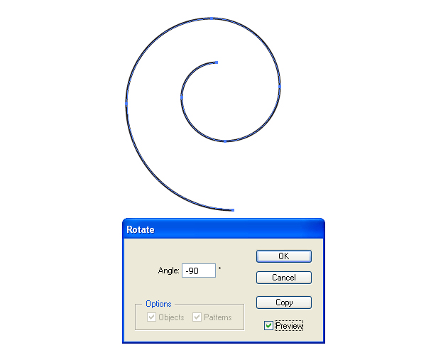
Rotate it, then apply Object > Transform > Rotate as shown:


Step 2

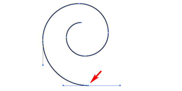
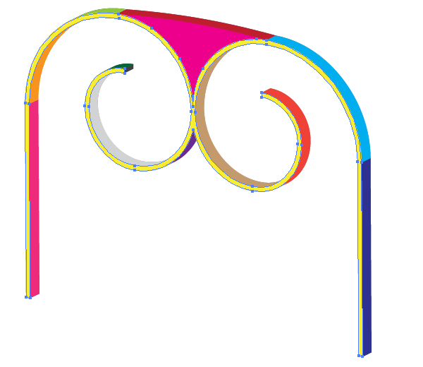
Use the Direct Selection Tool (A) to select the lowest anchor point of the spiral path…

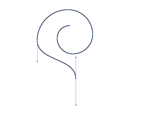
…and rotate this anchor point as shown:

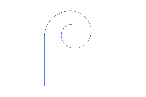
Then move this anchor point to the left as shown.


Step 3

Change the Stroke color (if you want) and the Stroke weight.

Go to Object > Transform > Reflect, and create a reflected copy of the spiral path.

Move the copy to the right. See the helpful diagram below:


Step 4

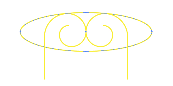
Lock both spiral paths in the Layers palette, grab the Ellipse Tool (L) and illustrate an elliptical path.

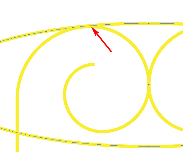
Grab the Scissors Tool (C) and click with it on the contact point of the ellipse and the spiral.

Do the same with the second contact point.

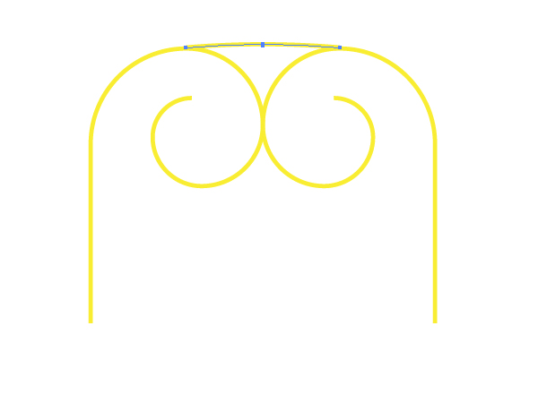
After that delete the ellipse. You should achieve the following result:


Step 5

Change the color of the top stroke because it will represent another detail of the bench.

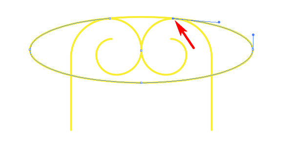
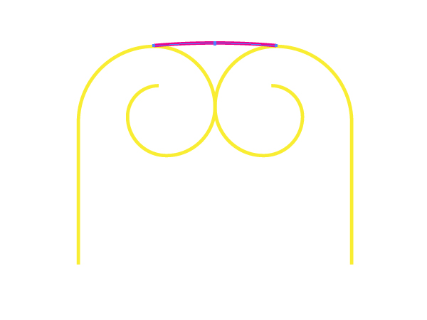
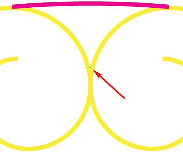
Blow up your artwork, take the Pen Tool (P) and click on the contact point between both spiral paths.

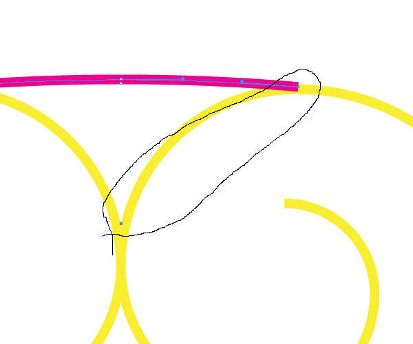
Then with the aid of the Lasso Tool (Q) select the shown anchor points:

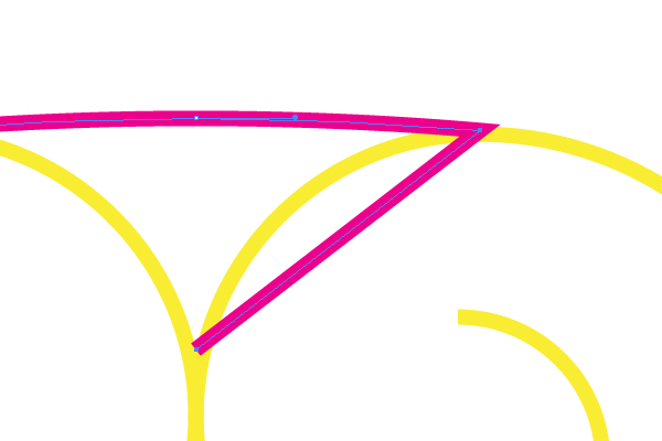
And go to Object > Path > Join (Command + J).

Repeat these actions with the other pair of anchor points.


Step 6

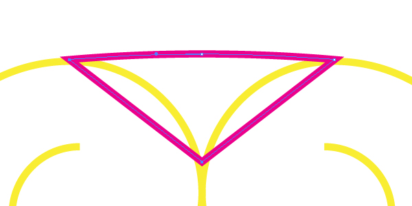
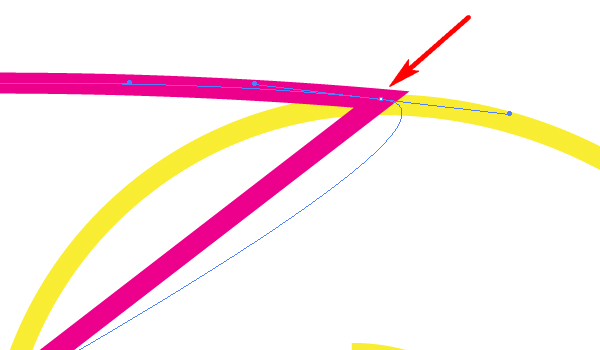
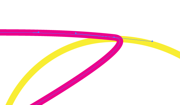
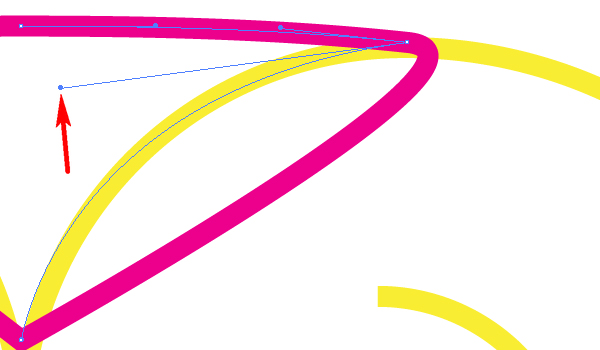
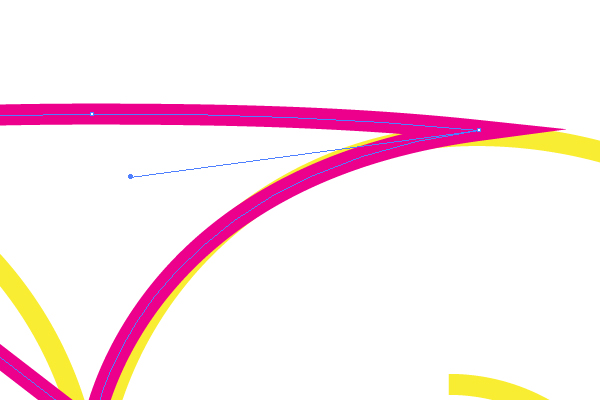
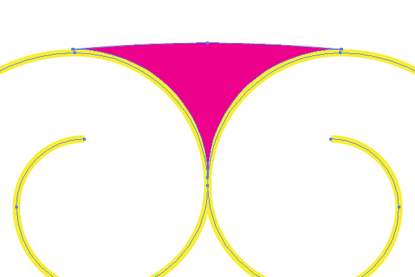
Grab the Convert Anchor Point Tool (Shift + C), drag and drop the rightmost anchor point of the crimson triangular path.

Then without changing the Adobe Illustrator tool grab the right handle and drag and drop it slightly as shown:

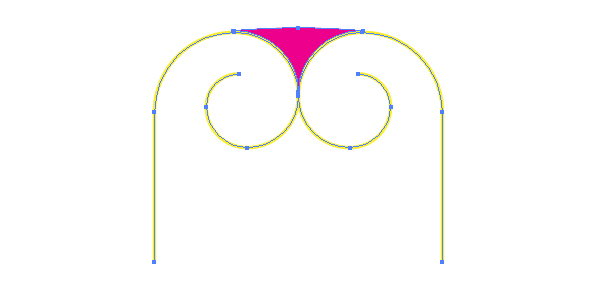
Do the same with the other anchor points, then change the fill color of the crimson path, and set the Stroke color to None. You should receive the result shown below.


Step 7

After these actions let’s select all the paths and apply Object > Group (Command + G),…

Now go to Effect > 3D > Extrude & Bevel. Specify there the pointed options:

You need to create a beautiful shape of the left bench support with this technique.


Step 8

Go to the Appearance palette, click there the “3D Extrude & Bevel” link in order to open the options window, then change the Surface value to “No shading.” You need to do this in order to decrease the quantity of paths after expanding.

Now apply Object > Expand Appearance. And apply Object > Ungroup three times.


Step 9

Unite all the necessary parts by going to the Pathfinder palette and clicking there the Unite button. See the helpful example diagrams below:

Inasmuch as we create our artwork in the CS5 version of Adobe Illustrator, we can use the new Shape Builder Tool (Shift + M) for this purpose. Take this impressive tool in the corresponding palette, and simply drag and drop it over the paths, which must be united. Follow the shown figure below:


Step 10

Delete all the unnecessary parts of your illustration that are invisible paths. Do it by pressing the Delete button on your keyboard.

After that paint the remained paths in different colors as shown:


Step 11

Select now the front yellow path…

…and fill it with an angled linear gradient.

Now select the light blue path and fill it with an angled linear gradient too.


Step 12

The next paths should be filled with corresponding linear gradients as well. Do it without assistance. I will show them only in the diagrams below for reference:

You need to achieve the following result:


Step 13

Take the Ellipse Tool (L) and produce a circle at the end of the spiral as shown below.

Fill it with a radial gradient that goes from white to black in color in compliance with correct use of light distribution principle.

Picture the second globe the same way.


Step 14

The triangular path…

…is merged with the surrounding details of the bench support. In order to mark it out let’s apply the Art brushes to it. In the beginning, sketch the usual elliptical path with the help of the Ellipse Tool (L), and fill it with white.

Go to Object > Transform > Scale and specify a Uniform scaling as shown in the dialog box. Then click the Copy button.

Set the Opacity of the biggest ellipse to 0.


Step 15

Go to Object > Blend > Blend Options. Set the Spacing to Specified steps, the quantity of steps to about 75, and click OK.

After this action, select both ellipses, and go to Object > Blend > Make (Command + Alt + B).


Step 16

Drag and drop this blend into the Brushes palette, and choose the Art brush option in the dialog box.

Set the items for the brush as you can see them in the diagram below, and name the brush “White brush.”

Repeat these manipulations for making a “Black brush” from the blend shown here.


Step 17

Now select the triangular path, Copy it and Paste in Back (Command + C then Command + B), and divide the copy by using the Scissors Tool (C) on the indicated points. You will receive three paths.

Apply the “Black brush” to the top path. Change the Stroke weight and the opacity if it is necessary in your own artworks.

Apply the “White brush” to both lateral paths made from the original triangle. Change the Stroke weights of the paths.

Go then to Object > Blend > Blend Options and specify the values in the dialog box, which you can see in the figure below:

Now select both lateral paths and go to Object > Blend > Make (Command + Alt + B).

And after these actions you can crop all the paths using a clipping path created from the original triangular path. You must go to Object > Clipping Mask > Make (Command + 7) to apply this action.


Step 18

Select the left bench support, Copy it, and Paste in Front (Command + C then Command + F). Move it in order to represent the right bench support detail.


Step 19

Yes, you can use the usual 3D menu commands for creating the wooden cross-bars of the bench. But I think it is more interesting to illustrate them without the usual 3D commands of Adobe Illustrator. Let’s see how this works. Now use the Rectangle Tool (M) to sketch a rectangular path.

Copy it, and Paste in Front (Command + C then Command + F). Move it to the right as shown:

Go to Object > Blend > Blend Options and set there the Spacing to Specified steps, the quantity of steps to 4, and click OK.

Then go to Object > Blend > Make (Command + Alt + B).

And produce an Art brush from it too.


Step 20

Draw the following path over the left support detail and apply this Art brush to it.

Do the same for the right support detail.

Now select these paths, go to Object > Expand Appearance, and apply > Ungroup three times. After these manipulations, take the Pen Tool (P), blow up your artwork area, and delete the unnecessary anchor points in every blue block. Every block must have only 4 anchor points.


Step 21

Change the Fill color of the blue block to None, then change the Stroke color to blue on both support details of the bench.

Now concentrate your attention on the the following actions in my tutorial. You have 12 blue blocks which have 48 anchor points all together. Now you need to divide them into 48 parts. You can do this with the aid of the Scissors Tool (C), for example, by clicking with it on every anchor point. Then take the Direct Selection Tool (A), select the upper right anchor point of the rightmost line in the rightmost block over the left bench support,…

…press the Shift button on your keyboard, and while holding this button down, select the upper right anchor point of the rightmost line in the rightmost block over the right bench support.

Go to Object > Path > Join (Command + J).

Illustrate all visible lines the same way.


Step 22

These paths (indicated below) are invisible. Therefore, you may delete them.

Fill the wooden bars with different colors. You can fill the lateral surfaces of the bars with light and dark brown.

Fill the upper surface of a bar with an angled linear gradient as shown.

Do the same with the other paths.


Step 23

Do you know how to simulate a wood texture in Adobe Illustrator, and only in Adobe Illustrator? If not, follow on. First, create a simple short path in the beginning. It should not be long.

Drag and drop it into the Brushes palette. Select the Scatter Brush option in the dialog box. And set the items for the brush as shown below:


Step 24

Select this Scatter brush in the Brushes palette, take the Paintbrush Tool (B), and draw the following path:

It is wonderful, isn’t it? But this is not all. Apply Object > Expand Appearance, and Object > Ungroup twice.

Do you know how many paths are selected now? More than three thousand in my own artwork! And naturally all of them have an influence on the file size. Take the Lasso Tool (Q), and select the paths accurately which are not located over the wooden bars of the bench. See the images below for reference…

…and press the Delete button on your keyboard twice.

Repeat these manipulations.


Step 25

Now let’s go to the Brushes palette and click there the “New Brush” button. Select the Bristle Brush option in the dialog box. And set the items for the brush as shown:

Change the Fill color in the Control Panel to brown and apply the new Bristle brush to these strokes. Change the Stroke weight if necessary.

Crop the strokes with the corresponding clipping path:


Step 26

In order to create a shade from the bench legs, use the “Black brush.”

And crop the paths with clipping paths.


Conclusion

The final image is below.

Announcing Mactuts+ — Mac & OS X Tutorials, Guides & How To’s!

$
0
0


We’re excited to let you know about the latest addition to the Tuts+ family — Mactuts+!

Mactuts+ is focused on teaching you how to use your Mac more effectively, efficiently, and powerfully. You’ll learn about the basics of OS X, how to switch, how to use accessories and time-saving software, work with your Mac in an enterprise setting, and how to save time with advanced productive tips and tricks.

Read on to find out more, and learn about our $1,000 competition!


What to Expect on Mactuts+

Mactuts+ is focused on teaching you how to use your Mac more effectively, efficiently, and powerfully. We’ll be covering a wide range of different techniques, and offering advice on everything from customising your desktop and using OS X, to automating complex tasks and delving into Terminal. So whether you’re completely new to OS X or you’re a seasoned pro, we’ve got you covered!

We’ll be publishing a combination of step-by-step written tutorials and screencasts/video lessons. In most weeks we’ll be publishing 4-5 high quality tutorials, so make sure to subscribe to the Mactuts+ RSS feed so you don’t miss a thing.

If you think you have the skills to create a screencast or text and image tutorial for Mactuts+, it’s easy to familiarize yourself with the guidelines and pitch your idea. We’re hungry for user contributions and pay great money for tutorials.


Win $1,000 — Submit Your Tips & Tricks!

We’re excited to let you know about our Mactuts+ launch competition, giving you the chance to win $1,000 to put towards a new Mac! You just need to submit a short screencast that showcases your favourite OS X tip, trick, or shortcut.

We’d love to find out more about how you use your Mac productively, and discover the tips and tricks that help to speed up your workflow. These might be related to a particular app, something built into OS X, an automator action, terminal command, or anything else!

Find out how to enter


Subscribe, Follow & Stay Up To Date

Don’t forget to follow Mactuts+ on Twitter, Facebook, and everywhere else! Here’s how to keep up to date with what’s going on:


Our First Few Posts…

If you’d like to delve straight into the content, here are a few quick links to our first handful of posts on Mactuts+. We hope you find them useful — it’s a good taster of what’s to come!

  • Preparing Your Mac for Mountain Lion

    Preparing Your Mac for Mountain Lion

    Apples next big operating system is set to release in the middle of this month and its likely that youll be one of the many users who are upgrading from Snow Leopard or Lion. Its not surprising, either, because there are a lot of great features in this update and its going to be the same price for users of either of the aforementioned versions. In light of that, why not update to version 10.8, Mountain Lion?

    Visit Article

  • 4 Easy Ways to Automate Your Mac’s Schedule

    Easy Ways to Automate Your Mac’s Schedule

    Your Mac comes with lots of ways to schedule tasks, but not all of it’s ready to go out of the box. Beyond automated maintenance, OS X has a lot going for it, but you have to put in a bit of elbow grease to get everything working how you want it and on your schedule.

    Visit Article

  • How To Migrate All of Your Important Data To Your New Mac

    How To Migrate All of Your Important Data To Your New Mac

    We recently saw another WWDC come and go and despite little to no progress in the desktop area, the MacBooks all received nice upgrades. This means there’s a fresh crop of users transitioning to a brand new machine, a task which always brings with it a decent number of questions.

    Visit Article

How to Make a Vector Webcam Illustration

$
0
0


In this tutorial, you’ll learn how to make an illustration of a webcam by using Adobe Illustrator tools, such as: the Ellipse Tool (L), Pen Tool (P), Rectangle Tool (M), Gradients and the Pathfinder Panel. We’ll follow a professional vector illustration workflow. Let’s get started.


Step 1

Take the Ellipse Tool (L), draw an ellipse with the size of W=394 and H=244px. Now fill it with a Black to R=159 G=177 B=193, Radial color and apply the Stroke color R=85 G=104 B=109 with a 1pt Weight.


Step 2

Make two copies of the shape from the previous step using Command + C then paste with Command + F. Now move the shape that’s on top 10px up. Select the copies of the two shapes you just created, open the Pathfinder Panel, click on the Minus Front button. Turn off the Stroke color and fill the new shape with a Linear Gradient, with the colors R=47 G=153 B=160 to R=29 G=101 B=106. Also, apply Feather with Radius: 2px (Effect > Stylize > Feather).


Step 3

Select the shape from the previous step that you applied Feather to and go to Object > Path > Offset Path. Set the Offset to -2px, click OK and fill the new shape with an R=91 G=196 B=186 color. Then go to the Appearance Panel, click on the Feather effect, change the Radius to 3px, click OK and change the Blending Mode from Normal to Overlay.

We continue with the upper part of the webcam. We are not done with the lower part of the webcam yet, but we’ll go back to it a bit later. After we make the upper part, in order to be able to get to know how to make the upper part of the webcam’s shadow.


Step 4

Take the Ellipse Tool (L) and draw a circle at the size W=316 px and H=316 px. Now fill it with a Linear Gradient using the colors R=159 G=177 B=193 to R=139 G=158 B=156. Place the shape on top of all other shapes in position as shown below.


Step 5

With the shape from the previous step selected, go to Object > Path > Offset Path. Apply Offset: -2px and click OK. Now fill the new shape with Radial Gradient colors R=244 G=248 B=249 to R=159 G=177 B=193.


Step 6

Make two copies of the shape from the previous step using Command + C then paste with Command + F, and again Command + F. Then move the top shape 10px up. Select the copies of the two shapes you just created, open the Pathfinder Panel, and click on the Minus Front button. Now fill the new shape with R=200 G=214 B=224 color.


Step 7

Make the upper part of the shape the same way by making two copies of the shape from Step 5, then slide the second copy 2px down. Select both copies, open the Pathfinder Panel, click on the Minus Front button and fill with an R=200 G=214 B=224 color.


Step 8

Take the Ellipse Tool (L), draw an ellipse with the size W=226 px and H=244 px, fill it with an R=211 G=226 B=232 color and place it in position, as shown in the picture below:


Step 9

With the shape from the previous step selected, go to Effect > Stylize > Drop Shadow. Set the values shown below and click OK.


Step 10

With the shape from the previous step still selected, go to Object > Path > Offset Path. Set the Offset to -2px and click OK. Now open the Appearance Panel. Delete the Drop Shadow effect and fill the shape with Radial Gradient colors R=40 G=51 B=55 to R=21 G=26 B=28.


Step 11

Duplicate two times the shape from the previous step. Move the second copy a few pixels down and to the right, then select the two copies. Open the Pathfinder Panel and click on the Minus Front button. Do the same thing for the right part of the shape, then group the last two shapes (Object > Group), and fill them with R=61 G=70 B=76 color. Apply a Feather Radius at 10px to the group and click OK. Now change the Blending Mode from Normal to Multiply and reduce the Opacity to 20%.


Step 12

Take the Pen Tool (P) and make the shapes on top of all others. If the shapes go outside of the shape you filled with a Radial Gradient in step 10, use the Pathfinder Panel and the Intersect button. Fill them with a Linear Gradient and apply Gaussian Blur. Change the Blending Mode of each shape as shown below:


Step 13

Take the Ellipse Tool (L), draw an ellipse with the size W=105 px and H=111 px and in position as shown in the picture below. Fill it with a Linear Gradient using the colors R=139 G=158 B=156 to R=211 G=226 B=232.


Step 14

Duplicate two times the shape from the previous step with Command + C then paste with Command + F, and Command + F again. Move the second copy a few pixels to the right and then select both shapes. Open the Pathfinder Panel, click on the Minus Front button and fill the resulting shape with an R=35 G=31 B=32 color.


Step 15

Select the shape from step 13 and go to Object > Path > Offset Path. Set the Offset to -3px, click OK and fill the new shape with Linear Gradient colors R=21 G=26 B=28 to R=40 G=51 B=55.


Step 16

Take the Pen Tool (P) and start adding shapes in the position and color shown below. I’ve also applied Gaussian Blur to some of them, look at the pictures below for detail:


Step 17

Take the Ellipse Tool (L), draw an ellipse with the size W=58 px and H=62 px. Now fill it with R=0 G=12 B=15 color. Place the shape in position as shown below:


Step 18

Select the shape from the previous step and go to Object > Path > Offset Path. Set the Offset to -2px and click OK. Now fill it with Linear Gradient colors R=85 G=104 B=109 to R=75 G=93 B=97. Move the shape 1px to the left.


Step 19

Copy the shape from the previous step using Command + C, then paste with Command + F. Use the Pen Tool (P) to make another shape over the copy as shown in the picture below.

Now select the copy and the shape you just created. Open the Pathfinder Panel, click on the Minus Front button, and fill the new shape with Linear Gradient colors R=211 G=226 B=232 to White with Opacity at 0%. Then change the Blending Mode of the shape from Normal to Screen and set the Opacity at 70%.


Step 20

Copy the shape from Step 18 with Command + C then paste with Command + F. Use the Direct Selection Tool (A) to select the left and lower key point. Now press Delete on the keyboard. Then turn off the Fill color and apply a 1px Stroke with a White color.


Step 21

Make two copies of the shape from Step 18, move the top copy 3px to the right, then select both copies and open the Pathfinder Panel. Click on the Minus Front button and change the color of the resulting shape to R=85 G=104 B=109.


Step 22

Copy the shape from the previous step with Command + C then paste with Command + F. Now use the Direct Selection Tool (A) to select and delete the right key point. Turn off the Fill color and apply a 1px Stroke with R=211 G=226 B=232 color. Look at the picture below for reference details:

Select all the shapes of the upper part of the webcam and group them (Object > Group).


Step 23

In this step we are going to make the shadow of the top part of the webcam. In order to do this, take the Ellipse Tool (L) and draw an ellipse in any position you decide is best, then fill it with a dark color. Apply Gaussian Blur of 4px and change the Blending Mode from Normal to Multiply with Opacity 50%. Now use the Pen Tool (P) to add the shapes shown below, apply Gaussian Blur to them too, and also change the Blending Mode as shown below:


Step 24

Select the shapes that will represent the shadow of the upper part of the webcam, group them (Object > Group), then send them under the group of the upper part of the group by going to Object > Arrange > Send Backward. Look at the picture below:

In the next steps we are going to make the webcam’s antenna.


Step 25

Take the Rectangle Tool (M), draw a rectangle the size W=72 px and H=332 px with rounded corners of 40 px Radius.


Step 26

With the rectangle that you rounded the corners to selected, go to Object > Expand Appearance, and fill the shape with a Linear Gradient as shown below:


Step 27

Select the shape from the previous step and go to Object > Path > Offset Path. Set the Offset to -2px and click OK. Move the new shape that appeared after applying Offset 1px to the left, open the Gradient Panel and click on the Reverse Gradient button.


Step 28

With the last shape you created in the previous step selected, go to Object > Path > Offset Path, set the Offset to -2px, and click OK. Move the new shape that appeared after applying Offset 1px to the left and change the gradient’s colors.


Step 29

Make two copies of the last shape using Command + C, then paste with Command + F, and again Command + F. Move the top copy 1 pixel down and 1 pixel to the right. Now select both copies, open the Pathfinder Panel, click on the Minus Front button, and fill the shape with White.


Step 30

Select all shapes of the antenna and group them (Object > Group). Rotate the shapes of the group to -8 degrees and send them behind the shapes of the upper part of the webcam by applying Object > Arrange > Send Backward.


Step 31

Copy the shape from Step 28 with Command + C and then paste with Command + F. Use the Pen Tool (P) to make another shape over the copy as shown below. Now select the copy and the shape you just created. Open the Pathfinder Panel, click on the Minus Front button, fill the new shape with a Black color, and then change the Blending Mode from Normal to Multiply with 20% Opacity.


Final

At the end you can add a background and shadow in the way you want. Here is the final result:

QuickTip: How to Create a Glossy Speech Bubble Icon

$
0
0


In this tutorial we will learn how to create a speech bubble icon using the Shape Builder Tool and the Pen Tool. We will use only grayscale colors and different blending modes for quick coloring. This method of coloring lets us to work very quickly and re-color all the artwork in a couple of seconds. Let’s start!


Step 1

Take the Ellipse Tool (L) and create an ellipse with a grey fill with a slight mixture of yellow.

To tell the truth, the color isn’t very important yet, because we can adjust the bubble’s color after the creation of all of its elements. Now take the Pen Tool (P) and create a tail of the speech bubble.


Step 2

Select the created forms and click on "Unite" in the Pathfinder panel.

Copy and paste the form to its front (Command + C then Command + F). Fill the new object with a radial gradient which consists of white, black and gray colors.

So we have created the light and shade on the surface of the speech bubble.


Step 3

Apply the Screen blending mode to the upper object.

This allows coloring the shades of light into shades of the lower form. Now with the Pen Tool (P) create the forms of a glare.


Step 4

Select the forms of the glares and fill them with a radiant gradient from black to light grey color. To control the position and the length of the gradient use the Gradient Tool (G).

Apply the Screen blending mode to the forms.


Step 5

Create shapes of glares on the lateral surface of bubble with the Pen Tool (P). Fill these objects with the grey color.

Select the bubble shape and glare forms on the side surface, then take the Shape Builder Tool, hold down the Option key and click on the parts of the glare which go beyond the form of a bubble.

This action leads to the removal of these parts of the glare.


Step 6

Apply the Screen blending mode to the derived objects.

Create the form of the shade in the lower part of the bubble.

With the Shape Builder Tool delete the parts of this form, which go beyond the form of the bubble, just as we did it in the previous step.

Apply the Multiply blending mode to the derived form.


Step 7

Why did I use a particular blending mode? It is very easy, my friends. When you create the glares, use the Screen blending mode. If you work with shades, apply the Multiply blending mode. To control the intensity of the glare or of the shade you simply need to adjust the grey color in the Color panel.


Step 8

Now let’s create an ellipsis on the bubble. Take the Ellipse Tool (L) and create a circle with the black fill.

Copy this circle and paste it front (Command + C then Command + F). Reduce the diameter of the upper circle to 2-3 px. You can do it in the Transform panel or in the Control panel. Fill this circle with the linear gradient, which consists of black and grey color. Set an angle of 95 degrees to this gradient in the Gradient panel.


Step 9

With the Pen Tool (P) create the form of the glare in the upper part of the circle. Fill the glare with the linear gradient from black to grey color, apply the Screen blending mode.

Copy the lower circle and paste it back (Command + C then Command + B), fill the copy with the white color and move it to a couple of pixels down.

Group the three circles and the form of glare (Command + G).


Step 10

Move the group horizontally to the right while holding the Shift and the Option keys, which will create a copy.

Use the shortcuts Command+ D to repeat the last action. As a result, we have three groups, which are located at an equal distance from one another.

Change the turning angle of the gradient of the central and the right point.


Step 11

Create the ellipse with the Ellipse Tool (L). Fill the ellipse with an ellipse gradient that’s off-center. The gradient consists of two grey and one white slider. Apply the Multiply blending mode to the ellipse.

So we have created the drop shade from the speech bubble.


Conclusion

The method of coloring with the objects, which consist only of the grayscale colors, has an advantage to the coloring of the color objects. In reality, we have only one color object and it is the lower form of the speech bubble. The change of its color will change the color and shade of the whole bubble.

You should agree, creating each of the colored bubbles in the image below would have taken too much time if you didn’t use this technique. I hope you’ve enjoyed this tut.

How to Illustrate a Mobile Phone Blackjack App Interface

$
0
0


In the following tutorial you will learn how to create a mobile phone blackjack app interface. This tutorial uses many different vector techniques including the Appearance Panel, Transparency Settings, Patterns and more. This is an advanced tutorial that people of an intermediate skill level will find to be a challenge, but also very rewarding. Let’s begin!


Step 1

Hit Control + N to create a new document. Enter 640 in the width box and 960 in the height box then click on the Advanced button. Select RGB, Screen (72ppi) and make sure that the "Align New Objects to Pixel Grid" box is unchecked before your click OK. Now, turn on the Grid (View > Grid) and the Snap to Grid (View > Snap to Grid). Next, you’ll need a grid every 10px. Go to Edit > Preferences > Guides & Grid, enter 10 in the Gridline every box and 1 in the Subdivisions box. You can also open the Info panel (Window > Info) for a live preview with the size and position of your shapes. Do not forget to set the unit of measurement to pixels from Edit > Preferences > Unit > General. Al these options will significantly increase your work speed.


Step 2

Pick the Rectangle Tool (M), create a 640 by 30px shape, fill it with black and place it in the top of your artboard. Continue with the Rectangle Tool (M), create a 640 by 930px shape, fill it with R=45 G=132 B=47 and place it below the black rectangle, as shown in the following image.


Step 3

Disable the Snap to Grid (View > Snap to Grid) then go to Edit > Preferences > General and make sure that the Keyboard Increment is set at 1px. Select your green rectangle and make two copies in front (Control + C > Control + F > Control + F). Select the top copy and hit the down arrow once to move it 1px down. Reselect both copies, open the Pathfinder panel and click on the Minus Front button. Fill the resulting shape with R=21 G=51 B=23.


Step 4

Reselect your green rectangle and make two new copies in front (Control + C > Control + F > Control + F). Select the top copy and move it 2px down. Reselect both copies and click on the Minus Front button from the Pathfinder panel . Fill the resulting shape with R=21 G=89 B=23.


Step 5

Reselect your green rectangle, focus on the Appearance panel and add a second fill using the Add New Fill button. It’s the little white square icon from the bottom of the Appearance panel. Select this new fill from the Appearance panel, lower its opacity to 50%, change the blending mode to Overlay and add the linear gradient shown in the following image. The yellow zero from the gradient image stands for opacity percentage.

Make sure that your green rectangle is still selected, keep focusing on the Appearance panel, add a third fill and select it. Make it black, lower its opacity to 8%, change the blending mode to Multiply and go to Effect > Artistic > Film Grain. Enter the properties shown below and click OK.

Finally, add a fourth fill for your green rectangle. Select it, make it white, lower its opacity to 10%, change the blending mode to Multiply and go to Effect > Artistic > Sponge. Enter the properties shown in the following image and click OK.


Step 6

Enable the Snap to Grid (View > Snap to Grid). Pick the Rectangle Tool (M), create an 640 by 20px shape, fill it with R=61 G=62 B=64 and place it as shown in the first image. Select this new rectangle, make two copies in front (Control + C > Control + F > Control + F) and disable the Snap to Grid (View > Snap to Grid). Select the top copy and move it 1px down. Reselect both copies and click on the Minus Front button from the Pathfinder panel. Fill the resulting shape with R=37 G=38 B=40.


Step 7

Reselect the first rectangle created in the previous step and make two new copies in front (Control + C > Control + F > Control + F). Select the top copy and move it 2px down. Reselect both copies and click on the Minus Front button from the Pathfinder panel. Fill the resulting shape with R=145 G=145 B=145.


Step 8

Reselect the main rectangle created in the sixth step and go to Effect > Stylize > Drop Shadow. Enter the properties shown in the left window, click OK and go again to Effect > Stylize > Drop Shadow. Enter the properties shown in the right window and click OK.


Step 9

Pick the Type Tool (T) and add some text pieces as shown in the first image. Use the Futura font with the size set at 8pt, make it Bold and set the color at R=174 G=174 B=174. Select all these text pieces, open the Align panel and click on the "Vertical Align Bottom" button. Focus on the left and the right pieces of text and position them as shown in the first image. Now, select all your text, focus again on the Align panel and simply click on the "Horizontal Distribute Center" button. In the end your text should be perfectly aligned as shown in the third image.


Step 10

Reselect the text pieces created in the previous step, group them (Control + G) and go to Effect > Stylize > Drop Shadow. Enter the data shown in the following image and click OK.


Step 11

Enable the Snap to Grid (View > Snap to Grid). Pick the Rectangle Tool (M), create an 640 by 80px shape, fill it with R=138 G=94 B=60 and place it as shown in the first image. Select this new rectangle, make two copies in front (Control + C > Control + F > Control + F) and disable the Snap to Grid (View > Snap to Grid). Select the top copy and move it 1px down. Reselect both copies and click on the Minus Front button from the Pathfinder panel. Fill the resulting shape with R=117 G=76 B=41.


Step 12

Reselect the main rectangle created in the previous step and make two new copies in front (Control + C > Control + F > Control + F). Select the top copy and move it 2px down. Reselect both copies and click on the Minus Front button from the Pathfinder panel. Fill the resulting shape with R=195 G=153 B=108.


Step 13

Repeat the techniques mentioned in the last two steps but move the copies up instead of down. Reselect the main rectangle created in the eleventh step, add the two Drop Shadow effects shown in the second image then make a copy in front (Control + C > Control + F). Select this copy, focus on the Appearance panel and edit the existing Drop Shadow effects as shown in the third image.


Step 14

Enable the Snap to Grid (View > Snap to Grid). Pick the Rectangle Tool (M), create a 100 by 40px shape and place it as shown in the following image. Fill it with a random color and go to Effect > Stylize > Rounded Corners. Enter a 5px radius, click OK and go to Object > Expand Appearance.


Step 15

Disable the Snap to Grid (View > Snap to Grid), select the shape created in the previous step and go to Object > Path > Offset Path. Enter a -2px Offset and click OK. Select the resulting shape, make a copy in front (Control + C > Control + F) and move it 1px down. Reselect the two shapes created in this step and click on the Minus Front button from the Pathfinder panel. Fill the resulting shape with white and lower its opacity to 50%.


Step 16

Reselect the rounded rectangle created in the fourteenth step and go again to Object > Path > Offset Path. Enter a -2px Offset and click OK. Select the resulting shape, make a copy in front (Control + C > Control + F) and move it 5px up. Reselect both shapes created in this step and click on the Minus Front button from the Pathfinder panel. Fill the resulting shape with the linear gradient shown in the following image and lower its opacity to 30%.


Step 17

Reselect the rounded rectangle created in the fourteenth step and go to Object > Path > Offset Path. Enter a -2px Offset and click OK. Select the resulting shape and make a copy in front (Control + C > Control + F). Select it and move it 5px down. Reselect both shapes created in this step and click on the Minus Front button from the Pathfinder panel. Fill the resulting shape with the linear gradient shown in the following image and lower its opacity to 30%.


Step 18

Reselect the rounded rectangle created in the fourteenth step and focus on the Appearance panel. First, select the fill, lower its opacity to 50% and replace the flat color with the linear gradient shown in the following image. The white number from the gradient image stands for location percentage. Keep focusing on the Appearance panel, make sure that your shape is still selected and add a 2pt stroke. Select it, make it white, align it to inside and lower its opacity to 20%. Next, add a second stroke for your rounded rectangle using the Add New Stroke button from the bottom left corner of the Appearance panel. Select this new stroke, make it white, 1pt wide, align it to inside and lower its opacity to 20%.


Step 19

Reselect the rounded rectangle edited in the previous step, make sure that to fill or stroke is selected in the Appearance panel and add the two Drop Shadow effects shown in the following image.


Step 20

Pick the Type Tool (M) add the white "Deal" text and place it as shown in the following image. Lower its opacity to 70% then add the Drop Shadow effects shown below.


Step 21

Enable the Snap to Grid (View > Snap to Grid). Pick the Rectangle Tool (M), create a 100px square and place it as shown in the following image. Fill it with none but add a 3pt stroke. Set its color at R=205 G=191 B=129, align it to inside, lower its opacity to 40% and change the blending mode to Overlay. Also, go to Effect > Stylize > Rounded Corners. Enter a 10px radius and click OK.


Step 22

Pick the Rectangle Tool (M), create a 400 by 55px shape and two 60px squares and place them as shown in the first image. Fill them with none but add a 3pt stroke. Set its color at R=205 G=191 B=129 and align it to inside. Select the two square and go to Object > Path > Add Anchor Points. Grab the Direct Selection Tool (A) and focus on the left rectangle. Select the middle, left anchor point and move it 10px to the right. Move to the right square. Select the middle, right anchor point and move it 10px to the left. In the end your shapes should look like in the third image.


Step 23

Disable the Snap to Grid (View > Snap to Grid). Reselect the large rectangle created in the previous step and make two copies in front (Control + C > Control + F > Control + F). Select one of these copies along with the left, smaller shape edited in the previous step and click on the Minus Front button from the Pathfinder panel. Select the other copy of the rectangle along with the right, smaller shape edited in the previous step and click on the Minus Front button from the Pathfinder panel. Grab the Type Tool (T) and add the three text pieces shown in the third image. Select the top and the bottom text and lower their opacity to 70%.


Step 24

Reselect the shapes and the text created in the last two steps and group them (Control + G). Select this new group, lower its opacity to 30%, change the blending mode to Overlay and go to Effect > Warp > Arc. Enter the data shown in the following image and click OK.


Step 25

Enable the Snap to Grid (View > Snap to Grid). For the following step you will need a grid every 5px. So, go to Edit > Preferences > Guides & Grid and enter 5 in the Gridline every box. Pick the Rectangle Tool (M), create a 105 by 20px shape and place it as shown in the following image. Fill it with the linear gradient shown in the following image and add a 2pt stroke. Set its color at R=254 G=198 B=111 and align it to inside. Make sure that this new rectangle is still selected, focus on the Appearance panel and add a second stroke using the Add New Stroke button. It’s the little, black square icon from the bottom, left corner of the Appearance panel. Select this new stroke, make it 1pt wide, align it to inside and set its color at R=204 G=112 B=0. Keep focusing on this new shape, make sure that no fill or stroke is selected (in the Appearance panel) and go to Effect > Stylize > Rounded Corners. Enter a 3px radius, click OK and go to Effect > Stylize > Drop Shadow. Enter the properties shown in the following image and click OK.


Step 26

Disable the Snap to Grid (View > Snap to Grid). Pick the Type Tool (T), add the text shown in the following image and go to Type > Create Outlines. Select the resulting group of shapes, turn it into a compound path (Object > Compound Path > Make) and fill it with the linear gradient shown in the final image.


Step 27

Reselect the compound path created in the previous step and make two copies in front (Control + C > Control + F > Control + F). Select the top copy and move it 1px down. Reselect both copies and click on the Minus Front button from the Pathfinder panel. Turn the resulting group of shapes into a compound path (Object > Compound Path > Make) and fill it with R=112 G=48 B=22. Reselect the compound path created in the previous step and add the Drop Shadow effect shown in the final image.


Step 28

Enable the Snap to Grid (View > Snap to Grid). Pick the Rectangle Tool (M), create a 505 by 20px shape and place it as shown in the following image. Fill it with white and go to Effect > Stylize > Rounded Corners. Enter a 3px radius, click OK and go to Object > Expand Appearance. Disable the Snap to Grid (View > Snap to Grid), select the resulting shape and make two copies in front (Control + C > Control + F > Control + F). Select the bottom copy and move it 1px down. Reselect both copies and click on the Minus Front button from the Pathfinder panel. Fill the resulting shape with R=57 G=219 B=74.


Step 29

Reselect the rounded rectangle created in the previous step and fill it with the linear gradient shown in the following image. Remember that the yellow zero from the gradient image stands for opacity percentage. Make sure that your shape is still selected and focus on the Appearance panel. First, select the fill, lower its opacity to 50% and change the blending mode to Color Burn. Next, add a 1pt stroke, align it to inside and set its color at R=0 G=147 B=68.


Step 30

Reselect the rounded rectangle edited in the previous step and add a second fill. Select it, change its blending mode to Color Burn and use the linear gradient shown in the following image.


Step 31

Enable the Snap to Grid (View > Snap to Grid). Next, we’ll create the chips. You will need a grid every 1px. So, go to Edit > Preferences > Guides & Grid and enter 1 in the Gridline every box. Pick the Ellipse Tool (L) and create a 40px circle. Fill it with none but add a 7pt stroke. Make it white, align it to inside then go to Object > Path > Outline Stroke.


Step 32

Pick the Pen Tool (P), draw a vertical and a horizontal path then place them as shown in the first image. Select them and go to Object > Transform > Rotate. Enter a -22.5 degrees angle and click on the Copy button. Reselect the vertical and the horizontal paths and go again to Object > Transform > Rotate. This time enter a 22.5 degrees angle and click on the OK button. In the end your paths should look like in the third image.


Step 33

Reselect the shape and the paths created in the last two steps and click on the Divide button from the Pathfinder panel. Move to the Layers panel and you will find a new group with a bunch of shapes. Keep the eight, white shapes highlighted in the second image and delete the rest. Focus on the remaining shapes. Select the top, the bottom, the left and the right, white shapes, turn them into a compound path (Object > Compound Path > Make) and fill it with R=50 G=50 B=50. Add a second fill for this new compound path, select it from the Appearance panel, lower its opacity to 15%, change the blending mode to Multiply and use the radial gradient shown in the third image. Select the remaining four, white shapes and turn them into a compound path (Object > Compound Path > Make). Fill it with the linear gradient shown in the fourth image then add second fill. Select it from the Appearance panel, make it black, lower its opacity to 5% and go to Effect > Path > Offset Path. Enter a -1px Offset and click OK.


Step 34

Pick the Ellipse Tool (L), create a new, 40px circle and place it as shown in the first image. Fill it with none but att a 1pt stroke. Align it to inside, set its color at R=50 G=50 B=50, lower its opacity to 10% and change the blending mode to Multiply. Continue with the Ellipse Tool (L), create a 26px circle and place it as shown in the second image. Fill it with none but att a 2pt stroke. Align it to inside, set its color at R=30 G=30 B=30 and go to Effect > Stylize > Drop Shadow. Enter the properties shown in the following image and click OK.


Step 35

Pick the Ellipse Tool (L), create a 22px circle, fill it with the linear gradient shown below and place it as shown in the first image. Select this new circle and make two copies in front (Control + C > Control + F > Control + F). Select the top copy and move it 1px down. Reselect both copies and click on the Minus Front button from the Pathfinder panel. Fill the resulting shape with white.


Step 36

Pick the Ellipse Tool (L), create a 38px circle, fill it with a random color and place it as shown in the first image. Select this new circle, make a copy in front (Control + C > Control + F) and move it 1px down. Reselect both shapes created in this step and click on the Minus Front button from the Pathfinder panel. Fill the resulting shape with the linear gradient shown in the following image and lower its opacity to 50%.


Step 37

Pick the Ellipse Tool (L), create a 40px circle, fill it with R=50 G=50 B=50 and place it above the shapes created in the last six steps. Move to the Layers panel and drag this new circle below the shapes that make up the chip so far. Make sure that this new circle is selected and add the two Drop Shadow effects shown in the following image. Focus on the Appearance panel and add a second fill for your shape. Make it black, drag it below the existing fill, lower its opacity to 10% and go to Effect > Path > Offset Path. Enter a 2px Offset and click OK.


Step 38

Disable the Snap to Grid (View > Snap to Grid). Pick the Type Tool (T), add the "100" and go to Type > Create Outlines. Select the resulting group of shapes, turn it into a compound path and fill it with the linear gradient shown in the following image.


Step 39

Reselect the compound path created in the previous step and make two copies in front (Control + C > Control + F > Control + F). Select the top copy and move it 1px down. Reselect both copies and click on the Minus Front button from the Pathfinder panel. Turn the resulting group of shapes into a compound path (Object > Compound Path > Make) and fill it with R=74 G=74 B=74. Reselect the compound path created in the previous step and add the Drop Shadow effect shown in the final image.


Step 40

Select all the shapes created in the last nine steps and group them (Control + G). This will be your chip. Make five copies of this group and replace the R=50 G=50 B=50 used for the compound path created in step #33 with the colors shown in the following image. Also, replace the "100" with the numbers shown in the image below. Use the same techniques and effects mentioned in the last two steps.


Step 41

Enable the Snap to Grid (View > Snap to Grid) and return to "gridline every 10px". So, go to Edit > Preferences > Guides & Grid and enter 10 in the Gridline every box. Select you chips one by one and place them as shown in the following image.


Step 42

Now, let’s create the second type of chip. From now on you will need a grid every 1px. So, go to Edit > Preferences > Guides & Grid and enter 1 in the Gridline every box. Pick the Rectangle Tool (M), create a 4 by 18px shape and fill it with white. Continue with the Rectangle Tool (M) and create three, 4px squares. Place them as shown below and fill them with the colors shown in the following image.


Step 43

Reselect the bottom square created in the previous step and make two copies in front (Control + C > Control + F > Control + F). Select the top copy and move it 1px up. Reselect both copies and click on the Minus Front button from the Pathfinder panel. Fill the resulting shape with black and lower its opacity to 30%.


Step 44

Reselect the top square created in step #42 and make two copies in front (Control + C > Control + F > Control + F). Select the top copy and move it 1px down. Reselect both copies and click on the Minus Front button from the Pathfinder panel. Fill the resulting shape with white and lower its opacity to 15%.


Step 45

Pick the Rectangle Tool (M), create a 1 by 18px shape, place it as shown in the first image and fill it with the left linear gradient. Create a new, 1 by 18px shape, place it as shown in the second image and fill it with the right linear gradient.


Step 46

Reselect the white rectangle created in step #42, make a copy in front (Control + C > Control + F) and bring it to front (Shift + Control + ] ). Fill this copy with black, lower its opacity to 20%, change the blending mode to Multiply and go to Effect > Artistic > Film Grain. Enter the data shown in the following image and click OK. Select this new rectangle along with all the shapes created in the last four steps and group them (Control + G). This will be second type of chip.


Step 47

Select the group created in the previous step and make five copies. Focus on these copies and replace the color used for the squares and the 1 by 18px rectangle as shown in the following image.


Step 48

Select the brown chip created in the previous steps, place it as shown in the following image and go to Effect > Distort & Transform > Transform. Enter the data shown in the following image and click OK.

Continue with the rest of the chips. Place them as shown in the following images then add those simple Transform effects.

For this final group you also need to add the two, discrete Drop Shadow effects shown in the following image.


Step 49

Pick the Rectangle Tool (M), create a 192 by 212px shape, fill it with white and place it as shown in the first image. Next, you’ll need the Round Any Corner script. You can find it in the Vectortuts+ article 20 Free and Useful Adobe Illustrator Scripts. Save it to your hard drive, return to Illustrator and grab the Direct Selection Tool (A). Select the bottom anchor points (highlighted in the first image) and go to File > Scripts > Other Script. Open the Round Any Corner Script, enter a 10px Radius and click OK. In the end your shapes should look like in the third image.


Step 50

Reselect the shape created in the previous step and go to Object > Path > Offset Path. Enter a -1px Offset and click OK. Select the resulting shape and make a copy in front (Control + C > Control + F). Select this copy and move it 1px up. Reselect both shapes created in this step and click on the Minus Front button from the Pathfinder panel. Fill the resulting shape with R=131 G=131 B=131.


Step 51

Reselect the white shape created in step #49 and replace the white with the linear gradient shown in the first image. Add a second fill for this shape and use the linear gradient shown in the second image. Select it from the Appearance panel, lower its opacity to 15% and go to Effect > Path > Offset Path. Enter a -3px Offset and click OK.


Step 52

Reselect the shape edited in the previous step and add a third fill. Make it black, lower its opacity to 5%, change the blending mode to Multiply and go to Effect > Artistic > Graphic Pen. Enter the data shown in the following image and click OK. Keep focusing on this shape and add a 1pt stroke. Align it to inside and set its color at R=10 G=10 B=10. Make sure that your shape is still selected, open the Graphic Styles window and simply click on the New Graphic Style button. This will save a new graphic style in your graphic styles window. You’ll need it later.


Step 53

Reselect the shape edited in the previous step and make a copy in back (Control + C > Control + B). Select this copy, remove the extra fills and the stroke, keep only the bottom fill then add the two Drop Shadow effects shown in the following image.


Step 54

Pick the Ellipse Tool (L), create a 22 by 152px shape, fill it with the linear gradient shown below and place it as shown in the following image. Select the fill from the Appearance panel and go to Effect > Stylize > Inner Glow. Enter the data shown below and click OK. Keep focusing on this shape and add a 3pt stroke. Align it to inside, make it black and lower its opacity to 10%. Reselect this rectangle, make sure that no fill or stroke is selected (in the Appearance panel) and go to Effect > Stylize > Rounded Corners. Enter a 3px radius and click OK.


Step 55

Reselect the shape created in the previous step and add the two Drop Shadow effects and the Transform effect shown in the following image.


Step 56

Make some new copies for those tiny chips, rotate them -90 degrees and place them as shown in the following image.


Step 57

Focus on the little chips added in the previous step and add the Transform and the Drop Shadow effects shown in the following image.


Step 58

Pick the Rectangle Tool (M), create a 102 by 152px shape, fill it with white and place it as shown in the first image. Again, you’ll need the Round Any Corner script. Grab the Direct Selection Tool (A), select the bottom anchor points (highlighted in the first image) and go to File > Scripts > Other Script. Open the Round Any Corner Script, enter a 5px Radius and click OK. In the end your shapes should look like in the third image.


Step 59

Reselect the shape created in the previous step and go to Object > Path > Offset Path. Enter a -1px Offset and click OK. Select the resulting shape and make a copy in front (Control + C > Control + F). Select this copy and move it 1px up. Reselect both shapes created in this step and click on the Minus Front button from the Pathfinder panel. Fill the resulting shape with R=131 G=131 B=131.


Step 60

Reselect the white shape created in step #58, go to the Graphic Styles panel and simply click on the graphic style saved in step #52. Make a copy in back (Control + C > Control + B) of this shape. Select it, remove the extra fills and the stroke then add the two Drop Shadow effects shown in the following image.


Step 61

Pick the Rectangle Tool (M) and create an 88 by 115px shape. Fill it with a random color, place it as shown in the first image and go to Effect > Stylize > Rounded Corners. Enter a 3px radius click OK and go to Object > Expand Appearance. Switch to the Ellipse Tool (L), create a 30 by 14px shape and place it as shown in the second image. Reselect both shapes created in this step and click on the Unite button from the Pathfinder panel.


Step 62

Reselect the shape created in the previous step and replace the flat color used for the fill with the linear gradient shown in the following image. Select the fill from the Appearance panel and go to Effect > Stylize > Inner Glow. Enter the data shown below and click OK. Keep focusing on this shape and add a 3pt, black stroke. Select it from the Appearance panel, align it to inside and lower its opacity to 10%. Reselect this shape, make sure that no fill or stroke is selected (in the Appearance panel) and add the two Drop Shadow effects shown below.


Step 63

Pick the Rectangle Tool (M), create four, 2 by 3px shapes, fill them with the colors shown below and place them as shown in the following image. Select all four rectangles and simply drag them inside the Swatches panel to turn them into a pattern.Once you have your pattern you can get rid of those four rectangles.


Step 64

Pick the Rectangle Tool (M), create an 82 by 56px shape, fill it with the linear gradient shown below image #1 and go to Effect > Stylize > Rounded Corners. Enter a 4px radius and click OK. Make sure that this new rectangle is still selected and go to Object > Path > Offset Path. Enter a -1px Offset and click OK. Fill the resulting shape with the linear gradient shown in the second image.


Step 65

Reselect the second rectangle created in the previous step and go to Object > Path > Offset Path. Enter a -3px Offset and click OK. Fill the resulting shape with R=22 G=67 B=129 and focus on the Appearance panel. Select the existing Rounded Corners effect, decrease the radius to 3px and click OK. Make sure that this blue shape is still selected and again to Object > Path > Offset Path. Again, enter a -3px Offset and click OK. Fill the resulting shape with the linear gradient shown in the third image and focus on the Appearance panel. Select the existing Rounded Corners effect, decrease the radius to 2px and click OK.

With this new shape selected go one last time go to Object > Path > Offset Path. Enter a -2px Offset and click OK. Select the resulting shape and focus on the Appearance panel. First, replace the linear gradient used for the fill with the pattern created a few steps ago. Next, open the existing Rounded Corners effect and decrease the radius to 1px. Finally, add a 1pt stroke for this shape. Make it 1pt wide, align it to outside and set its color at R=22 G=67 B=129.


Step 66

Reselect the first rectangle created in step #64 and add the Drop Shadow effects shown in the following image. Select all the shapes created in the last two steps and group them (Control + G). This will be your card.


Step 67

Duplicate the group created in the previous step. Select this copy, place it as shown in the following image and go to Effect > Distort & Transform > Transform. Enter the properties shown in the following image and click OK.


Step 68

Finally, add two rotated cards as shown in the following image.


Conclusion

Now your work is done. Here is how it should look.

Viewing all 8649 articles
Browse latest View live


Latest Images