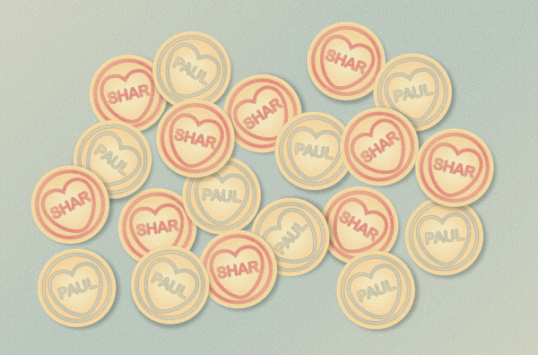
In today’s tutorial I’m going to show you how I created a Love Heart candy inspired illustration using Symbols and the Appearance panel. It’s great for beginners as there’s no need to use the Pen Tool! You can customise the text easily on the design for whatever purpose you like, however my example is based on my upcoming wedding next year!
Step 1
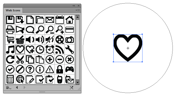
There are several ways to create a heart shape, some prefer using shape tools where as I’m going the much easier route. Go into the Symbols panel and click on the drill down menu then Open Symbols Library and select "Web Icons". This is a standard selection of icons available in Adobe Illustrator. Use the Symbol Sprayer Tool (Shift + S) and click one instance of the heart icon called "Favorite" onto your art board.
Step 2
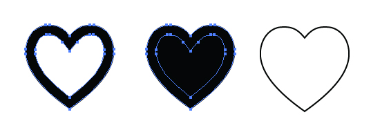
Go to Object > Expand to convert your symbol into edittable shapes and then use Object > Compound Path > Release (Alt + Ctrl + Shift + 8). This will give you two shapes… the overall heart shape and the smaller heart which is used to subtract from the larger shape. We’re interested in the larger shape so delete the smaller heart and then change the larger to a null fill and a black stroke for now.
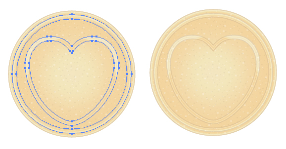
Step 3
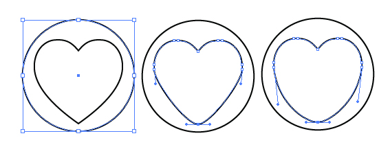
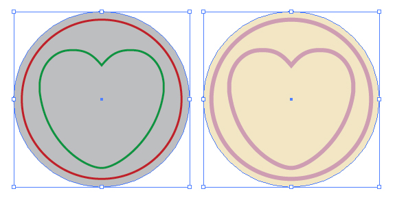
Using the Ellipse Tool (L) hold down Shift + Alt to create an even circle around your heart. Use the Direct Selection Tool (A) to then round the heart at the bottom and drag the side handles downwards to make it more plump. This is so we have more room to add text.
Step 4
Duplicate the circle and then enlarge it with the Free Transform Tool (E) to be slightly larger than the initial circle and heart shape. I’ve then given the largest circle a yellow/peach fill (C=5, M=8, Y=25, K=0). The strokes for the smaller circle and heart can be any color at this stage. We’ll call this part of the candy the embellishment form now on.
Step 5
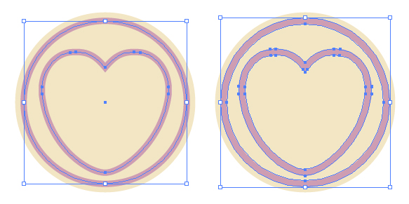
I’ve given the embellishment a 3pt Stroke Weight and then Object > Expanded it to a fill. With both selected, create a Compound Path (Ctrl + 8).
Step 6
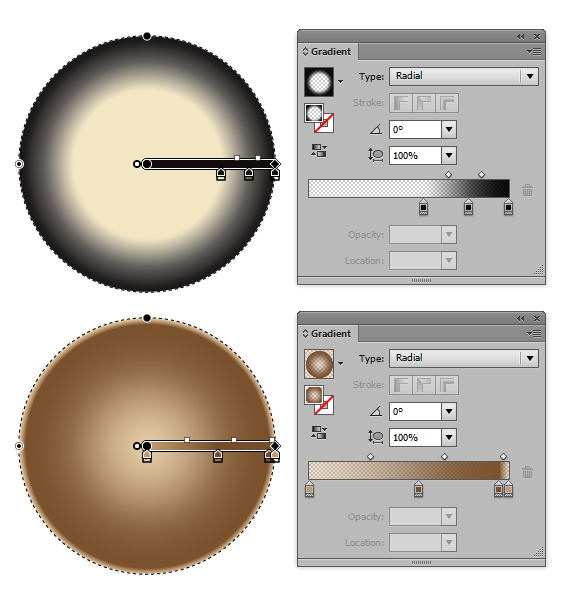
So let’s hide the embellishment for now and focus on the candy itself. I’m going to be adding several elements via the Appearance panel. The first is adding a radial gradient, so go into the drill down menu and select New Fill. I always start out with a default gradient, in this case the black vignette one and then drag and drop colors into the Gradient panel.
From left to right the values are as follows:
- Location 0%, Opacity 30%, C=25, M=40, Y=65, K=0
- Location 55%, Opacity 65%, C=40, M=65, Y=90, K=35
- Location 95%, Opacity 95%, C=40, M=65, Y=90, K=35
- Location 100%, Opacity 30%, C=25, M=40, Y=65, K=0
This fill is then set to Blending Mode Hard Light, Opacity 30%.
Step 7
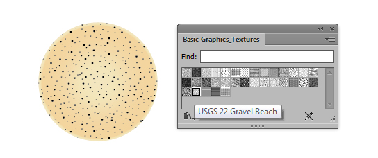
Add a New Fill and then go into your Swatch panel and into the drill down menu. Select Open Swatch Library > Patterns > Basic Graphics > Basic Graphics_Textures and select the one titled "USG22 Gravel Beach". Change the Blending Mode to Screen and Opacity to 30%.
Then in the Appearance panel drill down menu select Duplicate Item to duplicate the pattern fill. Go to Object > Transform > Scale and have only "Transform Patterns" ticked. I’ve reduced the pattern in this fill by 70% and then click on OK. Change the Blending Mode to Multiply and Opacity to 5%. These two pattern fills will create a subtle noise texture. Without the changing of the scale of the second pattern, it would cancel them out and you wouldn’t see any pattern.
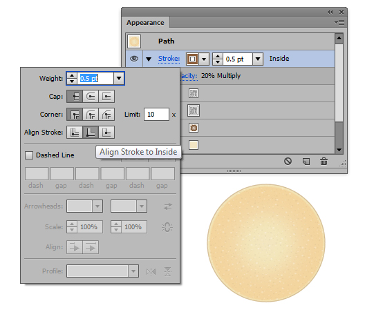
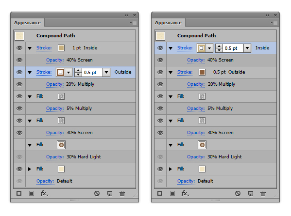
Step 8
Now to add a subtle stroke to our candy. There will be a null filled stroke by default so fill this with a brown shade (C=35, M=60, Y=80, K=25). Click on the link "Stroke" to access the Stroke panel to modify it. I’ve changed the Stroke Weight to 0.5pt and Align Stroke to Inside. Then set the Blending Mode to Multiply and Opacity to 20%.
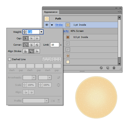
As we did with the pattern fill, highlight the stroke you’ve just created and select Duplicate Item from the drill down menu. Change the Stroke Weight to 1pt and the stroke color to a light brown (C=20, M=25, Y=55, K=5) and change the Blending Mode to Screen and Opacity to 40%.
Step 9
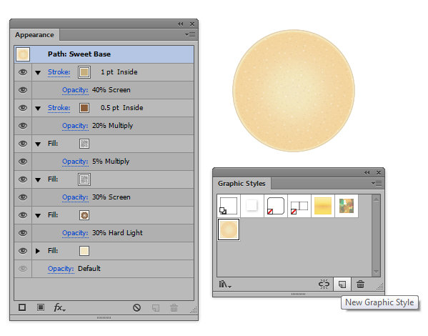
Now we have our candy look and we may need to use it again in the future, so it’s always good to go into the Graphic Styles panel and add New Graphic Style. This essentially saves all those elements from the Appearance panel which you can then apply to future shapes without needing to go over adding new fills etc… again! If you double click on the icon in the Graphic Styles panel, you’re given the option to rename your Graphic Style. I’ve called my Sweet Base (in the UK we call candies, sweets).
If you’re going to be creating additional elements to an illustration and they’re going to have a similar look – apart from say the color of it or perhaps any gradients used; keep the style consistent by applying a previously created graphic style and modifying it. Go to your embellishment and select it and apply the Sweet Base graphic style.
Step 10
Now that the Sweet Base has been applied, we can modify the elements within the Appearance panel to suit the embellishment. I’m going to hide the gradient fill for now as this is one of the main contributing factors to the color. I’m going to modify the strokes of the candy as shown below.
Step 11
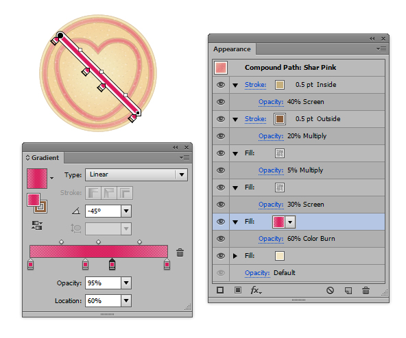
As we did from modifying the black vignette gradient, I’m going to modify the new gradient to give two different colors. I’m not one for gender specific colors but I do really love the color magenta and my partner does really like the color blue, however feel free to use which ever colors you wish for this section. I’ve set the gradient to a -45 degree angle. Duplicate the candy base and embellishments so you have two candies to modify.
I’m going to use the following for the magenta candy (C=10, M=100, Y=50, K=0).
- Location 0%, Opacity 60%
- Location 40%, Opacity 95%
- Location 60%, Opacity 95%
- Location 100%, Opacity 60%
I’ve then set this layer to Blending Mode Color Burn, Opacity 60%. I’ve saved it as a New Graphic Style under the name "Shar Pink".
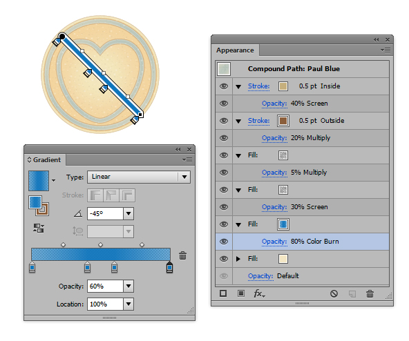
For my partner’s candy, I’m going to be using the same gradient elements, but just dragging and dropping a blue shade (C=85, M=50, Y=0, M=0) onto each of the gradient sliders. I’ve set the Blending Mode to Color Burn and Opacity to 80%. Depending on which colors you use, will dictate how you set the Opacity and in some cases, such as pale colors you may need to change the Blending Mode. I’ve saved this as a New Graphic Style under the name "Paul Blue".
Step 12
Using the Type Tool (T), click in the middle of your candy and type in the names or text you wish to use. I’m using "Shar" and "Paul". Shorter words will work better than longer ones and Shar is my nickname, so it works better in this instance than Sharon. I’ve used the Font "Arial Rounded MT Bold" and Font Size 16pt. I’ve opted for this as it’s sans serif and has rounded corners.

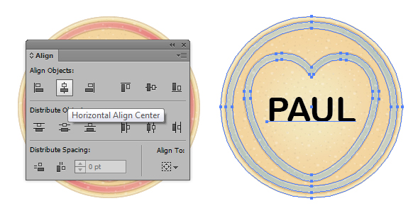
Step 13
To make sure everything is neatly aligned by selecting all your shapes for one candy and going into the Align panel. Select Horizontal Align Center.
Step 14
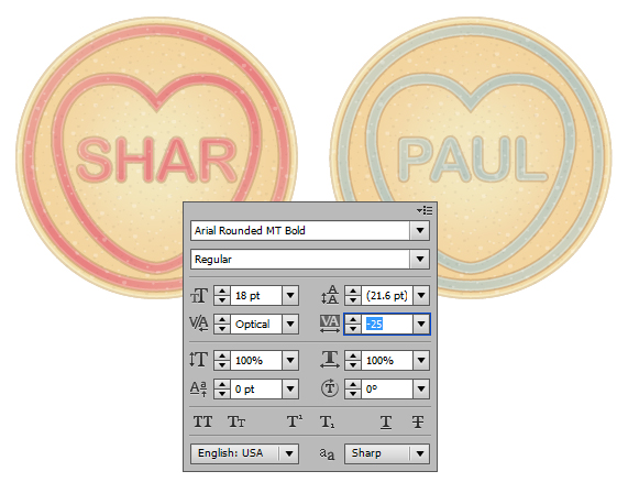
Apply the "Shar Pink" and "Paul Blue" Graphic Styles as appropriate to see how your candies look. On reflection from seeing mine, I think I’m going to go into the Character panel and modify some details.

There should be a link along the top of your screen when you select any type element called Character. Click into this to get further options. I’ve modified the Font Size to 18pt and then the Tracking to -25.
Step 15
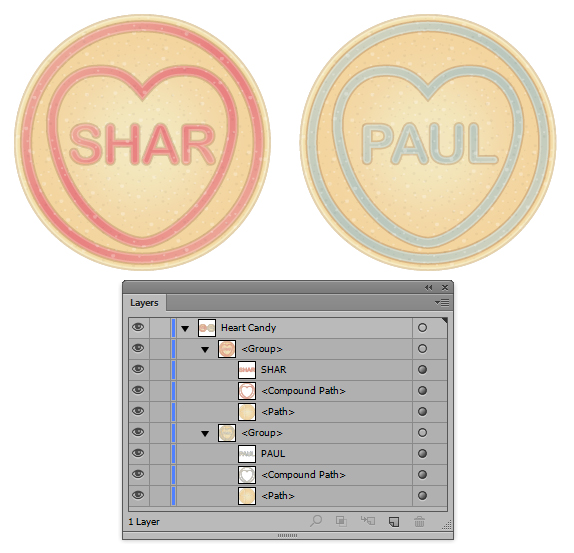
Now that I’m happy with my candies, I’m going to Group (Ctrl + G) them up so it’s easier to know which element belongs to which candy.
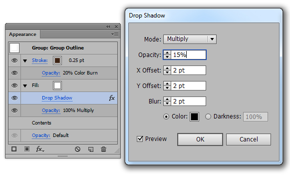
Click on one of the Groups and look in the Appearance panel. If you apply a stroke or fill to this, it will apply it on top of the parts inside. So I’m going to darken the stroke of the elements by adding a dark brown stroke with a 0.25pt Stroke Weight and then set it to Blending Mode Color Burn, Opacity 20%.
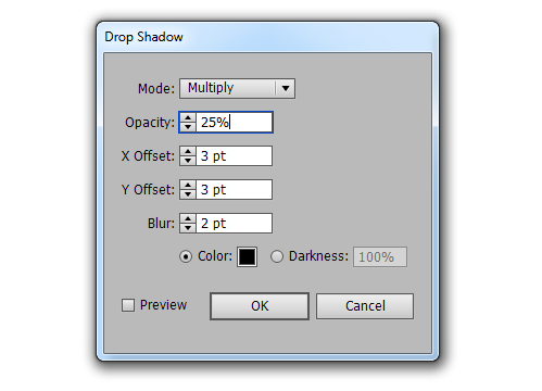
I’ve then added a white fill and added a Drop Shadow Effect (click on the "fx" button) with the below options and then set the fill to Blending Mode Multiply, Opacity 100%. If you set a white fill to Multiply, it cancels it out. However it has a black drop shadow, so the only thing visible will be the drop shadow, not the white fill.
Step 16
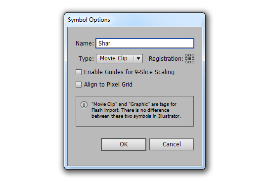
Now drag and drop your groups individually into the Symbols panel. You’ll get a pop up Symbol Option. Just rename it appropriately (in this case I’ve called them "Shar" and "Paul") and click on OK. Ignore the other options as this is for Flash.
If you’re duplicating many of the same objects, Symbols are a great way to save on file size.
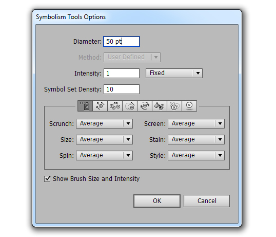
Step 17
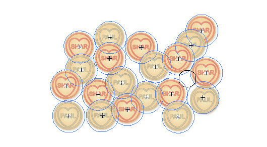
I’m now going to distribute the candies onto my art board using the Sprayer Tools. If you double click on the Symbol Sprayer Tool (Shift + S) in the Toolbar, you’ll be able to access it’s Options. I’ve changed the Diameter to 50pt, the Intensity to 1 and Symbol Set Density to 10 (maximum). This is just so when I click onto the canvas, I get 1 instance per quick click instead of multiple.
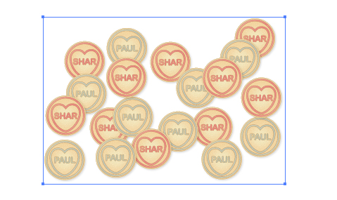
I’ve then sprayed a selection across the art board. Sprayed a couple Shar, then Paul, then Shar and then Paul and so on. If you spray symbols in a similar area, they will combine to create one symbol set. If you lock or hide your symbol set, when you use the Symbol Sprayer Tool (Shift + S) again, you will create an additional symbol set.
Step 18
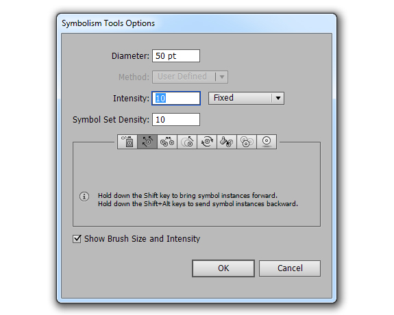
Double click on the Symbol Sprayer Tool (Shift + S) again and change the tool to the Symbol Shifter Tool. This moves around the symbols by dragging them across with your mouse/tablet. I’ve changed the Intensity to 10 (maximum) as I want it to have the maximum effect while I’m dragging symbols around.
So I’m moving the symbols around. You’ll need to click on the specific symbol in the Symbol panel to modify it in the symbol set. For example, say I was moving around a Paul symbol. Click on the Paul symbol in the Symbol panel and then drag around the symbol on your art board to where you wish. You’ll notice if you went to drag around a Shar symbol, this would be frozen in place. This is true with all the Symbol tools.
Step 19
I’m now going to use the Symbol Spinner Tool to rotate the candies.
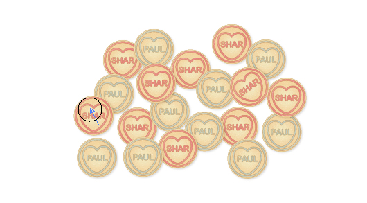
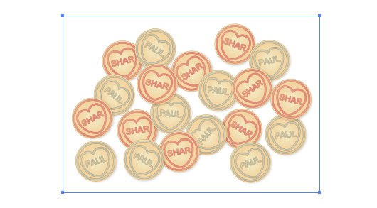
Now I’m happy with our illustration.
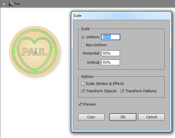
Step 20
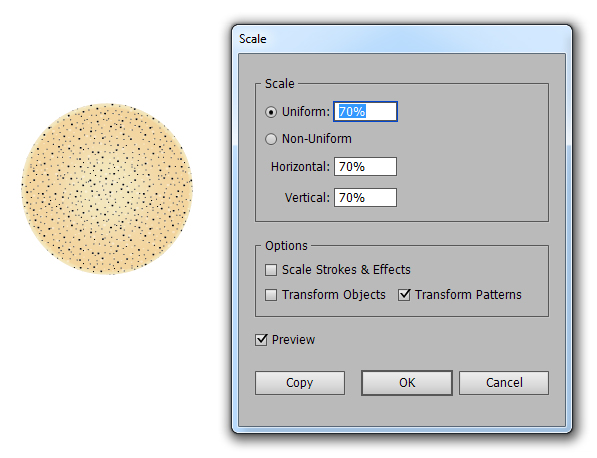
Say you’re unhappy with a specific element within your Symbol. You can double click on it within the Symbol panel and you’ll enter into Isolation Mode. You can tell this by you’ll have the symbol in the middle of your canvas with a grey bar along the top of your interface. I’ve selected the text and embellishment and reduced the Scale to 93%. I’ve applied this to the Object and the Patterns, not the Strokes and Effects.
I’ve then modified the drop shadow of the group of the symbol as shown below. I’ve applied this to both of the candies.
Conclusion
To finish off I’ve drawn a Rectangle (M) across the canvas and filled it with the "Paul Blue" graphic style. It’s a simple background but it works in this instance… further proof to how using Graphic Styles can save time!
I hope you’ve enjoyed this tutorial and can think of many phrases you could place on your own candies. Perhaps you could use it to create a Valentine’s graphic for a client or even for your better half. Have fun exploring the Appearance panel and Symbols!