In this quick tip we will create a set of web buttons with the help of 3D Effects in Adobe Illustrator. Why? Because in this way we can forget about using different brushes and effects for adding highlights and shadows and we can achieve this in a single step, taking advantage of the light settings and Bevel shapes available. Let’s begin!
Step 1. The Button Shape
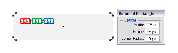
Let’s start with the basic shape for this web button so take the Rounded Rectangle Tool and click anywhere on your artboard to open the Rounded Rectangle window. There, enter the numbers shown and you will get the shape that we need. Select light gray as the fill color.
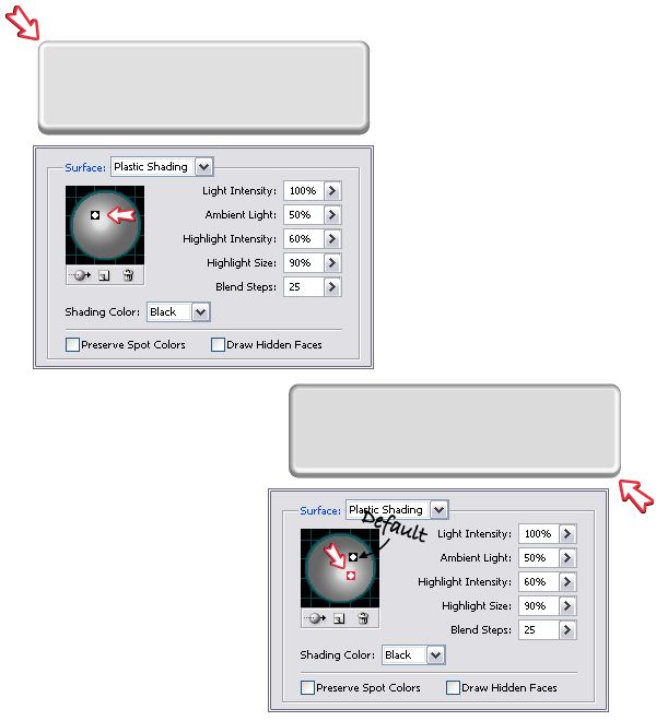
Step 2. 3D Settings
Having this rectangle selected, go to Effect menu > 3D > Extrude & Bevel. In the right side of the image below you can see the default settings, only the rotation coordinates are changed. I would love to use the Bevel shapes more often but sometimes they just don’t generate the results that I want. In this case, if you choose Tall-Round as the Bevel shape the change is more than obvious. You will get the rounded edge and also you won’t have to worry about the highlights and shadows later.
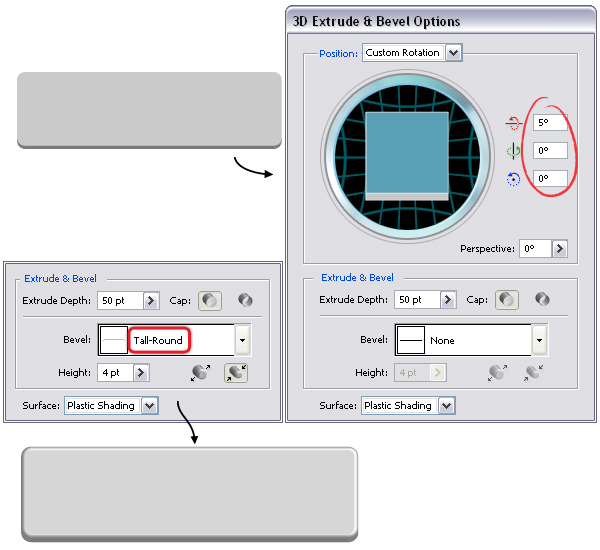
If you increase the Height value the rounded edge becomes thicker.
In the Extrude & Bevel Options window press the More Options button to open the entire dialog and focus on the bottom part. If you want to highlight the upper left corner move the light to the left as indicated below or toward the bottom if you want to highlight the bottom right corner.
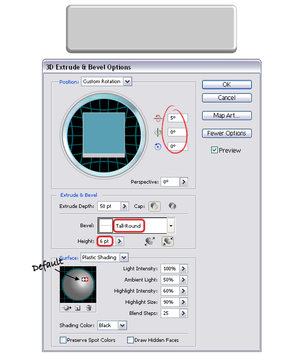
Step 3. The 3D Button
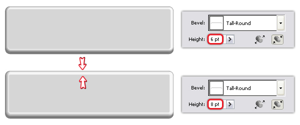
Finally, here are the settings that I’ve used. Change the coordinates, choose Tall-Round as the Bevel shape, increase the Height from 4 pt to 6 pt and move the light slightly to the left.
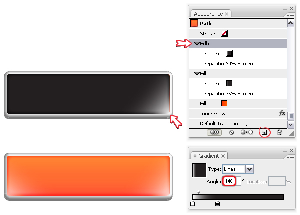
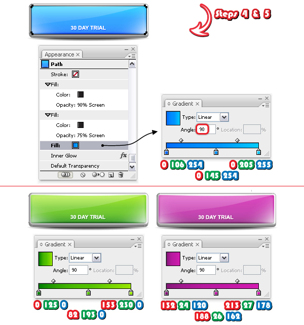
Step 4. Color the Button
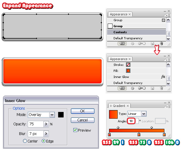
While the 3D button is selected, go to Object menu and choose Expand Appearance. Now, use the Direct Selection Tool (A) to select the inner rounded rectangle and fill it with the linear gradient shown. Set the angle to 90 degrees. With this rectangle selected, double click on Contents (because this shape is in a group) in the Appearance Panel and this way you will see the existing attributes. Next, go to Effect menu > Stylize and apply the Inner Glow effect using the settings shown.
Step 5. Add Shine
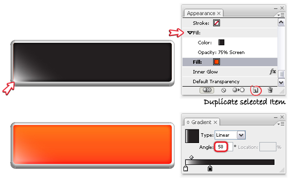
Having the existing fill selected in the Appearance Panel, click on the Duplicate Selected Item icon at the bottom and you will get a second fill. Change the gradient to the one shown using white and black and set the angle to 50 degrees. Change the Blending Mode to Screen (black becomes transparent) and reduce the Opacity to 75%.
Duplicate this second fill as you did earlier and keep the same gradient. Set the angle to 140 degrees and increase the Opacity value from 75% to 90%.
Step 6. Use an Art Brush
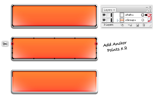
Now, select using the Direct Selection Tool (A) the inner rectangle and from the Object menu choose Copy and Paste in Front. In the Layers panel drag the new rectangle outside the button-group because we don’t want it there. Remove the existing attributes and give it a black stroke. While this rectangle is selected, go to Object > Path > Add Anchor Points two times to add some extra points. Next, take the Scissors Tool (C) and click on the two indicated points to cut the shape then delete the path from the bottom.
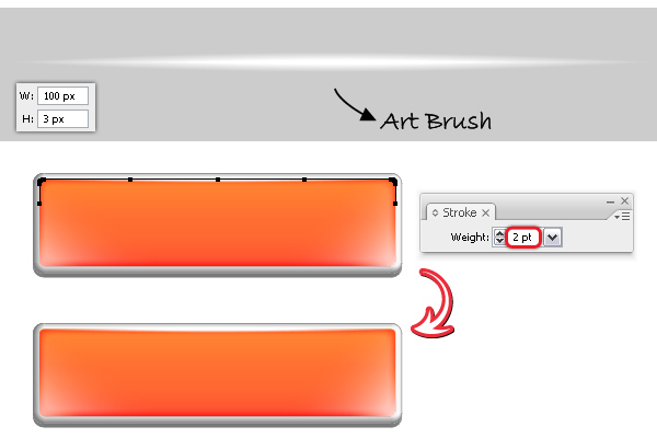
Now, you need an Art brush. I’ve explained how to do it in this quick tip at Step 9. The only difference is that, this time I started from a 100 x 3 px ellipse instead of 200 x 5 px. After you drag it into the Brushes Panel to save it as a new art brush, use it to stroke the path from the top. Set the weight to 2 pt.
Step 7. Add Shadow
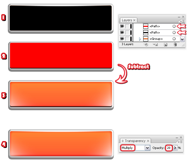
Copy and Paste in front again the inner rectangle and drag it outside the button-group, in front of it. Remove the existing appearances and give it a black fill (1). Now, Copy and Paste in Front the black rectangle and change the fill color so you can differentiate them. Move the red rectangle a little up by pressing the Up Arrow Key on your keyboard two times (2). The Keyboard Increment should be set to 1 px (Edit menu > Preferences > General).
Select both shapes and choose Subtract from shape area > Expand from the Pathfinder Panel. The resulting thin shape should have a black fill (3). Change the Blending mode to Multiply and reduce the Opacity to 20% (4).
Step 8. Gloss
Next, using the Pen Tool (P) draw a path over the button as in the image below. Copy and Paste in front again the inner rectangle, remove the existing appearances and just give it a black stroke. Select this rectangle and also the blue path and click Divide in the Pathfinder Panel. From the Object menu choose Ungroup then delete the shape from the bottom.
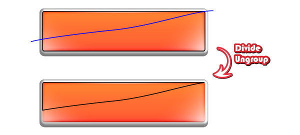
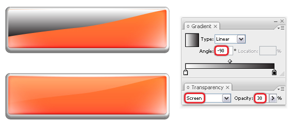
Fill the shape obtained with a linear gradient from white to black and set the angle to minus 90 degrees. Change the Blending mode to Screen (black becomes transparent) and reduce the Opacity to 30%.
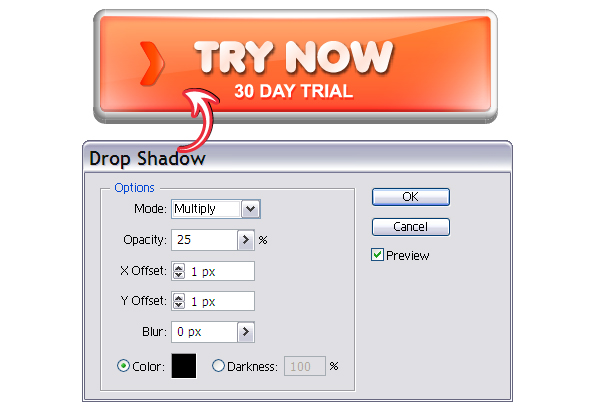
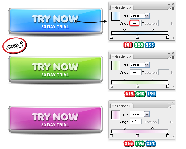
Step 9. The Text
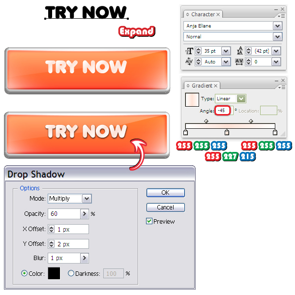
Let’s continue with the text. With the Type Tool (T) type "TRY NOW" using a font called Anja Eliane, size of 35 pt. You can find the font here. From the Object menu choose Expand then fill the text with the linear gradient shown. Set the angle to minus 45 degrees. Next, go to Effect menu > Stylize and apply the Drop Shadow effect using the settings from below.
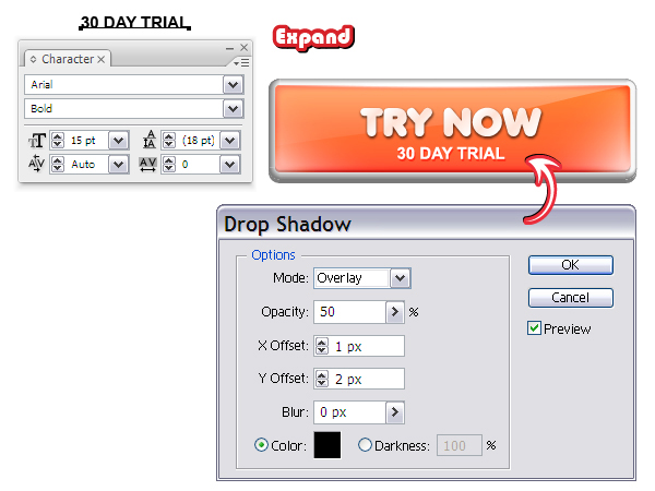
Now, type "30 DAY TRIAL" using Arial Bold, size of 15 pt then select Expand from the Object menu. Fill the text with white then apply again the Drop Shadow effect using the settings shown.
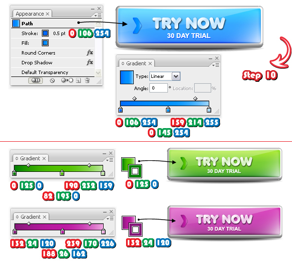
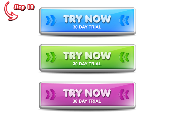
Step 10. Arrows
From the Symbols Panel (Window menu > Symbols) open the Symbol Libraries Menu and in the Arrows category find Arrow 24. Drag it into your working area and press the Break Link to Symbol icon at the bottom of the panel. Ungroup it twice then go to Effect menu > Stylize > Round Corners and apply a 3 px Radius (1). Fill the arrow with the linear gradient shown then give it a 0.5 pt Stroke using the color indicated (2).
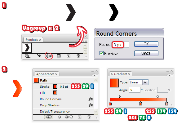
Move the arrow on the button then go to Effect menu > Stylize and apply the Drop Shadow effect.
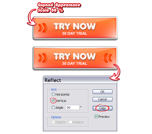
Having this arrow selected, choose Expand Appearance from the Object menu in order to expand the two effects applied then go to Object menu > Transform > Scale, choose 80% and hit Copy. You will get the smaller arrow. Arrange them as in the image and make sure they are horizontally aligned. Select them both then go to Object menu > Transform > Reflect. Choose Vertical then hit Copy. Arrange the two new arrows on the right side and the button is ready.
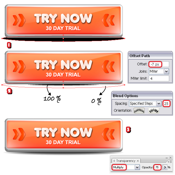
Step 11. Shadow
All that is missing is a shadow under the button. Take the Ellipse Tool (L) and draw a flat ellipse at the bottom then select black as the fill color (1). Send this ellipse behind the button then go to Object menu > Path > Offset Path and apply a minus 7 px Offset. You will get a smaller ellipse in the middle (2). Set the Opacity for the bigger ellipse to 0% then select them both and go to Object menu > Blend > Blend Options. There, select 25 Specified Steps and go back to Object menu > Blend > Make (3). Reduce the Opacity for the resulting blend-group to 75% and if you put the button on a particular background, also change the Blending mode to Multiply.
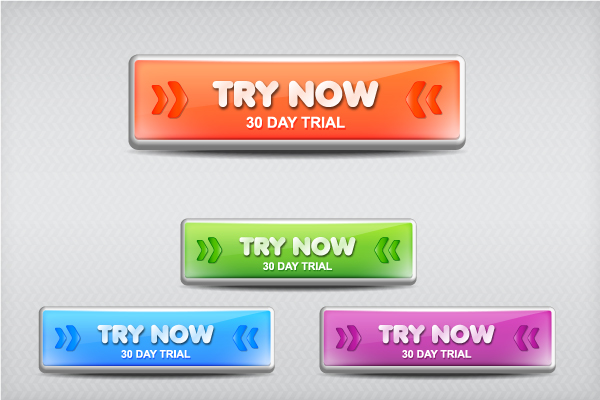
Here is the final web button:

Step 12. Other colors
Starting from this button you can obtain many other color variations. All you have to do is to make a copy of the button and change a few things. In the images below you can see three examples: blue, green and purple. All the shapes that are visible in the image below have not been modified. Keep them as they are. Those that are hidden means they will be modified and we will take each individually.
Let’s start with the rounded rectangle. Select it with the Direct Selection Tool (A) and take a look at the Appearance Panel. Change the first gradient fill with the new gradient shown and keep all the other attributes as they are. Do the same thing for the green and purple web buttons.
For the text, simply change the middle stop of the gradient from light orange to light blue respectively light green and light purple. "30 DAY TRIAL" remains the same.
Now, select the arrow and change the gradient fill then the stroke color as indicated. The effects remain the same.
Finally, as you did at Step 10, select Expand Appearance then scale the arrow to obtain the smaller one. Reflect the two and you are done.
Final Image
This is the final image and here are the four web buttons ready to be used. If you want to save them for web, check out another tutorial of mine where I explain how to do this in detail.