
Colored pencils may seem like a childish medium, but in this tutorial I'm going to show you the two-layer technique. By layering two disparate colors, you can create a non-color-crayon-box color that matches what you see in real life. We'll start by making a swatch guide that showcases every color combination we can make, and then use that color knowledge to pencil a still life.
What You'll Need

- 5.25" x 9" piece of paper (I prefer Stonehenge)
- 7" x 9" piece of paper (I prefer Stonehenge)
- HB pencil
- Pen (optional)
- Ruler
- Color pencils: Poppy Red, Orange, Canary Yellow, True Green, Grass Green, True Blue, Ultramarine, and Violet
- Still life photo (available as an attachment to this tutorial)
1. Make Your Color Chart
We're going to be making a color chart that shows all of the color combinations for our two-layer technique. The two-layer technique is a great way to create neutral colors, darker colors, and also more complex colors that don't come in the color pencil box. We'll be making 28 boxes that measure 1" x 1" on our 5.25" x 9" piece of paper.
Step 1
We'll make the vertical margins for our 1" boxes. Measure in 1/4", then 1", then 1/4", then 1", and so on from left to right.

Step 2
Now we'll make the horizontal margins for our 1" boxes. Measure down 1/4", then 1", then 1/4", then 1", and so on from top to bottom.
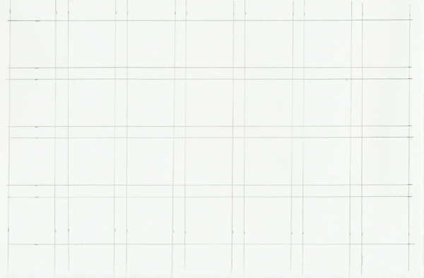
Step 3
Label each box with abbreviations of the color combinations so that you know which two colors will go in each. I used the following code for mine, but feel free to write out your colors fully.
- Poppy Red = R
- Orange = O
- Canary Yellow = Y
- True Green = TG
- Grass Green = G
- True Blue = TB
- Ultramarine = B
- Violet = V
I went through the color palette from R to V and listed out all of the combinations. I'll list them out here so you can easily write them on your paper.
- First row = R+O, R+Y, R+TG, R+G, R+TB, R+B, R+V
- Second row = O+Y, O+TG, O+G, O+TB, O+B, O+V, Y+TG
- Third row = Y+G, Y+TB, Y+B, Y+V, TG+G, TG+TB, TG+B
- Fourth row = TG+V, G+TB, G+B, G+V, TB+B, TB+V, B+V

Step 4
We're ready to start filling in the color chart! We'll start by penciling in the first layer of red in the top row. Since we're layering colors, don't press really hard. You don't want to fill in the paper solidly or else you won't be able to add another layer on top.

Step 5
Starting in the first box, pencil in the second color, in this case orange, on top of the red first layer.

Step 6
Move on to the second box and pencil in the second color for that one, which is yellow.

Step 7
Move on to the third box and pencil in the second color for that one, which is true green.

Step 8
Work your way through the rest of the first row. You should start to see the subtle differences between the boxes.

Step 9
Now we're on the second row. Since the orange combinations don't take up the entire row, only fill in the boxes that have orange as the first layer.

Step 10
Pencil in the second layer of orange combinations with their appropriate colors.

Step 11
Moving on to yellow! Fill in the first layer of the yellow boxes.

Step 12
As you did with the red and orange combinations, pencil in the second layer of the colored pencils.

Step 13
Continue filling in your color chart until all 28 boxes have two layers of colored pencils. I prefer to use a pen to go over the square borders afterward so that the color combinations stand out even more.

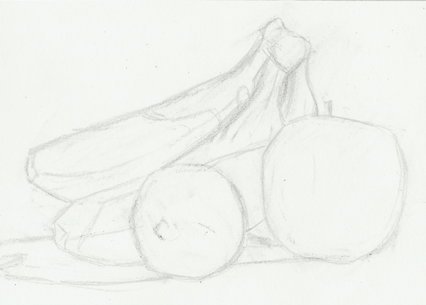
2. Sketch Your Still Life
Step 1
Pull out your 7" x 9" piece of Stonehenge paper and measure out 1" margins around the outside.

Step 2
Then, using the photo linked in the supplies above, sketch out the still life. I recommend using the side of your pencil rather than the point because the hard edge of the point can dig a groove in the paper and leave a white spot in your finished drawing.
3. Pencil in the First Layer Colors
We're ready to put in some color! Using the photo as a reference, look closely at the colors in the fruit. Compare those colors to the ones in your chart. We're going to use this chart to help us decide what colors we'll be layering to match the colors in the photograph.
Step 1
I like to start with the lightest colors and work to darker ones when I lay in the first layer of color. So let's start by penciling in the yellows. I put in the yellows where the final color is yellow, yellow green, or a yellow orange.

Step 2
Now we're going to pencil in the true greens. I put in the true greens where the final color is a medium green.

Step 3
Orange is a bit lighter than the grass green, so let's layer in the orange as a first layer in the areas that will be a red orange or a dark brown.

Step 4
Now we can pencil in the grass green. In this photo, we'll be putting grass green in as the first layer of color in areas that are in deep shadow.

Step 5
Finally, we want to make sure we fill in the shadow on the table as well. Since the shadow on the table is lighter than the darkest dark in the fruit, we'll fill the first layer of color for the shadows in with a true green.

4. Pencil in the Second Layer Colors: The Apple
Here is where the color chart really comes in handy. Use it to figure out which combinations on the chart match the colors in the photograph.
Step 1
To make things easier, I'll be working my way through the fruit individually so you can clearly see what I'm doing. I'm going to start by layering in a second layer of red into the apple where I want the final color to be a red orange or red yellow. I'll also add in a layer of grass green in the areas that need to be darkened, and some orange in the areas that need to be an orange yellow.

Step 2
You can see we're getting somewhere, but the colors need to be pushed further. I'm going to go back in and add the first layer of color back over the top of the second layer to deepen the values. So I put red back over the green and yellow over the oranges.

Step 3
To push the darks even more, I'm going to add one last little layer of grass green over the darker areas. We're still just using two colors to create each final color, but the added layers help make the color more vibrant and closer to the photograph.

5. Pencil in the Second Layer Colors: The Lime
Step 1
Just as we did with the apple, we're going to pencil in the second layer of colors for the lime using our color chart and the photograph as guides. Pencil true green in over the yellow areas to create a yellow green. Then color in grass green over the first layers of true green to create a darker green. Finally, add in some violet as the second layer to the grass green to create the darkest spots of the lime.

Step 2
Due to the lime's vibrancy, we're going to add a layer of yellow to the entire lime to make it pop. We'll also draw in some of the dimples of the lime with more of the violet and grass green. Go slowly here to avoid overdoing it with the dark colors.

6. Pencil in the Second Layer Colors: The Bananas
Step 1
Like limes, bananas can be a bit hard to color because we see them as being just one color, but if you look closer, you'll discover they have yellow oranges and yellow greens in their peels. We'll add in oranges and true greens on top of the yellow first layer to mix those colors. Also add in grass green on top of the first layer of true green to push the shadows on the banana.

Step 2
To neutralize the banana further, we're going to add a third layer. I colored in a light layer of orange in the shadows to make them less green. I also added grass green to the ends of the bananas to get them closer to their brown color.

Step 3
Just as we did with the lime, color over the entire bunch of bananas with the yellow colored pencil to really make things pop. Again, we're still keeping to the two-layer technique in terms of the number of colors, but an additional layer of the same colors pushes their vibrancy.

7. Pencil in the Second Layer Colors: The Shadows
Since we used true green to lay down the first layer of color in the shadows, we'll neutralize it with violet. This is also the closest color combination when we use our color chart and the photograph as references.

8. Final Touches
If you want to push your still life just a tiny bit more, squint your eyes at the photograph and find the darkest darks. Then go in with your violet and ultramarine and gently build up a layer of that color to push the depths of the shadows. Here I darkened the tops and ends of the bananas, the shadows on the bananas, and the parts of the shadows on the table where they meet the fruit.
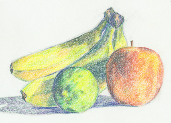
You've Made a Colorful Still Life!
Now that you have your swatches of color combinations, you can continue to use the two-layer color pencil technique to draw just about anything. The more color pencils you have in your box, the more color combinations you have, so don't fear making a new guide of swatches. Never fear adding too many disparate colors. If anything, you'll discover how to make the most lovely browns and grays.
