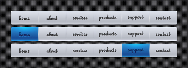
In the following tutorial you will learn to create a nice navigation menu. This is particularly useful for people who want to make perfectly aligned rollover states for websites and applications.
Step 1
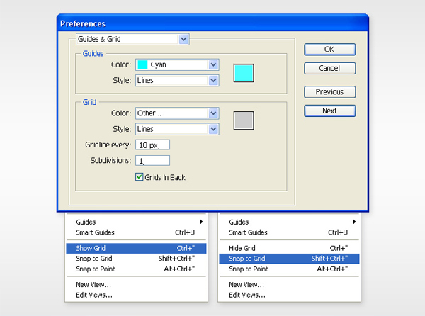
Create a 630 by 190px document. First, turn on the Grid (View > Grid) and the Snap to Grid (View > Snap to Grid). Next, you’ll need a grid every 10px. Go to Edit > Preferences > Guides & Grid, enter 10 in the Gridline every box and 1 in the Subdivisions box. You can also open the Info panel (Window > Info) for a live preview with the size and position of your shapes. Do not forget to replace the unit of measurement to pixels from Edit > Preferences > Unit > General. All these options will significantly increase your work speed.
Step 2
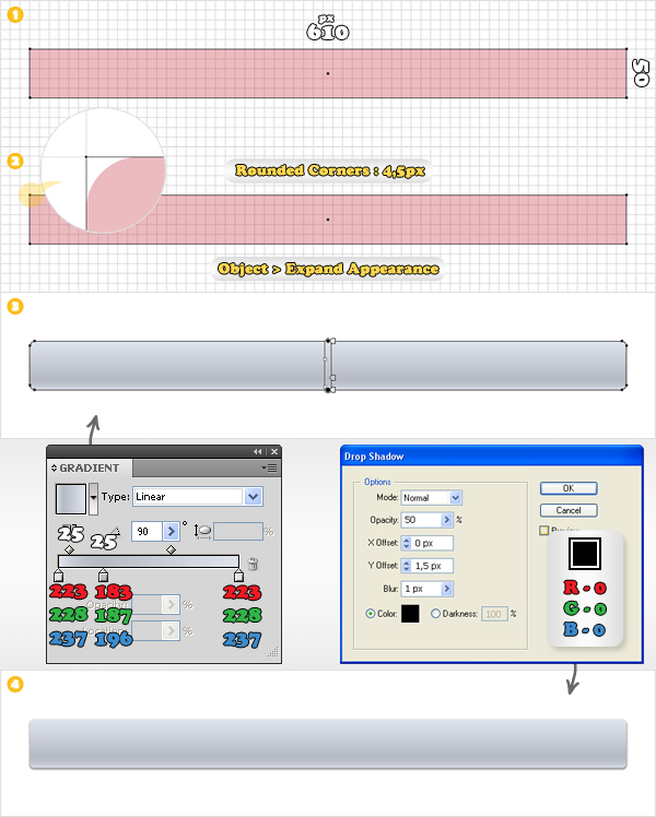
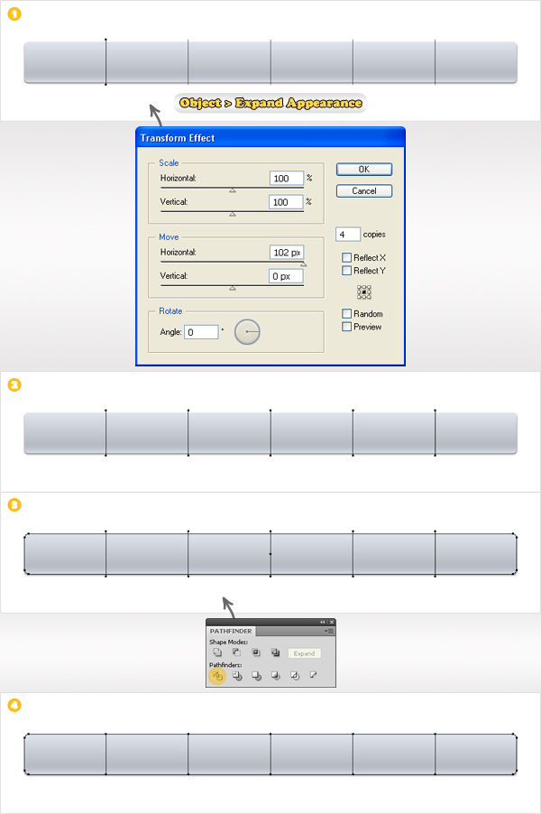
Start with the Rectangle Tool (M). Create a 610 by 50px shape. For the moment fill it with any color and remove the stroke. Select this fresh shape and go to Effect > Stylize > Rounded Corners. Enter a 4,5px Radius, click OK then go to Object > Expand Appearance. Fill the resulting shape with the linear gradient shown below.
If you take a closer look at the gradient image you’ll notice some white text. It stands for sliders location. First, select the middle slider and set its location to 25% then select the left diamond icon and set its location to 25% too. Finally, go to Effect > Stylize > Drop Shadow. Enter the data shown in the final image then click OK.
Step 3
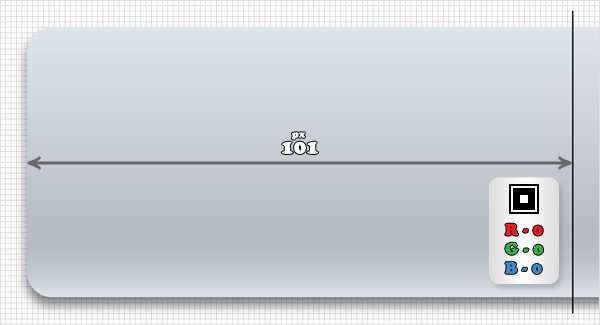
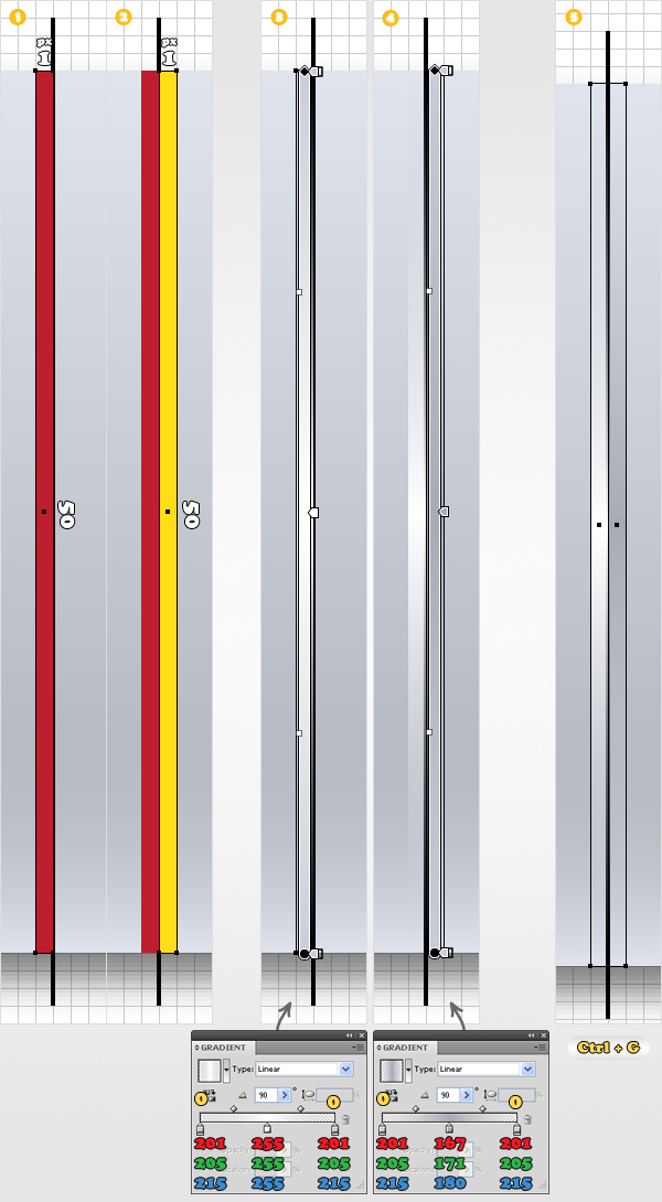
For the following steps you’ll need a grid every 1px. Go to Edit > Preferences > Guides & Grid and enter 1 in the Gridline every box. Pick the Pen Tool (P) and draw a 56px, vertical path. Add a black stroke for this path so you can easily distinguish it. Finally, place it 101px to the right of the left side of the rounded rectangle.
Step 4
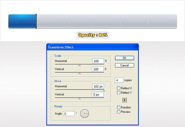
Next, you need to create two thin and tall rectangles. Create the first one (1 by 50px) and place it to left of the vertical path. Make a copy of this shape and move it 1px to the right. Return to the left shape, select it and fill it with the first linear gradient. Again, take a closer look at the gradient images and you’ll notice some yellow text. It stands for opacity. Select the right shape and fill it with the second linear gradient. Reselect both shapes created in this step and group them (Control + G). For the moment, make this group invisible.
Step 5
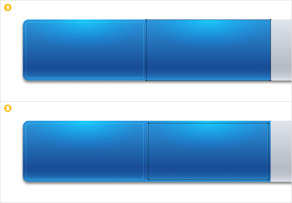
Return to the vertical path. Select it and go to Effect > Distort&Transform > Transform. Enter 4 in the Copies box and 102 in the Move > Horizontal box. Click OK then go to Object > Expand Appearance. You will get a group of five vertical paths.
Duplicate the rounded rectangle. Select this copy along with the group of vertical paths and click on the Divide button from the Pathfinder panel. This will divide your rectangle in five different shapes. Select each shape and remove the drop shadow effect from the Appearance panel.
Step 6
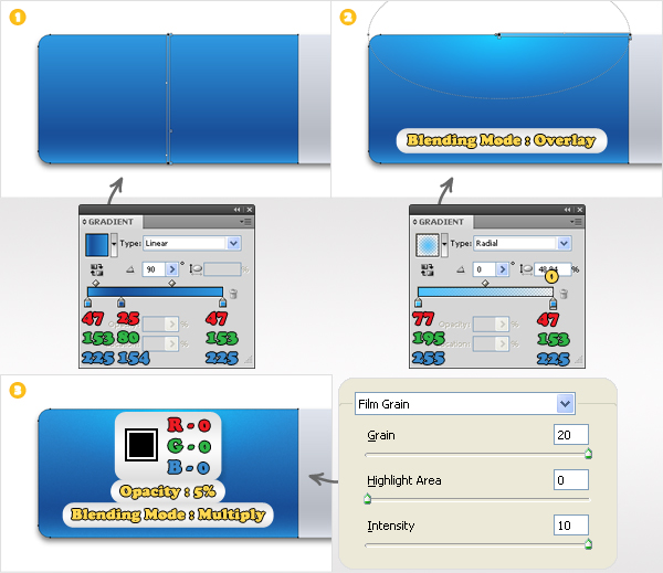
Now, let’s focus on one of the shapes made in the previous step. I chose the leftmost one. It should be already filled with the linear gradient mentioned in the second step. Select this fill and replace the color from the existing gradient with the colors shown in the first gradient. Next, go to the Appearance panel, open its fly-out menu and click on Add New Fill. This will add a second fill for your selected shape.
Select this new fill (from the Appearance panel), use the radial gradient shown below the second image and change its blending mode to Overlay. Add a third fill and make it black. Lower its opacity to 5%, change its blending mode to Multiply then go to Effect > Artistic > Film Grain. Enter the data shown below then click OK.
Step 7
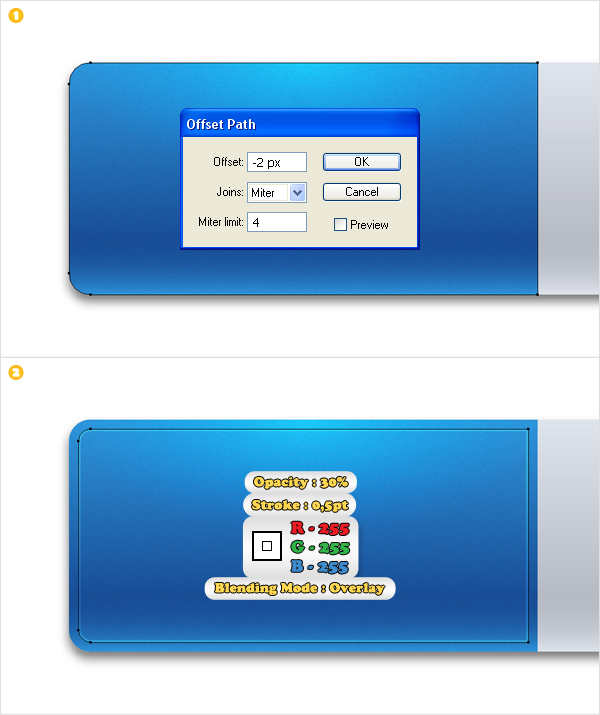
Select the shape edited in the previous step and go to Effect > Path > Offset Path. Enter a -2px Offset and click OK. Select the resulting shape, remove all fills, add a 0,5px, white, aligned to inside stroke and change its blending mode to Overlay.
Step 8
Add the same effect for the rest of the shapes and don’t forget the stroke. You should create a separate layer for each blue shape. That way it will be easier for you to manage the look of the menu.
Step 9
Turn on the visibility for the group made in the fourth step. Move it in the top of the Layers panel. Lower its opacity to 80% then go to Effect > Distort&Transform > Transform. Enter the data shown below then click OK.
Step 10
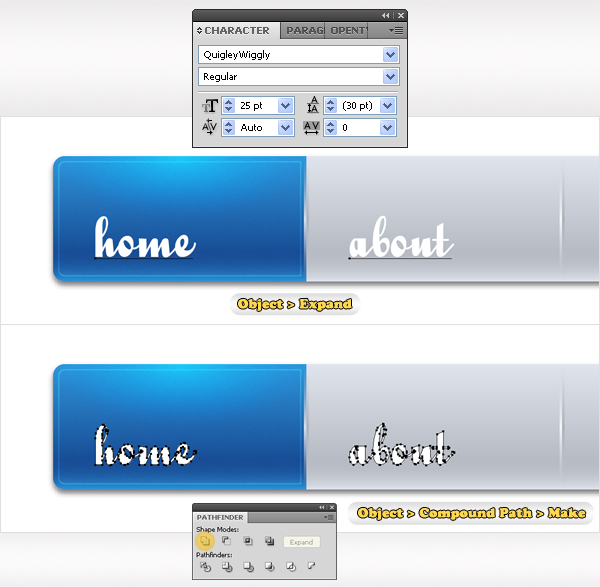
Finally, the text. First you need the Quigley Wiggly font. Now pick the Type Tool (T) and add your text as shown. Expand the text then select the resulting shapes and click on the Unite button from the Pathfinder panel. If you get more than a shape after the Unite option go to Object > Compound Path > Make.
Step 11
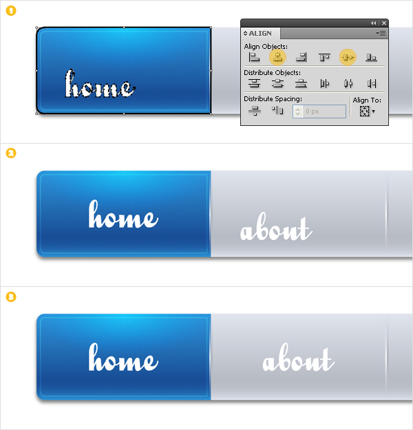
Next, you need to align this text. Start with “home”. Pick the Selection Tool (V). Select the text shape along with the blue shape, click on the border of the second one (it should get emphasized) then click on the Horizontal Align Center and Vertical Align Center buttons. Repeat the same technique for the rest of your text.
Step 12
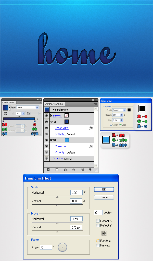
Now, let’s add some effect for the text. First, the blue version. Select the text shape and fill it with the linear gradient shown below. Select the fill (from the Appearance panel) and go to Effect > Stylize > Inner Glow. Enter the data shown below then click OK. Next, add a second fill and move it below the existing one. Select it, fill it with R=52 G=160 B=230 then go to Effect > Distort&Transform > Transform. Enter the data shown below and click OK. Now, your text should look like in the image below.
Step 13
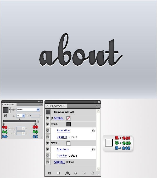
Now the grey version. You don’t need to remove or add any effect. All you need to do is edit the existing fills. Select the top fill and replace the exiting gradient with the one shown below then select the bottom fill and replace the fill color with the one shown below. In the end your text should look like in the image below.
Step 14
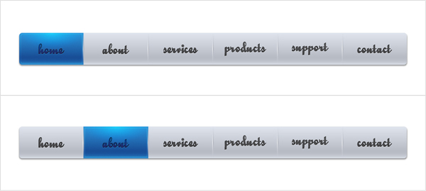
Finally, make a blue and grey version for each text shape and you’re done.
Conclusion
There you have it, a simple way to make a navigation menu with rollover states. Another tip is to save your styles so you can apply them to other elements you may need, such as icons and forms. I hope you’ve enjoyed this tut.