

Rococois an artistic movement and style, affecting many aspects including painting, sculpture, architecture, interior design, decoration, literature, music, and theater. It originated in Paris in the early 18th century as a reaction against the strict regulations of the Baroque and was soon adopted throughout France and later in other countries, principally Germany and Austria.
The characteristics of this time period are:
- a preference for light (ivory white) and pastel colors
- elaborate, organic patterns
- elaborate decoration—gold was especially prominent, adding a level of luxury to the pastel colors
- use of curves and swirls based on the shapes of the “C” and the “S”mimicking shells, rocks, and stylized acanthus leaves
- use of asymmetry along with symmetry—things became less controlled
Follow this tutorial and learn how to create a beautifully decorated text effect inspired by the Rococo time period in Adobe Illustrator. If you are curious about how to manipulate the letters and how to create the golden, elaborate decorative elements around the letters, then let's begin!
If you are interested in more vintage text effects, gold text styles, or text effects in general, head over to GraphicRiver and you'll surely find what you are looking for there. There are plenty of designs to choose from.
Tutorial Assets
To complete the tutorial, you will need the following assets:
- Kingthings Organica Font I dafont.com
- Black Blend Art Brush 100x3 I How to Create a Set of Multi-Use, Blend Brushes
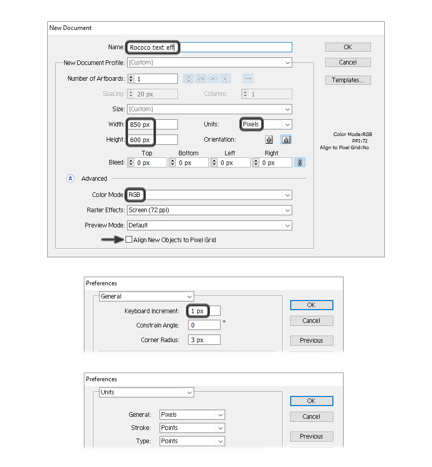
1. How to Open a New Document
LaunchIllustratorand go to File> New to open a blank document. Type a name for your file, set up the dimensions, and then select PixelsasUnitsandRGBasColor Mode. Make sure that Align New Objects to Pixel Grid is not checked.
Next, go to Edit> Preferences > General and set the Keyboard Increment to1 px and while there, go to Unitsto make sure they are set as in the following image. I usually work with these settings, and they will help you throughout the drawing process.
2. How to Manipulate the Text
Step 1
Take the Type Tool (T) and write “ROCOCO” on your artboard using a font called Kingthings Organica, size of 120 pt. After that, chooseExpand and Ungroup (Shift-Control-G) from the Object menu to get the individual letters.
Spread the letters on your artboard because you'll need more space between them.

Step 2
Now, focus on the letter “R” because you need to distort it a little.
First, select the letter and go to Object > Compound Path > Release; then delete the small hole at the top (1).
Next, use the Direct Selection Tool (A) to select only the anchor point indicated and move it inwards a little by pressing the Right Arrow key on your keyboard a few times. After that, make the left side of the letter a straight line by moving the anchor point underneath (2).

Step 3
Use the Direct Selection Tool (A) again to select the anchor point indicated, and move it upwards a little by pressing the Up Arrow key on your keyboard a few times (1). Continue with the next two points indicated—move them and also adjust their handles in order to get the rounded look (2).
Finally, distort the anchor points at the bottom (3) to get the inner corners, and you can see the final result in the image below (4).

Step 4
Take the Ellipse Tool (L) and draw a 9 x 18 px ellipse as the new hole. After that, while both shapes are selected, press Minus Front in thePathfinder panel.
At this point, the letter “R” is ready.

Step 5
Now, focus on the letter “C”. Use the Direct Selection Tool (A) to select only the anchor point indicated and move it a little to the right by pressing the Right Arrow key on your keyboard a few times. After that, drag a selection over the points in that area with theDirect Selection Tool (A) and move all of them downwards to get extra space.

3. How to Create the Golden Border and Pattern
Step 1
Select the first letter and give it a 3 pt Stroke using the color indicated. Next, go to Effect > Stylize > Drop Shadow and apply this effect.

Step 2
While the letter stays selected, add two New Stroke attributes above the first in the Appearance panel—one having a 2 pt Stroke using a shade of beige and the other having a 0.5 pt Stroke using a shade of cream.
When you are done, apply the same style to the rest of the letters.

Step 3
Copy and Paste in Back (Control-B) the letters and delete all existing appearances. Select a light gray fill color (1).
With the letters still selected, add a New Fill attribute above the first and use a pattern called Medieval Diamonds Color from the Swatch Libraries Menu > Patterns > Decorative > Decorative_Ornament (2).
Now, go to Object > Transform > Scale and once there, make sure that only the Patterns option is checked and type 60% in theScale field. Hit OK and your pattern should look smaller now. Set theBlending Mode to Overlay (3).

4. How to Draw the Decorative Elements
Step 1
Focus on the letter “O”. Grab the Pen Tool (P) and draw a shape like in the next image (1) followed by the rounded shape at the top (2). Take your time and draw the next shape (3) and after that, select the three shapes and press Unite in the Pathfinder panel. As a result you will get a simplified version of an acanthus leaf, which is specific to the Rococo style (4).

Step 2
While the first acanthus leaf stays selected, go to Object > Transform > Reflect. Check the Vertical option and hit Copy. You will get the second leaf on the left side, and now you need to move it into the right place (1).
Next, select the two existing leaves and Reflect them again. This time, check the Horizontal option and hit Copy. Move the resulting third and fourth leaves into the right place at the bottom of the letter “O”, and make sure that the rounded tips of the acanthus leaves are overlapping in the middle (2).

Step 3
To make things easier, select and multiply the existing four acanthus leaves and then arrange them on top of the other two “O” letters.

Step 4
Now, focus on the letter “C”. First, select and copy the leaves from the other letters and arrange two of them on the left side of the letter “C”. They should fit properly (1).
For the two leaves on the right side, you need to make a few adjustments (2). Remove the rounded tips of the leaves by deleting the points in that area with the Delete Anchor Point Tool (-), and after that, create the new tapered tips like in the image below (3).

Step 5
Let's continue with the letter “R”. Grab two copies of the acanthus leaves and arrange them on the left side (1). You need to distort these shapes a little by moving the points from the middle area closer to the golden edge of the letter (2).
Repeat the same thing for the two leaves on the right side and make a few adjustments until the shapes follow the contour of the letter. Also, make the inner part of the two leaves at the bottom a little longer by moving only the anchor points in that area closer to each other.

Step 6
At this point, each letter should have the four acanthus leaves on the left and right sides.

Step 7
Let's continue with other decorations. The shape in the image below (1) is a simpler and smaller version of the acanthus leaf made earlier. After you draw it, Reflect it vertically to get the second one in the left side (2). Now, Reflect horizontally both shapes and you will get the ones at the bottom (3).
Multiply these four small acanthus leaves and arrange them on the tops and bottoms of the other letters.

Step 8
Focus on the letter “C” and arrange a copy of the small acanthus leaf as shown (1). Reflect horizontally this leaf and arrange the second one at the other end of the letter (2).
The same thing goes for the other letter “C”.

Step 9
The last decoration is a mix between a flower ornament and a shell ornament, both very predominant in the Rococo style. Use the Pen Tool (P) to draw a shape as shown in the following image (1), and then Reflect it horizontally to get another one at the bottom (2). Now, copy andRotate 90 degrees both shapes to get the ones on the left and right sides of the letter “O” (3).
Multiply these shell shapes for the rest of the letters.

5. How to Color the Decorative Elements
Step 1
Let's recap. The blue shapes are the big acanthus leaves, the green shapes are the small acanthus leaves, and the orange shapes are the shell decorations. Select one of each shape and make a set of copies.
Select only the orange and blue shapes, go to Object > Transform > Scale, and type 220% in the Scale field. Hit OK. Next, select the small green shape, and this time, type 400% in the Scale field to make it a lot bigger.

Step 2
Select the three decorative shapes and fill them with the color indicated. After that, go to Effect > Stylize > Inner Glow and apply this effect twice using the settings shown.

Step3
Focus on the shell decoration and draw a shape as shown in the next image. Fill it with the color indicated and then apply the Inner Glow effect twice.

Step 4
Select the shell decoration (both shapes), the big acanthus leaf, and the small acanthus leaf, and go to Object > Expand Appearance in order to expand the Inner Glow effects applied earlier.
Now, we can scale the decorations back to their original size. Select the shell decoration and the big acanthus leaf and go to Object > Transform > Scale. Type 45% in the Scale field and hit OK. For the small acanthus leaf, type 25% and hit OK.
Why is this scale up / scale down method necessary? Because the Inner Glow effect looks way better when applied to bigger shapes, and after you expand the effect, you can scale the shapes back to their original size without losing quality.

6. How to Add Details to the Decorative Elements
Step 1
In the image below is the big acanthus leaf already expanded (1). Take the Pen Tool (P) and draw a small moon-like shape filled with the linear gradient shown (2).
Use the Pen Tool (P) again to draw three wavy paths on the leaf (3) and give them a 2 pt yellow Stroke using the Black Blend Art Brush 100x3 (info below). Next, add a New Stroke attribute at the top of theAppearance panel and use the same Black Blend Art Brush but change the stroke color and keep the Stroke Weight at 1 pt. You can see the end result in the image below (4).
I have an entire tutorial dedicated to Blend Brushes and how useful they are: How to Create a Set of Multi-Use, Blend Brushes. In that tutorial you can find more information about the Black Blend Art Brush 100x3 used here, how to create it, and how to save it in your Brushes panel. I use these Blend Brushes all the time in my drawings, and you should definitely have them in your library, always ready to use.

Step 2
Draw a short path like the one in the following image, and give it a 0.5 pt Stroke using light brown and the Black Blend Art Brush (1).
Select the shape of the leaf and Copy and Paste in Place (Shift-Control-V)in order to get a copy of it in front of everything. Set this copy to stroke-none and fill-none (2).
Now, select all the shapes that make up this decoration and go to Object > Clipping Mask > Make (Control-7) (3).

Step 3
Remember the modified acanthus leaves for the letters “R” and “C”? The same thing goes for them. Follow the steps in section 5 and 6 again, and apply the same settings to these shapes.

Step 4
In the next image is the small acanthus leaf already expanded (1). First, draw the moon-like shape and use the same gradient as earlier (2). After that, draw two wavy paths on top and apply the two Stroke attributes again (3). Next, it's time for the mask to obtain clean edges (4), and you can see the final result below (5).

Step 5
Let's add some details to the shell decoration. Take the Pen Tool (P) and draw three paths on each side of the shell, and give them a 1 pt brownStroke using the Black Blend Art Brush again (1).
Draw three new paths on each side of the shell, but shorter this time. Apply the two Stroke attributes to them just as we did earlier (2).
The last thing is to make a copy of the shell shape in front of everything, set to stroke-none and fill-none, and mask the decoration to obtain clean edges (3).

7. How to Arrange the Decorative Elements
Step 1
First, grab the big acanthus leaf and arrange it on the bottom right side of the letter “O”; then Reflect it horizontally and vertically to obtain the other three leaves, and arrange them exactly on top of the original blue shapes (1).
Next, grab the small acanthus leaf and arrange it on top of the original green shape; then Reflect it to obtain the other three leaves (2).
Next, grab the shell decoration and do the same thing. If you have an empty space at the base of the shell, you can draw a small rectangle to cover it (3). When you are done, select all four shells along with their rectangles and go to Object > Arrange > Send to Back (Shift-Control-[).

Step 2
Multiply and arrange the decorations on the rest of the letters.
Don't delete the original blue, green and orange shapes because you will need them later in the tutorial.

8. How to Create the Inner Shadows
Step 1
Focus on the letter “O”. Follow the sequence of images, select the decorative elements indicated, and apply the Drop Shadow effect using the settings shown.

Step 2
Move on to the letter “C” and apply the same settings from above to the decorative elements around it. Apply the Drop Shadow effect to the two small horizontal leaves as well.

Step 3
Repeat the same thing for the rest of the letters. The only decorations that don't have a shadow are the shells.

9. How to Mask the Inner Shadows
Step 1
For this step you'll need the original blue, green and orange shapes that I said to keep earlier in the tutorial (1). Also, make copies of the small rectangles at the base of the shells (2).
Next, select the shape of the letter “O” and Copy and Paste in Place (Shift-Control-V) to get a copy of it in front of everything. Remove all existing appearances for this copy and pick any fill color (3).
While all these colored shapes stay selected, press Unite in the Pathfinderpanel to merge them into a compound path (4). Repeat the same thing for the rest of the letters and, before you go further, make copies of these gray shapes for later use.

Step 2
Select the four big acanthus leaves, the four small leaves around the letter “O” (1), and the compound path obtained in the previous step (stroke-none, fill-none), and go to Object > Clipping Mask > Make (Control-7). As a result, the shadow is only visible inside the letter (2).
Repeat the same thing for the rest of the letters.

10. How to Add Extra Decorations on the Letters
Step 1
Grab the Pen Tool (P) and draw a shape like the one in the following image; then Reflect it vertically to get the other half.
Arrange the two pairs of shapes on the letter “O” and then move them behind the golden border of the letter but in front of the pattern.

Step 2
Fill these four shapes with ivory white and also give them a 1 pt black Stroke. While the Stroke attribute stays selected in the Appearance panel, go to Effect > Distort & Transform > Transform and apply a 0.5 px Horizontal Move.
Add a New Stroke at the top of the Appearance panel, select a light shade of pink, and the decorations are ready.

Step 3
Multiply and arrange the decorations from the previous step on the other “O” letters. Don't forget to move them between the golden border and the pattern.

11. How to Create the Shadow Behind the Letters
Grab the copies of the compound paths made earlier in the tutorial and move them to a new layer behind the letters. Select any fill color; then go to Effect > Stylize > Drop Shadow and apply this effect four times.

These are the settings for the Drop Shadow effects in order:

Congratulations! You're Done
The Rococo-inspired text effect is ready, and here is the final result. I hope you enjoyed this tutorial, and if you decide to recreate it, don't forget to share an image with us. I would love to see it.

And here is a close-up to showcase the beautiful decorative elements.
