Clik here to view.

A few times a each month we revisit some of our reader’s favorite posts from throughout the history of Vectortuts+. This tutorial by Jonathan was first published on April 14th 2010.
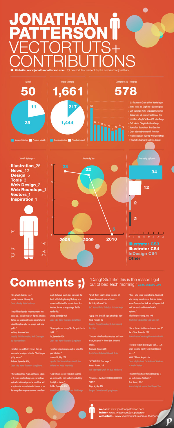
Merge form and function to create outstanding modern infographics. In this tutorial you will learn that data doesn’t have to be boring, it can be beautiful! Learn how to use various graph tools, illustration techniques and typography to make an accurate and inspiring infographic.
Step 1
Start by using the Rectangle Tool (M) to draw a shape. Give it a subtle radial gradient too.
Clik here to view.
Step 2
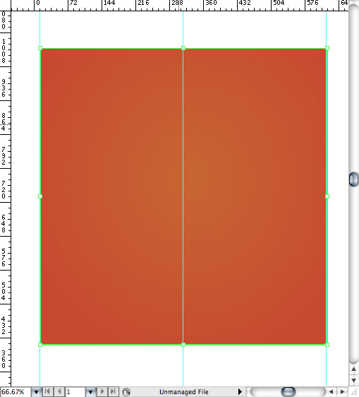
The entire design is based on a grid of four columns. To make the columns first select the rectangle and drag a guide onto the centre of the shape. Drag guides onto the left and right edges of the shape too. Tip: Quickly show the ruler by pressing Command+R.
Clik here to view.
Step 3
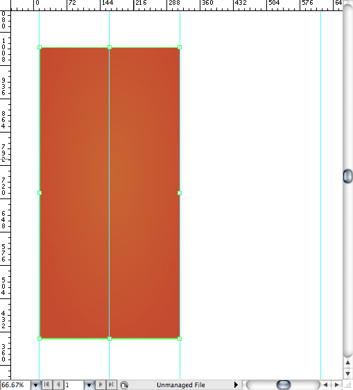
Condense the shape so it fits within the left-most guide and centre guide. Now, add another guide where the centre of this condensed shape is.
Clik here to view.
Step 4
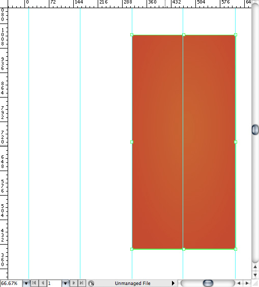
Move the shape over to the right and add another guide to the centre here.
Clik here to view.
Step 5
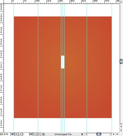
Using the Rectangle Tool draw a thin white box on the centre line that will be the width of the gap between the columns. Add guides to both sides of the small box and delete the centre guide. Tip: Guides are locked by default. In order to delete a guide go to View > Guides > and uncheck Lock Guides. Then, click on the guide and press the delete key.
Clik here to view.
Step 6
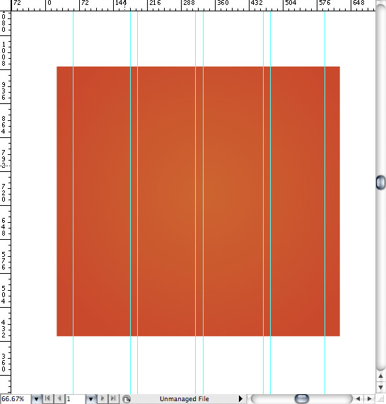
Repeat the process for the other columns with your final result being below. Widen the orange box so it’s slightly larger than the outermost guides.
Clik here to view.
Step 7
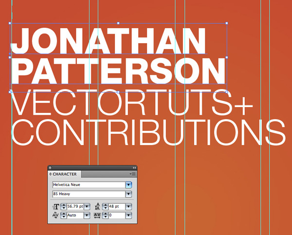
I like to place the most important graphics first and work-in the ancillary charts and graphs afterwards. Pay attention to scale and balance as you’re beginning to place your elements on the page. Below, the combination of heavy and thin text complement each other.
Clik here to view.
Step 8
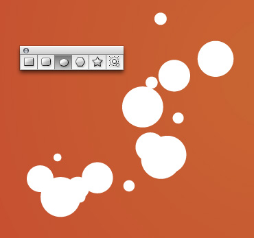
Early on you can experiment with placing a main graphic that will help give the piece some visual interest. I chose to use circles as the very tall orientation of the layout will benefit from these contrasting shapes. Using the Ellipse Tool (L) draw some arbitrary circles or varying sizes.
Clik here to view.
Step 9
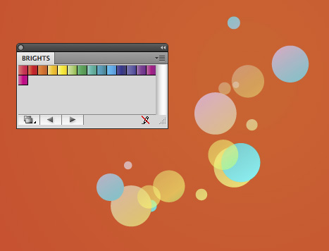
Give the circles a variety of gradients. To access Illustrator’s predefined gradients go to Window > Swatch Libraries > Gradients > Bright’s.
Clik here to view.
Step 10
I’ve placed the first group of circles in the corner and extended them off the page.
Clik here to view.

Step 11
To ensure a clean edge we’ll clip the circles so that they look like they stop where the background stops. First, draw a rectangle with no fill or stroke. Make sure the rectangle is in front of the circles. Select the circles and the rectangle then go to Object > Clipping Mask > Make.
Clik here to view.

Step 12
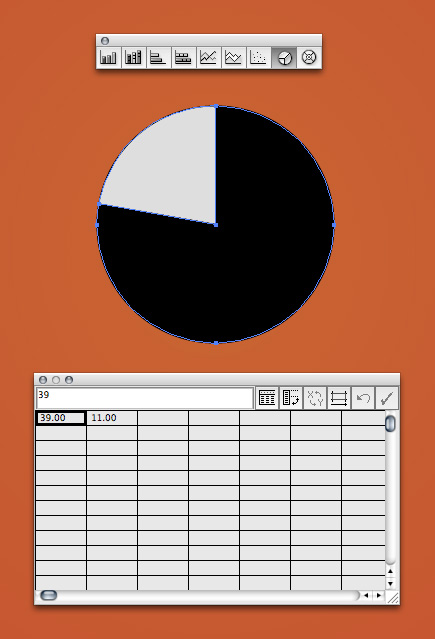
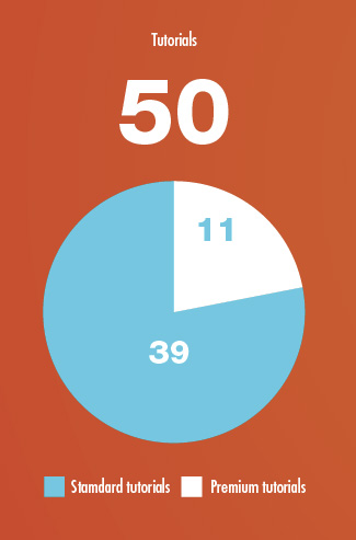
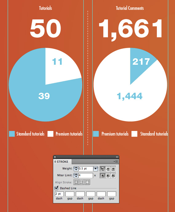
I’m using a variety of graphs in this infographic. To create an accurate pie graph click the appropriate graph then click and drag on your document to create a graph at a specific size. The first graph we’ll plot the data, 50 tutorials with 39 being standard and 11 being premium. Having said that, enter 39 in the first box and 11 in the second. Press the tab key to advance to the next box. Once you’re finished click the checkmark icon in the upper right.
Clik here to view.
Step 13
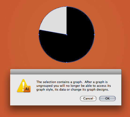
Much of the styling of all the graphs is created by hand. To further manipulate the graph ungroup it by going to Object > Ungroup. You’ll receive a dialog as shown below. If you’re satisfied with the graph click OK. Tip: After you’re plotted your graph but before you ungroup it simply control+click on it and go to Data to further edit the information.
Clik here to view.
Step 14
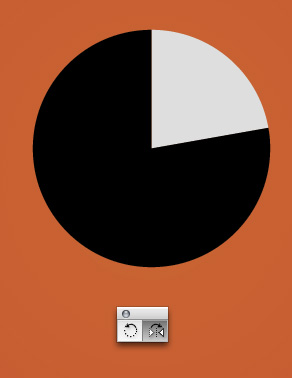
This step is a matter of preference. I didn’t like how the small gray area was on the left so I flipped my graph using the Reflect Tool (O.)
Clik here to view.
Step 15
Manually add the graph numbers and key.
Clik here to view.
Step 16
As expected, I’m using the grid as a basis for how wide my graphs are. To create a dividing line between the graphs use the Pen Tool (P) and draw a vertical line. In the Stroke Palette select Dashed Line and enter 2pt in the first box. Tip: When scaling previously drawn strokes, check or uncheck Scale Strokes and Effect in the preferences panel (Command+K) to achieve un-scaled or scaled strokes.
Clik here to view.
Step 17
To create the effect of a recessed line draw two lines, one darker and one lighter.
Clik here to view.

Step 18
Place the darker line slightly above the lighter line to create the illusion of light coming from above.
Clik here to view.

Step 19
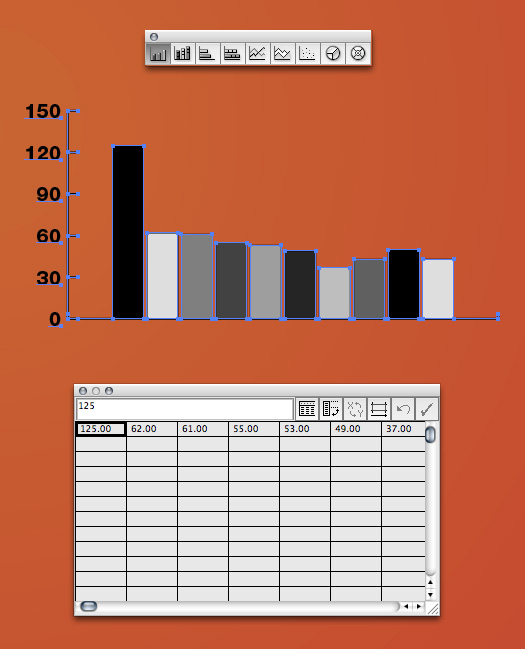
The next graph I’ll create is a Column Graph (J.) Again, click and drag to create the graph size of your choosing. Enter the values for your graph. The scale on the left is automatically generated based on the variables you enter. Click the checkmark icon when you’re finished.
Clik here to view.
Step 20
Ungroup your graph so that you can make visual edits to it. Below, I’ve condensed the graph so it looks taller rather than wider. Of course I could have just drawn the box for the graph tall but this is after the fact.
Clik here to view.
Step 21
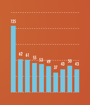
Below, I want the text that corresponds with the graph to be a set width. To accomplish this, use the Text Tool (T) and click and drag from the top highlighted circle to the lower highlighted area. This will predefine the text area so the information fits perfectly between the guides.
Clik here to view.
Step 22
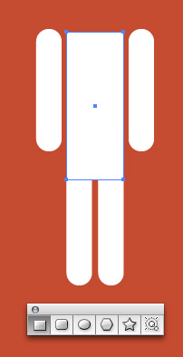
To create the icon of the man, use simple shapes. Start with the Rounded Rectangle Tool. Adjust the radius of the corners by holding the up or down arrow as you draw the shape.
Clik here to view.

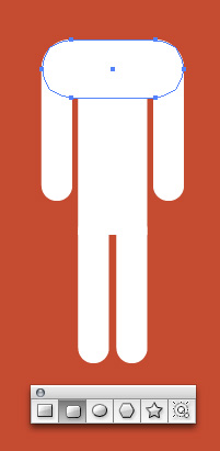
Step 23
Draw a rectangle with no rounded corners for the torso.
Clik here to view.
Step 24
Use another rounded rectangle for the shoulders.
Clik here to view.
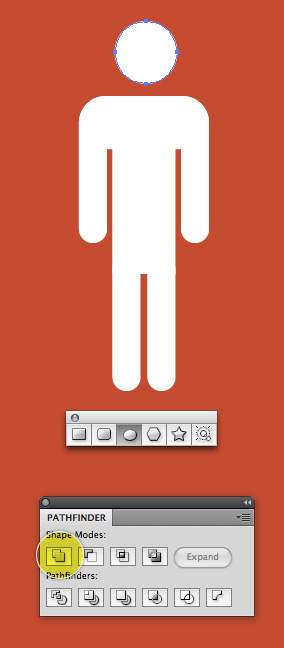
Step 25
Finally, use an ellipse for the head. Select all the individual shapes that comprise the man and in the Pathfinder click Unite. This will give you one solid shape.
Clik here to view.
Step 26
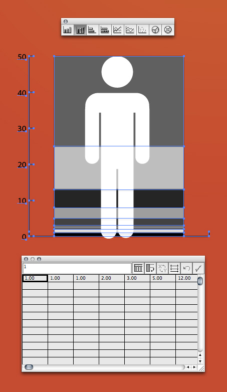
To create a more stylized graph we’ll use the man to represent the information. Using the Stacked Column Graph Tool click and drag to draw the graph the same height of the man. Enter your variables then click the checkmark icon.
Clik here to view.
Step 27
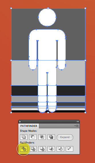
Ungroup and get rid of the other numbers and lines. Using the Pathfinder Palette again, click Divide. Now, each section of your man is divided into accurate sections. Ungroup all the shapes and get rid of the extra gray shapes around the edges.
Clik here to view.
Step 28
Separate each section of the man by selecting them using the Selection Tool and pressing up or down once.
Clik here to view.

Step 29
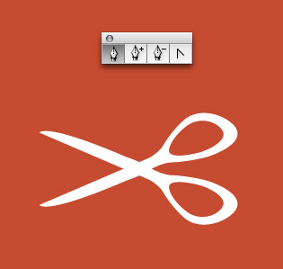
To create the scissors you’ll need to use the Pen Tool (P) and freehand draw the shape as shown.
Clik here to view.
Step 30
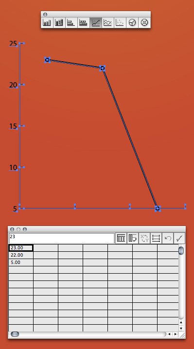
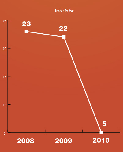
This graph is created using the Line Graph Tool.
Clik here to view.
Step 31
Add the key to the bottom manually and the figures above the points manually.
Clik here to view.
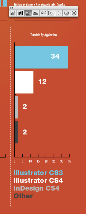
Step 32
The last graph is created using the Stacked Bar Graph Tool. Again, add the details manually.
Clik here to view.
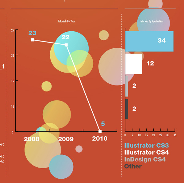
Step 33
To add some interest to the design I’ve layered in the circle graphic behind the graphs. There is no secret to the process… as long as it looks good and helps balance the design, go for it!
Clik here to view.
Step 34
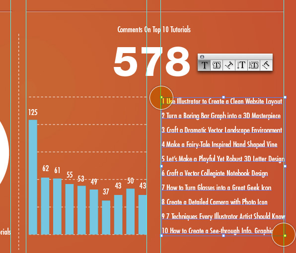
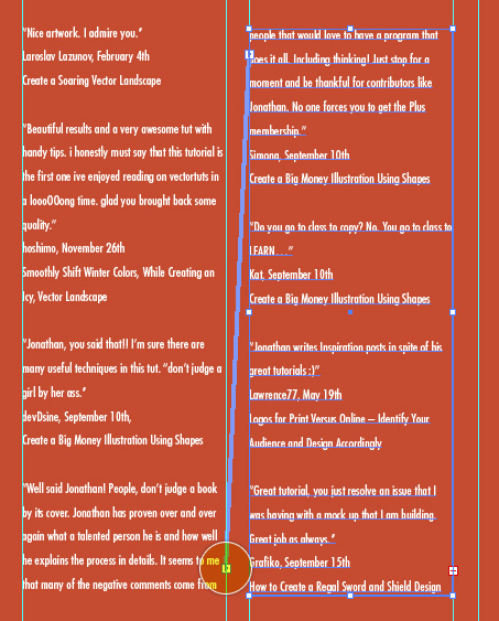
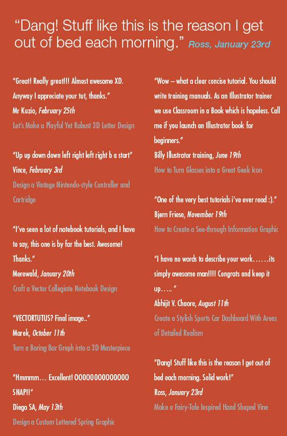
To create the list of comments draw a text box like we did in Step 21.
Clik here to view.
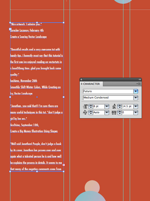
Step 35
Since comments will span from one box to another click the plus sign in the bottom right corner then click anywhere on the page and a new linked text box of the same size will be created!
Clik here to view.
Step 36
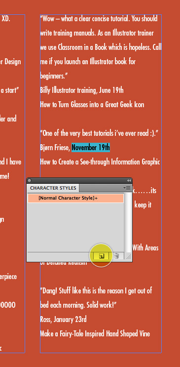
When dealing with large amounts of text it’s a good idea to create styles for that text. In this case I’ve created a style for the date and tutorial title. Styles make it easy to change all the text at once if you ever need to go back and make a change to color, size, font etc. To create a style first select the text that you want to style. Next, in the Character Styles Palette (use the Paragraph Styles Palette if you’re styling a paragraph of text) click Create New Style.
Clik here to view.
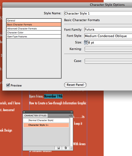
Step 37
Double click the new style in the Character Styles Palette to open up the options panel. In the options panel adjust your text to suit your liking. Click OK. Note: Even though you check Preview, new styles that haven’t been applied can’t be previewed.
Clik here to view.
Step 38
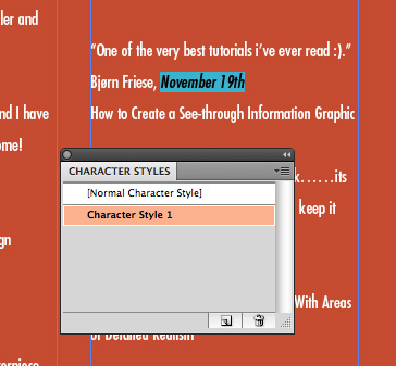
With your text that you want to style still highlighted, SLOWLY double click on the style in the Character Styles Palette to apply the style.
Clik here to view.
Step 39
I’ve created a style for the tutorial title in addition to a style for the date.
Clik here to view.
Step 40
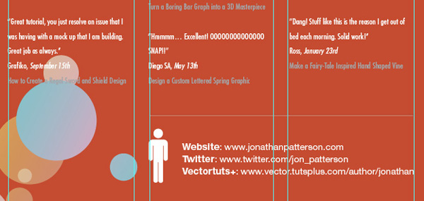
Finish your design by adding any pertinent details to the bottom.
Clik here to view.
Final Image Preview
That’s it! You’ve just learned how to create a modern infographic.
Clik here to view.
Clik here to view.
Clik here to view.
Clik here to view.
Clik here to view.
Clik here to view.
Clik here to view.