In today’s article, I’m going to show you twenty pieces of amazing vector art, which have color themes that are associated with the four seasons.
Winter Palette Vector Art
What’s surprising to know that although we think of Winter as being the cool season, a Summer palette is also one which is dominated by cool tones. A cool palette is blue dominated. When we think of Winter, we think of it being a cold season and often think of ice and snow. Winter palettes contain cool colors such as blues, whites and grays. We sometimes think of Winter as being a depressing season, we’re not outside basking in the sun and when we do we’re too cold to have fun, which is why palettes for this season are often less saturated than other seasons.
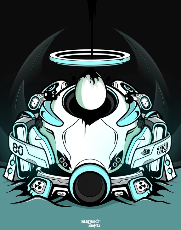
Sacred Helmet Mark 2 by Subjekt Zero
T.r.e.a.d. S.o.f.t.l.y. by Flash Parade
Kella by ChaseJC
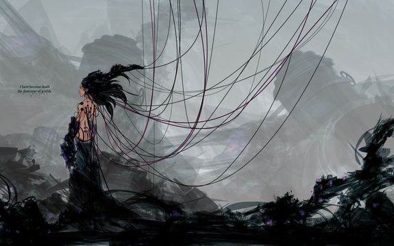
Remember to Breathe by Pyrotensive
Skyline GTR Vector by Depot HDM

Spring Palette Vector Art
Spring colors are warmer in comparison, along with Autumn/Fall, they are seasons with a yellow influence. We associate growth and nature with this season.
Typically a Spring palette would contain a lot of green, but of a high saturation and leaning to a yellow/green as a blue/green would be cooler in comparison. A bold varied palette works well, with the colors focused on more fresh tones of yellow, green, pink and purple.
Think of new flowers coming into bloom and birds/chicks hatching from eggs. Dominate the palette with yellow/green to capture the themes of nature in the Spring.
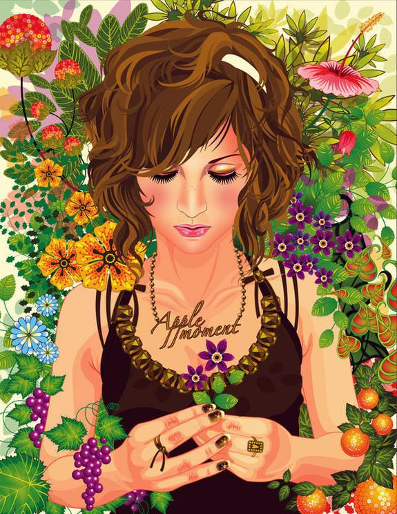
Flower Garden by Apple Moment
Harem by Gruberjan
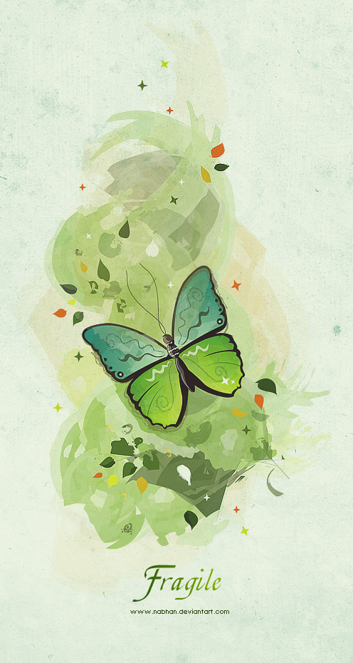
Fragile by Nabhan
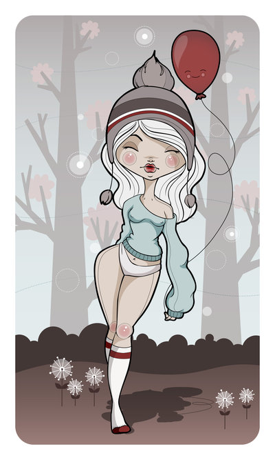
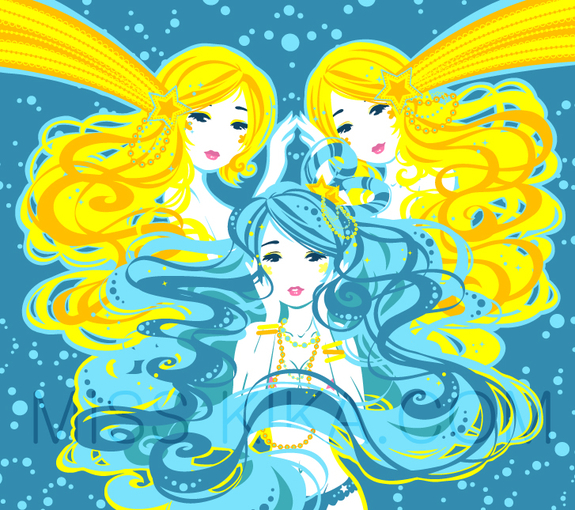
Rare Bird by Lanitta
Summer Palette Vector Art
Summer themes help influence the palette for this season. Memories of the taste of ice cream, the beach and holidays abroad come to mind. For a typically warm season, due to the themes, the palette is a cool one. Consider palettes of pastel shades and clear blue skies/oceans are all pale shades.
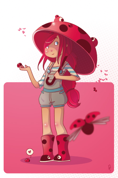
Ladybird Boots by Shy Attitudes
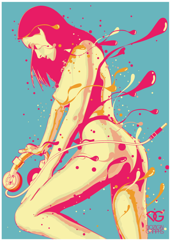
Fade away by dozign
Fashion Illustration 5 by Breeleman
Curse of the CareWeres by Winter Artwork

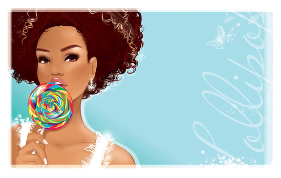
Blueberry Lemonade by Blush-Art
Autumn Palette Vector Art
Autumn or Fall is an easier season to associate color palettes with… consider the changing of the leaves from a deep green to a mustard yellow to a bold red or even a rich brown. Think of fields harvesting their grain and the color of straw in bundles. Like Spring, it’s color palettes are warm and often a darker set of colors.
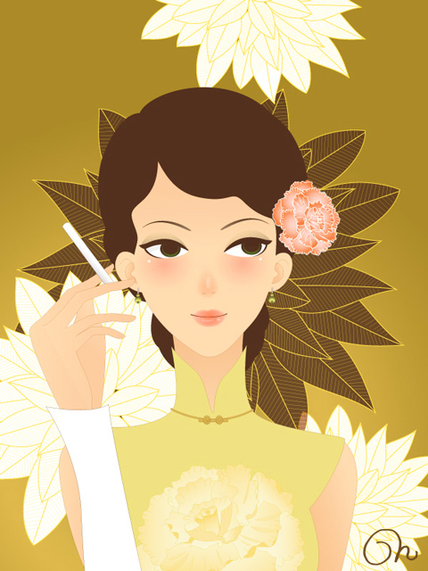
Old Shanghai by cqcat
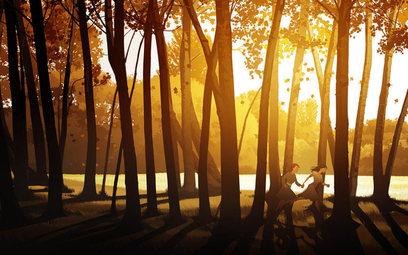
Running through the Forest by Javieralcalde
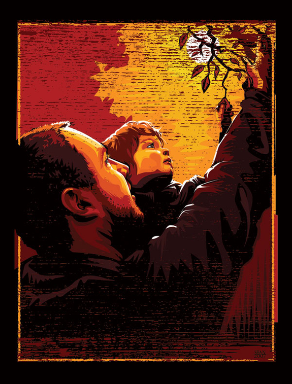
Brother and Son by Shannon T
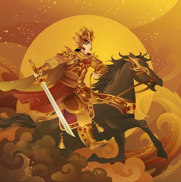
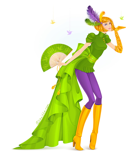
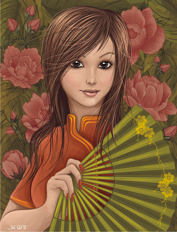
With Fan by Lady Ghost
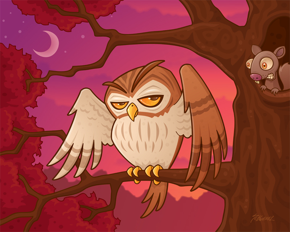
Mister Owley by fizzgig
Conclusion
When producing a piece of art with a season in mind, consider using the dominating colors of the season. Remembering that Winter/Summer use cool blue themes and Spring/Autumn are warm yellow themes.
Of course, you don’t have to stick completely to these colors to create a piece with a seasonal theme, it’s not to say a spring palette can’t have hints of blue or a winter can’t have yellows. Think of Christmas and Santa, although he’s from a snow covered climate, he still wears a bold red, which is a warm color. It’s all about selecting the season influenced colors in the largest areas of the canvas.
If you’d like to find out more about using color combinations and themes in your art, check out Iaroslav Lazunov’s informative article entitled Open the Door into the Science of Color Theory.