Vectortuts+ is all about helping people turbo charge their skills, and today we’re launching a special community post that will help some of our readers take their images to the next level. Inspired by the Friday Photo Critique over on Phototuts+, we have gathered together some of the Vectortuts+ writers to share some helpful advice and get things started. The best thing is, you can be part of it too! Find out more at the jump.
Peer Review, 1
To launch the very first Vectortuts+ Peer Review we have asked some of the Vectortuts+ writers to share some of their advice and tips, if you would like to join in you can do so in the comments section, just a few tips before we begin…
How to Participate:
- Each contributor has offered a piece of work that they would like help with, please keep this in mind when you share your thoughts. The images are not perfect, but they can be with the right advice and some friendly encouragement. (Vectortuts+ reserves the right to delete any rude comments)
- If you’re better with pictures (let’s face it, most of us are) feel free to take a screenshot of the image using Little Snapper, Skitch or a similar program and paste a link to the annotated image in the comments section with an explanation of the tweaks.
If you want to take part in the next peer review:
Add your work to our facebook photo gallery with a description about the piece and the help/advice you’re looking for. A selection will be published on our site as part of the next Community Review.
Let’s get started!
The Reviewers:
Andrei Marius: Vectortuts+ Writer and Editor of VforVectors
Kai Loon Chan: Reviewer at GraphicRiver and Web Designer
Kate (LoungeKat) McInnes: Associate Editor of Vectortuts+, Reviewer at GraphicRiver and Author of Rockstar Icon Designer
Sharon Milne: Vectortuts+ Writer and Freelance Illustrator Chewed Kandi
Sean Kelly: Vectortuts+ Contributor, Freelance Illustrator and Animator.
Image Category: Logo
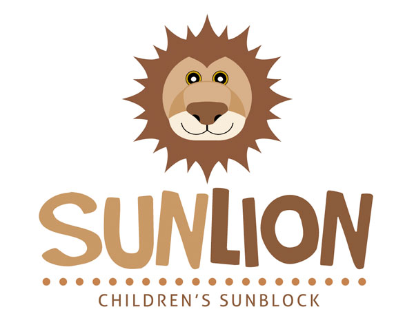
Details:
Designer: Xstortionist
Details: “I used shapes to create the illustrated logo. I wanted to give the lion a fun & friendly look that would appeal to children and toddlers. I used primitive shapes (circles & triangles) and modified them to give me the look I was going for.
I’d like feedback on how I can improve the illustration to better the quality. The eyes really don’t feel like they are a part of the design and I think the colors could be improved as they seem a bit dull. The dots might be a bit larger than they should be as well. I’m also having a hard time converting this so that it can be one color on a black background (inverse variation).
All-in-all, I’d love to get feedback from the professionals on how to better the design and give it a polished look."
Feedback:
Sean Kelly: “The shape of the face is cute as is the big nose, but to really make it appealing the eyes have to be quite a bit larger. I would would also put them a bit further apart and make the white dots in the eyes a bit offset so they look more like light reflections.
The colors are monochromatic, to make the illustration ‘pop’ use a contrasting or highlight color like a bright sunny yellow. To convert the design to a single color you will need to do a couple of things: if there are dark colors neighboring each other add a white line to separate them; in areas such as the nose where 2 shades of a color are neighboring, outline the shape and make both fills the same color.”
Kate (LoungeKat): " I really like the concept, I think that it could be pushed a bit further to really emphasize the name. When I think about the sun, and sunblock, I think of zinc cream (I hope this is a universal name, we use it here in Australia). Adding a line of zinc /sunblock over the nose of the lion would link the logo to the company’s product.
Also, try making the eyes a bit bigger, or even cover them with some sunglasses. As for the mane, it could look nice and link to the company more if the mane was actually a sun shape. If you want to use basic shapes you could use a few squares rotated to make the pointy outline of a sun, at the moment I think that there’s allot of detail going on with the image, and simplifying it down to the basic elements will make it stand out more. If you’re creating this image in Adobe CS4 and above you can also use the Appearance Panel to roughen the edges of the shapes to give it a lumpy hand drawn look that matches the font."
Image Category: Line Drawing
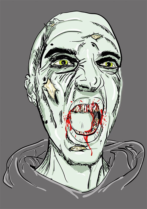
Details:
Designer: Roel Wijker
Details: "I made this with this tut. Create A Grisly Zombie Illustration With A Pen Tablet. I used my Wacom tablet for the first time ever! It was great to work with it. I’m planning on doing some more work with it, but I’m pretty happy about my first attempt. Is there anyone who has some more tips or tuts on how I could use my tablet?"
Feedback:
Andrei Marius: “Use a thicker brush to highlight the overall head shape and the main components of the face (nose, eyes, mouth & ears). Continue with a thinner brush and add the details for the areas mentioned before.
Finally, use the thinner brush to add the jagged effect.”
Sean Kelly: “I love using the Blob Brush with the tablet, I find it really intuitive. Double-click the tool icon and set it to ‘Merge only with selection’, this means that you can manipulate the lines and fills easier to get them looking just right. I set smoothness to between 20 and 60 depending on the style I am going for, and Fidelity to 3 pixels and I set Brush Size to Pressure with Maximum variation. When drawing with the brush I use the [ and ] keys to increase and decrease the brush size quickly.
I jump between the Blob Brush (Shift + B) for drawing, the Eraser (Shift + E) for deleting unwanted parts of lines and the Warp tool (Shift + E) for pushing the lines around. The standard Brush tool is also useful, especially when you are making detailed hatching style shading. You can set the style of the end of the stroke to the perfect pointed look.”
Kai Loon Chan: "I kinda like it, the execution isn’t perfect but the result is scary. The shadow lines are a little bit messy and the zombie looks like it has four eyebrows. The outlines are very inconsistent. My tips are to improve the shadow lines, it helps you to create the depth of the composition while also creating the motions."
Sharon Milne: "Moving from using a mouse to a tablet can take a lot of getting used to and considering this is your first attempt I think you’ve done a great job. You’ve shown you can take advantage of the pressure settings of the Blob Brush Tool to detail the various areas and shading. You’ve followed the tutorial well and hit the achievement for creating pressured lines with the tools provided.
My advice with this piece specifically would be to look at increasing the pressure around the outside of the face/eyes/lips/nose to make these areas stand out more and using softer/lighter strokes for the hatching/shading. With using similar thickness strokes throughout the portrait you’re not defining the areas, so on first glance your eyes see the whole piece, rather than focusing on the key areas.
Tutorial wise on taking advantage of your stylus, try this tutorial by Cheryl Graham "Create a Painterly Landscape with the Blob Brush Tool " – some areas require lighter strokes, some heavier strokes and it will help you get more of a grasp on control of your stylus with a pressure sensitive tool – not to mention it has a great end result. I’ve used a graphics tablet for years now and I’ve found it great for rendering many lines… for example why not try out this quick tutorial on drawing a dog: Create an Adorable Puppy with Negative Space and the Paintbrush Tool – you will see the benefits of how quick you can create the fur strokes and it helps you play with drawing strokes in different directions.
I hope this helps you out. I really do think you’ve started off really well so the only way is up! Enjoy vectoring with a graphics tablet!"
Image Category: Pet Portrait
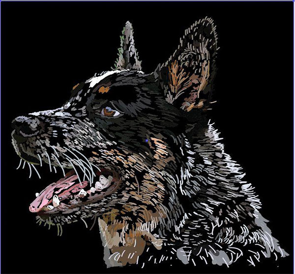
Details:
Designer: Donni Didit
Details: "OK, I did this for a course I am doing in graphic design and my teacher commented that lots of line work can cause problems with printing but failed to say why. I really love doing lots of detail, so for the chance of a critique, would love to know how to produce detail without problems! I mostly used the brush tool in this piece. ![]() "
"
Feedback:
Andrei Marius: "It looks unfinished, but overall it’s a good start. Keep adding more brushes. I think that you can get a pretty nice illustration. All you need is patience. From time to time try a different background color. It might help you to spot the areas that need darker/lighter colors."
Sean Kelly: “I think the print problems that your teacher is referring to is the fact that the background of the image is solid black and the lighter color areas are quite small. This will mean that the ink will bleed into the details and the print will not turn out as you would expect. To make sure that all the colors are set to 100% opacity simply select the whole image, open the Transparency Panel – if there are multiple Opacity values the Percentage number will be blank, click where the value should be and type 100.”
Sharon Milne: "I’m loving the scratchboard effect of this dog portrait – I think he’s a German Shepard or at least has some blood in there! What is great about this vector is you’ve skillfully rendered the fur in the direction it should be, this is often an error you see in those who try out rendering fur.
However, what would benefit well in this piece is that you try experimenting with the length of the strokes of fur. Around the mouth and edges of the ears and eyes, the fur is much finer and shorter. This should be represented in the strokes.
I’d also keep the consistency of the strokes throughout. So the much larger strokes and shapes towards the bottom of the neck, I’d change to strokes of fur. With the tongue, I’d be tempted to go a more dot/pointism effect as it would represent the texture of the tongue.
If you’re going for a scratchboard effect, the blob brush tool would be great if you had it on pressure with a graphics tablet, as it would represent the scratches better. Although you could also use Width Profiles in the Stroke panel in AI CS5.
All in all, I think this is a great start into doing pet portraits and a good style. With a little fine tuning this will be fantastic!"
Image Category: Illustration
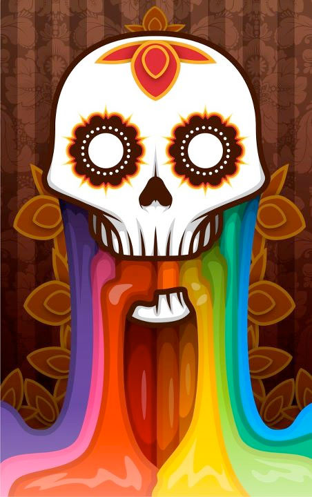
Details:
Designer: Phillip Meagher
Details: "Hmm, this is a vector thing I drew up for Halloween! It’s kind of inspired by the Mexican day of the dead makeup and stuff along that line! I don’t even know what feedback/help I need because I’m really just starting out in vector stuff but i figured I’d put this up and see what comes out of it ![]() "
"
Feedback:
Sean Kelly: “This is looking good, the only suggestions I would make is to use some subtle gradient fills or textures in the skull to make it match the rainbow goo. Also the shading at the top of the goo is a bit messy compared with the rest of the piece, try just using one shade or even use a blur effect on the shading shapes so they are not harsh.”
Sharon Milne: "When I was first sent this, I honestly struggled to think of anything straight away on how to improve this vector illustration so any critique would be very nitpicky! I love how the skull is rendered, uniform lines and it’s decorations are very geometric.
If I was to pick fault in it, I’d be tempted to carry the same style which is created in the skull (being that of sleek lines and curves) into the rest of the composition. For example the rainbow coming from the skull, although it is rendered well, the curves are not of the same quality. As the skull appears to be mirrored, I’d be tempted to create the rainbow from modified shapes and then mirroring these, of course modifying them around the mouth to fit the composition.
I think the background is a bit too detailed considering the shading and shapes of the skull and rainbow. The stripes alone may be the best option rather than the intricate pattern which is overlaid on top. Also to maintain the same style, I’d remove the drop shadows from the orange/red teardrop shapes as drop shadows aren’t used elsewhere. Maybe apply to these tear drops the same appearance of the eyes – the 2 outlines of the shapes.
Again, these points are just nitpicking and some fine tuning to consider. The skull itself is fantastic and it would be great seeing more in this style."
Kate (LoungeKat): " I really like this image too. I think you could make the colors pop by using the HSB sliders to create pure shades for the highlights. I’m looking at this and the highlights look like they have a bit of white in them. Using the HSB sliders you can alter pure shades (Hue, Saturation and Brightness) without having to add black or white to them. You can find this slider in the pop out menu in the color palette.
Another issue that you should watch out for is to always draw more than you need. This image looks fairly tightly cropped, just be sure that you draw outside of the canvas so the image can be used for printing and other formats. Great work!"
Over to You
What are your thoughts on the work above? Critiquing work helps the artist see new possibilities, and it also helps you learn to evaluate art, which will help you take that same analysis and apply it to your own work. Participate in the comments below with your opinions on how to improve the work above.