In this tutorial you will learn how to quickly create a series of recycled paper textures. You can use these to apply the effect of old paper over illustrations. The goal of this tutorial is to show you some shortcuts for aligning objects on the Artboard by using the Align Panel to your advantage. With this basic knowledge it will become very easy to create many patterns with many different looks in just minutes.
Step 1
Create a new Document, preferably in square format. Since we are working in vector the size does not really matter. I am going for 400 × 400 pixel at 72 dpi.
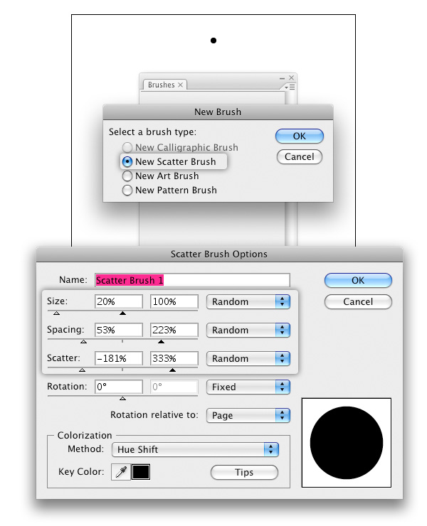
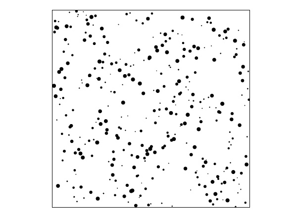
What we need to start out with are a lot of circles in different sizes. We could take the ellipse tool and place them manually on the Canvas, but this takes lots of time and there is a quicker way to do this. A Scatter Brush can make this quick and easy. Since we don’t need precision, we’re just going to create a simple Scatter Brush and draw some random lines with it.
Create a circle filled with black. Drag it into the Brush Panel and choose "Scatter Brush" from the window. Choose some random settings, important to get a variety of sizes is to set the Size setting to random. The exact numbers for both Spacing and Scatter do not matter, just drag the numbers around.
Step 2
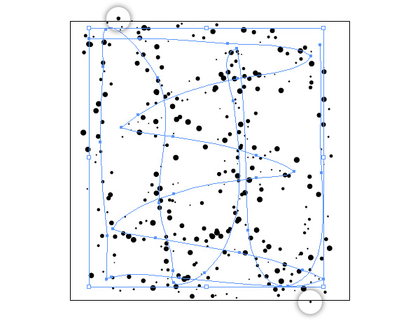
Take the Brush Tool and draw some lines randomly across the Canvas.
As you can see we now have many small circles in different sizes. Go to Object > Expand Appearance. The Brushstroke will now be broken up into shapes.
They are grouped right now, but we need them separated. Go to Object > Ungroup. Every shape is still in its own group, so go to Object > Ungroup again. You can still see the original Brush Stroke in the selection, delete it.
You can see some shapes are outside of the Canvas, in the next step will take care of this.
Step 3
We want our pattern to be exactly 400 × 400 px big. We could move the shapes that are outside the Canvas manually into the canvas, but depending on your Brush settings there may be way too many shapes outside to do it that way.
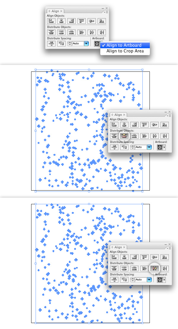
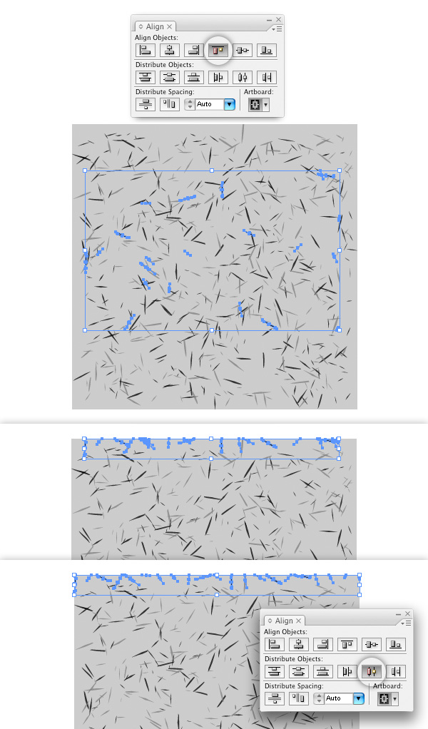
Open the Align Panel. On the Artboard setting, choose Align to Artboard. Select all your shapes.
We want them nicely spread on our Canvas. To achieve this, use the Align Panel and its Distribute Objects functionality. Apply Vertical Distribute Center and then Horizontal Distribute Center. Your shapes will now all be contained inside the Canvas and be exactly 400 × 400 px big.
Step 4
So far it looks more like Dalmatian fur, than recycled paper. In recycled paper you often find bits of different colored papers in uneven shapes. To achieve this look, we will apply an Effect on our shapes.
Step 5
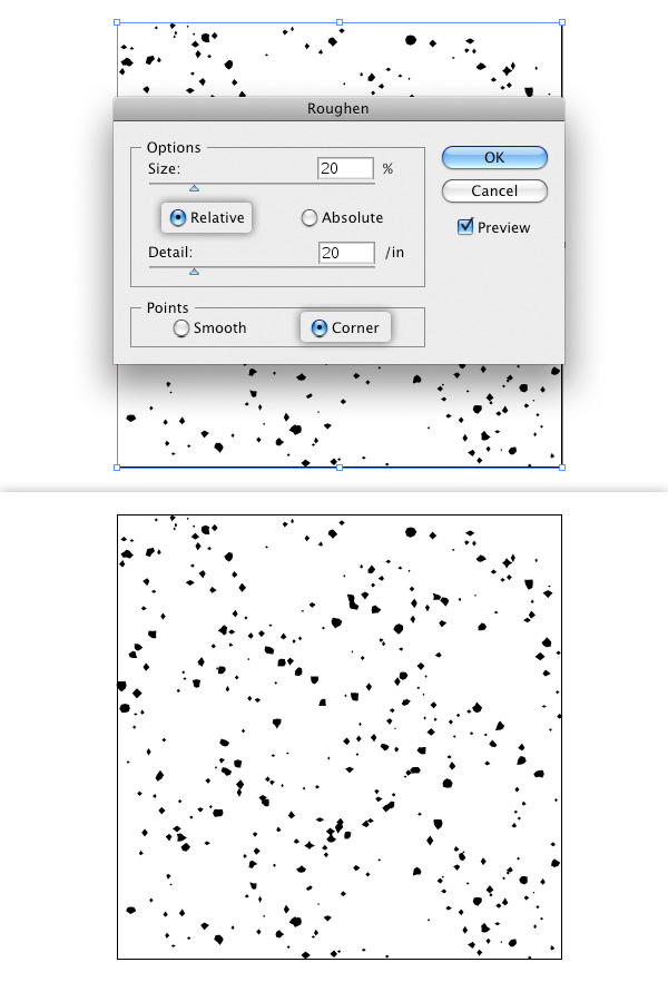
Select all shapes and go to Effect > Distort & Transform > Roughen and use the settings as shown in the screenshot. Go to Object > Expand Appearance when you are satisfied with how the shapes look after applying the effect.
Step 6
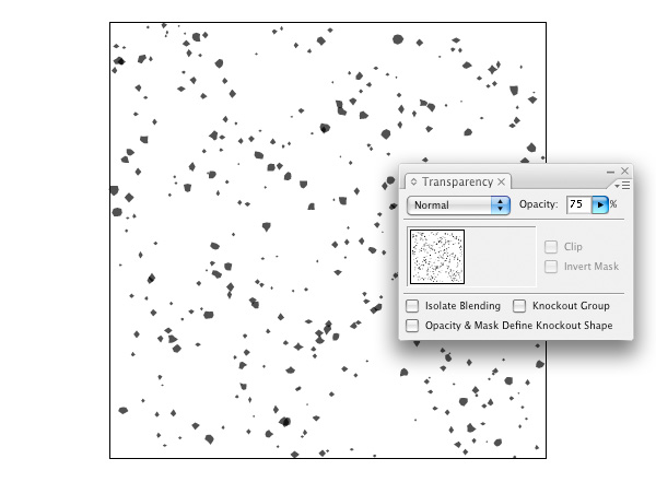
In order to get a less uniform appearance we want to reduce the shapes opacity. Group all the objects, this group will be the base for the following steps.
Step 7
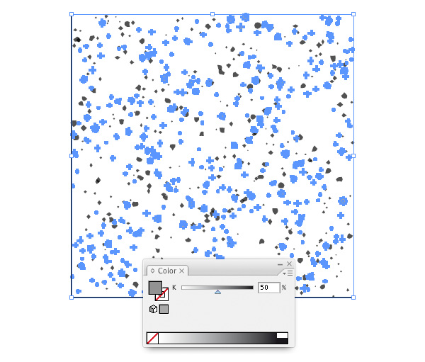
Duplicate the group and rotate it 180°. Change the color of this group to 50% Black.
Step 8
Create a rectangle in the Canvas size and place it behind the two groups of shapes. Set its color to 25% Black. Now you have our basic pattern. I want to keep it simple and use only 3 colors for the patterns, the background and 2 different colored bits of paper.
Ungroup everything and distribute the elements along the Artboard again, as you did in Step 3. This step will be repeated a few more times later on, so keep it in mind. If there are some blank areas in your pattern, move shapes manually to fill up those gaps.
Select everything and drag into the Swatches Panel. And we are done with the first texture pattern.
Step 9
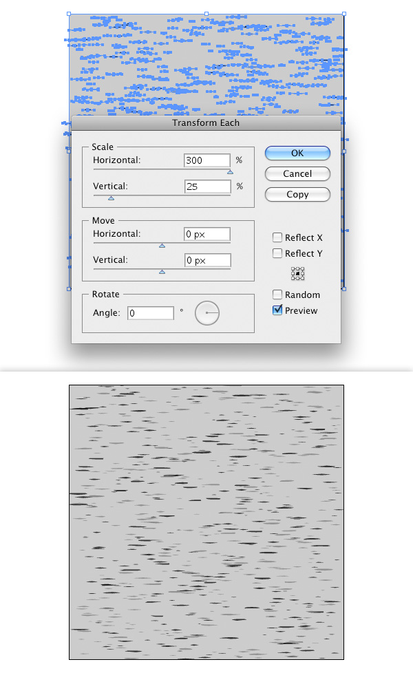
Now we are going to create our second pattern. This should have shapes in a longer form, pretty much like grains of rice. Select everything but the background square and go to Object > Transform > Transform Each.
These bits of paper are supposed to be wide and thin. By changing the horizontal and vertical Scale non-uniform, we can easily create this sort of texture. As you can see, some shapes exceed the Artboard again, so we repeat the Vertical and Horizontal Distribution step again. Select everything and drag into the Swatches Panel.Your second pattern is done.
Step 10
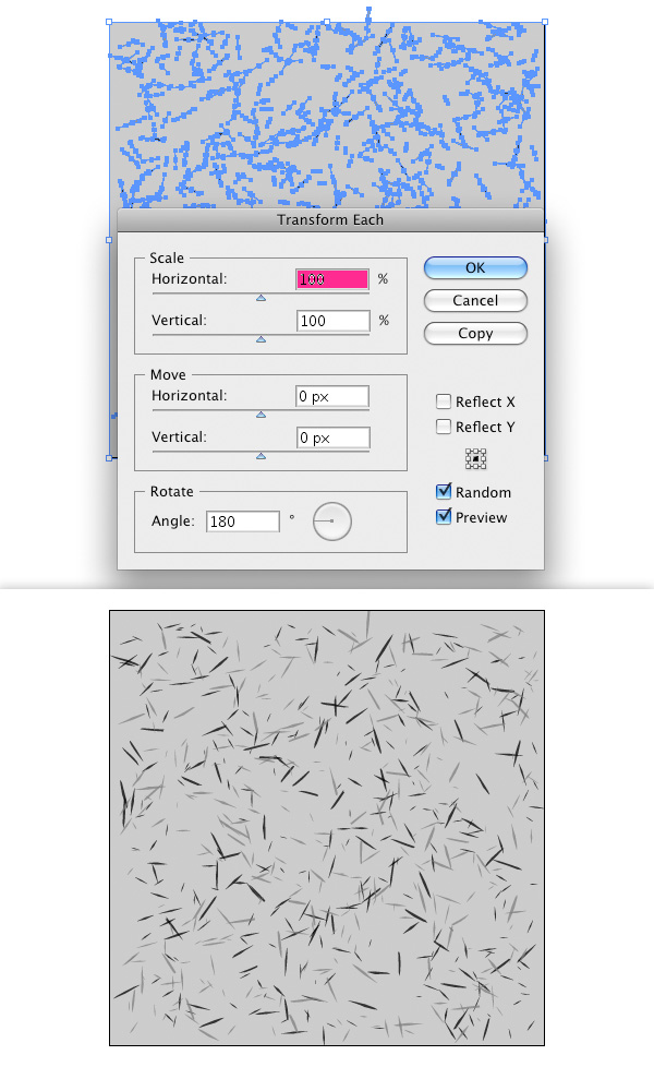
Let’s create a third pattern. This one should be more vivid, but based on our second pattern.
Select all the shapes, without the background, again and go to Object > Transform > Transform Each again. This time we will rotate the shapes to have a messier pattern. It is important to set the Rotation to 180° and to check the Random setting. By doing so each element will be rotated between 0° and 180°.
Repeat Step 3 again to distribute the shapes inside the Artboard again. Drag everything into the Swatches Panel to save the pattern.
Step 11
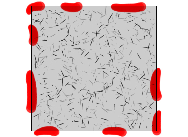
If you take a closer look at the last pattern we just created, you will notice some gaps at the edges of the Canvas. They will become more visible if we apply the pattern to a bigger shape, so we will have to fix this.
We could do so by dragging shapes around manually. Depending on how your pattern looks, this may take a while.
But we can also use the Align Panel again, to make our lives easier.
Your Align Panel should still be set to Align to Artboard. Select some random shapes, about 10 or more. On the Align Panel, click Vertical Align Top so the shapes all have the same vertical position. To have them spread even more evenly you can additionally align them along the whole width of the Artboard. This way we will also have shapes in the corners of our pattern.
Repeat this step for all 4 sides, with the respective aligning method for each side.
Step 12
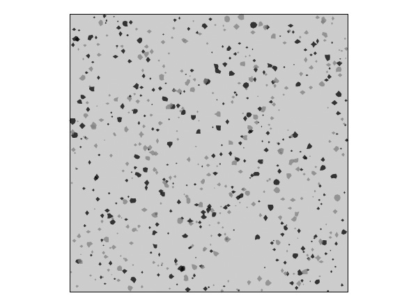
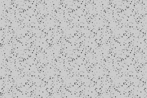
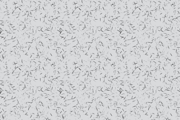
Below are the three patterns we created.
The first basic pattern, with circles that were roughened up.
The second pattern, with long and thin paper bits.

The third pattern, with randomly rotated paper bits.
Conclusion
You can create a series of more textures by applying more effects to the shapes, adding more shapes in another color, apply an effect to only some of the shapes, mixing 2 patterns etc.
Of course you can also apply "real" colors to the shapes. I stayed with grey tones, to demonstrate the effect. But you could pick a light yellow tone for the background and some pink or blue color to the paper bits. There is no limit to your imagination. My best advice is to play around as much as you can and stay with whatever looks best to you.
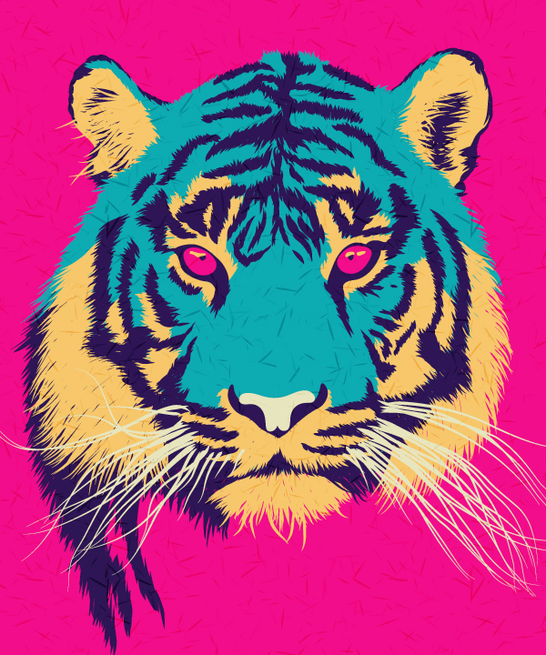
However, now that you know how to create a recycled paper texture, you can use these patterns to enhance vector illustrations and give them a retro look. I will demonstrate this with one of my illustrations. I created a new shape above my illustration, filled it with my pattern and set its Blend Mode to Soft Light and its Opacity to 50%.