In today’s beginner tutorial, I’m going to show you how to create a vector Polaroid, with minimal use of the Pen Tool. I’ll then show you how you can use it in combination with another illustration to frame it.
Introduction
When my partner and I first got together, he was trying to impress me by wanting to learn how to create vector art. The first thing I taught him was to create a vector Polaroid. The reason being is that it didn’t require much use of the Pen Tool, which can be daunting when you first try it. Also, it introduced him to some pretty awesome tools and effects. Needless to say, he did impress me and we’re getting married next year.
So let’s get started with the tutorial and learning how to create your own retro vector Polaroid!
Step 1
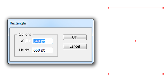
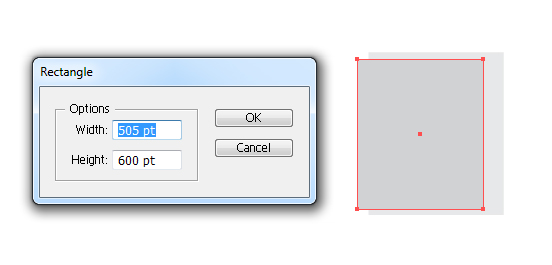
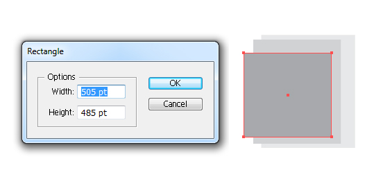
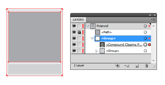
I’m going to start creating the vintage Polaroid using some base shapes made from rectangles with the Rectangle Tool (M). As it has specific ratios, I’m going to click once on the canvas and enter in the values for the three rectangles I wish to create. For now, the colors of these shapes aren’t relevant, as we’ll be changing them later on.
The first which is the larger of the trio will be 540pt by 650pt.
The second will allow a slight border around the frame and will be 505pt by 600pt.
And the smallest will be 505pt by 485pt.
Step 2
As you may have noticed, our rectangles aren’t in the correct positions for an instant film photograph, so I’m going to use the Align panel (Windows > Align or Shift + F7) to help position them.
First Select All (Command + A) of the rectangles and use the option Horizontal Align Center.
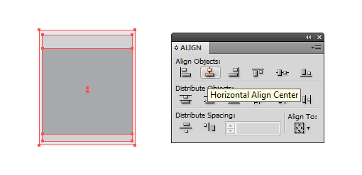
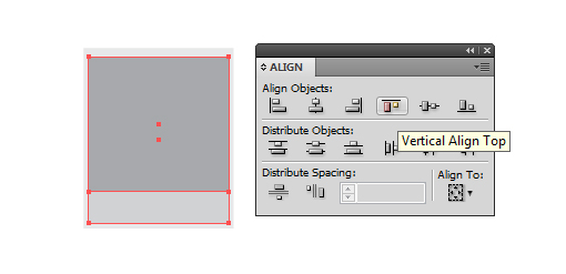
I’ve deselected the largest rectangle and with the two smaller, used the option Vertical Align Top. While still selected, I used the arrow keys on my keyboard to nudge upwards both rectangles in the below position. If you’ve moved them off center, you can always Select All (Command + A) and use Horizontal Align Center to center them again.
Step 3
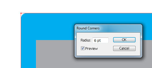
I’m going to slightly round the corners of the largest rectangle. So select the shape and go to Effects > Stylize > Round Corners and enter the value 6pt and click on OK.
This is a Live Effect, which means you can go back into the Appearance panel to modify this value at any time. You can tell it is a Live Effect by looking at the shape below. Although the blue shape does in fact have a curved corner, the points around the shape are still that of a rectangle.
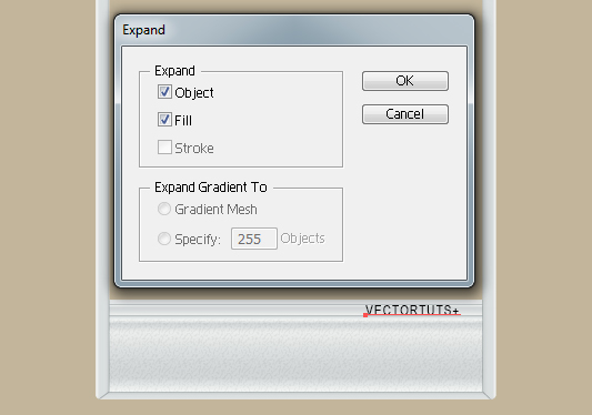
I’m going to remove the Live Effect, but maintain the Round Corners shape by keeping the shape selected and going to Object > Expand Appearance. You’ll know the Live Effect has been expanded as the shape now has two points at the corner instead of just the one.

Step 4
If you look at the back of a Polaroid, you’ll notice there are folds and a development paste pouch around the edges and along the bottom respectively. I’m going to use the Line Segment Tool (\) to section off the folds and pouch. To make the lines easier to match up with the shapes already drawn and points from our rectangles, I’m going to enable Smart Guides (Command + U).
If you haven’t used Smart Guides before, after enabling them if you slowly hover your cursor around the shapes you’ll notice it snaps to points and paths. This feature is great when you’re wanting to draw accurate lines, as you will be today.
I’m going to start drawing a line from a corner and overlapping a point, while holding onto the line until I get the Smart Guide highlighting the edge of the medium sized rectangle. I’ll click on this end point with Smart Guides highlight “anchor” so I know the lines will be flush.
Holding Shift will help to create a perfectly straight vertical line. When holding Shift you can create a line which is at a strict 45 degree angle in any direction. I’ve used this same method to create the horizontal line along the top of the photo. Again I’ve used the benefits of Smart Guides to ensure my horizontal line is as flush as it’s highlighted “path” where the lines meet.
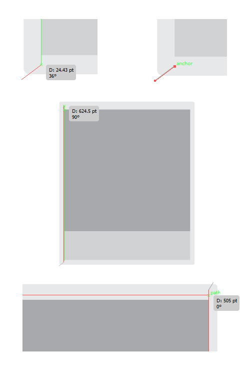
You can use Smart Guides when using the shape tools (as well as many of the other AI tools), as shown below. Here I’ve used the Rectangle Tool (M) and made sure it is flush on either side of the vertical lines.
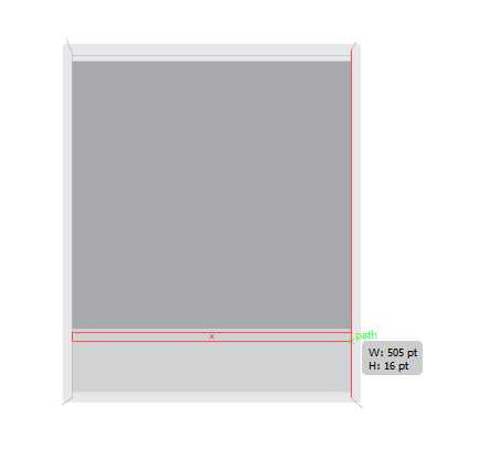
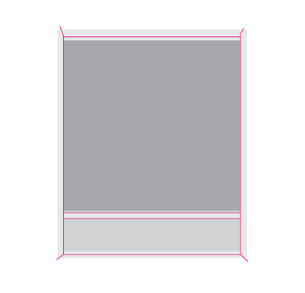
I’ve drawn the below lines to section off our Polaroid. I’ve Grouped all the lines together (Command + G).
Step 5
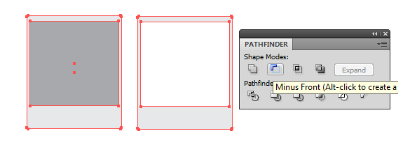
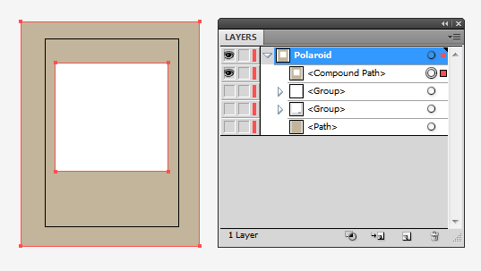
I’m going to Copy (Command + C) and Paste in Front (Command + F) the smallest and the largest rectangles. Then I’m going to use the Pathfinder panel (Shift + Command + F9) to remove the smallest from the largest using the option Minus Front. This should leave you with the overall frame of the Polaroid.
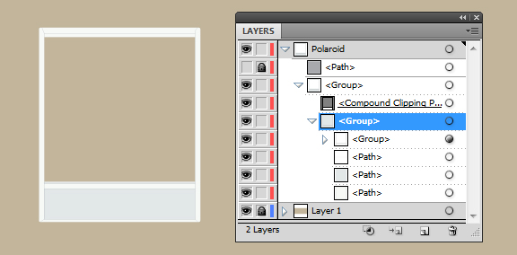
Step 6
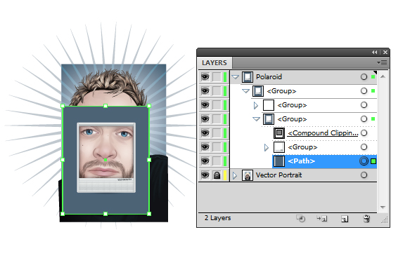
I’m going to create a Clipping Mask with our new shape. So I’m going to Group all of the shapes and lines, apart from the smallest rectangle. Do so by selecting the shapes and lines you wish to be Group, and then pressing Command + G. In my below example, I’ve hidden the new shape we created in Step 5 and locked the smallest rectangle, as I’m not wanting to modify it at this stage.
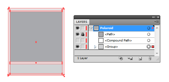
Unhide the new shape (if you did so), and select it as well as the Group. Now go to Object > Clipping Mask > Make (Command + 7). It will combined the elements into a new group. If you drill down into this group, you’ll be able to see the components. A Clipping Mask will only make visible whatever is contained within the shape of the Clipping Path.
Step 7
Staying drilled down into the Clipping Mask group, I’m going to select each one of the individual components (apart from the Clipping Path) to alter their fill/stroke color with the following:
- Large Rectangle Fill Color: C=3, M=1, Y=3, K=0
- Stroke Color: C=0, M=0, Y=0, K=20
- Medium Rectangle Fill Color: C=10, M=6, Y=7, K=0
- Sectioning lines Stroke Color: C=10, M=6, Y=7, K=20
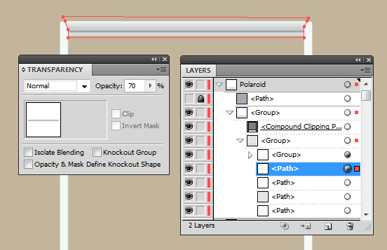
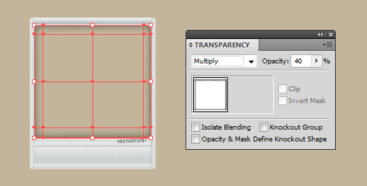
I’ve also amended the Transparency settings via the Transparency panel (Shift + Command + F10). The medium rectangle is set to Opacity 90%. The group of sectioning lines has been set to Blending Mode Multiply and Opacity 100%.
If you apply these settings to the Group, rather than the individual lines, it displays the effect of the Blending Mode/Opacity as if all of the components of the Group are one complete object. If I was to do it individually, you’d notice areas where the lines overlap (for instance where the rectangle is in the lower portion of the Polaroid) would be much darker than the rest.
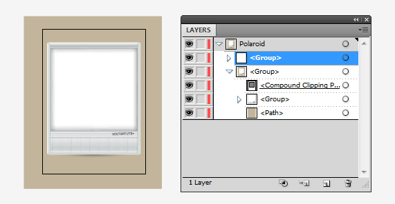
Step 8
Just as you’re able to modify objects within a Clipping Mask, you can also add and remove objects should you need to. I’m going to add shapes onto the frame of the Polaroid. Using the Pen Tool (P) and our friend Smart Guides, I’m going to draw the top flap of the frame, using our sectioning lines as a guide for the angles of the sides of the flap.
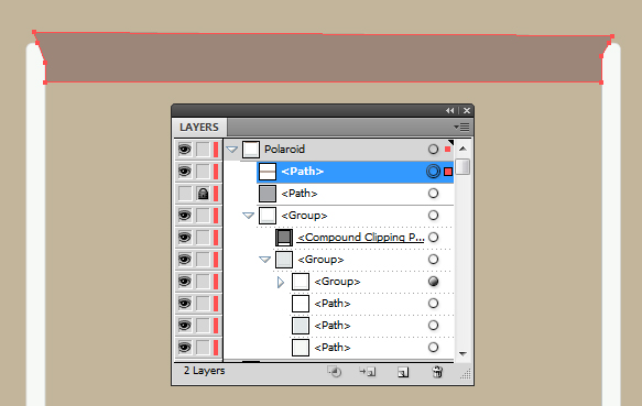
All you will need to do once the shape is complete is select it and then drag and drop it into the Clipping Mask. As you can see below, the new shape now benefits from the Clipping Path’s boundaries by hiding the overlapping areas.
Step 9
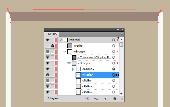
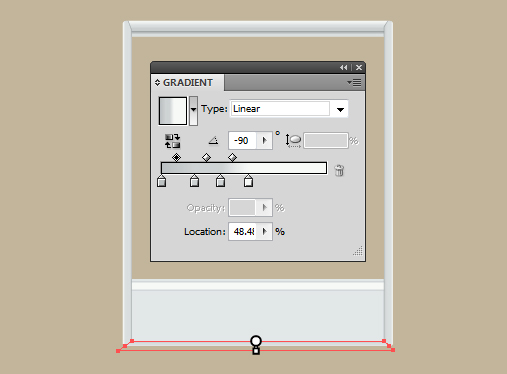
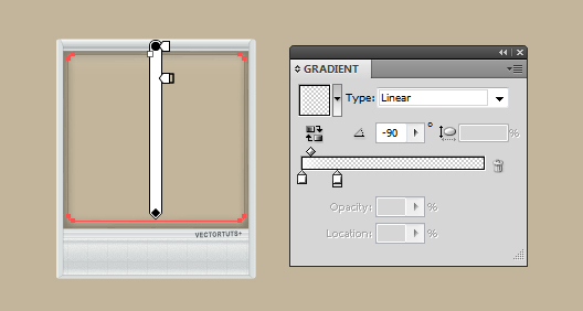
I’m going to use a Linear Gradient to create the appearance of a flap. What I tend to do is fill my shape with a default gradient and then drag and drop colors from my Swatch onto the Gradient Sliders. I then move the Gradient Sliders to alter the appearance of the gradient. To change a vertical linear gradient to a horizontal gradient, change the value of the Angle to 90 degrees.
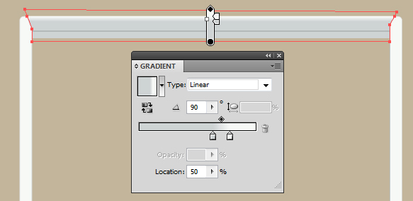
I’ve then dragged and dropped further colors into the Gradient panel and used the Gradient Tool (G) to modify the positions of the colors, respective to the sectioning line.
I’ve used the following shades from Left to Right:
- C=10, M=6, Y=7, K=10
- C=10, M=6, Y=7, K=45
- C=10, M=6, Y=7, K=20
- C=10, M=6, Y=7, K=10
- C=3, M=1, Y=3, K=0
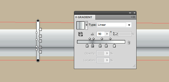
I then reduced the Opacity to 70%.
Step 10
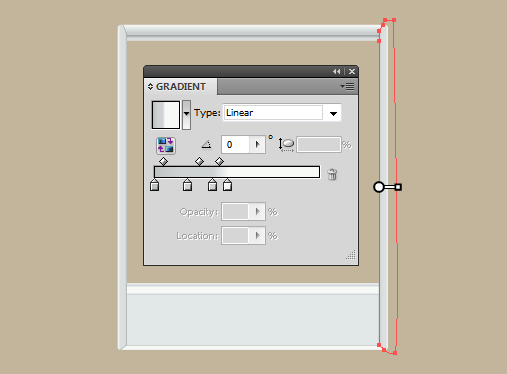
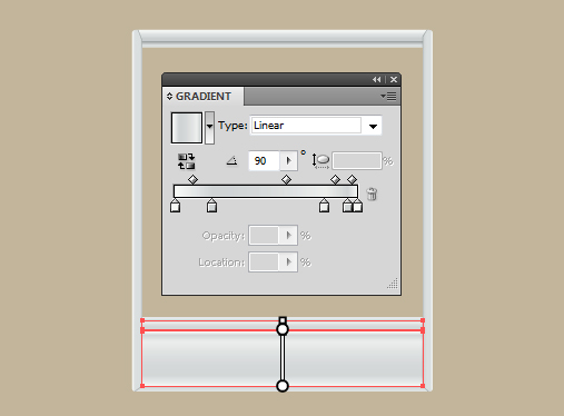
I’ve used the same gradient for the other shapes of the frame and pouch, however I removed some of the colors and reorganized them. To remove a color from the gradient, select the Gradient Slider and use the Bin at the right. All the new shapes need to be set to Opacity 70%.
Step 11
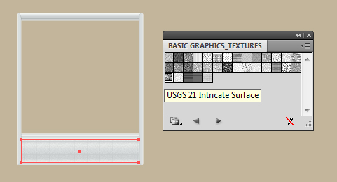
Copy (Command + C) and Paste in Front (Command + F) the pouch/rectangle. I’m going to add a subtle texture to it by using a default pattern, which is already within Adobe Illustrator’s library. In the Swatch panel go into the drop down menu in the top right of the panel and select Open Swatch Library > Patterns > Basic Graphics > Basic Graphics_Textures. From this select the pattern “USGS 21 Intricate Surface” and it will automatically be added to your Swatch.
Fill the duplicated rectangle and change the Blending Mode to Multiply and Opacity to 5%.
Step 12
Our frame is more or less done, yet there is one more thing you can add to the frame to give it your own unique twist. On the back of a Polaroid you can often find the brand name or even the batch number of the film. So why not add your name, your illustrations title, or even a date in the same style?
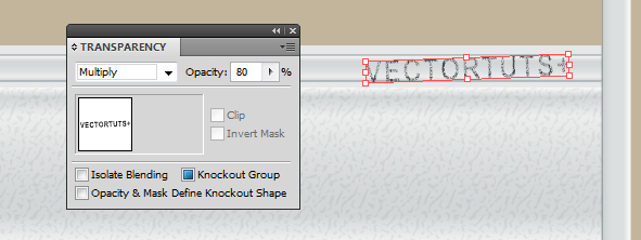
I’ve used the Type Tool (T) above the pouch with the below settings. I’ve opted to write “VECTORTUTS+” here for obvious reasons.
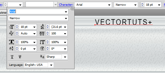
Step 13
When using the Type Tool (T) in Adobe Illustrator, it can only display typefaces you already have on your computer… which may sound obvious. This means that if you were to pass the file to a friend and for some bizarre reason they didn’t have the “Arial” typeface the text wouldn’t display properly. So it is worth Object > Expanding the typeface to shapes. In this tutorial I’ll be expanding the typeface, but if you’re going to be using this frame over and over again, I’d skip that step.
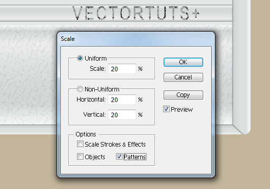
I’m going to change the fill color of our branding to “USGS 21 Intricate Surface” so it looks textured, but the pattern seems too big within the text. To alter the scale of the pattern go to Object > Transform > Scale and make sure that only “Patterns” is ticked. I’ve changed the scale of this pattern to Uniform 20%.
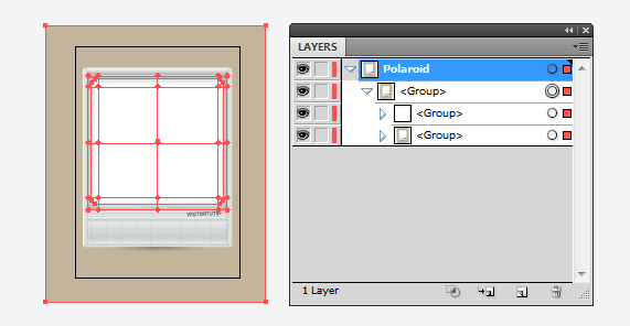
Then I’ve used the Free Transform Tool (E) to rotate the text slightly. These branding stamps are never completely perfect right? When done, Group all the elements together for the frame (Command + G).
Step 14
Now to work on the film which will overlap the illustration underneath. I’m going to duplicate the small square and hide it for now, it will be used at a later step. Change the fill color to an off black shade (C=0, M=0, Y=0, K=95). Using the Mesh Tool (U) with the assistance of Smart Guides, put a point in the direct center and then color it pure white.
Go around the square adding white points to the corners. You won’t be able to add the fourth corner as this will have been created from you adding the three points. You’ll now need to select each point with the Mesh Tool (U) and color them white as shown below.
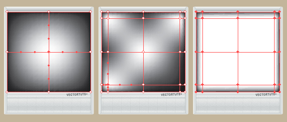
Select the mesh shape in full and then change the Blending Mode to Multiply and Opacity to 40%. You’ll notice that the white center has now vanished, as the Blending Mode is only influencing anything with the presence of color – which white has none (hence all the zeros!). This will give a vignette effect to the photo.
Step 15
Of course, with the photo part of the Polaroid being slightly raised, there may be a shine/gloss to the image. I’m going to draw over the square with a Rounded Rectangle and then use a transparent white linear gradient. You do this by creating a gradient which has the same color on two Gradient Sliders. Select one of the Gradient Sliders and then reduce the Opacity to the value you desire. In this case it would be 0%.
Once done, set the Blending Mode to Screen and the Opacity to 40%, then Group both the mesh and rounded rectangle together (Command + G).
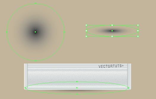
Step 16
I’m going to create a subtle shadow along the bottom of the Polaroid using another transparent gradient… this time it’s a Radial Gradient. In the Gradient panel use the drop down menu to change it to a Radial gradient. Then drag and drop the black into both Gradient Sliders.
Whenever I use a plain radial gradient, I tend to use it with a circle as I find it easier to manipulate the dimensions of a circle with the Free Transform Tool (E) than using the Gradient Tool (G). So this tip might be good for you if you’ve experienced the same issue.
First use the Ellipse Tool (L) with the radial gradient fill and hold Alt + Shift, then drag outward to produce an even circle. You’ll notice the radial gradient will then be exactly in the center and isn’t distorted in shape. Then use the Free Transform Tool (E) to squash it and stretch it in the manner you wish.
I’ve placed it under the group for the frame and set it to Blending Mode Multiply with Opacity 100%. Then I have Grouped it with the frame (Command + G).
Step 17
What we have now should be two groups, one containing the vignette and shine which will be on top of the frame. If you don’t have your artboard visible you can do so by going to View > Show Artboards (Command + Shift + H).
Select both groups and then position them within the frame. You’re going to need to create an overall background to the Polaroid. I’ve done this by using the Rectangle Tool (M). The color is irrelevant as you can alter this depending on the color of your illustration to compliment or contrast with it.
Duplicate this new Rectangle, which you’ve used for the background, and then unhide the small square you duplicated in step 14. Drag it out of the Group and on top of the duplicated background. Using Pathfinder > Minus Front, remove the small square from the background rectangle.
Step 18
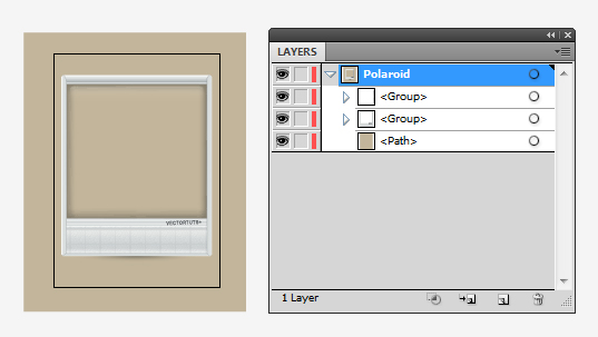
Group the original background rectangle with the Polaroid frame (Command + G) so you are now left with two groups. Then cut out the background rectangle by creating a Clipping Mask (Command + 7) with the Polaroid frame group.
Now Select All (Command + A) and Group up everything (Command + G) to make it easier to duplicate onto another illustration project.
Step 19
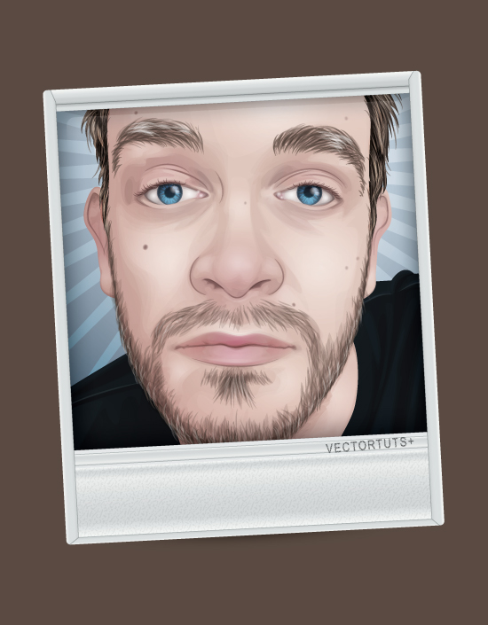
Open up the illustration of your choice, in this case I’m using a portrait of my other half. You can find the tutorial of how to create this male portrait here on Vectortuts+.
Create a New Layer, then Copy (Command + C) the Polaroid group, and Paste (Command + V) onto your illustration.
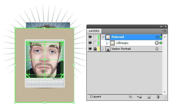
From here you can use the Free Transform Tool (E) to resize your Polaroid group (hold down on Alt + Shift to do it evenly to avoid distortion in ratio) or even drill down into the group to change the color of the background. I’ve opted to change the background color for my Polaroid to a shade of brown to bring out the blue tones in the image.
Step 20
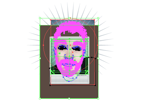
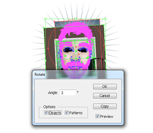
To give it a less uniform look, I’m going to slightly rotate the portrait and the Polaroid. So Unlock All (Alt + Command + 2) and then Select All (Command + A).
Now go to Object > Transform > Rotate and set the value you wish the illustration and Polaroid to be rotated by. Remember to tick both Objects and Patterns, then click on OK.
Step 21
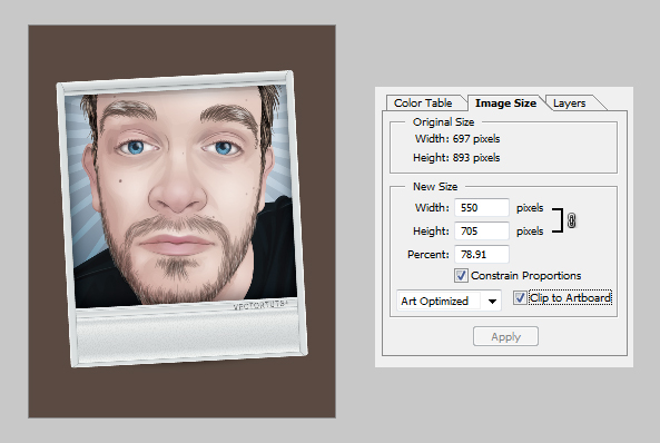
Finally, use the Artboard Tool (Shift + O) to position the boundaries of the artboard or alter the dimensions. The Artboard Tool (Shift + O) is specifically useful when you’re using the Save for Web and Devices option. Think of it as a cropping tool and you’re defining which area of your illustration you want cropped and saved.
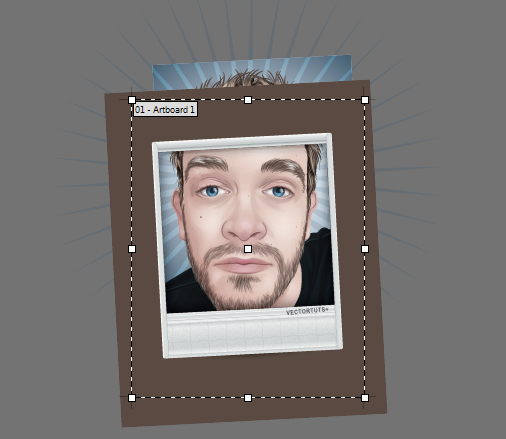
Then when saving go to File > Save for Web & Devices. In the Image Size options to the right, there is a tick box “Clip to Artboard”, make sure this is ticked. A preview of your cropped illustration will appear to the left once you “Apply”. Then save as usual.
Conclusion
Of course the keen eyed people will notice that I have in fact put an illustration on the back of a Polaroid instead of the front. It’s simply to give added detail and to introduce those starting with Adobe Illustrator some new techniques!
You can always remove the detailing around the Polaroid and leave it as a plain rectangle, with the overlapping mesh/shine square and subtle shadow to go for a more realistic approach.
Hope you’ve found today’s tutorial interesting and picked up some new techniques and tools to use in future projects.
What other creative ways do you think you could frame and present an illustration?