Follow this tutorial and learn how to create a 3D newspaper text effect using the Extrude & Bevel effect and the Map Art option. We will create all the pieces of newspaper with the help of the Area Type Tool and save them as symbols. We’ll then give this effect a discreet old look by using the Note Paper effect. We will also work with graphic styles to speed up the workflow, so let’s begin!
Final Image Preview
You can find the source files in the directory labeled ‘source’ that came in the files that you downloaded. You may wish to look through them briefly before we begin. A preview of the final image is below.

Step 1
First, open a new web document. Take the Type Tool (T) and type “NEWS” using the font Gill Sans Ultra Bold, with the size of 150 pt.

Step 2
With the text selected, go to the Object menu and choose Expand, then Ungroup to obtain the four letters. Fill them with light gray or any other color.

Step 3
Now let’s make them 3D. Select the letter “N”, go to the Effect menu > 3D and apply the Extrude & Bevel effect. Set the values as shown below.

Step 4
You can apply the same settings to the other letters or you can rotate them to create a more attractive look. Just change the values in the Extrude & Bevel Options window as indicated. Now arrange them as shown. The Extrude Depth remains the same for each letter.

Step 5
Let’s start to create the first newspaper article. Take the Type Tool (T) and type “World News” as the title of the newspaper using a font called Penshurst, Bold, size of 15 pt. You can find the font here. Select only the letters “W” and “N,” then change the font to Monotype Corsiva, size of 25 pt.

Step 6
Next, take the Pen Tool (P), or the Line Segment Tool (\), and draw the two lines under the title. Give them a black stroke, then set the Stroke weights as indicated. Between the lines type the date and the newspaper’s website using the Lucida Sans Typewriter font, Bold, size of 5 pt.

Step 7
Now, type a title for the article, in this case “Living Green” using a font called Another Typewriter that you can find here.
Make sure that the Rulers are on (View > Show Rulers or Command + R) and drag the two guides exactly to the ends of the two lines. Now use the Rectangle Tool (M) to draw a rectangle between the guides as the text container, like in the image below.
Take the Area Type Tool, click on the path (not inside) and start typing the article, or paste some text from anywhere. The font I used is called Old Newspaper Types and can be found here.

Step 8
The first article is almost ready. All that is left to do is to open the Paragraph Panel (Window menu > Type > Paragraph) and choose the type of alignment you want. You can also choose to check or uncheck the Hyphenate option.
When you are done, select everything and choose Expand from the Object menu, then drag the article into the Symbols Panel to define the first symbol, which will be used for the front side of the letter “N”.

Step 9
Next, use the Rectangle Tool (M) to draw a rectangle having the dimensions shown as another text container. Take the Area Type Tool, click on the path, and paste any text, then select Expand from the Object menu. Drag this piece of newspaper article into the Symbols Panel to define the second symbol that will be used for the side of the letter “N”.

Step 10
Draw two other rectangles and type some text in them using the Area Type Tool. You can see the dimensions of the rectangles and the type of font that I’ve used next to each one below. When you are done, Expand them and drag them into the Symbols Panel.

Step 11
The next thing to do is to map all these symbols. Select the letter “N” and from the Appearance Panel, open again the Extrude & Bevel Options window, then click on the Map Art button. Here select the Front symbol from the list and apply it on the first surface. You can scale it and move it until you get the desired result.

Step 12
Move on to the next surface, the one on the left, and select the symbol “Side 2″ that you saved earlier. Rotate and scale it so that you obtain a similar result. Continue with the next surface (top left) and apply the symbol “Side 3″.

Step 13
On the top right surface apply the symbol “Side 4″ and you are done with the first letter.

Step 14
Let’s create the symbols that we need for the letter “E”. Take the Rectangle Tool (M) and draw a rectangle having the dimensions shown. Switch to the Area Type Tool, click on the path and type or paste any text inside the container.
When you are done, select Expand from the Object menu and drag it into the Symbols Panel to save it. I named this symbol “E front” and it will be applied on the front surface of the letter “E”.

Step 15
With the letter “E” selected, open the Extrude & Bevel Options window from the Appearance Panel and then the Map Art window. Apply the symbol saved in the previous step on the front surface and adjust it until it looks like below.

Step 16
Next, draw another rectangle with the dimensions shown, then type or paste the text inside it using the Area Type Tool as before. The plus sign indicates that there is too much text in relation to the size of the container. If you hold the Alt key and click the plus sign twice, a second rectangle will appear containing the hidden text (1).
Adjust the size of the second container so that the entire text is visible, then align them horizontally (2). Now select the two containers, expand them and drag them into the Symbols Panel (3). Name this symbol “E Side”.

Step 17
In the Map Art window select the symbol defined in the previous step and apply it on the surface indicated.

Step 18
We need three more symbols for the letter “E”. Draw the rectangles and type the text inside them. In the image below you can see the dimensions of the three rectangles and the font that I’ve used. After you expand them, drag them into the Symbols Panel.

Step 19
In the Map Art window apply the “E Side 2″ symbol on the surface indicated below, then continue with the other two symbols “E Side 3″ and “E Side 4″ as shown. The letter “E” is ready.

Step 20
Next, take the Type Tool (T) and type “Daily News” using Penshurst Bold, size of 12 pt. Also using the Type Tool (T) select only the letters “D” and “N,” then change the font to Monotype Corsiva, with a size of 22 pt. Continue to draw the two lines using the Pen Tool (P), or the Line Segment Tool (\), then type the date and the website between them, as you did before. For them I used the Lucida Sans Typewriter font, Bold, with a size of 4 pt.
Now, type a title for the article, then draw a rectangle as the container for the article having the dimensions shown. Type the text inside using the Area Type Tool and the font indicated. When you are done, select everything, and from the Object menu choose Expand. Name this symbol “W front”.

Step 21
Map this new symbol on the front surface of the letter “W”. I rotated the symbol to create a different look.

Step 22
Follow the next image and create the rest of the symbols that we need for the letter “W”. Notice the dimensions of the text containers, the type of font, and the names of the symbols.

Step 23
I indicated in the image below what symbol corresponds to which surface of the letter, therefore open the Map Art window and apply them as shown. The letter “W” is ready.

Step 24
We are now at the last letter. Take the Type Tool (T) and type the title, in this case “Today’s Weather” using Monotype Corsiva, with a size of 15 pt. Under it draw a line with a 1 pt black Stroke, then draw a 181 x 207 px rectangle. Type the text inside, then select everything, and choose Expand from the Object menu. I named this symbol “S Front”.

Step 25
In the next image you can see the last three symbols that we need. Draw the first two rectangles with the dimensions shown and type the text inside them using the Area Type Tool.
Duplicate the second text container and keep only the last part of the text as indicated. You will see in the next step why we did this. When you are done, expand these symbols, and drag them into the Symbols Panel.

Step 26
With the letter “S” selected, open the Extrude & Bevel Options window, then the Map Art window. First map the symbol “S Front” on the front surface of the letter. If you move on to the next surfaces you will notice that the top wavy area is not made of a single surface but two, as shown below.
If it were just one surface we no longer need the symbol “S Side 4″. When you map the “S Side 3″ and “S Side 4″ symbols try to match them the best you can. Zoom in on the letter and move the symbol “S Side 4″ until the words from the beginning match with the ones from the end of the “S Side 3″ symbol.

Step 27
At this point all the letters are ready. If you are happy with them, go to the Object menu and select Expand Appearance, then Ungroup them all three times.

Step 28
Now focus on the letter “N”. In the Layers Panel notice that it is composed of four main groups, which correspond to the four mapped surfaces. The last two groups are the two gray shapes from the interior that have not been mapped. If you select the group “Side 2″ you will see that there is a hidden part of the symbol. We need to fix this. Select the group containing the text and the clipping path, then click Trim from the Pathfinder Panel.
Do the same thing for the other three groups (Front, Side 3, and Side 4) then for the other three letters.

Step 29
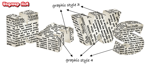
Select the front shape of the letter “N” and replace the gray fill color with the radial gradient shown below. From the Appearance Panel open the fly-out menu and select Add New Fill. Change the gradient to Neutral 6. You can find this gradient in the Swatch Libraries menu under Gradients > Neutrals. Now set the Blending mode to Soft Light, but only for this second fill. This way you will get a discreet old look.

Step 30
With the second fill selected in the Appearance Panel, go to Effect > Sketch and apply the Note Paper effect. After you are done, drag the small thumbnail indicated into the Graphic Styles Panel to save it. Apply this style to the front shapes of the other three letters and this way you will finish faster.
For the letter “S” delete the group containing the text and the clipping path from the area indicated because it should be empty.

Step 31
Select the shape from the left side of the letter “N” and fill it with the radial gradient shown. Now choose again Add New Fill from the fly-out menu in the Appearance Panel. Keep the same gradient, then apply the Note Paper effect using the settings shown. Reduce the Opacity to 50%, but only for this second fill. Drag the thumbnail into the Graphic Styles Panel next to the first one to save it.

Step 32
Apply the graphic style saved in the previous step to the top shapes of the letter “N,” then continue with the rest of the letters, and apply the same style for the shapes shown below.
The top shape of the letter “S” requires a little more attention therefore follow the next step.

Step 33
If you select the top curved shape of the letter “S” you will notice that it is actually a group of many smaller shapes, therefore you can’t apply the graphic style as with the other shapes.
To fix this, select the group (without the text) and first choose Ungroup from the Object menu, then Add to Shape Area from the Pathfinder Panel. As a result of these actions you will obtain a single shape and you can now apply the same graphic style used as the previous step.

Step 34
Let’s continue with the two shapes from the interior of the letter “N”. Select the one from the top, fill it with the first radial gradient shown, then add a second fill as you did before. Keep the same gradient and apply the Note Paper effect using the settings shown in step 31. Reduce the Opacity to 25% for this second fill, then drag the thumbnail into the Graphic Styles Panel to save the third style.
Move on to the shape at the bottom. Repeat the same process, only use the second gradient shown, then save this style also.

Step 35
Apply the two graphic styles saved in the previous step to the other shapes from the interior as indicated, but make sure you ungroup them first.
Step 36
Fill the two remaining shapes of the letter “E” with the color shown, then fill the two shapes of the letter “S” with the radial gradient.

Step 37
The letters are almost ready. The edges of the letters are not sharp because of the Note Paper effect applied, but we can fix this with some clipping masks.
Copy and Paste in front the shape from the front of the letter “N” and delete all the existing appearances. Select the group containing this shape, the text and the original front shape, then from the Object menu choose Ungroup then Clipping Mask > Make.
Do the same thing for all the sides of the letter that have the Note Paper effect applied, then repeat this step for the other three letters.

Step 38
Take the Ellipse Tool (L) and draw a 200 x 10 px flat oval. Now use the Direct Selection Tool (A) to select only the left and the right anchor points, then press the Convert Selected Anchor Points to Corner option. Drag the resulting shape into the Brushes Panel and choose New Art Brush. In the Art Brush Options window check Proportional.

Step 39
Follow the corners and the edges of the letters, then use the Pen Tool (P) to draw the small red paths you see below. Stroke all these paths with the art brush defined in the previous step, then change the weight to 0.25 pt. With all of them selected, go to the Object menu, and choose Expand Appearance. Set the Blending mode to Multiply and lower the Opacity to 30%.

Step 40
Let’s add some shadows. Draw the first two shapes using the Pen Tool (P), fill them with black, then go to Effect > Blur and apply a 5 px Gaussian Blur. Send the shape form the left behind the letter “E”, but in front of the letter “N” and the shape from the right, behind the letter “S,” but in front of the letter “W”.
Next draw the other shapes shown in the second part of the image and send all of them to back. Fill them with black and apply an 8 px Gaussian Blur. Lower the Opacity to 40%.

Final Image
We finished and here is the final image: