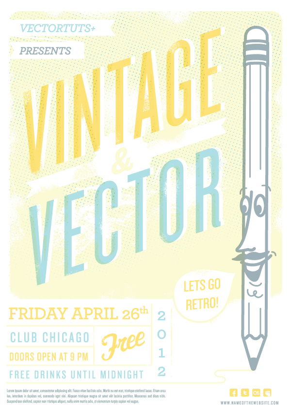
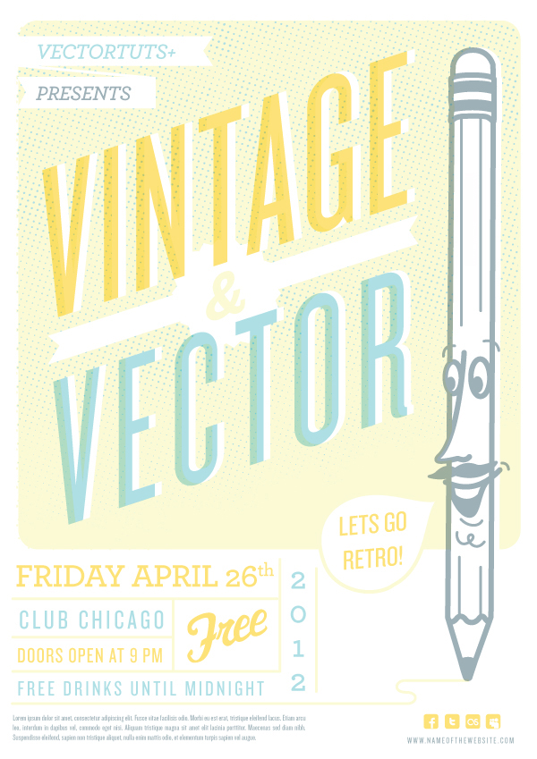
This tutorial will cover the process of creating a vintage inspired retro flyer design. There are four main areas of concentration to achieve this look and feel: color, type, character and texture. We’ll review a complete vintage vector design workflow to create this retro flyer design. Let’s get started.
Flyer Design Templates on Graphic River
The workflow in this tutorial series is excellent preparation for creating this kind of flyer design work for clients. You can also consider putting your graphic talents to work by adding your own uniquely designed flyer template to GraphicRiver. It’s a popular and growing category to contribute to.
Keep in mind, if your client project has a tight deadline or narrow budget, there are many flyer design templates to choose from.
Step 1
Do research and actually get inspired. As simple and basic as it sounds, this is really an important step to have in your design process. Inspiration is key in creating something that actually feels inspired by design of the past, instead of just faking or mimicking the aesthetic.
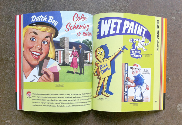
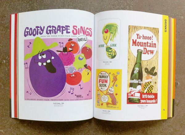
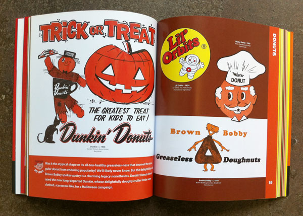
Actually digging through a book is preferred, but in a pinch simply image search things like ‘vintage ads’, ‘retro poster design’ or ‘old handbills’. The images below are from the actual book I looked through for inspiration, Ad Boy: Vintage Advertising with Character.
Step 2
Sketch. Hopefully something grabs you from the research process, get your ideas out and down on paper.
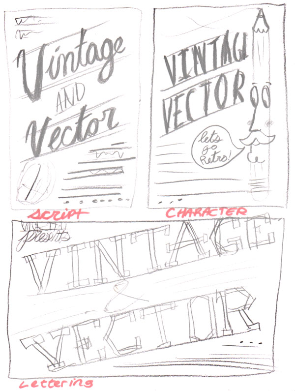
Step 3
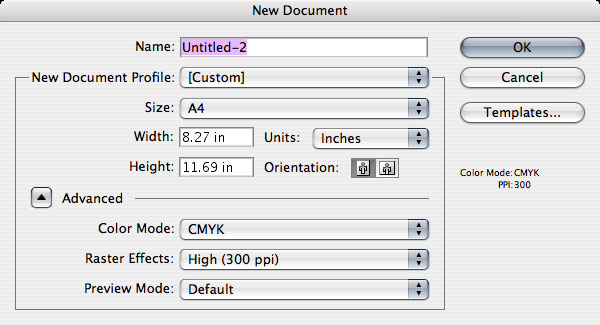
For a flyer you want to stick to something similar to the A4 or letter document size. The reason being is that these are standard sizes and will be easily reproducible on print and copy machines, etc…
Step 4
Pick your Palette. Establishing a color palette from the start helps to create the overall feel of the design. Here is a look at the colors I will be using. Keeping a limited color palette is key to getting the vintage vibe. Limit your design by using only two to three colors max. Here you have yellow and blue, with a lighter and dark variation on each.

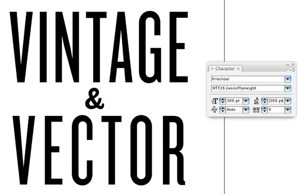
Step 5
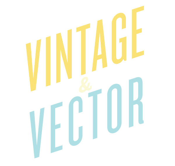
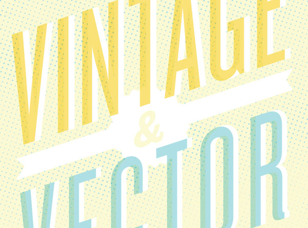
Start with the largest, most important info on the flyer and choose a nice, clean sans serif typeface. Here I am using Knockout in JouniorFlyWeight for ‘VINTAGE’ and ‘VECTOR’ text. The ampersand is set in Knockout WelterWeight. I am also adding some tracking to the word ‘VECTOR’ so that the bottom word aligns nicely on each side with the top word.
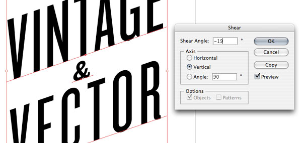
Step 6
Next we will create the angle on the headline type. Command + Click > Transform > Shear and using the dialog box choose and a -19 shear angle with a vertical axis. Having Preview checked helps to get it just right.
Step 7
Apply the previously chosen colors to the headline type, light and dark yellow, and light blue.
Step 8
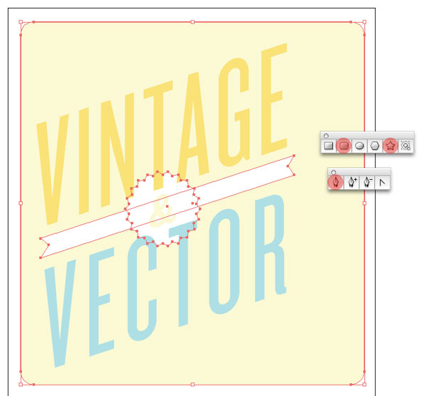
Simply using the Rounded Rectangle tool and Pen Tool, create a background shape and a banner shape (with the same angle as the headline type) to start establishing the overall layout. Also, use the Star Tool to integrate a shape with the banner to hold the ampersand.
Step 9
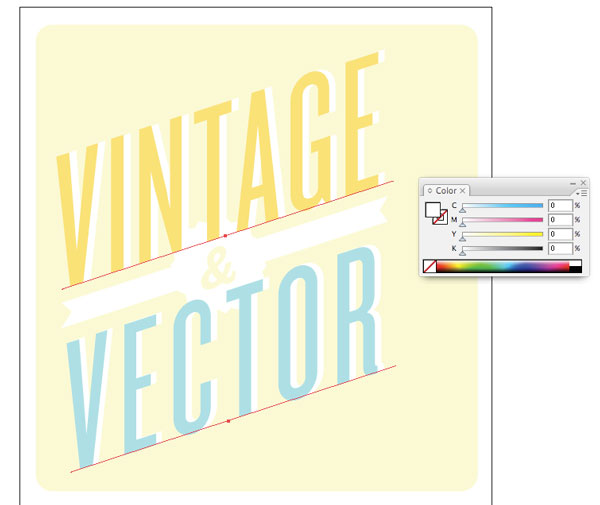
Next we will select both ‘VINTAGE’ and ‘VECTOR’ text, then Copy and Paste in Back. While the text is still selected change the fill color to white.
Step 10
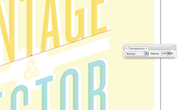
Select the top ‘VINTAGE’ and ‘VECTOR’ type and in the Transparency palette change the mode from Normal to Multiply. This gives the type a ‘screen-print’ vintage effect.
Step 11
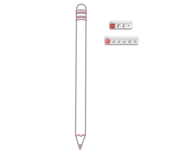
Now, we have a little fun and design an anthropomorphized pencil character, just like they used to do on vintage ads. Reference this previous cartoon character design tutorial for an in-depth tutorial of the character design process.
For our purposes here, I will generalize the process. Start with the general shape/lines of the object using the Pen Tool. Use mostly lines with a nice thick stroke and filled shapes where necessary.
Step 12
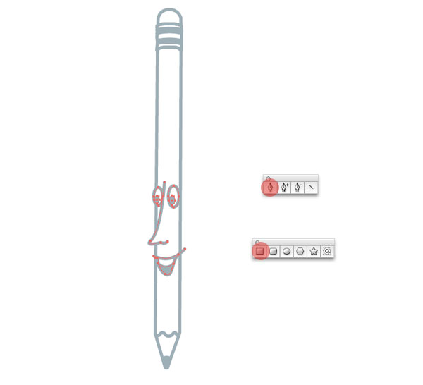
Add the face detail, simplified eyes, smiling mouth and sharp nose using the Pen Tool. Also, I am using the four color, which is dark blue.
Step 13
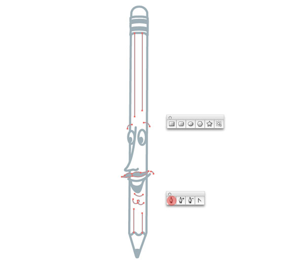
Add details, eyebrows, lip, chin and of course mustache for style.
Step 14
Next, we’ll apply the same ‘screen-print’ retro effect to the pencil character by Copy and Pasting in Back (Command + B) the shape’s basic outline and giving it a white fill.
Step 15
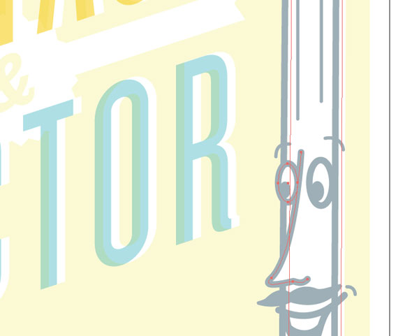
Again, in the Transparency palette, apply Multiply to the dark blue character lines.

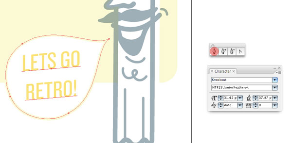
Step 16
Give the pencil character a speech bubble, so the character can sing. Saying something funny and silly like ‘LETS GO RETRO!’ fits the theme of this flyer design, again it’s set in Knockout.
Step 17
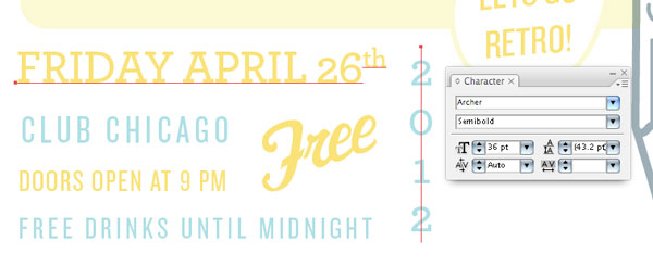
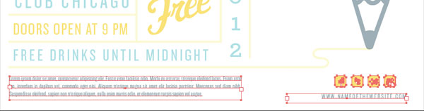
Next, integrate the details (date, location, time, etc..) below the round corner background shape. Using a new typeface, which is Archer Semibold, separate some specific info and again using Knockout for the rest.
Be sure to use a lighter color with this smaller type. Here I am using Knockout JuniorFeatherwt and some nice open tracking to subtlety reference a letterpress lock-up. I also created a custom ‘Free’ script for variety.
Step 18
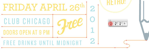
Using the Pen Tool draw simple lines coming from the pencil tip, to create rules between the stacked type.
Step 19
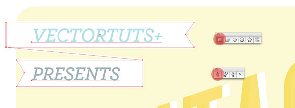
We are getting close, now for the final touches. In the open space in the upper left corner, lets pay respect to the man – the lovely folks over at Vectortuts+ with a nice little banner lock-up. Create it using the Rectangle Tool and Pen Tool and set it in Archer.
Step 20
Down at the bottom of the flyer implement any of the necessary fine print and details, such as legal disclaimer, social media links, website url, etc…
Step 21
Now you could just stop there, it looks pretty nice and definitely has the vintage vibe going. But there are two things I’d do to really take this thing to the next level. Apply a halftone texture to the light yellow background shape in light blue. For simplicity sake, I have included the halftone texture in the source files. It gives it a nice, subtlety weathered look, without looking like grunge. And its adds some awesomeness to the headline type.
Step 22
Now, we’ll employ the technique of creating bit map tiff texture from my previous tutorial, GO CRAZY WITH TEXTURES!
Put them on the headline type, the background shape, everything. Even down to the lines between the type lock-up in the bottom. Use the same colors that were used throughout the design. All of these box shapes (the bounding box on the TIFF files are where I have integrated texture. Yes, it takes a little bit of time and finesse.
Final Image
Wowzers! Was that some work or what? Good stuff, hopefully you learned a lot about getting a vintage vibe when designing a retro flyer. The final image is below. You can view the large version here.