Our latest course will teach you how to create professional digital paintings using Adobe Photoshop. Concept artist and illustrator Hardy Fowler will cover the entire process in detail, from blank canvas all the way to final presentation.
You’ll learn many easy techniques for creating high-quality digital artwork, and no matter what skill level you start with, you’ll take your art to new heights.
You’ll complete two complete projects: a painting of a character’s face and then a full body character illustration.
You can take our new course straight away with a free 10-day trial of our monthly subscription. If you decide to continue, it costs just $15 a month, and you’ll get access to hundreds of courses, with new ones added every week.
To help with your digital painting, you can also check out these Photoshop add-ons, from textures and text effects to actions and brushes.
2016 has officially begun, and we here at Envato Tuts+ want to make sure you keep your resolutions by helping you learn something new. From photo manipulation to digital painting and more, start the year off right by introducing yourself to Photoshop's unlimited potential.
Cover the Basics
There's no better place to start than the basics. The A to Z series features a comprehensive guide with a complete rundown of basic features, tools, and settings. You can also see more quick tips about these tools in the Photoshop in 60 Seconds series.
Photoshop tutorials wouldn't be complete without learning the basics of photo retouching. Learn how to use a wide range of tools for intensity and impact in all your photography.
Don't feel intimidated by the wonder of digital painting. With a tablet in hand and these quick tutorials, you'll be on your way to creating beautiful digital paintings in no time!
Creating your own icons is the perfect way to add flair and personality to your brand. Follow along with the tutorials below to create these stunning yet simple designs.
Although Photoshop is known for its extensive use with pixel-based images, you can incorporate vectors into your work too. See how in the tutorials below!
We have made Photoshop fun for all ages! Check out the Adobe Photoshop for Kids series for simple exercises to involve your family as a part of your learning process.
With an extensive library of design courses at your fingertips, take advantage of all that Envato Tuts+ has to offer you. Check out these courses, which are perfect for improving the fundamentals.
Exploring your creativity begins with the first step. Stick to your goals in 2016 and join us back here at Envato Tuts+ for more inspiration! Good luck!
For this article in the international artist series, we turn to Spain, featuring four illustrators and designers who create fantastic work, from lettering to character design and more! I asked each artist how their country and culture inspired their work, and they delivered fantastic answers. Enjoy!
Baimu Studio
Baimu Studio focuses on Art Direction and lettering in Barcelona, Spain. Their work, which you can check out at their portfolio, is fun and filled with movement. Check out a few selections below!
OFFF & Showusyourtype
"Ever since I have had use of reason I've felt like a citizen of the world, with no strings or boundaries. And especially nowadays, we are all connected, social networks and the internet break the last frontier, in my opinion.
"On the other hand I think the passion I feel about my work is connected with my culture. As a Spanish-Mediterranean guy I have warm blood. I don't conceive of designs or illustrations as a flat process, so I look at every project excited to discover what is going to happen.
"I love to get involved and put my heart and soul in every project, for me this is more than my profession: it's my passion. And I love to show and transmit those feelings in my work."
Jorge is an illustrator in Valencia, Spain. His work, which you can catch in his portfolio, focuses on strong character design with a great sense of typographic design and composition. Check out a selection of his work below!
Polo Jugando al Polo
"Well, I think it´s obvious that your surroundings influence you. So my city, my country, my neighborhood influences me. The houses I see on the street, the people I say, 'Hi' to every day... Those are the things I see and those are the thing I have in my mind when I draw.
"I wouldn´t say that the flag, the national anthem, or the folklore influence me, but on the other hand living here with the culture we have, the traditions, even the weather makes us different than countries like Sweden or Russia.
Squid&Pig are an illustration and design duo in Valencia, Spain. Their work, which you can check out at their portfolio, is utterly adorable and fun. Check out a small selection of their work below!
Little Bear—LOVE SAVOR's Kawaii Mascot Design
"The truth is that we have a 'kawaii' style, and it's influenced by Japan. In our country, this style is not as common as a form of communication; it's interpreted as something specifically aimed at a young audience. This limits us a little from time to time in our work, and that's why 90% of our clients are international.
"The 'kawaii' style is simple and usually pretty static. Our culture gives expression to our characters. We often make exaggerated and joyful characters, sometimes in excess.
"The European style has influenced us to add light and shadow to our designs, sometimes even textures, which are not usually as common in the Japanese style."
Jordi is an illustrator and character designer in Barcelona, Spain. His work, which you can see more of in his portfolio, is character-driven and full of life. Check out a selection of it below!
Forest Tiki
"I think my country didn't influenced my work too much, but maybe the city where I live, Barcelona, influenced me to love the arts, music, and culture in general because Barcelona is one of the most multicultural cities in the world.
"About the culture of my country, I think the Catalan people have a different culture as the other countries in Spain. We have our own culture and our own language, and maybe that has set us apart from the other Spanish people.
"I am influenced, like the others artists of my generation, by the anime series we watched in our childhood, like Dr Slump, Dragon Ball or Ranma, and the movies we watched in those years of our lives."
Welcome to our Illustrator in 60 Seconds series, in which you can learn an Illustrator skill, feature, or technique in just a minute!
The Pathfinder Panel
Having trouble figuring out how to use the different Shape Modes found under the Pathfinder panel? Well, worry no more, since in this short video you’ll learn exactly how to use them!
This is part of a new series of quick video tutorials on Envato Tuts+. We’re aiming to introduce a range of subjects, all in 60 seconds—just enough to whet your appetite. Let us know in the comments what you thought of this video and what else you’d like to see explained in 60 seconds!
Did you make your New Years Resolution to share your knowledge or help others? Well this may be the opportunity for you!
Here on Envato Tuts+, we're always looking for unique and talented instructors to create quality content for our demanding readers. If you feel you fit the bill and want to be paid for your knowledge, then read further.
What We're Looking For
Envato Tuts+ has many areas of content and while we love a variety of avenues, we're specifically looking for instructors to create written and/or screen cast content for our free education side and our premium courses side. The topics we're specifically looking for are:
Photo Manipulations
Logo Design
Fundamental Drawing Tutorials
Print Design
Apparel Design
Font Design
Typography and Hand Lettering
Creative Photoshop Actions
Design Theory
You must also be comfortable with the English language. We can proof your content, but we can't rewrite everything for you. To put it simply, if you struggle when deciding whether to write its or it's, this might not be the gig for you.
We're looking for content from quick tips to in depth tutorials to full screen cast courses. Most of all, we want instructors who can explain themselves clearly, accurately and produce quality end results. Whether you're an expert in Adobe Illustrator, Adobe InDesign, Inkscape, Adobe Photoshop or any other design package, we want to hear from you!
What Do You Get Out of It?
There are many benefits in becoming an Envato Tuts+ Instructor:
Getting paid for a subject you're passionate about is always rewarding. Depending on the content type and subject, you could be billing thousands per month!
Get your name out into the community, this is especially good if you're just starting your freelance career
Establish yourself as an expert in your given field by writing regularly for a respected educational network
We accept both professionally written tutorials and video screen casts, so it's all to do with how comfortable you feel sharing your knowledge
There are many ways in which is pays to write tutorials. Take it from me, I've been doing this for over five years now!
Pitch a Tutorial!
While I can tell you which areas we're specifically looking into, it all comes down to what areas are your strongest and what you feel most confident in teaching. If you are interested in becoming a Envato Tuts+ Instructor, why don't you pitch us an idea. We looking forward to hearing from you.
In this tutorial, you will learn how to create an ornamental traditional
winter pattern (similar to the ones on your cozy sweaters) within the
grid, using just the squares. This pattern is seamless, so it can be
used on fabrics, wrapping paper, surface design, and much more!
Why not try looking for winter pattern inspiration on Envato Market.
1. Draw the First Design of the Pattern
Step 1
After opening your Adobe Illustrator and creating a new document 600 x
600 px Width and Height, we need to adjust a few options. Go to Edit >
Preferences > General and adjust your settings using the image below.
Step 2
Go ahead and enable the Grid (View > Show Grid) because it will help
you to draw the pattern. Adjust the grid options: press Control-K and
choose Guides & Grid from the pop-up menu. Enter the settings you
see in the image below. After that, go to View > Snap to Grid—this
will help you to draw within the grid.
Your art board should look like in the image below: six big grid squares horizontally and vertically, which consist of many smaller grid squares.
Step 3
For the pattern, we will use the two colors shown below. To
make the colors easily accessible, drag each color to the Swatches
panel.
Step 4
Ok—so everything is all set, ready to go! Let's get started!
We will start the pattern from the top left corner of our art board.
We’ll take the green fill color from the Swatches panel and use the Rectangle Tool (M) to draw four green squares diagonally.
Before setting the
position of the first square, be sure to count how many grid squares
you want to leave from the top and left side of your art board. Your finished First design should be exactly in the middle of the one of the six big grid squares. I left five small grid squares from the top and the left side of my work space.
By the way, did you notice how easy it was to lay the green squares over the grid? That's because you checked Snap to Grid!
Step 5
Choose the red fill color and with the Rectangle Tool (M), draw a few red rectangles as shown in the image below.
Step 6
Create more red rectangles.
Step 7
Now, we want to reflect our design vertically. Select everything you
created before and press the O key on your keyboard (to create a
reflection) and then the Enter key. In the new
dialogue window, enter Axis Vertical, Angle 90 degrees and press Copy.
You will get a reflected copy of your design. Using the keyboard,
press the Right Arrow key 17 times and you should have a design element
similar to this:
Step 8
Select everything you created before this step, press the O key and then
the Enter key again. We will now create a horizontal reflection. In the
new dialogue window, check Axis Horizontal, Angle 0 degrees and press
Copy. Again, press the Down Arrow key on your keyboard 17 times. You should
have something like this!
Step 9
Add a few more green squares for further decoration.
Step 10
Select all the elements and press the Enter key. When the Move window pops up, enter the following options and press Copy.
Keep pressing Control-D on your keyboard four more times to fill the line.
2. Draw the Second Design of the Pattern
Step 1
Count down six grid squares (from the First design we created) and draw a red square. Add a green square diagonally to the right.
Step 2
Select the two squares that you just created and press the Enter key. Enter the following options and press Copy.
Your result should look like this:
Keep pressing Control-D until you fill in the whole width.
3. Create the Third Design of the Pattern
Step 1
We will now begin by creating a quarter of what will be our whole
design—we will create the rest by making copies and reflections.
Referencing the image below, carefully arrange the green squares.
Step 2
Select all the green squares from the previous step, press the O key
(reflection) and then the Enter key. Make a vertical reflection
of the design just as you did for the first element. Press the Copy
button in the dialogue window.
After that, using the Right Arrow keyon
your keyboard, move the copy to the right. Your result should look like this:
Step 3
Create a horizontal reflection of the design you got from the previous step. Move the copy down.
Voilà! You should have a design like this:
Step 4
Select the entire design that you just created, press the Enter key (moving) and then make a copy of it horizontally.
Press Control-D a few more times to fill up the line.
4. Create the Fourth Design of the Pattern
Step 1
Draw the design you see in the image below.
Step 2
Select the design you just created, press the Enter key, and move the design horizontally.
Press Control-D until you fill up the line.
5. Create the Fifth Design of the Pattern
Step 1
Draw three diagonal lines like the ones you see in the image below.
Step 2
Follow a similar process—press the O key and then the Enter key.
Move the copy using the Right Arrow key on your keyboard until you get a triangular form like this:
Step 3
Select the triangular form from the previous step and press the Enter key. Use the following settings to move the design.
Keep pressing Control-D and your result will look like this:
6. Create the Sixth Design for the Pattern
Step 1
Draw the design you see in the image below.
Step 2
Move it horizontally:
Press Control-D twice more.
Step 3
Select the design from the previous step, except for the line of four green squares on top, and move it vertically:
Step 4
Add a few more red squares:
Step 5
Select the design from the previous step and move it horizontally:
Press Control-D a few more times.
7. Create a Copy of the Second Design
Now that you have created several different design elements, feel free
to reuse them. For example, I took the Second design element, created a
copy and then moved it down using the Down Arrow key.
8. Recolor the Copy of the Third Design
Step 1
You can also take a copy of the design element and change the color.
For example, I took the copy of the Third design and recolored it.
Step 2
Then I moved it horizontally and made copies just like I did for the Third design.
9. Create a Copy of the Second Design Once More
You can create a copy of the designs you like as many times as you want.
10. Create a Copy of the First Design
Create a copy of the First design and move it down.
11. Create a Copy of the Fourth Design
Create a copy of the Fourth design and move it down.
Awesome Work, You're Now Done!
Let’s finish off our pattern now. Create a big square (Height and Width
600 px) behind everything—this will be our background. Set the fill
color to R=241, G=240, B=219.
Grab the whole pattern with the background to the Swatches panel. Draw a few basic shapes using this pattern and enjoy! Don’t they look like Christmas ornaments?
Congrats on finishing this winter fair isle pattern! You just learned how to draw a pattern using the grid. Why not get more inspirations and create even more winter patterns? Hope you are having a warm and cozy winter!
In this tutorial we are going to create a 3D isometric map made from combinations of a few landscape photos. No 3D software is used in this project—we are going to use only Adobe Photoshop. The end result can be used as an icon or as part of an infographic.
Tutorial Assets
To complete the tutorial you will need the following assets:
Soil texture (personal photo, available inside the zip file)
1. Prepare the Canvas
Step 1
First of all, we need to add an isometric grid to our canvas. You can find instructions for this in the isometric tutorial we published earlier.
Step 2
Based on the grid, draw a rectangle vector shape on the isometric surface. You can use any color, because this is just a guide for our next photo manipulation process.
Step 3
Duplicate the vector shape by clicking Control-J, and move it upward.
Step 4
From now on, you can turn off the grid, because we won't be needing it anymore.
2. Build the Soil
Step 1
Draw the left side of the 3D map using the Pen Tool. Double-click its layer shape and then add a Gradient Overlay.
Step 2
Set its Fill to 0%.
Step 3
Repeat the same step on the other side.
Step 4
Draw a new shape using the Pen Tool, covering the whole map. Add a Gradient Overlay to the shape and then set its Fill to 0%.
Step 5
Grab the soil texture and place it on top of the map.
Step 6
Control-click the left side of the map to make a new selection based on its shape. Click the Add layer mask icon in the lower part of the Layers panel to cut off the rock texture outside the shape.
Step 7
Repeat the same process on the other side of the map.
3. Build the Hill
Step 1
Grab the hill landscape and overlay it on the map with low Opacity. Position it until you get a nice perspective.
Step 2
Add a layer mask to the landscape photo and then paint with black to hide unwanted areas. In this case, I want to retain the street, the hill next to it, and the tree in the corner. Try to get a natural shape using your brush stroke. We don't want this to be a flat, box-like shape.
Step 3
Let's go back to the soil. We need to make it darker and more believable. Start by painting shadow on its corner. Add a new layer and simply paint black using the Brush Tool with low Opacity.
Step 4
The result is already much better. Keep on adding black shadow to the soil to make it a lot darker.
Step 5
Next, grab another dirt or soil texture. Paste it on top of the previous soil and set its mode to Overlay. Take your time, add a layer mask, and carefully insert any dirt, rocks, and roots into the soil to make it as realistic as possible.
Step 6
Let's add another landscape image into the map. Place the landscape behind the current hill landscape. Add a layer mask to the landscape image and then paint black to remove most of its content while leaving part of its valley.
Step 7
Add a new layer and then paint shadow on areas of the new landscape as indicated below.
4. Add the Sea
Step 1
Now, add the sea image behind the map. Position it where you like it most.
Step 2
Control-click the base of the map to create a new selection based on its shape. Click the Add layer mask icon to hide unselected pixels.
Step 3
Manually fix broken elements in the landscape, if there are any, by painting them with white using a soft brush. In this case, do this with the rock.
Step 4
To add more waves to the sea, we can simply duplicate the sea image and move it to a different position. Apply the same layer mask as the first one and then hide some of the areas until it blends with the first image.
Step 5
Select the ocean by Control-clicking on its layer shape. Add a Photo Filter Adjustment Layerwith Cooling Filter to increase the contrast of its blue sea surface.
5. Add Details
Step 1
Let's add more contrast into the scene manually. Start by selecting the main hill. Make a new layer on top of it and then click Edit > Stroke to add a stroke line.
Step 2
Apply a Gaussian Blur filter to soften the line, and then reduce its Opacity setting in the Layers panel. If necessary, you can also delete a segment of the blurred line using the Eraser Tool.
Step 3
Repeat this process, and add another shadow by painting with black on a new layer.
Step 4
Let's make the road more realistic by adding an unfinished street at the end. Activate the hill landscape layer and then paint with white to reveal a chunk of street hanging outside the map. Right underneath the street, paint black to add thickness to the street and then paint a big soft shadow on the soil.
Step 5
To make it appear more realistic, add a new layer and scribble some short black lines using the Pencil Tool with 1 px brush size on the street. Duplicate the layer, and invert its color to white by pressing Control-I. Move the white scribbles down 1 pixel. Reduce their Opacity setting in the Layers panel.
Step 6
Add another shadow and highlight onto the scene by painting with black and white using a soft big brush with low Opacity.
Step 7
Here's the fun part. The map will not be complete until we have a small car on the empty street. You might notice that in our main landscape there's a parked car. Select and then copy it to a new layer (Control-J). Place it on the street, add a layer mask, and then hide unneeded pixels by painting them with black.
6. Add the Background
Step 1
We will use a simple background for this map. Activate the Gradient Tool with a standard white to black gradient. Drag from top to bottom until we have this background.
Step 2
Let's add a shadow underneath the map. Control-click the base to make a new selection. Fill it with black, deselect (Control-D), and then apply a Gaussian Blur filter (Filter > Blur > Gaussian Blur) to soften it. Repeat this process a few times with different Radius settings and layer Opacity until we have a realistic floor.
Step 3
We may need to draw shadow manually by painting black on the canvas using a big soft Brush Tool with low Opacity.
Step 4
This grey background is just too dull. Let's make it more interesting by changing its color to blue. Add a Photo Filter Adjustment Layer above the background and select Cooling Filter.
Conclusion
Now, we have reached the final result. As you can see, there are no complicated tricks in this tutorial. We only used a simple layer mask and a bit of manual drawing.
I believe that it is important to select the best landscape photos—by doing this, we save ourselves from time-consuming photo editing and can focus on working with the map shape. I hope you understand this tutorial and can follow it easily. If you do follow along, let me know your result. I'd love to see it. Thanks.
These invitations, with their vintage-inspired design, wouldn’t look out of place on the set of The Grand Budapest Hotel. They would look great for traditional or vintage-themed wedding celebrations. They also happen to be in Pantone's two colors of the year, 2016—baby blue and powder pink!
In this tutorial I’ll show you how you can create these pretty-as-a-picture invitations, and prepare them for sending straight off to the printers.
For this tutorial, you’ll need to have access to Adobe InDesign. If you want to find even more inspiration for wedding invitations, check out the stylish range of invite templates on GraphicRiver.
1. Prepare the InDesign Document
First up, we need to set up a new InDesign document for the front and reverse of the invitation card. Our card is going to be 175 mm by 125 mm, a dinky size that will fit nicely in most standard envelope sizes.
Step 1
Open up Adobe InDesign and go to File > New > Document.
In the New Document window that opens, increase the Number of Pages to 2, and deselect Facing Pages.
From the Page Size drop-down menu choose Custom... to open up the Custom Page Size window.
Type ‘Wedding Invite’ into the Name text box, and set the Width to 175 mm and Height to 125 mm. Click Add, and then hit OK.
Step 2
Back in the New Document window, set the Margins on all sides to 10 mm, and introduce a Bleed of 3 mm on all sides too.
Click OK to create the new document. Page 1 will be the front of our invitation, and Page 2 will be the reverse.
2. Layer Up!
It’s really important to layer the content of the invitation; this helps to keep your content organized and easily editable.
Step 1
Expand or open the Layers panel (Window > Layers).
Double-click on the default Layer 1 name in the panel to open the Layer Options window. Rename the layer Background Texture and click OK.
Step 2
Click on the Create New Layer button at the bottom-right of the Layers panel. Double-click on the default layer name that appears.
Rename the layer Background Color and click OK.
Repeat the same process, creating and editing the names of a further three layers, called Border, Ribbon and Typography, until you have a set of layers as shown below.
Step 3
Invitations look extra-special if they have unusual trimmed edges or corners. For this invitation design, we’re going to create a simple rounded-corner effect on the card, which you can achieve by creating a die line.
When you send the artwork to print, the printer will be able to see that this layer is not to be printed, but indicates that the die line is to be cut post-printing.
To set up a die-line layer, once again click on the Create New Layer button on the Layers panel, and double-click the default layer name to open the Layer Options window.
Rename the layer DIE LINE - DO NOT PRINT.
From the options available at the bottom of the Layer Options window, deselect the box next to Print Layer. Click OK.
Now you have a full set of six layers—great job! For now, lock all the layers in the Layers panel.
Now we can get started with the fun stuff...
3. Introduce a Vintage Texture
Vintage-style designs look more authentic if they have a slightly aged, worn look. We can introduce a background texture to the card to recreate this look.
Step 1
Unlock the layer at the bottom of the pile, Background Texture, and click on the layer to activate it.
Remaining on Page 1 of the InDesign document, take the Rectangle Frame Tool (F) and drag across the page, extending to the trim edge of the page on all sides (not as far as the bleed edge).
You’ll need to select a photo or vector with a suitable vintage texture to place in the background of your card. I like vintage-style paper textures with a warm color, as this usually gives a really nice effect to the final design. Try out this vintage paper texture from PhotoDune.
Back in your InDesign document, select the rectangle frame with your mouse, go to File > Place, and choose your paper image. Click Open.
Step 2
Arrange the image in the frame proportionally, by selecting the Fill Frame Proportionally button from the Controls panel running along the top of your screen.
Then, with the frame still selected, go to Object > Corner Options.
Select Rounded from the drop-down menu of Shape options, and set the Size to 8 mm on all corners. Click OK.
Step 3
With the frame selected, go to Object > Effects > Transparency. In the Effects window that opens, keep the Mode set to Normal, and reduce the Opacity to 77%.
From the window’s left-hand menu, select Gradient Feather. Under Options, set the Type to Radial, and pull the slider to the left to make the gradient effect very subtle.
Click OK.
As a final step, select the frame on Page 1 and Edit > Copy. Scroll down to Page 2, and go to Edit > Paste in Place.
4. Sort Out Your Swatches
Color is going to be key to achieving that lovely vintage effect. Muted, sugar-sweet shades are going to make your invitation look wonderfully romantic.
Step 1
Expand or open the Swatches panel (Window > Color > Swatches).
From the Swatches panel’s drop-down menu, select New Color Swatch.
Uncheck the box that reads Namewith Color Value, and rename the new swatch Pale Grey. Set the values below to C=11 M=8 Y=11 K=0.
Click Add and then OK.
Step 2
Repeat the process, adding another new CMYK swatch. Rename it Pale Blue, and set the values to C=26 M=4 Y=6 K=0.
Create a further three new swatches with the following names and CMYK values:
Pink: C=0 M=33 Y=14 K=7
Peach: C=6 M=44 Y=53 K=0
Rust Red: C=18 M=79 Y=78 K=7
Great work! Now you’ve got a set of vintage-friendly CMYK swatches ready to use on your invite design.
Step 3
Now we can apply some of the colors we’ve created to the backdrop of our design.
Return to the Layers panel. Lock the Background Texture layer, and unlock the next layer up, Background Color.
Select the Rectangle Tool (M) from the Tools panel and drag onto Page 1 to create a shape the same Width and Height as the rectangle with the texture photo sitting on the layer below.
Adjust the corners to match the 8 mm rounded corners of the frame below (Object > Corner Options).
With the rectangle still selected, set the Fill Color to Pale Pink, and the Stroke Color to [None].
Then go to Object > Effects > Transparency. Reduce the Opacity to 80% and click OK.
Select the rectangle shape and Edit > Copy. Go to Page 2 of the document and Edit > Paste in Place.
5. Get Decorating!
We want to make our vintage design look as delicate and intricate as possible. To do this, we can add some ornate graphics onto the design to frame the text and decorate the border of the card.
Step 1
Glyphs, characters that make up part of a font, are a great way of introducing effective decorative elements in an instant.
Davys is a great font for decorative glyphs. Download it (for free!), install and return to your InDesign document.
Take the Type Tool (T) and drag onto Page 1 of your document to create a frame that takes up about a quarter of the page.
Set your type cursor into the text frame. Then, from the Character Formatting Controls panel at the top of the screen, choose Davys from the Font drop-down menu. Set the Font Size to 140 pt and Font Color to [Paper].
Open up the Glyphs panel by going to Window > Type & Tables > Glyphs. Choose the swirly glyph shown (loaded as a comma [,]) and double-click to insert it in the text frame.
Position the text frame in the bottom-right corner of the page, resting the edge of the glyph against the margins.
Step 2
Select the text frame with the Selection Tool (V, Escape) and Edit > Copy, Edit > Paste. Select the pasted frame and Right-Click (Windows) or Control-Click (Mac OS) > Transform > Flip Horizontal.
Position the pasted text frame in the bottom-right corner of the page, as shown.
Step 3
Select both text frames, Copy and Paste to create a further two identical text frames, and then Right-Click (Windows) or Control-Click (Mac OS) > Transform > Flip Vertical.
Position the two new frames at the top of the page, as shown below.
Select all four text frames containing the decorative glyphs, and then go to Object > Effects > Transparency. Reduce the Opacity to 45%, and click OK.
Select all four text frames and Edit > Copy. Move down to Page 2, and Edit > Paste in Place. Adjust the Font Color to Pale Blue.
Step 4
Return to the Layers panel and lock the Background Color layer. Unlock the next layer up, Border.
Select the Rectangle Tool (M) and drag to create a shape 168 mm in Width and 119 mm in Height. Position the shape centrally on Page 1 and adjust the corners to rounded 8 mm corners (Object > Corner Options).
Set the Stroke Color to Pale Blue and the Fill Color to [None].
Open the Stroke panel (Window > Stroke), and set the Weight of the shape’s stroke to 36.85 mm; this will extend the border’s color past the edge of the bleed. Adjust the Align Stroke to Align Stroke to Outside.
Step 5
Select the pale blue rectangle and Edit > Copy, Edit > Paste in Place.
Adjust the Stroke Type of the pasted shape to Thick-Thin,Stroke Weight to 2.835 mm, Align Stroke to Center and Stroke Color to Rust Red (all adjustable from the Stroke panel).
As a final step for editing the border of the card, drag your mouse over the whole card to select both the blue and red shapes, and then Edit > Copy.
Scroll down to Page 2 and Edit > Paste in Place.
Step 6
Let’s now add the ribbon decoration to the center of Page 1.
Return to your InDesign document, and go to Page 1. Return to the Layers panel and lock the Border layer. Unlock the next layer up, Ribbon.
With the Glyphs panel open (Window > Type & Tables > Glyphs), create a new text frame with the Type Tool (T), perhaps away from the main page and just onto the pasteboard to give you a bit more room to play around.
Place your type cursor in the text frame and set the Font to Adhesive Nr Seven, Font Size 120 pt. Choose a plain, straight ribbon from the set of glyphs available, like the one pictured below, and insert it into the frame.
Step 7
With the text frame selected, go up to Type > Create Outlines to transform the glyph into a vector. Change the Fill Color to Pink.
Take the Scissors Tool (C) and snip at the top and bottom of the ribbon towards the far-right side, to create two parts to the ribbon.
Delete the shorter section of ribbon.
Select the remainder of the ribbon and Edit > Copy, Edit > Paste. Select the pasted ribbon and Right-Click (Windows) or Control-Click (Mac OS) > Transform > Flip Horizontal.
Position the flipped ribbon next to the original ribbon, to the right side, until they are perfectly lined up, and you have a much longer ribbon. This means you don’t have to distort the edges of the ribbon to get more length.
With both parts of the ribbon selected, Right-Click (Windows) or Control-Click (Mac OS) > Group.
Position the ribbon centrally onto Page 1 of your document, and then go to Object > Effects > Outer Glow.
Set the Mode to Screen, and choose Peach as the Blending color. Set the Opacity to 75%.
Choose Softer for Technique, Size to 2.469 mm, Noise to 7% and Spread to 20%. Then click OK.
Your ribbon now has a lovely vintage-style glow.
6. Introduce Vintage-Style Type
There’s such a huge range of vintage-style fonts available, but I’m here to help you choose some of the nicest out there...
Return to your InDesign document, and to the Layers panel. Lock the Ribbon layer and unlock the next layer up, Typography.
Zoom into the center of Page 1 of your document, and create a long, narrow text frame using the Type Tool (T).
Type ‘Name 1’ into the frame, and set the Font to Museo Slab 500, Font Size 21 pt, All Caps, Align Center and set the Font Color to Rust Red.
Edit > Copy, Edit > Paste the text frame, position on the right-side of the ribbon and adjust the text to read ‘Name 2’.
Create a new, smaller text frame, with just an ampersand set in Playfair Display Italic, Size 18 pt, and Font Color to [Paper]. Adjust the transparency a little (Object > Effects) to make it appear a little faint.
Step 3
Introduce two more text frames, one above and one below the central ribbon.
Set the text in Museo Slab 500, All Caps, Align Center, Rust Red, with hyphens either side of the text set in Fortunaschwein.
Step 4
Now for a slightly trickier text effect... let’s set some text on a curved baseline.
Take the Ellipse Tool (L) from the Tools panel and draw a rough oval, about 83 mm in Width and 45 mm in Height.
Use the Scissors Tool (C) to snip the left and right sides of the oval, and then delete the lower section.
Position the half-oval centrally on Page 1, above the existing text.
Adjust the Stroke Color to [None].
Take the Type on a Path Tool (Shift-T) and click the curved line to transform it into a text path.
Type ‘-YOU ARE CORDIALLY INVITED-’ and set the Font to Fortunaschwein, Size 13 pt, Align Center and Color to Rust Red.
You may need to adjust the text to run across the top of the line by taking the Selection Tool (V, Escape) and dragging the small vertical line at the center of the curve upwards to sit above the line.
Step 5
Select the curved text line that you created in the previous step, and Edit > Copy.
Edit > Paste, and then Right-Click (Windows) or Control-Click (Mac OS) > Transform > Flip Horizontal to flip the pasted line.
Then, once again, Right-Click (Windows) or Control-Click (Mac OS) > Transform, and choose Flip Vertical, so the curve dips downwards.
Grab the small vertical line at the center of the curve and pull upwards to make the text run along the inside of the curve, as shown.
Then adjust the content of the text to specify the dress code, or whatever other information about the event you’d like to include.
Step 6
Introduce another text frame above the lower curved line, as shown, and type in ‘Location’.
Set the Font to Dorchester Script, Size 25 pt, Align Center, and set the Font Color to Pale Blue.
Step 7
Place a small, square text frame just below the top curved line of text, and select the rose glyph from the set of glyphs available in the Davys font (Window > Type & Tables > Glyphs). Set the Font Color to [Paper].
Flank the rose with two other glyphs from Davys; here I’ve used the same curly glyph I used on the background of the invitation. Set these in Rust Red.
Step 8
The typography for the front of your invitation is finished, and it’s looking fantastic!
All that’s left to do is to put an RSVP note and contact on the reverse of the card (Page 2).
Set the text in Museo Sans 500, and Copy and Paste the little rose glyph onto Page 2 as well to give an extra special touch.
7. Create Your Die Line
Before you send your lovely invitation off to the printers, you need to add a die line to the corners of the card to make sure the invitations end up with a nice rounded effect after they’ve been printed and trimmed.
Step 1
To do this, head back to the Layers panel and lock the Typography layer. Unlock the next layer up, DIE LINE - DO NOT PRINT.
Create a rectangle using the Rectangle Tool (M) and create a shape the same size as the page, 175 mm by 125 mm. Position perfectly on the page—either Page 1 or 2 will do.
Set the Stroke Color to [Black] and the Stroke Weight to 0.7 mm. It doesn’t need to be any thicker than this.
Select the rectangle and Edit > Copy, Edit > Paste in Place onto the other page of the document, so you have two identical die lines on both sides of your invitation.
Step 2
Go to Window > Output > Attributes. Check the box that reads Overprint Stroke, while you have one of the die lines selected.
Repeat the step for the die line on the other page.
Your Finished Invitation
Your die line is now ready, and your whole invitation design is complete. Great work!
If you’re looking to add special technical details to your invitation, such as a die line, embossing or foil (metallic) effects, it’s usually a good idea to package up your InDesign file (File > Package), and send that packaged folder to your printer of choice. They will be able to set up the print-ready file for the press in the way that suits them best.
In this tutorial we’ve covered lots of design and technical skills, many of which are going to put you in good stead for tackling other print design projects, so give yourself a big clap on the back! To sum up, you’re now able to:
Set up the template for a two-sided print invitation in Adobe InDesign
Give your designs a vintage-inspired look using textures, colors and suitable typefaces
Use layers to build up content on your design in a professional, organized way
Experiment with curved baselines for text using the Ellipse Tool and Type on a Path Tool
Set up a printer-ready die line on your invitation
Awesome work. Why not take your design to the next level and experiment with reversing the color combination of blue and pink?
If you’re looking for even more wedding invitation inspiration, check out the range of stylish invite templates available on GraphicRiver.
In this entry for our Design in 60 Seconds series, we take a look at the LAB Color Mode.
Maybe you've heard of the LAB color mode, but never really knew what it was or why to use it. It's actually the color model that most closely approximates human vision and has a much larger color gamut than either RGB or CMYK. (By the way, it isn't pronounced as "lab." You say each letter just as you would with RGB or CMYK.)
If you've got just a minute, I'll tell you how it works.
This is part of a new series of quick video tutorials on Tuts+. We're aiming to introduce a range of subjects, all in 60 seconds, just enough to whet your appetite. Let us know in the comments what you thought of this video and what else you'd like to see explained in 60 seconds!
The vibrant street image featured in the video is available for purchase from Envato Market.
From
Space Invaders to Super Mario, pixel art is well known within the
game industry of yore. It's quite likely that you grew up seeing
a great deal of the art form through gaming consoles or PCs without a
great deal of investigation into the process of creating it. If, however, you were anything like me as a child, simply
guiding Link through Hyrule was not enough: you wanted to create the
artwork he swung his sword in, too.
As
pixel art in game design, illustration, and other media has made
quite a comeback in recent years (likely due to nostalgia and an
appreciation of a beautiful, if sometimes tedious, style of artwork),
it's a great time to ask the question: “What's the deal with pixel
art?”
What Qualifies as Pixel Art?
Video game style pixel sprites.
Considering
that everything you are viewing on your monitor, tablet, or phone is
comprised of many, many pixels, the often asked question is “how is
this not pixel art?” It's art, it's made of pixels, so surely all
digital art is pixel art. While technically correct, when talking
about “pixel art”, we're focused on a specific style of artwork
most often employed within the gaming industry. Pixel art is a
raster-based digital work that is created on a pixel-by-pixel level.
Typically very small, the art form is similar to mosaics or
cross-stitch in that it focuses on small pieces placed individually
to create a larger piece of art.
Many
image editing programs can be used to generate pixel art, so long as
the program allows artwork to be drawn on a one pixel by one pixel
scale. As such, the popularity of artists using MS Paint arose due to
its being readily available to Windows users. In the case of other
image editing programs, tools outside of hard-edged pencils and
erasers are typically discouraged. A hallmark of pixel art tends to
be the artist's ability to render complex designs and scenes without
the use tools like Dodge, Burn, or shape tools.
What Techniques are Used?
Pixel art house showing dithering techniques in the cloud, window, and use of tool-assisted gradient backgrounds.
Often,
the color palette within pixel art is limited. In previous years (we're talking a couple decades at this point), the limit in color
count was due to the limits of game consoles or display on a computer
monitor. As such, a technique known as dithering was employed.Dithering is the staggering of two colors in order to blend them
together without having to involve extra colors. The pattern an
artist uses, either style of staggering pixels or density of
dithering, contributes to how well the colors blend. It's similar in
style to the artistic technique of stippling.
Another
technique used is anti-aliasing. This allows a an object or game
sprite to blend easily into the background or another object.
Depending on the overall look an artist is striving to achieve, anti-aliasing
may not be used at all. Often, anti-aliasing takes the form of
pre-rendered backgrounds and leads to painterly work which allows a
game sprite to stand out from the background and be easily seen by
the player.
Both
techniques can either be done by hand or with the help of tools
within a program like Adobe Photoshop. When saving pixel art in
either the GIF or PNG format (both of which are the best formats due
to the addition of JPEG artifacts often ruining pixel art quality),
Photoshop allows for color limiting options, dithering, and hard or
anti-aliased edges. The same goes for how an image is re-sized within
the program, allowing users to enlarge pixel art without losing its
hard edges.
What Does 8-bit Mean Anyway?
An example of an 8-bit, or 256 color palette: the Mac default palette.
It's
terrible trendy for pixel art inspired designs to be called 8-bit
whether they are truly 8-bit or not. Within pixel art, 8-bit is in
reference to the color. An 8-bit console, like the Nintendo
Entertainment System, was able to display up to 256 colors . Each
color was based on a set of integers, 8 being the highest number of
integers that could be stored at the time by that machine. So the
color profile that was used held 3 bits (or bytes of data) of red, 3
bits of green, and 2 bits of blue, creating 256 colors that were
displayable. Additional limits were placed on video games depending
on how much information was stored and accessed on a game cartridge.
While a console could display a multitude of colors and animations,
limits set allowed the games to render quickly during game play and
process faster.
In
the early 1990's, consoles like Super Nintendo and Sega Genesis were
16-bit, upping the color display count to a whopping 65,536. This
allows for smoother gradients and more complex artwork to be created
and animated within video games. By the time consoles and computers
displayed 32-bit graphics (think Playstation One), 3-D rendered work
was already taking hold and artists rendering pixels were now
rendering polygons. Additionally,
game consoles were able to render said graphics at a higher speed
than their predecessors thanks to advances in technology over the
years.
What
is Isometric Pixel Art?
Let's
say you're playing a side-scrolling video game like Contra (well
known as an arcade game in the late 1980's and on the Famicon/NES
console). You'll notice that the artwork is in profile and no
vanishing point exists. There's no perspective going on at all in
games like this. The same goes for Super Mario games throughout the
80's and 90's. Additionally, games like The Legend of Zelda: A Link to the Past
showed a top-down view (showing the top or the top and one side),
where the player was able to peer into buildings from above. This
showed an added dimension to the graphics being displayed, as well as
characters within the game, but the overall look was still very flat
in comparison to 3-D rendered games produced later.
A simple isometric block showing construction lines on the left and being colored-in on the right.
When
someone refers to pixel art being “isometric”, they're talking
about a type of parallel projection that takes on a 3/4-like view
more accurately referred to as “dimetric projection”. It's not
quite 3-D, but no longer as flat as the aforementioned perspective
styles seen in other pixel art. A well known example of isometric
perspective in gaming would be the 1982 classic “Q*Bert”. While
the character of Q*Bert himself is flat, the levels on which he hops
show the top and two sides of each box. Such a view made the played
move Q*Bert in a mostly diagonal fashion.
Creating
isometric or dimetric pixel art is far more complicated than a side
or top-down view. Often artists work on a grid in order to keep their
vertical, horizontal, and diagonal lines from straying into the wrong
perspective and their angles at the correct degree for the scene.
It's quite similar to working with perspective in technical drawing
and takes a fair bit of planning, measuring, and understanding of
shapes, space, and how they coordinate in order to form accurate
objects, sprites, and environments. Once 3-D graphics became more
prevalent, the isometric pixel art style gave way to perspective
projection, which is easier for an artist working within a 3-D space
to create, as it's the type of space we exist within as well as
what's most often taught and used within multiple disciplines of art.
What
About Non-gaming Uses of Pixel Art?
Animated pixel dolls.
While
the most prevalent use of pixel art has been in video games, it's an
art form unto its own all the same. Pixel artists known as “dollers”
(as in, those who make dolls) use the style and techniques from 8-bit
and 16-bit video games in order to create base bodies, hair,
clothing, and environment for digital doll-like avatars.
Pixel art style website layout circa 2006.
Many
websites from the late 1990's into the mid-Millenium were filled with
animated GIFs, avatars, and layouts rendered entirely in pixel art.
This was most prevalent in South Korea where the popularity of
websites like iBravo and Sayclub had users purchasing components for
their profiles or to interact with other users. Additionally,
doll-makers were created from the artwork on websites like these (and
those like them worldwide) whereupon users would dress up base bodies
in pre-made clothing and accessories to display within their profiles
on websites like Myspace.
Animated avatar showcasing emotion.
Emoticons
and kaoani (a Japanese term derived from “kao” meaning “face”,
and “ani” meaning “animated”) were all initially rendered in
a pixel format. In the case of both, they were often animated
allowing users on early social media, message boards, and within
instant messengers to display qualities such as mood, activities, or
various wordless communications. Animated buddy icons became
extremely popular for users of AOL Instant Messenger some fifteen
years ago.
Computer
icons throughout the 90's were pixel art pieces. Your mouse cursor,
unchanged for decades, is still a simple pixel art graphic.
Interestingly, most of these uses of pixel art have been replaced by
vector graphics (or the popularity of them has) within the past
decade. Doll-makers, website avatars, full website layouts, and more
are all vector graphics (presented as raster-images) likely due to
the need for multiple display sizes within each device (computer,
tablet, phone, etc).
Nostalgia
as an Art Form
Leaving
aside the practical uses of pixel art, artists nostalgic for the
style of work within video games from their younger years create
illustrations and pieces of design for art's sake. Some pieces are
enlarged, retaining the fidelity of each pixel edge, rendering the
piece mosaic-like, whereas other artwork is created on the
small-scale over a large picture plane rendering the work something
akin to “Where's Wally?” (Waldo for my fellow North Americans). In
either case (or any other creation based on the style), it's a part
of the growing movement to capture the past in the form of art. By
creating pieces of work reminiscent of media of the past, our
interaction with it is involved within sharing memories we've had
with similar styles within video games, internet browsers, and early
social media.
Alternatively,
artists may just really enjoy the look and feel of pixel art versus
having some higher agenda for engaging with the art form. In any
case, its popularity has been on the rise appearing in art galleries,
on clothing and other accessories, and right back in various gaming
platforms.
Care to dive into pixel art yourself? Why not check out these wonderfully relevant tutorials and take some pixels for a spin:
Well, I’m back again, but this time I’m going to do something different, something that I hope you'll find interesting.
Today, I’m going to take a step back from the regular “in-depth technical tutorials/quick tips” and talk a little bit about icon design from a more general perspective. I'll share with you ten tips that I’ve come up with after doing some research from both my work and the work of others.
So if you’re into icon design as much as I am, grab a hot cup of coffee (I already have mine), and buckle in, since in the following article, we’re going to go over some things that might change/improve your creative process when it comes to designing these little pieces of artwork.
Also, before we start, I wanted to let you know that all of the icon packs used in this piece, and thousands more, can be found over at Envato Market, where designers from all around the world regularly upload new work.
1. Know Your Icon History
I know some of you will probably disagree, but the fact is no matter what you do in life, whether you’re a designer or a mechanical engineer (or anything else by that logic), you should always find the time and energy to gather information on the subject, since not only do you owe your career to those people, but you will also find out some interesting and educational things during the process.
Now, you don’t really need to go all crazy on the research, but you should at least try and find an answer to these three simple questions:
Who?
When?
Why?
Who?
The “Who” stands for the first creative tinkerers that came up with the idea of using icons as digital symbols. This aspect is usually overlooked and I don’t really understand why, since without the original “creators”, icon design might not have even been what it is today; these people laid the foundation for all that we use now. So, open up a tab and pay some homage by reading whatever you can find about them. You’ll probably understand why these people are so important to the birth and evolution of icon design and user interfaces.
When?
The “When”, as you’ve probably already guessed, stands for “that specific window in time” when the actual need for icons as digital visual symbols appeared. For those of you who didn’t know, icon design only appeared back in 1981 with the birth of the Xerox 8010 Star, which was basically the first computer that had a GUI or Graphic User Interface, which means that the art form itself is by no means old compared to others. But it’s not “young” either, since it has evolved incredibly quickly over the years, and it still hasn’t reached its full momentum.
Why?
The “Why” is probably the most important out of the three since it will explain how it all came to be, but to be honest, all of them are deeply interlinked, because the three variables influenced one another to a high degree.
Let’s take a minute and consider how different things could have been if the reasons behind the birth of the GUI were different, or if the people behind the project were never born. We would probably still be using line interfaces—well, probably not, but hey, things would be a little different, believe me!
Now, I won’t let you off that easy by giving you all the answers, since I really don’t want to spoil the journey for you. But I will leave you a link to a beautiful interactive website that has all the information gathered in one place and presents it so damn well.
In the end, this is just an exercise meant to help you get in touch with the roots of icon design, which I strongly advise you to do since you’ll understand why some things are as they are today. Also by comparing what has been done up until this point, you should be able to see how icons have evolved in terms of style and complexity, and grasp the direction of where things are going, or who knows even change that direction by producing something new and innovative.
2. Carry Out Some Basic Research for Any New Project
Now if the first tip was a nice little exercise that I thought you could do to boost your knowledge about icon design, this one is in my opinion a rule that you should try and adhere to, since it will help you define the style and visual language of the elements that you have to design within every new project.
Coming from a background in social sciences, I’ve managed to understand and appreciate the benefits of developing and applying an early research phase in almost everything that I do, even in icon design, since it allows me to better understand the “subject” and how it can affect both me and the other people/end users that it’s meant to cross paths with.
Now, in our case, the “subject” is actually a digital product that is created to sustain a visual conversation with users who will in the end interact with it. This interaction has to be easy to establish, and most importantly it has to feel natural, in the sense that the symbol has to speak clearly and trigger a common specific emotion/word in the hearts and minds of those who are viewing it, no matter whether it’s the first or the thirtieth time they're laying eyes on it.
So great icons have to be universal, and they have to go beyond barriers like gender, race, age, etc., and communicate the same message no matter who the end user is.
Now, as with any other product, icons are usually created with a certain role in mind. Whether they’re going to be used on a website or displayed inside an app, you should always take some time to think about the different variables that you have to account for when creating each and every one of them, since the style and "feel" will almost certainly be affected by these factors.
This can be easily achieved by spending a couple of hours and engaging in a research stage where you have to figure out the answers to these three short questions:
Who?
What?
How?
Who?
The “who” stands for “user” and describes all the variables that define him or her. This question is essential since, depending on the target audience, you need to adapt your design patterns in order for them to satisfy some conditions that might vary from one project to another.
In other words, you have to “figure out” who your user is by constructing an exhaustive list of characteristics that in the end might affect his or her experience with the icons and the UI itself.
Usually these characteristics are:
Age (younger users vs. older ones)
Gender (male users vs. female ones)
Race (cultural differences)
Education (educated users vs. users with no education)
Technical Skills (tech savvy users vs. users that fear technology)
Let’s take a quick example, and think about how age as a socio-demographic variable affects the way younger generations interact with UIs compared to older ones.
If your end user is younger, chances are that his or her eyes are more equipped to deal with smaller sized icons, but for an older user, things might be different. With age comes sight deterioration, which poses a serious problem if you’ve created a super small interface.
Then you have the problem of older users being afraid to change and use new technologies, since it’s harder for them to understand and figure out how new stuff works compared to the old ones they used back in the day.
The style of the actual icon can be perceived and accepted differently by older users, especially in cases where we use bright, saturated colors that might not be that appealing to them, since their eyes react differently to these stimuli compared to the eyes of younger people.
Now, if we throw in “education” as a third variable, then we have an even bigger divide, since within both age groups there will be users that have a basic education and users that haven’t had the chance to attend a proper learning institute.
While I don’t necessarily think that there’s a general rule when it comes to the level of education and the user’s ability to use a specific technology, there are definitely situations where users that have never come across a specific symbol might not be able to understand the meaning of an icon, since they’ve never had the chance to conceptualize it in that form.
Also, race is another thing we still have to think about, since some symbols might be read differently by users from other regions of the world depending on the context they are put in.
Once you start finding answers, you will see how your “user” is taking shape, since with each quality that you discover, you come closer to creating a definitive pattern that you will need to implement and use within your design, and therefore your visual language.
On the other hand, the “who” must also be used to figure out who the person or company that is initiating the communication is, since by knowing both the source and receiver we can identify the perfect sweet spot where the icons and UI communicate effortlessly, and they do so in a manner that reflects the personality of the company that is behind it.
This last part is usually done by creating custom variations of the symbols that are already being used, in order to give them a unique style that people can easily link to a brand.
What?
The “what” stands for “message”, or more precisely what I as a visual creator have to communicate to my audience. It might be a simple word, or an emotion. Whatever we want to pass on to our users, we have to make sure that it’s done in a manner that is simple enough to be understood by the person interacting with it.
Now, it’s pretty obvious that our “message” is directly linked to our audience, so depending on what variables we have identified within the end user, we have to make it simple enough for them to be able to interpret and understand.
So, if our audience is mainly composed of young people that have a higher level of education, that gives us the power of creating more complex-looking icons. If the users were older and had a lower level of education, then we would have to adapt our visual language so that our icons were simple enough to pass the idea through to them.
The “what” can also stand for “mission”, or more exactly the core business of a product, where in some cases users are actually required to have a basic visual symbol knowledge base in order for them to be able to interact with it.
Of course, you still have to try to build a language that is easily accessible to your core audience, but sometimes you might just have to force them to learn new things since in the end it’s in their best interest to do so.
A perfect example of this is using new creative/technical software such as Adobe Illustrator, AutoCad or any other one where, even though the icons were created with simplicity and ease of use in mind, the user still has to widen his or her visual knowledge base by getting familiar with the specific functions and buttons available as icons.
Example of Illustrator Icons
How?
The “how” stands for multiple things, from “how is my user going to interact with my UI?” to the different ways that I can adapt the visual language to facilitate an easier interaction. So the “how” will show us the path that we need to take once we’ve found the answers to the previous two questions. It is our guide that allows us to build and refine our visual language, allowing us to sustain a clear connection with our target audience, our end users, who at this point should be clearer than ever.
The “how” will also let us define the style and direction of our icons, since now we should know whether we should use smaller icons vs. larger ones, or more complex ones vs. basic ones.
Once you’ve found the answers to these three questions, you can then move on and start working on the actual icons themselves, since you should have a strong foundation to start from.
3. Figure Out the Theme
The theme is usually the next logical step that one needs to take when creating icons, and is something deeply related to the context where they will be used. You can think of the “theme” as being a story that is told by its composing elements, the icons.
As with any story, the facts have to be in sync, since you can’t name your story “The Old Man and the Sea” and then start talking about spaceships and rockets—that would be pretty confusing. So your “theme” will be reflected by the carefully crafted icons which will have to touch base with the idea/concept behind it.
Depending on who you are creating the icons for, whether it’s for yourself or for a client/company, you will find that the paths to choosing the right theme are quite different because the context might give you more or less liberty than you would desire.
Usually, if you’re creating an icon pack just for you, to use as part of your portfolio or to sell online, you have full creative liberty when it comes to finding a theme since nobody else is involved in the making and sharing of the product. The problem is that sometimes this can prove to be a hard challenge since it’s tricky to figure out exactly what you want to do all the time.
What I usually do when I find myself in a pickle is grab a piece of paper and then write down five different keywords that I would like to transform into icons. Once I’ve made my selection, I then start thinking about the different objects that I could include into my pack and write those down as well, making sure to gather at least 20 elements so that I’ll have a strong start. Then I take a couple of moments and revise my list since this usually results in adding more elements that I might have overlooked. When I’ve reached a number that I feel comfortable about, I then move on to the next step.
Now, when creating a theme for a client, the decision is usually made in collaboration with one or sometimes multiple persons who will try to present you their vision and then wait for you to come up with something that fulfills that vision. Most of the time you will find this helpful, since clients will always know more about their product/service than you, which means they can actually be a great resource that you can use in order to do your job.
Other times, the client will be totally unprepared and will want you to create something similar to what designer “X” or “Y” did for somebody else. If you’re ever in that situation, always remind your client that being original is more important than having a visual identity similar to somebody else’s. It is in these moments that you have to take control and guide the client to a common ground, where they don’t feel left outside of the decision-making process, and show them why your vision might work better.
4. Defining a Style for Your Icons
Once you have a theme, the next thing you have to start thinking about is the style that you want to use to create your icons. Now if the “theme” is your story then the “style” is how you tell that story, and it’s really important since it gives you the opportunity to set yourself apart from all the rest, by making something unique.
Today we have two big, not so completely different styles that are trending: flat and line icons.
4.1. Flat Icons
The first one is "flat", which is probably the easiest thing to call it, since it doesn't have all the bling and polish that skeuomorphism had going on for it, but instead follows a simpler principle where the symbol is a more playful depiction of its real-life counterpart or function.
If I were to briefly characterize the style, I would say that it's easy to grasp since you don't have to develop and master any crazy gradient skills, and it's fun to work with since you can play with a lot of shapes and colors and get something really interesting in the end.
The second style is "line", and it's a combination of flat with a flavor of old-school line work, where you isolate the different sections of the composition by adding thinner or thicker lines or outlines. Compared to the previous style, line icons can be built by using both fill shapes and outlines.
Another thing that's different with this style is that it forces you to work a lot more with the Pen Tool (P) compared to flat icons where you would rely on basic shapes such as rectangles and circles which you would adjust using the Pathfinder panel in combination with some other adjusting tools.
Now whether it’s “line icons” or “flat icons” it doesn’t really matter as long as you create something that carries your own personal signature, which if it’s good enough will instantly let people know who the author is.
I find style to be a sum of three different aspects:
Color
Shape
Expression
Color
Color is one of those things that helps define a personal style but it’s not that easy to master, since there’s an entire theory behind it, which you have to master since it will help you a lot. You can think of color as the “tone” that you set for your story. The brighter and warmer the colors are, the happier and warmer the story becomes.
Of course, this is just a small interpretation, since there are all kinds of meanings assigned to colors, which I won’t go over, since there’s already a very well-written piece that explains everything that you need to know in depth.
Shape
Now if color sets the “tone” to the story, then shape defines the skills of the “storyteller” since there are designers that can create highly detailed pieces of artwork, while others achieve the same effect using simple shapes that are just as expressive.
Beyond that, shape also helps establish the “mood” of the story, or more exactly how your users perceive the icons. You can go for a more playful feel which can be achieved by using soft rounded corners and shapes or for something more formal by using straight corners and lines.
You can also choose between shapes and lines that have a more organic feel that look more natural and ones that feel more man-made. In the end it’s all up to you and the project’s needs.
Expression can be viewed as the “emotion” that your icons trigger inside the mind of the person viewing them. As you’ve probably guessed, this is mainly done by combining smart color schemes with the right type of shapes. Without expression, your style will inevitably suffer since you won’t have that unique “something” capable of engaging the mind of the beholder.
Now the problem with style is that it’s somewhat hard to find, since usually creative minds are wired differently, which means that a particular designer might develop his or her style faster while others might have to work a little harder to discover theirs.
Usually, this is the biggest question that people ask in icon design, but the honest truth is that there is no universal formula for achieving a mind-blowing style. It’s all subjective to each and every one of us, and it only depends on the time and energy that we put into the process of becoming better at what we do. Style won’t find you until you’ve proven to be worthy of it, but believe me, when it does, you’ll be smiling for days.
Also, there’s nothing wrong with trying out different styles, since this is actually a good way to find out what you’re good at and what you could do to improve. Don’t believe me? Well, just pick a couple of your favorite icon designers and go back to their early days and try and see how their style developed and changed over time.
Today the trend with icon design is mostly focused on “line work”, where the composition is made out of fill colors and hard thick lines that delimit the different sections that build up the actual icon. The reason behind its popularity is mainly due to the simplicity with which you can express an idea/emotion by using just a couple of shapes and colors, compared to the old days of skeuomorphism where icons were created to resemble their real-world counterparts as closely as technically possible.
The thing with style is that it’s always changing, since designers always find new ways of improving what was done up to a certain point, which in the end leads to a transition to something new, something “fresh” that is powerful enough to make everybody else adhere to it. Also, as in fashion, icon trends always find a way of reviving themselves so there’s always a chance that we will see a dying trend come back to life at a distant point in time.
5. Create With Size Variation in Mind
Size—or more exactly “sizes”—is probably the most important aspect that you need to decide on, no matter the project that you’re working on, since your icons will probably be used across a range of different size and pixel density screens. This means that they have to follow certain predefined sizes established either by the interface or by the OS itself.
This is usually the case for mobile OS's where the companies responsible for their creation and development make these specifications public and ask the developers to adhere to them in order to keep things consistent.
So whether it’s Google’s Android or Apple’s iOS, you can easily find the right size / sizes that you need to come up with when creating a set of icons for a mobile app.
Other times you will be working on a website or a piece of software that will give you more freedom, but that means you have to take time and research which size works best depending on the different variables that you have to consider.
Now, you don’t have to know each size variation for each device and OS by heart, but you have to know that depending on the project’s needs, you will have to adapt and use predefined values instead of coming up with ones on your own.
On the other hand, if you’re building an icon pack to sell on an online market, you have the same rules here too, since usually these packs come with predefined size variations, that start from 16 x 16 px all the way to 256 x 256 px.
By knowing exactly which sizes you have to create, it will be far easier to manage any project, since you won’t have to pull the plug on the creative process and waste time on doing research that you should have done before you started creating anything.
As a general rule, no matter where your icon will end up being used, always start from the smallest size and use that as a base grid to build all the larger ones since when dealing with pixel perfect objects it’s easier to scale them up than to scale them down, which usually results in breaking your design.
You can read more on the process of correctly scaling your icons in this little tutorial that I wrote just recently.
6. Achieve Consistency and Coherence Using Reference Grids
As a general rule, if you’re creating an icon pack, so more than one icon for a project, the product has to be consistent all the way, otherwise the “style” will end up being nonexistent since your icons won’t be in visual harmony.
That being said, the next thing that you should start learning and applying throughout your workflow is Reference Grids. By definition, a Grid is a “structure made up of a series of intersecting straight (vertical, horizontal, and angular) or curved guide lines used to structure content. The grid serves as an armature on which a designer can organize graphic elements in a rational, easy-to-absorb manner” (Wikipedia).
In icon design, Reference Grids are usually a necessity since they allow you to create cohesive icon packs, which is kind of a must since you can’t sell a product that has an unbalanced style across its assets.
7. Always Avoid Using Text Inside Your Icons
Let’s be honest: if your icon isn’t able to tell its story by simply taking a look at it, then you’ve probably done something wrong, since the symbol behind it has to overcome the need of using any words.
Think how weird it would be if you had a clock icon with the word “clock” written under it. I mean, it should be obvious that what you’ve created is a clock without having to express it with words.
Beyond that, think how hard it would be to create a super small icon (24 x 24 px) and put in a word with a 6 px font weight next to it, and then actually expect the user to be able to read it.
Yeah, sure there are a couple of situations where you could use a letter or number, for example a text document icon or a calendar one, but these are usually rare cases, where these symbols might actually add to the style and meaning of the icon.
As a general rule, you should always stay away from using text, and instead find a way to create an icon that has a clear voice and expresses what it stands for from the start, without the need of any external help.
When it comes to photos, there are situations where images are still being used, but I have to be honest, I’ve never even once thought about using photos as part of an icon. I mean it’s just plain weird, since the whole reason for using icons in the first place is to translate a function or part of reality into a UI.
8. Aim to Achieve Pixel Perfection
For those who have read some of my other tutorials, you might know by now that I’m a real fanatic when it comes to creating pixel-perfect artwork, since I’m a strong believer in a “job well done”.
No matter what you’re doing, whether it’s icon design or mechanical clocks, there’s a clear line between those who create with quality in mind and those who create just for the sheer motive of making a quick buck. Believe me, you’ll always want to be part of the first group since otherwise you won’t last long.
This is the case with icon design, where in order to be good you’ll have to learn how to create for the digital medium by making sure that every little shape and line is perfectly snapped to the pixel grid in order for the icon to be as sharp and crisp as possible.
I’ve seen tons of badly constructed icons that look all mushy when displayed on higher dpi devices, and I’ve always asked myself why they didn’t do things the right way. In the end, it was this that motivated me to research as much as I could on the subject and create a “how to” instructional tutorial that explains the process of creating pixel-perfect artwork.
If learning by watching is more up your alley, then there's also a nice video course that I created a few months ago, which will take you through the step-by-step process of creating a set of pixel-perfect icons.
This one falls under the “less is more” principle since the whole idea of icon design is to create a visual symbol that speaks for itself while being as simple as possible in terms of its overall construction.
The reason behind this is that usually icons come in small-sized packages, which means that you as a designer and visual tinkerer have to find the optimal amount of detail that enables it to maintain its informational package while losing as much unnecessary “visual weight” as possible. By doing so, you will enable users to be more confident in their ability to understand and use both the icon and the different functions integrated within it, thus creating a more efficient interaction.
Some might argue that by stripping the icon down to its “bare essentials” you end up losing a lot of its visual appeal, but let me strongly disagree since I’ve seen some spectacular icons that are beautiful in their simplicity.
Remember, in the end your mission as an icon designer is to create something functional that is easy to use and has a nice appeal to it.
10. Always Iterate
Never, ever stop at just the first version of a design. Always force yourself to create as many iterations as possible until you find that golden one that not only speaks volumes but also looks the best. By doing so, you always push yourself to grow and develop skills faster and most importantly do a better job, which is something that each and every one of us should aim for.
It doesn’t matter if it happens on a plain piece of paper or on an 800 x 600 px Artboard. What matters is that you explore as many directions as possible before deciding on the definitive version, because your first ideas are not always the best ones.
If you want to push your skills and imagination to the max, limit yourself to six or eight iterations and do your best for each and every one of them. Then when you’re done, take a couple of moments to analyze and see which one does the job better and why.
If you manage to take this and turn it into a daily routine, I guarantee you will be able to tackle new projects faster, since you’ll know from the start which style works best, and you’ll become better at creating icons that in the end will reflect your level of craftsmanship.
In Conclusion
Now, to wrap things up, all these tips are simple things that each and every one of you could have probably come up with, but what makes them special (at least for me) is that they came from my own experience, my own creative journeys with both their ups and downs so that you can improve the way you tackle the creation of icons.
I really hope you’ve found them useful, and if you have any other tip that you want to share with the rest of us, make sure to leave it in the comments area since I’m sure that both I and everybody else reading it will be thankful.
Also, before I go I'll leave you with a link to all the icon packs that I've used as references, in case you want to check them out.
Glittering text effects are such a lovely addition to almost any design! This tutorial will show you an easy way to create a glittering gold thread text effect, using a simple glitter texture and one layer style. Let's get started!
Tutorial Assets
The following assets were used during the production of this tutorial:
Open the IMG_1598 image from the Red, Gold, Silver Glitter Background pack. Go to Select > All, and then to Edit > Copy.
Step 2
Create a new 590 x 392 px document, and set the Resolution value to 72.
Go to Edit > Paste, rename the glitter image's layer to Glitter, and then resize it until it fits within the document.
2. Style the Glitter and Define the Pattern
Step 1
Double click the Glitter layer to apply a Color Overlay effect using the following settings:
Color: #b69617
Blend Mode: Soft Light
Opacity: 50%
This will brighten up the texture a little bit.
Step 2
Go to Image > Adjustments > Levels, and change the Highlights value to 205.
Step 3
Go to Edit > Define Pattern, and type Glitter in the Name field.
3. Create the Original Background and the Text
Step 1
Create a new 950 x 700 px document, and then place the Canvas _03 image from the Canvas 1-25 pack on top of the Background layer.
Step 2
Create the text using the font Nickainley Regular, and change the Size to 150 pt.
4. Style the Text
Double click the text layer to apply the following layer style:
Step 1
Add a Bevel and Emboss with these settings:
Check the Anti-aliased box
Highlight Mode: Vivid Light
Opacity: 65%
Shadow Mode: Color Burn
Color: #885f18
Opacity: 50%
Step 2
Add a Texture with these settings:
Pattern: Glitter
Scale: 25%
Depth: 25%
Step 3
Add a Pattern Overlay with these settings:
Pattern: Glitter
Scale: 25%
Step 4
Add a Drop Shadow with these settings:
Blend Mode: Linear Burn
Color: #807b6a
Opacity: 23%
Spread: 3
Size: 1
And that's pretty much it!
You can use other glitter patterns, and play around with the layer style's colors if needed, to get different results.
Just make sure to use a thin font to get the best effect.
Congratulations! You're Done
In this tutorial, we modified a glitter pattern and used it with a couple of layer effects, to create a super easy and quick glittering gold thread text effect.
Please feel free to leave your comments, suggestions, and outcomes below.
Designers often find themselves having to create a little design, a super cool icon or even a custom text effect. But somehow it just looks a bit flat, a bit cold maybe. So how can you add a bit of life to your creations?
It’s simple: use some textures. They are all around us, from nature to man-made textures, and they can give your artwork the extra pop it needs. Our new course will give you a greater understanding of how to create custom textures in Adobe Illustrator.
What You’ll Learn
Graphic designer Simona Pfreundner will show you how to use effects and tools in Illustrator to enhance your digital designs. You will learn how to create a wide range custom textures:
grass
sand
snake-skin
brushed metal
wood
leather
denim
wool
carpet
Watch the Introduction
Start Learning With a Free Trial
You can take our new course straight away with a free 10-day trial of our monthly subscription. If you decide to continue, it costs just $15 a month, and you’ll get access to hundreds of courses, with new ones added every week.
Or if you want to grab some ready-made textures to use in your design, check out the selection of more than 5,000 textures on Envato Market.
If you've ever wanted to try out game development and character design, then this tutorial is for you! Today we’ll be creating a sprite sheet for a fancy bird-like creature for video and mobile games, using various tools and functions of Affinity Designer. We’ll go through the full process, from outlining the sketch to coloring and creating a set of poses that can be used for animation. Let’s get started!
1. Draw the Basic Parts of the Character
Step 1
I usually start making up a character by
sketching and trying to find the proper image, an interesting form, and an unusual
appearance. Try combining some fictional details of animals or objects that
you meet in real life, searching for original and extraordinary solutions. You
can get inspired by browsing through the game characters or game sprites sections of Envato Market or searching game character sprite on Pinterest. Try to make up your own original ideas, creating unexpected combinations.
When you’ve made several variations, select
the one you like most and continue working with it. Try different poses and facial expressions.
I make a lot of rough sketches, which help
me to understand how my character moves, whether it looks interesting and original, whether it fits the surrounding environment or concept of our
future game and so on.
Finally, I’m quite satisfied with the
fantasy mysterious look of this little guy, and here’s the sketch we’ll be
working with in this tutorial. You can download it directly from here—just right mouse click on the picture and
save it to your PC.
Step 2
We’ll be working with the Drawing Persona
of Affinity Designer, using its vector features to create our character sprite
for video games, which can be easily animated in different poses.
Let’s create a New Document of 600 x 800 px
size. Use the Place Image Tool to
import our sketch and position it in the center of the canvas.
And let’s start outlining the character.
Take the Ellipse Tool (M) and make a
shape, fitting the size of the face. Arm yourself with the Pencil Tool (N) and draw a beak, tracing the sketch. You can edit
the stroke using the Node Tool (A)
to make it more smooth and flowing.
Step 3
Select both shapes that we’ve created and
use the AddOperation in the upper context
toolbar. This way we’ve merged both elements into a single shape.
Now use the Ellipse Tool (M) to make an eye and add a couple more ellipses
to make it more detailed. Follow the lines of the sketch, making the shapes fit
the sketch.
Step 4
Use the Pencil Tool (N) to draw a long, curved line across the face and edit
it, if needed, using the Node Tool (A). We
can change the Style, Width and
other parameters of our line in the
Stroke panel (you’ll find it in one of the tabs next to the Colour panel).
From here, let’s set
the Width to 11 pt and move down to the Pressure
drop-down window. Here we can vary the width of separate segments of the line,
using the graph. Select the right point of the curve on the graph and drag it down to make
the right part of the stroke (which is at the nose of the character) thinner.
Step 5
Now take the Rectangle Tool (M) and let’s move on to the body. Make a rectangle,
aligning it to the body, and Convert
it to Curves in the top context
toolbar. Switch to the Node Tool (A)
and start moving the bottom nodes away from each other, making the bottom part
wider.
Select both upper nodes and drag them up to cover the head of our
character. Then select the top right node and use the Convert to Smooth
function from the top context toolbar, making the right part of the rectangle
smooth and rounded.
Step 6
Now use the Node Tool (A) to modify the left side of the body, adding more
nodes, making the corners smooth and making the outline fit the sketch.
Step 7
Let’s add the feathers to the bottom part
of the body, forming a kind of skirt. Take the Ellipse Tool (M) and form a squashed shape at the bottom left side
of the body. Press Option-Shift and
drag the shape to the right, making a copy. Repeat the same action, making more
copies and filling all the bottom part.
Finally, select the body shape and the
feathers, head to the top context toolbar and apply the Add Operations. Great! Now we’ve merged the elements into a
single shape.
Step 8
Now we move on to the leg. Let’s make it
simple: draw a straight vertical line with a small foot at the bottom.
Head to the Stroke panel and let’s
add more dimension to the leg by making it thicker. Set the Width value to 60 pt and use the Pressure
graph to make its bottom part thinner, as shown in the screenshot below.
Step 9
Now we need to turn the stroke into a shape
so that we’re able to edit it, to add details, outlines and so on. Keeping
the leg selected, go to Layer >
Expand Stroke. The shape looks good enough, although it might have a bunch
of nodes.
While the shape still looks smooth, it may
become very tricky and time-consuming to delete all the unneeded nodes manually. We have two options here: either to leave the shape as it is with a
bunch of nodes, or, if you’re particular about quality, to make a new shape.
We
can use one of the drawing tools here—either the Pencil tool (N) or the Pen Tool (P). I prefer the Pen Tool (P). Just trace the created leg above, making a smooth, rounded shape, and using the Node Tool
(A) to move the nodes around.
Copy the leg to add another one.
Step 10
We have a two-layered feather “skirt” on
our sketch, so let’s add a second feathered body layer.
Copy the body shape and extend it down, making the shape tall, so that it
fits the sketch. Delete the top part of the extended shape, leaving only the skirt.
You can do this with the help of the Node
Tool (A) by selecting all the unneeded upper nodes and deleting
them.
As an option, you can also erase the upper part of the shape with the Vector Crop Tool. However, I prefer the
first method, because the Vector Crop
Tool leaves the erased part hidden inside a clipping mask. This can be
quite helpful in many cases, when you need to restore the shape, but we won’t
need to do it.
Step 11
Now let’s form a stylized arm or a wing for
our bird character. Make an ellipse, fitting the wing on the sketch, and Convert it to Curves. Drag both side anchor points down a bit, making the
shape wider at the bottom. Add another ellipse, making the arm bent at the
elbow.
Step 12
Proceed by Converting the second ellipse to
Curves, and use the Node Tool (A)
to move the lines around, making them fit the sketch. Use the Add Operation to merge the shapes and
make all the nodes smooth.
Step 13
Finally, use the Pencil Tool (N) todraw
a small tuft of feathers at the elbow and merge it together with the arm as well.
Great! The outlines are ready. Now let’s
add the colors!
2. Applying Colors & Varying Poses
Step 1
We’ll be working with a dark-purple
palette. I usually pick the colors with the help of the Colour panel and the Eyedropper
Tool, which can be found right above the color wheel in the Colour panel.
Try making the top parts of the character
lighter than the bottom parts in order to separate the elements from each
other, making them pop out. Make the face light beige, creating a striking
contrast in order to make it the main element of the character, which attracts
the viewer's attention.
Step 2
Now let’s work with the face. Apply the
colors to all three ellipses of the eye, making its inner part darker, creating a
hole. And let’s edit the red line across the face. Make it thicker, increasing
the Stroke Weight in the Stroke panel. Cut
(Command-X) the line, select the beige face shape and go to Edit > Paste Inside. Great! Now the
line is inside the face shape, like being inside a clipping mask, and we still can
edit it, if needed.
Step 3
Let’s add some shadows to our character,
making it more detailed. Take the Pencil
Tool (N) and start drawing a shape, partially covering the left side of the
body. It doesn’t have to be perfect, because we’re going to Cut (Command-X) it and then Edit > Paste Inside of the body
shape. Make the shadow a bit darker than the body.
Step 4
Use the Ellipse Tool (M) to add a group of small circles along the edge of
the shadow, overlapping each other and making the shadow textured. Hold down Shift to make the circles perfectly
even.
Add a darker-purple ellipse for the shadow
beneath the face (press Command-[
several times to move the ellipse beneath the face shape). Make more details,
forming a dark shadow on the lower “skirt”, and add a blue overtone with
speckled circles at the right side of the character’s body. Finally, make the
arm much lighter than the body, separating it from the rest of the elements.
Don’t forget to add two small, rounded
shadows to the legs, making them more three-dimensional.
Step 5
Lower the Opacity of the bright-blue highlight in the Layers panel to make it more subtle.
If you want to play around with the colors, making them more vivid, use the Eyedropper Tool to pick the color from
one element and apply it to the other. If you haven’t tried this tool in Affinity Designer yet, it may be a bit
tricky but still very convenient.
Find the Eyedropper
icon in the Colour panel and drag it
right onto your image. You will see a magnifier that helps to select the
desired color, which appears next to the Eyedropper
icon in the Colour panel. Now you
can apply it to any shape you select, simply by clicking the tiny colored circle in the Colour panel.
Step 6
Let’s add more details to our fancy guy.
Add the shadows to all the body parts, including the head and the arm (if you
haven’t added yet) and make some more spots on the face to make it more textured.
Place a couple more ellipses inside the
eye, gradually brightening the colors to make it look glowing. You can see my Layers panel
in the screenshot below, demonstrating all the parts of the eye group.
Step 7
Our character already looks good at this
stage, but if we imagine putting it above a detailed video-game background, it might blend with the
background if the color palettes of the elements are similar. We
need to make our character more distinct above any kind of a
background. It must be attractive and clearly visible at first glance.
And here is a simple way to visually separate the character: we should use
outlines! The thicker the outline around the character is, the more distinct it
becomes!
Select the arm, go to the Colour panel and apply a black Stroke
with 3 pt Width value. Add the
outline to the face and legs as well. You might need to select the elements inside the group using the Layers panel, in order to apply the Stroke.
Step 8
As for the body, I want to apply a single
outline to the whole shape. However, the body consists of two elements, so we’ll do a little trick.
Select both body parts and duplicate them (Command-C> Command-V). You will see the copies in your Layers panel. Select the
copies and merge them into a single shape using the Add Operation.
Now we can actually set the Fill color of the merged shape to none
in the Colour panel and apply a nice
thick 4 pt Stroke, keeping the
outline shape on top of the body.
Step 9
Let’s see what we have so far. We’ve
created a fancy fantasy character, which consists of the body (together with
the face), a pair of winged arms and a pair of funny legs. And that’s actually
all we need to make a moving game sprite! Make sure you’ve Grouped (Command-G) all the parts properly in the Layers panel, keeping your work neat and
consistent.
Now we can make a certain set of poses
that can be performed by our character during the game. You can browse the game character sprite sheet section at GraphicRiver to see what poses are usually used in games, or make up your own.
Here I’ve presented the basic poses by
simply moving the parts of our sprite, making it stand, run, jump or faint.
Notice that I’ve removed the glowing eyes in the faint pose to make it look
more unconscious.
Victory! Our Fantasy Game Character Sprite
Is Ready!
Great job! We’ve just finished creating
our fancy bird creature and made a sprite sheet of several simple poses that can be
used for animation. I hope you’ve found some useful tips and tricks that will
help you to get to know Affinity Designer better or will inspire you to
create some new unique characters and sprite sheets for PC, browser or
mobile games.
If you want to get a ready-to-use vector
EPS file with our fancy bird, including the detailed frames for each pose, check out this bird creature sprite sheet.
It can be used for simple animation.
Have fun designing new characters, and
don’t forget to share your results!
In this tutorial I will be taking you through the steps of how to animate a character walking in place. Basically you will be creating a walk that loops infinitely, so if you were to incorporate a walk like this into a movie, perhaps the background would be scrolling from right to left behind the character to give the illusion of forward movement.
A walking character is one of the most important things to learn as an animator. Animation is all about creating the illusion of movement. One of the things that characters do the most to get around and move is walking! So let's get to it!
1. Draw Our Main Walking Poses
Step 1
Start by drawing the floor guidelines. When I animate a
walk, I like to draw a guideline for each foot so that the footfalls are consistent. We are animating a simple side view walk, but the foot that is farthest
from us will be slightly further back
than the foot that is closest to us. In order to make this illusion convincing, the character can't be floating all over the place. The character needs to be grounded.
Step 2
Draw our first pose/extreme. I like to start with the character
in mid-step. The leg closest to us (the right leg) is making contact with the ground. We are working rough, and our walking
character is a simple automaton with a round head, so I’ve only indicated the eyes
with dots. We will only animate the legs and body; the arms we will animate
later. Let’s concentrate on getting the legs right first.
Step 3
Draw our second extreme, in which the leg in the back is
passing the leg in the front. The foot closest to us (the character's right foot) is flat and grounded and is sliding back. Of course, he's not actually sliding, but to give the illusion of walking in place, the feet "slide".
Notice how the body is higher up now. In most cases, people do not stay the same height as they walk—they bob up and
down as one leg passes the other. Even though the leg farthest from us
is partially blocked by the front leg, let's make sure the leg
“attaches” correctly to his hip on the side farthest from us. Don’t be afraid
to work rough and sketch through the body to work out where the leg attaches.
Step 4
Let's draw our third extreme pose. Now the back leg
is forward and the front leg is back. Don’t forget to keep lining up those
tootsies to the floor guidelines!
The top of the character’s body should be at the same level
as the first extreme. It's pretty much the same pose as our first extreme, except the legs are reversed.
Step 5
Let’s draw our fourth extreme. Now the character’s body is higher up because the front leg is passing the back leg—the body is at the same level as our second extreme.
Let's see how our walk looks so far! Looking good! Now let's sweeten it and add some in-betweens!
2. In-Between Our Poses
Step 1
Let's add an in-between between extreme 1 and 2. Notice how that back foot
is starting to come up and that front foot is making first contact with the
ground. You don’t want the back leg to start to come up before the front foot
makes contact with the ground, or the character would fall on his face. No matter
what drawing you are at, in-between or extreme, the character should always be
balanced!
Step 2
Now add an in-between between our second and third extreme. Keep checking that the feet are not floating and that the character looks grounded.
Let’s take a look at that in-between in relation to our second and third extremes. When I animate an in-between, I like to favor the drawing
that I am animating towards.
Step 3
Now let's add an in-between between our third and fourth extreme.
Step 4
Finally, let's add an in-between between our fourth extreme and our first extreme. This makes our first drawing our
last drawing, making it a true animation cycle that loops infinitely. Wow, that's a lot of walking!
Let's see how it looks so far! Nice! It's just missing one thing...
3. Animate the Arms
We still need arms! Now that we have the feet and body looking good and moving well,
let's add the arms. It depends on your animation—the character may be carrying
something and the arms wouldn’t have to move, or maybe your character is cold and
his hands are in his pockets. In this case, I’m going to show you a simple walk
with the character's arms swinging with the walk.
We’ll add arms to the extremes one through four first, and then add the arms to our in-betweens, in the same order in which we drew them.
The arms usually swing opposite to the legs: the right arm
swings forward as the left leg moves forward and so on.
Step 1
Add arms to the first extreme. The arm closest to us is swinging
back, and the leg farthest from us is moving back.
Step 2
Add arms to the second extreme. The arms are in mid-swing. I "cheated" the arm farthest from us so we can see it peeking from behind the body, but normally the arm would probably be directly behind the body and would be blocked altogether.
Step 3
Add arms to the third extreme.
Step 4
Add arms to the fourth extreme. The arms are in mid-swing.
Step 5
Now add arms to the drawing between your first and second
extreme.
Step 6
Now go ahead and add your arms to the rest of your
in-betweens, making sure you in-between the arms' swinging action. Don’t forget
to work rough and not get bogged down with making it look perfect. It is important
that you get the animation to work and look convincing before you worry about
adding detail.
Let's take a look… Looks great!
4. Tighten Up Our Animation Drawings
Now that we have our animation looking sweet, we can lose the red floor guidelines and start tightening up the line for our walking character. I'm still working lose with an ink line, but making things neater such as neatening up the roundness of the head, making sure the eye looks good in all frames, fixing the thickness of the arms and legs, etc…
I left my rough line in light grey and am inking my final line in dark green so we can see the line against the grey.
Keep cleaning up your animation frames. Make sure those feet still look grounded!
Keep going—we're almost done! Looks great!
Awesome Work, You're Now Done!
Looking great! Congrats! You animated a great walk! Remember, practice makes perfect. Keep animating!
Generally, products are designed and developed in isolation, and understandably so. Branding and logos need to be created digitally before they can be printed onto posters, banners and tee-shirts. Mock-ups are a great way to visualize the product in an end state, without having to actually commit to the production and risk costly mistakes. This helps to catch any unforeseen issues with the design and helps to draw attention and create excitement for the product.
Envato Market has a great selection (over 14,000!) of high-quality product mock-ups to make your job easier. But how do you know which mock-up to use with your product? Let's look at 10 design tips to make sure your product mock-up is effective and serves to increase the visibility of your product.
1. Know the Product
This may seem like an obvious statement, but I've seen this very simple idea be ignored and lead to embarrassing results. If you are a designer hired to craft an effective marketing campaign for a product, it's likely you are not intimately familiar with the product, and it is very tempting to just grab the product shot and slap it onto a cool-looking mock-up. This may be quick and easy, but ultimately is a disservice to the product and the client.
Take the time to fully understand the product before drafting a mock-up. As an extreme (and oversimplified) example, you wouldn't want to put the logo for an animal rights group on a fur-coat mock-up. Do your homework to make sure you are not accidentally committing a similar mistake just because you don't have a good understanding of the product. For example...
This. Doesn't. Work. If the product is touting its interactive, all-digital features, newspapers are probably a poor choice for the product mock-up.
2. Know the Message
This is a logical flow from the first point, but requires a bit more work. Once you have full confidence in what the product is, seek to understand what the product can do for the intended buyers. What need is it fulfilling? What service is it providing?
Then choose a mock-up that communicates this message. Mock-ups that place the product in front of a slate-grey background with some elegant cast shadows may be attractive, but don't do a great job of communicating what the product is actually for.
So if you are designing a business card for a nutritionist, it's a good idea to use a mock-up that contains elements of healthy food.
3. Know the Audience
This one can be tricky to navigate effectively. The idea is to develop a mock-up that is appealing to the target audience. To do that, you first need to understand who that audience is, and have a grasp of what their general preferences would be.
The challenge is to accomplish this without falling into the trap of stereotypes. Avoid assigning a preference based on gender, ethnicity, religion, body type, culture, or political affiliation.
Instead, craft a preference based around the shared interest of the audience. If the product is targeted at hunters, a product mock-up could include elements like camouflage, rugged boots and an outdoor setting. A product mock-up for a coffee app would work well in a coffee-shop setting with steaming mugs and biscotti.
So if the product is a mobile app that records and edits audio, it's a fair guess that a major portion of the clients will be musicians. With that in mind, it's a good idea to incorporate musical instruments into the design, like this phone mock-up.
Every artistic medium is different. Each method of displaying a creative work has its own set of advantages and drawbacks. Understanding these is critical for an effective design.
The classic example of this is including the color white on printed materials. Generally, the print medium doesn't include white. White is assumed to be the color of the paper. So if you are doing a mock-up for an invitation on material that isn't white, be sure the white portions of your design are the paper color.
For example, this ad uses a great deal of white. It's integral to the message of the product, because the winter season is closely associated with cold and snow, plus the high-key photography contributes to the effect.
So developing a mock-up of this product on a printed page might dull the brightness of the whites and negate the impact of the ad.
One of the biggest mistakes I see with product mock-ups is a mismatch of resolution or image quality between the product and the mockup. This can happen in several ways, but frequently it stems from a misunderstanding of how much resolution is required for the final image (this is related to the "Know the Medium" point above).
If the product mock-up is going to be printed out on a full-sheet poster, you will not be able to simply grab the thumbnail of the product logo from the corner of the website and blow it up to fit the poster image. There will be an obvious mismatch in image quality.
When working with logos or branding, work with vectors wherever possible. These will scale nicely and prevent issues in the final results. When dealing with images, get high-resolution (generally 300 dpi or better) versions of the images to work with. Likewise, be sure the mock-up elements are of equivalent resolution and quality.
For example, this Sign & Facade Mock-Up contains high-quality imagery of realistic signs. But when used with a low-resolution, rasterized version of a logo, the results are underwhelming.
Notice how the logo appears soft, blurry, and pixelated. That's because a low-resolution jpg was used. Now look at the difference when using a high-quality vector version of the same logo.
The sign looks sharp and matches the visual integrity of the background image, which leads to a more convincing composite, which leads to a more effective product mock-up!
6. Color Considerations
An effective product mock-up should draw attention to the product, not distract from it. One easy method of accomplishing this is with careful color considerations.
If the product has a noticeable color scheme, choose a mock-up design with colors that would contrast with those and make the product stand out. This could be a strict complementary color (the colors are directly opposite one another on the color wheel) or it could be as simple as a warm or cool filter over the background to shift the tones enough to create a subtle color contrast.
In this movie poster design, the overall warm tones of the poster are nicely offset by the cooler tones of the surrounding environment.
One very simple way to make the product appear more intimate and user-friendly is to actually include hands in the mock-up. Showing the product physically in the hands of a user sends a subconscious message to the audience inviting them to participate with it.
Of course, there are pitfalls to be aware of with this technique. If the product is for hand cream, don't use a set of dry, chapped hands in the mock-up. Also, be aware of any cultural sensitivities that might arise from tone of skin or masculine/feminine appearance of the hands. Tread carefully so as not to imply that certain people or groups require certain products more than others.
If you are a designer developing a product mock-up for a client, make it clear up front that good content needs to be provided.
If you are on the marketing team trying to put together a good product mock-up from one of the templates available through Envato Market, be aware that the templates will likely include some "lorem ipsum". That is nonsensical, stand-in content used to visualize the final design. This must be replaced with good, well-written content and quality images. Unless the name of your product actually is Lorem Ipsum, do not ever just leave the stand-in content in the design. It may be one of the most difficult and arduous tasks, but well-written content must be developed and included in the design.
After the last point stressing how important it is to have well-written, quality content, this point feels almost painful.
Sometimes that content will not be seen. And that's OK.
The point of a product mock-up is to get a big-picture visualization of the product in a real-life situation. That often means that some the information or features will be obscured, illegible, or not even visible. Keep in mind that the point of the mock-up is to show the bigger picture, and not to make every line of text accessible. Now, the product itself should be completely user-friendly and every text bit of text clear and readable. But this is not that. This is a mock-up. Let the product do the job of delivering the content, and the mock-up do the job of selling the product.
Keep the product mock-up design clean and free of distracting elements. Don't force the audience to search for the product, or they will lose interest and move on.
If your product mock-up is a banner on the side of a bus, don't put the bus beneath a billboard for a different product or next to a bus stop covered with competing posters. The challenge is to create a scene that is realistic, attractive, and effective at displaying the product without confusion.
Here's a quick review of the 10 design tips for creating effective product mock-ups.
Know the Product. Before selecting a product mock-up approach, first make sure you have a solid understanding of the product and what it does.
Know the Message. Use the mock-up design to help communicate the message of the product.
Know the Audience. Use elements that would appeal to the target audience, but be careful to avoid stereotypes.
Know the Medium. Every medium has pros and cons, so be sure to understand what those are and how to use them.
Resolution Is Critical. Use vector logos and brands, and high-resolution images to preserve the visual fidelity of the mock-up.
Color Considerations. A solid understanding of color theory can go a long way in crafting an appealing product mock-up.
Consider Hand-Held. Make the product more personal by using a shot of human hands holding or using the product.
Prepare Good Content. Don't let a mock-up leave your desk while it still has Lorem Ipsum or watermarked images.
Remember the Big Picture. Not all the content will be legible in the mock-up, and neither does it need to be. You will need to learn to live with this.
Don't Let It Get Lost. Choose settings that are uncluttered by other designs competing for attention.
Welcome to our monthly feature of fantastic tutorial results created by you, the Envato Tuts+ community! Every day visitors like you take the time not only to read our tutorials but also to try them out. This is an assortment of those comment submissions found throughout the Design & Illustration section. Check out this set of results and join in for the next roundup, published next month!
Vector Tutorial Results
The first set of pieces were taken from the comment sections of vector tutorials in an assortment of vector drawing programs. Check out the results below!
Using the Blend Tool to Create a Halftone Effect Portrait in Adobe Illustrator
"This tutorial is very helpful. The methods for achieving the final effect are not complicated as I first thought. I only had trouble making the water drops look realistic. Thank you for the great tut!"
Quick Tip: How To Create a Simple Sticker Text Effect
This next set of tutorial results was taken from the comment sections of various Adobe Photoshop tutorials published here on Envato Tuts+,and the contributions range from text effects to patterns and more! Check out the results below.
Create an Autumn-Themed 3D Text Effect With Photoshop CS6 Extended
"Another great one, Rose. Thanks again. I'm having fun trying..."
Create a Glowing 3D Text Effect With Filter Forge and Photoshop
User Zephyrbreeze shared their sweet result from a 3D text effect tutorial by Rose. They commented:
"Awesome tutorial, Rose! I ran into some issues however I was able to get an end result. Although I do have to mention that I'm fairly new to Photoshop. It was fun nevertheless! Here is my result!"
The final set of results are taken from assorted design tutorials that don't fit in the two previous categories, such as print design, drawing, and more. Check out the pieces users created below!
How to Create a Historical Fiction Book Cover in Adobe InDesign
"I loved this tutorial except a little problem. I never seem to find the exact mockup size for this particular size of book. All that can be found out there are larger and longer kinds of books.
Thank you anyways, your tutorials are clear and easy to follow."
Really enjoyed this Tut! my first time using Indesign too. Thank you so much Grace
How to Be Involved in the Next Showcase
Have you created a piece based on one of our tutorials here in the Design & Illustration section of Envato Tuts+? We're keen for you to share your results with us! Check out the general guidelines below to join in with our community:
Your artwork should be similar in some way to the tutorial that you followed or that inspired it. The aim of these showcases is to share what readers have created after following the tutorial.
Comment on the tutorial you used, attaching an image of your result. We're keen on all levels of ability: from beginner to advanced!
Include a comment about your result, yourself, or your process. We like knowing about you and what you're sharing.
Share the tutorial when you share that artwork elsewhere on the web. If you've posted your piece on sites like Facebook, Tumblr or Behance, link back to the tutorial so that other users know your source and can join in on the fun.
Many thanks to the users highlighted above who shared their results with the Envato Tuts+ community. I look forward to checking out your brilliant versions of our tutorials in the near future, and welcome users new and old to participate in upcoming showcases.
In this tutorial we will make a cute fox character, learn how to draw fur for animals, and create our own custom brush in Paint Tool SAI. Let's get started!
1. Make a Sketch of the Animal Character
Step 1
Our first step is to make a sketch of our animal character. You can look at pictures and photos to understand how animals look and what their body structure is like.
As there is such a big choice of cute animals, I've decided to stop on foxes. They are cute, red and furry—that’s all I want for now! My fox will have a name: Mr. Waffle. Because why not?
So, let’s get to sketching. Create a New Canvas about 3200 x 2400 px. We need it that big, because we will work on small details and want our work to be comfortable.
Take a Sketch or Pen and start sketching out our fox. We begin with overall shapes, for all its body parts using mostly round and smooth shapes, such as circles. For legs we just use lines—so we know where they’ll be placed on the drawing. Look at real foxes to get the feel of their body structure.
After you’ve finished with the main shapes, turn the opacity of the current layer to 20-30% and create a New Layer on top. Now we can refine our sketch and add more details. But also, as we're drawing in cartoon style, we can make some considerations and draw some parts bigger or smaller. So, we can draw bigger ears and eyes, add more volume to the fur, and whatever else comes to your mind. At this stage, be creative, and have fun with sketching.
I also decided to experiment with the tail and drew four of them to see which one I liked the most. You can do that by creating a New layer for each variation and turning its visibility on and off for comparison.
Step 2
In the end, I go with the tail that covers his legs. I chose it because it makes the fox more interesting, as if he has something to hide.
After choosing the tail, delete all other variants and Merge Down Layer, and then turn its opacity to 20-30% and create a New Layer on top. Make a new sketch for Mr. Waffle, refining all the details, but don’t work too much on that—we need it only to apply colors in the right places, and in the results we’ll paint on these lines.
Our clean sketch is ready for coloring! Create a New Layer under this line-art layer, take the Pen, and fill our fox with solid gray color. We need that to always stay inside the lines while painting.
Now we'll add color to this sad gray… Make him bright and happy.
2. Basic Coloring
Step 1
Lock the gray shape of our fox by choosing Preserve Opacity, and take the main color for our fox—in this case orange. Then take the Bucket tool and fill the gray shape with orange. If some parts remained gray, paint on them with the Pen.
Then create a New Layer on top, and Clipping Group it to the main color layer. Take an AirBrush and apply the basic colors for our fox. At this stage you can be rough and untidy, but that’s fine, because we need this layer only to envision the color placement.
Continue putting colors under the line art layer. When you feel satisfied with them, create a New Layer on top, and now we came to the fun part: coloring the line art. Don’t worry about how clean is it, because we’ll get into detailing soon.
Step 2
After you've painted colors on the line art, we can move on to the detailing. We'll start with his face. Add volume to the nose, eyes and ears. It's starting to look like a cunning little fox!
Some detailing is fine, but don’t put too much work in—enjoy the process. What about the small details, such as fur? I’ll show you a trick for them soon.
Step 3
It’s time to add life to Mr. Waffle! On top of our coloring details layer, create a New Layer and set its mode to Multiply. Take the AirBrush and choose a pale brown color for the shadows. Why not black, you may ask? One tip: pure black color for shadow is never a good idea. It makes colors look dirty and too dark. When using a Multiply layer, paint with soft colors, and you’ll get better results. So, take this color and apply it to the dark areas of our fox.
And… we’re done with shadows.
Step 4
Now let’s make highlights. Create a New Layer on top of the shadows layer, and set its mode to Overlay. At first, take warm brown and paint all highlighted areas. In this case, the light source will be from Mr. Waffle’s back. Then, for more effect, choose bright orange and add it to the areas where the light will fall directly.
Step 5
Looks a lot better! Now that our shadows and highlights are all in the right places, we can add more details, especially to the face of our fox. Pay close attention to the eyes, because they are one of the most
important parts of our drawing.
3. Create Your Own Custom Brush
Now that our coloring is close to being finished, we can move to the fun part and create
our very own custom brush for the fox’s fur.
You can download brushes from the web and save them in your elemap folder in Paint Tool SAI, but it's important to know how to create your own brush for specific purposes.
Open the brush template from the Attachments. Don’t change the size! It should stay its original size, otherwise this brush won’t be opened by the program.
Create a New Layer on top of the template layer and take the Pixel tool (in some cases it can be named the Binary tool). With solid black—and black only—paint dots inside the circle. Make sure you choose 100% black, because if you have gray or any other color, the program will take them as blank. And you can’t draw with a blank brush.
When
finished, save this file as BMP, because it’s the brush format for Paint Tool
SAI. I named this brush 'fur'.
Step 2
Open
your Paint Tool SAI folder; you’ll see something like this. Save or copy your
brush to the elemap folder. You can also find all the brushes you use in this
folder, and if you want, modify them.
Then
open you Paint Tool SAI with start-sai.exe. If you open it as usual—with sai.exe—it won’t open your new brush.
Step 3
When the program loads, you will find your new brush in the brush setting area, where you can also change these settings for different effects and actions.
See the difference between Fur 100 and 0 Brush shape affection. Change this setting to see which one will act best as fur. You can play with them and get different interesting results.
4. Continue With Detailing and Fur
Step 1
And finally, we can make fur! Take your new custom fur brush and draw the fur for our Mr. Waffle. You can take the colors that are already on your drawing using the Color Picker or by clicking the button on your graphic pen (at least this feature is possible with Bamboo Fun). Make this little fox furry.
Step 2
We don’t want Mr. Waffle to float in the air, so make a shadow under him, and it will look as if he is sitting on the ground. Create a New Layer under all other layers, take the AirBrush with some texture, and apply dark gray as a shadow. Don’t forget where your light source is located! In this case, from the back of the fox.
Step 3
Put some extra work into the highlights: we can make it look as if our character is shining in the light. Just draw soft yellow and white on the edges of the fox on the New Layer, and it will add a shining effect.
Step 4
If you like, add finishing touches, such as fur or highlights on the eyes, some separate fur strokes, and other details.
And We've Made It!
We finished our animal character and Mr. Waffle says, "Thank you!" Hopefully you've found some interesting techniques and learned how to create your own brush in Paint Tool SAI. Have fun drawing, and always enjoy the process!
Welcome to our Illustrator in 60 Seconds series, in which you can learn an Illustrator skill, feature, or technique in just a minute!
The Grid
Having trouble understanding how Illustrator's Grid system works? Well have no fear, this little tutorial will help you get started. It presents the basic concepts that you need to be aware of in order to be able to use it.
This is part of a new series of quick video tutorials on Envato Tuts+. We're aiming to introduce a range of subjects, all in 60 seconds—just enough to whet your appetite. Let us know in the comments what you thought of this video and what else you'd like to see explained in 60 seconds!
Business cards are essential for any business, whether freelance illustrator or big design agency. Cards are a great way to establish new connections at networking events and to showcase your brand. Business cards may be small, but they need to pack a punch to have the potential to win new business.
Here, we’ll take a look at ten professional tips for designing your own business cards, from how you should get started to how to use typography, graphics and print effects to leave a lasting impression.
The first thing you should do once you have opened up your software of choice (look to Adobe InDesign, Quark and Adobe Photoshop for print-friendly layout programs) and created your business card document (complete with a bleed, of course!), is to lay out a grid on both the front and reverse pages of your card.
Yup, it might seem obvious, but structuring your design with the help of a grid is going to make your cards appear more balanced and pleasing to the eye.
Mixing up smaller square sections with longer rectangles creates interest and gives you perfect places for dropping in different items of info, whether that’s a social media icon or a phone number.
As you’re designing, keep referring to the grid for lining up text and graphics—you’ll notice a difference in the quality of your design, and it’s such an effortless way of introducing a simple structure to your cards.
If you’re working in InDesign, you can easily insert a grid by going to View > Grids & Guides > Show Document Grid. You can also edit the proportions of your grid from Preferences > Grids.
If you’re in Photoshop, add a grid to your canvas by going to View > Show > Grid; and edit the grid’s settings from Preferences > Guides, Grid & Slices.
2. Simple Can be Effective... I Promise
OK, admittedly there are some clearly non-minimal card designs scattered throughout this article, but you should never underestimate the understated power of a confidently minimal business card.
While some lose their heads and cram that tiny rectangle with all manner of photos, colors, drop shadows, Word Art (*shudder*)—you name it, it’s probably on a business card somewhere—you can restrain yourself, and produce a card that is simple, minimal and elegant.
Minimal designs certainly don’t have to be boring. Take a look at this simple card template—using a high-contrast black-and-white scheme, boxing headers in a simple frame and using a sans serif typeface set in confident uppercase results in a layout that’s a breath of fresh air.
It’s clear, concise, design-forward and lacks fuss—isn’t that what most people want in a creative freelancer or employee?
So, if in doubt about where to begin with designing your business cards, why not take a step back and experiment with applying less, not more, to the design. You’ll be pleasantly surprised with the result.
3. Get Playful
Novelty business cards are having a moment, and they’re certainly a great way to grab someone’s attention. If your target client leaves that networking event clutching dozens of business cards, a quirky design is a sure-fire way to make sure they sit up and notice your card when they get back to the office.
Why not play on the idea of the hand-held card? Consider designing your business card as a travel postcard, luggage tag, concert ticket or a playing card, as in this vintage-inspired novelty template.
Integrate your occupation and contact details into the design seamlessly and use appropriate typefaces, colors and textures to achieve your desired result. Novelty designs only work when they look completely authentic and clever, so be brave and develop your idea fully.
If you’re creating a playing-card design, for example, look for vintage-inspired fonts and papery, grungy textures to sit on the background of your design. You can also apply a sepia-toned filter to your photo to achieve a Victoriana-style effect.
You can do this in Photoshop by applying a Black & White Adjustment layer from the Layers panel. Double-click on the Tint color square at the top of the window that opens, and adjust this to a yellow/oatmeal color.
Click OK to saturate the photo with a sepia tint.
Find real-life examples of playing cards and tickets, and take note of their thicknesses and print finishes. Are you able to replicate this in your final design as closely as possible? A final tip—for vintage-inspired novelty designs, avoid gloss finishes or overly bright foiling; these could spoil your authentically old-fashioned design.
4. Introduce Photos in a Creative Way
Photos are not all that common on business cards, and for good reason. It can be difficult to make photos look good on such a small space; at best they can lack impact, and at worst can make your cards appear sloppy and unprofessional.
Having said that, when photos are arranged in the right way, they can look fantastic. If you work in a visually creative field, like photography or fashion design, a business card can be a great place to showcase some of your best work.
Rather than simply slapping a photo onto your layout and hoping for the best, try setting a number of different photos in unusual, geometric frames, as in this photo-heavy card template.
Framing your images creatively in hexagons, circles or triangles makes a collage effect look instantly more interesting.
Integrating a photo into the background of your card can also look great, although this tends to work better with low-contrast images like the ones on this starry sky business card. Detailed images with a lot of color and light-dark variation, like portraits, might be trickier to lay text over in a legible way.
5. Stay On-Trend With Flat Graphics
To keep at the forefront of your field, you want to avoid your business cards feeling outdated or poorly designed. Keeping abreast of current design trends and applying them to your design will keep your cards looking fresh and modern. It will also send out the message that you know what looks good now, and that you can create designs that will appeal to modern consumers.
Flat-style graphics are a super-simple way of achieving this on-trend effect.
Flat design has wide appeal and looks great. Clean shapes, button icons and infographic-inspired illustrations will give your business cards that much sought after 2D appeal, as you can see on this simple flat design template.
Think simple, quirky and playful... and avoid drop shadows, highlights and gradients at all costs.
Download some great free flat icon designs from flaticon.com to use on your card designs.
They’re great for livening up contact details (phone, email and website details) and making them ‘pop’ on the design.
6. Black + White + Bright Colors = Surprisingly Chic
Stuck on which colors to use on your business card? Try out this colorful yet elegant combination for a card that ticks boxes for tech- and print-industry occupations...
Set the background and text of your card in black (or a chic slate grey—try C=58 M=48 Y=47 K=38) and white. Then apply a single bright accent color to text, banners or logos to really make the information shout.
It’s a chic way of lifting your cards from dreary monochrome territory to something easier-on-the-eye, without committing to too much color.
If you’re feeling brave, bring in a whole spectrum of rainbow-inspired color onto the design, but in small doses, as in this elegant business card example.
Grounding your color palette with more corporate black-and-white will keep your color experiments looking professional, not garish.
7. Add a Logo
Even if you’re a sole freelancer, consider designing a logo to represent your small business. Logos are more memorable than names alone, and are a great opportunity to showcase visually the kind of creative business that you want to be.
If you’re stuck for where to start, just take your initials, or even just the first letter of your first name, as in this logo-embellished business card, set in a lovely sans serif typeface and framed with a geometric border. Simple! This sort of logo will look great if you work in graphic design or web design.
Logos based on your signature, or using hand-written typefaces that mimic this look, also work really well on business cards. It’s a more personal, friendly-looking approach to logo design, and will suit illustrators and fashion designers.
Make a feature of your logo on your business cards—banish other graphics and blow up your logo to large size to create a high-impact backdrop to your contact details.
8. Make a Visual Nod to Your Occupation
Sometimes business cards can look a little... well... samey. So many people have well-designed business cards these days that it can be difficult to make your card really stand out.
Think about how you can transform your business card into a statement about what you do. Are you a photographer? Create a lightbox-style design, or fill one side of the card with a camera illustration, as in this cool business card template.
Illustrator or artist? Why not transform one side of your card into a painter’s palette?
Web designer? How about setting your text in the style of HTML code? Set neon green text against a black background for a design that is equal parts ‘coding genius’ and ‘Matrix’—web design agencies will love it!
When I used to work at a media agency, we had to contact photographers at short notice for shoots and PR events. Some photographers would be picked on the basis that they’d been reliable in the past, but sometimes we were desperate and had to pick a completely new photographer. One aspiring photographer had sent us a business card, but it was really the design of the card that made us pick him for the job. He had designed the card in a polaroid-inspired, vintage style, which made the card look instantly different from dozens of others.
The moral of the story? If you want to win new business, ensure your business card will sell your services without the need for you to be physically present.
Creating a design that says something about what you do in a unique, eye-catching way is always going to set you apart from others.
9. Don’t Be Shy
Networking and trying to win new business is no time to be shy. You want to convince potential clients that you’re a confident person to work with, and that you’re not afraid to discuss new ideas and face creative challenges head-on.
OK, so we can’t all be outgoing smooth talkers, but even wallflowers will benefit from a business card design that’s, well, a bit shouty. Try out a simple typographic layout, with bold, simple colors, as in this outgoing business card template.
It looks really cool, but it also has the added benefit of making your card very visible. If you’re a graphic designer or typesetter it showcases your awesome typography skills too!
Most digital printing services are now able to print a number of different designs in one print batch, so try out printing a range of different colors for your cards. A big pile of multi-colored typographic cards is irresistible for clients at networking events and trade shows.
10. Think Outside the ‘Box’
Even though we live in an overwhelmingly digital age, print business cards still have a firm place in the world of business networking. Why is this? Perhaps because sharing a tactile, physical card with another individual in person has more meaning and more memorability than sending an email or a LinkedIn request.
Business cards are tactile—their thickness, print texture and shape adds to the overall memorability of the networking experience.
So make sure to think about how your business card will feel to a person. For example, a thicker card might give a luxurious feeling to the card, and in turn communicate that you were willing to spend money on producing the best cards possible. Therefore a person can conclude that presentation is very important to you, which is very reassuring for a client looking to employ a creative.
Think about print finishes too—a matte coating on a slightly textured card is both on trend and feels velvety smooth to touch. Gloss coating is not enjoying a moment in the sun right now, but gloss finishes might look great on small touches, like logos and typography, to catch the light and introduce a bit of contrast to the design.
Your card doesn’t necessarily need to conform to the traditional sharp-cornered rectangle either, and you don’t need to do any fancy (and costly!) laser-cutting to make a difference.
Doing something as simple as die-cutting the card to create rounded corners gives cards a subtle point of difference that shows that you made that extra bit of effort. These sleek business cards are otherwise nothing special, but their rounded corners just make you want to pick them up and run your finger around their edges.
When you’re designing, always think about the end product and how it will look in print. A subtle print finish or die-cut can make a world of difference.
Conclusion
In this article we’ve looked at ten ways that you can improve the design of your business cards, to help you win new business and establish a brand for yourself.


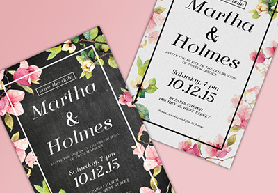


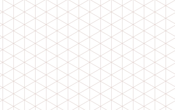


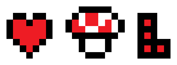


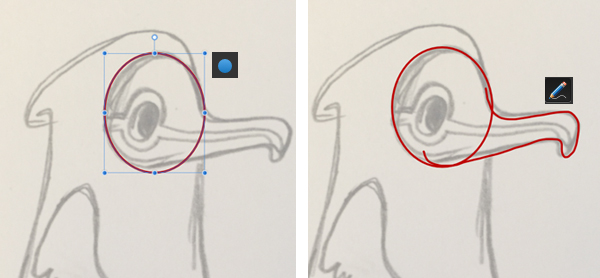
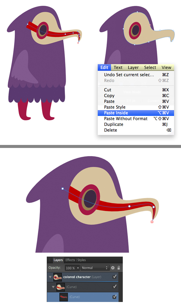
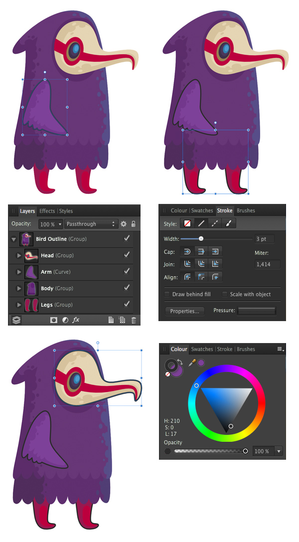


