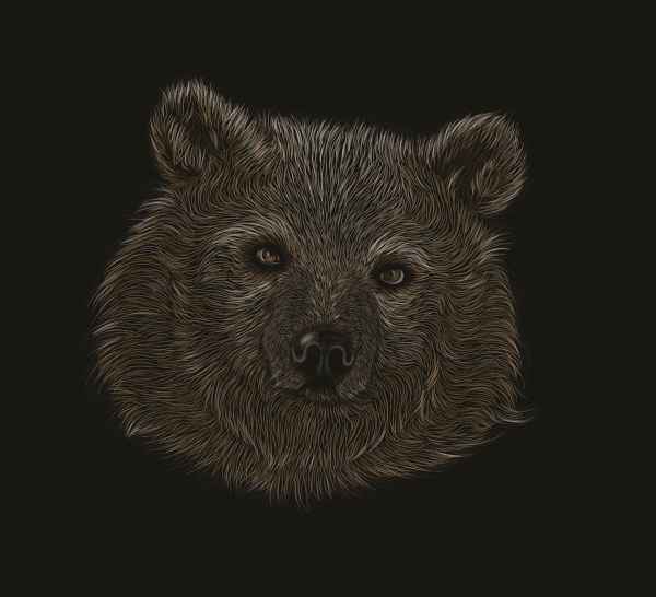
Today’s tutorial is aimed at those who are beginners with Adobe Illustrator CS (and later versions) and who also have access to a graphics tablet. In this Basix tutorial I’ll be showing you how to create your own scratchboard effect bear portrait, along the way giving you helpful hints on how to make the whole process easier.
Introduction
Although I’ve created this using my Wacom Bamboo (an old model at that), you can achieve the same effect with just a mouse. The drawback is that it will take longer to create and the lines may not come out as organic looking.
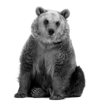
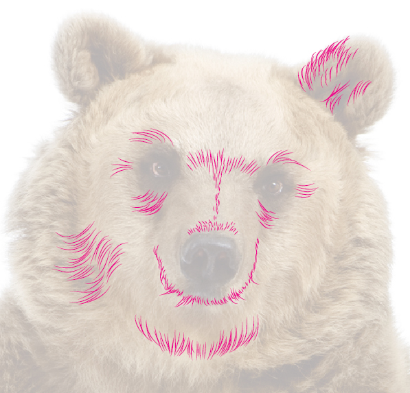
I’m going to be using stock from Photodune as a base, however you can recreate this with any furry animal you wish.
I’ll be using a brush I created in a previous tutorial, which is also aimed at beginners. It’s the Width Profile 1 brush and is very easy to recreate without the need of the Pen Tool (P) to produce curves.
So let’s jump straight in!
Step 1
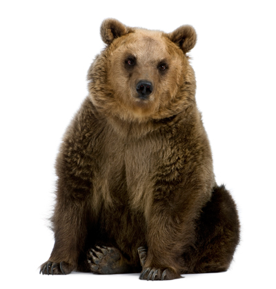
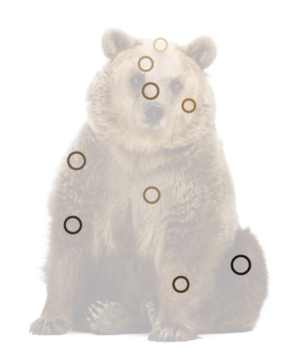
Although the following steps may not be necessary for all users, they may help others with identifying colors and contrasts within a stock image. I remember when I first started out vectoring from stock images, I would play around with the contrast of an image so the highlights and shadows were more noticeable.
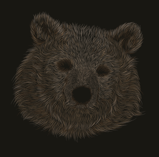
So let’s have a look at our initial stock image without any light/color enhancements:
There are two ways you can help yourself in identifying the colors more clearly. This function is available in the majority of photo manipulation programs and it’s known as “Curves”. I’m using Photoshop CS5 here for my alterations. Go to Image > Adjustments > Curves (Command + M) and from the Preset drop down menu select Increase Contrast (RGB). Then click on OK.
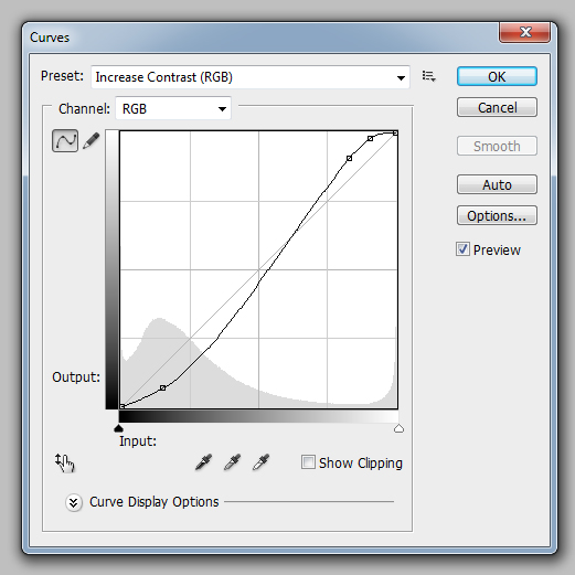
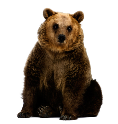
The result will be that the shades will be a lot more vibrant and the highlights and shadows are much more noticeable, therefore should be easier for you to pick out the patches of color.
Step 2
If you’re finding difficulties in picking out the areas of color, there is another way to help you and that would be working from a grayscale image.
In Photoshop that would be going to Image > Adjustments > Black & White (Alt + Command + Shift + B). Play around with the Preset drop down menu (while Preview is ticked) to find out which works best for the stock image you have. I’ve used High Contrast Red Filter in this case.
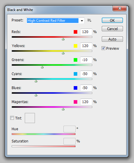
And the result you get from this is as follows:
I’ll be working with the unmodified image of the bear throughout, but all the steps will apply just as well if you’ve modified the colors.
Step 3
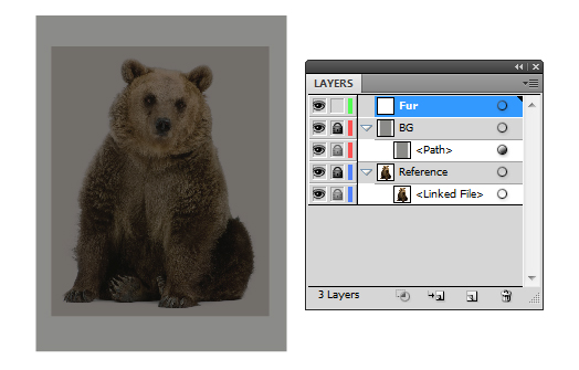
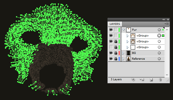
Now to start vectoring! I’m going to set up my layer folders as follows:
Double-click on “Layer 1″ and rename it “Reference,” then click on OK. Go to File > Place and locate your stock image to place it on the artboard. If the image is too large, you can use the Free Transform Tool (E) while holding Alt + Shift, and pull one of the corners to resize it evenly. Lock the layer folder for now by clicking on the second column on the Layers palette.
Create a New Layer (button along the bottom of the Layers palette) and rename it to “BG”. Within this layer use the Rectangle Tool (M) to draw across the canvas with an off black fill (C=70, M=65, Y=70, K=80). This shade will give a more realistic shade of a scratchboard, rather than having a jet black fill. Lock the layer folder for now.
Create a New Layer and rename it “Fur”. This is where you’re going to be drawing your strands of fur in.
Step 4
So let’s get into using your graphics tablet to draw fur. The reason I enjoy rendering fur so much is that it feels like such a natural action with my hand and it is a relaxing process once you have control with a stylus.
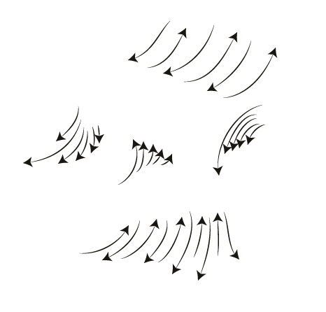
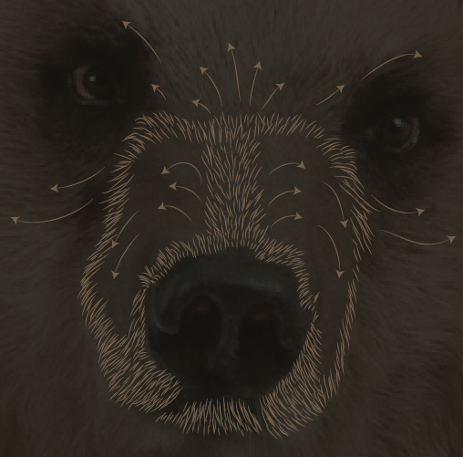
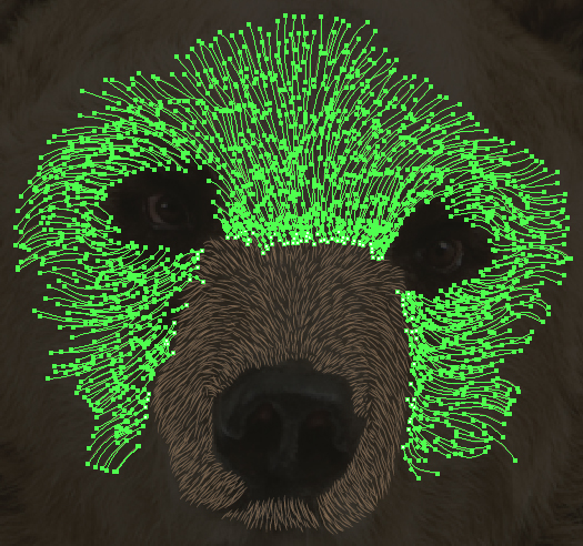
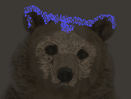
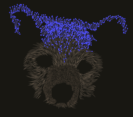
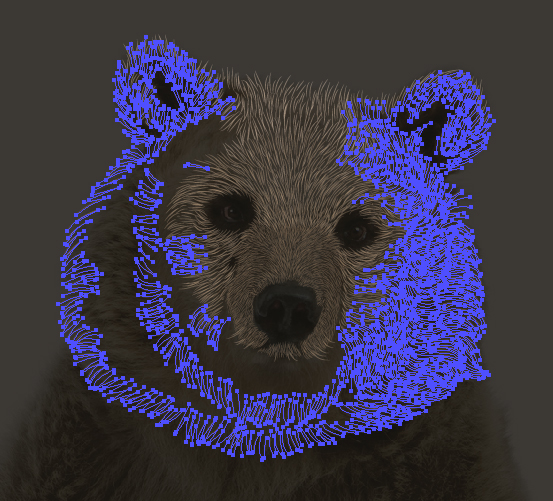
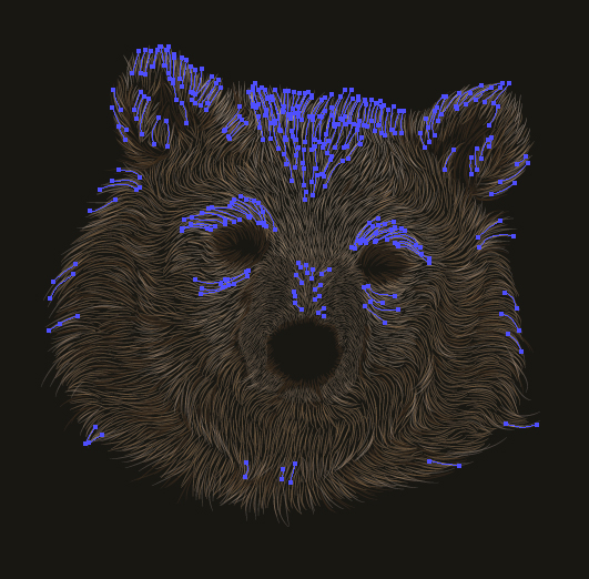
If you’ve not tried drawing small strokes with your graphics tablet before, take some time to practice before you jump in. I use the Paintbrush Tool (B) to draw my strokes and for fur specifically, I’m using the previously mentioned Width Profile 1 brush. I’ve added arrowheads at the end of my strokes to show you the directions I draw in.
If I’m looking at a large area of fur where it’s all going in a similar direction, I tend to do a tight zig-zag motion with my stylus (the top and bottom groups of arrows). For smaller more controlled areas, the strokes will tend to go in the same direction (the central groups of arrows).
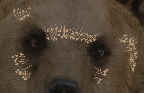
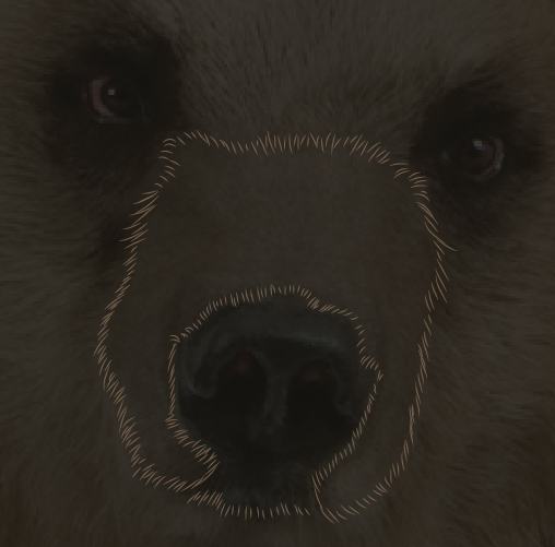
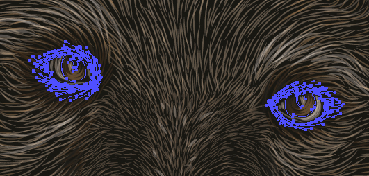
So let’s look at applying those sorts of strokes to fur with a quick preview of our bear. As you can see I’ve needed more control over the strokes along the bottom of the eyes/cheeks and for the forehead. For more bushy areas of the fur, I’ve been able to do the zig-zag motion. This is just how I render fur and it may not be a comfortable way for you, so it’s worth taking some time to practice before you jump in to rendering the fur. Practice really does make perfect in this case!
Step 5
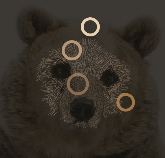
There are a couple of ways you can get the colors from the stock image. The first is what I used to do when I was first getting into vector art and that’s going around the image with the Eyedropper Tool (I) in areas of large color and then adding a shape to the canvas to keep the color for future use.
If you’re using this method though, remember to hide your “BG”, otherwise it will only pick up the color of that shape!
So below are the main areas I’ve picked up on and then used the Ellipse Tool (L) to draw a circle in the area. I’ve applied it to the stroke, because when I later go on to select the shape, I’ll be just using strokes on the canvas and not fills. It just makes things a little easier.
Then after you’ve selected your colors, Select All (Command + A) and then in the Swatch palette go into the drill down menu and click on Add Selected Colors. As you can see below, it’s added all those shades to the Swatch for later use.
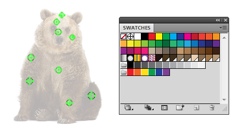
While your circles selected, Group them up (Command + G) and hide/unhide as required.
Step 6
Another way of doing this is to use Kuler, which is a user generated color palette selection tool. You can download the app or use it via the website. Assuming you don’t want to download the app I’m going to show you how to use the website.
First make your way to the Kuler website and then log in at the top right hand corner. Then go to Create > From an Image. You can then upload the stock image you’re working from.
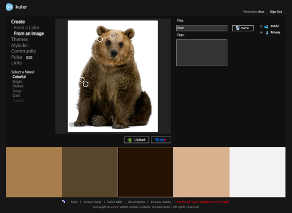
From there, you can “Select a Mood” and look through a variety of palettes it’s generated of colors from the image. I’ve stuck with the default which is “Colorful”, however if you’re unhappy with the selection, you can always customise it.
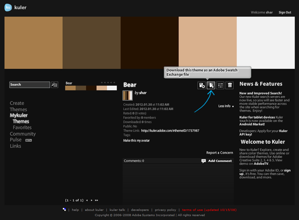
You can allow others to download the palette or keep it private to your account before you click on Save. Once you do so, you can download the palette and save it within your Swatch Preset’s folder in your Adobe folder.
Step 7
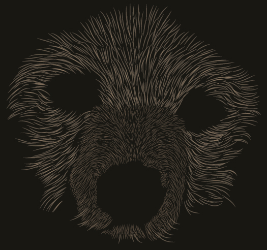
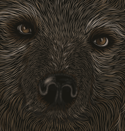
Before we go into vectoring our bear, let’s talk about fur length and style. This is where working from a stock image can help you a great deal. Pay close attention to the style and length of the fur, notice the way it flows and how some areas are more random than others. Notice areas where there are transitions from short fur to longer fur.
Again, why not practice drawing the fur before you decide to jump in, this will be especially helpful when working in fur, which goes from one direction to another, when it goes from short to long fur.
Step 8
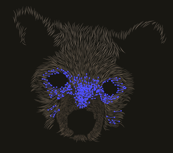
So let’s start vectoring the fur. I’m using the Width Profile 1 brush with the Paintbrush Tool (B). The fur around the nose/snout are short and fine, so I’m going to use a 0.25pt Stroke Weight to help emphasis this. I start off by rendering the fur around the area, as if to give myself a guideline to know I have to render fur within the area. I can go on auto pilot a bit more with this in mind.
Remember to pay attention to the direction of the fur, especially for your guidelines as this will influence the fur you render after.
When filling in the shape, if there is a change in direction of the fur – for instance on the top of the snout there is almost a parting in the fur as it goes down one side then another – draw yourself more guidelines and work inwards from there.
Also consider the direction of the fur leading on from this area.
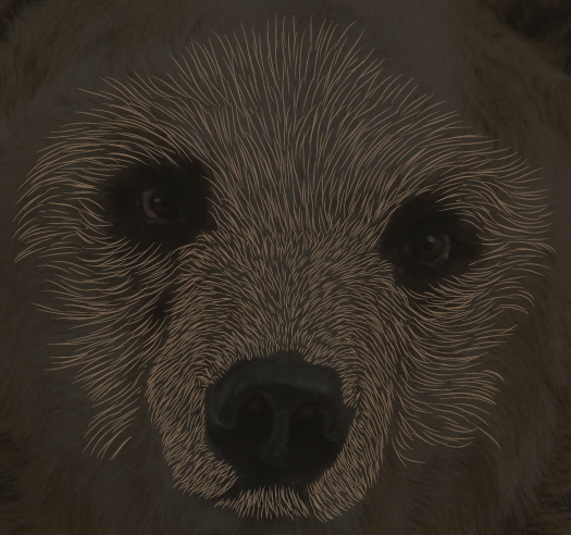
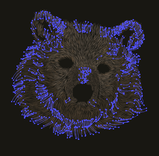
After I’ve filled in the area, I’ve went on to continue drawing in the fur in the surrounding area. Notice the transition of fur going from short to long and almost curling around the eyes. I’ve set the strokes all to 50% Opacity via the Transparency panel.
Step 9
As you may have noticed, the fur of the snout is a different shade to the face. I also want this fur to be thicker as it’s not as fine. Select the fur with the Lasso Tool (Q) and change the shade and Stroke Weight to 0.5pt.
I’ve added additional strokes to the chin with the new shade and thicker stroke.
Step 10
Select one of the strands of fur from the snout and then go to Select > Same > Appearance and this will select all of the snout strands. Then make them a Group (Command + G). Repeat this process for the face hairs.
It’s good practice when rendering fur (or even hair) to Group all the strands by color and/or appearance. This makes it easier to go in and modify should you need to balance the colors.
Step 11
Continue the process of rendering the fur by making the circles visible by unhiding, use the Eyedropper Tool (I) to sample the color, change the Stroke Weight to 0.5pt and Opacity to 50%.
Then draw in your strokes in the appropriate areas.
Step 12
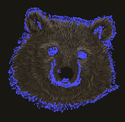
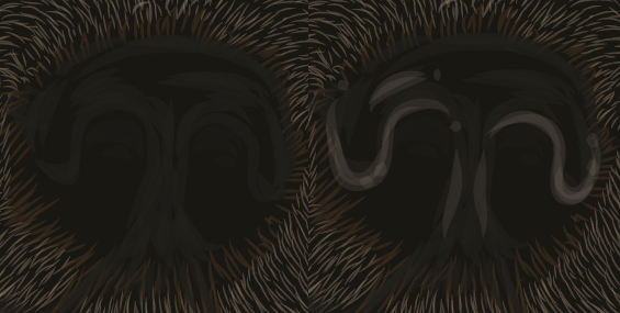
As you’re working with limited colors, you’ll need to work into your fur transitions between the strand colors. How I do it is by firstly drawing in the strands and giving the edges of each area gaps. If you notice below, there are several gaps around the face area, which will allow me to interlock the strokes so the areas blend in better together.
Once you’ve done this, you can add additional strokes within the areas here and there to give an even better blend. You can notice this by the strands going in between the eyes and forehead below.
I’ve also repeated this same process between the snout and eyes, to emphasis the parting of the fur and the top of the snout. Don’t worry if the strands overlap each other. With working with a lower Opacity (50%), with the strands overlapping they give some variation in color to make it look more organic.
Step 13
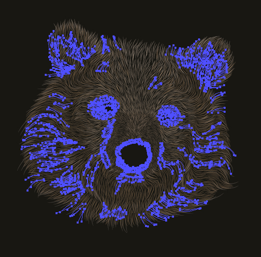
I’m using my fourth color now. These strands on the reference image are a lot more random and tend to flow in one direction then another. This is when you can apply some artistic licence! Put in your guidelines to define the areas going in one direction, then another, and then as you did with the snout, fill in the areas in between.
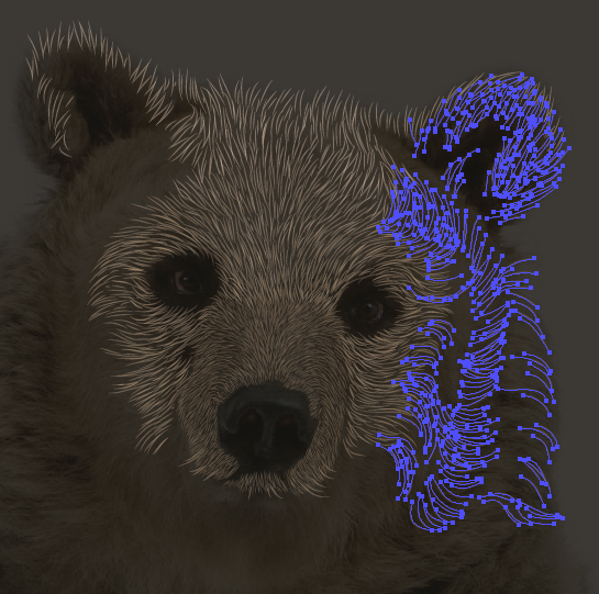
Once one side of the face is completed, go in to complete the other side in the same manner.
Don’t be afraid to leave gaps of black as this can help emphasis shadow cast from the chin and/or fur.
Step 14
I then went in with the lightest shade and added slight highlights to the fur with the Opacity set to 30%. This will help blend the colors more and will also help emphasis the chin, ears and parting on the snout.
Step 15
Now using the darkest shade, I’ve started to work on added shadows with definition under the chin, around the snout, the nose and eyes.
Step 16
I want to add further highlights and it does get to a point where the artboard feels like there is no longer any more space to add a large amount of fur. The way to get around this is to add lighter strokes set to Blending Mode Screen and Opacity 40% in the areas which require the highlights.
As these strokes by themselves are not as bold, you can increase the Stroke Weight to 1pt, so it can overlap as many strokes as possible without it being over the top. Once done, Group the strokes (Command + G).
After I’ve viewed the strands, I felt they were too bright. This is where you can get benefit from Grouping your strokes as I’ve just changed the Opacity of the Group of highlights to 90%.
Step 17
Just as you add highlight, you can add shadow. However you want to do it without making the actual black scratchboard background darker than it is. This would mean avoiding using Blending Modes! I do this by using a slightly lighter shade than the original scratch board color (C=70, M=65, Y=70, K=80). I’ve just reduced the K value to K=75.
Then draw these strokes with a Stroke Weight of 1pt set to Opacity 40%, around the areas where you require shadow. You’ll also notice that around the edges of the fur I’ve added this dark shade. This is so there is a faint halo around the fur, which could be light picked up in the background. It’s only very faint, but helped add detailing to your portrait.
Step 18
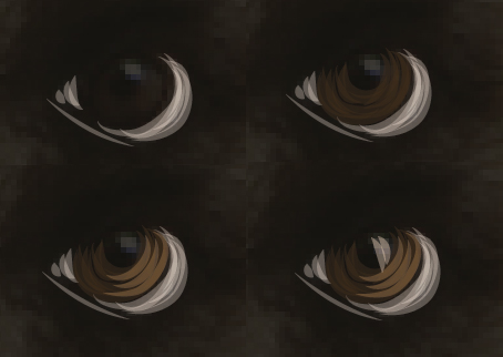
For the eyes, work with a variety of Stroke Weights and Colors to produce a scratchboard effect with just strokes. For instance, I’ve used a thinner stroke along the bottom of the eye (0.25pt) and then used a thicker one for the actual eye details (0.5pt). Try to keep the strokes going in the same direction.
Step 19
I’ve then used the dark shade used for shadows (C=70, M=65, Y=70, K=75) to add more definition around the iris, pupils and surrounding eye areas to make them more refined.
Step 20
The nose I’ve constructed in a similar method, however with a much larger Stroke Weight (2pt). The reason being is that the shine and texture of the nose is much more blurred than say around the eyes.
Step 21
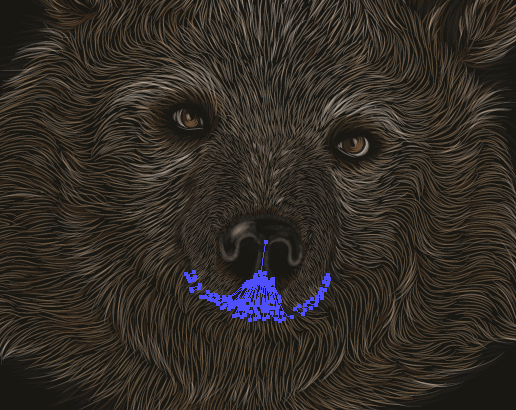
Finally, I’ve used the dark shade for shadow again to help add further definition to the mouth area and give more emphasis on the chin.
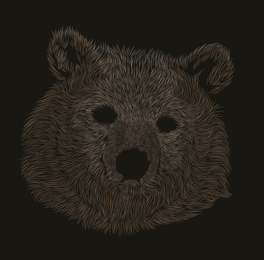
Conclusion
I hope you’ve learned some basic skills of constructing fur from a stock image, with these skills you can use them in future projects.
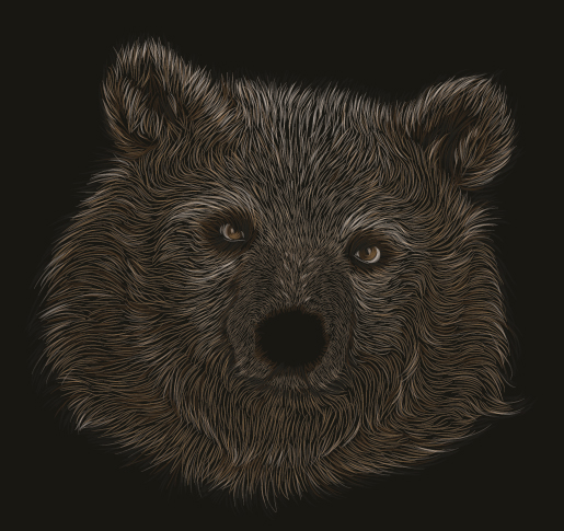
Want some more inspiration? Why not check out the wolf portrait I did for a friend over on deviantART, using exactly the same method!