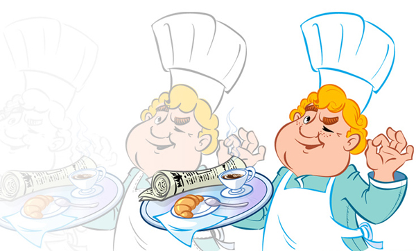
Today Russian illustrator Victoria Vasilyeva will share the secrets of her Illustration skills with us. She specializes in illustrating children’s books, advertising, creating characters and icons. In this Quick Tip you will learn more about how to take an illustration client from concept to final artwork, let’s get started!
Step 1
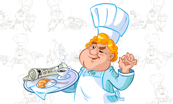
Several times I have been asked to teach drawing or describe in detail how something has been created, but I don’t think I have the authority to teach anything anybody because I’m still learning. But I can tell you how to follow the same process of learning. For example, let’s take one of my characters — a cook — I will tell you about the stages of its creation and its working aspects.
The process starts when a customer comes to me and asks me to create a cook character. After easy and casual conversation, I usually find out what is required of me, what style, color, suggestions, and other details.
After acknowledging the customers wishes and the necessary requirements (if any) I start to imagine the possible outcomes and I will keep thinking about it until the next morning. When I’m daydreaming about the project, I visually go over different images, perspectives, character types, colors. Some people come up with this on the fly, but my mind needs to be relaxed and my eyes closed. After the meditation I proceed to sketching. In order to chose the right direction, I suggest three different variants to the customer.
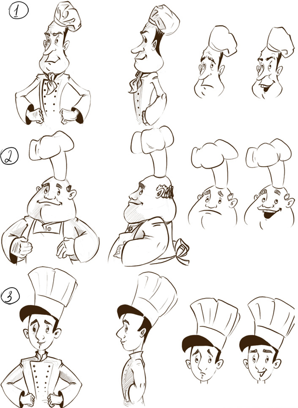
The customer chooses the good natured chef.
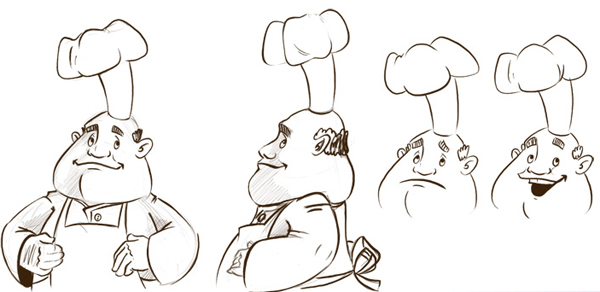
With some direction from the client, I then change some of the characters features.
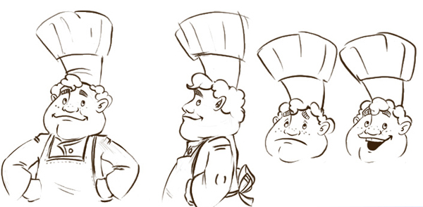
As an example I then position the refined character in one of the poses they require.
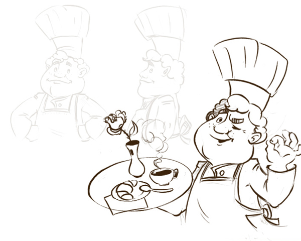
When the customer is happy, I proceed to drawing of all the positions.
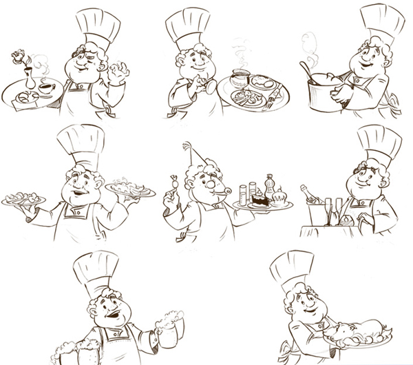
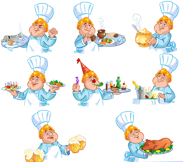
When the outlines are approved, I then move onto coloring.

I understand that you are much more interested to know the nuances of drawing itself, rather than the stages of communication with the customer. So get down to work, omitting the process of creating a sketch, I will show you how I work with vector.
Step 2
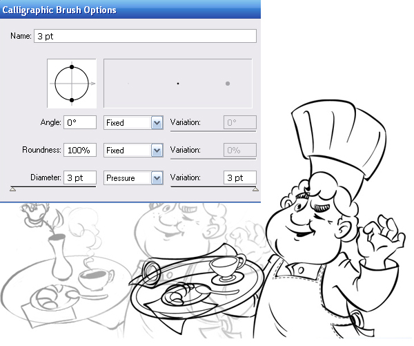
Paste your sketch in the workspace of Adobe Illustrator (File > Place). Set the opacity of the sketch to 50%. Start drawing a smooth outline with a brush in a new layer above the sketch. By the way, to draw such outline seems to be a heroic deed, therefore I create the outlines with Graphic Tablet. I use the Paintbrush Tool and Blob Brush Tool for the outline.

The Paintbrush Tool creates a regular opened path which thickness depends on the pressure on the stylus.
The Blob Brush Tool creates a line that represents an object with a closed outline.

Settings for the Paintbrush Tool:
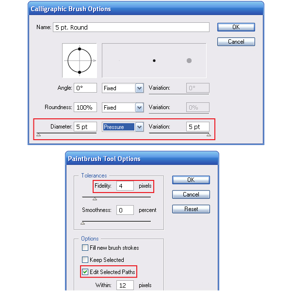
Settings for the Blob Brush Tool:
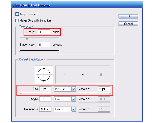
By varying the pressure on the stylus, we get a "live" line.
Step 3
Create another layer, place it between the sketch and outline layers. I’ll be using this layer for the color.
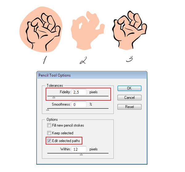
Using the Pencil Tool (N) and the Pen Tool (P) tools, I am creating color vector objects in this layer that convey the color of basic objects. Usually, at this step, I define basic colors. In my case the choice of tools depends on what shape the object will be. If it is flat with a clear outline, I find it will be easier to use the Pen Tool. If an object has an irregular "playful" outline, such as hair, then I use the Pencil Tool.
Often, I find it difficult to create the outline of a desired shape for the first time. In such cases I usually draw a simple object in an arbitrary shape and then edit it. For this purpose, the settings of the Pencil Tool (N) must be able to edit the selected path. As a result, we get something like the following image.
Step 4
I like images with black outlines, but this style is very demanding for the accuracy of the lines. With this image I prefer to work with color contour which for me is much easier to create. I’m making the outline a lot darker than the basic color. Sometimes it may be completely opposite colors. In any case, strive to achieve harmony.
Step 5
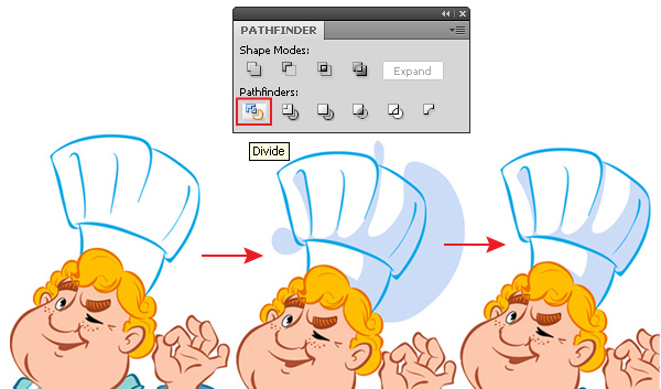
This is my favorite stage of work. I’m starting to add new objects that define the shadow, light, fine details and patterns, which strongly affect the overall impression on the image. I draw objects absolutely arbitrary, not just trying to get into shape of the outline, but setting the right shape inside of it. Then with the help of the Pathfinder panel, I cut off the unnecessary part from the shadow.
This is how it is done, duplicate an object according to which the shadow will be cut (Command + C, Command + F). Select the upper outline and shadow, and then click on the Divide button from the Pathfinder panel. With the help of the Direct Selection Tool (A) select and remove the unwanted objects.
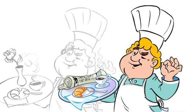
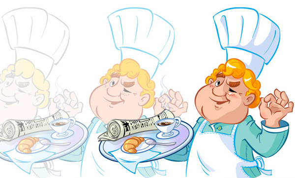
As a result of such coloring, I get a cook.
As a result, I have 3 layers: a Sketch, Coloring, and Outline. Remove the layer with a sketch. Leave the Coloring layer unchanged, and to apply to the layer with an outline Object > Expand Appearance. This action replaces all the brush strokes of the paths with the closed objects.
Step 6
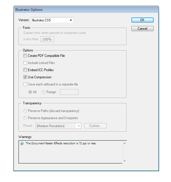
At the final stage, when the character is colored, the outline is colorful. I take the Blob Brush Tool and start putting focus on increasing the thickness of the contour in the areas of the picture where the shadow is. Next, remove all the unnecessary data from the file, for example, all the colors in the Swatches panel, all the brushes from the Brushes panel, and all the symbols from the Symbols panel. This allows you to slightly reduce the file size. Save the file with the following settings.
Conclusion
I hope you found this Quick Tip to be useful, if you have any questions on creating your own vector illustrations, you can write them in the comments section below.