Quantcast
Channel: Envato Tuts+ Design & Illustration
Viewing all 8954 articles
Browse latest View live

So You Want to Be a Freelance Illustrator?

$
0
0
Illustration by Hanna Sandvig
Illustration by Hanna Sandvig, featured in ImagineFX reader EXpose.

Design and Illustration careers are as varied as the artists in them. Today, we’ll explore the world of freelance illustrators. I sought out and questioned freelancers from around the globe who were gracious enough to share their experiences with me. We’ll discuss their training, daily tasks, how they source clients, the media they work in, self-promotion and motivation, and more.

Unlike the life of an in-house artist, where you work with a specific company, freelancers need to manage their time, money, and client base wisely in order to keep things running. They are often their own boss and take on multiple roles (promoter, social media guru, accountant, artist agent, art director, and more) in order to keep things moving throughout their career. I sincerely hope you find the following to be informative, motivating, and inspiring as I do after having poured over multiple sets of answers from a variety of artists. Consider this your guide on the role of freelance illustrators.

What Does a Freelance Illustrator Do?

The short of it is they illustrate for a variety of clients. Let’s break down some of the more commonly found roles and tasks associated with the career path:

  • Editorial and Book Illustrations: One of the markets most commonly thought of when discussing illustration, editorial work may be done for newspapers, magazines, or blogs. While many companies use stock art for these purposes, large publications like The New Yorker are renowned for their illustrations, which are done by freelancers. The same goes for book covers and interior illustrations. Graphic designers do the designing, but often illustrators are called upon for drawing, paintings, and more.
  • Character Design and Concept Art: This often goes hand-in-hand with toys, apparel design, entertainment art, and other product design. Illustrators often draw, and as such are contracted to create a range of concept work and character designs for various companies. Toy companies, greeting card companies, various entertainment companies and other firms all contract freelancers to breathe life into projects.
  • Apparel, Textile, and Product Design: This would be T-shirt designs and print patterns on clothing and accessories. Although many companies have an internal design team, it’s common for companies, brands, etc., to outsource apparel and product design. Usually the freelancer will work with the internal design team in email form, meeting deadlines and coordinating efforts rather than being a part of the internal team’s meetings or working with higher-ups within a company itself. As an example, Disney, Mattel, and MGE are all companies that outsource design like this (as well as too many others to count).
  • Entertainment Art: Discussed a bit above, this covers comic books, matte paintings for movies and television, and anything else contracted for entertainment purposes. Sometimes it’s a VFX or art department that outsources some of its own work in order to meet the deadlines of a larger production. Or, in the case of comic books and similar publications, artists may create guest strips, panels, or cover art that benefits both the publication and the artist in terms of bringing each other customers. It’s a wide, wide umbrella, and varies as much as the art itself.
  • Packaging Illustration: Not to be confused with packaging design, illustrations of this sort are incorporated into the graphic designer’s duty (either within a company or handed off to another contracted worker). Depending on the team involved, they may outsource illustrated pieces for toys, beauty products, food packaging, and more. Some companies even produce specific artist series of products in order to leverage their popularity against or with a well-known or up-and-coming illustrator.
  • And more… I could list freelance illustrator jobs forever, as they do go on as much as anyone needs or wants professional illustrative work. Not noted above are personal pieces commissioned from freelancers that may be a gift for someone else or simply for themselves. We’ll explore other ways freelancers generate revenue aside from companies who are reselling their work in some manner later in this article.
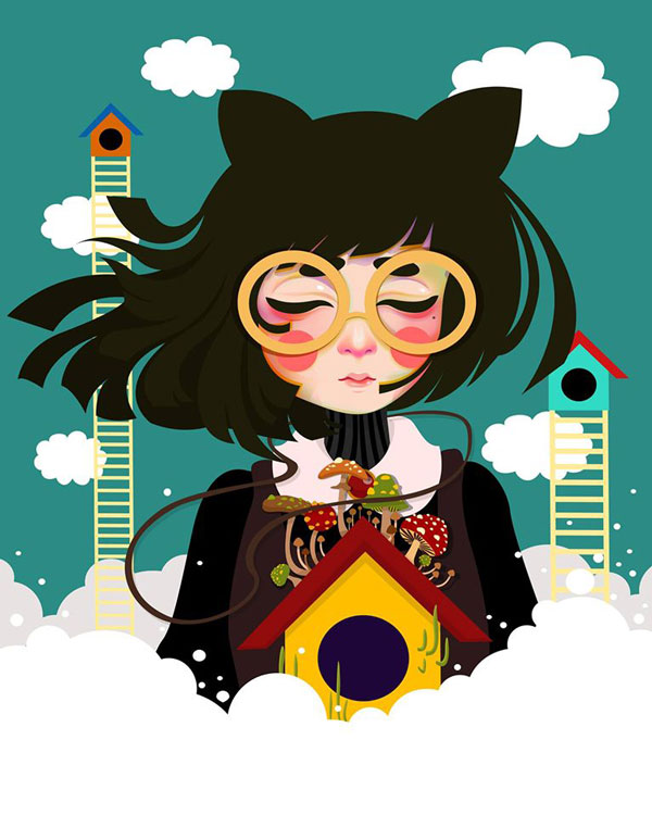
Artwork by Nikki Radan
Illustration by Filipino artist, Nikki Radan.
“As an illustrator for Dreame, my role is to create imagery out of the dreams, goals, stories and even poems and songs that are given to me via email from the dreamers (client) who have chosen me from the website.” — Nikki Radan, discussing a freelance project offered on www.dreame.me

What Training Is Involved?

Now that we've got a basis for what an illustrator may do, it’s important to talk about the sort of training, schooling, and preparation freelancers may have taken in order to get their careers moving in the right direction.

As we learned with in-house graphic designers, some artists are formally taught, some are self-taught, and others take on a mix of the two. Of those who filled out my questionnaire, 40% were self-taught, 60% were formally trained, and all continued to educate themselves in whatever way they could to grow as artists. Some chose to attend an art school or special training program, while others opted for the art department of a larger university.

Whether or not you pursue formal art training, the cost, syllabus, instructors, and value clients may place on certificates, degrees, or accolades obtained have an impact on your decision. Building a portfolio is the end result, regardless of the path taken, as no artist can be contracted for work without having something to show a client. Formal settings provide a structure for skill and portfolio building. Informal settings or self-guidance require a healthy dose of self-motivation.

Subject matter studied includes anatomy, perspective, value studies, painting, digital media, and more. Every aspect of visual art is or can be explored, and really should be for a working artist to thrive.

Artwork by Jared Hart
An example of commissioned work by Jared Hart.
“I graduated from the College for Creative Studies in 2008 with a BFA, my area of focus was Animation and digital media. If I'm asked to bring my work, I have a portfolio prepared.” — Jared Hart on the subject of his educational experience.

How Are the Clients?

One of the most common questions for freelancers is where they source clients or how clients find them. To go with it, one of the more common answers is through an online portfolio. While it’s not a guarantee that displaying artwork online will lead to work, websites like Behance and DeviantArt allow artists to connect with possible clients or give them an easy space to organize a portfolio. Additionally, artists may choose to create their own website for this purpose or use one of the many blog platforms (Blogger, Tumblr, etc.) to showcase their art.

Illustration work for Backyard Brains by Cristina Mezuk
Illustration work for Backyard Brains by Cristina Mezuk.
“99% of the time it’s word of mouth. A friend of a friend is looking to hire somebody, and they wind up coming to me.” — Cristina Mezuk on the subject of clients.

Sometimes, however, a job may come from responding to a call for art, an online ad, or through the magic of networking. While it’s ideal for a client to find you and be familiar with your work, applying for a gig or appealing to the possible need for your artwork to a potential client may result in a new revenue source. It is important, however, to promote yourself appropriately and not to bother or spam anyone with links or portfolio pieces for the sake of networking, as it’ll likely backfire.

Book cover illustration by Hanna Sandvig
Book cover illustration by Hanna Sandvig.
“I currently illustrate book covers for indie authors and small publishers, and stick to light romance/chick-lit style books. 
This gives me two advantages: 1) The authors tend to spend a lot of time networking and chatting with each other, so they tell their friends if they like your work, and 2) They are generally looking for an author to work on an entire series. 
Because of this, I haven't had to look hard for clients, they find me, and a good client will often lead to steady work.” — Hanna Sandvig on the subject of clients.

Who Are the Clients?

Now that we've discussed how a client may find you, it's important to know who they may be, what working with them may be like, and what's expected from you, the freelance illustrator. As I've already broken down some examples of this and will continue to break down the process of freelancing, I refer to the quotes of artists I interviewed about their experiences to answer the question.

Storyboard by Miss ChatZ
Storyboard by Miss Chat*Z.
"My clientele vary from high profile companies like LINE, VIBER, Leo Burnett, Saatchi, NYMGO, record labels, etc... and I have smaller companies/ profiles as well like mothers, cooks, burlesque dancers, porn actresses, authors, shop owners... the list goes on... there is no range." — Sirine, aka Miss Chat*Z, on her clientele.

What's the Process of a Freelance Project Like?

Every project's process varies. From the responses illustrators gave me as well as my own experience, projects begin with a discussion and design brief. Getting to know what the client wants and needs is important as you'll waste less time on both sides, allowing you to move on to a new project faster and increasing the possibility of that client's return to your services. Good communication is very important.

A common routine consists of the following:

  • project brief
  • sketches and concept art
  • first draft
  • second draft
  • final design
  • final edits

Each step usually needs to meet the client's approval before you move on, although there are many exceptions to this rule. Perhaps your freelance work has a different structure that fits the type of work you're doing. Concept art may be an example where the deliverable, or artwork being commissioned, is of a rougher quality than the final design work required for a book cover illustration.

Illustrative work by Asher Benson
Illustrative work by Asher Benson.
"I've completed conceptual work from sketch to finished render [...] I’ll usually finish in the scope of two weeks [...] It’s a gamble on whether that project will ever see the light of day. It’s a great boost for your portfolio, but getting the green light to use it can be agonizing. Sometimes you end up making work for a project that you’ll never be allowed to share..." — Asher Benson on freelance concept art.

What Other Forms of Revenue Do Freelancers Have?

It's an important question: are freelance illustration jobs the primary source of income for a freelancer, or do they take on other work? Perhaps the freelancing gig is a side job in itself, as it is for Bahia Khalid, who says:

"Freelancing is my freetime job, after office hours. Only happens when I have clients. . . something rare. . ."
Illustration by Bahia Khalid
Illustration by Bahia Khalid.

Alternatively, illustration may be the freelancer's only source of income where they maintain a specific client base, consistently work with new clients or take on new clients often, or they market their artwork in other ways in addition to being commissioned and contracted for illustration work.

Illustrative work by Miss ChatZ
Illustrative work by by Miss Chat*Z.
"It’s the only work I do. Sometimes I get myself associated with other businesses but illustration is the main focus." — Sirine, aka Miss Chat*Z, on the subject of working as an illustrator.

This brings us to the important point of selling artwork and merchandise yourself. Having an online shop serves as another source of income and can be handled by a third party like Society6, Redbubble, InPrint, or by artists themselves through marketplaces like Etsy, Big Cartel, and Storenvy.

How Does Self-Employment Work?

Self-employment varies from country to country (and state, province, prefecture, territory, etc). There are a few constants, however:

  • You must pay taxes on all income.
  • Get to know your deductibles (supplies, research, tax credits, etc).
  • Research fees, licenses, and documentation for running a small business before you begin.
  • You need to either be your own accountant or hire one.
  • You may be subject to taxes in other countries, depending on their laws or deals with your own.

Additionally, it's important to research your legal rights as an artist, work with contracts (drawn up by your client's lawyer, created by an artist guild's lawyer, etc.), and have a clear idea of what could happen if your work is stolen. Unlike working in-house, where the ownership of any work you create is established when employed, ownership is defined from client to client. So knowing if you can display freelance work within your profile (did you sign a non-disclosure form?) or if you're able to sell prints of the artwork (did you retain copyright and merely license the artwork to the client?) are important distinctions to make.

A freelancer's timeline is often determined by their client's deadline, their motivation to work, and their own personal schedule. Some keep regular business hours while others work whenever possible or in order to accommodate other needs. There is no clock to punch into, however, and though missing a deadline or procrastinating can have negative consequences, freelancers also have the freedom of naming their own work hours and prices, when possible. 

Illustration by Nikki Radan
"Meteor Balloon" by Nikki Radan.
"As a freelancer, I still try to make and follow a time frame [of] when I'm going to make a commission just so I can have everything organized. This helps me accomplish tasks efficiently." Nikki Radan on the subject of her average workday.

Conclusion

Artwork by Cristina Mezuk
Technical illustration of Backyard Brains product, the EMG Spiker Shield, by Cristina Mezuk.

The roles of freelance illustrators are numerous. Some days they spend most of their time drawing, while other days it's a round of bookkeeping and debriefing with clients. Clients range from large companies to friends, and everything in between. Freelancers are self-employed and have to wear many hats (artist, agent, accountant, etc.) in order for business to run smoothly and grow.

Regardless of the pros and cons of freelancing, illustrators come in all varieties, making the career path as unique as those who follow it. An understanding of other artists' experiences may allow you the tools necessary to start or even continue along this and related commercial design paths for a long-lasting career.

Many thanks to the artists interviewed for this article. You can check out some of their portfolios in the links below:


Create an Isometric Pixel Art Office Building in Adobe Photoshop

$
0
0
Final product image
What You'll Be Creating

In earlier tutorials, we created a pixel art character and gave it a car and places to live. Now, let's give it a place to work.

An office building is a great piece to do in isometric pixel art because you can add as many floors as you'd like and end up with a pretty large building that took about the same amount of work to do as a house or smaller building.

You'll need to have gone through the Isometric Pixel Art Character and the Isometric Pixel Art House tutorial before proceeding.

1. Dimensions

Let's make a floor height and footprint that looks congruent with our character.

Step 1

So we'll use the character as a measuring stick, as usual. Here the height I've chosen is 60 px for one floor.

setting the height of the first floor

I like using multiples of 10 px because moving the elements around using the keyboard arrows while holding down Shift happens in multiples of 10 px, so things fall into place much more quickly and easily.

Step 2

Now let's decide on the width for the entrance part of the building. It will have pretty wide double doors, so the width for the entrance should allow them in with a bit of space around.

I will also be keeping most of these distances in multiples of 10 px, for the reason explained above; it makes things easier later on (and if you're finicky at all, it feels good to have your distances measured in round numbers).

deciding the width of the entrance

The vertical dashes here are simply being used as guides—we might delete them or draw over them later on, so they're not necessary but they usually are helpful.

Step 3

The entrance area will protrude a bit, so let's give it some depth.

giving depth to the entrance

Step 4

Add one more line parallel to the entrance. This will be the glass wall. Together with the entrance they would pretty much make the total width for our building.

making the length of the building

We'll add some seams to the glass wall—that's why those dashes are there.

Step 5

Now let's add more depth: the side wall of the building. It'll be shorter than the front side.

adding depth to the building

Step 6

Let's finish the footprint. You can move the guide lines to another layer for a while. Here I closed off the area and filled it with white so that the next steps are a little easier.

building footprint finished

Step 7

Now we duplicate the footprint and move it up to the height we had already decided for the level.

duplicate the footprint

Since the surface was filled with color, we have slightly fewer lines to remove.

Step 8

We still have to remove the rest of the lines that the walls will block.

close the volume off

Add a few vertical corner lines and your volume is complete.

2. Details

Now we'll take care of most of the coloring and details that the first floor will require, which will stay almost the same for the rest of the floors.

Step 1

Let's add most of the vertical lines we'll need: one on each corner and some extra ones for the glass wall panes' edges.

separate the vertical surfaces

Step 2

Find colors you like for the different sections of the building. I've chosen to make the entrance look like concrete. The glass walls are about the same color that was set for windows on the previous house tutorial, and the small area on the edge will be a dark brick kind of color.

color the vertical surfaces

You should try playing with the Hue/Saturation/Brightness sliders to find the final colors.

Step 3

Let's set a width for the double doors and push that surface a little bit into the volume. As usual, you'll want to make the peak corners a lighter shade than the walls.

making space for the front door

Step 4

Now we set the height for the doors.

space for the front door

Step 5

And here I've done a slightly dark line right next to a slightly light line to look like small grooves—it seems to be common on these kinds of buildings and it makes the concrete walls not too flat/boring.

details on the concrete

We'll also apply these grooves horizontally, later on.

Step 6

We'll make the front doors mostly glass, so fill with the same color as the parallel glass wall. Also, add vertical border lines for the doors, one on the inside corner and the other one in the center. To find the center you can measure the whole break in the concrete with the Select Tool (you'll get the width in the info panel), and then divide that by 2 and you'll know the distance between the inside corner and where the center corner must go.

glass for the doors

Because the walls around the doors cover part of them, don't expect both of the doors' glass rectangles to be the same width.

Step 7

Let's add a frame around the glass. I've chosen a dark grey, with a slightly cool hue.

One pixel of grey was enough vertically. For the bottom line I left 3 px height. Also, add the dark lines between the grey and the glass.

Step 8

Here are the finished doors. I added a small highlight for the bottom part of the grey/metal areas, a few pixels at about the character's arm height (these are the locks) and a few darker glass lines, for some sort of glass effect.

door frames

Step 9

Now, on to the glass wall. Make the front corner lighter and add an area with a darker shade of the glass color. You can use the Magic Wand Tool to select the white top surface and then move that selection down about 10 px so the selection intersects with the areas of the glass wall you'll want to paint.

darker areas of glass

Step 10

Finish the lines for all these glass parts. Most corners don't need to be black, and the seams on the glass should be just slightly darker than the surrounding colors.

finishing the lines for the glass walls

Also, push out the brown wall a bit.

Step 11

Adjust the colors of the brown wall, now that it's pushed out.

adjust the lighting on the brown wall

The ground floor is almost done.

Step 12

Now copy the level and paste it on a new layer (or Alt-Shift-up arrow) and place it right over the ground floor.

duplicate the ground floor

Step 13

Of course, there won't be doors on the subsequent levels, so start turning the doors into a window by joining them into one and adjusting the size. Here it's already a lot shorter, vertically.

start to turn the door into a window

Step 14

There's no need for the thick bottom edge on the frame, now that it's a window. Get rid of it and make the window narrower. Make sure to keep it centered; if you make it 12 px shorter on the right, make it 12 px shorter on the left as well.

adjust the width of the window

Step 15

Then finish the areas around the window. Fill in the concrete wall color.

finish the window

Step 16

And make the extra details on the wall. We'll be adding a few more grooves to the concrete, this time horizontally. Like the previous ones, these are made with one slightly darker shade of wall color, right next to a slightly lighter one. They will need to be applied to both the top and bottom of this level.

finish the walls around the window

Step 17

Now for the glass. We want to keep the seams, but the top and bottom ones are right now in black and we want them with the same color as the rest of the seams.

make the glass walls seamless

Step 18

Finally we'll do the same with the brown wall, but it's even simpler for this one as there are no grooves or seams. It's just a continuation of the same colors. The easiest way to do this fix is with the Magic Wand Tool; selecting all three colors and then Alt-nudging 1 px up and also down.

brown walls also seamless

Step 19

Let's add a tiny window to this brown wall. It'll be a nice little accent—the window will be in a different style. Start with a rectangle. If you do it like this, it looks as if it has rounded corners and it seems cleaner.

add window frame

Step 20

Fill the rectangle with dark grey (the same color as in the door), and then add a highlight on the top and a few lines parallel to the top and frontmost edge.

color for window frame

Step 21

Give it some depth. Here I also added a highlight on the bottom border.

depth for small window

Step 22

Add a glass color and a dark line between the glass and metal.

glass for small window

Step 23

And then just duplicate it so it's also on the ground floor.

duplicate new window

The second floor is complete.

3. Rise

The second floor is in a way like a tile—you could repeat it as many times as you want, and have a 100-floor building if you wanted.

Step 1

But we won't do 100 floors. For this building, five floors feels about right. Anyway, if the building is too tall and every floor is the same, it kind of wastes illustration space with more of the same.

You can select the second floor layer and press Alt-Shift-up arrow to duplicate it on the fly. Or you could copy/paste, and then just place where it belongs. As I mentioned before, it's possible to move selections 10 pixels in any direction by pressing Shift and the arrow keys.

multiply the floors

Step 2

We'll repeat only part of the floor for the top, so that we have a piece of the building that's there simply to provide access to the rooftop terrace. We only need to bring up the concrete part.

You may want to do this on a new layer.

add final level

Step 3

Finish off the volume.

finish the top volume

Step 4

Add the matching details.

add the necessary details

Step 5

Here I added a small section to top off the little concrete box. It looked to me a little abrupt without it. 

top it off

Step 6

Fill the top with a light shade of the concrete color and fix any lines that may need fixing. We'll be adding a bit of roof grainy texture, as we did with the apartment building. Start with a rectangle, centered on the top.

making a bit of roof texture

Step 7

Find a color you like for it, and then apply the soft grainy texture and soften the edge.

making a bit of roof texture

Step 8

If we wanted, we could imply the door to the terrace is on the side of the cube that we can't see, but instead let's add it to the visible side. We'll copy the doors we already did and adjust them to this new wall.

copy entrance doors

Step 9

It only needs one door. I kept the little lock visible, and aside from removing one of the doors I also made the one I kept a little narrower.

resize to single door

Step 10

The original door faced the lighter side of the building, so you should adjust the colors to match the new side.

adjust the new door colors

Step 11

Then simply remove the bit of wall below the door.

clean up

Step 12

And to finish the volumes for the terrace, let's add a railing—it should be about the character's waist height. Start with the one at the back, and give it the colors of the brown wall.

add terrace railing

Step 13

Then (you might want to put this in a new layer) make the railing go around and on the front edges.

finish terrace railing

Then simply make the borders that come into contact with wall or floor a bit lighter than black.

cleaner lines

And all volumes are complete.

4. Textures

Time to finish our building by adding a few simple textures.

Step 1

This is the texture we'll add to the brown walls. It won't be black and white, but to create it, do these lines of 2 px alternating. You can draw just a few pixels and then select and duplicate many times until you cover a large area. You could also do it as a brush by selecting the tile and then going to Edit > Define Pattern.

simple texture

Step 2

Once you have plenty of your texture, you place it in a new layer, covering all brown areas. Ideally the black parts of the texture should go over most of the black lines in the drawing.

laying texture on top

Step 3

Change the opacity of the texture layer to 20%, or as desired.

Shortcut: you can change layer opacities by pressing numbers on the keyboard while the Move Tool is active.

Then on the layers with the brown wall, select all areas of the brown color with the Magic Wand Tool. If you have these areas spread over many layers, you'll find it useful to set the Magic Wand Tool to Sample All Layers.

select the proper colors

Step 4

Go back to the layer with the texture and invert the selection (Select > Inverse) and delete.

You'll be left with texture that covers only the walls it's supposed to.

remove the rest of the texture

Step 5

Now find a color for the rooftop surface.

terrace surface color

Step 6

And let's make another simple texture. For this surface we'll do tiles.

Start with a rectangle using a darker shade of the new surface color. Then inside this darker rectangle do another rectangle but with a shade that's lighter than the surface. Then duplicate and arrange multiple times.

create a simple tile

Step 7

Duplicate until you can cover the whole terrace floor with the texture. The contrast shouldn't be too high for this tile.

laying tile texture over terrace surface

Step 8

Then repeat the same process as before to cut out the unwanted areas of texture.

removing leftover texture

You can now, if you want, merge all your building layers.

Building Complete!

Congratulations! The office building is done, and now the pixel sky is the limit!

building is complete

Create a Crazy Sticker Bombing Seamless Pattern in Adobe Illustrator

$
0
0
Final product image
What You'll Be Creating

Are you ready to twist your mind and create a super-bright and playful seamless pattern with crazy characters? In this tutorial we’ll go through the entire process of developing a sticker bombing style pattern, rendering every character with basic shapes and Warp Effects and then gathering the created elements into a fancy overlapping texture with the help of the Pattern Tool. Let’s get started!

1. Create the Character Stickers With Basic Shapes

First of all, let me say a few words about the actual style of our future pattern in order to inspire you and to make the topic clearer. 

Sticker bombing is a whimsical and ambitious design style which came from Japan with their special JDM stickers. A similar style was also formed by a group of enthusiasts from New York who created a lot of fancy graffiti images one over another, the so-called “bombs”. 

It's usually associated with street art and the way of decorating various things (mostly vehicles, skateboards and so on) with colorful overlapping stickers of various sizes in order to emphasize some part of an object and to attract the viewer’s attention. 

Sticker bombing commonly uses some ready-made stickers with well-known characters, but in this tutorial we’ll go further and create our own crazy band of heroes.

Step 1

Let’s start by creating a funny hipster cat with a cup of coffee. 

First of all, let’s create a squashed ellipse with the Ellipse Tool (L) and fill it with bright-orange color. Then move to Effect> Warp > Arc and set the Vertical Bend value to 48%, bending our ellipse to the left side. Now that we have one of the cat’s paws ready, Object > Expand it and create the body base by forming an almost even circle. Stick our banana-shaped paws to both sides of the body. Keep a couple of copies of the paw-shape, because we’ll need them later.

form the body and paws from ellipses

Unite all the created elements in Pathfinder, making a single shape. Our shape looks more like a chicken now, so we need to smooth the sides. Select the side anchor points that are left in the places where the paws merged with the body, and delete them by clicking the Remove selected anchor points button in the control panel above. Then edit the area in the bottom part of the body, by moving the anchor handles with the help of the Direct Selection Tool (A).

unite the shapes in pathfinder

Use the paw copies that we created earlier to add a pair of cat’s ears in the upper part of the body.

add ears

Step 2

Let’s put some trendy hipster glasses on our cat! Start by making an ellipse and delete its upper part with the Eraser Tool (Shift-E) by holding the Alt key to erase an even half. Go to Object > Path > Offset Path and set the Offset value to about -5 px, creating a smaller shape inside the first one. Your Offset value may differ from mine, but you can see the actual scale of the objects in comparison to each other in the screenshot below.

Select both objects and use the Minus Front function of the Pathfinder panel to cut out a hole, thus creating a glasses rim. Duplicate the rim by clicking it with your left mouse button and dragging while holding the Alt key.

form hipster glasses with minus front

Step 3

Add a simple and cute nose to our cat by forming a triangle with the Polygon Tool and then smoothen its corners with Effect> Stylize > Round Corners. Set the Radius to about 4 px and check the result by ticking the Preview box. Object > Expand the nose and fill it with bright pink color.

add triangle nose

Let’s add a pair of funny round peepers to the kitty. Start by placing a white even circle by holding the Shift button and making a shape with the Ellipse Tool (L). Add a smaller brown circle inside for the iris. Finally, create a white triangle highlight on top of the iris and form the second eye.

render the eyes

Step 4

Move on and create a paper coffee cup that our character will be holding in its paws. Make the base from a brown rectangle with the help of the Rectangle Tool (M).Then select its lower left anchor point and click the Enter key to call out the Move options window. Set the Horizontal Position value to 5 px and other values to 0 px, thus moving the point straight horizontally to the right. Repeat the same with the right anchor point, setting the Horizontal Position value to -5 px this time and moving it closer to the center, thus making the cup base narrower at the bottom.

Add a light-yellow rectangle for the cup’s cap and make its lower part wider in the same way as we did with the cup base. Finally, make an additional anchor point in the middle of the cup’s bottom part and drag it down a bit, making the shape smoother and more curved.

make a paper coffee cup from rectangles

Add another rectangle of a pale-yellow color across the middle of the cup for the paper wrap. Bend it down with the Arch Warp Effect, setting the Horizontal Bend value to -20%. Duplicate the cup base and use the Intersect function of Pathfinder to cut off the unneeded parts.

add an arched paper wrap

Step 5

Add an elliptical logotype in the center of the paper wrap and use the Knife Tool (you can find it in the same folding menu as the Eraser Tool) to draw a curved line across the created ellipse, thus splitting it into two halves. Separate the halves from each other, forming a coffee bean. 

form a coffee bean with knife tool

Step 6

Cover the left side of the cup with a narrow rectangle and apply Arc effect with 10% Vertical Bend value to curve the rectangle. Object > Expand the shape and fill it with dark-brown color, switching the Blending Mode to Screen in the Transparency panel, this way creating a warm overtone on the cup. Add another bent rectangle on the opposite side of the cup and switch it to Multiply Blending Mode, making a shadow.

add shadows and highlights

Step 7

Place the cup above the cat's tummy and use the Pencil Tool (N) to draw a curved freehand shape for the “arm” or paw. Fill it with linear gradient from yellow on the tip to orange so that the arm blends with the cat’s body and at the same time pops out. Add the second arm, placing it on the opposite side, so that the cat is holding the cup.

draw the arms with pencil tool

Step 8

Create another squashed ellipse, this time for the cat’s tail. Apply the Arc Warp effect with -4% Horizontal Bend value to make the bottom part wider and expand the shape. Apply another Arc effect to the same shape with -24% Vertical Bend value. Attach the tail to the cat’s body and expand it if you’re happy with the result. Otherwise, increase the Bend value to make the tail more curved.

render the tail with arc warp effect

Step 9

Form the inner pinky part of the cat’s ears by applying the Offset Path to the cat’s body, creating a smaller body silhouette inside. Fill the created shape with pink color and separate the upper part with the Eraser Tool (Shift-E), deleting the bottom part completely. 

Make the cat's figure a bit more three-dimensional by adding a gentle shadow. For this purpose, duplicate the body base twice and move the copy down and to the right a bit. Use the Minus Front function of the Pathfinder panel to cut off the unneeded parts, leaving only a thin stroke along the edge of the body. Fill it with darker orange color, forming the shadow.

make the ears and add a shadow to the body

Step 10

Let’s add an outline to our character in order to separate it from other stickers when we’ll be forming a pattern. Select the body shape and set the Stroke color to dark brown. Head to the Stroke panel. Here we need to set the Weight to 3 px and switch the Cap and Corner in the middle positions. As for the arms, let’s change the Profile of the outline toWidth Profile 1 (you can find these options in the upper control panel), thus making the lines very thin at both ends. Don’t forget to add the outlines to the coffee cup and the cat’s tail as well.

form the outline with stroke

Step 11

Let’s use the base of our hipster cat to make another cat character with an aristocratic look. 

First of all, change the position of the paws and the tail to make the characters differ from each other. Then start adding minor details. Form a monocle rim by creating two even circles, one inside the other, and cutting out the center. Add another smaller circle for the glass and make it semi-transparent by lowering the Opacity in the Transparency panel. Make a group of stripes and turn them into a single object by creating a Compound Path (Control-8). Place the created stripes above the glass, cutting off the unneeded parts outside the monocle, and switch it to Screen Blending Mode, creating a highlight. Add a small overtone to the rim as well, by selecting a rim shape and creating a smaller and lighter brown element inside with the help of the Offset Path.

form the circled monocle for aristocratic cat

Let’s make the cat’s eyes half closed to give him an important and haughty look. Duplicate the white eyeball shape and fill it with orange, a bit darker than the skin tone. Use the Eraser Tool (Shift-E) to delete the lower part, forming the eyelid.

form the eyelid with the Eraser Tool

Step 12

Our cat needs a few more appearance details that will make him look like a sir. Firstly, let’s add a fancy curled moustache! Start by forming an even circle and use the Direct Selection Tool (A) to drag its right anchor point further right and up a bit. Use the Anchor Point Tool (Shift-C) to move the anchor handles, forming a sharp angle. Continue moving the handles to form a twisted curl.

render the mustache

Step 13

What's a sir without a top hat? Let’s make one! Form a dark-brown rectangle and make its bottom part much narrower, as we did with the paper coffee cup. Add a squashed ellipse for the hat brim and make the hat more three-dimensional by adding a highlight from one side and a gentle shadow from another. Decorate the hat with a bright turquoise stripe made with a narrow rectangle and Arc effect. Rotate the finished hat slightly and let it cover one of the cat’s ears.

make a top hat from rectangle

Step 14

Our cat’s hands are still empty, so let’s add a few more items! These will be a smoking pipe and a teacup. Start forming the pipe from its upper part, which consists of two squashed brown ellipses, one inside the other. Make the top ellipse darker, depicting the deepening in the pipe.

Add another ellipse of lighter brown color for the base of the pipe and place the first group of ellipses right in the middle of the new ellipse. Erase its upper part, forming a rounded wooden pipe bottom.

make a smoking pipe with ellipses

Duplicate one of the cat’s arms and attach it to the pipe, making a mouthpiece.

attach a mouthpiece

Step 15

Use the base of our pipe to form a simple teacup, making its inner part a bit larger. Switch the colors to light-turquoise and use the Pencil Tool (N) to add a tiny crooked shape for the cup handle. Put the cup and the pipe in the cat’s hands.

form a teacup from the pipe base

Add outlines to the cat and the items.

make the outline with stroke

Step 16

Our next character is a cute chicken. The base of its body is created in a similar way as the cat’s moustache, but not so curly. Start with an even circle of a bright yellow color and move both side anchor points up a bit to make the top of the ellipse more flattened. Drag the lower anchor point down and reposition the anchor handles to create a sharp-pointed tail.

make a chicken body base from ellipse

Step 17

Draw two ellipses one inside the other for the chick’s eye. Make the inner circle dark-brown, forming an iris, and add a tiny white spot above for the highlight. Make a copy of the eye and move it to the opposite side of the bird’s head. Select both the body and the eye-copy and use the Shape Builder Tool (Shift-M) to delete the unwanted parts by holding the Alt key and clicking them.

render the eyes

Use the Polygon Tool with 3 Sides to form two tiny triangle shapes for the beak. Rotate the shapes and move their central anchor points closer to the right.

form a beak with triangles

Step 18

Add another orange ellipse for the chick’s wing and use the Shape Builder Tool (Shift-M) to make it fit the body. Use the Blob Brush Tool (Shift-B) with default settings (or check out my settings in the screenshot below) to form a small arched line for the bird’s leg. Add three tiny fingers and Unite all parts in Pathfinder. Duplicate the created element and move the copy to the right, adding the second leg.

make the wing and add legs with blob brush tool

Make our bird more childish and cute by adding a funny curled lock on the top of the head with the Blob Brush Tool (Shift-B). Add dimension by forming a subtle shadow on the right part of the body and, finally, outline our character, making it more defined and vivid.

add a curled lock and create the stroke outline

Step 19

Let’s add more birds for our future pattern! This time we’ll make a funny owl. Form a blue ellipse and modify it by flattening its upper part. Use the Eraser Tool (Shift-E) to delete the bottom part of the body and start adding small details: place an even circle in the lower left corner of the body shape. Hold Shift and Alt at the same time and drag the created circle to the right, creating a copy. Press Control-D several times, repeating your last action to create more copies, thus forming a skirt-like shape. Unite all the elements in Pathfinder, making a single shape.

create a base for the owl body

Add a light-yellow ellipse for the face. Squash the shape by moving its upper anchor point down and extend the side anchor handles to make the face heart-shaped.

add face with ellipse tool

Add big rounded eyes and form a small triangle beak in the center of the owl’s face.

render the eyes and the beak

Step 20

Let’s form a feathered wing. Place three squashed ellipses close to each other, varying their height. Group(Control-G) the shapes and go to Effect > Warp > Arc, bending the feathers to the right side with -50% Vertical Bend value.

form a wing with arc effect

Object> Expand the wing and Unite the feathers in Pathfinder. Duplicate the shape and reflect the copy to the other side of the owl. 

Select the body base and go to Effect > Distort & Transform > Free Distort to reveal the pop-up Free Distort options window. Make the bottom part of the body narrower by moving the lower points of the square closer to the center. Add a gentle shadow as we did previously and outline our character.

use free distort to the body

Step 21

Let’s make a copy of our owl and modify it a bit to render an entirely new character. Change the color of the body parts to violet and work at the facial expression. Erase the upper part of the eyeballs, creating a grumpy look. Select the beak shape and go to Effect > Warp > Arch, setting the Vertical Bend value to 45% to make a crooked beak.

create a grumpy owl

Style a wind-swept bang on top of the owl’s head with the help of the Pencil Tool (N) and don’t forget to Stroke it.

and stylish bang

Here is how our grumpy owl looks at this step.

outline the grumpy owl

Step 22

The last character of our sticker set is a lovely T-Rex dinosaur. Start by forming his head from a green circle and make it slightly extruded by dragging the left anchor point further left. This will be the dino’s nose area. As for the body, let’s take our cat’s basic body shape and fill it with the same green color, attaching it to the head and forming a distinctive dinosaur silhouette.

form the dinosaur body base

Step 23

Move on and make another essential body part: a long green tail. Place a narrow shape made with Rounded Rectangle Tool at the lower part of dino’s body. Head to Effect > Warp > Arc and set the Vertical Bend value to 5%, making the tail wider from its left side. Expand the shape and add two more anchor points closer to the tip of the tail. Use the Direct Selection Tool (A) to bend the tip by moving its final anchor point up.

form a long tail with rounded rectangle

Step 24

Use a pale-yellow circle to form a row of funny teeth. Place the teeth group beneath the head shape by rearranging its position with Control-[ keys combination. Add two short rounded paws touching the dino’s cheeks. Finally use the same teeth-circled shapes to create a chain of spinal elements running along the edge of the body right to the tip of the tail. Form two arched strokes for the eyes with the help of the Blob Brush Tool (Shift-B) and add two tiny round nostrils.

add teeth and scales with ellipse tool

Use the Eraser Tool (Shift-E) to edit the scales, which we’ve placed on dino’s head, by erasing their bottom part. Switch the color of the scales to light green and add several groups of elliptical spots to the body. Finish up by adding a dark-brown outline to our character.

edit the spinal scales and outline the body

Step 25

We've already created a paper coffee cup and a fancy teacup that we can use separately from our characters in order to fill the blank spaces of our pattern. Let’s add one final element that we’ll be able to use for the same purpose! This will be a simple donut.

Start by forming an even circle of creamy color. Cut out a hole in the middle and deform the shape slightly with the help of the Warp Tool (Shift-R) (I’ve left the Warp Tool options as default, but you can change the brush size or the intensity if you click the tool icon twice).

Use the Offset Path function several times to create two smaller shapes one inside the other. Fill the newly created shapes with yummy pink color, making the top shape brighter to give it a glazed look. Sprinkle the top of the donut with bright yellow confectionery crumbs made of tiny rounded rectangles. Add a solid brown stroke to the donut.

render a simple donut with ellipse tool and offset path

Step 26

Now that all items are ready, we can start rendering the pattern! You can finish up with the characters at this step or go further and add a few minor details to each of them, making the images more intricate and cartoonish. 

For example, I like the spots that we’ve formed for our T-Rex, so I decided to add the same spots to other characters as well. I also decorated both owls' bodies with two additional layers of feathers. For this purpose I just copied the body shape several times, moved the upper copy up, and cut off the unwanted pieces that were left outside the character.

When you're satisfied with the result, let’s move to the final part of our tutorial!

add minor details to the characters

2. Render a Crazy Sticker Bombing Seamless Pattern

Step 1

Select all the items that we’ve made so far and go to Object > Pattern > Make. By entering the pattern creation mode, you’ll be notified that the new pattern we're creating will be added to the Swatches panel. You can edit the created pattern any time from the Swatches panel, even after returning to normal mode.

Find the Pattern Options window and set the Width and Height of the Tile to 600 x 600 px. Leave the Tile Type as Grid to make the arrangement of the objects easier.

Start moving the characters over the canvas and rotate them by various angles. You will see transparent copies of the objects, which help you to form the pattern, imagining the whole picture.

start forming the pattern with the pattern tool

Step 2

Use the Reflect Tool (R) to mirror the objects over the Vertical or Horizontal (if you want some objects to be upside down) Axis, making the pattern more dynamic and diverse. Put the stickers one above the other, making them overlap, so that there are no white spots or blank spaces between them.

reflect the elements

Step 3

If you see that some objects blend with each other, making a mess, feel free to recolor them (don’t forget to keep the initial copy as well)! For example, we’ve placed two orange cats too close to each other. In order to visually separate them, let’s change the skin tone of the hipster cat to lighter yellow. Switch the color of the glasses to lilac and make a bright spot by coloring the coffee cup pink.

recolor the characters

Step 4

Continue filling up the composition, adding more characters.

add more items

Add donuts and cups here and there to make the scene more varied.

get rid of blank spaces

If some elements happen to cross the character’s faces or look as if they are in the wrong place, just reposition or delete them completely. For example, select and rotate the brown cat’s tail to move it away from the lower cat’s eyes.

reposition or delete the unneeded elements

Step 5

As soon as you’re happy with how your pattern looks, click Done in the upper panel, quitting the Pattern mode. 

Let’s try out our texture! Make a rectangle of 600 x 800 px size, find our pattern in the Swatches panel and apply it to the created shape. Now we can leave it as it is or make the tiling smaller. Find the Scale Tool (S) in the Tools panel and click it twice to call out the options window. Set the Scale to Uniform with 70% value. Tick the Transform Patterns box, unchecking the others, and hit Preview to see the result.

scale our pattern

Boom! Our Crazy Sticker Bombing Seamless Pattern Is Finished!

Great work! I hope you’ve enjoyed styling playful characters and designing this fancy seamless texture, discovering some new tips and tricks! Try out these simple techniques and get back for more! Good luck!

final result of sticker bombing seamless pattern

Creative Arabic Calligraphy: Kashida, Ta'jîm and Tashkîl

$
0
0
Final product image
What You'll Be Creating

In this lesson we'll look at two more sets of "design elements" before we start putting it all together to create letterforms and compositions.

Kashida: The Art of Justification

Spacing, which we have studied in an earlier lesson, should not be confused with kashida (aka tamdîd, tatwîl or madd, all of which means "elongation" or "stretch"), the equivalent of justification for Latin-script texts. To justify a text is to make sure all the lines in a block of text begin and end on the same level. When a block of text is not justified, it is ragged left or right, like this:

Ragged text

In contrast, below is text that has been justified. In the Latin script, this is done by expanding or contracting the space between letters. In the Arabic script, it is done by stretching the letters themselves, and this is not necessarily in the context of equalizing a text: kashida can be applied to a standalone word just to make it more interesting.

Justified text

I want to make a subtle distinction here between stretching actual letters, and extending the connecting stroke to the next letter. For our purposes, we'll refer to the first case as stretch or mashq, and to the second as lengthening or tatwîl. Kashida will refer to justification in general as achieved by either or both. 

The text above shows examples of lengthening only, as a computer font can do no more. Lengthening is only applicable to some connecting letters, when they do connect (that is, when they are in their initial or medial form):

Lengthening

Lengthening is not applicable to boxed letters, or to be more accurate, is unwanted there. This is because boxed letters, which are strongly horizontal, can be stretched in their body —at least in rectilinear scripts. Not so in round scripts, so stretching is largely exclusive to Kufic.

Stretching

Stretching is preferred over lengthening whenever possible, because it doesn't create a big white space in the texture of the text. Therefore, if a letter can stretch, to lengthen it makes no sense, and looks wrong. Dâl, for one, is not a connecting letter, so it could not be lengthened anyway. Boxed letters are useful because they can stretch even when they are final or isolated.

When a letter ends in a flat tail, that can be lengthened as well:

Lengthening flat tails
Historical examples
Examples of lengthening (1), stretching (2) and lengthened tails (3) in the Blue Qur'ân.

This leaves us with a few letters that can neither stretch nor lengthen in the positions shown:

Letters that can neither stretch nor lengthen

Inevitably, some words are going to be impossible to stretch.

Here's a list of words that offer zero to many possibilities for justification. A red cross means that option is not possible; an orange one, that it is possible, but not desirable. Let us examine why.

Case study of various words

In the case of أكل lengthened to أكــــــــل, we have already seen that when a letter can stretch, it makes no sense to lengthen it instead. 

The next word has two lengthening options because it contains two letters that can be lengthened. What difference does it make which we use? The difference is beauty. While the ربـــــيع option is not wrong, it is, simply put, a boring option, because the long stroke is bang in the middle. The word is then divided into two somewhat equal parts, which appears static yet not accurate enough to be satisfying. 

In contrast, the uneven split in ربيــــــع is dynamic—the final Ayn looks much better on its own, if split there must be. There is also the fact that the Yâ' here is the long sound, and matching the lengthening of the line to that of the sound is both pleasing and artful.

The final word offers several possibilities and it's not so easy to discard some. إستطـــــــلع was discarded because, again, we have a box letter being lengthened instead of stretched. It is even more undesirable here because the two verticals of the Tâ' and Lâm have been split apart, and verticals, as we saw in our lesson on Spacing, are always better close together. 

The next discard is based on sheer unattractiveness; it is not necessarily wrong to have more than one kashida in the same word, but it needs to look good and balanced, and this is not the case. Perhaps if they were both the same length, the result would be less half-baked, and perhaps context would make the difference. It's not cut and dried. 

The same goes for the other options—they may or may not work, depending on context. Personally, I would choose the stretched option if I wanted the word to remain blocky, or one of those that isolate a single letter ( إستطلـــــــع or إســــــتطلع ), for the dynamism of the result.

Historically, kashida was used for various reasons, some aesthetic and some functional. The list offers suggestions for introducing this device in a composition to great effect.

Aesthetic Use

  • Justification itself is the most obvious use: leveling the beginning and end of every line in a paragraph so that it is altogether shaped like a regular block, or adjusting the length of a single line.
  • Introducing breathing spaces in a body of text, and/or a pleasing rhythmic pattern of spaces.
  • Positioning letters (pushing them out of the way, so to speak) so that ascenders and descenders don't clash, especially when lines are quite close together, but also to create alignments within the text.

Justified section title
In this 9th century Qur'ân, the section title is made to take up the full length of the page, as well as being highlighted by its golden colour.

Functional Use

  • A word is often extended (to the point that it takes up an entire line) to mark the beginning or end of a paragraph. This was particularly common when Arabic used no other punctuation.
  • Bringing attention to important words in a text, the equivalent of bolding or highlighting them.
Highlighting with kashida
Despite the tightness of this page, it is immediately clear where a new Sura begins: it is where the kashida is present, highlighting the word Rahmân in the Bismillah that begins every Sura. In later times the kashida moved to the first word, Bismillah itself, but it still served the same purpose.

Other considerations

  • Where possible, and if not overridden by other considerations, kashida is made to match a long sound as mentioned above.
  • Two-letter words are generally not stretched or lengthened.
  • Avoid "stairs", or the superposition of elongations on two consecutive lines, unless that is done by design and well studied.

Exercise 1

Here is a sentence with two stretchable letters and plenty of connections that can be lengthened.

Exercise 1

(This is an old Lebanese proverb that says: "In April nature becomes like a bride.")

Print out Exercise1.pdf which is included in the downloads folder. You will find a grid over three lines, with the first and last letter of the sentence already in place. Your task is to distribute and justify these four words over the three lines in a way that looks nice to you. 

You can try several possibilities; I recommend starting by just trying out the kashidas without worrying about aesthetics. The restrictions in place actually make it easier by not allowing infinite possibilities. Exercise1solutions.pdf shows two possibilities and points out what makes them interesting.

The letters are very thin so that you can copy them by hand, preferably freehand even if the lines don't come out straight. It's quicker so you'll be able to focus on the exercise rather than on handling the ruler. Also, it's about time we start drawing letters, even skinny ones, to warm up for the next lesson!

Ta'jîm and Other Diacritics

These are a number of additional signs that can accompany an Arabic text to indicate sounds not included in the pure alphabet. They are often neglected in the rectilinear scripts, which predate ta'jîm, and much more prominent (compulsory, even) in the round scripts, but it is good to have them in our palette, so to speak, as potential for added layers of visual interest. 

However, we must bear in mind that there is a certain hierarchy to be respected in their usage. Vowel marks, for instance, cannot be included if pointing is not. The diacritics are discussed in order of precedence, starting with the highest rung of the hierarchy, unless specified.

As this is not a language lesson, I'll only give minimal info regarding the sound and function of these marks, focusing instead on their shape and position, i.e. what we need to know to be able to create with them.

Ta'jîm

These are the diacritic "dots", or for a better term, the pointing used to differentiate letters that share a letterform, such as ح and ج. Ta'jîm, or i'jâm, literally means "foreignization", because, like the other sets of signs that make reading easier, pointing was introduced for the sake of populations that were not native Arabic speakers and therefore would struggle with the correct reading of the Qur'ân.

The dots are at the top of the diacritic ladder of hierarchy: they need to be present before any other level is included. If they are omitted, then the script should be entirely bare, save for the isolated hamza (see below) which has a semi-letter status.

Tashkîl

Literally "forming [elements]", these are phonetic guides or diacritics.

Hamza and shadda

Hamza:

Shaped like a small Ayn without returning tail. Depending on the sound accompanying it, it can be placed over the Alif, Wâw and Yâ' (in which case the Yâ' loses its dots), under the Alif, or independently on the baseline. The size of the hamza changes subtly: when attached to one of the letters above, it tends to be tiny, like other diacritics. When it's isolated on the baseline, it is more sizeable, without attaining the full size of a letter. Scaling the isolated hamza is an interesting design conundrum.

Shadda ("stress"):

This sign is the equivalent of doubling a consonant. It has the shape of a tiny Sîn without a bowl (somewhat like a mini-W) and can be found above any letter except the Alif. Another aspect of the shadda is that it pairs up with the short vowels as shown below: fatha and damma over it, kasra under it (not under the baseline, exceptionally).

Hierarchy-wise, the shadda and diacritic hamza are in close contest. However, the isolated hamza is a semi-letter and as such, takes precedence even over ta'jîm.

Harakât ("movements"):

They indicate the short vowel sounds that the alphabet lacks. Fluent speakers are expected not to need them, and even today they are mostly used in learning texts, children's literature, religious texts where pronunciation is vital, or here and there where a word is ambiguous. And, of course, for purely aesthetic purposes. These signs are:

Harakat
  • Fatha: A diagonal stroke from upper right to lower left, or horizontal—never vertical so as not to be confused with the dagger alif. Always above the letter.
  • Kasra: Same shape as the fatha, but positioned below the letter.
  • Damma: Shaped like a tiny Wâw, always above the letter.
  • Sukûn: A hollow circle indicating "stillness", an absence of sound.
Historical examples
  • Madda: Shaped like a tilde, or possibly a long horizontal dash, but it should not be able to be confused with the fatha. It only appears above an Alif, doubling it; so in effect it is the Alif's own shadda.
  • Dagger alif ألف خنجرية: This is an archaic way of writing the long a sound, as the Alif was originally often unwritten within a word; that's why very old words, including the word Allah itself, have Alif vocalized but not written. As a result, the dagger alif occurs frequently in the Qur'an, but rarely in daily writing where words are spelled in the modern way—except words so old and common their spelling has been in continuous use unchallenged, such as "this", hâdhâ هذا, but even there, the pronunciation is assumed to be commonly known, and the sign is not used. It is a short vertical stroke above and between two letters, where the Alif sound should be.
  • Wasla: A "joining" symbol written above the Alif to suppress its pronunciation, joining two words without a glottal stop. It looks like a tiny Sâd without a bowl, and is only ever found on the first Alif of a word or of the article.
Historical examples

Evolution and Diversity

All of these symbols underwent a long evolution before settling in the form that we use today, and their entire history can be followed within Kufic texts, from complete absence, to early experimental forms, until at last in the so-called Eastern Kufic, they are seen fully mature. Today's average Arabic reader, looking at the text below, would automatically attempt to recognize the letters based on the red dots (until they realized that yielded no sense).

Early system of diacritics
Abbasid Qur'ân, 8th or 9th century.

But these dots are not pointing at all! In this early vocalization system, they indicate the short vowel sounds (harakât, described below). The actual pointing is done in small dashes close to the letters, which themselves look exactly like what we now use for vowel sounds, so things were altogether turned around in the course of their evolution. 

The example below, though later in time, has no diacritics at all other than pointing, and even that only where a word is too ambiguous. Thus the word تشتدوا, near bottom right, has a full set of dots, while تكونوا  just above it, was judged too unmistakeable to warrant them.

Pointing in the Blue Quran
The Blue Qur'ân, 10th century.

Contemporary to this is another manuscript where the system, in contrast, makes elaborate use of colour: red dots are still used for the short vowels, hamza are added in green, shadda in gold. The pointing is now even more discreet as the dashes are the same colour as the body text. You can just see an example on the bottom line, towards the left, where a thin dash on the Nûn of من is nearly eclipsed by a large red dot.

Colour-coded diacritics
10th century Qur'ân.

One needs to also be aware of regional differences, which continue to this day—perhaps not in typed media, but at least in handwriting and calligraphy, particularly religious. 

In Egypt, for instance, the final Yâ' may be unpointed, causing the unaware reader to confuse it with a "broken alif", written like an unpointed Yâ' but pronounced like an Alif. North Africa, the province of the Maghribi scripts, followed its own line of evolution and so held on to some bits of early diacritics. In particular, the Qâf and Fâ' are pointed differently than they are in the Mashriq: in the text below, the letter circled in red, looped with a single dot above, is a Qâf. The Fâ' is circled in blue, and its dot is below the loop.

Diacritics in a Maghribi text
13th-century North African Qur'ân

Notice also another use of colour: the vowel marks, including a dagger alif, are the same colour as the body (and they are horizontal dashes, a signature of Maghribi), except for the sukûn. The latter is blue, like the shadda, presumably because they are both silent. There is another sign very much like sukûn, except for its green colour, over some Alifs: that is a wasla. One more circle, orange and full, stands for the hamza.

In the elegant Eastern Kufic page below, colours are used again, but more sparingly and within a fully-formed system. 

Pointing is in large round dots, as if the previous ratio of bold lines to tiny dashes had been reversed, but is actually the most subtle part of the diacritics, as the dots are gold with only a fine outline. 

Again the vocalized signs are all in one colour (red), while those that are mute, like the sukûn, are blue. 

There is an additional detail of interest: circled in white, you'll notice tiny letters, ح and ع, under their in-text equivalent. When pointing was still a novelty, it became customary for a time to annotate non-pointed letters with their tiny isolated self, as done here, for clarity. 

Diacritics in an Eastern Kufic text

Getting Creative With Pointing

The number and basic position of the dots, which identify letters, have been described in Anatomy of the Letterforms, and there's little more to be said in the way of rules. There is much, however, to be said about what can be done with pointing as an aesthetic element. Because they're so simple, and because calligraphy is about beauty more than function, dots are a singularly free part of the script.

Shape

The shape of the "dots" is by no means necessarily round. In fact they seldom are, looking at historic examples. We have already seen them written as dashes, and in the rounded scripts they are canonized as the rhombus shape created by the reed, which in the geometry of Kufic can translate to a dynamic square (diamond). 

There is no restriction at all on their shape, in theory, except good taste: the more fanciful the shape, the more noticeable they are, and that can quickly become visually cloying. Even when working with a short sentence or a single word, it is always good to estimate the number of dots it contains before getting overly creative with them. 

Here are two examples from my own work where the shape of the dots was determined during the design process, to enhance the composition.

The word توّاب only contains three dots, and this design kept their repetition small. In addition, the sobriety of the design needed to be balanced with intricate touches. So I chose an unusually detailed shape for the dots, which worked beautifully as the intricacy of the pointing sets off the simplicity of the rest and gives a sense of scale, and vice versa; plain round dots would have made the whole composition look plain.

Creative pointing 1

This next word, ثبات, has double the pointing, and the design multiplies that by 18! Normally I would leave out the dots altogether, but in this case, the extremely rectilinear Kufic would have been too severe. So once again I balanced it out, but this time using the simplest of shapes—dashes. Being harmonious with the dominating rectangles, they don't intrude on the composition but echo it on a smaller scale, and by the same token make it more delicate than it would have been without them.

Creative pointing 2

Size

The size of the dots is equally free, but I recommend not being arbitrary: Let the diameter be in a clear ratio to the line width (1:1, 1:2, 1:3...). This isn't only perceived as looking right; it also ensures that you'll always find a harmonious positioning. Otherwise aligning two or three dots can look very awkward. The same consideration applies to the distance between the dots and the line.

Ratios of dots to the line
Dots in a ratio to the line of 1:1, 1:2 and 2:1 respectively

Positioning 

The two dots can also, for instance, be placed vertically rather than horizontally. The three dots are usually in a triangle, but can just as well be aligned. If the line width of the letters is substantial, as it often is in Kufic, a creative approach could be to place the dots within the line width, or overlapping it halfway.

Creative pointing 3
Examples of unusual dots positioning, from my work.

To Sum It Up:

  • Diacritics can be completely or partially omitted, bearing in mind the hierarchy of addition.
  • Diacritics can serve as visual accents by taking a different colour from the letters (with the distribution of colour very much up to the calligrapher).
  • There isn't one final single system, even if most of those that were in use at one point or another are long out of use.
  • Pointing in particular is highly flexible in shape and location.
  • Diacritics can be modeled closely on the style of the letters, or made to completely contrast; for instance, freehand cursive diacritics to give movement to a very architectural Kufic.

Exercise 2

Below is a pointed and accented sentence. Print out a few copies of the unaccented version, included in the downloadable folder (Exercise2.pdf), and experiment with adding different levels of diacritics, using different colours in different ways, and modifying their shapes and placement to your taste.

Exercise 2

(This is another old Lebanese proverb: "Roaring March is the month of earthquakes and downpours, with seven big snows, not counting the little ones.")

How to Paint a Dapper Victorian Cat in Adobe Photoshop

$
0
0
Final product image
What You'll Be Creating

Digital artists have the unique ability to travel back in time by tapping into the styles and techniques of other periods. In today's tutorial I'll show you how to create a fun, dapper cat, inspired by the beautiful portrait paintings of the Victorian era. My tools of choice will be Adobe Photoshop CS6 and a Wacom Intuos Pen Tablet. Let's begin!

Tutorial Assets

The following assets were used in the production of this tutorial:

Brainstorming: The Victorian Era

Cats, plus moustaches and suits, always equals a very fun painting! But I had no clue when I began this project that the idea of humanizing animals is so popular throughout art history that it even has its own name.

According to Wikipedia, Anthropomorphism (dare you to say that five times fast), is the "attribution of human form or other characteristics to anything other than a human being."

Many storytellers have used tales of animals that speak and wear human clothes since the beginning of time.

Victorian Elements

For digital artists, replicating traditional styles like acrylic and oil paintings is actually quite fun. And to get a better grasp of the Victorian era of painting, I studied many images from Google to pick up the commonalities in technique and form.

Here are some things I noticed that I could apply to my painting:

  • The subject was often positioned in front of landscape scenery or curtain drapery. 
  • Subjects also were positioned at an angle facing slightly off from center view.
  • Rich colors dark in tone were always used (reds, browns, and black).
  • Paintings were realistic, but used choppy brush strokes for details.
  • There was a huge focus on dramatic lighting, with lots of shadow enveloping the subject.
  • Museums and owners often use ornate gold frames to frame these works.

Once I had enough information, I could move on to researching the clothes to dress my cat!

1. Sketch the Victorian Cat

Step 1

I stumbled across this really great Pinterest post dedicated to Anthropomorphism and used it as a huge inspiration for this piece. Tumblr was also a great avenue for gathering references, since many people already dedicated their pages to Victorian fashion.

Creating a New Document in Adobe Photoshop I used the following settings for this painting:

  • Dimensions: 8.5 x 11 inches
  • Resolution: 300 dpi

Step 2

To start dressing my cat, I first made a very rough trace of this PhotoDune reference using a Standard Round Brush (B).

Trace the Cat Reference

Step 3

Keeping all the references I gathered in mind, I dedicated new layers to sketching three different outfits to choose from. 

Sketch Outfits for the Cat

Step 4

After looking through my choices, I thought that combining certain outfit details might make for a really great piece. With this in mind, I created a much cleaner version of my original sketch, adding extra details like the monocle eyepiece to further tell the Victorian story. 

Clean Up the Cat Sketch

Step 5

So as not to over-complicate this piece, I decided that a very simple oval frame would suffice. Using the Ellipse Tool (U) I created one long oval for the frame, and then Duplicated it, resizing the second oval into place. 

Use the Ellipse Tool to Create the Frame

Next I simply position the cat into the frame by hitting Control-T to select the Free Transform Tool. Hold Shift while resizing to maintain the shape of the cat. 

Resize the Cat to Fit Inside the Frame

2. Create a Grayscale Base

Starting a painting on a white background can be very intimidating, so I created two new layers to set my basic tonal values. 

I filled the background layer with a light gray color using the Paint Bucket Tool (G).

Fill the Background with a Light Gray Color

Then I used a Hard Round Brush to fill the portrait and frame with a darker gray.

Fill the Painting Area with a Dark Gray

3. Paint the Base Colors

Step 1

Control-Shift-N to create a New Layer and set it as a Clipping Mask to the gray circle. This will help keep everything you paint within the guideline of that circle. Select a Textured Brush from the Brush panel to begin painting the base colors. 

Paint the Base Colors on a Clipping Mask

Paint the base colors for the head and outfit, referring to your original references for color inspiration. 

Step 2

Set a new layer to Multiply. Pick a dark brown color to begin painting in some deep shadows similar to the style of old Victorian paintings.

Paint Shadows on a Layer Set to Multiply

4. Build Textures, Light, and Shadow

Step 1

To convey realism with any piece, it's important to paint above the sketch layer. Start painting above your sketch, making sure to carve out the structure of the cat's face and outfit. Pay special attention to the original cat reference in order to understand the natural flow of hair.

Paint Above the Sketch Layer

Step 2

Add a New Adjustment Layer for Hue and Saturation and set it as a Clipping Mask to the gray circle, as in our previous steps. Adjust the Lightness to -70 so that we can establish more contrast between the cat and the background.

Add a Hue and Saturation Adjustment Layer

Step 3

Painting with Layer Blend Modes allows us to adjust the colors without ruining our work. Here I used a layer set to Overlay to brighten up the piece a little, by painting with a warm yellow color.

Add an Overlay Layer to Brighten Up the Painting

Step 4

Experimenting can lead to many surprises! Adding an additional light source will help to make this painting really pop, so I use a mixture of Hard and Soft Round Brushes to paint where the color catches the cat.

Add an Additional Light Source

5. Paint the Background Curtain

By keeping the different components of this painting on separate layers, we can easily add background elements like a red curtain. First, I add a new Clipping Mask to our portrait circle and position it underneath the cat layer. Then I use a Hard Round Brush to begin painting a red curtain reminiscent of typical Victorian pieces. 

Paint the Background Curtain

To finish the curtain I switch over to a Grunge Brush to add texture as well as the finishing touches.

Finish the Background Curtain

6. Further Develop the Fur and Outfit

Step 1

Now it's time to make this painting come to life! Build the texture of the fur by using short strokes in the direction the hair flows. Use a Hard Round Brush to establish the overall texture, and then transition to a Soft Round Brush to create an airier feel.

Paint the Fur with Hard and Soft Brushes

Step 2

Set a layer to Multiply to deepen the shadows of the overall piece. Then set another layer to Overlay using the color white to light our subject for added contrast against the dark background.

Deepen and Brighten Colors with Multiply and Overlay Layers

Step 3

In order to paint fur realistically, you'll have to paint several layers of shadows, mid tones, and highlights to establish the appropriate body and movement. Vary your stroke length and try not to hack at the fur or else it'll create an unnatural effect. 

Continue Painting the Fur Until it looks Realistic

7. Use Adjustment Layers to Intensify Colors

I can never finish a painting without an Adjustment Layer or two. Go to Layer > New Adjustment Layer > Levels and adjust the Shadows, Mid tones, and Highlights Input Levels to continue punching out that contrast.

Add a New Adjustment Layer for Levels

Add another New Adjustment Layer for Color Balance, adjusting the Midtones and Highlights to bring out the bluer hues.

Add a New Adjustment Layer for Color Balance

8. Paint the Frame and Background

Step 1

Let's move on to the frame and background. Use the Ellipse Tool (U) with a fill of white to create an oval shape on top of the sketched frame. 

Use the Ellipse Tool to Create the Oval Frame

Step 2

Right-click and select Blending Options. Add a Drop Shadow and Inner Shadow.

Add a Drop Shadow and Inner Shadow to the Frame

Step 3

Add new layers and set them to Clipping Masks for the shadows, color, and texture of the frame. Keeping these all on separate clipping masks will allow you to paint without worrying about going outside the lines. 

Create Clipping Masks for the Color Texture and Shadows

Use a deep red color as the base of the frame, and apply a bright gold texture on top of it with a Grunge Brush

Here is the final frame.

Final Frame for the Painting

Step 4

Time for the background color. Fill a New Layer with dark blue and set it as a Clipping Mask to the gray background. You can fill the gray layer itself, but I always like to keep my options open by creating new layers that are easily adjustable.

Color the Background Blue

9. Create a Damask Pattern

Step 1

Let's hang this Victorian painting on the wall with an easy Damask Pattern. Sketch the outline of a custom damask design on a New Document in Photoshop. Fill the design with black using a Hard Round Brush.

Sketch a Custom Damask Design in Photoshop and Fill it

Step 2

Duplicate this design several times, positioning the duplicates into place using the Free Transform Tool (Control-T). Merge the layers. When you're finished, use the Rectangular Marquee Tool (M) to select the design and go to Edit > Define Brush Preset to create your own damask brush. 

Create a Custom Damask Design Brush

Step 3

Use your custom damask brush to carefully stamp the brush on one half of the wall. Duplicate and Flip (Edit > Transform > Flip Horizontal) the layer to complete the background. When you're finished, set the layer to Vivid Light and bring down the Opacity to 12%.

Create a Damask Pattern Background

Add a simple Vignette effect by Filling a New Layer with black and Erasing the center with the Eraser Tool (E). Set the layer to Soft Light and bring down the Opacity to 80%.

Add a Vignette Effect to the Background

10. Finishing Details

Time to finish this painting! Using the Brush Tool (B), take a Hard Round Brush with high Opacity (50-100%) and finish cleaning up the painting. During this stage I mostly focus on making sure that details are well defined and not too blurry.

Don't forget details like whiskers, the gold chain for the monocle eyepiece, and the vest buttons. And of course, add additional hairs affected by that colorful light source!

Clean Up the Painting and Finish Details

Your Dapper Cat Is All Done!

I hope you've enjoyed following the process for this fun digital painting. You can learn many techniques to improve your art by researching traditional styles and attempting them in Photoshop. Good luck! And feel free to help me come up with a name for my dapper cat in the comments! 

Final Result for Painting a Dapper Cat in Photoshop

The Complete Beginner’s Guide to Chinese Fonts

$
0
0

How many glyphs are there in a Chinese font set? Does Chinese have “serifs” and “sans-serifs”? What is the Helvetica of the Chinese font world? We’ll answer all these questions and more as we cannonball into the deep end of East Asian typography.

Why You Should Care

From a practical perspective, I’m getting an increasing number of calls from web and graphic designers who are being asked to produce Chinese-language versions of printed and digital materials. That might be you someday, no?

From a learner’s perspective, Chinese text is just flat-out cool. As far as anyone knows, Chinese is the world’s oldest in-use writing system, and most of the major East Asian written languages are kind of like Github forks of written Chinese. Many of those languages, though they’ve evolved into something unique and distinct, still include Chinese characters today. 

Plus, Chinese is pretty. Who doesn’t like looking at pretty things?

Because Nothing’s That Easy: Traditional vs. Simplified Chinese

Did you know there are two standard versions of written Chinese?

Long story short, after Chairman Mao and the Communists came into power in 1949, Mao decided that he could raise national literacy rates by decreasing the complexity of the language. So he rounded up some linguists and they got busy. Wikipedia tells us that the 

“PRC issued its first round of official character simplifications in two documents, the first in 1956 and the second in 1964.”

The thing is, Mao wasn’t the boss of Hong Kong, Taiwan or Macau at the time, so they never made the switch, instead keeping the original, traditional Chinese. There were also a bazillion Chinese immigrant communities and Chinatowns that had been established overseas before the new language was released; they also kept the traditional characters.

Where Simplified Chinese characters are used:

  • As the official written language of Mainland China, used everywhere after around 1954-64, from TV subtitles to product packaging.

Where Traditional Chinese characters are used:

  • As the official written language of Hong Kong, Taiwan and Macau.
  • In Chinatowns established outside of China.
  • On antique documents written in Mainland China prior to 1954.
  • In extremely formal usage in Mainland China, like official place names or titles.
  • Incorporated into languages which forked off Chinese before the simplification, like Japanese, Korean and retro Vietnamese.

Con-fu-sing!

Hallelujah, it’s Raining Glyphs

Think about what all that history means for font foundries: to release a pro font, they not only have to create a character set of at least around 20,000 characters, they have to do it twice: once for Simplified and once for Traditional. And that doesn’t even take multiple font weights (thicknesses) into account. 

I’m sorry, did you say 20,000?

Oh, many pardons–did I not drop that bomb already? Despite simplification, professional simplified Chinese fonts must include a glyph count approximately 20,000 strong, sometimes a few thousand more, sometimes a few thousand less. That includes the English alphabet, English and Chinese punctuation, and a big ol’ dictionary of Chinese characters. Traditional character sets have been known to run to 30,000 or higher. Non-professional fonts will sometimes squeak by with as few as 2,000 of the most common glyphs, but these shouldn't be used for base body text, as you'll inevitably run into a character you need but don't have. 

How does that work with @font-face and webfonts?

It doesn’t. China’s not on the @font-face boat at all, they’re still stuck with their original browser standard fonts and PNG/SVG for special type. Because Chinese font files contain so many glyphs, they usually run from about 3-7 MB per font weight, a size which defies web embedding (and which partially explains why Flash maintained its popularity here for so long). Only recently have some extremely experimental technologies emerged for Chinese non-standard webfont rendering, like Youziku and Justfont.

httpyouzikucom
http://youziku.com
httpenjustfontcom
http://en.justfont.com

Major Classifications of Chinese Fonts

Western language fonts are classified under a few major headings and a pantheon of minor ones. We have serif and sans-serif. We have blackletter, script, display, slab, monospace, and a handful of other words that indicate a general typographic style. Though you can’t really place every single font into either a serif or sans-serif category (some fonts, like hand-drawn scripts, don’t really fit under either) these two words are probably the most commonly used font distinctions, bandied about even outside of the design industry.

In this sense, Chinese font classifications are very similar to our own. In Chinese, the two most commonly used classifications are song ti (sounds like sawng tee), which you could think of as the Chinese serif, and hei ti(sounds like hey tee), similar to a sans-serif. The word “ti” 体 essentially means “font”, so you can expect to see that word at the end of many font names.

Songti (宋体)

If one type of font had to be chosen to represent Chinese typography, it would be the songti. Earlysongti scripts were in use as far back as the Song Dynasty (960-1279 A.D.), when Chinese woodblock printing reached its golden age. Due to the grain of the wood in the woodblocks, which ran horizontally, horizontal lines were easy to produce and could be thinner, but vertical lines, which ran counter to the wood grain, were prone to breakage during carving, and had to be thicker. Plus, because the end points of the horizontal lines were easily worn away, flourishes were added to make them thicker and longer-lasting. And so songti, the Chinese serif typified by perfectly straight horizontal strokes, wider verticals, and classy but regimented flourishes, was born.

Thin straight horizontals thick verticals and flourishesserifs
Thin, straight horizontals, thick verticals and flourishes/“serifs”

Web Standards

The font Zhongyi Songti (中易宋体), better known by its English name SimSun, and its predecessor, New Songti (NSimsun -  新宋体) is the Times New Roman of Simplified Chinese, made popular due to its out-of-the-box inclusion in Windows XP. The Simsun love affair continued until very recently: it was still the default Simplified Chinese input font in Windows 7. Ask a Chinese web designer what makes an interface look “Chinese”, and you’ll often get a chuckle and the answer, “Simsun, 12pt”–that's how ubiquitous this font has been until very recently.

Songti Examples

Here’s SimSun, the oh-so-utilitarian default Chinese songti:

Note the classic songti thick verticals and straight, thin horizontals in FZCuSong, created by famous Chinese foundry FangZheng:

Hong Kong-based typography savant Julius Hui was commissioned to create the Chinese typeface for the New York Times prior to the launch of its Chinese language site. He chose an ultra-sharp songti with endpoints which stylistically match the NYT’s existing logo: 

So meta: a songti calligraphy book from the 1950’s:

A songti was used on the founding seal of the People’s Republic of China for the 1954 signing of the constitution: 

Songti font for the featured article title at the bottom of the May 2009 cover of Chinese Marie Claire magazine:

This condensed songti appears on a wall plaque. On the top line, “Quotes from Chairman Mao”, and below, “We should modestly, cautiously, avoiding pride, avoiding hot-temperedness, serve the Chinese people heart and soul.”

Heiti (黑体)

The other major classification is the heiti, which could loosely be translated as “sans-serif”. Heiti fonts are a relatively modern invention. The exact history of heiti is heavily disputed by scholars, but we see it emerge in the commercial press around the early 1900’s.

Blocky structure no flourishes
Blocky structure, no flourishes

Web Standards

SimHei was the standard sans-serif to SimSun’s serif. In recent years, Microsoft Yahei has started to replace SimHei as the preferred standard in web layouts, but there are still a couple of compatibility issues: MS YaHei was introduced in Windows Vista, but the number of machines still running XP in China–even now–would blow your mind, so while everyone's still pretty tired of looking at SimHei, it's not quite safe to give it up.

Heiti Examples

Here’s your basic SimHei:

And the upstart heiti, Microsoft Yahei, which I’ve (probably hyperbolically) been calling the Chinese Helvetica:

Source Han Sans is a lovely new heiti released by Adobe in 2014, in partnership with Google. You’ll notice the endpoints don’t splay the way they do in SimHei:  

An early example of heiti used as a title font in a 1913 newspaper:

Noto Sans Simplified Chinese is part of Google’s universal language project:

Currently my favorite heiti is Yuehei by Makefont:

Shanghei, another–and much more stylized–Makefont heiti home run:

An italicized, design-y heiti on a gorgeous package of spearmint gum (traditional Chinese characters) from the 1960’s:

via univscn
via univs.cn

Kaiti (楷体)

A kaiti font mimics basic brush script lettering–you might loosely translate this as “regular brush”. But a kaiti is not a novelty font, it never gets overly flowery, and it’s still constructed within certain parameters and maintains an upright structure.  Here’s Adobe Kaiti Standard which comes bundled with Photoshop and some other Adobe products:

Horizontals can be angled soft blobbier terminals and natural stroke widths
Horizontals can be angled; soft, blobbier terminals and natural stroke widths

Chinese Calligraphy Names in Fonts

If we’re going to get crazy accurate here, kai doesn’t just mean “brush script”. It’s actually one of the more clearly-written ancient calligraphic script styles, emerging somewhere between 151-230AD. There are other calligraphic styles that appear in modern font names, like caoshuti (cursive script),lishuti (scribe script), and xingshuti (running script), but those fonts are much fancier and more stylized and you see them less in basic typography. 

If you want to dig into calligraphic styles, check out this gorgeous letterpress History of Chinese Characters project by one my favorite modern typographers, Archer Zuo (and for heaven’s sake, check out this great interview with him on Creative Hunt):

Web Standards

Kaiti does have a web standard version for simplified Chinese, simply called “Kaiti”(or Biao Kaiti), so yes, you can use a basic kaiti in web layouts. I wouldn’t recommend this at small sizes, though. 

Kaiti Examples

Modern kaiti fonts are inspired by calligraphic styles like thick kaiti poem called “Passing through Duchang County” by Song Dynasty calligrapher Su Dongpo (1037-1101AD):

And this bureaucratic record from around 1300AD:

Kindle Kaiti Bold:

And FZKai:

All of the large lettering in this 1925 newspaper is kaiti:

Fangsongti (仿宋体)

Fangsongti is a hybrid style, mixing the structure of a songti with the hand-lettered visual influence of a kaiti. The untrained eye will have a rough time telling the difference between a fangsongti and asongti at first, but here’s a quick trick to telling them apart: the horizontal lines in a classic songti are perfectly straight, whereas in a fangsongti, they’re tilted. Plus, the fangsongti doesn’t go quite so big with the endpoint flourishes, and stroke widths don’t vary as much as they can in a songti.

Horizontal lines angled usually lighter flourishes
Horizontal lines angled, usually lighter flourishes

Fangsong Examples

Here’s FangZheng’s take on fangsong:

Another big rival foundry, Hanyi does a sharper approach in Hanyi Fangsong:

A custom “flyaway” fangsong typeface made by this guy:

In an old manuscript:

Meishuti (美术体)

In English, we’d call meishutia “display font”. These are highly stylized font faces that might range from silly to historical to novelty–the word meishu actually just means “artistic”, so this covers a great range of lettering types. There are no web standard meishuti fonts. To use these online, you’d need to use SVG or PNG methods, or employ extremely experimental Asian font embedding formats like Youziku. Here’s Dingding Hand, some swirly-whirl nonsense from Makefont:

Here’s some custom meishuti on camera packaging from the 1970’s:

Yuanti (圆体)

Yuanti are typically a sub-class of heiti (sans-serif). It’s more of a search tag than a font type—the Chinese word yuan means “round”, and that’s exactly what these are: sans-serif fonts with soft curves at the corners. Yuanti is popular in modern corporate collateral and advertising. There are no web-standard fonts here either. 

You May Have Noticed: Font Name Prefixes

As you may have already surmised, Chinese font names are often prefixed with the name of the foundry. Fonts that being with “HY” are made by Han Yi. Fonts which begin with “FZ” are made by Fangzheng. Fonts beginning with “MF” are the work of Makefont, etc. 

Yes, You Have to License Chinese Fonts 

And yes, they are way, way more expensive than English fonts (and they should be–did I mention 20,000 glyphs already?) But all is not lost: some foundries provide demo versions of the font for personal use with limited character sets, so if you just want to play around, make a logo, or style headings or titles, you should be able to do that with demo fonts. 

Some Structural Considerations

Squares Everywherez

Chinese characters are designed on a rigidly square grid, and well-designed characters sit evenly within a square space. Even Chinese punctuation marks typically take up a full square of space, and there’s no need to add additional spaces after periods or commas. I could get into spacing for years, but suffice to say, the square is the basic building block of the written language. 

Up, Down, Left, Right: Directionality

I’m not gonna diss your nerd cred: you probably know enough about manga to know that Asian languages can be read right-to-left, up-to-down. These days, in most situations, Chinese text is read left-to-right, same as English. But because of that whole built-on-a-square thing, Chinese works a lot better rendered up-to-down in vertical lines. This means that in arty contexts where blocks of texts are short (book covers, logos, signage) it’s ok to get pretty creative in terms of how you lay out characters without losing too much readability–as long as there’s some semblance of a word order, it can probably be read. For basic reading, however, left-to-right, top-to-bottom (like English) is standard. 

Look Ma, no Spaces

In a language with no spaces, how do you know when one word starts and another word begins?  And if the text can be written in any direction, how do you know where to begin reading? I’ve been studying Chinese for many years now, and oddly, I can’t answer that question. There came a point in my studies where the cadence of the language fell into place, and I didn’t notice the lack of spaces anymore. And apparently, neither does anyone else: 

In 2008, researchers published a study in which they looked at the effects of adding word spacing to Chinese on the reading abilities of Tianjin Normal University students. They tried placing spaces between each character and between groups of characters, and concluded:

“... the results of the present experiments indicated that inserting spaces between words (or highlighting word boundaries) did not facilitate reading Chinese, at least beyond the level observed for normal unspaced text.”

The lack of spacing has several interesting ramifications in terms of typesetting, most notably the fact that there’s no word hyphenation in Chinese–typesetters must know where one word or concept ends and the next one begins in order to line-break properly. 

A Gallery of Modern Typographic Design in Chinese

 Let’s put it together, shall we? I have some primo Chinese typographic design work here, starting with this poster by Tan Ho from Macau. The design consists of four characters, read from top to bottom, illustrating a popular Chinese saying: 天天向上. 天天向上 literally translates into “every day upwards”, or “to make an effort to improve oneself on a daily basis”. You’ll see that Tan has turned the characters into arrows pointing towards the sky, and surrounded each letter with clouds to illustrate the meaning. 

This stunner was created by More Tong from Shanghai. This single image contains two characters, broken apart. The character are 非常, the Chinese name for ad agency Anomaly. He actually broke apart the word 非 and placed each half on either side of the word 常 - can you see it?

This poem visualization by Liam Lee, Beijing-based typographer, is layered with meaning. He effortlessly weaves the essence of the characters, the words of the poem, the vibe of the poem, and the character visuals together into a storied piece of art. This is read up-down, right-left. Notice how you can find traces of “trees”, “peaks”, and “rhythm” hidden among the lines and characters, and how the “boundless ocean” breaks the “bounds” of the square character, flowing across the two lines (right column, 8th character down).

In this much-shared series, designer Mr. Mz creates visual representations of famous people’s names. This one is the Chinese name of Zhang Fei张飞, a military general who’s often depicted in popular fiction with a bristling black beard: 

This work for Disney, done by Ding Yi, the founder of Makefont, was lauded for another reason: the brand-identity for Alice In Wonderland was well-preserved across linguistic mediums: 

 The custom Kong (empty) typeface, by Kevin He in Singapore:

The Chinese characters for New York, 纽约, turned into a visualization of the Empire State Building 纽 next to a hot dog 约, by Shangchin Ding:

Shanghai’s Wang 2Mu illustrates another Chinese phrase, 逆流而上 , meaning “to go against the current” (via creative blog NEOCHA):

Neat, yeah? Now that you can pick a songti out of a lineup, you’re all set to do some further digging into Chinese typography by taking a gander at all the killer Pinterest pins I’m not allowed to copy into this post. 

Further Reading

Icon Design in Sketch: Open Assignment

$
0
0

Here’s an open assignment for budding icon designers: your task is to design a harmonious suite of icons for a “Cinema Scheduling” app. The assignment objectives are as follows:

Assignment Objectives

  1. To create a pixel-perfect glyph for the app
  2. To design an iOS app icon
  3. To design a Mac OS X app icon
  4. To properly export the icon images and prepare them for development

This assignment is related to our recently released course "Icon Design with Sketch”, available to Tuts+ subscribers, or as a one-off purchase for $15.

Even if you are yet to watch the course, this icon design project gives you the prompt necessary to try your hand at some basic icon design. The attachments include basic templates (as shown in the video, and the referred course) to help you through the assignment.

The video below shows a summary of what this Icon Design Project: Open Assignment entails:

When you’ve finished the assignment, or if you’ve got any queries, feel free to share them throughout the Tuts+ community! Share your work, or even just post a comment below.

How to Create a Stencil Banner Text Effect in Adobe Photoshop

$
0
0
Final product image
What You'll Be Creating

Warping objects is a fantastic way of achieving some great, realistic effects. This tutorial will show you how to use shape properties, smart objects, textures, layer styles, and brushes to create a simple, stencil banner text effect. Then, you'll get to use the Warp command to make the final result look more realistic and give it some more depth. Let's get started!

Tutorial Assets

The following assets were used during the production of this tutorial:

  • Lintsec Regular font.
  • Cardboard texture stock by YmntleStock.
  • Unrestricted Neutral grunge 7 by DivsM-stock.
  • Soft Wallpaper pattern by Atle Mo.
  • Concrete wall 3 pattern by Atle Mo.
  • You'll also need to load a default Photoshop brush set. So go to Edit > Presets > Preset Manager, and choose Brushes from the Preset Type dropdown menu. Then click the little arrow to the right of the Preset Type dropdown menu, and click Square Brushes near the bottom of the pop-up menu. When the dialog box appears after that, just click Append, and you’ll get the Square Brushes set.

1. Creating the Background

Step 1

Create a new 909 x 620 px document, and set the Resolution to 200.

Place the Cardboard texture stock image on top of the Background layer, resize it as needed, and merge it with the Background layer when done. Then duplicate it, and go to Filter > Convert for Smart Filters.

Background Smart Object

Step 2

Click the Create new fill or adjustment layer icon at the bottom of the Layers panel and choose Levels.

Levels

Step 3

Click the Clip adjustment to layer icon at the bottom of the Properties panel and change the Shadows value to 15.

Levels Values

Step 4

Click the Create new fill or adjustment layer icon again and add a Color Balance adjustment layer. Click the Clip adjustment to layer icon, make sure the Tones option is set to Midtones, and then change the values to -45, 0, and 2.

Color Balance Values

2. Creating and Positioning the Rectangles and the Text

Step 1

Pick the Rectangle Tool, and create a 140 x 200 px rectangle using the color #edebdf.

Create Rectangle Shape

Step 2

Pick the Ellipse Tool, and choose the Subtract Front Shape option in the Options bar. Then click the Geometry Options icon, and set the Fixed Size's W and H values to 7.

What you'll need to do next is click and drag slightly to create two holes at the top of the rectangle. You can use some guides to help you position the circles as well, but that's not necessary.

Subtract Ellipses

Step 3

Create the text in All Caps, each letter in a separate layer, using the font Lintsec Regular, the Size 43 pt, and the color Black.

Create Text Layers

Step 4

Place the first letter's layer below the rectangle shape's layer you created, rename the rectangle layer to whatever letter is below it, and then select both layers.

Pick the Move Tool, and click the Align vertical centers and Align horizontal centers icons in the Options bar.

Align Centers

Step 5

Duplicate the rectangle layer, move the copy on top of another letter, and repeat the rest of the steps until each letter has a rectangle.

Duplicate and Position Rectangles

3. Creating the Final Stencil Shapes and the Shadow Layers

Step 1

Select all the text layers you have, and go to Type > Convert to Shape (or right-click one of them and choose Convert to Shape).

Convert Text to Shapes

Step 2

Select each letter's layer and its rectangle layer, and go to Layer > Combine Shapes > Subtract Shapes at Overlap. This will merge both layers into one, and subtract the letter from the rectangle, creating the stencil shape.

Create the Stencil Shape

Step 3

Repeat that for the rest of the letters you have.

Final Stencil Shapes

Step 4

Duplicate each shape layer, place the copy below the original, and double-click the copy's thumbnail to change its color to #afaba3.

Once you're done, select each shape layer you have, right-click it, and choose Convert to Smart Object. This will make the Transforming and Warping that we'll be performing next non-destructive and editable.

Convert to Smart Objects

Step 5

Select each copy shape layer, and then go to Filter > Blur > Gaussian Blur, and change the Radius to 3.

Gaussian Blur

Step 6

After you apply the Gaussian Blur, change the copy (shadow) layers' Blend Mode to Multiply, and the Opacity to 85%.

Shadow Blend Mode and Opacity

This will finish up creating the stencil and shadow layers.

Stencil and Shadow Layers

4. Styling the Stencil Layers and Warping the Shadows' Shapes

Step 1

Double-click the first letter's stencil shape layer to add a Pattern Overlay effect using the following values:

  • Blend Mode: Multiply
  • Opacity: 50%
  • Pattern: Soft Wallpaper
Pattern Overlay

Step 2

Right-click the styled layer, and choose Copy Layer Style. Then select the rest of the stencil layers, right-click any of them, and choose Paste Layer Style. This will apply the Pattern Overlay effect to the rest of the layers.

Copy and Paste Layer Style

Step 3

Select each stencil layer with its shadow layer, and then go to Edit > Free Transform. Rotate, move, and resize the selected layers as you like, and tap the Return key to accept the changes. Do the same for the rest of the letters until you like how they're placed.

Transform Stencil and Shadow Layers

Step 4

Next, for each shadow layer, select it, and then go to Edit > Transform > Warp, and play around with the shadow shape a little bit by clicking and dragging the mesh areas, control points, and/or handles.

Warp Shadow

Step 5

Take your time with this step, and don't be afraid to try different things and modify the shape more than once until you like the result you get. Hit the Return key when done to accept the changes.

Modify Warped Shadow Shape

Using the Warp command to create the shadows instead of the Drop Shadow effect gives us much more control over the final result, and helps us achieve a more realistic and interesting final effect.

Warped Shadow Result

5. Adding a Gradient Overlay

Step 1

This is a subtle, optional step, but it helps enhance the final lighting.

Double-click the first letter's stencil shape layer, and apply a Gradient Overlay effect using a Black to White gradient fill, and change the other values as follows:

  • Blend Mode: Soft Light
  • Opacity: 10%
  • Angle: 20
Gradient Overlay

Step 2

Apply the same effect to the rest of the letters, but make sure to change the Angle value depending on the direction of the letter's shadow you modified earlier. You can do that while you're still under the Gradient Overlay tab, by clicking and dragging the gradient fill over the letter until you like how it looks.

Move Gradient Overlay

Once you're done applying the Gradient Overlay effect to each letter, you should end up with something like this:

Applying Gradient Overlay Result

6. Adding the Texture to the Stencil Shapes

Step 1

Place the Unrestricted Neutral grunge 7 image on top of all layers, and resize it as needed.

Letters Texture

Step 2

Press and hold the Command and Shift keys, and click each stencil shape layer's thumbnail to create a selection.

Stencil Cards Selection

Step 3

Click the Add layer mask icon at the bottom of the Layers panel. This will use the selection to create a mask that applies the texture to the stencil shapes only.

Add Layer Mask

Step 4

Change the texture layer's Blend Mode to Color Burn and its Opacity to 25%.

Texture Layer Blend Mode and Opacity

7. Creating the Twine's Paths

Step 1

Create a new layer on top of all layers and call it Twine. Pick the Pen Tool and choose the Path option in the Options bar.

What you'll need to do next is create the paths where you want to add the twine. You can click to add corner anchor points, and click and drag to create curves. Keep in mind that the path created doesn't have to be perfect, as you can pick the Direct Selection Tool (A) at any time later to adjust the anchor points or the direction handles.

Pen Tool

Step 2

The simplest way to create the paths is to click and drag where you want the path to start, and then click and drag where you want it to end.

To separate the paths, press and hold the Command key, and click outside the path you've finished creating so that it won't be connected to the path you'll create after it.

Creating the Twine Paths

Once you're done creating the paths, all the stencil shapes should be connected.

Twine Paths

8. Modifying the Twine's Brushes and Stroking the Paths

Step 1

Set the Foreground color to #afaba2, pick the Brush Tool, and open the Brush panel (Window > Brush). Under the Brush Tip Shape tab, modify the settings as below:

Brush Tip Shape

Step 2

Hit the Return key once to stroke the path with the modified brush tip.

Alternatively, you can pick the Direct Selection Tool (A), right-click the work path, and choose Stroke Path. Then, choose Brush from the Tool drop-down menu, make sure that the Simulate Pressure box is unchecked, and click OK.

Stroke Twine Path

Step 3

Under Brush Tip Shape in the Brush panel, choose the Hard Square 10 pixels brush tip, and modify its settings as shown below:

Brush Tip Shape

Step 4

Click the Shape Dynamics tab, change the values as shown below, and make sure to set the Angle Jitter Control value to Direction. This will make the brush tip's angle follow the path's direction.

Shape Dynamics

Step 5

Create a new layer on top of the Twine layer, call it Stripes, and stroke the path with the new brush tip.

Pick the Direct Selection Tool(A) and hit the Return key to get rid of the work path.

Stroke the Stripes

Step 6

Command-click the Twine layer's thumbnail to create a selection, select the Stripes layer, press the Command-J keys to duplicate the selection in a new layer, rename the copy layer to Stripes, and delete the original Stripes layer.

Duplicating the Stripes

Step 7

Change the Stripes layer's Fill value to 0, then duplicate the Twine layer, drag the copy below the original and rename it Twine Shadow.

Twine Shadow Layer

9. Styling the Twine and the Stripes Layers

Double-click the Twine layer to apply the following layer style:

Step 1

Add a Bevel and Emboss with these settings:

  • Size: 14
Bevel and Emboss

Step 2

Add a Texture with these settings:

  • Pattern: Concrete wall 3
  • Depth: 71%
Texture

Step 3

Add a Color Overlay with these settings:

  • Color: #f5f2ed

You can use any other color you like as well.

Color Overlay

This will style the twine.

Styled Twine

Step 4

Double-click the Stripes layer to apply a Color Overlay effect by changing the Blend Mode to Multiply, and using any color you like as well. Here, the color used is #ea4342.

Color Overlay

This will color the stripes.

Colored Stripes

10. Modifying the Twine's Shadow

Step 1

Select the Twine Shadow layer, and pick the Rectangular Marquee Tool. Select a piece of the twine, and go to Edit > Transform > Warp.

Select Twine Piece

Step 2

Transform the shadow using the Warp command just like you did for the original stencil shapes' shadows. Once you're done, go to Select > Deselect (Command-D) to get rid of the selection.

Warp Twine Shadow

Step 3

Repeat the same steps to select and warp each piece's shadow. It is better to keep the shadow a bit subtle for the little pieces connecting the stencil cards.

Warp Small Twine Pieces Shadow

11. Adding Vignette to the Final Result

Step 1

Click the Create a new fill or adjustment layer icon and choose Gradient.

Gradient Adjustment Layer

Step 2

Use a Transparent to Fill gradient with the colors #e3e1d5 to the left and #595959 to the right. Change the Style to Radial and the Scale to 450.

Gradient Fill Options

Step 3

Make sure that the Gradient layer is on top of all layers, and change its Blend Mode to Linear Burn.

Gradient Blend Mode

Step 4

Select the Background copy layer, go to Filter > Blur Gallery > Iris Blur, and change the Blur value under the Blur Tools panel to the right to 5.

You can change the shape of the ellipse by clicking and dragging the four dots that are connected by the line, and modify the Transition Area by clicking and dragging the four larger dots between the center pin and the outer blur line.

Iris Blur

This will add a simple vignetting effect to the final result.

Vignetted Result

Congratulations! You're Done

In this tutorial, we used a cardboard texture for the background, and adjusted its coloring and brightness.

Then, we used a couple of shape tools and options to create the main card shape, added the text, converted it to shapes, and merged it with the card shapes to get the final stencil shapes. We then duplicated those shapes to create the shadows, and converted all the shape layers into Smart Objects. We styled the layers, and used the Transform and Warp commands to move them around and reshape them, before adding a simple texture.

After that, we used the Pen Tool to create the twine's path, modified a couple of simple brushes to stroke the paths and add the stripes, and styled the stroked parts to add texture and color. We also warped the twine's shadow to match the cards' shadow.

Finally, we used a Gradient adjustment layer and the Iris Blur filter to add some vignetting to the final result.

Please feel free to leave your comments, suggestions, and outcomes below.


New Opportunity for Freelance Writers at Envato Studio

$
0
0

Are you a freelance writer? Are you looking to get more business? If so, our parent company Envato has an exciting opportunity for you.

Envato Studio is an online shopfront for freelance services, with dozens of categories including logo design, photo retouching and icon design. Soon there'll be a couple of new categories: "writing" and "content". And that's where you come in.

The Opportunity

We're looking for people who can offer any of the following services:

  • Website Content
  • Copywriting
  • Blog and Article Writing
  • Press Releases
  • Product Descriptions
  • Proofreading and Editing
  • Technical Writing
  • Creative Writing
  • Resumes and Cover Letters

If you sign up at Envato Studio to offer some of those services, the benefits for you include:

  • Tapping in to Envato’s existing community of over 4 million registered users. Every day they are creating thousands of websites and digital products—and we know they need content.
  • Getting in early on a less-crowded marketplace.
  • Fair compensation for your skills. You are free to set your own price.
  • Helping us shape and grow our content category.

How Envato Studio Works 

Freelancers can set up profiles and offer a selection of services for a fixed price and scope. Clients can compare the services on offer and pick the one that’s right for them. When someone orders your service, we provide the tools for you to work together and ways to tackle more work beyond the scope of the original project—our most successful freelancers have lots of repeat clients. 

This all means that you spend your time doing the work that you love, rather than chasing clients for work.  You can find more info in the FAQ.

Next Steps

Check out the Envato Studio website, and if you are keen to be a part of our community, simply leave your details on this form. If you meet our criteria, we'll be in contact soon!

Creating an Adorable Strawberry Tiger in Adobe Illustrator

$
0
0
Final product image
What You'll Be Creating

Are you a fan of tigers as much as I am? If so, you might have heard of the rare and appropriately named Golden Tabby Tiger, also known as a Strawberry Tiger. In this tutorial we'll go through the step-by-step process to make our own cute little bundle of golden fur.  

1. Create Base Elements From Your Sketch

Step 1

I've cleaned up the line quality in Adobe Photoshop and now we can start our project. I'm working in Adobe Illustrator at a size of 11 x 8.5 inches for this specific composition.

I like to keep my layers as neat as I can, and labeling them as you go is a good practice. Doing so makes it easier not only for you as the artist, but also for clients, printers, and any other contributors who may need to have access to this file. I've labeled the first layer "Sketch" and locked the layer to make sure that I won't accidentally move or delete the sketch. 

Tiger Sketch

Step 2

Once our Sketch layer is locked, we can proceed to make another layer which we can call "Tiger" for the time being. We can now start choosing our colors for the body of our tiger. I'm a big fan of Radial Gradients and usually use two or three colors. We'll use two bright oranges, as well as a pure white for our strawberry fur.

Choosing Color for the Tigers Body

Step 3

Using our trusty Pen Tool (P), we'll lay out our figure using the sketch as a template. If you're not following it exactly, it's not that big of a deal. If you look closely, you'll see bits of black peeking through from behind his orange tail. I'm getting the same effect, but there is a bit of give to the design. Remember to have fun with this.

Starting the Tiger Body in Orange
Adding Fur to the Chest Area

Step 4

With our body ready, we can now pay more attention to the head. You may have to adjust the width of your Radial Gradient to get your colors to spread where you'd like them, but this doesn't take much time. As with the body, I'm following my sketch just enough to make a readable shape.

Adding the Orange Head

Step 5

With the larger parts of our face set, we can go in and lay the markings into our face. In order to see these, I simply need to turn my Transparency to between 40% and 50%. You'll be able to see right through your new path work and make the appropriate corrections if need be.

Once my markings have been layered, I can go in and use my Feather effect at 0.2 in to smooth away the edges. We're looking for a soft blend of color.

Adding White Markings to the Face a
Smoothing Out the White Markings on the Face

2. Forming the Facial Features

Step 1

Once the main face colors are complete, we can now overlay our features. I like to start with the largest pieces first, and work my way in. I'll form the nose first and the mouth second. I've gone with a soft pink, since this is a cute rendering of a tiger. It's meant to look less intimidating and more juvenile in nature.

Adding A Nose and Mouth
Close Up of the Mouth and Nose Being Made

Step 2

In order to make our contour lines, we'll be using the same color scheme as the body, minus the white. It's easily seen, but it doesn't come off as being too harsh. If we used a pure black to make the lines and shading, it wouldn't look as natural. The Transparency has been changed to between 20% and 60% for most of these lines.

Adding Contour Lines to the Face

Step 3

Our little tiger will be needing his stripes. We'll be using the same two-toned Radial Gradient, but we'll turn the Transparency down to 0% for the lighter of the two colors.

Follow along the Sketch lines and create your own stripes. Adjust your stripe gradient as needed.

Adding Ear Markings
Turning the Shapes Transparent in Order to See the Stripes on the Face
Adding the Stripes to the Face

Step 4

Once you're happy with your stripes, you can go in and add a few fur marks using the same color scheme.

Adding More Fur to the Ears

Step 5

Next, we'll add a highlight color to the bridge of the nose. We're using another light orange and golden yellow to create a warm glow.

Adding Highlight to the Nose
Changing the Direction of the Colors on the Nose

Step 6

Using our golden highlight color, we'll work it across the forehead as well. This color is a bit too sharp and needs to be toned down.

Using a FeatherEffect of 0.1 in gives us a blended tone that smoothly interacts with the rest of the fur.

Adding Highlights to the Forehead
Softening the Highlights on the Forehead and Nose

Step 7

Once we are finished adding to the ears and the rest of the hair on top of his head, we're left with a bright and cheery feel.

The Finished Look After Adding the Highlights to the Face

Step 8

At this point in our project, we can add whisker marks to his face. I like to create one side, make a Group (Control-G), and then duplicate that group to make the other side of the whiskers.

Adding Whisker Marks
Duplicating the Whiskers on Each Side

Step 9

After making both sets of whisker marks, we have a very well rounded little feline. He's coming along nicely, so we should be okay to start the eyes.

Finished Look of the Whiskers

3. Rendering the Eyes

Step 1

Since we have the initial eyes made, we can make a duplicate of the shapes and make them a 1 ptStroke line smaller.

Adding the Eyes

Step 2

I've taken the Eyedropper Tool (I) to sample the nose color, but I won't be stopping here. If you'd like pink eyes that's entirely your preference, but for this little tiger I've chosen other colors.

Creating the New Color for the Eyes

Step 3

I'm going with a lovely dark navy blue and a periwinkle for the first step. Since we're working with orange, the best way to complement it would be a nice blue.

Picking the New Eye Color
Adding the New Eye Color 

Step 4

We'll add a few reflection marks to the eyes to add a source of wonder to our little tiger. Although this looks pretty good as it is, I think we can achieve a bit more depth by adding one final layer to them.

Adding Shine to the Eyes

Step 5

Using a periwinkle and a cotton blue, we'll add just a little more dimension to our tiger eyes. 

Adding Depth to the Eyes

4. Adding Whiskers and Body Stripes

Step 1

Our little tiger needs whiskers. We can accomplish this by making several pure white Stroke lines with a weight of 1 pt. Group (Control-G) these and bring the Transparency down to 40%

Adding Whiskers
Finished Whiskers

Step 2

Next, we'll render our tiger's body stripes. We'll be creating these with the same color scheme as the face. 

Adding the Additional Body Stripes

Step 3

Right around the tips of the ears of our tiger's head, we can add a little white. It's an important little detail that you'll find on most tigers.

Adding White Markings to the Ears

5. Adding Dimples to the Nose

Step 1

We'll go back to the nose and add texture to it. Using a series of Ellipses (L), we'll make enough to cover the entire front. 

Detailing the Nose

Step 2

Group (Control-G) all of your Ellipses (L)

Masking the Nose Dimples

Step 3

Duplicate the front of the nose and create a Clipping Mask(Control-7) to tailor our texture to the right specifications. 

The Finished Nose

6. Detailing the Body

Step 1

We're making good progress, so we can now give a bit more attention to his body. We only have his main orange coloring, but we need to apply a white stomach as well.

The Finished Markings of the Nose Against the Body

Step 2

Using a solid butter cream coloring, we'll cover the lower half of his body. We'll finish up this look by using the Feather Tool to smooth and blend into this orange fur.

Adding Cream Markings to the Stomach
Smoothing Out the Stomach Markings

Step 3

As we did with the face, we'll add highlights to his back to give us a warm glow. It also gives us that added bump to our composition. 

Adding Highlight to the Back
Overall Look After Adding Highlights to the Tail as Well

Step 4

Using the same coloring that we've used around our tiger's mouth, we'll start to detail the fur around his chest. We won't need much since he's done in a less than realistic style.

Adding Detail to the White on the Chest

Step 5

Your tiger's chest fur will look something like this. Though it is done simply, it still reads well. 

Finished Look After Adding All the Shading on the Chest

Step 6

Adding more fur to the cheeks will give him a cuddly appeal. Just as we did with the whiskers, we'll do one side at a time, duplicating one to match the other.

Adding Texture Fur to the Cheeks
Duplicating the Cheek Texture

Step 7

At this point, we're now ready to add a cute little row of teeth to our little tiger's mouth. He's not very vicious or mean, so they're rounded to reiterate that he's a sweet juvenile tiger.

Add a layer of shine to them to finish off the look. The tongue has been enhanced by adding a very small bit of pink in a two-toned gradient, and using our Feather effect at a Weight of 0.06 in

Adding Teeth
Adding the Tongue and Teeth Highlights

Step 8

Our body is not complete without feet to match. I'm using the same butter cream to create the base, and the shading is done using the chest colors. 

Adding Paws

Step 9

Once the paws are ready, we can add claws to top them off. I'm using a pure white solid with a 1 pt Stroke line. 

Adding Claws

7. Adding a Defining Stroke

Step 1

Our little tiger is now ready for the next step. We've almost completed him, but there's just one thing we need to add, a full body Stroke line.

Overall Look Before Applying the Stroke Line

Step 2

This step might get a little tricky if you're not paying attention to your layers. You'll need to make a duplicate of the entire tiger and take out any pieces that are linked to Clipping Masks. These you will need to delete so that they will not interfere with the rest of your piece. 

Also, make sure your whiskers are turned into Fills. You can do this by selecting the whiskers and clicking on Object > Expand and clicking the Stroke box. After doing so, change all of your duplicate layer to a new color. This is a precaution so that you won't accidentally create hundreds of gradient layers in the next step.

Select all of the pieces and using our Pathfinder Tab (Shift-Control-F9), we can Unite all of our pieces to form one whole.

Creating a Duplicate and Making the Stroke
Creating a Full Solid of the Body

Step 3

In this step, we can flip the Fill to a Stroke. Make sure to smooth out your edges as indicated below.

Creating the Stoke Line

Step 4

Once your Stroke has been created, it will look like this against your tiger.

Applying the Stroke Line

8. Adding Foreground and Background Elements

Step 1

After finishing your tiger, you can now add foreground and background elements. I've decided to use a butter cream and forest green to make most of these. 

Choosing the Background Color

Step 2

We can form little sprouts of grass at his feet, which we can decorate later with flowers. 

Adding Foreground Grass

Step 3

Using the Rectangle Tool (M), create your background color. It's a muted color that doesn't take away from the intensity of our tiger.

Adding A Background

9. Making Bamboo

Step 1

Our next step is to create the bamboo for our background. Start with a single shoot, and create layers. 

First Step in Making Bamboo
Second Step in Making Bamboo

Step 2

We can now add leaves and leave stems to our towering bamboo shoots. Do this throughout your shoots in various places. 

Third Step in Making Bamboo
Fouth Step in Making Bamboo

Step 3

Group (Control-G) your bamboo or Unite them however you please. This is your little space, so add or take away as many shoots as you'd like. 

Grouping Bamboo to Make Background Element

Step 4

Adjust your colors so that you can apply it almost as camouflage to your background rectangle. You can always play with this coloring to suit your own needs.

Recoloring Bamboo Element
Bamboo with Background

Step 5

Our little tiger is almost complete, but we'll add a few flowers to decorate the grass at his feet. This of course something you can decide not to add if flowers aren't your thing.

Applying the Tiger to the the Whole Picture

10. Making Flowers

Using the forest green and pure white to create small flowers, we'll disperse them around until we're happy with the overall look. 

Adding Side Flowers
Adding Forward Sitting Flowers

And Voila! Your Ferocious Little Tiger is Complete!

Congratulations, you’ve done a great job on creating a fun and ridiculously cute tiger. I hope it was at least informative, and that you can apply these ideas to your own projects in the future!

Finished Project

How to Create a Simple Bar Chart in Adobe Illustrator

$
0
0
Final product image
What You'll Be Creating

In the following steps you will learn how to create a simple bar chart in Adobe Illustrator. For starters you will learn how to set up a simple grid and how to create the main shapes using simple rectangles. Next, you will learn how to give a 3D feel to your chart using a simple trapezoid and a linear gradient. 

Moving on, you will learn how to take full advantage of the Transform effect while creating some subtle dividers and the colored bars. Finally, you will learn how to add several pieces of text and a simple mesh that will serve as a background.

1. Create a New Document and Set Up a Grid

Hit Control-N to create a new document. Select Pixels from the Units drop-down menu, enter 600 in the width and height boxes, and click on the Advanced button. Select RGB, Screen (72ppi) and make sure that the Align New Objects to Pixel Grid box is unchecked before you click OK.

Enable the Grid (View > Show Grid) and the Snap to Grid (View > Snap to Grid). For starters you will need a grid every 10 px, so simply go to Edit > Preferences > Guides > Grid, and enter 10 in the Gridline every box and 1 in the Subdivisions box. Try not to get discouraged by all that grid—it will make your work easier. Keep in mind that you can easily enable or disable it using the Control-" keyboard shortcut.

You should also open the Info panel (Window > Info) for a live preview with the size and position of your shapes. Don't forget to set the unit of measurement to pixels from Edit > Preferences > Units > General. All these options will significantly increase your work speed.

setup grid

2. Create the Main Shapes

Step 1

Pick the Rectangle Tool (M) and focus on your Toolbar. Remove the color from the stroke, and then select the fill and set its color to R=84 G=100 B=144. Move to your artboard and simply create a 450 x 460 px rectangle—using Snap to Grid should make your work easier.

main shape large

Step 2

Return to your Toolbar and replace the existing fill color with R=244 G=215 B=255. Using that same Rectangle Tool (M), create a 450 x 50 px shape and place it right below the existing shape, as shown in the following image.

main shape small

Step 3

Disable the Snap to Grid (Shift-Control-") and then go to Edit > Preferences > General and make sure that the Keyboard Increment is set to 1 px.

Make sure that the smaller rectangle is still selected and make two copies in front (Control-C > Control-F > Control-F). Select the top copy and move it 1 px up using the up arrow button from your keyboard. Reselect both shapes made in this step, open the Pathfinder panel (Window > Pathfinder) and click the Minus Front button. Make sure that the resulting shapes stays selected, and replace the existing fill color with a simple white (R=255 G=255 B=255).

main shape small highlight

Step 4

Reselect that smaller rectangle and go to Effect > Stylize > Drop Shadow. Enter the attributes shown in the following image and then click the OK button.

main shape small shadow

Step 5

For this step you will need a grid every 5 px, so go to Edit > Preferences > Guides & Grid and enter 5 in the Gridline every box.

Using the Rectangle Tool (M), create a 450 x 10 px shape, pick a random orange for the fill color and then place it as shown in the first image. Focus on the bottom side of this new shape and switch to the Direct Selection Tool (A). Select the left anchor point and drag it 45 px to the right, and then select the right anchor point and drag it 45 px to the left. In the end your orange rectangle should turn into a trapezoid as shown in the second image.

trapezoid

Step 6

Make sure that your trapezoid is still selected and simply replace the existing fill color with the linear gradient shown in the following image.

trapezoid gradient

3. Add Subtle Dividers

Step 1

Return to gridline every 10 px, so simply go to Edit > Preferences > Guides & Grid and enter 10 in the Gridline every box.

Using the Pen Tool (P), create a 50 px vertical path and place it as shown in the following image. Make sure that this path stays selected and focus on the Appearance panel (Window > Appearance). Remove the color from the fill and then add a 1 px stroke and set its color at R=247 G=148 B=30. Switch to gridline every 1 px, so go to Edit > Preferences > Guides & Grid and enter 1 in the Gridline every box. Focus on the bottom side of this orange path and grab the Direct Selection Tool (A). Select that bottom anchor point and simply drag it 1 px up.

vertical line

Step 2

Make sure that your vertical path stays selected and focus on the Appearance panel. Select the stroke, replace the existing color with a simple white and then go to Effect > Distort & Transform > Transform. Drag the Move-Horizontal slider to -0.5 px and click OK.

vertical line color

Step 3

Make sure that your vertical path stays selected, keep focusing on the Appearance panel and add a second stroke using the Add New Stroke button. Select this new stroke, replace the existing color with the linear gradient shown in the following image and then go to Effect > Distort & Transform > Transform. Drag the Move-Horizontal slider to 0.5 px and click OK.

vertical line color

Step 4

Reselect your vertical path, focus on the Appearance panel, make sure that the entire path is selected (simply click on the "Path" piece of text from the top side of the panel) and go to Effect > Distort & Transform> Transform. Enter 7 in the Copies box, drag the Move-Horizontal slider to 50 px and then click the OK button.

vertical line multiply

Step 5

Using the Rectangle Tool (M), create a 50 px square, set the fill color to R=234 G=241 B=255 and place it as shown in the following image.

frame

4. Add the Bars

Step 1

Using the Rectangle Tool (M), create six rectangles and use the the color, size and location attributes shown in the following image.

colorful bars

Step 2

Make sure that your yellow and orange rectangles are all selected, and go to Effect > Distort & Transform > Transform. Drag the Scale-Horizontal slider to 96% and then click the OK button.

squeeze bars

5. Add the Subtle Lines

Step 1

Using the Pen Tool (P), create a 350 px horizontal path and place it as shown in the following image. Make sure that it stays selected and focus on the Appearance panel. Remove the color from the fill and then add a 1 px white stroke.

horizontal lines

Step 2

Reselect your horizontal path, focus on the Appearance panel, make sure that the entire path is selected, and go to Effect > Distort & Transform > Transform. Drag the Move-Vertical slider to 0.5 px, click OK and then go again to Effect > Distort & Transform > Transform. Enter 9 in the Copies box, drag the Move-Vertical slider to 40 px and then click the OK button.

multiply horizontal lines

Step 3

Reselect your horizontal path and go to Effect > Stylize > Drop Shadow. Enter the attributes shown in the left window (in the following image), click OK and then go again to Effect > Stylize > Drop Shadow. Enter the attributes shown in the right window and then click the OK button.

horizontal lines shading

Step 4

Make sure that your horizontal path stays selected, keep focusing on the Appearance panel and simply click that "Opacity" piece of text to open the Transparency fly-out panel. Change the Blending Mode to Soft Light and lower the Opacity to 40%.

horizontal lines transparency

Step 5

For this step you will need a grid every 5 px, so go to Edit > Preferences > Guides & Grid and enter 5 in the Gridline every box.

Using the Pen Tool (P), create a 5 px horizontal path and place it as shown in the following image. Make sure that it stays selected and focus on the Appearance panel. Remove the color from the fill and then add a 1 px stroke and set its color to R=184 G=191 B=209.

tiny line

Step 6

Reselect your tiny horizontal path, focus on the Appearance panel, make sure that the entire path is selected, and go to Effect > Distort & Transform > Transform. Drag the Move-Vertical slider to 0.5 px, click OK, and then go again to Effect > Distort & Transform > Transform. Enter 9 in the Copies box, drag the Move-Vertical slider to 40 px, and click the OK button.

tiny line

Step 7

Reselect your tiny horizontal path and go to Effect > Stylize > Drop Shadow. Enter the attributes shown in the left window (in the following image), click OK and then go again to Effect > Stylize > Drop Shadow. Enter the attributes shown in the right window and then click the OK button.

tiny line

6. Add the Text

Step 1

Disable the Snap to Grid (Control-').

Using the Type Tool (T), add the text and the arrow shown in the following image. Set the text color at R=84 G=100 B=144 and then open the Character panel (Window > Type > Character) and use the attributes shown in the following image. Make sure that all your pieces of text are selected and go to Effect > Stylize > Drop Shadow. Enter the attributes shown in the following image and then click the OK button.

text months

Step 2

Using that same Type Tool (T), add the text and the arrow shown in the following image. Set the text color at R=184 G=191 B=144 and then focus on the Character panel and use the attributes shown in the following image. Make sure that all your pieces of text are selected and go to Effect > Stylize > Drop Shadow. Enter the attributes shown in the following image and then click the OK button.

text

7. Add a Simple Shadow and the Background

Step 1

Enable the Snap to Grid (Control-'). Return to gridline every 10 px, so simply go to Edit > Preferences > Guides & Grid and enter 10 in the Gridline every box.

Using the Rectangle Tool (M), create a 400 x 65 px shape, set the fill color at R=84 G=100 B=144 and place it as shown in the first image. Make sure that this new rectangle stays selected, send it to back (Shift-Control-[) and then go to Effect > Blur > Gaussian Blur. Enter a 15 px Radius and click OK.

shadow

Step 2

Focus on the Layers panel and simply lock all the shapes made so far. Using the Rectangle Tool (M), create a 700 x 740 px shape, send it to back (Shift-Control-[), set the fill color at R=203 G=211 B=208 and make sure that this new rectangle covers your entire artboard.

background

Step 3

Pick the Mesh Tool (U), focus on the rectangle that covers your entire artboard and add a bunch of mesh points as shown in the following image.

mesh

Step 4

Keep focusing on your mesh and use the Direct Selection Tool (A) to select each of the mesh points and add the colors indicated in the following image.

mesh colors

8. Try Different Colors for Those Bars

Finally, feel free to try different colors for your colored bars.

different bar colors

Congratulations! You're Done!

Here is how it should look. I hope you've enjoyed this tutorial and can apply these techniques in your future projects. If you liked this tutorial, you should also take a look at this one: Create a Simple Line Graph in Adobe Illustrator.

final product

Create a Design Moodboard: Communicating Color and Texture in Adobe InDesign

$
0
0
Final product image
What You'll Be Creating

Moodboards are a great way of organizing your ideas for a design project. You can simply use a moodboard as a personal creative aid, providing inspiration and direction for tackling a brief.

Moodboards are also fantastic methods of communicating your creative ideas to a client. A polished, beautiful board can give your client an immediate understanding of your style and intentions for a project, and can help to get them on board (no pun intended!) with your ideas much quicker than verbal communications could do alone.

In this tutorial you’ll learn how to put together a grid-based moodboard, and look at how you can combine images, color, textures and typography to give the board a unified, professional look. 

We'll focus on how you can best communicate your intended color palette and textures for a design project, making this kind of board relevant for all sorts of design projects—across graphic design, branding design, photography, textile design and interior design.

You’ll need Adobe InDesign for this tutorial; and access to Adobe Bridge would be a bonus, though not essential.

1. Organize Your Ideas

Step 1

connect the brief to an emotion

Imagine this scenario: a client has given you a brief to give their brand a design refresh. 

Before you even think about tackling the details of the refresh—for example, a new logo, brand guidelines, a new website, etc.—a first step is to communicate to the client the mood of the refreshed designs. How do you want the consumer to feel when they come into contact with your client’s brand? How do you want the client to feel about their own brand? 

A moodboard needs to emotionally connect to the viewer. Your selection of images, colors, textures and typography will come together to give an emotional undertone to the board. This may sound difficult and a bit deep, but don’t worry—have a think about what you want your designs to communicate in simple terms. 

In this example, I’ve designed for a fictional retail company. I want their customers to feel calm and relaxed when they visit the brand’s stores. I then thought about how to connect that emotion with what the brand actually offers—which in this (fictional!) case, is organic and fair-trade fashion and lifestyle products.

Step 2

images images images

The next step is to get inspired! Browse Google Images, Pinterest, or stock image sites like Photodune, and save any images you feel connect in some way to your ideas for tackling the brief. Try to pick a range of images: some with people, some without, some landscapes, and some with plain textures or simple patterns that catch your eye.

Save them all in one folder on your computer. The images I’ve picked for my moodboard are listed below:

If you have access to Adobe Bridge, open it up and navigate to your folder of images. If not, no problem: simply browse through your images directly in your Finder (Mac OS) or Windows Explorer

Adobe Bridge

Can you spot any common color trends across your selection of images? More generally, have you picked more cool (blues, greens) or warm (reds, oranges, pinks) colors? Do you have a predominant color, as well as lesser-used complementary colors? It’s fine to have a little bit of range, as long as they work well together.

In my selection I can see that blue is a prominent color across many of the images, with dusky purples and earthy greens also making an appearance. Warmer paper and wood textures help to balance out the coolness of the blues. 

Take note of the colors you think commonly appear. If you have some images that don’t fit the general trend and stick out like a sore thumb, be disciplined and delete them!

2. Create the Grid for Your Board in InDesign

Step 1

Now you have your set of images prepared, you can start to prepare the layout of your moodboard. 

For this we will need to move over to InDesign. Open InDesign and go to File > New > Document to open the New Document window.

Keep the Intent as Print (you can export the moodboard as a digital PDF file later if you would prefer to share it online or on email), and Uncheck Facing Pages.

Select A3 from the Page Size drop-down menu and switch the Orientation to Landscape

Increase the Number of Columns to 6 and reduce the Gutter of the Columns to 0 mm. Set the Margins on all sides to 4 mm and the Bleed on all sides to 3 mm.

new document

Click OK.

moodboard page

Step 2

Open the Layers panel (Window > Layers) and double-click on the default Layer 1 name in the panel to open the Layer Options window. Rename the layer as Images and click OK.

layer options

Back in the Layers panel, select New Layer from the panel’s drop-down menu, or click on the Create New Layer square icon at the bottom right of the panel.

Name this second layer Transparent Overlay and click OK. Repeat this process five more times to create a total of seven layers in the following order: Typography, Border, Square Grid, Diagonal Strokes and finally Circle, at the top.

layers panel - unlocked

Click in the blank space to the right of the ‘eye’ icon in the Layers panel, to the left of each layer’s name, to lock all the layers except Border. Click on the layer name to activate it.

layers panel

Step 3

Select the Rectangle Tool (M) from the Tools panel running along the left side of your screen and drag to create a rectangle that sits along the edge of the page (the trim edge). Set the Weight of the Stroke to 7 mm. You can keep it as [Black] for now—we’ll change the color later in the tutorial.

black border

Step 4

Lock the Border layer and Unlock the Square Grid layer.

We want to divide the page into a series of square sections. The vertical columns have been marked out for us already, so let’s use the rulers to build up a series of horizontal rows. Drag a guide down from the top ruler (View > Show Rulers) to the center point of the page, at 148.5 mm.

Drag a second guide down to 74.25 mm (a quarter of the way down the page), and a third to 222.75 mm.

guides

Step 5

Remaining on the Square Grid layer, select the Line Tool (\) from the Tools panel and, holding down Shift, drag from left to right to create a perfectly straight horizontal line. 

Extend the length of the line so that it sits on the left edge of the page, and extends across to the right side of the page. Position the line so that it runs along one of the guides you created in the previous step. 

Increase the Weight of the Stroke to 2 mm.

Select the line and Edit > Copy, Edit > Paste, positioning this second line along another guide. Repeat one more time, so you have three horizontal lines crossing the page.

horizontal lines

Select one of the lines and Right-Click (Windows) or Control-Click (Mac OS) > Transform > Rotate 90 Degrees CW to create a vertical line. Position along the edge of one of the columns.

Select the vertical line and Edit > Copy, Edit > Paste four times, positioning each new line along a column border, as shown, until you have a grid of 24 squares.

Black grid

3. Drop in Your Images

Step 1

Lock the Square Grid layer and Unlock the Images layer at the bottom of the Layers panel.

If you have Mini Bridge (versions CS5, CS6 and CC of InDesign), go to Window > Mini Bridge to open it in InDesign. Mini Bridge is a super useful little tool for browsing and dropping images into your InDesign documents. But if you don’t have Mini Bridge, you can simply use the File > Place function for inserting your images.

Select the Rectangle Frame Tool (F) and drag to create a square frame that fits neatly within one of the grid sections. 

Set the Mini Bridge panel alongside the document. Select an image and click and drag it from the panel, dropping it on the image frame you have prepared. 

Mini Bridge

Create a second new frame using the Rectangle Frame Tool (F) as before and drop in a different image. Try to group more similarly colored images together to create ‘groups’ of color on the board. 

Images inserted

Create a third frame two square sections in height and drop in a third image from Mini Bridge.

image from Mini Bridge

Step 2

Continue to create new image frames, some a single square in diameter, some two squares in length or in height, and drop in more images from Bridge. 

placing images

Position across the page, fitting each within the spaces allocated by the grid.

Don’t be afraid to repeat images across the board, particularly if you want to draw attention to a particular image, color or texture.

Leave a couple of squares blank, scattered at different points on the board.

mini bridge and board

4. Lifting and Applying Color

Your images are looking great! Now we can start to pull out the color from the images to give the board some extra clarity.

Step 1

Open the Swatches panel (Window > Color > Swatches [F5]). 

Now select the Eyedropper Tool (I) from the Tools panel and hover over one of the images on your board. 

eyedropper tool

Click once to pick up the color from the image. The eyedropper cursor icon will fill, and the color will appear in the Fill or Stroke squares at the bottom of the Tools panel.

To add the color to the Swatches panel, select New Color Swatch from the Swatches panel’s drop-down menu. 

new color swatch

The picked-up color automatically flashes up in the window. Adjust the Color Mode to CMYK, then click Add and finally, click Done.

CMYK color mode
new color swatch

The new swatch has been added to your Swatches panel. You can repeat the process for other colors, using the Eyedropper Tool (I) to pick them up from your images. Try to build up a palette of about five swatches to give you plenty of color options to play with.

The CMYK swatches I have used here are:

swatches panel

Step 2

Select the Rectangle Tool (M) and drag to create a square; position it in one of the blank spaces on the board. Set the Fill to one of your selected colors, preferably one that was lifted from one of the adjacent pictures.

colored shape

Create a second square using the Rectangle Tool (M) and set the Fill to a different color.

colored square
board preview

Step 3

Lock the Images layer and Unlock the Border and Square Grid layers. Drag your mouse across the whole page to select the border and all the black lines on the page. Then adjust the Stroke Color to [Paper].

white grid lines and border

Step 4

Remaining on the Square Grid layer, note where the white lines cross through the center of the larger images, cutting them in half. We want the lines to frame the outside of each image, but not dissect them. 

Pull back the edges of the lines, using the Scissors Tool (C) if you need to cut lines to create separate sections, until you have created borders around each image, as shown.

board preview

5. Introduce Shapes and Transparencies

Step 1

Lock the Border and Square Grid layers and Unlock the top layer, Circles.

layers panel

Select the Ellipse Frame Tool from the Tools panel and, holding Shift, drag to create a perfect circle about 65 mm in diameter. Set the Stroke Color to [Paper] and the Stroke Weight to 2 mm, to match the grid lines.

Position the circle on the join of four of the grid squares in the top-right corner of the page, and set the Fill to another of your swatches from the Swatches panel. 

blue circle

Edit > Copy and Edit > Paste the circle, positioning this second circle in the bottom-left quarter of the page. Set the Fill to [None] and drop in an image from the Mini Bridge panel. Plain textures or simple patterns will work best. Here I’ve chosen a papery image.

paper texture
board preview

Step 2

Lock the Circles layer and Unlock the Transparent Overlay layer.

Select the Rectangle Tool (M) and drag to create a square that fits within one of the grid squares, as you did earlier when you created your image frames in Part 3 of the tutorial. 

Give the square a Fill Color from your Swatches selection, but no Stroke Color

square shape

Take the Scissors Tool (C) and snip two of the opposite corners of the square to create two triangle sections.

split triangles

With one of the triangle sections selected, go to Object > Effects > Transparency. Set the Mode to Normal and reduce the Opacity to 60%. Click OK

effects panel
triangle with transparency

Place the triangle over one of the square images, fitting the edge in the corner, snug against the white grid lines. Try and match the Fill Color of the triangle to the dominant color of the image.

triangle overlay

You can Edit > Copy, Edit > Paste the triangle a few times, varying the Fill Color, the position and rotation (Right-Click (Windows) or Control-Click (Mac OS) > Transform > Rotate...). To place triangle shapes over taller images, pull up on the top edge of the triangle to stretch it out.

board preview

Step 3

Return to the Layers panel and Lock the Transparent Overlay layer. Unlock the Diagonal Strokes layer, a few layers above.

Take the Line Tool (\) and hover over one of the triangle shapes. Drag your mouse down across the diagonal edge of the triangle, from corner to corner. Set the Stroke Weight to 2 mm and the Stroke Color to [Paper] to again match the grid lines.

white line

Repeat for the other triangle shapes, so that each transparent triangle appears bordered on all sides by a white line.

triangle border
board preview

6. Add in Typography

Some limited text can enhance your moodboard. You can introduce fonts and type weights that complement your images and colors, and use ‘buzz words’ that tie the images together.

Introducing typography is optional, and in some cases it may not be necessary. But let’s go through the process of how I introduced typography onto this moodboard design.

Step 1

Lock the Diagonal Strokes layer and Unlock the Typography layer.

layers panel

In this design I’m using two different free-to-download fonts: Lekea Type, a classic serif, and De La Fuente, which is a retro-inspired sans serif typeface.

Take the Type Tool (T) and zoom in on the top left section of the board. Drag to create a small text frame that extends across the width of one of the square sections, and position it towards the top of one of the squares. Type something that sums up the color trend of the section; here I’ve typed ‘Cool Blues’.

Set the Font to De La Fuente, Size 36 pt, All Caps, Align Center, and set the Font Color to a pale swatch, e.g. [Paper].

text frame

Step 2

Create a second text frame and type a single letter into the frame. Here I’ve typed ‘B’ (for ‘Blue’). Set the Font to Lekea, Size 250 pt, and Font Color to a contrasting swatch. Here I’ve used a dark blue.

You can apply a transparency to the text to make it more subtle, by first selecting the text frame, then going to Object > Effects > Transparency. Set the Mode to Multiply and reduce the Opacity to 60%.

transparency applied to text

Be sparing with introducing more text frames across the board, but a couple here and there will really help to tie together your design.

text frame

Your Board Is Complete!

Fantastic work, your moodboard is finished and it looks great! 

final board

You can export your board to PDF format for print (File > Export > select Adobe PDF [Print]) or digital circulation (File > Export > select Adobe PDF [Interactive]); or export the file as a JPEG, PNG or TIFF image (File > Export).

Let’s recap the lessons we’ve covered in this tutorial. These tips and tricks can easily be applied to your own moodboard designs:

  • Consider your project brief and try to connect your ideas with an emotional response (for the consumer and/or client).
  • Try to spot dominant color trends across your images, and arrange the images in rough groups.
  • Use the Eyedropper Tool in InDesign to lift color from your images and create a color palette for your moodboard.
  • Create a simple grid layout for your moodboard first, and place different elements of the board on separate layers to keep it organized and easily editable.
  • Use Adobe Bridge (via the Mini Bridge panel) to easily drop images onto your board.
  • Introduce different shapes, transparencies and typography to add interest to your board.

How to Learn to Draw: Stage One, Manual Skills

$
0
0
Final product image
What You'll Be Creating

We all used to draw as kids. It was easy back then, no matter if you used color pencils, a stick, or your finger on a steamy window. But even then you might have noticed that some children drew better than you. Not that you knew what "better" meant—all you knew was the sweetness of praise. Whenever you heard someone else being praised, and your own work ignored, you felt worse and worse. Eventually, you gave up on drawing. Why would you continue if nobody cared?

Now, whatever the reason, you want to come back, but it seems so scary. Those children who never gave up are working as professionals now, and their art looks almost magical. How could you possibly bridge that gap? Will you ever catch up on them?

The answer is, nobody knows. But it's not them you should be catching up on. There's your dream about you drawing what you want, in any style you want, without being constantly critiqued for your mistakes. That "future you" should be your ideal, because becoming as good as him or her is what depends on you, not the skill/determination of others.

Once you set your future self as your point of reference, you'll be constantly progressing. Being better than yesterday is your goal. Doesn't it sound more possible than becoming as good as someone else in no time? If you agree with me, join me in this great quest. I won't show you how to draw—you wouldn't even want that! Instead, I'll show you how to learn to draw. I'll lead you through four big stages that you'll reach at your own pace.

This is stage one. If you've wondered how to start after such a long break, here you'll find the answer. I'll present a set of exercises for absolute beginners—some of them you may find obvious, but it will only mean you're a bit more advanced than you thought! Ready?

Set Your Mind

When you decide to learn something, the right attitude is far more important than all the textbooks in the world. I've already given you one piece of advice—compare your skills to your future self, not to others. There are more, so read this part carefully before starting the exercises.

Perfection Doesn't Exist

When you set up your goal, it may look completely plausible. "This is me today, and this is me when I reach the goal," that's what you imagine. There's a certain way to go between these two points, and it seems like something you can do. However, you miss one important point—your needs change with you.

Today it may seem so amazing to be able to draw a stick figure, but only because you can't do it yet. Once you reach your goal, it loses its power and you're looking for something else, something stronger. You can't want what you already have. That's why you may whine that you can't draw a stick figure as if it were some worthy skill, and someone who can draw a stick figure whines that they can't draw a real human.

There is no point where you'll be good enough. That's how we're constructed, so just accept it. You'll never think of your skills: "I'm a great artist and I don't need to learn anything else, I just do it for fun at this point." It's not going to happen! There will always be something you can't do, something that would complete you... and once you get it, that new thing opens your eyes to a new world of things yet to learn.

drawing how much do you know
When you think you know 99% of something, that last 1% shows you how wrong you were

If there is a way to be perfect, it's to stop trying. You must understand that no matter how good you are at drawing, it will not make you a better, more valuable person than you are now. It's also true from the other side—no matter how bad you are at drawing, it doesn't make you less worthy. This brings us to another point:

Do It For Yourself

If you want to draw beautifully only to feel that old sweetness of praise, prepare for a lot of suffering. Do you remember that feeling when you were so proud of your work until someone critiqued it? Why does your satisfaction go away so easily only because a random stranger stated their opinion?

why critique hurts so much

When you rely for your satisfaction on the opinion of others, you'll never be fulfilled. More, you give power over your mood to people who don't really care about it! Even if it makes you a good artist, eventually, you'll be constantly stressed about not being good enough. And would you rather be a great, stressed artist, or just be a bad, but fulfilled one?

I've elaborated on the topic of critique in this article, so if you're feeling it's something you have a problem with, make sure to read it. Remember: you don't want to be a great artist. You just want to be satisfied with your works, and you happen to think you need to be as great as professionals for it. You don't! Stop comparing yourself to them, and instead see if you can be better than you were yesterday—that's all you need to be satisfied.

It's you who sets your goals, so don't make them painfully hard to reach on purpose. You need to set the good enough yourself. Keep it fun, take it easy, and don't be hard on yourself for not being as good as someone who has practiced for years. You do it for yourself, and yourself only. Learn to be glad about your small progress, no matter what others think about it. What do they know, after all?

There's Only One Goal

You may have a lot of reasons to start learning to draw, but you only have one goal. It's to learn how to draw! "Learn" is the key word here, because you can't really be taught to draw once and for all. It's a constant, never-ending process. Thus, if you set your goal to "be able to draw anything I want 100% realistically", you'll fail—because this goal depends on what you want, not what you're able to draw. And what you want changes as your skill develops, along with your vision of 100% realism.

learning never ends how to learn to draw
That feeling that there is some end point is only an illusion

It's important to understand that the journey never ends. As long as you stay under the impression that there is a goal you need to reach to be happy with your art, you will never be! Learn to appreciate every little sign of progress and just enjoy the journey. Learning is the only thing you'll always be doing, and it's the only goal that won't move anywhere.

If you really need more definite goals, feel free to create them. However, don't rely on any of them for all your happiness and confidence—that's pointless. And even when following these small goals, keep in mind that it's all about the process, and it doesn't really matter when you reach them.

Manual Skills

The simpler drawing as a whole seems, the less advanced you probably are. Funny as it may sound, there is a rule for it, and it's called the Dunning-Kruger effect. In short, the less you know about something, the more you think you know. It's because the knowledge about what you don't know is knowledge, too!

You may say "I know drawing isn't simple—if it was, I could do it!" Yet you're almost crying when your drawing doesn't turn out as you'd like it to. If you really knew how hard it is to draw something right, you wouldn't be so frustrated—it would be obvious for you that it must be hard!

When you look at a skilled artist drawing his masterpiece and you can't understand how it's done, you may be tempted to blame it all on talent. This is a clear sign that you're a beginner. When you're more advanced than this, even just a little bit—if you only tried to learn how to draw—you can see it's not about one skill.

why is drawing so hard
When you're an utter beginner, you think all it takes is to draw it

I divided the most important drawing skills into four stages:

Stage 1: Draw What You Want

This is all about the most basic definition of drawing: creating marks on something. It's about training your hand to work almost automatically with the tool you want to use. Beginners often see it as the one and only drawing skill, but in fact it's just a base. Keyword: physical exercise.

simple drawing course for beginners 1

Stage 2: Draw What You Want

This is about using the tool intentionally, avoiding guesswork. If after drawing something pretty you are afraid you couldn't ever draw it again, this is probably the stage you should work on. It's also for you if you can't copy references properly unless you trace them. Keyword: precision.

simple drawing course for beginners 2

Stage 3: Draw What You Want

This is less about drawing as you may know it, and more about memory. The main idea has been included in this article, but there are also other exercises that will make it easier. While the previous stage was about drawing things from your head, this is about putting these things there. Keyword: visual database.

simple drawing course for beginners 3

Stage 4: Draw What You Want

This is the hardest, the vaguest part. How can you draw anything just as you want it, no matter what others might expect? How can you make something not realistic, but still plausible? Notice that it comes after mastering realism! Keyword: style.

simple drawing course for beginners 4

How to Learn

Of course, today we're working on stage 1, hence such a long introduction. You need to be aware that it's not a tutorial in a strict sense—these are exercises that will help you get to the next level, but it's all up to you how you use them.

For the purpose of this tutorial I'm going to assume you're using a simple pencil and a sheet of paper. Beginners often wonder if they should start with a pencil, or maybe with a graphics tablet, but the other way makes it more complicated than necessary. There is a good chance you're familiar with a pencil—no need to add another tool you need to learn from scratch.

However, if you're experienced at traditional drawing and want to start your adventure with digital drawing, these exercises may help you get used to the specific stylus movement. If you want to draw with your other hand (for example because of injury or just for fun), they will be helpful, too!

Now, there is no one and and only proper pencil grip. Start with the one you use for writing and then, if it doesn't feel precise/comfortable enough, modify the stance. All the exercises are a playground for you—don't press yourself, test your abilities, and don't compare them to any imagined ones.

Remember:

  • Exercise in short sessions (5 to 15 minutes), but regularly—at least once a day.
  • Your handshouldn't hurt—it may get tired, but if it's more than this, find a more comfortable version of the movement.
  • Keep your hand relaxed—don't press the pencil with all your power. Your job is to make marks, nothing more.
  • Don't use any special paper or a sketchbook. Feel free to draw on one-side-printed pages you were going to throw away, or the cheapest copy paper.
  • Turn on good music, or even an audio-book—there's no need to focus fully on what you're do. The goal here is to make these movements automatic for your hand.
  • Never forget why you're doing it. Don't treat it as a chore—you can stop at any time if you don't want it!

Enough talking, let's get to work already!

1. Draw Doodles

Start loosely—simply draw something. Whether you believe it or not, you already can draw, you just want to gain more control over it. Let yourself have some fun and just draw, as if it were a boring lesson and you had nothing to do. Don't draw anything specific, and don't judge it!

how to learn to draw

This exercise:

  • warms up your hand
  • makes your hand relaxed
  • reminds you what drawing is about
  • lets you free your mind
how to learn to draw 2
This is a warm-up exercise, so don't push yourself!

All the examples, like the one above, were drawn with my left hand (I'm right-handed). Your primary hand is probably more proficient, because you use it (at least sometimes) for hand-writing. Still, the non-trained hand of an experienced artist clearly shows the manual side of the drawing process.

2. Control Direction

Draw a bunch of dots, or a starry sky. Then play Snake! Try to move smoothly, and don't take sharp turns. If you want to make it more challenging, use more dots and first connect them diagonally.

how to learn to draw 3

This exercise:

  • teaches you how to change direction smoothly
  • lets you gain control over the direction of the line—this is the first step in reaching precision
  • trains your hand for various positions
  • lets you check whether the grip feels comfortable in every position
how to learn to draw 4
This is a funny exercise you can treat like a game

3. Draw Any Lines

Straight lines can be very difficult for the untrained hand, so it's all the more important to practice them. Don't go for perfect straightness—draw the lines quickly, lightly, using various directions. Some of them you'll find more comfortable than others, and it's OK. It's the reason why I draw my creatures facing left!

how to learn to draw 5

This exercise:

  • practices stable grip
  • extends the previous exercise
  • lets you find the "flow" of your hand—the most comfortable direction for your lines
how to learn to draw 6
Don't worry if they turn out shaky—it's completely normal when you start

When you find that perfect direction, keep using it in future. Rotate the sheet if necessary, but stick to that favorite flow—it will be your first step towards comfortable drawing.

4. Draw Ovals

I intentionally didn't say "circles", because circles are as scary as straight lines. Go for ovals, and not even perfect ones. Draw them big and small, fast and slow, and don't worry about their perfection. The goal here is to keep turning and end where you started.

how to learn to draw 7

This exercise:

  • practices rotation of the hand in a small and big range
  • teaches you how to manage the grip during rotation
  • is the next step in gaining control over direction
how to learn to draw 8
Forget about perfect circles for a while—they're rarely needed in drawing

5. Practice Hatching

Hatching is a technique used for shading, but it is also based on a very important movement of the hand. Draw a series of fast, short lines all in the same direction, and then cross them with another series. You can also use the "hairball" technique, or other versions of hatching. If it's hard, start a bit more slowly, but never focus on one line!

how to learn to draw 9

This exercise:

  • lets you re-create a motion you've just used
  • trains your hand for fast, but deliberate motion
  • trains "small and sharp" motion
  • forces you to find ways for non-tiring repetition
  • teaches you how to think in terms of "area" instead of "line"
how to learn to draw 10
This technique will always be a little bit tiring, but try to find a way that takes no more effort than necessary

6. Fill Closed Areas

Let's link two exercises. Draw ovals, and then quickly fill them with hatching. The goal here is not to cross the outlines, which may be very difficult if you do it fast enough. Don't fix the gaps—rather practice it until they stop appearing.

how to learn to draw 11

This exercise:

  • extends the "line drawing" exercise—trains stable grip
  • increases your confidence about line control
  • groups up a few different exercises
  • trains your precision for both the start and end point of the line
how to learn to draw 12
It's harder than you think!

7. Master Pressure Levels

It's very hard for a perfectionist beginner to let go. It's somehow imprinted in them that every line must be perfect at once, with no corrections. This exercise is the first step towards breaking this "rule". Draw lines and some doodles using various pressure levels. Change it as you go, and see if you can make it gradual. You can even draw a gradient out of the lines!

how to learn to draw 13

This exercise:

  • gives you freedom!
  • teaches you the crucial vertical movement and how to combine it with the common horizontal movement
  • trains your "feel" of the grip
  • is the most important of them all
how to learn to draw 14
Softer pencils (B) have more pressure levels than hard ones (H)—check them and find your favorite

8. Repeat Lines

Let's continue the previous exercise. Now you're going to learn a very important trick, something that most beginners aren't even aware of.

Draw a short line with low pressure. Then draw over it once again, and again. For the last stroke you're allowed to use higher pressure. Do the same with various lines, quickly, and don't worry if it doesn't turn out too well at first. It's a hard exercise, but it works miracles!

how to learn to draw 15

This exercise:

  • trains your precision
  • gives you complete control over the line
  • gets you to a higher level of accuracy
  • gives you confidence about what you can draw—the lines start appearing as intended, they don't simply "turn out" any more
how to learn to draw 16
Don't go too slow, or it will give you no effect

9. Draw "Soft" Shapes

All these exercises should prepare you for this last one. Circles or long lines are almost impossible to draw all at once, without any additional tools. The truth is that artists rarely draw anything with long lines—short lines are much easier to control. 

Learn this and become free—draw various shapes, lifting and shifting back the pencil all the time. Do it quickly and try not to force your hand too much.

how to learn to draw 17

This exercise:

  • lets you get rid of the most restricting beginner's habit
  • lets you truly plan where your line goes, instead of letting your hand decide
  • prepares you for another stage
how to learn to draw 18
You can draw anything with this technique—see for yourself how much it changes

Here We Go!

Use these exercises to practice your manual skills every day. The progress they will give you depends solely on your determination and discipline. Do them until they're child's play before moving on to the next stage. The order is very important here—without a good foundation, everything you'll learn later will be harder to master.

This may be boring, but remember what it's all about—you're teaching your hand moves that are the base of even the most complicated drawings. It's as if you were buying ingredients for a new, amazing recipe. You can invest more and have the tasty food you're craving, or try to save and get disappointed in the end. Nothing worth having comes easy!

Remember: repetition is the key here. What you're training is called muscle memory, and like "normal" memory it requires constant, regular practice for something to get imprinted for longer. So keep training and stay tuned for the next stage—the one about intention and precision.

how to learn to draw final
You can print this image for a quick reminder of all the exercises

New Course: Environment Concept Art for Games

$
0
0

In our new design course, concept artist and game designer Jonathan Lam will teach you how to paint environment concept art for video games. The course will take you through a step-by-step process of learning how to paint and design in Adobe Photoshop. Topics covered will include composition, value, painting with colour, lighting effects, and shape language.

Environment concept art for games final landscape

You can take our new course straight away by subscribing to Tuts+. For just $15 a month, you get access to this course and hundreds of others, with new ones added every week.

How to Create an Address Book Icon in Adobe Illustrator

$
0
0
Final product image
What You'll Be Creating

In the following steps you will learn how to create a detailed address book icon in Adobe Illustrator. For starters you will learn how to set up a simple grid and how to create the main shapes using the grid and the Snap to Grid feature, the Rectangle Tool, the Ellipse Tool, and some basic effects and vector shape building techniques. 

Moving on, we'll create the metallic rings using somewhat simple shapes along with basic blending and masking techniques. 

Finally, you will learn how to take full advantage of the Appearance panel as you'll add color, shading, highlights and subtle textures for those main shapes.

1. Create a New Document and Set Up a Grid

Hit Control-N to create a new document. Select Pixels from the Units drop-down menu, enter 600 in the width and height boxes, and then click on the Advanced button. Select RGB, Screen (72ppi) and make sure that the Align New Objects to Pixel Grid box is unchecked before you click OK.

Enable the Grid (View > Show Grid) and the Snap to Grid (View > Snap to Grid). For starters you will need a grid every 5 px, so simply go to Edit > Preferences > Guides > Grid, enter 5 in the Gridline every box and 1 in the Subdivisions box. Try not to get discouraged by all that grid—it will make your work easier. Keep in mind that you can easily enable or disable it using the Control-" keyboard shortcut.

You should also open the Info panel (Window > Info) for a live preview with the size and position of your shapes. Do not forget to set the unit of measurement to pixels from Edit > Preferences > Units > General. All these options will significantly increase your work speed.

setup grid

2. Create the Main Shapes

Step 1

Pick the Rectangle Tool (M) and focus on your Toolbar. Remove the color from the stroke, and then select the fill and set its color to R=92 G=87 B=154. Move to your artboard, create a 230 px square, and go to Effect > Stylize > Rounded Corners. Enter a 40 px Radius, click OK, and then go to Object > Expand Appearance. Move to the Layers panel, open the existing layer, double-click on that purple shape and rename it "backCover".

back cover shape

Step 2

For this step you will need a grid every 1 px, so go to Edit > Preferences > Guides & Grid and enter 1 in the Gridline every box.

Return to your toolbar and replace the existing fill color with R=247 G=148 B=30. Using the Rectangle Tool (M), create a 201 x 210 px shape, place it exactly as shown in the following image and then go to Effect > Stylize > Rounded Corners. Enter a 38 px Radius, click OK and then go to Object > Expand Appearance.

pages shape

Step 3

Return to gridline every 5 px, so simply go to Edit > Preferences > Guides & Grid and enter 5 in the Gridline every box.

Using the Ellipse Tool (L), create two 10 px circles, pick a random grey for the fill color, and place them exactly as shown in the following image.

pages shape

Step 4

Reselect your orange rounded rectangle along with the two grey circles, open the Pathfinder panel (Window > Pathfinder) and click the Minus Front button. In the end your orange shape should look like in the second image. Move to the Layers panel and rename it "pagesMain".

pages shape

Step 5

Get back to your toolbar and replace the existing fill color with a simple yellow (R=255 G=200 B=0). Using the Rectangle Tool (M), create a 205 px square, place it as shown in the following image, and go to Effect > Stylize > Rounded Corners. Enter a 40 px Radius, click OK and then go to Object > Expand Appearance.

front cover shape

Step 6

Using the Rectangle Tool (M), create a 100 px square, place it exactly as shown in the following image and then hit Shift-Control-X (or simply go to Effect > Apply Same Effect) to add that same Rounded Corners effect used in the previous step. Make sure that this new yellow shape is still selected and go to Object > Expand Appearance.

front cover shape

Step 7

Reselect both yellow shapes and click the Unite button from the Pathfinder panel.

front cover shape

Step 8

Using the Rectangle Tool (M), create a 25 x 50 px shape, place it as shown in the following image, and pick a random grey for the fill color. Make sure that this new shape stays selected and go to Effect > Stylize > Rounded Corners. Enter a 5 px Radius, click OK and then go to Object > Expand Appearance.

front cover shape

Step 9

Select your grey rounded rectangle along with the yellow shape and click the Minus Front button from the Pathfinder panel.

front cover shape

Step 10

Using the Ellipse Tool (L), create two 10 px circles, pick a random grey for the fill color and place them exactly as shown in the following image.

front cover shape

Step 11

Reselect your yellow shape along with the two grey circles and click the Minus Front button from the Pathfinder panel. In the end your yellow shape should look like in the second image. Move to the Layers panel and rename it "frontCover".

front cover shape

Step 12

Switch to gridline every 1 px, so go to Edit > Preferences > Guides & Grid and enter 1 in the Gridline every box. Using the Rectangle Tool (M), create a 28 x 50 px shape, place it exactly as shown in the following image, set the fill color to R=141 G=198 B=63 and then go to Effect > Stylize > Rounded Corners. Enter a 10 px Radius and click OK. Move to the Layers panel, find this green shape and rename it "pagesAtoF".

pages A to F shape

Step 13

Using the Rectangle Tool (M), create a 28 x 50 px shape, place it exactly as shown in the first image, set the fill color to R=141 G=198 B=63, and then go to Effect > Stylize > Rounded Corners. Enter a 10 px Radius, click OK and then simply hit Control-[ to send this shape behind the existing green shape. Move to the Layers panel, find this new green shape, and rename it "pagesGtoR".

Using the same tool, create a new 28 x 50 px shape, place it exactly as shown in the third image, set the fill color to R=0 G=148 B=68, and then go to Effect > Stylize > Rounded Corners. Enter a 10 px Radius, click OK, and then use that same Control-[ keyboard shortcut to send this shape behind the existing green ones. Return to the Layers panel, find this new green shape, and rename it "pagesStoZ".

pages shapes

Step 14

Select all your green rounded rectangles and use that same Control-[ keyboard shortcut to send them behind your yellow shape, as shown in the second image.

pages shapes

3. Create the Metallic Rings

Step 1

Return to gridline every 5 px, so simply go to Edit > Preferences > Guides & Grid and enter 5 in the Gridline every box.

Using the Ellipse Tool (L), create a 40 px circle, place it as shown in the first image and focus on the Appearance panel. Make sure that there's no color set for the fill and then select the stroke. Set its color to R=237 G=28 B=36 and then click that "Stroke" piece of text to open the Stroke fly-out panel. Increase the Weight to 6 px, check the Align Stroke to Inside button, and then go to Object > Path > Outline Stroke.

Now select your "backCover" shape and make a copy in front (Control-C > Control-F). Select this copy, along with the red shape made in this step, and click the Intersect button from the Pathfinder panel.

red circle

Step 2

Using the Ellipse Tool (L), create a 10 px circle, pick a random color for the fill and place it as shown in the first image. Select this tiny new circle along with your red shape and click the Minus Front button from the Pathfinder panel. Make sure that the resulting group of shapes is selected and simply hit Shift-Control-G to Ungroup it.

Get rid of the bottom red shape and then select the remaining red shape and focus on the Appearance panel. Replace the existing fill color with a simple black (R=0 G=0 B=0) and then click that "Opacity" piece of text to open the Transparency fly-out panel. Change the Blending Mode to Soft Light and lower the Opacity to 40%.

black shape

Step 3

Using the Ellipse Tool (L), create a 40 x 35 px shape, place it as shown in the first image and focus on the Appearance panel. Make sure that there's no color set for the fill and then select the stroke. Set its color to R=39 G=170 B=225 and then click that "Stroke" piece of text to open the Stroke fly-out panel. Increase the Weight to 6 px, check the Align Stroke to Inside button, and then go to Effect > Path > Offset Path. Enter a -2 px Offset, click OK, and then go to Object > Path > Outline Stroke.

blue circle

Step 4

Disable the Snap to Grid (Shift-Control-') and then go to Edit > Preferences > General and make sure that the Keyboard Increment is set to 1 px.

Make sure that your blue shape is selected and make two copies in front (Control-C > Control-F > Control-F). Select the top copy and move it 1 px down using the down arrow button from your keyboard. Reselect both copies made in this step and click the Minus Front button from the Pathfinder panel. 

Make sure that resulting group of shapes is selected and hit Control-8 (or go to Object > Compound Path > Make) to turn it into a simple compound path. Move to the Appearance panel, replace the existing fill color with black, lower its Opacity to 25% and change the Blending Mode to Soft Light.

blue circle shading

Step 5

Make sure that your blue shape is selected and go to Object > Path > Offset Path. Enter a -1 px Offset, click OK and duplicate the resulting shape (Control-C > Control-F). Select this copy and move it 1 px down using that same down arrow button from your keyboard. Reselect both shapes made in this step and click the Minus Front button from the Pathfinder panel.

Turn the resulting group of shapes into a new compound path (Control-8), make sure that it stays selected and focus on the Appearance panel. Replace the existing fill color with a simple white (R=255 G=255 B=255) and change its Blending Mode to Soft Light.

blue circle highlight

Step 6

Make sure that your blue shape is selected and make two copies in front (Control-C > Control-F > Control-F). Select the top copy and move it 1 px down. Reselect both copies made in this step and click the Minus Front button from the Pathfinder panel. Turn the resulting group of shapes into a new compound path (Control-8), make sure that it stays selected, and focus on the Appearance panel. Replace the existing fill color with white, lower the Opacity to 50%, and change the Blending Mode to Soft Light.

blue circle shading

Step 7

Make sure that your blue shape is selected and go to Object > Path > Offset Path. Enter a -2 px Offset, click OK, and duplicate the resulting shape (Control-C > Control-F). Select this copy and move it 1 px down. Reselect both shapes made in this step and click the Minus Front button from the Pathfinder panel.

Turn the resulting group of shapes into a new compound path (Control-8), make sure that it stays selected and focus on the Appearance panel. Replace the existing fill color with black, lower the Opacity to 50% and change the Blending Mode to Soft Light.

blue circle shading

Step 8

Make sure that your blue shape is selected and go to Object > Path > Offset Path. Enter a -1 px Offset, click OK and duplicate the resulting shape (Control-C > Control-F). Select this copy and move it 1 px up. Reselect both shapes made in this step and click the Minus Front button from the Pathfinder panel.

Turn the resulting group of shapes into a new compound path (Control-8), make sure that it stays selected and focus on the Appearance panel. Replace the existing fill color with black, lower the Opacity to 30%, and change the Blending Mode to Soft Light.

blue circle shading

Step 9

Make sure that your blue shape stays selected and focus on the Appearance panel. Replace the existing fill color with R=128 G=125 B=134 and then select the stroke. Set its color to R=89 G=84 B=97, align it to inside, and make sure that the Weight is set at 1 px.

grey circle

Step 10

Make sure that your grey shape is still selected, focus on the Appearance panel and add a second fill using the Add New Fill button. Select this new fill, drag it above the stroke, change its Blending Mode to Overlay, and replace the existing color with the radial gradient shown in the following image. Keep in mind that the yellow zero from the Gradient image stands for Opacity percentage.

grey circle gradient

Step 11

Make sure that your grey shape is still selected, focus on the Appearance panel and add a third fill using that same Add New Fill button. Select this new fill, drag it to the top of the panel, change its Blending Mode to Overlay and replace the existing color with the radial gradient shown in the following image. Don't forget that the yellow zero from the Gradient image stands for Opacity percentage.

Now select all the shapes that make up your metallic ring and simply hit Control-G to Group them.

grey circle gradient

Step 12

Enable the Snap to Grid (Control-').

Using the Rectangle Tool (M), create a 40 x 20 px black shape and place it as shown in the first image. Switch to the Ellipse Tool (L), create a 10 px circle and place it exactly as shown in the second image. Reselect both shapes made in this step and click the Minus Front button from the Pathfinder panel. In the end your black shape should look like in the fourth image.

black mask

Step 13

Reselect your group along with the black shape made in the previous step, open the Transparency panel (Window > Transparency), click the Make Mask button and then uncheck the Clip box. In the end your masked group should look like in the second image. Select it along with the transparent, black shape that makes up the shape and Group them (Control-G). Move to the Layers panel and simply rename this new group "ring".

mask group

Step 14

Switch to gridline every 1 px, so go to Edit > Preferences > Guides & Grid and enter 1 in the Gridline every box.

Duplicate your "ring" group (Control-C > Control-F), select the copy, drag it down and place it as shown in the following image.

duplicate group

4. Add Color, Shading, Highlights and a Subtle Texture for the Back Cover

Step 1

Return to gridline every 5 px, so simply go to Edit > Preferences > Guides & Grid and enter 5 in the Gridline every box.

Using the Rectangle Tool (M), create a shape the size of your artboard, set the fill color to R=228 G=220 B=199 and send it to back using the Shift-Control-[ keyboard shortcut. Make sure that this new rectangle stays selected, focus on the Appearance panel, and add a second fill using that same Add New Fill button. Select this new fill and add the radial gradient shown in the following image. Don't forget that the yellow zero from the Gradient image stands for Opacity percentage.

background

Step 2

Select your "backCover" shape, focus on the Appearance panel and add a second fill using that same Add New Fill button. Select this new fill, set the color to black, lower its Opacity to 5%, change the Blending Mode to Soft Light and then go to Effect > Artistic > Film Grain. Enter the attributes shown in the following image and then click OK.

back cover texture

Step 3

Make sure that your "backCover" shape stays selected, focus on the Appearance panel and select the existing stroke. Make it black, lower its Opacity to 10%, change the Blending Mode to Soft Light and then open that Stroke fly-out panel. Increase the Weight to 2 px and check the Align Stroke to Inside button.

back cover stroke

Step 4

Make sure that your "backCover" shape stays selected, keep focusing on the Appearance panel, select that purple fill and go to Effect > Stylize > Inner Glow. Enter the attributes shown in the following image and then click OK.

back cover inner glow

Step 5

Make sure that your "backCover" shape stays selected, keep focusing on that purple fill from the Appearance panel and go to Effect > Stylize > Drop Shadow. Enter the attributes shown in the following image and then click OK.

back cover drop shadow

Step 6

Make sure that your "backCover" shape stays selected, keep focusing on that purple fill from the Appearance panel and go again to Effect > Stylize > Drop Shadow. Enter the attributes shown in the following image and then click OK.

back cover drop shadow

Step 7

Make sure that your "backCover" shape stays selected, keep focusing on that purple fill from the Appearance panel and go again to Effect > Stylize > Drop Shadow. Enter the attributes shown in the following image and then click OK.

back cover drop shadow

Step 8

Make sure that your "backCover" shape stays selected, keep focusing on that purple fill from the Appearance panel and add the five Drop Shadow effects shown in the following image.

back cover drop shadows

5. Add Color, Shading and Highlights for the Front Cover

Step 1

Disable the Snap to Grid (Control-').

Make sure that your "frontCover" shape is selected and make two copies in front (Control-C > Control-F > Control-F). Select the top copy and move it 1 px down using the down arrow button. Reselect both copies made in this step and click the Minus Front button from the Pathfinder panel. Turn the resulting group of shapes into a compound path (Control-8), make sure that it stays selected and focus on the Appearance panel. Set the fill color to white, lower its Opacity to 30% and change the Blending Mode to Soft Light.

front cover highlight

Step 2

Make sure that your "frontCover" shape is still selected, focus on the Appearance panel, and simply replace the existing fill color with R=124 G=129 B=200.

front cover

Step 3

Make sure that your "frontCover" shape stays selected, focus on the Appearance panel and add a second fill using that same Add New Fill button. Select this new fill, lower its Opacity to 15%, change the Blending Mode to Soft Light and use the linear gradient shown in the following image. Remember that the blue numbers from the Gradient image stand for Location percentage while the yellow ones stand for Opacity percentage.

front cover gradient

Step 4

Make sure that your "frontCover" shape stays selected, focus on the Appearance panel, and add a third fill using that same Add New Fill button. Select this new fill, make it black, lower its Opacity to 5%, change the Blending Mode to Soft Light and go to Effect > Artistic > Film Grain. Enter the attributes shown in the following image and then click the OK button.

front cover texture

Step 5

Make sure that your "frontCover" shape stays selected, keep focusing on the Appearance panel, select that purple fill and go to Effect > Stylize > Drop Shadow. Enter the attributes shown in the following image and click OK.

front cover drop shadow

Step 6

Make sure that your "frontCover" shape stays selected, keep focusing on that purple fill from the Appearance panel, and go again to Effect > Stylize > Drop Shadow. Enter the attributes shown in the following image and click OK.

front cover drop shadow

Step 7

Make sure that your "frontCover" shape stays selected, keep focusing on that purple fill from the Appearance panel, and go again to Effect > Stylize > Drop Shadow. Enter the attributes shown in the following image and click OK.

front cover drop shadow

Step 8

Make sure that your "frontCover" shape stays selected, keep focusing on that purple fill from the Appearance panel, and go again to Effect > Stylize > Drop Shadow. Enter the attributes shown in the following image and click OK.

front cover drop shadow

Step 9

Make sure that your "frontCover" shape stays selected, keep focusing on that purple fill from the Appearance panel and go to Effect > Stylize > Inner Glow. Enter the attributes shown in the following image and click OK.

front cover inner glow

6. Add Color, Shading and Highlights for the Paper Pieces

Step 1

Focus on the Layers panel, select your "pagesMain" shape and move to the Appearance panel. Select the existing fill and go to Effect > Stylize > Drop Shadow. Enter the attributes shown in the following image and then click OK.

pages drop shadow

Step 2

Make sure that your "pagesMain" shape stays selected, keep focusing on the Appearance panel, reselect that orange fill and then add the six Drop Shadow effects shown in the following image.

pages drop shadow

Step 3

Make sure that your "pagesAtoF" shape stay selected, focus on the Appearance panel and replace the existing fill color with R=238 G=230 B=209. Add a second fill for this shape, select it and use the linear gradient shown in the following image. Don't forget that the yellow zero from the Gradient image stands for Opacity percentage.

pages drop shadow

Step 4

Make sure that your "pagesAtoF" shape stays selected, focus on the Appearance panel, select the bottom fill and add the seven Drop Shadow effects shown in the following image.

pages drop shadow

Step 5

Now you need to copy the properties used for your "pagesAtoF" shape and paste them onto your "pagesGtoR" shape. You can easily do it using the target icons.

Go to the Layers panel, focus on the right side and you'll notice that every shape comes with a little grey circle. That's a target icon. Hold the Alt button from your keyboard, click on the target icon that stands for your "pagesAtoF" shape, and drag onto the circle that stands for your "pagesGtoR" shape. Select the "pagesGtoR" shape, focus on the Appearance panel, and turn off the visibility for the Drop Shadow effect highlighted in the following image.

pages drop shadow

Step 6

Copy the properties used for your "pagesAtoF" shape and paste them onto your "pagesStoZ" shape. Select the "pagesStoZ" shape, focus on the Appearance panel and turn off the visibility for the two Drop Shadow effects highlighted in the following image.

pages drop shadow

Step 7

Reseect your "pagesAtoF", "pagesGtoR" and "pagesStoZ" shapes and duplicate them (Control-C > Control-F). Select only the copies and go to Object > Expand Appearance. Make sure that the resulting group of shapes is selected and simply click the Unite button from the Pathfinder panel. Select the resulting shape and add a simple yellow fill (R=255 G=200 B=0).

pages shading

Step 8

Enable the Snap to Grid (Control-'). Switch to gridline every 1 px, so go to Edit > Preferences > Guides & Grid and enter 1 in the Gridline every box.

Make sure that the yellow shape made in the previous step is still selected and make a copy in front (Control-C > Control-F). Using the Rectangle Tool (M), create a 30 x 134 px shape, place it exactly as shown in the first image, pick a random green for the fill color, and then go to Effect > Stylize > Rounded Corners. Enter a 5 px Radius, click OK and then go to Object > Expand Appearance.

Select this green rounded rectangle along with the yellow copy made in the beginning of the step and click the Minus Front button from the Pathfinder panel. Make sure that the resulting shape stays selected and focus on the Appearance panel. Replace the existing fill color with a simple black, lower its Opacity to 50% and change the Blending Mode to Soft Light. Move to the Layers panel, find the shape made in this step and simply drag it below your "frontCover" shape.

pages shding

Step 9

Using the Rectangle Tool (M), create a 30 x 134 px shape, place it exactly as shown in the first image, pick a random green for the fill color, and then go to Effect > Stylize > Rounded Corners. Enter a 5 px Radius, click OK and then go to Object > Expand Appearance.

Select this green rounded rectangle along with the remaining yellow shape and click the Minus Front button from the Pathfinder panel. Make sure that the resulting shape stays selected and focus on the Appearance panel. Replace the existing fill color with a simple black, lower its Opacity to 50% and change the Blending Mode to Soft Light. Move to the Layers panel, find the shape made in this step and simply drag it below your "frontCover" shape.

pages shading

Step 10

Pick the Type Tool (T) and open the Character panel (Window > Type > Character). Select the Calibri font, make it Bold, set the size at 8 px and then simply click on your artboard. Add the letters shown in the following image and use R=108 G=100 B=79 for the text color.

Make sure that all your pieces of text are selected and go to Effect > Stylize > Drop Shadow. Enter the attributes shown in the following image and then click OK.

text

7. Create the Transparent Plastic Piece

Step 1

Return to gridline every 5 px, so simply go to Edit > Preferences > Guides & Grid and enter 5 in the Gridline every box.

Using the Rectangle Tool (M), create a 75 x 30 px shape, make it black, and place it as shown in the first image. Make sure that this new rectangle stays selected and focus on the Appearance panel. First, select the existing fill, lower its Opacity to 15% and change the Blending Mode to Soft Light. Next, select the existing stroke, make it black, lower its Opacity to 15%, change the Blending Mode to Soft Light and then open that Stroke fly-out panel. Increase the Weight to 4 px and check the Align Stroke to Outside button.

Keep focusing on the Appearance panel and add a second stroke for this shape using the Add New Stroke button. Select this new stroke, make sure that the color is set to black, lower its Opacity to 5%, change the Blending Mode to Soft Light and then open that Stroke fly-out panel. Make sure that the Weight is set at 1 px and check the Align Stroke to Outside button.

plastic black

Step 2

Using the Rectangle Tool (M), create a 75 x 30 px orange rectangle and place it as shown in the first image. Switch to the Ellipse Tool (L), create a 10 px circle and place it as shown in the second image. Select both shapes made in this step and click the Minus Front button from the Pathfinder panel.

plastic orange

Step 3

Disable the Snap to Grid (Control-').

Make sure that your orange shape is selected and make two copies in front (Control-C > Control-F > Control-F). Select the top copy and move it 1 px down. Reselect both copies made in this step and click the Minus Front button from the Pathfinder panel. Turn the resulting group of shapes into a simple compound path (Control-8), make sure that it stays selected and focus on the Appearance panel. Replace the existing fill color with a simple white, lower its Opacity to 20% and change the Blending Mode to Soft Light.

plastic highlight

Step 4

Make sure that your orange shape is selected and make two copies in front (Control-C > Control-F > Control-F). Select the top copy and move it 1 px up. Reselect both copies made in this step and click the Minus Front button from the Pathfinder panel. Turn the resulting group of shapes into a simple compound path (Control-8), make sure that it stays selected and focus on the Appearance panel. Replace the existing fill color with a simple white, lower its Opacity to 10% and change the Blending Mode to Soft Light.

plastic highlight

Step 5

Make sure that your orange shape is selected and make two copies in front (Control-C > Control-F > Control-F). This time select the bottom copy and move it 1 px down. Reselect both copies made in this step and click the Minus Front button from the Pathfinder panel. Turn the resulting group of shapes into a simple compound path (Control-8), make sure that it stays selected and focus on the Appearance panel. Replace the existing fill color with a simple black, lower its Opacity to 5% and change the Blending Mode to Soft Light.

plastic shading

Step 6

Make sure that your orange shape stays selected and focus on the Appearance panel. Select the fill, replace the existing color with a simple white, lower its Opacity to 5% and then go to Effect > Stylize > Inner Glow. Enter the attributes shown in the following image, click the OK button, and you're done.

plastic transparent

Congratulations! You're Done!

Here is how it should look. I hope you've enjoyed this tutorial and can apply these techniques in your future projects.

final product

To the Point: Interview With Rod Hunt

$
0
0
Bhartiya City artwork
Bhartiya City artwork.

Today I'm interviewing London-based illustrator Rod Hunt. Read on to get a dose of his intricate artwork, and learn about his experiences as an artist and as chairman of PR for ICON—The Illustration Conference. Plus, you can answer the question on everyone's mind, "Where's Stig?" through his work for the BBC's Top Gear. Let's get to the point!

Hey Rod, thanks so much for the interview! Let's start at the beginning: What got you into art?

Comics were a big influence me, especially British comic "2000 AD", and the thing that got me drawing as a kid.

The man himself Rod Hunt
The man himself, Rod Hunt.

Who or what are your main sources of inspiration?

Apart from comics, my inspirations would go back to games from my youth on the ZX Spectrum like "Knight Lore", "Batman", "Alien 8", and "Head Over Heels" by Ultimate Play the Game; the isometric ones were particular favorites.

I also grew up with science fiction films like "Star Wars", "The Day the Earth Stood Still" and "Forbidden Planet", and old TV shows like "Flash Gordon" and "Star Trek". Their design aesthetic definitely stayed with me and their visions of the future are still what I think the future should look like. And of course the robots were always cool! I also owned a few old tin robot toys as a kid, which were amongst my favorite toys.

I love old illustrations from 50’s and 60’s advertising, pulp fiction covers, album sleeves, old posters, comics, etc. Having a sense of history and what’s gone before is very important, as you can’t learn from just what everyone is doing today. The American painter Edward Hopper has also been a big influence on me due to his lighting and ability to capture a moment in time.

Wheres Stig drag race piece
"Where's Stig?" drag race piece.

Are you formally trained? If so, where did you go, what degree did you achieve, and what was the experience like? If not, how did you work up your portfolio for professional work?

I did a one year foundation atBournemouth and Poole College of Art and Design, followed by an degree in Illustration at the Cambridge School of Art at Anglia Ruskin University, and I have to say it was a great four years of learning and socializing.

Being at art college gave me four years to develop my skills, thought processes and the freedom to experiment without any commercial considerations. Of course the real leaning about the business of illustration starts once you graduate and launch yourself into setting up your career. There’s a lot more to it than just drawing pictures. In illustration it’s the quality of the work that counts to clients and qualifications are on the whole pretty irrelevant. I don’t think any client has ever asked what my results were.

Dublins FBD insurance piece
Dublin's FBD Insurance illustration.

What is your creative process like? 

Everything starts in an A5 sketchbook with very rough and throwaway compositions to work out the overall page layout and where text will be placed. At this stage I purposely draw with a biro so that I can’t erase anything; keeping away from detail to keep the ideas flowing.

Compositionally it’s important to have flow through the piece, leading the eye on a journey. The piece has to work as a whole and not look like the sum of its parts or be disjointed. It’s important not to be seduced into the detail too soon and lose sight of the overall goal. I also need to give myself enough thinking and doodling time at the beginning of a project before producing a finished rough drawing. That’s where the real hard work is done and is the foundation of a great piece of work. 

Sketch and layout

After I’m happy with the very rough compositions and idea, I move on to creating a detailed fully finished pencil rough, drawing with a 2B pencil on heavyweight cartridge paper usually at A3, but some of my detailed map roughs I have to draw at A1. It’s at this point I work out the amount of detail in the piece. With some of my detailed pieces the old adage “less is more” might not initially seem to apply to my work, but it’s far from chucking loads of stuff in and hoping it holds together. If I keep adding more stuff, it doesn’t automatically make it a better piece. In lots of ways it’s like having 20 illustrations in one, each small part telling a story in itself, which then forms a larger story.

The roughs are then scanned and used as a guide in a background layer in Adobe Illustrator to produce the final artwork. After using a normal Wacom tablet for quite a long time I decided to invest in a Wacom Cintiq to help with the work flow and speed things up. It was a pretty wise investment as drawing directly onto the screen made things much more natural and intuitive. 

I tend to use Illustrator as a straight drawing tool and use effects sparingly, aiming to keep the hands-on feel with my work, despite producing the final artwork on the computer. At the end of the day the computer should just be seen as another way of making a mark on a page. Everything is broken down into many layers so I can keep track of all the detail and make things easily editable for myself.

Looking For Transwonderland - Book Cover Illustration
Looking For Transwonderland: Book Cover Illustration

For how long have you worked professionally?

I've been at this full time now for over 18 years. After art school it took me a couple of years to build my portfolio and start gaining clients before I could take the plunge and go full time.

Intermarch Christmas Catalogue  Advertising Campaign
Intermarché Christmas Catalogue & Advertising Campaign

What's your typical work day like?

Up by 8.30 am for half a gallon of black coffee, followed by a walk or bike ride to my studio at Second Floor Studios & Arts by the Thames Barrier in South East London; I’m usually in by 10 am. Fire up the Mac and go though the first emails of the day, and deal with any overnight inquiries. 

If I don’t have to get straight on a job for a looming deadline, I’ll probably do a bit of promo; maybe updating the blog, website, Flickr, or an online portfolio. After that it’s heads down on the current job until 1 pm when I’ll stop for lunch. If the weather is nice I might get out of the studio and sit on the Thames river wall. Possibly I’ll do some reading back in the studio and catch up with design news. I think it’s important to be very aware of what’s going on in the wider design world beyond what you're doing. You never know when that information might be useful or lead to discovering a new potential client.

Then it’s back to work by 2 pm, before a tea break around 4 pm where I might meet up with some of the other artists on site at the studios. Then a final stint until I leave for home, hopefully before 8 pm. Get home, have some dinner and try to switch off from work, though I might have to deal with an inquiry from my US agent in New York, or take a conference call with a client about a job that I might be working on out there. It’s great to work internationally, but you do have to juggle multiple times zones sometimes.

Rods studio space
Rod's studio space, filled with inspiration as well as his own work.

How about your work space? Can you give us an insight into how and where you work?

My studio is right by the Thames Barrier in South East London at Second Floor Studios & Arts, London’s largest single site artists studio provider. I have a 200 sq ft studio room to myself amongst nearly 450 other artists studios. My studio also has a great view of the Thames itself and all the river traffic, which can be a bit of a distraction when something interesting comes up the Thames like an Aircraft Carrier!

These days I couldn’t do without my iMac and my Wacom Cintiq screen tablet. My Cintiq has been a wise investment, making the whole process of using a tablet completely intuitive and more natural.

Rods work space
Rod's work space.

You have excellent skill with perspective drawing. What drew you to working isometrically?

I guess the isometric computer games stayed with me from when I was a kid, but I never set out to work in this way; it’s something that has evolved organically over time. I started creating isometric work at art college when I painted with fat hogs hair brushes and acrylic paint on paper. After I gradated in 1994 and started working towards getting commissions, some of this work was part of my portfolio. My second ever published commission, which was for New Statesman magazine in 1995, was isometric.

Indonesia etc isometric illustration

The next big leap forward was when I reinvented my work in 2001 by going completely digital, changing over to working in Adobe Illustrator. Lads' mag Maxim asked me to create an isometric lingerie shop which helped me to develop my new digital isometric language. This then led to more commissions and refining the style. 

The book cover for "Change the World 9 to 5" in 2006 then started me on the path of much more complicated scenes and cityscapes, the culmination of which has been "Where’s Stig?", which took the detail and sophistication to a whole new level. All along I’ve followed where I saw an opportunity and what I was having fun doing.

Wheres Stig book cover

Your client list is quite impressive. When working freelance, do clients typically find you, or have you had to seek them out?

The Internet is probably the first port of call for most clients these days when sourcing an illustrator. Website portfolios, blogs, inspiration sites, interviews, Instagram, Twitter, Flickr, etc; I do all of these and more. Sites like Behance and The Association of Illustrators (the AOI) are also excellent portals for clients to find creative talent. 

But I’m still a great believer in the value of quality print promotion targeted direct to a client. I usually produce a 28 page full color brochure every 12-18 months, essentially a complete portfolio in a book, sending up to 3,000 copies to clients in the UK, US, Europe, Australia, New Zealand, South Africa and Asia. An expensive exercise, but it has proved to be fruitful. I buy a mailing list for the contacts from Bikinilists, and the AOI also produce affordable client directories which I've used in the past. This way I have up-to-date contacts and don’t have to spend my valuable time researching thousands of names. 

London takes the bus
London Takes the Bus

Producing something memorable that a client will want to keep increases my chances of having my work in the forefront of their mind. It’s about raising your profile and getting your name into a client's head, which sometimes means sending work to people for years before they find the right opportunity to use you. 

I feel that many illustrators don’t invest enough time and resources in promoting their work, or exploring all possible markets and outlets for their work. In the past even I probably didn't do enough. The most important part for me is the art, but to be successful and build a sustainable career you have to put the business first. At the end of the day it doesn't matter if you’re selling widgets or illustrations; the business principles are the same: have a great product and market it well. I budget at around 10% of my business turnover on promotion a year. You have to “speculate to accumulate” as the saying goes. You might be the best illustrator in the world, but if clients don’t know about your work you won’t get commissioned. Get seen, get remembered. 

London takes the bus sculpture

How did you come to work with an artist's rep/agent? What's the experience been like?

I’d known Louisa St. Pierre, Director of Illustration, Interactive and Integrated Media at Bernstein & Andriulli (BA Reps) from when she was a rep at Central Illustration in London. I caught up with her in New York in 2008 at ICON5 The Illustration Conference, and we casually discussed her repping me in in the US. In early 2009 we made it official.

The US is a huge market, though it can be very regional too. There’s also the time difference, which works in my favor with deadlines but when dealing with quotes and negotiations can mean being on the phone at 11 pm at night to a client in LA. Financially to promote myself with print promotion in the US the same way and scale I do here could be prohibitive. My New York based rep Bernstein & Andriulli is one of the best there is, with a reputation and artist roster that is second to none. They know the market and the corporate culture intimately. They also have the contacts and existing relationships with clients. They’re out there working for me, putting my work to clients and dealing with inquiries, negotiations, and chasing payments so I don’t have to. It takes the pressure off me so I can concentrate on the markets I know best, the UK and Europe, and expanding into new markets like Asia.

Lightbox Interactive Environmental Graphic Display

How did you get involved with the popular "Where's Stig" book series? What's the process in creating the book and typically, how long as each one taken? 

I’ve had an ongoing relationship with Top Gear that started with working with Top Gear Magazine in the early 2000’s. In 2008 they asked me to illustrate an “unrealistic cartoon simulation” of the top Gear studio for the forthcoming Big Book of Top Gear 2009.

They were so pleased with the illustration I did that it got them all thinking, "What if we were to expand the style into a whole book?" I felt a book had massive potential but would entail a huge commitment from me. So the idea of "Where’s Stig?" was born, essentially a Top Gear inspired "Where’s Wally/Waldo?" spoof involving The Stig, Top Gear’s resident tame racing driver. We had several conversations about ideas, feasibility, timing, costs, and eventually we got the green light to go for it!

Wheres Stig illustration

"Where’s Stig?" was a major hit reaching number 6 in the UK Christmas book charts, and the 4th bestselling hardback non-fiction book of 2009. It’s pretty crazy to think I’ve had a Top 10 bestselling book! I've created two successful sequels, "Where's Stig? The World Tour" and "Where’s Stig? Motorsport Madness".

There’s a wealth of visual material from the show so there’s a lot to draw on for inspiration. It’s fun getting in all the geeky things and stunts they've undertaken, giving the show’s fans all the in-jokes. So there’s so much to choose from. The show can be a bit risqué, and the publisher and Top Gear are very supportive in not wanting to tone down certain un-PC elements.

Cover of Wheres Stig Motosport Madness

There’s a huge amount of research that has to go into each piece as many scenes are directly based on episodes of the show (such as the Vietnam, Middle East or Deep South specials) or stunts they've done. I’ve watched a ridiculous amount of repeats of Top Gear while doing the books. Since the latest book being based around motorsport, not only were there Top Gear races inspired by the show but also many famous motor races from around the world including Le Mans, Dakar Rally, Nascar, Wales Rally and Formula One Grand Prix. Lots of research was needed on the tracks, places and the different cars involved.

Wheres Stig Dakar rally
"Where's Stig?" Dakar Rally.

The biggest issue with creating a book on this scale is time. Six months sounds like a long deadline but it flies past at a frightening pace, and it was the only job I had time to work on for the entire duration. It’s a very labor intensive process and the print deadline cannot be missed if the book is going to hit the shops in time for the lead-up to Christmas. So good time management is essential, right down to working out on a spreadsheet exactly how long I could spend on each piece of artwork and crossing off the days as I went. There was no margin for overrunning with the deadline.

The complexity of your work is mind blowing. I'm currently staring at the pieces you did for Ikea Russia titled "Apartmentology". What was the brief for this project? How did you get involved with it and was it something that, aside from showcasing Ikea furniture, you could take liberties on with the style of apartments or situations that the little people inside them are in?

The Russian IKEA advertising campaign was a particularly intense commission. My first thoughts when I received the project outline were “This is going to be a hell of a lot of work!” The whole project took around 8 to 10 weeks in total, from briefing to final artwork. There was a considerable amount of work involved with very long hours in the studio to complete the project on time for the campaign's launch. This is one of the most detailed illustrations I've ever produced, requiring extensive research and reference for a high level of accuracy to represent the many featured products from the IKEA catalog.

Ikea apartment illustrattion
IKEA: Families & Apartments Advertising Campaign

I was given a detailed brief and outline including mood boards, descriptions, and background stories for each family. There was a lot of discussion about the layouts of the apartments, with a "Tetris" interlocking style arrangement seeming the most suitable. Everything started with a detailed pencil line drawing, and once that was approved by the client the final artwork was produced in Adobe Illustrator drawing with a a Wacom Cintiq. Alongside this, Instinct BBDO were also producing a photoshoot of the actual families and apartment sets; these then also fed into the look of the final illustration.

Ikea apartment illustration
IKEA: Families & Apartments Advertising Campaign

Each family has their own unique character with IKEA furniture and products suitable for their lifestyles. For instance the "Darkness Loving Family" have a dark and red Gothic feel with moody lighting, while the "Pet Family's" apartment has a nature-inspired interior.

Ikea apartments poster

What are some current projects you can talk about that you're working on? 

I’ve worked on quite a few advertising commissions last year, including creating a map of Dublin for Irish Insurance company FBD’s ad campaign with Publicis, French supermarket Intermarche’s Christmas Toy Catalogue campaign with Publicis in Paris, and at the end of 2014 working with Saatchi & Saatchi on part of Toyota’s Go Fun Yourself campaign for the Aygo.

One of my most satisfying projects last year was creating an illustrated bus sculpture for Transport for London’s Year of the Bus Sculpture Trail, which took place across London. The launch event took place in London's Trafalgar Square in October, and it was great to see my work displayed in such a prestigious public location. I found inspiration for the design by looking at the Key Bus Routes in central London map and seeing that it almost looks like the map is spelling the word "Bus" in the route lines.

Toyota Aygo Wheres The X Advertising Campaign
Toyota Aygo: Where's The X? Advertising Campaign

What words of advice do you have for aspiring artists?

  • Get out there and get your work seen by as many people as possible. You should never be afraid to show people your work. It’s important to invest enough time and resources in promoting your work and exploring all possible markets. You may be the best designer/illustrator in the world, but if no one sees your work, you won’t get commissioned. 
  • Be yourself and indulge your personal interests in your work, as that is what will set you apart from everyone else. 
  • Perseverance. It can take quite some time to get really established. 
Wheres Stig in Rome
From "Where's Stig? Motorsport Madness"
  • There’s a steep learning curve for the actual business of illustration: pricing, contracts, ethics, copyright, and managing deadlines. There’s much more to being an illustrator than drawing pictures, so it’s vitally important to educate yourself if you want to have a successful and sustainable career. I recommend joining the Association of Illustrators. They’re constantly campaigning to protect all illustrator’s rights, and if you need advice and support with pricing commissions, contracts, copyright, promotion, developing your career, etc., it really pays to get help from the experts. I know first hand the value of being a member and the confidence it gives you in your career. I wouldn’t be the successful professional I am today without their training, advice and guidance over the years.
  • Maintain control over your copyright in your illustrations. There are very few occasions that clients really need to own the copyright in your work. Your body of work is your livelihood, and you should be entitled to the financial benefits of your talent and hard work.
  • Think big because everyone else thinks small.
WWE Hall Of Fame Revealed - Editorial Illustration
WWE Hall Of Fame... Revealed: Editorial Illustration

Many thanks to Rod for taking the time out of his ever busy schedule to run through my many questions and not only give us an insight into his work, but also offer fantastic advice for freelance artists everywhere.

For more of Rod's work, check out the links below and follow him around the web!

Quick Tip: Painting With Layer Blend Modes in Adobe Photoshop

$
0
0

In Digital Painting 101, we're tackling a breakdown of all the tools you need to know to make the most out of this incredible medium. For today's quick lesson, I'll show you what Layer Blend Modes are in Adobe Photoshop and which ones work best for your digital painting workflow.

What Are Layer Blend Modes?

Layer Blend Modes allow you to make color changes to your digital paintings according to the option selected. So if you don't already have a set color palette when you start a painting, these options will make the necessary color adjustments to your existing palette. They are located in the drop-down menu of the Layers panel, with many versatile options to choose from.

Layer Blend Modes

Here is a breakdown of each blend mode according to Adobe.

Keep in mind that:

  • Base color means the original color in the image.
  • Blend color is the color being applied.
  • And the Result color is the finished blend. 

Normal

Normal is the default layer mode. This is the mode where all your paintings should start.

Dissolve

Dissolve randomly replaces the pixels of the base color with the blend color, creating a very pixelated effect.

Darken

Darken creates the result color by looking at the color information in each channel, and selecting either the base or blend color as the blended result.

Multiply

Multiply creates a darker color result by multiplying the base color by the blend color.

Color Burn

Color Burn darkens the base colors to reflect more of the color used to blend by increasing the contrast between the two.

Linear Burn

Linear Burn decreases the brightness of the base color by darkening it to reflect the blend color.

Darker Color

Darker Color creates a low value color by comparing all the channel values for the blend and base colors and displaying the lower value colors as the result. 

Lighter Color

Lighter Color displays the higher value colors after comparing the total channel values for the blend and base colors.

Lighten

Lighten creates the result color by comparing the color information in each channel and selecting either the base or blend color as the final, whichever is lighter.

Screen

Screen creates a lighter color effect by multiplying the inverse of the blend and base colors.

Color Dodge

Color Dodge decreases the contrast between the blend and base colors by brightening the base color to reflect the blend.

Linear Dodge (Add)

Linear Dodge increases the brightness of the base color to reflect the blend color.

Overlay

Overlay multiplies or screens the colors depending on the base. It also becomes an essential effect to your digital painting workflow.

Soft Light

Soft Light darkens or lightens colors depending on the blend.

Hard Light

Hard Light screens or multiplies the colors depending on the blend.

Vivid Light

Depending on the blend color, Vivid Light increases or decreases the contrast of the colors by burning or dodging them.

Linear Light

Depending on the blend color, Linear Light increases or decreases the brightness of the colors by burning or dodging them.

Pin Light

Pin Light is used to add special effects to your painting by replacing colors depending on the blend color.

Hard Mix

Hard Mix creates an intense color effect by adding the RGB values of the blend color to the RGB values of the base color.

Difference

Depending on which color is brighter, Difference either subtracts the blend color from the base color in each channel or the reverse.

Exclusion

Exclusion creates an effect similar to difference but with a lower contrast.

Subtract

Subtraction creates the result color by subtracting the blend color from the base.

Hue

Hue combines the luminance and saturation of the base color and the hue of the blended color for the final result.

Saturation

Saturation combines the luminance and hue of the base color and the saturation of the blend color to create the final result.

Color

Color creates a monochrome effect by combining the luminance of the base color with the hue and saturation of the blend color. 

Luminosity

Luminosity creates the inverse effect of color mode.

But Why Would I Use Blend Modes?

There is more to life than the Brush Tool. And sure, you could learn how to pick the perfect color swatches every time, but it might take years alone just to master this one technique. Digital painting is unlike any other medium around. It allows you to make major adjustments in only seconds, so allow the program to help you in order for your work to evolve.

Many people mistake these tools for "cheating", but be open-minded to the process. If you attack digital paintings with the same mindset as photo manipulations, then you'll understand the wide scope of tools available at your fingertips.

Painting With Layer Blend Modes

So what exactly are these Layer Blend Modes good for? Let's tackle some common scenarios where these blend modes work best.

Coloring: Grayscale Bases

Many digital artists paint in grayscale first to establish light and shadow. When it's time to convert the grayscale painting to color they usually do so with Layer Blend Modes.

The most common modes for this transition are Color, Hue, Multiply, Color Burn, and Overlay. Depending on the option, these settings help establish the perfect base of color for your painting.

Coloring Grayscale Bases with Layer Blend Modes in Photoshop

Coloring: Change Colors

Maybe you'd like to make a quick change to a color you've already applied. Experiment by applying color on top of the section on a new layer. You'll have to cycle through a couple of different blend modes to see what works best, but Color, Hue, and Hard Light tend to work wonders for this step. 

Change Colors with Layer Blend Modes in Photoshop

Coloring: Creating Cool Color Schemes and Tint Effects

Think of it as an Instagram filter for your painting. Create a new layer and fill it with a solid color set to one of these blend modes: Darken, Pin Light, Difference, Screen, or Exclusion. Adjust the Opacity of the layer to the 0-50% range for a cool tinting effect!

Create Cool Color Effects with Layer Blend Modes in Photoshop

Lighting: Adding Shadows

Want to add a quick shadow to your paintings? Select a darker value of your original color and paint it under the Multiply mode. Instantly add drama to any piece with this quick adjustment.

Add Shadows with Layer Blend Modes in Photoshop

Lighting: Adding Highlights

Sometimes you'll realize that your painting just got a little too dark in tone. You can easily brighten it up by playing with Layer Blend Modes. Set the layer to Overlay and use the Brush Tool (B) to paint the color white for an instantly brighter effect. Brighter values of warm and cool colors also work great for this step and add incredible intensity to your painting.

Add Highlights with Layer Blend Modes in Photoshop

But I'm a Beginner, I Can't Remember All This!

Relax and take a deep breath. After all, you're working with the limitless potential of Photoshop so there isn't just one solution to solving your problems. Trial and error is a huge part of the process.

Try this:

If you want to experiment with a blend mode but are not sure which one to choose, apply the color onto the canvas, and click on the Normal option. Notice how the blend mode stays selected? Now use the Up and Down Arrow Keys to switch through the different blend modes until you find the one that works best.

Conclusion

Layer Blend Modes are one of the many great tricks to achieving beautiful color effects in Photoshop. Experiment with different colors and make notes for future reference. In no time you'll have a mental Rolodex stocked with with great solutions and ideas. Good luck!

And Check Out These Tutorials for Inspiration!

Want to see these Layer Blend Modes at work? Check out these great tutorials to see the effect in action.

Design an International Women's Day Wall Decal in Adobe Illustrator

$
0
0
Final product image
What You'll Be Creating

Whether you work in a store, a basement, an office building, or from your own home, there are a few things you can do to upgrade the look of your space. Decals are a fun and affordable way to do so, and you can customize them in any die-cut shape, size, and quantity. And what better way to decorate any environment than with a empowering message, celebrating International Women's Day.

In this tutorial we will create a wall decal to honor, respect, and show our love towards ordinary women who have played extraordinary roles in history and in their communities, to emphasize gender equality, and the empowerment of women in their society.

International Women's Day is celebrated on March 8, with purple, white and green ribbons, to symbolize justice and dignity—the values associated with women's equality.

In this tutorial, we will start with an initial dynamic idea and go through the step-by-step process of creating and preparing our files for decal printing and cutting.

1. Setting Up Your File

Step 1

Open up any version of Adobe Photoshop, create a New Document(Command-N) with a Preset: International Paper, Size: A4, Background: White, and Resolution: 300pixels/inch.

adobe photoshop create new document sketch illustration a4 international paper resolution 300 command n pixel inch

Select the Type Tool (T), and with a light grey color selected, type in the number "8" with the font Gill Sans: Regular at aFont Size of about 971 pt. I stretched and scaled down the font a bit to create a more feminine form.

For International Women's Day, I went for a spring theme, with lots of floral and leafy elements, which I will convert later on to a nine-color vector. I also added a cute feminine face, along with the text: "March 8 : International Women's Day". Remember to maintain a neat and simple design.

Add a new layer to sketch on (Create New Layer from the Layers panel). With a light blue color selected and the Brush Tool (B), lightly sketch out your idea within the borders of the "8".

Here's a look at my design:

sketch international womens day adobe photoshop type tool 8 layer font gill sans brush tool

Trash the "Text" and "Background" layers, and save the file as "IWD_Sketch" in PNG format, to maintain its transparency.

Step 2

Open Adobe Illustrator CC and create a New Document, measuring A3 size and Orientation: Portrait, and set the color mode to CMYK. These settings can be altered at any stage when working in Illustrator.

A3 size works best for this project, because it will fit on any wall.

File > Place (Command-Shift-P). A preview icon of your file will appear. Click on the upper left corner of your artboard, to center your image on the artboard. Then open the Layers panel, Window > Layers.

In the Layers panel, name your image layer "Sketch".

Open Layer Options from the Layers panel, and select Options for 'Sketch'. Check the Dim Images to: 20%, check Lock and click OK

layer options panel lock dim percentage layer sketch adobe illustrator

Step 3

Then on top of the "Sketch"layer, Create New Layer, and name it "8".

Select the Type Tool (T), and type in the same font type and size you applied on Adobe Photoshop, to write the "8". Remember I initially distorted the "8" slightly, so Object > Expand, and the Expand dialog box will appear. Check Object and Fill, and click OK. This will turn your type into an object.

Distort the shape to fit the illustration.

object expand type font shape fill ok adobe illustrator

Once you've got the shape aligned properly, View > Guides > Make Guides (Command-5), to transform your object into a guide outline.This will guide our artwork within the borders of the "8".

Lock the "8" layer, and then between the "Sketch" and "8" layer, Create New Layer, and name it "Artwork".

We are now ready to start tracing.

layer sketch create type guide font make guides command five 5 adobe illustrator

File > Save (Command-S), and save your illustrator file as "IWD_Decal".

2. Type, Color Palette, and Cut Contour

Step 1

Start by typing in the text.

Open Windows > Type > Character (Command T).

Select the Type Tool (T),Gill Sans Bold, with Paragraph: Align Center, type in the text, and vary the font size to create a dynamic look.

type text gill sans bold international womens day align center  character windowmarch 8 adobe illustrator

Highlight "March 8" and "International", and set the Leading to 56 pt, to create a little space between the words.

text set leading march 8 international womens day character window command T adobe illustrator

Next highlight "Women's Day" and set the Leading to 38 pt to bring the two words closer together.

test set the leading 38 pts international womens day adobe illustrator

When you are done, Type > Create Outlines (Shift-Command-O)—this will turn the type into objects.

Close the Character Panel, because it is no longer needed. Object > Ungroup (Shift-Command-G) the words so we can give each letter a color.

Step 2

The graphic world has a lot of online tools that can help you quickly create new and exciting color combinations to use for your projects. Each app has a unique functionality, so you need to know which ones can deliver the features you need. I’ve got a deep admiration for ColRD. It allows you to upload images to extract color palettes, and it lets you download swatches to Adobe Illustrator and Photoshop.

Check out the color palettes available on the site. Make sure to choose one with International Women's Day color codes. Once you have chosen or generated your color palette, save it as IWD_Palette, download it and move it onto Adobe Illustrator.

It will open in the Swatches panel, Window > Swatches. 

We need to set up our spot colors. Do not use gradients.

Double click each color swatch to open Swatch Options, and convert Color Type to Spot Color.

Once you have set the nine spot colors, add one red color swatch and name it "Cut Contour", as we will use it to create our cut outline.

adobe illustrator create color swatch spot colors cmyk cut contour name swatch type

Step 3

Color the text shapes with shades from the generated IWD_Palette.

color shapes using spot colors adobe illustrator swatches palette

For decal cutting, you will need to create a border outline around each shape. This is the line that the machine will cut. So Windows > Stroke, select your text shapes, and give them a Stroke of about 1 pt, with the "Cut Contour" spot color from the Swatches panel.

Do not expand strokes. Keep in mind that the cutting system cuts letters based on their outlines. The cutter follows the contour of each path and not its stroke.

stroke cut line machine contour outline adobe illustrator red

File > Save (Command-S).

3. Shapes, Form & Contour

Step 1

Let's start by tracing out the lady face.

Select the Ellipse Tool (L), with no fill and black stroke of 1 pt. Create the cheek ellipse.

To create an ellipse within an ellipse: Object > Path > Offset Path at about -0.15 in, Joins: Round and OK.

ellipse offset path inner circles round joins preview limit inches adobe illustrator

Repeat the action again but with -0.1 in. There should be three ellipses in total.

Give the cheeks a blush of color, by filling in the fill and keeping stroke to none. For the outer ellipse, give it a "Cut Contour" stroke of 1 pt, since we only need the machine to cut the outer ellipse, and not the inner ones.

Next trace the eyes. Select the Ellipse Tool (L) andhold down the Shift key to constrain proportions, to create a perfect circle.

To create the pupils: Object > Path > Offset Path, at -0.1in.

object path offset path circle ellipse tool inches round joins preview adobe illustrator

Fill in the eye ellipses, and then select the Pen Tool (P), and trace the right eyelashes, eyebrows, and nostril.

When designing a decal it's better to stay away from thin lines and pointy edges. So make sure your shapes are thick and edges are rounded slightly.

In Adobe Illustrator CC, Live Corners are a great feature to help you control the shape of corners. To access the tool, take the Direct Selection Tool (A), select the object you want to edit, and you will see inside each corner edge a small double circle icon. 

One way of adjusting the corners is by double-clicking on one of the Live Corners, and a Corners dialog box will appear where you can edit the corner style, radius and rounding.

For the eyelash shape, select Corner: Round and Radius: 0.02 in,with Rounding: Absolute.

live corner widget round corners direct selection tool radius rounding adobe illustrator

Another method of adjusting the Live Corners is selecting the shape with the Direct Selection Tool (A), and dragging the live corner widgets. Just play around with the options to see what's fitting with the shapes you created.

Color in your shapes, and add a "Cut Contour" stroke of 1 pt to the outer shapes only where the machine will cut.

Step 2

Select the Pen Tool (P), with white fill and black stroke of 1 pt, and trace in the lips.

Open Window > Pathfinder, and Pathfinders: Trim the upper and lower lips.

pathfinder panel trim pathfinders fill ungroup adobe illustrator

Adjust the Live Corners of the lips.

Object > Ungroup (Shift-Command-G).

Color the fills.

Then select both the upper lip and lower lip, Copy (Command-C), Paste in Front (Command-F), and Shape Modes: Unite from the Pathfinder panel, so that we can outline the lips' edges for cutting. 

Remove the fill and add a "Cut Contour" Stroke.

stroke outline cut corners unite pathfinder shape modes copy paste in front command f command c adobe illustrator

File > Save (Command-S).

Step 3

Next we need to mirror the facial features to make it symmetrical.

Select the right eye, nose and cheek features with the Selection Tool (V) .

Then select the Reflect Tool (O) and set up the center reference point (blue anchor point) next to the nose shape; Option-Shift-Drag and release when the object is properly mirrored into position. (This shortcut will snap the reflected object to 45°angles.)

selection tool V and refelect tool o option shift drag short cut reflect objects 45 degree angle adobe illustrator

Create New Layer, name it "Features", and move the text and facial features into that layer, and lock.

Step 4

Move onto the "Artwork" layer to start tracing the floral artwork in the "8" borderlines.

Start with the easy parts, the ellipses. Select the Ellipse Tool (L) and with fill set at none, and stroke at black, trace over the round objects. Hold down Shift and Alt to createperfect circles.

To diversify the looks of the circles a bit, increase the stroke weight of some selections. Make sure the strokes are quite thick.

Then Object > Expand. Check Fill and Stroke, and click OK.

ellipse object expand fill and stroke tool L artwork development adobe illustrator

Color the ellipses, and give the stand-alone ellipses a "Cut Contour" Stroke. As you go along, color each ellipse and arrange the order of each according to its suitable layering. 

If you want to move an object to the top or bottom position, select the object and choose Object > Arrange > Bring To Front(Shift-Command-]) or Object > Arrange > Send To Back(Shift-Command-[).

To move an object by one step to the back or to the front, select that object and choose Object > Arrange > Send Backward(Command-[) orObject > Arrange > Bring Forward(Command‑]).

Step 5

Next we trace the vine-like shapes.

Open the Stroke Options from Stroke panel, and select a Stroke Weight of 6 pt, with Round Cap and Round Join Corner.

Select the Pen Tool (P), and start drawing in the vines. Vary your stroke weight with each vine—just keep in mind to keep the lines thick for the decal so the stickers don't break when you paste them to the wall.

adobe illustrator stroke panel options round cap corners join pen tool P points artwork

Once the vine-like features are traced, change all strokes to filled objects by selecting all with the Selection Tool (V) and Object > Path > Outline Stroke. Give each a fill color.

Next, using the Pen Tool (P), with green fill and stroke set to none, trace over the leaf-like elements. Create variation by giving leaves different shades of green.

Again, a nice trick to create paths within paths is to use Offset Path (Object > Path > Offset Path), and give it a suitable offset value. A minus (-) numeral will create an inner path, and vice versa.

adobe illustrator minus path offset path object shortcut inner

As you move along with the artwork, again you must adjust the object positions to the front or back, check the alignments, and remove unnecessary strokes.

Gradually, the artwork will come to life.

pen tool P adobe illustrator trace stroke weight offset postion front back

Step 6

Let's create some simple flower shapes.

One of the most basic building blocks in Adobe Illustrator are polygons. The fastest and simplest place to start would be the Polygon Tool, found in the main toolbar, under the Rectangle Tool (M). 

Select the Polygon Tool. Click once on the artboard where you want the shape. A dialogue box will appear. Select 5 Sides, 0.19 inch Radius for a simple flower, and click OK.

Effect > Distort & Transform > Pucker & Bloat, and a dialog box will appear. Increase the percentage by 47% to Bloat the shape in order to create petals.

Effect Distort  Transform Pucker  Bloat adobe illustrator polygon tool percentage create flowers

Object > Expand Appearance, and offset path (Object > Path > Offset Path), about 0.04 inches to create an outer path around the flower petals.

You can create hundreds of designs by simply experimenting with these three functions. Try increasing your polygon sides, for example, and test out the Pucker & Bloat option. 

adobe illustrator offset path pucker bloat options expand appearance polygon tool

Step 7

There are plenty of irregular designs in the piece. I like to keep away from mechanical looking pieces, so use the Pen Tool (P) tocreate a more hand-traced feel to the objects.

Select the Pen Tool (P). With fill set to none and a black stroke of 1 pt, trace the rest of the sketch. Keep in mind we will offset some paths right after to create some diversity and layering in the artwork.

adobe illustrator use pent tool P trace irregular objects shapes

Delete the "Sketch" layer. Give the traced shapes color fills, and alter the black strokes to none. As you go along, make sure the objects are positioned correctly. 

Remember to move a shape on top or bottom, select the path: Object > Arrange > Bring To Front(Shift-Command-]) or Object > Arrange > Send To Back(Shift-Command-[).

Moving shapes by one step back or front, select that shape: Object > Arrange > Send Backward(Command-[) orObject > Arrange > Bring Forward(Command‑]).

adobe illustrator arrange objects color send to front back bring forward step

Step 8

Go back through the artwork, and offset more paths to create variation in the floral artwork.

adobe illustrator offset paths create variation floral artwork

Color in the new offset paths.

offset path color adobe illustrator variation style floral artwork

Unlock the "Features" layer.

Go over the entire artwork, retouch any color fills, add, remove and scale any shapes that look ill-fitting, and make sure all elements fit properly into the "8"guide. Stay away from small elements, and too many sharp edges. Some sharp edges are acceptable, but keep it under 50%.

adobe illustrator retouch scale rotate offset color artwork

4. Preparing the File for Print and Cutting

Step 1

For decal laser cutting, an outline is required around the elements that need to be cut in the artwork.

Since we have a lot of separate elements and not one single object, we need to create an outline for each separately. Outlining this design in the red "Cut Contour" swatch means that's where the laser cutter will cut out the design.

With the Selection Tool (V), select elements that are connected to one another.

Follow these steps: 

  1. Copy (Command-C).
  2. Paste in Front (Command-F).
  3. Shape Modes: Unite from Pathfinders Panel, so we can outline the group.
  4. Set Fill to None, and click "Cut Contour" Spot Color in the Swatches panel, to outline the group with a Stroke of 1 pt.
outline cut contour group outline adobe illustrator decal cutting machine

Repeat this action for all connected elements. For stand-alone elements, just add a "Cut Contour"with Stroke of 1 pt.

Your file should look something like this at the end:

adobe illustrator cut contour outline elements cutting printer

Hide the "8" layer.

Step 2

To make sure there are no mistakes, check that each element's line work, color, and cutting line are perfect. Make sure that:

  • all paths, except cutting lines, are outlined
  • all text is converted to outlines
  • the cutting outlines do not overlap, double-up, or cross
  • all line thicknesses meet the minimum requirements set by the print house

Step 3

Save a master copy of the artwork in Illustrator, and then export a copy of the file in Illustrator EPS format. This is the standard file format for most cutters.

Now that the file is set, take it to your local printer, and they will assist you in printing and should guide you on how to apply the decal to your wall.

wall decal phot living room apply international womens day  march 8

Congratulations, You Are Done!!

You learned a step-by-step process of creating a fun decal by simply learning to use shortcuts like offset path, paste to front, working with live corners, uniting paths and using the Pen and Polygon Tools, and selection tools to manipulate paths.

If you are looking for a way to decorate your walls without damaging them with nails, glue or thumbtacks, decals provide a fun and easy way to decorate. Decals can easily be customized for each season, event or holiday.

Remember to ask your local print house for guidelines before you begin designing. They will give you the best advice, specific to your needs and design.

How to Create a Quick Sketch Text Effect in Adobe Photoshop

$
0
0
Final product image
What You'll Be Creating

This tutorial will show you how to use smart objects, layer styles, and some filters to create a simple sketch text effect. I'll also give you a cool tip for changing the coloring of the final result pretty easily using a Photo Filter adjustment layer. Let's get started!

Tutorial Assets

The following assets were used during the production of this tutorial:

1. Creating the Pattern

Step 1

Create a new 80 x 80px document, set the Foreground color to #e0e0e0, pick the Brush Tool, and open the Brush panel (Window > Brush).

Choose a soft round 1 px tip, check the Noise and Wet Edges boxes, and modify the rest of the settings as shown below:

Brush Tip Shape

Shape Dynamics:

Shape Dynamics

Step 2

Create a new layer, and start drawing some diagonal lines to get a pattern fill for your text effect.

Create Pattern Fill

Step 3

When done, make the Background layer invisible (by clicking the eye icon next to it), and then go to Edit > Define Pattern, and type in a name for the pattern. Then click OK.

Define Pattern

2. Creating the Background, Text, and Photo Filter Layers

Step 1

Create another new 1000 x 750px document, pick the Paint Bucket Tool, choose the Pattern option in the Options bar, and fill the Background with any pattern you like from the 9 Tileable Notepad Patterns pack.

Fill Background with Pattern

Step 2

Create the text in Black using the font Panton Black Caps and the font Size 150 pt.

Create the Text

Step 3

Right click the text layer, choose Convert to Smart Object, and change the smart object layer's Fill value to 0.

Then duplicate the smart object layer three more times, so that you end up with a total of four smart object layers.

Group all the smart object layers you have, name the group Text, and change its Blend Mode to Normal. This is the part that will enable you to change the text color easily later on.

Creating the Smart Object Layers and their Group

Step 4

Click the Create new fill or adjustment layer icon at the bottom of the Layers panel and choose Photo Filter. Place the Photo Filter adjustment layer inside the Text group on top of all the smart object layers.

Choose the Color option, and then change the color to #3f3f3f and the Density to 100%, and uncheck the Preserve Luminosity box.

Photo Filter Settings

3. Styling the Text

Step 1

Double click the first smart object layer to apply a Pattern Overlay effect using the following settings:

  • Opacity: 70%
  • Pattern: Use the pattern you created at the beginning of this tutorial.
Pattern Overlay

This will style the inner part.

Styled Pattern Filled Text

Step 2

Double click the first copy smart object layer to apply the following layer style:

Add a Stroke with these settings:

  • Size: 1
  • Position: Center
  • Color: #c9c9c9
Stroke

Step 3

Add an Inner Shadow with these settings:

  • Color: #bfbfbf
  • Distance: 0
  • Spread: 100
  • Size: 1
Inner Shadow

Step 4

This will style the first stroke layer. Right click the styled layer, and choose Copy Layer Style. Then select the remaining copy layers, right click one of them, and choose Paste Layer Style.

First Stroke Layer

Step 5

Double click the second copy smart object layer to modify some of the values used for the layer style:

For the Stroke effect, change the Color to #bfbfbf.

Stroke

Step 6

For the Inner Shadow effect, change the Size to 2.

Inner Shadow

This will style the second stroke layer.

Second Stroke Layer

Step 7

Double click the third copy smart object layer to change some of the Stroke effect settings:

  • Opacity: 90%
  • Position: Inside
  • Color: #d6d4d4
Stroke

This will style the last stroke layer.

Third Stroke Layer

4. Applying the Filters

Step 1

Select the first copy smart object layer, and go to Filter > Distort > Ripple. Change the Amount to 20 and the Size to Medium.

Ripple Filter

Step 2

Select the third copy smart object layer, and go to Filter > Distort > ZigZag. Change the Amount to 5, the Ridges to 10, and the Style to Out From Center.

ZigZag Filter

Step 3

Finally, go to Filter > Blur > Surface Blur. Change the Radius to 3 and the Threshold to 12.

Surface Blur Filter

5. Moving the Text and Changing the Color

Step 1

What you'll need to do next is pick the Move Tool, and then select each of the three copy smart object layers, and move it slightly. You can move any or all of the layers depending on the effect you want to get.

Moving the Stroke Layers

Step 2

If you want to change the coloring of the text, all you need to do is select the Photo Filter layer, and in the Properties panel, click the color's box to choose a different one. The color used here is #3060ce.

Placing the Photo Filter layer inside a group the contains the elements it's supposed to affect, and changing that group's Blend Mode to Normal instead of Pass Through is the trick to make this work.

Change the Color

Congratulations! You're Done

In this tutorial, we created a simple pattern using a modified brush tip.

Then we filled a background with a lined paper pattern, created some text and converted it into a smart object, and then created a couple of copies of it. We then styled each copy to get the sketch effect, with the help of some filters that we applied after styling the layers.

Finally, we moved the layers around a bit, and used a Photo Filter adjustment layer to change the color of the final result.

Please feel free to leave your comments, suggestions, and outcomes below.

Meet Tuts+ Survey Prize Winner Tassia Pellegrini

$
0
0

Name: Tassia Pellegrini

Location: Amsterdam, Netherlands

Topics of Interest: Graphic Design, UX Design, Front-End Development, UI, Information Architecture

Occupation: Interface Designer, Booking.com

When Tassia Pellegrini was a teenager growing up in Brazil, she was so desperate to sharpen her design and coding skills that she applied for an international credit card just so that she could subscribe to Tuts+.

Now she's a successful web designer working for Booking.com in Amsterdam, creating user interfaces for large products. Read on to find out how Tassia achieved such swift progress in her career, and what advice she has for other people who want to start a new career in a new country.

Tassia Pellegrini
Tuts+ survey runner-up Tassia Pellegrini

Tassia has always taken her professional development seriously. She studied Internet Systems at a private college in the Brazilian city of Salvador, and supplemented that with her own learning online. 

She credits all the Tuts+ tutorials, books, articles and courses she's read or watched over the years for helping her achieve her dream of a career in web design.

I started to think broader, and to pay attention to other details, which made me feel more mature in my coding skills. All the things I learned helped set me apart from the average designers in my region at that time. 
Logo that Tassia designed for Cinema Social

She focused mostly on learning advanced techniques for the most common design tools (Adobe Photoshop, Illustrator and In Design), and sharpening her HTML and CSS skills. Tuts+ also helped her learn how to build themes for WordPress, giving her more skills to add to her portfolio, and she says it was a good way to improve her English too!

Her hard work started to pay dividends when the biggest newspaper group of Brazil’s northeast hired her as a senior web designer. 

Tassias website and visual identity design for Comida Saudavel
Tassia's website and visual identity design for Comida Saudavel

But although she dreamed of moving abroad and furthering her career, Tassia was held back by fear and self-criticism, and spent six years getting no further than dreaming about it. 

Then, finally, she decided to take the plunge. 

She took a long look at her career history and her strengths and weaknesses, and spent a year shaping and developing some skills, like: 

  • leadership skills by doing volunteer work at AIESEC
  • project management skills by being a freelancer
  • public speaking skills by being a professor at a design college
  • making experimental/personal projects of different kinds to practise her design approaches 

After all that, she rebuilt her portfolio and résumé and started to apply to places that were aligned with her goals. 

This mindset change helped me figure out my main goals and feel confident to move forward. And it happened.
Logo that Tassia designed for Ukrainian band Odyn V Kanoe

Tassia is still only 25, and there's plenty more she wants to achieve and learn about, like prototyping and data-driven design. But the hard work she's put in to developing her skills has allowed her to achieve a lot, and she's happy with where she is right now.

In the end, there’s no rule or method to be successful, but knowing your “whys” and “whats” can help a lot in achieving your goals. At least for me it was the key.

Want to see some more of Tassia's work, or connect with her to chat about web design? You can find her at:

Viewing all 8954 articles
Browse latest View live