Although crocodiles aren't the closest extant relatives of dinosaurs, they surely don't look much different than them. Big, scaly, ferocious, with huge jaws full of sharp teeth—they make a good reference for dragons, don't they? Let's take a look at four species of crocodilians (the family of crocodiles): the well known crocodiles and alligators, and lesser known species such as caimans and gharials.
1. General Crocodile Anatomy
Skeleton
Let's take a look inside a crocodile to understand what makes its body look as it does.
First of all, notice how huge the skull is in comparison to the rest of the body. It's quite uncommon for modern vertebrates! Also, the body is very long and kept very close to the ground because of the short limbs and sprawling gait. The tail is long, very big, and makes up a significant part of the body.
All these bones would be hard to remember, but we don't need to do it. We can simplify the most important pieces of information into something much more useful:
To create the correct pose of an animal we need to know how it moves. As you may have noticed, crocodiles often "crawl" with their belly almost on the ground. It's because of their "sprawling" posture—their elbows and knees are pointing to the outside (B) instead of being kept on the sides of the body (A). However, unlike lizards, crocodiles aren't restricted to this movement; they can stand almost upright, with their limbs rotated the "correct" way. This lets them move very fast.
Another important thing to remember is that crocodiles drag their tails on the ground, which differentiates them from dinosaurs.
To remember this pose, imagine that crocodiles constantly do push-ups
Body
The crocodile's musculature is hidden well under the thick skin, so we don't need to learn about individual muscles. Let's just take a look at how invisible muscles define the visible silhouette:
2. Draw the Head of a Crocodile
Step 1
Start with a gentle curve. Attach a big circle to it, then another one in the middle, and one on the end.
Add a smaller circle to the last one (the tip of the "lips") and an ellipse on the top (the nose). Attach a circle to the biggest one—it will be the back of the lower jaw.
Step 2
Use the circles and the spaces between them to determine the curve of the crocodile smile.
Step 3
Add eyes on the top of the head.
Step 4
Base your final lines on the guide lines.
Step 5
Time for the teeth! Crocodiles have both their jaws the same width, so all the teeth will be visible. Can you see the curves of the "lips"? The longest teeth are where the curve is the the most convex.
Step 6
Draw the upper teeth according to this formula.
Step 7
Now, for the lower teeth—locate the convex parts...
Step 8
... and draw the teeth.
Step 9
Use the same circles to create the top view. Make sure to keep them in a row!
Step 10
Add the eyes on the top...
Step 11
... and the rest should be quite simple. Notice the V-shape!
Step 12
What's really interesting about the crocodile head is that what you see is actually a skull covered with skin—there are very few muscles in this area. There's just one great exception: the jaw muscles. Observe how they work to draw the opened mouth of a crocodile properly:
Step 13
Alligators are very similar to crocodiles, but there are two things that make it easy to distinguish them. First, the lower jaw of the alligator is narrower than the upper one, so the lower row of teeth isn't visible on the top.
Second, the head of the alligator is much wider, U-shaped, and less curvy.
Step 14
Caimans, smaller relatives of true crocodiles, look just like smaller crocodiles—the snout is shorter, and the eyes seem bigger and more protruding.
Step 15
Another member of the crocodile family, the gharial, has a really characteristic head:
very long snout with a distinctive bump on the end (males only)
even rows of teeth
protruding eyes
3. Draw the Eyes of a Crocodile
Step 1
Start with an ellipse and draw the pupil inside. Just like cats, crocodiles' eyes are slit in the light and round in the dark.
Step 2
Add the ridges around.
Step 3
Add simple lines to create scales.
Step 4
Crocodile eyes are protruding, so that the animal can keep them above the water level when its body is fully submerged. Remember that when drawing the eye—it shouldn't be "stuck" to a flat wall of skull, but should have a 3D structure.
Step 5
There's an ear right behind the eye, so let's include it.
Step 6
Add the scales.
Step 7
And finish it up.
4. Draw the Feet of a Crocodile
Crocodiles have five toes on the front feet and four toes on the hind feet. The webbing depends on the actual species:
Alligators have all their feet webbed.
Caimans and gharials have their back feet webbed.
True crocodiles may have their back feet webbed, or none at all, depending on the species.
1—front feet; 2—hind feet
Step 1
To draw the feet, start with a general construction. The ellipse defines the point of "pushing".
Step 2
Add the toes.
Step 3
Add circles almost on the tip, to define the width of the toes.
Step 4
Draw the outlines of the toes. Notice that this outline is pretty simple to draw even without any type of guide lines ("baby hands"), so you may skip the previous steps and go right here, if you feel confident.
Step 5
Add the claws. Notice that not all of the toes end with claws! (Use the scheme from before as a reference).
Step 6
Now, if your species has the webbing, add it.
Step 7
Polish up the drawing.
5. Draw the Crocodile Scales Pattern
Although the skin of a crocodile may look very complicated, it's actually friendlier for drawing than a snake or a fish. Let's see how to turn this chaos into order!
Step 1
Start with vertical bands around the body.
Step 2
Cross them with horizontal lines just as below. The first of the squarish scales should appear.
Step 3
The scales we've just sketched are the keeled ones—they have a ridge, or a small plate, in the middle.
Step 4
Now, add horizontal lines on the rest of the squarish, but un-keeled scales. They don't need to be very even; it's even better if they are a little bit random.
Step 5
The areas that are left are where all the chaos begins. Very small, roundish scales occur here in irregular rows. Create these rows:
Step 6
Then cut these rows with short horizontal lines.
Step 7
Some of the smaller scales are slightly keeled too, although with them it looks more like a hump. These scales will seem bigger and thicker among the others.
Step 8
Place two big keeled scales behind the eyes, and two plates on top of them.
Step 9
When it comes to the head, it's not actually covered in scales—it's rather cracked skin, so it has the same pattern as dried mud.
Step 10
If you follow all the guide lines, you should have now a fully scaled crocodile. It's surely a lot of work! In the practical part of this tutorial I'll show you how to avoid this chore at least partially.
6. Meet the Crocodile Species
We've already mentioned some of the crocodiles, so let's get to know them more closely. Remember—colors may vary depending on the actual species.
The Crocodile
"True crocodiles" belong to the largest of the family. They're usually olive-green, with darker patches that may create stripes. The underside is brighter, yellowish or creamy white.
The Nile crocodile
The Alligator
As I've already said, alligators have wider snouts, with only the upper row of teeth showing when the mouth is closed. Their head is also smoother. They are darker than crocodiles, with a more whitish underside.
The American alligator
The Caiman
Caimans, such as the spectacled caiman, look like smaller crocodiles with big heads. To stress the difference between them and their bigger cousins, you can use brown as their main color.
The spectacled caiman
The Gharial (Gavial)
Gharials are the easiest to picture properly—their snouts are impossible to confuse with any other crocodilian. When it comes to colors, they can be black, dark brown, and even vivid green.
The gharial
7. Practical Exercise—Draw a Crocodile Step By Step
Now we're going to take all this dry information and use it for something practical. Remember: I'm only showing you how to use it, so don't copy me step by step—rather, do the same as me, using the tips from previous steps in your own way.
Step 1
Start by sketching the idea right from your mind. You should include the simplified skeleton in this, but it doesn't need to be visible.
Step 2
Define the body blocks. If you're having problems here, remember—it's not about drawing crocodiles now. It means you should work on your manual skills and/or perspective before trying something as specific as animals.
Step 3
Sketch the head according to the instruction.
Step 4
Draw the outlines of the head.
Step 5
Add the teeth.
Step 6
Connect the head with the rest of the body by adding the neck. Bigger crocodiles and alligators have a "flagging" neck that gets flattened like a big bag of sand when the animal is on the ground.
Step 7
Now we're going to work on the scales. I promised to show you a non-chore way of drawing them, so let's see what we can do. Start by defining the basic lighting. It's light that sculpts details, so we don't need to draw them in the shadows.
Step 8
Draw the guide lines for scales, step by step, only in the light area and on its borders.
Step 9
Then draw the scales: solid in the light area and subtler in the transition area.
Step 10
If it's only a sketch, you can also add simple grids in the shadow looking like simplified scales.
Step 11
Finish the picture any way you want!
We're Done!
Now you can draw your own ferocious crocodiles! Feel free to use this information to create your own species, including dragons and other fantastic beasts. If you like this tutorial, make sure to check others of the series. Thank you for spending some time with me and see you next time!
Bellydance has a long history in Middle Eastern culture, and according to some experts it should be considered a dance of celebration, performance art or folk dance rather than entertainment of a seductive or provocative nature. Its roots are quite unclear, but it has had a presence in the history of Egypt, Turkey, Lebanon, Syria, Greece, and the "Khaleeji" region.
Traditionally associated with religious and erotic elements, the dance was created to fit the nature of a woman's torso muscles, hip and chest movement. Bellydancing focuses mainly on sensually weaving those body parts independently to the beats of the oriental music.
Bellydancers often dress themselves with colorful, highly decorated two-piece costumes (bra and skirt), free flowing gowns, embellished belts, shimmery scarves, coin belts or kaftan wear. They might also adopt props like zills, swords, veils, or canes for their dance.
Nowadays bellydancing can be spotted at weddings, family occasions, celebrations, festivals, and restaurants.
In this tutorial I will take you through the creative process of creating an album cover, from illustrated sketch to final EPS format. Learn to create cover art which you can upload to your track playlist. We will begin by sketching on Adobe Sketch, move on to some handy tools in Adobe Illustrator CC (2014 release), and incorporate Adobe Color CC into the work.
For some musical inspiration while you work, head over to SoundCloud, and immerse yourself with some exotic melodies and lush tunes from the Arab world.
1. Adobe Sketch and Illustrator Setup
Step 1
One of my commonly used pieces of software on-the-go is Adobe Sketch, which you can download right onto your iPad. It's a great tool to sketch out your ideas wherever you are, its tools behave realistically, and you can upload the finished work directly onto yourCreative Cloud and send to Adobe Illustrator/Photoshop CC automatically.
Let's begin. Open Adobe Sketch, rename your Project as "Bellydance Cover Art", and start sketching with your finger, or if you have an iPad-compatible stylus, that will work too. I work with the Intuos Creative Stylus, which you can also purchase from Wacom.
Select the first Pencil tool from the top menu, and a dark blue tone, and start sketching.
Draw very lightly at first. The pen works on pressure, so the harder you press the darker the pencil stroke will be. Use the Eraser tool to remove any errors. Once you are satisfied, make sure you are logged in to your Creative Cloud. Now we can share the work, by clicking the Share menu, and Send to Illustrator.
Step 2
Your illustration will open by itself on Adobe Illustrator CC (2014), as "Bellydance Cover Art - Sketch 1.sket".
Now we want to create an album cover, so we need to customize the artboard to be a square fit. File > Document Setup, and select Edit Artboards.
Name: Bellydance Cover
Width 22cm
Height 22cm
Click OK.
File > Save As, Bellydance_Player_Cover_Art.ai.
We need to rename and lock the layer so that we can trace our drawing on top, so open Windows > Layers. Rename the layer as "Sketch".
Double-click the layer to open the Layer Options menu, and check Lock and Dim Images to: 25%, and OK.
On top of the Sketchlayer, Create New Layer, and name it "Artwork", so we can begin tracing the work on this layer.
One cool feature of the new Adobe Illustrator CC (2014) is that you can create your own custom Tools panel, to combine all the tools you commonly use for drawing.
Go to Windows > Tools > New Tools Panel, name it "Artwork Tools", and click OK. A new Tools panel will appear. You can just drag and drop any tool from the original Tools bar to the custom panel, and then close the original tools bar, to keep only the tools you need.
You can later save the custom Toolspanels in your Workspaces, by creating a workspace dedicated to drawing. Windows > Workspace > New Workspace.
File > Save (Command-S).
2. Tracing Tools
Step 1
Before we begin to trace out the artwork, let's learn some new featured tools.
Typically when I trace, I like to trace the small tidbits on top and move down to the skin, hair and background, since the larger areas don't need much work. The belly dancer's costume is fully embellished, so we can begin by filling up the forms in her outfit.
The Pen Tool (P) is one of the most important tools in Adobe Illustrator. In the 2014 release of Illustrator CC, new updates to the tool give you more precision and flexibility when crafting your art. One main feature is the Pen Tool Preview, which lets you see your path (red line) before you place your anchor points, and saves you from cleaning paths later.
Another cool feature to test out is the ability to drag unequal point handles.
In previous versions, when you added a point, equally paired anchor handles were created. Now when adding a new point and holding the Command and Alt keys down, you can vary the length of the new anchor point handles, and control your curves more, without ruining your shape.
Another handy tool to test out is the Curvature Tool (Shift-~). It's basically the Pen Tool (P) with a curving twist option. It helps you to draw your curves more smoothly and quickly.
It's a bit tricky to get the hang of the first time, so take your time to try it out. One trick of this tool is the ability to draw perfect circles. Simply select the Curvature Tool (Shift-~), and click once in the center of each circular guide. With four clicks you can create a circle.
And in case you want to have a straight line between the points, just double-click the center of each guide.
If there is an existing path you wish to fix, simply select the shape with the Selection Tool (V), and then take the Curvature Tool (Shift-~) and select the path, in order to convert it into a smooth curve.
If you find it difficult at first, just use the Ellipse Tool (E), especially when you need to draw the coin ellipses.
Once you get the hang of the new features, all you really need to trace the artwork are the Pen Tool (P), Curvature Tool (Shift-~) and Ellipse Tool (E). Set your stroke to black with no fill color, and start tracing.
Step 2
Color is essential to good design, so you need to make sure you choose the right hues. There are several apps to help you choose the right color scheme. I used Adobe Color CC. For this album I decided to go with fiery red tones.
Create your color schemes, name them, and save.
Adobe Color CCgenerates themes you can sync with Adobe
desktop apps like Photoshop and Illustrator, and mobile apps
like Illustrator Line, Illustrator Draw, and Photoshop Sketch.
Open Windows > Color Themes.
If you are connected through Creative Cloud, click the refresh button and all your themes will be synced onto Illustrator.
Let's color!
As you go along, arrange the stacking order of the shapes according to their proper layering.
To move an object to the top or bottom position in its group
or layer, select the object you want to move and choose Object >
Arrange > Bring To Front(Shift-Command-]) or Object > Arrange >
Send To Back(Shift-Command-[).
To move shapes by one object to the front or
to the back, select the object you want to move, and
choose Object > Arrange > Bring Forward(Command-]) or Object > Arrange > Send Backward(Command-[).
Step 3
Next trace the body parts, using the same tools, with the Stroke set to black and Fill to none.
In the Layers panel, Create New Layer under "Artwork", and give it the title "Background".
Trace with the Curvature Tool (Shift-~) one part of the smoke, in the "Artwork" layer, on top of the the belly dancer's hip. Then on the "Background" layer, trace the rest of the smoke illustration.
File > Save (Command-S).
Step 4
Lock the "Artwork" and "Background" layers, Create New Layer on top of "Artwork", and give it the title "Text".
Open Window > Brushes. In the Brushes panel sub-menu, Open Brush Library > Artistic > Artistic_Calligraphic.
The Artistic_Calligraphic panel will open. You will find a 40pt.flat brush. Drag and drop it into the Brushes panel, then close the Artistic_Calligraphic panel.
Double click on the 40pt.flat brush and the Brush Options panel will open. Adjust the setting to:
Angle: 62 degrees / Random
Roundness: 35 percent / Stylus Wheel
Size: 46pt / Random
Click OK.
Click B, a shortcut for the Paintbrush Tool, and with the newly amended brush selected, trace the Arabic text " Ya Habibi", which translates to "My Love". Not everyone has the Middle Eastern version of Illustrator, so it's easier to just draw the text at this point.
Next let's place in the English text. Click T, the shortcut for the Type Tool.
On the top menu bar you will find:
Character: Here you can select the font of choice. I selected the Brody font.
Font Size: 59 pt.
Make sure Paragraph is Align Left and Left-to-Right Paragraph Direction.
Now rotate the text Rotate (R), so it's aligned with the Arabic "Ya Habibi".
Next, select the Type Tool (T) again, with Brody font, 32 pt, Paragraph: Align Left and Left-to-Right Paragraph Direction, and type in "Bellydance Music from the Middle East".
File > Save (Command-S).
Step 5
Lock the "Text" layer, and unlock "Artwork".
Move on to Adobe Color CC and select the skin, hair, smoke and background tones.
Once you are done, move back to Illustrator and the Sync Color Themes panel.
Start coloring the remaining elements on the artboard. While you color, arrange the stacking order of the elements correctly.
Select the object you want to move, and
choose between:
Object > Arrange > Bring Forward(Command-])
Object > Arrange > Send Backward(Command-[)
Object >
Arrange > Bring To Front(Shift-Command-])
Object > Arrange >
Send To Back(Shift-Command-[).
If you feel you need to add or remove elements, do improvise as you go along.
Window > Stroke, and open the Stroke panel options. Choose Weight: 2 pt and Round Cap: Round Join.
Check Dashed Line, and set Dash to 0 pt and Gap to 5 pt. This will create the bead effect on her dress embellishments.Try to vary the point values to create a variation in the piece.
File > Save (Command-S).
Select the Pencil Tool (N) and add in some more embellishments using the same bead settings.
Step 6
Unlock the "Background" layer and color in the smoke.
Open Windows > Gradient. Select the Rectangle Tool (M) and fill in the background color with a fire (yellow to red) Radial gradient.
Unlock the "Text" layer and give the text color.
For the Arabic illustrated font, Object > Expand Appearance. For the English type, Type > Create Outlines.
Position the text as you find fitting.
Then with the Selection Tool (V) select all the text, and Group (Command-G). Drag slightly downwards, while holding down the Alt key, to Duplicate the text.
Windows > Transparency. Give the new group a Multiply transparency mode. Then Object > Arrange > Send Backward(Command-[), and File > Save (Command-S).
3. Pattern and Effects
Step 1
Lock the "Text" and "Artwork" layers, and move on to the "Background" layer.
Let's add a pattern to the background.
Select the Polygon Tool from our default Tools panel: Window > Tools > Default(the downside of a customized toolbar is the ability to drag the entire tool sub-menu with each tool).
Select All (Command-A), and press Command-2 to Lock Selection. We need to lock all the elements so they don't get in the way of our pattern design.
Create an orange filled polygon.
Select the shape and hold down the Shift key and
you‘ll notice that the shape is constrained to moving only on a
horizontal or vertical plane. If you hold down Option/Alt and Shift-Drag, it will make a copy
that is lined up horizontally.
Now Command-D, to duplicate the action, and fill the artboard dimensions.
Group (Command-G) the polygons and then hold down Option/Alt and Drag to make a copy. Align the second group at an angle to the top polygons and Shift-Drag to copy one last polygon to fill the empty space at the end.
Select both groups, and hold down Option/Alt and Drag to make a copyvertically. Then Command-D to Duplicate and fill the artboard dimensions.
File > Save (Command-S).
Select All (Command-A) and Group (Command-G). Then click Object > Arrange >
Send To Back(Shift-Command-[) to send it behind the smoke.
Set Transparency to Screen mode, at 80%.
Object > Unlock All (Command-Option-2).
Unlock the "Artwork " and "Text" layers.
Select all the smoke shapes, with the Direct Selection Tool (V), and give them a Screen transparency mode of 50–85%.
File > Save (Command-S).
Alter the transparency of the smoke as you see fit, and fix any colors or transparencies you find not so accurate in composition.
I went back and fixed the skin tones to a lighter shade, adjusted pattern transparency Overlay at 43%,addedcolor to the gradient background, and adjusted the text shadow.
Step 2
Finally all you need to do is export the image.
File > Save (Command-S).
File > Export, JPEG format, with Use Artboards checked, and click Export.
In the JPEG Options pop-up box, select RGB for Color Mode, with Screen Resolution of 72 ppi, and OK.
Finally, open your music player of choice and add in the artwork to your playlist.
Congratulations! Your Playlist Cover Is Ready!
We have created a playlist cover art, which you can upload to your favorite bellydance tracks.
We learned how to sketch on-the-go with Adobe Sketch and then share our work through Creative Cloud, and we discovered some handy
tools in Adobe Illustrator CC (2014 release) like the new Pen Preview, Curvature Tool, customizing the Toolbar, use of brushes to create text, adopting the functions of Adobe Color CC, and many more tricks.
Hope you enjoyed this tutorial, and looking forward to see your version of the design.
Creative advertising is what drives brands and makes them relevant to the modern world. In Advanced Retouching Techniques for Advertisements, you’ll learn how to use compositing and retouching in Adobe Photoshop to create an effective advertisement.
What You'll Learn
In this course, you’ll learn how to incorporate a product shot, in this case a beer bottle, into a dramatic scene to help emphasise the beer and create an effective advert that you couldn't produce with natural photography.
Tuts+ instructor Lewis Moorhead will take you through the steps in detail, showing you how to create an advertisement by combining various stock images and retouching them to make the whole scene look realistic.
Here's a free preview of some of the lessons from this course:
Document Setup and Background
In this lesson, you will learn how to set up the document and start to build up your image, starting with the background and night sky.
Adding Detail to the Tree-Trunks
This video is from later on in the course. Now that the scene is more fully developed, you will be completing the tree trunks as well as adding in parrots.
Initial Shadows and Highlights
Here you will start to add shadows and highlights on the trunks and trees. This will help to bring about the illusion of realism.
Start Learning for Just $15
You can take our new course straight away by subscribing to Tuts+. For just $15 a month, you get access to this course and hundreds of others, with new ones added every week.
In the following steps you will learn how to create a detailed illustration of pencils in Adobe Illustrator.
For starters you will learn how to set up a simple grid and how to create the tip of your pencil using basic tools and effects along with some neat stroke techniques. Moving on, you will learn how to create the body of your pencil using basic vector shape building techniques and a bunch of linear gradients.
Next, you will learn how to add subtle shading and a piece of text and how to easily recolor your entire pencil. Finally, you will learn how to create your own calligraphic brush and how to add some colorful scribbles using the Polar Grid Tool and the Scribble effect.
1. Create a New Document and Set Up a Grid
Hit Control-N to create a new document. Select Pixels from the Units drop-down menu, enter 1400 in the width and height boxes, and then click on the Advanced button. Select RGB, Screen (72 ppi), and make sure that the Align New Objects to Pixel Grid box is unchecked before you click OK.
Enable the Grid (View > Show Grid) and the Snap to Grid (View > Snap to Grid). For starters you will need a grid every 5 px, so simply go to Edit > Preferences > Guides > Grid, and enter 5 in the Gridline every box and 1 in the Subdivisions box. Try not to get discouraged by all that grid—it will make your work easier. And keep in mind that you can easily enable or disable it using the Control-" keyboard shortcut.
You should also open the Info panel (Window > Info) for a live preview with the size and position of your shapes. Do not forget to set the unit of measurement to pixels from Edit > Preferences > Units > General. All these options will significantly increase your work speed.
2. Create the Main Shapes of the Pencil Tip
Step 1
Pick the Rectangle Tool (M) and focus on your Toolbar. Remove the color from the stroke, and then select the fill and set its color to R=181 G=135 B=101. Move to your artboard and simply create a 35 x 55 px rectangle—the Snap to Grid should make this easier.
Step 2
For this step you will need a grid every 1 px, so go to Edit > Preferences > Guides & Grid and enter 1 in the Gridline every box. Focus on the bottom side of your rectangle and pick the Direct Selection Tool (A). Select the left anchor point and drag it 17 px to the right and then select the right anchor point and drag it 17 px to the left.
Step 3
Using the Pen Tool (P), create a 25 px horizontal path and place it exactly as shown in the first image. Make sure that this path stays selected and focus on the Appearance panel (Window > Appearance). Remove the color from the fill and then select the stroke. Make sure that the Weight is set to 1 px and replace the existing color with a random blue.
Return to your artboard, keep focusing on this blue path and pick the Direct Selection Tool (A). Select the right anchor point and simply drag it 9 px up as shown in the second image.
Step 4
Make sure that your blue path is still selected and go to Effect > Distort & Transform > Roughen. Enter the attributes shown in the following image, click OK and then go to Object > Expand Appearance.
Step 5
Reselect your blue path along with the brown shape, open the Pathfinder panel (Window > Pathfinder) and click the Divide button. Make sure that the resulting group is selected and simply hit Shift-Control-G to Ungroup it. Now, select the bottom shape and replace the existing fill color with R=147 G=149 B=152.
3. Add a Subtle Wooden Texture
Step 1
Using the Ellipse Tool (L), create a 63 x 90 px shape and place it approximately as shown in the following image. Make sure that this new shape stays selected and move to the Appearance panel.
First, remove the color from the fill and then select the stroke. Replace the existing color with a random green and then click that "Stroke" piece of text to open the Stroke fly-out panel. Set the Weight at 2 px and then move to the Profile drop-down menu and select Width Profile 2.
Step 2
Make sure that your green oval shape is still selected and make a copy in front (Control-C > Control-F > Control-F).
Select this copy, make it 56 px wide and 80 px long, place it approximately as shown in the following image and then move to the Appearance panel. Select the existing Stroke and simply increase the Weight to 4 px.
Step 3
Make sure that the smaller green oval shape is still selected and make a copy in front (Control-C > Control-F > Control-F).
Select this copy, make it 49 px wide and 70 px long, place it approximately as shown in the following image and then move to the Appearance panel. Select the existing Stroke and simply decrease the Weight to 2 px.
Step 4
Make sure that the smaller green oval shape is still selected and make a copy in front (Control-C > Control-F > Control-F).
Select this copy, make it 42 px wide and 60 px long, place it approximately as shown in the following image and then move to the Appearance panel. Select the existing Stroke and simply increase the Weight to 3 px.
Step 5
Make sure that the smaller green oval shape is still selected and make a copy in front (Control-C > Control-F > Control-F).
Select this copy, make it 35 px wide and 50 px long, place it approximately as shown in the following image, and then move to the Appearance panel. Select the existing Stroke and simply lower the Weight to 2 px.
Step 6
Now, you need to make sure that these green oval shapes are concentric. Select all these shapes and pick the Selection Tool (V). Click on the border of the largest oval shape (it should get emphasized), move to the Align panel (Window > Align) and then click the Horizontal Align Center and Vertical Align Center buttons.
Make sure that all your green oval shapes are still selected and simply hit Control-G to Group them. Make sure that this new group is selected and go to Effect > Warp > Arc. Enter the attributes shown in the following image and click OK.
Step 7
Reselect your group of green shapes and go to Object > Expand Appearance. Make sure that the resulting group of shapes is still selected and simply hit Control-8 (or go to Object > Compound Path > Make) to turn it into a compound path.
Now, select your brown shape and make a copy in front using that same Control-C > Control-F keyboard shortcut. Select this copy along with your green compound path and click the Intersect button from the Pathfinder panel. Turn the resulting group of shapes into a new compound path (Control-8), make sure that it stays selected and move to the Appearance panel. Replace the existing fill color with a simple black (R=0 G=0 B=0), lower its Opacity to 20% and change the Blending Mode to Soft Light.
4. Add Shading and Highlights for the Tip
Step 1
Using the Rectangle Tool (M), create an 18 x 55 px shape and place it as shown in the first image. Make it black, lower its Opacity to 20% and change the Blending Mode to Soft Light. Keep focusing on this new rectangle and pick the Direct Selection Tool (A). Select the top left anchor point and drag it 8 px to the right, and then select the bottom right anchor point and drag it 17 px to the left. In the end things should look like in the second image.
Step 2
Using the Rectangle Tool (M), create a 17 x 52 px white shape and place it as shown in the first image. Focus on the bottom side of this new rectangle and grab the Direct Selection Tool (A). Select the left anchor point and drag it 8 px to the right, and then select the right anchor point and drag it 8 px to the left. Make sure that this white shape stays selected, lower its Opacity to 80%, change the Blending Mode to Soft Light and then go to Effect > Blur > Gaussian Blur. Enter a 2 px Radius and click OK.
Step 3
Using the Rectangle Tool (M), create a 17 x 60 px white shape and place it as shown in the first image. Focus on the bottom side of this new rectangle and grab the Direct Selection Tool (A). Select the left anchor point and drag it 8 px to the right and then select the right anchor point and drag it 8 px to the left. Make sure that this white shape stays selected, lower its Opacity to 20% and change the Blending Mode to Soft Light.
Step 4
Using the Rectangle Tool (M), create a 5 x 40 px white shape and place it as shown in the first image. Focus on the bottom side of this new rectangle and grab the Direct Selection Tool (A). Select the left anchor point and drag it 2 px to the right, and then select the right anchor point and drag it 2 px to the left. Make sure that this white shape stays selected, lower its Opacity to 25% and change the Blending Mode to Soft Light.
5. Create the Body of Your Pencil
Step 1
Return to gridline every 5 px, so simply go to Edit > Preferences > Guides & Grid and enter 5 in the Gridline every box. Using the Rectangle Tool (M), create a 15 x 400 px rectangle, place it as shown in the first image and pick a simple blue (R=39 G=170 B=225) for the fill color.
Switch to gridline every 1 px, so go to Edit > Preferences > Guides & Grid and enter 1 in the Gridline every box. Pick the Ellipse Tool (L), create a 15 x 18 px shape, place it as shown in the second image, and use that same blue for the fill color.
Step 2
Reselect both blue shapes and simply click the Unite button from the Pathfinder panel.
Step 3
Return to gridline every 5 px, so simply go to Edit > Preferences > Guides & Grid and enter 5 in the Gridline every box. Using the Rectangle Tool (M), create a 10 x 400 px rectangle, place it as shown in the first image and pick a simple green (R=0 G=161 B=75) for the fill color. Focus on the top side of this new rectangle and switch to the Direct Selection Tool (A). Select the left anchor point and drag it 5 px down as shown in the second image.
Step 4
Switch to gridline every 1 px, so go to Edit > Preferences > Guides & Grid and enter 1 in the Gridline every box.
Using the Ellipse Tool (L), create a 10 px circle, place it as shown in the first image and use that same green (R=0 G=161 B=75) for the fill color. Make sure that this new shape stays selected, pick the Anchor Point Tool (Shift-C) and simply click on the left anchor point that makes up your green circle. In the end things should look like in the second image.
Step 5
Reselect both green shapes and simply click the Unite button from the Pathfinder panel.
Step 6
Return to gridline every 5 px, so simply go to Edit > Preferences > Guides & Grid and enter 5 in the Gridline every box.
Duplicate your green shape (Control-C > Control-F), select the copy and place it as shown in the first image. Make sure that this copy stays selected and go to Object > Transform > Reflect. Check the Vertical box and then click the OK button.
Step 7
Disable the Snap to Grid (Control-'). Make sure that your blue shape is selected and make two copies in front (Control-C > Control-F > Control-F). Select the top copy and move it 1 px to the left using the left arrow button from your keyboard. Reselect both copies made in this step and click the Minus Front button from the Pathfinder panel.
Make sure that the resulting shape stays selected, lower its Opacity to 15%, change the Blending Mode to Soft Light and then replace the existing fill color with the linear gradient shown in the following image. Keep in mind that the yellow numbers from the Gradient image stand for Opacity percentage, while the blue ones stand for Location percentage.
Step 8
Make sure that your blue shape is selected and make two copies in front (Control-C > Control-F > Control-F). Select the top copy and move it 1 px to the right using the right arrow button from your keyboard. Reselect both copies made in this step and click the Minus Front button from the Pathfinder panel.
Next, you need to copy the properties used for the thin shape made in the previous step and paste them onto the thin shape made in this step. Here is how you can easily do it. Go to the Layers panel, focus on the right side, and you'll notice that every shape comes with a little grey circle. It's called a target icon. Hold the Alt button from your keyboard, click on the target icon that stands for the thin shape made in the previous step, and drag onto the circle that stands for the thin shape made in this step.
Step 9
Make sure that your blue shape is selected and make two copies in front (Control-C > Control-F > Control-F). Select the top copy and move it 3 px to the right. Reselect both copies made in this step and click the Minus Front button from the Pathfinder panel.
Again, copy the properties used for the other thin shapes and paste them onto the thin shape made in this step.
Step 10
Make sure that your blue shape is selected and make two copies in front (Control-C > Control-F > Control-F). Select the top copy and move it 6 px to the right. Reselect both copies made in this step and click the Minus Front button from the Pathfinder panel.
Once again, copy the properties used for the other thin shapes and paste them onto the shape made in this step.
Step 11
Reselect your blue shape and simply replace the existing fill color with the linear gradient shown in the following image.
Step 12
Select the green shape on the right and simply replace the existing fill color with the linear gradient shown in the following image. Don't forget that the blue numbers from the Gradient image stand for Location percentage.
Step 13
Reselect your remaining green shape and simply replace the existing fill color with the linear gradient shown in the following image.
6. Add More Shading and a Piece of Text
Step 1
Reselect all the shapes made so far and duplicate them (Control-C > Control-F). Select these copies and click the Unite button from the Pathfinder panel. Fill the resulting shape with a simple black.
Step 2
Make sure that your black shape stays selected, send it to back (Shift-Control-[) and then move to the Appearance panel. First, select the existing fill and go to Effect > Stylize > Drop Shadow. Enter the attributes shown in the top left window, click OK, and then add the other three Drop Shadow effects shown in the following image.
Return to the Appearance panel and add a second fill for your shape using the Add New Fill button. Select this new fill, make sure that the color is set to black, and go to Effect > Path > Offset Path. Enter a -1 px Offset, click OK, and then go to Effect > Stylize > Outer Glow. Enter the properties shown below, click OK and then return to the Appearance panel.
Select the existing stroke, make sure that the color is set to black, lower its Opacity to 50%, change the Blending Mode to Soft Light and then open that Stroke fly-out panel. Make sure that the Weight is set to 1 px and then check the Align to Outside button.
Step 3
Reselect all the shapes made so far and go to Object > Transform > Rotate. Set the Angle at -90 degrees and then click the OK button.
Step 4
Pick the Type Tool (T) and focus on the Character panel (Window > Character). Select the Ignis et Glacies Extra Sharp Bold font, setting the size to 10 px and the tracking to 100. Now, simply click on your canvas and add your piece of text. Make sure that it stays selected and go to Effect > Stylize > Drop Shadow. Enter the attributes shown in the following image and click OK.
Step 5
Select the tiny grey shape that makes up the tip of your pencil along with the three long shapes that make up the body of your pencil, and duplicate them (Control-C > Control-F). Select these copies, click the Unite button from the Pathfinder panel and then hit Control-8. You'll use this new compound path to recolor your entire pencil. Make sure that it stays selected, replace the existing fill color with a simple black, and then change its Blending Mode to Overlay. In the end your pencil should look like in the third image.
7. Multiply Your Pencil and Recolor the Copies
Step 1
Enable the Snap to Grid (Control-'). Switch to gridline every 1 px, so go to Edit > Preferences > Guides & Grid and enter 1 in the Gridline every box.
Using the Ellipse Tool (L), create a 105 px circle, make it blue (R=39 G=170 B=225) and place it as shown in the first image. Using the same tool, create a 15 px white circle and place it as shown in the second image.
Step 2
Select all the shapes that make up your pencil and switch to the Rotate Tool (R). Hold the Alt button from your keyboard, drag that reference point near the center of your tiny white circle, release the mouse button and the Rotate window should open. Set the Angle at 45 degrees and then click the OK button. Make sure that this newly created group stays selected and simply hit the Control-D keyboard shortcut six times. In the end things should look like in the third image.
Step 3
Focus on the newly created pencils. Select the black compound paths used to recolor your pencils and change the Blending Mode from Overlay to Color Burn. Now, select these compound paths one by one and simply replace that black with the colors shown in the following images.
8. Add the Round Scribbles
Step 1
Reselect that tiny white circle and get rid of it. Pick the Polar Grid Tool and simply click on your artboard. Enter all the attributes shown in the following image and then click the OK button. Make sure that this polar grid stays selected, place it as shown in the first image, and then go to Object > Transform > Rotate. Set the Angle at 22 degrees and then click the OK button.
Step 2
Reselect your polar grid along with the blue circle and click the Divide button from the Pathfinder panel. Ungroup (Shift-Control-G) the resulting group, select the shapes highlighted in the second image, and simply delete them.
Step 3
Select the eight shapes that make up your central circle and replace the existing fill color with the colors shown in the following images.
Step 4
Make sure that the colored shapes that make up your central circle are still selected and go to Effect > Stylize > Scribble. Enter the attributes shown in the following image and then click OK.
9. Create a Calligraphic Brush and Add More Scribbles
Step 1
Open the Brushes panel (Window > Brushes) and click the New Brush button. Check the Calligraphic Brush box and click OK. Name your new brush, enter all the attributes shown in the following image, and then click the OK button.
Step 2
Pick the Brush Tool (B), select your calligraphic brush from the Brushes panel, move to your artboard and draw a bunch of wavy paths that connect your pencils with the colored scribbles. Use the colors shown in following image (the same colors used for the shapes that make up the central circle), and once you're done, don't forget to send these paths to back (Shift-Control-[).
10. Add the Background
Step 1
Using the Rectangle Tool (M), create a 1410 px square, set the fill color at R=255 G=250 B=240, make sure that it covers your entire artboard and don't forget to send it to back (Shift-Control-[).
Step 2
Make sure that your background square is still selected, focus on the Appearance panel and add a second fill using that same Add New Fill button. Select this new fill, lower its Opacity to 50%, change the Blending Mode to Soft Light and replace the existing color with the radial gradient shown in the following image.
Step 3
Make sure that your background square is still selected, focus on the Appearance panel and add a third fill using that same Add New Fill button. Select this new fill, make it black, lower its Opacity to 2%, change the Blending Mode to Multiply and go to Effect > Artistic > Film Grain. Enter the attributes shown in the following image and then click OK.
Step 4
Make sure that your background square is still selected, focus on the Appearance panel, and add a fourth fill using that same Add New Fill button. Select this new fill, make it white, lower its Opacity to 8%, change the Blending Mode to Multiply and go to Effect > Artistic > Sponge. Enter the attributes shown in the following image and then click OK.
Congratulations! You're Done!
Here is how it should look. I hope you've enjoyed this tutorial and can apply these techniques in your future projects.
To know digital painting at any level, you need to know the best workflow while using the software. In today's quick tip, we'll tackle Hard vs. Soft Brushes in Adobe Photoshop. I'll show you the difference between the two, and the common painting scenarios that work best for each brush.
But I Can Already Draw...
Naturally, if you can draw on paper you should be able to paint in Photoshop, right?
Well, not really.
I've seen many great traditional artists struggle when transitioning to a digital medium. And the truth is, digital painting requires more than just basic drawing principles. It requires a complete understanding of the software you use and the limitless potential of its tools.
You see, to paint digitally you must reprogram your mindset into believing that you can change your painting at any time. Once you get to know the tools better, this realization truly comes to fruition.
Hard vs. Soft Brushes
So what are hard and soft brushes? Well, the Hardness of a brush directly pertains to how crisp the edges are. The more you increase the Hardness percentage, the cleaner the brush stroke. For a more diffused edge, simply decrease the Hardness.
Opacity also plays an important role in defining the Hard or Soft nature of a Standard Round Brush. The higher the Opacity, the more paint you're applying.
These are the settings that I consider for a Hard or Soft Brush.
Hard Brushes
50–100% Hardness
50–100% Opacity
Soft Brushes
0–50% Hardness
0–50% Opacity
You'll notice that there is a happy medium where the brush's edges aren't too much of either extreme. 50% Hardness becomes a great setting to paint in many details without worrying about the brush edges being too soft.
To show you which settings work best according to different painting scenarios, let's take a look at these examples.
Sketches
Let's start with the sketch. Sketches should always be made with a Hard Brush—typically at around 100% Hardness. Sometimes you'll see artists adjust settings for a more tapered end, but this option just allows the brush strokes to have a traditional feel, like a normal pencil sketch.
By keeping the brush edges solid, your sketches will always be nice and tidy.
In contrast, a Softer Brush will make it harder for you to notice certain details, especially because the diffused edges will cause areas to blend together.
Blocking in Colors
When artists "block in colors", they are setting the general color scheme or tonal value to their painting. Usually this process involves using a Hard Round Brush (50–100% Hardness) to lay the colors onto the sketch first.
Then they follow up by blending with a Soft Round Brush (0–50% Hardness).
In this same scenario, if you start out with a Soft Round Brush you'll notice that the colors will muddy up together. You'll also have to spend more time applying many layers of colors just to get the same effect as a Hard Round Brush.
Not only that, but most things in nature have some texture or weight to them. And it's much harder to convey this idea when you're only painting with a Soft Brush.
So think of digital painting like building a beautiful sculpture. Carve out the essentials with a Hard Brush first, and then smooth out whatever is necessary with a Soft Brush.
Finishing Details
Visually, a piece of cotton and a diamond stone are two very different textures. But most details you paint will need some form of a crisp edge—like a diamond stone.
Whenever you see yourself getting close to the finish line, kick the Hardness and Opacity up a couple notches. Use a heavier, more solid brush to paint in those final details.
So Basically, I Should Only Use a Hard Brush?
No, but you definitely want to be way more comfortable painting with a Hard Brush versus a Soft Brush. Consider the Soft Brush as a sidekick that helps polish everything up for the Hard Brush. Try to find a happy medium (literally, 50% Hardness) and always adjust according to what's right for the painting.
Hard vs. Soft Brush Mental Checklist
If you're experiencing problems and you feel like your painting just doesn't look right, it might be the brush edge. Keep a mental checklist as a reminder of what kind of details work best under these settings.
Hard Brushes Are Great For:
nature: general landscape and details like grass, rocks, trees, etc.
clothing and accessories
general face features
hair
shaping any other organic or inorganic materials
Soft Brushes Are Great For:
nature: the sky, clouds, smoke, fog, etc.
creating smooth skin
polishing textures
general blending (after color blocking)
Depth of Perception
The only other time you might use Soft Brushes heavily is when dealing with Depth of Perception. Depth of perception is that really cool effect where objects seem either closer or farther away from us according to which details are blurred.
But honestly, you can get away with this same effect by utilizing other tools, like Gaussian Blur. Don't worry, we'll cover incorporating different tools into your digital painting workflow in another lesson!
Conclusion
To succeed with your digital paintings, pay attention to the basics. Most of the headache you'll encounter can be easily managed by simply adjusting a tool's setting. Always try to take a break often so you can see your work with fresh eyes, and allow your paintings to tell you exactly what they need. Good luck!
Typography plays a huge part in the way brands are perceived, and how successful brands become with consumers. A wise choice of type can make a logo more memorable, more aspirational, more trustworthy and more exciting. Minimal typographic logos are simple to achieve, and can often have more impact than a symbolic logo design.
Here, we’ll take a look at how typography can be used successfully across logo design, and break down how you can create effective branding for different sorts of commercial businesses, using very basic typographic tips and tricks.
We’ll explore how simple tweaks to typeface, sizing, case, weight, tracking, alignment, and colour can really lift your typographic designs, and make them industry-appropriate in an instant. If you want to recreate the designs as you read, you will need to have access to Adobe InDesign.
Recreate the Designs Using InDesign
The designs pictured throughout this tutorial have been put together using Adobe InDesign.
To recreate the logos as you read, open InDesign and create a new document for Print. Set the Size to A4, and the orientation to Landscape. Set the No. of Pages to 1 for now; you can add pages as needed. Click OK.
1. Play Up an Ampersand
Many companies are formed through partnerships or collaborations and will have an ‘and’ as part of their company identity, e.g. Smith and Sons, D&G, H&M, Jones & Partners.
Consider emphasising the ‘and’ of the company name by giving prominence to an ampersand, ‘&’, in the brand design. A decorative, ornate ampersand looks elegant and old-fashioned, giving the logo a sophisticated, grown-up appearance. A large ampersand also emphasises the collaborative nature of the company, which reassures the consumer or client that they are being looked after by an expert team.
Formal businesses that provide client services, like law firms or financial consultancies, would suit this sort of brand design, as would educational or academic institutions, like universities and museums.
This example logo design was created usingCaslon 540 LT Std, set in Roman and Italic, though any serif font with a nice ampersand design could work just as well. The Italic weight of Caslon has a lovely curling ampersand, which complements the more traditional serif uppercase characters.
You can also set a prominent ampersand in a sans serif typeface. This transforms the look and mood of the logo design. This example design is set in BonvenoCF Light. It might work well for a digital agency or technology firm, or for a modern hospital or health trust.
Create the Logo in InDesign
Step 1
To recreate this serif ampersand design, hop over to InDesign and open up the document we set up earlier.
Drag a guide down from the top ruler (View > Show Rulers) to provide a baseline to sit your text on.
Open the Layers panel (Window > Layers) and double-click the default Layer 1 title to rename the layer. Rename it as Guides and click OK.
Click the Create New Layer icon at the bottom right of the Layers panel to create a second layer above Guides. Rename this as Black Text. Repeat the process to create another two layers, the first named White, and the top layer named Blue Ampersand.
Step 2
Click on the Black Text layer to ensure you’re working on that layer. Now select the Type Tool (T) from the Tools panel and drag to create a square text frame.
Type a single letter into the frame and set the Font to Caslon 540 LT Std Roman, Size 150 pt. Sit the bottom of the letter on the baseline, marked out by the guide. Select the text frame and Edit > Copy, Edit > Paste, editing the letter. Sit the second frame to the right of the letter, with about a 20 mm gap between the two letters.
Step 3
Return to the Layers panel and click on the top layer, Blue Ampersand, to activate it. Create a third text frame and type '&' into it. Set the Font to Caslon 540 LT Std Italic, Size 170 pt. You can pull it out in a bold color for contrast—here I’ve used a strong blue, C=86 M=0 Y=19 K=0.
Step 4
Lock the Blue Ampersand layer, and hop one layer down, to White. You can apply a touch of white to create the appearance that the far left side of the ‘W’ letter has been erased by the ampersand.
Select the Ellipse Tool (L) and drag to create a small oval to fit in the top right corner of the ampersand. Set the Stroke to [None] and the Fill to [Paper]. Repeat to create a second small oval that sits in the bowl of the ampersand.
And you’re done! An elegant, classic logo design pulled together by a bold ampersand.
2. Frames Can Give Logos a Stamp of Authority
Some brands need to have more than just their name as part of their brand identity. A client might ask you to include a slogan or office location(s) as well.
You can balance out different sections of text by applying an A, B, C rule. A is the company name, and should be the largest heading. B is a sub-heading, for the next largest and next most important piece of information. The C heading is the smallest and least important piece of text.
So in this example, 'The Hotel Company' is A, 'New York London Paris' is B, and 'World-Class Service Since 1952' is C.
All the text is set in Arial Bold and Regular. Increasing the Tracking (the space between all the letters) also increases the legibility of the logo and gives the letters some room to breathe.
That’s all fine and the text looks balanced, but the text still looks, well, just like text. How can we transform it into something that looks more like a logo?
Strokes and frames are really simple to apply to your branding designs, but are sometimes overlooked. Framed by four simple black solid strokes, the text is transformed into an understated, minimal logo.
Put a solid black frame around the text, and the logo appears more like a stamp. This design style would really suit lifestyle brands, or luxury retail.
Create the Logo in InDesign
Step 1
Return to InDesign and drag a guide down from the top ruler (View > Show Rulers) to create a baseline.
Select the Type Tool (T) and drag to create a long, narrow text frame. Position it centrally on the page. Type the company name, and set the Font to Arial Bold, Size 40 pt and All Caps. Increase the Tracking to 130.
Step 2
Create a second, narrower text frame, and type in the office location(s). Set the Font to Arial Bold, Size 15 pt, All Caps and up the Tracking to 130. Position this frame centrally above the company name.
Set a third text frame below the company name, setting the Font to Arial Regular, Size 11 pt, All Caps and Tracking to 130, as before.
Step 3
Select the Line Tool (\) from the Tools panel and, holding down Shift on your keyboard, drag from left to right to create a perfectly straight horizontal line. Position it to the right side of the B heading of the logo, and extend it to line up with the last character of the company name.
Set the Stroke Color to [Black] and the Stroke Weight to 0.3 mm. Open the Stroke Panel (Window > Stroke) and set the Cap to a Round Cap, to soften the end points of the line.
Step 4
Edit > Copy and Edit > Paste the line, positioning it to the left side of the B heading. Paste two more strokes, positioning them to either side of the C heading, and extending their lengths if needed.
Step 5
To create a frame around the whole of the text instead, select the Rectangle Tool (M) and drag to create a frame that allows for around a 13 mm margin between the edge of the frame and the text on all sides.
From the Stroke panel, set the Weight to 1 mm and the Type to Thick-Thin.
3. Choose Retro Type for Friendly Branding
Many businesses need a more friendly and accessible brand look than companies in more formal or exclusive sectors. Food brands, cafés, charities and creative agencies need to be approachable, and the typography they use in their brand designs can really help to reinforce this cheerful, open ethos.
Retro-inspired type designs are a great fit for these sorts of businesses. Simultaneously trendy and nostalgic, the right vintage-inspired typeface can make a brand seem warm and inviting.
Fonts that reference 1950s design styles, with their cheery, fun aesthetic, are great for logo designers. Check out this example logo design for a coffee brand. Set against a pastel colored background, the type runs along a curved path. You should keep the design flat (no shadows or gradients) for a modern take on the vintage look, to keep it fresh and relevant.
Create the Logo in InDesign
Step 1
Return to your InDesign document and create a new page. Open the Swatches panel (Window > Color > Swatches) and click the New Swatch icon at the bottom right of the panel.
Double-click the name of the new swatch to edit it. Set the Mode to CMYK and the values to the following: C=35 M=1 Y=20 K=0. Click OK.
Select the Rectangle Tool (M) from the Tools panel and drag to create a frame 180 mm in Width and 60 mm in Height. Set the Stroke Color to [None] and the Fill Color to your new swatch, C=35 M=1 Y=20 K=0.
Step 2
Select the Ellipse Tool (L) and drag to create a rough oval, about 195 mm in Width and 100 mm in Height. Position centrally over the colored rectangle, with the top half of the oval sitting in the colored area.
Select the Type on a Path Tool (Shift-T), which you can find on the drop-down menu under the Type Tool (T) in the Tools panel. Hover over the left side of the top edge of the oval until a small ‘+’ icon appears next to your cursor. Click once and the edge of the oval will be transformed into a text path.
Type ‘The Little Coffee Co.’ and set the Font in the free-to-download Grand Hotel. Up the Font Size to 70 pt, and set the Font Color of ‘The’ and ‘Co’ to [Paper]. Set ‘Little Coffee’ in a new CMYK swatch, which you can create from the Swatches panel, C=64 M=55 Y=50 K=50.
If you need to adjust the amount of curve under the type, you can pull the bottom central anchor of the oval shape up (to reduce the depth of the curve) or down (to increase the depth).
Step 3
Select the Type Tool (T) and drag to create a small, narrow text frame. Sit it centrally below the company name. Type ‘~(space)Est. 2005(space)~’ and set the Font in a thin sans serif type. Here I’ve used BonvenoCF Light, which has a slightly retro look.
Set the Font Size to 20 pt, Font Color to [Paper],All Caps and Align Center.
Step 4
In this example design, we’ve introduced color to give the logo a more vintage look. However, a great tip for testing the strength and versatility of a logo design, particularly if it’s been designed in color, is to set it in black. If the design looks a little ‘off’ when the color is stripped away, the design probably needs a bit more thought.
You can also set the logo in white and set it in front of a photographic background to further test how it will work across different types of layouts and designs. Will it work equally well standing alone on a print document as it will as part of a webpage design, for example?
4. Make Your Type Designs Iconic
Type logos can be in danger of looking a little bland and boring next to their image-based counterparts. We’ve looked at how adjusting the typeface and size of characters and introducing frames can make a logo more interesting and dynamic. But how can you ensure your logo design is going to be memorable?
Many businesses, particularly in the retail sector, create ‘icons’, as well as logos, to represent their brand. Icons can work just as well as logos at small sizes, and are usually constructed on a square, rather than rectangular, layout. They often contain less information (no subtitles or other extra information) and, as a result, are often more versatile and memorable than logos.
A clothing brand, for example, might choose to use a punchy, memorable icon to print on merchandise. Small, symbolic designs attract attention even at small scale, and can further attract the eye with color application and contrast.
If you’re designing a logo that needs to stand out, and that will look attractive across a diverse range of media, from merchandise to shop windows, consider setting your type within a square or circular layout. Aim to strip out any unnecessary extra information and keep the design striking and minimal.
Take this example logo design, for a fictional clothing and accessories brand, Jodie. The type logo is fine, but not particularly interesting.
The icon version of the design encloses the brand name in a colored circle, and sets the text in white for added contrast. This version looks immediately more modern and memorable.
It’s also a more versatile design—you could simply switch up the color of the icon to give a different identity to the brand’s different ranges (e.g. for women, for men, for children, etc.).
Create the Icon in InDesign
Step 1
Return to your InDesign document and create a new page if needed (add from the Pages panel [Window > Pages]).
Select the Type Tool (T) and drag to create a text frame 115 mm in Width and 40 mm in Height. Position the frame centrally on the page, and type ‘Jodie’ into the frame.
Set the Font to Callie HandRegular, set the Size to 122 pt and set the text to Align Center.
Step 2
Create a second, much smaller, text frame and type ‘TM.’ into the frame. Position to the top right of the first text frame, just above the dot of the ‘i’.
Set the Font to Fira SansRegular, Size 12 pt and Align Center.
Step 3
Select the Ellipse Tool (L) from the Tools panel and, holding down Shift, drag to create a perfect circle 91 mm in diameter. Position over the top of the ‘Jodie’ text frame. Right-Click (Windows) or Control-Click (Mac OS) > Arrange > Send to Back.
Set the Stroke Color to [None] and the Fill Color to a new pink CMYKSwatch, C=0 M=51 Y=20 K=0 (select New Color Swatch from the Swatches panel [Window > Color > Swatches]).
Step 4
Adjust the text color of both text frames to [Paper] from the Character Formatting Controls panel running along the top of the screen or from the Swatches panel.
Conclusion
Designing logos and icons can be incredibly simple when working with typography alone. Keep these tips in mind while designing to make your branding designs effective, memorable and client-appropriate:
Enhance an ampersandto give style and flair to otherwise conservative, formal logos. Don’t be afraid of overlapping characters or dramatically adjusting tracking or kerning to give your logo a unique and elegant look.
Frames and lines can be used to pull together multiple lines of text and give a logo an authoritative appearance. Stick to the A, B, C rule for sizing headings to give your design a sense of structure and order.
To make logo designs more friendly and less formal, adopt retro or hand-drawn fonts for a nostalgic twist. Set type in warm, complementary colors to inject more optimism into the design.
Consider designing a type-based icon for enhanced memorability and impact. Stick to a minimal design and simple color contrast to maximise the icon’s versatility.
Find out more about choosing fonts for logo and other print design with this fun tutorial from Julie Felton.
Welcome to our monthly feature of fantastic tutorial results created by you, the Tuts+ community! Every day visitors like you take the time to not only read our tutorials but try them out. This is an assortment of those comment submissions found throughout the Design & Illustration section. Check out this round of results and join in for the next roundup, published next month!
Vector Tutorial Results
The first set of pieces were taken from the comment sections of vector tutorials in an assortment of vector drawing programs. Check out the results below!
Create a Lisa Frank Inspired Colourful Pegasus in Adobe Illustrator
"Absolutely awesome! Just finished this brilliance on my iPad."
Quick Tip: Create a Simple Seashell in Adobe Illustrator
User Sonnetmcr allows us to spend a day at the beach with a fabulous version of Diana Toma's vector seashell tutorial.
"Great lesson! Thanks! Here's my work. I've found it difficult to do the Intersect operation like in Step 9. I had to make lots of copies of the shell itself and do Intersect operation with each thin shape."
How to Make a Neon Calavera Girl Vector Portrait in Adobe Illustrator
"Thanks very much Nataliya. This tutorial is really nice. Below is my try. Recently I followed one tutorial by Andrei for creating Spider, so I embedded it just for fun."
Create a Mysterious Halloween Scene in Adobe Illustrator
Tanja rose to the occasion and created this delightful version of a Halloween scene from Yulia Sokolova's tutorial. She added:
"Hard but wonderful tutorial, tnx Yulia! <3"
Adobe Photoshop Tutorial Results
This next set of tutorial results was taken from the comment sections of various Adobe Photoshop tutorials published here on Tuts+,and the contributions range from text effects to patterns and more! Check out the results below.
Create a 3D Retro Text Effect Using Layer Styles in Adobe Photoshop
"Very cool effect! The power of Photoshop always amazes me."
Design Results
The final set of results are taken from assorted design tutorials that don't fit in the two previous categories, such as print design, fractals, and more. Check out the pieces users created below!
Create a Post-Apocalyptic Movie Poster in Adobe Photoshop and InDesign
"Thanks really much for that awesome tutorial. For a long time now, I wanted to do such book covers, but I was not sure how to do it. Here is my trilogy."
"Can't get enough of these. Thanks so much for sharing your mad skills. You helped me draw this. Now I just wish I could do it all from my mind quicker. My attempt."
Have you created a piece based on one of our tutorials here in the Design & Illustration section of Tuts+? We're keen for you to share your results with us! Check out the general guidelines below to join in with our community:
Your artwork should be similar in some way to the tutorial that you followed or that inspired it. The aim of these showcases are to share what readers have created after following the tutorial.
Comment on the tutorial you used, attaching an image of your result. We're keen on all levels of ability: from beginner to advanced!
Include a comment about your result, yourself, or your process. We like knowing about you and what you're sharing.
Share the tutorial when you share that artwork elsewhere on the web. If you've posted your piece on sites like Facebook, Tumblr or Behance, link back to the tutorial so that other users know your source and can join in on the fun.
Many thanks to the users highlighted above who shared their results with the Tuts+ community. I look forward to checking out your brilliant versions of our tutorials in the near future, and welcome users new and old to participate in upcoming showcases.
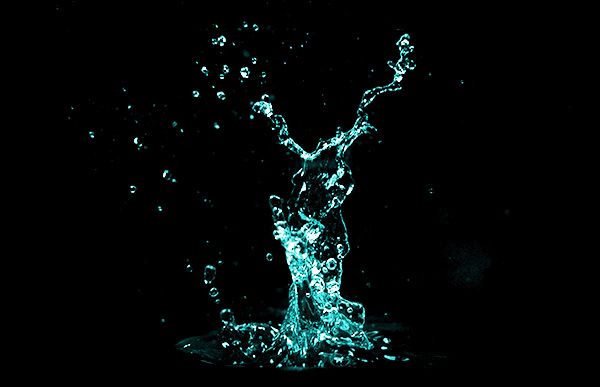
Water is a complicated structure. It is transparent, and despite it
being so clear, we can see it somehow. And even in its most "normal"
state, liquid, water has many forms, so different from each other.
Although water looks so simple—and is simple in its
construction—you can't learn how to paint it once and for all. It's
because you don't really paint water, but the effect it has on the world
seen through it.
In this tutorial you're going to learn how to render liquid water in many forms: drops, lakes, puddles, rain, and waterfalls. I'll show you how to use a variety of Adobe Photoshop tools to accelerate the process of painting. I'll also explain the rules behind all of these, so that you can modify my examples to your needs. The most important lesson from this will be how to use filters to create all the textures you need in a few seconds.
This is a continuation of the Paint Frozen Water tutorial and some of those tricks will be used here too, so make sure to check it out.
1. Paint a Water Drop
Before we start, let's take a look at what the effect we want is about:
The light source: its direction is crucial here.
The highlight: it makes the distinctive shiny dot in the front of the drop.
The specular shadow: you can see the highlight because it's reflected instead of being let inside. That's why we have a shadow under it.
Secondary reflection: the rest of light that was let in gets reflected outside.
Cast shadow: because the light inside gets reflected, it's not cast here, hence the shadow.
Because a water drop is also a lens, it may focus bright light and let it into the cast shadow.
The natural state of a group of water particles is a sphere. However, because of gravity, we observe it as a flattened dome. It also means it changes in perspective: from an oval top view (1) to a dome side view (2).
Step 1
We're
going to paint a water droplet with a method that will let you reuse it
for as many drops as you wish. Feel free to modify my method to create
the effect you like the most.
First, get yourself a background (for example this leaf texture; make the canvas not wider than 600 px), and draw an oval with a hard brush on a New Layer.
Step 2
Double-click the layer to access the Layer Style. Set the Fill Opacity to 0 to make the droplet transparent.
Step 3
Check Bevel & Emboss. This is going to create the shadow on the front and light on the back of the droplet.
Play with Depth (1) and Size (2) to fit both shadow and light inside the drop without making them sharp.
Set the Angle to the direction of the shadow (3).
Change the Gloss Contour to Gaussian (4).
Set the Highlight Mode to Overlay to give the light a brighter version of the background (5).
Play with the Opacity of the Shadow to achieve a natural effect (6).
Step 4
Check Stroke—it will add a clean border between the inside and the outside.
The stroke should be almost invisible—play with the size to make it so (1).
Change the Fill Type to Gradient (3).
Adjust the Angle to our light source (4).
Play with the Scale to make the transition soft (5).
Drop the Opacity if the stroke is too sharp (2).
Step 5
Check Inner Shadow—it will add a bit of volume to the droplet.
Adjust the Angle to that of our lighting (1).
Play with the settings to place the shadow just by the edges, leaving the center area clean (2).
Change the Contour to Rounded Steps (3).
Add a bit of Noise (4).
Step 6
Check Color Overlay—it's not obligatory, but it will make the drop stand out more.
Set the Blend Mode to Overlay for good brightness and transparency (1).
Choose a greenish blue (e.g. #006372) as the color (2).
Lower the Opacity until it's barely visible (3), unless you want to have a colored liquid.
Step 7
Check Gradient Overlay—it will give us the illuminated area on the back of the drop.
Set the Blend Mode to Screen for brightness (1).
Change the Angle to point to the place we want to illuminate (3).
Play with the Scale to place the gradient properly (4).
Lower the Opacity to make the light visible, but not white (2).
Step 8
Check Outer Glow—it will imitate the light hitting around the droplet, which is very helpful in case of a dark background.
Change the Blend Mode to Screen for brightness (1).
Set the Color to white (4).
Make it quite small, scattered, and barely visible using the Opacity (2), Noise (3), and Size (5).
Step 9
Check Drop Shadow—it will create the cast shadow behind the droplet.
Set its Angle to our lighting (2).
Play with the Distance, Spread, and Size to create the impression that it's behind the drop, but not under it (3).
Drop the Opacity to make the shadow more natural (1).
Step 10
To add even more volume, check Inner Glow.
Set the Blend Mode to Multiply for darkness (1).
Set the Color to dark blue (e.g. #1e1e5a) (3).
Set the Source to Center (4).
Play with the Choke and Size to place the shadow in the center, just where the Inner Shadow ends (5).
If the effect is too strong, lower the Opacity (2).
Step 11
Now
we only need to add a dot of highlight on the front of the drop. Create
a New Layer and paint it with a hard brush using pure white.
Step 12
To make the highlight stand out more, simply check Outer Glow in its Blending Options.
Step 13
To make both styles easily reusable, open the Styles window (Window > Styles) and click the Create New Style icon with your chosen layer selected.
Step 14
Now, every time you want to paint a drop, simply:
Paint the shapes with a hard brush, each on a new layer.
Apply the style of a droplet by selecting the layer and clicking the style.
Add a new layer above the previous one and paint a white dot with a hard brush.
Apply the style of a glow to the dot.
Step 15
If you want to create a bigger drop, there are two things to remember for you:
Drops can't be very big, otherwise gravity takes over and destroys their
shape. So this picture must be a macro view—with the observer being very
small or very close to the scene.
The magnifying effect of a drop-lens is clearly visible in this view and should be stressed in your picture.
And, of course, the layer style we've created for small droplets must be modified to fit this bigger view.
To create the magnifying effect:
Duplicate (Control-J) the background.
Duplicate the drop.
Put the duplicated background layer between two drop layers.
Make the Clipping Mask by hitting Control-Alt-G.
You
can additionally cut the outside by selecting the drop (Control-click),
inverting the selection (Control-Shift-I) and cutting (Control-X) the
redundant part.
Step 16
Go to Filter > Liquify (or press Control-Shift-X) and use the Bloat Tool (B) to make this part bigger.
2. Paint a Lake or a River
Step 1
We'll start with the same scenery as in the previous part, where we've set the water level and created the reflection. We should have the background, the clipping mask, and the reflection clipped to it.
Step 2
Create a New Layer clipped (Control-Alt-G) to the previous one. Fill (G) it with dark brown or gray.
Step 3
Duplicate (Control-J) the background and drag it over the clipped layers. Clip (Control-Alt-G) it too.
Step 4
We need to get rid of excessively strong reflections underwater. Double-click the layer and go to the Blend If section. Hold Alt and drag the white arrow far to the left to make the brightest areas transparent.
See? No specular reflections!
Step 5
Create a New Layer and fill it with the color of the mountains (dark blue). We'll use this layer to give a bluish tint to the water.
Step 6
Change the Blending Mode of the layer to Multiply and lower the Opacity as you see fit. The less clear the water (the deeper the lake), the less transparent it should be.
Step 7
Let's come back to the reflection—it's the most important aspect of water. Duplicate it, put it above all the clipped layers, and unclip (Control-Alt-G) it for a moment. Lower its Opacity a little bit, just to see what's behind, and fix it as shown below. Use the Rectangular Marquee Tool (M) to select the area and drag it when holding Alt to copy. Your goal is to create the illusion that there's just water behind these columns. It doesn't need to be perfect—it only needs to cheat the system, not your eyes.
Step 8
Clip the layer back. Double-click it and make the dark areas transparent by dragging the whole black marker to the right, and then Alt-drag its right half to the very end.
Step 9
This effect weakens with distance, so we need to conceal a part of it. Come back to the original reflection and drag it to the top (still clipped). Add the Layer Mask to it (a "camera" icon on the bottom bar of the layers tab) and add a black-white gradient to it—the black part should be in the foreground.
Step 10
We've got perfectly still water, which isn't very natural. What if we want to add slight ripples to it?
Click the lower of the reflections and go to Filter > Filer Gallery. Select Sprayed Strokes from the Brush Strokes list, change the Stroke Direction to Horizontal and play with the sliders to get the right effect (you may need to resize the picture first, since there's a limit for these settings).
Step 11
These were subtle ripples. We can make them stronger by adding a pattern, which will make it more believable for a river.
Create a New File; make it rather big. Fill it with any color, double-click it and add Satin (of the set Patterns) as the pattern. Then select it all (Control-A) and copy (Control-Shift-C).
Step 12
Paste the pattern to our main file. Use the Free Transform Tool (Control-T) to adjust it to the perspective—the pattern should be the thickest in the background and the biggest in the foreground. Control-drag the corners to adjust them separately.
Step 13
The pattern looks a bit too regular. You can use the Patch Tool (J) to fix it—simply select an area with the tool and drag it to a place you want to have copied. No need to be perfect!
Step 14
Use the same pattern once again to make the background even denser.
Step 15
Use the Layer Mask and a soft brush to blend the background into the rest.
Step 16
Merge (Control-E) both ripple-layers and clip them.
Step 17
Of this ripple-layer, we want only white to be visible—black should be transparent. Do you remember how to achieve this effect? (Hint: double-click...).
Step 18
Change the Blending Mode to Overlay and enjoy the effect.
The bright ripples in the shadow may look as if they are reflections on the bottom—if you want to go for this effect, erase the ripples from the columns' base.
Step 19
Water is very reflective—it literally works like a mirror. It means it also reflects strong light all around. Our scene isn't the best example for it (the light source isn't reflected here), but I'll try to show you how to get the illusion of light reflected by ripples.
Create a New Layer and use the Rectangle Tool (U) to draw a rectangle. Put the Satin pattern on it.
Step 20
Right-click the layer and Rasterize Layer Style. Change its Blending Mode to Overlay, and then use the Free Transform Tool (Control-T) to adjust the rectangle to the perspective. You can also use the Warp mode to break the regularity of the pattern.
When you're ready, use the Layer Mask to blend the rectangle into its wall.
Step 21
If the effect is too weak, duplicate (Control-J) the layer.
Step 22
Use the same method for the other column.
Step 23
We can also give a sort of "thickness" to the water by adding the Filter > Filter Gallery > Distort > Glass filter.
Step 24
If you want to paint a deep lake, with the bottom far from the
observer, the bottom will not be visible. Instead, use a dark blue,
green, or brown as the color of the water, with no "background" visible
underneath.
Big ripples, as we've used before, may not work well here. Let's try a different method. Create a New Layer clipped to the water area and fill it with black. Go to Filter > Noise > Add Noise. Then use Filter > Blur > Motion Blur with 0 Angle.
Go to Filter > Filter Gallery > Artistic > Plastic Wrap to create small ripples. Then use the Free Transform Tool to adjust the perspective.
Set the Blending Mode to Overlay and lower the Opacity.
3. Paint a Puddle
Step 1
Again, we need the background and the reflection. Create a New Layer and use the Lasso Tool (L) to sketch the puddles.
Step 2
Fill the shapes with brown, and then lower the Opacity, so that the bottom is slightly visible.
Step 3
Put the reflection above the layers, and then click the puddle-shapes layer while holding Control—it will select them. Then invert the selection (Control-Shift-I) and Delete the outside. (We're not using the Clipping Mask, because the puddles are half transparent and so would be the reflection).
Step 4
Just like we did with the lake's reflection, we need to make the dark parts of the reflection transparent.
Step 5
Again, we need to apply Fresnel effect to the reflection. Use the Layer Mask for that.
Step 6
Let's disturb the surface a little bit, using the Filter > Filter Gallery > Distort > Glass filter.
Step 7
Duplicate (Control-J) the puddle shapes and put the layer above all the layers. Change its Fill to 0, and then double-click it to play with the settings. The actual values depend on the dimensions of your picture, but just keep in mind that the goal is to create a slight shadow inside...
... and a brighter edge outside.
4. Paint Light Rain
Step 1
Create a New Layer. Fill it with black, and then Filter > Noise > Add Noise. Use the Free Transform Tool (Control-T) to extend the borders of the rectangle.
Step 2
Go to Filter > Pixelate > Crystallize. Use the Free Transform Tool again to move the noise away from the foreground.
Step 3
Go to Filter > Blur > Motion Blur to create real drops out of this chaos. Change the BlendingMode to Screen to remove the black background.
Step 4
Use the Layer Mask to clean the drops off the columns.
Step 5
Again, create a new noise layer.
Go to Filter > Filter Gallery > Artistic > Dry Brush.
If the dots are too weak, use the Levels editor (Control-L) and drag the right marker far to the left.
Use the Motion Blur again to create the falling drops.
Step 5
Let's disturb the surface of the puddles with light drops. Make sure all the background (ground, columns, sky, and puddles) is merged. Then grab the Soft Round brush, go into Quick Mask Mode (Q) and paint an oval on the puddle.
Step 6
Hit Q once again to go out of the mode, and then Invert the selection (Control-Shift-I). Go to Filter > Distort > Twirl and play with the angle to get the right effect.
Step 7
Repeat for other areas. To make it faster, you can create a New Action. Paint the oval in the Quick Mask Mode, and then press Record and do the following:
Press Q
Press Control-Shift-I
Press Control-F (apply last used filter)
Press Control-D
Press Q
Use this action when you paint the oval, and then keep on painting.
5. Paint Heavy Rain
Here's a surprising fact: we don't really know what rain looks like. Seriously. In our mind we usually picture it as tons of drops falling all around, but that's not what we actually see. If you don't believe me, just create a "rain brush" and spray it all over the picture. It just doesn't work like this! Raindrops move too fast and there are too many of them for our eyes to notice all of them at the same time—even cameras have problems with it.
Therefore, whatever we paint, it will be just a approximation—a painting of impression rather than an observable occurrence. We need to focus on what rain does to the scene instead of painting the raindrops, because we don't see the raindrops.
Step 1
The sky is too clear for our heavy rain. Add more clouds, for example by using a stock photo. Adjust it to the background by using the Layer Mask.
Step 2
Open the Window > Adjustments window and click the first icon. Put this layer on the top and adjust it, so that the whole picture gets dark and gloomy.
Step 3
Use the Soft Round brush to paint thick rain in the background.
Step 4
Use the Soft Round brush with low Opacity to make the other column mistier.
Step 5
Make the puddles darker, too. You can use the Curves (Control-M) editor for it.
Step 6
There will be too many drops to create ripples individually for them, so let's ripple them with a filter instead. Go to Filter > Filter Gallery and experiment with Distort > Glass and Artistic > Plastic Wrap.
Step 7
Merge (Control-E) all the layers, and then duplicate it. Use the Layer Mask to select the first column. (If you want to see what you're painting in this mode, press \).
Step 8
Go to Filer > Filter Gallery > Artistic > Plastic Wrap. Use it to imitate water flowing on the walls.
Step 9
Use the Layer Mask to make the water on the darker side more transparent.
Step 10
Do the same for the other column.
Step 11
We're going to make the ground wet and shiny. Create a New Layer and fill it with any color, double-click it and add Satin (of the set Patterns).
Step 12
Right-click the layer and Rasterize Layer Style. Then, just like we did with the lake, adjust the pattern to the perspective with the Free Transform Tool (Control-T), by dragging its corners when holding Control.
Step 13
Change the Blending Mode to Soft Light. Then double-click it and play with the Blend If settings to make the black transparent.
Step 14
Use the Layer Mask to clean the overlapping parts.
Step 15
Create a New Layer. Use the Soft Round brush to draw strong mist in the background.
Step 16
Change the Opacity to 50%. Use the Layer Mask to remove the columns from the mist.
Step 17
Merge all the layers except the mist. Right-click its mask and select Apply Layer Mask. Then Control-click it to select its area and use Filter > Blur > Motion Blur with the angle of your rain (your main layer needs to be selected for this). Now the background looks blurry because of all these raindrops, even though we haven't painted any.
Step 18
Create a New Layer and paint over the other column with a hard brush.
Step 19
Control-click the white column, and then hide the layer and select the main one. Use the Motion Blur once again, this time with a slightly smaller Distance.
Step 20
Create a New Layer and fill it with black. Then go to Filter > Noise > Add Noise.
Step 21
Use the Free Transform Tool to stretch the rectangle a bit over the borders.
Step 22
Go to Filter > Filter Gallery > Artistic > Dry Brush. It will make various fine dots out of the noise. Change the Blending Mode to Screen to see them properly.
Step 23
Use the Motion Blur filter to create rain out of the dots. You can use the same method with different effects, to make it fit your expectations. Again, rain isn't an observable object, it's a very variable occurrence, and there are many ways to picture it believably. Feel free to use bigger drops, greater blur, or anything you like!
Step 24
When heavy rain and a puddle meet, an interesting splash appears. In our scenery they won't be very noticeable, but I'll show you how to create a detailed one in case you want to use it for a macro scene.
Create a New File, fill the background with black and add a New Layer. Paint an oval.
Paint a bigger oval above and connect them.
Add "arms".
Add a lot of fine dots and lines around.
Lower the Opacity of the layer, and then create a new one and stress only some areas with white. Then delete completely the first layer, Merge Visible and Invert (Control-I) the colors. Go to Edit > Define Brush Preset to save it.
Step 25
Come back to the main file. Create a New Layer and paint the splashes with your new brush. Remember to adjust their size to the perspective.
Step 26
To make the splashes more natural, lower the Opacity and/or set the Blending Mode to Overlay. Duplicate the layer to strengthen the effect.
Step 27
You can add the splashes on the wall that the rain is hitting. To get a proper angle without changing the setting of the brush, just Rotate the view (R).
6. Paint a Waterfall
Just like with rain, a waterfall can be pictured in many ways. Since waterfalls are considered beautiful and they are photographed all the time, there's a good chance your painting will be compared to a photo. The problem is that photographed, fast moving water will look different depending on the shutter speed of the camera. The slow-shutter-speed waterfall is the easiest to render, and that's why this method was used in video games not so long ago—that's also why they looked so bad.
But hey, even modern AAA titles don't have perfect waterfalls, so why is that? Water is an extremely complex subject. Every drop works like a lens, and it takes a significant effort for the computer to render a lens effect. Just imagine what happens when you gather thousands, millions of lenses! That's why a complex waterfall must be broken into a set of "rules" that make it simpler for the computer to handle.
It's the same with painting. There are three ways for you:
You can paint a waterfall from a reference just as you would anything else—using patches and blobs of color.
You can create a waterfall out of all the drops, paying attention to every single one of them.
You can try to find the rules making a waterfall look as it does, and then find a way to re-create them in Photoshop.
Obviously, we'll try the third method! I've modified the scene for this purpose. It may not be your typical waterfall-base, but it will do.
Step 1
Start by defining the direction of the flowing water. The greater the pressure, the bigger the arch. Pay attention to perspective!
Step 2
Make sure the background is merged. Go into the Quick Mask Mode (Q) and paint the inside of the sketch.
Press Q once again and invert the selection with Control-Shift-I. Then go to Filter > Filter Gallery > Distort > Glass. This way we'll distort what's beneath the water, just as water would optically do.
Step 3
Create a New Layer and draw a rectangle with the Rectangle Tool (U). Go to Filter > Noise > Add Noise to fill it with chaos.
Now use Filter > Pixelate > Crystallize to gather the tiny dots into clusters.
Go to Filter > Filter Gallery > Artistic > Watercolor to soften the edges. Duplicate (Control-J) and hide it—we're going to need it yet.
Last, go to Filter > Filter Gallery > Brush Strokes > Sprayed Strokes. Use Vertical for Stroke Direction. It should look a bit like water flowing down!
Step 4
Use the Free Transform Tool (Control-T) to adjust the rectangle to the perspective. Grab the corners when holding Control to drag them individually.
Step 5
Double-click the layer and change the Blend If settings to make the black areas partially transparent.
You can use the Color Balance editor (Control-B) to make it more bluish.
Step 6
Duplicate (Control-J) the "water wall" and adjust it to higher layers. You can use the Warp Mode of the Free Transform Tool (Control-T) to achieve this.
Step 7
My waterfall is partially in shadow, so I used the Layer Mask to make the water less shiny in that area.
Step 8
Reveal the copy of the modified noise. Go to Filter > Filter Gallery > Artistic > Sponge. We're going to make flowing water foam out of this.
Step 9
Use the Free Transform Tool (Control-T) in the Warp Mode to curve the rectangle.
Step 10
Play with the Blend If settings to make the black areas transparent.
Step 11
Again, use the Layer Mask to adjust the shading.
Step 12
Come back to the background layer and select the water right beneath the waterfall in the Quick Mask Mode (Q).
Use this selection to put a Filter > Filter Gallery > Distort > Glass filter on it. The river's surface can't be smooth when so much heavy water is falling into it!
Step 13
Using textures is simple and fast, but they also give a boring, fake feel. We need to add some randomness. That's why we're going to paint more foam manually.
Create a New File and fill the background with black. Paint something chaotic like this. It doesn't need to look the same—most chaotic patterns will work well here.
Invert the colors (Control-I) and Edit > Define Brush Preset.
Change the settings (F5) as shown below.
Step 14
Use the brush to paint more directional foam. Now, it's all up to you how to use it. The more "curved" the waterfall, the more foam and the less clear water is visible.
Start by adding a lot of foam on the top—it's where water "tries to" flow to the front, but gravity pulls it down.
The water is splashing heavily at the bottom, so add a whole cloud of foam here. Change the size of the strokes all the time—big, almost transparent strokes will work great in the borders.
Foam is also flowing down the waterfall.
If the pressure isn't very high, some water drops will fall down under the main curve.
You can use theBubble brush from the previous part to add air bubbles here and there.
Step 15
Let's make the wall under the waterfall properly wet. Select it in the Quick Mask Mode (Q).
Add one of the filters we've used before for distortion, for example Glass.
Step 16
Finish the picture by adding any details you like. I added a Plastic Wrap filter on the column right next to the waterfall to make it look wet. I also added bigger ripples to the river, as we did with the lake.
Step 17
Now, there's a chance you don't like this effect. It may just not be compatible with your idea of a waterfall. Let's change the "shutter speed" of our picture and see if you like this other version better.
Basically, slow shutter speed adds nothing more than motion blur. The problem is that the Filter > Blur > Motion Blur filter uses only a single direction, and the waterfall is curved. We need to select it part by part, reducing the selection as the curve increases. Use the Quick Mask (Q) for it.
When it comes to the foam, you can unify it with Filter > Blur > Gaussian Blur, and add more of it with the Soft Round brush.
Better? I hope so!
Fluidly to the End!
In these two tutorials we've taken care of all the forms of water you can imagine. I hope it helps you in your future projects, whatever they may be! But that's not the end—if you want to harness all the elements, in the next tutorial of the series we're going to talk about the forms of fire. See you next time!
In this installment of our interview series, I had the distinct pleasure of asking one of our own Tuts+ instructors, Monika Zagrobelna, questions about her artwork, process, and experiences as an artist and instructor. You may recognize her work from the numerous animal drawing tutorials here on Tuts+. I hope you enjoy getting to know the woman behind those fantastic tutorials and exploring more of her portfolio.
Monika, thank you so much for the interview! Let's start from the top: What got you into illustration?
I can’t
really remember a time when I wasn't drawing at all. It was always fun for
me, though I didn't take it seriously for a long time. As a kid I used to draw
my own games for my friends. I even remember I created over 100 fake Pokémon that later were drawn with colored
pencils, cut out of paper and used for duels like in the anime series. I've
just always been creative, and drawing is a way for me to bring my countless
ideas to life, so that others can see them too.
I can be
inspired by pretty much anything: my dreams, some line heard in a movie, an
interesting fact about an animal… My ideas mostly come from nowhere; usually
when I’m busy and I can’t do anything about them at the moment. When it comes
to the works of great artists, I’m either extremely jealous or intimidated, but
then it also makes me motivated to become as good as them. My favorite artists,
usually in terms of their techniques, creativity, or way of teaching, are Sam
Nielson, Stanley Lau, Therese Larsson, Bobby Chiu, and Christopher Onciu.
"Dragons are my favorite drawing subject".
Did you study art formally, are you self taught, or both?
Formally I’m
an IT specialist with specialization in graphic design, so I was taught how to
program, create web pages, and occasionally design a logo. Interestingly, I’m not good at any of these
things, and what I’m really good at, creating and drawing, I have taught myself
in my free time. However, I still have been learning from these amazing artists
who give their time to share their skills on the internet for free, so I think
the line between attending a professional art course and self-learning is a bit
blurred nowadays.
"One of the first dragon pictures I've ever drawn, dated probably 2006-2007."
What is your creative process like?
Not more than
two years ago I used to simply draw. There was no process, no preparation. I
didn't believe I could make a living from being an artist, especially in
Poland, so it didn't matter how good (or not) I was. Then there was a moment
when I realized that drawing wasn't only about talent and unconscious learning.
Finally I understood that all these people on art forums aren't poor untalented
artists who want to learn how to draw, but that they’re actually decent artists
learning how to be better. I was a decent artist too, and I wanted to be
better, but I didn't know how—so I started to learn.
"My study on dragon feet, based on the American rhea, the T-Rex, and the emu."
Now I’m not able to just draw anything—it’s my curse and my blessing. Before I started
learning, I thought I knew probably 60–70% about drawing. Now I know it’s more
like 2%, and this number actually drops when I learn new things, because with
every mastered topic there come ten topics I had no idea were there to learn.
So, before I create, I analyze the topic as
extensively as possible. I rarely draw fully rendered works these days—I'd rather spend my time sketching and studying. Maybe I take it too seriously, but
studying is actually a lot of fun for me. I love learning new things and understanding
how something works, and that applies to everything, not only drawing. I believe
there will come a day when I will be able to draw anything without preparation, but I hope it will not be too soon—the journey itself is exciting
enough!
"My preparation before drawing a werewolf."
What programs and tools do you use in creating your work? Anything you're especially fond of that you'd like to recommend to readers?
My favorite
tool is a soft pencil, but these days I usually create my sketches directly in Adobe Photoshop because it makes it easier to modify the pose or fix one element.
What I really love about digital painting software is I don’t need to bring all
my tools to the desk and clean up afterwards. However, if I had to start my
digital painting adventure now, I wouldn't choose Photoshop—it’s too big and too
complicated when all an aspiring artist needs is a set of basic brushes, a
color palette and a canvas that can be easily cleared. Everything else is, and
was for me for a long time, an obstacle in developing your skills.
I use a Wacom Intuos Pro M tablet, but I don’t see much difference between it and my old Wacom Bamboo (now it’s Intuos, I think). When I was “tabletless”, I used to scan my sketches and edit them in Adobe Illustrator; that’s very mouse-friendly, but now I can’t imagine myself being bound by a
mouse.
"After studying something I create my own reference sheet for future use."
For how long have you worked as an artist? Is this your main line of work?
I don’t
consider myself a professional artist yet. In March last year I got my engineer
degree and at that time I was already writing for Tuts+, so there was never a need
for me to look for a “real” job. Since writing tutorials requires a constant
development from me, I treat it as a kind of training time for some other
artistic job in the future.
What's your typical work day like? How about your work space? Can you give us an insight into how and where you work?
I get up at 7
everyday, be it a work day or weekend. I've learned it makes it easier to get up
on Monday when there’s no Sunday-laziness to compare to. I sit at my computer
at 8, check e-mails and social sites, reply to comments, and then get to work. I
work according to the Pomodoro technique: 25 minutes of work, 5 minutes of break. It
keeps my eyes and back healthy. I’m the most productive before noon, and then
my efficiency gradually drops. If everything goes according to plan, I end
working about 4pm, but there are lot of days, especially right before the
deadline, when I work much later than 6pm. There was one tutorial, I won’t
tell you which, that required me to work 18 hours a day for some time.
"My kingdom—I spend most of my life here."
After I finish my work day, I take a break for 30
minutes of pilates or yoga. Pilates is awesome if you work a lot at the computer,
and my body likes yoga positions too. Then it’s time for… more work. I used to
play a lot of computer games—I have a full Steam library, and I was even
addicted to a MMORPG called Shadowbane at one time. Now I focus completely on
what I want to achieve and there’s no space for games any more. I don’t feel I’m
losing anything, though. It’s just that creating has turned into my biggest passion,
and nothing compares to it. Luckily, I happen to have a loving partner who understands it!
"Another generic dragon. Did I mention they are my favorites?"
I work at home, which has its good and bad sides.
I have a self-built PC constructed especially for Photoshop, my Intuos Pro
tablet, and, more recently, two monitors—one with awesome contrast and
colors, and another, normal one, to see what most other people see on their
screens. The second screen is also very useful for using references or looking
at a full version of the picture when I’m working on details. I also have an
assistant, Kinzie, a possibly-half-Norwegian-Forest-Cat, who does her best to
distract me from working.
Kinzie at work.
You write fantastic tutorials for Tuts+ on drawing animals, both real and fantastic. What's your focus when creating tutorials?
I try to
convince my readers that drawing isn't really about creating lines, but about
knowing where and when to place them. So instead of creating step-by-step
tutorials that result in only one picture in only one style, I focus on
learning about the essence of the animal. When you learn the anatomy, knowing why
the animal looks the way it does, you are able to use this knowledge in any style
you wish. You can also easily create new, believable creatures based on what
you know about real ones.
Before
creating a tutorial I research the animal, fix my own
misconceptions, and note everything that’s important for drawing. Sometimes I’m
tempted to include even totally unrelated things (did you ever wonder why
kangaroos aren't as intelligent as humans, despite being born in an even earlier
developmental stage than us and having “hands” that could be used for
manipulating tools? No…? OK, let’s go back to drawing), because I’m so
fascinated by them. I've been drawing animals longer than anything else, so you
could say it’s my obsession.
For animal references, do you primarily use photographs, or do you draw from life as well?
Unfortunately,
I have to drive one hour to get to my nearest zoo, and it also happens to have
the most expensive tickets in Poland, so I have to rely on photographs most of
the time. It’s not really that bad, as long as I use a lot of them and don't base
my observations on only one or two. I made it my goal to visit zoos as often as
possible. I even visited the Czech Republic to see my favorite snow leopards, and
then I learned there are two specimens in Poland, three hours from my place (I
saw them last year!).
I use these visits to extend my personal stock base, to
observe the animals and to feel into them—to become them for a while. There’s a lot of controversy about zoos,
but I know one thing for sure: if it wasn't for them, I would have no chance to
see all these majestic animals alive, and neither would the photographers who bring us references to draw.
Monika observing cougars in Zoo Opole. "I love being so close to them!"
What do you find the most difficult to draw? How about the most difficult to teach?
Generally,
all the non-live things are quite hard for me. I don’t like drawing architecture;
it’s not natural for me to measure and count things when creating. I use simplified perspective rules for my
animal drawings, but they don’t work for buildings or cars. I also don’t like designing
environment art, backgrounds, locations, all of these; that’s not my thing. And
what I can’t do, I can’t teach, so these would be also the most difficult to
teach for me.
"I prefer to focus on the creature. Here's one of the rare cases with quite detailed environment added."
What projects are you currently working on?
There’s my
big, personal project about human anatomy that I’d like to turn into a course
one day; it’s a huge study I've been working on for over a year and it’s still far
from done. I also cooperate with my partner on creating a quite unusual web app
for time management. It’s something I could make use of, but I hope I won’t be
the only user! There’s my book too. I've been writing it for a few years, but
it was rewritten from scratch twice as my writing and storytelling skills
developed. I hope this third time will be a charm. This book makes me motivated
to learn how to draw humans; I so wish to picture my characters properly one
day!
"I constantly experiment with styles of painting and shading."
What are your plans for future work?
I would love
to work as a freelance concept artist or an illustrator. Creating and
interpreting things is what attracts me to drawing, so that could be a nice way
to live. However, I don’t want to make any definite plans. Two years ago I
would not have imagined myself where I am now, so I guess there’s no way to tell what the future will bring. I would like to create a book for artists about dragon anatomy, stylized
for a real anatomy book. I’d like to write and draw comics. I’d like to create
a browser game about animals. I’d like to create something that people will
draw fan art for… But these are only vague projects. Time will tell!
"I like creating new beasts, here a 'dragriffin'."
What words of advice do you have for emerging illustrators or artists who wish to engage in design as you have?
There is this
quote I heard some time ago, and I think it’s very true: “Find your passion,
become very good at it, and finally someone will pay you to do it." Today we’re
not limited by the region we were born in. If your country doesn’t have art
schools, take courses online; if there’s no art industry where you live, work
as a freelancer for companies abroad. Don’t get discouraged—if you’re sure that
art is what you want to do in life, focus on it, and give it all your heart. It
will pay off one day!
Many thanks to Monika for taking the time to chat about her artwork, process, and experiences thus far as a working artist. For more of Monika's work, you can check out some of the links below as well as her tutorials here on Tuts+.
Colored pencils may seem like a childish medium, but in this tutorial I'm going to show you the two-layer technique. By layering two disparate colors, you can create a non-color-crayon-box color that matches what you see in real life. We'll start by making a swatch guide that showcases every color combination we can make, and then use that color knowledge to pencil a still life.
What You'll Need
5.25" x 9" piece of paper (I prefer Stonehenge)
7" x 9" piece of paper (I prefer Stonehenge)
HB pencil
Pen (optional)
Ruler
Color pencils: Poppy Red, Orange, Canary Yellow, True Green, Grass Green, True Blue, Ultramarine, and Violet
Still life photo (available as an attachment to this tutorial)
1. Make Your Color Chart
We're going to be making a color chart that shows all of the color combinations for our two-layer technique. The two-layer technique is a great way to create neutral colors, darker colors, and also more complex colors that don't come in the color pencil box. We'll be making 28 boxes that measure 1" x 1" on our 5.25" x 9" piece of paper.
Step 1
We'll make the vertical margins for our 1" boxes. Measure in 1/4", then 1", then 1/4", then 1", and so on from left to right.
Step 2
Now we'll make the horizontal margins for our 1" boxes. Measure down 1/4", then 1", then 1/4", then 1", and so on from top to bottom.
Step 3
Label each box with abbreviations of the color combinations so that you know which two colors will go in each. I used the following code for mine, but feel free to write out your colors fully.
Poppy Red = R
Orange = O
Canary Yellow = Y
True Green = TG
Grass Green = G
True Blue = TB
Ultramarine = B
Violet = V
I went through the color palette from R to V and listed out all of the combinations. I'll list them out here so you can easily write them on your paper.
First row = R+O, R+Y, R+TG, R+G, R+TB, R+B, R+V
Second row = O+Y, O+TG, O+G, O+TB, O+B, O+V, Y+TG
Third row = Y+G, Y+TB, Y+B, Y+V, TG+G, TG+TB, TG+B
We're ready to start filling in the color chart! We'll start by penciling in the first layer of red in the top row. Since we're layering colors, don't press really hard. You don't want to fill in the paper solidly or else you won't be able to add another layer on top.
Step 5
Starting in the first box, pencil in the second color, in this case orange, on top of the red first layer.
Step 6
Move on to the second box and pencil in the second color for that one, which is yellow.
Step 7
Move on to the third box and pencil in the second color for that one, which is true green.
Step 8
Work your way through the rest of the first row. You should start to see the subtle differences between the boxes.
Step 9
Now we're on the second row. Since the orange combinations don't take up the entire row, only fill in the boxes that have orange as the first layer.
Step 10
Pencil in the second layer of orange combinations with their appropriate colors.
Step 11
Moving on to yellow! Fill in the first layer of the yellow boxes.
Step 12
As you did with the red and orange combinations, pencil in the second layer of the colored pencils.
Step 13
Continue filling in your color chart until all 28 boxes have two layers of colored pencils. I prefer to use a pen to go over the square borders afterward so that the color combinations stand out even more.
2. Sketch Your Still Life
Step 1
Pull out your 7" x 9" piece of Stonehenge paper and measure out 1" margins around the outside.
Step 2
Then, using the photo linked in the supplies above, sketch out the still life. I recommend using the side of your pencil rather than the point because the hard edge of the point can dig a groove in the paper and leave a white spot in your finished drawing.
3. Pencil in the First Layer Colors
We're ready to put in some color! Using the photo as a reference, look closely at the colors in the fruit. Compare those colors to the ones in your chart. We're going to use this chart to help us decide what colors we'll be layering to match the colors in the photograph.
Step 1
I like to start with the lightest colors and work to darker ones when I lay in the first layer of color. So let's start by penciling in the yellows. I put in the yellows where the final color is yellow, yellow green, or a yellow orange.
Step 2
Now we're going to pencil in the true greens. I put in the true greens where the final color is a medium green.
Step 3
Orange is a bit lighter than the grass green, so let's layer in the orange as a first layer in the areas that will be a red orange or a dark brown.
Step 4
Now we can pencil in the grass green. In this photo, we'll be putting grass green in as the first layer of color in areas that are in deep shadow.
Step 5
Finally, we want to make sure we fill in the shadow on the table as well. Since the shadow on the table is lighter than the darkest dark in the fruit, we'll fill the first layer of color for the shadows in with a true green.
4. Pencil in the Second Layer Colors: The Apple
Here is where the color chart really comes in handy. Use it to figure out which combinations on the chart match the colors in the photograph.
Step 1
To make things easier, I'll be working my way through the fruit individually so you can clearly see what I'm doing. I'm going to start by layering in a second layer of red into the apple where I want the final color to be a red orange or red yellow. I'll also add in a layer of grass green in the areas that need to be darkened, and some orange in the areas that need to be an orange yellow.
Step 2
You can see we're getting somewhere, but the colors need to be pushed further. I'm going to go back in and add the first layer of color back over the top of the second layer to deepen the values. So I put red back over the green and yellow over the oranges.
Step 3
To push the darks even more, I'm going to add one last little layer of grass green over the darker areas. We're still just using two colors to create each final color, but the added layers help make the color more vibrant and closer to the photograph.
5. Pencil in the Second Layer Colors: The Lime
Step 1
Just as we did with the apple, we're going to pencil in the second layer of colors for the lime using our color chart and the photograph as guides. Pencil true green in over the yellow areas to create a yellow green. Then color in grass green over the first layers of true green to create a darker green. Finally, add in some violet as the second layer to the grass green to create the darkest spots of the lime.
Step 2
Due to the lime's vibrancy, we're going to add a layer of yellow to the entire lime to make it pop. We'll also draw in some of the dimples of the lime with more of the violet and grass green. Go slowly here to avoid overdoing it with the dark colors.
6. Pencil in the Second Layer Colors: The Bananas
Step 1
Like limes, bananas can be a bit hard to color because we see them as being just one color, but if you look closer, you'll discover they have yellow oranges and yellow greens in their peels. We'll add in oranges and true greens on top of the yellow first layer to mix those colors. Also add in grass green on top of the first layer of true green to push the shadows on the banana.
Step 2
To neutralize the banana further, we're going to add a third layer. I colored in a light layer of orange in the shadows to make them less green. I also added grass green to the ends of the bananas to get them closer to their brown color.
Step 3
Just as we did with the lime, color over the entire bunch of bananas with the yellow colored pencil to really make things pop. Again, we're still keeping to the two-layer technique in terms of the number of colors, but an additional layer of the same colors pushes their vibrancy.
7. Pencil in the Second Layer Colors: The Shadows
Since we used true green to lay down the first layer of color in the shadows, we'll neutralize it with violet. This is also the closest color combination when we use our color chart and the photograph as references.
8. Final Touches
If you want to push your still life just a tiny bit more, squint your eyes at the photograph and find the darkest darks. Then go in with your violet and ultramarine and gently build up a layer of that color to push the depths of the shadows. Here I darkened the tops and ends of the bananas, the shadows on the bananas, and the parts of the shadows on the table where they meet the fruit.
You've Made a Colorful Still Life!
Now that you have your swatches of color combinations, you can continue to use the two-layer color pencil technique to draw just about anything. The more color pencils you have in your box, the more color combinations you have, so don't fear making a new guide of swatches. Never fear adding too many disparate colors. If anything, you'll discover how to make the most lovely browns and grays.
Water splashes are a beautiful phenomenon. The randomness of liquid physics ensures that every splash is unique. The result is a natural struggle of the fluid as an external force flings it around and gravity insists it return to a resting state. This struggle takes place in the span of a fraction of a second, and it often happens too quickly for us to be able to capture and appreciate the simple majesty of the effect.
Because water splashes are so familiar, yet elusive, they make for excellent compositional elements. The image of a splash also conveys movement and mood. If you want to use them in your own designs, you probably consider purchasing stock images as your only option. This Quick Tip is here to show you that with a bit of effort, you too can create your own beautiful water splashes to use!
1. It's All About the Light
The absolute first thing to discuss is the mechanics of capturing the water splash with a DSLR. It's more challenging than it looks. The main issue is the speed. The splash only lasts for a moment, and it will not be still. To capture it appropriately, the camera needs a very quick shutter speed. I found that anything slower than a speed of 1/1000 of a second resulted in motion blur.
The image below was captured at a shutter speed of 1/800 of a second.
The movement and shape of the water is beautiful, but the shutter speed isn't quick enough to freeze the motion and provide sharp results.
The problem then with increasing the shutter speed is that light becomes a major issue. The faster the shutter, the less light gets through. In this image, the shutter speed is set at a blazing 1/2000 of a second. The drops are sharp and clear, but the overall image is way too dark.
Now there are professional solutions to this problem. Off-camera strobes are ideal in this situation, especially ones that can fire off several times per second. If you have one of those, use it! But I'm guessing those pieces of equipment aren't all that common for graphic designers, especially since the price can range from hundreds of dollars to thousands!
The other aspect of this speed issue is timing. Catching the water splash directly in frame is nearly impossible when working with a single exposure. The better option is to use a continuous release and capture several frames to ensure you get one that is useable. This compounds the light problem, as not every flash is capable of firing off continuous exposures.
My solution? Clamp lights! And lots of them!
I found these lamps at my local hardware store for about $10 apiece. They are very simple and clamp onto almost anything. I use them for just about everything now! I also recommend Natural Daylight colored light bulbs with as high a wattage as you can find. In my setup I'm using three 23 Watt CFL bulbs and one 50 Watt flood light bulb.
This much light is needed to compensate for the shutter speeds. Just for comparison, here's a shot of my hands holding some water under those lights with a "regular" shutter speed of about 1/100.
Now here's how it looks with the shutter speed dialed up to 1/3200.
For your own project, you will need to experiment with the lighting and shutter speeds to get the right balance for you.
2. Surface Splash Technique
This is the first of two techniques to capture water splashes. It's the easier of the two and should be used to build confidence in the shots, before attempting the second technique.
Step 1
For this approach you will need a simple glass aquarium filled about a third of the way with water. Set up the clamp lamps pointing down into the water. It's important to use a dark background, like a black sheet or curtain. Fortunately, due to the high shutter speeds, it's unlikely you will need to worry about any light spills onto the curtain showing up in the shots.
Step 2
Mount the camera on a tripod right at the water level. The lens should be looking over the surface of the water. Be watchful of reflections, although the shutter speed will help keep most of those out since they generally won't be bright enough to be visible. In this shot, I brightened up the reflections just to give a better idea of the camera position.
Step 3
To create the splash, drop an ice cube into the water right in front of the camera. Why an ice cube? Because there's no color in it to reflect into the splash. They float and are easy to fish out of the water, and they are cheap and readily available! Drop the ice while holding down the shutter to shoot continuous shots.
Step 4
Remove the ice cube from the water, and then carefully use a napkin to wipe the splash drops off the sides of the aquarium.
Step 5
Repeat the process several times. This will require patience.
I ended up taking around 100 shots just to get four or five images worth using.
3. Hand Splash Technique
Ready for the next level of water splash shots? This technique is a bit more difficult due to the additional moving parts. Basically the idea is to cup water into your hands in front of the camera, and then capture the splash as you let the water go into a mid-air splash. The results are quite different from the previous technique as there's no surface for the splash to interact with.
Step 1
The setup for this technique is a little different. It requires a bowl of water, a large basin to catch the water, and an assistant who doesn't mind getting a little wet!
Step 2
Mount the camera on the tripod and aim the lens at a point about 2 feet in front of it—the lamps should all be focused on this same point. Scoop up some water between your hands (or have your assistant do the wet work!) and hold it in front of the camera.
Step 3
While the camera is shooting continuous shots, release the water! Pay attention to the hand movements. Different release techniques will create different shaped splashes.
Step 4
Repeat the release technique slightly higher than the camera lens to capture the drops as they fall. Just as with the prior technique, have patience and keep trying until you have several good frames.
4. Going Digital
Time to dry off the hands, stow the lights and camera gear, and get those images into Photoshop! The goal is to create a set of custom brushes that will be readily available for future digital projects.
Step 1
Select an image to begin working with. The clearer and sharper the splash appears, the better the results will be.
Step 2
Increase the contrast with Layer > New Adjustment Layer > Levels. Adjust the slider handles by pulling the outer handles inwards until the image appears crisp and sharp.
Step 3
Photoshop brushes disregard any color information, so it's the best practice to do likewise when crafting custom brushes. Add a Hue/Saturation adjustment layer and pull the Saturation slider down to -100.
Step 4
Add a New Layer above the image layer. Use a soft edged brush with black paint to paint over the surface of the water, the top edge of the aquarium, any hint of a reflection and any out of focus drops. The idea is to isolate the splash shape as completely as possible.
Step 5
Photoshop determines brushes by dark pixels over white. The splash photos are the opposite of that. So add an Invert adjustment layer to reverse the colors.
Step 6
Go to Edit > Define Brush Preset. Give the brush a name and hit OK. This brush will now be added to your library of brush presets.
5. Use My Brushes
I fully encourage you to create practical effect brushes on your own. It's
not a very difficult task and it is incredibly rewarding. Cultivating
the skill to transition visual effect from practical to digital will
open up new possibilities for your digital designs. But if you don't
have the time or capability to create these brushes on your own, I've
included mine here for you to use on your personal projects.
Step 1
Download the attached file for this tutorial, WaterSplashBrushes.abr. Then go to Edit > Presets > Preset Manager. In the Brushes section, use the Load button to navigate to the downloaded file.
This will add 13 new Water Splash brushes to your Brush Preset library
Step 2
Go be amazing! Use these brushes to add an interesting natural element to your digital artwork.
Want More?
Can't get enough custom creative
brushes in Photoshop? Check out the rest of our series on creating Photoshop Brushes from Scratch. Hungry to learn more about how to use custom
brushes in photo manipulation projects? Check out my profile of courses and tutorials here at Tuts+ and find all that, and much more!
Creating
your own library of digital resources pulled from real-world practical
effects is a skill that will pay off exponentially in the future.
Instead of searching stock sites for interesting textures, try creating
some for yourself! I'd love to see them in the comments below.
Want to save time on your design work? Yes! Great, then let's dig in.
This article is overflowing with time-saving tips that will not only have you working more proficiently, but get you punching above your weight. Learn how to crank up your output, while avoiding burnout and income plateaus, all by working just a little bit smarter as a designer.
Get a productive primer on task, time, and project management techniques. Learn how to put web services and graphic software to work for you. Turn your work patterns into a system that produces more, faster. And discover habit-building techniques to put these rapid-fire, quick tips to action in your day-to-day work as a designer.
Jump into these 55 productive tips to hustle more strategically, get more done, more consistently, focus better on the design work you so enjoy doing, and start cooking up some high-energy growth. Let’s get to it!
1. Filter your projects down into actionable tasks.
It’s difficult to sit down and say that you’re going to design an entire website, from branding through to coding. Even a small website is a complex project, with multiple tasks to complete. Get into the habit of breaking down large projects into incremental tasks, then scheduling those components to work on. Any big project can be broken down into a series of milestones and individual tasks.
2. Apply one-touch task management.
Get familiar with the basics of the popular productivity system Getting Things Done. In GTD you’ll learn the touch it once principle, which recommends that you process and assign tasks as they come in. So, when you read an email, either act on it immediately (if it takes two minutes or less), or add that task to your task management system and assign a time to take action on it. Don’t just read it and then leave it to start over with later. If a simple graphic request comes in, do it right away. Otherwise, add the task to your schedule.
3. Focus on your most important design tasks (MITs).
Identify and prioritize your most important tasks for the day. Keep it to a limited number of tasks to work on, such as three. Also, try to tackle them as early in the day as possible. This gives your day purpose. These might be components of a big client design project or that hand lettering side project that you’ve been meaning to dust off. The big rocks only move if you pick them up every day. Learn more about what an MIT is and how MITs relate to your goals.
4. Tackle your difficult tasks first thing.
This is known as eating the frog—yes, that metaphor makes it easy to remember. It’s all too easy to start work with your email, get distracted on incoming requests, and not make headway on your most important graphic design projects. This is especially true of those important tasks that you just don’t want to do and are procrastinating on. Start your day with a big win, dig in, and get that tough task accomplished first thing.
5. Outsource simple graphic tasks or those you just don’t like.
7. Take your big list of tasks and bundle the related ones.
Task bundling leads to greater efficiency, especially with the less critical tasks or repetitive tasks that can otherwise be distracting to your workflow. Instead of leaving social media open all day, jump in for just 20 minutes and post across all channels at once, then close it down. If you need to do recruiting tasks, such as checking job boards, or emailing potential clients, tackle those tasks together. This will free up the rest of your time to concentrate on your more important design work—distraction free.
8. Use the right task management software for you.
There are so many task management software options today—hundreds to choose from. There’s no greater time-sink than shifting between task software, but using any decent task app will improve your efficiency. Do some basic research, then choose one and stick with it for a while. Here are a few to consider, listed from simple to complex (and I’ve used all of these): Clear, TeuxDeux, Wunderlist, Things, and OmniFocus.
Chaos may sound creative, but it isn’t conducive to cranking out a number of design projects on a daily basis—and it’s far from reliable. Your creative work routine gives you a foundation for getting things done, not just when you feel like it, but every day. For some inspiration, take a look at: Benjamin Franklin’s routine, famous creative routines, and more classic creative routines. Notice how unique your daily work routine can be, as long as it’s consistent.
10. Apply time boxing techniques to get things done.
Time boxing is the action of fixing a time period to work on a task, group of tasks, or a project. Whether you opt for working in increments of 25 minutes, as with the Pomodoro technique, or prefer to work in larger chunks of time (such as two hour increments), time boxing will have you breaking down your open-ended design projects into manageable work sessions. Learn more about time boxing and why it’s so effective.
11. Maximize your high-energy time.
Every creative is different. You may prefer to work late, crafting visuals well into the night, but many of us experience our most clarity shortly after waking up. Take note of your circadian rhythm, so you can schedule your most challenging tasks when you are at your peak. Schedule your low energy tasks for times of the day when your energy is typically lower. Learn more about assigning energy levels as contexts to your tasks.
12. Find your focus and flow.
Focus on one task at a time, unplugging all distractions, such as email and Twitter. Avoid surfing the web and put your phone into silent mode during a work session. Be mindful of what you’re working on, and work slowly and conscientiously at first, as this will open you up to getting into a groove on a project. It’s hard at first, but the more often you get into flow with your design work, the easier it is to do again—and again. Learn how to find your focus and get into the zone.
13. Take care with meetings and other time killers.
Meetings can be helpful, especially when it’s a complex issue that needs talking out. It’s all too easy to get sucked into unproductive meetings though. Avoid meetings that are unnecessary. Also, protect the high energy times in your schedule, as meetings don’t require the same level of creativity as designing. Take care against similar time killers. Grabbing a cup of coffee can turn into a conversation, can turn into an hour of your most productive time spent talking about some political issue, rather than cranking out the design work you needed to get done today.
14. Add software efficiencies and custom automation to your workflow.
Start making use of software that can automate actions you commonly do or make tasks quicker and easier to complete. TextExpander is useful for saving lots of typing time. Also, if you're on a Mac, then start using Alfred to work more efficiently. There are a number of apps you can use to make your workflow more efficient and automated. Take a look at optimizing your workflow with custom setups with these types of apps. Learn more about automation on your Mac. Also, maybe even learn a little bit of coding to customize your automation further.
15. Run time experiments and track your time.
You can use a spreadsheet to manually track how long your design tasks take, or use a time tracking app like Toggl or Harvest, or even record how long tasks take you in a written journal. You can track your time for client projects, in order to feed into accurate billing, but that same type of tracking can be used to improve your output. Once you know how long a task takes you on average, experiment and see if you can improve those times—continually look for ways to improve. Learn more about leveraging time tracking to improve your design efficiency.
If you work at a design agency, then you know how powerful it is to have a full team to step up and work on big client projects. You also know how important it is to have a single vision coming from your art director and to have one person in charge of project management. Freelance designers can level up with a similar approach and start taking on larger design projects. Moving towards an art direction and project management role means learning how to lead a team. It can be a difficult move, but will allow for scaling what you can offer your clients well beyond just the time you can personally work on their design projects.
17. Assemble your design team.
You may have some design friends who specialize in skills that differ from yours. If not, start making some. These are the type of connections that work really well for collaborating on larger design projects. Keep an eye out at conferences and in design forums. Grab contact details and keep in touch. Use popular design sites to reach out and discuss client project opportunities. Dribbble Pro, for example, allows you to send direct messages to fellow designers about potential work projects and opens up greater search options.
18. Set your projects up with pipelines.
Sure, adaptability is key if you’re tackling a new project that you’ve never worked on before. But if you’re consistently building websites for similar clients, or offer another regular design service on an ongoing basis, then break your design projects down into milestones. This will allow you to schedule multiple complex projects and deliver on them reliably—giving you consistency to scale.
19. Outsource components of large-scale client design projects.
20. Scope your projects well from the get-go and avoid "scope creep”.
Contracts don’t sound sexy compared to cranking out a lovingly flat design. But they set the tone and scope of each project in a professional manner. On any large project, clients will inevitably ask for more features, or email you at 1am with their next big idea to add to their project. With a clear scope established, you’re in a great position to rework deadlines, and increase the project budget, with each additional design request your headache of a client makes.
21. Keep on top of communication with your clients.
Opt for short, to-the-point, consistent updates with your clients. Sure this takes time, but it will save so much more time in the long run by avoiding misunderstandings that can derail a large design project.
22. Get client sign-off on designs throughout the project.
There are some great tools for doing this, such as DesignSignoff, Pixelapse and LayerVault. These types of tools are also built to collaborate with your design team, present design options and the ideas behind your work, and handle version control.
23. Settle on project management software that works for you and your team.
There are a lot of options to consider for project management software, such as: how the app feels, costs, features, client support, complexity, cloud integration, and more. Here are a few popular options to consider, from simple to complex: Trello, Basecamp, Daylite, Streamtime, Asana, and Podio.
24. Use affordable cloud-based services for your design business.
For virtually any aspect of your business, there is a SAAS app that will help streamline your workflow. It can take some time to set up these components, but once done, you can work a whole lot faster.
26. Take care of critical, client-related business in the cloud.
Store your client details in an easy to reference contact or client relationship manager, such as Highrise, Insightly, or Podio. Send proposal and contracts with apps like Quote Roller, Bidsketch, or Motiv. Track client invoices and keep track of accounts with FreshBooks, Xero, or QuickBooks.
27. Share files quickly with your team and clients.
28. Use social media time saving tools without overdoing it.
Use tools like Buffer for quick posting or Hootsuite for managing your social channels. There are so many social media channels and tools available. It’s best to take a minimum approach here, and only put as much time into social media as you see a return with. Experiment with one social channel, one tool, and one strategy at a time, and stick with what works for your needs.
29. Snap software together online into automated workflows across apps.
Instead of looking for one software solution that does everything (i.e. the holy grail), you can instead use each app online for what it’s great at, then put it together with other awesome apps to form online workflows. Take a look at apps like Zapier and IFTTT to get started with snapping these Lego pieces together. You can use these to build custom components for your design business workflow or offer unique services to your clients.
30. Click services together into full-path fulfillment options.
Much like the SAAS software mentioned in the previous section above, you can click coding and design services together like Lego pieces as well—building full-path solutions you can offer your design clients.
31. Start with templates and assets, then hire providers to customize them.
Envato Market is the place to get professional WordPress templates, in any theme style you can imagine. Across Envato Market you can purchase affordable code and graphic assets to build client projects. The service providers on Envato Studio are familiar with these themes and components, many being very active in Envato Market, so these are the very experts you can tap into to customize these components and click them together for your clients.
Sure, five dollars for a logo is cheap, but if it’s off the mark, then you’ll need to have it redone by a professional—wasting your very valuable time. If you’re in a tight spot, need assistance, and want to take a chance on a hobbyist, then go for it. Keep in mind though that you often get what you pay for. Envato Studio service providers offer high quality, affordable services, but not bottom of the barrel pricing.
37. Choose service providers that are quick and easy to use.
Do you really have time to wade through and give feedback on 99 or more designs? Or how about spending time crafting a brief, posting a job on a freelance marketplace, and reviewing a slew of incoming pitches? Instead, it’s quicker to work with just one, high-quality, reliable designer, which you can find quickly through Envato Studio. And this way you can build a relationship with them; they can become a fixture of what you offer through your design business.
Get familiar with the options for customizing your Photoshop workspace to your liking. Learn how to setup Illustrator's workspace and other app workspaces. Customize the workspace setups for the variety of design work you do. For example, you may need different tools for working with typography in Illustrator versus the setup for the vector illustration work you do.
39. Create reusable templates for your recurring projects.
40. Create a library of files for your most used graphic resources.
Keep your most used icons on one artboard or all your textures in one file you can access quickly from PS or AI. If you work with a team, then keep it accessible through Dropbox. Use a consistent, logical naming convention for your files as well. This way, when you need a graphic you often go to, you know where to find it.
41. Get familiar with keyboard shortcuts, and create your own, in all your most used graphic applications.
Memorize useful keyboard shortcuts in Photoshop and other graphic apps you use on a regular basis. Also, create your own shortcuts for anything you do on a regular basis, which has you clicking through panels or sifting through menus. Here’s how to create custom keyboard shortcuts in Illustrator, including how to apply additional workspace customizations.
42. Create and put actions to work for you.
Create Photoshop actions for common tasks you perform often. Actions can be recorded and then played back, saving you time on repetitive graphic tasks. Actions are simple to get started with, but there is so much you can learn to do with them. For more on actions, jump into our course on how to set up actions in Photoshop to showcase your projects.
43. Enhance your use of actions with batch processing.
Take Photoshop actions further with batch processing. You can learn how to process hundreds of files. Quickly change file types, resize multiple files, apply compression, and more with this automation tool.
44. Create standard operating procedures for your design and business work.
All the services and online tools mentioned in the article can be turned into workflows. It’s helpful, especially as your team grows, or your design business explodes, to document your procedures. These are guidelines and instructions on how your business operates. They are the groundwork for a productive, reliable business. They help position you to outsource or hire staff to complete tasks you’re currently doing yourself. Learn more about how to document procedures and systematize your design business.
45. Use checklists to avoid mistakes and time-consuming failures.
Checklists are a special type of procedural document that are particularly helpful for standardizing workflows, and ensuring quality goals are met. Checklists help keep your design projects from crashing and burning like an ill-prepped B-17 Bomber, especially as you add more members to your team. Learn more about the power of checklists.
46. Set up an intranet to house your procedures.
Google Apps for Work is a good choice for an easy to make design business intranet. You can start by documenting your procedures as Docs in Google Drive and then level up to using a Google site for housing those procedures. Learn more about setting up your intranet with Google Sites.
47. Document your procedures as you grow.
As you add more components to your design business, keep track of how you market, land sales, interact with your clients, fulfill services, and communicate. Give step by step instructions for how to complete tasks that are critical to your business operation. If you make use of service providers at Envato Studio, document what services you use and how they fit into your workflow.
48. Approach making changes as a series of simple habits to form.
Making changes to your design business involves building positive habits. There is way too much in this article to try to change in a single day, week, or even a month. Improving your productivity involves implementing a series of permanent changes, one at a time.
49. Start by making tiny changes.
Actions take time to become habits. Start small, and repeat an action until it becomes routine. For example, if you want to work more quickly by using keyboard shortcuts, then add one keyboard shortcut to your workflow today. Then use it every day, for a week or two, until it becomes a go-to part of your workflow. Then add another keyboard shortcut until it’s a permanent habit. Instead of trying to change too much and getting overwhelmed, just make one tiny change after another.
50. Assign triggers to your new habits.
This can be as simple as scheduling an hour every Friday to document one of your workflows. Or limiting processing email to an alarm that goes off on your phone at 10am every morning. Firing up Photoshop can direct you to set up your ideal workspace for the project at hand, grab related templates you’ve created, and get started in much the same way on every project. Triggers are any event that you can assign an action to. They are really helpful for building habits.
51. Add those tiny habit changes together.
Habit stacking involves chunking habits together into routines. Your morning routine may start rather disorganized. But every little habit change to your routine you make will add up. You might start with grabbing a coffee, clearing your desk, and firing up your laptop every day. Then you add the new habit of writing down your day's MITs next, adding this important task to your morning work routine. Repeat that one action until it’s a standard action when you get to work. Then move on to adding the habit of focusing on your most important creative task next, creating a stacked routine triggered by the start of your workday. The more you repeat these types of actions daily, the more ingrained your routines will become.
52. Hire a coach, form a support group, or tap into a productive platform.
Look online, or in local meet-ups, for like-minded designers to share the journey of building productive habits with. Close groups are particularly helpful if you want creative accountability for your productivity goals. Learn more about starting a thriving mastermind group. Or join a community, find a mentor, or hire a coach. Coach.me is one such community to find a productivity coach on. Here is an interview with designer and illustrator Jeff Finley, formerly of Go Media, discussing the coaching he does there.
53. Experiment with emotional hacks.
Working smart and structured is a robotic path to greater productivity, but we’re not robots—so that only goes so far. We’re emotional. Get a feel for what motivates you and add positive triggers to your daily routines. Whether it’s hopping from office to coffee shop between your work sessions, taking a moment to browse design galleries for inspiration, listening to energizing playlists to fire up your designs, or rewarding yourself with a creative task after tackling something difficult and business-y, look for ways to add energy to your workflow by tapping into your emotional triggers.
54. Appreciate every improvement you make and continue your path of productive growth.
It’s important to stay positive about the changes you’re making. Maybe make note of it once a week in your journal using Evernote or your favorite note-taking app. Celebrate with a sweet treat and coffee, or just take a couple of minutes to recognize your progress in a moment of mindfulness. Take this positive momentum and push on to the next change you plan to make a habit of.
55. Track your progress and continue to set new targets.
As you make note of your progress each week, take time to analyze the goals you've met, or make note of missteps and how you can improve them, and then set new habits to work on. You can also look at dedicated goal apps to help you with this tracking, such as Strides, GoalsOnTrack, and Lifetick. Or hack together a custom habit tracking system from your favorite task manager, such as Nozbe, as productivity expert Michael Hyatt does.
Take It One Step at a Time
There is a lot of ground covered in this post. It's a lot of work to build your own productivity system, start new habits, and apply time-saving shortcuts.
Get started by setting up a few tools and workflows, try things out, and find what works for you—even if it’s initially messy. Even if, at first, you don’t feel uber productive.
Try tackling just one small improvement at a time—each week. Build positive routines as you stack your habits. Track your results, keep experimenting, and your design business and career will slowly but steadily grow.
Your workflow will get quicker. You’ll start outputting more, as you scale, through the assistance of service providers, procedures, and your new appreciation for hustling strategically—allowing you to do more without requiring more of your time.
What strategies have you used to optimize and hustle strategically?What lasting changes have made a big, productive impact on your design work?How have you saved time and paved the way for growth? Share your stories with fellow designers in the comments below.
Adobe InDesign is a fantastic layout design program, but it isn’t usually the software of choice for editing images. Instead, Illustrator and Photoshop have traditionally been the best programs for editing vector and raster images, before saving and then placing them in InDesign.
In this quick tip tutorial we’ll take a look at an alternative method of working with images in InDesign, by pasting vector graphics directly into your documents. This gives you more flexibility and control over editing simple graphics while you work in InDesign, allowing you to switch up colors and stroke effects with ease.
We’ll weigh up the advantages and disadvantages of the technique, so you can start to play around with images in your InDesign layouts with confidence.
Pasting in Vector Graphics: The Advantages
So when is it a good idea to paste graphics directly into your InDesign artwork?
1. Simple Vectors Are a Breeze to Copy and Paste
In this example, I want to prepare a book cover layout which is covered in cute, collage-like clouds (learn how to create the book cover from scratch using this tutorial).
I’ve created a simple cloud outline in Illustrator using the Arc Tool (found under the Line Segment Tool drop-down menu, in the Tools panel).
I then went to Object > Path > Join to create an enclosed shape.
The shape has a black stroke and no fill. It’s important when you copy and paste vector graphics that they have either a Fill or Stroke Color, as InDesign will otherwise not be able to paste the vector. You’ll get this message instead:
As a final step I selected the cloud shape, complete with its black stroke, and went to Edit > Copy.
I then returned to InDesign and went to Edit > Paste. The cloud vector was dropped onto the page without a problem.
2. Pasted Graphics Are Directly Editable
I can now apply formatting to the vector, adjusting the Stroke Color to [None] and setting the Fill Color to [Paper]. I’m also able to apply effects to the graphic, in the same way I would apply effects to shapes or frames created in InDesign. Here I navigated to Object > Effects > Drop Shadow to add a slight shadow behind the cloud.
I could also add gradients, satin effects, bevel or emboss, etc., if I wanted to—all the different options which are accessible from the Effects window (Object > Effects).
I can also copy and paste the vector several times, and resize, rotate or flip it, easily and quickly.
It’s also really useful to have pasted vectors as you’re preparing different drafts or playing around with different color schemes for your InDesign layouts. If a client says they would prefer a pink background with a black cloud, I can switch up the colors in no time to let them see the result instantly, without needing to hop back and forth between Illustrator and InDesign, resaving different versions of the image file as I go.
Pasting in Vector Graphics: The Disadvantages
It can be really useful to know that you can paste vectors into InDesign—after all, it’s quick, easy, and gives you direct control over image editing in InDesign.
But it isn’t always appropriate or even possible to paste graphics into your InDesign documents. Some notes of caution...
1. Complex Vectors Can Cause Problems
Graphics which have effects applied to them (e.g. gradients or transparencies), or have any excessive detail or texture, may cause problems when you try to paste them into InDesign.
Take this example. This is a group of characters typed up in REIS and then outlined in Illustrator.
When I copy the graphic, and head over to InDesign to Edit > Paste, the vector is pasted in without a problem, but the speed at which InDesign operates immediately begins to slow down dramatically.
Sure, I can edit the Fill and Stroke Color of the graphics from the controls panel at the top of the screen (or from the Swatches panel [Window > Color > Swatches]), but it’s going to take a while to do, and building up the rest of the layout is going to be hair-tearingly slow!
In another example, I tried to paste an even more complex vector graphic into the InDesign layout, but I got this message, saying that the program would simply embed the image instead, meaning that the editing power you were hoping for becomes redundant.
There are ways of getting round this issue, if you still want to be able to edit more complex vectors directly in InDesign. Firstly, you can set the Display Performance to Fast Display, which can help to speed up the program and reduce any time delays as you navigate or apply formatting. Of course, this means you are less able to view the accurate result of any formatting changes you might make to the graphic, other than sizing or rotation, such as color or effects.
You can also paste your vector graphics onto a separate layer and switch off the visibility of the layer as and when needed, which can improve the speed at which InDesign operates.
You can also check that your Preferences are optimised to ensure that the graphic you are pasting preserves any original detail (such as a gradient effect).
In Illustrator, go to Illustrator > Preferences > File Handling & Clipboard to edit your preferences for copying and pasting images. Ensure that the option for AICB (no transparency support) is checked and check the box next to Preserve Appearance and Overprints. Click OK when you’re done.
Back in InDesign, navigate up to InDesign > Preferences > Clipboard Handling and ensure that the option at the top of the Preferences window, Prefer PDF When Pasting, is not checked. Click OK.
2. InDesign Links to Images for a Good Reason
Linked images, not embedded or pasted, take up much less space, and are more efficient for your workflow as a result.
Placing (File > Place) and linking images in InDesign creates a connection between the placeholder image on the page and its file location on your computer. This is good practice, particularly if your document is going to be image-heavy. You can view the InDesign document on High Quality Display (View > Display Performance) and see your document in high-resolution without sacrificing speed or performance, if your images are linked, not embedded.
This also means you can create multiple copies of the linked image in InDesign without a problem, and you can also easily relink or relocate multiple instances of the same image by simply hopping over to the Links panel (Window > Links) and clicking the Relink... chain icon.
When you’re ready to export your InDesign work for print or digital, InDesign brings back the original graphics that are linked to in the document, setting the final exported file with the resolution quality of the original images.
Conclusion
Pasting vector graphics straight into your InDesign layouts can be a huge timesaver, and is particularly useful when you’re still in the experimental, draft stages of a design, where you want to be switching up colors and effects constantly without the hassle of having to resave and relink freshly edited Illustrator images all the time.
You can see how editing the formatting of a graphic will change the look of your designs in real time, which promotes a speedy, dynamic workflow.
However, there are some pitfalls to be wary of. Complex Illustrator vectors can lose detail (such as gradients or transparencies) when pasted, slow down InDesign to a painful extent, or even refuse to be pasted at all.
The basic rule is: If you have a simple vector shape, with no effects applied to it, you’ll be good to go ahead with copying and pasting across; but exercise caution if you have a more complex vector design.
Ahoy, mateys! In this tutorial we will
learn how to draw a stylized flat portrait of a funny captain, using
basic shapes, warp effects and some custom brushes and textures. Get ready and
hoist the sails!
1. Form the Captain’s Head
Step 1
Start by taking the Rounded Rectangle Tool in Adobe Illustrator, click it once on the Artboard to reveal the
pop-up menu, and set the Corner Radius
to 5 px. Form an even square by
holding down the Shift button, and fill
it with linear gradient from pale yellow in the bottom to darker pink on top,
imitating a skin tone.
Step 2
Let’s start forming a nose by adding
another rounded rectangle and applying a linear gradient from light pink to
white. Switch the Blending Mode to Multiply in the Transparency panel, thus darkening the nose and making it blend
nicely with the face. Move the nose closer to the left side of the
face shape, making the head of our character turned to the side a bit, like the three-quarter view used in portraits.
Step 3
Add another rectangle perpendicular to the
nose bridge, and add two tiny dark brown squares for the nostrils.
Step 4
Now let’s render the tip of the nose! Add
another pinkish rectangle and move it closer to the left, partially covering the
left nostril. Copy the nose tip and Paste it in Front twice (Control-C> Control-F > Control-F). Move the upper copy up and to the right a bit by
pressing the up and right arrow keys a few times.
Select both the moved shape and the
one below it and use the Minus Front
function of the Pathfinder panel to
cut off the unwanted parts, leaving only a thin stroke. Apply the same gradient
in Multiply Blending Mode as we have
on the bridge of the nose. For this purpose, just select the created thin
stroke, take the Eyedropper Tool (I), and pick the color gradient from the nose bridge, thus forming a gentle
shadow on the tip of the nose and making it more prominent.
Step 5
Time to add some highlights! Put a couple
of rectangles above the nose bridge and the nose tip, filling them with linear
gradient from brown to black. Switch the Blending
Mode to Screen, creating a warm
overtone.
Step 6
Let’s add a pair of cartoon eyes and fill
them with gradient from grey to white. Add two more rectangles in Multiply Blending Mode behind the eyes
to deepen the eye-sockets.
We need to fix the overlapping parts of the
nose bridge and the shadows around the eyes. For this purpose, select all three
shapes and take the Shape Builder Tool
(Shift-M). Now you can click and drag the mouse over the parts you want
to unite. Let’s unite those parts of the eye shadows which are hidden behind
the nose bridge.
Step 7
Add a couple of thick eyebrows, filling
them with linear gradient from light brown at the upper edge to darker brown at the bottom. Rotate one of the brows a bit, creating a friendly look on the captain’s
face.
Step 8
Form a simple ear by making a small rounded
rectangle, filled with skin tone color. Select the Eraser Tool (Shift-E), hold downthe Alt key,clickyour left mouse button and drag the mouse over the left part of the ear. You will see a white rectangle
covering the shape. Release the mouse button in order to delete the unneeded part.
Duplicate the ear shape, reducing the size of the copy slightly and making it
darker to form the inner part of the ear.
Create a bigger rounded rectangle
and Send it to Back (Shift-Control-[),
behind all other objects. Fill the newly created shape with the same brown
gradient as on the eyebrows, forming a thick beard.
Step 9
Let’s continue styling the sailor’s beard
by adding another rounded rectangle perpendicular to the basic beard shape. Keeping
it selected, go to Object > Path >
Add Anchor Points. Select the lower point in the middle of the bottom part
of the rectangle with the Direct
Selection Tool (A) and Convert
selected anchor point to smooth by clicking the Convert button in the control panel above.
Finally, drag the modified point down a bit, creating a nice curve.
Step 10
Find the spot where the bottom part of the
beard intersects the basic beard shape and add another anchor point with the Add Anchor Point Tool (+). Select one
of the anchor handles with the Direct
Selection Tool (A) and, holding down the
Shift key, rotate the handles perpendicular to their initial position.
Adjust the length of the anchor handles to make a nice flowing line.
Step 11
Select both beard parts and Unite them in Pathfinder. Duplicate the beard twice and move the upper copy up
and to the right, as we did with the nose tip.Use the Minus Front function
to cut off the unwanted parts.
Fill the created part with the linear
gradient from light brown to white, and switch it to Multiply Blending Mode, forming a shadow in the bottom part of
the beard.
Step 12
Let’s make our captain more brutal by
styling a bushy moustache! Start by adding a small rounded rectangle on the
left part of his face and place it behind the nose (Control-[). Duplicate the created shape and drag the copy down and
to the right. Press Control-D once
to repeat the last action, creating another copy.
Select all three parts of the moustache and use the Reflect
Tool (O) to create a mirrored copy, forming the second half of the
moustache on the other side of the face. Add a tiny pink rectangle for the
lower lip of the character.
2. Create the Captain’s Hat & Clothes
Step 1
We’ll begin with the character’s forage
cap. First of all, let’s form the cap peak. Take the Polygon Tool and set the Sides
quantity to 3 in order to make a
triangle. Squash the shape and Convert its
upper anchor point to smooth. Select
the anchor point in the bottom part of the shape and move it up with the up arrow key. Place the cap peak above
the captain’s forehead and make it more three-dimensional by adding a gentle
highlight in Screen Blending Mode.
Step 2
Make a narrow rounded rectangle filled with
linear gradient from dark blue to lighter blue. Go to Effect > Warp > Arc and set the Horizontal Bend value to 22%
to make the shape slightly arched. Object> Expand the shape and place it under the cap peak, thus creating a
decorative cap edging.
Step 3
Add a golden button with the help of the Ellipse Tool (L) by placing one even
circle inside the other and filling both of them with linear gradient from dark orange
to bright yellow.Move on and start
forming the top of the cap by making a light greyish-blue rectangle with the Rectangle Tool (M).
Step 4
Transform the shape by moving its upper
right anchor point down, making a sharp angle on the upper left side. Create
a similar shape to form the second half of the forage hat. Darken the colors
of the cap and add a simple anchor emblem to the front part, making the cap
more detailed. You can find out how to make a simple anchor silhouette in my Seamless Anchor Pattern in Adobe Illustrator tutorial.
Step 5
Add an upside-down triangle for the chest,
filling it with skin tone, and form a neck-piece made up of two triangles. Fill
them with linear gradient from dark blue to light blue on top, adding dimension
to the shoulders. Put a couple of white stripes on both sides of the
neck-piece.
Step 6
Add a wide ellipse to shape the body of our captain,
making him broad-shouldered and manly.
3. Make a Smoking Pipe & Stylized Smoke
Step 1
Start forming the upper part of the pipe by
creating a squashed ellipse and filling it with dark brown linear gradient.
Create the inner part of the pipe by placing a smaller, darker squashed
ellipse inside the first one.
Step 2
Render the bottom part of the pipe by
adding a dark brown rounded rectangle and erasing its upper half with the Eraser Tool (Shift-E) as we did with
the captain’s ear. Make a copy of that part and move it to the right in order
to create a highlight with the help of the Minus
Front function of Pathfinder andScreen Blending Mode.
Move the highlight from the edge closer to
the center and make a couple of strokes with the Eraser Tool (Shift-E), crossing the highlight.
Step 3
Form the mouthpiece of our pipe by making a
narrow rounded rectangle. Go to Effect> Warp > Arc and set the Vertical
Bend value to 8%, making the
rectangle much wider from the left side. Object> Expand Appearance of the shape and applythe Arc effectonce again, but this time set
the Horizontal Bend value to 57% to make the shape smooth and
arched. Don’t forget to Expand the
object in order to apply the effect completely.
Step 4
Place the mouthpiece between the captain’s
moustache and his lower lip and combine both parts of the smoking pipe, adding a
golden overtone to make the pipe look polished.
Step 5
Let’s move on and render a stylized square
tobacco smoke, which comes out from the pipe. First of all, form a group of
rectangles of various sizes, overlapping each other and moving up and to the
right from the captain’s figure. Now let’s move the squares a bit, aligning
them towards each other. Select the bottom two squares and head to the Align panel. Set Align to Key Object and select the Horizontal Align Left function, to align both squares to the left
side.
Step 6
Align other squares to each other by the
left or right side if needed. When you’re satisfied with the result, select all
the squares and Unite them in Pathfinder, forming a single object.
Step 7
Let’s make the shape smoother. Go to Effect > Stylize > Round Corners and set the Radius value to 7 px.
Step 8
Fill the smoke with greyish-blue color.
Duplicate the shape twice and form a narrow stroke for the shadow with the help
of the Minus Front function of Pathfinder.
Step 9
Apply a linear gradient to the created
stroke, making it darker than the basic smoke shape. Select the shadow shape
and take the KnifeTool (you can
find it in the same folding menu as the Eraser
Tool). Move the Knife across the
shadow, making diagonal cuts at the corners. This way we create a nice shiny effect,
something like a mirrored glass.
Step 10
Although we're creating a flat-style image, it
shouldn’t look too flat. We need to separate the objects from each other,
adding more space and dimension. Simple shadows can help us a lot! Start from
the smoking pipe by duplicating it and Uniting
all the shapes of the created copy in Pathfinder,
thus making a pipe silhouette.
Move the created object down a bit and fill
it with linear gradient from brown to white, switching to Multiply Blending Mode and making a gentle shadow on the captain’s
lower lip and beard.
Move on and put a shadow under the
character’s moustache and nose, and also under the peak of his cap. Feel free to add more
shadows where needed—under the ear or over his chest.
4. Form a Decorative Rope Frame With the
Pattern Brush
Step 1
Let’s give our artwork a completed look
by placing the captain into a thematic frame. Firstly, we need to make a
stylized rope for our future brush. Start by making a small rounded rectangle
with a bigger corner radius, so that it looks almost like an ellipse. Use the Rotate Tool (R) and set the Angle value to -30º.
Select the shape and, holding down the Alt and Shift keys simultaneously, click and drag the shape to the right,
creating a copy. Make sure you have the Smart Guides turned on (View > Smart Guides), so that the
shapes snap to each other, making your workflow easier. Press Control-D to repeat the last action,
creating another copy of the rope element.
Step 2
Make the side elements darker to alternate
the colors of the entire rope. Now we need to make a bounding frame, which
defines the repeating element, helping us to create a seamless brush
stroke. Take the Rectangle Tool (M),
set the Fill and Stroke colors to none, and form a
square, crossing the middle parts of both side elements. Move the square behind all other elements (Shift-Control-[).
The Smart Guides will help you to be more
precise, marking the center of the shapes and showing their intersection. Add a few minor details such as
highlights and shadows to the rope, making it more detailed.
Step 3
Select all the created elements together with
the bounding frame and drag them to the Brushes
panel. Select the Pattern Brush and leave all options as default in the pop-up Options window.
Step 4
Let’s see our brush in action! Take the Ellipse Tool (L) and create an even
circle around our captain. Duplicate the circle and, keeping both the circle
and the captain selected, click the right mouse button and Make Clipping Mask, thus making the unneeded parts invisible.
Select the second circle and apply the rope pattern brush that we’ve created.
You can also take the smoke out of the Clipping
Mask and place it on the very top (Shift-Control-]),
making it pop out.
Step 5
Let’s add a simple paper ribbon to balance
the composition. Form a rectangle in the bottom part of our frame and fill it
with a sandy yellow color. Add two smaller rectangles of darker yellow on both sides of the ribbon.
Step 6
Create a darker triangle between the edges
of the upper and lower shapes, thus forming a fold. Select the side shapes, go to Object > Path > Add Anchor Points
and drag the side anchor points that we’ve added closer to the center,
making the shapes look like tiny flags.
Step 7
Group all parts of the ribbon (Control-G)
and go to Effect > Warp > Arc, setting
the Horizontal Bend value to 20%.
Step 8
Let’s Object> Expand our ribbon and add a few notches to make the paper look old and shabby. For this purpose, add three anchor points with the Add Anchor Point Tool (+), select the middle point with the Direct Selection Tool (A) and Convert it to corner. Drag the converted point down, creating a triangular notch
on the ribbon.
Step 9
Put some more notches here and there and
move on to the background behind the captain. Let's add some depth to our image by
placing a dark blue gradient shape behind the captain (double-click on the captain or right-click and Isolate Selected
Clipping Mask in order to edit the objects inside the mask). Speckle some
tiny circles above the dark background, depicting a night sky. Add another
rectangle behind the captain, making it a bit darker than the sky in order to form the ocean surface. Go to Effect > Distort & Transform >
Zig Zag and set the Size value
to 6 px and the Ridges per segment to 5.
Make the points Smooth, thus
creating an ocean wave.
Step 10
Add several thin stripes for the waves and
apply the same Zig Zag effect,
creating smooth curves.
Step 11
Let’s fill the empty space of our ribbon
with some text. Make up a phrase and choose an appropriate font to fit in the
composition. I’ve used the Amatic Bold free font, which you can get from Font Squirrel.Object > Expand your text,
turning it into a vector object, and apply the Arceffect with 15% Horizontal Bend
value. Switch the text color to darker
brown in order to fit our image color palette.
If you notice that some parts of the text
are crossing the empty space, just delete the unneeded parts with the help
of the Shape Builder Tool (Shift-M)
by clicking them while holding down the Alt button.
Step 12
Glorious! Now we have only some minor
details left to add to give our artwork a more interesting and completed look.
First
of all, let's Copy the captain’s
beard and Paste it in Front (Control-C > Control-F). Open
the Swatch Libraries menu in the Swatches panel, go to Patterns > Basic Graphics > Basic
Graphics_Textures and find the
Hatching texture. Apply it to the beard copy, imitating separate hairs. Use
the Scale tool (S) to reduce the
size of the texture elements by setting the Uniform Scale value to 70%
and ticking the Transform Patterns
checkbox. You can switch the textured shape to Multiply Blending Mode and reduce its Opacity in the Transparency
panel to make it more true-to-life.
Step 13
Finally, let’s add a soft noise effect to
our picture, making it more grained and textured. Start by placing a square of
a size of our artwork on top of all other objects. Fill it with light
greyish-yellow color and switch to Multiply
Blending Mode. Then go to Effect> Effect Gallery > Texture > Grain. Set the Intensity to about 72
and the Contrast to 53 and select the Sprinkles Grain Type. This way you get a nice gentle grain
effect.
Land Ahead! We’ve Finally Reached It!
Great job, mateys! We’ve successfully created a funny stylized captain’s portrait, using only basic shapes and effects. I hope you’ve discovered some new shores and destinations for your creativity and will use the described tips and tricks in your future artworks. Good luck!
The process of icon design may seem intimidating at first. However, once you've learned the basic ideas and techniques, you can apply the skill of icon design to create beautiful graphics to represent apps, software and much more.
Our new course, Icon Design in Sketch, will show you the fundamentals of designing simple app icons for iOS and OS X using Sketch.
What You'll Learn
With the help of Tuts+ instructor CJ Melegrito, you'll create two simple app icons using Sketch: one for iOS and one for OS X.
By the end of this course, you'll be ready to apply everything you’ve learned to design beautiful iOS and OS X app icons of your own. The course ends with an optional assignment to design an iOS and OS X icon for a Cinema Schedule app.
Watch the Introduction
Start Learning for Just $15
You can take our new course straight away by subscribing to Tuts+. For just $15 a month, you get access to this course and hundreds of others, with new ones added every week.
Lips in humans are instruments of emotion. Not because we speak with them, but also because of the infinite amount of feelings they can convey. As an artist who paints a still picture, you need to be able to express and suggest all that in one single shot—your painting.
This might sound easy enough, but most times it isn't. You have to master the various emotions' anatomy, while also using light, texture and color to suggest moods and themes.
Take for example the same pair of lips—one of them painted in breezy, light, natural, innocent colors while the other is done in fiery red, shiny lipstick ones. Just seeing the lips means the mood is already set!
So now we'll go over a technique (among many others—everyone has their own way of painting) for painting realistic lips.
1. Different Lip Shapes
First, a few basic lip shapes. From top to bottom, left column: normal lips, full lips, small lips.
From top to bottom right column: thin long lips, angelic lips, Hollywood lips.
2. Lips Seen From Different Angles
Now here are some different angles:
3. Lips Expressing Different Emotions
And some expressions!
4. Drawing the Base Sketch of the Lips
Step 1
Create a new document, and set it to 600 px width and 400 px height. Set its background to Transparent, RBG color mode.
Then once you have that open, name the existing layer "Skin", grab the Paint Bucket Tool (G) and set your foreground color to #c99e7e.
Step 2
Make a new layer and name it "Sketch".
Set your foreground color to #603521 and take the Brush Tool (B), set to a hard, round brush with both Opacity and Size Jitter turned on. Sketch out the shape of the lips.
5. Adding Base Color to the Lips
Next, it's time to start coloring.
We'll assume the light source is straight in front, at a 0 degrees angle, to make all this easier.
Create a new layer and name it "Lips color". Set your foreground color to #571b13 and taking a hard, round brush with Opacity Jitter turned on, begin filling in with color inside the borders of the lips. Ease out around the corners, so that it blends a little with your background skin color:
6. Lips Basic Shading
Step 1
Create a new layer. Name it "Basic Shading". Set your foreground color to #be4852 and grab the Brush Tool (B), set to a hard, round shape, with Opacity Jitter turned on. Paint around the top of the upper lip, and around the middle of the bottom lip. This will begin to create a tiny 3D effect already.
Step 2
Then set your foreground color to #b85365 and paint around the bottom of the upper lip and the top of the lower lip, like this:
7. Blending the Colors
Next, set your foreground color to #c54d59 and your background one to #701c1e.Remember that lips are convex structures, and since our light source is centered, the middle area of each lip will receive the most light.
Paint softly to enhance the middle of the bottom lip, as well as switch between your foreground and background colors using the X key to create the "crease" effect on the center of the upper lip.
After that, use the Smudge Tool set to a soft, round brush to blend in the colors.
8. Plumper Lips and Base Lip Creases
Step 1
Set your foreground color to #701c1e and start brushing around the bottom of the bottom lip, to give it more of a 3D aspect.
Step 2
Next, create a new layer and set your foreground color to #742528.
Lower the size of your brush to a very small one—say around 3 or 4 pixels, depending on the size in which you draw—and brush vertical, slightly curved lines on the bottom lip to create creases. Lower the layer's opacity very much, so that they are only barely visible:
9. Adding in Environmental Lighting
Next, we'll deal with the beginnings of the environmental lighting. Environmental light is the light (aka color, in Photoshop) that bounces off the edges of an object, enhancing its 3D appearance.
Step 1
Create a new layer and name it "Enviro Light".
Take the Brush Tool (B) and set it to a hard, round brush with both Opacity Jitter and Size Jitter turned on.
Set your foreground color to #8f503b and paint around the bottom edges of the bottom lip to create a beige effect, such as this:
Step 2
We'll do the same thing as in Step 1, but on the top of the top lip now. Like this:
10. Refining the Lips' 3D Look
Step 1
Next, set your foreground color to #692229 and brush around the top of the bottom lip. This will create the light shadow that the upper lip casts upon the bottom one. Then grab the Dodge Tool, set it to a soft, round brush with Range: Highlights and Exposure: 30% and brush around the ends of the bottom lip to make a soft highlight:
Step 2
Next, set your foreground color to #9b3337 and paint around the bottom of the top lip to create more environmental light.
Then set your foreground color to #d2a192 and your background one to #802424 and begin to give a more defined shape to the crease in the middle of the top lip. Press the X key to easily switch between your foreground and background colors. You can add in some soft creases to the top lip at this stage as well:
11. Lip Creases and Wrinkles
Step 1
Create a new layer, and name it "Lip Wrinkles". Set your foreground color to #490e0e and lower your brush size to a small one, only a few pixels large. Draw vertical, curved, random strokes on both lips, making sure the ones on the bottom lip are around the center and the ones on the top lip are around the edges:
Step 2
Then set your foreground color to #c88e82 and paint a copy of the first lines, using the new color. Make sure the lighter lines are parallel to the first and placed to the left of them. At the end, you can use the Smudge Tool to soften them up a bit, and lower Opacity to taste.
12. Adding Base Gloss
Set your foreground color to a dirty white like #f7dcde, and set your Brush Tool (B) to a soft, round brush with Opacity Jitter turned on. Create a new layer, and name it "Gloss 1".
Brush random vertical shapes around the middle of the bottom lip, like this:
13. Adding More Gloss and Further Detailing
Repeat the process to add more gloss, further refining the wrinkles. At this point I also used the Hue/Saturation command (Image > Adjustments > Hue/Saturation) to redden the lips some more.
Also, set your foreground color to #3c0a0a and brush around the bottom of the top lip, to create the shadow it casts on itself.
14. Detailing the Upper Lip
Time to give the upper lip some love too!
Step 1
Create a new layer, and then paint a blurry blob halfway between the two upper lip "hills". Make sure it's just slightly visible, as a faint glow. Then on top of that, use the same technique as before to paint the white highlights. Make sure that the layer's opacity/fill is set to 100%, otherwise you won't notice the light intensity difference between the fuzzy blob and the highlights!
Step 2
Create a new layer. Set your foreground color to #eccece and use a small, hard, round Brush (B) to brush light wrinkles over the top lip:
15. Adding Texture to the Lower Lip
Set your foreground color to #6f1e16 and your Brush (B) to a small, soft, round shape.
Brush soft, curved, vertical strokes onto the lower lip, to enhance the wrinkles.
16. Creating the Light Reflections
Step 1
Set your foreground color to #f8d7db and take the Pen Tool (P), set to Shape Layers mode. Create several random shapes, always keeping in mind the vertical orientation.
Step 2
Lower the Opacity of the Pen Tool layer to taste—but make sure it is only slightly visible, as if many windows would be reflected in it:
17. Adding Final Touches to the Lips
As a final touch to the lips themselves, create a new layer above all your others, and set it to Color Dodge blending mode. Set your foreground color to a light tone such as #f1d992.
Take a soft, round Brush (B) and paint around the mid-top of the bottom lip and the top of the top lip, to enhance your highlights. Then lower the layer's Fill to taste.
18. Painting the Interior of the Mouth and the Teeth Base
Step 1
Create a layer under all your Lips layers (but above your Skin color background layer). Name it "Mouth Background"—yes, very creative I know...
Then, set your foreground color to #2b0201 and using a hard, round Brush (B), paint with the dark maroon the area between the lips:
Step 2
Next, make a new layer again, and name it "Teeth". Set your foreground color to #52221d and, following the sketch, draw the base shapes of the teeth:
19. Adding Detail to the Teeth
Step 1
Start off by setting your foreground color to #6d4848 and your background one to #2f0503.
Then take a medium-soft, round brush with Opacity Jitter turned on, and paint the middle of the teeth (think of them in a convex way). Use the darker color to shade the outer edges. Also, lower the size of your brush to just a few pixels and define the boundaries between the teeth more:
Step 2
Next, set your foreground color to #856262 and define the bottom edges of the teeth—especially the frontal two ones—better:
Step 3
Using the same color, add a couple of strokes to highlight the following areas:
the left corners of the right-side teeth
the right corners of the left-side teeth
Step 4
Lastly, set your foreground color to #a18c8c and add two highlights of color around the inner corners of the left and right two front teeth:
20. Painting the Base Skin Shading
Step 1
Create a new layer and place it right above your background "Skin" one.
Then set your foreground color to #edb087 and your background one to #b35f51.
Take a soft, round, big brush and paint the top half in the lighter color, and the bottom half in the darker color:
Step 2
Next, set your foreground color to #f2d6ab and your background one to #903a39. Brush around the bottom of the lip with the darkest color, to create a shadow which follows the lip shape.
Then, with your lighter color, paint the chin as a lighter bump that goes from darker at the ends to shiny at the center:
Step 3
Next, set your foreground color to #f2d6ab and your background one to #b76141 and paint two spikes going up from the upper lip creases. Make the highlight stronger the closer you are to the lip, and weaker the further away you get.
Then, using the darker color, paint a cone of shadow between them, darker at the top and lighter as you get closer to the lips:
21. Blending the Lips With the Skin
Then set your foreground color to #84372a and your background one to #d78765.
Using the darker color, paint around the corners of the lips, darker the closer you are to the separation line between the lips, and lighter as you go outward. Focus mainly on the sides and the upper part.
Then press X to switch your foreground color with your background one, and start brushing lightly around the bottom of the separation line, to create a depth effect:
22. Adding Skin Texture
Go to Filter > Noise > Add Noise. Set it to Uniform, Monochromatic, around 2.5 intensity, and click OK. Then take the brush provided in the .abr attachment and paint lightly to create skin pores—alternate between light and dark colors for the best effect:
23. Optional: Painting Lips Makeup
You can always take it a step further and add makeup—let's try a Queen Amidala-esque one!
Set your foreground color to #ffffff and create a new layer. Set your layer to Linear Light mode and lower the Fill to 30%.
Then brush with a medium hard round brush with Opacity Jitter turned on around the top and bottom of the center of the lips.
Paint more around the center and less around the edges:
24. Admire Your Handiwork
Mandatory official step to motivate you to do more and better!
I hope you found this useful, and that you enjoyed the
journey. If you try this out and wish to share your result and/or hit bumps
along the way, feel free to drop a comment below about it.
Because I
believe that all designers have their own secret essentials pack, I decided to
show you how to build a small yet cute set of illustrations that you can use
however you like.
The entire
creative process will focus on using the Rectangle Tool's basic shapes, which we
will adjust here and there.
1. Setting Up Our
Document
Open up Adobe
Illustrator, and create a New Document(File > New) using the following
settings:
Number of Artboards: 1
Width:
600 px
Height: 600 px
Units: Pixels
And from the Advanced tab:
Color Mode: RGB—standard digital color model for the digital medium
Raster Effects:
Screen (72 ppi)
Align New Objects to
Pixel Grid: checked
2. Layering Our
Document
If you’ve
followed any of my other tutorials, you might have noticed that I have a
“thing” for Layers. So the current tutorial won’t be the first exception to
drop the layering process, which I find helps us achieve a better sense of
control over our elements.
Now that I've pointed that out, go to the Layers panel,
and create six layers, naming them as you see below:
background
notebook
pantone book
ipod
dice
pen
3. Creating the
Notebook
Step 1
Make sure you’re
on the notebook layer, lock all the other ones, and then using the Rounded Rectangle Tool, create a 176 x 230 px shape with a Corner Radius of 16 px. Use #695858 to give it a nice leather color.
Step 2
As you might
have noticed from the final example image, the left side of the notebook needs
to be hard cut, meaning we need to get rid of the top and bottom rounded corners.
To do so, simply grab the Direct
Selection Tool (A), click on the shape we just created, and then drag and
select the left middle anchor points.
Step 3
Once you have them selected, simply press Delete to erase them, and then use Control-J to unite the remaining
anchors, and form a whole shape.
Quick tip:To
make sure that the elements you are designing are positioned in the exact same
place as mine, use the Transform panel
to lock this first object onto the following coordinates:
X: 315
px
Y:
300 px
Step 4
As we now have our right side basic shape, we
need to create the left side binding. To do so, click on the Rectangle Tool (M) and draw an 8 x 230 px object, which we will color
using a darker shade #5C4D4D and place exactly on the left side of our previously
created shape.
Step 5
Now that we have
our basic shape for our notebook, it’s time to start adding some details. As
our illustration is line-based, we need to create the thick outline that
overall adds some playful weight to our composition.
Quick tip:I
want to take a quick break here, and explain why I chose to use the Offset Path function instead of giving
our objects a basic stroke value.
Due to the imperfect nature of the Alignto Pixel Grid in Illustrator, I found that instead of having to
reposition each object that has received a stroke (because it will shift
position by a couple of pixels), it is easier and handier to simply create a
back shape that acts as an outline. This way, you can create the highlights
more easily, as you don’t have to duplicate the object and then make sure to get rid
of its stroke.
Below you have two examples of the same object
jumping positions while trying to replicate the outline using Offset Path (in
the first one)...
... and a 6 px Stroke set to the Outside (in the
second one).
Now, let’s continue by duplicating the two
notebook parts that we have until now (select them both and Control-C > Control-F), and then
uniting them using the Pathfinder panel.
Step 6
Selecting our
newly formed shape, go to Effect >
Path > Offset Path and change the values as indicated below:
Offset: 6 px
Joins:
Round
Step 7
As soon as the offset is made, change the
shape’s color to a darker shade #453939, expand it (Object > Expand) and then position it under the notebook by
right-clicking on it and then Arrange> Send to Back.
At this point our illustration should look
something like this.
Step 8
Because almost
every part of our illustration will have an outline, we need to add one to the
binding too.
To do so, simply
grab the Rectangle Tool (M) and
create a 4 x 230 px shape, color it
using the same value as for the larger outline (#453939) and then position it (using
the Align panel) on the right side
of the binding, horizontally aligning the two.
Quick tip:In case you’re new to the Align panel,
you should know that in order to position two objects in relation to one
another, you must first have them selected and then define one of them as the
key object by simply clicking on it, and then make use of the different options
which are pretty straightforward.
Also, if some options like the Distribute Spacing aren’t visible,
that’s because you need to activate them by clicking on the small down-pointing
arrow in the top right corner, and then selecting Show Options.
Step 9
Our next task
will be to add some highlights and shadows to the notebook. First let’s take
care of the right side highlight. Simply copy (Control-C) and paste in place (Control-F) the lighter notebook object twice, and then move the upper
duplicate 2 px towards the left.
To be as accurate as possible, enable the Pixel Preview (View > Pixel Preview orAlt-Control-Y).
Step 10
With both duplicates selected, use Pathfinder’s Minus Front option to cut out the part that we don’t actually need.
Step 11
Change the
resulting shape’s color to white (#FFFFFF) and then go over to the Transparency panel (on the right side
toolbar) and adjust the values as below.
Blending Mode: Overlay
Opacity: 20%
Step 12
Next, we will
add a highlight for the binding.
Using the Rectangle
Tool (M) create a 2 x 230 px white
shape (use the same Overlay Blending
Mode with an Opacity of 20%) and then position it by using the Horizontal Align Right option.
Step 13
To add a shadow to the binding, simply duplicate
the highlight we just created, align it to the left margin of our binding
shape, and then make sure to change the color to black (#000000), the Blending Mode to Multiply and to lower the Opacityto about 10%.
Step 14
Once we’ve added
the highlights and shadow, we can move to adding the subtle sewing which will
add to the feeling of leather.
Using the Pen
Tool (P), draw a line that starts at the very top of the notebook (not the
outline) and ends at the very bottom, and set its Weight to 1 px. Color it using
the same #453939 value that we used for the outlines.
Step 15
Add small breaks in the line, by using the Stroke panel, and checking the Dashed Line option, giving it a value
of 4 px.
Step 16
As I’ve already positioned the leather stitch in
my version of the design, in order to help you visualize it more clearly, you
will have to make sure to distance it at about 2 px from the binding’s outline so that it looks like mine.
Step 17
Next we will
work on adding the angled scratch-like lines that will go over the right side
of our notebook.
Grab the Rectangle
Tool (M) and create two 1 x 438 px shapes, positioning them at a fair distance from one another.
Step 18
Now comes the
interesting part, as we need to create a total of about 57 individual pieces.
You might be tempted to copy the first and then press Control-F 57 times, but a quicker and more efficient solution would be
to use the Blend tool.
With both of the objects selected, go to Object > Blend > Blend Options.
Step 19
From the Blend
Options popup box, set the Spacing toSpecified Steps, enter 57 in the right value field, and then
press OK.
Step 20
For those new to the Blend tool, you should take note that the blend itself won’t be created until you go back to Object> Blend and then click on Make
(or if you prefer shortcuts, Alt-Control-B).
Step 21
As you’ve probably already seen, the objects in
the blend itself are linked, which means we need to expand the blend (Object > Expand) and then ungroup it
(right-click > Ungroup).
Step 22
Once you’ve ungrouped the objects from the
blend, make sure to click on the first one on the left (to mark it as the key
object), and then using the Align panel,
horizontally distribute the rest at a distance of 4 px from one another.
Step 23
Once you’ve distanced them
correctly, regroup them (Control-G) and
then rotate them at a -45° angle (right-click> Transform > Rotate).
Step 24
Now all we need
to do is position the lines on top of the right side of our notebook, and apply
a mask onto it so that it will cover only the surface that we want it to.
Select the
grouped objects, and using the Transformpanel, position them using the following coordinates:
X: 326 px
Y: 266 px
Step 25
Zoom in a little(Alt-scroll wheel) and select the
right side (the brighter) of the notebook, copy it (Control-C) and then paste it on top (Control-F) of the lines we positioned earlier.
As soon as you’ve done that, simply select both
the lines and the pasted object and create a Clipping Mask (right-click > Make Clipping Mask).
Step 26
You might have noticed that our clipped diagonal
lines are now overlaid onto the right side highlight and the vertical stitch we
created a few moments ago. To correct this, simply select both the highlight
and the stitch and move them up by using the Arrange > Bring to Front option.
Your illustration should now look similar to
this.
Step 27
For the circle part, with the anchor point, we
will first create an 80 x 80 px circle
using the Ellipse Tool, and color it
using #453939. Next we will flip the fill with the stroke (Shift-X) and set it to a thicker value of 4 px.
Step 28
Expand the
resulting circle (Object > Expand)
and then position it using the following coordinates in the Transform panel.
X: 298
px
Y: 304 px
Step 29
For the anchor point, create a 20 x 20 px rounded rectangle with a Corner Radius of 3 px, and then horizontally align them, making sure that you have 8 px both on the top and bottom side of
the rectangle going outside the height of the circle.
Step 30
To finish the vector circle representation,
simply create a 68 x 4 px rectangle
which will act as our handles, and position two 10 x 10 px circles at each end.
Now that the notebook itself is done, we just
need to add the elastic strap and then we can move on to the other objects in
the pack.
Step 31
Before we begin
working on the band, I recommend grouping the elements that form the notebook
(select them all and hit Control-G),so that we can easily move and adjust
different parts of the band.
Using the Rectangle
Tool (M) create a 14 x 238 px object,
color it using a lighter shade #9B7B7B and then position it at a distance of
about 24 px from the right side of
the notebook.
Step 32
Duplicate the shape (Control-C > Control-F), color it in the same dark shade as the
notebook’s outline (#453939),and
then go to Effect > Path > Offset
Path to create the outline section.
Step 33
Now that we have our strap outline, we need to
push it to the back along with the notebook itself. To do so, select both the
newly created object and the grouped notebook, and right-click > Arrange > Send to Back.
Step 34
For the strap’s highlight create a 2 x 238 px white object, and set its Blending Mode to Overlay, making sure to lower the Opacity to 20%. Then position it by vertically aligning it to the right
side of the strap segment.
Step 35
Cast a subtle shadow onto the notebook, by
creating a black 4 x 238 px rectangle,
with the Blending Mode set on Multiply and the Opacity lowered to 10%. Then position it immediately on
the left side of the strap’s outline.
Step 36
To finish off the strap, we will need to create
the dotted pattern. First create a 2 x 2 px circle, color it in the same shade as the outlines (#453939), and horizontally align it to the strap, making sure to position it about 12 px from the top of the strap’s outline.
Step 37
Now using the Ellipse Tool (L) create four 1
x 1 px circles, and position them at a distance of 1 px from the central larger shape we created previously. Use Pixel Preview(Alt-Control-Y) to get a better view on things.
Step 38
Group all five circles (both the larger center
one and the orbiting smaller ones) using Control-G and then create a copy by selecting and then dragging down 4 px while holding Alt.
Step 39
Duplicate the pattern by pressing Control-D 21 times (or by using the Blend trick I showed you when we
created the diagonal lines on the notebook).
4. Creating the
Pantone Book
Step 1
Move up onto the
pantone book layer, and using the Rectangle
Tool (M) create a 50 x 212 px shape
which we will color using #D8CECE. Position it with the help of the Transform panel using these
coordinates:
X: 442
px
Y: 297 px
Step 2
Give the base
form an outline by duplicating it (Control-C > Control-F), and then using the Offset
Path Effect.
Offset: 4 px
Joins:
Miter
Also change its color to #453939 and make sure
to send the object to the back (right-click > Arrange > Send to back).
Step 3
Now that we have the base pantone shape and its
outline, we need to create the little cutout in the lower right corner. We will
do so by using the Ellipse Tool (L) to
draw a 10 x 10 px circle, which we
will copy and then subtract from both the main shape and the back outline.
Step 4
Once you’ve added the cutouts, it’s time to give
the top one an outline. Simply paste (Control-F) the previously copied circle, and flip its fill with its stroke (Shift-X), making sure to set the Stroke to a thicker 4 px value. Also don’t forget to expand
the shape using Object > Expand while
you have it selected.
Step 5
Now how about adding some color to our little
illustration? Create a 50 x 118 px rectangle
horizontally top align it to the pantone’s main shape and then change its color
to #74B586.
Step 6
Add three color
box values at the bottom of the green rectangle by creating two smaller 16 x 8 px shapes (which will go towards
to outer margins) and one 18 x 8 px which
will be placed right in the middle.
Color the first box using #7CC290, the second
one using the same green as the bigger object (#74B586), and the last one using#639C73.
Step 7
Add a highlight and shadow by creating two 4 x 212 px rectangles (one black and
one white) and positioning them on each side of the pantone’s left and right
margins. Set the shadow’s Blending Mode toMultiply lowering the Opacity to 14%, and the highlight to Overlaywith an Opacity of 24%.
Step 8
Separate the green section from the lighter
brown one of the pantone book by adding one 50 x 4 px rectangle and positioning it at the bottom, and another 50 x 3 px rectangle which will go just above the
three colored box values.
Step 9
Since our
pantone book is almost done, all we need to do is add some little details that
will make it pop.
First let’s draw
the little plus sign by creating a 4 x
16 px rectangle, coloring it using a darker shade (#5A8C68) and then
duplicating it (Control-C > Control-F) and rotating
the resulting object at a 90°
angle.
Then group the two and position them at about 14 px from the top
and 6 px from the left.
Step 10
Once we’ve
finished the plus sign, it’s time to add some horizontal lines that resemble
actual text. For the top green section, create three rectangles (#5A8C68) with
the following values:
rectangle 1: width
26 px / height 4 px
rectangle 2:
width 12 px / height 4 px
rectangle 3:
width 18 px / height 4 px
After you’ve created the lines, position them at
about 12 px from the plus sign,
making sure to left align them to it, giving them a line space of 4 px and a 2 px between the bottom two pieces.
Step 11
For the lighter
brown section, create nine rectangles as follows:
Your pantone book should look something like
this.
5. Creating the
iPod
Step 1
As before the
first thing we need to create is our base shape. Using the Rounded Rectangle Tool, draw a 72
x 66 px object with a Corner Radius of4 px and then color it in a light
grey (#999999). Don’t forget to position it correctly using the following
coordinates:
X: 169
px
Y:
370 px
Step 2
Duplicate the previously created shape (Control-C) and paste it on top (Control-F). Using the Offset Path function, create a new
object with an offset of 4 px and
color it in a darker grey (#545454). Also make sure to send the object to the
back of our iPod’s main body.
Step 3
Next we’ll add the shadow and highlight by simply
duplicating the lighter grey shape of the iPod twice and moving the upper
duplicate 4 px to the left. With
both copies selected, use Pathfinder’s
Minus Front function to cut out the
unwanted section.
Step 4
Set the resulting shape’s Blending Mode to Overlay,lowering
the Opacity to 20%.
Step 5
To create the
shadow, simply duplicate the highlight (Control-C > Control-F) and then vertically reflect the shape (right-click > Transform > Reflect).
Make sure to align it to the left side of the
iPod and to change its color to black (#000000) setting its Blending Mode to Multiply and its Opacity to10%.
Step 6
Next, we’ll
create the top section buttons. Grab the Rounded
Rectangle Tool and draw an 8 x 4 px object
with a Corner Radius of 1 px. Color it in a darker grey (#A8A8A8)
and then position it using the following coordinates:
X: 191
px
Y: 333 px
Step 7
Using the Direct
Selection Tool (A) select the bottom-centered anchor points and delete
them, uniting the remaining form using Control-J. Then select the bottom anchor points one more time and move them up 1 px.
Step 8
Create the highlight and shadow by using the
same technique we followed for the iPod’s body.
Step 9
Add an outline to the shape by duplicating the
main object and applying an Offset Path effect,
with an Offset of 4 px, Round Joins and the default Miter
Limit. Once the outline is created, select it and send it to the back,
grouping (Control-J) all the button
components (main body, highlight, shadow and outline).
Step 10
Create the second button by copying (Control-C) and pasting (Control-F) the first instance and then
positioning it at about 2 px towards
the left, making sure to send them both to the back of our iPod.
Step 11
For the front buttons, we will need to first create
the ring in relation to which we will position the rest of the elements. Using
the Ellipse Tool (L) create a 42 x 42 px light grey circle (#808080), flip its fill with
its stroke, and then give it a thick 14
px weight.
Step 12
Expand the shape (Object > Expand) and then center it both vertically and
horizontally to the iPod’s main object—the light grey one.
Step 13
When it comes to
the front buttons, will first create the bottom minus one and build up from
there.
Using the Rectangle
Tool (M),create a 2 x 6 px object,
which we will color in a darker grey (#999999). Horizontally align it to the
ring and then position it at the middle of the bottom section of our ring.
Step 14
Copy the minus button, and move it to the top
section of the ring, making sure to keep it centered as we did with the bottom
one. Create another instance and rotate it at a 90° angle, thus creating our plus button.
Step 15
For the previous
and next buttons we will create one instance which we will then reflect and position
in its correct place.
Before we start
creating the arrows, let’s grab the vertical section of the plus button and move
it to the left, positioning it using the following coordinates:
X: 145
px
Y: 370 px
Step 16
Once you have the first section of the previous
button positioned, we need to grab the Pen
Tool (P) and create a left oriented arrow with a height of 6 px and a width of 3 px which we will stick to the front
line section.
Step 17
To finish the button, duplicate the arrow and
position it exactly on the right side of the one we already have, grouping all
three of the elements together (Control-J).
Step 18
To create the
next button, simply duplicate and reflect the one created just a few moments
ago and then position it on the right side of the ring using these coordinates
in the Transform panel:
X: 190
px
Y: 370 px
Step 19
For the
play/pause button we’ll need to create a slightly bigger version of each of the
elements that we’ve already drawn. For the pause section, simply create two 2 x 8 px rectangles, color them using #808080,
distance them at 2 px from one
another, and once grouped, position them at the following coordinates:
X: 173
px
Y: 370 px
Step 20
When it comes to the play button, again using
the Pen Tool (P) create a right
oriented arrow with a height of 8 px and
a width of 6 px.
Our iPod should now be ready for use.
6. Creating the
Dice
We’re almost
there guys. The final pieces of our illustration are the dice and the crayon, so
it won’t be long until you’ll have a cool looking self-made vector pack.
Step 1
Assuming you’ve already moved up onto the dice
layer, grab the Rounded Rectangle Tool and
create a 30 x 30 px object with a Corner Radius of 3 px, which we will color using #DBDBDB and position after the
following coordinates:
X: 190
px
Y: 278 px
Step 2
Duplicate the dice’s base shape and after
coloring it in a darker grey #545454 give it an Offset Path of 4 px,sending
the resulting outline to the back (right
click > Arrange > Send to Back).
Step 3
Repeat the same process for creating the shadow
and highlight used in the iPod part, keeping the same values for both the Blending Modes and the Opacity levels.
Step 4
In order to complete the dice we need to add the
little dots that indicate the number it has landed on. Using the Ellipse Tool (L) create a 6 x 6 px circle and color it in the
same dark shade as the outline (#545454). Then using the Align panel, position it right in the center of the dice.
Step 5
For the other dots, simply duplicate the middle
one four times, and then position each of the copies at a distance of 3 px both
horizontally and vertically from the centered one.
Step 6
To create the second dice, just copy the one we
already have and move it so that you have about 10 px between the two. Then duplicate the centered dot and align
one copy to the left dots and the other to the right ones.
7. Creating the Pencil
Step 1
To start
building the pencil, we’re going to rely on the good old Rectangle Tool (M) and create a yellowish (#F4D484) 12 x 122 px object which we’re going to
position after the following coordinates:
X: 150
px
Y: 246 px
Step 2
In order to create the tip, we’ll first have to
draw the main pinkish (#E2C3C3) shape from which we will build on the rest of the object.
Using the Pen Tool (P) create a
downward pointing triangle, with a width of 12 px and a height of 14 px,
placing it exactly at the end of the pencil’s body.
Step 3
As you’ve probably gotten used to by now, we
need to add an outline to our little yellow buddy. To do so, first create a
duplicate of both the main body and the tip (Control-C > Control-F), color them using the grey from the iPod’s
outline (#545454) and after that apply an Offset
Path of 4 px to get it looking
chunky. Also always remember to send the outline to the back as we don’t want
it obscuring our main shapes.
Step 4
As we want the bottom side of the pencil to stay
flat, we will need to expand the outline (Object> Expand) and then remove the top middle anchor points using the Direct Selection Tool (A), uniting the remaining
ones (Control-J) and moving them up
by 4 px.
Step 5
Next we need to add some vertical lines to
delimit the three sections of our pencil’s body. Create two 2 x 120 px rectangles and position them
at a distance of 4 px from one
another. After that quickly group them (Control-J) and horizontally top align them to the pencil.
Step 6
As the tip needs
some detailing we will start working on adding the round sections that are
usually a result of sharpening the pencil.
Using the Ellipse
Tool (L) create two smaller 2 x 2 pxcircles and cut them in half by deleting the top anchor points. Once you’ve
done that, use the Direct Selection Tool
(A) to move the bottom anchor points down by 1 px.
Step 7
Again, using the Ellipse Tool (L),create a slightly larger 4 x 4 px circle deleting only the top anchor this time. You should
now have three shapes looking like these.
Step 8
Position all three shapes at 2 px from one another, group them and
then horizontally bottom align them to the pencil's base yellow rectangle.
Step 9
In order for the rounded shapes that we’ve just
created to be visible, we will need to give them an Offset Path Effect (Effect > Offset Path), expand and unite the
resulting offsetand then delete the
top section so that it won’t interfere with the yellow section of our pencil.
You should now have something like this.
Step 10
Add the shadow and highlight by creating two 2 x 120 px rectangles and aligning them
to the left and right margins of the yellow section of our pencil. Change theirBlending Modes and Opacity level to match those of the
iPod.
Step 11
As you can see, neither the shadow nor highlight
manage to cover the bottom rounded sections we created a few steps ago. To
correct this, simply select the left and right smaller shapes using the Direct Selection Tool (A) and copy (Control-C) and paste them (Control-F) on top of the originals.
Then use the Eye Dropper Tool (I) to
apply the same color styling used on the top rectangles. Once you’ve done that,
unite the shadow and highlight with their bottom respective parts using Pathfinder’s Unite function.
Step 12
Since we've started adding highlights and shadows, let’s
do the same for the pencil’s tip itself. Double-click on the pinkish section to
enter Isolation Mode and then create
two duplicates of the shape, moving the one on top 2 px to the left. With both of them selected, use Minus Front to get rid of the unwanted
part.
Step 13
Select the resulting shape and change its Blending Mode to Overlay,lowering its Opacityto 24%.
Step 14
Repeat the same process in Isolation Mode but this time move the upper duplicate 2 px to the right, changing the
resulting shape’s color to black (#000000), its Blending Mode to Multiply and
its Opacity level to 24%.
Step 15
Don’t worry
about the overlaying effect created by the intersection of the shadow and
highlight, as we will create a dark grey section that will cover it up.
Grab the Rectangle
Tool (M) and create an 8 x 6 px object
(#545454), which we will horizontally align to the pencil and position at about4 px from the bottom of the pencil’s
outline.
Step 16
We could leave the last object as it is, but as
I’m really detail-driven I feel we should mask it using the pinkish section
of the pencil. So select the pencil’s tip, copy and paste it on top, and then
with both it and the grey rectangle selected, right-click > Make Clipping Mask.
8. Adding a Colored
Background
To add a finishing touch to our design, make
sure you’re on the background layer, and create a 600 x 600 px square (the same size as our Artboard). Color it using#999999 and then
simply align it both vertically and horizontally to our Artboard.
It’s a Wrap!
I hope you
managed to follow the steps provided in the tutorial and most importantly learned
some cool stuff along the way.
Sorry for the length, but I wanted to
create something that even early Illustrator adopters could understand.
This year, Adobe Photoshop turns 25! Let's celebrate this iconic software's birthday by sharing with you some of the awesome resources here on Tuts+. Not only that, but for the next month, one of our premium video courses on Photoshop is free to access! Read on to find out more.
5 Photoshop Sessions to Master
Sometimes just one tutorial on a topic isn't enough and you want to learn an area of Photoshop from more than one tutorial. We have several collections of themed content, which will help you explore specific areas of design with Photoshop or a specific process, here on Tuts+. Here are my five favourite from the past few years for you to get your teeth into.
Photoshop Basix
Are you new to Photoshop? Have you been trying to teach yourself the basics of Photoshop, but found the amount of educational material available on the net a bit overwhelming? Photoshop Basix, by Adobe Certified Expert and Instructor Martin Perhiniak, is a series of 25 short video tutorials, around 5 to 10 minutes in length, that will teach you all the fundamentals of working with Photoshop.
Photoshop Brushes from Scratch
Join us in this series to learn how to create your own Adobe Photoshop brushes from scratch. Ideal for beginners and pros alike, these tutorials cover everything from the basic textures to more advanced techniques, taking your brush making skills to the next level.
These tutorials are ideal for beginners and show you pixel by pixel how to create your own people and buildings.
Introduction to Photoshop Layer Styles
Photoshop layer styles are a popular way to add effects, such as drop shadows and strokes, to layers in a non-destructive way. In this Session, we'll show you how to unlock their potential!
5 Beginners Photoshop Tutorials
If you're just starting out, perhaps the first place to explore the potential of this program is by trying our beginners tutorials. Here are just five of the tutorials we've posted over the past year which have gone down well with our community.
Looking for something more challenging? Here are some recent advanced tutorials you may have missed which will inspire you to explore Photoshop further.
Text effects in Photoshop will always be popular, which is why we publish so many of them to cope with the demand! Here's a selection of my all time favourite text effect tutorials, using a variety of techniques from simple layer styles, to photo manipulation to 3D effects.
Tuts+ have over 480 video based courses to help you learn creative and technical skills. Of those we have over 60 courses specific to a variety of Photoshop users. So if you use Photoshop for design and illustration, website design or to complement your photography, we've got you sorted. Here are five of my personal favourites.
Photoshop Essentials
It’s easy enough to pick up Photoshop and mess around with it for a bit, but if you want to really get things done, you need a few essential tips. Fortunately, we’ve got you covered.
Mastering the Wacom Tablet in Adobe Photoshop
One of the most valuable pieces of equipment for digital drawing is the pressure-sensitive graphics tablet. The leading manufacturer of these tablets is Wacom, and its products are remarkable. Yet simply owning the device doesn’t necessarily translate to creating better digital artwork. This course aims to initiate the beginning digital artist into the world of digital drawing with a tablet. Primarily focused on use in Adobe Photoshop, this course will teach you how to set up, customize, use, and master your own tablet.
Working with Text in Photoshop
Working with type in Photoshop is never as straightforward as we think, so in this course Howard Pinsky will first teach you the basics of type and then on to more advanced effects that can be accomplished, such as 3D effects, chrome text effect and much much more. So if you have been struggling with how to use type effectively in Photoshop, then struggle no more!
Photoshop for Photographers
With all of its tools and functions, attempting to learn Photoshop can be an intimidating prospect. In this course, Photoshop expert Dave Cross will help you learn to use the tools and techniques that are essential to any photographer's workflow. You won’t learn about every single tool and menu, because you don’t need to! Instead, you will finish this course with a strong understanding of key Photoshop techniques for photographers, including best practices, working non-destructively, adjusting images, retouching, resizing, working with Camera Raw and Lightroom, and much more.
Advanced Retouching Techniques for Advertisements
Creative advertising is what drives brands and makes them relevant to the modern world. In this course you’ll learn how to use compositing and retouching to create an effective advertisement. You’ll learn how to incorporate a product shot, in this case a beer bottle, into a dramatic scene to help emphasise the beer and create an effective advert that you couldn't produce with natural photography.
Our Birthday Gift to the Photoshop Community!
We love Adobe Photoshop here at Tuts+ and we want to help celebrate with style. If you're new to the software or want to brush up on your Photoshop skills, for the next month, we've made available our Photoshop Essentials video course for free! We think everyone should get to know this wonderful program and this is one of the best ways to start.
Happy Birthday Adobe Photoshop, you look fabulous for 25!
Adobe Photoshop is famous not only for its image editing feature, but also for its capabilities to design user interfaces. In this tutorial we are going to design a three-dimensional search and image display interface. We are going to use lots of vector shape features, and then apply Layer Styles to add a 3D effect.
Tutorial Assets
You will need the following free assets to follow this tutorial:
Start by making a new file (Control-N) with size 400 pixels × 300 pixels. For its background, select White.
Step 2
Click the Add Adjustment Layer icon and then select Solid Color. In the next dialog box, select a light color for the background.
Step 3
Double-click the Solid Color adjustment layer and then activate Pattern Overlay. For the pattern, select a free pixel pattern. Reduce its Opacity to 10% to keep it subtle.
2. Design a Search Box
Step 1
We want to keep all the layers organized. Start by making a new group layer.
Step 2
Draw a rounded rectangle with corner radius 6 px. For its color, use grey.
Step 3
Double-click the rounded rectangle shape and then apply the Layer Styles Stroke, Inner Shadow, and Gradient Overlay. These styles will add a 3D effect to the shape.
Step 4
Duplicate the shape by pressing Control-J. Change its color to blue. We are going to convert it into a button.
Step 5
Change the Layer Style settings. Feel free to play around with the settings, especially if you use different colors in the vector shape.
Step 6
Cut the button by adding a rectangle shape on its left side and then set its mode to Subtract Front Shape.
Step 7
Inside the search area, draw a white rounded rectangle with corner radius 2 pixels. Make sure it is placed in the center of the empty space.
Step 8
Double-click the shape to add the Layer Styles Bevel & Emboss, Stroke, Inner Shadow, Gradient Overlay, and Outer Glow. These effects will add a mild embossed effect to the search area.
Step 9
Duplicate the search area vector shape. Change its color to green. Cut it by adding a rectangle path on its left side with mode Subtract Front Shape.
Step 10
Add these Layer Styles to the shape.
Step 11
Add a label on top of the green shape. In this tutorial, I'm using the font NuOrder. Feel free to use any font. Double-click the text layer and then add the Layer Styles Drop Shadow and Gradient Overlay to add depth to the text, which will increase its readability.
Step 12
Add an arrow next to the label. You can draw it using two overlapping triangle shapes, with the last shape set to Subtract Front Shape.
Add the same Layer Styles to the arrow shape as in the label.
Step 13
We are going to add a magnifier icon on top of the search button. To draw it, start by making a doughnut shape made from two overlapping circle shapes.
Then add a rounded rectangle shape for the magnifier handle.
Step 14
Double-click the magnifier icon to add Layer Styles. In the Layer Style dialog box, activate Bevel & Emboss, Stroke, Inner Shadow, Gradient Overlay, and Outer Glow. A combination of all these Layer Styles will turn the icon into a nice hole that goes through the button.
Step 15
Add a label on the search area. To make it readable, add a subtle Drop Shadow Layer Style.
Step 16
Duplicate the main shape and place it on top of the search bar. Add the Layer Styles Inner Glow and Gradient Overlay from black to white with low Opacity.
Reduce the Fill layer to 0% until we have only the gradient sitting on the search bar.
Step 17
Now, we want to turn the search bar into a 3D shape. Start by duplicating the search button and moving it down a few pixels. Change its color to a darker blue. Make sure the duplicated shape is placed behind the search bar.
Step 18
Repeat this step for the search bar main shape. Move it downward a few pixels and change it to a darker color.
Step 19
Double-click the shape and then add the Layer Style Drop Shadow. Remember that you will always need to add a drop shadow to every 3D shape.
Step 20
We also want to add a highlight on top of the button. Control-click the top search bar shape to make a new selection based on its shape. Make a new layer on top of every layer. Click Edit > Stroke. Set the stroke color to white.
Step 21
Remove the selection we have just made by pressing Control-D. Soften the stroke line by applying a Gaussian Blur filter.
Step 22
Add a layer mask and remove some of the highlight by painting it with black.
3. Image Display
Step 1
To keep all the layers organized, as always we start by making a new group layer. We will place every layer in the next step inside this group layer.
Step 2
This image display interface is going to use the same style as the previous search bar. That's why we are going to start by duplicating the basic shape of the search bar. We want to take the main search bar, button, search area, its highlight, and its rear side.
Step 3
Clearly, we want it to be bigger. Use the Direct Selection Tool to select points on the upper part of the display interface and then pull it upward a few pixels.
Step 4
Add an image that is going to be displayed above the display area layer. Convert it to a Clipping Mask by pressing Control-Alt-G. The image will go inside the display area.
Step 5
Activate the Polygon Tool. From the Option Bar, set Sides to 5, and activate Star and Smooth Corners, with Indent Sides By: 50%. Click and drag to start drawing a star shape. Double-click the vector shape layer and then activate the Layer Styles Bevel & Emboss, Stroke, Gradient Overlay, Outer Glow, and Drop Shadow.
For the gradient, use the gold gradient available in the default gradient preset.
Step 6
Activate the Move Tool and then Alt-drag the star shape to duplicate it. We want to have four stars on the right side of the display. These stars will represent the image rating.
Step 7
Select all the star layers in the Layers Panel. Make sure the Move Tool is active. Click the distribute icon in the Option Bar to fix the stars' alignment and spacing.
Step 8
Activate the uppermost star layer and then change setting in its Bevel & Emboss Layer Style to Down. Change its Inner Shadow color and also its gradient in Gradient Overlay.
This star should be perceived as an unselected star. In this case, we have a display rating 3 stars out of 4.
Step 9
Our next work is adding a floating 3D banner in the display area. Start by drawing a rounded rectangle shape with corner radius 6 px. We are consistently using 6 px corner radius to match it with the basic shape of the search bar.
Step 10
Extend the corner of the banner by adding a 6 px × 12 px rectangle shape. We need this size, 6 px and 12 px, to match the corner radius of the banner, 6 px. You'll understand the reason soon.
Step 11
Next, add a circle with 6 px radius and set it to Subtract Front Shapes.
Step 12
Double-click the shape and then apply the following Layer Styles.
The result is not yet perfect. We need to add a shadow to make it curvy.
Step 13
Make a new layer on top of the banner and convert it to a Clipping Mask (Control-Alt-G). Paint some shadow manually on left side of the banner.
Step 14
For the rear side of the banner, draw a rounded rectangle with a darker color. As on the front side, use a corner radius of 6 px. Add the same Layer Style as for the front side.
Together, the result is a floating banner.
Step 15
Draw a new layer between the front and rear side of the banner. Paint shadow manually using the Brush Tool.
Keep on adding shadow behind the banner as shown in the following picture. Draw the banner shadow on the canvas and its shadow on the image display.
Step 16
Add text on the banner. Double-click the layer and then activate the Layer Styles Drop Shadow and Gradient Overlay.
Conclusion
Here's the final result of our search bar and image display interface. In this tutorial, you have learned how to add a three-dimensional effect to a flat vector shape, draw simple icons with vector tools and Layer Styles, and make the perfect rounded rectangle manually. I hope you enjoyed the tutorial and learned some new techniques from it.
Artists are usually pictured as spontaneous, slightly crazy
individuals. When they get inspired, they forget about everything and
just... create.
However, when you're merely a beginner artist, it
doesn't seem to work like this. Yes, you get inspired, but you can't
allow yourself to forget about everything—instead, you go and search for
a reference or two, or a tutorial, or a set of tips. In the process you
lose your primary idea and modify it to what you're learning. You want
to draw a new species of big cats? Sorry, there's no tutorial for the
vision in your head, but here's how to draw a tiger.
The
problem is, you can't become that free-drawing artist before passing
through the learning phase. "Senior" artists simply have their heads
full of various memory-references
created consciously at one time of their lives, and they use them while
working without any visible reference.
But that doesn't mean you're
fated to draw only generic things until you reach this phase. Follow me
to see a method of drawing your mind out, even when you have no idea
what it is you want to draw!
Turn It Upside Down
When
you start your picture from a reference, there's little chance you'll
draw something truly original. A reference constrains you—be it a
certain pose, or a perspective, or the lighting. You can change it,
adjust it by using other references, but this very beginning is
extremely important for the final effect.
Let's assume that your typical process of drawing looks like this:
inspiration
idea
looking for a reference that fits the idea as closely as possible
starting a picture
adjusting details to your idea
finishing the picture
There's
a clash between steps 2 and 3—it's just impossible to find a
reference that reflects your idea perfectly. That's why you use
something more general and fix the inaccuracies later. But what about
the situation when your vision isn't very clear? How to find a reference for that?
What kind of a reference would I possibly need for this idea?
Let's shuffle the list a bit:
inspiration
idea
starting a picture
looking for a reference for what you've just started
adjusting details to the reference
finishing the picture
"Hey",
you say, "This is what I did when I was at the very beginning. My pictures
looked terrible and that's why I started using references in the first
place!" Well, maybe you did, maybe you didn't. Take a look at steps 4
and 5. This is where the secret is hidden!
Inspiration and Idea
This
one is the easiest, usually. Inspiration comes on its own, even when
it's not expected. You're watching a movie where a dragon kills a
unicorn, and you're thinking: "What if there were a unicorn that could stand a chance against a dragon? What would such a creature look like?" When you're
inspired, you feel heat in your heart—the urge to go and bring the idea
to reality. And the more things stop you (e.g. you're at work, or
school, or there's dinner to be cooked), the stronger the heat and the
more promising the idea looks!
When it comes to inspiration, there's nothing more powerful than a "what if" question
Inspiration is pure, full of
endless promises. Nothing can go wrong here. Then it gives birth to an
idea, a child of yours. Your ideas are based not only on the
inspiration, but on what you are—on your desires, fears, memories.
They're perfect as they are, because they're yours.
However,
as long as they're in your mind only, they don't seem real. You have a
lot of things in your mind, right? A lot of imaginary stuff that nobody
should care about. But this idea, it's something you're in love
with. You want it to be real, and in order to do this you need to place
it somehow in minds of others. You need to create it.
Starting a Picture
When
you were a child, this phase was easy as pie. What's more, you didn't even
need any prior inspiration to draw. You were given a sheet of paper and a
pencil, and this was enough to start drawing. There was always
something you could draw, after all! Without thinking, you proceeded to
draw your family, your pets, a character from your favorite show. And if
your picture didn't resemble it at all for others, you were happy to
explain your parents or your teacher what they should see in it.
What
has changed? When you were a kid, your audience was more understanding
towards you. You were just too little to do any better. Now, you're not
so little any more. A lot of other people of your age draw awesome
things, and the same is expected from you, if you want to be considered a
good artist.
A plain sheet of paper and a pencil aren't
enough to start drawing any more. You need an idea, something creative, because
another drawing of flowers in a vase won't impress anyone. But it's
something you're probably good at, creating ideas. If only bringing them
out were easier...
Artistic tabula rasa—the clean canvas that you can fill with anything. That's why it's so hard to start!
There is a time in the life of every artist
when just drawing isn't enough. You can't just draw wolf paws forever
and ever, waiting for them to become more realistic on their own.
There's a time when you should suspend creating and start learning.
This is when you understand how to find what you need in tutorials and
references to complete the gaps in your knowledge.
But there's a problem in all this. Once you were able to draw your idea, even though others didn't recognize it. Now you're not able to draw your idea, even though others do
recognize what you've drawn. You just wish they recognized what you
wanted to draw, and not what it turned out as. And all you can do for
now is to learn more and more, endlessly, waiting for the time when
you'll be able to draw anything you want just as you want it!
Is
there any way to fulfill this dream about "just drawing" without
learning, and learning, and learning? Do you really need to learn wolf
anatomy in detail when you want to draw a wolf-like creature once in
your life? Can't you bypass it somehow?
Get Prepared
In
order to picture your idea as accurately as possible, you need to draw
it without any middlemen. The problem is you rarely know exactly what
you want to draw, no matter how clear the idea is. That's where
references come to help—but at the same time, they bring a lot of
"noise" you didn't plan. I'm going to show you a method, step by step,
to start your picture without a reference. Because the start is what
really matters!
Inspiration Comes First
You can use many
ways to get inspired, but I'll show you one that you may not know about. It works great if you need a fast inspiration with a clear idea. Do you
recall any situation when you were doing a repetitive task all day, and
then when you closed your eyes you were still seeing it very clearly?
We're going to use it!
Visit the front page of your favorite
online art gallery, something with a lot of great, mind-boggling
artworks that you can see all at the same time. You can select a
category that you're interested in, or use a mix of them all. Now,
simply browse them. Spend at least 30 minutes looking and scrolling. Stay
focused, don't let your mind wander. Pay attention to the act of
observation!
DeviantArt will give you a variety of inspiration-inducing works
After seeing loads of them, maybe dozens, maybe
hundreds, sit down or lie down comfortably. Close your eyes and stop
thinking for a while. If you did this properly, you should still see the
artworks before your closed eyes! This is because of the brainwash
you've just experienced. Your mind tries to sort all this gigantic
amount of visual information you have seen in a short period of time,
and, obviously, it fails.
What you see now with your "third eye"
(with your brain, not eyes directly, because your closed eyes see black
only) is not a mix of artworks you have seen, but a mix of elements
of them. And they get combined into completely new artworks. At the
beginning you may only get fragments of ideas, which is enough to be
inspired, but if you practice this way of seeing, you may observe it all
with clear, colorful details—like in some dreams.
Stay sitting or lying down for
some time, watch this new gallery, and when something draws your
attention, observe it carefully. This effect is temporary—the longer and
the more intensively you've been watching the gallery in reality, the
stronger, the clearer, and the longer the visions will be, but they all
will fade, eventually. Make the most of them!
To Be Inspired, or Not to Be Inspired
The problem about having a clear idea is it's very easy to get disappointed when it doesn't come out as we wanted. If you're not an experienced artist, it's much better to have a general idea, e.g. "a frightening beast", "a cute, fluffy creature with huge fangs", etc. If you decide to create without a clear idea, you can still use the method of browsing a gallery—it will stretch your mind like a muscle.
What's interesting is that you're able to draw things you could never imagine, if you only let yourself. In order to do this, you must start drawing without any idea. Keep on reading to learn how.
Exercise Short-Term Muscle Memory
You
might have heard about muscle memory—if you use your hand in a
certain way often, it learns this motion and then it takes less effort
for you to repeat it properly. In drawing, it means that if you draw
something from a reference, with time it'll become easier to draw
manually, without thinking about it.
You also may know about
short-term memory. It's when you read a phone number and "carry" it in
your mind from a screen/paper to the keyboard of your phone. Then it's
lost, because it's not needed. If you wanted to keep it for longer,
you'd need to repeat it a few times and practice recalling it over a
longer period of time.
When you draw from imagination (i.e. after
long practice), you're using both long-term muscle memory and long-term
"true" memory. When you draw directly from a reference, you're using
"true" short-term memory, omitting muscle memory, as it has nothing to
say about it yet. But there's also short-term muscle memory, and it's the basis of warm-up drawings.
Let's say you practice drawing wolves
from imagination. You use references first, and then you try to draw a wolf
without a reference and it turns out pretty nice. However, next day
you'll probably need to start from scratch again. Even though you
remember the details, your new wolves look clumsy and your hand doesn't
seem to help you at all.
When you practice something
intensively for a short period of time, your hand kind of learns to foresee your next movement. That's why your drawings may look better
and better as the practice continues without breaks. But when you end
it, that memory gets discarded, since you're not using it any more. A lot
of these sessions are required for this memory to get "imprinted" in
you.
But it's not always needed! You may not want to learn how to
draw wolves—you just want your creature to have an anatomy similar to
the wolf. Is there a way to learn it just for a while?
You've
probably already realized it. The way is: use references to warm up your
hand and to show it what kind of movements you expect from it. Then
discard the references and draw what you want, using short-term muscle
memory of that recent drawing.
More precisely, when you're
inspired and you have a more or less clear idea, instead of searching a
perfect reference for it, analyze the idea. What does it consist of?
Does it have any elements that you can borrow from reality? If so, find
references for them. Any references, not necessarily perfect ones. If your creature is
wolf-like, gather a bunch of photos of wolves in various poses and
shapes.
Then simply sketch them very fast, very loosely. Don't think too
much, turn on good music, and make it as sweet and simple as a warm-up
exercise before an intense cardio training. You can even talk to someone
while doing it, or listen to an audio-book!
Do it for every
element. If your creature is winged, sketch the wings of various birds, big
and small, of sparrows, eagles, and vultures. If it has the eyes of a
predator, find pictures of lions, crocodiles, hawks, sharks. Don't
analyze, just draw right from a reference. You're teaching your hand,
not your mind, so don't over-think it.
If your idea is more
elusive than that, just look for pictures that have anything to do with it. If you
only know it's some kind of a fierce animal, draw all the fierce
animals you can think of. It will help you prepare not only your hand,
but also your mind.
Just Draw!
Time for the most
important part. You have your idea, you're very excited about it—or, you have nothing, but you're still very inspired—and
your hand has just learned various movements you may need. There's no
time to waste now—go and draw!
But... How?
This is the question, isn't it? Let's analyze it, step by step.
Step 1
If
you had a finished picture, no matter how detailed, you could squint
your eyes and see it become a dark blob of certain shape. This shape is
usually present in your picture from the very start—your personal touch
is hidden in it. That's why using a reference for this first step kills
the spirit of the picture—it's as if you were borrowing the "personal
touch" from someone else.
But this time is different! Use only
your idea and your hand "charged" with useful movements to draw this
general shape of your creature. Do it quickly, and the less you think
over it, the better. Before you let your hand learn on its own—this time, let
it draw on its own.
If you're struggling with creating anything, or you can't seem to find any attractive idea, find some kind of a pattern, something random. Have you ever looked at wallpaper or a floor and seen something that wasn't there? Our minds are great at this. Use this feature to find your idea along with its basic lines in any chaos.
The fact is you don't need an idea to start a picture. Draw anything, a tangled thicket of lines and blobs. Let your mind find something in it—something you could never imagine consciously. Treat it as a "connect the dots" game—observe it and add lines that will make it complete.
There's no better way to fight art-block than to draw a bunch of chaotic lines! They take almost no time, so you can try as long as something promising turns out
Step 2
Congratulations,
that was the hardest part! Now, add the limbs, all of them. Legs, wings,
additional appendages... A tail, if present, may find its spot in this
step, too. Just make them quick and simple, no paws, and even the joints may
be rather figurative. Make them follow the rhythm you've established in
the first step.
Step 3
Your mind should now
recognize something in this chaotic shape, and this will give you a
direction to follow. Use this feeling to decorate that big blob with smaller
shapes that roughly resemble something—maybe horns, maybe the
silhouette of wings, maybe a mane, spikes, or hard scale-plates.
Step 4
We're
diving into details now. Squint your eyes and try to tell what you see.
If some of the elements resemble something, but not as much as they
could, fix them. Add some smaller details like eyes, nose, paws with
fingers and claws, smaller spikes here and there. You can refine the
joints, and define the muscles roughly, just to establish the general shape
of the body once and for all.
At this stage you should know what
you're seeing, even though it may not be clear for others. Repeat this step as many times as needed until you're sure about all the elements.
However, it should stay just a loose sketch—don't clean it up!
Now,
an important hint. Although you may think there's only one way to
picture your idea properly, there are probably thousands of them. You
can use the fact that this phase is so quick and effortless to prepare a
whole set of sketches. Then you just need to choose the one that
"feels" the most accurate. If you prepare only one sketch, you'll never
know if it's the best you could do!
While drawing, turn on some music that fits your topic. For example, epic orchestral pieces will be great for designing a knight, and African rhythms for drawing a lion-like predator. It's your subconscious that's really creating at the moment, so give it as much help as possible from every sense. Me, I like to get the same facial expression that I'm trying to draw (even if it's a dragon), so that I can feel it more clearly.
Find Your References
Oddly
enough, we've survived that creation phase without any reference!
Thanks to this, your sketch is truly yours, with your own style, and you
may like it more than a super-refined sketch based on a reference.
But,
as we mentioned before, this was just a workaround. We can't draw
properly something we don't know. If we don't know how a wolf paw looks,
we need a reference—otherwise you'll draw only what you think
it looks like. However, with our base sketch established, we should know
exactly what references we need. So, look at your picture, see what it
is made of, and find its counterparts in real world.
I've searched for photos of "lizard spikes", "flint", "bark", "fern", and others to get this design right
If you did
this traditional way, you would need to adjust your idea to a reference.
Now you adjust a reference to your idea! What can go wrong?
Because
you haven't used a reference for the anatomy, you might have made some
mistakes that are revealed now. It's your job to separate
stylization/exaggeration from harmful misconceptions. For example, a
calf larger than a thigh may be OK, but redundant joints require some
skill to be drawn believably. If you're a beginner, stay with safe
solutions—go back to "crazy" anatomy when you have more experience.
Anatomy
may not be the only thing that can look wrong in your sketch. Fix
everything that needs to be fixed, but not more than this. This is what
references are for—they let you draw things you have never learned to
draw. Let them do their job!
Finish the Picture
Now I
can't help you any more. There are so many things you can do with your
sketch! But this is the most fun part. The idea is established and it
won't go anywhere, no matter what you do now. What's important, you can
use this sketch as a base for painting tutorials, like this winged hussar or this werewolf warrior. Simply skip the sketch-creation part and go learning!
Conclusion
Drawing,
as long as it's not your job (yet), should be fun. Focusing on
improvement is very important, but it may weaken your creativity. Don't
let your ideas rot in your mind—let them out from time to time. It
will remind you why you started to learn how to draw in the first place,
and will give you power for the harder lessons to come. It will also
train your creativity, and that's an important skill to have in this
job.
Why learn, then, if you can draw anything without it? The more references you have in your mind, the easier it is for you to start a "general shape" that resembles something real, and to guess the details you need to add to make it realistic. It's because the more elements you already know, the easier it will be for you to find them before they're complete.
So, as always, it's all a matter of balance.
Keep on learning, but never forget why you're doing it. Use your creative
sketches to find out what you can't do, and then focus on fixing it. Good luck!


.jpg)