Quantcast
Channel: Envato Tuts+ Design & Illustration
Viewing all 8959 articles
Browse latest View live

Create a Super Glue and a Paint Tube Icon

$
0
0


In the following tutorial you will learn how to create a super glue and a paint tube icon. These shiny icons are simple to create, we’ll cover a complete workflow, and show you techniques that will speed up your work process. Let’s get started!


Step 1

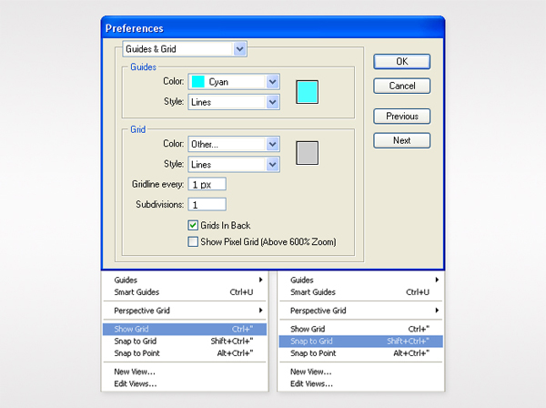
Create a 700 by 820px, RGB document. Turn on the Grid (View > Grid) and the Snap to Grid (View > Snap to Grid). Next, you’ll need a grid every 1px. Go to Edit > Preferences > Guides & Grid, enter 1 in the Gridline every box and 1 in the Subdivisions box.

You can also open the Info panel (Window > Info) for a live preview with the size and position of your shapes. Do not forget to replace the unit of measurement to pixels from Edit > Preferences > Unit > General. Al these options will significantly increase your work speed.

Step 2

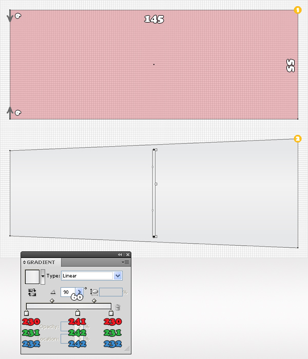
Pick the Rectangle Tool (M) and create a 145 by 55px shape. For the moment fill it with any color. Grab the Direct Selection Tool (A). Select the top left anchor point and move it 6px down then select the bottom, left anchor point and move it 6px up. The Snap to Grid should ease your work.

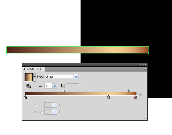
Now, your shape should look like in the second image. Fill it with the linear gradient shown below. Take a closer look at the gradient image and you’ll notice some white numbers. It stands for Location.

Step 3

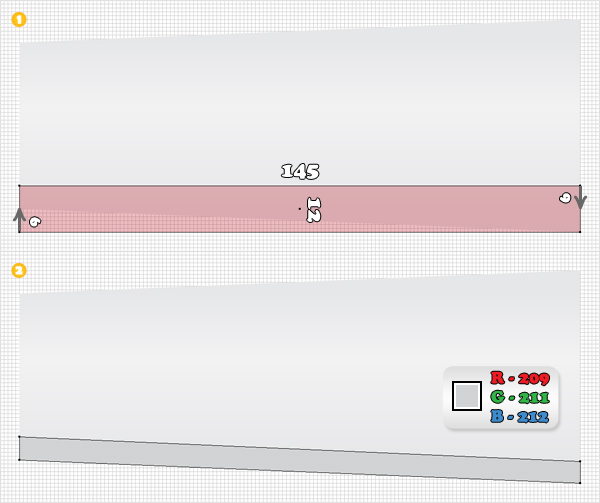
Reselect the Rectangle Tool (M). Create a 145 by 12px shape and place it as shown in the following image. Pick the Direct Selection Tool (A). Select the bottom, left anchor point of this new shape and move it 6px up. Select the top, right anchor point and move it 6px down. Now, this second shape should look like in the second image. Fill it with R=209, G=211, B=212.

Step 4

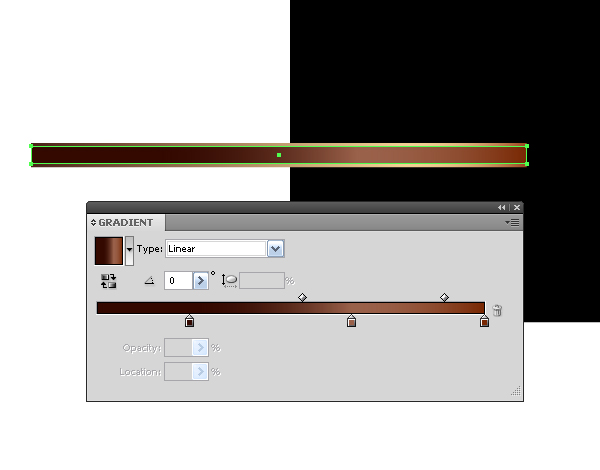
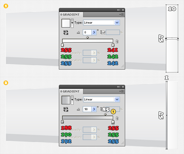
Grab the Rectangle Tool (M) and create a 10 by 57px shape. Place it as shown in the first image and fill it with the first linear gradient. Continue with the Rectangle Tool (M) and create a thin shape. Make it 1 px wide and 57px tall, then place it as shown in the second image. Fill it with the other linear gradient. Again, if you take a closer look at this gradient image you will notice some yellow numbers. They stand for Opacity.

Step 5

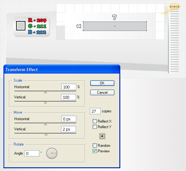
Continue with the Rectangle Tool (M) and create a 7px by 1px shape. Place it as shown in the following image, fill it with R=209, G=211, B=212. Now go to Effect > Distort & Transform > Transform. Enter 27 in the copies box, drag the Move Vertical slider to 2px, then click OK.

Step 6

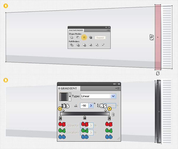
Duplicate the shape made in the second step (Command + C > Command + F). Pick the Rectangle Tool (M), create a 5px by 57px, shape and place it as shown in the first image. Select this fresh shape, along with the copy, and click on the Intersect button from the Pathfinder panel. Fill the resulting shape with the linear gradient shown in the second image. Pay attention to the Location and Opacity percentage.

Step 7

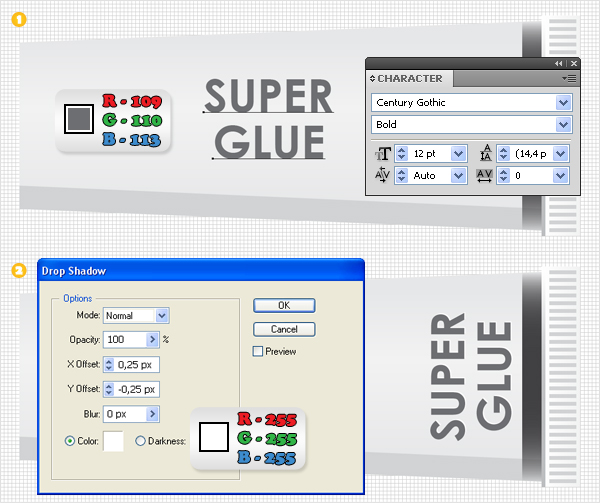
Pick the Type Tool (T), click on your artboard and add the “Super Glue” text. Use the Century Gothic font with a size of 12pt, make it bold and set the color to R=109, G=110, B=113. Select this text and rotate it 90 degrees. Place it as shown in the second image, then go to Effect > Stylize > Drop Shadow. Enter the data shown in the following image, then click OK.

Step 8

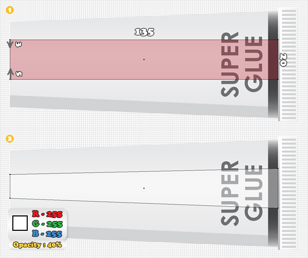
Pick the Rectangle Tool (M), create a 135px by 20px shape and place it as shown in the first image. Grab the Direct Selection Tool (A), select the top, left anchor point and move it 3px down. Now select the bottom, left anchor point and move it 5px up. Now, your shape should look like the second image. Fill it with white and lower its Opacity to 40%.

Step 9

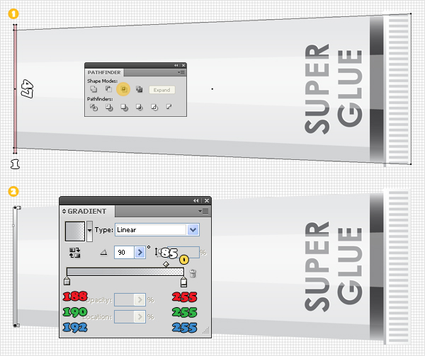
Again, duplicate the shape made in the second step (Command + C > Command + F). Reselect the Rectangle Tool (M), create a 1px by 47px shape and place it as shown in the first image. Select this fresh shape along with the copy and click on the Intersect button from the Pathfinder panel. Fill the resulting shape with the linear gradient shown in the second image.

Step 10

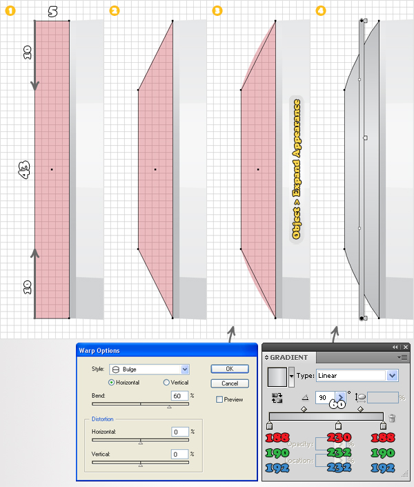
Focus on the left area. Pick the Rectangle Tool (M), create a 5px by 43px shape and place it as shown in the first image. Grab the Direct Selection Tool (A), select the top, left anchor point and move it 10px down, then select the bottom, left anchor point and move it 10px up.

Now your new shape should look like the second image. Select it and go to Effect > Warp > Bulge. Enter the data shown below, click OK, then go to Object > Expand Appearance. Fill the resulting shape with the linear gradient shown below.

Step 11

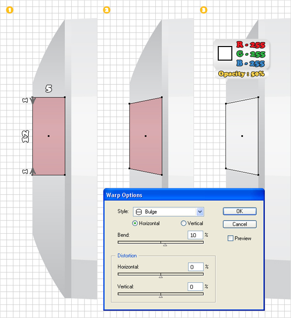
Reselect the Rectangle Tool (M). Create a 5px by 12px shape and place it as shown in the first image. Pick the Direct Selection Tool (A), select the top, left anchor point and move it 1px down. Select the bottom, left anchor point and move it 1px up. Now, this new shape should look like the second image. Fill it with white, lower its Opacity to 50%, then go to Effect > Warp > Bulge. Enter the data shown below and then click OK.

Step 12

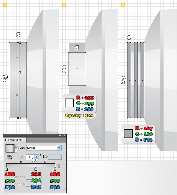
Grab the Rectangle Tool (M), create a 5px by 23px shape, place it as shown in the first image. Now fill it with the linear gradient. Continue with the Rectangle Tool (M). Create a 5px by 10px shape and place it as shown in the second image. Fill it with white and lower its Opacity to 50%. Again, use the Rectangle Tool (M) to create three similar shapes. Make them 1px wide and 23px tall, then fill them all with R=167, G=169, B=172.

Step 13

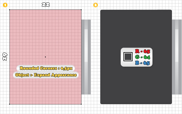
Use the Rectangle Tool (M) to create a 22px by 29px shape. Place it as shown in the first image, then go to Effect > Stylize > Rounded Corners. Enter a 0,5px radius, click OK, then go to Object > Expand Appearance. Fill the resulting shape with R=65, G=64, B=66.

Step 14

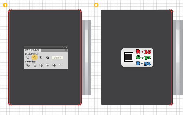
Disable the Snap to Grid (View > Snap to Grid), then go to Edit > Preferences > General, and enter 0,5 in the Keyboard Increment box. Select the shape made in the previous step and make two copies (Command + C > Command + F). Select the top copy and hit the left arrow once (to move it 0,5px to the left). Reselect both copies and click on the Minus Front button from the Pathfinder panel. Fill the resulting shape with R=35, G=31, B=32.

Step 15

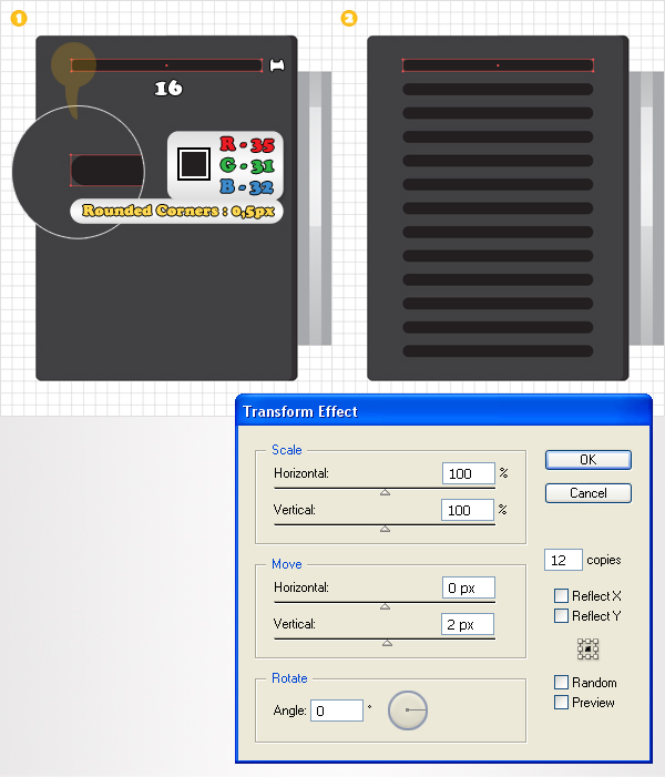
Enable the Snap to Grid (View > Snap to Grid) again, then pick the Rectangle Tool (M). Create a 16px by 1px shape and place it as shown in the first image. Fill it with R=35, G=31, B=31, then go to Effect > Stylize > Rounded Corners. Enter a 0,5px radius, click OK, then go to Effect > Distort & Transform > Transform. Enter 12 in the copies box, drag the Move-Vertical box to 2px, then click OK.

Step 16

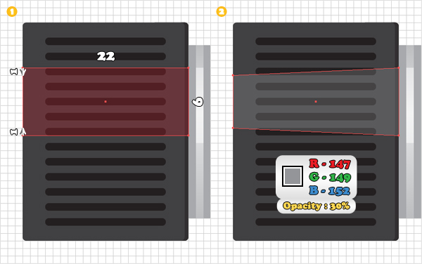
Grab the Rectangle Tool (M), create a 22px by 9px shape, and place it as shown in the first image. Pick the Direct Selection Tool (A), select the top, left anchor point and move it 1px down. Now select the bottom, left anchor point and move it 1px up. Now, your shape should look like the second image. Fill it with R=147, G=149, B=152, and lower its Opacity to 30%.

Step 17

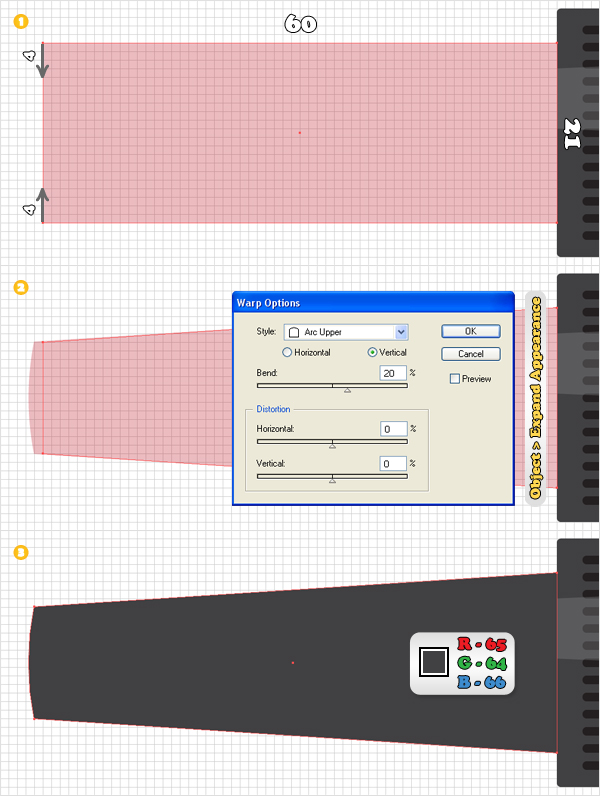
Pick the Rectangle Tool (M), create a 60px by 21px shape and place it as shown in the first image. Grab the Direct Selection Too l(A), select the top, left anchor point and move it 4px down. Now select the bottom, left anchor point and move it 4px up. Your shape should look like the second image. Select it and go to Effect > Warp > Arc Upper. Enter the data shown in the second image, click OK then go to Object > Expand Appearance. Fill the resulting shape with R=65, G=64, B=66.

Step 18

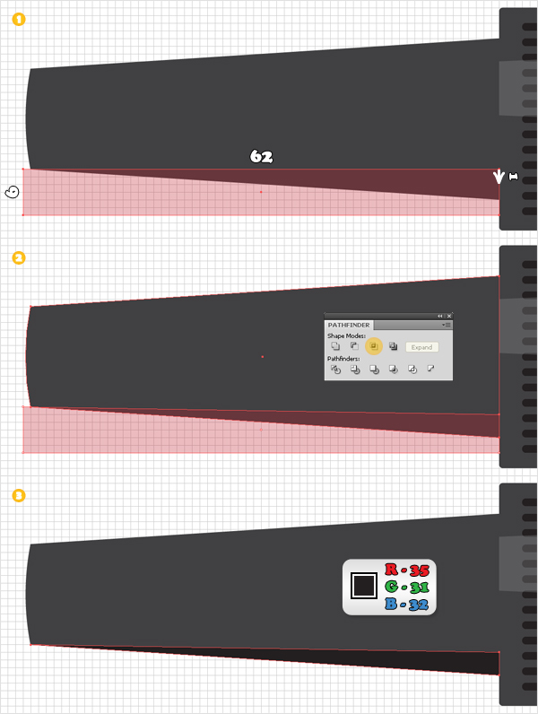
Duplicate the shape made in the previous step (Command + C > Command + F). Grab the Rectangle Tool (M), create a 62px by 6px shape and place it as shown in the first image. Pick the Direct Selection Tool (A), select the top, right anchor point and move it 1px down. Select this fresh shape along with the copy and click on the Intersect button from the Pathfinder panel. Fill the resulting shape with R=35, G=31, B=32.

Step 19

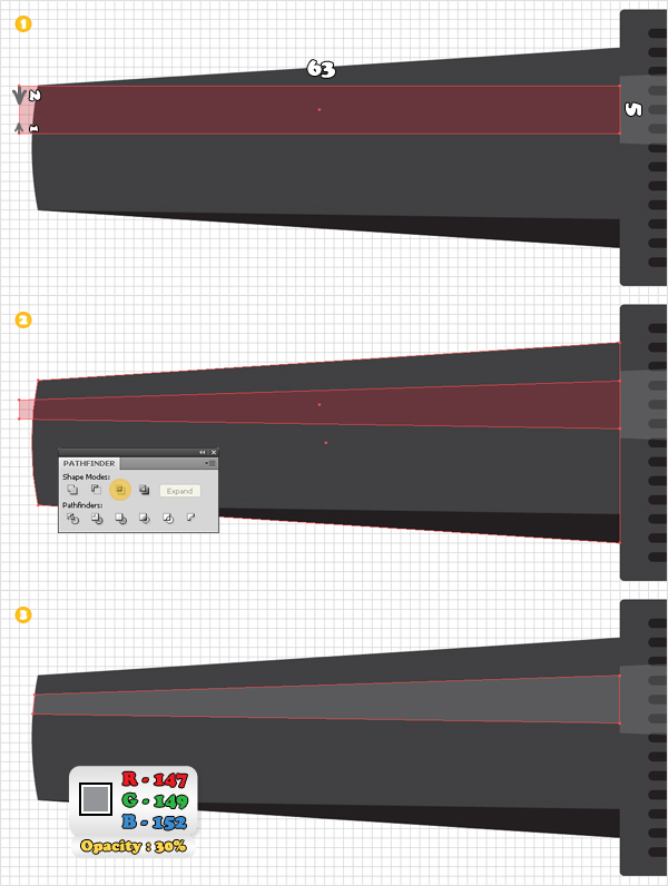
Again, duplicate the shape made in the seventeenth step. Pick the Rectangle Tool (M), create a 63px by 5px shape, and place it as shown in the first image. Grab the Direct Selection Tool (A), select the top, left anchor point and move it 2px down. Now select the bottom, left anchor point and move it 1px up.

Your shape should look like the second image. Select it along with the copy and click on the Intersect button from the Pathfinder panel. Fill the resulting shape with R=147, G=149, B=152, and lower its Opacity to 30%.

Step 20

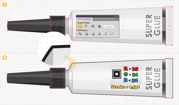
Duplicate the large shapes that make up the overall super glue tube. Select these copies and click on the Unite button from the Pathfinder panel. Fill the resulting shape with none and add a 0.5, aligned to the outside stroke (R=35, G=31, B=32). Select all the shapes created so far and group them (Command + G).

Step 21

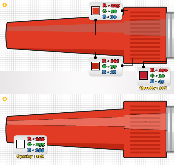
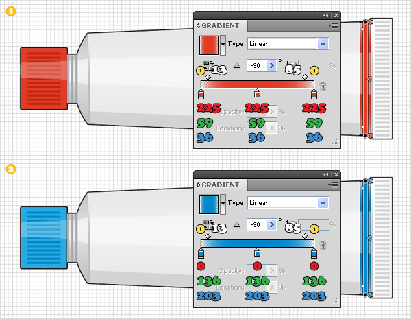
Duplicate the group made in the previous step. Move this new group a few pixels to the left. Now, let’s make some color changes for this second group. Replace the dark colors with the red tints shown below. Also, replace the fill color and the opacity percentage for the highlight elements, as shown in the second image.

Step 22

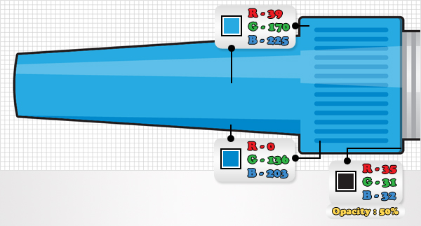
Make a new copy of the existing group and use the set of colors shown below.

Step 23

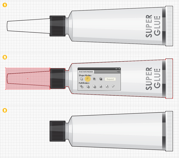
Now, let’s turn the super glue tube into a paint tube. Duplicate the group with the original super glue tube. Focus on this new group. First, remove the shape from the left end, as shown in the first image. Next, you need to edit the stroked shape.

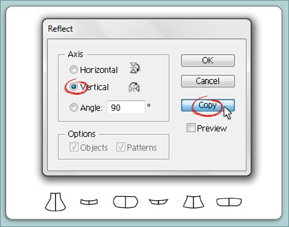
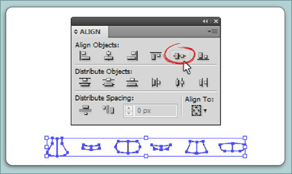
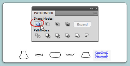
Pick the Rectangle Tool (M), create a simple rectangle and place it as show in the second image. Select this new shape along with the stroked shape and click on the Minus Front button from the Pathfinder panel. In the end your shape should look like the third image. Remove the text and you got your paint tube.

Step 24

Make two copies of the paint tube group. Focus on these new copies and replace the dark gradient with the linear gradients shown in the following images.

Step 25

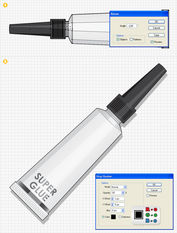
Let’s add some final effects for these tubes. Select the original super glue tube group and go to Object > Transform > Rotate. Enter a -135 degrees angle, click OK, then go to Effect > Stylize > Drop Shadow. Enter the data shown in the second image, then click OK. Repeat the same techniques for the rest of the groups.

Step 26

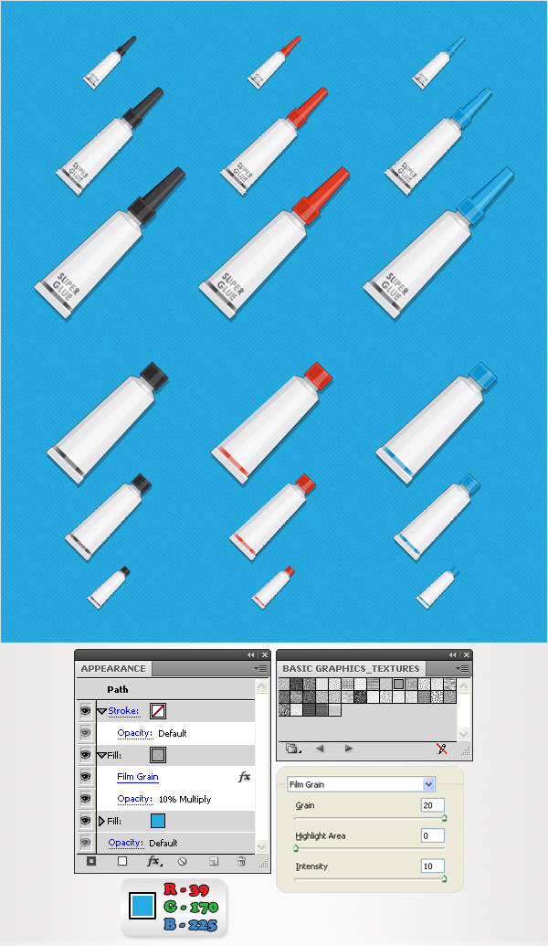
Here I made several copies of the tubes. Now, let’s add the background. Pick the Rectangle Tool (M), create a shape the size of your artboard, fill it with R=39, G=170, B=225 and Send it to Back (Shift + Command + [). Open the fly-out menu of the Swatches panel and go to Open Swatch Library > Pattern > Basic Graphics > Basic Graphics_Textures.

This will open a new window with some nice patterns. Reselect the blue rectangle, open the fly-out menu of the Appearance panel, and click on Add New Fill. This will add a second fill for your shape. Select this new fill and use the Diamond pattern. Lower its Opacity to 10%, change the blending mode to Multiply, then go to Effect > Artistic > Film Grain. Enter the data shown below, then click OK.

Step 27

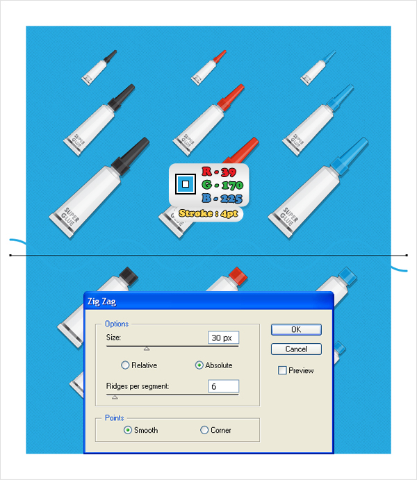
Now, let’s add the divider. Pick the Pen Tool (P), draw a 760px, horizontal path and place it as shown in the following image. Fill it with none, add a 4pt stroke (R=39 G=170 B=225) then go to Effect > Distort & Transform > Zig Zag. Enter the data shown below and click OK.

Step 28

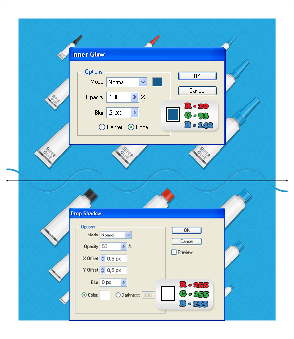
Reselect the path made in the previous step and go to Effect > Stylize > Inner Glow. Enter the data shown below, click OK, then go to Effect > Stylize > Drop Shadow. Enter the data shown below, click OK, and you’re almost done.

Step 29

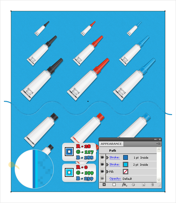
Finally, duplicate the blue rectangle made three steps ago. Move this copy above the divider (in the Layers panel). Select it, remove the fills and add a 2pt, aligned to inside stroke (R=0 G=199 B=239). With this shape still selected open the fly-out menu of the Appearance panel and click on Add New Stroke. This will add a second stroke for this new shape. Select it from the Appearance panel. Make it 1pt wide, set the color to R=28, G=117, B=188, and you’re done.

Conclusion

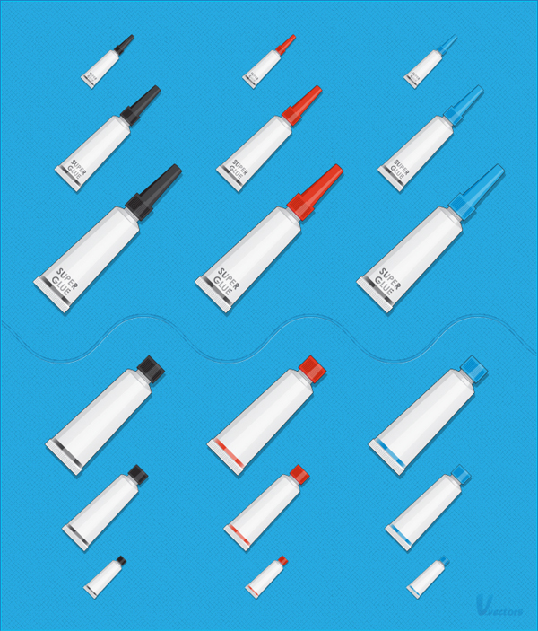
The final image is below.

Paola Antonelli Treats Design as Art

$
0
0


Just because you missed that awesome conference, doesn’t mean that you can’t still watch the lectures! This weekend we’re sharing a talk by Paola Antonelli, design curator at New York’s Museum of Modern Art, who wants to spread her appreciation of design — in all shapes and forms — around the world.

Create a Burning, Vector Match Using Gradient Meshes

$
0
0


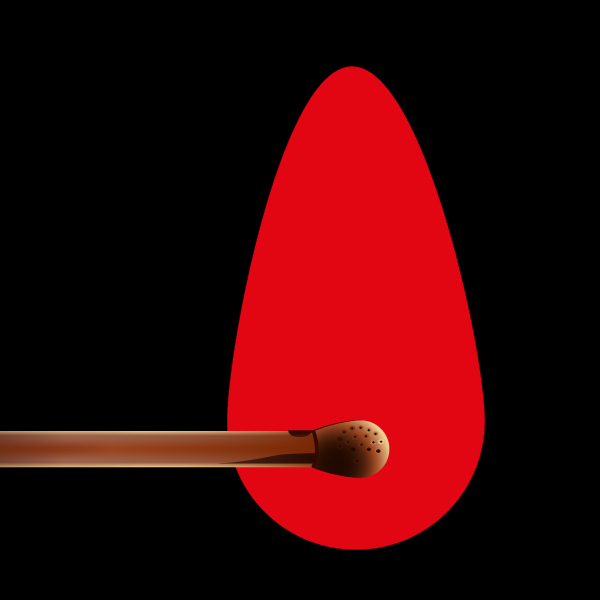
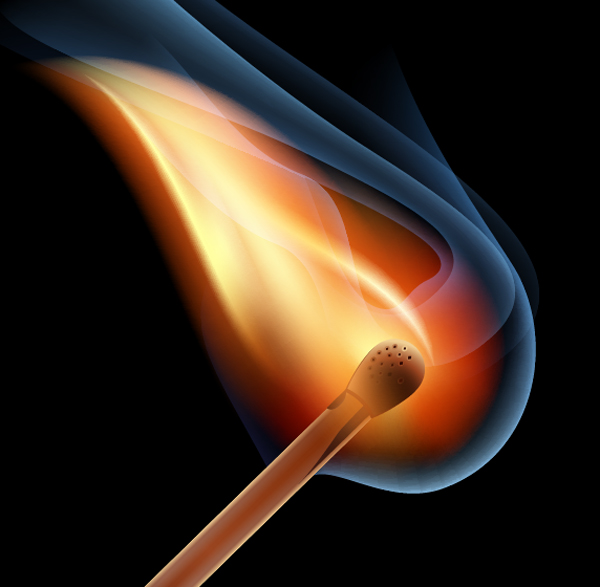
In this tutorial you will learn how to create realistic vector fire, using the Gradient Mesh Tool and Screen Blending mode. Believe me, there’s nothing overly complicated. Let’s strike a match!


Step 1

We will be working in RGB color model, if you do not have it installed, go to File > Document Color Mode > RGB Color. Let’s begin our tutorial by creating a background. Take the Rectangle Tool (M) and create a rectangle filled with a black color.


Step 2

Proceed to the creation of a match. Take the Rectangle Tool (M) and create a rectangle in the shape of a matchstick. Now fill it with a linear gradient of various shades of brown to convey the light distribution at the edges of the match.

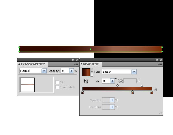
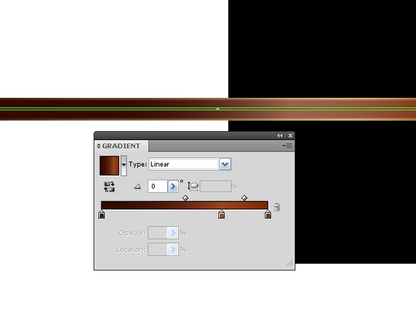
Copy this rectangle and paste it in front (Command + C; Command + F). Now slightly reduce the height of the rectangle and fill it with a new linear gradient. The shades of brown on this rectangle are darker than the ones on the bottom rectangle.

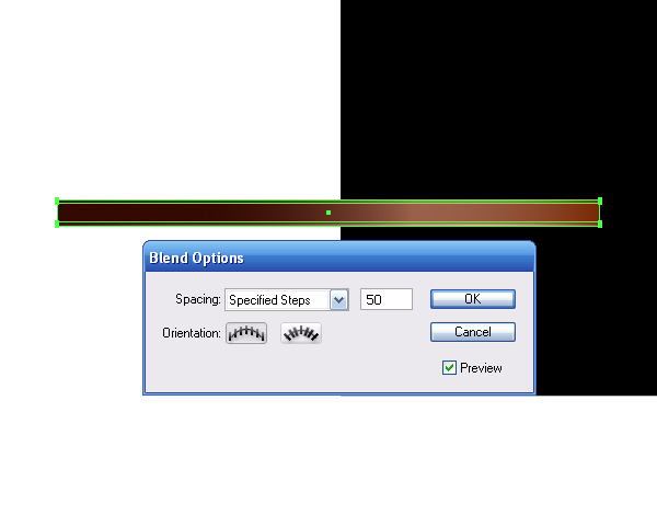
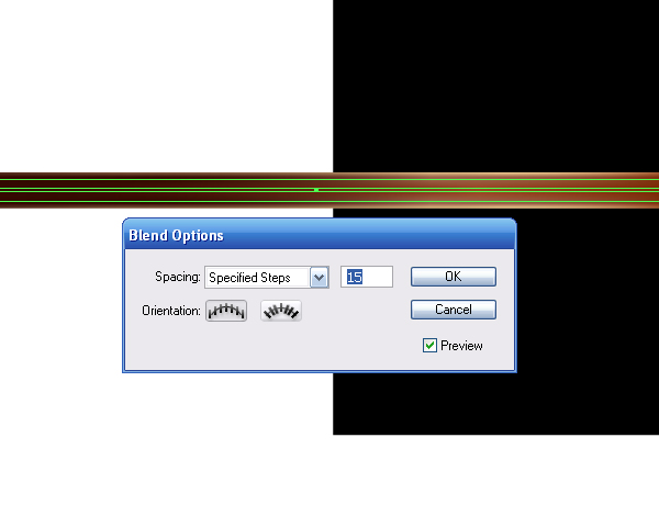
Select both rectangles and go to Object > Blend > Make.


Step 3

Create another rectangle of the same width as all the previous ones, as shown in the figure below. Set the gradient fill and Opacity to 0% in the Transparency palette.

Create a new rectangle the height of which equals a few pixels with the fill of the same gradient as a transparent rectangle.

Select the last two rectangles and go to Object > Blend > Make.


Step 4

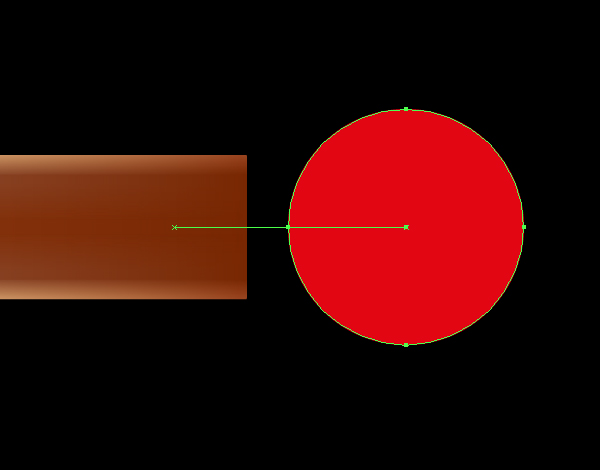
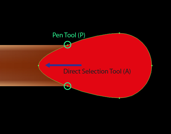
Proceed to the creation of a match head. Take the Ellipse Tool (L) and create a circle centered on the same axial line with the match.

For convenience turn on the Smart Guides mode (Command + U). Take the Direct Selection Tool (A) and pull out a circle to the left, while holding down Shift. Now take the Pen Tool (P) and put new anchor points at the intersections of the head with the matchstick.

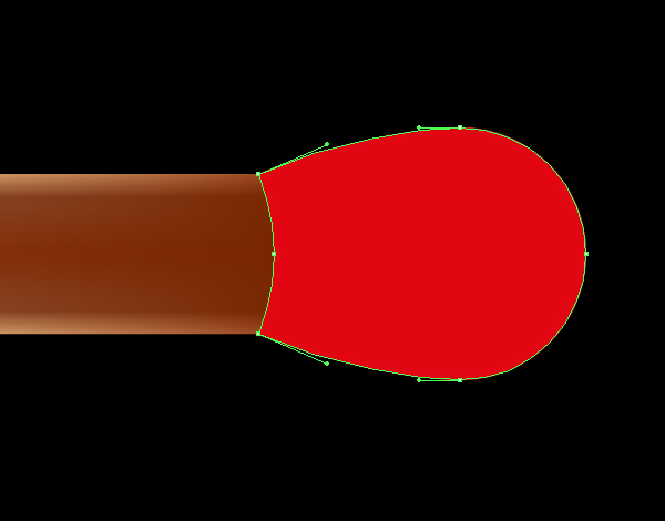
Using the Direct Selection Tool (A), transform the shape of the head to the view shown in the figure below.


Step 5

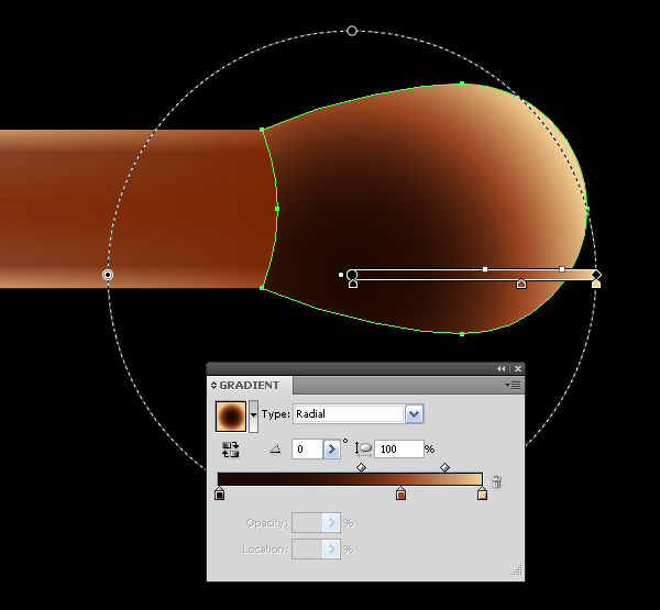
Fill the match head with a radial gradient that goes from dark brown to its light shades.

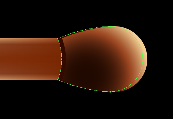
Copy and paste back the shape of the head (Command + C; Command + B). Fill the copy with a solid dark-brown color and shift it slightly to the left.


Step 6

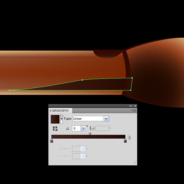
Take the Pen Tool (P) and create a place where the wood is burnt. These areas are filled with a linear gradient composed of dark shades of brown color.

Both of these objects must be located in the under layers below the match head.


Step 7

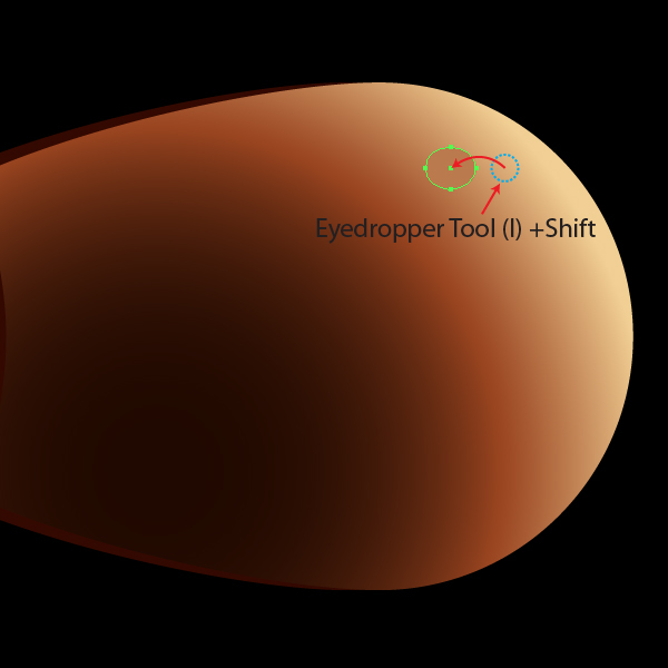
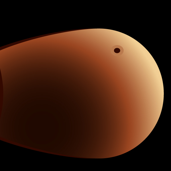
Create pores on the match head. Take the Ellipse Tool (L) and create an ellipse. For the fill color, use solid color of the fill of a radial gradient of the match head. To take the color, use the Eyedropper Tool (I) and hold down the Shift to select.

Often object selection interferes with choosing the right color, you can turn it on, go to View > Hide Edges (Command + H). Use the same combination of keys to activate the selection. Copy and paste the ellipse in front (Command + C; Command + F), reduce the size and fill it with a solid dark brown.

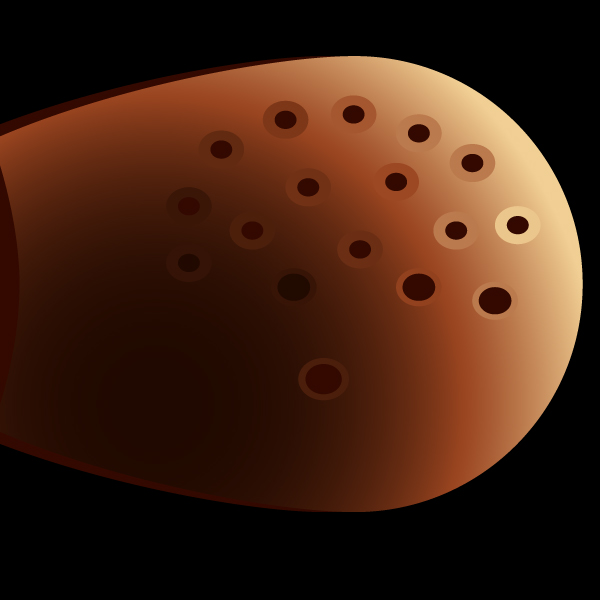
Using this technique to create more pores on the match head.


Step 8

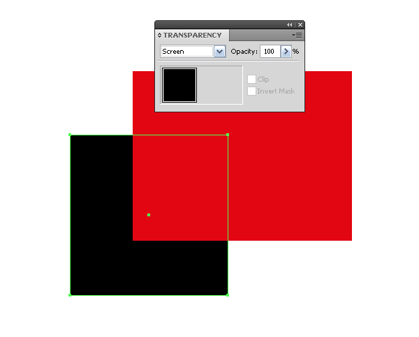
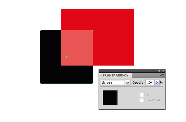
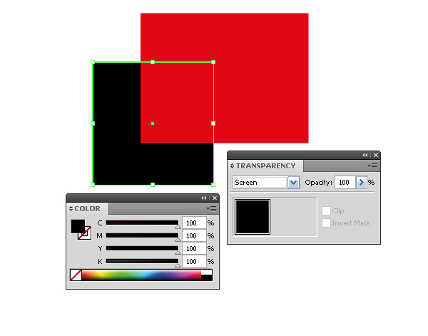
Now we’ll proceed to create the match flame. At this stage, you should learn one important property: black objects when overlapping over other objects become transparent if you set the Screen Blending mode for them in the Transparency palette in RGB color mode.

You can see below the same objects in the CMYK color mode.

If you are still working in the CMYK color mode, then in order to achieve this effect, you should use absolute black.


Step 9

Create the shape of the flame. Take the Ellipse Tool (L) and create a circle. Using the Direct Selection Tool (A), pull the top anchor point up. The shape of the flame should be located in the under layer below the elements of the match.


Step 10

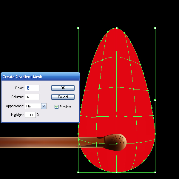
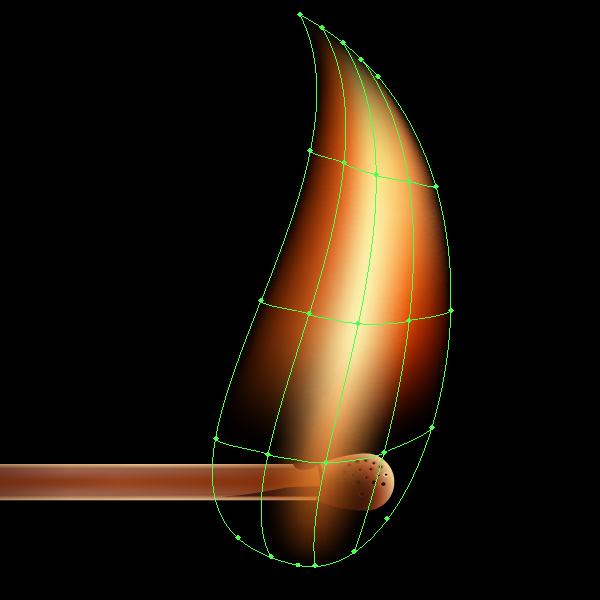
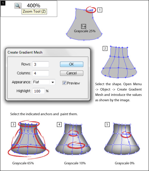
Select the shape of the flame, and go to Object > Create Gradient Mesh… and set the number of rows and columns in the dialog box.

Remember that you can edit the grid lines that are obtained automatically. Use the Gradient Mesh Tool (U) to create new lines, and use the same tool to remove them but this time hold down the Alt. Use the Direct Selection Tool (A) for grid line distortion and movement of the nodes.


Step 11

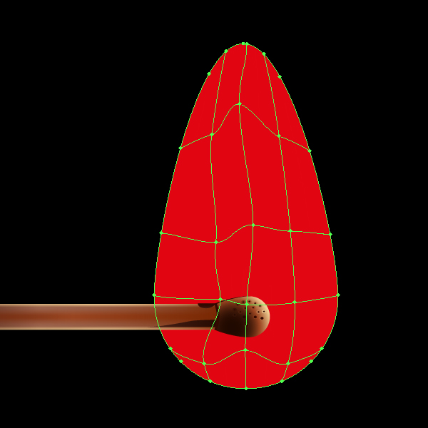
Thus, bring the lines and nodes of the gradient mesh to the view shown in the figure below. Flame is a movable object, so your grid can have a completely different shape.


Step 12

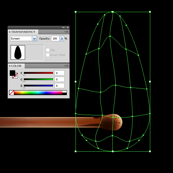
Select the gradient mesh with the Selection Tool (V) or by clicking on the appropriate under layer in the Layers palette and fill it with black. Set the Screen Blending Mode in the Transparency palette.


Step 13

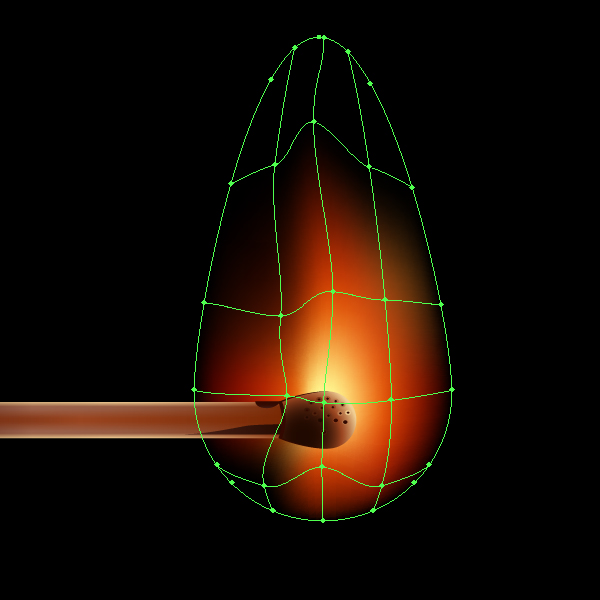
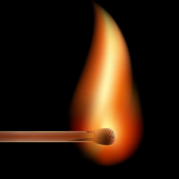
Proceed to the coloring of the flame. Select the grid nodes and apply yellow and red colors to them. Nodes that lie beyond the borders of the gradient mesh should remain in black, otherwise we get the sharp edges of the flame, which is unacceptable.


Step 14

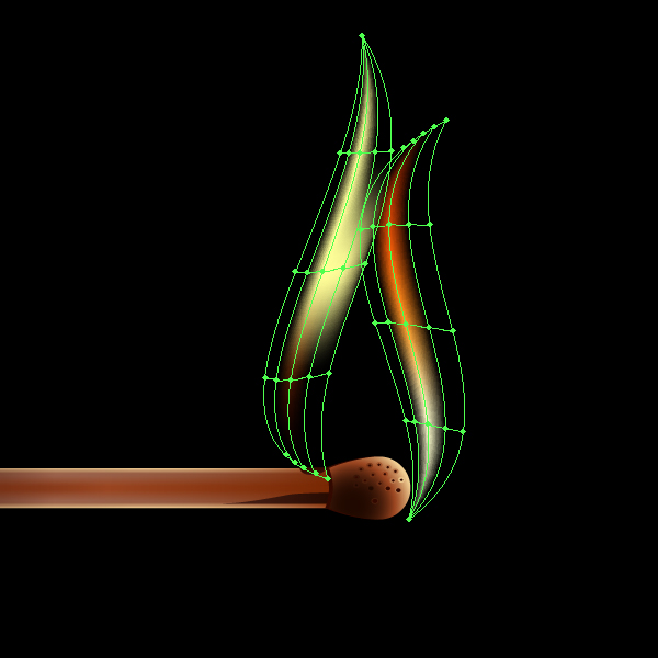
Create another object above the match. Using the technique described above, create a simple gradient mesh based on this object and color it.

And this is how two gradient meshes look together.


Step 15

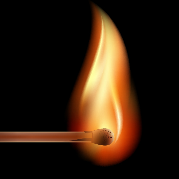
Now create two more feathers of the flame.

And all the elements of fire together.

When coloring the gradient mesh you can use the colors of the already colored grids. In this, you can rely on your artistic taste to create a very interesting work.


Step 16

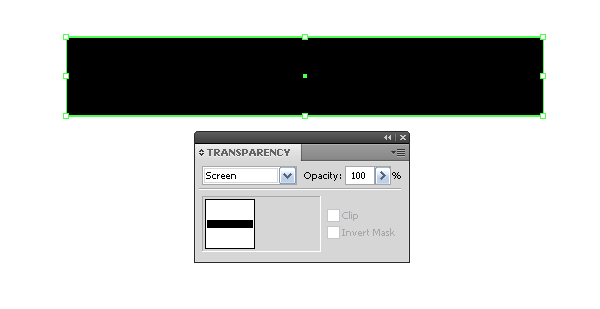
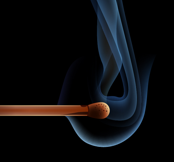
There is no smoke without fire, and vice versa. Start creating smoke. Take the Rectangle Tool (M) and create a rectangle filled with black. And set the Screen Blending Mode in the Transparency palette.


Step 17

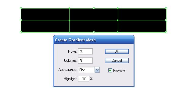
Keep the rectangle selected, go to Object > Create Gradient Mesh… and set the number of rows and columns in the dialog box.

Transfer the rectangle to the background in order to choose the right color, and replace the color of the two bottom central points of the gradient mesh with blue.


Step 18

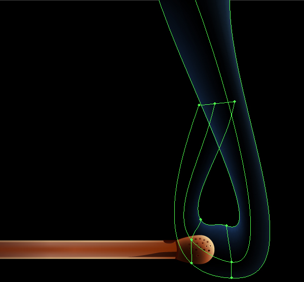
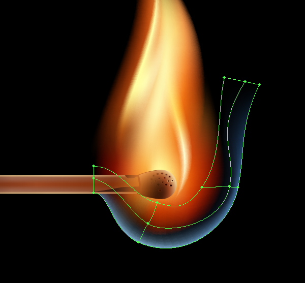
Now you need to bend the rectangle shape into the shape of a smoke stream. I used the following tools to transform such objects: the Direct Selection Tool (A), Lasso Tool (Q), and Rotate Tool (R).

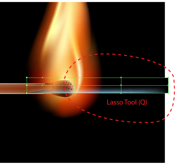
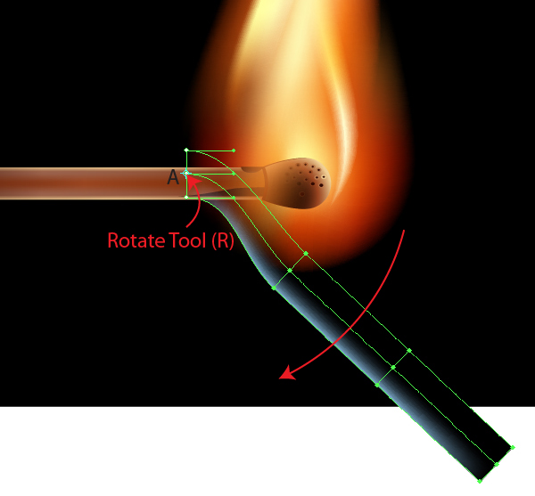
Let’s take a look at the transformation technique. First, lock all the objects except the rectangle in the Layers palette. Place the rectangle at the right place in your work, take the Lasso Tool (Q) and select all the nodes of the grid, except those that are on the left side.

Take the Rotate Tool (R) and set the center rotation at point A and use the same tool to bend the object.

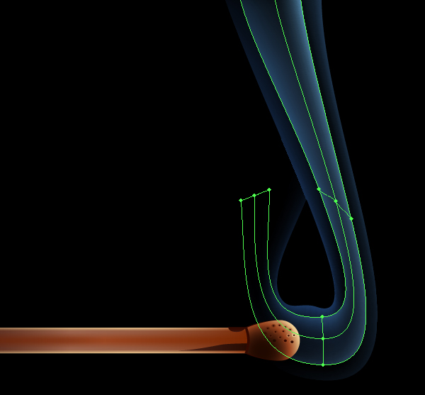
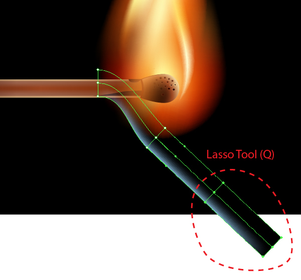
Now make another bend. Using the Lasso Tool (Q) select mesh nodes, as shown in the figure below.

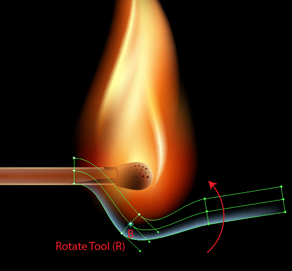
Take the Rotate Tool (R) and set the center of rotation at point B and bend the object using the same tool.

In addition, you can move individual nodes and (or) several nodes using the Direct Selection Tool (A). Grid line operation is the same as with operating any other vector objects. I think you’ve got the working principle down. Bring the object to the view shown in the figure below.

The smoke stream is located below the match in the Layers palette.


Step 19

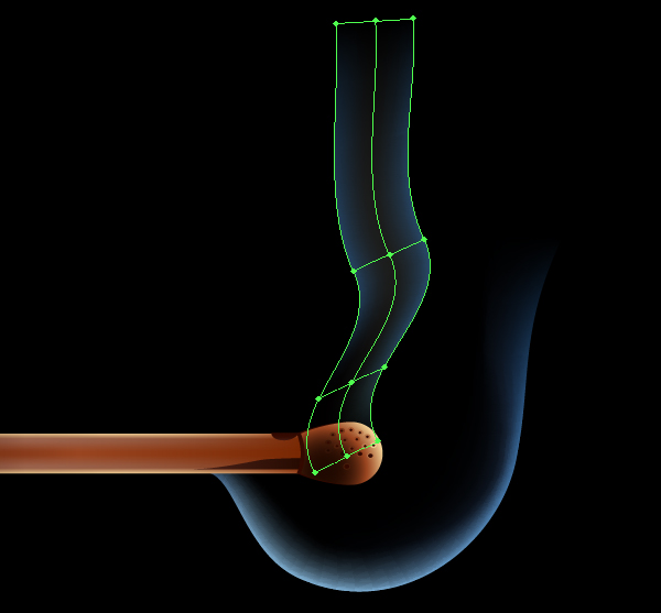
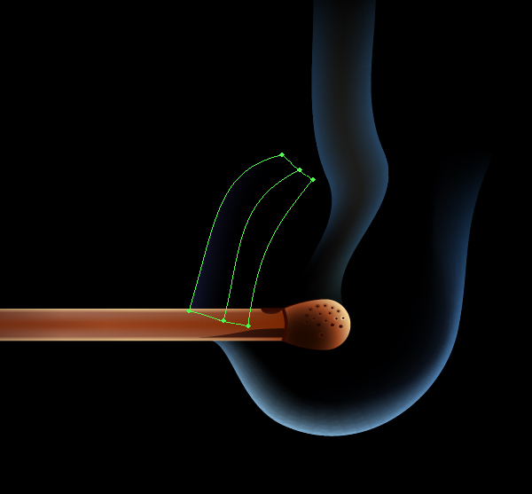
Using the technique described above, create a few more streams of smoke.

You’ve probably noticed that for the creation of these streams both sides of the original rectangle are colored in shades of blue, while central nodes of the grid stay black. Check how all the elements that make up the smoke look.


Step 20

We only have to create a composition. Creating a composition in the technical sense is always the final stage. Of course, before creating the work, you should have an idea about the final result, you can even make a few sketches. But it is convenient to complete your work with this stage. Why do you think it is so?

The thing is that it is easier to work with gradients if an object is placed vertically or horizontally. Imagine how much time you would spend on setting the gradients of the wooden piece of the match, if it was located at an angle to the normal line?

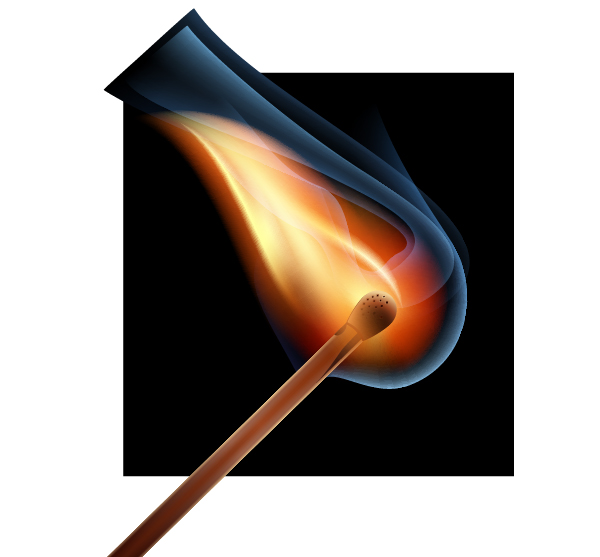
And the thing is not only in gradients, it is convenient to work with any object if it is located horizontally or vertically. Thus, unlock all objects in the Layers palette (in step 18, we locked some objects) and group up all the elements of our work and rotate them as shown below.

Also resize the background in this step so that the composition looked harmonious. When creating a composition pay attention not only to the harmony of objects, but to the harmony of empty space as well.

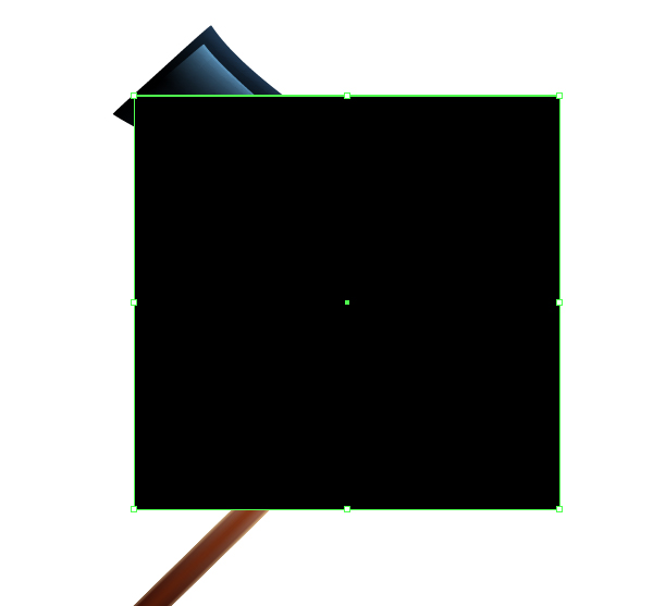
Now hide all the objects protruding beyond the background. Copy the black rectangle (background) and paste it in front (Command + C; Command + F). Move the under layer with the rectangle in the layers palette so that it is above all objects.

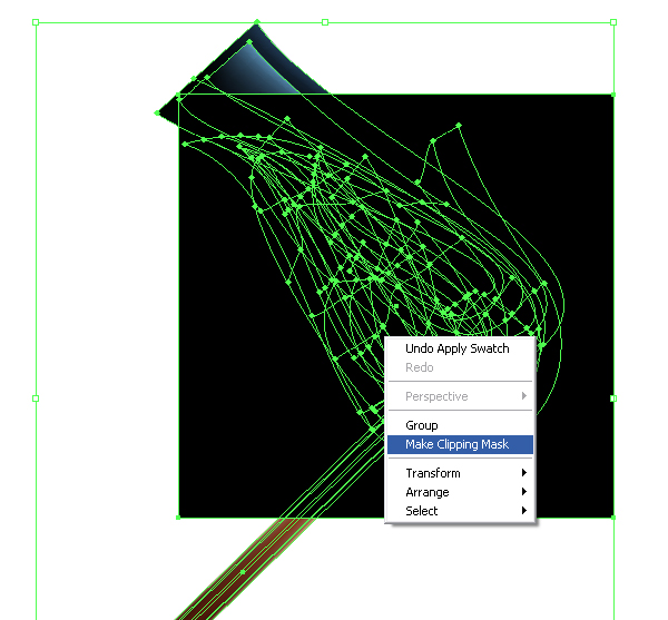
Select all objects Command + A. Now go to Object > Clipping Mask > Make or choose the appropriate option from the context menu.


Conclusion

Having mastered the technique described in this tutorial, you can create realistic vector flames, lighters or torches. Who knows, you might want to make a fire? And give it some heat!

Quick Tip: How to Create a Paper Style Alphabet using Illustrator 3D

$
0
0


In this tutorial we will learn how to create letters of the alphabet and the shadows of them using 3D modeling. The created style, as I see it, is perfect for creating logos, but you may also like to use it for a custom font or illustration.


Step 1

Start by picking the font that you will use to create your alphabet. In my work I was using austere font Tahoma Bold. Use large font size for convenience. Of course, you can experiment with different fonts.


Step 2

I will demonstrate the creation of the alphabet a single letter. So, take the Type Tool (T) and create letter R, shown in the figure in the step 1. Our alphabet will consist of letters and shadows of them. Since the letter consists of two parts, create a second R and pick a different color for the fill.

Select both letters and go to Object > Expand.

Ungroup the vector objects (Command + Shift + G).

Rotate each letter by 90 degrees (Object > Transform > Rotate).

Move both letters (one at a time) into to the Symbols palette.


Step 3

Now create a surface for 3D modeling. Take the Ellipse tool (L) and create a circle that’s larger than the height of the letters. Make the circle without a fill, it can have a stroke of any color.

Cut the circle in points A and B using the Scissors Tool (C) and remove the right side.

Arc AB – is a guide of the surface, in which our paper letter will be located. Now take the Pen Tool (P) and continue the arc with a straight line segment, it is a guide of the plane where the shadow will be located. The angle between the arc and the segment determines the angle of the drop shadow.


Step 4

Now proceed to modeling. Select the created guides of the surface and go to Effect > 3D > Extrude & Bevel and begin our experiments, I settled on the following parameters.

Now add the letter shape on the created surfaces. Open the 3D effect dialog box again, if you have closed it, you can do it through the Appearance palette, and click Map Art.

Choose the desired surface and set the letter sign created in step 2 for it.


Step 5

Unfortunately, we can only operate the location of the symbol in the Map Art dialogue box with the help of the cursor. The cursor doesn’t give us enough of the necessary accuracy for its positioning. It only aligns the symbol to the edges of the grid, in my case, I aligned the symbol to the bottom and right edges.

Now, pick a plane where the shadow will be located and apply the second symbol of gray color. This symbol should be aligned according to the bottom and right edge of the grid.

Click OK in both dialog boxes, the modeling is now complete.


Step 6

Now turn the 3D object into vector objects. Keep the letter selected, go to Object > Expand Appearance.

Now our letter contains a lot of unnecessary vector objects and Clipping Masks, they must be removed. I suggest the most effective way to do this is to save you time (because you will have to work on more than one letter). So, remove all the Clipping Masks (Command + Alt + 7), remove all unnecessary objects Object > Path > Clean Up.

Ungroup all the achieved elements. Vector objects achieved from 3D modeling, contain at least two issues: open paths and overlapped anchor points. To solve these issues, it is desirable to use Close Selected Paths and Merge Overlapped Anchors scripts, you can download them here.


Step 7

I have tried to accurately unite the shadow of the letter in the process of 3D modeling, I failed.

This can be fixed. Moving the shadow with the arrows, and working with the Direct Selection Tool (A), complete accurate positioning.


Step 8

Now, fill the shape of the letter with gray to white linear gradient, this will add volume to the shape.


Step 9

I want to warn you that some letters may not have a very nice look as a result of 3D modeling. In my case there were two trouble letters – X and Y. What can we do, not everything can be done automatically, we will have manually tweak the shape with the Direct Selection Tool (A).


Step 10

Before creating the entire alphabet, I would advise you to create and save all the symbols of letters, numbers and other signs, and a lot of the same templates of 3D model of the first letter. Then edit the created templates. Hopefully this will save you a lot of time.


Conclusion

I think it’s an interesting technique for creating logos, but quite tedious as well. If you have any tips on how to accelerate the process of creating the whole alphabet, leave a comment in the section below, I will listen carefully to your opinions

Interview with Sant Valentin

$
0
0


Today our guest is a true expert and person who will be interesting to talk to – Ukrainian designer Sant Valentin. “I believe that line should be alive, it does not have to have clearly defined directions, the more smooth and hasty lines, the more there is life in illustration style. I did not make up the name for my style, but to me it vaguely resembles watercolor,” says Valentin about vector graphics, and his style.

Q Hello Valentin, I am very glad to welcome you to Vectortuts+, tell us a little bit about yourself. When did you start drawing and why did you decide to become an illustrator?

Hello to all earthlings and readers of the best of projects Vectortuts+. I’m glad to be here and tell you a little bit about myself. My name is Sant Valentin, I am 27 years old. I was born, grew up and started my artistic career in sunny Ukraine. My creative activity started in early childhood, the sun shines brightly, kids develop rapidly. When I was able to pick up anything that leaves traces I started stubbornly to mess up everything around.

At first it was more like rock paintings, but eventually it started assuming more clear and recognizable shapes. Then I was caught by my parents and sent to the places where you can stain whatever you want, walls, ceiling and people around, and you would not be punished for that. More specifically, I was sent to the children’s school of art, where I got my first experience and skills in the organization of my creative activity.

Actually the decision to be professionally involved in art at the age of 6 was not made by me, but by my dear parents, for which I’m very grateful that they managed to send a child’s energy into the right direction.

Q Looking at your work, you can see the hand of an expert. Tell us about your education.

School of art for kids was not the only institution where I was polishing up my skills – or skills were polishing up me. Besides the art school, I studied in a regular comprehensive school as all normal children, the only thing was that my school was focused on art, that means that at school my major subjects were such as drawing, painting, sculpture, and a lot of additional activities which also developed me as a creative personality. But that was not the only thing I was loaded with in my unassailable childhood, apart from art school and secondary school majoring in art, I was destined to attend art studio and private classes tutored by already successful and very well-known at that time artists. Therefore, being admitted to college was easy, actually the whole school itself was like one big and long exam, a few new classes for the overall development, and implementation of the basics of design.

Q Lately you have been working as a freelancer, do you have experience working in an agency as a full-time illustrator? What are the main pros and cons of your current status?

Taking into account that I did not have anything else besides college experience, I started working in my field quite early, just on the third year of studying. I was working in the design studio as a concept designer and at the same time mastering things that were new for me, such as: 3ds Max, Adobe Photoshop, Adobe Illustrator, etc. which helped me a lot in further seeking and choosing a job.

My last position was as an art director, and then I closely became involved in freelancing. Why did I choose freelancing? It is freedom of flight, planning free time and ideas infinity that is as important for a creative person as the air. The companies I worked with, it eventually was not enough space for me, and when I realized that there’s nowhere to grow, probably because I did not have the right person next to me who could teach me new things, I decided that freelance is my choice. And actually it is very easy to raise your level when you do freelancing.

Q You have a lot of experience, during this period of time, have you developed the basic principles of working with a customer? What are these principles?

I really have a lot of experience working with clients, but I cannot say that my principles may be unique. I always respect a customer’s opinion and try to do the maximum of quality considering all the suggestions, but very often it happens that the customer’s wish is to the detriment of the quality.

There are no strict limits as such, I do not take projects that are not interesting for me, projects that are boring or do not have creativity, also those that go against my philosophy and religious beliefs. Everything else is not the principles, but I would rather call it the rules of work.

Q You work in many styles of design. Tell us what kind of jobs you do, what do you prefer? What is your strong point?

Yes, I do work in many styles, ranging from hand drawing, illustration, painting, to computer graphics, 3D modeling, animation, illustration, vector illustration, web design, creation of logos and emblems, and I cannot say that there is something from the mentioned above that I like less, it is all art. All that has creativity, it captures me and has place in my life, maybe the only thing I prefer more than the other is the creation of icons, it’s even more like a hobby than business, it amuses me to make up and then implement meanings into beautiful signs.

Q I really like the style of your vector works. Tell us about the basic techniques you use. Do you have any advice on working with color?

Vector illustration is a strict and clear style, it happened historically, since vector is an ideal format for printing that is why all the images in a vector must have clear and strict shapes, and as a rule limited in colors. But I’m using vector exactly in an opposite way, I believe that the line should be alive, it should not have clearly defined directions, the more smooth and deliberate lines are the more there is life in the style of illustration.

I have not thought about the name for this style, but it vaguely reminds me of watercolors, although according to colors this comparison is not appropriate. I basically have vivid and bright colors that I pick according to my taste and focus directly on the situation, the tones and colors demands content, most of the works are for business and are used on the Web.

Q One of the styles of your work is the creation of icons. What are the principles of creating icons that you can share with us? How do you achieve such clarity and sharpness? Do you remodel your works for variants of small icons? If so, how do you do that?

As I wrote above, the creation of icons is my hobby and great pleasure, someone collects coins, stamps, someone skydives, mountaineers, but I prefer less safe hobby, drawing icons, though I am also fond of collecting coins and stamps too. Technically, the process of drawing icons, requires thoroughness and diligence, nothing smart as it seems to me, relax, play music and create a pixel wonder. The main thing is a good idea, I think it’s 80% of the icon success.

Naturally good implementation along with a great idea is a work of art. In order to make the result crisp and juicy, it is necessary to draw an icon in a clearly specified size, all the theories and fables about the fact that vector transforms without loss of quality, and other blah-blah-blah, is nothing but the claim of people that did not face this problem, vector does transform, no doubt about it, but not in the case with the icon when you have hundreds of small, highly-developed elements, transformation without loss of quality is impossible, unless of course you are an earthling.

Q Do you consider yourself a successful freelancer?

I am confident and very goal-oriented, but I do not consider myself a successful freelancer, why?! Because I’ve not done everything yet, and did less than I can, but I need to do a lot and I can do that!

Q What do you think the freelancer should do to develop efficiently?

I would like to advise to all birds of feather that need an advice to work and improve, as the sky is a limit in everything, if you think you are doing your best, that means you don’t have enough criticism. Choose sources that are really strong and serious experts, and do not hesitate to present your work, whatever comments are they all go in the piggy bank of your experience.

Q Do you create work for the soul, or is all of your time involved in doing client orders? Do you have your favorite job?

I should say that all the projects I do, I do them for myself, with heart and soul. Of course, most of my job is business, but it does not mean that I do them without mood and do not enjoy the process and the result. According to that I see no sense in drawing something in my spare time.

I create all of my projects as if I created them for myself. Of course there are projects that are less interesting, but in this case, I will not do them fast to quickly get rid of. I will try to convince the customer and make a boring project more interesting for myself and for the user. Basically, I am very satisfied with my work and result. I cannot select a specific project and say that it is my favorite one, as a rule, the latest project becomes the favorite one, just because it is new and I’m glad that it had appeared.

Q You are a very active member of Deviantart community, and you even lead your own icon-words group. Tell us what goals you are pursuing creating this group? Did you get what you wanted?

Deviantart is a very successful and large-scale project, which brought together world-famous professionals of different styles. There is a lot that you can find, I just really like that Deviantart involves people with a completely different level of skills. And regardless the age, class, and country, people can communicate together with each other on professional issues and more. I am very pleased with this project, I hope it will prosper and continue making its users happy.

At Deviantart, I have my icon-words group created for all fans of icons. It’s very interesting to gather up people who share a common interest, so they could communicate and share secrets and experience. I want the icon-words group to be training as well. For this, I created a tutorial folder, where each user could share the process of creating the work, so to say to contribute to the development of younger generation, and at the same time, anyone who is interested in the process of creating icons. They could join the group and not only to admire the high quality of work, but also learn how they were created. I’m trying to get my group into a tutoring format so that people could carry off a piece of icon-words with them. But as there are not so many of us in the icon-words group, on this occasion, I’d like to say, join us!

Q Do you think that designers should participate in public life, exchange opinions on forums, criticize someone else’s works, and share advice?

Of course, communication is the engine of development. The more you communicate, the more knowledge and experience you get. Showing off your work you get criticism, that is the most valuable thing there can be in communication, criticism includes free advice and tips, although not all of it has to be blindly accepted. I prefer to hear the opinions of all that are willing to speak, listen to them and make my own opinion, as it is not always when the hints are true, but the truth is born in communication, in disputes and debates, it is a proven fact.

Q What interests you in life, how do you relax apart from designing?

Good question! What am I interested in apart from design? It is hard to say if there is something else that I’m interested in, I have dedicated all my life to it, design is an integral part of my life, it is not my work, not hobby, nor an interest or occupation, design is just my life.

Of course, excluding all the carnal interests common in all earth beings. And what about relaxing – it is a ticket to the next flight to Amsterdam, where is a rocket with full tanks of fuel waiting for me and all weekend spending on Mars with cute humanoids, I’m certainly kidding. I love an active and healthy recreation, swimming, soccer or getaway to the sea.

Q Valentin, thank you for the interview. Some final wishes for your colleagues and those who are just going to devote their life to this job?

I’m always glad to share advice and tell something that is valuable and useful to somebody. I wish all success in this venture to those who have just started in development. Those who are already developed, I wish you progress in improvement. Do it with pleasure and work for the benefit of creativity, be sensible and know how to look at things creatively.

Sant Valentin on the Web

Using Design Principles to Create Exceptional Vector Illustrations

$
0
0


Making an image is fairly straightforward, but making an image that stands out from the crowd is more science than it is luck. With the right combination of aesthetic and design, you can turn a good idea into a great piece of illustration. Today we will take a look at nine different design principles and how to apply them to the world of illustration.

Over the years, I have wondered why some of my illustrations are more popular to others, and exactly what makes a good illustration. There’s more than a few answers to this question, sometimes it’s the subject matter, and other times it’s promotion, but more often than not it comes down to the design.

Over the past few days I have looked at literally hundreds, if not thousands, of illustrations to see exactly what it takes to make a winning piece of work. The one factor I kept coming back to was design. The following is a list of design principles and how they can be used to enhance your illustrations.


Proximity

Proximity is the arrangement of elements that relate to each other to make a visual grouping. By placing different elements in close proximity a relationship is implied. The example below shows how the different symbols of music, food and activities, have been placed in close proximity to make a larger image. By looking at the arrangement you will see that each item works together to tell a visual story. If you placed the elements side by side the message of the illustration would be lost.

Terras Gauda Contest by L.E.GRÁFICO


Visual Hierarchy

Visual Hierarchy is achieved by creating a focal point by arranging elements so that the strongest concept is seen first and then subsequent elements are seen in order of importance. The illustration below is a good example. A pyramid shape is often employed to show hierarchy by placing the most important item at the top and implying a relationship with the elements below based on their position. The closer to the bottom the element is, the less important it becomes. The "Colonel" emblem at the top of the pyramid could be used as an image on its own, but though the use of hierarchy, the concept, and visual impact is emphasized. In fact, the image is only Suisse with the inclusion of the top element and the meaning of the illustration would be lost if you were to only show the bottom line of elements.

Highest Rank by Glenn Jones


Symmetry / Asymmetry

Symmetry and Asymmetry places elements in relation to one another to create unity and balance. The first example below shows how mirroring the image vertically brings balance and a sense of stability to the image. The geometric shapes work together and create additional elements of symmetry within the main focus point.

The second example shows how asymmetry works. The figure on the left is balanced out by the three stacked figures on the right. Although they may be different in appearance, the similar width and height of the left and right side creates a visual harmony.

Gazelle Poster by Kronk

Jolly Cream by Henriquepl


Repetition

Repetition uses repetitive elements to enhance meaning and bring visual interest to an image. The illustration of the bike wouldn’t be quite as interesting without the birds. By using the bird as a repetitive element, the bike takes on a new form and invites the viewer to ponder the meaning.

Birdcycle by Robert Lee


Unity

Unity is best described by a combination of elements that create a visual harmony. The illustration below uses unity as a way to bring a collection of elements together in a seemingly hap hazard way, but on closer inspection you will notice that it’s a pattern. The repeating elements within the design create balance and tie the items together in a visually pleasing manner.

Drinks by Konstantin Shalev


Contrast

Contrast is used to highlight a specific part of an illustration or design though the use of opposing elements, such as light and dark or large and small. In the example below the contrast is achieved by adding color to the focal point on a black and white image. The red emphasizes the face of the figure and is supported by smaller elements of a slightly darker red that moves the viewers eye around the image.

Hiddenmoves x Machine56 by Rajaya Yogaswara & Rhys Owens


Dynamics

Dynamics is used to suggest movement, flow and direction, it is also used to create emotions such as restfulness, anger or happiness. The image below has a strong focus on dynamics though the use of line and light to bring a free spirited and energetic feel to the image of a dancer. The dynamics of the illustration makes it very easy to imagine the dancer springing to life and moving across the page.

The Dance by Tony Ariawan


Emphasis

Emphasis is the use of a dominant focal point within a composition. The illustration below uses the monster set against the dark background of the cave as the main focal point, then the supporting elements of the gold and the miners are used to give the illustration meaning. Both elements support each other to create an interesting composition, with the element of emphasis helping to convey the meaning of the image in a way that’s simple to understand.

Deadly Goldmine by Andreas Krapf


Get Involved!

As an extension to this article I invite you to submit your own examples. Find an illustration that you admire and write down why you like it and which design principle it would fall under, then leave it as a message in the comments section below. Have fun!

Clarifying Our Discount Membership Promotion

$
0
0


Hi everyone,

I’m sure you would have noticed the $0.99 membership promotion we ran yesterday.

Tuts+ has never tried Promotion of a membership in this way before. Ever. We are not internet marketers so we are still learning and still make mistakes. We didn’t know what would be received poorly and what would be taken positively.

In proofing the post I wasn’t as thorough as I should have been. I wasn’t clear that it would default to a regular $9 membership after the first month. Naturally, this caused anger. To make sure nobody is adversely impacted from this I will be individually emailing those who were fortunate enough to get the offer. If they don’t get the email then we’ll happily refund them.

There was some confusion around the discount code. There was only the one code for all of the sites, but it had many uses. It ran out very quickly, in 3.5 hours. Again, this was the first time we’ve ever done something like this, and there was no way to tell how popular it would or wouldn’t be. There’s a high likelihood that we’ll do this or something similar to it again, but we can be confident in saying the same mistakes wont be made again.

I’m sorry for any confusion or disappointment that was caused by this, we’ll know how to better handle it next time.

Quick Tip: How to Create a Gummy Text Effect

$
0
0


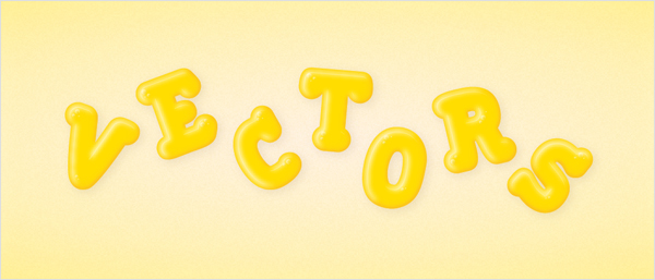
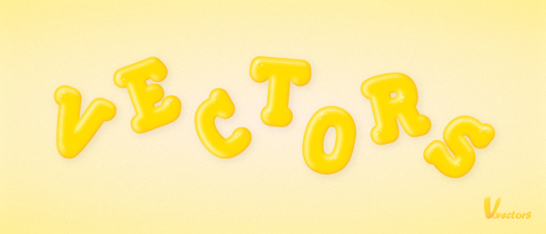
In the following tutorial you will learn to create a gummy text effect. Perfect for illustrative designs, you will create a cute and fun lettering effect using the Offset Path function and various other coloring techniques.


Step 1

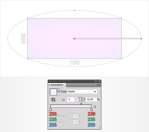
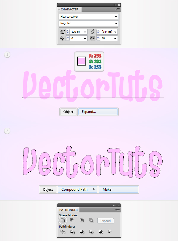
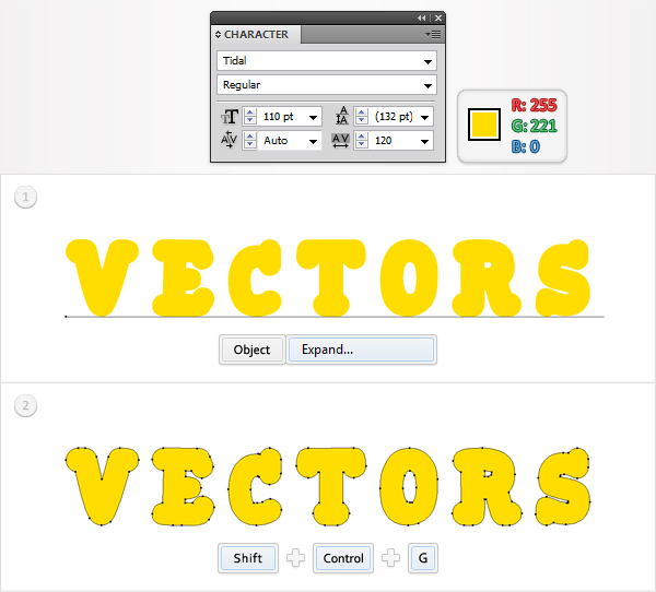
Create a 700px by 300px, RGB document. Select the Type Tool (T) and add your text using the Tidal font. Set the color at R=255 G=221 B=0 and the size at 110pt then go to Object > Expand. Select the resulting group and hit Shift + Control + G to ungroup it.


Step 2

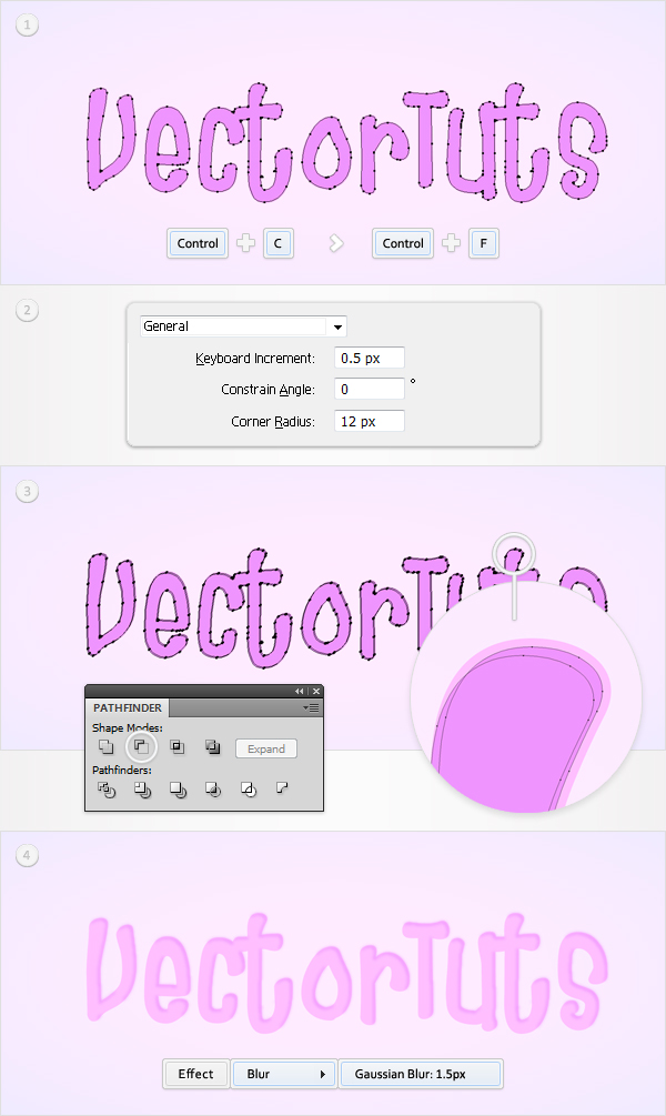
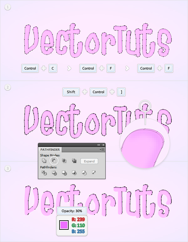
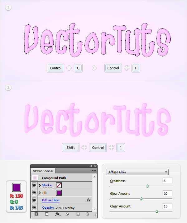
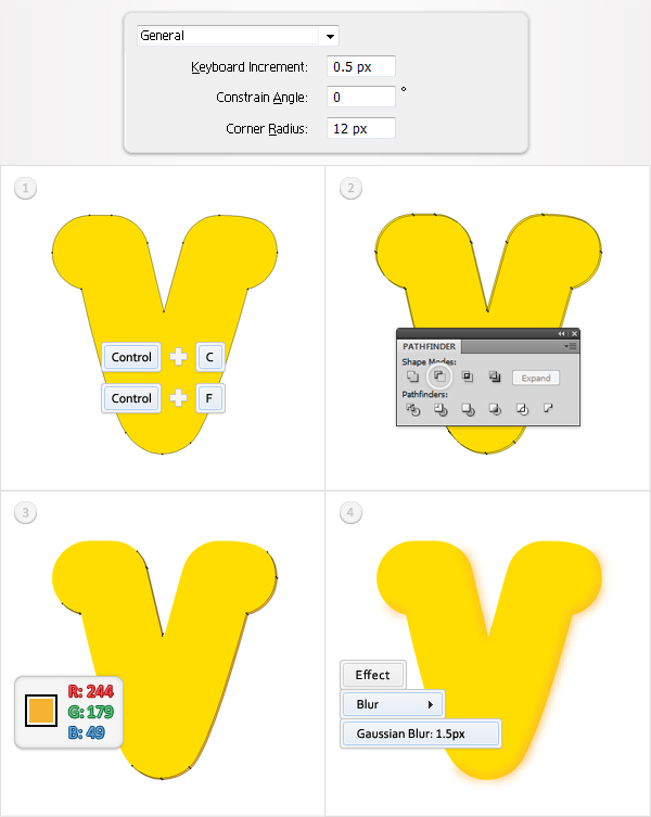
Let’s focus on the first letter shape. First, go to Edit > Preferences > General and enter 0.5 in the Keyboard Increment box. Now, select the "V" shape. Hit Control + C once then hit Control + F twice. This will add two copies of the selected shape. Select the top copy then hit the up arrow and the left arrow (to move it 0.5px up and to the left). Reselect both copies and click on the Minus Front button from the Pathfinder panel. Fill the resulting group of shapes with R=244 G=179 B=49 then go to Effect > Blur > Gaussian Blur. Enter a 1.5px radius then click OK.


Step 3

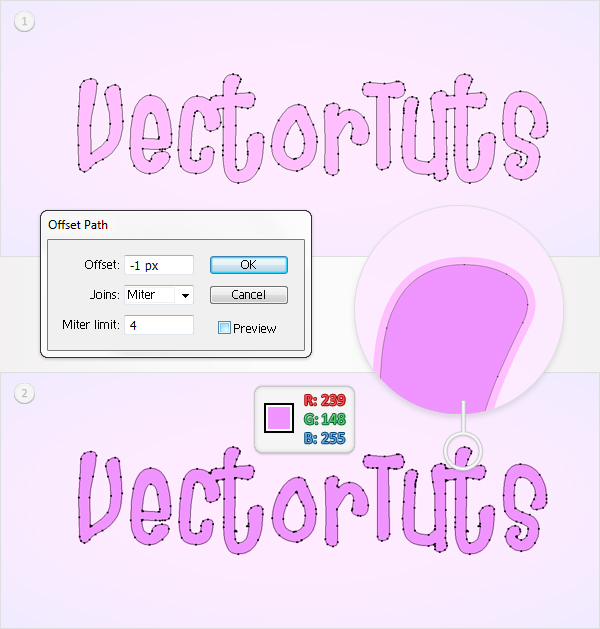
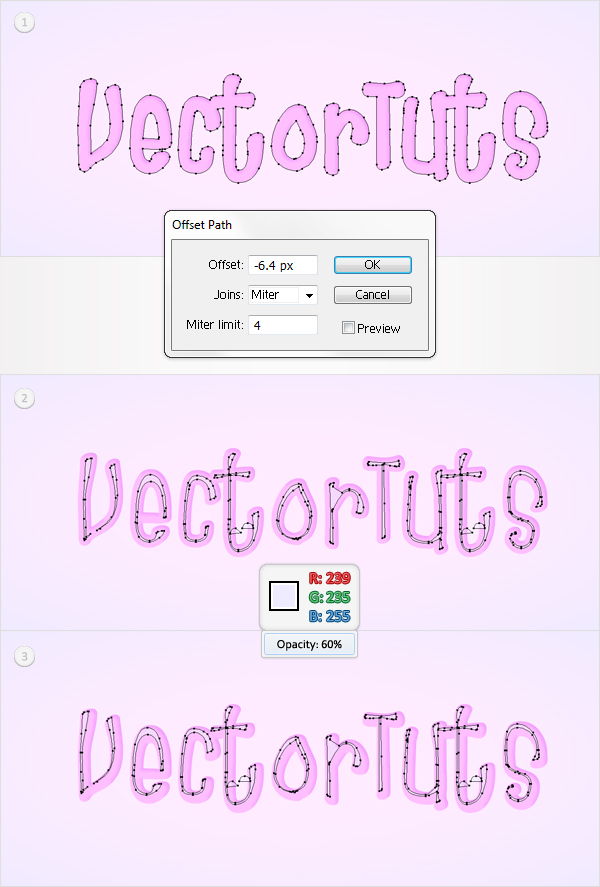
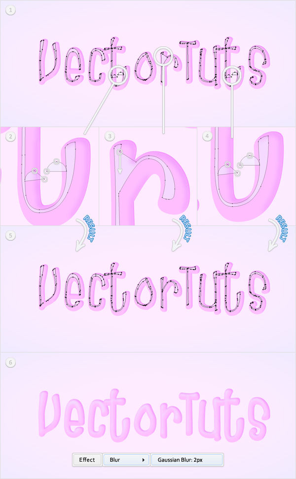
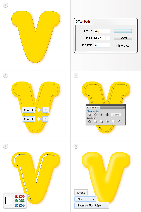
Reselect the "V" shape and go to Object > Path > Offset Path. Enter a -4px Offset then click OK. Duplicate the resulting shape (Control + C > Control + F). Select this fresh copy then hit the down arrow twice and the right arrow four times. Reselect the copy along with the original shape and click on the Minus Front button from the Pathfinder panel. Fill the resulting group of shapes with white then go to Effect > Blur > Gaussian Blur. Enter a 2.5px radius then click OK.


Step 4

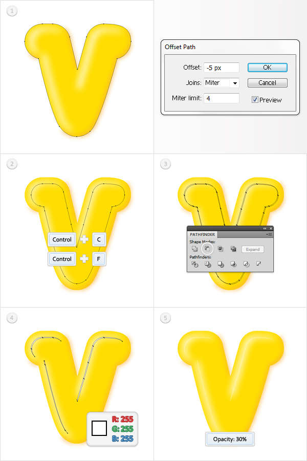
Reselect the "V" shape and again, go to Object > Path > Offset Path. This time, enter a -5px Offset and click OK. Duplicate the resulting shape. Select this new copy then hit the down arrow and the right arrow once. Reselect the copy and the original shape then click on the Minus Front button from the Pathfinder panel. Fill the resulting group of shapes with white and lower its opacity to 30%.


Step 5

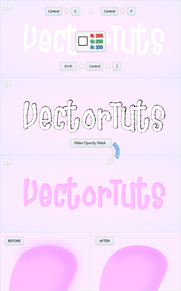
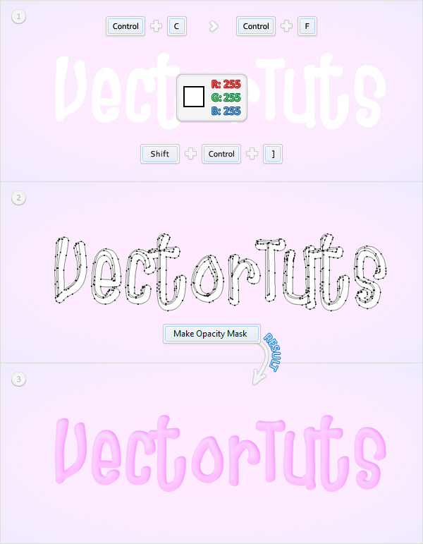
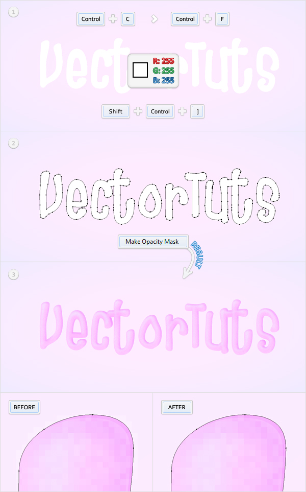
Select the groups made in the last three steps and hit Control +G to turn them into a single group. Make a new copy of the "V" shape, fill it white and Bring it to Front (Shift + Control + Right Square Bracket). Now, open the Transparency panel (Window > Transparency). Select the white shape along with the group, open the fly-out menu of the Transparency panel and click on Make Opacity Mask. The resulting shape should look like in the fourth image.


Step 6

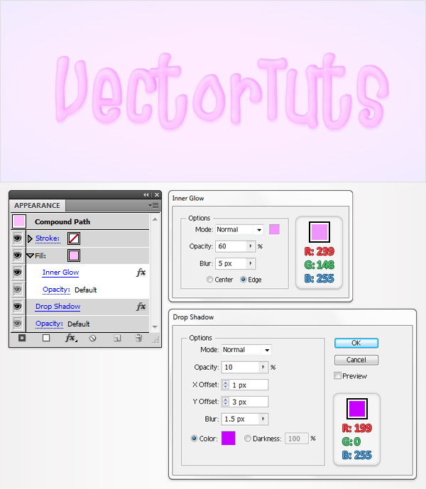
Reselect the "V" shape then select the fill from the Appearance panel and go to Effect > Stylize > Inner Glow. Enter the data shown below, click OK then reselect the entire path and go to Effect > Stylize > Drop Shadow. Again, enter the data shown in the following image then click OK.


Step 7

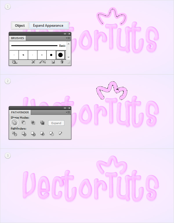
Repeat the techniques shown in the previous steps for the rest of the shapes.


Step 8

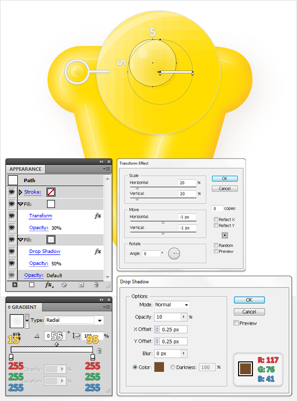
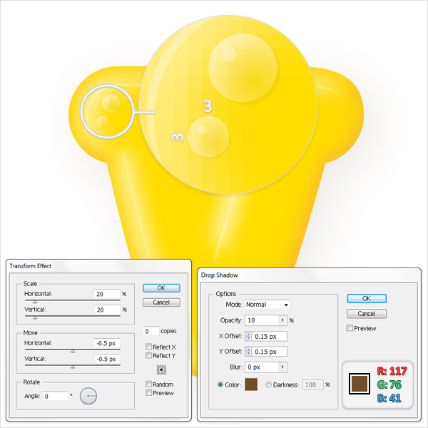
Now, let’s add some small details for these letters. Pick the Ellipse Tool (L), hold Shift and create a 5 by 5px shape. Fill it with the radial gradient shown below then select the fill from your Appearance panel. Lower its opacity to 50% then go to Effect > Stylize > Drop Shadow. Enter the data shown below, click OK then open the then fly-out menu of the Appearance panel and click on Add New Fill. This will add a second fill for your shape. Select it, make it white, lower its opacity to 30% then go to Effect > Distort & Transform > Transform. Follow the data shown in the following image then click OK. Take a closer look at the gradient image and you’ll notice some numbers above the gradients sliders. The white numbers stand for Location while the yellow numbers stand for Opacity.


Step 9

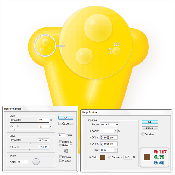
Duplicate the shape made in the previous step. Move this copy a few pixels down and to the left then resize it to 3 by 3px. Select it, go to the Appearance panel and edit the Transform and Drop Shadow effects as shown in the image below.


Step 10

Again,duplicate the shape made in the previous step. Move it a few pixels up and to the left then resize it to 1.5 by 1.5px. Select it, go to the Appearance panel and edit the Transform and Drop Shadow effects as shown in the image below.


Step 11

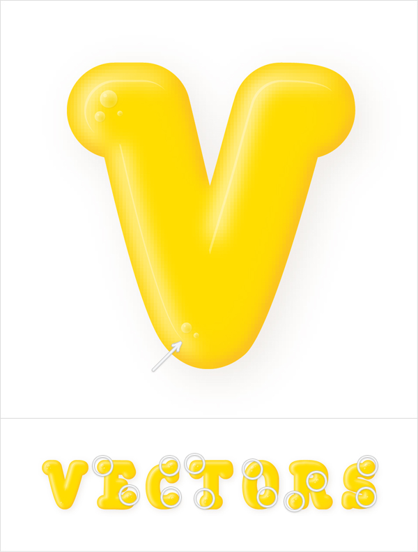
Make some copies for the shapes created in the last three steps and spread them above the text as shown in the following image. Try to place them in lighted areas.


Step 12

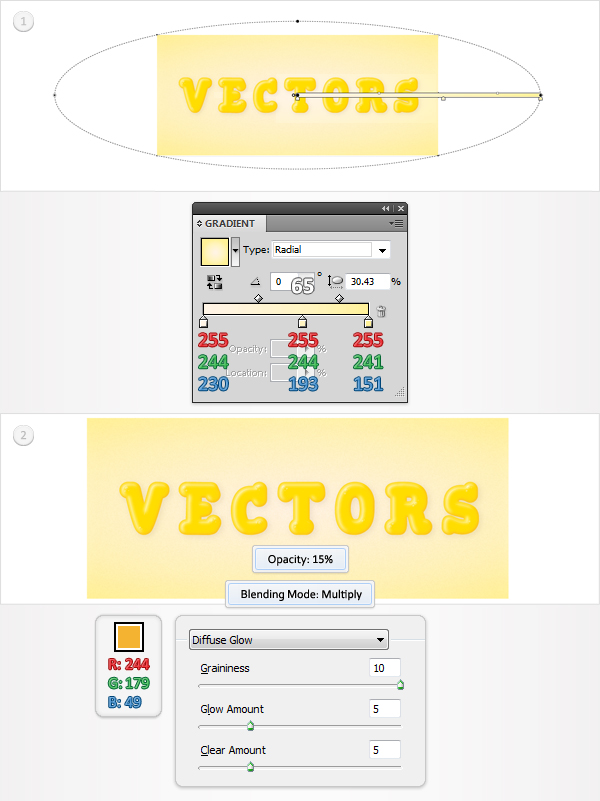
For the background, create a shape the size of your artboard using the Rectangle Tool (M). Fill it with the radial gradient shown below then add a second fill. Select this new fill (from the Appearance panel), set its color at R=244 G=179 B=49, lower its opacity to 15%, change the blending mode to Multiply then go to Effect > Distort > Diffuse Glow. Enter the data shown in the following image then click OK.


Step 13

Finally, make a group for each letter shape and its components. Now, rotate these groups as you want.


Conclusion

There you have it, a nice way to make gummy text. To take this further you can play around with different colors or even make a combination of colors. I hope you’ve enjoyed this tut.


Outstanding Vector Art from Creattica

$
0
0


High-quality vector work always blows me away. Creattica, Envato’s gallery website of great design and inspirational imagery, is always a great source to find a little vector inspiration. Here’s a quick rundown of some of the awesome work that has been recently submitted to Creattica under the vector graphics category.


1.Touch Of Spring


2.A Happy Ending


3.Whatcha lookin?


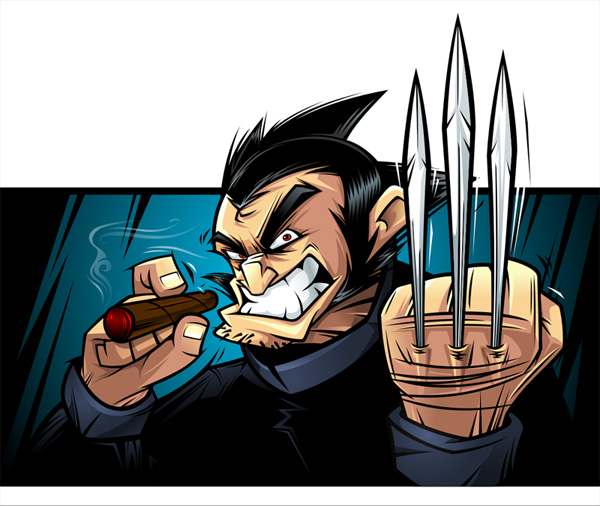
4.The Kraken


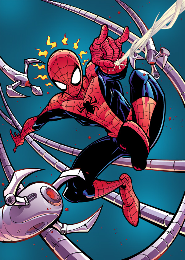
5.Spiderman


6.Octocrab


7.The Owls Are Not What They Seem


8.Illustrations


9.Guarded


10.The Candy King


11.Lumpeenkukka


12.Cup of tea


13.Japan Idol


14.Graffiti


15.Daft Punk


16.Marvel


17.Hunterrace


18.Game For INRS


19.The Programmer


20.My Future Pen


21.She Hulk


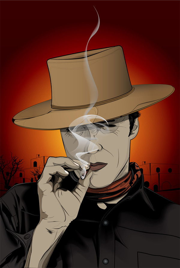
22.Clint the Good


23.Every Dog has it’s Day


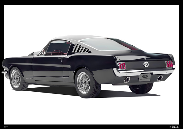
24.Mustang


25.Bunny DJ

Adobe InDesign CS5, Advanced Typography and Special Characters

$
0
0


Adobe’s InDesign is considered to be the most advanced multi-page editor software, but we need to take advantage of it’s full power to quickly create and deliver professionally formatted documents. In this article, we’ll review the nine advanced and special character topics, as well as corresponding shortcut keys, and additional information.

Scope and Focus of this Article

Most of the features explained in this article are general typography rules that will apply to any word processor, while some are only available in the Adobe CS suite, including InDesign and Illustrator. Also, some of the features are only available with Open Type fonts, which contain an extended character set including a number of special characters not available in other types of fonts.

To be noted that while extensive information on each of the following aspects is widely available, this article is just a short roundup of various typesetting features, and it should be treated as a checklist of things to remember when designing and reviewing a document.

Many times when working on large volumes of text or very tight deadlines, designers tend to ignore these aspects, however it is what makes the difference between a professional looking design and an average document. This article assumes you know the basics of working with Character and Paragraph Styles, and goes a bit beyond that.

Grid and Paragraph Style Rules

A few general rules to keep in mind when setting up your grid and paragraph styles:

  1. Your body text Paragraph Style should be defined first. Usual font settings for body text include 8/10 (meaning: font size/leading), 9/11 or 10/12, but feel free to pick any combination that would best fit your content and design.
  2. Your body text leading affects the baseline grid and other layout issues, so it’s best you set this correctly when starting a new document.
  3. Always use Optical kerning for all your Paragraph Styles. This ensures the optimal distance between letters, as defined by the typeface designer. You normally don’t need to alter this distance unless you really know what you’re doing. There are two additional kerning options available – Auto and Manual – Auto works similar to Optical, while Manual lets you adjust the spacing manually. But really, Optical should be ideal in most cases.
  4. Never add tracking to your lowercase body text Paragraph Style. The font designer has already defined the optimal letter spacing built into the font, so you don’t have to worry about that.
  5. You can, however, slightly track words in uppercase, titles and numbers throughout the document. You can set different letter spacing settings for each paragraph/character style you define, depending on it’s importance.
  6. Don’t use more than 50–70 characters per column for body text (ideally around 60). More than that would make rows too long and difficult to follow, especially for large volumes of text, such as books and annual reports. If using multiple columns, 40–50 characters per column should be your limit.
  7. If you plan on using justified text, keep in mind that works best for wide columns and is not recommended for narrow, multi-column designs. Also, avoid having hyphens on consecutive rows, since that creates on optical ‘gap’ on the edge of the text frame.

Show Hidden Characters

Before reading any further, make sure you activate the Hidden Characters feature, which will allow you to see the special non-printing characters (marked in blue) in your text boxes. You can do that by choosing Type > Show Hidden Characters from the main menu, or using the shortcut Command + Alt + I. Keep in mind that these characters won’t show up in InDesign’s Preview mode, so you might also need to switch back to Normal mode by pressing the W shortcut if you can’t see them.

9 Advanced Typography and Special Character Topics to Master

A summary of the aspects we’ll be covering:

  1. White Space
  2. Hyphens and Dashes
  3. Ligatures
  4. Smallcaps
  5. Optical Margin Alignment
  6. Glyphs
  7. Subscript & Superscript
  8. Figures
  9. Special Characters

1. White Space

The traditional space character is good most of the time for the main body of text, however there are cases when you need a wider/narrower space between some words.

While adding multiple consecutive spaces or changing the tracking setting are totally unprofessional and can create style overrides, luckily there are more elegant solutions for this problem. You can insert all the following spaces by choosing the options under Type > Insert White Space from the main menu.

  • Em space – virtually a blank square the size of the capital M in your selected typeface and point size. For a 12pt font size, an Em space will take up a width of 12pt. Frequently used as a measure for paragraph indents (Shift + Command + M).
  • En space – another blank space, half the width of the Em space, as defined above. For a 12pt font size, an En space will take up a width of 6pt. It’s used to create a bigger gap between certain words or special characters (Shift + Command + N).
  • Additionally, there are other narrower spaces, such as Third/Quarter/Sixth/Thin/Hair Space, which correspond respectively to 1/3, 1/4, 1/6, 1/8, 1/24 the width of an Em space.
  • A Punctuation space is as wide as comma or a colon. A Figure space is as wide as a figure character in your font, and it’s helpful for aligning numbers in tables.
  • Non-breaking space – normal width space that prevents words from breaking up at the end of a line. For instance if you have “3,300 USD” you might not want “USD” to drop to the next line, so you replace the space before “USD” with a Non-breaking space.

2. Hyphens and Dashes

There is some confusion regarding the difference between hyphens, dashes and various resembling math symbols. While every font has a number of hyphen-like characters included, only a few of them are commonly used:

  • Normal hyphens are used to split hyphenated words at the end of a line, or to join compound words or terms, like: “actor-director”. There is also a Non-breaking hyphen, which is in fact a normal width hyphen that prevents words from breaking up at the end of a line. You might need this for terms like “Pan-American” which must not be separated at the end of a line. This symbol keeps the words on the same line, and can be inserted instead of a normal hyphen via Type > Insert Special Character > Hyphen and Dashes > Non-breaking hyphen.
  • The Minus sign is used in math expressions or body text/tables to represent negative numbers (UNICODE U+2212).

There are however some situations when you need to transform regular hyphens into wider dashes, either by hand or using a search and replace on longer documents. Em and En dashes are by far the most useful:

  1. Similar to an Em space, an Em dash is as wide as the uppercase M letter in your selected font at your selected font size. It is mainly use to mark a pause in the text, like this: “Lorem ipsum dolor — sit amet — lorem ipsum.” The shortcut to insert a Em dash into a text box is Alt + Shift +/-.
  2. An En dash is half the width of the Em dash, and is used to define a range between 2 values. For example: “18–19 July,” years “2000–2011.” The shortcut is Alt +/-.
  3. Both Em and En dashes can be included between Thin spaces to give them a bit of room to breathe, but this is just a matter of personal taste. Personally I prefer to use Thin spaces around dashes.
  4. In recent times it is common that you use Em dashes instead of the regular bullet points to build a more contemporary list style.

A few examples of the elements we’ve explained so far, with the Hidden Characters feature turned on: An Em dash; A Non-breaking space – these words will stick together no matter the width of the text box; Em dashes in between Thin spaces; Normal spaces are marked by a simple dot.

3. Ligatures

Ligatures are pairs of two or three letters joined together into a unique shape. Most common ligatures start with the letter f: fi, fl, ff, ft, fb, fh, fk, ffi, ffl. It is recommended you always use Open Type ligatures whenever they are available in your selected typeface, by checking the Ligatures option in the Character Panel or the Paragraph Style Options dialog box.

4. Smallcaps

Smallcaps are alternative characters that are as high as regular lowercase characters and are used to highlight certain words or titles in your document. They are especially useful for acronyms; like: UNICEF, USA, NATO.

You can add a bit of tracking to acronyms in your document using a custom Character Style. People’s names can also be set in Smallcaps. For name initials such as E.M. Hemingway usually no space is required between E.M. Some designers prefer to use a Thin or Hair space in between these initials, but that depends on the font used and is a matter of personal preference.

5. Optical Margin Alignment

This is a very useful feature that will add a professional look to your text boxes by slightly pushing punctuation marks and some wide uppercase letters outside the text box, to visually align the text. They are especially handy for quotes enclosed in quotation marks, which will be hanging outside the box as shown above. Bring up the Window > Type & Tables > Story Panel, check Optical Margin Alignment, and enter the font size you are using for that particular paragraph.

6. Glyphs

The glyphs panel (Alt + Shift + F11) browses through the entire character set of a selected font, revealing an extended list of available characters you can use, which are not readily available on the keyboard. Just click in a text box, then double-click on a glyph to insert it at the cursor location. Let’s look at the panel explained in detail:

  1. Font selector – when you bring up the window it automatically selects your current typeface, but you can change it here.
  2. Font width selector – Choose Bold, Italic, etc.
  3. Decrease/increase glyph size by clicking these icons.
  4. Ligatures are listed as single characters, a unique shape made up of a group of characters.
  5. Subsets are groups of glyphs within the same font sorted by type: Extended Latin, Punctuation, Numbers, Currency, Symbols, Ligatures and so on.
  6. Recently used glyphs are very useful since most of the time you repeatedly need only a limited number of glyphs. You can see in this list I am only using a few language-specific glyphs in various font weights.
  7. Create your own sets for quick access, so you only see your selection instead of the entire font.
  8. Hovering a glyph shows more info about the character and it’s coding.
  9. Frequently used characters not available on the keyboard include currency numbers, copyright symbol, etc.

Notice some glyphs have a small arrow below, that means there are additional alternative glyphs available.

7. Subscript & Superscript

Open Type superscript and subscript is recommended at all times. If your typeface doesn’t have these glyphs built-in, you will see that marked in square brackets, as in the reference image. That means you have the alternative option of using an InDesign simulated superscript style, which is available in the Character Panel drop-down menu. Regardless, it is recommended you insert a Thin space before your subscripts and superscripts, so that they won’t stick to the preceding character.

8. Figures

  • For body text you can use Proportional Oldstyle Figures (shown above in pink), which align the bottom part of the figures in your text to the descenders. The “5″ in “2005″ goes down as much as the “q” in “que”. Oldstyle figures are not recommended for tables since they create vertical optical issues.
  • For tables it is best to use Tabular Lining figures (marked in green) that are specially designed to a fixed width to keep an optical alignment when used in a tabular structure.
  • Proportional Lining is a combination of the previous two modes, meaning there will be full height figures with flexible widths. You can find all these options in the Character > Open Type panel.

9. Special Characters

  • Multiplication sign – a special ‘x’ sign used to define mathematical expressions and physical dimensions. Example: 90×55 mm (UNICODE: U+00D7).
  • Ellipsis – a special character used instead of the three consecutive periods (UNICODE: U+2026).
  • Right indent tab – Shift + Tab.
  • End nested style here – invisible marker that would break applying a nested style inside a Paragraph Style.
  • Tab – usually you can just press the Tab key to insert a Tab character inside a text box; however, that won’t work inside a table where pressing the Tab key moves the cursor to the next table cell. Instead, you can go to Type > Insert Special Character > Other > Tab.

Conclusion

Applying these general typography rules will give a more professional look to your documents. You don’t need to remember everything, just have a printed copy of this article on-hand and use it as a checklist. Please feel free to add your comments and questions below.
Books and Resources

How to Create a Tube of Paint and a Brush, Using Adobe Illustrator

$
0
0


A few times a each month we revisit some of our reader’s favorite posts from throughout the history of Vectortuts+. This tutorial by Iaroslav Lazunov was first published on May 10th 2010.

In this tutorial we will learn how to create objects with shadows and penumbras using the Blend Tool. These techniques will help you bring any flat two-dimensional object to life by using lighting and shadow effects to create the illusion of volume and perspective.


Step 1

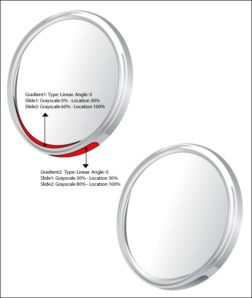
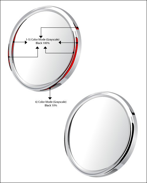
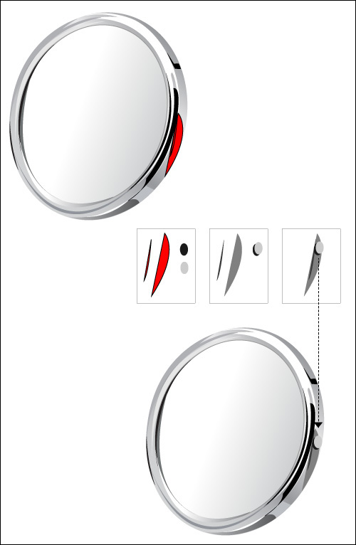
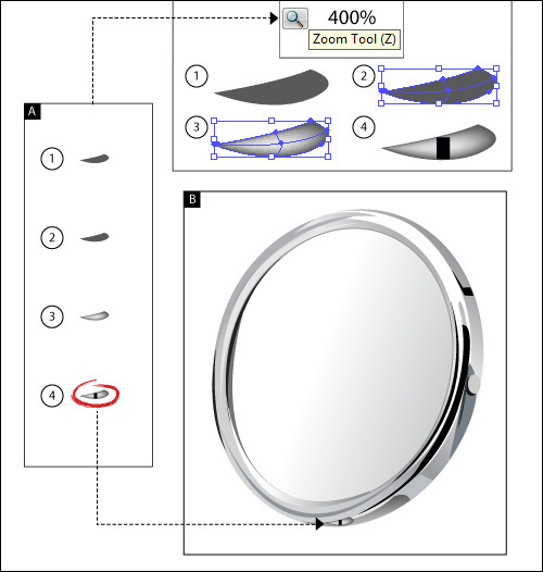
Launch Adobe Illustrator and create a new 800 by 800 pixel document. Take the Pen Tool (P) and create the shape of a tube. The tube will consist of several parts: the front, middle, upper, and lateral. Fill the created shapes with grey color without stroke. The shapes of the middle and upper part of the tube are shown on the pictures below.

Step 2

Now create the lateral part of the tube. Using the Pen Tool (P), create a curved line without fill, choose line width according to the size of a tube and set in the Stroke palette. Keeping the curved line selected go to Object > Expand, then ungroup.


Step 3

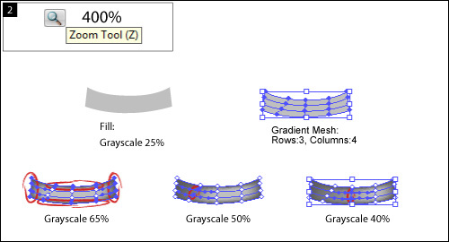
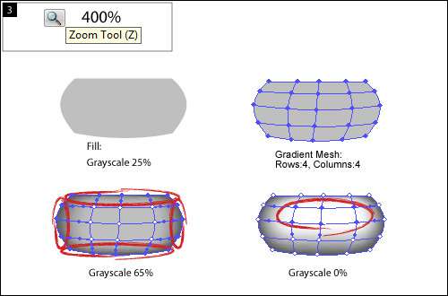
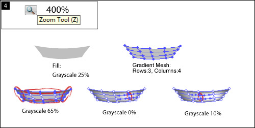
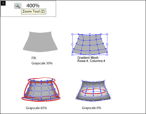
The tube of paint will be aluminium, so while creating under tints we will work with different shades of grey color. If you have to work with the shades of another color, you can open a dialog box Color Picker of the basic color, double-clicking on the Fill icon, and choose a color, moving on the color field to light or dark shades. We will use CMYK color model in this tutorial. This model is used in printing. We accept that the shadow is grey (K + 40), penumbra is grey (K = 20) and (K = 10), reflex is white (K = 0). Initially it is important to identify basic colors and their shades, and it is convenient for us to place them in the Swatches palette. Create shadows on the inner bent surface of the tube. Create three shapes, using the Pen Tool (P)

Now go to Object > Blend > Make … with the settings as on the picture below. The settings of the Blend can be always changed going to Object > Blend > Blend Options.

Step 4

Using the technique mentioned above, create a play of colors on the upper part of the tube.


Step 5

By analogy create a play of colors on the surface of the middle part of the tube. The drawback of this method of creating shadows is that the using of the Blend with the objects that are very different in shape may cause the emergence of artifacts. Therefore you often have to edit original shapes of the already finished Blend, using the Direct Selection Tool (A).


Step 6

Fill the lateral surface of the tube with a linear gradient from white to light grey color. Take the Pen Tool (P) and create a new shape, using the technique described in step 2. Fill the new shape with linear gradient from white to light grey color. Select both shapes of the lateral part of the tube and apply the Blend.


Step 7

Now create the front part of the tube. Create a circle using the Ellipse Tool (L). Now rotate the circle by 45 degrees clockwise, to do so go to Object > Transform > Rotate… with the settings shown on the picture below. Deform the ellipse using the Direct Selection Tool (A) as shown on the picture below. Now fill the shape with linear gradient of light grey to white color. When you have to portray three-dimensional objects (3D) it is more convenient to work as from life. If you do not have such an opportunity, means of Adobe Illustrator will help you to simulate the 3D object. Check this out in our example. The front part of the tube presents the part of a sphere. Simulate it. Create a circle using the Ellipse Tool (L), and cut out a segment using the Scissors Tool (C)
Now select the segment of the circle and go to Effect > 3D > Revolve … and turn the object to simulate the location of the created object. With the help of this effect you can also simulate the play of colors on the object by clicking on the More Options button in the dialog box 3D Revolve Options, you will have the access to the management of light.

Now you can use the created model as a visual aid while creating your object. I personally do not like to use a 3D object as part of the created picture. It is not convenient for us to edit such objects and the presence of such objects in the document overloads your computer’s memory, besides it unjustly increases the size of the file. But that is a matter of taste.


Step 8

Using the techniques mentioned above, create shadows, penumbras and lights on the front part of the tube.


Step 9

Get down to the creation of the thread on the front part of the tube. Take the Pen Tool (P) and create shape of the tube neck. For the right direction it is convenient for us to use the guide, which is rotated along the axis of the tube. I usually turn the guide with the Rotate Tool (R). Fill the created shape with linear gradient of light grey color. Create a play of colors on the tube neck.


Step 10

Create the front part of the neck. Create two concentric ellipse (centres of the ellipse have the same coordinates) using the Ellipse Tool (L). Fill the larger ellipse with white color, and the smaller one with light grey. Select both ellipses and apply the Blend.


Step 11

Create the thread. Create three ellipses, pay attention to the fact that red ellipse has the same sizes and coordinates that the larger ellipse created in the previous step. Select three ellipses and click on the Divide from pathfinder box. Now ungroup all the items and delete unnecessary objects. Fill the front part of the thread (blue shape) with linear gradient of light grey color, and fill the lateral part (green shape) with white color. Group up the thread elements and shift them slightly towards the tube.


Step 12

Copy the group (Command + C), paste it back (Command + B) and post a copy as shown on the picture. Select the two thread turns and apply the Blend with the settings shown on the picture below.

Step 13

Create a drop of paint. Take the Pen Tool (P) and create shape of a drop. Create a few more shapes and apply the Blend. You can experiment with the colors in this step, remember that the shapes included in the Blend, may be filled with a solid and gradient fill. Name the layer we worked with – Tube.


Step 14

Create shades under the tube. Create a new layer below the layer Tube and name it – Shadow. Take the Pen Tool (P) and create shape of shadow and penumbras. Select the created objects and apply the Blend. Proceed into the layer Tube. Create a red shape with the Pen Tool (P). Keeping it selected change the Blending Mode in the Transparency palette.

Step 15

Create a new layer above all the layers and name it – Brush. Create a brush. Take the Rectangle Tool (M) and create a rectangle with the orange filling. Now add a few smooth anchor points using the Pen Tool (P) and transform the shape of the rectangle into the shape shown on the picture below. Place the brush in the composition. Create three reflexes using the Pen Tool (P). Fill the reflexes with the linear gradient from orange to light orange.

Step 16

Now create a metal part of the brush. This technique does not differ from one of creating a tube.


Step 17

Create the hair part of the brush. Using the Pen Tool (P) draw the shape shown on the picture below. Fill the shape with the radial gradient from brown to dark brown. Now add the hairs. Create Art Brush. Take the Ellipse Tool (L) and create an ellipse as shown on the picture below. Fill the shape with white color and drag into the Brushes palette, choose New Art Brush in the open dialog box.

Step 18

Using the Pen Tool (P) create two hairs and apply the created brush to them. Select both hairs and apply the Blend with the settings shown on the picture below. Set 30% Opacity in the Transparency palette.

Step 19

Now create the shadow of the brush, duplicate the shape that you created in Step 15, rotate it using the Rotate Tool (R), and fill it with a linear gradient from grey to white.


Conclusion

So, we have created a tube of paint and a brush. You can take this tutorial further and create an entire set of paint colours or try and make a tube with its cap on. Remember that there are other drawing tools besides the mouse, Goodluck everyone.

Patrick Chappatte: The Power of Cartoons

$
0
0


Just because you missed that awesome conference, doesn’t mean that you can’t still watch the lectures! This weekend, we feature an inspiring talk by Patrick Chappatte that showcases his experiences of life though comic art. In a series of witty punchlines, Patrick Chappatte makes a poignant case for the power of the humble cartoon. His projects in Lebanon, West Africa and Gaza show how, in the right hands, the pencil can illuminate serious issues and bring the most unlikely people together.

25+ Best of, How to in Illustrator: Brush Tutorials

$
0
0


Need to amp up your Adobe Illustrator brush skills, then take a look at the best tutorials we have on Vectortuts+ for creating and using Illustrator brushes. Jump into one of these Illustrator tutorials that cover a range of workflows, such as using complex art brushes, pattern bushes, the Blob Brush Tool, and more. Whether you’re looking to master the technical how to of Illustrator’s brush tools, or how to integrate their use into a highly create workflow, we have you covered with a vast range of technical and artistic tutorials.


Create a Feather Brush and Set of Detailed Wings in Illustrator

In this tutorial you’ll learn how to create a feather art brush in Illustrator. You’ll then learn how to use it to create a set of angel wings, which can be added to your illustrations. It’s a common element in fantasy style art to have a set of wings. Ranging from bird like wings to epic angel wings, they can communicate a sense of freedom. This illustrator brush tutorial is for intermediate users.

best of, how to illustrator brush tutorials 1

How to Create a Climbing Rope Pattern Brush

A simple two-point-path can be transformed into a powerful Pattern Brush. The technique behind this illustrator brush tutorial will help save you a lot of time. Learn how to work with Illustrator Pattern Brushes in this intermediate tutorial.

best of, how to illustrator brush tutorials 2

How to Create a Hair Braid Pattern Brush in Illustrator

In today’s tutorial, you’ll learn how to create a deceivingly complex, yet easy to make, patterned hair brush using Adobe Illustrator. Discover how to create detailed elements in hair design with ease, from creating strands of hair all the way to more complex elements. Learn a complete process in how to create hair braids in this intermediate Illustrator pattern brush tutorial.

best of, how to illustrator brush tutorials 3

How to Illustrate Dynamic Hair Using Adobe Illustrator’s Paintbrush Tool

This tutorial will show you how to create a dynamic hairstyle from a reference image. You will use the Paintbrush Tool, basic skin shading and transparent gradients. Learn how to put custom Illustrator Profile Brushes to work in this intermediate tutorial.

best of, how to illustrator brush tutorials 4

A Comprehensive Guide: Illustrator’s Paintbrush Tool and Brush Panel

Illustrator’s Paintbrush Tool (B) and Brush Panel are some of it’s most powerful tools. With the Paintbrush Tool (B) and Brush Panel you can dress up your vector paths into compelling flourishes, patterns, tapered edges, and more. In this comprehensive beginner tutorial, you’ll learn how to break down the basics of the Paintbrush Tool and Brush Panel and how to create your own Illustrator brushes. Using brushes will greatly improve you Illustrator productivity and helps you create artwork you never thought possible.

best of, how to illustrator brush tutorials 5

Quick Tip: How to Draw a Stylized Motorcycle with Complex Illustrator Brushes

The application of Illustrator brushes can be very different, from imitating smudges in painting up to the most unexpected effects. In this beginner tutorial you will learn how to create complex brushes in Adobe Illustrator and how brushes work together to create some interesting effects.

best of, how to illustrator brush tutorials 6

Quick Tip: How to Create a Hand Drawn Style Text Effect

In the following tutorial you will learn how to use different layered brushes and effects to create a hand drawn text effect. Perfect for illustrative designs, you will create a cute and fun lettering effect in this intermediate tutorial.

best of, how to illustrator brush tutorials 7

Using Illustrator CS5 Tools to Create a Painted House – Vector Premium Tutorial

If you want to learn how to use a combination of the new Illustrator CS5 features – including the Perspective Grid and Natural Media Brushes – to create a 100% vector illustration with a painted finish, then we have an awesome tutorial for you. In this advanced Premium tutorial you’ll create a scene with perspective and paint all its elements with the Natural Media Illustrator brushes that create an excellent painted simulation with brush strokes that can be freely edited.

best of, how to illustrator brush tutorials 8

How to Make a Parrot Illustration with Custom Illustrator Brushes

This intermediate Illustrator tutorial covers the vector painting process in creating beautiful parrot illustration. You’ll learn how to use the standard Illustrator brushes, and how to make your own brushes to add more detail to your illustrations, for example the feathers on the parrot. You will also learn how to make a thick outline around your subject to add style and how to make a soft focus background with the Mesh Tool to set the scene.

best of, how to illustrator brush tutorials 9

Create Winter Festival Brushes in Illustrator CS

In this beginner Illustrator tutorial you’ll learn how to create a holly, ivy and a berry brush to create a Winter Festival wreath. These Illustrator brushes aren’t limited to this artwork, and can be used in pieces of vector art and decorations, just put your imagination into it after practicing.

best of, how to illustrator brush tutorials 10

Illustrate a Grunge Style Talking Skull in Vector with Illustrator Brushes

In this Illustrator tutorial I’ll show you how to create a grungy skull illustration using an image and some freebies around the web. These techniques can be easily applied to other grungy illustrations, and not only skulls. You’ll learn some useful Illustrator brush techniques in this intermediate tutorial.

best of, how to illustrator brush tutorials 11

How to Create Fireworks Using Adobe Illustrator Brushes and Effects

In this beginner Illustrator tutorial you’ll learn how to create vector fireworks using the Pixelate Effect and complex Art Brushes. Learn to decorate a night landscape or a greeting card with bright fireworks.

best of, how to illustrator brush tutorials 12

Create a Gold Chain Pattern Brush with Illustrator

In this intermediate Illustrator tutorial you’ll learn how to use pattern brushes to create complex vector artwork. Creating pattern brushes can save time and is a great technique to have on hand. After this tutorial, you will be able to create great pattern brushes. Add that to your Illustrator brush skills and design arsenal.

best of, how to illustrator brush tutorials 13

How to Create Smoky Brushes and Type In Illustrator CS4

Smoke is fascinating, and experimenting with smoky effects has the potential to wow viewers. In this intermediate tutorial you’ll learn how to create realistic smoke, make it into an Illustrator brush and use it to create some dynamic illustrated lettering. This text effect is smokin’!

best of, how to illustrator brush tutorials 14

Create a Painterly Apple with Illustrator CS5′s new Bristle Brush

The new Bristle Brush in Illustrator CS5 gives you the best of both worlds: The painterly effects of real media and the control and flexibility of a vector drawing. We’ll use another new feature in CS5, the “Draw Inside” drawing mode, which will let us do what every artist likes to do — color outside the lines. Take your vector painting techniques to the next level with this how to Illustrator brush tutorial.

best of, how to illustrator brush tutorials 15

Create a Vector Tree with Custom Illustrator Brushes and the Gradient Mesh Tool

In this beginner Illustrator tutorial you will learn how to create a leaf-filled, vector tree – step by step. Some of the techniques we’ll use are custom made Illustrator brushes to create the leaves, and Gradient Mesh Tool for creating light and shadows.

best of, how to illustrator brush tutorials 16

Create a Japanese Ukiyo-e Style Print – Vector Premium Tutorial

If you want to take learn how to create a traditional Japanese style print, then we have an awesome tutorial for you. In this intermediate Premium tutorial you’ll learn how to create a landscape in the style of a Japanese Ukiyo-e print. You will get acquainted with lots of manual techniques, and learn how to make your job easier using the Art, Scatter, and Blob Illustrator Brushes.

best of, how to illustrator brush tutorials 18

Create a Painterly Landscape with the Illustrator Blob Brush Tool

Illustrator’s Blob Brush is an intuitive and versatile tool. When used with a graphics tablet, you can create loose, painterly images that venture far from the sharp, clean lines usually associated with vector graphics. These files retain all the benefits of vector files, however, allowing you to experiment and be flexible with scale, color and composition. Advanced your Illustrator brush skills with this how to tutorial aimed at intermediate users.

best of, how to illustrator brush tutorials 19

How to Create a Three Color Wolf Skull in Illustrator

In this beginner Illustrator tutorial you’ll learn the process of designing an aggressive wolf skull using just white, black, and grey. Clients often ask for mind blowing vector images with a low number of colors and no gradients when designing for print. The question is how can you add depth to an illustration, give it an artistic feel, and still keep it commercial? One solution: concept, variable line thickness, contour, shadow and fill color. You’ll use a Wacom tablet (not compulsory), reference images, and Illustrator brushes to complete this tutorial.

best of, how to illustrator brush tutorials 20

Create a Watercolor Vector Flower Illustration

Illustrator is great for creating sharp flawless lines and elements, but sometimes you want to create an illustration with some texture and depth. Watercolor paintings have great textures and depth and their look can be made in vector. In this intermediate Illustrator tutorial learn all the wonderful things vectors have to offer, like scalability. Blends and Illustrator brushes make up the majority of the techniques used in this tutorial.

best of, how to illustrator brush tutorials 21

Inking and Coloring the Comic Strip “The Brads”

In this advanced Illustrator tutorial, we’ll walk through the steps of creating a comic strip using Illustrator’s Pen Tool, custom brushes and masking features. This is a fun tutorial that covers the comic creation process, while showcasing the comic strip “The Brads.” Learn a professional comic creation workflow that utilizes Illustrator brushes and other vector techniques.

best of, how to illustrator brush tutorials 22

Easily Make Shiny Realistic Vector Hair with Illustrator Brushes

This intermediate Illustrator tutorial you’ll learn how to easily make realistic-looking shiny vector hair. You’ll use Illustrator brushes to create S shapes and use them to construct natural looking hair. You should have a basic understanding of Adobe Illustrator tools before you begin this tutorial.

best of, how to illustrator brush tutorials 23

Create CS5 Width Profile Brushes in any Version of Adobe Illustrator CS!

Adobe Illustrator CS5 has a new option within the Stroke window known as “Width Profile”. This intermediate Illustrator tutorial shows how you can create brushes and use them in any version of Adobe Illustrator CS. You will also learn how to create, save and use your new Illustrator brushes!

best of, how to illustrator brush tutorials 24

How to Make an Inspired, Golden Painting in Illustrator

In this intermediate Illustrator tutorial we will travel back in time to learn how to recreate the painting style of one of the most outstanding symbolism artists – Gustav Klimt. His works are full of warm golden colors, simple ornaments, irregular patterns, natural symbols, and asymmetric shapes. We will work to produce this style with the help of Adobe Illustrator tools, such as Illustrator brushes.

best of, how to illustrator brush tutorials 25

Draw a Glowing, Vector Pocket Watch – Front and Back

In this intermediate Illustrator tutorial you will learn how to draw the front and the back side of a pocket watch from scratch. This tutorial is detailed and by the end you will know how to draw all kinds of shapes, like cog-wheels and small screws. You’ll learn to create the scatter brushes used for the designs on the watch and how to use some of the existing patterns and gradients in Illustrator’s library to your advantage.

best of, how to illustrator brush tutorials 26

Quick Tip: The Blob Brush in Action

Illustrator’s Blob Brush settings can be confusing. Seeing it in action will help you get the most out of this fun, flexible tool. Learn how to make painterly scenes and objects with a few strokes of the Blob Brush and Eraser in this beginner Illustrator tutorial. You will be surprised by how fun this tool is!

best of, how to illustrator brush tutorials 27

Quick Tip – Using the Illustrator Blob Brush and Eraser for Character Lines

In this Video Quick Tip you will learn how to use a digital drawing tablet in conjunction with the Blob Brush and Eraser tools to create character outlines. If you don’t own a tablet, don’t worry, you can still follow along with this intermediate Illustrator tutorial and achieve a great looking result. Let’s begin!

best of, how to illustrator brush tutorials 28

Quick Tip: Create a Pretty Bouquet of Flowers with Adobe Illustrator

In this intermediate Illustrator tutorial you will learn how to create a bouquet of pretty flowers, using only Art Brushes and and the Gradient Mesh Tool. You will find that the techniques learned in this Quick Tip will help you craft a variety of flowers and decorative elements. Let’s get started!

best of, how to illustrator brush tutorials 29

Quick Tip: How to Create a 3D Map Pullout for Information Graphics

$
0
0


In this Quick Tip Video, you will learn how to use a clever trick to make a map element appear to zoom out from its background. Popular with information graphics, this effect is perfect for a variety of creative uses. Let’s get started!

Draw a Shiny Make-Up Mirror with Adobe Illustrator

$
0
0


In this tutorial we’ll create a pretty make-up mirror using mostly grayscale and hard shapes to achieve a shiny metallic effect, also we’ll be using gaussian blur effects and the mesh tool for a better result.


Step 1

We’ll begin by creating a 245 by 296 pixel and 204 by 257 pixel ovals using the Ellipse Tool (L).


Step 2

Select both ovals and use the Align palette (Shift + F7) to center vertically and horizontally.


Step 3

Move the smaller oval 1px down and 8px to the left.


Step 4

Select both ovals and in the Pathfinder palette (Shift + Command + F9) click on Minus Front.


Step 5

Use the Rotate Tool (R) to rotate the shape -17 degrees.


Step 6

With the shape selected, open the Gradient panel (Command + F9). Click on the default grayscale gradient and add two sliders in the middle of the gradient by clicking twice anywhere between the two sliders on the color strip.

Open the color panel (F6) too and click on the panel option (in the top right corner of the panel) to verify that Grayscale is selected from the list. Assign the sliders color and locations: Slide1 Grayscale 20% with Location 0%. Slide2 Grayscale 48% with Location 45%. Slide3 Grayscale 8% with Location 75%. Slide4 Grayscale 48% with Location 100%. The angle must be 45º with a Type of Linear.


Step 7

Create inside the shape a 204px by 257px oval and rotate it -17 degrees. Fill it with a gradient (grayscale): Slide1 Grayscale 0% with Location 40%. Slide2 Grayscale 22% with Location 100%. The angle must be -20º. Add a stroke to the oval (Command + F10) with a Weight of 1pt and Stroke color of grayscale 40%.


Step 8

Use the Pen Tool (P) to draw the red shapes as in the picture. Fill them with the indicated colors, then Erase the strokes.


Step 9

Use the Pen Tool (P) again to draw the red shapes as in the picture. Fill it with the indicated gradients, then Erase the strokes.


Step 10

Let’s add hard shadows. Draw the red shapes as in the picture and fill it with a grayscale of 100%, except the shape 6 that should be filled with a grayscale of 10%.


Step 11

Draw the red shapes as in the picture. Fill the biggest shape with a grayscale of 50% and the narrow shape with a grayscale of 78%. Create a 11px by 17px oval and fill it with a grayscale of 90%. Copy and paste it in the same place (Command + C and Command + F). Select the top oval and fill it with a grayscale of 20%, move it 3 pixels to the right and 2 pixels up. Select both ovals and group them.


Step 12

Use the Pen Tool (P) and draw a shape as in the picture (1), fill it with a grayscale of 65%. With the shape selected, create a gradient mesh (Menu > Object > Create Gradient Mesh) with 2 rows and 2 columns (2). Fill the central anchor point with a grayscale of 10% (3). Create on the central anchor point a 3px by 5px rectangle and fill it with a grayscale of 100% (4). Group the two created shapes and be sure that they are placed in the bottom of the mirror.


Step 13

Use the Pen Tool (P) to draw the red shapes as in the bottom picture. Fill it with the gradients and colors indicated in the box.


Step 14

Use the Ellipse Tool (L) to create five ovals and set the values as shown in image A. Place the 2nd oval on the 1st oval, align them vertically and horizontally, then move the 2nd oval 2 pixels to the right (a). Place the 3rd oval on the 2nd oval, then align them to the right horizontally and to the center vertically (b). Place the 4th and 5th ovals exactly at the center of the 3rd oval. Move the 4th oval 1 pixel to the right (c). Select and group them all.


Step 15

Create seven shapes as shown in table A. Apply the corresponding fills. Place the parts following the pattern shown in table B and group them all. Place it at the left of the mirror (C).


Step 16

In this step we are going to work with the Mesh Tool (Menu > Object > Create Gradient Mesh). Now we need to create different shapes that compound the base of the mirror. We are going to divide the base in parts and work on each shape as shown in table A, separately.

Use the Pen Tool (P) to draw half of each shape in step 17.

Use the Reflect Tool (O) to create a copy in vertical reflex, place it next to the other shape.

Select both shapes and open the Align panel (Shift + F7), then click on Vertical Align Center.

Join both shapes. Open the Pathfinder panel (Shift + Command + F9) and click on Shape Modes: Unite.

1. Use the Direct Selection Tool (A) to select the anchor point as shown by the image. Move it 3 pixels down. You’ll have to repeat the following process with all shapes, changing the values.

1-a. Select all the shapes and paint them with a 25% grayscale.

2. With the shape selected, open the Gradient Mesh Tool panel (Menu > Object > Create Gradient Mesh) and introduce the following values: Rows = 3 – Columns = 4. The other values always stay the same (Appearance: Flat – Highlight: 100%).

Then select the indicated anchors points as shown by the images and paint them with established colors: 3. Grayscale 65%, 4. Grayscale 10%, and 5. Grayscale 0% respectively.


Step 17

Use the Rectangle Tool (T) to draw black rectangles as shown by the image. Draw too similar shapes as those selected in the image, and fill them with a grayscale of 55%.


Step 18

1. Draw a 187px by 49 px oval. Copy and paste it in the same place (Command + C and Command + F) and move the top oval 26 pixels up.

2. Select both ovals, open the Pathfinder panel (Shift + Command + F9) and click on Minus Front.

3. Create a 187px by 25px rectangle, select both shapes, open the Align panel (Shift + F7) and center them vertically and horizontally.

4. Move the rectangle 25 pixels up.

5. Select both shapes, open the Pathfinder panel and click on Shape Modes: Unite.

6. Draw a 187px by 49px oval. Select both shapes, open the Align panel again and center them vertically and horizontally.

7. Move the oval 25 pixels up. Assign the fills as shown in the bottom image. The Oval is a Gradient: Slider1 Grayscale 15% with Location 0%, Slider2 is Grayscale 50% with Location 100% and Angle 60º. Bottom shape Gradient has and Angle 0º with a Linear Type. Slider1 Grayscale 50% with Location 0%, and Slider2 with Grayscale 0% and Location 70%, and Slider3 Grayscale 50% with Location 100%.


Step 19

1. To create the base reflex, duplicate the 4th to last shape.

2. Use the Scale Tool (S) and scale it 40% vertically.

3. Select only the bottom shape, apply a scale of 170% vertically and move it 1 pixel down.

4. Select all, open the Transparency panel (Shift + Command + F10), then click on Opacity and introduce a value of 75%.


Step 20

Now, let’s add a shape and the last details for the base reflex.

1. Create a 33px by 6px oval, fill it with a Grayscale of 100%. Place it under the base and align them vertically.

2. With the oval selected, open Menu > Effect > (Photoshop Effects) Blur > Gaussian Blur, and apply a Radius of 5 pixels. Move the oval 3 pixels up.

3. Place the oval at the back of the base: open Menu > Object > Arrange and click on Send to Back ( Shift + Command + [ ).

4. Select all. With the Reflect Tool (O) apply reflex: horizontal. Put it in the same place as shown by the bottom image. Select the base reflex with the shape created in step 18 and send all to back.


Step 21

Use the Pen Tool (P) and the Rectangle Tool (R) to create the shapes shown selected by the bottom image. All shapes will be filled with a grayscale of 100%, but shape 3 has a transparency with an Opacity of 15%.


Step 22

Use the Pen Tool (P) to draw 5 red shapes, as shown by the bottom image. You can see a zoom of shapes 1 and 5 as a reference. Apply the colors and gradients indicated by the table. The white shape must go in front because it is a shine.


Step 23

In this step we’re going to apply a Gaussian Blur to the shapes. Use the Group Selection Tool and select the shapes: 2, 3, 4, 5, 7 and 9. Open the Gaussian Blur panel: Menu > Effect > (Photoshop Effects) Blur > Gaussian Blur.

Apply a Radius of 3,0 pixels. Now select the shape 6 and apply a Gaussian Blur with a Radius of 5,0 pixels. Finally, select the shapes 1 and 8 and apply a Gaussian Blur with a Radius of 1,5 pixels.


Step 24

Finally, let’s add a little detail. Create a shape as shown by the image with the corresponding values and put it in the same place shown in the image.


Final Image

This is the final result. I hope you enjoyed it.


Primary Design Elements Found in Outstanding Digital Illustrations

$
0
0


Following on from, Using Design Principles to Create Exceptional Vector Illustrations, today we have a collection of digital illustrations that highlight the primary elements of design. Design elements are the building blocks that are used to create an image. These include, line, color and shape. Although they may seem basic, if you take the time to think about the elements and how they can be used, you will have a better understanding of your creations – and perhaps think of a few new ideas too!


Space

Space is described in two ways. Negative Space, which is the space around the subject, and Positive Space, which is the shape of the subject matter.

In the image below you can see that the positive space has been used to create depth and focus in the image. The hair creates further depth and cuts away into the background to add contrast between the decorative area of the face and the subtle area of the background. Through the use of the flat dark purple color, the positive space of the hair is made into a negative space.

Non Cadenza Album Cover for Sweet Content by Jared Nickerson


Line

Line is a continuous mark made by a tool such as the pencil and brush or the edge of a shape. Line can be curved, zigzag, horizontal, diagonal, vertical, dashed and dotted. Line is an element that’s more interesting than people first think. The visual impact of a line can be changed with rhythm, length and weight.

The image below has a playful appearance created with the use of repetitive curves made into a shape. The hand at the top is poised in such a way that the viewer is lead to believe the image could be unraveled like a knitted sweater.

“Line on Bike and More” (part of a series) by Jonathan Calugi


Color

Color is in every image you see. Different moods and temperatures can be conveyed with the use of color. An example would be red tones for hot and blue tones for cold. Contrasting colors are used to draw attention to areas of an image, and Monochromatic colors are used to create harmony. For more information on color theory, see Open the Door into the Science of Color Theory by Iaroslav Lazunov.

The Monochromatic grays in the image below accentuate the atmosphere of the image and add emotion to the figure. If the illustration was full color it would convey a different mood and perhaps confuse the message.

Bad Habits Never Die by Cronobreaker


Shape

Shape is a geometric or organic element that stands out from the space around it. Shapes can be used in ways such as layering or groups and can be textured, colored or outlined.

Below you will see an example of the ways shape can be used to create an image. Each element of the castle is made from geometric shapes balanced with color and repetition. The contrast between the dark background and the bright colors also creates visual interest.

The Decemberists (gig poster) by Dan Stiles


Texture

Texture is a representation of surface and medium. There are two kinds of texture – Implied Texture, which is used visually to communicate the way an object would feel, such as rough pencil to represent stone or smooth brush strokes to look like silk. Tactile Texture is the finish on a real object, such as a spiky sculpture or a smooth piece of pottery.

The image below uses different textures to emphasize the cold, scary atmosphere of a graveyard at night. The Crow is different and has a smooth texture to make it stand out as the main element of the image.

This image is available as a Vector Premium tutorial.

Night Landscape by Iaroslav Lazunov


Form

Form is the use of 3D. It can be illustrated or made as a real object. In illustrative terms, form is the use of tone and shape to make an object appear three dimensional.

By now you will have noticed that many of the design elements can be used together. In the illustration below, you will see how the artist has used highlights and shade to make the form of the object, and then used shape and texture to create the illusion of mass.

Ogrest01 by Nzinzi Fabrice


Value

Last but not least, we have Value. Value is also referred to as Tone. Value is used to show the relationship between light and dark on a surface and is used to emphasize form and depth.

The Illustration below uses value/depth to create a figure that appears to rise out of the background. Varying contrasts of the shade is used to show some elements in the foreground and others in the background. The shapes also overlap to create a visual hierarchy.

MTV + 55DSL / Touch (project) by Alex Trochut


Get Involved!

As an extension to this article I invite you to submit your own examples. Find an illustration that you admire and write down why you like it and which design element it would fall under, then leave it as a message in the comments section below.
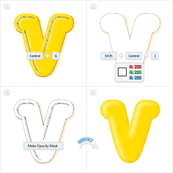
Free Vector Downloads: 50+ Illustrator Patterns for Vintage Design

$
0
0


Alrighty then, we’ve rounded up a whole slew of Adobe Illustrator patterns for you to download today. They are all free vector downloads with a retro style. The designs vary, from simple circles, to ornate patterns. Some are quite unique, adorned with vain peacocks or colorful butterflies. Many have a vintage wallpaper design feel to them. There are numerous patterns for Illustrator that are composed of floral and organic elements. Also, a bunch of them have flowing symmetry. Jump in and download these free seamless vector patterns now, and use them on your next retro design project to add a timeless feel.

Many of these patterns are available for commercial use, as well as personal use. Some may have stronger restrictions though, so as always check the usage rights before using.


One Off, Free Vintage Illustrator Patterns

Vintage Bird + Flower Pattern

This awesome design freebie from Ars Grafik is of a vintage bird and flower pattern, good as both a Photoshop pattern and an Illustrator pattern. It was inspired by a playful retro fabric. The pattern download includes an AI file with pattern swatch, PAT file of the design, and a lossless, high-res PNG for use in any other digital art program.

Free Vector Downloads of Illustrator Patterns for Vintage Design 1

Free Vector Floral Seamless Pattern

This seamless vector pattern is available as an EPS file, so it can be brought into Illustrator, or other vector software. This floral pattern has a vintage wallpaper feel. The flowers and leaves feel properly organic and the lighting on them is unique.

Free Vector Downloads of Illustrator Patterns for Vintage Design 2

Seamless Vectors – Paisley

This is a seamless paisley, vector pattern from the Supreme Vector Set. The author notes that you can use these vectors as you wish, for your clients or for your personal projects. This pattern has an organic retro feel.

Free Vector Downloads of Illustrator Patterns for Vintage Design 3

Damask Seamless Pattern

This vintage designed vector wallpaper pattern would be great for the background of an alternative music site, or a 50s style print that would benefit from a retro design. Grab this free vector download available as an EPS file, so this pattern can be opened in Illustrator or another comparable vector program.

Free Vector Downloads of Illustrator Patterns for Vintage Design 4

Retro Circles Vector Pattern

Grab this free vector download of a seamless retro pattern made up of circles and dots. This Illustrator pattern is saved in an AI and EPS vector version. This vintage circle design is simple, but fun vector background to download today.

Free Vector Downloads of Illustrator Patterns for Vintage Design 5

Seventies Vector Pattern

This is a seamless vector pattern, great for art footage or for your retro graphic design. This vintage inspired vector wallpaper pattern is easy to use in your design work, textile and lifestyle illustrations and web graphics. It’s a simple blue seamless vector pattern background in Illustrator, available as a free vector download download in AI and EPS vector art formats.

Free Vector Downloads of Illustrator Patterns for Vintage Design 6

Romantic Flowers Vector Pattern

Free vector floral image of a romantic flower pattern background. Download this beautiful vector background, which is great for your artistic décor illustrations, invitations and textile prints. Grab this vintage Illustrator pattern of a flower composition in vector art format. This is a free vector download resource to add to your vector stock footage collection.

Free Vector Downloads of Illustrator Patterns for Vintage Design 7

Vector Freebie: Ornate Flourish & Pattern

Download this seamless vector pattern from GoMedia. They created each one from scratch, and admit to having “baggy eyes” to show for it. The line quality is is very high. Grab this retro design today. It’s available as a free vector download and can be used as an Illustrator pattern, as it’s an AI file. This pattern tiles seamlessly, so it’s great for filling vector backgrounds.

Free Vector Downloads of Illustrator Patterns for Vintage Design 8

Vector Ornament Pattern

A vintage old ornament seamless vector pattern design created using Illustrator. This pattern can be used when creating a vintage design to give your vector background a more authentic look. This Illustrator pattern can be used in commercial design projects, as well as non commercial design projects. It’s available as a free vector download in EPS format.

Free Vector Downloads of Illustrator Patterns for Vintage Design 9

Abstract Summer

This free seamless vector pattern is available from Pattern Shop. The design is composed of numerous flowing butterflies and would make a great vintage vector background design. It’s available as a free vector download in EPS format.

Free Vector Downloads of Illustrator Patterns for Vintage Design 10

Baroque Seamless

This free vector download is designed Designious.com and available in EPS format. They are known for creating high quality Illustrator patterns and vector graphic sets. This Baroque seamless pattern has a vintage design flavor and will make a great retro vector background in your next design.

Free Vector Downloads of Illustrator Patterns for Vintage Design 11

Free Seamless Vector Pattern – Vintage Velvet

This free vector pattern with a vintage design look and feel is created by Pattern Head. It is a simple design with a wallpaper pattern feel. The free download includes an EPS file that you can load into Adobe Illustrator (or your favorite vector editor). It also includes a PNG thumbnail that you can use right away in your web designs or load them into your Photoshop pattern library (Edit->Define Pattern). You can use the downloads for personal or commercial projects though read the usage restrictions carefully, as always.

Free Vector Downloads of Illustrator Patterns for Vintage Design 12

A Very Beautiful Floral Seamless Vector Pattern

This is a beautiful unique floral vector pattern is available in a wide range of various colors that are great for adding to retro designs. The beauty of this Illustrator pattern is that’s its available to be used within commercial and non commercial design projects. This free vector set includes an EPS file that has Illustrator Pattern swatches with various colors already applied.

Free Vector Downloads of Illustrator Patterns for Vintage Design 13

Peacock Vanity

“Peacock Vanity” is one of several hundreds seamless patterns LittleLionStudio has created. This Illustrator pattern is of a fantasy retro garden adorned by a majestic peacock. It has a wonderful, organic childlike feel with a vintage design touch. It looks perfect for a vector background or wallpaper design. Grab it today as a free vector download, which is available as an AI file.

Free Vector Downloads of Illustrator Patterns for Vintage Design 14

Seamless Retro Vectors

Grab this free vector download of an attractive retro seamless pattern from Designious.com. This Illustrator pattern is available as an EPS file. It’s composed of various retro design floral elements. This free vector background is great for using as a vintage wallpaper element in your next design.

Free Vector Downloads of Illustrator Patterns for Vintage Design 15

Seamless Vector Pattern

Here’s a seamless vector pattern from Designfruit. This fluid geometric style would make for a great retro design element. Grab this free vector download today, it’s available as an Illustrator Pattern in EPS format.

Free Vector Downloads of Illustrator Patterns for Vintage Design 16

Free Vintage Illustrator Pattern Sets

Free Vector Patterns – Ornate Swirls (3 in set)

This seamless vintage design pattern set is available in three colors. Grab them as a free vector download in EPS format or as PNG patterns if needed in non-vector formats. This interlocking retro design is composed of beautiful ornate swirls.

Free Vector Downloads of Illustrator Patterns for Vintage Design 17

Seamless Retro Wallpaper (4 in set)

These seamless Illustrator patterns have a great retro design. Grab this free vector download composed of four floral pattern sets, which are created by VectorOpenStock. It would be great to use as wallpapers patterns, website backgrounds, and decoration of any print material.

Free Vector Downloads of Illustrator Patterns for Vintage Design 18

4 Free Seamless Vector Patterns for Illustrator (4 in set)

These Illustrator patterns are a must download. This diverse set has a retro vibe and has a few diverse designs. The dandelions and flowers are super modern and colorful. They’d be great on stationery! And what’s more fun than Vogue models for old sewing patterns? Colorful vintage pattern girls are very cool. This free vector download is available in AI file format, so you can access the vector patterns in several ways.

The easiest is just to download, unzip, and open the file in Illustrator. However, if you do only this, the patterns won’t be saved into your Swatch Library AND the file will look blank because it’s only meant to call up the swatches, so check in your swatches palette first before getting really frustrated at downloading a freaking blank Illustrator file.

Free Vector Downloads of Illustrator Patterns for Vintage Design 19

20 Seamless Plaid Patterns for Illustrator (20 in set)

This timeless set of seamless Illustrator patterns is available as a free vector download. They are created by Grant Friedman of Colorburned, who is also our Psdtuts+ Editor. Each pattern swatch is completely vector and can be used for just about any purpose including fashion design, graphic design, package design, web design, or whatever else you can think up.

Free Vector Downloads of Illustrator Patterns for Vintage Design 20

Free vector patterns (3 in set)

This set of seamless vector patterns is available as a free vector download. Grab this intricate pattern today, which brings a vintage design that would make a great vector wallpaper.

Free Vector Downloads of Illustrator Patterns for Vintage Design 22

Royalty-Free Illustrator Vector Swatch Patterns (8 in set)

This is a free set of eight Adobe Illustrator Swatch Patterns. These are seamless vector patterns that can be used to fill objects such as shapes, letters and words. Rather than using a solid color for a typeface, fill it with a swatch pattern. Drag these from the swatches panel to the canvas; change the colors. Drag them back to the swatches panel to create new swatches using different colors.

Free Vector Downloads of Illustrator Patterns for Vintage Design 23

Illustrator Patterns – Resource Roundups


Illustrator Pattern Making Tutorials


Illustrator Patterns – Sites to Download From


Premium Vintage, Vector Pattern Packs on Vectortuts+

Quick Tip: How to Create a Piped Frosting Text Effect

$
0
0


In the following tutorial you will learn to create a paste text effect. Using the Gradient, Pathfinder and Blur tools you will make a text effect that can be used to illustrate a piped frosting effect.


Step 1

Create a 700px by 300px, RGB document. Pick the Rectangle Tool (M) and create a shape the size of your artboard. Fill it with the radial gradient shown below then lock it.


Step 2

Pick the Type Tool (T), click on your artboard and add your text. Use the Heartbreaker font with a size of 120pt then set the color at R=255 G=191 B=255 and the tracking at 50. With this text selected go to Object > Expand. Select the resulting group, click on the Unite button from the Pathfinder panel then go to Object > Compound Path > Make. Double click on the resulting path (in the Layers panel) and name it Text.


Step 3

Select "Text" and go to Object > Path > Offset Path. Enter a -1px Offset and click OK. Fill the resulting path with R=239 G=148 B=255.


Step 4

Duplicate the path made in the previous step (Command + C then Command + F). Go to Edit > Preferences > General and enter 0.5 in the Keyboard Increment box. Reselect the fresh copy then hit the down arrow and the left arrow twice. Now, select this copy along with the path made in the previous step and click on the Minus Front button from the Pathfinder panel. Fill the resulting group of shapes with R=G=B= then go to Effect > Blur > Gaussian Blur. Enter a 1.5px radius then click OK.


Step 5

Make a new copy of "Text" (Command + C then Command + F), Bring it to Front (Command + Shift + Right Square Bracket) and fill it with white. Select this new shape along with the group made in the previous step and go to the Transparency panel. Open the fly-out menu and click on Make Opacity Mask.


Step 6

Make two new copies of "Text" and Bring them to Front (Shift + Command + Right Square Bracket). Select the top copy then hit the left arrow and the down arrow once. Reselect both copies and click on the Minus Front button from the Pathfinder panel. Fill the resulting group of shapes with R=239 G=110 B=255 and lower its opacity to 30%.


Step 7

Select "Text" and go to Object > Path > Offset Path. Enter a -6.4px Offset and click OK. Bring the resulting shape to Front (Shift + Command + Right Square Bracket) , fill it with R=239 G=235 B=255, lower its opacity to 60% then hit the left arrow and the up arrow seven times. Now, your shape should be placed as shown in the third image.


Step 8

Pick the Delete Anchor Point Tool (-), focus on the areas shown in image 2 and #4 then click on the highlighted anchor points to remove them. Grab the Direct Selection Tool (A), select the anchor point highlighted in the second image and drag it a few pixels down. Now, your shapes should look like in the fifth image. Select it and go to Effect > Blur > Gaussian Blur. Enter a 2px radius then click OK.


Step 9

Make a new copy of "Text" (Command + C then Command + F), Bring it to Front (Command + Shift + Right Square Bracket) and fill it with white. Select this new shape along with the path made in the previous step and go to the Transparency panel. Open the fly-out menu and click on Make Opacity Mask.


Step 10

Make a new copy of "Text" (Command + C then Command + F) and Bring it to Front (Command + Shift + Right Square Bracket). Fill it with R=130 G=0 B=145, lower its opacity at 25%, change the blending mode to Overlay then go to Effect > Distort > Diffuse Glow. Enter the data shown in the final image then click OK.
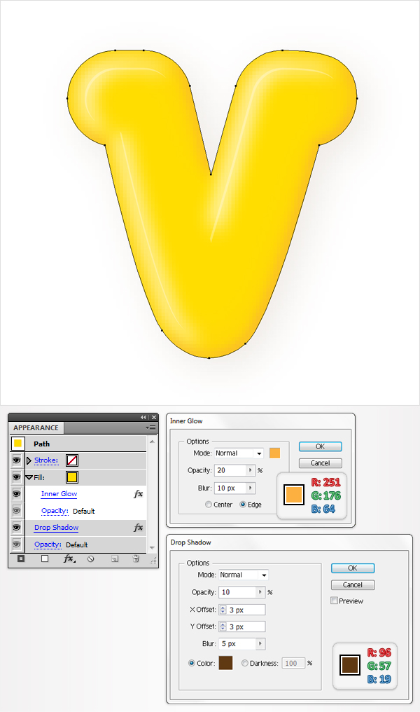

Step 11

Make one final copy of "Text" (Command + C then Command + F), Bring it to Front (Command + Shift + Right Square Bracket) and fill it with white. Select this new shape along with the shape made in the previous step, go to the Transparency panel, open the fly-out menu and click on Make Opacity Mask.


Step 12

Reselect "Text" and go to Effect > Stylize > Inner Glow. Enter the data shown below, click OK then go to Effect > Stylize > Drop Shadow. Again, enter the data shown in the following image then click OK.


Step 13

Finally, open the Brushes penal and pick the Brush Tool (B). Select the 15pt Round brush from the Brushes panel, add a smooth path as shown in the first image then go to Object > Expand Appearance. Make sure that the resulting shape is filled with R=255 G=191 B=255 then click on the Unite button from the Pathfinder panel. Now, repeat the techniques from the previous steps for this new shape. In the end your shape will look like in the third image.


Conclusion

There you have it, a nice looking paste effect. An idea how you could use this technique is to make piped frosting for cake illustrations. Have a play around with different shapes and colors and see what you can come up with. I hope you’ve enjoyed this tut.

Create a Personalized Child Fairy Print – Vector Premium Tutorial

$
0
0


Today, we have another Vector Premium tutorial, which is available exclusively for Premium members. If you want to learn how to create a fairy scene filled with childish wonder, then we have an awesome tutorial for you. This tutorial is filled with professional details, such as how to add fairy/elf like characteristics, create insect wings, a fantasy scene and use blurs to create depth and focus.


This Premium Tutorial is Filled with Professional, Creative Instructions

In today’s Premium tutorial I’m going to show you how I created a personalized fairy scene using the image of a child. Parents, especially new parents, are extremely proud of their children and will always like to capture the fleeting years of their youth through commissioned art. They further appreciate to see their young one(s) in an enchanting scene, as if to create a story for them to appreciate.

Plus members can Log in and Download! If you’re not a member, you can of course join today! You can view some key images from this tutorial below.

5
30a
61e

This tutorial will push your Illustrator skills with all the tools and techniques that are used. Also covered, is printing onto affordable high-quality prints. Below is the final print.

photo1
photo2

Vector Premium Membership

As you know, we run a Premium membership system that costs $9 a month (or $22 for 3 months!), which gives members access to the Source files for tutorials as well as periodic extra tutorials like this one! If you’re a Premium member you can log in and download the tutorial. If you’re not a member, you can of course join today!

Best of the Vector Web – April 2011

$
0
0


Each month, we search the web for the best vector-related content and showcase it here for you all to enjoy. This month, we showcase high quality tutorials on using vector patterns in your illustrations, adding killer chrome to your text, giving your identities skulltastic flavor, and more. We have loads of tutorials, in addition to inspiring articles, resources, and useful freebies inside. Dig into April’s illustration and design material for vector enthusiasts.

Vector Tutorials

  • tut-2

    Add Depth to Abstract Illustrations

    George Chichinadze uses Illustrator and a bit of Photoshop in this beginner tutorial to quickly create a strong sense of depth in abstract work. The techniques used here are easy to implement and the results are attractive. A great tutorial to give a try and work on your composition skills.

    Visit Tutorial

  • tut-6

    Hot Rod Monster Design Process

    Philip Hepler here from 316 Graphics shows us the design process behind the next Arsenal vector pack. The concept is a lot of fun with some hot rod elements which later turned into a vector set inspired by the art style of Ed “Big Daddy” Roth. Learn all about the design process for this fun vector pack. You can also watch the vector brush process video as well.

    Visit Tutorial

  • tut-3

    How To Create a Cool Chrome Text Effect in Illustrator

    Follow this step by step tutorial from Chris Spooner on how to create a super cool retro chrome text effect in Illustrator. Learn to use a range of gradients to give the impression of bright highlights, then take the text into Photoshop for some finishing touches. This vintage text effect is easy to create.

    Visit Tutorial

  • tut-4

    How To Create a Stylish Skull Based Vector Illustration

    The skull and crossed pistons mark is a popular adaption of the tradition skull and crossbones symbol and is commonly seen in motorcycle culture, amongst other counter-cultures. Follow this beginner Adobe Illustrator tutorial from Chris Spooner and learn how to create your own underground skull & crossed pistons graphic. You’ll start with a simple sketch, then build up the detail using a range of linework and vector shapes.

    Visit Tutorial

  • tut-2

    Create a Seamless, Mexican-inspired Pattern

    Mexican prints are known for their bold colours and beautiful flowery, repetitive geometric shapes. In this tutorial, Berlin-based artist Amrei Hofstätter (aka Vertico’s Puppets) will show you how to create a complex, colourful pattern by using just two simple geometric objects in Illustrator. Amrei will also show you how you can turn your artwork into a pattern swatch that can easily be used to fill other shapes. You’ll also learn what details are important when you create a seamless pattern.

    Visit Tutorial

  • tut-5

    How to Make a Realistic Vintage Typewriter in Illustrator

    In this intermediate Illustrator tutorial you’ll learn to use gradients, opacities, a process of shape building, as well as vector textures to create a realistic retro typewriter. There are a lot of steps, but the process feels doable, as so much detail is explained thoroughly.

    Visit Tutorial

  • tut-1

    Create a Kaleidoscopic Effect

    Martin Sati shows you how to add motion to your vector shapes in this intermediate tutorial. The artist shows you how to work with organic circular compositions, blend vector patterns into each other, and place various scenes into a larger composition. He works on each section much like placing bricks, makes sure it all flows together, after creating numerous textures, shapes, and recognizable figures. Great process.

    Visit Tutorial

  • tut-7

    Animating Blends in Adobe Illustrator

    Jeff Witchel creates a flag waving animation using Illustrator in this beginner video tutorial. He uses the Warp > Flag options to bend the flag, and creates multiple instances of the flag in different positions. He gives some tips to add some randomness via horizontal and vertical distortion, as well as some scaling. He uses specified steps for creating the blend of these various grouped flag objects. Then he exports as a Flash SWF file as layers to animate these blends.

    Visit Tutorial

  • tut-8

    Skeleton Stroke Lettering in Illustrator for Custom Type

    There are so many great fonts available out there that you can use for your design work, but how about drawing your own font? In this tutorial, Trisna shows us how to create letters (like Futura font) from scratch using a method she calls “skeleton stroke.” This brief beginner level tutorial will take you through some simple, yet powerful vector-drawing techniques using Illustrator.

    Visit Tutorial

  • tut-9

    Create an Ornate 3D Gift Box in Illustrator

    In this illustration/drawing tutorial, Jasmina shows us how to create a gift box using Adobe Illustrator. You’ll learn to use color gradients, vector shadows and blending in order to achieve a semi-realistic, glossy look. For beginners, this tutorial will also be a practical, hands-on lesson on the Blend Tool, one of Illustrator’s most powerful tools.

    Visit Tutorial

  • tut-10

    Create a Stylish Print Ready Flyer

    This tutorial from Ainsley over at Bloom Web Design shows how to create a print ready flyer in Adobe Illustrator. This tutorial is excellent for beginners, and also the Photoshop mockup steps are covered as well.

    Visit Tutorial

Vector Inspiration, Articles, and Resources

  • art-4

    Improve Your Illustrator Skills

    Over at Noupe they rounded up an assortment of high quality Illustrator tutorials this month, which is aimed at beginners to learn some basic skills. There is a vast assortment of tutorials selected from various Illustrator blogs that showcase the depths and explore the possibilities of working with Illustrator. These tutorials will be helpful in building up your AI skills and their may be some you’ve missed from recent releases, so jump over there.

    Visit Article

  • art-1

    Heavy Metal Revolution – How Rock Art Became Hip Again

    If you’re not a metal fan, then you probably have an image of the genre that consists of violent gore, skulls, and sadistic imagery, which dominated heavy metal cover art in the 80′s. Today though artwork is interpreted more artistically and often with a greater level of intuitive connection with the audience, which imparts the dark essence of the music. Read about some of these contemporary artist’s processes, many of which use Illustrator and Photoshop, along with traditional techniques in their work.

    Visit Article

  • art-2

    The Work of Max Huber

    Time to grab some retro inspiration. Veerle Pieters shows us a sample of the work from Swiss graphic designer Max Huber, from late the 50′s and early 60′s. The selection of work on display shows his dynamic use of color, composition and geometric shapes.

    Visit Article

  • art-3

    The Renmen Project x Blood Sweat Vector

    This project is one of the most ambitious and detailed of the Renmen Project pieces, and the first large group Blood Sweat Vector collaboration projects, bringing together 12 BSV artists to create a series of unique and fresh new Typographic illustration artworks. Artists were organized in to pairs to work together on 1 letter from the word “RENMEN,” (which is the Haitian word for LOVE).

    Visit Article

  • art-5

    10 Ways to be More Efficient

    If you run a studio, or even a one man shop, you’re much more than just a designer or illustrator, you’re also a business owner. This article imparts some practical advice on running a design studio and keeping projects on task.

    Visit Article

(FREE!) Vector Downloads

  • free-1

    Font Collection: 10 Interesting Free Grungy Fonts

    Jacob Gube brings us a carefully collected assortment of stylish, free grungy fonts. This collection of fonts features distressed, grungy fonts that are perfect for when you want to make a messy design. The fonts are organic in nature, and often mimic hastily written, scratched or aged handwriting.

    Visit Article

  • free-2

    A Collection of Free Adobe Illustrator Floral Vector Files

    This collection published last year by NaldzGraphics, but I just came across them recently. There are a number of free floral vectors roundup up here, which could come in handy this spring and summer.

    Visit Article

  • free-3

    7 New High-Quality Free Fonts

    One can never have too many fonts in their design resource library and Web Design Ledger regularly brings us roundups of free high quality fonts to add to our collection. Minaeff Ect typeface looks particularly interesting. Enjoy!

    Visit Article

  • free-4

    25 Best Fresh Icon Sets From 2011 All In One Place

    This is a great compilation of all the best icon sets that where all created in 2011. While most of these are not vector, a few are, and all of them will be a great addition to your collection of free design resources. Download and enjoy!

    Visit Article

  • free-5

    Set of web label element 5 set

    This set of vector web label elements from Vecto2000.com looks tasty. This high-quality vector is available free to download, so jump over and grab it.

    Visit Freebie

Viewing all 8959 articles
Browse latest View live