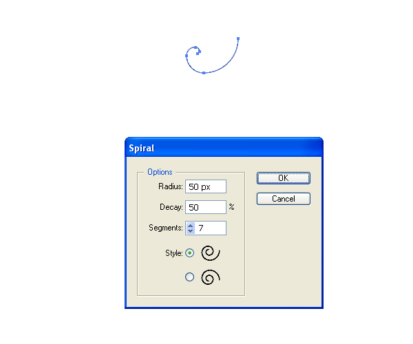
Just because you missed that awesome conference, doesn’t mean that you can’t still watch the lectures! This weekend, we feature a thought provoking presentation by Denis Dutton and animator Andrew Park on the Darwinian theory of Beauty. They examine how art, music and other beautiful things, far from being simply "in the eye of the beholder," are a core part of human nature with deep evolutionary origins.
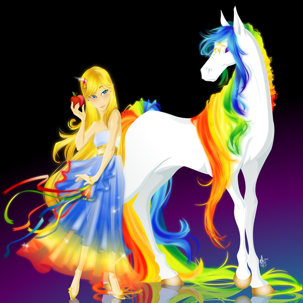
The Debut album of If I Were A Mountain… entitled “Dreams Are For Their Dreamers,” is an introspective EP that takes a dive into the dream world and molds it into a melody that soothes and transports the listener. This article details the process I took when creating the album art.
Final Cover Preview
Shown below is the cover art for the album. The cover was the catalyst for the rest of the design elements that were created. Read on to get a more in-depth understanding of the process involved.
Image may be NSFW. Clik here to view.
Project
If I Were A Mountain… was in need of a design for their debut album. The sounds that they produce needed to be communicated visually. The design needed to present their growth as a serious force to be reckoned with, yet still appeal to their non-traditional, indie-rock fan base. The design needed to be professional yet approachable, and modern yet non-mainstream.
Pre-concept Preparation
Before creating any visuals for this project, it was important to have the fullest understanding of the music that my client produced. I made sure to listen to the entire album to get the best understanding of what the client was all about. Check out the links below to hear for yourself!
With any project there is the opportunity to extract ques and information that can provide insight into the best creative execution for a project.
With any project there is the opportunity to extract ques and information that can provide insight into the best creative execution for a project. In addition to listening to each of the songs, I took a close look at the album name, song titles, lyrics and physical appearance of the band to determine more information that helped frame in the identity of the artist.
First, based on the album name I deduced that the overarching take-away that he wanted his listeners to feel was a sense of wonder.
Second, the song titles echoed the album name with titles such as “Sunny Day Driving,” “More to Accomplish,” and “Renaissance.” This further communicated the uplifting nature of the album.
Third came the lyrics. The client provided the lyrics to all the songs, which made it even easier to quickly reference what a song was about.
Last but not least was my client’s physical appearance. Artists of all types have physical characteristics that set them apart from everyone else. This was the case with my client too. I made sure note any unique qualities.
Evaluating all of these factors individually helped solidify the visual look the album needed to encompass.
Concept Brainstorming and Sketching
Armed with all of the information I had learned and discovered, I took to brainstorming and sketching.
I knew from the beginning I wanted to create a unique representation of the album title. I wanted it to be somewhat literal without being trite.
One of If I Were A Mountain’s… main visual characteristics is his curly brown hair. This is an extremely obvious feature and his fan-base has come to associate this look with him. With this in mind I found it very fitting to work that characteristic into the concept.
From there I knew I wanted to weave in his name into the execution. I decided that I would use his curly hair as the focal point of the art. The curls of his hair would double as the peak of a mountain!
With the framework of the design in place I took to drawing a quick sketch to solidify how this concept might play out on paper.
Image may be NSFW. Clik here to view.
While sketching the initial concept I knew there were things that would be better left to further exploration when it came time to design the artwork at the computer level, which was the case with the artist and album name. I left these items very loose during the sketch phase.
Since creating an illustration is a much more complex and time consuming undertaking, I wanted to first verify with my client that this concept met his expectations. It’s much easier to come up with another concept, versus spending time illustrating something only to discover that the client had something else in mind, then going back to square one. Clients many times change their minds, so it’s better to be safe than sorry.
In this case, fortunately, the client did not have any changes after I described the concept. From there it was on to the fun part, creating the actual design!
Executing the Cover
I first started with illustrating the curly hair, as this would require the most time and attention. I illustrated about seven locks of hair… enough to provide some variance for the amount of hair that needed to be built up. Below are a couple examples.
Image may be NSFW. Clik here to view.
Next, I tediously layered each lock of hair on top of one another to build up a convincing pile of hair. I made sure to pay close attention to create something that looks like a head of hair AND a mountain. To accomplish this I made the head slightly less round and made it form somewhat of a peak, as a mountain does. It was important for the shape to first look like hair and second to suggest a mountain.
Image may be NSFW. Clik here to view.
Image may be NSFW. Clik here to view.
After the basic shape of the hair was in place, I decided to work on incorporating the text. I knew I wanted something eclectic and fun to match the whimsical nature of the illustration. To give the letters their hand-drawn charm, I did exactly that, drew them by hand.
As for the album name, I wanted that to complement the free flowing nature of the artists name so I used a more rigid and vertical font there.
Image may be NSFW. Clik here to view.
Once these items were in place I knew I had successfully placed the correct hierarchy on the way the album cover was viewed. It’s easy to start adding in other design elements before the more important elements are in place. For this reason I held off on adding clouds and other design enhancing elements so that I wouldn’t have to work in the essential elements around the non-essential ones.
Image may be NSFW. Clik here to view.
To finish off the cover I added color and depth to the hair, drew in clouds, the background ribbon and small design enhancing elements like the music notes.
Image may be NSFW. Clik here to view.
Creating the rest of the pieces was easy once the cover was complete. Obviously all of the design elements need to work in tandem, so I used the cover as the jumping off point for the rest of the elements.
Client Review
After all the elements were designed it was then time to show the client the finished design. I felt confident after all the background information I had done and was provided with, and due to the fact that I had verified the concept with him beforehand that there would likely not be many changes, if any.
And I was correct. The client had no changes to the design, so I finished making everything print ready.
Result
The client was very pleased with the finished piece and is currently working on assembling a CD release party to celebrate this step in his career! Check out the full design below.
Image may be NSFW. Clik here to view.
Connect and Purchase
Like If I Were A Mountain… on Facebook and follow him on Twitter!
Learn how to create a retro vector seal logo in Adobe Illustrator with Ryan Quintal. We’ll be using simple shapes, effects, transparency masks, and a free grunge texture pack from PSD TutsPlus to create the final effect.
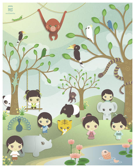
In today’s article I’m going to show you some fantastic examples of children’s illustrations created in vector, which combine bold colors and cute characters. Each piece will be sure to bring a smile to your face.
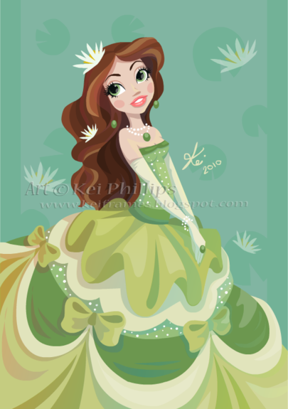
Kinkei‘s work reminds me of Disney’s playful and cartoon style and this piece is one of many which uses it to create an elegant and colorful princess illustrations. What’s appealing and doll like about her illustrations are the big eyes and the feminine dresses, which are common elements throughout her pieces.
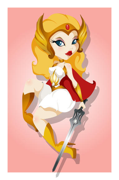
Hands up if you were a fan of He-Man and She-Ra as a child? I loved She-Ra and so this piece by FlashParade grabs me straight away. Great 80s fan art rendered in a character style that again utilizes the use of big eyes to create a doll like impression.
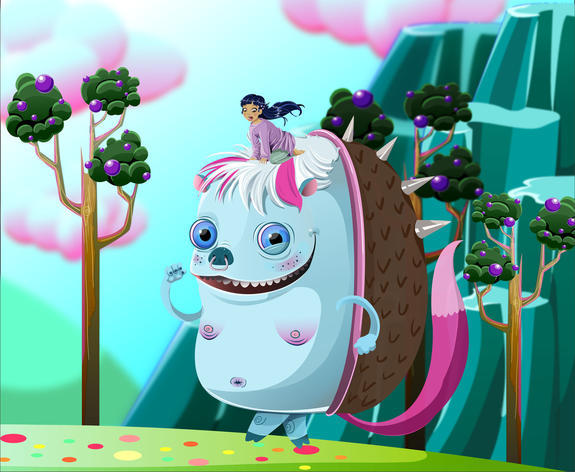
I remember seeing this piece for the first time and I fell in love with it straight away. I personally think of the bizarre style of “Ren & Stimpy,” a little demented and a little quirky, yet still ever appealing to a young audience. This piece unites human with a comical creature to help children imagine how big the character would be in person and what it would be like to interact with it.
This type of piece you could easily see either in a children’s book or even on children’s clothing. The latter is mainly due to its great use of limited colors and its cheerful style. Definitely a piece young toddlers could connect to and make them smile, which is partly due to the simple structure of the faces and the use of curves.
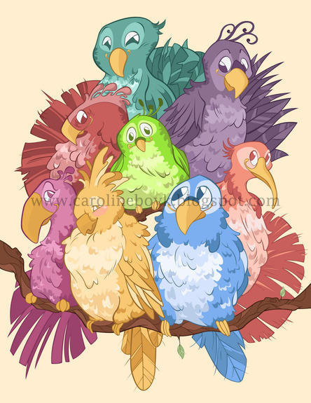
Imagine a poster above your child’s wall with these cheeky chappies on it! All of them smiling down upon him/her and introducing them to the colors of the rainbow. What I love about this piece is how every bird has its own character, it’s own persona, which are wonderfully rendered in monochrome colors and line art to match.
One theme is common throughout these illustrations and that’s of bright colors and a positive atmosphere, which is very true of our next piece by MrBumbz, even his name shouts friendly and cheerful! This piece shows how creative a child’s imagination is and what could be on her mind. I love the use of gradients in this piece.
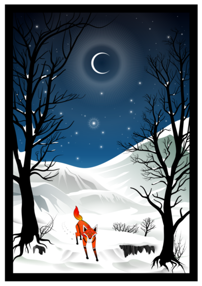
This piece draws influence from the folk tales of “Watership Down”. This illustration is full of little delicate details, such as a the shine from the moon and stars, the tribal markings on the fox and the intricate details in the trees. Again, this is a great illustration using gradients – this time to create atmospheric snow details in the hills. Beautifully done!
Owaikeo‘s work is always inspiring and this piece is the tip of the iceberg with his more conceptual work. Although the initial impression is that it’s not really a children’s illustration (Where’s the bright primary colors? Where are the adorable characters?), I’d beg to differ. In fact, this sort of illustration is the type a child and adult alike could sit staring at. An illustration that expands the imagination is a great theme for any children’s illustration!
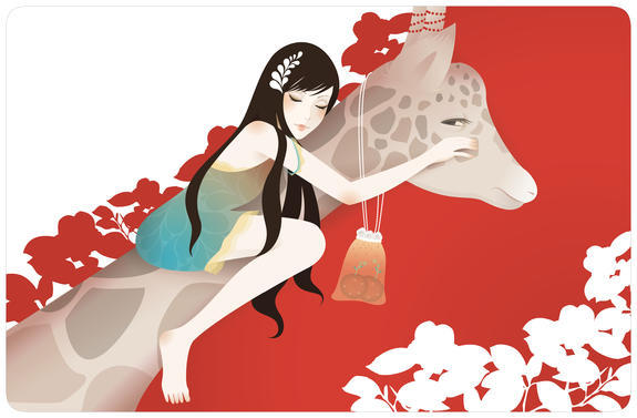
I’m a big fan of animals, and in illustration the more bizarre looking to our standard domestic pets the better. They’re more recognizable if they’ve got a long trunk, horns or even a long neck. These sorts of animals stick in the imagination of children because they don’t look the same as a cat and a dog. They look different and they endear themselves to children. I know so many people who have grown up with giraffes and elephants as their favorite animals. This piece of course, plays itself to the young children who favor animals (although not on purpose). It’s been delicately done and would appeal to a young girl.
Sun2197 has combined shapes and a drop shadow effect to create this Asian inspired paper craft styled piece. With a subtle texture over the top, it gives it a more authentic paper feel. What I love about this illustration is the simple shapes, almost like putting together a piece with felt boards you’d get as a child… or maybe I’m showing my age here!
Taking Big Bird to the next level with a childhood game of “Hide & Seek”. Great character design and the use of primary colors have created this charmingly devious scene.
Although they say blue is for boys and pink is for girls, I think this illustration would appeal to both alike. Limkis has used her unique vector techniques and creative character design to craft this elegant and playful children’s illustration, which as a grown up, I’d be proud of display on my own walls!
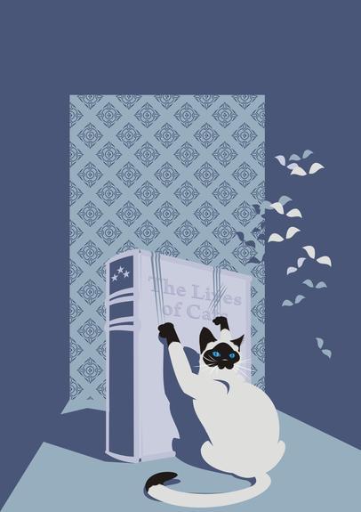
I love how the simple objects stand out on this piece against the patterned background. Again with the animal theme and playing on the many lives or should I say the “lies” of a cat! I’d imagine seeing this dramatic illustration in a children’s book or even the cover. It’s simple and memorable.
My breath was taken from me when I saw the amazing rendering skill in this piece. Mixing gradients and possibly feathering/masks to create this delicately detailed illustration. Like the piece before, I love how the simple colored birds compliment the background, they definitely help both elements stand out and make them easy for a child to visually grasp.
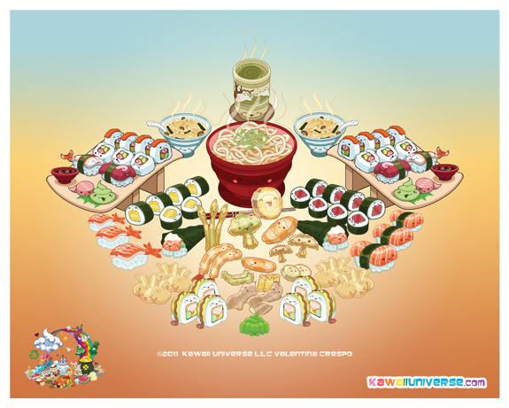
As children, we often are afraid to try new things and new foods from different cultures. By turning this platter into anthromorphic illustrations, Valentina Crespo has a friendly way of introducing new things into a child’s life.
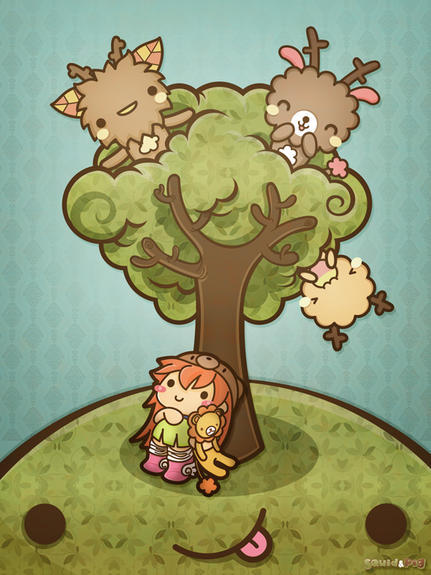
Staying on a similar “kawaii” style, Squidpig has created a cheerful scene. An inspiring style is shown here, with the bold line art and shapes mixed with a textured/pattern fill to give it that extra bit of refinement.
Sleeping Bunny wouldn’t be out of place in any child’s bedroom as even looking at it instills calm to the most hyperactive of bodies. What I appreciate most about this piece is the way the moon has been rendered. The layering of transparent shapes give a unique texture to the moon.
PixelledandDead‘s use of bold and bright colors are a common theme in her work and Rainbows and Stars is no exception, in fact probably one of her most bold pieces. What young girl doesn’t love horses? Especially one as flamboyant as this! I love her use of blurs in this piece which only exaggerates the wonderful dreamy atmosphere.
Although darker in saturation than the piece before, Interstellar Friends is still just as bold and varied in color. This is a prime example of a charming character design not requiring the bright primary color palette to enforce a children’s theme. You have to admire the use of gradients in this piece, it’s a unique piece!
So maybe there is a slight adult theme within this illustration, however the overall composition and use of colors would appeal to children. The nature of the characters and the way it’s been rendered reminds me of Pixar movies, which typically contain some humor which would appeal to parents. Zzanthia‘s style is always inspiring, using feathering and gradients she creates soft and vibrant vector illustrations.
Conclusion
I hope today’s feature article has inspired you to create a piece that would be perfect for children. Sometimes remembering what you enjoyed as a child and putting stylus to tablet can create illustrations all generations can appreciate and make people smile.
Have you created an illustration children would love? Do you know any pieces that remind you of your childhood? Show us, we want to see!
Mac ‘vs’ PC, ‘vs’ Linux, ‘vs’ Mobile Device… Is the competition really worth it? In the past, "Computer A is better than Computer B" may have been a fair argument, but with multi platform graphics applications and more power in a mobile phone than a room full of vintage computers, is there really an ideal machine for Graphic Designers? Read on and share your thoughts with the Vectortuts+ community.
Which is Best?
Personal computers have been around for a long time, some people even find it difficult to remember life without them. Over this time, Graphic Designers and Illustrators have gone from using them as clunky typewriter replacements, to slick machines that render complex images (not to mention run multiple programs and connect to the internet). So with the average computer far exceeding the power of computers from even a few years ago, is there still a reason to chose one computer type over another?
Personally I own both a Mac and a PC, this is for a few reasons. I have a Desktop PC because it’s cheaper and I can pack it full of extras without breaking the bank, add a second monitor with the spare change and run games in my limited time off (also bought with the spare change!). I have a MacBook Pro for freelancing (almost everyone expects a freelance designer to use Mac), so I can use (and love) programs like Billings, Little Snapper and CandyBar and so I can confidently navigate the Mac OS when I’m working "in-house".
If I was to chose the computer that I made better illustrations on, I couldn’t tell you. Aside from some horrible experiences with Windows Vista (I’m now running 7) my PC is just as usable than my Mac, and because I have no need for video or 3D rendering my workflow is just as fast on both machines.
Poll:
This is where I’m going to ask for your opinions. What Type of Computer do you use for Design and why? Fill out the poll and leave your thoughts in the comments section below. Let’s get the discussion started and figure out if there really is an ideal machine for modern Graphic Designers.
Note: The poll has been updated to reflect software rather than hardware with the previous votes remaining the same
We have a new set of vector illustrations available exclusively for Vector Premium members. In this pack you will find a great selection of rockets in a retro style with an additional grungy texture. The plain colours make the images easy to edit, which makes it easier to use them in your designs, stylish posters, adverts, stickers, or postcards. These illustrations can add a retro throwback and vintage space age feel to your next project. Learn more at the jump!
New Vector Premium Illustrations
There are ten illustrations in this pack. The license allows you to use them in your commercial client projects as well, see the download file for details. Below are the group of unique illustrations, which can be colored any way you choose, as it’s all vector (in EPS, AI and CDR formats)!
Image may be NSFW. Clik here to view.
This new Vector Premium Pack is created by Anastasiia Kucherenko. She loves drawing and experimenting with different illustration styles. We’re excited to partner up with her on this exclusive Premium release!
Image may be NSFW. Clik here to view.
Vector Premium Membership
As you know, we run a Premium membership system that costs $9 a month (or $22 for 3 months!), which gives members access to the Source files for tutorials as well as periodic extra tutorials, and Premium Packs like this one! If you’re a Premium member you can log in and download the tutorial. If you’re not a member, you can of course join today!
Subscribe to the Vectortuts+ RSS Feed to stay up to date with the latest vector tutorials and articles.
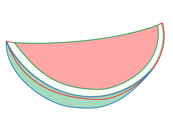
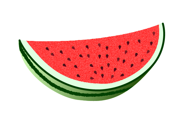
In this Quick Tip you will learn how to make a simple and great looking Watermelon illustration. Using Blends, Mesh, Brush, and Symbol Sprayer tool, you will be well on your way to creating a mouth watering fruit salad in no time!
Step 1
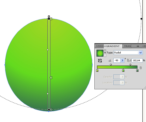
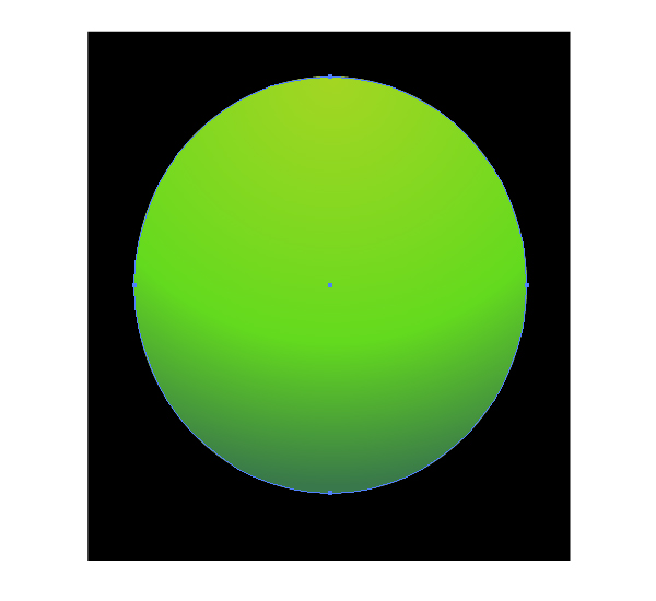
Take the Ellipse Tool (L) and create the ellipse which is shown on the figure below. Then take the Gradient Tool (G) and fill the ellipse with the Radial gradient from light green to dark green in color.
Image may be NSFW. Clik here to view.
Step 2
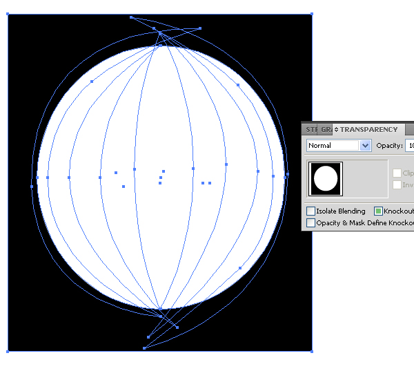
Take the Pen Tool (P) and create dark green paths, like in the example image below. Every path has no Stroke. Pay attention, that the further to the ellipse edge you go, the darker the path fillings become. Also, the further to the ellipse edge you go, the thinner the paths become.
The top and the bottom parts of the paths may lie beyond the bounds of the ellipse. It is not important in this step, because we will use the opacity mask for cutting the superfluous parts. (Of course, this way of cutting is just one of many possible ways).
Image may be NSFW. Clik here to view.
Step 3
Take the Rectangular Tool (M) and create the black rectangle over the ellipse and paths. (Don’t worry, this is not the "Black Square" of Kazimir Malevich)
Image may be NSFW. Clik here to view.
Take the Selection Tool (V), select the ellipse which has been made in Step 1, copy it and paste in front (Command + C then Command + F).
Image may be NSFW. Clik here to view.
Fill this ellipse with white, then group the black rectangle and white ellipse (Command + G).
Image may be NSFW. Clik here to view.
After that, select all the shapes by pressing Command + A, and go to the Transparency palette.
Image may be NSFW. Clik here to view.
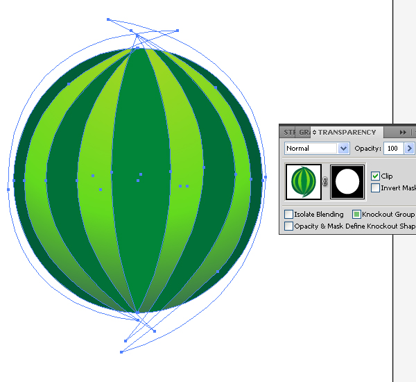
Choose the "Make opacity Mask" command from the Transparency palette menu.
Image may be NSFW. Clik here to view.
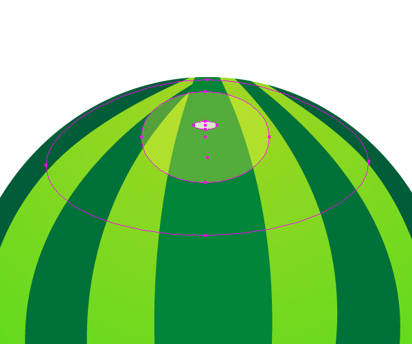
Step 4
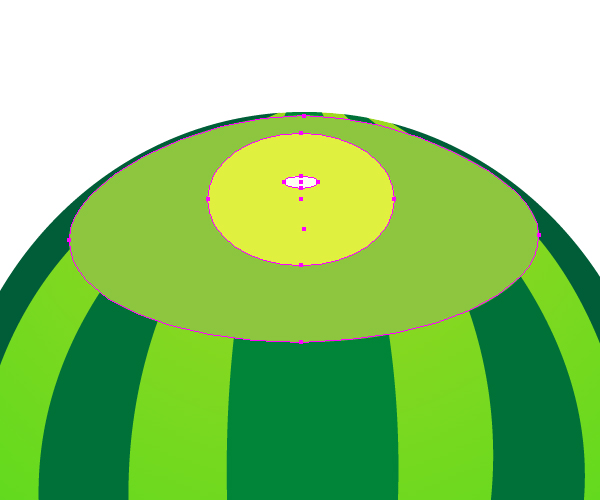
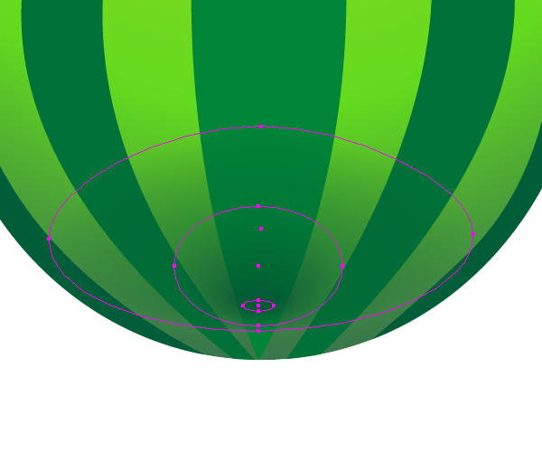
With the Ellipse Tool (L) create three ellipses which are shown on the diagram below. Fill them with the corresponding colors. The biggest ellipse must be located in the bottom, the smallest one must be located on the top.
Image may be NSFW. Clik here to view.
Set the next Opacity values to – 0% for the biggest ellipse, to 37% – for the middle ellipse, to 75% – for the smallest ellipse.
Image may be NSFW. Clik here to view.
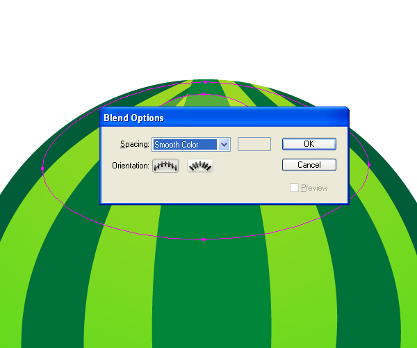
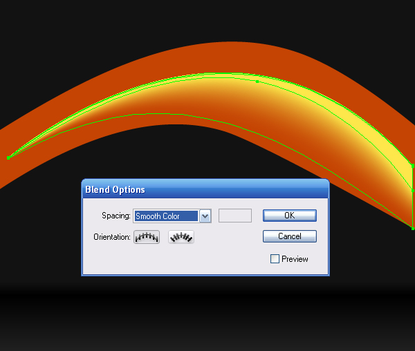
Go to Object > Blend > Blend Options and set the Spacing to Smooth Color.
Image may be NSFW. Clik here to view.
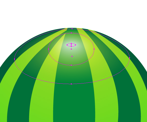
Then go to Object > Blend > Make (Command + Alt + B), you will receive the distribution of light on the surface of a watermelon.
Image may be NSFW. Clik here to view.
Do the same for creating the distribution of shadow.
Image may be NSFW. Clik here to view.
Step 5
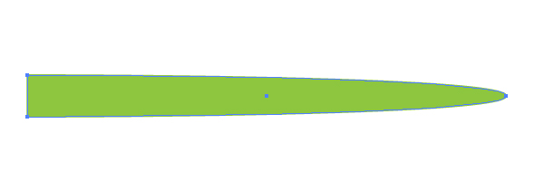
Let’s create a brush for the watermelon’s stem. In the beginning, create the following path. The color of Stroke is the same as the color of filling.
Image may be NSFW. Clik here to view.
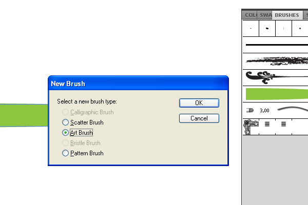
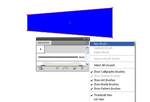
Then go to Brushes palette. Take this brush and drag it into that palette. Select "the Art Brush" type in the window, which is shown below.
Image may be NSFW. Clik here to view.
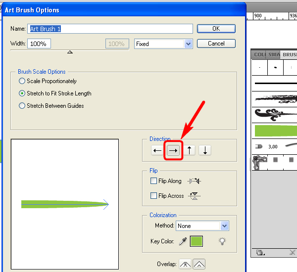
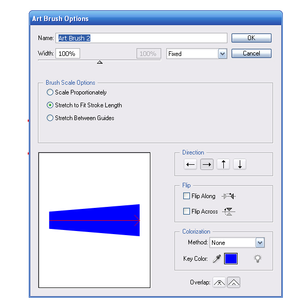
In the window of brush options set the direction from left to right (from the wide end of a brush to the narrow one) and click the OK button.
Image may be NSFW. Clik here to view.
Take the Pen Tool (P) and create the line for the stem in the top part of a watermelon.
Image may be NSFW. Clik here to view.
Then go to the Brushes palette and click on the brush icon which has just been made by you.
Image may be NSFW. Clik here to view.
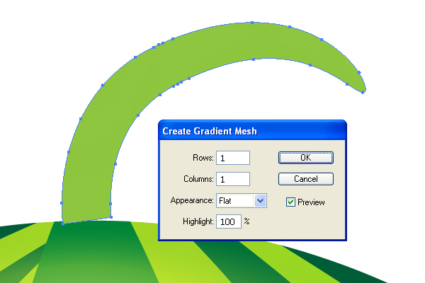
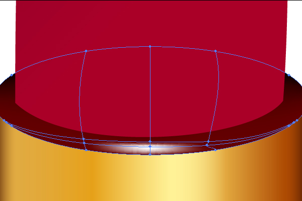
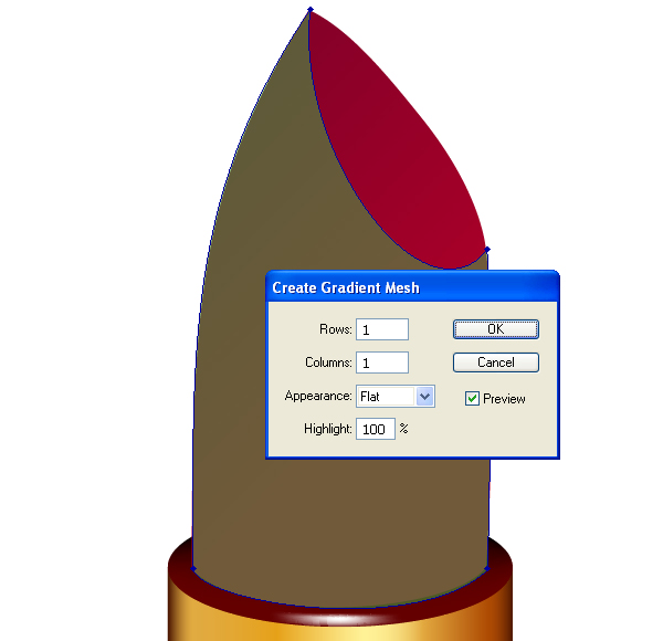
Go to Object > Expand Appearance. Then go to Object > Create Gradient Mesh, and set the options as they are shown on the diagram below.
Image may be NSFW. Clik here to view.
Then take the Mesh Tool (U) and create several anchor points on the stem. Change the colors of these anchor points to the brown tints in order to give a stem some realistic shades.
Image may be NSFW. Clik here to view.
Go to Object > Arrange > Send Backward.
Image may be NSFW. Clik here to view.
Step 6
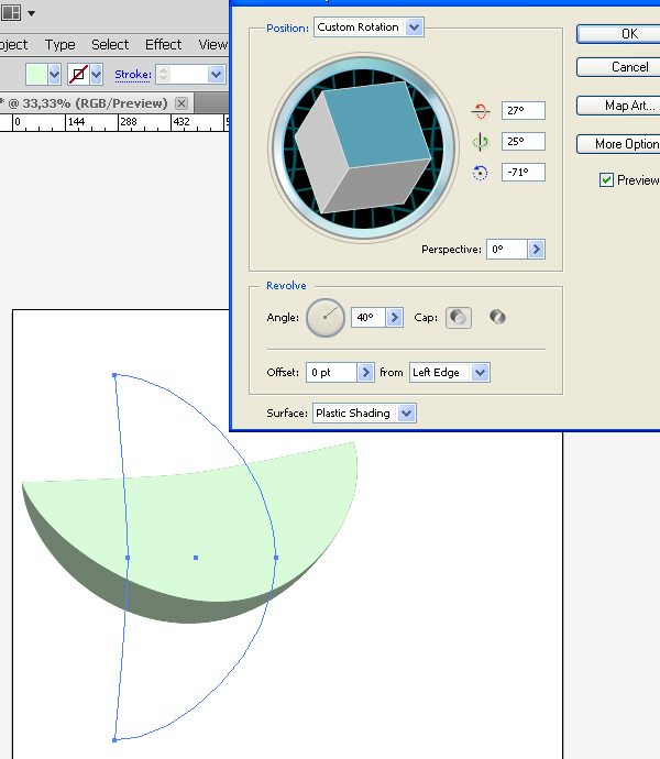
Now we need to create the segment of a watermelon. Create the path, which is shown on the diagram, with the help of the Pen Tool. Then go to Effect > 3D > Revolve. Set the values which you can see on the diagram.
Image may be NSFW. Clik here to view.
Step 7
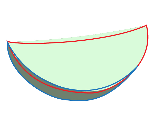
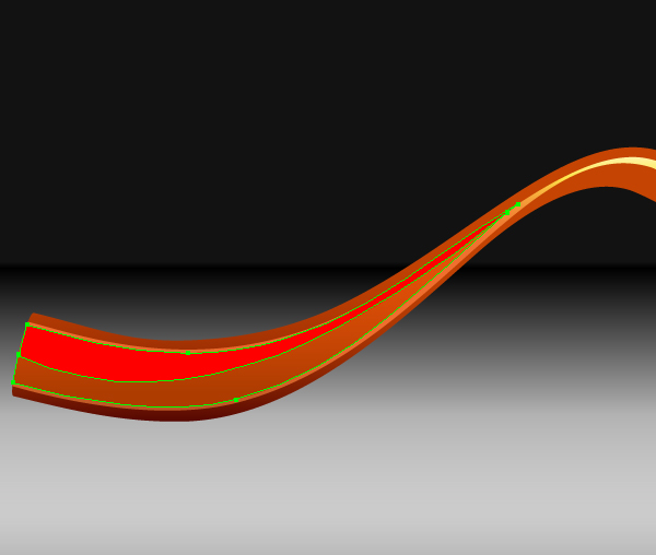
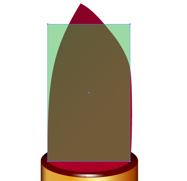
Create the two closed paths: red path and blue path (colors are given only for assistance and not important). The red path must be under the blue path. These paths must be drawn near the 3D render of the watermelon segment (see the diagram).
Image may be NSFW. Clik here to view.
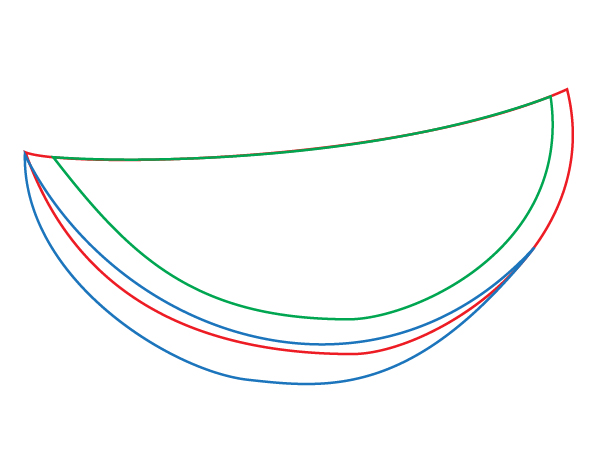
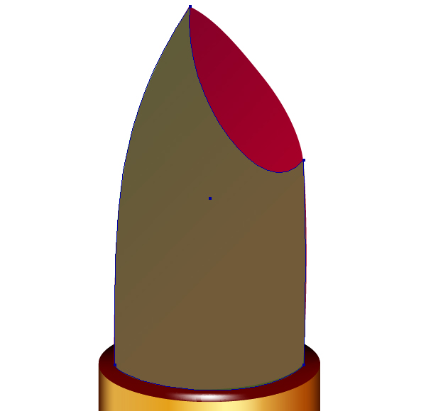
After that delete the 3D object and draw another path (green), which must coincide with the top line of the red path as exactly as possible.
Image may be NSFW. Clik here to view.
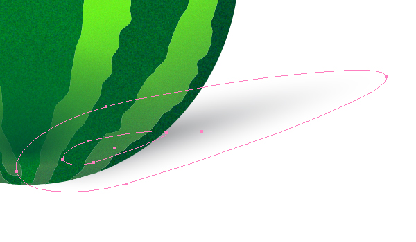
Step 8
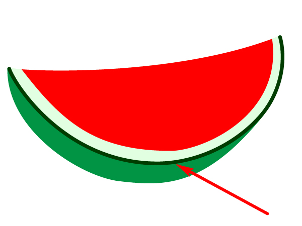
Then paint the paths, and add another path which is a dark green line to represent the watermelon peel (pointed by an arrow on the diagram). This line must be drawn along two paths (red and blue).
Image may be NSFW. Clik here to view.
Image may be NSFW. Clik here to view.
Step 9
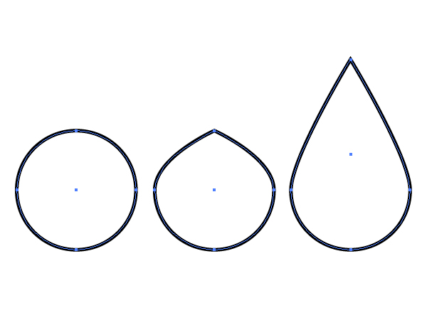
Now create a seed. The way of creating it is shown on the diagram below. You make a circle, then drag the top point up, use the "Convert Anchor Point" Tool to make the pointed top on the teardrop shape.
Image may be NSFW. Clik here to view.
Fill the seed with a Radial gradient filling, which is shown on the diagram below.
Image may be NSFW. Clik here to view.
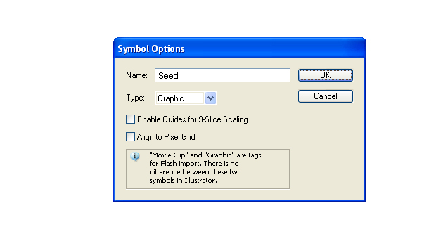
Drag this seed into the Symbols palette. Set the options of a new symbol.
Image may be NSFW. Clik here to view.
Step 10
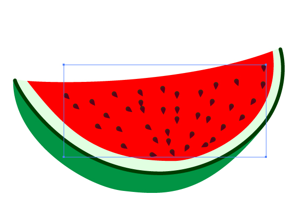
Then take the Symbol Sprayer Tool (Shift + S) and create the Symbol set on the Watermelon pulp segment.
Image may be NSFW. Clik here to view.
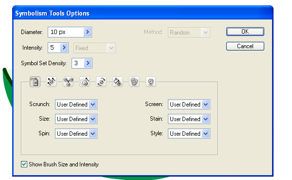
If your seed is too big or too small you need to change its dimensions. Moreover, maybe you will need to change the options for the Symbol Sprayer Tool. I used the following options for my picture.
Image may be NSFW. Clik here to view.
Step 11
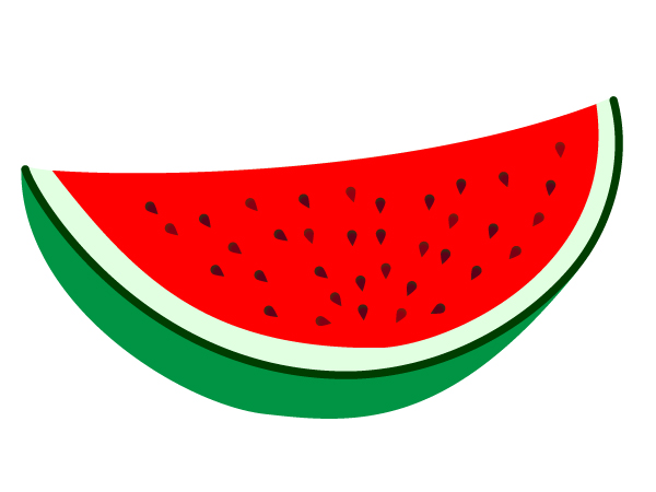
Go to Object > Expand two times. Then go to Object > Ungroup. Distribute the seeds over the pulp. You can do this with the help of the Selection Tool (V). Set the opacity for some seeds to the range from about 75% to 100%, this will allow you to mimic seeds lying under the pulp.
Image may be NSFW. Clik here to view.
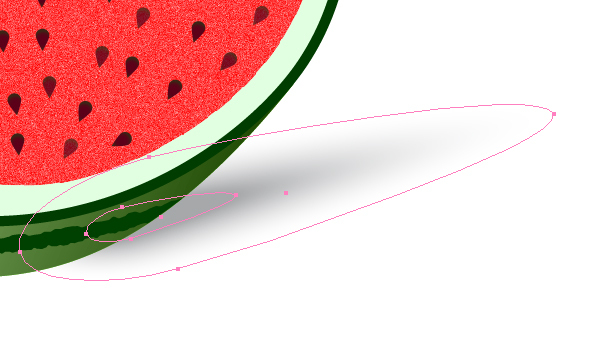
Step 12
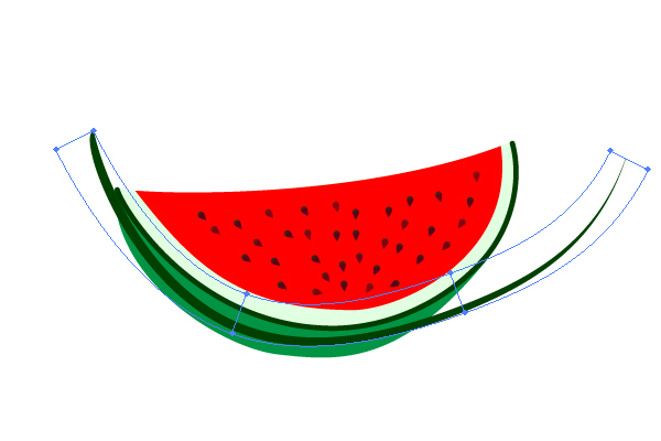
Create a new path with dark green filling. This path must be located along the peel of a watermelon’s segment. You may first create a straight path, and second distort it by going to Object > Envelope Distort > Make with Warp.
Image may be NSFW. Clik here to view.
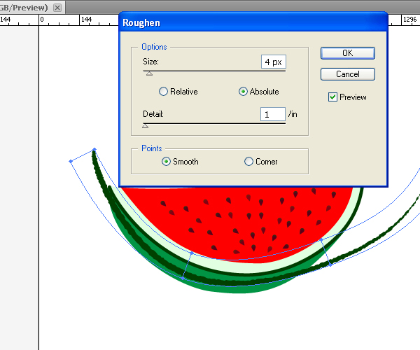
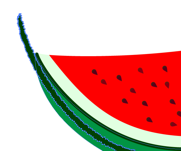
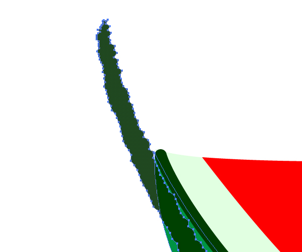
Go to Effect > Distort & Transform > Roughen, and set the following options.
Image may be NSFW. Clik here to view.
Step 13
Go to Object > Expand Appearance. Then select the group which has just been received and the peel of the watermelon’s segment.
Image may be NSFW. Clik here to view.
Take the Shape Builder Tool (Shift + M) and while holding the Alt button, click on the unnecessary parts of the group.
Image may be NSFW. Clik here to view.
Zoom in to delete any small unnecessary parts.
Image may be NSFW. Clik here to view.
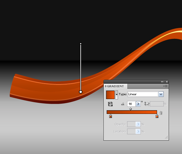
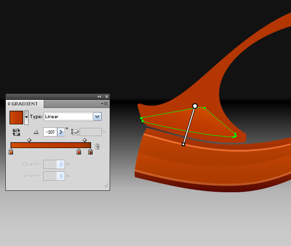
Step 14
Now select the peel of the segment, copy it and paste in front (Command + C then Command + F). Fill it with a Linear gradient from white to black. White color represents light, and black color represents shadow.
Image may be NSFW. Clik here to view.
Decrease the opacity of this path to about 70%.
Image may be NSFW. Clik here to view.
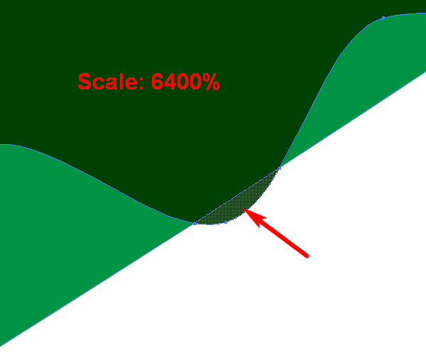
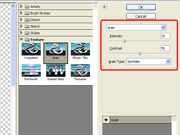
Step 15
Select the pulp of the segment, and go to Effect > Effect Gallery > Texture > Grain, and set there the options which you can see on the figure below.
Image may be NSFW. Clik here to view.
You will receive the following picture.
Image may be NSFW. Clik here to view.
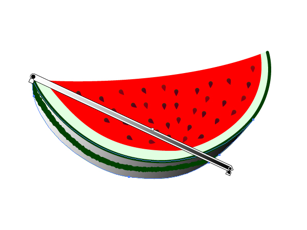
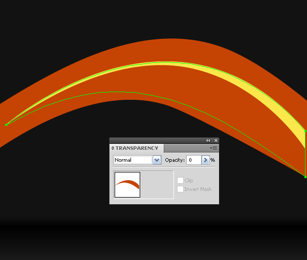
Step 16
Stylize the full watermelon. Apply Grain texture (type: "Clumped") and Roughen effects to the ellipses and to the stripes on it. You will receive something similar to the following image.
Image may be NSFW. Clik here to view.
Step 17
Create shadows. Use Blends for them (from gray to white), like you have done in the step earlier to create the top highlight.
Image may be NSFW. Clik here to view.
Image may be NSFW. Clik here to view.
Step 18
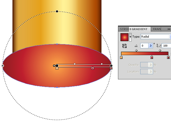
Take the Ellipse Tool (L). Create the ellipse in the diagram below with it. Set the Stroke of the ellipse to None. Fill the ellipse with the Radial gradient filling, which is shown on the diagram below. Set the Opacity of the filling to 80%. Go to Object > Arrange > Send to Back.
Image may be NSFW. Clik here to view.
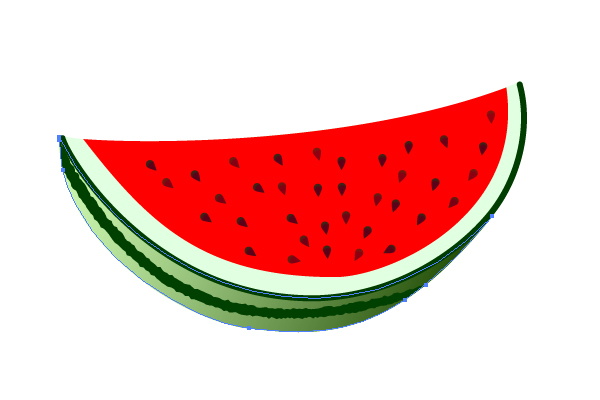
Conclusion
So, you have just made a watermelon. Take a look at different kinds of fruit and see if you can model them using the techniques you have learned in this tut. Have fun!
Today we will take a quick look at how to be creative with style sheets and make a unique and highly editable table of contents in InDesign. Let’s get started!
Step 1: Document Setup
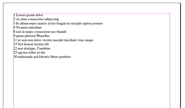
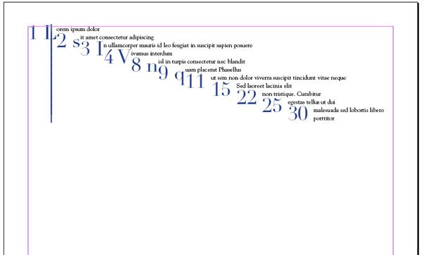
Create a new document; the default setting should do just fine. Create a text box then create the text in the format of: Page Number, Page Title, New Paragraph, and repeat. You should have something like the following:
Image may be NSFW. Clik here to view.
Step 2: Drop Cap Styles
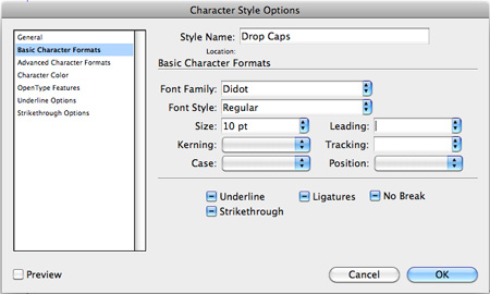
To create the numbers we are going to use drop–caps. that way we don’t need to try to line up columns or multiple text boxes. Create a new Character Style: I called mine "Drop Caps". Then I selected a font, size, and color as seen below.
Image may be NSFW. Clik here to view.
Image may be NSFW. Clik here to view.
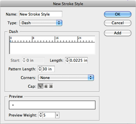
Step 3: Creating Vertical Rules
You need to create a new stroke style. From the stroke options select "Stroke Styles," then click on "New…" to create a new style. The options I selected are below.
Length: Determine how think the line is; mine is fairly thick, so we can see it easily
Pattern Length: Determines how often the stroke will repeat. Since we don’t want it to repeat, I used an extremely high value.
Corners: I didn’t want any corners, so I simply selected "None".
Image may be NSFW. Clik here to view.
Step 4: Paragraph Styles
Next we are going to add the styling to the text associated with our numbers.
Add the basic paragraph styling:
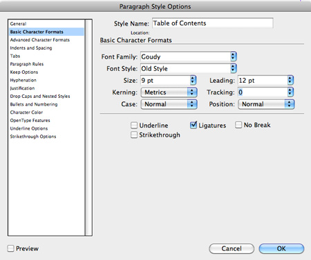
First, create a new paragraph style: I called mine Table of Contents. Then I add my Basic Character Formats: mine are seen below.
Image may be NSFW. Clik here to view.
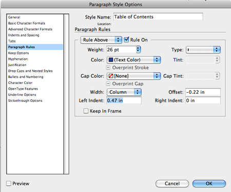
Add the Vertical Rule:
To do this, you still want to edit your paragraph style options and go to the "Paragraph Rules" tab. Make sure the "Rule On" is ticked for "Rule Above."
Weight: Will change the height of our vertical rule. In this case, I want the rule to be the height of the numbers.
Offset: This is vertical offset. I wanted the rule to extend slightly above the text, so I entered a negative value.
Left Indent: This will move the line off the left edge, in this case I wanted to push the rule in so it is closer to the text than the numbers.
Then from the "Type" drop-down, select the stroke style we previously created.
Image may be NSFW. Clik here to view.
Add the Drop-caps:
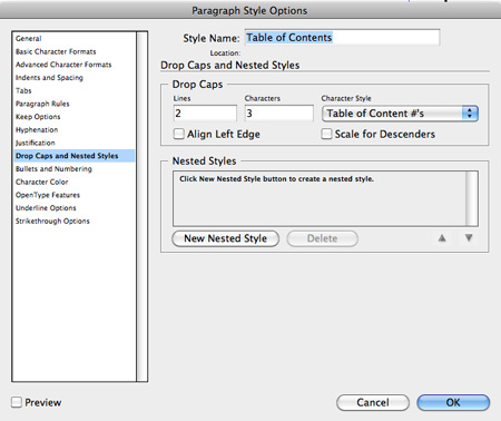
Now we need to add our drop-cap: in the paragraph style, go to the "Drop-caps" tab.
Lines: Determines how many lines your number will take up.
Characters: Determines how many characters will be drop-caps; we have selected three, and this will be explained shortly.
Image may be NSFW. Clik here to view.
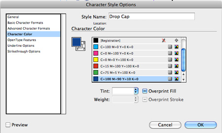
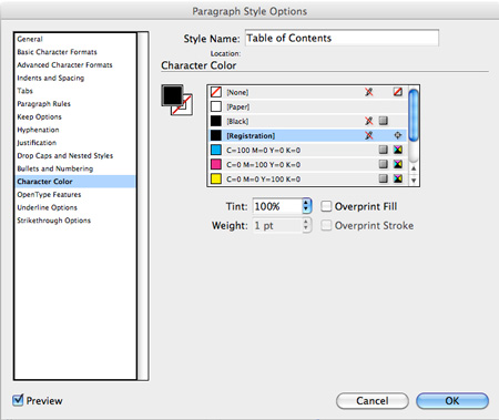
Add a Character Color:
Image may be NSFW. Clik here to view.
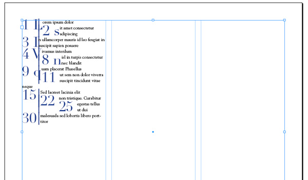
Step 5 Applying the Styles
As I’m sure you have noticed, we haven’t actually done anything yet. So now, select all your text (numbers included) and apply your "Table of Contents" paragraph style. You should now have something pretty ugly like the following:
Image may be NSFW. Clik here to view.
Then I added columns so it makes a little more sense (or does it ?).
Image may be NSFW. Clik here to view.
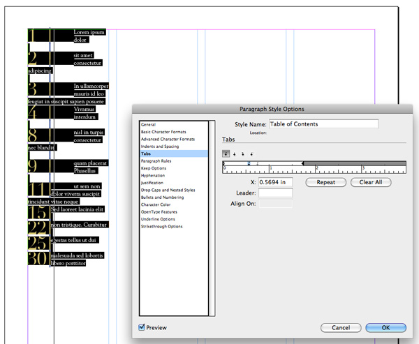
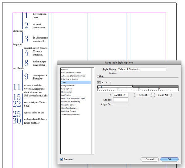
Step 6: Clean-up Time
To fix this, you simply need to put hard returns after each item. You’ll notice that it still looks off. If you recall in our paragraph styling, we added a drop cap that effects the first three characters. Well, we did that so we can get our numbers to lineup. You can have them lineup left or right; tabs or spaces need to be added in the correct spots.
Right Justified: To make all the numbers right justified, simply add tabs after each number. For single digits, you’ll need to add a single space between the number and the tab (#+space+tab=3). Then adjust your tabs in the paragraph setting, so everything lines up nicely.
Image may be NSFW. Clik here to view.
Left Justified: To make the numbers left justified, you use the exact same process for single digits, only you add a tab before the number instead of a space after (tab+#+tab=3). Then, line up the numbers using the tabs adjustment in you paragraph styling.
Image may be NSFW. Clik here to view.
Step 7: Final Adjustments & Variations
Right now, we have something that could work, but there are just a couple of things to make it look a bit cleaner:
Narrowing the vertical rule: Adjust the length within the "Stroke Style" Menu.
Adding vertical pace between each item: in the paragraph style, I added a bit of space before each item (.2 in.).
Broken Rule (so it is not one continuous vertical rule): After each item, use a soft return instead of a hard return.
Image may be NSFW. Clik here to view.
Step 8: Adding Digits
This is all fine and good, but what do we do if there are more digits? Well, that’s actually pretty easy too; you just add another digit to the drop-cap in the paragraph style, then add appropriate tabs, or spaces. You will more than likely need to adjust your vertical rule inset as well as your tab settings.
Example: for three digits – Drop Cap Characters = 4, single digit number format (tab+tab+#+tab=4), double digit (tab+##+tab=4), and triple digit (###+tab=4).
Image may be NSFW. Clik here to view.
Conclusion:
What really makes this technique powerful is that the entire table of contents is being controlled by one paragraph, character, and stroke style, so edits to the table of contents are extremely efficient. I hope you enjoyed this tutorial and learned a technique or two.
This tutorial will cover a set of tools and techniques for creating a photorealistic vector chopper, such as Blends, Gradient, Gradient Mesh and most importantly we will meet the new VectorScribe plugin, which will make your job easier.
The VectorScribe plugin offers dynamic change in shape, fully managed, and correct rounding corner radii, the selection and simultaneous control of anchor point handles, fixing the rotating angle of the edited handle, Smart Remove point feature, and much, much more. It is really a fantastic addition to Adobe Illustrator. I came up with an idea to create this chopper right after testing the plugin, I wanted to create something as quick and elegant as the VectorScribe plugin. Let’s get started!
Step 1
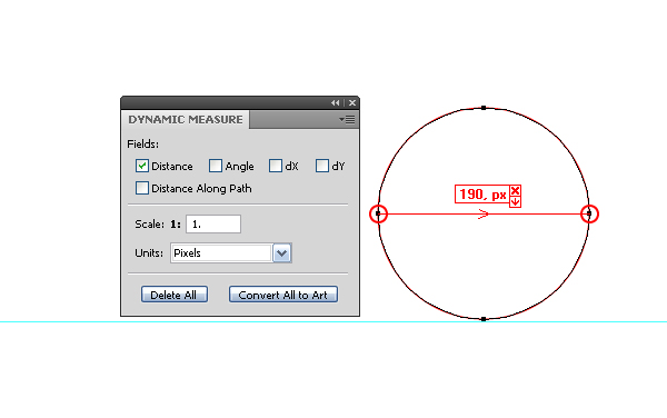
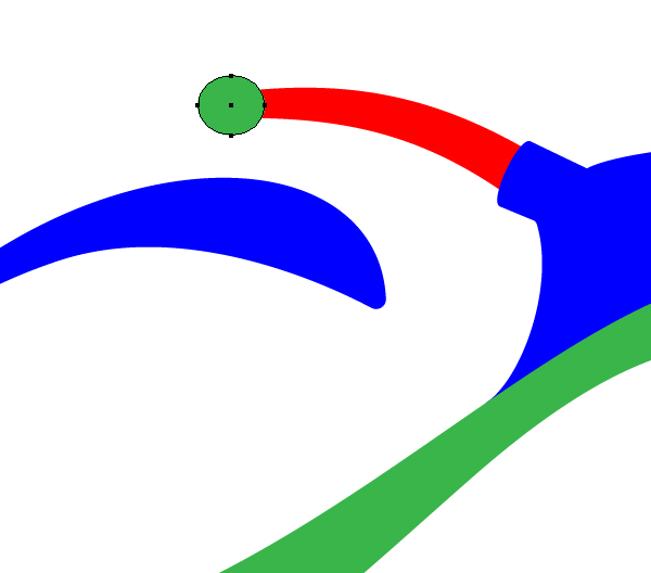
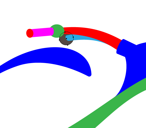
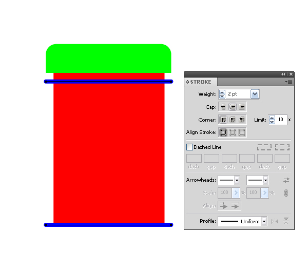
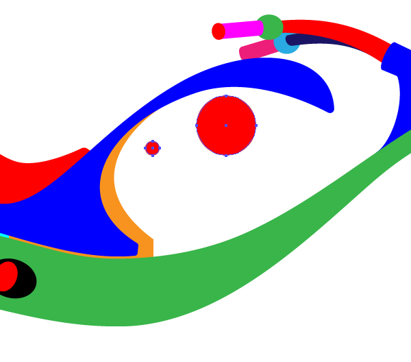
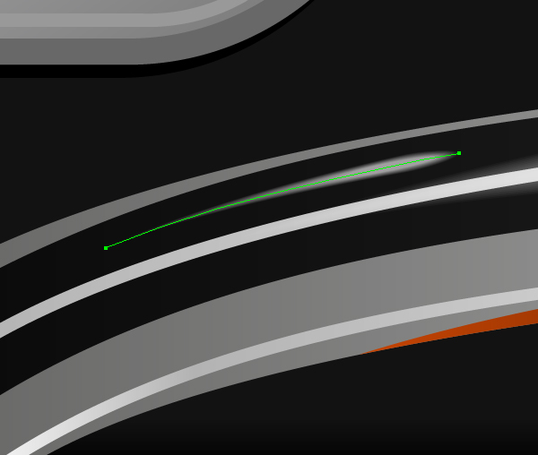
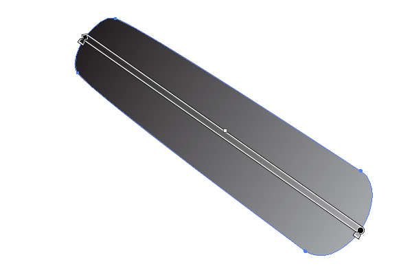
Start with creation of the geometry of the bike. Let’s create simple shapes, which will determine its basic proportions. Take the Ellipse Tool (L) and create a circle – it is the shape of the front wheel. Now create a horizontal guide and place it so that it passes through the lowest point of the circle.
Image may be NSFW. Clik here to view.
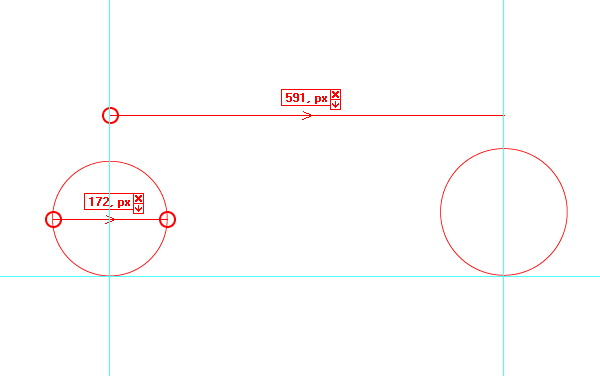
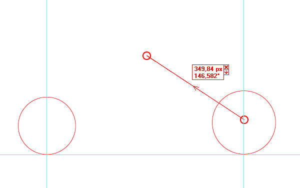
Preferably that you will adhere to the sizes listed here, therefore it will be easier for you to stick to proportions. To indicate the sizes, I’ll be using the Dynamic Measure tool. This tool is included in the VectorScribe plugin toolkit. In this work, it will be used as an auxiliary tool for display purposes. It may be useful for you to establish the sizes in technical drawing.
Image may be NSFW. Clik here to view.
You can adjust the scale, use different measurement units and choose the parameters that will be displayed.
Step 2
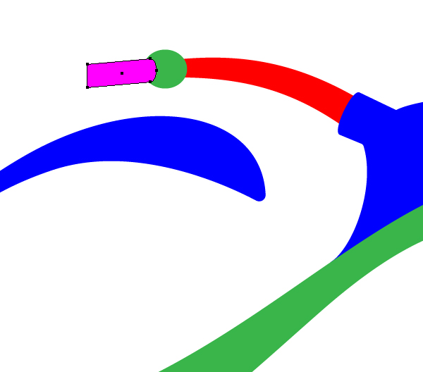
Create another circle – the rear wheel.
Image may be NSFW. Clik here to view.
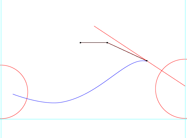
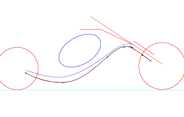
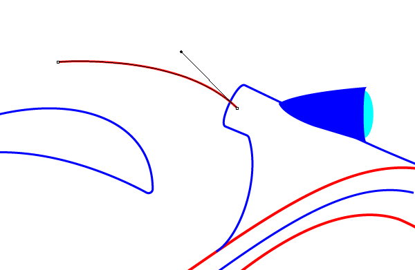
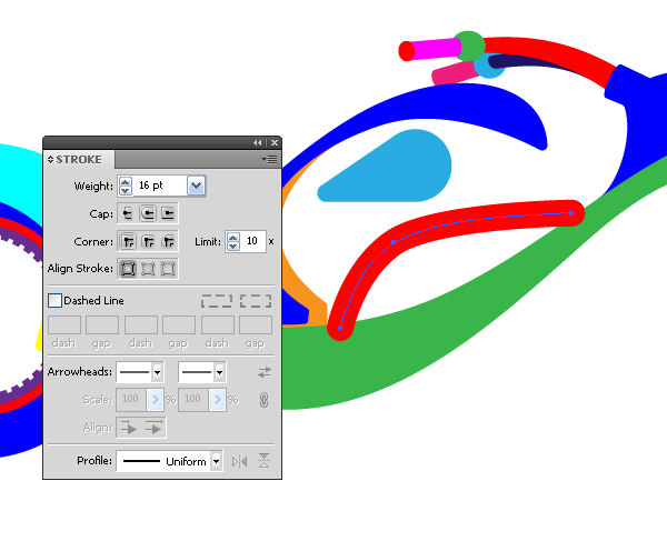
Take the Pen Tool (P) and create a line segment – it is a guide of the front fork of the bike. You certainly should not follow the sizes with such accuracy, it will be enough just to take an entire quantity.
Image may be NSFW. Clik here to view.
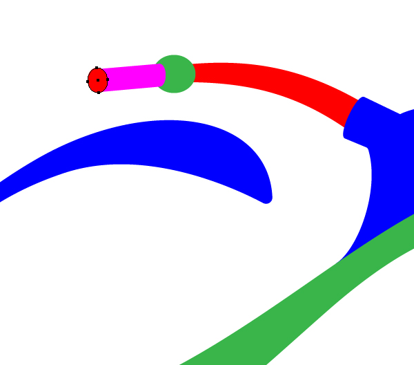
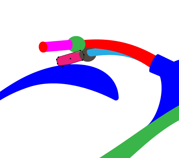
Step 3
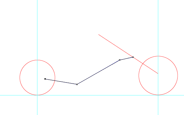
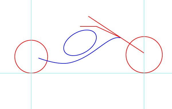
With the help of the Pen Tool (P) create a broken line as shown below – it is the basis for the motorcycle frame guide.
Image may be NSFW. Clik here to view.
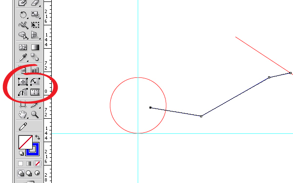
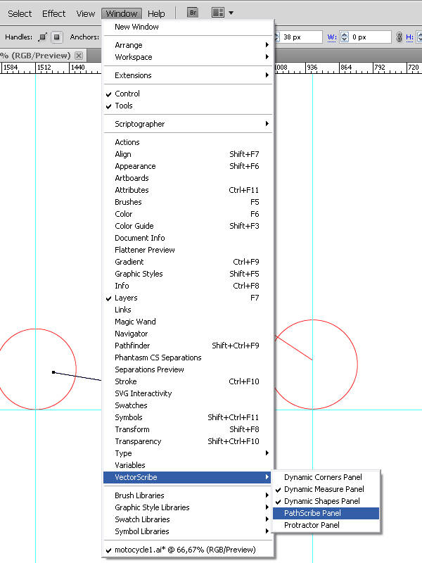
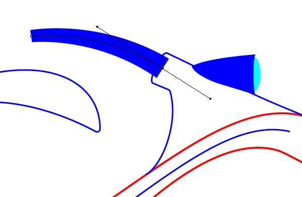
This guide should have a wavy appearance, see how you can use the VectorScribe plugin for the paths editing. After installing the plugin, its tools will appear in the sidebar and the palette will be available in the Windows menu.
Image may be NSFW. Clik here to view.
Image may be NSFW. Clik here to view.
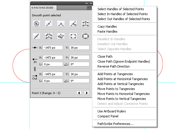
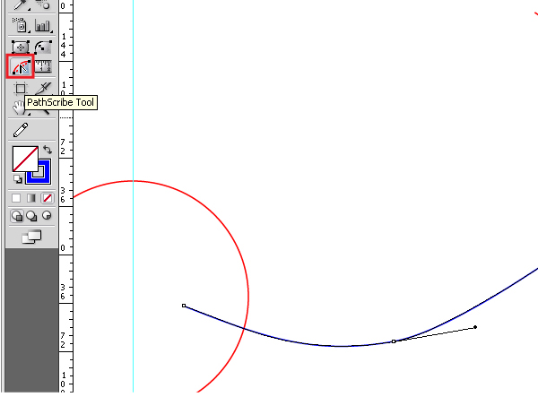
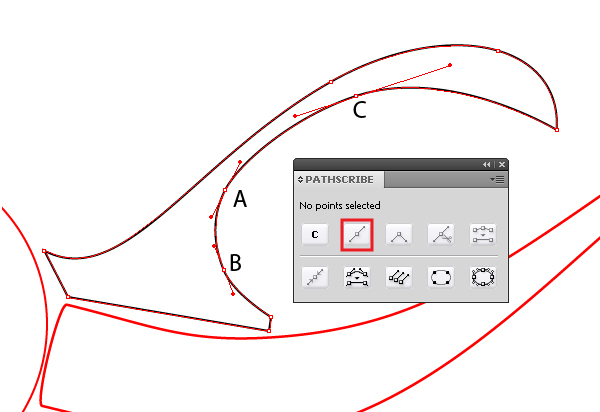
So, open PathScribe panel. It has 10 basic commands, which we will learn while practicing, as you complete this tutorial. Besides this, the panel has a menu with lots of additional functions.
Image may be NSFW. Clik here to view.
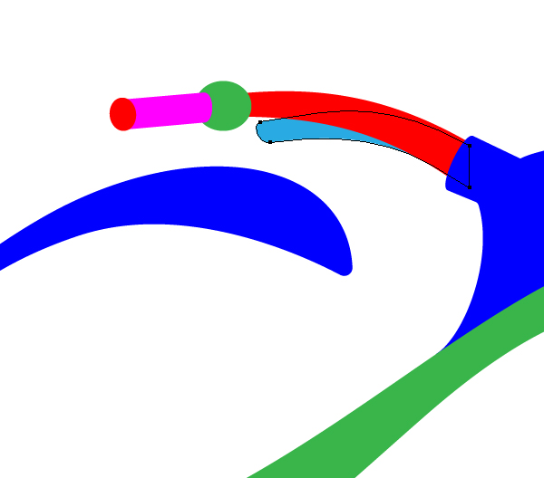
Step 4
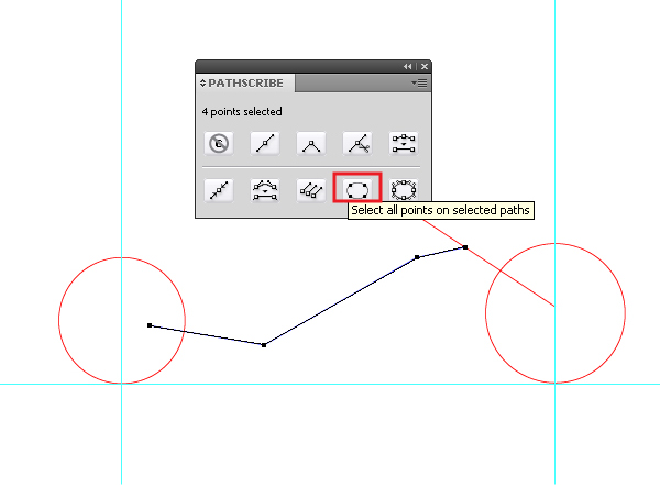
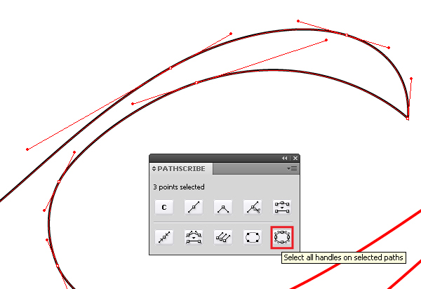
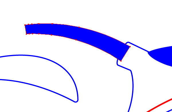
To select all the points of the selected path, you simply press the corresponding button in the palette and avoid using other selection tools, such as the Lasso Tool (Q) or the Direction Tool (A).
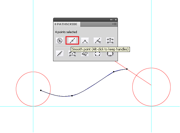
Image may be NSFW. Clik here to view.
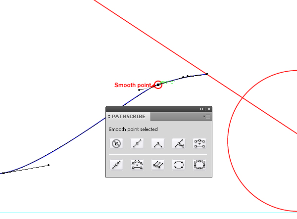
You will agree, that it is very convenient, especially when you have multiple objects that overlap each other. Now transform all the selected points into smooth ones.
Image may be NSFW. Clik here to view.
Step 5
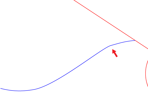
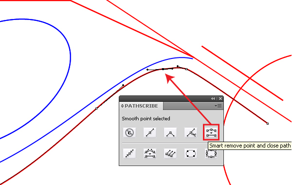
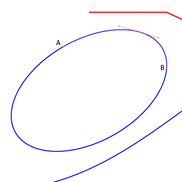
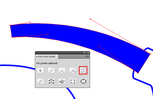
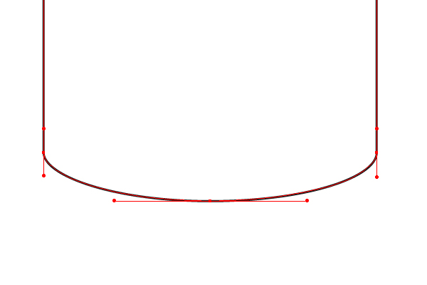
An experienced illustrator knows how important it is to place the points correctly so that the paths are smooth. Their amount is of fundamental importance as well and knowing this skill does not matter if you are using the VectorScribe plugin. I put one extra point on purpose because of this the curve does not look so perfect.
Image may be NSFW. Clik here to view.
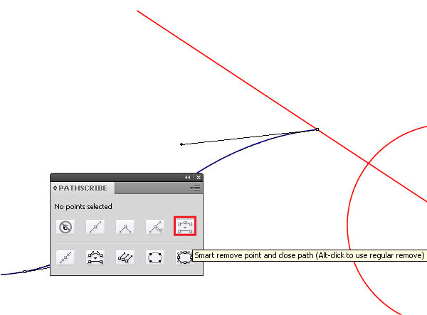
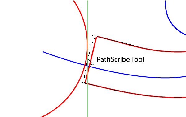
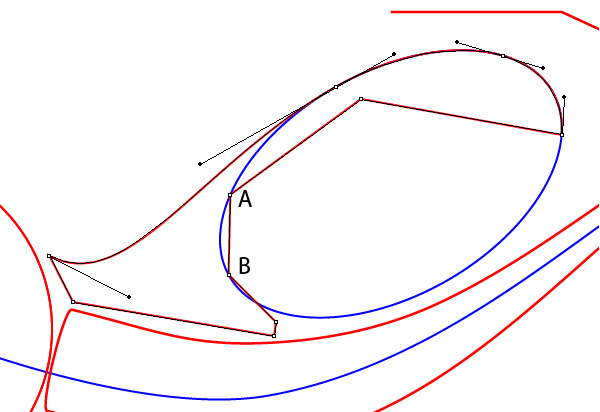
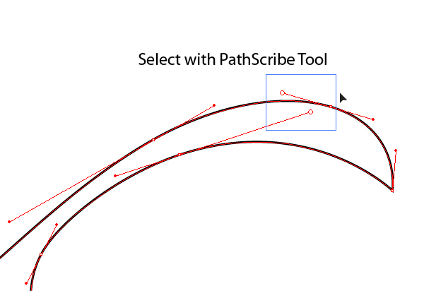
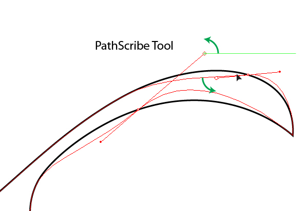
Removing the extra point in the traditional way will greatly change the path trajectory and it will have to be edited. The PathScribe Tool is designed to control points and their handles that can do much more than the Direct Selection Tool (A).
Image may be NSFW. Clik here to view.
So, take the PathScribe Tool and select an extra point.
Image may be NSFW. Clik here to view.
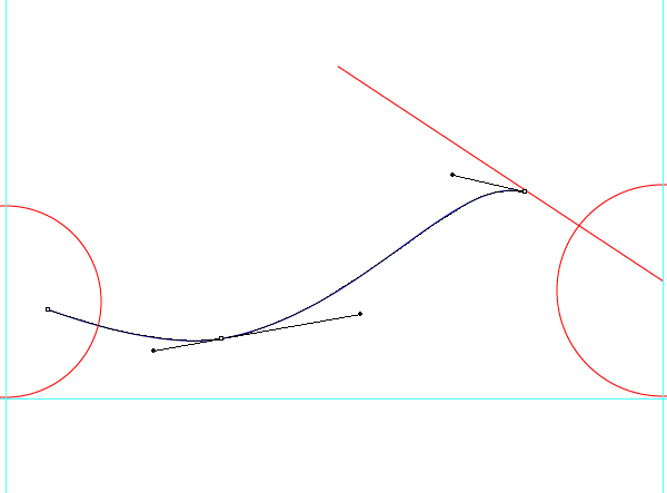
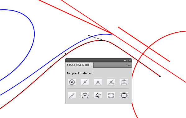
By clicking on the Smart Remove point button, the path becomes perfectly smooth.
Image may be NSFW. Clik here to view.
Operating the handles of the points, brings the curve to the shape indicated in the figure below.
Image may be NSFW. Clik here to view.
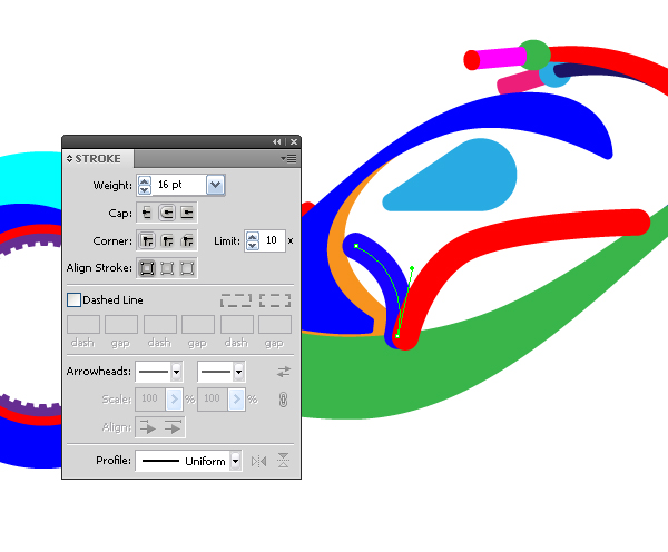
Step 6
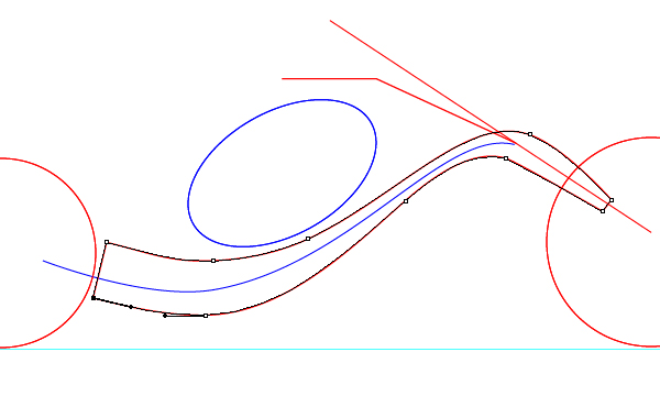
Take the Pen Tool (P) and create a broken line, which will set the location of the handlebar of the motorcycle.
Image may be NSFW. Clik here to view.
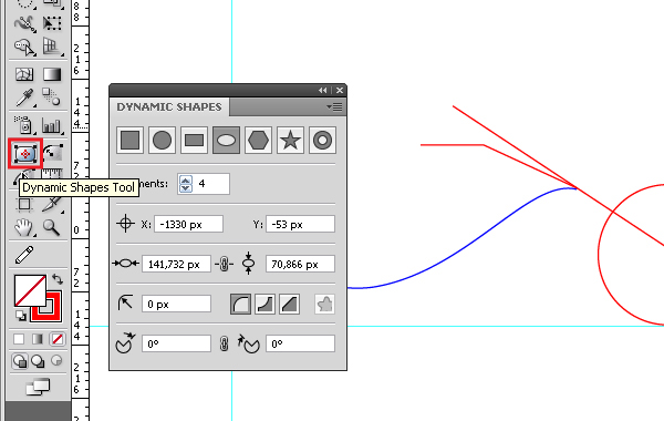
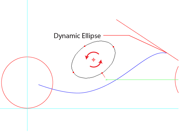
The location of the fuel tank and engine will be set up by an ellipse, we will use the Dynamic Shapes Tool only for this purposes.
Image may be NSFW. Clik here to view.
The palette of this tool is impressive, isn’t it? In this case, the use of this tool is justified by the fact that we can immediately assign any position of the axes of the ellipse in the process of creating, rather than only vertical-horizontal ones, as in the case with the Ellipse Tool (L).
Image may be NSFW. Clik here to view.
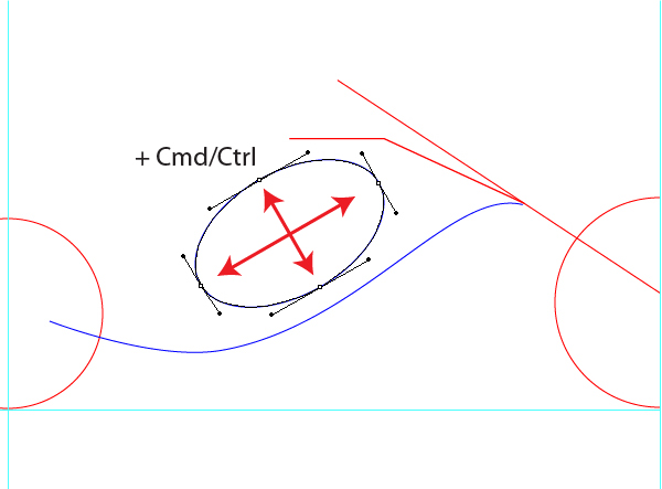
To change the proportions between the axes, hold down Command while creating an ellipse. So, you should get the ellipse like this.
Image may be NSFW. Clik here to view.
Image may be NSFW. Clik here to view.
Step 7
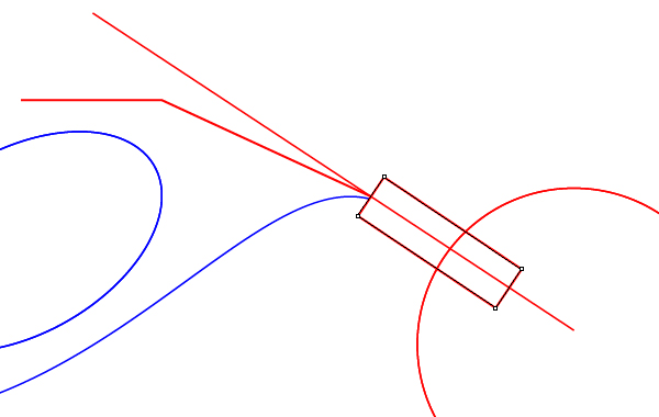
Proceed to the creation of the elements of the motorcycle. Start with the frame. With the help of the Dynamic Rectangle create a rectangle, so that its greater sides are parallel to the front fork.
Image may be NSFW. Clik here to view.
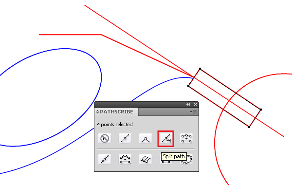
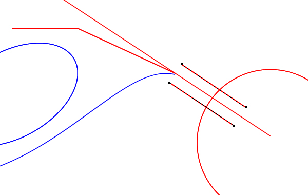
Divide the rectangle into parts, using the Split Path from the PathScribe palette, this command cuts the figure at the anchor points (similar to Scissors Tool, but for the whole path). Now remove the smaller sides of the rectangle.
Image may be NSFW. Clik here to view.
Image may be NSFW. Clik here to view.
Take the Pen Tool (P) and extend the left side of the rectangle, creating a wavy curve, as shown in the figure below.
Image may be NSFW. Clik here to view.
Remove the extra point in the path, using the button Smart Remove point.
Image may be NSFW. Clik here to view.
Image may be NSFW. Clik here to view.
Using the same technique, create the upper part of the frame and close the path.
Image may be NSFW. Clik here to view.
With the help of the PathScribe Tool you can bend the straight parts of the path. To do this, select the location with the tool, and while holding down the Shift key, pull to the side.
Image may be NSFW. Clik here to view.
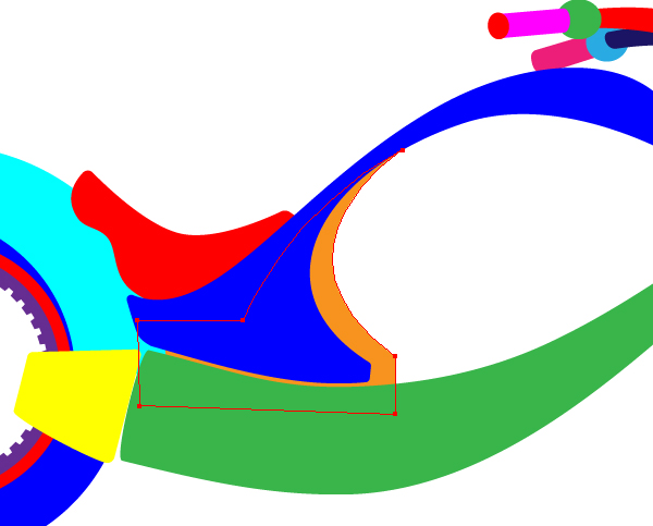
Step 8
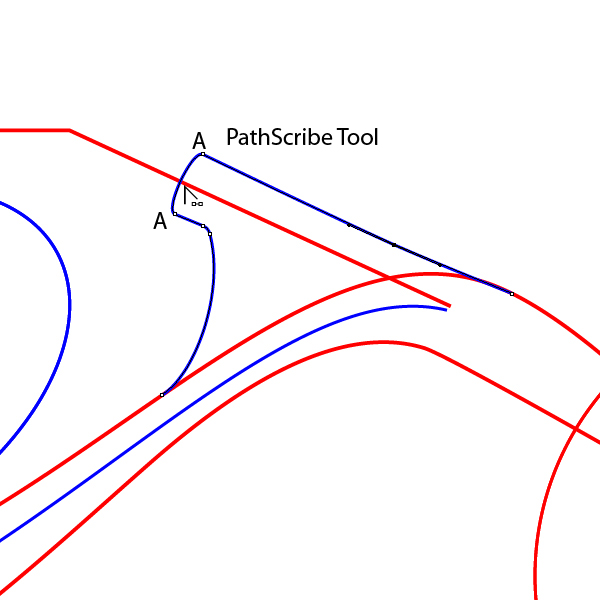
Using the Pen Tool (P) create a part of the frame at the place of the mounting of the handlebar and the shape of the headlight. On the section AA, there is used the technique described at the end of the previous step.
Image may be NSFW. Clik here to view.
Image may be NSFW. Clik here to view.
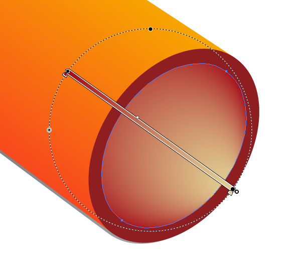
Create an ellipse using the Ellipse Tool (L) – this will be the front glass part of the light.
Image may be NSFW. Clik here to view.
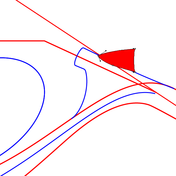
Step 9
Using the Scissors Tool (C) cut the ellipse at points A and B and continue the upper part of the ellipse with the Pen Tool (P), as shown below.
Image may be NSFW. Clik here to view.
Image may be NSFW. Clik here to view.
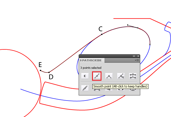
Select the points C, D, E and hit the Smooth point button from the PathScribe palette.
Image may be NSFW. Clik here to view.
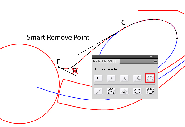
Delete point D, by clicking on the Smart Remove point button.
Image may be NSFW. Clik here to view.
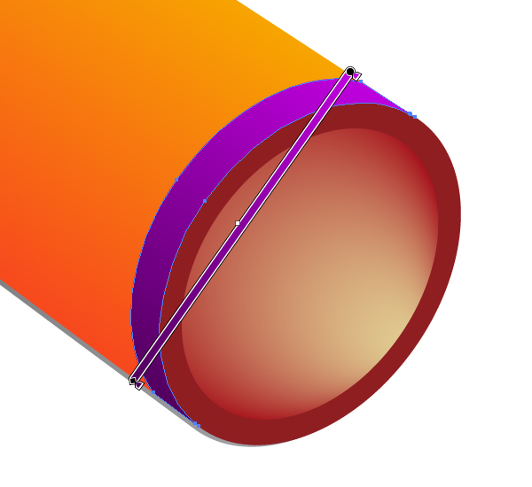
Step 10
Close the fuel tank path with the help of the Pen Tool (P), A and B points must lie on the outline of the lower part of the ellipse.
Image may be NSFW. Clik here to view.
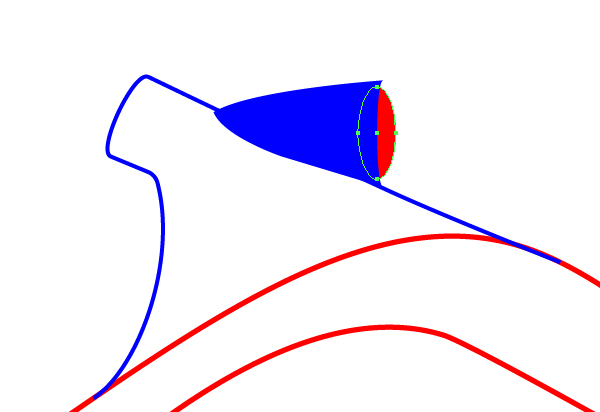
Now remove the bottom of the ellipse, it is no longer needed. Transform A, B and C points into the smooth ones.
Image may be NSFW. Clik here to view.
Now, let’s take a little break and have a look at some more stunning properties of the PathScribe Tool, which greatly simplifies path editing.
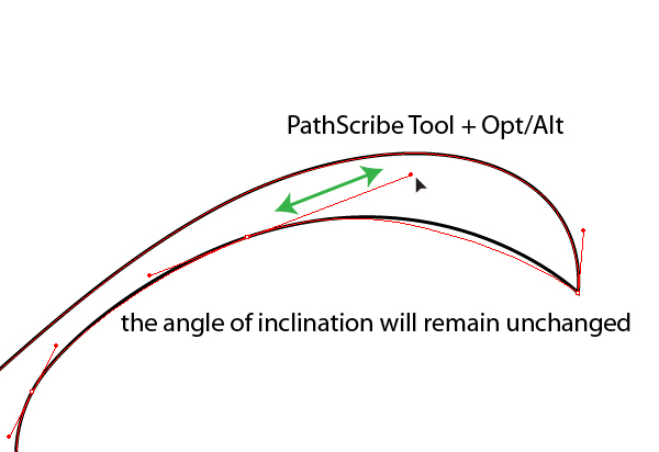
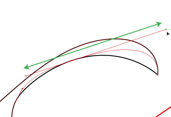
1. You can change the length of the handle of the point while the angle of inclination will remain unchanged. To do this, use the PathScribe Tool, while holding down the Alt.
Image may be NSFW. Clik here to view.
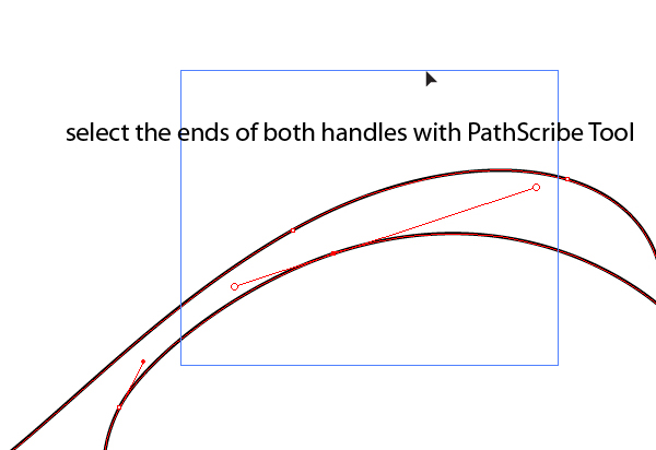
2. You can change the length of the handle of the point of the node symmetrically, to do this select the ends of both handles of the node with PathScribe Tool and proceed to operating, the length of the handles will change simultaneously.
Image may be NSFW. Clik here to view.
Image may be NSFW. Clik here to view.
3. You can simultaneously edit the handles of the different points, they just need to be selected and edited.
Image may be NSFW. Clik here to view.
Image may be NSFW. Clik here to view.
4. You can select the handles of all nodes and edit them simultaneously; there is an appropriate button in the PathScribe palette.
Image may be NSFW. Clik here to view.
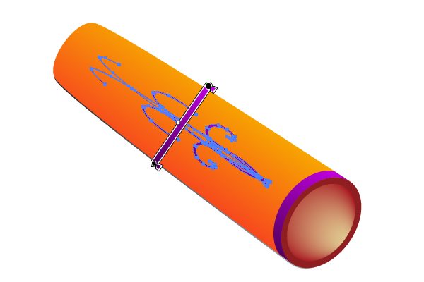
Step 11
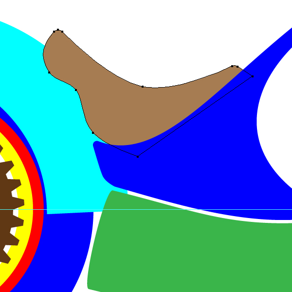
Change the curvature of the lower linear portion of the upper part of the motorcycle, manipulating the handles of nodes A and B.
Image may be NSFW. Clik here to view.
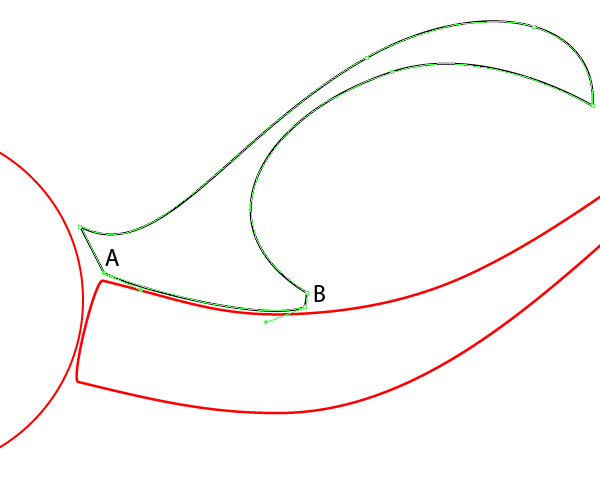
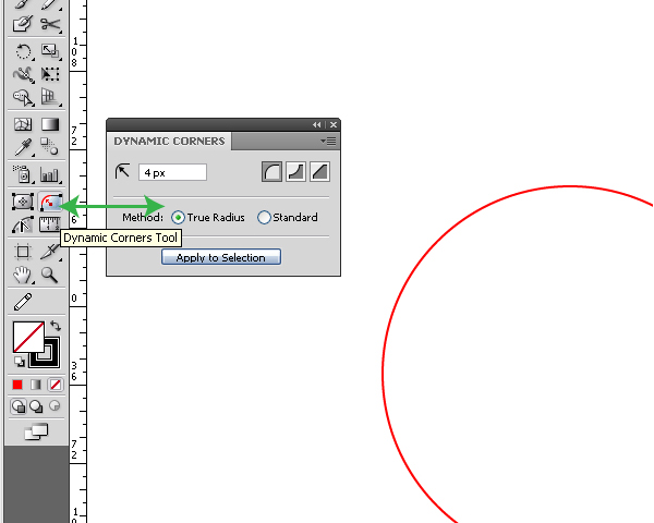
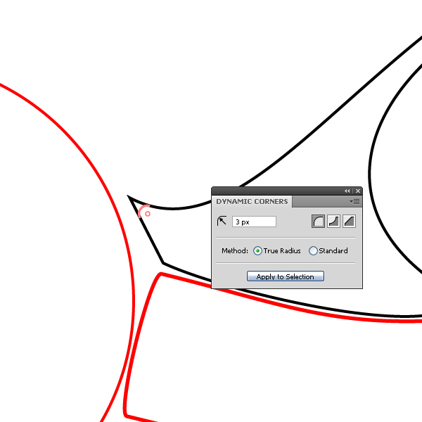
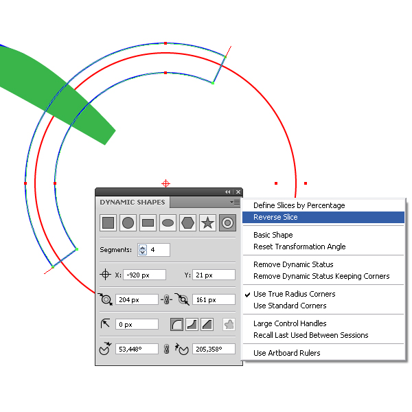
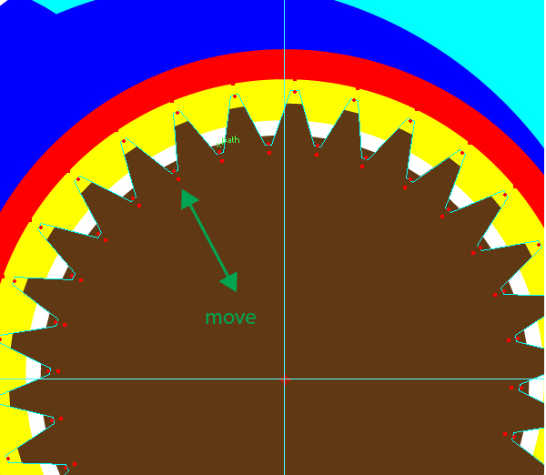
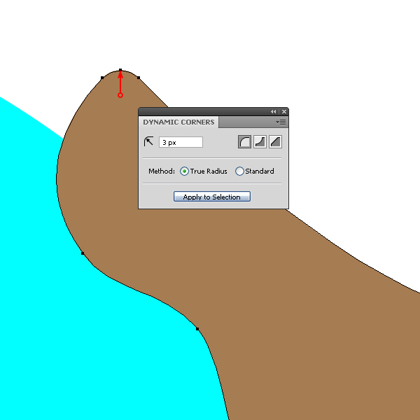
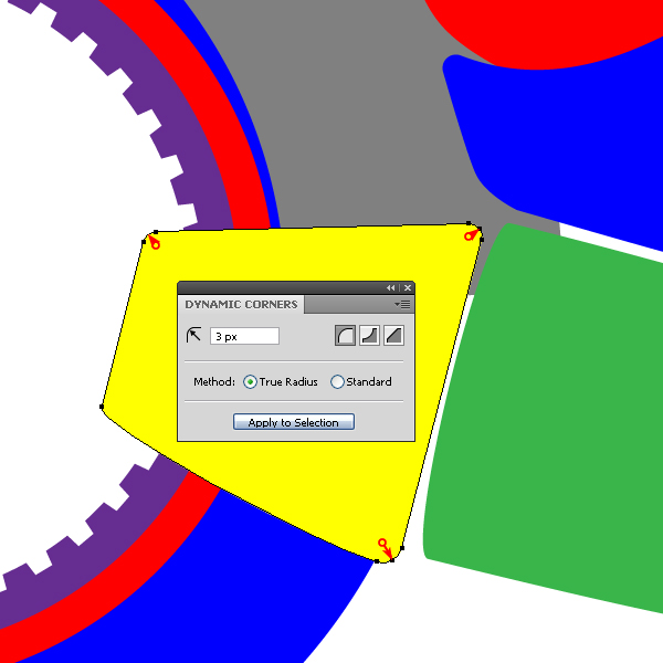
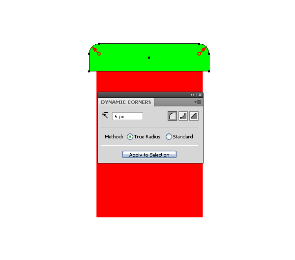
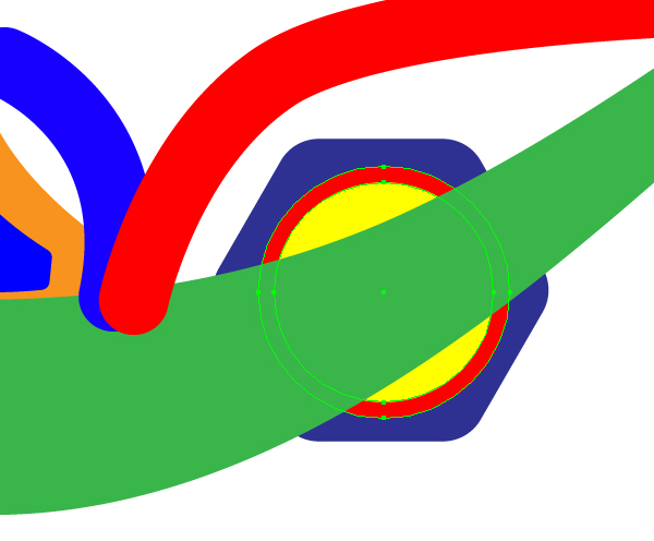
Now you can proceed to the rounding of the corners. To round the corners, there is a Dynamic Corners Tool and Dynamic Corners palette.
Image may be NSFW. Clik here to view.
You can round off the corners one at a time, setting radius of rounding for each one, and you can select a few or all of the angles and round them with a single radius. It’s really very simple! Take the Dynamic Corners Tool, set the desired radius in the palette and move the cursor to the corner. When you hover over it, the plugin shows us how the rounded corner will look, the shape in this case can be unselected.
Image may be NSFW. Clik here to view.
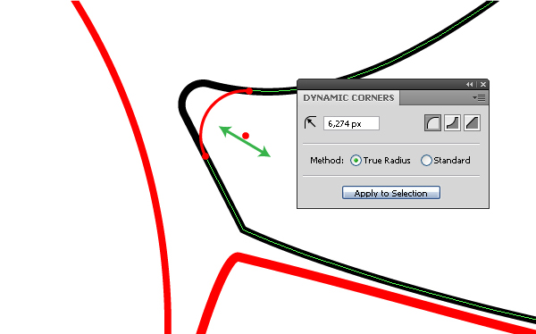
Click on the corner and the corner becomes the required shape. Besides this, the radius can be controlled by moving the cursor to the center of the radius of rounding.
Image may be NSFW. Clik here to view.
Fantastic, I told you! So, in just a couple of seconds we rounded all the corners of the upper shape of the motorcycle.
Image may be NSFW. Clik here to view.
Step 12
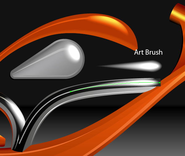
Proceed to the creation of the handlebar shape. We will create its shape using the Art Brush. The shape of the brush should be like a trapezoid, which you can easily make from a rectangle by moving its nodes.
Image may be NSFW. Clik here to view.
I advise you to make your brush shape commensurate with the elements of your motorcycle. Save the brush as an Art Brush in the Brushes palette.
Image may be NSFW. Clik here to view.
Image may be NSFW. Clik here to view.
Take the Pen Tool (P) and create an arc – it forms the base for the handlebar shape. Keeping the arc selected, apply the created brush to it.
Image may be NSFW. Clik here to view.
Image may be NSFW. Clik here to view.
After applying the brush, it is always possible to edit the shape of the curve, to which it applies, and pick the desired width in the Stroke palette. Keep the handlebar shape selected, go to Object > Expand Appearance.
Image may be NSFW. Clik here to view.
As a result, we got an object with multiple extra components. This always happens in such cases. Extra points make the editing of this object seriously harder. Delete extra points by running the Smart Remove points from the PathScribe palette.
Image may be NSFW. Clik here to view.
There are only 4 points, and the shape is still the same! Guys, I am so happy! As I remember, Adobe Illustrator CS3 suffers from the fact that as a result of the Expand Appearance command for the brush (besides the bunch of points), we get an open path and several overlapped points. We get the same result, if you apply the Expand Appearance command to 3D objects, which affects the Adobe Illustrator of all versions.
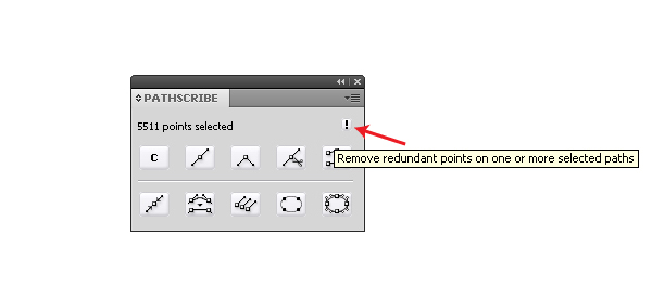
Previously, to fix these issues, I resorted to a variety of scripts, now we can remove them using the commands from the PathScribe panel. If your path contains overlapped points, then in the PathScribe panel appears an exclamation mark after you select it, clicking on its picture will remove all these points in one path or more.
Image may be NSFW. Clik here to view.
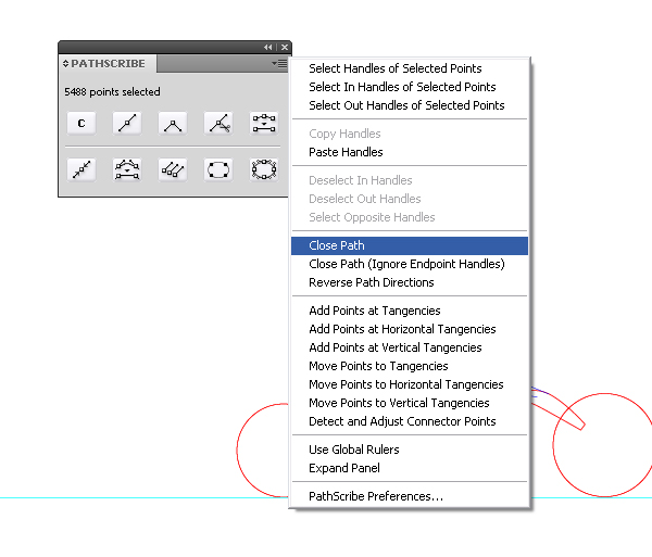
If you have an open path, choose the Close Path command from the menu of the PathScribe palette.
Image may be NSFW. Clik here to view.
Step 13
Fill the shape using different colors and place them in the right order, moving the under layers with them in the Layers palette.
Image may be NSFW. Clik here to view.
Proceed with the creation of the shape of the wheels. Create two guides, passing through the center of the first wheel for the convenience of further work.
Image may be NSFW. Clik here to view.
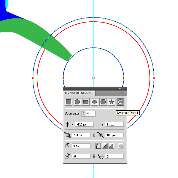
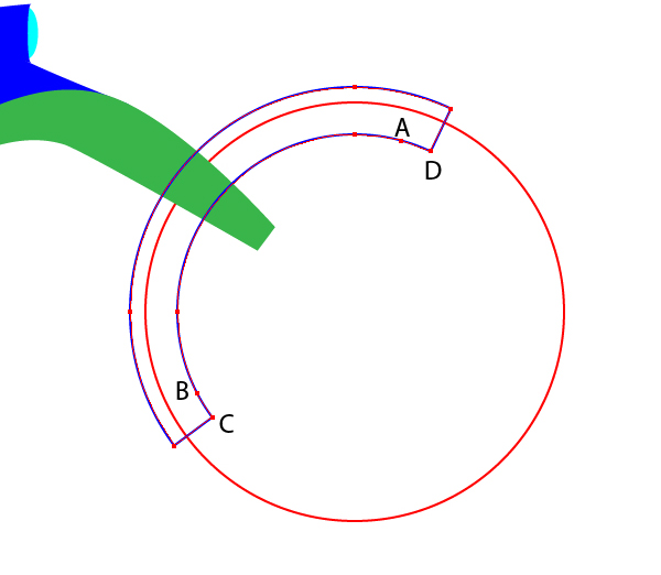
Create the front fender. Take the Dynamic Shapes Tool and choose Dynamic Donut from the Dynamic Shapes palette and create two circles at a time.
Image may be NSFW. Clik here to view.
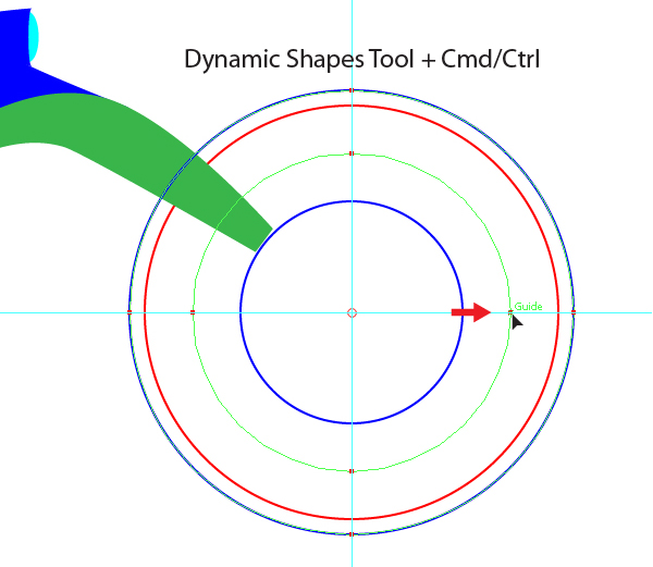
Note, that this figure represents a Compound Path. To change the diameters of these circles you need to tear out the circle node with the help of the Dynamic Shapes Tool, press the mouse button and holding it press the Command button, and while holding down the mouse button make the move. Manipulation must be done only in the sequence provided by me!
Image may be NSFW. Clik here to view.
Step 14
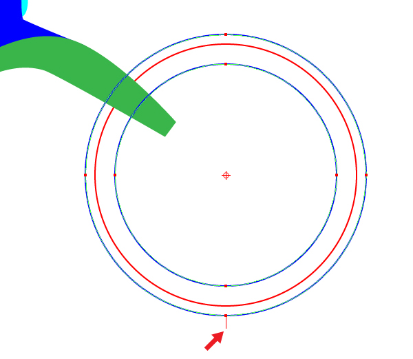
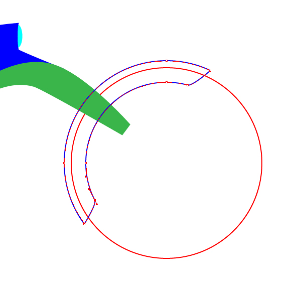
Dynamic Shapes have another interesting feature. Can you see the tail at the bottom of the wheel? In fact, there are two of them.
Image may be NSFW. Clik here to view.
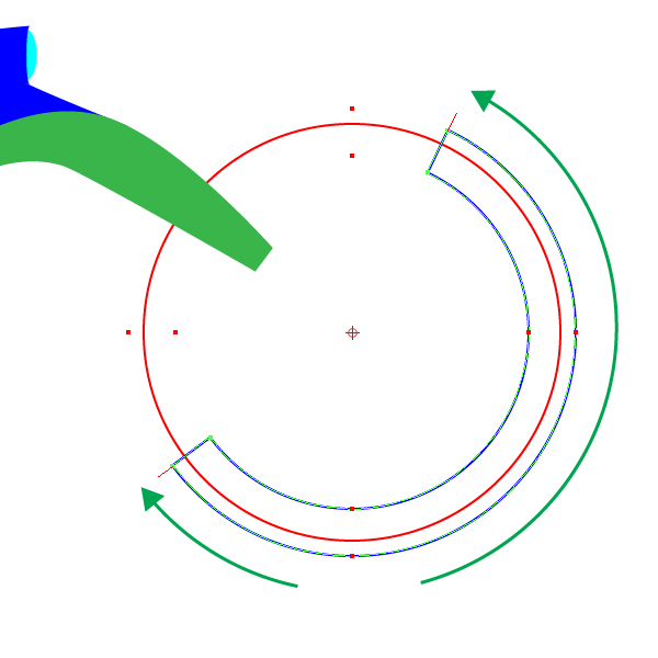
Their movement helps to cut out sectors in the Dynamic Shapes.
Image may be NSFW. Clik here to view.
Cut sector can be reversed.
Image may be NSFW. Clik here to view.
Put new points A and B and remove the points C and D.
Image may be NSFW. Clik here to view.
Do it in the traditional way with the help of the Pen Tool (P).
Image may be NSFW. Clik here to view.
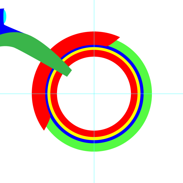
Using a Dynamic Donut, create a few more objects (tires, the elements of the rim) and place them in the right order in the layers palette.
Image may be NSFW. Clik here to view.
Step 15
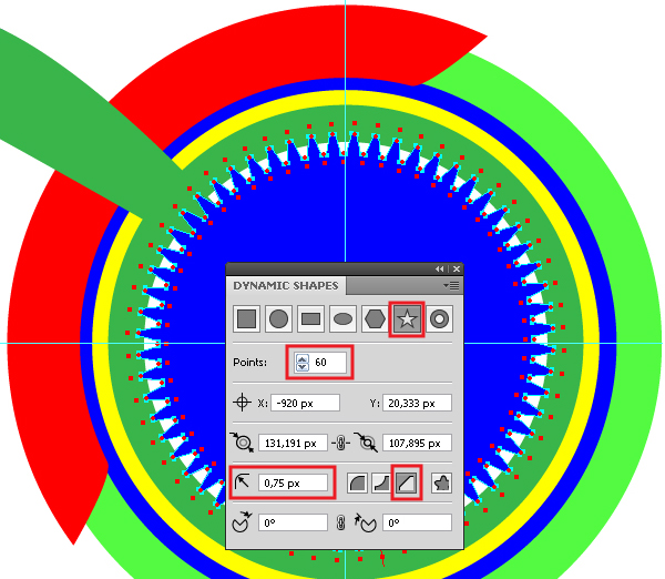
The wheel of our bike will not be regular. Turning torque on the wheel will be transmitted through a gear wheel. Creating all sorts of stars is a really strong side of the VectorScribe plugin. To create the gear, use the Dynamic Shapes Tool, the setting parameters of this tool are shown in the figure below.
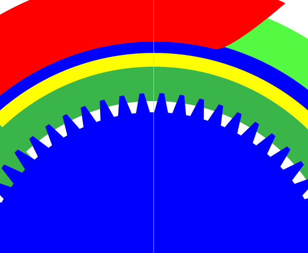
Image may be NSFW. Clik here to view.
A star may have sharp, rounded ends or cut along the straight line, as in my case.
Image may be NSFW. Clik here to view.
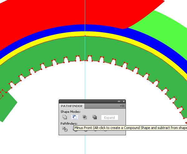
Select the inner, dark-green rim and create a star, now press the Minus front button from the Pathfinder palette.
Image may be NSFW. Clik here to view.
The internal gearing is ready.
Step 16
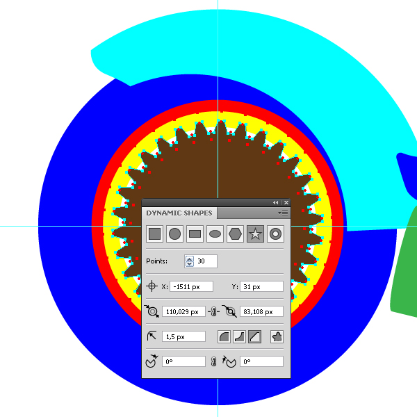
The technique of creating the rear wheel has no difference from the one of creating the front wheel, except for the setting of the star of the gear wheel.
Image may be NSFW. Clik here to view.
Note, that you can easily change the size of a dynamic shape created by moving the markers of the shape or changing the set values in the Dynamic Shapes palette.
Image may be NSFW. Clik here to view.
Step 17
Create the motorcycle seat. I have created a broken path with the Pen Tool (P), then converted the corner points into smooth ones with the help of the Smooth point from the PathScribe palette and rounded corners using the Dynamic Corners Tool.
Image may be NSFW. Clik here to view.
Image may be NSFW. Clik here to view.
The same technique was used for the creation of a trapezoidal element at the end of the motorcycle frame.
Image may be NSFW. Clik here to view.
Step 18
With the help of the Ellipse Tool (L) and the Pen Tool (P) create elements of the motorcycle handlebars.
Image may be NSFW. Clik here to view.
Image may be NSFW. Clik here to view.
Image may be NSFW. Clik here to view.
Image may be NSFW. Clik here to view.
Image may be NSFW. Clik here to view.
Image may be NSFW. Clik here to view.
Step 19
Take the Pen Tool (P) and create the inner part of the upper shape of the motorcycle.
Image may be NSFW. Clik here to view.
Step 20
Now let’s proceed to the creation of the engine components. Let’s start with the cylinder head. This element, we will create on the side of the motorcycle, and then place it in the correct place. Take the Rectangle Tool (M) and create two rectangles, which I lined vertically with the help of the Align palette. I rounded the tops of the upper rectangle with the Dynamic Corners Tool.
Image may be NSFW. Clik here to view.
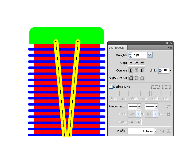
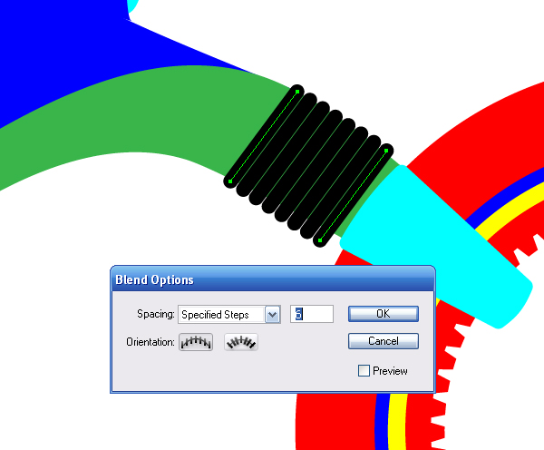
Now, create the edge of the cylinder’s air-cooler. Take the Pen Tool (P) and create two horizontal lines of equal length with a stroke of 2px width and rounded ends.
Image may be NSFW. Clik here to view.
Select both lines and go to Object > Blend > Make.
Image may be NSFW. Clik here to view.
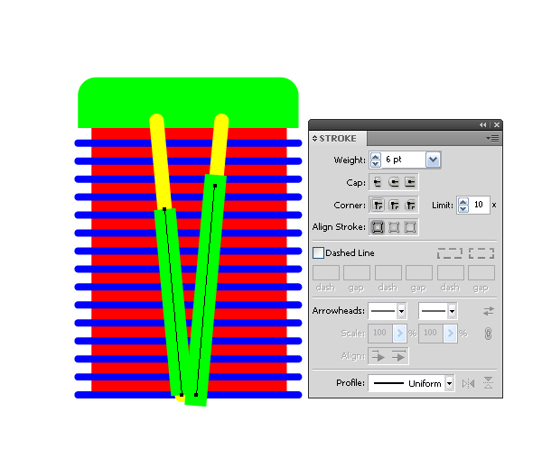
Now with the help of the Pen Tool (P) create two cylinder tubes and group up all the elements of the cylinder (Command + G).
Image may be NSFW. Clik here to view.
Image may be NSFW. Clik here to view.
At this step the work with the cylinder is completed, return to it when working with color.
Step 21
Now create the lid of the ignition unit. Take the Ellipse Tool (L) and create two circles under the gas tank of the motorcycle.
Image may be NSFW. Clik here to view.
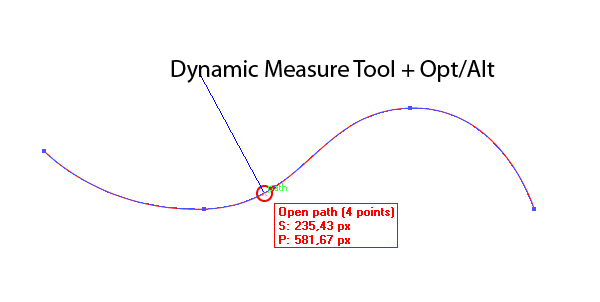
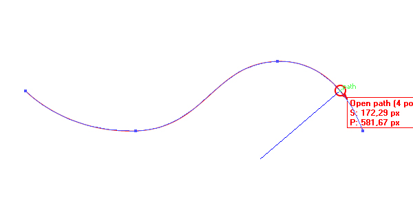
We need to construct two tangents to these circles. Let’s review a little bit. The Dynamic Measure Tool allows you to build perpendiculars (normal lines) to any curvilinear outline. Take the Dynamic Measure Tool and drag along the contour by holding down the Alt key, and you will see how the normal changes dynamically depending on the location of the cursor. In this case, the end of the normal corresponds to the center of the circle tangent to this path.
Image may be NSFW. Clik here to view.
Image may be NSFW. Clik here to view.
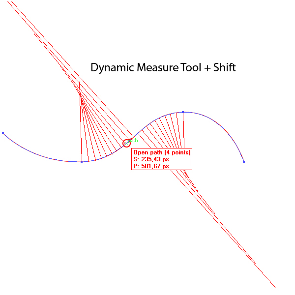
If when you drag the mouse pointer along the path you also hold down Shift, you’ll see a family of normals between adjacent nodes of the chosen area of the path.
Image may be NSFW. Clik here to view.
You can turn a dynamic normal into a vector object, you just need to click in the right place of the path.
Image may be NSFW. Clik here to view.
Our case is more complicated, but it can be solved easily by simply selecting two circles, and running the Common Tangents script. You can download this script here.
Image may be NSFW. Clik here to view.
Delete the inner tangents and connect the external ones with the Pen Tool (P).
Image may be NSFW. Clik here to view.
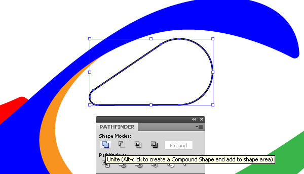
Select both circles and the trapezoid, now press the Unite button from the Pathfinder palette. Perfect!
Image may be NSFW. Clik here to view.
Step 22
Now create a protective arc with the Pen Tool (P) and the exhaust pipe in the same way.
Image may be NSFW. Clik here to view.
Image may be NSFW. Clik here to view.
Step 23
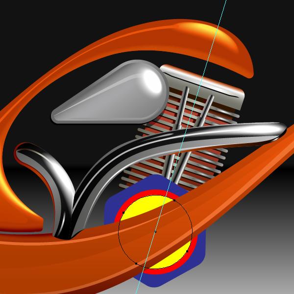
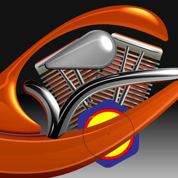
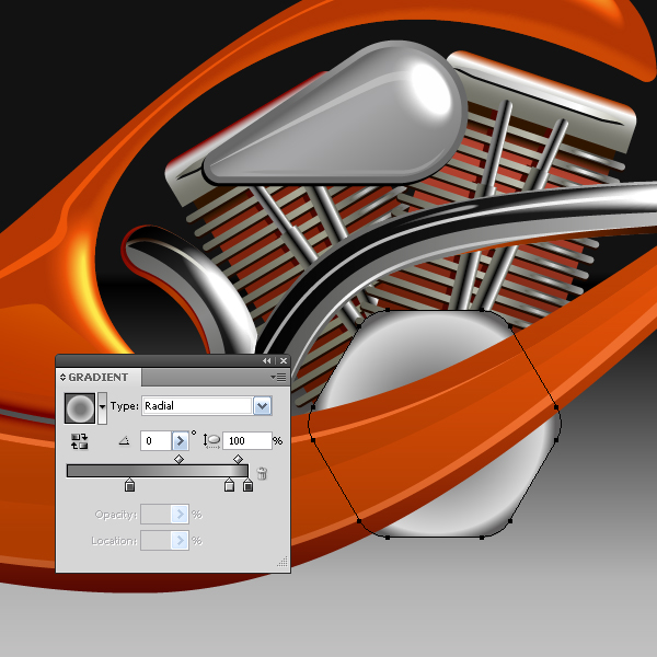
Create two ellipses using the Ellipse Tool (L) or Dynamic Shapes Tool, as shown below. We will turn them into a stop sign later on.
Image may be NSFW. Clik here to view.
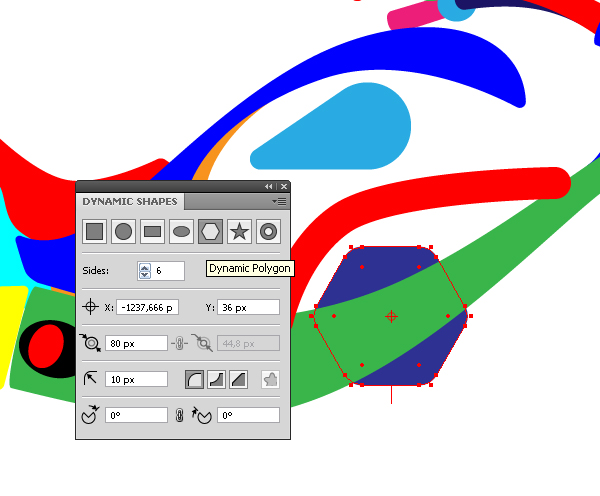
Step 24
With the help of the Dynamic Polygon create the transmission, the setting parameters of the shape are shown in the Dynamic Shapes palette in the figure below.
Image may be NSFW. Clik here to view.
Create two more circles on the transmission, the centers of the polygon and circles must match together.
Image may be NSFW. Clik here to view.
Step 25
Create a decorative element in the shape of a trapezoid with the help of the Pen Tool (P) at the lower end of the bike’s front fork. I rounded the corners with the Dynamic Corners Tool.
Image may be NSFW. Clik here to view.
Step 26
Using the technique described in step 19 for the air-cooling edges, create a decorative element on the front fork of the motorcycle.
Image may be NSFW. Clik here to view.
The basic geometry is created, now we’ll proceed to coloring.
Step 27
It’s very useful to create the background before color matching, if you are not making an isolated object on a white background of course. Take the Rectangle Tool (M) and create a rectangle the size of the background and fill it with linear gradient, which consists of black and gray colors.
Image may be NSFW. Clik here to view.
Step 28
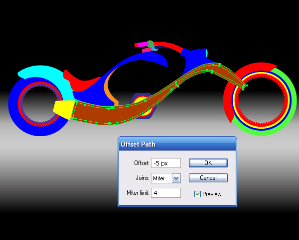
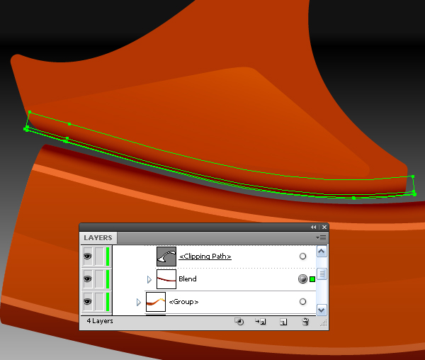
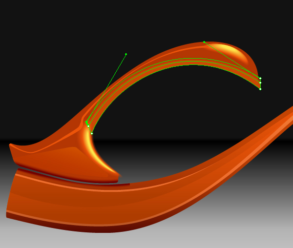
We are not done with shaping when coloring the motorcycle, such is the destiny of vector artists Image may be NSFW. Clik here to view. . Select the frame of the bike and go to Object > Offset Path and set the offset parameters to -5px in the dialog box.
Image may be NSFW. Clik here to view.
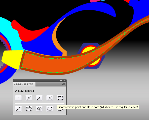
After this command, we have a new outline, the shape of what needs to be edited. This outline contains a large amount of extra points. This is another case where you want to use the Smart Remove point from the PathScribe palette.
Image may be NSFW. Clik here to view.
After the removal of the extra points the outline can easily be edited.
Step 29
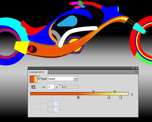
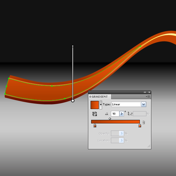
Fill the upper outline with a linear gradient that goes from orange to yellow and light yellow.
Image may be NSFW. Clik here to view.
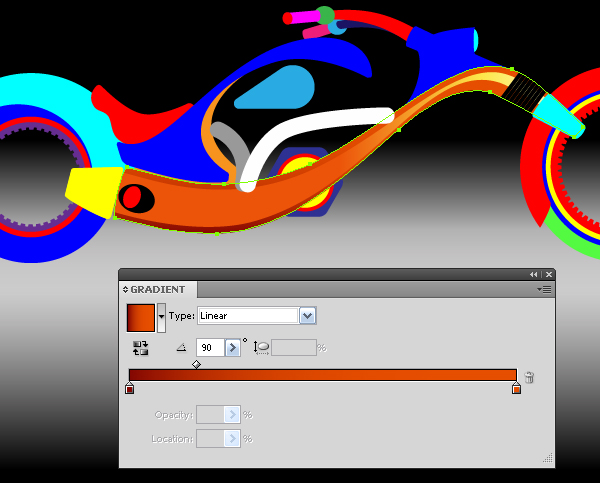
Fill the bottom outline with a linear gradient that goes from dark orange to orange.
Image may be NSFW. Clik here to view.
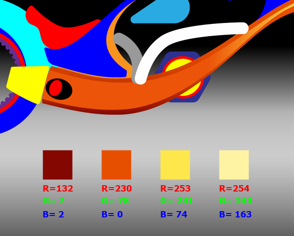
In these two gradients, I used basic colors that will be used for the motorcycle parts, painted in orange. The figure below shows the values of these colors in the RGB color mode.
Image may be NSFW. Clik here to view.
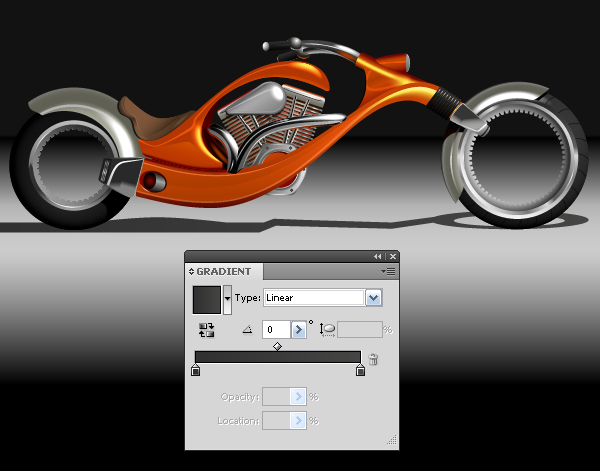
To get the shades from the basic colors just slightly move your slider in the Color palette, while holding down Shift at the same time. To obtain light shades, move the slider to the right, and to get dark shade, move it to the left. I will give one more bit of advice, often the selection interferes when choosing the right color, turn it off when choosing a color for various elements (Command + H will enable/disable the selection of objects). Knowing this, you will no longer suffer when selecting color.
Step 30
Before coloring you definitely have to determine the position of the light source. The locations of glares, shadows, and gradient direction depend on it. In my case, the light source is located up and to the right of the viewer. There are many methods to add volume to the picture, we will deal with some of them in this work.
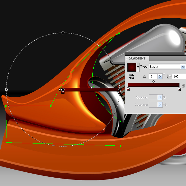
The first method involves creating a series of vector objects that are very close in shade (certainly, except for areas of glares), the shape of which reproduces the location of light and shadow. We have already started to apply this method to the frame of the bike. Select the upper object and again go to Object > Offset Path and set the offset parameters to -2px in the dialog box, remove extra points with the Smart Remove point, edit the shape and fill it with a linear gradient that reproduces the light distribution.
Image may be NSFW. Clik here to view.
Step 31
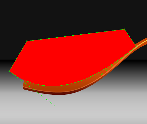
Create another shape on the frame, take the Pen Tool (P) and create an object, as shown in the figure below.
Image may be NSFW. Clik here to view.
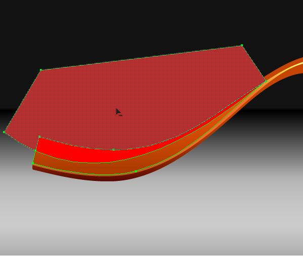
Select the upper object and the created shape, take the Shape Builder Tool and holding down the Alt key, delete the part of the red figure behind the intersection of shapes.
Image may be NSFW. Clik here to view.
Image may be NSFW. Clik here to view.
Edit the obtained shape (try to make the lines balanced and elegant) and fill with a linear gradient.
Image may be NSFW. Clik here to view.
In this way, the light distribution can be reproduced on smooth surfaces, the reflection of light has clear boundaries, usually those are flat spots of the object.
Image may be NSFW. Clik here to view.
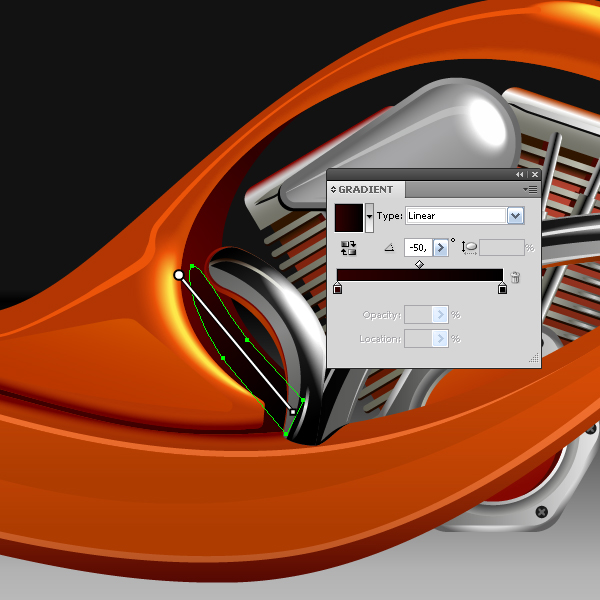
Step 32
The second technique consists in using the Blend to create highlights and shadows on the surface of objects. Create a light highlight on the front part of the frame. Take the Pen Tool (P) and build two shapes, as shown in the figure below.
Image may be NSFW. Clik here to view.
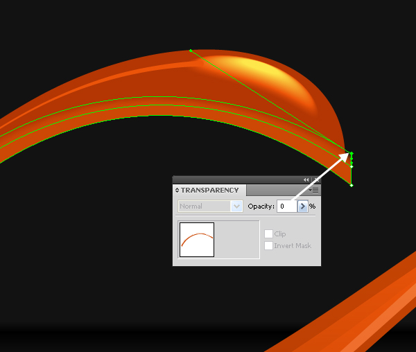
The upper shape has a solid yellow fill, the lower one has a solid orange fill with 0% Opacity. Select both shapes and go to Object > Blend > Make.
Image may be NSFW. Clik here to view.
Do not despair if it does not come out good the first time the way you want it to be, which is normal. Edit the shapes included in the Blend with the Direct Selection Tool (A), color, of course, can be edited as well.
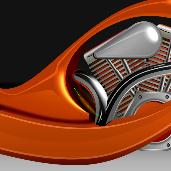
Step 33
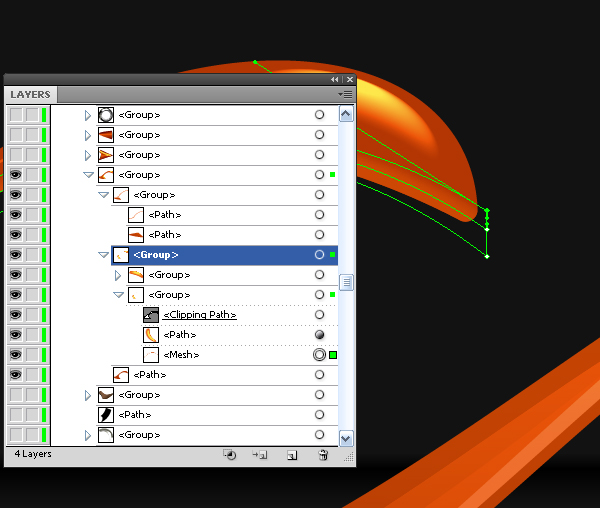
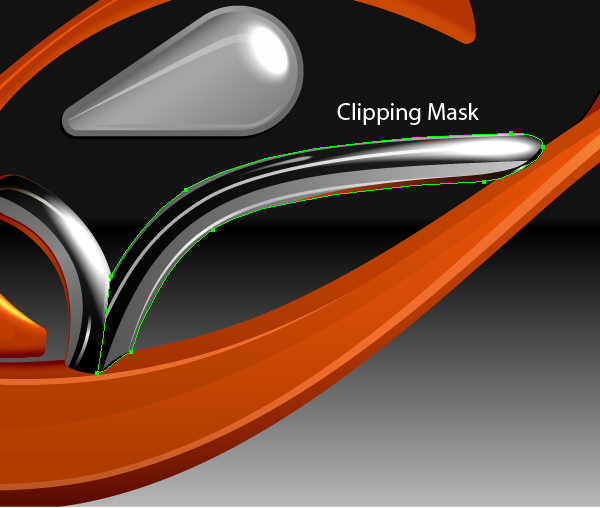
When you create highlights and shadows by this method you can go beyond the edges of objects. The spots of the highlights and shadows that go beyond should be covered with the help of a Clipping Mask.
Image may be NSFW. Clik here to view.
Image may be NSFW. Clik here to view.
Step 34
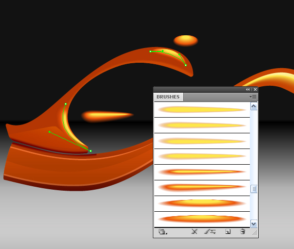
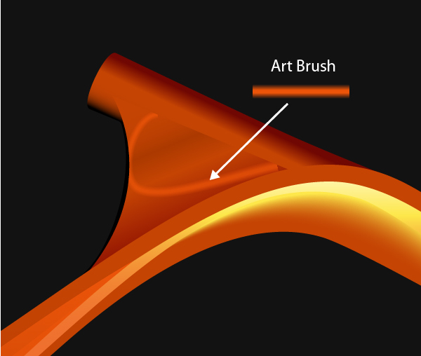
Now let’s look at the third technique. There are cases when it’s very hard to choose the shape of the original objects for the blend. Usually this happens on the surfaces with curves. In such cases, I use the Art Brushes. These are created from blend objects, which are based on simple geometric shapes.
The picture below shows the shapes of brushes and the point of use. The lower shapes of blend objects have 0% Opacity. There is shown the Brushes palette next to it, so that you do not think that I get the desired result from the first attempt. Yes, it is tedious work, but the result is worth it.
Image may be NSFW. Clik here to view.
Step 35
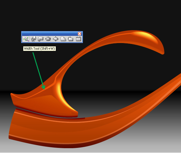
Now we’ll look at the fourth technique. Also, create highlights that have sharp boundaries. On the figure below you can see such a highlight created with the help of the Pen Tool (P). The stroke width of this outline was changed with the help of the Width Tool.
Image may be NSFW. Clik here to view.
Step 36
Now we’ll look at the fifth technique. To create the highlight, use a simple mesh objects created based on the rectangle transformation. Extra grids of such objects are manageable, and the direction of the newly created lines are predictable.
Image may be NSFW. Clik here to view.
To achieve a smooth transition change the opacity of mesh nodes.
Image may be NSFW. Clik here to view.
The elements that go beyond the mesh object should be covered with a Clipping Mask.
Image may be NSFW. Clik here to view.
That’s about it. Let’s take a look where I applied them.
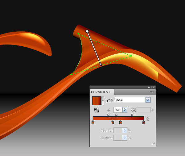
Step 37
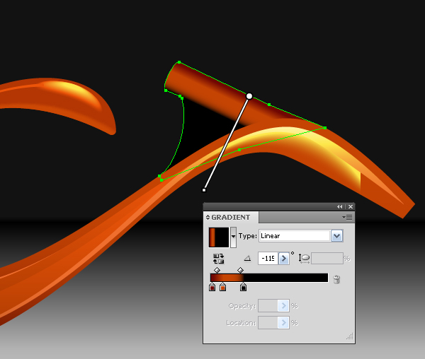
Well, apply a linear gradient at the bike section for mounting the handlebar at the front fork of the motorcycle.
Image may be NSFW. Clik here to view.
The new shape was achieved as a result of the intersection, and linear gradient again.
Image may be NSFW. Clik here to view.
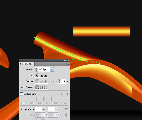
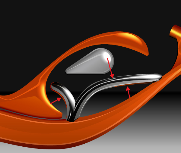
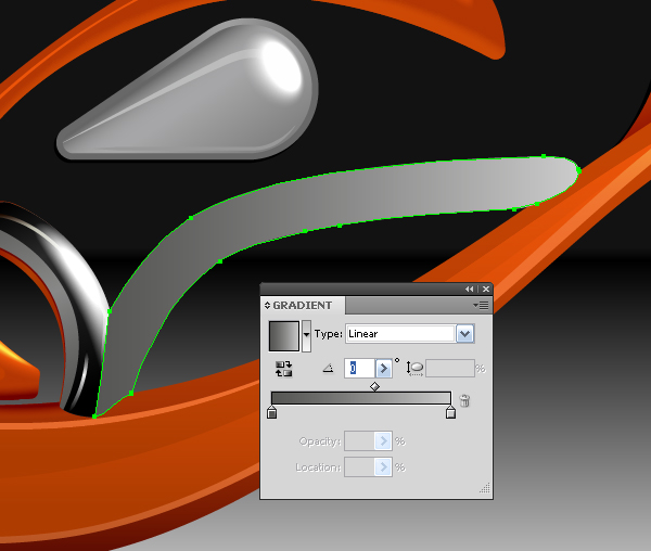
The highlight and brush that was applied to the outline was created with the help of the Pen Tool (P).
Image may be NSFW. Clik here to view.
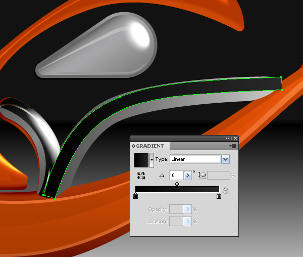
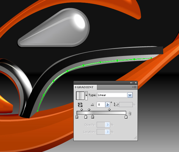
Now for one more brush (new outline). The brush width is adjusted with the help of the Stroke Palette, the part that goes beyond is covered with the help of a Clipping Mask.
Image may be NSFW. Clik here to view.
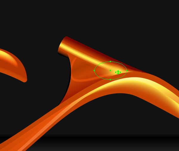
And finally, blend-object which has two ellipses in its base, the lower (bigger) ellipse has 0% Opacity.
Image may be NSFW. Clik here to view.
I guess you got the point.
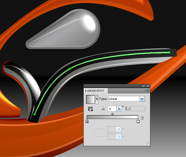
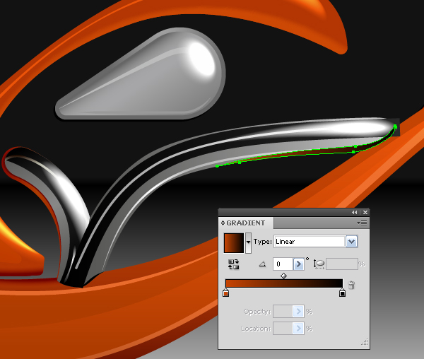
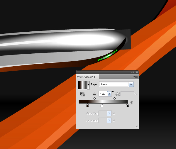
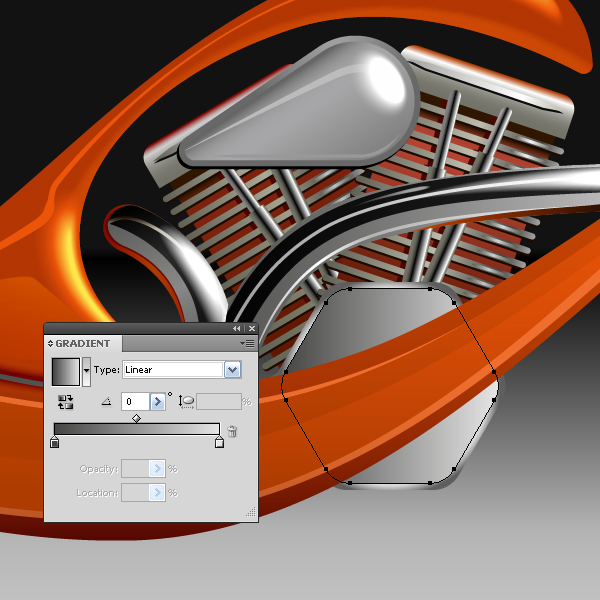
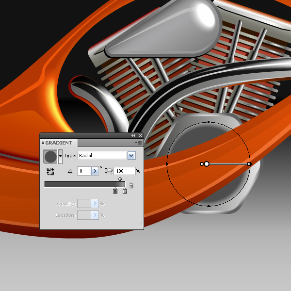
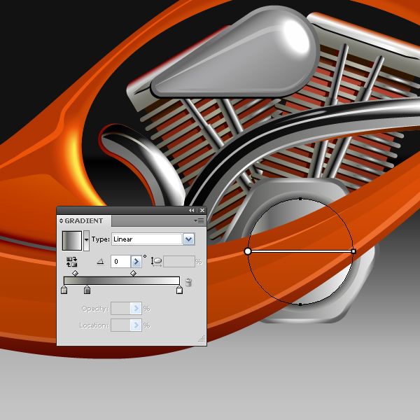
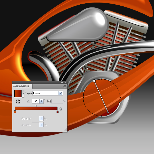
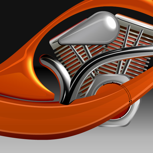
Step 38
The principle of creating chrome-plated parts is the same as described above. You only have to pay attention to colors and highlights of the adjacent elements, as they will be reflected on the chrome parts.
Image may be NSFW. Clik here to view.
I will show you the stages of creation of one tube to give you an example to follow, and so that you can see that there is nothing supernatural about making this. You just need to learn to separate anything you need to create into simple objects. This approach is put up in all fine arts. “Divide and rule,” is known from ancient times.
Image may be NSFW. Clik here to view.
Image may be NSFW. Clik here to view.
Image may be NSFW. Clik here to view.
Image may be NSFW. Clik here to view.
Image may be NSFW. Clik here to view.
Image may be NSFW. Clik here to view.
Image may be NSFW. Clik here to view.
Image may be NSFW. Clik here to view.
Image may be NSFW. Clik here to view.
Step 39
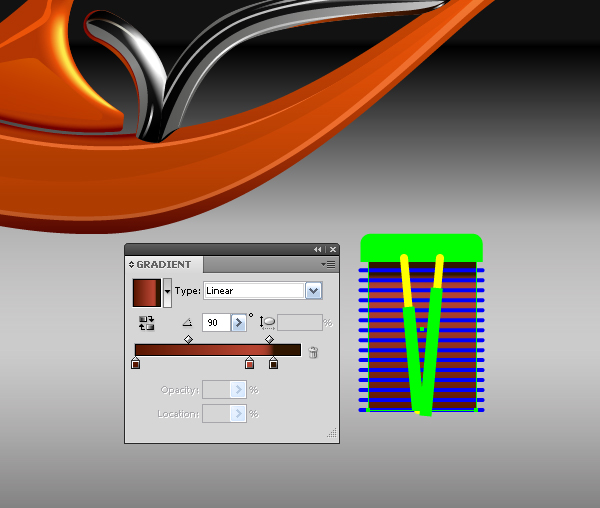
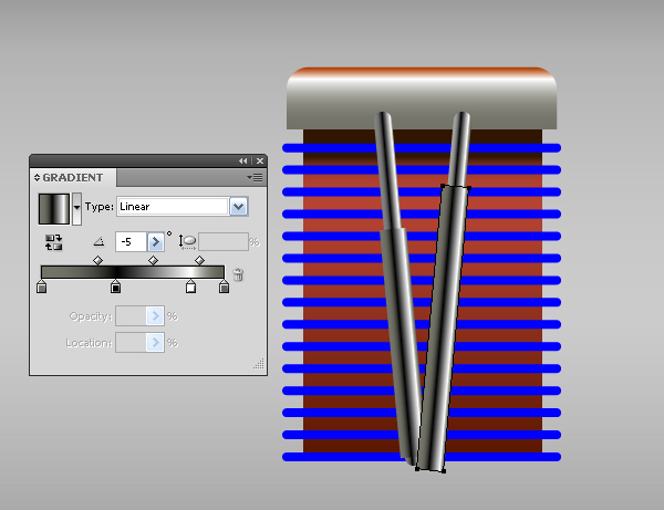
Now let’s proceed to the work on the engine cylinder and placing it on the right place. Just to remind you, the cylinder was created in step 20. Fill the lower rectangle with a linear gradient, gradient colors should reproduce the shadow from the cylinder, lid, and color distribution from top to bottom. It’s not difficult.
Image may be NSFW. Clik here to view.
Fill the cylinder lid with a linear gradient consisting of the shades of gray color, the upper color is dark orange (the reflection from the orange fuel tank on the cylinder lid).
Image may be NSFW. Clik here to view.
Step 40
Select the cylinder tubes and go to Object > Expand.
Image may be NSFW. Clik here to view.
Image may be NSFW. Clik here to view.
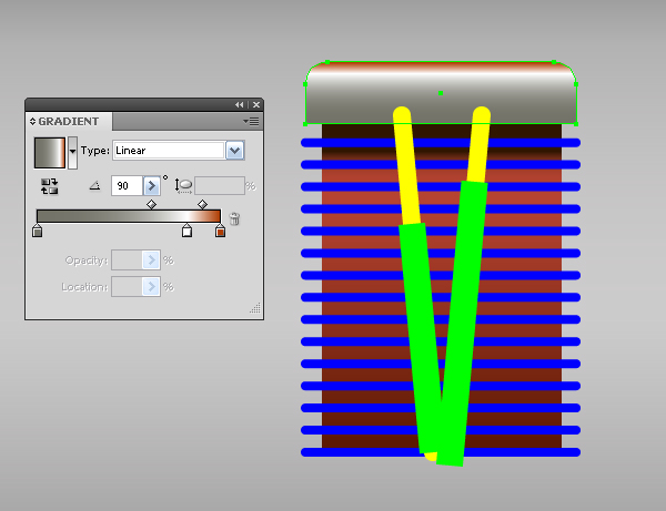
Fill the tubes with a linear gradient consisting of shades of gray color in order to show the play of light on their cylinder surface.
Image may be NSFW. Clik here to view.
Step 41
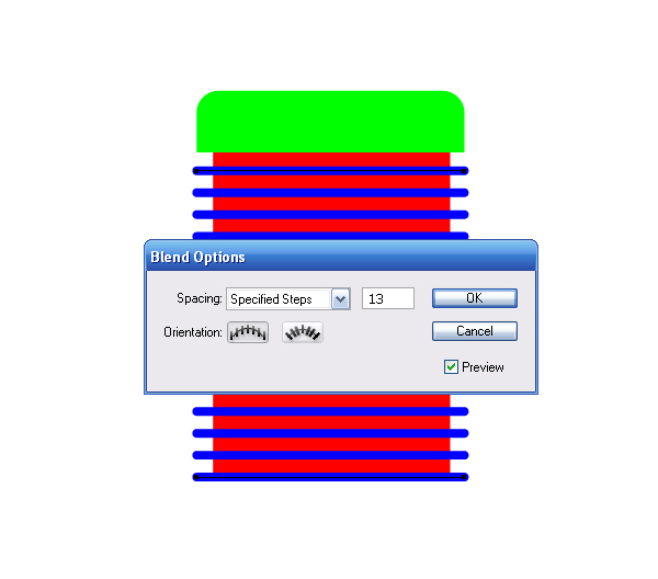
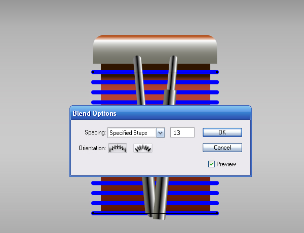
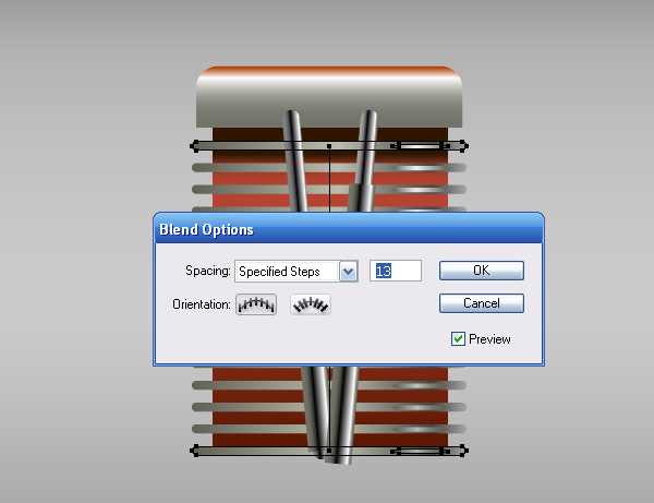
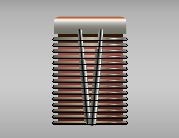
Get down to the air-cooling edges of the radiator. Now they represent a blend-object that has 13 steps.
Image may be NSFW. Clik here to view.
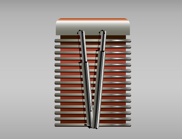
Select this blend object and go to Object > Blend > Release and then go to Object > Expand.
Image may be NSFW. Clik here to view.
Fill the top and bottom edges with a linear gradient consisting of the shades of gray and reproducing the play of light on these elements.
Image may be NSFW. Clik here to view.
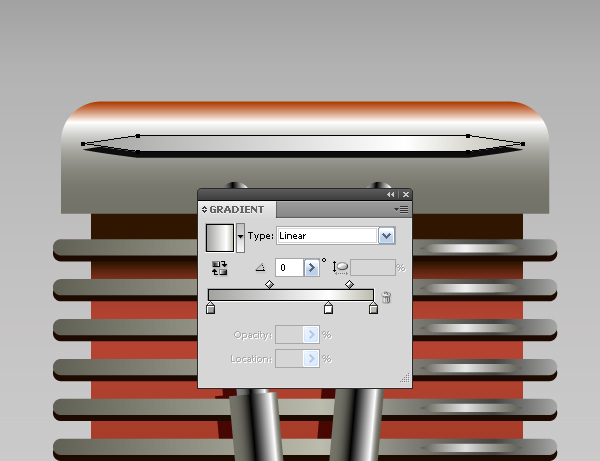
Step 42
Create a shape similar to that shown in the figure below – that is a highlight on the upper edge of the cylinder and fill it with a linear gradient.
Image may be NSFW. Clik here to view.
Duplicate this shape and drag it straight down to the lower edge. Make the central color the darker one in the linear gradient.
Image may be NSFW. Clik here to view.
Group up the elements of the upper and lower edges and restore the blend (Object > Blend > Make).
Image may be NSFW. Clik here to view.
Step 43
Copy the created blend object and paste it back, then go Object > Blend > Release, set the dark brown color for new elements, and shift them down a little bit.
Image may be NSFW. Clik here to view.
Step 44
Create a shadow on the tubes using the same technique, .
Image may be NSFW. Clik here to view.
I decorated the cover of the cylinder with one more element.
Image may be NSFW. Clik here to view.
Now select and group up all the elements of the cylinder (Command + G).
Step 45
Proceed to the installation of the cylinder on its place. Place the cylinder behind all the objects of the motorcycle and turn its axis so that it can pass through the center of the transmission.
Image may be NSFW. Clik here to view.
Step 46
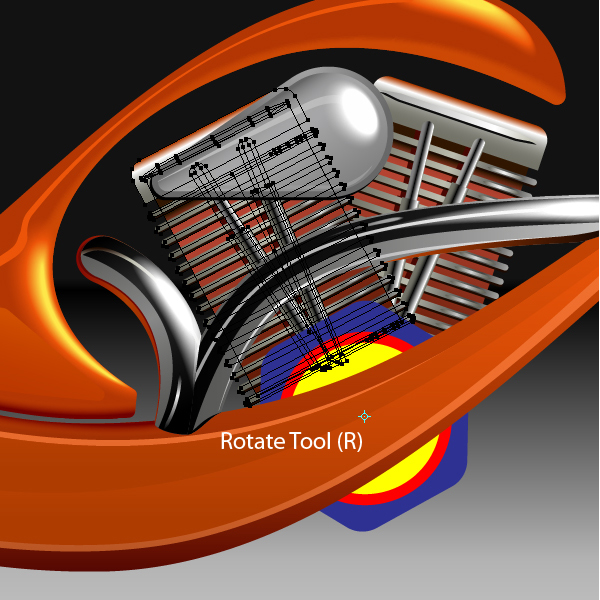
Now let’s create the second cylinder. Take the Rotate Tool (R) and set the center of rotation to the center of the transmission box, and turn the cylinder, while holding down the Alt key.
Image may be NSFW. Clik here to view.
Place the second cylinder lower than the first one, and edit the colors of the gradient fills of its elements, moving them to the dark side. The second cylinder is located further away from the light source, than the first one.
Image may be NSFW. Clik here to view.
Step 47
Below you’ll see how to create the elements of the transmission box.
Image may be NSFW. Clik here to view.
Image may be NSFW. Clik here to view.
Image may be NSFW. Clik here to view.
Image may be NSFW. Clik here to view.
Image may be NSFW. Clik here to view.
Image may be NSFW. Clik here to view.
Image may be NSFW. Clik here to view.
Step 48
Fill the inner hollow of the upper part of the motorcycle with a radial gradient.
Image may be NSFW. Clik here to view.
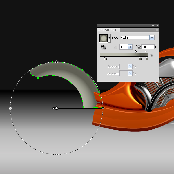
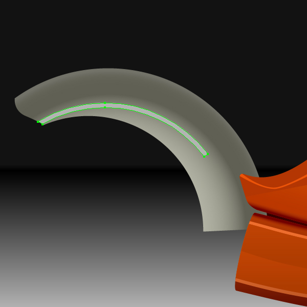
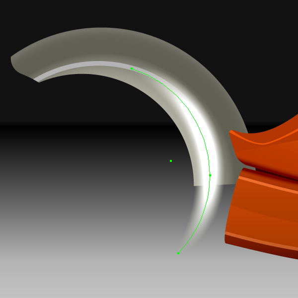
With the help of Pen Tool (P) create the shadow of the pipe.
Image may be NSFW. Clik here to view.
Now create a glare of light with an Art Brush made from a blend (the technique of creating such elements is described above).
Image may be NSFW. Clik here to view.
Step 49
The figure below shows the steps for creating the shield of the rear wheel.
Image may be NSFW. Clik here to view.
Image may be NSFW. Clik here to view.
Image may be NSFW. Clik here to view.
As you can see there is nothing new in the techniques that I use. Try to color the rest of the elements on your own, mastering the techniques described above.
Image may be NSFW. Clik here to view.
Step 50
With the help of the Pen Tool (P) and the Ellipses Tool (L) create a shadow of a motorcycle. Fill the shadow with a linear gradient, as shown in the figure below.
Image may be NSFW. Clik here to view.
Step 51
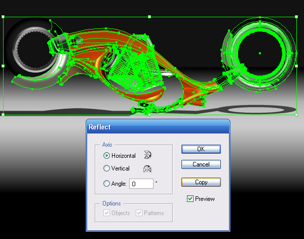
Once all the elements of the motorcycle are ready, group them up. Now proceed to the creation of the reflection of a motorcycle. Select the bike and go to Object > Transform > Reflect (Horizontal) and click on the Copy button in the dialog box.
Image may be NSFW. Clik here to view.
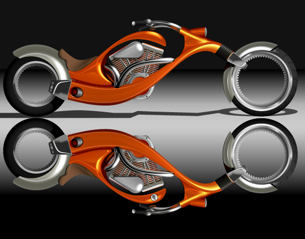
Move the reflection of a motorcycle down horizontally, as shown in the figure below.
Image may be NSFW. Clik here to view.
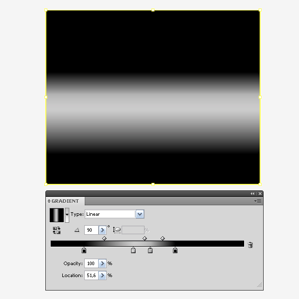
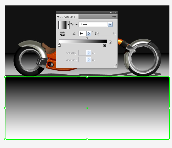
Now take the Rectangle Tool (M) and create a rectangle so that it covers all the reflection of the motorcycle. Fill the rectangle with a black to white, vertical, linear gradient.
Image may be NSFW. Clik here to view.
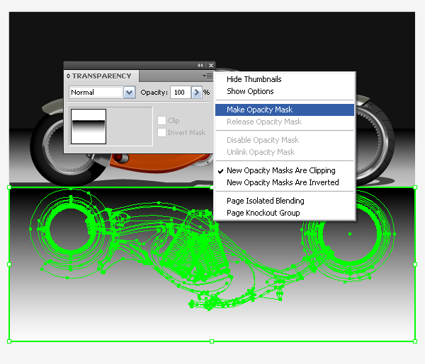
Select the reflection of the motorcycle and the upper rectangle and choose the Make Opacity Mask from the Transparency palette menu.
Image may be NSFW. Clik here to view.
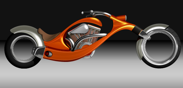
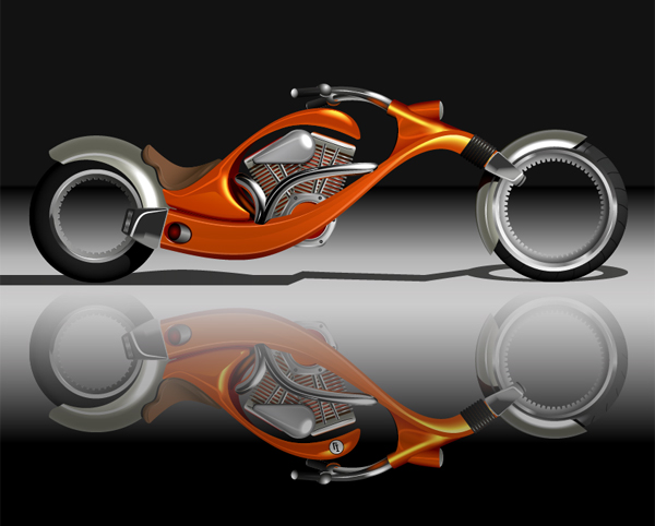
Well that’s all, the bike is ready.
Conclusion
I admit that technically it is a difficult work, but it would be even more difficult if I did not have VectorScribe plugin. You know, you quickly get used to good things, I do not even know how I managed to be without this excellent complement to Adobe Illustrator before working with this new tool. Try it and you’ll understand what I mean.
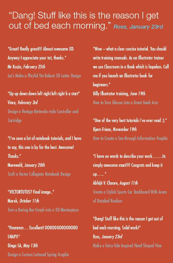
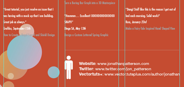
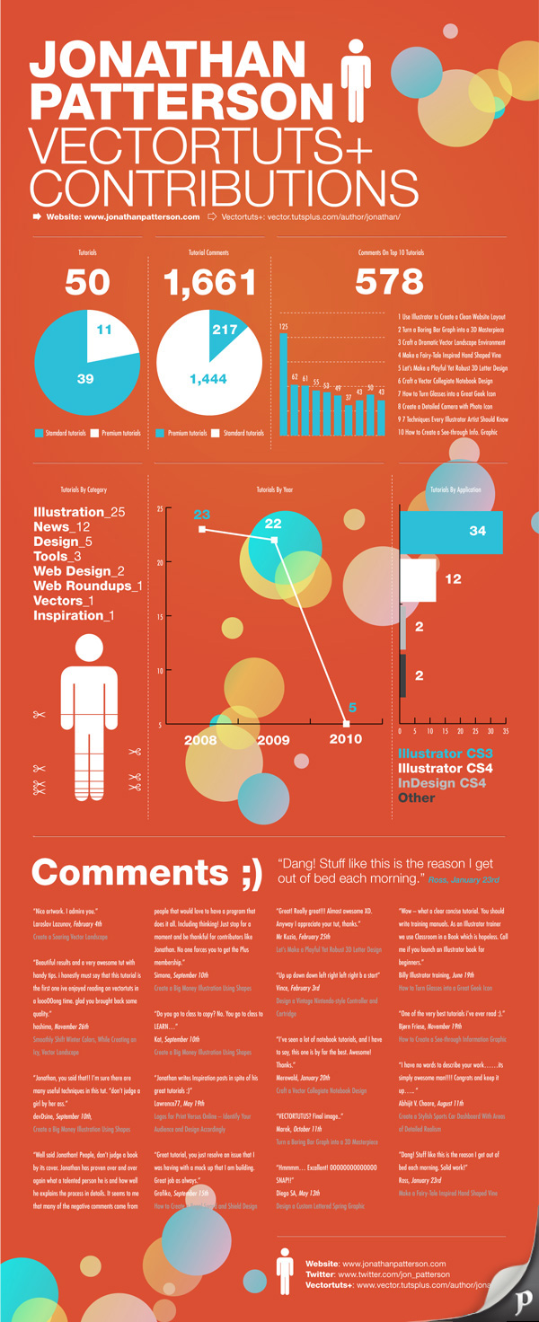
A few times a each month we revisit some of our reader’s favorite posts from throughout the history of Vectortuts+. This tutorial by Jonathan was first published on April 14th 2010.
Merge form and function to create outstanding modern infographics. In this tutorial you will learn that data doesn’t have to be boring, it can be beautiful! Learn how to use various graph tools, illustration techniques and typography to make an accurate and inspiring infographic.
Step 1
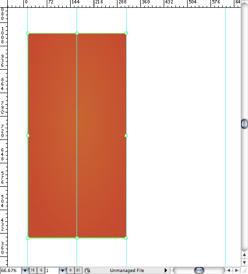
Start by using the Rectangle Tool (M) to draw a shape. Give it a subtle radial gradient too.
Image may be NSFW. Clik here to view.
Step 2
The entire design is based on a grid of four columns. To make the columns first select the rectangle and drag a guide onto the centre of the shape. Drag guides onto the left and right edges of the shape too. Tip: Quickly show the ruler by pressing Command+R.
Image may be NSFW. Clik here to view.
Step 3
Condense the shape so it fits within the left-most guide and centre guide. Now, add another guide where the centre of this condensed shape is.
Image may be NSFW. Clik here to view.
Step 4
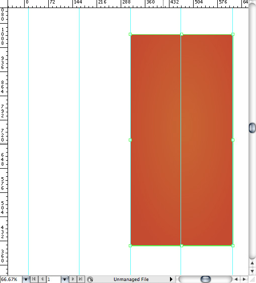
Move the shape over to the right and add another guide to the centre here.
Image may be NSFW. Clik here to view.
Step 5
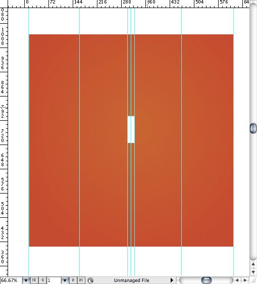
Using the Rectangle Tool draw a thin white box on the centre line that will be the width of the gap between the columns. Add guides to both sides of the small box and delete the centre guide. Tip: Guides are locked by default. In order to delete a guide go to View > Guides > and uncheck Lock Guides. Then, click on the guide and press the delete key.
Image may be NSFW. Clik here to view.
Step 6
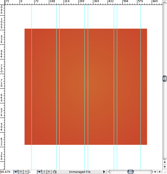
Repeat the process for the other columns with your final result being below. Widen the orange box so it’s slightly larger than the outermost guides.
Image may be NSFW. Clik here to view.
Step 7
I like to place the most important graphics first and work-in the ancillary charts and graphs afterwards. Pay attention to scale and balance as you’re beginning to place your elements on the page. Below, the combination of heavy and thin text complement each other.
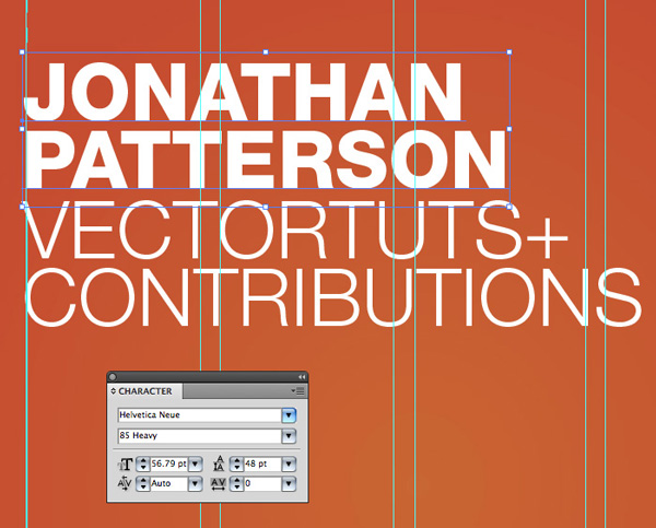
Image may be NSFW. Clik here to view.
Step 8
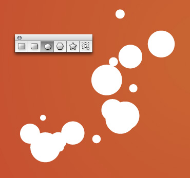
Early on you can experiment with placing a main graphic that will help give the piece some visual interest. I chose to use circles as the very tall orientation of the layout will benefit from these contrasting shapes. Using the Ellipse Tool (L) draw some arbitrary circles or varying sizes.
Image may be NSFW. Clik here to view.
Step 9
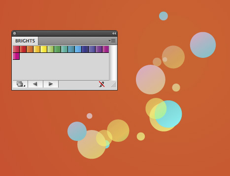
Give the circles a variety of gradients. To access Illustrator’s predefined gradients go to Window > Swatch Libraries > Gradients > Bright’s.
Image may be NSFW. Clik here to view.
Step 10
I’ve placed the first group of circles in the corner and extended them off the page.
Image may be NSFW. Clik here to view.
Step 11
To ensure a clean edge we’ll clip the circles so that they look like they stop where the background stops. First, draw a rectangle with no fill or stroke. Make sure the rectangle is in front of the circles. Select the circles and the rectangle then go to Object > Clipping Mask > Make.
Image may be NSFW. Clik here to view.
Step 12
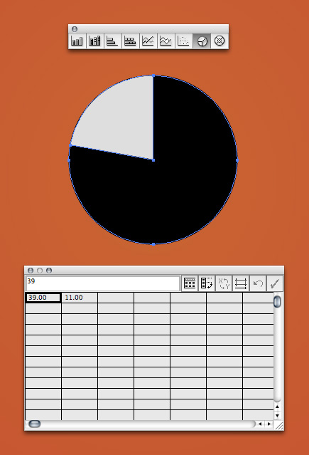
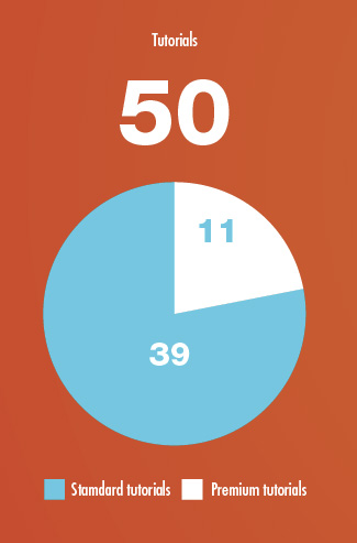
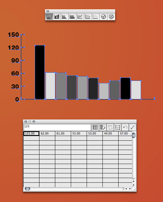
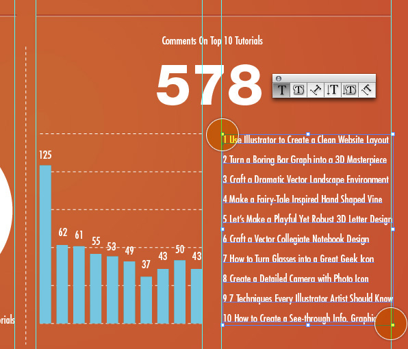
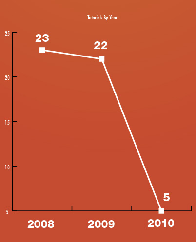
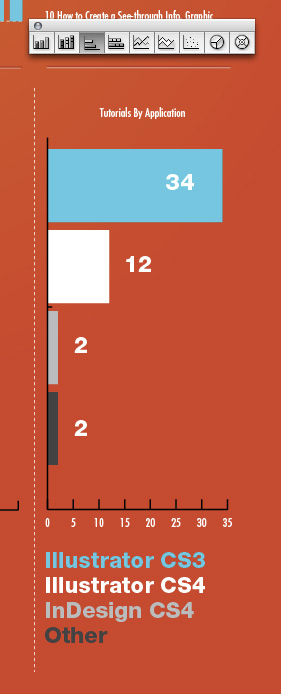
I’m using a variety of graphs in this infographic. To create an accurate pie graph click the appropriate graph then click and drag on your document to create a graph at a specific size. The first graph we’ll plot the data, 50 tutorials with 39 being standard and 11 being premium. Having said that, enter 39 in the first box and 11 in the second. Press the tab key to advance to the next box. Once you’re finished click the checkmark icon in the upper right.
Image may be NSFW. Clik here to view.
Step 13
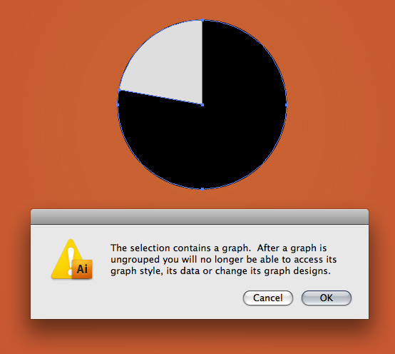
Much of the styling of all the graphs is created by hand. To further manipulate the graph ungroup it by going to Object > Ungroup. You’ll receive a dialog as shown below. If you’re satisfied with the graph click OK. Tip: After you’re plotted your graph but before you ungroup it simply control+click on it and go to Data to further edit the information.
Image may be NSFW. Clik here to view.
Step 14
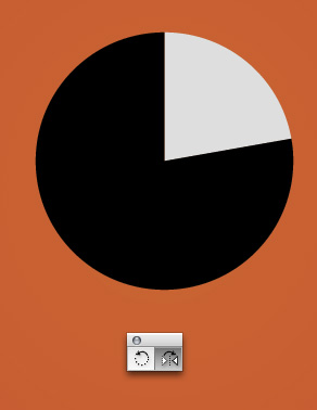
This step is a matter of preference. I didn’t like how the small gray area was on the left so I flipped my graph using the Reflect Tool (O.)
Image may be NSFW. Clik here to view.
Step 15
Manually add the graph numbers and key.
Image may be NSFW. Clik here to view.
Step 16
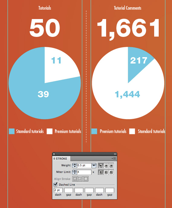
As expected, I’m using the grid as a basis for how wide my graphs are. To create a dividing line between the graphs use the Pen Tool (P) and draw a vertical line. In the Stroke Palette select Dashed Line and enter 2pt in the first box. Tip: When scaling previously drawn strokes, check or uncheck Scale Strokes and Effect in the preferences panel (Command+K) to achieve un-scaled or scaled strokes.
Image may be NSFW. Clik here to view.
Step 17
To create the effect of a recessed line draw two lines, one darker and one lighter.
Image may be NSFW. Clik here to view.
Step 18
Place the darker line slightly above the lighter line to create the illusion of light coming from above.
Image may be NSFW. Clik here to view.
Step 19
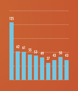
The next graph I’ll create is a Column Graph (J.) Again, click and drag to create the graph size of your choosing. Enter the values for your graph. The scale on the left is automatically generated based on the variables you enter. Click the checkmark icon when you’re finished.
Image may be NSFW. Clik here to view.
Step 20
Ungroup your graph so that you can make visual edits to it. Below, I’ve condensed the graph so it looks taller rather than wider. Of course I could have just drawn the box for the graph tall but this is after the fact.
Image may be NSFW. Clik here to view.
Step 21
Below, I want the text that corresponds with the graph to be a set width. To accomplish this, use the Text Tool (T) and click and drag from the top highlighted circle to the lower highlighted area. This will predefine the text area so the information fits perfectly between the guides.
Image may be NSFW. Clik here to view.
Step 22
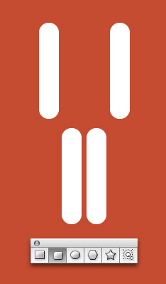
To create the icon of the man, use simple shapes. Start with the Rounded Rectangle Tool. Adjust the radius of the corners by holding the up or down arrow as you draw the shape.
Image may be NSFW. Clik here to view.
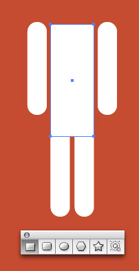
Step 23
Draw a rectangle with no rounded corners for the torso.
Image may be NSFW. Clik here to view.
Step 24
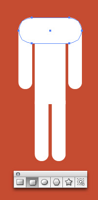
Use another rounded rectangle for the shoulders.
Image may be NSFW. Clik here to view.
Step 25
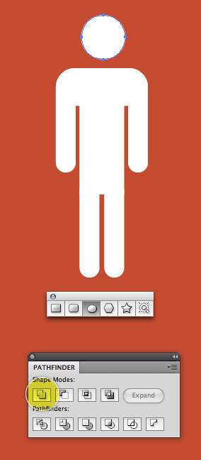
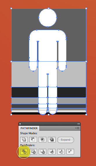
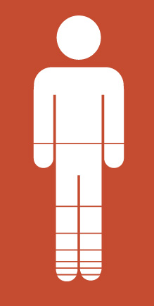
Finally, use an ellipse for the head. Select all the individual shapes that comprise the man and in the Pathfinder click Unite. This will give you one solid shape.
Image may be NSFW. Clik here to view.
Step 26
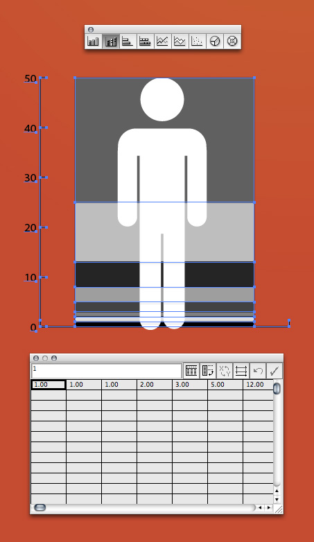
To create a more stylized graph we’ll use the man to represent the information. Using the Stacked Column Graph Tool click and drag to draw the graph the same height of the man. Enter your variables then click the checkmark icon.
Image may be NSFW. Clik here to view.
Step 27
Ungroup and get rid of the other numbers and lines. Using the Pathfinder Palette again, click Divide. Now, each section of your man is divided into accurate sections. Ungroup all the shapes and get rid of the extra gray shapes around the edges.
Image may be NSFW. Clik here to view.
Step 28
Separate each section of the man by selecting them using the Selection Tool and pressing up or down once.
Image may be NSFW. Clik here to view.
Step 29
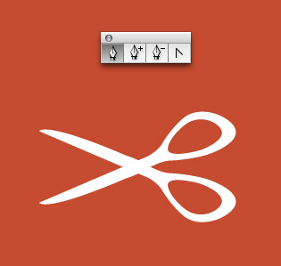
To create the scissors you’ll need to use the Pen Tool (P) and freehand draw the shape as shown.
Image may be NSFW. Clik here to view.
Step 30
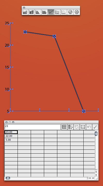
This graph is created using the Line Graph Tool.
Image may be NSFW. Clik here to view.
Step 31
Add the key to the bottom manually and the figures above the points manually.
Image may be NSFW. Clik here to view.
Step 32
The last graph is created using the Stacked Bar Graph Tool. Again, add the details manually.
Image may be NSFW. Clik here to view.
Step 33
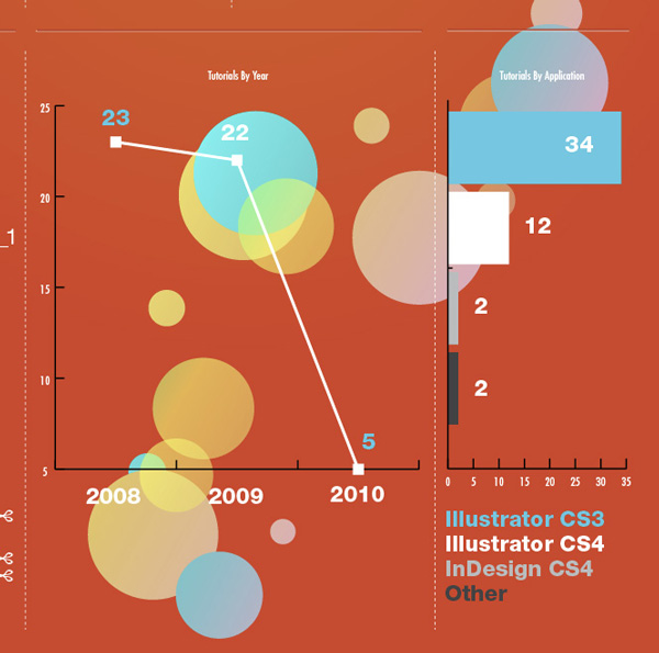
To add some interest to the design I’ve layered in the circle graphic behind the graphs. There is no secret to the process… as long as it looks good and helps balance the design, go for it!
Image may be NSFW. Clik here to view.
Step 34
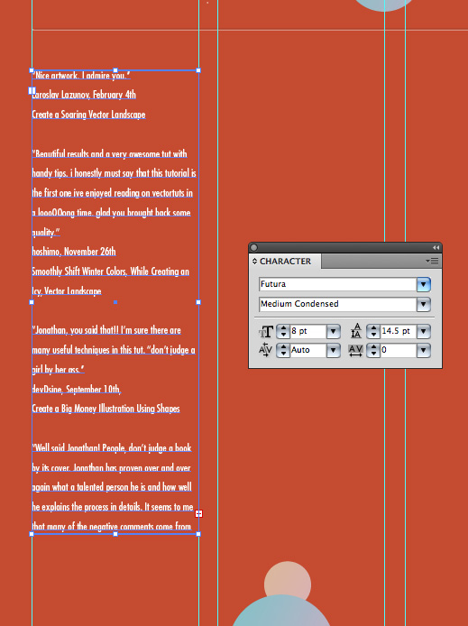
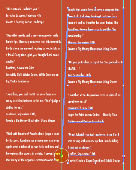
To create the list of comments draw a text box like we did in Step 21.
Image may be NSFW. Clik here to view.
Step 35
Since comments will span from one box to another click the plus sign in the bottom right corner then click anywhere on the page and a new linked text box of the same size will be created!
Image may be NSFW. Clik here to view.
Step 36
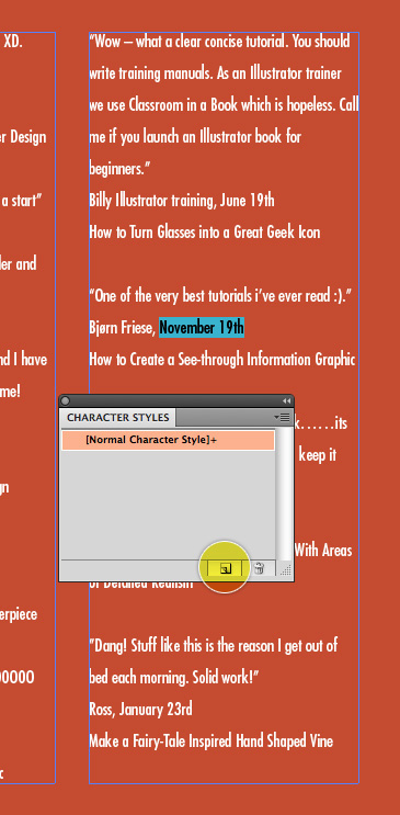
When dealing with large amounts of text it’s a good idea to create styles for that text. In this case I’ve created a style for the date and tutorial title. Styles make it easy to change all the text at once if you ever need to go back and make a change to color, size, font etc. To create a style first select the text that you want to style. Next, in the Character Styles Palette (use the Paragraph Styles Palette if you’re styling a paragraph of text) click Create New Style.
Image may be NSFW. Clik here to view.
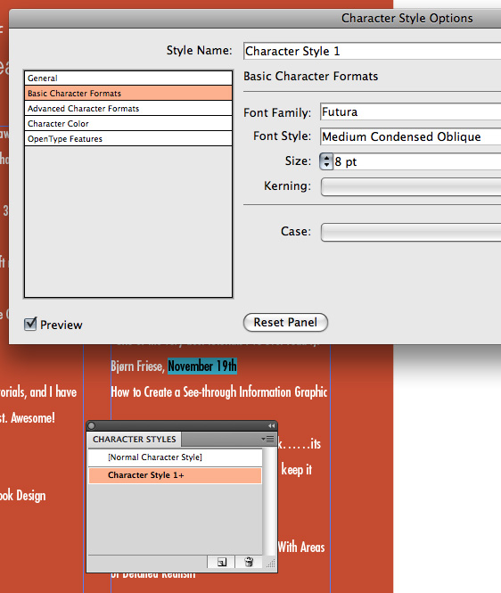
Step 37
Double click the new style in the Character Styles Palette to open up the options panel. In the options panel adjust your text to suit your liking. Click OK. Note: Even though you check Preview, new styles that haven’t been applied can’t be previewed.
Image may be NSFW. Clik here to view.
Step 38
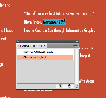
With your text that you want to style still highlighted, SLOWLY double click on the style in the Character Styles Palette to apply the style.
Image may be NSFW. Clik here to view.
Step 39
I’ve created a style for the tutorial title in addition to a style for the date.
Image may be NSFW. Clik here to view.
Step 40
Finish your design by adding any pertinent details to the bottom.
Image may be NSFW. Clik here to view.
Final Image Preview
That’s it! You’ve just learned how to create a modern infographic.
Just because you missed that awesome conference, doesn’t mean that you can’t still watch the lectures! This weekend we’re sharing a talk by Stefan Sagmeister, New York-based graphic designer and typographer . Every seven years, designer Stefan Sagmeister closes his New York studio for a yearlong sabbatical to rejuvenate and refresh their creative outlook. This talk is a a fantastic inspiration for all creative disciplines, and explains how taking time off can be better for creative outlook than working extended hours in the office.
Hello everyone! Today we’ve got a special treat for you. Our friends at UPrinting are giving away a free 13 inch MacBook Pro (valued at $1,199) and $1,000 worth of printing to 1 lucky Tuts+ reader. To win, all you have to do is answer a simple question and submit it using the form below.
Image may be NSFW. Clik here to view.
While I am sure most of you are skimming through this text to find details on how you can enter, we would like to tell you a bit more about UPrinting before you do. UPrinting is a socially responsible online printing, marketing and technology firm with a distinct vision and clear approach to helping small businesses grow. It serves thousands of on-demand printing orders online daily, using high-quality printing presses and a robust yet simple and easy-to-use online ordering system, resulting in high-end printing at low costs.
They also offer cool print products, such as postcards, that could help you send out your artworks to friends and clients. That’s an awesome way to inspire and connect with people!
UPrinting.com has earned customer loyalty by offering more customizable options than other online printer. The company is popular for its Free File Review, a complimentary proofing service that requires no upfront payment. UPrinting.com also offers convenient marketing support such as design services and direct mailing to help the small or medium-sized business grow.
Ok, now that you know a bit more about UPrinting, now I am sure you are wondering a bit more about this giveaway. As stated in the intro, UPrinting is giving away a 13 inch MacBook Pro (valued at $1,199) and $1,000 in printing services to 1 lucky reader. To enter, all you need to do is answer the following question and submit it by following the link below.
Which UPrinting print product do you find most useful? Why?
* Please note that we will be sharing your name and email address with UPrinting. This means that you may receive emails from them after the conclusion of this giveaway. If you’re ok with this, you may submit your entry by following the link above.
The Prizes
1 MacBook Pro (valued at $1,199) Specs: 13-inch, 2.3 GHz, 2.3GHz dual-core, Intel Core i5, 4GB 1333MHz, 320GB 5400-rpm1, Intel HD Graphics 3000, Built-in battery.
$1000 in printing credits from UPrinting. Valid for one-time use, applicable to printing cost only.
Rules
Fill out this form. Tell us which UPrinting print product you find most useful and why.
You may only enter once. Anyone submitting more than once will be disqualified.
Make sure to enter a valid email address so that we can contact you.
Entries will be accepted until Monday, June 6, 2011 at 11:59 PM, EST.
Giveaway is open to all jurisdictions.
You must be of legal age in the jurisdiction that you reside to enter.
Giveaway is void where prohibited.
MacBook Pro shipping free.
Shipping for printing services is free for U.S. residents. Non U.S. residents must pay for shipping for printing services.
Your name and email will be shared with UPrinting at the conclusion of this giveaway. By submitting your entry you consent to receiving correspondence from them.
Follow this tutorial and you will find out how to draw a clock that goes round and round to the infinite with the help of Adobe Illustrator’s Art Brushes. You will also learn some tricks on how to make all the hours and the divisions to fit perfectly.
Step 1
Start by opening a new web document then draw a 500 x 400 px Rectangle that will define your working space. Now take the Spiral Tool and draw the first spiral like the pink one in the image. While drawing the spiral press the Up Arrow key on the keyboard to create more segments. When you are done draw two more spirals or just scale the first one and make sure they are centered at the end.
Image may be NSFW. Clik here to view.
Step 2
To create the Spiral Art Brush first take the Star Tool and draw a small black triangle. Rotate it -90 degrees and using the Selection Tool (V) drag the right side to make it longer like below. Drag the obtained shape into the Brushes Panel and choose New Art Brush. Use it to stroke the first spiral made.
Image may be NSFW. Clik here to view.
Step 3
Next you need to divide the spirals and to do that first draw with the Pen Tool (P) a straight vertical path that will define the 12-6 direction through the middle of the clock. Take the Add Anchor Point Tool (Plus Symbol) and starting from the top click on each spiral to add a point where each spiral intersects this path. Zoom as much as needed and do this until you arrive at the other end of the spirals, all the way in the middle not only on the shown point in the image. When you are done take the Scissors Tool (C) and click on all these added points to cut and obtain the half segments.
Image may be NSFW. Clik here to view.
Step 4
Take the Type Tool (T) and type the hours from 6 to 12 first. The font I used is Algerian, 105 pt. Go to the Object menu and Expand then scale each hour like shown above each one. Now you need to place them at equal distance from each other and this is an important step otherwise the hours and the divisions won’t fit. Take a look at the X and Y values in the Transform Panel. Keep the same Y value for all hours and at the X value starting from 6 keep adding 100 px for each hour according to the previous one. Repeat this step for the 12 to 6 hours.
Image may be NSFW. Clik here to view.
Step 5
Drag the 6 to12 and 12 to 6 hours into the Brushes Panel and choose New Art Brush. From now on I will refer to them as 6-12 Art Brush and 12-6 Art Brush. Stroke the first segment of the third spiral, the black one, using the 6-12 Art Brush and as you can see the straight path drawn at the step 3 doesn’t go through the middle of 6 and 12 as it should. Here is the trick to fix that. Drag the art brush back into your working area from the Brushes Panel and there will be a rectangle in the group. Select it and drag the left side in the middle of 6 and the right side in the middle of 12 like you see in the image. Do the same for the 12-6 Art Brush then drag them both back into the Brushes Panel. Now stroke the segment using the new brush and this time it fits perfectly.
Image may be NSFW. Clik here to view.
Step 6
Double click on Stroke in the Appearance Panel to open the Stroke Options window. Here you can change the Size value if you think the hours are too big and if they are flipped or upside down check the Flip Along and Flip Across options. Also check Proportional. Continue to stroke the other segments all the way and use the 12 or 6 hours from the previous segment as reference to adjust the Size value as you go. After expanding you can delete the duplicated hours.
Image may be NSFW. Clik here to view.
Step 7
To create the Divisions Art Brush first draw a triangle shape and the four lines having a 1.5 pt black Stroke. Copy and Paste them five times and arrange them in a row then place one more triangle at the end. Scale each one of them from 100% up to 70% for the last triangle. Also use again the same method from the step 4 to make sure all the divisions are perfectly aligned and at equal distance. Keep the same Y value for each division and to the X value this time add only 10 px starting from the first triangle. This step will take some time but otherwise the divisions won’t fit with the hours.
When you are done take the Delete Anchor Point Tool and delete the points from the left side of the first triangle and the points from the right side of the last triangle. This is another trick to know otherwise after you define the brush you will have to drag it back into your working area to move the sides of the rectangle in the middle of the first and the last triangle, like you did for the 6-12 and 12-6 Art Brushes at the step 5. Now you don’t need to because you already obtained the halves.
Image may be NSFW. Clik here to view.
Step 8
Stroke the first segment of the blue spiral using this Divisions Art Brush defined earlier. I changed the Width value to 70% because I thought the divisions were too big but in your case it’s up to you. Continue to stroke the rest of the segments and use the last half triangle from the previous segment as reference to scale the next segment as much as needed so they fit perfectly like shown in the close up. For example, in my case a 75% Width value was just right for the second segment then 80% for the third one, 85% for the fourth one and so on. As long as you zoom enough to see each pair of halves and you set the right Size value all the Divisions stroked segments will fit properly. You can also make further adjustments using the Direct Selection Tool (A) after expanding.
Image may be NSFW. Clik here to view.
Step 9
Next select the pink spiral, go to the Object menu and Expand Appearance. The colors used for the gradient are: blue (R=84,G=159,B=215), dark blue (R=0,G=86,B=120), orange (R=208,G=155,B=39), yellow (R=243,G=232,B=92), brown (R=122,G=117,B=99), green (R=98,G=138,B=102), again dark blue (R=0,G=86,B=120), again blue (R=84,G=159,B=215) and light blue (R=188,G=217,B=242). Set the angle value to 10 degrees. Copy and Paste in front this spiral shape, keep the same gradient just change the angle value to 90 degrees and set the Blending mode to Color Burn.
Image may be NSFW. Clik here to view.
Step 10
Let’s add some shadows. Select the first group of hours (the 12 is missing because I said you need to delete the 12 and 6 hours that are duplicates) then go to Effect > Stylize > Drop Shadow and set the values like in the image. Do the same for the next four hour groups not for all of them because the rest of the hours are too small and there is no need.
Image may be NSFW. Clik here to view.
Step 11
Fill the 500×400 px rectangle in back from the beginning with a linear gradient called Purple, Yellow that you can find in the Swatch Libraries menu under Gradients > Color Combinations. Change the angle value to 180 degrees. Duplicate this rectangle, delete the fill and use it to mask the clock. To do that select all the clock shapes made so far and also the empty rectangle, that must be in front of them and go to Object > Clipping Mask > Make.
Image may be NSFW. Clik here to view.
Step 12
All that is left to do is to select the spiral shape in back (there are two) and go to Effect > Stylize > Outer Glow. Set the values like in the image and the color used is black (R=0,G=0,B=0).
Image may be NSFW. Clik here to view.
Final Image
Here is the final image of the infinite clock, play around with the settings to see what you can come up with. I hope you enjoyed this tutorial.
Freebie time! Jump in, we’ve rounded up a massive resource of vector business people silhouettes. There are 15 packs listed here and well over 150 vector silhouettes. They’re all free vector downloads with a simple flat or linear style. All these free graphics are illustrated with limited colors and are easy to use in your vector work – making for quick additions into the background, or for when you need to add a simple business element to your design. Add some free vector silhouettes to your business resource folder today.
Many of these free vector silhouettes are available for commercial use, as well as personal use. Some may have stronger restrictions though, so as always check the usage rights before using.
These trendy young businessmen may be just what you need for your next business designs. They have a bit more edge than the classic handshake pictures of most free vector clipart. It’s available in EPS in the free download.
Business graphic resources always come handy. And these have a professionally illustrated feel, with multiple stances, props, and use of light hitting the vector people with gray shades. Grab this free vector silhouette pack now. They are available in different vector formats (EPS, SWF, SVG, and WFM).
This set of free vector businessmen silhouettes is a continuation from the those above. You can see the style is the same, but they’ve added additional poses, such as handshakes and powerful stances. Grab these free vector business people now. They are available in different vector formats (EPS, SWF, SVG, and WFM).
Over thirty businessmen silhouettes available for free download, as an EPS file. They are all styled with a limit of three colors, so quite flat, but also very versatile to use and recolor as needed. Grab this free vector silhouette set today.
Stylistically this is a continuation from the pack above, as it’s colored the same and has a similar look made by the same artist. In this pack though there are over twenty business women available for free download. Grab this free vector silhouette set today, it’s in EPS format as well.
Grab this huge set of vector people silhouettes, all sporting business attire, and interacting in business activities. These vector clip art silhouettes are better to edit with Adobe Illustrator CS or Adobe Photoshop CS and above. Other Graphics Software (Such as Corel Draw or Freehand) can be used for editing these files as well. The are available for free download as AI, EPS, CSH, and JPG format.
Here is another business people silhouette set available for free vector download as an EPS and AI format. They are in vector format, so as with the other packs mentioned here, they can be resized as you wish without losing quality and can be use in your print designs, web designs, flyers, posters and any designs you want.
One more set of free business people silhouettes. All these silhouette are ready to use in your amazing designs, creating eye catching graphics, print design, motion graphics, 3d rendering, flyers, posters. These unique, hand drawn graphics are available for free download in AI, CSH, and PNG formats.
23 vector silhouettes of business women for free downloading. Grab this uniquely drawn vector girl silhouette set today. These graphics are available for free download in AI, CSH, and PNG formats.
This free graphic is of a business presentation composed of vector silhouettes. It shows a businessman making a pitch to business people or possibly a team meeting. The silhouettes people look professional, as well as the scene. You can grab this free vector download as an Adobe Illustrator AI file.
This vector graphic is filled with vector people all in business attire and standing strongly, some on cell phones, or holding briefcases. It’s placed against an abstract business sky rise city background. Grab this free vector download now, which is available as an Adobe Illustrator AI file.
This vector graphic has a few business professional silhouettes people in from of a world map. There is another file in this download as well that has vector silhouettes in front of abstract, statistical puzzle pieces, which gives a cool data feel. Grab these free vector white-collar workers, which are available in EPS format with JPG previews.
These free vector silhouettes are of the same businessman in different poses, all classic: checking his schedule, watch check with folder in hand, and staring stoically off into the distance. This file is available as a free vector SVG.
This vector freebie of a business man in silhouette is available in reversed black with white lines, as well as simple lines over white. This vector EPS file is available for free download as well.
This vector freebie has a handful of vector people silhouettes of business managers against a funky dotted circle background. Kind of a strange combination, but you can easily grab any of these elements out of the vector file and use them in your next design project. This free download is available in EPS format.
We’re proud to announce that Vectortuts+ author Ben Mounsey has teamed up with Aetuts+ to create "Breath Of Life" a five part series on how to animate a vector illustration with After Effects. You may remember Ben from his fantastic Core Art Skills Series, and excellent illustrator tuts. Now you can follow along with a five part video series that will take you from working with a sketch to animating a walk cycle. Read on to find out more!
In this installment you will be creating character artwork in illustrator, learning how to design for animation, then prepare the artwork for import to After Effects.
In this tutorial you will be starting the animation process, beginning with the character walk cycle. You will learn how to use the puppet tool with the character artwork, and work though the key principles of the walk cycle.
In the 4th installment you will learn the more advanced animation techniques in After Effects. You will how to create a looping walk cycle, and also how to work with 3D layers and animating Masks.
In the final part of the series, you will make the finishing touches to the animation whilst covering some of the more technical aspects of animating in After Effects. You will be using the Camera Layer, creating and using Adjustment layers and animating logo text, along with a great new Expression.
Are distractions a negative issue when you’re freelancing from home or creating a new piece of art? In today’s article, I’m looking at justifying and refocusing the tasks that distract me to be of benefit to myself, my craft, and future work.
Whether you’re working from home or creating a fabulous illustration, one thing for sure is that there are plenty of distractions out there. If you’re like me and tend to browse many freelance blog websites “distractions” are a common topic. There’s eliminating distractions, avoiding distractions and even articles on managing distractions… but really, in a creative field, should we assume that all distractions have a negative impact on our workflow?
Distractions Can Be Positive
I must admit, I am prone to distractions… playing with Illustrator and tools I’ve not used before, scribbling on pieces of paper around my desk, browsing social networking sites, reading blogs… and I must admit, reading celebrity trash sites, it’s my guilty pleasure. I’m also a stubborn person and I refuse to admit that my slacking moments during work are negative to my workflow. I’d like to challenge the stance that distractions make you less productive and hinder your work.
It takes a lot of self discipline to remove distractions from your work time, so it’s time to look at the distractions you have and make them work for you and not against you. Looking at my own distractions and common behaviors of others, have you considered the following:
Playing with Illustrator, Photoshop, etc.: Some of my favorite effects I’ve learned in the past have been discovered from playing with Illustrator. I might not create anything noteworthy from this distraction, but have you considered that experimenting with creative applications is time well spent? If it wasn’t for my distraction time with Illustrator, I wouldn’t have found out how to use Live Trace or patterned brushes or even the Blob tool.
Doodling: This one is easy to justify; however, let’s break it down. Practice makes perfect and if you’re doodling little houses, faces, symbols or even practicing your handwriting, from a digital artist perspective it’s good to keep on revisiting your organic creative roots.
Doodling can also lead to inspiration for a future project or help you hammer out elements you were unsure of. Focus your doodling on elements you find hard to master. For me, my reference free work could do with a little help, so I tend to doodle the human body and animals. It all helps!
Social Networking: In this day and age, anyone and everyone is on Facebook and often on Twitter. Whenever I feel the need to check out what my old friends are up to or what those “10 new tweets” are it’s often because I feel I’m missing something or just needing a quick blast of social interaction.
Working from home, alone is a lonely line of work and as humans we crave interaction. What I’ve done is link my Facebook to my Twitter account and began interacting more on my Facebook artists page. From this I’ve been able to talk to fellow creatives and those who are interested in vector. I’ve gained inspiration for future work and tutorials from social interaction, which is more focused on the line of work I do.
Reading Blogs: Rather than cutting out reading blogs, why not change which blogs you read? Expand your journal horizon and focus on more creative blogs… like Vectortuts+. It might not be the same as catching up with the latest dramas of a friend, but it can help your brain relax for a moment or two and you could even pick up on something new, catch up on trends, or gain a resource which is bankable!
Guilty Pleasure Sites and Activities: I’m sorry, there is no easy way to say it… this one is hard to justify your use of time with. You could convince yourself that catching up on David Tennant’s antics will have a positive impact to your workflow. You could even try to justify that reading game reviews of Rift will help take something off your mind, but unless you’re creating a piece that is linked to these, you’d be a fool to justify them.
This being said, I did try to justify to myself that playing Left4Dead and World of Warcraft were a valid use of my time, as I was creating tutorials on how to create a Witch Zombie and Blood Elf. Needless to say, this was met with major disapproval from my partner!
Vector Artists on Distractions
I ventured into the Vector Community over on deviantART to see what they thought about distractions and how they could be of benefit.
Q Do you do anything to prevent yourself from being distracted while working? If so, what?
Nope, I love distractions. Distractions help me get my head out of my artwork.
I currently play Marvel vs Capcom 3 to help me with lighting (the lighting is great in that game!) and character ideas.
Q Do you think allowing creative distractions could help develop and enhance your workflow and output? If so why?
It can if it’s not planned. You really need to be off the cuff with that sort of thing.
Q If you think that creative distractions are positive, have you set aside time to invest in your skill with these tasks, if so how?
I love doing shape studies, I post them on DA just for fun. I really hate doing full blown illustrations, most of my characters and studies
I create off the cuff with no planning. So you could say that all of my artwork is a huge collection of doodling. I am currently working on some large scale Illustrations so stay tuned.
Q Do you have any examples of your own work that you’ve created due to doodling or from the practicing of tools?
My whole gallery is full of them but, here are a select few
Q Has there been any skills you’ve feel you’ve improved upon due to distractions, if so what?
Definitely, if I’m drawing something and then get distracted by a book? By the time I put the book down the concept for my drawing has gotten the time to grow some and generally for the better.
Q Do you think allowing creative distractions could help develop and enhance your workflow and output? If so why?
Practice makes perfect, but patience can help a great deal too. Distractions can be used as a tool. If I feel like I’m rushing a piece, I take a step back from it, let myself get distracted by something else and then return to the piece once the distraction has helped squash that rushing urge.
Q Do you have any examples of your own work that you’ve created due to doodling or from the practicing with tools?
Q What do you find to be your biggest distraction? Websites? Doodling?
I guess the biggest negative kind of distraction for me is having someone watching while I work, like somebody walking around me and making positive or negative comments, or a place that makes it possible for someone else… other than that, web pages, mail, chat or even phone doesn’t look like a big distraction for me.
Q Has there been any skills you feel you’ve improved upon due to distractions, if so what?
As for what you call positive distraction, stuff like sketching, doodling, trying new tools and things, I agree that they improve you and your ability to express yourself and develop you and I also believe that looking at other creative work, spending time with something involving creativity and emotion and even having a chat with a beloved friend or admired artist is also a very positive effect and these things also deserve our time.
Q Do you think allowing creative distractions could help develop and enhance your workflow and output? If so why?
Of course it will change but I am not sure if the effect will be positive or negative, maybe it is about luck or having control over it, but I think it is OK to take a break from the labor part of your work and do it on just mentally and I agree that what you call positive distraction is good at those times, but if you get away too far maybe when you come back you might find yourself without the motivation to continue and like me, you might find it easier to start something new, rather than continue the one you have left. Maybe its better in the beginning.
Q Do you have any examples of your own work that you’ve created due to doodling or from the practicing with tools?
Yes, most of my work evolved from my sketches and from the times I tried some new tools or things. This is necessary for me to preserve the enthusiasm to work and also I found almost everything about my technique while trying things like those. To be specific, my work called “old tree” came out from my experiments with the “scribble” effect and “warp” tool. I was just trying those things without thinking about the result.
Q What do you find to be your biggest distraction? Websites? Doodling?
Websites, doodles are certainly one of my distractions; however, they influenced me positively helping even in the creative process.
Q Has there been any skills you feel you’ve improved upon due to distractions, if so what?
My creativity certainly improved thanks to see through the pages with some works of other artists and as I said, music is something that helped me a lot in creative processes.
Q If you think that creative distractions are positive, have you set aside time to invest in your skill with these tasks, if so how?
I make several sketches, I go out to distract myself and I hear music from various artists. Sometimes the inspiration can come from a simple walk through my city, or a drawing I do. These things simple help me a lot.
Q Do you have any examples of your own work that you’ve created due to doodling or from the practicing with tools?
Q What do you find to be your biggest distraction? Websites? Doodling?
Websites, no doubt those are the most distracting. Doodling is part of my process so maybe I can say is also an exercise. I doodle all the time and this helps me get more ideas and to improve the piece I’m working at the moment. So usually I’m working on something in illustrator, and I always have a sheet of paper or a notepad on the desk so I also doodle at same time and sometimes this completely changes the direction of what I’m working on. So websites are bad distractions and doodles are a good, creative distractions.
Q Do you do anything to prevent yourself from being distracted while working? If so, what?
As I said websites are the most distracting things so if I want to work focused on something I close other programs running, disconnect from the internet and leave open only Illustrator and the music player.
Q Do you think allowing creative distractions could help develop and enhance your workflow and output? If so why?
Yes. I think distractions helped me improve my workflow, the fact that I stop sometimes to doodle or just to write down an idea or word that comes to my mind and when I get back to Illustrator I can see points that I can modify or remove, colors that can be changed, maybe a different color palette. So allowing those simple distractions is like the “fresh eyes effect,” but in real time and is very useful. At least for me. When I stay for some time without working on any vector, for like 6, 7 months, then when I start again I feel an overall improvement with the quality of my work… more precise lines and curves, more attention with the details.
Q Do you have any examples of your own work that you’ve created due to doodling or from the practicing with tools?
Sometimes an idea starts with a doodle, testing a brush or plugin or just boredom. Almost all my type treatments and fonts were “vector doodles” that worked so I turned them into real fonts like “Calzone,” which you can see in almost all my recent artworks. A few other examples are “Downtown Squaretown,” which I started to practice the native 3D tools. “Color Vector Doodle” to see how to create a doodles entirely in Illustrator from scratch, because usually I do everything on paper and then scan and Live Trace. “Flower Power Disco,” which I tried to mix my usual vector crisp lines with hand-drawn, imperfect doodles. Another one that is interesting to mention is the portrait of adult model Priya Rai in which I started creating the hair the way I do now, which I think is nice. I avoid using gradients and blends as fake gradients as well, blurs and things like that, so this way hair looks more real in a vector context.
Inevitably there are distractions out there, which you couldn’t easily argue they would help enhance your productivity, improve your workflow or get you more money in the bank. Real life seems to happen more when you work and create from home, such as family, loved ones, pets and friends. However consider modifying some of your “optional” distractions to be of benefit to your art and see if you reap any rewards from it. After all, if you’re going to have a distraction or two that you don’t see ceasing, it is worth trying to change it to be of more use.
What distractions do you have? Do you think you could justify them? Tell us your point of view on this and whether you agree with me on modifying your distraction behavior or do you think I’m trying to justify my bad working habits?
Adobe In Design lets you wrap text around any object, including text frames and imported images. There are different styles to choose from and some features you can set up including the distance between the text and object frame. In the following Quick Tip you will learn more about basic image and text placement in InDesign. Let’s get started!
Activate Text Wrap
To activate this option go to: Window > Text Wrap (Option + Command + W).
Image may be NSFW. Clik here to view.
There are five options to choose from:
No text wrap (A): Object is placed over or below text (depending on your layer distribution) without interrupting it.
Wrap around bounding box (B): Text is distributed according the bounding box around the frame; this mean whatever shape your container is, it will always have a square or rectangle frame around it and this will be the area used for text wrap.
Wrap around object shape (C ): Text is accommodated alongside the container form following its shape.
Jump object (D): Object is left alone without text at its right and left sides.
Jump to next column (E): Like the last option but in this case no text is left after the object, the remaining content is displaced to the next column.
Image may be NSFW. Clik here to view.
All of the wrap options, except the first, let you select the distance you want between object and text; this distance is called offset. You can modify it by inputting a value in any of the desired sides, take note if the "chain" icon is selected all of the settings will have the same size.
Image may be NSFW. Clik here to view.
In the following picture the chain icon has been deactivated and only top and bottom values were added; notice the right and left margins are just next to the text.
Image may be NSFW. Clik here to view.
Additional Wrap Options Features
If you use any of the "Wrap Around" options there are some additional settings you can select. To activate this panel click over the menu icon on the top right corner of the Text Wrap window and select "Show Options".
Image may be NSFW. Clik here to view.
Wrap to:
Right side
Left side
Both right & left sides
Side towards spine
Side away from spine
Largest area
The first wrap options are pretty much self explanatory; text can be fit to the right (A), left (B) or both right and left (C) sides of the object. The last option is "Largest Area" (D) which compares the right and left spaces and fit the text at the largest. Note: if you change the object frame position and vary the areas, text will automatically fit into the new largest one.
Image may be NSFW. Clik here to view.
The options which are not very clear at first are: "Side towards spine" and "Side away from spine". Spine is the region where two facing pages meet; for example where the paper is folded in a magazine. Now you know what spine is, in this particular case, the function of these options are understandable. You can fit the text towards the spine (E) or away from it (F).
Image may be NSFW. Clik here to view.
Image may be NSFW. Clik here to view.
Image may be NSFW. Clik here to view.
When you use "Wrap around object shape" some additional options are activated, these are the "Contour options":
Bounding Box: text is wrapped around the bounding box.
Detect Edges: wraps around the frame shape automatically.
Alpha Channel: This option is displayed only if the image has been saved with alpha channel information. InDesign recognizes the default transparency from Adobe Photoshop as an alpha channel.
Photoshop Path: This option is displayed only if an image path is available. Select a path from the Path menu to generate the wrap shape.
Graphic Frame: Generates the limits according to the object frame.
Same as Clipping: The area is defined from the clipping path of the image.
Also you may have noticed there is an "Invert" checkbox right next to the Text Wrap icons; activating that option just does what it says, it inverts the area of the wrap.
Image may be NSFW. Clik here to view.
Finally; if your image has some empty space inside it you use that space for including text by checking the "Include inside edges" option.
Image may be NSFW. Clik here to view.
Using the Fit Content Options
To insert content in a frame (A) going to "File > Place" (Command + D). A window will prompt where you can select which file you’d like to use. Select it and the mouse will change showing a small thumb (B), now click over the frame to insert it (C); for this case as the picture is much bigger than the frame only a small portion of it is displayed.
Image may be NSFW. Clik here to view.
Image may be NSFW. Clik here to view.
InDesign has five options to fit content into frames; select any of the frames and the option will be visible near the right side of the tools menu.
Image may be NSFW. Clik here to view.
Each option is pretty much self explanatory and their use is just according to our needs. The five options are:
Fit content to frame (A) (Option + Command + E)
Fit content proportionally (B) (Option + Command + C)
Center content (C) (Shift + Command + E)
Fit frame to content (D): (Shift + Option + Command + E)
Fit frame proportionally (E): (Shift + Option + Command + C)
Image may be NSFW. Clik here to view.
You can also accede to these options by Command + Clicking over the image and look for the "Fitting" section.
Image may be NSFW. Clik here to view.
Conclusion
Now you know how to enhance your documents presentation. InDesign let us use some really good tools to use with text wrap and make our life easier with the content fit options. Just by doing some small tweaks you can achieve a much better result. I hope you’ve enjoyed this tut.
Today, we have another Vector Premium tutorial, which is available exclusively for Premium members. If you want to learn how to create a shiny modeled vector icon, then we have an awesome tutorial for you. Learn professional 3D vector icon creation technics using opacity masks, gradient meshes, blends and 3D modeling in Adobe Illustrator.
This Premium Tutorial is Filled with Professional Creative Instructions
This work is a common project created together with Iaroslav Lazunov and Oleksandr Iegupov. In this tutorial you will learn how to create smooth transitions between the intersecting surfaces, and find the lines of their intersections. We will use opacity masks, gradient meshes, blends and 3D modeling. This tutorial contains a lot of useful tips and interesting solutions.
Plus members can Log in and Download! If you’re not a member, you can of course join today! You can view some key images from this tutorial below.
Image may be NSFW. Clik here to view.
Image may be NSFW. Clik here to view.
Image may be NSFW. Clik here to view.
Image may be NSFW. Clik here to view.
Image may be NSFW. Clik here to view.
Vector Premium Membership
As you know, we run a Premium membership system that costs $9 a month (or $22 for 3 months!), which gives members access to the Source files for tutorials as well as periodic extra tutorials like this one! If you’re a Premium member you can log in and download the tutorial. If you’re not a member, you can of course join today!
In the following tutorial you will learn how to use the Mesh, Gradient, Shape Builder and Spiral Tool to make an illustration of lipstick. The skills you will learn can easily be transferred to creating various basic objects, so let’s get started!
Step 1
Take the Rectangle Tool (M) and create a rectangle.
Image may be NSFW. Clik here to view.
Add an anchor point and convert the bottom part of the rectangle to a smooth form. See the diagram below.
Image may be NSFW. Clik here to view.
Then take the Gradient Tool (G) and fill the figure with a Linear gradient. Set the gold colors for gradient sliders and the stroke to none. See the image below for reference.
Image may be NSFW. Clik here to view.
Step 2
Take the Ellipse Tool (L) and create an ellipse. Fill it with the Radial gradient, use the image below as a reference. Set the Stroke to None.
Image may be NSFW. Clik here to view.
Send the ellipse to the back, by going to Object > Arrange > Send to Back.
Image may be NSFW. Clik here to view.
Step 3
Take the Rectangle Tool (M) and create a rectangle which has the same width as the large axis of the ellipse. Convert the bottom anchor points to smooth. Fill the path with a Linear gradient filling from light to shade of the color you want. Send the shape to the back.
Image may be NSFW. Clik here to view.
Image may be NSFW. Clik here to view.
Step 4
Now let’s create some shadow from the lower part of the lipstick. Select the part which has just been received with the Selection Tool (V), copy it and paste in front (Command + C then Command + F). Fill it with the Linear gradient filling with tints of gray color. Then go to Object > Transform > Scale > Non-uniform and set there the values which you can see on the diagram below.
Image may be NSFW. Clik here to view.
After sending the shadow backward we will receive a shadow, like the one in the image below.
Image may be NSFW. Clik here to view.
Step 5
Create an ellipse with the big axis equal to the width of the gold rectangle which was made in the Step 1, fill it with a color or gradient as you like.
Image may be NSFW. Clik here to view.
Then create a path which will represent the main part of the lipstick. Fill it with an angled linear gradient with red hues of color.
Image may be NSFW. Clik here to view.
Select the ellipse and go to Object > Create Gradient Mesh. Set the values which you can see on the diagram below.
Image may be NSFW. Clik here to view.
Take the Mesh Tool (U) and create a distribution of lights and shadows of brown color in the elliptical mesh. Follow the diagram below.
Image may be NSFW. Clik here to view.
Step 6
Take the Rectangle Tool (M) and create a rectangle of any color. Place it over the top part of the lipstick. Set the opacity of to about 50%.
Image may be NSFW. Clik here to view.
Convert the rectangle to the form shown on the diagram with the help of the Direct Selection Tool (A).
Image may be NSFW. Clik here to view.
Go to Object > Create Gradient Mesh and set the values shown in the image below.
Image may be NSFW. Clik here to view.
Change the color of the Mesh to cherry tints. Then take the Mesh Tool (U) and create a distribution of lights and shadows. Pay attention at the white color of the top anchor point.
Image may be NSFW. Clik here to view.
Step 7
Copy the bottom part of the lipstick in order to create two paths – elliptical and pseudo-rectangular. See the diagram for reference.
Image may be NSFW. Clik here to view.
Then copy the top ellipse and paste it in front (Command + C then Command + F). Move it down.
Image may be NSFW. Clik here to view.
Take the Shape Builder Tool (or pathfinder if you’re not using CS5) and create a lateral path which is selected on the diagram.
Image may be NSFW. Clik here to view.
Pay attention at the lateral sides of these paths.
Image may be NSFW. Clik here to view.
After that place the received path on the top of the bottom part of the lipstick.
Image may be NSFW. Clik here to view.
Set the Stroke to None. And fill it with a Linear gradient.
Image may be NSFW. Clik here to view.
After that you will receive the following image.
Image may be NSFW. Clik here to view.
Step 8
Take the Spiral Tool and click on the workspace. Set the following values.
Image may be NSFW. Clik here to view.
Rotate it by going to Object > Transform > Rotate. Then copy a spiral line and create the other spirals.
Image may be NSFW. Clik here to view.
Go to Object > Transform > Scale and change the Vertical dimensions of the spirals and change the Stroke Weight of them. Then select all three spiral groups and go to the Align palette in order to align them as you can see it below.
Image may be NSFW. Clik here to view.
Then select all the spirals and go to Object > Expand.
Image may be NSFW. Clik here to view.
Take the Shape Builder Tool (or use the pathfinder) and create a compound path from these spirals.
Image may be NSFW. Clik here to view.
Place this compound path on the lowest part of the lipstick and fill it with a Linear gradient filling.
Image may be NSFW. Clik here to view.
Step 9
In order to draw a lid, first create the following path and fill it with the Linear gradient filling, as you can see on the diagram below.
Image may be NSFW. Clik here to view.
Then go to Object > Transform > Rotate in order to represent the lid on the table’s surface.
Image may be NSFW. Clik here to view.
Step 10
Take the Ellipse Tool (L) and create an ellipse with brown filling. Rotate it and place it in the lowest part of the lid.
Image may be NSFW. Clik here to view.
Step 11
Select a lid and an ellipse, copy them and paste in front (Command + C then Command + F). Take the Shape Builder Tool (or pathfinder) and unite both paths. Fill the resulted path with the Linear gradient filling from light gray to dark gray.
Image may be NSFW. Clik here to view.
Place it under the lid. Scale it and move it somewhat down in order to represent a shadow.
Image may be NSFW. Clik here to view.
Step 12
Create another ellipse and fill it with the Radial gradient filling. This ellipse will represent the inside of the lid.
Image may be NSFW. Clik here to view.
Step 13
Create the next path and fill it with a Linear gradient from light to dark.
Image may be NSFW. Clik here to view.
Step 14
Place the spiral compound path (from Step Image may be NSFW. Clik here to view. on the lid and fill it with a Linear gradient filling.
Image may be NSFW. Clik here to view.
Image may be NSFW. Clik here to view.
Step 15
Place the lid under the lipstick.
Image may be NSFW. Clik here to view.
Create an ellipse and fill it with a Radial gradient filling from yellow to white.
Image may be NSFW. Clik here to view.
Place the ellipse under the lipstick and lid.
Image may be NSFW. Clik here to view.
Conclusion
You have just made a lipstick. I hope you enjoyed this tutorial.
A few times a each month we revisit some of our reader’s favorite posts from throughout the history of Vectortuts+. This tutorial by Ian Yates was first published on August 19th 2008.
If you use Adobe Illustrator, then it’s almost certain that you use the Pen tool when creating your paths. This comprehensive guide aims to introduce or remind you of features, shortcuts, and methods for working with what is arguably Adobe’s most essential tool.
1. Functions
Pen tool : Click on artboard to create paths with straight segments, click and drag to create paths with Bezier curves.
Image may be NSFW. Clik here to view.
Add anchor point tool : Click on a path segment to add anchor points.
Image may be NSFW. Clik here to view.
Delete anchor point tool : Click on anchor point to remove from path.
Image may be NSFW. Clik here to view.
Convert anchor point : Click on an anchor point and drag to create bezier handles where there were none, click on an anchor point with handles to a remove them.
Image may be NSFW. Clik here to view.
Scissors : Not part of the Pen tool group, but definitely associated with it. Click on a path segment to divide into two paths.
Image may be NSFW. Clik here to view.
2. Keyboard Shortcuts
Select Pen tool (P)
Select Add anchor point tool (+)
Select Delete anchor point tool (-)
Select Convert anchor point tool (Shift + C)
Select Scissors tool (C)
3. The Cursors
The pen tool takes on different forms depending on what you’re doing when you’re using it. Each one intuitively makes you aware of the action you are about to perform.
(Caps Lock to toggle between pointer and cross hair)
Image may be NSFW. Clik here to view.Image may be NSFW. Clik here to view.Prepared to begin path
Image may be NSFW. Clik here to view.Image may be NSFW. Clik here to view.Whilst midway through creating or editing a path
Image may be NSFW. Clik here to view.Image may be NSFW. Clik here to view.When mouse is pressed
Image may be NSFW. Clik here to view.Image may be NSFW. Clik here to view.When hovered over path section; to add an anchor point to path
Image may be NSFW. Clik here to view.Image may be NSFW. Clik here to view.When hovered over anchor point; to remove anchor point from path
Image may be NSFW. Clik here to view.Image may be NSFW. Clik here to view.When hovered over begin point of path; to close path
Image may be NSFW. Clik here to view.Image may be NSFW. Clik here to view.When hovered over endpoint of existing path; to continue path
Image may be NSFW. Clik here to view.Image may be NSFW. Clik here to view.When hovered over existing anchor point
4. Secondary Mouse Controls (with path selected)
Pen tool hover over anchor point : changes to Delete anchor point tool
Pen tool hover over path segment : changes to Add anchor point tool
Pen tool hover over end anchor point : changes to Convert anchor point tool
Skellie / aetuts_skellie_2123
5. Keyboard Controls
Hold Shift to constrain movements to 45°, 90°, 135° or 180° whilst creating or editing anchor points and handles.
Select anchor point with Direct selection tool and click Delete. Anchor and adjoining path segments are deleted leaving two paths.
Pen tool + Option (Alt) : changes to Convert anchor point tool.
Pen tool hover over bezier handle + Command (Ctrl) : allows editing of bezier curve.
Tolerance: Radius of the selection area around anchor points. Must be between 1 and 8 pixels, 1px if you’re deadly accurate with your mouse or have a lot of anchors in close range of one another, 8px if you prefer less precision. 3px is the default value.
Image may be NSFW. Clik here to view.
Object Selection by Path Only : When checked, this option allows selection of objects only by clicking their paths. Clicking on their filled areas is ineffective, comparable to working in Outline mode (View > Outline).
Image may be NSFW. Clik here to view.
Snap to Point: Also checkable via View > Snap to Point, though via the Selection & Anchor Display dialogue the tolerance can also be determined from 1 to 8 pixels. This value again represents the radius around anchor points. When lining up two objects, anchor points from one will snap to points of the other should they be positioned within the specified range.
Image may be NSFW. Clik here to view.
Anchor Point and Handle Display: Determines the way in which your path anchor points and handles are displayed.
Image may be NSFW. Clik here to view.
Highlight Anchors on Mouseover: When checked, highlights anchor points when hovered over with cursor.
Image may be NSFW. Clik here to view.
Show Handles When Multiple Anchors are Selected: When checked, this options displays the handles of points when multiple points are selected. Otherwise, handles of multiple selected points are not displayed.
Image may be NSFW. Clik here to view.
7. Other Shortcuts and Tips
Select the Direct Selection tool before selecting the Pen tool. Press and hold Command (Ctrl) to give you access to the last tool selected (in this case the Direct Selection tool) for editing of paths and handles without deselecting the path.
With path selected, use the Spacebar to give you access to the Hand tool. Move your screen without deselecting the path or changing tools.
While creating or editing an anchor point, click and hold mouse + Spacebar to alter the position of the anchor point you’re working on.
Image may be NSFW. Clik here to view.
With Direct Selection tool select endpoint and starting point of path. Command (Ctrl) + J to Join.
With Direct Selection tool select endpoint and starting point of path. Command (Ctrl) + Option (Alt) + Shift + J to join and average simultaneously.
To smoothen a path by reducing the number of anchor points open the Simplify dialogue (Object > Path > Simplify) and adjust according to your needs.
Image may be NSFW. Clik here to view.
Conversely, should you want more anchor points to improve manipulation go to Object > Path > Add Anchor Points. A new anchor point will appear after every existing anchor point on the selected path.
To prevent the Pen tool from changing it’s function when interacting with other anchor points or paths, open the general preferences dialogue (Illustrator > Preferences > General) and check the Disable Auto Add/Delete option. The Pen tool will now only draw paths.
Image may be NSFW. Clik here to view.
8. Best Practice Suggestions
Drag handles from the first anchor point when beginning a curved path.
Drag your handles around just one third of the curve you’re creating for a smooth path.
Image may be NSFW. Clik here to view.
Position anchor points on a curve where the paths begin to change direction, not in the middle of it’s curve.
Image may be NSFW. Clik here to view.
Be sparing with your use of anchor points, fewer points = neater path.
9. The Pen Tool Exercise
This is all well and good in theory, but while these tips are fresh in your mind why not put them into practice? Download the Pen Tool Exercise file and follow the guides to create precise paths, using the hints and shortcuts covered in this article.

 Image may be NSFW.