Quantcast
Channel: Envato Tuts+ Design & Illustration
Viewing all 8990 articles
Browse latest View live

How to Build Flexible and Lightweight UIs in Adobe Illustrator

$
0
0

Over the years, I’ve developed some methods and tricks to improve my productivity and work consistency. This tutorial will cover how to embrace modular thinking in your workflow, when building flexible and lightweight UIs using Adobe Illustrator CS5 (or above) along with some free resources. Let’s get started.

1. Set Up a Flexible Foundation

Building the Grid

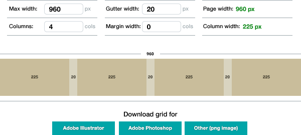
Gridcalculator.dk offers the options you’ll need to easily create a flexible grid. This can save you time on experimentation and calculations.

Managing the Grid

Grids should be separated from objects, so you can toggle their visibility independently and re-use them while designing multiple pages or screens. 

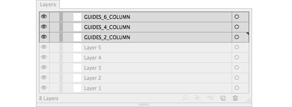
Place your guides as the top layers of your document, above all your content. 

If your grid has multiple columns, it’s best to separate them into independent layers or it might get too crowded. Some pages might need four columns others might need only two. This allows you to manage grid’s visibility according to your needs.


Using Vector Browsers

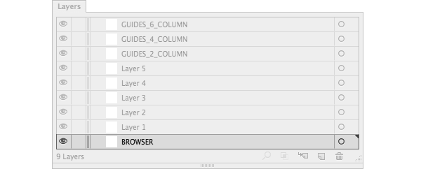
Using a fully scalable browser will be helpful to export high resolution images and to build responsive designs. 

Position your browser(s) below all your content layers.

Note: In the attachments of this tutorial, you can download my responsive Illustrator setup which includes vector versions of both chrome desktop and safari mobile.

2. Optimize Your Workspace

Customizing Workspaces (Window > Workspace) to fit your personal or project needs is crucial to your workflow. I know which tools I use most frequently, so closing/opening panels, and moving windows around, is boring and unproductive. I currently work with three Workspaces depending on screen size: 

  1. for my laptop, when I’m on the move.
  2. for my studio external display.
  3. for my home external display.

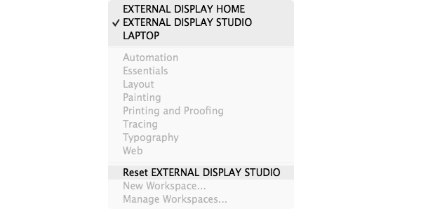
Using Workspaces is really neat: I can easily revert the interface to my default settings by clicking Reset (name of your Artboard).

3. Design with Pixel Precision

Pixel Alignment Options

When creating a new document, leave the Align New Objects to Pixel Grid unchecked. Yes, unchecked.

If you check that option, some UI elements, like outlined (expanded) text, will be distorted and you won’t be able to draw some shapes freely when your points are constantly snapping to the pixel grid.

You should choose which objects need to be pixel aligned by selecting the Align to Pixel Grid option from the Transform panel.

Note: Once you apply Align to Pixel Grid to an object, there’s no way to revert the selected object to the original ”unaligned” state. Unchecking that box won’t save you.

Enable Pixel Preview

When zooming your artwork above 100%, you can actually see the pixels as if you are working with a bitmap image. Activate it by going to View > Pixel Preview. This will let you spot which pixels might cause fuzzy edges so that you can fix them on the fly.

Note: The pixel grid is sensitive to the ruler origin (0,0). Moving the origin of the ruler will change how Illustrator “rasterizes” artwork. Also, make sure your object X and Y coordinates are rounded.

Do Simple Math

Illustrator has some basic mathematical functionality to adjust objects within panels and dialogs. This is useful when you want to add (+), subtract (-), divide (/) or multiply (*) values. These operations can be used in objects, strokes, transparency and in many other things.

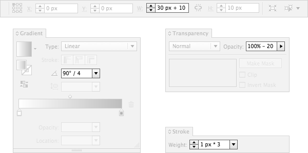
Unfortunately, you can only do an operation at a time. Something like “260/3*2” is not possible.

4. Work with Re-usable UI Objects

Use Symbols and Instances

Usually the same UI component is used over and over again, only changing its size and color. Think modular, plan ahead and build non-destructive components that can be easily recyclable. Avoid checking every screen to see whether you have forgotten to update one element. Symbols can be very powerful when well though out.

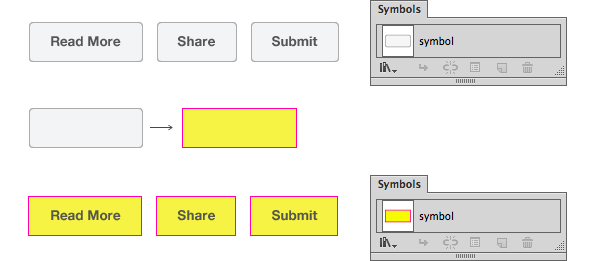
Whenever you change the original symbol, those changes get immediately reflected in all instances found in your document. This is especially useful for recurring regions, such as buttons, footers, pagination elements, navigation, backgrounds, etc. 

You can even use symbols inside symbols (”combos”). This saves you time and ensures consistency throughout the UI.

Non-Destructive Editing Using 9-Slice Scaling

The 9-Slice Scaling is an advanced symbol’s option that allows you to define which areas of a symbol will not stretch while changing its size.

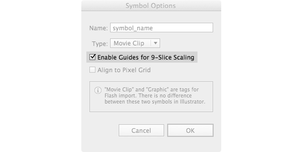
If you change the width of a symbol without using this function, you will obtain deformed shapes. This can be specially helpful for buttons when you only need a segment of a symbol to be stretched.

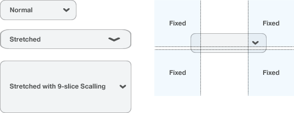
Note: You can enable 9-scaling in a symbol at any time. But for better results, make sure to check the 9-scaling option when you are creating the symbol for the first time.

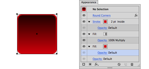
Non-Destructive Editing Using Appearance Attributes

Appearance attributes do not effect the underlying structure of an object or group of objects. It’s pretty useful to use effects like rounded corners or stacks of color fills that can be changed or removed at all times.

Dynamic Text Buttons

There’s a way to create buttons that adapt to your text length. This is how:

  1. Select your text box.
  2. In the Appearance panel add two new Fill layers.
  3. Position your Characters layer between the two Fill layers.
  4. Select the lower Fill layer.
  5. Go to Effect > Convert to Shape > Rectangle
  6. Customize the shape options padding.
  7. Done

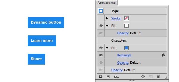
Play around with it. You can save that as a Graphic Style for future use.

Note: This is only recommended for wire-framing since pixel alignment is hard with this method.

5. Working with Color
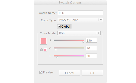
Global Colors

This is one of the most underrated features, but it's very powerful. Every time you modify a Global Color, all objects using that swatch are updated. You can instantly fine-tune dozens of objects.

Color Groups and Palettes

Color Groups is a big time saver when working with huge color schemes or multiple brands at one time. Giving them clear names, makes it easy for people to search and work from the same file.

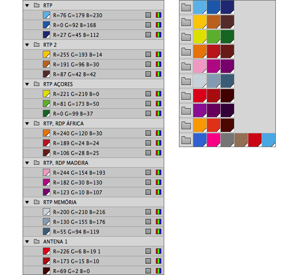
If you are willing to experiment, you can download palettes and color schemes from sources like Kuler and Colourlovers.  Also, play around with the Recolor Artwork wheel to try different color themes: Edit > Edit Colors > Recolor Artwork.

6. Working with Text

Use Character Styles Only

Character styles can be applied to any amount of text: from big chunks to single words. They are more flexible and trump paragraph styles. Since we are not doing print work, only use character styles to ensure that your typography is consistent.

You should order your Character Styles list by size: from bigger to smaller text, by layout order: from top to bottom, or alphabetically. This will help you maintaining a better hierarchy and easily search through your list. 

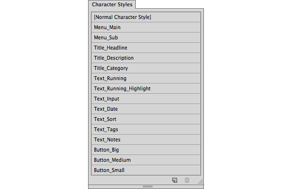
Fine tune and reuse your styles as much as possible to avoid creating too many exceptions. This will simplify the development and enhance consistency.

Write Representative Dummy Text

Any text without context or relevance to the subject is worthless. Don’t abstract yourself from the real experience. “Lorem ipsum” gives you a shape, but it doesn't give you meaning. Writing your own copy for headlines or navigation helps explain their use and the valuable information they can give. If your site or application requires data input, enter real and relevant words. Type a real name or city.

When you use real text, you discover issues that might otherwise go unnoticed: columns are too wide/narrow, fields needed to be bigger/smaller, some things work in one language but don’t work on others, etc.

Using representative data is a good heads-up for what the final product is going to be.

7. Designing for Multiple Screens at Once

Responsive Design

With Illustrator you’re not limited to a specific resolution. In a single document, and using Artboards, you can simulate how an UI should respond to different screen resolutions and edit them simultaneously using Global Colors, Symbols and Character Styles. Even with dozen of different screens, the file will stay small and easy to manage.

1. Artboards as Device/Screen Sizes

Name each Artboard according to the device/screen size. This will automatically name those screens upon saving. I’ll share some saving and naming tips further in the tutorial.

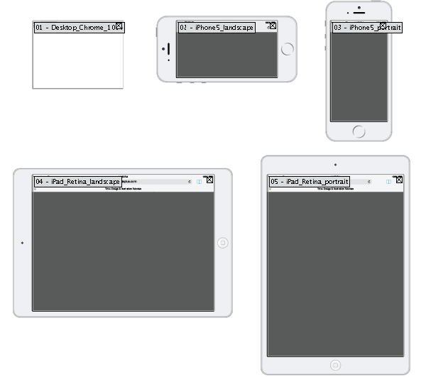
Note: In the attachments of this tutorial, you can download the responsive illustrator setup seen above.

2. Layers Named as Pages:

This allows you to see how a single page looks in every screen size and export all layers (pages) from a select Artboard (screen size) independently.

8. Organize Your Files

Clean up is really important to keep your files in good shape and speed up performance. To achieve that, use Illustrator’s built-in options.

Clean up Using Actions

Windows > Actions > Delete Unused Panel Items
This action will automatically go through each panel, select the contents that are not in use, and then delete them in a matter of seconds.

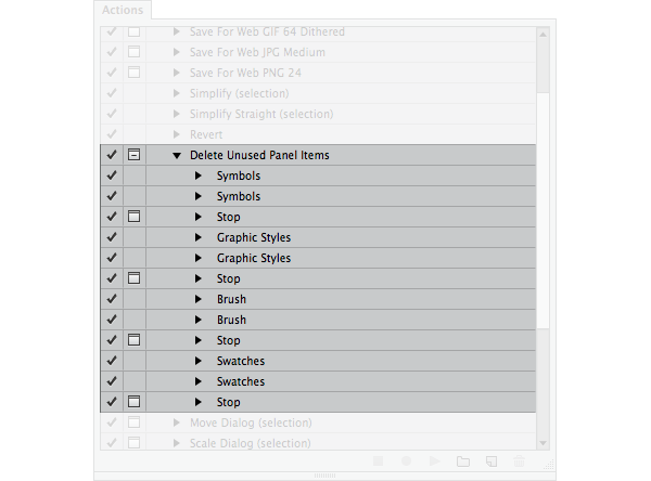
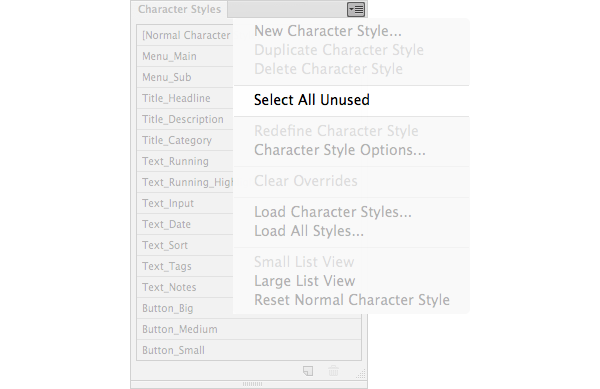
This default action doesn’t include cleaning up your unused character styles. You can add that step or you can manually Select All Unused, then trash them.

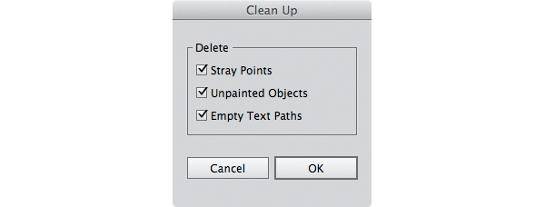
Clean up Using Clean Up Command

If you want to get rid of stray points, unpainted objects and empty text paths, this is how:

  1. Unlock all layers
  2. Make all layers visible
  3. Object > Unlock all (to make sure that we apply this method to all objects)
  4. Select all Objects in all layers
  5. Object > Path > Clean Up
  6. A dialog pops and select OK.

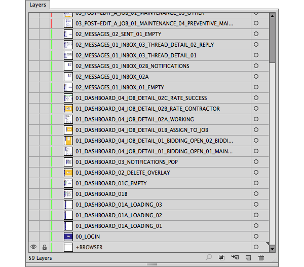
Layer Managing and Naming

When using layers, hide all groups or object in the Layers Panel Options. This is how it should look:

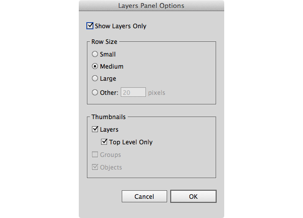
Name each layer with a page name. Give numbers to each layers’ name to keep them ordered when exported. Using caps and non-spacing names sometimes make them easy to read.

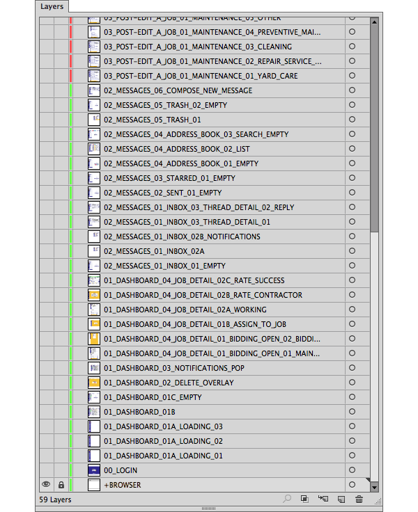
Those 59 layers/pages weight only 2.5mb (no images embedded), which allows high performance and very fast saving times.

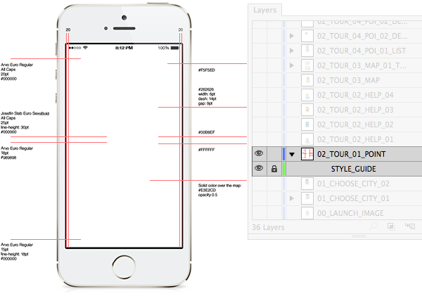
Layers with Style Guides

To include style guides for development in your files, you should create a “sub-layer” associated to each a page/layer. This is how you do it: 

  1. Create new layer named STYLE_GUIDE
  2. Drag and drop that layer over your desired layer.

Those guides will stay on top of your content and since they are positioned in a “sub-layer”, you can easily manage their visibility.

Placing images

When placing bitmap images, don’t embed them in your file. Choose Link instead.


This will decrease your file-size, improve illustrator performance and gives the ability to edit those images separately. Illustrator automatically detects when a file is updated.

9. Saving and Exporting Options

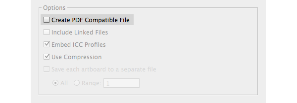
Avoid PDF compatibility

�If you follow all the steps above, your files should be lightweight. Although, if you check Create PDF Compatible File while saving, this will bloat your file size and raise the saving time. Since we’re only dealing with screen graphics with multiple layers and artboards, there’s no real advantage in leaving this checked.

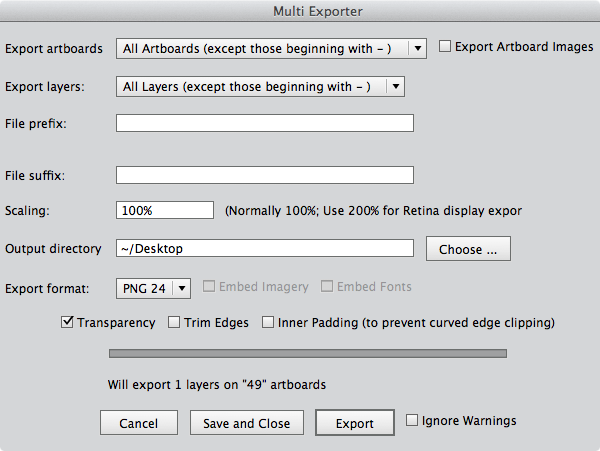
Export Multiple Layers and Artboards�

For better control of the exporting options, download this Multi Exporter script. Using it is pretty straightforward, but take a look at the documentation so you can take full advantage of it.


Manage and Export Mobile Assets�

Device size/resolution fragmentation makes exporting mobile assets require a lot of time. Well, scripts can also help with that. Download this Illustrator scripts for mobile design.

Mobile assets required specific file naming depending on the OS. To follow their naming conventions, it’s easier to create separated Illustrator files for each OS. If some assets are common to the platforms you are working on, create a file named “common” or whatever suits you.


Optimizing the Output

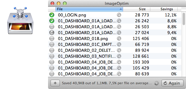
In web and mobile environments, performance is key and every byte counts. Illustrator lacks PNG/JPG optimization so use ImageOptim (Mac OS X) after exporting your content.

Final Thoughts

We're heading towards a responsive and agile web, where our UIs need to be immune to pixel density and consistent across many different sizes. Infinite scalability is invaluable, and vectors are an important part of resolution independence. 

Illustrator’s modular workflow stands up against scale and time and it’s a solid option from a productivity and flexibility standpoint. I’m sticking with it. What about you?

2014-04-30T12:12:08.188Z2014-04-30T12:12:08.188ZRafael Matos da Silvahttp://design.tutsplus.com/articles/how-to-build-flexible-and-lightweight-uis-in-adobe-illustrator--cms-20512

Quick Tip: Fun With Objects to Marker in Inkscape

$
0
0

In this Inkscape quick tip, we're going to go over a neat object menu option called Objects to Marker. It's a really neat way to use custom designs if the prepacked ones just don't cut it. Let's jump right in!

1. Objects to Marker Explained

Step 1

Well, if you've ever worked with markers in Fill and Stroke's Stroke style options, then this will look familiar to you. You simply select Start, Mid, and End Markers - which are graphics applied on nodes.

Step 2

Inkscape comes with a bunch of prepacked shapes, but Objects to Marker allows you to use any custom object as a marker. Below, I'm going to turn a star into a marker by selecting it and heading up to Object > Objects to Marker. You'll notice that your object will then disappear.

Step 3

Now is the time to go over to Fill and Stroke and open up the marker drop-down menu for your custom marker. For me, it never shows up the first time. I always end up having to expand the drop-down menu, close it, then open it up again to get it to refresh and display my custom marker as an option. Also, I have to do this with all three drop-down menus every time I add another marker.

2. Add Your Own Style to Custom Markers

Step 1

I went ahead and added my custom star marker on all of the markers. Also notice that when you change the width of your stroke, the size of your markers will change drastically (it's almost a little annoying). If you need a bigger stroke with smaller markers, you'll have to redo your Objects to Marker with a smaller scaled version of your object.

This is why you'll see that almost all of the prepacked markers have a small, medium, and large version.

Step 2

And of course, you may want to change the color of your markers after the face. Thankfully, there's an Extension for this one. Select your path and click Extensions > Modify Path > Color Markers to Match Stroke.

Step 3

You can also use complex designs as markers. The red apple below is indeed sideways, but this is so it appears correct as a marker. I'll show you what I mean next.

Step 4

Below, I drew a vertical line from top to bottom. That means my Start Marker is on the top and an upright apple set as a marker would actually be sideways. That's why I tilted my apple accordingly prior to setting is as a marker. Lot's of manual adjustments for directional sensitivity.

Step 5

Yes, you can even Color Markers to Match Stroke on complex objects.

3. Extend a Mid Marker Along a Stroke

Step 1

Below, I've arranged three separate parts of a pencil that I'll be using as markers.

Step 2

Now I've drawn my line and applied the markers as you can see below.

Step 3

Finally, we just keep adding more middle nodes to let those MidMarkers fill in the gaps. Pretty cool, huh?

Step 4

Of course, we could start out with a crazy line like this as well.

Step 5

Then we'd end up with a crazy pencil!

This Marks the End!

Now you know how to completely use Objects to Marker. It's really easy and super fun to play around with, as you can see. Whether you need custom markers for professional projects, or you just want to make a crazy pencil, Objects to Marker is just what you needed. Thanks for reading!

2014-05-01T12:12:11.369Z2014-05-01T12:12:11.369ZAaron Niezehttp://design.tutsplus.com/tutorials/quick-tip-fun-with-objects-to-marker-in-inkscape--cms-20639

Design Striking Layouts for Your Own Cookery Book Using InDesign

$
0
0
tag:design.tutsplus.com,2005:PostPresenter/cms-20551
Final product image
What You'll Be Creating

In this tutorial we’ll create a variety of layouts for a Cookery Book intended for self-publishing, either in print or as an eBook, using Adobe InDesign. I’ll show you how you can showcase simple, striking photos to create minimal, colourful designs for your pages. Let’s get cooking!

Many thanks to Cameron Knight for the beautiful photos used in this tutorial. You can read Cameron’s tutorial for putting these together here.

1. Set Up the Layout of the Document

Step 1

Open InDesign and select File > New Document. In the New Document window set the Intent to Print and set the No. of Pages to 9. Keep Facing Pages selected. Under Page Size select Custom... from the drop-down menu to open the Custom Page Size window. Under name type ‘Cookery Book’ and set Width to 170 mm and Height to 270 mm. Click Add, and then OK

Set the Top Margin to 18 mm, Bottom Margin to 23 mm, Inside Margin to 21.5 mm and Outside Margin to 15.5 mm. Set the Bleed to 3 mm, but keep the Inside value at 0 mm. Click OK.

2. Select Fonts for Use In Your Layouts

Step 1

For a Cookery Book, it’s a great idea to have two distinct fonts to hand, to create separation between the Recipe Header and/or Method and the Ingredients list. 

In this tutorial I will be using a classic serif font, Calluna for the recipe headers and any bulk body text. I will be using a rustic, type-written font, Special Elite to contrast against this in the ingredients lists and page footers.

3. Set Up a Master for Your Book

Step 1

Ensure the Pages panel is open by going to Window > Pages. You will see that an A-Master consisting of two pages combined as a spread has been automatically added in InDesign.

Double-click the A-Master spread to bring it up on screen. Drag a vertical guideline from the left-hand ruler to 13 mm  on the first page of the Master and drag a second to 137 mm on the second page of the Master.

Zoom in to the bottom left-hand corner of the spread and select the Type Tool (T) from the tools control panel. Drag to create a small text frame 3 mm in Width and 3 mm in Height. Position this against the left-hand guideline you’ve just inserted, and below the bottom margin and go to Type > Insert Special Character > Markers > Current Page Number. Set the text to Align Left,Font to Special Elite Regular, and Size to 9 pt.

With the ‘A’ highlighted go to the Fill drop-down menu in the Character Formatting Controls and set the tint of the Black Fill to 80%.

Step 2

With the text frame selected, go to Edit > Copy and Paste onto the opposite page of the A-Master. Position this new text frame against the right-hand guideline you created in Step 1 at the same horizontal alignment (around Y position 226 mm). Change the text alignment to Align Right.

Step 3

Use the Type Tool (T) to create a new text frame 133 mm Width and 3 mm Height. Type ‘my cookbook’ into the frame and set the text to Align Center. Set the Font to Special Elite Regular,Size 9 pt, and the Black tint to 80% as before. 

Position this at the bottom of the left-hand page of the A-Master, lined up against the page number frame and centered between the outside and inside margins.

With the frame selected, Edit > Copy > Paste and move this new frame into an identical position on the right-hand page of the Master.

You will see that the Master has been automatically applied to all the pages in the document.

4. Create a Striking Opening Page

Step 1

Double-click the page icon for Page 1 to bring up the page on screen.

Use the Rectangle Frame Tool (F) to create a large frame, extending across the whole page, up to the bleeds. Set the Fill of the Frame to [Paper]

For some of the pages, we can use images set against a white or pale background to provide contrast and allow shots of simple ingredients to really stand out. You can use the Levels filter in Photoshop to increase the white in a given photo before placing the image in InDesign.

Go to File > Place and select your image, click Open. Double-click within the frame to directly select the image and hold down Shift to scale the image without distorting.

Step 2

Use the Type Tool (T) to create a new text frame 134 mm Width and 58 mm Height. Type ‘My (paragraph break) CookBook’ and set the Font to Calluna Regular. Set the Font Size to 80 pt and Leading to 80 pt

Highlight ‘M’ and ‘C’ separately and set the Size to 90 pt to give emphasis. 

Highlight ‘Cook’ and set the Colour to a fiery red, C=8, M=95, Y=100, K=1 to bring out the colour of the spices in the photo.

5. Design a Vibrant Introductory Spread

Step 1

Double-click on the page icon for Page 3 in the Pages panel top bring the page up on screen. Use the Type Tool (T) to create a new frame 133 mm in Width and 48 mm in Height. Type text for a header, ‘The Importance (paragraph break) of Ingredients...’  

Insert a short introductory paragraph after another break, here I’ve used ‘Try to use organically sourced, fresh ingredients in your cooking. (paragraph break) You will taste the difference!’.

Highlight the header text and set the Font to Calluna Regular,Size to 49 pt, Leading to 53 pt. Maintain the Colour as default Black for now.

Highlight the remaining text; set the Font to Calluna Regular, Size to 12 pt and Leading to 14.4 pt

Step 2

Divide Page 2 into a simple grid by dragging a vertical guideline from the left-hand ruler to 65 mm and drag a horizontal guideline to 80 mm.

Step 3

Use the Rectangle Frame Tool (F) to create a frame 68 mm in Width and 246 mm in Height. Position this against the left-hand bleed on Page 2 of the document, extending up to the top bleed and down to the bottom bleed. It should rest roughly against your new vertical guideline.

Give the frame a solid Stroke in [Paper] with a Weight of 1 mm. Go to File > Place and select a coloured photo that you feel can be cropped and zoomed in without losing the clarity of its subject. Use the Fill Frame Proportionally option in the top control panel to arrange it until you are happy.

Step 4

Introduce another couple of image frames, as above, which meet at the horizontal guideline (You can Copy > Paste the existing image frame and edit the dimensions). 

Place images in these with contrasting, yet complementary colours. In this example, you can see that overall I’ve gone for a zesty, summery colour palette, which really makes the food pop!

Introduce an additional image frame on the opposite page, meeting the horizontal guideline.

Step 5

Select the Eyedropper Tool (I) and hover over the background colour of one of the photos. Click once and double-click the resulting swatch which appears at the bottom of the Tools panel. Select Add CMYK Swatch and click OK.

Return to the text frame at the top of Page 3 and highlight ‘Ingredients...’ Set the Text Colour to your new swatch (the swatch I’ve used here is C=0, M=88, Y=73, K=0), which has appeared in the drop-down Fill menu in the top control panel.  You can also apply this to parts of the body text that you want to make stand-out.

Step 6

Double-click on the A-Master spread to bring up the Master on screen. Drag and select the two page number frames and the two footer frames on the spread and Edit > Copy. Return to the Pages 2 and 3 spread and Edit > Paste in Place. Set the Text Colour for all these items to [Paper].

Great work - you have a gorgeous, colourful intro spread!

6. Create a High-Contrast Recipe Spread

Step 1

Double-click the Page 4-5 icons to bring up the spread. Go to View > Fit Spread in Window.

Introduce some vertical guidelines onto Page 4 to allow us to create evenly sized columns. Drag a guideline to 130 mm, a second to 76 mm, and a third to 69 mm

Step 2

Use the Type Tool (T) to create a text frame 133 mm Width and 53 mm Height. Type ‘Creamy Salmon (paragraph break x 2) with Danish (paragraph break) Sugar-Browned (paragraph break) Potatoes’. 

Set the Font to Calluna Regular. Highlight ‘Creamy Salmon’ and set the the Font Size to 49 pt and the Colour to a neutral, mustard swatch, C=12, M=51, Y=100, K=1. Highlight the remaining text and set the Size to 30 pt and Leading to 32 pt. Maintain the default Black Colour.

Step 3

Introduce a new text frame 53.5 mm Width and 122 mm Height. Insert an ‘Ingredients’ Header followed by the list of ingredients. Set the Font of the Header and any sub-headings to Calluna Regular, Size to 21 pt, Leading to 25.2, and set the Colour to a tint of 80% Black.

Set the Font of the remaining list of ingredients to Special Elite Regular, Size 10 pt, Leading 10 pt; leaving a paragraph break between each ingredient for clarity. Pull out any important information in the mustard swatch, C=12, M=51, Y=100, K=1, but keep the rest of the list as Black

Step 4

Create a new column to allow the text to flow into it. Create a text frame and position this between the two vertical guidelines along from the first column. Click on the small white box at the bottom-right of the first column and click again into this new frame to connect the two. 

You can drag a horizontal guideline down onto Page 4 to ensure that the text lines up exactly with the first column.

Step 5

Use the Line Tool (\) to introduce a stroke 106 mm in Length and position this below the ‘Ingredients’ Header to frame it. Go to Window > Stroke to open the Stroke Panel. Set the Weight to 0.35 mm, the Type to Thick-Thin and the Stroke Colour to a tint of 60% Black.

Step 6

Move over to the opposite page, Page 5. Drag a vertical guideline to roughly the center point of the page, and drag two horizontal guidelines down to roughly split the page into 6 sections.

Use the Rectangle Frame Tool (F) to insert a frame around 70 mm by 70 mm, set the Fill to [Paper] and position this in the top-left corner of the page, resting against the grid formed by the guidelines. Go to File > Place and choose an image with a white background. Click Open. Use the Fill Frame Proportionally option in the top control panel to arrange the image in the frame centrally.

Step 7

Edit > Copy > Paste the image frame 5 more times and File > Place or Relink (Window > Links) to insert new images to create an ordered, chequered effect.

Awesome - this spread is looking really nice. 

7. Design an Engaging Method Spread

Step 1

Double-click on the Page 6 page icon in the Pages panel to bring it up on screen. From the top ruler drag a horizontal guideline down to 122 mm. From the left-hand ruler drag a vertical guideline to 86 mm.

Step 2

Use the Rectangle Frame Tool (F) to create a frame that fits within the bottom-left corner of Page 6, the boundaries of which you’ve created with the guidelines. Extend it to the edges of the bleed. 

As for Pages 2 and 3, give the frame a solid Stroke in [Paper] with a Weight of 1 mm

Go to File > Place and select one of your Method images, click Open. Use the Fill Frame Proportionally option to arrange the image in the frame, though a zoomed-in image would work really well here.

Step 3

Drag another vertical guideline to 232 mm on the opposite page, Page 7

Select the image frame you created in Step 2, above, and Edit > Copy > Paste. Repeat to create a third image frame. 

Arrange these within the grid you created with your guidelines, as in the image below. Replace the two new image frames with your other Method photos and arrange their scale and proportions until you are happy with the result.

Step 4

You will see that the photos you’ve introduced to the page are cutting across the Page 7 footer, which doesn’t look great. Go to the Pages Panel and drag the Master [None] and drop on Page 7.

Go to the A-Master and drag to select the page number text frames (not the footer text frames); Edit > Copy

Return to Page 6 and 7 and Edit > Paste in Place. Highlight the page number frame on Page 6 only and set the Text Colour to [Paper].

Step 5

Introduce your Method text onto the page by creating two text frames at the top-left of Page 6 and along the right-hand side of Page 7. You can Edit > Copy > Paste the text  and stroke you already created for the previous spread (Pages 4 and 5) to mimic the formatting you already set up for those pages. 

Ensure the steps are clearly laid out, with adequate space between each step of the method. Give plenty of space between the edges of the text and the images (I allowed a gap of 17 mm) to give a professional look.

Excellent work - you’ve created a beautiful, minimal method page.

8. Put Together a Mouth-Watering Final Page

Step 1

Now that you’ve ‘done the cooking’ you want to see the beautiful results! We’ve used a simple white with bright colour palette for the pages so far. For contrast we’re going to create a dark, moody page for the finished recipe shot.

Double-click the Pages 8-9 page icons to bring the spread up on the page. Use the Rectangle Frame Tool (F) to create a frame that extends across the whole spread, reaching up to the edge of the bleed on all sides. Go to File > Place and select an image with a dark background. It doesn’t have to be black, but something which will contrast well against a paler text. Click Open.

Double-click within the frame to arrange the image. Try to use a very high-quality image which you can zoom into with ease. Try to give the image a jaunty, cropped angle to add interest.

Step 2

Introduce a text frame using the Text Tool (T)61 mm Width and 35 mm Height. Type ‘Bon (paragraph break) Appétit!’ and set the Font to Calluna Regular, Size to 51 pt, Leading to 55 pt, and Text Colour to [Paper].

Position the frame in the lower left-hand corner of Page 8, or wherever on your page that the dark background of the photo comes through.

Step 3

Introduce a framing Stroke beneath the text using the Line Tool (\). Set the Length to 84 mm (in this example so it merges with the white edge of the plate), Colour to [Paper], Weight to 1 mm and the Type to Thick - Thin.

Step 4

Double-click on the A-Master to bring the Master spread up on screen. Drag across the bottom of the spread to select both page number text frames and both the footer text frames. Edit > Copy and return to Pages 8-9. Edit > Paste in Place

Set the Text Colour of both the page number and footer on Page 8 to [Paper].

Great work - you have a final page that looks good enough to eat!

9. Prepare Your Book for Print or Digital

Step 1

The aim of this tutorial has been to show you some ways of creating striking, contemporary and minimal layouts for a cookery book. You can use the ideas presented here to create your own exciting layouts. 

Once you have put together your whole book, you may want to export this as an Interactive PDF for sharing online (go to File > Export > and select Adobe PDF (Interactive) from the Format menu; and select Spreads from the subsequent menu). 

Alternatively, you can create a print book by going to File > Export > and selecting Adobe PDF (Print) from the drop-down menu. Select Press Quality from the Adobe PDF Preset drop-down menu, and check All Printer’s Marks from the Marks and Bleeds menu.

Great Job, Now When Do We Eat?! 

Good luck with visualising your own gorgeously gastronomic designs!

2014-05-02T04:26:11.273Z2014-05-02T04:26:11.273ZGrace Fussellhttp://design.tutsplus.com/tutorials/design-striking-layouts-for---your-own-cookery-book---using-indesign--cms-20551

Quick Tip: Create a Simple Open Box Icon in Adobe Illustrator

$
0
0
Final product image
What You'll Be Creating

In the following steps you will learn how to create a pretty simple box icon in Adobe Illustrator. 

For starters you will learn how to setup a simple grid and how to create a bunch of pixel perfect shapes using the Rectangle and the Direct Selection Tool along with some basic Pathfinder options and the Live Corners feature. Moving on, you will learn how to add simple colors and sleek highlights using flat colors or linear gradients and some basic blending techniques. Finally, you will add the background and a subtle shadow using a simple rectangle, some new blending techniques and the Gaussian Blur effect.

1. Create a New Document and Set Up a Grid

Hit Control-N to create a new document. Select Pixels from the Units drop-down menu, enter 600 in the width and height boxes then click on the Advanced button. Select RGB, Screen (72ppi) and make sure that the Align New Objects to Pixel Grid box is unchecked before you click OK

Enable the Grid (View > Show Grid) and the Snap to Grid (View > Snap to Grid). For starters you will need a grid every 5px, so simply go to Edit > Preferences > Guides > Grid, enter 5 in the Gridline every box and 1 in the Subdivisions box. Try not to get discouraged by all that grid, it will ease your work and keep in mind that you can easily enable or disable it using the Control-" keyboard shortcut. You should also open the Info panel (Window > Info) for a live preview with the size and position of your shapes. Do not forget to set the unit of measurement to pixels from Edit > Preferences > Units > General. All these options will significantly increase your work speed.

Box Icon

2. Create the Main Shapes

Step 1

Pick the Rectangle Tool (M) and focus on your Toolbar. Remove the color from the stroke then select the fill and set its color at R=127 G=63 B=152. Move to your artboard and simply create a 90 x 40px rectangle, the Snap to Grid feature should ease your work. Focus on the bottom side of this fresh shape and switch to the Direct Selection Tool (A). Select the left anchor point and drag it 15px to the right then select the right anchor point and drag it 15px to the left. In the end your purple rectangle should turn into a simple trapezoid as shown in the second image.

Box Icon

Step 2

Set the fill color at R=28 G=117 B=188, pick the Rectangle Tool (M), create a 120 x 75px shape and place it exactly as shown in the first image. Focus on the top side of this new shape and switch to the Direct Selection Tool (A). Select the left anchor point and drag it 35px to the right then select the right anchor point and drag it 35px to the left. In the end things should look like in the second image.

Box Icon

Step 3

Set the fill color at R=39 G=170 B=225, pick the Rectangle Tool (M), create a 180 x 35px shape and place it exactly as shown in the first image. Focus on the top side of this new shape and switch to the Direct Selection Tool (A). Select the left anchor point and drag it 30px to the right then select the right anchor point and drag it 30px to the left. In the end things should look like in the second image.

Box Icon

Step 4

Reselect both blue trapezoids, open the Pathfinder panel (Window > Pathfinder) and click the Divide button. Make sure that the resulting group of shapes is selected and simply hit Shift-Control-G to Ungroup it. Focus on the resulting shapes and replace the existing fill colors with the ones shown in the following image.

Box Icon

Step 5

Pick the Direct Selection Tool (A), select the ten anchor points highlighted in the first image, move to the control panel, focus on the Corners section and simply enter 5px in that white box. In the end things should look like in the second image.

Box Icon

3. Add Color and Some Sleek Highlights

Step 1

Disable the Snap to Grid (View > Snap to Grid), enable the Smart Guides (Control-U), set the fill color at white (R=255 G=255 B=255) and pick the Pen Tool (P)

Hover over the top, right anchor of your blue shape until you will get a that "anchor" piece of text. Simply click on that spot then move to the bottom side of your blue shape and simply click on it when you get the "intersect" smart guide. 

Continue with the Pen Tool, click on the bottom, right anchor point of your blue shape then return to the top anchor point and close your path. In the end you should have a simple, white triangle as shown in the fourth image.

Box Icon

Step 2

Make sure that your white triangle is still selected, open the Gradient panel (Window > Gradient) and simply click on the gradient thumbnail to add the default black to white linear gradient. 

Make sure that your shape stays selected and focus on the Gradient panel. Set the Angle at 0 degrees then focus on the gradient colors. Select the left gradient slider and set the color at R=117 G=76 B=41 then select the right gradient slider and set the color at R=139 G=94 B=60. Reselect the Pen Tool (P), add a second triangle as shown in the second image and fill it with the same linear gradient.

Box Icon

Step 3

Disable the Smart Guides (Control-U) then go to Edit > Preferences > General and make sure that the Keyboard Increment is set at 1px. Select your blue shape and make two copies in front (Control-C > Control-F > Control-F). 

Select the top copy and simply move it 1px down using the down arrow button from your keyboard. Reselect both copies made in this step and click the Minus Front button from the Pathfinder panel. 

Make sure that the resulting shape stays selected and focus on the Appearance panel (Window > Appearance). Set the fill color at white then simply click on the "Opacity" piece of text to open the Transparency fly-out panel. Lower the Opacity to 30% and change the Blending Mode to Soft Light.

Box Icon

Step 4

Reselect your blue shape and make another two copies in front (Control-C > Control-F > Control-F). 

Select the top copy and simply move it 1px up using the up arrow button from your keyboard. Reselect both copies made in this step and click the Minus Front button from the Pathfinder panel. 

Make sure that the resulting shape stays selected, bring it to front (Shift-Control-] ) and focus on the Appearance panel (Window > Appearance). Set the fill color at black (R=0 G=0 B=0), lower its Opacity to 10% and change the Blending Mode to Soft Light. Reselect your blue shape and simply replace the flat color used for the fill with the linear gradient shown in the final image.

Box Icon

Step 5

Select your left, orange shape and make two copies in front (Control-C > Control-F > Control-F). 

Select the top copy and simply move it 1px down using the down arrow button from your keyboard. Reselect both copies made in this step and click the Minus Front button from the Pathfinder panel. 

Make sure that the resulting shape stays selected and focus on the Appearance panel (Window > Appearance). Set the fill color at black, lower its Opacity to 20% and change the Blending Mode to Soft Light. Move to your right, orange shape and repeat the techniques used for the left one.

Box Icon

Step 6

Reselect your left, orange shape and simply replace the flat color used for the fill with the linear gradient shown in the following image. Move to the right, orange shape and replace the flat color used for the fill with the linear gradient shown in the following image.

Box Icon

Step 7

Select your green shape and make two copies in front (Control-C > Control-F > Control-F). 

Select the top copy and simply move it 1px down using the down arrow button from your keyboard. Reselect both copies made in this step and click the Minus Front button from the Pathfinder panel. 

Make sure that the resulting shape stays selected and focus on the Appearance panel (Window > Appearance). Set the fill color at black, lower its Opacity to 20% and change the Blending Mode to Soft Light. Reselect your green shape and simply replace the flat color used for the fill with the linear gradient shown in the final image.

Box Icon

Step 8

Selecy your purple shape and make a copy in front (Control-C > Control-F) then select the red shape and make a copy in back (Control-C > Control-B). 

Move to the Layers panel, select this red copy and move it 1px down. Reselect both copies made in this step and click the Intersect button from the Pathfinder panel. 

Make sure that the resulting shape stays selected and focus on the Appearance panel (Window > Appearance). Set the fill color at black, lower its Opacity to 10% and change the Blending Mode to Soft Light.

Box Icon

Step 9

Select your red shape and make two copies in front (Control-C > Control-F > Control-F). 

Select the top copy and simply move it 1px up using the up arrow button from your keyboard. Reselect both copies made in this step and click the Minus Front button from the Pathfinder panel. 

Make sure that the resulting shape stays selected and focus on the Appearance panel (Window > Appearance). Set the fill color at white, lower its Opacity to 80% and change the Blending Mode to Soft Light. Reselect your red shape and simply replace the flat color used for the fill with the linear gradient shown in the final image.

Box Icon

Step 10

Select your purple shape and simply replace the flat color used for the fill with the linear gradient shown in the final image.

Box Icon

4. Create the Background

Step 1

Pick the Rectangle Tool (M) and simply click on your artboard to open the  Rectangle window. Enter 610 in the Width and  Height boxes then click the OK button to create your 610px square. 

Make sure that this new shape remains selected, send it to back (Shift-Control-[ ) then open the Align panel (Window > Align). Set the aligning to Artboard (open the fly out menu and go to Show Options if you can't see the Align To section as shown in the following image), make sure that your shape is selected then simply click the Horizontal Align Center and Vertical Align Center buttons. In the end your square should cover the entire artboard as shown in the following image.

Box Icon

Step 2

Reselect your square, focus on the Appearance panel and add a second fill using the Add New Fill button (pointed by the blue circle in the following image). 

Make sure that this new fill stays selected, lower its Opacity to 30% then move to the Gradient panel (Window > Gradient) and simply click on that gradient thumbnail. Keep focusing on your Gradient panel, select Radial from the Type drop-down menu then move to the gradient colors. Select the right slider and set the color at R=169 G=124 B=80 then select the left slider, set the color at R=255 G=239 B=210 and lower its Opacity to 0%. Grab the Gradient Tool (G), focus on your artboard and stretch your radial gradient as shown in the following image.

Box Icon

5. Add Subtle Shading

Step 1

Enable the Snap to Grid (View > Snap to Grid). For this step you will need a grid every 1px, so go to Edit > Preferences > Guides & Grid and enter 1 in the Gridline every box. 

Using the Rectangle Tool (M), create a 66 x 6px shape, set the fill color at black and place it as shown in the first image. Focus on the bottom side of this fresh rectangle and switch to the Direct Selection Tool (A)

Select the left anchor point and drag it 2px to the right then select the right anchor point and drag it 2px to the left. Make sure that this black shape remains selected, focus on the Layers panel and drag it below all those shapes that make up your box icon. 

Move to the Appearance panel, select the existing fill and simply lower its Opacity to 10%. Keep focusing the Appearance panel, make sure that the existing fill is still selected and simply duplicate it using the Duplicate Selected Item button (pointed by the blue circle in the following image). 

Select the bottom fill, increase its Opacity to 20% and go to Effect > Blur > Gaussian Blur. Enter a 5px Radius and click OK. Return to the Appearance panel, make sure that the entire path is selected (simply click on the "Path" piece of text from the top of the Appearance panel) and go to Effect > Stylize > Rounded Corners. Enter a 3px Radius and click OK.

Box Icon

Step 2

Return to gridline every 5px, so simply go to Edit > Preferences > Guides & Grid and enter 5 in the Gridline every box. Using the Ellipse Tool (L), create a 100 x 50px shape, set the fill color at black and place it as shown in the first image. 

Focus on the Layers panel and simply drag this new shape below all the shapes that make up your box icon. Move to the Appearance panel, make sure that your squeezed circle is still selected, lower its Opacity to 15% and go to Effect > Blur > Gaussian Blur. Enter a 15px Radius, click OK and you're done.

Box Icon

Congratulations! You're Done!

Here is how it should look. I hope you've enjoyed this tutorial and can apply these techniques in your future projects.

Box Icon
2014-05-02T12:12:05.899Z2014-05-02T12:12:05.899ZAndrei Mariushttp://design.tutsplus.com/tutorials/quick-tip-create-a-simple-open-box-icon-in-adobe-illustrator--cms-20564

Kerning, Spacing, and Other Text Tricks in Inkscape

$
0
0

Inkscape has a lot of nice built-in features for quickly editing text and font. We'll go over these as well as a few neat tricks to really get the most from your text.

1. Text and Font

Step 1

If you haven't already, head up to Text > Text and Font to bring up this dialog box. It's simple and straight to the point.

Step 2

I'll be honest though. I rarely ever open up that dialog box because as long as you have some text selected, you'll get everything you need in the text toolbar. So go ahead and type some text and let's get started!

2. Spacing and Kerning

Step 1

Below, I put a -12.00letter spacing on my text to achieve this result. It simply increases/decreases the spacing between all of the letters.

Step 2

On the other hand, kerning adjusts the letter spacing only between the letters you've selected. What I've done below is click in between "INK" and "SCAPE". Then I just set the horizontal kerning to 20.00. Easy enough, right?

Step 3

But wait, now you've gone kern crazy and messed up your precious text. Not to fear, because Text > Remove Manual Kerns is here! Just give it a click and you'll be as good as new. (This doesn't remove spacing, just kerning.)

Step 4

And of course, we can't forget about word spacing, which is exactly what it sounds like. If you've got a whole sentence, then spacing between words may be what you need. I've set mine to 8.00 and it seems to always give text a more epic look.

3. Shift and Rotation

Step 1

First up, we have vertical shift. It works the same was as kerning does, except it moves the letter up or down. Below, you'll see that I couldn't resist using Hollywood as an example, but I just went through each letter and assigned different vertical shift values. It actually looks pretty neat though!

Step 2

Character rotation is equally neat. By increasing/decreasing the value, you can effectively tilt individual letters in a text object. Again, I went through each letter and adjusted the rotation to come up with something like this.

It's also worth noting that character rotation will totally mess up letter spacing, so you'll almost certainly have to go through each letter afterwards and adjust horizontal kerning to get it to look right.

4. Path Effect Editor

Step 1

That's right, after you Path > Object to Path your text object, you can go to Path > Path Effect Editor to really customize your text. I'm going to apply a Bend effect and click Edit on canvas.

Step 2

Then this nifty line pops up and we can manipulate it like a regular path! Neat, huh?

Step 3

Or perhaps Envelope Deformation is more up your alley! The possibilities are endless.

Text Modifications Made Easy!

We went over the basics of text design along with introducing the endless possibilities from the Path Effect Editor. Hopefully you learned a few tips on how to make your text design unique and effective. Thanks for reading!

2014-05-05T12:47:07.299Z2014-05-05T12:47:07.299ZAaron Niezehttp://design.tutsplus.com/tutorials/kerning-spacing-and-other-text-tricks-in-inkscape--cms-20576

How to Create a Retro Fox Illustration in Adobe Illustrator

$
0
0
Final product image
What You'll Be Creating

By following this tutorial you'll learn how to create a cute fox illustration in Adobe Illustrator. Using basic shapes, stylish colors and the Warp Effect tool, you can create a charming cartoon character in a retro style. This is a great project for beginners! Let's get started. 

1. Creating the Head and Face

Step 1

First we are going to create the head. Take the Polygon Tool and click on your workspace. A new dialogue window will ask you how many corners and what radius you want. Make 3 corners and any radius you want. Then click OK. Once you have a triangle, fill with color R=212, G=88, B=42. Now we need to adjust the Warp options (Effect > Warp > Arc Upper) as shown in the image below.

Step 2

Copy the triangle and paste it on the back (Control-C, Control-B), then change the color to R=233, G=218, B=194. Change the Arc Upper to Bulge (Effect > Warp > Bulge):

Step 3

You should have the following base shape for the head:

Step 4

Keep the same fill color. Using the Ellipse Tool (L), draw an oval. Pick the Convert Anchor Point Tool (Shift-C) and simply click on the left anchor point of the oval and then the right anchor point. After that, adjust the Warp options (Effect > Warp > Arc) as shown in the image below.

Step 5

Place the shape you've just created behind (Control-X, Control-B) the shape created in Step 3.

Step 6

Now, we will create the eyes and the nose. Using the Ellipse Tool (L), create small circle and set the color to R=70 G=62 B=55. To make nice round circle, hold the Shift key while you’re creating the circle. Using copy-paste, make three circles. Place them accordingly like the image below.

Step 7

Now, the ears. First, we will create the right ear. Using the Polygon Tool, create a triangle and set the color to R=212 G=88 B=42. Adjust the Warp options (Effect > Warp > Bulge) as shown in the image below.

Create a copy of this triangle with the same Warp options. This will be the inner part of the ear, so you need to make it smaller and darker (color R=178 G=66 B=31).

Step 8

Now, the left ear. Use the image below to get an idea of how the left ear should look.

The smaller part of the left ear:

Step 9


Put the ears together and then place them on the head of the fox. Send them to the back (Control-X, Control-B) so that they sit behind the head.

2. Create the Body

Step 1

Now we are going to create a white fur neck under the head of the fox. Draw a triangle with fill color R=224 G=204 B=169. Adjust the Warp options (Effect > Warp > Bulge).

Step 2

Create a triangle (color R=42 G=148 B=68) with Bulge. This will be the body.

Step 3

Put all the parts together. Don't forget to place the head in the front of the body.

3. Creating the Legs and Paws

Step 1

We'll start by creating the fox's leg. Make an oval with fill color R=212 G=88 B=42. Select Arc in the Warp Options window. After that, expand this figure (Object > Expand Appearance).

Step 2

Draw an oval with color R=70 G=62 B=55. Pick the Convert Anchor Point Tool (Shift-C) and simply click the top and bottom anchor points of the oval; this will make the end points pointy. Copy-paste to create two duplicates of this shape and put them together as shown below. Then go to the Pathfinder panel and press the Unite button. Now you have one shape. Make one more copy of this shape and keep it for later. I will let you know when you need it!

Step 3

Select the shape that was created in the previous step and put it on the tip of the arm to create the paw. After that, make one more copy of the paw (Control-C, Control-F). Holding the Shift key, select the dark gray shape and the new copy of the paw together. Go to Pathfinder panel and press the Intersect button.

Now right-click your mouse and select Transform > Reflect. In the window that appears, check Vertical axis of reflection, make sure that it is set to 90degrees and press Copy. Now you've got the second arm.

4. Putting All the Parts Together

Step 1

Simply place everything together, as shown in the image below. Your fox is really coming together!

5. The Tail

Step 1

Create an oval with fill color R=175 G=51 B=18. Make pointy ends on the oval, using the technique shown in previous steps. Then go to Effect > Distort and Transform > Twist. Once the window pops up, choose -100 degrees and press Okay. Expand the appearance (Object > Expand Appearance).

Step 2

Remember the copy of the fox's paw that you created in step 3.2? I asked you to keep it for later—now it's time! Change the color to R=224 G=204 B=169 and place it on the tail. Make another copy of the tail (Control-C, Control-F). Keep this copy selected and, holding the Shift key, select the light brown shape. Now press the Intersect button on the Pathfinder panel.

Step 3

Place the tail behind the body. Look how cute it is!

6. Decorations

Step 1

We will be using circles and pointy ovals to create flowers.

The color of the petals on the first flower is R=229 G=211 B=182. The color of the middle circle is R=235 G=212 B=103. The color of the leaves is R=97 G=108 B=67.

The color of the petals on the second flower is R=60 G=94 B=76. The color of the middle circle is R=88 G=52 B=56. The color of the leaves is same as the first flower.

The color of the petals on the third flower is R=73 G=117 B=95. The color of the middle circle is the same as the second flower.

Group every flower with leaves (Right-Click > Group).

Step 2

We will now create a strawberry. Draw an oval with color R=178 G=31 B=41. Pick the Direct Selection Tool (A) and select the left and right anchor points. Shift them up. Then, draw tiny yellow ovals (R=235 G=212 B=103) and spread them over the red oval. Add three leaves (R=97 G=108 B=67). Group the whole strawberry together (Right-Click > Group).

7. Background

Step 1

Behind the fox create a large circle (R=114 G=147 B=118). Place the flowers and strawberries on the edge of the circle to create a frame.

8. Final Touches

Step 1

Draw a square with the fill color R=166, G=191, B=170 and size 600px both width and height. Place it behind everything.

Step 2

Look at the Appearance panel. Click on the tiny triangle in the top right corner and in the pop-up menu select Add New Fill. Now open a new Swatches panel (Swatches > Patterns > Basic Graphics > Basic Graphics_Dots) and select the 10DPI 20% pattern for this new fill. Set the Opacity to Soft Light.

Conclusion

Congratulations, your fox illustration is done! You see, it's not difficult. I hope you found some useful tricks and have enjoyed this tutorial!


2014-05-06T11:30:11.996Z2014-05-06T11:30:11.996ZNataliya Dolotkohttp://design.tutsplus.com/tutorials/how-to-create-a-retro-fox-illustration-in-adobe-illustrator--cms-20733

Create a Cute Bird With Geometric Shapes in Adobe Illustrator

$
0
0
Final product image
What You'll Be Creating

In this tutorial, you'll learn how to draw a cute geometric bird in Adobe Illustrator, with the use of the Shape Builder tool and Outline Stroke. 

The main theme in this illustration is the word “ajua”. This is an expression used mostly in northern Mexico. When people are having a great time with friends or family, drinking or singing they yell, “AJUA!!”


1. Create a New Document and Sketch

Step 1

Create a New Document (Command-N), 600 x 642 px in size, and add two layers:

  • Illustration
  • Sketch
1-1

Step 2

Create a rough sketch of what you'd like the final result to look like, and put it in layer called Sketch. You can either draw your picture with the Blob Brush Tool (Shift-B) using a digital tablet or mouse, or do it the traditional way with pencil and paper and scan or photograph it. 

1-2

Step 3

Set the Opacity of the sketch to 20% and lock the Sketch layer. Now we can start our illustration.

1-3

2. Set Up the Color Palette

Step 1

First, I chose the four colors shown below. We're going to use the Blend Tool (W) to create additional color values to add to the finished picture. Use the Rectangle Tool (M) to create four squares (one of each color, as pictured below) then select the Blend Tool (W). Click on the turquoise square and then click on the purple square to create a gradient between them. Do the same for the yellow and red squares. 

2-1

Step 2

Following the instructions above, you'll have created a color blend that looks something like the first figure below. To create more specific values of color you need to select the blend, and with the Blend Tool selected press Enter to see the Blend Options. In the Spacing section, check the Specified Steps option and add a value of 5. Now you have 14 color values in total.

2-2

Step 3

Finally select both blends and go to Object > Expand and then click OK. Now you have your color palette.

2-3

3. Draw the Bird's Face

Step 1

To draw the bird’s beak, draw a Triangle using the Polygon Tool. To do this, select the Polygon Tool, hold-click on the canvas and use the arrow keys on your keyboard to change the number of sides of the shape that appears. Duplicate the triangle twice and move one of the duplicates upwards. Select both duplicates and then with the Pathfinder panel select Minus Front. Color the shapes as shown below.

3-1

Step 2

Each cheek is made of two Ellipses (L). First, make a small red ellipse for the colored spot on the cheek. 

Then, to create the shape either side of the beak, create a larger ellipse with a 7pt Stroke. Using the Scissors Tool (C) click on the two points of the ellipse that are circled in the image below. This separates the section between those two points from the rest of the ellipse. Use the Selection Tool (V) to select and delete the to delete the other part of the ellipse, as you don't need it anymore. Then select the shape you've created, and go to Object > Path > Outline Stroke to convert the stroke to a path. 

Move the two shapes into place, and you've created one cheek. Duplicate it and apply the Reflect Tool (O), then move the shapes into place as per the image below.

3-2

Step 3

To draw the eyes we're going to use the same technique as for the cheeks. Start by creating a circle using the Ellipse Tool (L) with an 9pt stroke. The eyes are upturned semi-circles, so you need to use the Scissors Tool (C) again to separate the two halves of the circle. Delete the bottom half, then select the remaining section and apply Object > Path > Outline StrokeDuplicate the eye you've created, and move both shapes into place. The bird’s face is done!

3-3

4. Drawing the Bird’s Body

Step 1

To start the bird's body, select the Rounded Rectangle Tool and draw a rectangle, as shown in the image below. 

Tip: You can change the roundness of the rectangle by clicking and holding, then using the up and down arrow keys.

To create the two geometric sections at the top of the bird's head, duplicate the base figure by copying and pasting in front (Command-F), then use the Eraser Tool (Shift-E) andhold the Alt key and drag to make straight shapes. Remember to duplicate the base figure to create more details. Color your three shapes in different shades of turquoise, referring to the image below. 

Tip: If you need to do a straight shape you can achieve them using the Eraser Tool (Alt and drag) instead of drawing rectangles and using pathfinder. It’s a faster way to work.

4-1

Step 2

Use the Polygon Tool to draw a triangle, and then select the Shape Builder Tool (Shift-M). The way I use this tool is by selecting the figures I want to modify, and then clicking on them to convert them to small paths (+ Icon), but if you press Alt you can erase unnecessary paths (- Icon). Also, you can click and drag to unite or erase more than one shape.

Tip: When you need to make more than one shape in a base figure you can draw all of them, then duplicate your base figure, select the paths you need and Unite or Erase as you need with the Shape Builder tool. You’ll save some time this way, too.

4-2

Step 3

Keep duplicating the base figure and using the Eraser Tool to add more and more details. Finally, add a little triangle to finish the body.

4-3

Step 4

Draw a Circle and, using the Convert Anchor Point Tool (Shift-C), click on the bottom of the circle and drag the anchor point down, as shown in the image below.  Duplicate your new shape twice, and Rotate (R) and Reflect (O) the duplicate shapes, arranging them to create the feathers on the bird’s head.

You can add details like the shadow on the feathers by using the Offset Path Tool(Object > Path> Offset Path) and set it to 13 px. Now you can duplicate the feather figures and use the Shape Builder Tool like before.

4-4

5. Draw the Bird’s Wings and the Hamburger

Step 1

For the wings, just draw a line (as shown in the image below) then use the Width Tool (Shift-W) to modify it. Finally convert to paths, Duplicate the shape twice to create three parts for the wing, and create your second wing by copying and reflecting the one you have.

5-1

Step 2

To add more detail simply draw some Rectangles (M) as shown in the reference picture and color them accordingly. Move them into place, and now our wings are done!

5-2

Step 3

To draw the hamburger, start by drawing three rectangles for the base of the bun, and add a rounded rectangle for the meat. Add some detail with small circles (remember to group objects like the circles and use the Align Window to keep everything aligned to the center of the picture).

5-3

Step 4

Now draw a triangle and a rectangle to make the cheese. Select the rectangleand apply the Zig Zag Effect (Effect > Distort & Transform > Zig Zag). Set the size to 5px and the ridges per segment to 9.

5-4

Step 5

To draw the bread make a rounded rectangle and use the Eraser Tool to cut it in half (as shown in the image below), then draw a triangle to get the base shape. Add some triangles and rectangles, duplicate the base figure and use the Shape Builder tool to add all the details.

i5-5

6. The Bird's Tail

Step 1

The tail is pretty simple. Just draw two circles, one inside the other, and use the Eraser Tool to remove the slightly less than half from the bottom. Then draw two triangles with the Polygon Tool, and use the Shape Builder Tool to get the shapes shown in the reference image below. 

6-1

Step 2

Add some details to the tail by using circles and playing with the geometry you already have. Duplicate and erase paths in a straight line until you're happy with the configuration of the contrasting shapes and colors. 

6-2

7. Drawing the Background

Step 1

Start by drawing some rectangles.

7-1

Step 2

Add some triangles and a circle.

7-2

Step 3

Now that you got all the paths you need, use the Shape Builder Tool.

7-3

Step 4

Your shapes should look like the blue ones on the reference image below. Now, paint them with your color palette.

7-4

Step 5

The background should look something like this:

7-5

8. Adding Final Details

Step 1

To add more details we are going to draw a heart and a hat. For the heart you need to draw two circles, then apply Unite in the Pathfinder tool, erase two anchor points and drag the center anchor point a little lower. Then apply the Convert Anchor Point Tool (Shift-C) to adjust the nodes, add detail and boom, you're done.

8-1

Step 2

The hat is also pretty simple. First draw a rounded rectangle and use the Scissors tool (C) to remove what you don't need. Refer to the image below for an example. Convert the Stroke to a Path, add more rounded rectangles and use the Shape Builder tool to get the shape of the hat. Once you've added color and a few little details, you're done!

8-2

Your picture should look something like this:

8-3

Step 3

Add some more details and now our illustration is finished. I've circled the finishing touches in the image below, but you can use your imagination and add whatever you want!

8-4

Conclusion

Congratulations! Your illustration is finished. I hope you enjoyed this tutorial and learned something new. Keep on drawing, people. Saludos!

Final_Image
2014-05-07T14:00:09.842Z2014-05-07T14:00:09.842ZBeto Garzahttp://design.tutsplus.com/tutorials/create-a-cute-bird-with-geometric-shapes-in-adobe-illustrator--vector-25714

Create a Simple Notebook Icon in Adobe Illustrator

$
0
0
tag:design.tutsplus.com,2005:PostPresenter/cms-20426
Final product image
What You'll Be Creating

For starters you will learn how to setup a simple grid and how to create several pixel perfect shapes. Moving on, you will learn how to add subtle highlights using the Pathfinder panel and basic blending techniques. Finally, you will learn how to add shading and a simple background using the Appearance panel and the Stroke panel along with a bunch of simple effects.

1. Create a New Document and Set Up a Grid

Hit Control-N to create a new document. Select Pixels from the Units drop-down menu, enter 600 in the width and height boxes then click on the Advanced button. Select RGB, Screen (72ppi) and make sure that the Align New Objects to Pixel Grid box is unchecked before you click OK

Enable the Grid (View > Show Grid) and the Snap to Grid (View > Snap to Grid). You will need a grid every 5px, so simply go to Edit > Preferences > Guides > Grid, enter 5 in the Gridline every box and 1 in the Subdivisions box. You should also open the Info panel (Window > Info) for a live preview with the size and position of your shapes. Do not forget to set the unit of measurement to pixels from Edit > Preferences > Units > General. All these options will significantly increase your work speed.

Notebook Icon

2. Create the Main Page

Step 1

Pick the Rectangle Tool (M) and focus on your Toolbar. Remove the color from the stroke then select the fill and set its color at R=255 G=238 B=205. Move to your Artboard and simply create a 115 x 125px rectangle, the Snap to Grid feature should ease your work.

Notebook Icon

Step 2

Using the Direct Selection Tool (A), reselect your rectangle, move to the control panel and enter "5px" in the Corners box. If you happen to use an older version of Illustrator you will have to use the Rounded Corners effect. Make sure that your rectangle is selected and go to Effect > Stylize > Rounded Corners. Enter a 5px Radius, click OK and go to Object > Expand Appearance. In the end your shape should look like in the following image. 

Move to the Layers panel (Window > Layers), open the existing layer, simply double-click on your shape and rename it "page".

Notebook Icon

Step 3

Using the Pen Tool (P), create an 115px, horizontal path and place it as shown in the first image. Once again, the Snap to Grid feature will come in handy. Add a 1pt stroke for this new path and set its color at R=0 G=128 B=200

Make sure that your horizontal path stays selected and focus on the Appearance panel (Window > Appearance). Simply click on that "Opacity" piece of text to open the Transparency fly-out panel and lower the Opacity to 15%. Next, you need to make sure that your path is perfectly aligned to the pixel grid. Reselect it and go to Effect > Distort & Transform > Transform. Drag the Move-Vertical slider at -0.5px and click OK. Enable the Pixel Preview (View > Pixel Preview) then have a look at your path with and without the Transform affect to understand exactly how things change.

Notebook Icon

Step 4

Make sure that your horizontal path is still selected and go to Effect > Distort & Transform > Transform. Enter "8" in that Copies box, drag the Move-Vertical slider at 10px and then click OK.

Notebook Icon

Step 5

Using the Pen Tool (P), create an 100px, vertical path and place it as shown in the first image. Add a 1pt stroke for this new path, set its color at R=248 G=164 B=150, lower the Opacity to 80% and then go to Effect > Distort & Transform > Transform. Drag the Move-Horizontal slider at 0.5px and click OK.

Notebook Icon

Step 6

Disable the Snap to Grid (View > Snap to Grid) then go to Edit > Preferences > General and make sure that the Keyboard Increment is set at 1px. Make sure that your "page" shape is selected and make two copies in front (Control-C > Control-F > Control-F). Select the top copy and move it 1px up using the up arrow button from your keyboard. 

Reselect both copies made in this step, open the Pathfinder panel (Window > Pathfinder) and click the Minus Front button. Select the resulting shape, set the fill color at black (R=0 G=0 B=0) and lower its Opacity to 5%. Make sure that this thin, new path stays selected, open the Graphic Styles panel (Window > Graphic Styles) and simply click on that New Graphci Style button to save a new graphic style.

Notebook Icon

Step 7

Make sure that your "page" shape is selected and make two copies in front (Control-C > Control-F > Control-F). Select the top copy and move it 2px up using that same up arrow button from your keyboard. 

Reselect both copies made in this step and click the Minus Front button from the Pathfinder panel. Select the resulting shape and simply add your saved graphic style from the Graphic Styles panel.

Notebook Icon

Step 8

Make sure that your "page" shape is selected and make another two copies in front (Control-C > Control-F > Control-F). Select the top copy and move it 3px up. 

Reselect both copies made in this step and click the Minus Front button from the Pathfinder panel. Again, select the resulting shape and add your graphic style from the Graphic Styles panel.

Notebook Icon

3. Create the Top Side of the Icon

Step 1

Enable the Snap to Grid (View > Snap to Grid). Make sure that your "page" shape is selected and make a copy in front (Control-C > Control-F). Using the Rectangle Tool (M), create a 115 x 25px shape, set the fill color at R=235 G=175 B=56 and place it as shown in the second image. 

Select this new rectangle along with the copy made in the beginning of the step and click the Intersect button from the Pathfinder panel. In the end your orange shape should look like in the fourth image. 

Move to the Layers panel, simply double-click on the shape made in this step and rename it "top".

Notebook Icon

Step 2

Disable the Snap to Grid (View > Snap to Grid). Make sure that your "top" shape is selected and make two copies in front (Control-C > Control-F > Control-F). 

Select the top copy and move it 1px down using the down arrow button from your keyboard. Reselect both copies made in this step and click the Minus Front button from the Pathfinder panel. 

Select the resulting shape, set the fill color at white (R=255 G=255 B=255), lower its Opacity to 50% and change the Blending Mode to Soft Light.

Notebook Icon

Step 3

Make sure that your "top" shape is selected and focus on the Appearance panel. Select the stroke and set the color at white, lower its Opacity to 30% and change the Blending Mode to Soft Light

Keep focusing on the Appearance panel and simply click on that "Stroke" piece of text to open the Stroke fly-out panel. Set the Weight at 1px and check the Align Stroke to Inside button. In the end things should look like in the following image.

Notebook Icon

Step 4

Reselect your "top" shape, make sure that the entire path is selected (simply click on the "Path" piece of text from the top of the Appearance panel) and go to Effect > Stylize > Drop Shadow. Enter the properties shown in the left window (in the following image), click OK and go again to Effect > Stylize > Drop Shadow. Enter the properties shown in the middle window, click OK and go one more time to Effect > Stylize > Drop Shadow. Enter the properties shown in the right window and click OK.

Notebook Icon

Step 5

Reselect your "top" shape, make sure that the entire path is selected and add the three Drop Shadow effects (Effect > Stylize > Drop Shadow) shown in the following image.

Notebook Icon

4. Create the Background

Step 1

Pick the Rectangle Tool (M) and simply click on your artboard to open the Rectangle window. Enter 610 in the Width and Height boxes then click OK. Fill the newly created shape with R=0 G=167 B=157 then send it to back (Shift-Control-[ ). 

Next, you need to center this square, so open the Align panel (Window > Align). Set the aligning to Artboard (open the fly out menu and go to Show Options if you can't see the Align To section as shown in the following image) then simply click the Horizontal Align Center and Vertical Align Center buttons. 

In the end your square should cover the entire artboard as shown in the following image. Move to the Layers and rename this new shape "background".

Notebook Icon

Step 2

Reselect your "background" shape, focus on the Appearance panel and second fill using the Add New Fill button (pointed by the blue circle in the following image). Make sure that this new fill stays selected, open the Gradient panel (Window > Gradient) and simply click on the gradient thumbnail to add the default black to white linear gradient. 

Keep focusing on your Gradient panel, select Radial from the Type drop-down menu then move to the gradient colors. Select the right slider and set the color at R=38 G=34 B=98 then select the left slider, set the color at R=0 G=167 B=157 and lower its Opacity to 0%. Grab the Gradient Tool (G), move to your Artboard and stretch that radial gradient as shown in the following image.

Notebook Icon

5. Add Subtle Shading

Step 1

Make sure that your "page" shape is selected and focus on the Appearance panel. Select the existing stroke, set its color at black and change the Blending Mode to Soft Light. Open the Stroke fly-out panel for this stroke, make sure that the Weight is set at 1px and check the Align Stroke to Inside button. 

Keep focusing on the Appearance panel and add a second stroke for your shape using the Add New Stroke button (pointed by the blue circle in the following image). Select this new stroke, lower its Opacity to 20%, change the Blending Mode to Soft Light and check the Align Stroke to Outside button from the Stroke fly-out panel.

Notebook Icon

Step 2

Make sure that your "page" shape is selected, focus on the Appearance panel, select the existing fill and add the two Drop Shadow effects (Effect > Stylize > Drop Shadow) shown in the following image.

Notebook Icon

Step 3

Make sure that your "page" shape is selected, focus on the Appearance panel and add a second fill using that same Add New Fill button. Select this new fill, drag it in the bottom of the Appearance panel and set the color at black. 

Make sure that it stays selected, lower its Opacity to 10%, change the Blending Mode to Soft Light and go to Effect > Path > Offset Path. Enter a -1px Offset, click OK and go to Effect > Distort & Transform > Transform. Drag the Move-Vertical slider at 4px and click OK.

Notebook Icon

Step 4

Make sure that your "page" shape is selected, focus on the Appearance panel and add a third fill using that same Add New Fill button. Select this new fill, drag it in the bottom of the Appearance panel and set the color at black. 

Make sure that it stays selected, change the Blending Mode to Soft Light and go to Effect > Path > Offset Path. Enter a -3px Offset, click OK and go to Effect > Distort & Transform > Transform. Drag the Move-Vertical slider at 6px, click OK and go to Effect > Blur > Gaussian Blur. Enter a 10px Radius and click OK.

Notebook Icon

Congratulations! You're Done!

Here is how it should look. I hope you've enjoyed this tutorial and can apply these techniques in your future projects.

Notebook Icon
2014-05-12T13:01:02.178Z2014-05-12T13:01:02.178ZAndrei Mariushttp://design.tutsplus.com/tutorials/create-a-simple-notebook-icon-in-adobe-illustrator--cms-20426

Create a Simple Line Graph in Adobe Illustrator

$
0
0
Final product image
What You'll Be Creating

In the following steps you will learn how to create a simple line graph in Adobe Illustrator. For starters you will learn how to setup a simple grid and how to create the two main rectangles. Next, you will learn how to create a dashed grid using the Rectangular Grid Tool along with some basic effects and Stroke attributes. Moving on you will learn how to create the line guides using only the Appearance panel and how to save and use a simple graphic style. Finally, you will learn how create some simple pieces of text and how to add subtle shading.

1. Create a New Document and Set Up a Grid

Hit Control-N to create a new document. Select Pixels from the Units drop-down menu, enter 600 in the width and height boxes then click on the Advanced button. Select RGB, Screen (72ppi) and make sure that the Align New Objects to Pixel Grid box is unchecked before you click OK

Enable the Grid (View > Show Grid) and the Snap to Grid (View > Snap to Grid). For starters you will need a grid every 5px, so simply go to Edit > Preferences > Guides > Grid, enter 5 in the Gridline every box and 1 in the Subdivisions box. Try not to get discouraged by all that grid, it will ease your work and keep in mind that you can easily enable or disable it using the Control-" keyboard shortcut. You should also open the Info panel (Window > Info) for a live preview with the size and position of your shapes. Do not forget to set the unit of measurement to pixels from Edit > Preferences > Units > General. All these options will significantly increase your work speed.

Line Graph

2. Create the Background and the Main Shape

Step 1

Pick the Rectangle Tool (M) and focus on your Toolbar. Remove the color from the stroke then select the fill and set its color at R=40 G=35 B=45. Simply click on your artboard to open the Rectangle window. Enter 610 in the Width and Height boxes then click the OK button to create your 610px square. 

Next, you need to center this new shape, so open the Align panel (Window > Align). Set the aligning to Artboard (open the fly out menu and go to Show Options if you can't see the Align To section as shown in the following image) then simply click the Horizontal Align Center and Vertical Align Center buttons. In the end your square should cover the entire artboard as shown in the following image. 

Move to the Layers panel (Window > Layers), open the existing layer, simply double-click on your shape and rename it "background".

Line Graph

Step 2

Make sure that the Rectangle Tool (M) is still active, set the fill color at R=30 G=61 B=81, create a 475px square and place it roughly as shown in the following image. Move to the Layers panel and simply rename this new shape "main".

Line Graph

3. Create the Dashed Grid

Step 1

Focus on your Toolbar, remove the color from the fill then select the stroke and set the color at white (R=255 G=255 B=255). Keep focusing on your Toolbar and select the Rectangular Grid Tool to open the Rectangular Grid Tool Options window. Simply click on your artboard, enter all the attributes shown in the following image then click the OK button. Make sure that this new grid is selected and place it exactly as shown in the first image, the Snap to Grid feature should ease your work.

Line Graph

Step 2

Make sure that your entire grid is still selected and simply hit Shift-Control-G to Ungroup it. Select the rectangle that frames your grid and simply hit the Delete button from your keyboard to remove it. In the end things should look like in the second image.

Line Graph

Step 3

Keep focusing on your grid, select the ten horizontal paths and open the Transform panel (Window > Transform). Make sure that the Constrain Width and Height Proportions button is not activated and simply enter 360px in the Width box. In the end things should look like in the second image.

Line Graph

Step 4

Make sure that all your white paths are selected, focus on the Appearance panel and simply click on that "Stroke" piece of text to open the Stroke fly-out panel. Check the Dashed Line box and the Align Dashes to Corners and path ends buttons then simply enter 5px in the first two dash and gap boxes. In the end things should look like in the following image.

Line Graph

Step 5

Make sure that all your white paths are selected and simply hit Control-G to Group them. Next, you need to make sure that these thin paths are perfectly aligned to the pixel grid. Select the group made in this step and go to Effect > Distort & Transform > Transform. Drag both Move sliders at -0.5px and click OK

Enable the Pixel Preview (View > Pixel Preview) then have a look at your path with and without the Transform affect to understand exactly how things change. Don't forget to disable the Pixel Preview (View > Pixel Preview) once you're done.

Line Graph

Step 6

Reselect your group of white paths, focus on the Appearance panel and simply click on that "Opacity" piece of text to open the Transparency fly-out panel. Lower the Opacity to 25% and keep focusing on the Appearance panel. Make sure that your group is still selected and go to Effect > Stylize > Drop Shadow. Enter the properties shown in the following image and click OK.

Line Graph

4. Create the First Line Guide

Step 1

Grab the Pen Tool (P) and create a somewhat simple path as shown in the following image. Select it and focus on the Appearance panel. Make sure that there is no color set for the fill, select the stroke, set the color at R=255 G=25 B=100 then open the Stroke fly-out panel. Set the Weight at 4px then simply check the Round Cap and the Round Join buttons (pointed by the blue circles in the following image).

Line Graph

Step 2

Make sure that your yellow path stays selected, focus on the Appearance panel, select the existing stroke and simply duplicate it using the Duplicate Selected Item button (pointed by the blue circle in the following image). Select this new stroke, set the Weight at 3px and the color at R=255 G=222 B=23 then go to Effect > Distort & Transform > Transform. Enter the properties shown in the following image and click OK.

Line Graph

Step 3

Make sure that your yellow path stays selected, focus on the Appearance panel, select the top stroke and duplicate it using that same Duplicate Selected Item button. Select this new stroke, set the Weight at 1px and the color at R=247 G=148 B=30 then open the existing Transform effect. Replace the existing properties with the ones shown in the following image and click OK.

Line Graph

Step 4

Make sure that your yellow path stays selected, focus on the Appearance panel, select the bottom stroke and duplicate it using that same Duplicate Selected Item button. Select this new stroke, drag it in the bottom of the Appearance panel, set the Weight at 6px and the color at black (R=0 G=0 B=0) then lower its Opacity to 15%.

Line Graph

Step 5

Make sure that your yellow path stays selected, focus on the Appearance panel, select the 4px stroke and go to Effect > Stylize > Drop Shadow. Enter the properties shown in the left window (in the following image), click OK then hit Shift-Control-E twice to add the same effect two more times. Make sure that your 4px is still selected and go one more time to Effect > Stylize > Drop Shadow. Enter the properties shown in the right window and click OK.

Line Graph

Step 6

Reselect your yellow path, focus on the Appearance panel, make sure that the entire path is selected (simply click on the "Path" piece of text from the top of the Appearance panel) and go to Effect > Stylize > Rounded Corners. Enter a 5px Radius and click OK. Make sure that your yellow path is still selected, open the Graphic Styles panel (Window > Graphic Styles) and simply click on the New Graphic Style button to save a new graphic style.

Line Graph

5. Create the Other Two Line Guides

Step 1

Grab the Pen Tool (P) and create a new path as shown in the following image. Select it and simply add your saved graphic style from the Graphic Styles panel. Make sure that this fresh path stays selected and focus on the Appearance panel. Select the top stroke and replace the existing color with R=239 G=65 B=54. Keep focusing on the Appearance panel, move down to the next stroke, select it and replace the existing color with R=247 G=148 B=30. Finally, select the 4px stroke and replace the existing color with R=255 G=205 B=109.

Line Graph

Step 2

Grab the Pen Tool (P) and create a new path as shown in the following image. Select it and simply add your saved graphic style from the Graphic Styles panel. Make sure that this fresh path stays selected, focus on the Appearance panel and simply replace the existing stroke colors with the ones shown below.

Line Graph

6. Create

Step 1

Using the Ellipse Tool (L), create a 20px circle and place it as shown in the first image. Select this new shape and focus on the Appearance panel. Make sure that you have no color set for the fill, select the stroke, set its color at R=39 G=170 B=225 then open the Stroke fly-out panel. Set the Weight at 4px, check the Align Stroke to Outside button (highlighted by the blue circle in the following image) then go to Object > Path > Outline Stroke.

Line Graph

Step 2

Disable the Snap to Grid (View > Snap to Grid) then go to Edit > Preferences > General and make sure that the Keyboard Increment is set at 1px. Make sure that your blue shape is selected and make two copies in front (Control-C > Control-F > Control-F). Select the top copy and move it 1px down using the down arrow button from your keyboard. 

Reselect both copies made in this step, open the Pathfinder panel (Window > Pathfinder) and click the Minus Front button. Make sure that the resulting group of shapes is selected and simply hit Control-8 to turn it into a simple compound path. Select it, set the color at white and change its Blending Mode to Soft Light.

Line Graph

Step 3

Make sure that your blue shape is selected and make another two copies in front (Control-C > Control-F > Control-F). Select the top copy and move it 1px up using the up arrow button from your keyboard. Reselect both copies made in this step and click the Minus Front button from the Pathfinder panel. Turn the resulting group of shapes into a new compound path (Control-8), set its fill color at black and change the Blending Mode to Soft Light.

Line Graph

Step 4

Reselect your blue shape and focus on the Appearance panel. Select the fill, lower its Opacity to 10% and replace the existing color with white.

Line Graph

Step 5

Make sure that your white circle stays selected, focus on the Appearance panel and select the stroke. Set the color at black and the Weight at 1px, lower its Opacity to 20% and check the Align Stroke to Outside button from the Stroke fly-out panel. 

Keep focusing on the Appearance panel and add a second stroke for your shape using the Add New Stroke button (pointed by the blue circle in the following image). Select this new stroke, set the color at white and the Weight at 1px, lower its Opacity to 10% and check the Align Stroke to Inside button from the Stroke fly-out panel.

Line Graph

Step 6

Reselect your white circle, focus on the Appearance panel, make sure that the entire path is selected and add the three Drop Shadow effects (Effect > Stylize > Drop Shadow) shown in the following image.

Line Graph

Step 7

Enable the Snap to Grid (View > Snap to Grid). Reselect your white circle along with the two, thin compound paths and Group them (Control-G). Multiply this new group (Control-C > Control-F) and spread the copies roughly as shown in the second image.

Line Graph

7. Add the Text

Step 1

For this step you will need a grid every 1px, so go to Edit > Preferences > Guides & Grid and enter 1 in the Gridline every box. Grab the Type Tool (T), simply click on your artboard and add the piece of text shown in the following image. Make sure that all this text stays selected, set its color at R=187 G=183 B=200 and open the Character panel (Window > Type > Character). Select the Calibri font, make it Bold and set the size at 12px.

Line Graph

Step 2

Reselect all your text and add the five Drop Shadow effects shown in the following image. Make sure that one of these piece of text is still selected and save a new graphic style using that same New Graphic Style button from the Graphic Styles panel.

Line Graph

Step 3

Grab the Type Tool (T) and add a longer piece of text as shown in the following image. Use the same color, font and style, but increase the font size to 15px. Make sure that this new piece of text is selected and simply add the graphic style saved in the previous step.

Line Graph

8. Add Color, Shading and Highlights for Your Main Shape

Step 1

Select your "main" shape, focus on the Appearance panel and add a second fill using the Add New Fill button (pointed by the blue circle in the following image). Select this new fill, lower its Opacity to 50%, change the Blending Mode to Overlay and open the Gradient panel (Window > Gradient). Simply click on the gradient thumbnail to add the default black to white linear gradient. Keep focusing on your Gradient panel, select the left slider and make sure that the color is set at white then select the right slider, set the color at R=30 G=61 B=81 and lower its Opacity to 0%. Make sure that the fill added in this step stays selected, grab the Gradient Tool (G), focus on the artboard and stretch your linear gradient roughly as shown in the following image.

Line Graph

Step 2

Reselect your "main" shape, focus on the Appearance panel and add a third fill using that same Add New Fill button. Select this new fill, set the color at black, lower its Opacity to 7%, change the Blending Mode to Multiply and go to Effect > Artistic > Film Grain. Enter the properties shown in the following image and click OK.

Line Graph

Step 3

Make sure that your "main" shape stays selected, focus on the Appearance panel and select the stroke. Set the color at white, lower its Opacity to 50%, change the Blending Mode to Overlay then set the Weight at 2px and check the Align Stroke to Inside button from the Stroke fly-out panel.

Line Graph

Step 4

Make sure that your "main" shape stays selected, focus on the Appearance panel and add a second fill using that same Add New Stroke button. Select this new stroke, set the color at R=55 G=32 B=35 and the Weight at 1px then check the Align Stroke to Inside button from the Stroke fly-out panel. Return to the Appearance panel and add a third stroke for your shape. Set the color at R=35 G=31 B=32, lower its Opacity to 10%, change the Blending Mode to Soft Light then set the Weight at 1px and check the Align Stroke to Outside button from the Stroke fly-out panel.

Line Graph

Step 5

Make sure that your "main" shape stays selected, focus on the Appearance panel, select the bottom fill and add the four Drop Shadow effects shown in the following image.

Line Graph

Step 6

Reselect your "main" shape, focus on the Appearance panel, make sure that the entire path is selected and go to Effect > Stylize > Rounded Corners. Enter a 5px Radius, click OK and you're done.

Line Graph

Congratulations! You're Done!

Here is how it should look. I hope you've enjoyed this tutorial and can apply these techniques in your future projects.

Line Graph
2014-05-14T13:12:08.441Z2014-05-14T13:12:08.441ZAndrei Mariushttp://design.tutsplus.com/tutorials/create-a-simple-line-graph-in-adobe-illustrator--cms-20618

Create a Coffee Mug Design in Adobe Illustrator

$
0
0
tag:design.tutsplus.com,2005:PostPresenter/cms-21030
Final product image
What You'll Be Creating

Mugs are part of our everyday life. They help us enjoy most of our favorite daily beverages - from warm coffee and tea to cold milk and ice tea. Can we make the experience even more enjoyable while having our drink from our very own designed mug? Sure we can. It’s always more fun to use a colorful mug instead of the boring blank ones. And it will be also a nice addition in the kitchen. So let’s start designing our mug!

1. Create a New Print Document.

Most of the printable mugs are the same size – so we’ll go with 200mm by 90mm. 

2. Start Sketching

Step 1

Let’s make a sketch filled with funny monsters which will brighten our sleepy mornings.
Most of the blank printable mugs are white – let’s take advantage of it and make a bright and cheerful illustration on white background. We can also put a small banner at the middle bottom of the mug where you can write your name on it, so everyone (siblings, roommates and co-workers) will know it’s your mug! I am using a pen tablet but you can also draw your sketch on a piece of paper and then scan it and import it to Illustrator.


I chose five colors for our illustrations. They may seem little, but later on we’ll add tiny details and you’ll be glad we didn’t add more colors.

Step 2

 Rasterize the sketch. Select the drawing and go toObject > Rasterize.


Step 3

Choose150 dpi from the dialog box.


Step 4

Drop the Opacity to 50% and Lock the layer (Control-2). Add new layer to start creating the illustration. The sketch will be visible enough so we can trace the shapes. Being locked, it won’t bother us on accidental clicking.


3. Trace the Sketch

Step 1

Start tracing! Using the Pen Tool (P), we’ll trace the drawing we made, shape by shape. It requires a bit of time and maybe some nerves if you are a beginner, but trust me it is worth it when you see the final result.


Try not to add many anchor points. This way your lines will be smooth and eye-catching.

Step 2

Pay extra attention when you’re tracing the letters. We want them readable, so try to follow the sketch’s path well. You can drop the Stroke Weight to 0.5 points for better viewing.


Step 3

Once you’re done, delete the sketch layer and check your traced drawing. Make sure all paths are closed. Your drawing should look like this.


4. Color Your Design

Step 1

Let’s see how our mug monsters will look in color. We already had a color palette in our sketch so we can use the same colors. My palette contains five colors. I am showing you them in CMYK percentage, but feel free to use any color you want. You can draw little colored boxes next to the artboard so you can pick them easily.


Step 2

First select every monster’s body and color it according the sketch. It should be easy as pie since we have five color palette. Just select the body shape and using the Eyedropper Tool (I) select a desirable color from our palette or from the Swatches panel.


Step 3

Now that we have colored bodies, it’s easier to continue coloring. We’ll resume with coloring the horns and their eyes. Use dark gray (90%) – that way we won’t have absolute black and our illustration will get a certain retro feel to it.


Step 4

Now let’s color their legs – we can use the same color as the body for their feet, and their legs can be in any other color out of our five color palette. We’ll leave their hands in outline, like they did in those old cartoons.


At this point our illustrations should look like this.


Step 5

Now, let’s add color to our last element, the name banner.


Use light color for the front part, darker one for the back part, and darkest one for the middle part. That way we’ll get the right perspective and depth in our 2D illustration. We are using the dark gray (90% gray) for the letters.


5. Add Details

Our illustration should look like this. But, we have still much white space! Let’s fill it up with some confetti-like shapes!


Step 1

Outside the artboard, using the pen tool draw four simple triangles and four simple circles. Color them in some of the colors from our color palette.


Step 2

Now using the copy and paste command, replicate them, let’s say five times. Now we have lots of vector confetti to throw around our monsters!


Step 3

Start randomly arranging the circles and triangles around the monsters. 


Step 4

Don’t stop until you fill most of the blank space. Your illustration should look something like this!
It’s funny how few simple colorful shapes can brighten up a drawing!


6. Add a Subtle Texture to Shapes

Now for our final touch, let’s add a discreet outline texture to our monsters. It won’t be noticeable at first sight, but it will add a dose of retro charm to it.

Step 1

Select the main monster body. Open the Brushes panel and in the options menu, find theOpen Brush Library. Click on it, and you will get brush sets in various categories.


Step 2

Open the Artistic category, and select the Chalk Charcoal Pencil subcategory.


Step 3

You will get a library of rough brushes. Select a suitable brush. I will use the one labeled as Charcoal Pencil. You see the effect of the stroke brush – subtle yet very appealing.


Step 4

Repeat the same step for all other monsters bodies.


Sit Back and Relax, You're Done!

And we are done! Our illustration is ready for printing. Take it to your local print shop and get your very own, one of a kind mug!

But before you run off to the print shops, I have one very important tip regarding printed mugs: never, ever wash them in a dish washing machine. The print will fade and eventually it might fall off. Always hand-wash them. Enjoy your coffee!

2014-05-21T12:12:12.277Z2014-05-21T12:12:12.277ZIvan Petrusevskihttp://design.tutsplus.com/tutorials/create-a-coffee-mug-design-in-adobe-illustrator--cms-21030

How to Create an Easy Coffee Shop Facade in Adobe Illustrator

$
0
0
tag:design.tutsplus.com,2005:PostPresenter/cms-20673
Final product image
What You'll Be Creating

In this tutorial you will learn how to create a street landscape with ease, using mainly the Rectangle Tool and a few effects in Adobe Illustrator.

1. Set the Background

Step 1

Go to File> New to create a new document, size 600px by 800px.

Create three new layers (Window > Layers):

Step 2

Select the background layer. Pick the Rectangle Tool (M), click the artboard and set the rectangle to 600px by 800px. Set the fill color to R=219 G=219 B=219 and align it to the artboard with the Align panel (Window > Align):

Select the Rectangle Tool (M) click the artboard and set the rectangle to 600px by 85px. Set the fill color to R=190 G=190 B=190 and align it to the artboard. 

Step 3

We will add a footpath. Draw a rectangle above the previous one. Don't worry about going outside of the artboard, we'll sort this out later. Set the stroke to 2pt and the stroke color to R=168 G=155 B=152.

Pick the Line Segment Tool (\), hold the shift key and draw a vertical line with a 2pt stroke and stroke color R=168 G=155 B=152.

Drag the newly created line to the right holding Alt-Shift to copy it.

Then hit Control-D three times to repeat your last action:

Select all these shapes, go to the Pathfinder panel (Window > Pathfinder) and hit Divide.  Then go to Object > Expand, select Stroke only and hit OK.

Keep the group selected and go to Pathfinder again and hit Unite

Pick the Rectangle Tool (M), draw a rectangle as below, keep it selected, hold the Shift key, select the footpath shape and hit Minus Front in the Pathfinder. Do the same thing on the other side and you have your footpath!

2. Create the building

Step 1

Select the building layer. Draw a rectangle as below with no stroke and fill color R=232 G=201 B=193.

Step 2

Then we will use the Transform effect to draw the bricks. Select the Rectangle Tool (M), click the artboard and set the rectangle to 22px by 9px. Set the fill color to R=186 G=63 B=38 and place it outside of the bottom left corner of the building shape. 

Keep the brick selected, go to Object > Transform > Move and in the Horizontal box enter -2px.

Keep the brick selected, go to Effect > Distort & Transform > Transform and apply the settings below:

Here is the result:

Select the original brick shape, again go to Effect > Distort & Transform > Transform and apply the settings below:

Do the same thing one more time with the following settings:

And here is what you get:

Step 3

Select the original brick shape again and go to Object > Expand Appearance. Keep the all group selected and hit Unite in the Pathfinder.

Copy and paste (Control-F) the building shape and bring it to front (Object > Arrange > Bring to Front). Keep it selected, hold the Shift key and select the bricks group. Go to the Pathfinder panel and hit Crop.

And here we have a nice brick wall!

Step 4

Select the coffee shop layer. Pick the Rectangle Tool (M), click the artboard and set the rectangle to 340px by 150px, give it a R=110 G=86 B=69 color fill. Align it to the building, placing it slightly to the right.

Draw a second rectangle of 370px by 85px, align it to the first one:

Step 5

Let’s add a shadow between the bottom and the top part of the coffee shop. Hold the Shift key and select the two rectangles. Copy and paste them in front (Control-F). Move the top part a few pixels down, change the fill color to R=79 G=59 B=46

Select the two shapes and hit Intersect in the Pathfinder.

Step 6

Select the top rectangle again, copy and paste it in front (Control-F), give this new rectangle a 2pt stroke, no fill and set the stroke color to R=79 G=59 B=46. 

Resize it as below and align it to the bigger rectangle.

Step 7

Let’s add text to the sign. Select the Type Tool (T), select the Desdemona font (Type > Font), set the size of the characters to 50 and the color to white. Click inside the rectangle and type the text.

Keep the text selected, go to Object > Expand. Hit OK and add a 1pt white stroke to it.

Step 8

We will add windows to the coffee shop. Pick the Rectangle Tool (M), draw two white rectangles and place them as below:

Select those two new rectangles, copy and paste them in front (Control-F), give them the fill color R=68 G=50 B=40. Resize them as below:

Step 9

We will add windows to the building. So select the building layer. Pick the Rectangle Tool again and draw a rectangle size 70px by 130px, give it a 5pt white stoke and set the fill color to R=68 G=50 B=40. 

Pick the Line Segment Tool (\), hold the Shift key and add a line in the middle of this rectangle. Draw another white rectangle for the window sill:

Select the three shapes and Group them together (Control-G) then go to Object > Expand, select fill and stroke and hit OK. 

Select the window group, place it above the coffee shop, on the left. Hold Alt-Shift and drag the group to the right to copy it. 

Select the two windows, hold Alt-Shift and drag them up to duplicate them:

3. Add Details

Step 1

Let’s add signs on the coffee shop windows. Draw a small rectangle, set the fill color to R=234 G=210 B=197. Pick the Polygon Tool, click the artboard, enter 3 sides and hit OK. Give the triangle no fill color and set the stroke color to R=234 G=210 B=197. Adjust the size and align it to the rectangle.

Pick the Type Tool (T), select the Myriad Pro font, set the color to R=63 G=134 B=137 and type your text. Adjust the size and align it to the rectangle. Group the three shapes together (Control-G) and go to Object > Expand and hit OK.

Step 2

Draw an ellipse size 140px by 60px, draw a rectangle and align it to the center of the ellipse. Select both shapes, go to the Pathfinder panel and hit Minus front. 

We will use this shape as a guide to type the text on the window.

Place the arc in the center of the window, select the Type on a Path Tool and click the anchor point on the very left hand side of the arc. Select the American Typewriter font, set the stroke to white and to 16.5pt and type your text. 

Step 3

We will add a coffee cup on the window. Pick the Ellipse Tool (L), draw an ellipse holding the Shift key to have it perfectly round. Select the Delete Anchor Point Tool (-) and click the top anchor point of the ellipse to delete it. 

With the Selection Tool (V) select the shape and drag the top part down to squash it a little. Add a squashed ellipse on top with fill color R=53 G=53 B=3.

Draw a circle for the handle. Apply a thick white stroke. Pick the Convert Anchor Point Tool (Shift-C) and click the bottom anchor point. Then select it with the Direct Selection Tool (A) and drag it down. Rotate the handle with the Rotate Tool (R).

Go to Object > Expand, hit OK, resize it and place it on the cup.

Draw a rectangle with a white fill. Got to Effect > Wrap > Flag and apply the settings as bellow. Keep the rectangle selected and go to Object > Expand appearance, hit ok. 

Click the new shape and drag it to the right holding Alt-Shift to copy it. Align them with the cup.

Place the cup on the window.

Step 4

 We will add a gutter on the side of the building. Select the building layer and draw a long thin rectangle the height of the building and give it the fill color R=109 G=85 B=68.

To add details to the gutter, draw a circle at the bottom and a rectangle as below. Set their color fill to R=79 G=59 B=46.

Click the rectangle, hold Alt-Shift and drag it upwards.

Hit Control-D to repeat this action two more times.

Step 5

Let's add a clock on the left hand side of the building. Pick the Ellipse Tool (L) and draw a first circle with fill color R=109 G=85 B=68. Draw a second one, smaller and white and place it on top. Then draw a tiny one, with fill color R=109 G=85 B=68. Align them using the Align panel.

Pick the Line Segment Tool (\) and draw two lines with stroke color R=109 G=85 B=68. In the Stroke panel, give then a thick weight and hit Round Cap. Keep the the two lines selected and go to Object > Expand, hit OK.

Add smaller ellipses and duplicate them as bellow:

Draw a rectangle, hold Alt-Shift and drag it dawn to duplicate it and place them behind the clock (Object > Arrange > Send to Back) :

Select all the shapes and Group them together (Control-G), adjust the size of the clock and place it on the left side of the building.

Step 6

Let's add a few pots of plants and flowers.

For the first pot, draw a square with the fill color R=232 G=201 B=193. Select the top left anchor point with the Direct Selection Tool (A) and move it a few points to the left. Do the same on the other side. Then go to Effect > Stylize > Round Corners and set the Radius to 3px.

Then draw a long ellipse, with fill color R=188 G=204 B=31. Pick the Delete Anchor Point Tool (-) and click the bottom anchor point of the ellipse. Pick the Convert Anchor Point Tool (Shift-C) and click the top anchor point:

Place the ellipse behind the square (Object > Arrange > Send to Back), align them and Group them together (Control-G). Place the plant in front of the coffee shop.

For the flower pot at the windows, draw a rectangle with fill color R=232 G=201 B=193. Select the top left anchor point with the Direct Selection Tool (A) and move it a few points to the left. Do the same on the other side. Then go to Effect > Stylize > Round Corners and set the Radius to 3px. 

For the flowers, draw a square, set the fill color to R=188 G=204 B=31. Go to Effect > Distort & Transform > Pucker & Bloat and enter 75%. Then go to Object > Expand Appearance. Add a white ellipse in the middle.

Duplicate the flower (drag it holding Alt-Shift) and change the color of some of them to R=63 G=134 B=137. You can also rotate, enlarge or reduce some of them. Then arrange them on the pot:

Group them all together (Control-G), duplicate the group and place the pots on the edges of the windows.

Step 7

Let's add a bench in front of the coffee shop. Draw a white horizontal rectangle, click the rectangle and drag it down holding Alt-Shift. 

Draw a narrower white horizontal rectangle. 

Add another white rectangle but vertical this time, click it and drag it holding Alt-Shift to copy it. Select all the shapes and Group them together (Control-G)

You're Done, Fancy a Coffee?

I finish off the illustration by changing the colors of some of the bricks to help them stand out. And here is your final result. I hope you've enjoyed this tutorial and found some great tips on building illustrations from simple shapes.

2014-05-22T16:03:08.372Z2014-05-22T16:03:08.372ZAlexandra Martinhttp://design.tutsplus.com/tutorials/how-to-create-an-easy-coffee-shop-facade-in-adobe-illustrator--cms-20673

Create a Retro Phone Illustration in Adobe Illustrator

$
0
0
tag:design.tutsplus.com,2005:PostPresenter/cms-20577
Final product image
What You'll Be Creating

I'd like to share with you today a quick tutorial on creating a retro phone illustration in Adobe Illustrator. This is a get taster of my new Tuts+ course, Mastering Sketch Design in Illustrator.

In that course, you’ll dive right in and create a still life entirely in Illustrator. You’ll learn to sketch it all out with various drawing tools, and render your objects with layered gradients, transparent shapes, and various Blending Modes. By the end of the course, you’ll know how to freely sketch, draw, and paint complete designs in Illustrator without using any additional applications.

1. Create the Phone

Step 1

Start with a simple, quick sketch of an object. You can use a stock photo for reference, set up a still-life, or a photo of your own. I used the Paintbrush Tool (B) and the default Calligraphic Brush in quickly sketching out this Princess telephone. Group (Control-G) together your stroked lines and reduce the group's Opacity to 40% in the Transparency panel.

Step 2

Using the Pen Tool (P), I traced each section of the phone. In order to keep each plane separate for when I create the line art, I changed colors frequently.

Step 3

Continue tracing each section of the object until you have the entire thing drawn out. It's up to you how detailed you choose to make your drawing. Hide the sketch group in the Layers panel. We'll handle the phone's cord later.

2. Creating the Line Art

Step 1

In order to create the line art, I found it easiest to use the Shape Builder Tool (Shift-M) in order to separate overlapping portions of objects so each shape ends where the next begins.

  1. Select two overlapping shapes. 
  2. With the Shape Builder Tool in use, select the intersecting portion of the two shapes.
  3. Deselect the bottom shape and combine the top two into a single shape.

Repeat this technique throughout your object and Group everything together.

Step 2

Copy (Control-C) and Paste (Control-V) the object group and change the fill color to null and the stroke color to a dark purple, blue, or black. In the Stroke panel, set the caps and corners to Rounded and the Stroke Weight to 3pts. In the Transparency panel set the Blend Mode to OverlayPaste another line art group and set the Blend Mode to Normal, Opacity to 60%and the Stroke Weight to 0.5ptAlign both line art groups with the main object group. 

3. Drawing the Phone Cord

Step 1

Using the Pencil Tool (N), set the Stroke Weight to 10pts and start drawing a spiraled line. In order to keep the line from being deformed, I set the Fidelity to Smooth in the Pencil Tool's Options. You'll find that the line can only be drawn for so long, so make you you can Edit Selected Paths (again in the tool's options) and pick up where you left off in order to have the phone cord be one complete path.

Step 2

Copy and Paste the cord. Hide or set the copy aside. Expand your cord under Object. Set the fill color to whatever your phone will be (in this case a blue). Copy and Paste the expanded cord line twice and use the same settings for the cord's line art as was used for the phone in the previous section. Unhide the stroked cord line, set the Stroke Weight to 2-4pts, the color to something lighter than your cord base color, and the Blend Mode to Overlay. Group together all cord objects and place behind the phone group.

4. Render the Phone

Step 1

Choose a color for your phone to be. I chose a pastel blue, as seen in the phone cord in the previous section. Typically, Princess phones come in assorted pastels.

Step 2

Start with shadows: cast, form, core, and middle tone areas. I drew gradient shapes with the Pencil Tool and layered them on top of each other. The gradient is dark purple at 100% Opacity to 0% Opacity. The Blending Modes vary from Hard Light to Normal, each shape's overall opacity varies from 40%-100%, and I altered the angles of the gradients with the Gradient Tool (G).

Step 3

In the case of this phone there's three main sections that will be rendered: the handset, the top of the housing (where the dial is), and the front of the housing (facing the viewer). Copy and Paste the phone base group and Unite the shapes in each of these sections in the Pathfinder panel. You should have three phone pieces. These will be used to Make Clipping Masks (Control-7).

  1. Group together your shadow gradient shapes you worked on throughout the previous step.
  2. Select the newly united handset shape. Make sure it aligns with the rest of the phone illustration and is above the shadow gradient group in the Layers panel. Make a Clipping Mask either by hitting Control-7 or going to Object > Clipping Mask > Make.
  3. Continue creating shadow and highlight gradients. For the highlights, I used a Radial Gradient of light yellow (similar to what's used for the background) at 100% to 0% Opacity. The Blend Mode was set to Overlay and I reduced the overall Opacity of each shape to 60% in the Transparency panel.

Step 4

  1. Continue working on each section of the phone. Consider how the handset is casting shadows onto the housing.
  2. When you've finished rendering the phone, Group everything together and create cast shadows on the background below the phone. In this case, it'll be carpeting, so no highlighting (for a shiny table or floor) will be needed.
  3. Some of the shadows are large shapes drawn with the Ellipse Tool (L) with a Radial Gradient version of the shadow gradients used previously. Three of them are layered beneath the phone group which keeps some of the shadows harsh and dark, and others diffused. When finished, Group together all of your shadow layers.

5. Background and Final Touches

Use the Rectangle Tool (M) to draw two large rectangles to create your background. The floor has been created from three separate layers: a flat gray color, a gradient layer using the same shadow gradient from earlier in this tutorial, and an additional gray layer with the Note Paper effect applied in the Appearance panel with the settings seen below. The Note Paper layer is, finally, set to Multiply, and all three are Grouped together.

Step 2

For the polka dots in the background, draw four small circles with the Ellipse Tool, making each one a different color. Copy and Paste all four so you have two staggered lines of circles. Select all eight circles and create a new pattern in the Pattern Options panel. Use this for a layer above the yellow background and set it to Multiply.

Step 3

Finally, let's add some sparkles as a finishing touch. Draw a small white circle with the Ellipse Tool and apply the effect under Effects > Distort & Transform > Pucker & Bloat.  Set the Pucker percentage to 103 and Expand the shape under ObjectEither Copy and Paste the sparkle around your composition, or create a Scatter Brush. Go to the Brushes panel, select New Brush and choose Scatter Brush. Choose from the options below in creating your brush, hit OK, and use the Paintbrush Tool to scatter sparkles around your illustration.

Great Job, You're Done!

Now that you've completed this teaser tutorial, check out the full course, Mastering Sketch Design in Illustrator. In it you'll sketch out your composition with a series of thumbnails, utilize 2-point perspective in order to create an 80's inspired still life, create perfect line art, render each object, and create a fun patterned background to bring it all together.

2014-05-23T14:13:07.438Z2014-05-23T14:13:07.438ZMary Winklerhttp://design.tutsplus.com/tutorials/create-a-retro-phone-illustration-in-adobe-illustrator--cms-20577

Create a Sweet Honeycomb Pattern in Adobe Illustrator

$
0
0
tag:design.tutsplus.com,2005:PostPresenter/cms-20656
Final product image
What You'll Be Creating

1. The Honeycomb Base

Step 1

Let's start with the Polygon Tool. Create a hexagon with a 0.6in radius in a dark mustard yellow (R=147 G=104 B=20).

Step 2

In order to create a perfect border behind our first hexagon, go to Object > Path > Offset Path and enter 4px as the Offset (it'll immediately convert to whatever unit of measurement your copy of Illustrator is set to).

Step 3

Apply a Linear Gradient to the offset hexagon with the Gradient Tool (G). The colors, arranged in the Gradient panel from left to right, are as follows:

  • R=255 G=179 B=45
  • R=255 G=204 B=102
  • R=255 G=229 B=139
  • R=255 G=189 B=63
  • R=255 G=234 B=144
  • R=255 G=204 B=102
  • R=255 G=179 B=45

2. Render the Honeycomb

Step 1

Using the Ellipse Tool (L), draw a circle covering the lower half of the hexagons. Apply a Linear Gradient going from R=255 G=214 B=82 at 100% to 0% Opacity and angled at 90°. Select the inner hexagon and the gradient circle. Using the Shape Builder Tool (Shift-M), select the portion of the gradient circle that does not overlap  the inner hexagon. Deselect and delete for a clean half circle over the honeycomb.

Step 2

Copy (Control-C) and Paste (Control-V) the inner hexagon and change the fill color to null and the stroke to R=153 G=102 B=51 and a 0.25 weight line. 

Step 3

Select the gradient hexagon and Offset by 1px. Set the fill color to R=255 G=234 B=144.

Step 4

Repeat Step 1 from Section 2 with two overlapping circles. Add them in Pathfinder before beginning the process of deleting the non-intersecting component from the inner hexagon. Set the Linear Gradient at -90° that goes from R=102 G=51 B=0 at 100% to 0% Opacity.

Step 5

Offset the inner hexagon by -4px and apply a Linear Gradient of R=255 G=204 B=102 from 100% to 0% Opacity. Set the Stroke Weight to 0.5pt and color to R=102 G=51 B=0.

Step 6

I used the Rectangle Tool (M) to draw three simple shapes on the bottom three edges of the original inner hexagon (the dark mustard one). Use the Direct Selection Tool (A) to angle the two shapes on the side so they mimic the angles of the hexagons within the honeycomb shape. Apply a Linear Gradient to each going from R=255 G=189 B=63 to R=255 G=234 B=144 and back again. Reduce the Opacity of each shape in the Transparency panel to 42%.

Step 7

Using the Pen Tool (P), draw an eight-sided shape that overlaps the inner hexagons.Apply the same gradient from Step 4Group (Control-G) everything together.

3. Create the Pattern

Step 1

Select the honeycomb group and hit Make Pattern in the Pattern Options panel. Choose Hex by Column as your Tile Type and when satisfied with the pattern you've created, hit Done.

Step 2

Use the Rectangle Tool to apply the pattern you just created over your artboard (select it in the Swatches panel).

Step 3

In order to make your honeycomb print a bit more realistic you'll need some of the holes to be empty and free of honey (or larvae). Copy and Paste the original honeycomb group and delete some of the brighter gradient shapes. Change the middle hexagon shape to the same brown gradient used in Section 2, Step 4. Group this second hexagon group together.

Step 4

Finally, Paste the darker honeycomb pieces around the pattern-filled rectangle so they overlap the hexagons of the original pattern. Group some together in sets of twos, threes, and fours (depending on how large your pattern is).

Great Work! Your Design is Complete!

Your honeycomb design is complete. Use it as a wallpaper for your desktop or phone, apply it as a text effect, or create some bees and drippy honey to go with it.

2014-05-26T10:12:12.974Z2014-05-26T10:12:12.974ZMary Winklerhttp://design.tutsplus.com/tutorials/create-a-sweet-honeycomb-pattern-in-adobe-illustrator--cms-20656

Create a Gentle Flat Oriental Pattern in Adobe Illustator

$
0
0
tag:design.tutsplus.com,2005:PostPresenter/cms-20952
Final product image
What You'll Be Creating

In this tutorial we will make a simple yet beautiful oriental pattern in Adobe Illustrator. Various objects of Asian culture will be created with basic shapes and then combined into a neat composition, forming a seamless pattern, that will fit perfectly as a background for your blog, an ornamental wrapping paper for your gift or a festive piece of fabric for clothing. Interested? Let’s get started then!

1. Create Traditional Paper Lanterns

Step 1

We’ll start by forming the first element of our texture – a red paper lantern. Firstly, make a rectangle using the Rectangle Tool (M) and fill it with pure red color. Secondly, go to Effect > Stylize > Round corners and set the Radius to approximately 30 px, to give our shape a lantern look.

Step 2

Add a small rectangle on top of the basic lantern shape and press the Enter. Set the Vertical value in the pop-up Move window to -3 px in order to separate the rectangle from the lantern and to maintain our simple style.

Step 3

Add a thin white stripe using the Rectangle Tool (M) again, hold the Alt key and drag the stripe down a bit, so that we get the copy of our first stripe. Hit the Control-D combination a few times to repeat your last action, creating more copies. Use the Shape Builder Tool (Shift-M) to cut off those parts you don’t need.


Step 4

Let’s add a white shape using the Ellipse Tool (L) and put it into the center  with the help of the Align panel.

Step 5

Further, we need to add a tiny handle on top of our lantern. Make an oval shape with the Ellipse tool (L). Set the stroke to 2px and switch it to red color. We need only the upper arc of the ellipse, so we’ll use the Scissors Tool (S) to click on side anchor points of the ellipse and break it apart. Then just delete the unneeded part (blue on the screenshot). Check the Stroke options window to set the Cap and Corner to middle positions (Round).

Step 6

Add a few simple details to make our lantern more eye-catching. Add several stripes and edit them using the Shape Builder Tool (Shift-M). Put a red spot in the center of our lantern, so that it reminds a Japanese banner.

Step 7

Let’s form a second lantern, but of the other shape. Make an ellipse and place a handle from the red lantern. Add a thin white line using the Line Segment Tool (\) and go to Effect > Warp > Arc.  Set the Bend slider to -68%. The line will become arched, following the form of our lantern and making it more dimensional. Make the line dashed using the Stroke panel and add the finishing touch by drawing a fringe in the bottom of our lantern.

Step 8

Vary the length of the fringe elements and add a festive lace to the bottom of our lantern.

2. Render a Bamboo Fence

Step 1

An essential part of Asian pattern is a bamboo. Let’s make one! Draw a shape using the Rectangle Tool (M) and transform it by selecting the side anchor points with Direct Selection Tool (A) and moving them closer to the center. Make several copies of the bamboo and put the segments one above another. Duplicate the column and form a fence by varying the height of separate segments.

Step 2

Move on and make a simple brush for the leaves. Draw an oval with the Ellipse Tool (L) and convert the upper and lower anchor points to corner, making them sharp. Drag and drop the leaf to the Brushes panel and create the Art Brush, leaving the settings as default.

Step 3

Grab the Paintbrush Tool (B) and draw a few leaves around our fence.

3. Form a Gentle Sakura Blossom

Step 1

Beautiful eastern culture always reminds me of soft cherry petals. In order to make one, start by forming a shape with the Ellipse Tool (L). Cut off a segment from the ellipse by adding a triangle above the shape and modifying it with the Shape Builder Tool (Shift-M). Now we have something like a hoof-print. Convert the lower anchor point to corner by clicking it with the Convert Anchor Point Tool (Shift-C). Finally, select both side anchor points and move them up a bit, to make the upper part of the petal wider.

Step 2

Now we can shape our petals into a nice cherry blossom. Add a small circle under the petal. Take the Rotate Tool (R), hold the Alt key and click into the center of the circle. This will be our pivot point, over which we’ll be rotating the copies of the petal. Release the mouse button, set the Rotate Angle to 70 degrees in the pop-up options window and hit the Copy button. Press Control-D several times to repeat the last action, thus forming a flower.

Step 3

Add simple details to make the flower more fancy. Draw several lines with Line Segment Tool (\) and decorate them with circles.

Step 4

Group the created decorative elements and use the same trick with the Rotate Tool (R) to add them to every petal.

4. Render an Ornate Red Fan

Step 1

Start by drawing a rectangle and transform it by moving its lower anchor points closer to the center. Go to Effect > Stylize> Round Corners and set the Radius to 3 px to make the shape more smooth. Add a thin stick with the Rectangle Tool (M), Sent it to Back (Shift-Control-[)and Align to Key Object, thus putting the stick in the center of the red shape.

Step 2

Now we need to form a fan. Use the Rotate Tool (R) by holding the Alt key and clicking at the bottom of the stick. Set the Rotate Angle to 15 degrees and hit the Copy button. Press Control-D, forming the left part of our fan. Use the Reflect Tool (O) to reflect the created group of objects over the vertical axis. 

Step 3

Let’s make our fan more whimsy and ornate. Draw a squashed ellipse and convert its side anchor points to corners. Go to Effect> Warp > Flag and set the Bend value to maximum. Object > Expand Appearance of our shape and decorate the fan with newly created wavy lines.

Step 5

Create a 10-sides Polygon and go to Effect > Distort & Transform > Pucker & Bloat to make a simple flower by moving the slider to the Bloat side. Don't forget to apply Object > Expand Appearance to your flower.

Step 6

Decorate our fan with flowers, varying the size of each element. Select all the red shapes, Copy and Paste in Front. Unite the shapes in Pathfinder and use the Shape Builder Tool (Shift-M) to delete the unneeded parts, which left outside of the fan.

Make the ornament fill a bit darker, add a small circle handle in the bottom and – voila! – our fan is completed.

5. Add Some Zen Garden Stones

Step 1

Let’s add harmony to our composition by drawing a few smooth stones. Shape the first stone out of the ellipse by moving its anchor handles with Direct Selection Tool (A) and making the right part of the object narrower. Add another ellipse above the first one and reshape it to fit the composition. Add a small stone on top and use the leaf brush that we've made for the bamboo fence to add some cute leaves on both sides of the stones.

6. Render a Japanese Gate

Step 1

The only tool we need to create the stylized Japanese Gate is the Rectangle Tool (M). Create two rectangles, one above the other, making the lower rectangle slightly smaller. Add the pillars by placing another rectangle at one side of the gate and rotating it a bit. Reflect the pillar over the vertical axis and place its copy on the other side of the gate. Add some minor details, making the gate more fancy.

Step 2

Change the fill color of the elements to bright red and orange that we’ve used in our palette. Select the upper part of the gate and go to Effect > Warp > Arc, setting the Bend value to approximately -7%. Add some dark stripes in the bottom of the pillars. Use the Eraser Tool (Shift-E) with 1 pt size to separate the parts of the gate from each other by holding the Shift key to move the tool straight horizontally.

7. Compose a Neat Oriental Pattern

All the elements of our composition are ready! You can change the colors to your liking. Here I've made them a little more pale.

Step 1

Now the fun part! Select all the elements and go to Object> Pattern > Make, entering into the Pattern mode. You can play with the settings in the Pattern Options window, however the only thing I change here it the Width and Height (600x600 px). We make the tile square, so that our pattern remains seamless and we can use it not only for filling the shapes that we’re creating in AI, but we’re be able to export out pattern and use it for any purpose – print, set as a background, etc.

Spread the elements around the canvas and you’ll see how your pattern will look like with the help of semi-transparent copies of our objects.

Step 2

Copy the blossoms and recolor them according to the overall color palette. Add more copies of the blossoms behind all other objects, making them more transparent by lowering the Opacity in the Transparency panel.

Step 3

Continue adding more elements in order to get rid of blank spaces. Add the semi-transparent copies of the bamboo fence and spread the circles and simple flowers all over the canvas.

Step 4

Exit the Pattern Mode by pressing Done in the control panel above or just clicking twice on the empty space outside the Artboard. Now you can find your pattern in the Swatches panel and edit it anytime by clicking the Swatch Options button.

Congratulations! Our Gentle Oriental Pattern is finished!

Now you have a nice seamless pattern that can be used anywhere you like. Hope you’ve enjoyed the tutorial and discovered some useful things! Good luck in making new patterns!

2014-05-28T12:12:00.000Z2014-05-28T12:12:00.000ZYulia Sokolovahttp://design.tutsplus.com/tutorials/create-a-gentle-flat-oriental-pattern-in-adobe-illustator--cms-20952

How to Create a Bright Geometric Circle Pattern in Adobe Illustrator

$
0
0
Final product image
What You'll Be Creating

1. Cut up a Circle

Step 1

The design is simple to make. Start with the Ellipse Tool (L) and draw a circle. Copy (Control-C) and Paste (Control-V) that circle and make sure they're perfectly AlignedSelect the top circle and go to Effect > Distort & Transform > Pucker & Bloat and set the slider to -71%Expand under Object.

Step 2

Select both shapes and use the Shape Builder Tool (Shift-M) to separate each section. The points of the center shape that extend beyond the circle should be Deleted.

2. Basic Pattern Structure

Step 1

I chose cream to serve as the base color for the pattern. For the colors around the center, choose various brights and pastels. 

Step 2

Copied and Pasted my initial circle design three times and grouped them together to form the design. This leads to the center of the four circles to being more like a rounded square, which I rather enjoy. You can, of course, have Puckered your second circle in Section 1, Step 1 further to avoid this. Vary the colors of your design (you'll have another chance to do this later on). Make sure the center shape is cream, like those of the other four circles. To do so, draw a large circle around it, and select the center with the Shape Builder Tool and move on to the next step. 

Step 3

Delete any extraneous shapes so you're only left with the 21 objects seen below. Copy and Paste the central shape and place them on each edge. This allows you to fill up the space between each circle. Group together your design. 

3. Set up the Design Tile

Step 1

Group together your design. You're going to have to tile some of it manually in order to Divide it up so the pattern can tile seamlessly. Copy and Paste your design group and tile each copied group together. Fill in any holes with its corresponding shape (the same way you did in Section 2.

Step 2

Once you've got a decent amount of the design tiled, use the Rectangle Tool (M) to draw a rectangle that hits the "corners" of circles on its own corners (see below). It may take a bit of playing with the design to line it up. Select everything and hit divide in the Pathfinder panel. Delete all shapes outside of the rectangle (or square).

4. Colors, Gradients, and Pattern!

Select the inner shapes (the star burst ones) and fill them with the same cream color as done previously and make sure the other shapes hold the same brights and pastels are done in Section 2.

Step 2

Select the colorful portion of your design square, Copy, and Paste it. Apply a Linear Gradient that goes from a purple, brown, or maroon at 100% to 0% Opacity. Set the Blend Mode to Soft Light at 58% Opacity

Step 3

For the creamy centers of the design you'll have two groups of gradient shapes. The first uses the same Linear Gradient from the previous step at a 90° Angle. Set the Blend Mode to Soft Light in the Transparency panel.

Step 4

The second gradient group for the creamy centers of the design are Radial Gradients with the darker color at the edges of each shape. Align with the gradient group from the previous step and your design pattern. Group everything together.

Step 5

Finally, open the Pattern Options panel and hit Make Pattern. Play with the Tile Type and Brick Offset in order to get a pattern you enjoy. Ultimately, I chose Grid for the Tile Type so the Brick Offset doesn't matter.

Congrats, It's Over!

Look at you, creating fancy geometric patterns. Continue what you've done here by playing with different color themes, or start fresh and layer other shapes on to each other (hexagons, stars, teardrops, etc).

2014-05-29T12:12:00.000Z2014-05-29T12:12:00.000ZMary Winklerhttp://design.tutsplus.com/tutorials/how-to-create-a-bright-geometric-circle-pattern-in-adobe-illustrator--cms-20837

Warping and Sculpting Fun in Inkscape

$
0
0

There are a ton of ways to draw in Inkscape, but sometimes you need to bring in reinforcements to really get that special shape. Sure, you could probably freehand it just fine, but we're going to go over a tool that allows a controlled the controlled use of warping and sculpting.

1. The Tweak Tool

Step 1

You know, this one! When you select it, you're cursor will change into this orange circle.

Step 2

The concept is simple. Select your paths with the normal Selection tool and then click the Tweak tool. This will allow you to sculpt only the paths that you have selected.

Step 3

Then select your desired Mode (I have Push parts of paths selected) and drag your cursor over your paths.

Step 4

And of course, you can adjust the Width and Force to your liking. Also, you can even select multiple paths to warp at once. Below, I've changed my Mode to Shrink parts of paths.

2. Objects Work Too

Step 1

There are a few modes also for handling mass amount of objects as well. Go ahead and select a bunch of objects with the Selection tool, then click the Tweak tool again. The Mode I have selected is Move objects in any direction. Also note that Grouped objects don't behave very well and will most likely be handled separately.

Step 2

This simply moves your selected objects as if you were pushing them on a surface. Hockey, anyone?

Step 3

Another useful Mode for objects is Rotate objects. Select some objects and drag away!

3. A Little Drawing

Step 1

First, draw a simple ellipse as a starting point. Grab your Tweak tool so we can do some sculpting. The best Mode for this one will probably be Push parts of paths or Shrink parts of paths.

Step 2

Keep on sculpting until you get a nice splat shape. I periodically adjust my Width and Force depending on the detail I want.

Step 3

After some fine tuning, let's just throw some color on there. I did a crazy green slime color.

Step 4

For the final touch, head up to Filters > Bevels > Fat Oil to quickly apply a liquid type effect (I changed some of the filter settings to get it to look just right). There's our neat, finely sculpted slime splat.

All Done!

The Tweak tool is such a fun one to work with, especially when you know how to control it. It can be very helpful for those imperfect designs that just need to be warped to look right (like splats). I hope you learned enough about warping and sculpting in this Quick Tip to start using it in Inkscape right away! Thanks for reading.

2014-06-02T10:12:00.000Z2014-06-02T10:12:00.000ZAaron Niezehttp://design.tutsplus.com/tutorials/warping-and-sculpting-fun-in-inkscape--cms-20709

How to Create a Surreal Poster Design in Adobe Illustrator

$
0
0
tag:design.tutsplus.com,2005:PostPresenter/cms-20742
Final product image
What You'll Be Creating

1. Build the Mouth

Step 1

Let's start with the mouth. It's the top of the image and where the viewers' eyes will likely fall first. To begin, sketch out the mouth with the Pencil Tool (N). I'm using a 1pt weight stroke with the color set to a light blue (this is not important).

  1. I usually start with the top lip. I think of it as four curved strokes: two on either side that curve inward and two shorter stroked that form the cupid's bow.
  2. To complete the top lip I drew four strokes. The two side strokes curve in opposition to the top lines. The lines below the cupid's bow mimic them on a smaller scale.
  3. Choose how open you want your mouth to be. Just a little bit, as seen in Figure 3 below.
  4. Or you can go for a mouth that will reveal more teeth.
  5. The bottom lip flattens out a bit in the middle of the bottom edge.
  6. Complete the mouth. Note where the teeth are (is it a closed smile, open smile, etc). Group (Control-G) these lines together.

Step 2

Let's build up the mouth with shapes.

  1. Starting with the top lip, again, I want to focus on one half of it. Using the Pen Tool (P), I have traced the left half of the mouth, stopping in the center point and making sure the shape is closed.
  2. Copy (Control-C) and Paste (Control-P) the lip shape and Reflect over a Vertical Axisalign the two shapes so they overlap a bit and create a nice top lip.
  3. Repeat for the bottom lip.

Step 3

Unite the top lip shapes and the bottom lip shapes in the Pathfinder panel with their respective partners.

  1. In order to create the teeth, use the Pen Tool to draw a curved shape defining the bottom edge of the top row of teeth.
  2. Use the Rounded Rectangle Tool in order to draw a row of teeth overlapping the blue space from the previous step. 
  3. Use the Shape Builder Tool (Shift-M) in order to delete the rounded bottoms of the teeth. Select the blue shape and each tooth, Select the portion of the teeth shapes that do not intersect with the blue shape, Deselect, and Delete.
  4. Some of the teeth may sit above the lips themselves. Make sure to delete non-overlapping components of teeth before Grouping them together and placing them below the top lip in the Layers panel.
  5. Move the teeth group down a small bit so the blue shape from Figure 1. Draw a rounded tongue shape (with the Ellipse Tool (L)) and place it under all mouth objects in the Layers panel.

Step 4

Create a bottom row of teeth in the same manner as the group from Step 3.

  1. Your mouth will need a dark color drawn for the inside as well (behind the tongue). I drew shapes behind the mouth in dark brown with the Pen Tool.
  2. The drip shape seen in the final image is the same teal as the lower lip and was drawn with the Pencil Tool. Optionally, you can also build rounded drip shapes with a series of ellipses, rounded rectangles, or carefully using the Pen Tool

Group together your mouth components.

2. Create the Umbrella

Step 1

Before we get to the umbrella, let's quickly create a rainbow. Use the Rectangle Tool (M) in order to draw a long, narrow, vertical rectangle. Copy and Paste five times. I've used the following colors:

  • Orange: R=241 G=105 B=63 
  • Yellow: R=251 G=193 B=96
  • Light Green: R=151 G=203 B=121
  • Green: R=102 G=170 B=123
  • Light Blue: R=85 G=198 B=212
  • Navy Blue: R=21 G=49 B=73
  • Align the rectangles so they are the same distance apart, Group them together and place them underneath the mouth (and all other poster elements). 

Step 2

It's pretty simple to create an umbrella from a series of ellipses.

  1. Draw a large ellipse using the Ellipse Tool. Note that this isn't a perfect circle.
  2. Draw four overlapping circles and Unite all four in the Pathfinder panel.
  3. Using the Shape Builder Tool, select the intersecting an non-intersecting shapes that you've drawn (five total).
  4. The four bottom shapes, now separate from each other, are to be deleted.
  5. Once those other four sections are deleted you'll be left with your umbrella.

Step 3

The top of the umbrella, the ferrule, has a pointed teardrop shape. It's extremely simple to create. Draw a circle, pull the top anchor point upward using the Direct Selection Tool (A), and bring it to a point with the Convert Anchor Point Tool (Shift-C). Place on the top of the umbrella.

Step 4

For the handle of the umbrella, use the Pen Tool to draw a line that starts at the top of the umbrella and kicks to the left beneath it. Set the stroke weight to 8-10pts and taper the line with the Width Tool (Shift-W).

Step 5

Finally, for the stitched lines on the umbrella, draw curved lines from each umbrella point to the ferrule. Set the Stroke Weight to 1ptCap and Corner to Rounded, and Dashed Line to 5pt Dash and 5pt GapGroup all of these umbrella components together.

3. Sunshine and Rain Clouds

Step 1

In order to create the smiling sun for our poster we need to start with the sun's rays. Draw another pointed teardrop shape in yellow-orange (see Section 2, Step 3). With the teardrop selected create a New Brush in the Brushes panel. This is a simple Pattern Brush (see below) where the Outer Corner Tile is Auto Between and the Side Tile is Original. Hit OK and you'll find your new brush ready for use in the Brushes panel.

Step 2

Use the Ellipse Tool to draw a circle. Fill it with the same color as the brush you just made. Apply the brush to the stroke and resize both the circle and the Stroke Weight as needed to get the amount of rays you'd like on your cute little sun. 

For the face draw ovals for the eyes and use the Pen Tool to draw a mouth and little heart for a tongue, if you so desire. Group these pieces together and place the sun behind the umbrella within your poster's composition.

Step 3

  1. For the rain clouds, use the Ellipse Tool to draw a series of overlapping circles and ovals in various sizes. Unite them in the Pathfinder panel. 
  2. Use the Rectangle Tool to draw a rectangle that overlaps half of the cloud.
  3. Hit Minus Front in Pathfinder so you're left with a puffy cloud with a flat bottom edge. CopyPaste, and Reflect the cloud. change the fill color on the second cloud to a dark color and place it behind the first. Use the same teardrop shapes from Section 2, Step 3 for the raindrops in the poster design.

4. Render the Rainbows and Composition

Step 1

Use the Rectangle Tool in order to draw two rectangles that will appear beneath the mouth and umbrella. Each will have the same width as the rainbow. Apply a Linear Gradient using the Gradient Tool (G) that goes from dark brown at 100% to 0% Opacity. Set the gradient's angle to -90° so the darker color starts at the top of the gradient shape.

Step 2

Let's take a minute to check out the composition so far. Notice that the same gradient was applied to the mouth corners and tongue from the previous step. 

Step 3

In order to create the paintbrush handle at the bottom of the poster, check out the following:

  1. The handle and the base of the brush are both Rounded Rectangles. A circle forms the hole in the handle and the half circle strip on the handle was drawn with the Pen Tool.
  2. Place the brush at the bottom of the rainbow and draw a narrow rectangle (also cream-colored, as that is our background color) across the top of the brush.

Step 4

Finally, we've got to draw some little birdies.

  1. Start with a circle.
  2. Pull the left anchor point out with the Direct Selection Tool.
  3. Manipulate the top and left anchor point tools to form the head and tail (you're curving the former circle up and inward).
  4. Bring the curved left side to a point.
  5. Use the Pen Tool to draw a beak.
  6. Draw a circle for the eyes. Group together, Copy, Paste, and Scale the copied birds down or up, depending on your preference and scatter them around the left side of the composition. Change the bird's base color so there's more than just navy blue birds flitting about.

5. Add a Patterned Texture

Step 1

In order to create the patterned texture over top the whole poster, we'll start with a couple squares.

  1. Use the Rectangle Tool to draw a perfect square (hold down Shift). Ultimately, my pattern will be in navy blue. For visibility's sake, it's cream right now.
  2. Copy and Paste the square and Rotate them so you can Align them to their center points.
  3. Copy and Paste the squares again so you have a group of four, as seen below.

Step 2

Select your squares and Make a New Pattern in the Pattern Options panel. Keep the pattern type as a simple Grid. When satisfied, hit Done.

Step 3

Draw a large rectangle that covers the entire artboard. Apply your new pattern and reduce the Opacity to 21% or so in the Transparency panel. Change the Blending Mode to Soft Light

Congratulations, Your Poster is Complete!

When creating surreal poster designs, it's helpful to keep a list of items, objects, and concepts at hand. Doodle out designs and throw them together with a unifying palette. Whatever you've done in your own poster, whether following this tutorial to the letter or allowing it to inspire your creations, share it with us in the comments.

2014-06-04T12:01:00.000Z2014-06-04T12:01:00.000ZMary Winklerhttp://design.tutsplus.com/tutorials/how-to-create-a-surreal-poster-design-in-adobe-illustrator--cms-20742

How to Create the Batman Dark Knight Logo in Adobe Illustrator

$
0
0
Final product image
What You'll Be Creating

For starters you will learn how to setup a simple grid and how to create a a bunch of pixel perfect shape that will help you create the main logo shape. Using basic masking, blending and vector shape building techniques you will learn how to add some subtle highlights and texture. Taking full advantage of the Appearance panel you will learn how to add color, shading and more texture for your background and the logo shape. Finally, you will learn how to add several, tiny, glowing spots.

1. Create a New Document and Set Up a Grid

Hit Control-N to create a new document. Select Pixels from the Units drop-down menu, enter 600 in the width box and 410 in the height box then click on the Advanced button. Select RGB, Screen (72ppi) and make sure that the Align New Objects to Pixel Grid box is unchecked before you click OK

Enable the Grid (View > Show Grid) and the Snap to Grid (View > Snap to Grid). For starters you will need a grid every 5px, so simply go to Edit > Preferences > Guides > Grid, enter 5 in the Gridline every box and 1 in the Subdivisions box. Try not to get discouraged by all that grid, it will ease your work and keep in mind that you can easily enable or disable it using the Control-" keyboard shortcut. You should also open the Info panel (Window > Info) for a live preview with the size and position of your shapes. Do not forget to set the unit of measurement to pixels from Edit > Preferences > Units > General. All these options will significantly increase your work speed.

Batman Dark Knight Logo

2. Create the Main Shape

Step 1

Pick the Rectangle Tool (M) and focus on your Toolbar. Remove the color from the stroke then select the fill and set its color at R=247 G=148 B=30. Move to your Artboard and simply create a 310 x 100px rectangle, the Snap to Grid should ease your work.

Batman Dark Knight Logo

Step 2

Set the fill color at R=39 G=170 B=225, pick the Ellipse Tool (L) and create a 170 x 90px shape. Try to use the grid in the back as a reference and make sure that you're placing this new shape as shown in the first image. You can easily lower the Opacity of this blue shape if you wish to see the grid in the back. Make sure that your shape is selected, open the Transparency panel (Window > Transparency) and simply lower the Opacity to about 50%. Make sure that your blue shape is selected and make a copy in front (Control-F > Control-F). Select it and simply drag it 170px to the right as shown in the second image.

Batman Dark Knight Logo

Step 3

Set the fill color at R=0 G=148 B=68, pick the Ellipse Tool (L), create a 175 x 100px shape and place it exactly as shown in the first image. Make sure that this new shape stays selected and go to Object > Transform > Move. Enter "375px" in the Horizontal box and simply click the Copy button. This should create a second green shape as shown in the second image.

Batman Dark Knight Logo

Step 4

For this step you will need a grid every 1px, so go to Edit > Preferences > Guides & Grid and enter 1 in the Gridline every box. Set the fill color at R=127 G=63 B=152, pick the Rectangle Tool (M), create a 55 x 45px shape and place it exactly as shown in the following image.

Batman Dark Knight Logo

Step 5

Focus on the bottom side of your purple rectangle and pick the Direct Selection Tool (A). Select the right anchor point and drag it 10px to the left then select the left anchor point and drag it 15px to the right and 5px up. In the end your purple shape should look like in the second image.

Batman Dark Knight Logo

Step 6

Keep focusing on the bottom side of your purple shape and make sure that the Direct Selection Tool (A) is still active. Select the right anchor point (highlighted by the blue circle in the following image), move to the control panel, focus on the Corners section and simply enter "8px" in that white box. 

Next, select the left anchor point (highlighted by the green circle in the following image), get back to the Corners section from the control panel and enter "25px" in that white box. In the end your purple shape should look like in the second image.

Batman Dark Knight Logo

Step 7

Reselect your purple shape and go to Effect > Distort & Transform > Transform. Check the Reflect X button, enter "1" in that Copies box, drag the Move-Horizontal slider at 60px and click OK. Make sure that your purple shape is still selected and go to Object > Expand Appearance. Select the resulting group of shapes simply hit Shift-Control-G to Ungroup it.

Batman Dark Knight Logo

Step 8

Set the fill color at R=237 G=28 B=36, pick the Rectangle Tool (M), create a 17 x 15px shape and place it exactly as shown in the first image. Focus on the bottom side of this new rectangle and pick the Direct Selection Tool (A). Select the right anchor point and drag it 4px to the left then select the left anchor point and drag it 4px to the right. In the end your red shape should turn into a trapezoid as shown in the second image.

Batman Dark Knight Logo

Step 9

Using the Ellipse Tool (L), create a 17 x 6px shape and place it exactly as shown in the first image. Select this squeezed circle along with your red trapezoid, open the Pathfinder panel (Window > Pathfinder) and click the Minus Front button.

Batman Dark Knight Logo

Step 10

Reselect all the shapes made so far and simply click the Minus Front button from the Pathfinder panel. The resulting shape should look like in the second image. Move to the Layers panel, open the existing layer, simply double-click on your shape and rename it "logo".

Batman Dark Knight Logo

3. Tweak Your Main Shape and Add a Simple Background

Step 1

Keep focusing on your "logo" shape, pick the Direct Selection Tool (A) and select the three anchor points highlighted in the first image. Go the Corners section from the control panel and simply enter "0.2px" in that white box. 

Continue with the Direct Selection Tool (A), select the four anchor points highlighted in the second image, return to the Corners section and enter "1px" in that white box. 

Finally, select the two anchor points highlighted in the third image and enter "3px" in the Corners box.

Batman Dark Knight Logo

Step 2

Pick the Rectangle Tool (M) and simply click on your artboard to open the Rectangle window. Enter 610 in the Width box and 420 in the  Height box then click OK. Fill this new shape with R=67 G=71 B=82 then send it to back (Shift-Control-[ ). 

Next, you need to center this rectangle, so open the Align panel (Window > Align). Set the aligning to Artboard (open the fly out menu and go to Show Options if you can't see the Align To section as shown in the following image) then simply click the Horizontal Align Center and Vertical Align Center buttons. In the end your rectangle should cover the entire artboard as shown in the following image. 

Move to the Layers and simply rename this new shape "background".

Batman Dark Knight Logo

4. Add Subtle Highlights and a Texture for Your Main Shape

Step 1

Make sure that your "logo" shape is selected and go to Object > Path > Offset Path. Enter a -1px Offset and click OK. Select the resulting shape and focus on the Appearance panel (Window > Appearance). Remove the color from the fill then select the stroke and set its color at R=237 G=28 B=36.

Batman Dark Knight Logo

Step 2

Keep focusing on your red path and pick the Direct Selection Tool (A). Select the eleven anchor points highlighted in the first image, simply hit the Delete button from your keyboard and you should end up with the seven red paths as shown in the second image.

Batman Dark Knight Logo

Step 3

Focus on your bottom, red path and pick the Direct Selection Tool (A). Select the anchor point highlighted in the first image, move to the control panel and simply click on the Cut path button. This should cut your path in half.

Batman Dark Knight Logo

Step 4

Reselect all your red paths and focus on the Appearance panel. Select the stroke, replace the existing color with white then simply click on that "Stroke" piece of text to open the Stroke fly-out panel. Set the Weight at 0.5px then move down to the Profile section, open that drop-down menu and select Width Profile 1

In the end things should look like in the first image. Make sure that all these paths are still selected and hit Control-G to Group them. Select this new group, focus on the Appearance panel, simply click on that "Opacity" piece of text to open the Transparency fly-out panel, and lower the Opacity to 35%.

Batman Dark Knight Logo

Step 5

Make sure that your group of white paths is still selected and make a copy in front (Control-C > Control-F). Select this new group, focus on the Appearance panel, increase its Opacity to 80%, change the Blending Mode to Color Dodge and go to Effect > Blur > Gaussian Blur. Enter a 5px Radius and click OK.

Batman Dark Knight Logo

Step 6

Next, you need to mask that blurred group of paths made in the previous step. Reselect your "logo" shape, make a copy in front (Control-C > Control-F), bring it to front (Shift-Control-] ) and replace the existing fill color with white (R=255 G=255 B=255). Select this new shape along with the blurred group of shapes , focus on the Transparency panel and simply click on that Make Opacity Mask button. In the end your masked group should look like in the third image.

Batman Dark Knight Logo

Step 7

Disable the Snap to Grid (View > Snap to Grid) then go to Edit > Preferences > General and make sure that the Keyboard Increment is set at 1px. Select your "logo" shape and make two copies in front (Control-C > Control-F > Control-F). Select the top copy and move it 1px up using the up arrow button from your keyboard. 

Reselect both copies made in this step and click the Minus Front button from the Pathfinder panel. Make sure that the resulting group of shapes is selected and simply hit Control-8 to turn it into a simple Compound Path. Select it and focus on the Appearance panel. Set the fill color at black (R=0 G=0 B=0), lower its Opacity to 50% and change the Blending Mode to Soft Light.

Batman Dark Knight Logo

Step 8

Reselect your "logo" shape and make a copy in front (Control-C > Control-F). Select this new shape and focus on the Appearance panel (Window > Appearance). Remove the color from the fill then select the stroke and set its color at R=237 G=28 B=36

Using the Direct Selection Tool (A), select the two anchor points highlighted in the first image, delete them and you will end up with two red paths. Select the top one and get rid of it.

Batman Dark Knight Logo

Step 9

Focus on the remaining, red path. You will need a built-in brush for this path so open the Brushes panel (Window > Brushes). Open the fly-out menu and go to Open Brush Library > Artistic > Artistic_ChalkCharcoalPencil. Make sure that your red path is selected, simply replace that red stroke with the "Chalk" art brush, lower its Opacity to 20% and change the Blending Mode to Soft Light.

Batman Dark Knight Logo

Step 10

Now you need to mask the path with that "Chalk" art brush. Reselect your "logo" shape, make a copy in front (Control-C > Control-F), bring it to front (Shift-Control-] ) and replace the existing fill color with white. Select this new shape along with the path and click on that Make Opacity Mask button from the Transparency panel. In the end your masked path should look like in the third image.

Batman Dark Knight Logo

Step 11

Reselect your "logo" shape and go to Object > Path > Offset Path. Enter a -1px Offset and click OK. Make sure that your new shape is selected and make a copy in front (Control-C > Control-F). Select this copy and move it 5px up using the up arrow button from your keyboard. 

Reselect both shapes made in this step and click the Minus Front button from the Pathfinder panel. Turn the resulting group of shapes into a Compound Path (Control-8), set the fill color at R=190 G=197 B=207, lower its Opacity to 20% and change the Blending Mode to Soft Light.

Batman Dark Knight Logo

5. Add Color, Shading and More Texture for Your Main Shape Using the Appearance Panel

Step 1

Make sure that your "logo" shape stays selected and focus on the Appearance panel. Select the fill, replace the existing color with R=190 G=197 B=207 and go to Effect > Stylize > Inner Glow. Enter the properties shown in the following image and click OK.

Batman Dark Knight Logo

Step 2

Make sure that your "logo" shape stays selected, focus on the Appearance panel and add a second fill using the Add New Fill button (pointed by the blue circle in the following image). Select the fill, open the Gradient panel (Window > Gradient) and simply click on the gradient thumbnail to add the default black to white linear gradient. 

Keep focusing on your Gradient panel, select Radial from the Type drop-down menu then move to the gradient colors. Select the right slider and set the color at R=58 G=62 B=73 then select the left slider, add the same color and lower its Opacity to 0%. Make sure that the fill added in this step stays selected, focus on your artboard, pick the Gradient Tool (G) and stretch your gradient roughly as shown in the following image. Return to the Appearance panel, keep focusing on the fill added in this step and lower its Opacity to 50%. Keep in mind that the yellow zero from the Gradient image stands for Opacity percentage.

Batman Dark Knight Logo

Step 3

Make sure that your "logo" shape stays selected, focus on the Appearance panel and add a third fill using that same Add New Fill button. Select this new fill, change its Blending Mode to Soft Light and add the radial gradient shown in the following image. Don't forget that the yellow zero from the Gradient image stands for Opacity percentage and use the Gradient Tool (G) to stretch this new gradient as shown in the following image.

Batman Dark Knight Logo

Step 4

Make sure that your "logo" shape stays selected, focus on the Appearance panel and add a fourth fill. Select it, set the color at black, lower its Opacity to 30%, change the Blending Mode to Multiply and go to Effect > Artistic > Sponge. Enter the properties shown in the following image, click OK and go to Effect > Stylize > Feather. Enter a 5px Radius and click OK.

Batman Dark Knight Logo

Step 5

Make sure that your "logo" shape stays selected, focus on the Appearance panel and add a fifth fill. Select it, set the color at black, lower its Opacity to 15%, change the Blending Mode to Multiply and go to Effect > Distort > Diffuse Glow. Enter the properties shown in the following image, click OK and go to Effect > Stylize > Feather. Enter a 5px Radius and click OK.

Batman Dark Knight Logo

Step 6

Make sure that your "logo" shape stays selected, focus on the Appearance panel and add a sixth fill. Select it, set the color at R=47 G=51 B=62 and change the Blending Mode to Soft Light.

Batman Dark Knight Logo

Step 7

Make sure that your "logo" shape stays selected, focus on the Appearance panel and select the stroke. Set the color at black, lower its Opacity to 30%, change the Blending Mode to Soft Light then open the Stroke fly-out panel. Make sure that the Weight is set at 1px and check the Align Stroke to Inside button.

Batman Dark Knight Logo

Step 8

Make sure that your "logo" shape stays selected, focus on the Appearance panel, select the existing stroke and duplicate it using the Duplicate Selected Item button (pointed by the blue circle in the following image). Select the new stroke, lower its Opacity to 10%, replace the flat color with the linear gradient shown in the following image and go to Effect > Path > Offset Path. Enter a -1px Offset and click OK.

Batman Dark Knight Logo

Step 9

Make sure that your "logo" shape stays selected, focus on the Appearance panel, select the bottom fill and go to Effect > Stylize > Drop Shadow. Enter the properties shown in the top, left window (in the following image), click OK then add the other four Drop Shadow effects shown in the following image.

Batman Dark Knight Logo

Step 10

Make sure that your "logo" shape stays selected, focus on the Appearance panel and add a new fill using that same Add New Fill button. Drag this new fill in the bottom of the Appearance panel, lower its Opacity to 5%, change the Blending Mode to Soft Light and go to Effect > Path > Offset Path. Enter a 5px Offset, click OK and go to Effect > Blur > Gaussian Blur. Enter a 25px Radius and click OK.

Batman Dark Knight Logo

6. Add Color and Textures For the Background Shape

Step 1

Make sure that your "background" shape stays selected, focus on the Appearance panel and add a second fill. Select it, set the color at black, lower its Opacity to 30%, change the Blending Mode to Multiply and go to Effect > Artistic > Sponge. Enter the properties shown in the following image and click OK.

Batman Dark Knight Logo

Step 2

Make sure that your "background" shape stays selected, focus on the Appearance panel and add a third fill. Select it, set the color at black, lower its Opacity to 20%, change the Blending Mode to Soft Light and go to Effect > Distort > Diffuse Glow. Enter the properties shown in the following image and click OK.

Batman Dark Knight Logo

Step 3

Make sure that your "background" shape stays selected, focus on the Appearance panel and add a fourth fill. You will need a built-in pattern for this new fill, so go to the Swatches panel, open the fly-out menu and go to Open Swatch Library > Patterns > Basic Graphics > Basic Graphics_Textures. A new window with a set of built-in patterns should open. Make sure that the fill added in this step is still selected, add the "Diamond" pattern, lower its opacity to 15%, change the Blending Mode to Multiply and go to Effect > Artistic > Film Grain. Enter the properties shown below and click OK.

Batman Dark Knight Logo

Step 4

Make sure that your "background" shape stays selected, focus on the Appearance panel and add a fifth fill. Select this new fill, lower its Opacity to 50%, change the Blending Mode to Soft Light and add the radial gradient shown in the following image. Don't forget that the yellow zero from the Gradient image stands for Opacity percentage.

Batman Dark Knight Logo

7. Add Tiny Glowing Spots

Step 1

Using the Ellipse Tool (L), create a 4px circle and set the fill color at white. Make sure that this tiny shape stays selected and focus on the Appearance panel. Select the existing fill, lower its Opacity to 30%, change the Blending Mode to Overlay and go to Effect > Distort & Transform > Pucker & Bloat. Drag the slider at -75% and click OK.

Batman Dark Knight Logo

Step 2

Make sure that your white circle stays selected, focus on the Appearance panel and add a second fill. Select this new fill, drag it in the bottom of the Appearance panel and make sure that the fill color is set at white. Lower its Opacity to 50%, change the Blending Mode to Color Dodge and go to Effect > Blur > Gaussian Blur. Enter a 5px Radius and click OK. Make sure that your tiny circle is still selected, open the Graphic Styles panel (Window > Graphic Styles) and simply click on the New Graphic Style button to save a new graphic style. Once you're done you can get rid of that tiny circle.

Batman Dark Knight Logo

Step 3

Using the Ellipse Tool (L), create two, 3px circles and two, 4px circles, set their fill color at white and place them roughly as shown in the first image. Make sure that all four shapes are select and simply add your graphic style from the Graphic Styles panel.

Batman Dark Knight Logo

Congratulations! You're Done!

Here is how it should look. I hope you've enjoyed this tutorial and can apply these techniques in your future projects.

Batman Dark Knight Logo
2014-06-05T13:12:00.000Z2014-06-05T13:12:00.000ZAndrei Mariushttp://design.tutsplus.com/tutorials/how-to-create-the-batman-dark-knight-logo-in-adobe-illustrator--cms-20617

How to Create a Spring Floral Pattern in Adobe Illustrator

$
0
0
tag:design.tutsplus.com,2005:PostPresenter/cms-21049
Final product image
What You'll Be Creating

1. Create the Petals and Stamens

Step 1

First, we are going to create the petal. Using the Ellipse Tool (L) create an oval and apply the fill color R=113, G=20, B=113. Take the Convert Anchor Point Tool (Shift-C) and simply click on the bottom anchor point of the oval. Using the Direct Selection Tool (A), shift the left and right anchor points slightly upwards.

Step 2 

Let’s create the bud. Copy-paste the petal created in the previous step to make two more petals. Set the fill color of these new petals to R=101, G=3, B=96. Place the new, slightly darker petals on the back (right-click > Arrange > Send Backward).

Step 3

Now the stamens. Create a small oval using the Ellipse Tool (L) and a long vertical rectangle using the Rectangle Tool (M). Set the fill color of these shapes to R=253, G=185, B=19. Group two shapes together to form stamen (right-click > Group) and copy-paste it to make four stamens.


Step 4

Place the stamens behind the petals made in Step 2.

Step 5

Duplicate all the petals and send them to the back. Set the fill color to R=73, G=3, B=73 for these new copies. Now you have the whole bud.

2. Create the Stem and the Leaves

Step 1

On to the stem now. Take the Rectangle Tool (M) and draw a long vertical rectangle. Fill it with two-colored Linear Gradient from violet (R=101, G=3, B=96) to green (R=141, G=139, B=0). Look at the Gradient panel and make the Angle -90 degrees. Then move the Gradient Slider Location to 20%. After that, place the stem on the back (right-click > Arrange > Send to Back).

Step 2

Let’s create the leaves. Pick the Ellipse Tool (L) and draw three different length ovals. Set the fill color to R=163, G=165, B=16. Make sure that the first one is selected and go to Effect > Warp > Arc. In the options window, set the Arc type to Vertical, then set the Bend to -30%, Horizontal Distortion to 0% and Vertical Distortion to -15%.

Then, select the second oval and go to Effect > Warp > Arc. In the options window, set the Arc type to Vertical, then set the Bend to 30%, Horizontal Distortion to 0% and Vertical Distortion to -15%.

Select the third oval and go to Effect > Warp > Arc. In the options window, set the Arc type to Vertical, then set the Bend to 60%, Horizontal Distortion to 0% and VerticalDistortion to -15%. Now the very important step — select the three ovals and go to Object > Expand Appearance.

Step 3

As shown in the image below, place the leaves on its place. Now you have a crocus!

3. Create a Different Flower

Step 1

Take the entire flower you created in the previous steps and duplicate it. Now, unleash your creativity! Make few changes to the leaves. For example, delete one leaf and leave just two of them, as shown in the image below. Select the lightest petal and change the color to R=87, G=2, B=89. Then select two darker petals and change their color to R=73, G=3, B=73. After that select three darkest petals and change their color to R=50, G=2, B=51.

4. Create a Yellow Flower

Step 1

Again, as we did in the previous step, take the entire flower you created and duplicate it. We will now change the leaves. Select the lightest petal and change its color to R=255, G=242, B=3. Then select two darker petals and change their color to R=244, G=226, B=6. After that select three darkest petals and change their color to R=232, G=210, B=5. Then select the stamens and change their color to R=244, G=123, B=32. Lastly, we will change the stem. Look at the Gradient panel and change the color of the Gradient Slider from violet to yellow (R=224, G=197, B=3).

5. Add Curvature to the Flowers

Step 1

Group every flower (right-click > Group). Select the first flower and go to Effect > Warp > Arc. In the options window, set the Arc type to Vertical, then set the Bend to -20%, Horizontal Distortion to 0% and Vertical Distortion to -25%. Select the second flower. Go to Effect > Warp > Arc. In the options window, set the Arc type to Vertical, then set the Bend to 20%, Horizontal Distortion to 0% and Vertical Distortion to -20%. Select the third flower, go to Effect > Warp > Arc. In the options window, set the Arc type to Vertical, then set the Bend to 30%, Horizontal Distortion to 0% and Vertical Distortion to -30%.

6. Create the Background

Step 1

Let’s draw a large square by using the Rectangle Tool (M) and holding down the Shift key at the same time. Set the fill color to R=247, G=247, B=241.

Step 2 

Place the flowers scattered randomly all over the square created in the previous step.

7. Create a Seamless Pattern 

Step 1

Pick the Selection Tool (V) and select all the flowers, but without the background. Group them together (right-click > Group). Press the Enter key and the Move window should pop up. Enter in Horizontal Position 600 px, Vertical Position 0 px, Distance 600 px and the Angle 0 degrees. Now, press the Copy button.

Step 2 

Select again all the flowers inside the art board and press the Enter key. In the Move window make Horizontal Position -600 px, Vertical Position 0 px, Distance 600 px and Angle 0 degrees. Press the Copy button.

Step 3

Select all the flowers inside the art board once again and press the Enter key. In the Move window make Horizontal Position 0 px, Vertical Position 600 px, Distance 600 px and the Angle 90 degrees. Press the Copy button.

Step 4

Select all the flowers inside the art board again and press the Enter key. In the Move window make Horizontal Position 0 px, Vertical Position -600 px, Distance 600 px and the Angle -90 degrees. Press the Copy button.

Step 5

Now, you need to ungroup everything. Select all the elements (Control-A) and ungroup them (right-click > Ungroup). You need to delete all the flowers that do not cross the background. Your result should look like the image below:

Step 6

Group all the flowers without the background. For this, you can select everything (Control-A) and while holding the Shift key, uncheck the background. Now you have selected all the flowers. Group them together. Make another copy of the background (Control-C, Control-F) and send it to the front (Control-X, Control-F). Keep the new copy of the background selected and while holding the Shift key, select the grouped flowers. Go to Pathfinder panel and press the Crop button.

Step 7

We’re almost there! You should now have something like the image below:

8. Play With Your Pattern

Step 1

Select everything (Control-A) and for easier management, let’s make it smaller. Then simply drag it to the Swatches panel. Now draw any shape from the Tools panel and apply the new created pattern. Watch and enjoy the spring unfold in front of you!

Conclusion

Congratulations, you made beautiful spring floral pattern! Now you can apply these steps to create any seamless patterns. Good luck!

2014-05-27T14:11:00.000Z2014-05-27T14:11:00.000ZNataliya Dolotkohttp://design.tutsplus.com/tutorials/how-to-create-a-spring-floral-pattern-in-adobe-illustrator--cms-21049

Create a Cute Bird With Geometric Shapes in Adobe Illustrator

$
0
0
tag:design.tutsplus.com,2005:PostPresenter/vector-25714
Final product image
What You'll Be Creating

In this tutorial, you'll learn how to draw a cute geometric bird in Adobe Illustrator, with the use of the Shape Builder tool and Outline Stroke. 

The main theme in this illustration is the word “ajua”. This is an expression used mostly in northern Mexico. When people are having a great time with friends or family, drinking or singing they yell, “AJUA!!”


1. Create a New Document and Sketch

Step 1

Create a New Document (Command-N), 600 x 642 px in size, and add two layers:

  • Illustration
  • Sketch
1-1

Step 2

Create a rough sketch of what you'd like the final result to look like, and put it in layer called Sketch. You can either draw your picture with the Blob Brush Tool (Shift-B) using a digital tablet or mouse, or do it the traditional way with pencil and paper and scan or photograph it. 

1-2

Step 3

Set the Opacity of the sketch to 20% and lock the Sketch layer. Now we can start our illustration.

1-3

2. Set Up the Color Palette

Step 1

First, I chose the four colors shown below. We're going to use the Blend Tool (W) to create additional color values to add to the finished picture. Use the Rectangle Tool (M) to create four squares (one of each color, as pictured below) then select the Blend Tool (W). Click on the turquoise square and then click on the purple square to create a gradient between them. Do the same for the yellow and red squares. 

2-1

Step 2

Following the instructions above, you'll have created a color blend that looks something like the first figure below. To create more specific values of color you need to select the blend, and with the Blend Tool selected press Enter to see the Blend Options. In the Spacing section, check the Specified Steps option and add a value of 5. Now you have 14 color values in total.

2-2

Step 3

Finally select both blends and go to Object > Expand and then click OK. Now you have your color palette.

2-3

3. Draw the Bird's Face

Step 1

To draw the bird’s beak, draw a Triangle using the Polygon Tool. To do this, select the Polygon Tool, hold-click on the canvas and use the arrow keys on your keyboard to change the number of sides of the shape that appears. Duplicate the triangle twice and move one of the duplicates upwards. Select both duplicates and then with the Pathfinder panel select Minus Front. Color the shapes as shown below.

3-1

Step 2

Each cheek is made of two Ellipses (L). First, make a small red ellipse for the colored spot on the cheek. 

Then, to create the shape either side of the beak, create a larger ellipse with a 7pt Stroke. Using the Scissors Tool (C) click on the two points of the ellipse that are circled in the image below. This separates the section between those two points from the rest of the ellipse. Use the Selection Tool (V) to select and delete the to delete the other part of the ellipse, as you don't need it anymore. Then select the shape you've created, and go to Object > Path > Outline Stroke to convert the stroke to a path. 

Move the two shapes into place, and you've created one cheek. Duplicate it and apply the Reflect Tool (O), then move the shapes into place as per the image below.

3-2

Step 3

To draw the eyes we're going to use the same technique as for the cheeks. Start by creating a circle using the Ellipse Tool (L) with an 9pt stroke. The eyes are upturned semi-circles, so you need to use the Scissors Tool (C) again to separate the two halves of the circle. Delete the bottom half, then select the remaining section and apply Object > Path > Outline StrokeDuplicate the eye you've created, and move both shapes into place. The bird’s face is done!

3-3

4. Drawing the Bird’s Body

Step 1

To start the bird's body, select the Rounded Rectangle Tool and draw a rectangle, as shown in the image below. 

Tip: You can change the roundness of the rectangle by clicking and holding, then using the up and down arrow keys.

To create the two geometric sections at the top of the bird's head, duplicate the base figure by copying and pasting in front (Command-F), then use the Eraser Tool (Shift-E) andhold the Alt key and drag to make straight shapes. Remember to duplicate the base figure to create more details. Color your three shapes in different shades of turquoise, referring to the image below. 

Tip: If you need to do a straight shape you can achieve them using the Eraser Tool (Alt and drag) instead of drawing rectangles and using pathfinder. It’s a faster way to work.

4-1

Step 2

Use the Polygon Tool to draw a triangle, and then select the Shape Builder Tool (Shift-M). The way I use this tool is by selecting the figures I want to modify, and then clicking on them to convert them to small paths (+ Icon), but if you press Alt you can erase unnecessary paths (- Icon). Also, you can click and drag to unite or erase more than one shape.

Tip: When you need to make more than one shape in a base figure you can draw all of them, then duplicate your base figure, select the paths you need and Unite or Erase as you need with the Shape Builder tool. You’ll save some time this way, too.

4-2

Step 3

Keep duplicating the base figure and using the Eraser Tool to add more and more details. Finally, add a little triangle to finish the body.

4-3

Step 4

Draw a Circle and, using the Convert Anchor Point Tool (Shift-C), click on the bottom of the circle and drag the anchor point down, as shown in the image below.  Duplicate your new shape twice, and Rotate (R) and Reflect (O) the duplicate shapes, arranging them to create the feathers on the bird’s head.

You can add details like the shadow on the feathers by using the Offset Path Tool(Object > Path> Offset Path) and set it to 13 px. Now you can duplicate the feather figures and use the Shape Builder Tool like before.

4-4

5. Draw the Bird’s Wings and the Hamburger

Step 1

For the wings, just draw a line (as shown in the image below) then use the Width Tool (Shift-W) to modify it. Finally convert to paths, Duplicate the shape twice to create three parts for the wing, and create your second wing by copying and reflecting the one you have.

5-1

Step 2

To add more detail simply draw some Rectangles (M) as shown in the reference picture and color them accordingly. Move them into place, and now our wings are done!

5-2

Step 3

To draw the hamburger, start by drawing three rectangles for the base of the bun, and add a rounded rectangle for the meat. Add some detail with small circles (remember to group objects like the circles and use the Align Window to keep everything aligned to the center of the picture).

5-3

Step 4

Now draw a triangle and a rectangle to make the cheese. Select the rectangleand apply the Zig Zag Effect (Effect > Distort & Transform > Zig Zag). Set the size to 5px and the ridges per segment to 9.

5-4

Step 5

To draw the bread make a rounded rectangle and use the Eraser Tool to cut it in half (as shown in the image below), then draw a triangle to get the base shape. Add some triangles and rectangles, duplicate the base figure and use the Shape Builder tool to add all the details.

i5-5

6. The Bird's Tail

Step 1

The tail is pretty simple. Just draw two circles, one inside the other, and use the Eraser Tool to remove the slightly less than half from the bottom. Then draw two triangles with the Polygon Tool, and use the Shape Builder Tool to get the shapes shown in the reference image below. 

6-1

Step 2

Add some details to the tail by using circles and playing with the geometry you already have. Duplicate and erase paths in a straight line until you're happy with the configuration of the contrasting shapes and colors. 

6-2

7. Drawing the Background

Step 1

Start by drawing some rectangles.

7-1

Step 2

Add some triangles and a circle.

7-2

Step 3

Now that you got all the paths you need, use the Shape Builder Tool.

7-3

Step 4

Your shapes should look like the blue ones on the reference image below. Now, paint them with your color palette.

7-4

Step 5

The background should look something like this:

7-5

8. Adding Final Details

Step 1

To add more details we are going to draw a heart and a hat. For the heart you need to draw two circles, then apply Unite in the Pathfinder tool, erase two anchor points and drag the center anchor point a little lower. Then apply the Convert Anchor Point Tool (Shift-C) to adjust the nodes, add detail and boom, you're done.

8-1

Step 2

The hat is also pretty simple. First draw a rounded rectangle and use the Scissors tool (C) to remove what you don't need. Refer to the image below for an example. Convert the Stroke to a Path, add more rounded rectangles and use the Shape Builder tool to get the shape of the hat. Once you've added color and a few little details, you're done!

8-2

Your picture should look something like this:

8-3

Step 3

Add some more details and now our illustration is finished. I've circled the finishing touches in the image below, but you can use your imagination and add whatever you want!

8-4

Conclusion

Congratulations! Your illustration is finished. I hope you enjoyed this tutorial and learned something new. Keep on drawing, people. Saludos!

Final_Image
2014-05-07T14:00:09.842Z2014-05-07T14:00:09.842ZBeto Garzahttp://design.tutsplus.com/tutorials/create-a-cute-bird-with-geometric-shapes-in-adobe-illustrator--vector-25714
Viewing all 8990 articles
Browse latest View live