tag:design.tutsplus.com,2005:PostPresenter/cms-21049What You'll Be Creating
1. Create the Petals and Stamens
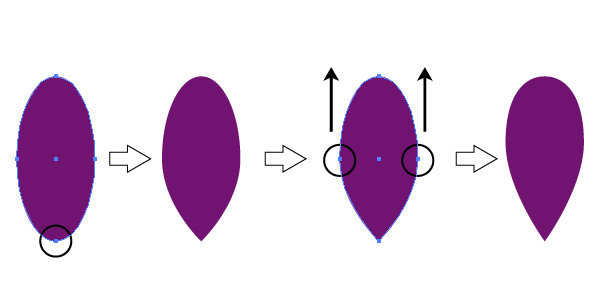
Step 1
First, we are going to create the petal. Using the Ellipse Tool (L) create an oval and apply the fill color R=113, G=20, B=113. Take the Convert Anchor Point Tool (Shift-C) and simply click on the bottom anchor point of the oval. Using the Direct Selection Tool (A), shift the left and right anchor points slightly upwards.
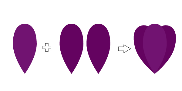
Step 2
Let’s create the bud. Copy-paste the petal created in the previous step to make two more petals. Set the fill color of these new petals to R=101, G=3, B=96. Place the new, slightly darker petals on the back (right-click > Arrange > Send Backward).
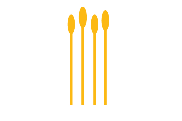
Step 3
Now the stamens. Create a small oval using the Ellipse Tool (L) and a long vertical rectangle using the Rectangle Tool (M). Set the fill color of these shapes to R=253, G=185, B=19. Group two shapes together to form stamen (right-click > Group) and copy-paste it to make four stamens.
Step 4
Place the stamens behind the petals made in Step 2.
Step 5
Duplicate all the petals and send them to the back. Set the fill color to R=73, G=3, B=73 for these new copies. Now you have the whole bud.
2. Create the Stem and the Leaves
Step 1
On to the stem now. Take the Rectangle Tool (M) and draw a long vertical rectangle. Fill it with two-colored Linear Gradient from violet (R=101, G=3, B=96) to green (R=141, G=139, B=0). Look at the Gradient panel and make the Angle -90 degrees. Then move the Gradient Slider Location to 20%. After that, place the stem on the back (right-click > Arrange > Send to Back).
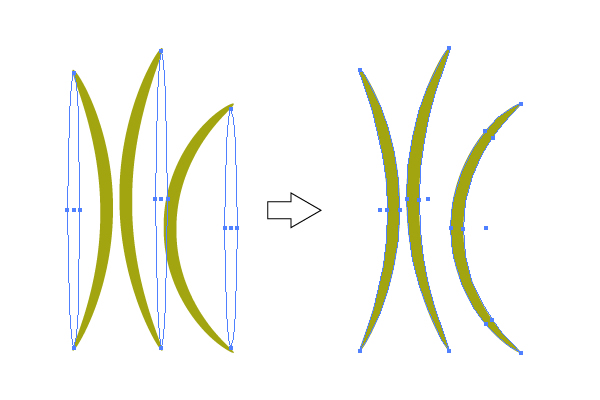
Step 2
Let’s create the leaves. Pick the Ellipse Tool (L) and draw three different length ovals. Set the fill color to R=163, G=165, B=16. Make sure that the first one is selected and go to Effect > Warp > Arc. In the options window, set the Arc type to Vertical, then set the Bend to -30%, Horizontal Distortion to 0% and Vertical Distortion to -15%.
Then, select the second oval and go to Effect > Warp > Arc. In the options window, set the Arc type to Vertical, then set the Bend to 30%, Horizontal Distortion to 0% and Vertical Distortion to -15%.
Select the third oval and go to Effect > Warp > Arc. In the options window, set the Arc type to Vertical, then set the Bend to 60%, Horizontal Distortion to 0% and VerticalDistortion to -15%. Now the very important step — select the three ovals and go to Object > Expand Appearance.
Step 3
As shown in the image below, place the leaves on its place. Now you have a crocus!
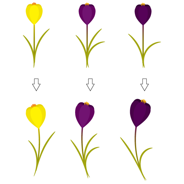
3. Create a Different Flower
Step 1
Take the entire flower you created in the previous steps and duplicate it. Now, unleash your creativity! Make few changes to the leaves. For example, delete one leaf and leave just two of them, as shown in the image below. Select the lightest petal and change the color to R=87, G=2, B=89. Then select two darker petals and change their color to R=73, G=3, B=73. After that select three darkest petals and change their color to R=50, G=2, B=51.
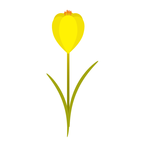
4. Create a Yellow Flower
Step 1
Again, as we did in the previous step, take the entire flower you created and duplicate it. We will now change the leaves. Select the lightest petal and change its color to R=255, G=242, B=3. Then select two darker petals and change their color to R=244, G=226, B=6. After that select three darkest petals and change their color to R=232, G=210, B=5. Then select the stamens and change their color to R=244, G=123, B=32. Lastly, we will change the stem. Look at the Gradient panel and change the color of the Gradient Slider from violet to yellow (R=224, G=197, B=3).
5. Add Curvature to the Flowers
Step 1
Group every flower (right-click > Group). Select the first flower and go to Effect > Warp > Arc. In the options window, set the Arc type to Vertical, then set the Bend to -20%, Horizontal Distortion to 0% and Vertical Distortion to -25%. Select the second flower. Go to Effect > Warp > Arc. In the options window, set the Arc type to Vertical, then set the Bend to 20%, Horizontal Distortion to 0% and Vertical Distortion to -20%. Select the third flower, go to Effect > Warp > Arc. In the options window, set the Arc type to Vertical, then set the Bend to 30%, Horizontal Distortion to 0% and Vertical Distortion to -30%.
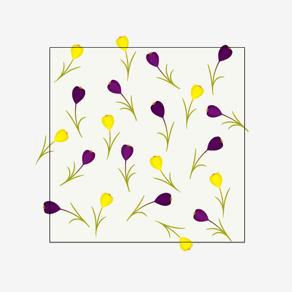
6. Create the Background
Step 1
Let’s draw a large square by using the Rectangle Tool (M) and holding down the Shift key at the same time. Set the fill color to R=247, G=247, B=241.
Step 2
Place the flowers scattered randomly all over the square created in the previous step.
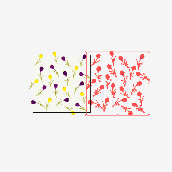
7. Create a Seamless Pattern
Step 1
Pick the Selection Tool (V) and select all the flowers, but without the background. Group them together (right-click > Group). Press the Enter key and the Move window should pop up. Enter in Horizontal Position 600 px, Vertical Position 0 px, Distance 600 px and the Angle 0 degrees. Now, press the Copy button.
Step 2
Select again all the flowers inside the art board and press the Enter key. In the Move window make Horizontal Position -600 px, Vertical Position 0 px, Distance 600 px and Angle 0 degrees. Press the Copy button.
Step 3
Select all the flowers inside the art board once again and press the Enter key. In the Move window make Horizontal Position 0 px, Vertical Position 600 px, Distance 600 px and the Angle 90 degrees. Press the Copy button.
Step 4
Select all the flowers inside the art board again and press the Enter key. In the Move window make Horizontal Position 0 px, Vertical Position -600 px, Distance 600 px and the Angle -90 degrees. Press the Copy button.
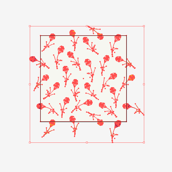
Step 5
Now, you need to ungroup everything. Select all the elements (Control-A) and ungroup them (right-click > Ungroup). You need to delete all the flowers that do not cross the background. Your result should look like the image below:
Step 6
Group all the flowers without the background. For this, you can select everything (Control-A) and while holding the Shift key, uncheck the background. Now you have selected all the flowers. Group them together. Make another copy of the background (Control-C, Control-F) and send it to the front (Control-X, Control-F). Keep the new copy of the background selected and while holding the Shift key, select the grouped flowers. Go to Pathfinder panel and press the Crop button.
Step 7
We’re almost there! You should now have something like the image below:
8. Play With Your Pattern
Step 1
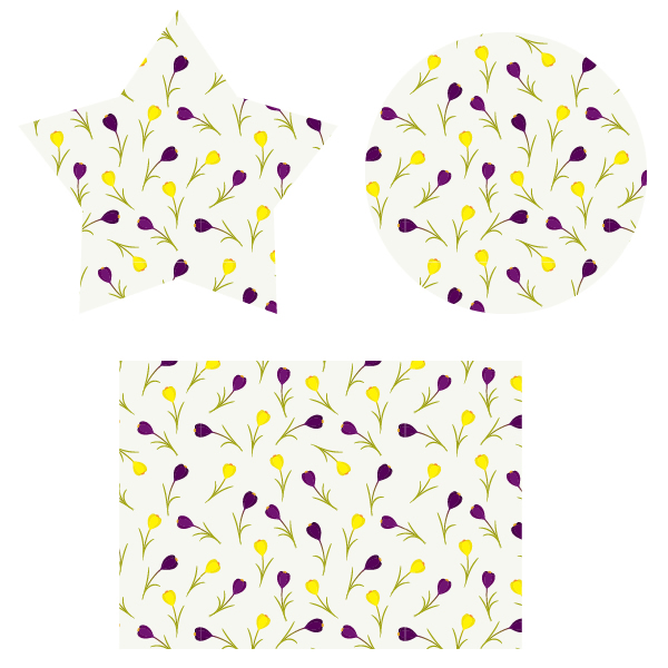
Select everything (Control-A) and for easier management, let’s make it smaller. Then simply drag it to the Swatches panel. Now draw any shape from the Tools panel and apply the new created pattern. Watch and enjoy the spring unfold in front of you!
Conclusion
Congratulations, you made beautiful spring floral pattern! Now you can apply these steps to create any seamless patterns. Good luck!
tag:design.tutsplus.com,2005:PostPresenter/vector-25714What You'll Be Creating
In this tutorial, you'll learn how to draw a cute geometric bird in Adobe Illustrator, with the use of the Shape Builder tool and Outline Stroke.
The main theme in this
illustration is the word “ajua”. This is an expression used mostly in northern
Mexico. When people are having a great time with friends or family, drinking or
singing they yell, “AJUA!!”
1. Create a New Document and Sketch
Step 1
Create a New Document (Command-N), 600 x 642 px in size, and add two layers:
Illustration
Sketch
Step 2
Create a rough sketch of what you'd like the final result to look like, and put it in layer called Sketch. You can either draw your picture with the Blob Brush Tool (Shift-B) using a digital tablet or mouse, or do it the traditional way with
pencil and paper and scan or photograph it.
Step 3
Set the Opacity of
the sketch to 20% and lock the Sketch layer. Now we can start
our illustration.
2. Set Up the Color Palette
Step 1
First, I chose the four colors
shown below. We're going to use the Blend Tool (W) to create additional color values to add to the finished picture. Use the Rectangle Tool (M) to create four squares (one of each color, as pictured below) then select the Blend Tool (W). Click on the turquoise square and then click on the purple square to create a gradient between them. Do the same for the yellow and red squares.
Step 2
Following the instructions above, you'll have created a color blend that looks something like the first figure below. To create more
specific values of color you need to select the blend, and with the Blend
Tool selected press Enter to see the Blend Options. In the Spacing section, check the Specified Steps option and add a value of 5. Now you have
14 color values in total.
Step 3
Finally select both blends and go to Object > Expand and then click OK. Now you have your color palette.
3. Draw the Bird's Face
Step 1
To draw the bird’s
beak, draw a Triangle using the Polygon Tool. To do this, select the Polygon Tool, hold-click on the canvas and use the arrow keys on your keyboard to change the number of sides of the shape that appears. Duplicate the triangle twice and move one of the duplicates upwards. Select both duplicates and then with the Pathfinder panel select Minus Front. Color the shapes as shown below.
Step 2
Each cheek is made of two Ellipses(L). First, make a small red ellipse for the colored spot on the cheek.
Then, to create the shape either side of the beak, create a larger ellipse with a 7pt Stroke. Using the Scissors
Tool (C) click on the two points of the ellipse that are circled in the image below. This separates the section between those two points from the rest of the ellipse. Use the Selection Tool (V) to select and delete the to delete the other part of the ellipse, as you don't need it anymore. Then select the shape you've created, and go to Object > Path > Outline Stroke to convert the stroke to a path.
Move the two shapes into place, and you've created one cheek. Duplicate it and apply the Reflect Tool (O), then move the shapes into place as per the image below.
Step 3
To draw the eyes we're going to use the same technique as for the cheeks. Start by creating a circle using the Ellipse Tool (L) with an 9pt stroke. The eyes are upturned semi-circles, so you need to use the Scissors Tool (C) again to separate the two halves of the circle. Delete the bottom half, then select the remaining section and applyObject > Path > Outline Stroke. Duplicate the eye you've created, and move both shapes into place. The bird’s face is done!
4. Drawing the Bird’s Body
Step 1
To start the bird's body, select the Rounded
Rectangle Tool and draw a rectangle, as shown in the image below.
Tip: You can change the
roundness of the rectangle by clicking and holding, then using the up and down arrow keys.
To create the two geometric sections at the top of the bird's head, duplicate the base figure by copying and pasting
in front (Command-F), then use the Eraser Tool (Shift-E) andhold the Alt key and drag to make straight shapes. Remember to
duplicate the base figure to create more details. Color your three shapes in different shades of turquoise, referring to the image below.
Tip: If you need to do a
straight shape you can achieve them using the Eraser Tool (Alt and drag)
instead of drawing rectangles and using pathfinder. It’s a faster way to work.
Step 2
Use the Polygon Tool
to draw a triangle, and then select the Shape Builder Tool (Shift-M). The
way I use this tool is by selecting the figures I want to modify, and then clicking on them to convert them to small paths (+
Icon), but if you press Alt you can erase unnecessary paths (- Icon).Also, you can click and
drag to unite or erase more than one shape.
Tip: When you need to make
more than one shape in a base figure you can draw all of them, then duplicate
your base figure, select the paths you need and Unite or Erase as you need with
the Shape Builder tool. You’ll save some time this way, too.
Step 3
Keep duplicating the base figure
and using the Eraser Tool to add
more and more details. Finally, add a little triangle to finish the body.
Step 4
Draw a Circle and, using
the Convert Anchor Point Tool (Shift-C), click on the bottom of the circle and drag the anchor point
down, as shown in the image below. Duplicate your new shape twice, and Rotate (R) and Reflect
(O) the duplicate shapes, arranging them to create the feathers on the bird’s head.
You can add details like
the shadow on the feathers by using the Offset Path Tool(Object > Path> Offset Path) and set it to 13 px. Now you can duplicate the
feather figures and use the Shape Builder Tool like before.
5. Draw the Bird’s Wings and the Hamburger
Step 1
For the wings, just draw
a line (as shown in the image below) then use the Width Tool
(Shift-W) to modify it. Finally convert to paths, Duplicate the shape twice to create three parts for the wing, and create your second wing by copying and reflecting the one you have.
Step 2
To add more detail simply
draw some Rectangles (M) as shown in the reference picture and color them accordingly. Move them into place, and now our wings
are done!
Step 3
To draw the hamburger, start by drawing three rectangles for the base of the bun, and add a rounded rectangle for the meat. Add
some detail with small circles (remember to group objects like the circles and
use the Align Window to keep everything aligned to the center of the picture).
Step 4
Now draw a triangle
and a rectangle to make the cheese. Select the rectangleand apply the Zig
Zag Effect (Effect > Distort & Transform > Zig Zag). Set the size
to 5px and the ridges per segment to 9.
Step 5
To draw the bread make a rounded rectangle and use the Eraser Tool to cut it in half (as shown in the image below), then
draw a triangle to get the base shape. Add some triangles and rectangles,
duplicate the base figure and use the Shape Builder tool to add all the
details.
6. The Bird's Tail
Step 1
The tail is pretty simple.
Just draw two circles, one inside the other, and use the Eraser Tool to remove the slightly less than half from the bottom. Then draw two triangles with the Polygon Tool, and use the Shape Builder Tool to
get the shapes shown in the reference image below.
Step 2
Add some details to the tail by using circles and playing with the geometry you
already have. Duplicate and erase paths in a straight line until you're happy with the configuration of the contrasting shapes and colors.
7. Drawing the Background
Step 1
Start by drawing some rectangles.
Step 2
Add some triangles and a circle.
Step 3
Now that you got all the paths you need, use the Shape Builder Tool.
Step 4
Your shapes should look
like the blue ones on the reference image below. Now, paint them with your color
palette.
Step 5
The background should look something like this:
8. Adding Final Details
Step 1
To add more details we are going
to draw a heart and a hat. For the heart you need to draw two circles, then
apply Unite in the Pathfinder tool, erase two anchor points and drag
the center anchor point a little lower. Then apply the Convert Anchor Point
Tool (Shift-C) to adjust the nodes, add detail and boom, you're done.
Step 2
The hat is also pretty simple. First draw a rounded rectangle and use the Scissors tool (C) to remove what you don't need. Refer to the image below for an example. Convert the Stroke to a Path, add more rounded rectangles
and use the Shape Builder tool to get the shape of the hat. Once you've added color and a few little details, you're done!
Your picture should look
something like this:
Step 3
Add some more details and
now our illustration is finished. I've circled the finishing touches in the image below, but you can use your imagination and add whatever you want!
Conclusion
Congratulations! Your illustration
is finished. I hope you enjoyed this tutorial and learned something new. Keep on
drawing, people. Saludos!
In the following steps you will learn how to create a flag bunting Pattern Brush in Adobe Illustrator.
For starters you will learn how to setup a simple grid and how to create the flags and the rest of the shapes that will make up the side tile of your Pattern Brush.
Next you will learn how to create the the shapes that will make up the corners and the start and end tiles of your Pattern Brush.
Finally, you will learn how to save a bunch of simple pattern, how to create your own Pattern Brush and how to easily use it.
1. Create a New Document and Set Up a Grid
Hit Control-N to create a new document. Select Pixels from the Units drop-down menu, enter 600 in the width box and 400 in the height box then click on the Advanced button. Select RGB, Screen (72ppi) and make sure that the Align New Objects to Pixel Grid box is unchecked before you click OK.
Enable the Grid (View > Show Grid) and the Snap to Grid (View > Snap to Grid). You will need a grid every 1px, so simply go to Edit > Preferences > Guides > Grid, enter 1 in the Gridline every box and 1 in the Subdivisions box. Try not to get discouraged by all that grid, it will ease your work and keep in mind that you can easily enable or disable it using the Control-" keyboard shortcut.
You should also open the Info panel (Window > Info) for a live preview with the size and position of your shapes. Do not forget to set the unit of measurement to pixels from Edit > Preferences > Units > General. All these options will significantly increase your work speed.
2. Create the Side Tile of the Pattern Brush
Step 1
Pick the Rectangle Tool (M) and focus on your Toolbar. Remove the color from the stroke then select the fill and set its color at R=230 G=231 B=232. Move to your artboard and simply create a 105 x 26px rectangle, the Snap to Grid should ease your work.
Step 2
Make sure that the Rectangle Tool (M) is still acrive, set the fill color at R=165 G=165 B=175, create a 105 x 1px shape and place it exactly as shown in the following image. Once again, the Snap to Grid feature should ease your work.
Step 3
Make sure that the Rectangle Tool (M) is still active, set the fill color at R=39 G=170 B=225, create a 13 x 14px shape and place it exactly as shown in the following image. Focus on the bottom side of this blue rectangle, grab the Delete Anchor Point Tool (-) and simply click on the right anchor point to remove it.
Switch to the Direct Selection Tool (A), select the remaining bottom anchor point and simply drag it 8px to the right. In the end your blue rectangle should turn into a simple triangle as shown in the second image.
Step 4
Make sure that your blue shape is selected make four copies in front (Control-C > Control-F). Select these copies one by one, place them as shown in the following image and replace the existing fill color with the ones shown below.
Step 5
Select your blue triangle and go to Effect > Warp > Arc Lower. Enter the properties shown in the following image, click OK and go to Effect > Warp > Arc Upper. Enter the attributes shown below, click OK and go to Object > Expand Appearance.
Step 6
Select your yellow triangle and go to Effect > Warp > Arc Lower. Enter the properties shown in the following image, click OK and go to Effect > Warp > Flag. Enter the attributes shown below, click OK and go to Object > Expand Appearance.
Step 7
Select your red triangle and go to Effect > Warp > Arc Upper. Enter the properties shown in the following image, click OK and go to Effect > Warp > Flag. Enter the attributes shown below, click OK and go to Object > Expand Appearance.
Step 8
Select your orange triangle and go to Effect > Warp > Arc Lower. Enter the properties shown in the following image, click OK and go to Effect > Warp > Arc Upper. Enter the attributes shown below and go to Effect > Warp > Flag. Enter the properties shown in the following image, click OK and go to Object > Expand Appearance.
Step 9
Select your green triangle and go to Effect > Warp > Arc Upper. Enter the properties shown in the following image, click OK and go to Effect > Warp > Flag. Enter the attributes shown below, click OK and go to Object > Expand Appearance.
Step 10
Grab the Direct Selection Tool (A), select the ten anchor points highlighted by the blue circles in the first image, focus on the control panel and simply enter "1px" in that Corners box. In the end things should look like in the second image.
Step 11
Reselect the five shapes that make up your flags and duplicate them (Control-C > Control-F). Select these copies and simply hit Control-8 to turn them into a simple Compound Path. Make sure that your compound path is selected and replace the existing fill color with R=245 G=124 B=174.
Step 12
Reselect your pink compound path and make a copy in front (Control-C > Control-F).
Using the Rectangle Tool (M), create a 105 x 1px shape, set the fill color at black and place it as shown in the second image. Select this thin rectangle along with the copy made in the beginning of the step, open the Pathfinder panel (Window > Pathfinder) and click the Intersect button.
Make sure that the resulting group of shapes is selected, turn it into a new Compound Path (Control-8) and focus on the Appearance panel. Simply click on that "Opacity" piece of text to open the Transparency fly-out panel, lower the Opacity to 30% and change the Blending Mode to Soft Light.
Step 13
Reselect your pink compound path and make a new copy in front (Control-C > Control-F).
Using the Rectangle Tool (M), create a 105 x 1px shape, set the fill color at white and place it as shown in the second image. Select this thin rectangle along with the copy made in the beginning of the step and click the Intersect button from the Pathfinder panel.
Turn the resulting group of shapes into a new Compound Path (Control-8), lower its Opacity to 30% and change the Blending Mode to Soft Light.
Step 14
Reselect your pink compound path and new make a copy in front (Control-C > Control-F).
Using the Rectangle Tool (M), create a 105 x 3px shape, set the fill color at black and place it as shown in the second image. Select this new rectangle along with the copy made in the beginning of the step and click the Intersect button from the Pathfinder panel.
Turn the resulting group of shapes into a new Compound Path (Control-8), lower its Opacity to 20% and change the Blending Mode to Soft Light.
Step 15
Using the Rectangle Tool (M), create a 105 x 1px shape, set the fill color at black and place it as shown in the second image. Select this new rectangle along with your pink compound path and click the Intersect button from the Pathfinder panel. Turn the resulting group of shapes into a new Compound Path (Control-8), lower its Opacity to 20% and change the Blending Mode to Soft Light.
Step 16
Reselect all the shapes made so far and hit Control-G to Group them. Move to the Layers panel (Window > Layers), simply double click on your new group and rename it "sideTile"
3. Create the Outer Corner and the Inner Corner Tiles of the Pattern Brush
Step 1
Pick the Rectangle Tool (M), create a 26px square, set the fill color at R=230 G=231 B=232 and place it as shown in the first image. Using the same tool, create an 11 x 1px rectangle and a 1 x 11px rectangle. Fill both shapes with R=165 G=165 B=175 and place them as shown in the second image.
Step 2
Using the Ellipse Tool (L), create a 5px circle, set the fill color at R=100 G=100 B=115 and place it as shown in the first image.
Make sure that your new shape is selected and go to Object > Path > Offset Path. Enter a -1px Offset and click OK. Select the newly created shape, replace the existing fill color with R=135 G=135 B=145 and go again to Object > Path > Offset Path. Enter a -1px Offset and click OK. Select the resulting circle and replace the existing fill color with R=209 G=211 B=212.
Reselect the three concentric circles made in this step along with the three rectangles made in the previous step and Group them (Control-G). Move to the Layers panel and simply rename this new group "outerCorner"
Step 3
Duplicate your "outerCorner" group (Control-C > Control-F), select the copy and drag it several pixels to the right as shown in the first image.
Focus on the Layers panel and rename this new group "innerCorner". Keep focusing on the Layers panel, open your "innerCorner" group, select the three concentric circles and simply drag them 1px up and 1px to the left as shown in the second image.
Next, select the 11 x 1px rectangle and move it 1px up then select the 1 x 11px rectangle and move it 1px to the left. In the end your "innerCorner" group should look like in the fourth image.
4. Create the Start and the End Tiles of the Pattern Brush
Step 1
Pick the Rectangle Tool (M), create a 15 x 26px square, set the fill color at R=230 G=231 B=232 and place it as shown in the first image.
Using the same tool, create a 12 x 1px rectangle, set the fill color at R=165 G=165 B=175 and place them as shown in the second image.
Step 2
Using the Ellipse Tool (L), create a 5px circle, set the fill color at R=100 G=100 B=115 and place it as shown in the first image.
Make sure that this new shape is selected and go to Object > Path > Offset Path. Enter a -1px Offset and click OK. Select the new circle, replace the existing fill color with R=135 G=135 B=145 and go again to Object > Path > Offset Path. Enter that same -1px Offset and click OK. Select the resulting shape and replace the existing fill color with R=209 G=211 B=212.
Reselect the three concentric circles made in this step along with the two rectangles made in the previous step and Group them (Control-G). Move to the Layers panel and simply rename this new group "startTile"
Step 3
Make sure that your "startTile" group is selected and go to Object > Transform > Reflect. Check the Vertical box then click the Copy button to create a horizontally flipped group copy.
Select the newly created group, drag it several pixels to the left (as shown in the third image) then move to the Layers panel and rename it "endTile".
5. Save Four Simple Pattern and Create Your Pattern Brush
Step 1
Reselect the five rectangles with the fill color set at R=230 G=231 B=232, focus on the Appearance panel and simply remove that color from the fill. This should make your shapes invisible.
Step 2
Select your "outerCorner" group and simply drag inside your Swatches panel (Window > Swatches) to save it as a pattern. Double-click on your new pattern and rename it "OuterCorner". Select your "innerCorner" group, save it as a new pattern and rename it "InnerCorner".
Step 3
Select your "startCorner" group, save it as a pattern and rename it "StartTile". Select your "endCorner" group, save it as a pattern and rename it "EndTile".
Step 4
Select your "sideTile" group, open the Brushes panel (Window > Brushes) and click the New Brush button (pointed by the little, blue arrow in the following image). Check the Pattern Brush box then click OK to open the Pattern Brush Options window. Enter "FlagsBrush" in the Name box then focus on to the Tile boxes. Open the Outer Corner, the Inner Corner, the Start Tile and the End Tile drop down windows and simply add your saved pattern. Once you're done, click the OK button and you should find your new pattern brush inside the Brushes panel.
6. Save a Simple Graphic Style
Step 1
Pick the Rectangle Tool (M) and simply click on your artboard to open the Rectangle window. Enter 610 in the Width box and 410 in the Height box then click the OK button. Make sure that the resulting shape stays selected and set its color at R=234 G=240 B=255.
Next, you will need to center it, so open the Align panel (Window > Align). Set the aligning to Artboard (open the fly out menu and go to Show Options if you can't see the Align To section as shown in the following image), make sure that your shape is selected then simply click the Horizontal Align Center and Vertical Align Center buttons. In the end your square should cover the entire artboard as shown in the following image.
Step 2
Using the Pen Tool (P), create a simple path roughly as shown in the following image. Make sure that it has no color set for the fill then select the stroke and simply add your "FlagsBrush" from the Brushes panel.
Step 3
Reselect your path, focus on the Appearance panel, select the stroke and add the four Drop Shadow effects (Effect > Stylize > Drop Shadow) shown in the following image. Make sure that your path stays selected, open the Graphic Styles panel (Window > Graphic Styles) and simply click the New Graphic Style button to save a new graphic style.
Step 4
Finally, create any shape or path that you like, make sure that it is selected and simply add your saved graphic style from the Graphic Styles panel.
Congratulations! You're Done!
Here is how it should look. I hope you've enjoyed this tutorial and can apply these techniques in your future projects.
tag:design.tutsplus.com,2005:PostPresenter/cms-21049What You'll Be Creating
1. Create the Petals and Stamens
Step 1
First, we are going to create the petal. Using the Ellipse Tool (L) create an oval and apply the fill color R=113, G=20, B=113. Take the Convert Anchor Point Tool (Shift-C) and simply click on the bottom anchor point of the oval. Using the Direct Selection Tool (A), shift the left and right anchor points slightly upwards.
Step 2
Let’s create the bud. Copy-paste the petal created in the previous step to make two more petals. Set the fill color of these new petals to R=101, G=3, B=96. Place the new, slightly darker petals on the back (right-click > Arrange > Send Backward).
Step 3
Now the stamens. Create a small oval using the Ellipse Tool (L) and a long vertical rectangle using the Rectangle Tool (M). Set the fill color of these shapes to R=253, G=185, B=19. Group two shapes together to form stamen (right-click > Group) and copy-paste it to make four stamens.
Step 4
Place the stamens behind the petals made in Step 2.
Step 5
Duplicate all the petals and send them to the back. Set the fill color to R=73, G=3, B=73 for these new copies. Now you have the whole bud.
2. Create the Stem and the Leaves
Step 1
On to the stem now. Take the Rectangle Tool (M) and draw a long vertical rectangle. Fill it with two-colored Linear Gradient from violet (R=101, G=3, B=96) to green (R=141, G=139, B=0). Look at the Gradient panel and make the Angle -90 degrees. Then move the Gradient Slider Location to 20%. After that, place the stem on the back (right-click > Arrange > Send to Back).
Step 2
Let’s create the leaves. Pick the Ellipse Tool (L) and draw three different length ovals. Set the fill color to R=163, G=165, B=16. Make sure that the first one is selected and go to Effect > Warp > Arc. In the options window, set the Arc type to Vertical, then set the Bend to -30%, Horizontal Distortion to 0% and Vertical Distortion to -15%.
Then, select the second oval and go to Effect > Warp > Arc. In the options window, set the Arc type to Vertical, then set the Bend to 30%, Horizontal Distortion to 0% and Vertical Distortion to -15%.
Select the third oval and go to Effect > Warp > Arc. In the options window, set the Arc type to Vertical, then set the Bend to 60%, Horizontal Distortion to 0% and VerticalDistortion to -15%. Now the very important step — select the three ovals and go to Object > Expand Appearance.
Step 3
As shown in the image below, place the leaves on its place. Now you have a crocus!
3. Create a Different Flower
Step 1
Take the entire flower you created in the previous steps and duplicate it. Now, unleash your creativity! Make few changes to the leaves. For example, delete one leaf and leave just two of them, as shown in the image below. Select the lightest petal and change the color to R=87, G=2, B=89. Then select two darker petals and change their color to R=73, G=3, B=73. After that select three darkest petals and change their color to R=50, G=2, B=51.
4. Create a Yellow Flower
Step 1
Again, as we did in the previous step, take the entire flower you created and duplicate it. We will now change the leaves. Select the lightest petal and change its color to R=255, G=242, B=3. Then select two darker petals and change their color to R=244, G=226, B=6. After that select three darkest petals and change their color to R=232, G=210, B=5. Then select the stamens and change their color to R=244, G=123, B=32. Lastly, we will change the stem. Look at the Gradient panel and change the color of the Gradient Slider from violet to yellow (R=224, G=197, B=3).
5. Add Curvature to the Flowers
Step 1
Group every flower (right-click > Group). Select the first flower and go to Effect > Warp > Arc. In the options window, set the Arc type to Vertical, then set the Bend to -20%, Horizontal Distortion to 0% and Vertical Distortion to -25%. Select the second flower. Go to Effect > Warp > Arc. In the options window, set the Arc type to Vertical, then set the Bend to 20%, Horizontal Distortion to 0% and Vertical Distortion to -20%. Select the third flower, go to Effect > Warp > Arc. In the options window, set the Arc type to Vertical, then set the Bend to 30%, Horizontal Distortion to 0% and Vertical Distortion to -30%.
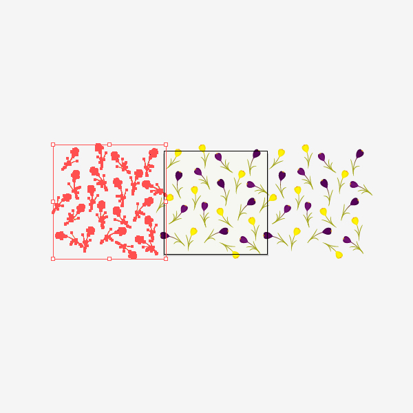
6. Create the Background
Step 1
Let’s draw a large square by using the Rectangle Tool (M) and holding down the Shift key at the same time. Set the fill color to R=247, G=247, B=241.
Step 2
Place the flowers scattered randomly all over the square created in the previous step.
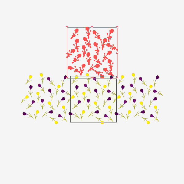
7. Create a Seamless Pattern
Step 1
Pick the Selection Tool (V) and select all the flowers, but without the background. Group them together (right-click > Group). Press the Enter key and the Move window should pop up. Enter in Horizontal Position 600 px, Vertical Position 0 px, Distance 600 px and the Angle 0 degrees. Now, press the Copy button.
Step 2
Select again all the flowers inside the art board and press the Enter key. In the Move window make Horizontal Position -600 px, Vertical Position 0 px, Distance 600 px and Angle 0 degrees. Press the Copy button.
Step 3
Select all the flowers inside the art board once again and press the Enter key. In the Move window make Horizontal Position 0 px, Vertical Position 600 px, Distance 600 px and the Angle 90 degrees. Press the Copy button.
Step 4
Select all the flowers inside the art board again and press the Enter key. In the Move window make Horizontal Position 0 px, Vertical Position -600 px, Distance 600 px and the Angle -90 degrees. Press the Copy button.
Step 5
Now, you need to ungroup everything. Select all the elements (Control-A) and ungroup them (right-click > Ungroup). You need to delete all the flowers that do not cross the background. Your result should look like the image below:
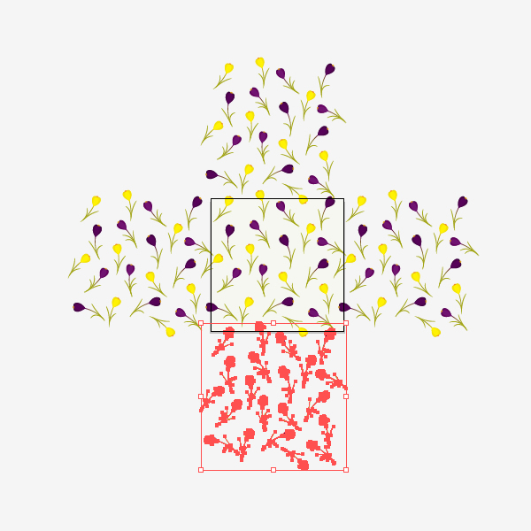
Step 6
Group all the flowers without the background. For this, you can select everything (Control-A) and while holding the Shift key, uncheck the background. Now you have selected all the flowers. Group them together. Make another copy of the background (Control-C, Control-F) and send it to the front (Control-X, Control-F). Keep the new copy of the background selected and while holding the Shift key, select the grouped flowers. Go to Pathfinder panel and press the Crop button.
Step 7
We’re almost there! You should now have something like the image below:
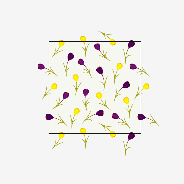
8. Play With Your Pattern
Step 1
Select everything (Control-A) and for easier management, let’s make it smaller. Then simply drag it to the Swatches panel. Now draw any shape from the Tools panel and apply the new created pattern. Watch and enjoy the spring unfold in front of you!
Conclusion
Congratulations, you made beautiful spring floral pattern! Now you can apply these steps to create any seamless patterns. Good luck!
Love football? The 2014 World Cup in Brazil starts today! In this tutorial, I decided to create a bright illustration with a retro style effect but with a nod to the hosting teams colors, all in Adobe Illustrator.
Lets create a New Document in Adobe Illustrator with following settings.
Step 2
You need some picture of footballer to be used as derivative. I found amazing image on Photodune. There are a lot of photos with football players available, however I picked this one because it has nice lighting and a good dynamic pose.
Step 3
Drag and drop your picture on the current layer. Open the Layer Settings by clicking double on this layer. Rename it as Picture and use the following settings.
Step 4
Let's create and add some retro colors in the Swatches panel. The colors have to be strong, contrasting and bright. Go to the Color panel and play with the RGB settings.
I'll be using a deep blue retro color. Nice for shadows and contours. Lets create and add a few more colors. These are the codes for the colors I'll be using: #FFFFFF, #AB673D, #AB673D, #FFD438, #179840, #66999C. You can use them or create your own.
2. Create the Main Shapes
Step 1
Create a New Layer above the stock image layer. Choose the dark blue color as Fill color. Lets create the main contour shape with Pen Tool (P).
Pay attention to details. But don't make the shape too smooth. Sharp angles give a good old school effect.
Use Preview mode (View > Preview) to see outlines only. Its great way to make this process much easier.
Step 2
When you have finished with the main shape select it and create one more contour by going to Object > Path > Offset Path. Lock the generated path (Object > Lock > Selection).
Step 3
Let's divide the original shape into several basic parts: head, hands, feet and clothes. Still using the Pen Tool (P) create a new shape of the face above the main shape.
Create the hands, legs and clothes elements the same way.
Actually it's not required for the shapes to be closed. You can just make some contour lines in the areas where the main shape will be divided.
Step 4
After that, select all shapes (except offset and locked one of course) and click the Divide button in the Pathfinder panel. Then Ungroup (Object > Ungroup) this all and remove any unnecessary stay objects.
Step 5
Select each piece and change the Fill color using the swatches you created before.
Step 6
Add more deep blue contours in the places which needs strong contrast.
Offset Path of each piece again (just like you have done before in Step 2) to get fast extra contour shapes. Use the Pen Tool (P)to create some lines on the hands and finger areas.
3. Add the Details
This part of work is most laborious. But at the same time it's the most fun and interesting.
Step 1
Starting from the top let's create face details using the Pen Tool (P). The Fill color is still deep blue. I decided to drop down the opacity level in Picture layer options to have better Preview.
Continue to add details around the face.
Step 2
Choose the yellow color for the fill and create the midtones areas. Don't forget to switch Preview mode all the time to see where you have to put this yellow color.
Step 3
Create a Calligraphic Brush for stylish artistic lines to make your artwork more detailed. Click the New Brush button in the Brushes panel and use the following settings.
Continue drawing using your graphics tablet. Experiment with pressure: some lines have to be thin, some lines need to be thick. If sometime you feel the need to use the Pen Tool - feel free to use it. As you can see on picture below I was using the Pen Tool for the larger areas, and Brush - for the line shaped thin areas.
This is important part of work when you realizing how exactly your whole image looks like. The style your details have to be kept through the whole work process.
If you're not happy with your Brush drawing results try to change this settings (press Enter). I was using these:
Also check out your Graphics Tablet settings. I have got Pressure Intensity set up on the hardest level to have the best pressure control.
Step 4
Add contour lights on hair with a brown color and some highlights on face using white. Continue going down and add shadows on t-shirt. Again use the Pen Tool for big solid areas and Brush for more detailed thin lines.
Add highlights as well.
Step 5
There is a great way to make your shadows and highlights areas more detailed and stylish. Add sharp contiguous lines here and there just like I've done on pictures below.
Look how I created the yellow midtones and white highlights on the hands. Do it same way: somewhere with Pen Tool and somewhere with Brush.
Step 6
Pay attention to contour lights - thin lines on the sides. These lines gives great contrast. Create them using the Paintbrush Tool (B).
Step 7
Continue going down with details. Add green midtones and white highlights on the shorts.
Add a number on the shorts too. Distort it with the Warp Tool and Direct Selection Tool (A).
Step 8
Still using the Paintbrush Tool add some decorative thin lines and little dots here and there to make illustration be more textured.
Step 9
Draw some lines on the gaiters and move to the shoes.
I was drawing blind because the shoes in derivative picture are black. Its almost solid black: poor midtones and highlights. That means sometimes you have to be extra creative and run with your imagination.
Step 10
Add the finishing touches: contrast lines, decorative dots, little scribbles. I add more curls to the hair, some wet drops on the face, few extra lines to the mustache and barb.
And finally we got cool bright retro styled footballer! Something is missing... oh yeah, the ball!
4. Create the Ball
You can create the ball same way you've done before with footballer. Nothing special. But I actually was using my old vector ball I created a long time ago. But it still works, and I'm gonna show you how.
Step 1
Copy-paste the ball. Select the copy and press Unite button.
Step 2
Fill the result shape with deep blue color from your Swatches panel. Offset this path going to Object > Path > Offset Path (with the same setting as for footballer). Paste the resulting path to the back (Object > Arrange > Send to Back).
Step 3
Ungroup the ball on top and select all the black objects using Select > Same > Fill Color (but make sure you already selected at least one). And just change selected shapes black color to deep blue.
Select all dark grey shapes and change their fill to green. Use this technique to change light grey to yellow and middle grey to brown.
Step 4
Remove excess shapes and add extra lines using the Paintbrush Tool.
Step 5
Move the ball closer to the man. Pay attention to the light direction. It has to be the same with footballer. In this case rotate the ball if you need.
5. Add Texture to Your Illustration
Step 1
Go to the Layers panel and make Picture layer invisible. Create a New Layer above Picture. Choose the Rectangle Tool (M) and create a new rectangle 500 x 700 px. Fill it with #66999C.
Step 2
Create a New Layer above all and paste there some vector dirty elements. I was using my old vector scratches. But if you have nothing to use, I will show how to create it fast.
Just take your camera and make a few shots of walls in your place or get outside and make some photos of asphalt. Dirty and scratched surfaces work best for this.
Drop your photo on the current layer, select it and go to Window > Image Trace.
Play with controllers to get best result. I traced my picture with these settings:
Push the Trace button when you're done and Expand it in top main menu. After that there will be a group of vector elements. Thats it!
Step 3
Change your dirty elements fill color to the same with background.
Drag, scale and rotate the copies of this dirt element around your illustration.
Step 4
Finally add some extra lines and splashes to get weathered retro look.
Score! You're Now Done!
Your retro footballer illustration is complete! It's perfect to be used in a poster design. Or you just can put it to your desktop. I hope you enjoyed this tutorial and gained some new useful skills.
Did you know you can easily create things like barcodes and calendars with a single click? Let's take a look at these Inkscape's Extentions and more!
We've all seen that Extensions drop-down menu in Inkscape, but it can be a little intimidating. Fortunately though, it contains really efficient ways to do complex operations as well as fairly simple ones too. Let's go over the most useful extensions as of Inkscape v0.48.4
Extensions are just one element of my new course, Advanced Techniques in Inkscape, that I will walk you through. Check the introduction below to find out more before we jump in with this tutorial.
1. Restack
Step 1
The very first extension in fact is Restack and it's quite useful if you happen to have a bunch of overlaying objects.
Step 2
What Restack does is change the z-index of each object to your desired specifications. Go ahead and select your objects then head up to Extensions > Arrange > Restack to open up the dialog box. As you can see below, my diamonds are already stacked from Left to Right, so nothing changes here.
Step 3
The Restack Direction has a good amount of options, all of which are self-explanatory. I've selected Bottom to Top and as long as you have Live preview checked, you'll notice the changes right away. This option starts stacking from bottom to top according to each shapes Top-Left bounding box corner.
Step 4
The other option that differs is Arbitrary Angle, where you get to define an Angle in which to stack. 215 degrees stacked my shapes from the top-right corner to the bottom-left corner.
A slight issue I came across personally was that Live preview wouldn't work unless I unchecked and rechecked it after every time I changed something.
2. Color Extensions
Step 1
There are a bunch of options in Extensions > Color, but they're all very straight forward. I'll compare my original drawing with a color adjusted one. Below, I've selected Grayscale.
Step 2
And here, I selected individual parts of my drawing to make Brighter and Darker for some quick shading.
Step 3
Of course, we can see the Negative of our drawings as well.
Step 4
Or just go crazy with Randomize!
Step 5
One of my favorites is Replace color, which is easily used by entering old and new hex color codes.
3. Extrude
Step 1
This is a great way to take any two shapes and turn them into a extruded 3D object. Go ahead and select two shapes in which to extrude and head up to Extensions > Generate from Path > Extrude to bring up the dialog box.
Step 2
I'm going to check Polygons and Live preview to give me what you see below. This new extruded part of your object is actually a separate group of polygons (which can be edited to your liking).
Step 3
The less glamorous option is Lines, which simply draws the extrusion lines.
4. Interpolate
Step 1
A fancy word to fill in the space between two paths with the gradual placement of specified paths. Go ahead and select a couple of objects/paths and click Extensions > Generate from Path > Interpolate.
Step 2
Let's check Live preview and watch the magic happen! Interpolation steps is the number of paths to place between the two selected objects. I also unchecked Duplicate endpaths because redrawing my original shapes seems unnecessary.
Step 3
I went ahead and packed 8 Interpolation steps in there along with an added Exponent of 1.0 which exponentially increases/decreases the position of the steps.
Step 4
And if our two original objects happened to have different styles, we could go ahead and check Interpolate style.
5. Embed/Extract Images
Step 1
If you've ever imported a bitmap into Inkscape, it's likely you've seen this dialog box before. It simply asks you if you'd like to embed the image or link it. I say, let's link it to keep or file size down... but what if that was the wrong decision?
Step 2
It might seem like I have my beautiful guitar picture locked in, but before you know it...
Bam! I accidentally renamed or deleted my image or something and you end up with the saddest image of all.
Step 3
Thankfully, next time I link an image and decide I want to embed it, I can just head up to Extensions > Images > Embed Images. You can either embed all of your images, or individually select the ones you want.
Step 4
Alternatively, you can go ahead and click Extract Image instead. This is nice if you happen to pass your Inkscape document on to somebody else and they want your source image.
6. Envelope and Perspective
Step 1
Now, you'll need a secondary path to use as a guide for these operations. Make sure it only contains four corners and only straight lines. Go ahead, and select both objects and head up to Extensions > Modify Path to find both Envelope and Perspective.
Step 2
These are both essentially the same operation, except that perspective applies the extra effect. Below, I have my Envelope transformation and my Perspective transformation, respectively. You can see the difference - envelope just sort of crams your object into a path while perspective keeps the shape proportionate to the perspective.
7. Other Useful Modify Path
Step 1
If you've ever used markers on paths, then you know they're always black no matter what. Fortunately, Extensions > Modify Path > Color Markers to Match Stroke is a terrific way to do this!
Step 2
And if you've ever applied dashes as a stroke style, there may have come a time where you'd like to separate them as individual paths. Well, here comes Extensions > Modify Path > Convert to Dashes. The name is a little misleading as it's not converting to dashes - it already is dashes. I think Dashes to Paths would be a more suitable name perhaps.
8. Render
Step 1
If you ever need a barcode for your package design, simply head up to Extensions > Render > Barcode. There's a bunch of coding options and the rest is simple.
Step 2
Perhaps you've needed to create a completely customized calendar in, say, 5 seconds? Amazingly, you can do just that by clicking Extensions > Render > Calendar. There's a bunch of options for styling as well. How cool is this?
Step 3
Also, if you've ever wanted to include a grid in your drawing, Extensions > Render > Grid is the way to do it. It's also a great way to draw tables!
That's It!
We just went over a bunch of Inkscape extensions - can you believe there's even more? Hopefully, this narrowed down list of the most useful extensions will help you get around Inkscape more efficiently. Some of these extensions are just plain cool though! Thanks for reading.
My new course, Advanced Vector Portraits was recently published. It's a follow on course from my first, Vector Portraits for Beginners and it shows you how to create detailed hair, skin shading, modified portraits and more. A perfect jumping board for exploring how to create style vector portraits which look different from their original stock image.
1. Modify Your Stock Image
As with all of my vector portraits, I start with an initial base image. Depending on the project you're taking on, you may need to carbon copy your stock image or you may be able to get creative. Advanced Vector Portraits focuses on the latter and shows you quick and simple ways to modify your reference image before you even start the vectoring process.
So following the more advanced route of modifying a stock image, I started with a great image from Photodune of a young blond woman. The character I'm wishing to inspire this portrait is Elsa from Frozen. She's young and she's blond... so I'm already half way there in terms of reference material in front of me. However the stock image is realistic, and Disney proportions aren't. They're a cartoon and I need to turn our blond woman into a big eyed, round faced beauty.
In the course, I'll show you how to create a very similar effect to this. Modifying the eyes, the face shape and lips to create this very rough looking reference image.
Now it doesn't need to be polished or perfect, it's only a reference and as long as you can still clearly see the features you need, we can work on this in vector.
2. It All Starts With Skin Shading
Step 1
When you're creating a detailed vector portrait, one of the most challenging elements to create is skin shading. It's a thankless job I'm afraid. It doesn't have the impact of the eyes, hair or lips. You'll know you're doing the skin shading right when people don't comment on it.
So first let's create our all important base shape with the Pen Tool (P) in Adobe Illustrator. This is going to be used to create a Clipping Mask (Control-7) and to provide a solid base to put many low Opacity shapes on top.
Step 2
For the initial skin shading shapes, I use Pathfinder > Minus Front to remove the lighter areas of the face from duplicates of the base shape. I then stack multiple variations of the shapes with low Opacities on top of the base to create a smooth transition of colour.
The skintones I tend to use can be found directly in Adobe Illustrator by going in the Swatches panel and into the drill down menu. Select Open Swatch Libraries > Skintones and you'll be presented with many palettes of varied ethnicity. I tend to select several so I can create the lightest of light and darkest of dark contrasts in the skin.
In my course I'll show you each shape that I draw for a manipulated portrait such as this and tell you further about the colours I use.
Step 3
The smaller the shapes I draw, the deeper the contrast. I always work on the shadowed areas first and use several Blending Modes with the original base shape colour to keep an even skin tone in the initial stages.
Step 4
Once the initial shapes are drawn, I then Group them (Control-G) and use a duplicate of the base shape to create a Clipping Mask (Control-7). This helps clean up the edges
Step 5
I then to continue to add dark shadow shapes to the skin and then Group them and place them in the clipping mask group.
Step 6
The next step is to add highlights to the skin (usually with transparent Radial Gradients) and variations in the skin tones. Variations such as rosey cheeks, slight greying in the corner of the eyes and a little touch of red on the nose.
Then I lighten the skin further and add more rosey tones to the skin (given Elsa is a fan of the cold) to create a more icy look.
3. Let's Work on those Lips
Step 1
The majority of shading should always be done with the skin shading. This is because the lips are part of the skin. Any additional detailing you add to the lips, such as colours, sparkles etc... should be done separately so they don't make the lips look as if they're floating on the surface of the skin.
I first begin with adding colour to the lips to create a base. I'll avoid adding too much colour to the areas where the light catches them.
Step 2
Then using the same process of adding highlights to the skin, I use transparent Radial Gradients to the lips to add highlights and textures.
Step 3
Finally, sparkles and glitter are added to the lips to create a more frosted look.
4. Create Striking Eyes
Step 1
In a portrait, the first thing we pay attention to is the eyes. This is your first impression with the viewer, so make it count and create striking eyes. In this design it helps that the eyes have been enlarged, it's just I'll need to make them striking enough!
Using pale transparent Radial Gradients, I first create shapes for the eyeball and corners of the eyes.
Step 2
One of the cleanest ways to create a detailed iris and pupil is to use the Appearance panel and Graphic Styles. It also means you can create two evenly styled eyes!
I've used a series of blues with varying Offset Paths and then finished it off with a Zig Zag effect. In the course, I will show you how to create this fill by fill.
Once the eyes are created, place them in a Clipping Mask to keep the edges tidy.
Step 3
Now that we have our eyes, we need to darken the skin around the eyes to help create a natural lash line. These shapes can also be drawn to help add shading to the eyeball and create a more 3D effect.
Step 4
Let's add some colours to the eyes by rendering some eye shadow and liner. Using transparent Radial Gradients, I've added purple around the eyes and then added dots to create a glitter effect.
Step 5
To finish off the eyes, I'm going to use one of my favourite art brushes, which has been taught in both of my vector courses (remember the beginners course is for free!).
First I add eyelashes and then move onto adding eyebrows. She's looking much more normal now! Finally I add a reflection of light in the eyes using another gradient.
I take this time to also add some freckles on the nose and cheeks.
5. Create a Braided Hairstyle
Step 1
In Advanced Vector Portraits, I'll teach you some solid hair style theory. How to build your own hair styles and make them look detailed! This is a variation of what I'll be teaching you, so you know how to add a braid into your design.
Braids (or plaits in the UK!) are hard to draw, especially if you rarely add them to your design. Sadly, Elsa's hair style includes a big, thick, blonde braid.
After you've sketched the top of your hairstyle on the skull, we're going to use a braid Art Brush to create a template for the braid. You can find out how to create your own braid brush via one of my old tutorials.
Step 2
Once you've sketched around the brush, use a the Bend Warp effect to create a curve in your design. This will give the perfect swishing braid for your portrait.
Step 3
Give yourself some direction of the grain of the hair in the plait by drawing in some strands. Give each section of the braid (there are three) their own colour. This will help you see where each of the sections are.
Step 4
Once you've got your initial sketches laid, it's time to create those all important base shapes. I've created one for the hair on top and one for the braid.
Step 5
The detailing of the hair begins with adding gradients to the bases and then adding initial strokes to the hair. These strokes follow the sketch you've done, so you're aware of where each of the sections of hair are. The sketch you've made of the direction of hair on the braid will help a great deal.
Step 6
Keep adding the light and dark strands to the hair to create a nice glossy hair style. Finish off the hair by adding individual hairs which will help give a more realistic look to the hair.
In the course, I will show you how to render the hair in detail and you'll see every stroke I draw.
Want to Learn More?
This portrait used exactly the same processes I use in Advanced Vector Portraits. In the course you'll learn how to create two different styles of portrait, using the same stock image!
The first is a monochrome portrait using detailed yet minimal shading.
The second is a more detailed portrait which follows exactly the same process as this Frozen portrait, but in much more detail. I'll talk you through each shape and stroke to create your own manipulated reference image and then vectoring the actual portrait.
Both portrait projects use exactly the same starting stock image! So what are you waiting for?
In this new quick tip you
will learn how to create a simple seashell in Adobe Illustrator.
You will begin
with the shape of the seashell which is made using basic shapes, the Rotate
option and the Pathfinder panel. To add more depth, you will add two types of
shading and also highlights on the surface of the seashell.
At the end, you
will color the seashells using different gradients and add the shadows. Let’s
begin!
1. Start
a New Project
Launch Illustrator and go
to File > New in order to open a blank document.
Type a name and set up the
dimensions then select Pixels as Units and RGB as Color Mode. Next, go to Edit> Preferences > General and set the Keyboard Increment to 1px then go toUnits & Display Performance and make sure that the Units are as indicated.
I usually work with these settings and they will help you throughout the
drawing process.
2.
Create the Shape of the Seashell
Step
1
Grab the Rectangle Tool (M)
and draw a 2 x 97px rectangle then give it a stroke using the color of your
choice. Now, zoom on the top part of the rectangle then grab the Add Anchor
Point Tool (+) and use it to add an extra point in the middle as shown in the
close-up. Do the same thing at the bottom of the rectangle.
Step
2
Use the Direct Selection
Tool (A) to select only the point added earlier and move it upwards 4px by
pressing the Up Arrow Key on your keyboard four times. Still having this point
selected, press the Convert selected anchor points to smooth icon in theControl panel. Don’t forget about the bottom of the rectangle and repeat the
same things.
Step
3
Having your rounded
rectangle selected, go to Effect > Warp > Shell Upper. Apply a 2%
Horizontal Bend
and hit OK.
Step
4
In order to expand the
effect that you have applied, go to Object menu and select Expand Appearance
then Ungroup (Shift-Control-G). I will name the shape obtained “first-rib”. While
this shape stays selected, go to Object > Transform > Rotate and select a5 degrees Angle then hit Copy. You will get a second “rib” on top but you need
to move it to the left a little, right next to the first.
Step
5
Now, select the second “rib”
(1) then go to Object > Transform > Rotate, apply again a 5 degrees Angle
and hit Copy. You will get the third “rib” (2) that you have to move in the
right place, to the left and a little down (3). These ribs must be right next
to each other even to overlap a bit but definitely without gaps between them.
Step
6
You get the point. Now,
select the third “rib” and rotate it 5 degrees to get the next one (1). Move it
to its place then continue to do the same thing (2). Once you get at the bottom,
you can overlap the last few shapes in order to get smaller “ribs” (3). At this
point I’ve switched to a green fill so you can see better the shape of the
seashell coming together. Don’t worry about the bottom of the seashell because
you will fix that later.
Step
7
Now, select all the shapes
from the left side and reflect them to the other side by going to Object >
Transform > Reflect. Check Vertical and hit Copy. Make extra adjustments if
needed.
Step
8
Next, select everything and
press Add in the Pathfinder panel in order to get a single shape.
Step
9
Grab the Pen Tool (P) or
the Line Segment Tool (\) and draw a straight path as shown in the following
image. Select the green shape and the line and press Divide in the Pathfinder
panel then Ungroup (Shift-Control-G). Delete the shape at the bottom because
you don’t need it.
Step
10
Use the Direct Selection
Tool (A) to drag a selection over the points at the bottom of the seashell and
press the Convert selected anchor points to smooth icon in the Control panel.
This will generate the handles and now you can move them downwards to create
the rounded bottom. Now the shape of the seashell is ready.
3. Add
Shading on the Seashell
Step
1
Grab the Star Tool and draw
a small triangle then switch to the Delete Anchor Point Tool (-) and remove the
three points indicated on its sides. Next, use the Direct Selection Tool (A) to
select only the bottom point and go to Object > Transform > Move. There,
type -64px in the Vertical field and hit OK.
Step 2
Now, take the Pen Tool (P)
and draw a rhombus like shape at the top as in the next image (1). Select both
shapes and press Add in the Pathfinder panel in order to create a single shape
(2). Use the Convert Anchor Point Tool (Shift-C) to transform the two inner
points indicated in the close-up from corner to smooth (3). You need that area
to be rounded but everything will make sense in the following steps. I will
name this shape “light-shading-shape”.
Step
3
Move the shape that you
have obtained at the previous step over the seashell and arrange it right
between the “ribs”. The rounded area that I’ve talked about earlier should
partially cover the top part of the “ribs” as in the close-up. I’ve set the Opacity
of the light-shading-shape to 50% so you can see exactly where they overlap but
you don’t have to, it’s just for visual purposes.
Next, make a copy of this shape
then rotate slightly and arrange it between the next two “ribs”.
Step
4
Continue to make more
copies of the light-shading-shape, rotate accordingly and arrange them between
the “ribs”. After the left side of the seashell is done (1) you can do the same
thing on the right side (2).
Step
5
At this point, use theDirect Selection Tool (A) to select the end point of one of the shapes and you
can make it a little shorter or a little longer. Repeat with the rest. The goal
here is that the light-shading-shapes to have different lengths at the bottom.
Step
6
The Opacity is set back to100% now. Copy and Paste in Front (Control-F) the seashell then select all
light-shading-shapes and Group (Control-G) them (1). Before you continue make a
copy of this group because you will need it at the next step. Now, select the
group of shapes along with the copy of the seashell and press Intersect in thePathfinder panel (2). Set the resulting shape to Blending mode Overlay and 25%
Opacity while having a black fill (3).
Step
7
The light shading is done
but we need more depth. Grab the copy of the group that you’ve made at the
previous step and move it in front of everything. Ungroup (Shift-Control-G)
them first then select one of the shapes with the Selection Tool (1) and make
it thinner by squeezing the bounding box
(2). You can see the end result in the third close-up.
Step
8
Continue to squeeze the
rest of the shapes. They must be in line with the original ones but thinner.
Step
9
Select black as the fill
color for these thinner shapes then Group (Control-G) them. Copy and Paste in
Front (Control-F) the seashell then select the group of shapes along with the
copy of the seashell and press Intersect in the Pathfinder panel. Set the
resulting shape to Blending mode Overlay and 50% Opacity. This is more of a
deep shading compared with the first.
4. Add
Highlights on the Seashell
Step
1
Grab the Pen Tool (P) or
the Line Segment Tool (\) and draw a path through the middle of one of the
“ribs” (1). Continue to draw other paths, one for each “rib” of the seashell
(3).
Step
2
Stroke all these paths with
an Art Brush called “Tapered – Round” that you can find in Brush Libraries Menu> Artistic > Artistic_Ink. Still having these lines selected, go to theAppearance panel and double click on the brush stroke applied to open theStroke Options window. Type 15% in the Width field and hit OK. Make sure that
the tip of the brush is downwards otherwise check Flip Along also.
Step
3
You should decrease the
width of the brush for the paths on the sides of the seashell. Keep the Width
for the paths in the middle as it was set at the previous step, 15% (1). Select
the next few paths then open the Stroke Options window and set the Width at12% (2). Select the next paths and decrease the width a little more as you rich
the sides of the seashell (3). For the remaining paths set the Width at 5-7%.
Step
4
While the stroked paths are
selected, select Expand Appearance from the Object menu then Ungroup
(Shift-Control-G) twice (1). Fill all resulting shapes with a white to black
radial gradient (2) then set the Blending mode to Screen (black becomes
transparent) and 50% Opacity. You can Group (Control-G) them at this point (3).
5. Color
the Seashells and Add Shadows
Step
1
Select the shape of the
seashell and replace the existing fill color with the radial gradient shown.
Use the Gradient Tool (G) to change the radius.
Step
2
While the seashell stays
selected, go to the Appearance panel and select the existing gradient fill then
press the Duplicate selected items icon. Select the new fill from the bottom
then go to Effect > Stylize and apply the Drop Shadow effect. You can see
the settings that I’ve used below.
Select this new fill (1) in
the Appearance panel and press the Duplicate selected items icon again. You
will get another fill at the bottom (2) and now, double click on the Drop
Shadow effect to open the window and change the settings. Duplicate the fill
one more time then open the Drop Shadow window again and change the settings
(3).
These are the Drop Shadow
settings that I’ve used for the three fill attributes.
Step
3
The green seashell is ready
and now you can create more seashells of different colors. Make a copy of the
first seashell then replace the existing green gradient with one using shades
of orange. Because you are using brighter colors, you can increase the Opacity
for the group of highlights from 50% to 70% (step 4.4).
Step
4
Here is another version.
Make one more copy of the first seashell then replace the existing gradient
with the one shown below. The highlights are barely visible at this point since
you are using lighter colors therefore increase the Opacity of the group from50% to 90%.
Step
5
You are finished are here
are the three seashells that we have created.
Congratulations, You're Done!
I hope you have found this
quick tip useful. You can use these seashells in your illustrations this summer
and if you decide to make them, please share your version with us. I would love
to see other colors.
Do you remember the good old video game, called Space Invaders? Let’s create something new in pixel art creation but it's going to be vector! We’ll draw the famous pixel aliens in Adobe Illustrator and liven them up with the help of the 3D effect!
1. Create a Pixel Monster
Step 1
Make a New Document of 600 x 600 px size.
To start with, we need a grid. Let’s use the Rectangle Grid Tool. Click on your Artboard once andrelease the left mouse button.Make the following settings in the pop-up Optionsmenu: Width and Height values equal 600 px; Horizontal Dividers Number equals 15; Vertical Dividers Number equals 15 as well. Click OK after you’ve done with the settings.
Step 2
After you’ve created the grid, align it with your Artboard and go to Object > Live Paint > Make.
Step 3
Now we can start drawing our pixel monster! Grab the Live Paint Bucket (K), switch the color to pink and start filling in the cells closer to the left side of the Artboard.
Step 4
Continue filling up the blank squares.
Step 5
One half of the funny alien is ready! Draw out the second part in the same way.
Step 6
The alien is finished! Don’t forget to Object >
Expand it in order to delete the grid.
2. Make the
Monster Dimensional by Turning It into a 3D Shape
Step 1
It’s time
for some simple magic trick! Select your object and go to Effect > 3D > Extrude &
Bevel.
Ta-da! Our shape became dimensional. Now we can play with the settings a bit. Set the Bevel to Tall-Round and the Height
to 3 pt.
Step 2
Click the More Options button and reveal the hidden Surface options menu. You may leave the settings as default or increase some values a bit in order to make the alien more bright, slick and shiny.
Our 3D pixel space Invader is finished!
Step 3
How about making the rest of them, using the same simple technique?
After you’ve finished, just select the space invaders and go to Effect > Apply Extrude & Bevel (Shift-Control-E) to automatically apply the 3D effect with the same options that we’ve set earlier.
Congratulations! The 3D Pixel Space Invaders are Finished!
I hope you’ve enjoyed using this simple and fun trick that you can use for creating other
pixel characters and objects. Good luck!
tag:design.tutsplus.com,2005:PostPresenter/cms-20830What You'll Be Creating
In the following steps you will learn how to create a simple 404 error page in Adobe Illustrator.
For starters you will learn how to setup a simple grid and how to create the main shapes using basic tools, the Appearance panel and the Live Corners feature.
Next, you will learn how to add some sleek dividers using a simple path, a Drop Shadow effect and some basic masking techniques. Moving on you will learn how to create the search field and the four yellow buttons using mainly the Appearance panel. Taking full advantage of the Snap to Gird feature and using basic vector shape building techniques and some basic stroke features your will learn how to create the three little icons.
Finally, you will learn how to create the simple tooltips and how to add a bunch of text.
1. Create a New Document and Set Up a Grid
Hit Control-N to create a new document. Select Pixels from the Units drop-down menu, enter 600 in the width box and 680 in the height box then click on the Advanced button. Select RGB, Screen (72ppi) and make sure that the Align New Objects to Pixel Grid box is unchecked before you click OK.
Enable the Grid (View > Show Grid) and the Snap to Grid (View > Snap to Grid). For starters you will need a grid every 5px, so simply go to Edit > Preferences > Guides > Grid, enter 5 in the Gridline every box and 1 in the Subdivisions box. Try not to get discouraged by all that grid, it will ease your work and keep in mind that you can easily enable or disable it using the Control-" keyboard shortcut.
You should also open the Info panel (Window > Info) for a live preview with the size and position of your shapes. Do not forget to set the unit of measurement to pixels from Edit > Preferences > Units > General. All these options will significantly increase your work speed.
2. Create the Main Shapes
Step 1
Pick the Rectangle Tool (M) and focus on your Toolbar. Remove the color from the stroke then select the fill and set its color at R=252 G=186 B=186. Move to your artboard and simply create a 275 x 400px rectangle, the Snap to Grid should ease your work.
Step 2
Using the Direct Selection Tool (A), reselect your yellow rectangle, focus on the control panel and simply enter "10px" in that Corners box. This should turn your rectangle into a rounded rectangle as shown in the following image.
Step 3
Make sure that your rounded rectangle stays selected, focus on the Appearance panel (Window > Appearance), select the stroke and set its color at R=232 G=146 B=0. Keep focusing on the Appearance panel and simply click on the "Stroke" piece of text to open the Stroke fly-out panel. Set the Weight at 1px and check the Align Stroke to Inside button.
Step 4
Make sure that your rounded rectangle is still selected, focus on the Appearance panel and add a second stroke using the Add New Stroke button (pointed by the blue circle in the following image). Select this new stroke, set its color at black (R=0 G=0 B=0) and check the Align Stroke to Outside button from the Stroke fly-out panel.
Keep focusing on this new stroke and simply click on the "Opacity" piece of text to open the Transparency fly-out panel as shown in the following image. Change the Blending Mode to Soft Light and lower the Opacity to 5%.
Step 5
Using the Rectangle Tool (M), create a 275 x 80px shape, set the fill color at black and place it as shown in the first image. Make sure that this new shape stays select, lower its Opacity to 20% and change the Blending Mode to Soft Light.
Switch to the Direct Selection Tool (A), select the two anchor points highlighted in the first image, focus on the control panel and simply enter "10px" in that Corners box. In the end things should look like in the second image.
Step 6
Using the Rectangle Tool (M), create a 275 x 80px shape, set the fill color at black and place it as shown in the first image. Make sure that this new rectangles stays selected, lower its Opacity to 10% and change the Blending Mode to Soft Light.
Step 7
Using the Rectangle Tool (M), create a 275 x 75px shape, set the fill color at black and place it as shown in the first image. Make sure that your new rectangle is selected, lower its Opacity to 5% and change the Blending Mode to Soft Light.
3. Create the Three Dividers
Step 1
For this step you will need a grid every 1px, so go to Edit > Preferences > Guides & Grid and enter 1 in the Gridline every box. Using the Pen Tool (P), create a 273px, horizontal path. Place it exactly as shown in the following image and add a 1px stroke with the color set at R=232 G=146 B=0.
Step 2
Next, you need to make sure that your horizontal path is perfectly aligned to the pixel grid. Reselect it and go to Effect > Distort & Transform > Transform. Drag the Move-Vertical slider at -0.5px and click OK.
Enable the Pixel Preview (View > Pixel Preview) then have a look at your path with and without the Transform affect to understand exactly how things change. Make sure that your horizontal path is still selected and go to Effect > Stylize > Drop Shadow. Enter the properties shown in the following image and click OK.
Step 3
Return to gridline every 5px, so simply go to Edit > Preferences > Guides & Grid and enter 5 in the Gridline every box. Using the Rectangle Tool (M), create a 275 x 10px shape, make sure that it has no color set for the stroke then select the fill.
Open the Gradient panel (Window > Gradient) and simply click on the gradient thumbnail to add the default black to white linear gradient. Make sure that your shape stays selected and keep focusing on the Gradient panel. Set the Angle at 0 degrees then select the black gradient slider and replace the existing color with white (R=255 G=255 B=255). Focus on the gradient bar and simply click on it to add a new gradient slider. Select this new slider, set its color at black, focus on the Location box (from the Gradient panel) and set it at 50%.
Keep in mind that the white numbers from the Gradient images stand for Location percentage. Reselect the rectangle made in this step along with your horizontal path, open the Transparency panel (Window > Transparency) and simply click the Make Mask button. In the end your masked path should look like in the third image.
Step 4
Duplicate your masked path (Control-C > Control-F), select the copy and simply drag it 80px up. Make sure that your copy stays selected, focus on the Transparency panel, select the mask and replace the existing linear gradient with the one shown in the following image. Remember that the white numbers from the Gradient image stand for Location percentage. In the end your new path should look like in the following image.
Step 5
Duplicate your top, masked path (Control-C > Control-F), select the copy and simply drag it 75px up. Make sure that your copy stays selected, focus on the Transparency panel, select the mask and replace the existing linear gradient with the one shown in the following image. In the end your new path should look like in the following image.
4. Create the Search Field and the Four Buttons
Step 1
Using the Rectangle Tool (M), create a 145 x 30px shape, set the fill color at R=232 G=146 B=0 and place it as shown in the following image. Make sure that this new rectangle stays selected, focus on the Appearance panel, select the existing fill and go to Effect > Sylize > Inner Glow. Enter the properties shown in the following image and click OK.
Step 2
Make sure that the rectangle made in the previous step stays selected and focus on the Appearance panel. Add a 1px stroke, set the color at black, align it to inside, lower the Opacity to 20% and change its Blending Mode to Soft Light. Keep focusing on the Appearance panel, make sure that your entire path is selected (simply click on the "Path" piece of text from the top of the Appearance panel) and go to Effect > Stylize > Rounded Corners. Enter a 3px Radius, click OK and go to Effect > Stylize > Drop Shadow. Enter the properties shown in the following image and click OK.
Step 3
Using the Rectangle Tool (M), create a 65 x 30px shape, set the fill color at R=253 G=218 B=47 and place it as shown in the following image.
Step 4
Make sure that your yellow rectangle stays selected, focus on the Appearance panel and add a second fill using the Add New Fill button (pointed by the blue circle in the following image). Select this new fill, set its color at R=252 G=206 B=23 and go to Effect > Distort & Transform > Transform. Enter the properties shown in the following image (make sure that your check the middle, bottom reference point), click OK and go to Effect > Stylize > Drop Shadow. Enter the attributes shown in the left window (in the following image), click OK and go again to Effect > Stylize > Drop Shadow. Enter the properties shown in the right window and click OK.
Step 5
Reselect your yellow rectangle and add a third fill using that same Add New Fill button. Select this new fill, drag it in the bottom of the Appearance panel and add the linear gradient shown in the following image. Keep in mind that the yellow zero from the Gradient image stands for Opacity percentage. This simply means that you need to select your gradient slider and enter that "0" in the Opacity box from the Gradient panel.
Return to the Appearance panel, make sure that the fill added in this step is still selected and go to Effect > Distort & Transform > Transform. Enter the properties shown in the following image, click OK and return to the Appearance panel. Select the entire path and go to Effect > Stylize > Rounded Corners. Enter a 3px Radius and click OK.
Step 6
Using the Rectangle Tool (M), create three, 30px squares and place them as shown in the following image.
Next, you need to copy the properties used for the yellow rectangle and paste them onto the three squares made in this step. Simply go to the Layers panel, focus on the right side and you'll notice that every shape comes with a little grey circle. It's called a target icon. Hold the Alt button from your keyboard, click on the target icon that stands for your yellow rectangle and drag onto the circle that stands for one of your three squares. Repeat this techniques for the other two squares. In the end things should look like in the second image.
5. Create the Three Tiny Icons
Step 1
Switch to gridline every 1px, so go to Edit > Preferences > Guides & Grid and enter 1 in the Gridline every box. Pick the Pen Tool (P), create an 11px, horizontal path, make sure that it stays selected and focus on the Appearance panel. Add a 4px stroke, set its color at R=232 G=146 B=0 then open the Stroke fly-out panel and check the Round Cap button. In the end your path should look like in the following image.
Step 2
Pick the Pen Tool (P), create an 8px, vertical path, place it as shown in the first image and add that same 4px, orange stroke used for the horizontal path. Make sure that your vertical path is selected and go to Object > Path > Add Anchor Points. Switch to the Direct Selection Tool (A), select the newly added anchor point and simply drag it 5px to the left as shown in the third image.
Step 3
Reselect the to paths that make up your orange arrow and go to Object > Path > Outline Stroke. Select the resulting shapes, open the Pathfinder panel and click the Unite button.
Step 4
Pick the Rectangle Tool (M), create an 18 x 17px shape and set the fill color at R=232 G=146 B=0. Using the Direct Selection Tool (A), select this new rectangle, focus on the control panel and simply enter "3px" in that Corners box.
Step 5
Using the Pen Tool (P), create two simple path as shown in the first two images. Select both paths and focus on the Appearance panel. Make sure that there is no color set for the fill then select the stroke, set its color at R=253 G=218 B=12 and the Weight at 2px. Reselect both paths made in this step and click the Outline button from the Pathfinder panel. Make sure that the resulting group of paths is selected and simply hit Shift-Control-G to Ungroup it. Reselect all those paths and add again that 2px, yellow stroke. Select only the tiny path highlighted in the fourth image and remove it using the Delete button from your keyboard.
Step 6
Reselect the yellow paths highlighted in the first image and go to Object > Path > Outline Stroke. Select the resulting shapes and click the Unite button from the Pathfinder panel. Select this newly created shape along with your orange, rounded rectangle and click the Minus Front button from the Pathfinder panel. Select the resulting group of orange shape and simply hit Control-8 to turn it into a simple compound path. Using the Direct Selection Tool (A), select your fresh compound path, focus on the control panel and simply enter "0.5px" in that Corners box.
Step 7
Pick the Rectangle Tool (M), create a 12 x 11px shape and set the fill color at R=232 G=146 B=0 and go to Object > Path > Add Anchor Points. Using the Direct Selection Tool (A), select the anchor point highlighted in the second image and simply drag it 5px up.
Step 8
Using the Pen Tool (P), create a simple path as shown in the first image, make sure that it stays selected and focus on the Appearance panel. Remove the color from the fill then select the stroke. Set the color at R=232 G=146 B=0 and the Weight at 3px then go to Object > Path > Outline Stroke. Switch to the Rectangle Tool (M), create an 2 x 5px shape, set the fill color at R=232 G=146 B=0 and place it as shown in the second image. Reselect the three orange shapes that make up your little home icon and click the Unite button from the Pathfinder panel.
Step 9
Using the Rectangle Tool (M), create a 2 x 5px shape and place it as shown in the first image. Select this new rectangle along with the orange shape that makes up your house icon and click the Minus Front button from the Pathfinder panel. Using the Direct Selection Tool (A), select the resulting shape, focus on the control panel and simply enter "1px" in that Corners box.
Step 10
Reselect the three shapes that make up your little icons, place them as shown in the following image then go to Effect > Stylize > Drop Shadow. Enter the properties shown in the following image and click OK.
6. Add the Text
Step 1
Pick the Type Tool (T) and open the Character panel (Window > Type > Character). Simply click on your artboard, add the "ERROR" piece of text and set its color at R=172 G=68 B=0. Use the Open Sans font, make it Bold then set the size at 14px and the tracking at 900px. Make sure that your piece of text is still selected and place it as shown in the following image. Reselect the Type Tool (T), add the "Search" and the "or" pieces of text, place them as shown below and use the text attributes shown in the following windows.
Step 2
Make sure that the Type Tool (T) is still active, add some new pieces of text as shown below and use the attributes shown in the following image.
Step 3
Reselect all pieces of text made so far and go to Effect > Stylize > Drop Shadow. Enter the properties shown in the following image and click OK.
Step 4
Using the Type Tool (T), add the "404" and set its color at R=252 G=206 B=23. Use the same font, make it Bold, set the size at 90px then place this new piece of text as shown in the following image.
Step 5
Make sure that your "404" piece of text is still selected and add the three Drop Shadow effects shown in the following image (Effect > Stylize > Drop Shadow).
7. Create the Tooltips
Step 1
Using the Rectangle Tool (M), create a 65 x 25px shape, se the fill color at R=60 G=36 B=21 and place it as shown in the following image.
Step 2
Make sure that your brown rectangle stays selected, focus on the Appearance panel, select the existing fill and duplicate it using the Duplicate Selected Item button (pointed by the blue circle in the following image). Select the new fill and go to Effect > Convert to Shape > Rectangle. Enter the properties shown in the following image, click OK and go to Effect > Distort & Transform > Transform. Enter the attributes shown below and click OK.
Step 3
Reselect your brown shape, focus on the Appearance panel, make sure that the entire path is selected and go to Effect > Stylize > Drop Shadow. Enter the properties shown in the following image and click OK.
Step 4
Using the Type Tool (T), add your "Go Back" piece of text, set the color at R=172 G=68 B=0 and place it as shown in the following image. Use that same Open Sans font, make it Bold and set the size at 11px. Reselect this yellow piece of text along with your brown shape and simply hit Control-G to Group them.
Step 5
Duplicate the group that makes up your little tooltip (Control-C > Control-F), select the copy and place it as shown in the first image. Focus on the yellow piece of text and replace the existing text with "Go Home". Repeat this technique and add the third tooltip as shown in the second image. Replace the existing piece of text with "Contact Us" and increase the width of that brown shape to 75px.
8. Add the Background and Some Subtle Shading
Step 1
Pick the Rectangle Tool (M) and simply click on your artboard to open the Rectangle window. Enter 610 in the Width box and 690 in the Height box then click the OK button. Make sure that the resulting shape stays selected and set its color at R=35 G=31 B=32. Next, you will need to center it, so open the Align panel (Window > Align). Set the aligning to Artboard (open the fly out menu and go to Show Options if you can't see the Align To section as shown in the following image), make sure that your shape is selected then simply click the Horizontal Align Center and Vertical Align Center buttons. In the end your square should cover the entire artboard as shown in the following image. Finally, simply hit Shift-Control- [ to send your dark rectangle to back.
Step 2
Reselect the main, yellow rectangle, focus on the Appearance panel, make sure that the entire path is selected and add the four Drop Shadow effects shown in the following image.
Congratulations! You're Done!
Here is how it should look. I hope you've enjoyed this tutorial and can apply these techniques in your future projects.
Create a simple, shape-driven floral pattern with Adobe Illustrator. Use polygons to make each of the pattern's elements, distort them with vector effects, and use the Pattern Options panel in order to bring your design together.
1. Let's Draw a Tulip
Step 1
Start with the Ellipse Tool (L) and draw a small circle. Use the Direct Selection Tool (A) to pull the top anchor point upwards. You have a few options here: keep the top rounded, use the Convert Anchor Point Tool (Shift-B) to bring it to a point, and/or use the Selection Tool (V) to squish the now teardrop-like shape down so it's smaller and fatter. The shape you choose will be the basis for your tulip's petals.
Step 2
Copy (Control-C) and Paste (Control-P) your tulip's petals twice. Use the Rotate Tool (R) to rotate both of the outside petals 20° and -20° respectively (you'll want the tops to rotate outward). Select all three of the shapes and Unite them in the Pathfinder panel. Use the Delete Anchor Point Tool (-) to delete the bottom anchor points that are not in the center of the tulip (see below).
Step 3
For the stem and leaves, you'll follow the same process from Step 1: draw a circle, pull the side anchor point out, and decide if you want the leaf's tip to be pointy or rounded. The stem was drawn with the Rectangle Tool (M). Place it beneath the tulip's head in the Layers panel. Copy and Paste your leaves and Rotate them as needed. Group (Control-G) your tulip's components together and let's move on to the next pattern element.
2. Let's Draw a Daisy
Step 1
Daisies and petaled flowers like them are fairly simple. Using the Polygon Tool, draw an eight-sided figure. With your octagon selected, go to Effect > Distort & Transform > Pucker & Bloat. Move the slider to 76% Bloat.
Step 2
Hit Expand under Object and your daisy will be its very own shape. Use the Ellipse Tool to draw a circle for the flower's center.
Step 3
For the stem, draw a long, narrow rectangle. Select the stem and go to Effect > Warp > Flag. In the WarpOptions, select Vertical and push the Bend slider to 50%. Once you've hit OK, make sure to Expand under Object and place it under the flower's petals in the Layers panel.
3. Creating Other Flowers
Step 1
This next one is another daisy. Instead of eight sides, however, choose 20 sides. Once again, apply the Pucker & Bloat effect at 92% so the petals are plentiful and thin. Don't forget to Expand your flower under Object and draw a circle for the flower's center.
Step 2
The next pattern element requires a quick custom brush. Draw a small circle with the Ellipse Tool. Select the circle and in the Brushes panel hit New Brush... and Scatter Brush. Keep its options set to Fixed, give it a unique name, and hit OK. Your new brush will be found in the Brushes panel.
Step 3
Draw a circle and set the stroke to your new brush (Select the circle and choose the brush in the Brushes panel). If you decide to change the color of your shape, you can edit the brush's color under Edit > Edit Colors... > Recolor Artwork. Expand your flower shape and Delete any extraneous shapes (those that aren't filled in) in the newly expanded group (take a gander at your Layers panel and keep it organized).
Step 4
Another rather simple pattern element are these green clover-like shapes. Draw a circle and apply the Pucker & Bloat effect at 82%. Expand the shape under Object. These will be copied and pasted around the pattern design.
Step 5
For the final flower of this design, we're going to create a simple layered daisy. Draw a six-sided polygon and set the Bloat to 96%.
Step 6
Copy, Paste, and set the fill color to a contrasting, bright color on the copied flower. Scale the copied flower down so it's about half the size. Place it on top of the original flower and draw a circle for the center. Group your components together.
4. Assemble Your Pattern
Step 1
Arrange your pattern components together in a pleasing way. I like to place them inside a rectangle and fill up the space as much as possible. Copy and Paste components around, recolor some of them, and don't forget to add various sizes of circles.
Step 2
Select the components of your design and hit Make New in the Pattern Options panel. Note empty spaces in your pattern design and fill them in with other flowers, circles, sparkles, etc. Hit Done when you're satisfied with your pattern, or to test it in action. You'll find it saved in your Swatches panel and you can edit it at any time (or make a copy to edit) by Double-Clicking on the pattern swatch.
Step 3
As you're filling in your design, Zoom (Z) out and notice how the pattern looks when repeating. Is it obvious that you've designed it in a rectangle? Or is the pattern seamless? I've changed the Tile Type to Brick by Column so its seams aren't as easily seen. Note how the stems of the daisies play up the tile change by creating sweeping lines throughout the pattern.
Well Done, You're Through!
Your pattern is now complete. With a handful of polygons you've made a field of flowers. Push your pattern designs further by creating more complex shapes and motifs with blends, gradient shapes, and gradient meshes.
tag:design.tutsplus.com,2005:PostPresenter/cms-21342What You'll Be Creating
In this tutorial, we will learn to create a cooking card that can be used as a cover for cookbook or recipe card, in Adobe Illustrator. We will use simple forms, learn how to move individual anchor points using the Direct Selection Tool. We will also use the Warp Effect, make Round Corners and cut off the shapes.
1. Create the Pot
Step 1
First, we are going to create the pot. Using the Rectangle Tool (M) draw a rectangle. Fill the resulting shape with color R=115 G=202 B=192. Then, go to Effect > Stylize > Round Corners and set the Radius to 30 px. Expand this shape by Object > Expand Appearance.
Step 2
Create another rectangle with any color that overlaps our blue rectangle on the top. Select two shapes together and go to the Pathfinder panel, and press Minus Front button.
Step 3
Now take the Rounded Rectangle Tool and draw a small rounded rectangle. This will become the handles of the pot. Put it on the left side of the pot. Now, holding the Alt and Shift keys together, move the handle to the right side of the pot to create another copy of the handle.
Step 4
Let’s create the lid. Using the Ellipse Tool (L), draw an ellipse in the same color. Then, draw a rectangle with any color that overlaps the oval on the bottom. Keep the two shapes selected and press Minus Front button in the Pathfinder panel.
Step 5
Using the Rounded Rectangle Tool create two more rounded rectangles at the top and at the bottom. That's becomes the lid of the pot.
Step 6
Place the pot and the lid together.
2. Create the Mushroom
Step 1
Take the Ellipse Tool (L) and draw a gray oval (color R=191 G=182 B=173). Using the Direct Selection Tool (A), select the left and right anchor points and shift them a little bit down.
Step 2
Draw a horizontal ellipse and set its color at R=216 G=207 B=198. Using the Direct Selection Tool (A), shift the left and right anchor point a little bit down.
Step 3
Duplicate the created shape and make it smaller and darker (color R=154 G=139 B=125).
Step 4
Put all parts together. To put the stem over the hat you need to select the stem and press Control-X, Control-F keys.
3. Create the Olive
This is the easiest object to create — olive. Simply create an oval (color R=159 G=166 B=23) and a smaller ellipse (color R=129 G=124 B=0).
4. Create the Tomato
Step 1
Create an ellipse and set its color to R=234 G=50 B=79.
Step 2
Make a very thin oval (color R=143 G=210 B=202). Next, take the Convert Anchor Point Tool (Shift-C) and simply click on the top anchor point of the oval and the bottom. Create three copies (Copy-Paste), and then lay them like a snowflake.
Step 3
Place the leaves on the tomato.
5. Create the Carrot
Step 1
Take the Ellipse Tool (L) and draw an oval (color R=241, G=93, B=94). With the Direct Selection Tool (A) select the left and right anchor points; shift them up. Then add three thin ovals to make the carrot leaves. Set the color to R=96, G=197, B=186.
6. Create the Beet
Step 1
Start with a red ellipse (R=234, G=50, B=79). Then, using the Direct Selection Tool (A), shift up the left and right anchor point little bit. Now, take the Convert Anchor Point Tool (Shift-C) and click on the bottom anchor point of the ellipse to make it sharp.
Step 2
On to the beet. Click on the Polygon Tool and then click on your work space. A new dialogue window will ask you how many corners and what radius you want. You need to make 3 corners with any radius you want. Then click OK. So, you have a triangle, which you fill with color R=231, G=25, B=57. Copy-paste this triangle to make two and make them narrow.
Step 3
Place the stems on the beet.
Step 4
The leaves. Draw two blue ovals - light blue (R=143 G=210 B=202) and darker blue (R=96 G=197 B=186). Then go to Effect > Distort and Transform > Roughen. In the dialogue window, enter Options Size 10 px Absolute, Detail 3/in, and in the Points section, check Smooth. Press OK. Make the same options for two leaves.
Step 5
Put the leaves in place, behind the stems (Control-X, Control-B).
7. Create the Ladle
Step 1
Cut off the unnecessary part from the green (R=159 G=166 B=23) ellipse.
Step 2
Create a narrow rectangle with the same color and slightly rotate it to the right. Go to Effect > Warp > Wave. In the new dialogue window, enter the following: Style Wave Horizontal, Bend 60%, Distortion Horizontal 0%, Vertical 0%. Press OK. You just created the handle for the ladle!
Step 3
Put two parts together to create the ladle.
8. Create the Onion
Step 1
After you created an oval (R=216 G=207 B=198), shift the left and right anchor points little up and make the top and bottom anchor points pointy.
Step 2
Add three green narrow ovals (R=159 G=166 B=23) to create the leaves of the onion.
9. Mix the Vegetables
To make it easier to maneuver, group every vegetable separately. For example, you need to select the whole beet, right-click the mouse and press Group. After you have grouped everything, place the vegetables in the pot as shown in the image below.
10. Create the Background
Step 1
Draw a circle with the fill color R=0, G=142, B=127. Send it to the back (Control-X, Control-B). Then add a square with the fill color R=216, G=207, B=198 and at size 600 px in the width and height. Send it to the back (Control-X, Control-B).
Step 2
To finish off the design, create few small circles and on the Transparency panel make their transparency Soft Light. Voila! We finally have one complete illustration of the cooking card.
Conclusion
You made it! Now you can create any vegetable you want using just simple forms! Have fun creating your own cooking pot of vegetables and please share your creations in the comments.
Henna, for those who are not familiar with it, is a natural
plant-based dye, mostly used to dye hair, skin, and natural fabrics. Commonly
used in the hot regions of the world, like the Middle East, Africa and Southern
Asia, this dye was also a mode of cooling the body, as well as a way to decorate
the hands and feet with non-permanent body art.
This naturally light brown to dark chocolate or
reddish-brown dye color is often used in weddings, holiday and love celebrations.
Over the years, however, it has gained
appreciation in other countries as a beautiful art form to be applied for fun and not
necessarily for any occasion. Henna art tattoos are a very safe and an
absolute fun way of designing painless body art without the commitment!
Henna art designs are generally made up of intricate floral
patterns, combined with leaves, birds, paisley patterns along with and not
limited to basic shapes like circles, triangles, tear drops, fine lines and
dots.
In part of this tutorial, we will learn to create freehand
brush strokes, to create a henna art inspired poster. We will learn to trace
the artwork by introducing the new tools and enhancements in Adobe Illustrator CC, like
the new Pencil Tool, Live
Corner Widgets, as well as integrating in the more traditional tools
to create a natural hand-drawn effect, to the poster.
1.Sketch and File Setup
Step 1
To start with our poster, we need to sketch out a design.
Take
an A4 paper, and run a line through the center to divide the art space. We just
need to sketch on half of the paper, because we will mirror the final image to
fit the poster layout.
We will be sketching the upper half of the header
area and on the lower half, I have decided to trace my left hand to represent
henna hand art. The wonderful thing about Henna art is you don’t need to be a skilled artist, to come up with a beautiful design!
The key is to start with one main element,
as I did with the peacocks in my sketch, and work your way around that element to
fill in the desired area. A rule of thumb about Henna is repetition and lacy
intricate design, so when sketching your piece, make sure you keep it delicate
with paisleys, fine lines, and flowing patterns. In addition, you could add the
more basic elements like circles, swirls, dots, and tear drops.
Once you are done, scan, save and move onto Illustrator CC.
Step 2
Open Illustrator CC (17.1) version, and create a new file File > New (Command-N).
Fill in the Name,
as “Henna_Art_Poster”. Select, Print,Size to be A3, for poster fitting size,
and OK. Place in your sketch, with
the new Place shortcut (Command-Shift-P), scale and position it on your artboard
properly.
In the Layers panel,
name the primary layer “Sketch”.Click
the submenu of the Layers panel, and
select Options for Sketch and check
the Dim Images to: 50%, and OK. Then Create New Layer, on top of the Sketchlayer, and name it “Henna Art”.
Now that our file is imported,save: File > Save (Command-S).
2. Tool Set Up
Step 1
Before we start tracing the sketch, we need to create a couple
of freehand style art brushes. To do so, we need to learn a bit about the Pencil Tool (N) to create those art
brushes.Illustrator’s Pencil
Tool (N), is ideal for sketching out freeform designs,
and gives that great hand-drawn effect to shapes and paths; a useful alternative to using
the Pen Tool (P). The Pencil Tool (N), allows
you to draw straight lines, smooth and fine detailed lines, reshapes lines, and also auto-close paths! If you didn’t use it much
before, you will love the Pencil Tool right now!
Let’s Test it.
a. Select the Pencil Tool (N), and try to draw a
free hand line. The tool will be presented with an asterix (*) next to it.
b. To draw a straight-line:Option invokes a straight line, presented by the pencil icon with a
dash (__). Now if you Option-Shift key, it will
constraint the straight line to 0°, 45°, 90°.
c. If you double-clickthe tool it will open Pencil Tool Options
dialog box, where will find the Fidelity slider. Fidelity allows you to create smoother lines. The higher the
fidelity, the less anchor points and smoother the line.
d. You can simply
close an active path with the Pencil
Tool (N), by moving your cursor back to the starting endpoint.
A small circle (°)
will appear next to the pencil
icon to indicate it, and automatically it closes path. If you choose to close
the endpoints of a path, at a specific number of pixels between the other, then
you can place in a predefined number of pixels, in the Pencil Tool Options dialog box > Within field.
e. You also have the
ability to continue drawing an active path by drawing over the end points, or
merge paths by continuing the path to the other endpoint - presented by the
pencil icon with a slash (/).
Step 2
Once you get the
hang of the Pencil Tool (N), start to render organic, hand drawn shapes, to create the Henna brush strokes.
Henna is a liquid
paste, so you would need to create a fluid-like art brush or circular shape to
present the form. Keep in mind not to add many anchor points to the art brush created,
to maintain fluidity when we trace over the sketch.
Step 3
With
the Brushes panel (F5) orWindow > Brushes, open. Drop and drag the first created art brush onto
the Brushes panel, and a New Brushdialog box will pop up. SelectArt Brush, and OK. Art Brush Options dialog
box appear. Name your first stroke, according to it’s features: mine is “Double
Round Thin”, select “Stretch to Fit
Stroke Length”, with a “Fixed” Width, and ColorizationMethod of Tints, so we can give a color hue to the
strokes at a later stage. The first brush is created.
Now do the same
steps for the second and third created art brushes. The second is called “Round
Tips”, and third is “Rounded”, and your brushes are ready. Test your created art
brushes to for reassurance, they give they maintain the effect you need. Now
that we have learnt the tool bits and extra options we can work with, you can
begin to trace.
3. Trace Your Sketch
Step 1
To start tracing, we need to start with the larger parts of
the sketch before adding in the intricate detail. So using the Pen Tool (P), with a blackStroke of 1.5 pt, and Fill to none, apply the “Rounded” Art Brush
from Brushes panel, and trace over the hand outline.
There’s a new cool function within Illustrator CC (updated
17.1), in which you can easily now edit the corners of shapes and paths in your
artwork. With the Direct Selection Tool
(A), select one or more of the corner anchor points and you will see some new control elements appear, which are
called the Live Corner Widgets (presented
by a circle and a point in the center). Select any of these Live Corner Widgets to change the shape
of the corner, by double clicking on it. A Corners
dialog window will pop up, where you can choose from three corner types - round,
inverted round, or chamber, and you could set an exact value to the rounding radius for selected angles,
from theCorners dialog window
or Control panel.
Also you
have the choice to drag the Live Corner Widgetsto adjust the corners. However they cannot be rounded further than the end
of the path or the neighboring point. The highest possible point of the
rounding will be highlighted in red.
For
short cuts, Up and Down Arrow Keys
while dragging a Live Corners Widgetchanges corner styles (Round, Inverted Round and Chamfer). Option + selecting the
Live Corners Widgets, also changes
the corner styles.
Once you have gotten the hang of the Pencil Tool (N) and Live Corners
Widgets, use
the Pencil Tool (N) to trace over all the
larger elements of the sketch. Try varying with art brushes from your Brushes panel and stroke weight from Strokes panel, until you achieve the
result you are satisfied with, in the decoration. This tracing process is a trial and error process, so you
would need to test out which art brush and which stroke works better for your
design.
Step 2
Once the larger detail is placed in, use the Paintbrush Tool (B) to trace the detailed line-work.
Don’t use the Pen tool
(P) because you will lose the free-hand render effect. While
tracing, you
might need to adjust the stroke weight, from the Stroke panel, in case the selected art brush features are large for
the stroke or shape.
When you are done, smooth out your strokes using theSmooth Tool. TheSmooth tool helps you smooth out and modify a selected path, by drawing over
it. Access the Smooth
Tool by clicking on it in the Tools panel. Hold Command to
temporarily access the Selection
Tool (V). Click to select that path, release Command,
and then smooth away!
You artwork should begin to pop out at this stage.
Step 3
You will notice I left out the dots, and some leaf-like
forms that is because I want to turn these elements into shapes and not paths.
For that reason, to create the dots in the design, use theBlob Brush Tool (Shift-B). It is
similar to a felt-tip marker: fun, quick and helps in creating solid shapes.
Just select a black color swatch, with no Stroke,
and Fill in the art selections you
want filled.
In conjunction with the Blob Brush Tool (Shift-B), the Eraser tool (Shift E), is used to carve out shapes from your blob.
To manage your blob brush size, hold left square bracket key ( [ ), to shrink the
brushes size and the right square bracket ( ] ), to enlarge.
Step 4
For the leaf-like forms and teardrops, use the Pen Tool (P), because
they have pointy ends. Once you are done, select the Sketch layer from your Layers panel, and drag it to the
trash, so you can visually see the design better. Now you can use the tools we
used for tracing, to fill in the empty spaces, correct the design and smooth
out the movement to the artwork. Alter your stroke widths to achieve the look you
are satisfied with. Once you are done, we are ready to color.
Step 5
Applying color, in Illustrator CC, has gotten cooler with Kuler. The cloud-based app,available on iTunes,
is helpful in generating
color themes from our surroundings, using the iPhone's camera. Download
the app, sign in with your Adobe ID and simply point the cam to extract colors
from your environment. For Henna colors I took snapshots of my skin, my Doberman’s
fur, and tree stumps from the garden, to capture the brownish-reddish hues. Kuler automatically generates and saves
the color themes and syncs them to your account.
Access the Kuler
panel from either the Swatches panel
by clicking the Kuler icon or Window > Kuler, and start applying
color to your strokes and fills. You may have to re-arrange the order of some
paths and objects, in front or behind other elements for aesthetical reasons.
Play with your design and test out what colors work more for you to achieve the
result you want.
4. Mirror and Save
Step 1
The next step is to mirror the artwork to make it symmetrical.
With the Lasso Tool (Q), select the upper
left artwork and hand Henna artwork. Select the Reflect Tool (O) (hidden under the Rotate Tool (R)) and set up the center reference point in the
middle of the canvas; Option-Shift-Drag and release when the
object is properly mirrored into position. (This shortcut not only clones the
reflected object, but also snaps it to 45°angles.)
Step 2
Our final step is to save the file into an Illustrator EPS
format, so we can move it onto Photoshop, with a transparent background, to
continue to add the other elements of our poster. File > Save As. Name your file “Henna_Poster_Artwork”, make sure Use Artboards, is unchecked so your image is not cropped at the
borders, and save it in the Version
that fits the Photoshop version you have. I saved it in CS6 format for Grace
Fussell to complete the second half of the poster tutorial.
Congratulation! You are Done!
The new features in Illustrator CC (17.1), with the Pencil Tool(N), Live Corner Widgets, shortcuts and
enhancements, makes it a fantastic program to work faster, edit your design, and
work with ease. I hope you enjoyed the tutorial, and have learned to render organic, hand drawn shapes and edit
your work with simplicity.
In the following steps you will learn how to create a simple sign post illustration in Adobe Illustrator.
For starters you will learn how to setup a simple grid. Next, using basic tools and effects along with some basic vector shape building techniques you will learn how to create the pole. Using mainly the Appearance panel and some simple pieces of text you will learn how to create the sign plates.
Finally, you will learn how change the orientation of the plates and how to create a simple background.
1. Create a New Document and Set Up a Grid
Hit Control-N to create a new document. Select Pixels from the Units drop-down menu, enter 600 in the width box and 630 in the height box then click on the Advanced button. Select RGB, Screen (72ppi) and make sure that the Align New Objects to Pixel Grid box is unchecked before you click OK.
Enable the Grid (View > Show Grid) and the Snap to Grid (View > Snap to Grid). For starters you will need a grid every 5px, so simply go to Edit > Preferences > Guides > Grid, enter 5 in the Gridline every box and 1 in the Subdivisions box. Try not to get discouraged by all that grid, it will ease your work and keep in mind that you can easily enable or disable it using the Control-" keyboard shortcut. You should also open the Info panel (Window > Info) for a live preview with the size and position of your shapes. Do not forget to set the unit of measurement to pixels from Edit > Preferences > Units > General. All these options will significantly increase your work speed.
2. Create the Pole
Step 1
Pick the Rectangle Tool (M), create a 15 x 480px shape and place it roughly as shown in the following image. Make sure that this shape stays selected, open the Gradient panel (Window > Gradient) and simply click on the gradient thumbnail to add the default black to white linear gradient.
Keep focusing on the Gradient panel, set the Angle at 0 degrees then move to the gradient colors. Select the left gradient slider and set the color at R=15 G=20 B=25 then select the right gradient slider and set the color at R=55 G=60 B=65. Focus on the gradient bar and simply click on it to add a new gradient slider. Make sure that this new slider is selected, set its color at R=100 G=105 B=110, focus on the Location box (from the Gradient panel) and set it at 35%. Keep in mind that the white numbers from the Gradient images stand for Location percentage. Add another two sliders for your gradient then use the color and Location attributes shown in the following image.
Step 2
Make sure that your rectangle is still selected and go to Effect > Stylize > Rounded Corners. Enter a 1px Radius, click OK and go to Effect > Warp > Arc Upper. Enter the properties shown in the following image and click OK.
Step 3
For the following steps you will need a grid every 1px, so go to Edit > Preferences > Guides & Grid and enter 1 in the Gridline every box. Using the Ellipse Tool (L), create an 11px circle, fill it with the radial gradient shown below and place it as shown in the following image. Focus on your artboard and use the Gradient Tool (G) to stretch your radial gradient as shown below.
Step 4
Using the Ellipse Tool (L), create a 19 x 8px shape, set the fill color at R=39 G=170 B=225 and place it as shown in the first image. Switch to the Rectangle Tool (M), create a 19 x 5px shape and place it as shown in the second image. Reselect both shapes made in this step, open the Pathfinder panel (Window > Pathfinder) and click the Unite button.
Step 5
Using the Ellipse Tool (L), create a 19 x 8px shape, fill it with the linear gradient shown below and place it as shown in the first image. Select this squeezed circle along with your blue shape and click the Minus Front button from the Pathfinder panel. Make sure that the resulting group is selected and simply hit Shift-Control-G to Ungroup it. Select the bottom, blue shapes (highlighted in the third image) and remove them using the Delete button from the your keyboard. Select the remaining blue shape and replace the existing fill color with R=225 G=225 B=225.
Step 6
Disable the Snap to Grid (View > Snap to Grid) then go to Edit > Preferences > General and make sure that the Keyboard Increment is set at 1px. Reselect your squeezed circle and make two copies in front (Control-C > Control-F > Control-F). Select the top copy and move it 1px down using the down arrow button from your keyboard.
Reselect both copies made in this step and click the Minus Front button from the Pathfinder panel. Make sure that the resulting shape stays selected and focus on the Appearance panel. Replace the existing fill color with white (R=255 G=255 B=255) then simply click on that "Opacity" piece of text to open the Transparency fly-out panel. Lower the Opacity to 80% and change the Blending Mode to Soft Light.
Step 7
Select all the shapes highlighted in the first image and simply hit Control-G to Group them. Make sure that your new group is selected and hit Shift-Control-[ to send it to back.
3. Create the Support Pieces for the Signs
Step 1
Enable the Snap to Grid (View > Snap to Grid). Using the Rectangle Tool (M), create a 17 x 52px shape, set the fill color at R=26 G=29 B=31 and place it as shown in the following image.
Step 2
Make sure that your dark rectangle is still selected and go to Effect > Distort & Transform > Transform. Enter the properties shown in the following image, click OK and go to Object > Expand Appearance. Select the resulting group of shapes and hit Shift-Control-G twice.
Step 3
Reselect the five, dark rectangles made in the previous step and simply hit Control-8 to turn them into a Compound Path. Using the Direct Selection Tool (A), select your entire compound path, focus on the control panel and enter "1px" in that Corners box.
Step 4
Make sure that your compound path is still selected and go to Effect > Warp > Bulge. Enter the properties shown in the following image, click OK then simply hit Shift-Control-[ to send it to back.
Step 5
Using the Rectangle Tool (M), create a 17 x 52px shape, set the fill color at R=39 G=170 B=225 and place it as shown in the following image.
Step 6
Make sure that your blue rectangle is still selected and go to Effect > Distort & Transform > Transform. Enter the properties shown in the following image, click OK and go to Object > Expand Appearance. Make sure that the the resulting group of shapes is selected, hit Shift-Control-G twice then turn your blue rectangles into a simple compound path.
Step 7
Make sure that your blue compound path is still selected and go to Effect > Warp > Bulge. Enter the properties shown in the following image, click OK and go to Object > Expand Appearance.
Step 8
Using the Direct Selection Tool (A), select your entire blue compound path, focus on the control panel and enter "1px" in that Corners box. Make sure that your blue compound path is still select and click the Divide button from the Pathfinder panel. Select the resulting group of shapes and simply hit Shift-Control-G to Ungroup it. In the end you should have five, separate, blue shapes.
Step 9
Disable the Snap to Grid (View > Snap to Grid). Focus on the top, blue shape, select it and make two copies in front (Control-C > Control-F > Control-F). Select the top copy and move it 1px down using the down arrow button from your keyboard. Reselect both copies and click the Minus Front button from the Pathfinder panel. Make sure that the resulting shape is selected and replace the existing fill color with R=76 G=79 B=81.
Step 10
Reselect your top, blue shape and make two copies in front (Control-C > Control-F > Control-F). Select the top copy and move it 1px up using the up arrow button from your keyboard. Reselect both copies and click the Minus Front button from the Pathfinder panel. Make sure that the resulting shape is selected and replace the existing fill color with R=76 G=79 B=81.
Step 11
Reselect your top, blue shape and make two copies in front (Control-C > Control-F > Control-F). Select the top copy and move it 3px down. Reselect both copies and click the Minus Front button from the Pathfinder panel. Make sure that the resulting shape is selected and replace the existing fill color with the linear gradient shown in the following image.
Step 12
Reselect your top, blue shape and make two copies in front (Control-C > Control-F > Control-F). Select the top copy and move it 3px up. Reselect both copies and click the Minus Front button from the Pathfinder panel. Make sure that the resulting shape is selected and replace the existing fill color with that same linear gradient used in the previous step.
Step 13
Reselect your top, blue shape and replace the existing fill color with the linear gradient shown in the following image.
Step 14
Move to the next blue shapes and simply repeat the techniques used for your top, blue shape. In the end things should look like in the following image.
4. Create the First Sign Plate
Step 1
Enable the Snap to Grid (View > Snap to Grid) and return to gridline every 5px, so simply go to Edit > Preferences > Guides & Grid and enter 5 in the Gridline every box. Using the Rectangle Tool (M), create a 155 x 50px shape, fill it with the linear gradient shown below and place it as shown in the following image. Don't forget that the white number from the Gradient image stands for Location percentage.
Move to the Layers panel (Window > Layers), simply click on the shape made in this step and rename it "plate".
Step 2
Make sure that your "plate" shape stays selected and go to Object > Path > Add Anchor Points. Switch to the Direct Selection Tool (A) and focus on the right side of your shape. Select the top and the bottom anchor points and simply drag them 25px to the left. Make sure that the Direct Selection Tool (A) remains active, select the anchor point highlighted by the purple circle in the second image, focus on the control panel and simply enter 5px in the Corners box. Select the two anchor points highlighted by the green circles in the second image and enter 10px in that same Corners box from the control panel. In the end your "plate" should look like in the third image.
Step 3
Make sure that your "plate" shape stays selected, focus on the Appearance panel, select the stroke, set the color at black (R=0 G=0 B=0) then simply click on the "Stroke" piece of text to open the Stroke fly-out panel. Set the Weight at 5px and check the Align Stroke to Inside button.
Return to the Appearance panel and simply click on the "Opacity" piece of text that stands for your stroke to open the Transparency fly-out panel. Lower the Opacity to 20% and change the Blending Mode to Soft Light.
Step 4
Make sure that your "plate" shape stays selected, focus on the Appearance panel, and add a second stroke using the Add New Stroke button (pointed by the blue circle in the following image). Select your new stroke, set the Weight at 2px, check the Align Stroke to Inside button from the Stroke fly-out panel and add the linear gradient shown in the following image.
Make sure that this new stroke is still selected and go to Effect > Path > Offset Path. Enter a -1px Offset, click OK and go to Effect > Stylize > Drop Shadow. Enter the properties shown in the following image and click OK.
Step 5
Make sure that your "plate" shape stays selected, focus on the Appearance panel, and add a third stroke using that same Add New Stroke button. Select this new stroke, set the Weight at 1px, check the Align Stroke to Inside button from the Stroke fly-out panel and set its color at R=76 G=79 B=81.
Step 6
Using the Rectangle Tool (M), create a 10 x 50px shape, set the fill color at black and place it as shown in the first image. Make sure that this new rectangle stays selected, focus on the Appearance panel, lower its Opacity to 20% and change the Blending Mode to Soft Light. Pick the Type Tool (T), simply click on your artbboard and add the text. Make sure that it stays selected and open the Character panel (Window > Type > Character). Use the Agency FB font, make it Bold then set the size at 20px and the color at R=245 G=245 B=245.
Step 7
Switch to gridline every 1px, so go to Edit > Preferences > Guides & Grid and enter 1 in the Gridline every box. Using the Pen Tool (P), create a 14px, vertical path and place it as shown in the following image. Select this new path and focus on the Appearance panel. Make sure that there is no color set for the fill then select the stroke. Set its color at R=225 G=225 B=225 then open the Stroke fly-out panel. Set the Weight at 3px then check the Round Cap and the Round Join buttons.
Step 8
Make sure that your vertical path is still slected and go to Object > Path > Add Anchor Points. Using the Direct Selection Tool (A), select the newly added anchor point and drag it 8px to the right. In the end things should look like in the third image. Make sure that your arrow path stays selected and go to Effect > Stylize > Drop Shadow. Enter the properties shown in the following image and click OK.
Step 9
Reselect your "plate" shape along with the piece of text, the black rectangle and the little arrow path and Group them (Control-G). Make sure that this new group is selected, simply send it to back (Shift-Control-[ ) then move to the Layers panel and rename it "signPlate".
5. Multiply your Sign Plate
Step 1
Return to gridline every 5px, so simply go to Edit > Preferences > Guides & Grid and enter 5 in the Gridline every box. Multiply your "signPlate" group (Control-C > Control-F), spread the copies as shown in the following image and change the pieces of text as shown in the following image.
Step 2
Make another two copies of your "signPlate" group, select both and go to Object > Transform > Reflect. Check the Vertical box and click the OK button. Place these new groups as shown in the following image, remove the existing pieces of text and add some new ones with similar attributes.
6. Change the Orientation of the Sign Plates
Step 1
Select the top, right "signPlate" group and go to Effect > Distort & Transform > Free Distort. Drag those anchor points as shown in the following image and click OK.
Step 2
Select the middle, right "signPlate" group and go to Effect > Distort & Transform > Free Distort. Drag those anchor points as shown in the following image and click OK.
Step 3
Select the bottom, right "signPlate" group and go to Effect > Distort & Transform > Free Distort. Drag those anchor points as shown in the following image and click OK.
Step 4
Select the top, left "signPlate" group and go to Effect > Distort & Transform > Free Distort. Drag those anchor points as shown in the following image and click OK.
Step 5
Select the bottom, left "signPlate" group and go to Effect > Distort & Transform > Free Distort. Drag those anchor points as shown in the following image and click OK.
7. Add a Simple Background
Step 1
Pick the Rectangle Tool (M) and simply click on your artboard to open the Rectangle window. Enter 610 in the Width box and 640 in the Height box then click the OK button to create your new rectangle. Make sure that this new shape remains selected, set the fill color at R=239 G=253 B=225, send it to back (Shift-Control-[ ) then open the Align panel (Window > Align).
Set the aligning to Artboard (open the fly out menu and go to Show Options if you can't see the Align To section as shown in the following image), make sure that your shape is selected then simply click the Horizontal Align Center and Vertical Align Center buttons. In the end your shape should cover the entire artboard as shown in the following image.
Step 2
Make sure that your blue rectangle in still selected, focus on the Appearance panel and add a second fill using the Add New Fill button (pointed by the blue circle in the following image). Select this new fill, lower its Opacity to 20%, change the Blending Mode to Multiply and add the radial gradient shown in the following image.
Keep in mind that the yellow zero from the Gradient image stands for Opacity percentage. This simply means that you need to select that gradient slider, focus on the Opacity box (from the Gradient panel) and set it at 0%.
Congratulations! You're Done!
Here is how it should look. I hope you've enjoyed this tutorial and can apply these techniques in your future projects.
In the following steps you will learn how to create a crayons illustration in Adobe Illustrator.
For starters you will learn how to setup a simple grid and how to create the main shapes using basic tools and effects. Using basic blending and vector shape building techniques you will learn how to add some sleek highlights for the existing shapes.
Moving on, you will learn how to work with linear gradients and how to add a subtle texture for some of the shapes that make up your crayon.
Finally, you will learn how add the illustration background, how to add subtle shading for your crayons and how to create a bunch of pretty simple doodles.
1. Create a New Document and Set Up a Grid
Hit Control-N to create a new document. Select Pixels from the Units drop-down menu, enter 600 in the width box and 570 in the height box then click on the Advanced button. Select RGB, Screen (72ppi) and make sure that the Align New Objects to Pixel Grid box is unchecked before you click OK.
Enable the Grid (View > Show Grid) and the Snap to Grid (View > Snap to Grid). For starters you will need a grid every 5px, so simply go to Edit > Preferences > Guides > Grid, enter 5 in the Gridline every box and 1 in the Subdivisions box. Try not to get discouraged by all that grid, it will ease your work and keep in mind that you can easily enable or disable it using the Control-" keyboard shortcut. You should also open the Info panel (Window > Info) for a live preview with the size and position of your shapes. Do not forget to set the unit of measurement to pixels from Edit > Preferences > Units > General. All these options will significantly increase your work speed.
2. Create the Main Crayons Shapes
Step 1
Pick the Rectangle Tool (M) and focus on your Toolbar. Remove the color from the stroke then select the fill and set its color at R=39 G=170 B=225. Move to your artboard and simply create a 15 x 130px rectangle, the Snap to Grid feature should ease your work.
Step 2
Set the fill color at R=255 G=194 B=223, make sure that the Rectangle Tool (M) is still active and create a four, 15 x 5px shapes. Place these new rectangles as shown in the following image.
Step 3
Reselect the five rectangles made so far and simply it Control-G to Group them. Make sure that your group is selected and go to Effect > Warp > Bulge. Enter the properties shown in the following image and click OK.
Step 4
Reselect your group and go to Object > Expand Appearance. Make sure that the resulting group is selected and simply hit Shift-Control-G twice to Ungroup your shapes. Focus on the Layers panel and get rid of the five, bottom, blue shapes. You will only need the main blue shapes and the four, pink ones.
Using the Direct Selection Tool (A), select the remaining blue shape, focus on the control panel and set the Corners at 1px.
Step 5
For the following steps you will need a grid every 1px, so go to Edit > Preferences > Guides & Grid and enter 1 in the Gridline every box.
Set the foreground color at R=255 G=192 B=66, pick the Rectangle Tool (M), create a 13 x 5px shape and place it as shown in the first image. Makes sure that this new shape stays selected and go to Effect > Stylize > Rounded Corners. Enter a 1px Radius, click OK and go to Effect > Warp > Arc Lower. Enter the properties shown in the following image, click OK and go to Object > Expand Appearance. Make sure that your yellow shape is still selected and simply hit Shift-Control-[ to send it to back.
Step 6
Set the foreground color at R=127 G=79 B=163, pick the Rectangle Tool (M), create a 13 x 6px shape and place it as shown in the first image. Makes sure that this new shape stays selected and go to Effect > Stylize > Rounded Corners. Enter a 0.5px Radius, click OK and go to Effect > Warp > Arc Upper. Enter the properties shown in the following image, click OK and go to Object > Expand Appearance. Make sure that your purple shape is still selected and simply hit Shift-Control-[ to send it to back.
Step 7
Set the foreground color at R=57 G=181 B=74, pick the Rectangle Tool (M), create an 11 x 15px shape and place it as shown in the first image. Focus on the top side of this green rectangle and switch to the Direct Selection Tool (A). Select the left anchor point and drag it 4px to the right then select the right anchor point and drag it 4px to the left. In the end your green rectangle should turn into a trapezoid. Reselect this shape and simply hit Shift-Control-[ to send it to back.
3. Add Subtle Highlights for the Main Crayons Shapes
Step 1
Disable the Grid (View > Hide Grid) and the Snap to Grid (View > Snap to Grid).
Reselect your green trapezoid and make a copy in front (Control-C > Control-F). Select the purple shape and go to Object > Path > Offset Path. Enter a 1px Offset and click OK. Select the resulting shape along with the copy made in the beginning of the step, open the Pathfinder panel (Window > Pathfinder) and click the Intersect button. Make sure that the resulting shape stays selected and focus on the Appearance panel (Window > Appearance). Replace the existing fill color with black (R=0 G=0 B=0) then simply click on that "Opacity" piece of text to open the Transparency fly-out panel. Change the Blending Mode to Soft Light and lower the Opacity to 70%.
Step 2
Go to Edit > Preferences > General and make sure that the Keyboard Increment is set at 1px.
Reselect your purple shape and make two copies in front (Control-C > Control-F > Control-F). Select the top copy and move it 1px down using the down arrow button from your keyboard. Reselect both copies made in this step and click the Minus Front button from the Pathfinder panel. Make sure that the resulting shape stays selected, set the fill color at white (R=255 G=255 B=255), lower its Opacity to 40% and change the Blending Mode to Soft Light.
Step 3
Select your purple shape and make a copy in front (Control-C > Control-F) then select the blue shape and go to Object > Path > Offset Path. Enter a 1px Offset and click OK. Select the resulting shape along with the copy made in the beginning of the step and click the Intersect button from the Pathfinder panel. Make sure that the resulting shape stays selected and focus on the Appearance panel. Replace the existing fill color with black, lower its Opacity to 70% and change the Blending Mode to Soft Light.
Step 4
Select your yellow shape and make a copy in front (Control-C > Control-F) then select the blue shape and go to Object > Path > Offset Path. Enter a 1px Offset and click OK. Select the resulting shape along with the copy made in the beginning of the step and click the Intersect button from the Pathfinder panel. Make sure that the resulting shape stays selected and focus on the Appearance panel. Replace the existing fill color with black, lower its Opacity to 70% and change the Blending Mode to Soft Light.
Step 5
Reselect your blue shape and make two copies in front (Control-C > Control-F > Control-F). Select the top copy and move it 1px up using the up arrow button from your keyboard. Reslect both copies made in this step and click the Minus Front button from the Pathfinder panel. Make sure that the resulting shape stays selected, set the fill color at white, lower its Opacity to 40% and change the Blending Mode to Soft Light.
Step 6
Reselect your blue shape and make another two copies in front (Control-C > Control-F > Control-F). Select the top copy and move it 1px down using the down arrow button from your keyboard. Reselect both copies made in this step and click the Minus Front button from the Pathfinder panel. Make sure that the resulting shape stays selected, set the fill color at white, lower its Opacity to 40% and change the Blending Mode to Soft Light.
4. Add Colors and a Subtle Texture for the Main Crayon Shapes
Step 1
Select your pink shapes, open the Gradient panel (Window > Gradient) and simply click on the gradient thumbnail to add the default black to white linear gradient. Make sure that your shapes remain selected and focus on the Gradient panel. First, set the Angle at 0 degrees.
Next, select the left gradient slider and set the color at R=80 G=80 B=80 then select the right gradient slider and add the same color. Focus on the gradient bar and simply click on it to add a new gradient slider. Make sure that this new slider is selected, set its color at R=30 G=30 B=30, focus on the Location box (from the Gradient panel) and set it at 15%. Keep in mind that the blue numbers from the Gradient image stand for Location percentage. Add a fourth sliders for this gradient then use the color and the Location attributes shown in the following image.
Step 2
Select your blue shape, make a copy in front (Control-C > Control-F) and bring it to front (Shift-Control-] ). Make sure that this fresh copy stays selected and focus on the Appearance panel.
Select the existing fill and replace the blue with black. Lower its Opacity to 5%, change the Blending Mode to Overlay then go to Effect > Path > Offset Path. Enter a -1px Offset, click OK and go to Effect > Artistic > Film Grain. Enter the attributes shown in the following image, click OK and return to the Appearance panel. Add a second fill for your shape using the Add New Fill button. Select this new fill and set the color at R=60 G=36 B=21. Lower its Opacity to 30%, change the Blending Mode to Color Burn then go to Effect > Path > Offset Path. Enter a -1px Offset, click OK and go to Effect > Sketch > Note Paper. Enter the properties shown in the following image and click OK.
Step 3
Reselect your blue shape and replace the existing fill color with the linear gradient shown in the following image. Don't forget that the blue numbers from the Gradient image stand for Location percentage.
Step 4
Reselect your yellow shape and replace the existing fill color with the linear gradient shown in the following image. You will need to save this complex gradient, so keep focusing on the Gradient panel. Click on that gradient thumbnail, simply drag it inside the Swatches panel (Window > Swatches) and your gradient will be saved.
Step 5
Reselect your purple shape and replace the existing fill color with your saved linear gradient from the Swatches panel. You need to make only one change for this gradient. Simply select the slider located at 70% and drag it at 65%.
Step 6
Reselect all the shapes made so far and duplicate them (Control-C > Control-F). Select only the copies and click the Unite button from the Pathfinder panel. Fill the resulting shape with black and focus on the Layers panel. Rename it "shadow" then simply turn off its visibility. You'll use this later.
Step 7
Enable the Grid (View > Show Grid) and make sure that the Snap to Grid remains disabled. You will use the grid as a simple reference. Select your green trapezoid and the Mesh Tool (U). Simply click on the top side of your shape and add four mesh points roughly as shown in the following image.
Step 8
Keep focusing on your mesh and pick the Direct Selection Tool (A). Select those mesh point columns one by one and add the colors shown in the following image.
Step 9
Reselect all your visible shapes and simply Group them (Control-G). Move to the Layers panel and rename this new group "main". Keep focusing on the Layers panel and turn on the visibility for your "shadow" shape.
Step 10
Reselect your "shadow" shape and send it to back (Shift-Control-[ ). Select this black shape along with your "main" group and Group them (Control-G). Focus on the Layers panel and rename this new group "crayon".
5. Create the Background of Your Illustration
Step 1
Pick the Rectangle Tool (M) and simply click on your artboard to open the Rectangle window. Enter 610 in the Width box and 580 in the Height box then click the OK button. Make sure that the resulting shape stays selected and set its color at R=255 G=250 B=240.
Next, you will need to center it, so open the Align panel (Window > Align). Set the aligning to Artboard (open the fly out menu and go to Show Options if you can't see the Align To section as shown in the following image), make sure that your shape is selected then simply click the Horizontal Align Center and Vertical Align Center buttons. In the end your rectangle should cover the entire artboard as shown in the following image.
Step 2
Make sure that your background shape is still selected, focus on the Appearance panel and add a second fill using that same Add New Fill button. Select the new fill, lower its Opacity to 50%, change the Blending Mode to Soft Light and add the radial gradient shown in the following image. Focus on the artboard and use the Gradient Tool (G) to stretch your radial gradient as shown below.
Step 3
Make sure that your background shape is still selected, focus on the Appearance panel and add a third fill. Select it, set the color at black, lower its Opacity to 2%, change the Blending Mode to Multiply and go to Effect > Artistic > Film Grain. Enter the properties shown in the following image and click OK.
Step 4
Make sure that your background shape is still selected, focus on the Appearance panel and add a fourth fill. Select it, set the color at white, lower its Opacity to 8%, change the Blending Mode to Multiply and go to Effect > Artistic > Sponge. Enter the properties shown in the following image and click OK.
6. Multiply, Recolor and Add Subtle Shading for Your Crayons
Step 1
Bring your "crayon" group to front (Shift-Control-]) and focus on the Appearance panel. Select that "shadow" shape inside your "crayon" group and focus on the Appearance panel.
Select the existing fill and go to Effect > Path > Offset Path. Enter a -1px Offset, click OK and go to Effect > Stylize > Outer Glow. Enter the properties shown in the following image, click OK and return to the Appearance panel. Add a 1px stroke, set its color at black and click on that "Stroke" piece of text to open the Stroke fly-out panel. Simply check the Align Stroke to Outside button.
Step 2
Focus on the Layers panel, select that "main" group inside your "crayon" group and go to Effect > Stylize > Drop Shadow. Enter the properties shown in the top, left window (in the following image), click OK then add the other five Drop Shadow effects shown in the following image.
Step 3
Duplicate your "crayon" group (Control-C > Control-F), select the copy and drag it several pixels to the right as shown in the first image.
Make sure that your group copy stays selected and go to Edit > Edit Colors > Recolor Artwork. Go to the Edit section, make sure that the Recolor Artwork box and Link harmony colors button are checked, then simply drag the color handles roughly as shown in the following image. Feel free to use different colors if you don't like this yellow version. Simply play with the Brightness and the color handles, there are a lot possibilities.
Step 4
Make a second copy of your "crayon" group and make it blue.
7. Create the Doodles
Step 1
Open the Brushes panel (Window > Brushes). You will need a built-in art brush, so open the fly-out menu of the Brushes panel and go to Open Brush Library > Artistic > Artistic_ChalkCharcoalPencil. Select the "Charcoal - Feather" art brush and pick the Brush Tool (B). Set the color at R=28 G=117 B=188 then draw a simple house as shown in the following image.
Step 2
Rotate your blue crayon and place it roughly as shown in the following image.
Step 3
Make sure that the Paintbrush Tool (B) is still active and use that same "Charcoal - Feather" art brush to create the paths shown in the following. Don't forget to use the two colors show below. Once you're done add the other two crayons as shown in the second image.
Step 4
Finally, feel free to play with this effect. Recolor your crayons however you want and make your own doddles.
Congratulations! You're Done!
Here is how it should look. I hope you've enjoyed this tutorial and can apply these techniques in your future projects.
In this tutorial, we will learn to create a cooking card that can be used as a cover for cookbook or recipe card, in Adobe Illustrator. We will use simple forms, learn how to move individual anchor points using the Direct Selection Tool. We will also use the Warp Effect, make Round Corners and cut off the shapes.
1. Create the Pot
Step 1
First, we are going to create the pot. Using the Rectangle Tool (M) draw a rectangle. Fill the resulting shape with color R=115 G=202 B=192. Then, go to Effect > Stylize > Round Corners and set the Radius to 30 px. Expand this shape by Object > Expand Appearance.
Step 2
Create another rectangle with any color that overlaps our blue rectangle on the top. Select two shapes together and go to the Pathfinder panel, and press Minus Front button.
Step 3
Now take the Rounded Rectangle Tool and draw a small rounded rectangle. This will become the handles of the pot. Put it on the left side of the pot. Now, holding the Alt and Shift keys together, move the handle to the right side of the pot to create another copy of the handle.
Step 4
Let’s create the lid. Using the Ellipse Tool (L), draw an ellipse in the same color. Then, draw a rectangle with any color that overlaps the oval on the bottom. Keep the two shapes selected and press Minus Front button in the Pathfinder panel.
Step 5
Using the Rounded Rectangle Tool create two more rounded rectangles at the top and at the bottom. That's becomes the lid of the pot.
Step 6
Place the pot and the lid together.
2. Create the Mushroom
Step 1
Take the Ellipse Tool (L) and draw a gray oval (color R=191 G=182 B=173). Using the Direct Selection Tool (A), select the left and right anchor points and shift them a little bit down.
Step 2
Draw a horizontal ellipse and set its color at R=216 G=207 B=198. Using the Direct Selection Tool (A), shift the left and right anchor point a little bit down.
Step 3
Duplicate the created shape and make it smaller and darker (color R=154 G=139 B=125).
Step 4
Put all parts together. To put the stem over the hat you need to select the stem and press Control-X, Control-F keys.
3. Create the Olive
This is the easiest object to create — olive. Simply create an oval (color R=159 G=166 B=23) and a smaller ellipse (color R=129 G=124 B=0).
4. Create the Tomato
Step 1
Create an ellipse and set its color to R=234 G=50 B=79.
Step 2
Make a very thin oval (color R=143 G=210 B=202). Next, take the Convert Anchor Point Tool (Shift-C) and simply click on the top anchor point of the oval and the bottom. Create three copies (Copy-Paste), and then lay them like a snowflake.
Step 3
Place the leaves on the tomato.
5. Create the Carrot
Step 1
Take the Ellipse Tool (L) and draw an oval (color R=241, G=93, B=94). With the Direct Selection Tool (A) select the left and right anchor points; shift them up. Then add three thin ovals to make the carrot leaves. Set the color to R=96, G=197, B=186.
6. Create the Beet
Step 1
Start with a red ellipse (R=234, G=50, B=79). Then, using the Direct Selection Tool (A), shift up the left and right anchor point little bit. Now, take the Convert Anchor Point Tool (Shift-C) and click on the bottom anchor point of the ellipse to make it sharp.
Step 2
On to the beet. Click on the Polygon Tool and then click on your work space. A new dialogue window will ask you how many corners and what radius you want. You need to make 3 corners with any radius you want. Then click OK. So, you have a triangle, which you fill with color R=231, G=25, B=57. Copy-paste this triangle to make two and make them narrow.
Step 3
Place the stems on the beet.
Step 4
The leaves. Draw two blue ovals - light blue (R=143 G=210 B=202) and darker blue (R=96 G=197 B=186). Then go to Effect > Distort and Transform > Roughen. In the dialogue window, enter Options Size 10 px Absolute, Detail 3/in, and in the Points section, check Smooth. Press OK. Make the same options for two leaves.
Step 5
Put the leaves in place, behind the stems (Control-X, Control-B).
7. Create the Ladle
Step 1
Cut off the unnecessary part from the green (R=159 G=166 B=23) ellipse.
Step 2
Create a narrow rectangle with the same color and slightly rotate it to the right. Go to Effect > Warp > Wave. In the new dialogue window, enter the following: Style Wave Horizontal, Bend 60%, Distortion Horizontal 0%, Vertical 0%. Press OK. You just created the handle for the ladle!
Step 3
Put two parts together to create the ladle.
8. Create the Onion
Step 1
After you created an oval (R=216 G=207 B=198), shift the left and right anchor points little up and make the top and bottom anchor points pointy.
Step 2
Add three green narrow ovals (R=159 G=166 B=23) to create the leaves of the onion.
9. Mix the Vegetables
To make it easier to maneuver, group every vegetable separately. For example, you need to select the whole beet, right-click the mouse and press Group. After you have grouped everything, place the vegetables in the pot as shown in the image below.
10. Create the Background
Step 1
Draw a circle with the fill color R=0, G=142, B=127. Send it to the back (Control-X, Control-B). Then add a square with the fill color R=216, G=207, B=198 and at size 600 px in the width and height. Send it to the back (Control-X, Control-B).
Step 2
To finish off the design, create few small circles and on the Transparency panel make their transparency Soft Light. Voila! We finally have one complete illustration of the cooking card.
Conclusion
You made it! Now you can create any vegetable you want using just simple forms! Have fun creating your own cooking pot of vegetables and please share your creations in the comments.
Henna, for those who are not familiar with it, is a natural
plant-based dye, mostly used to dye hair, skin, and natural fabrics. Commonly
used in the hot regions of the world, like the Middle East, Africa and Southern
Asia, this dye was also a mode of cooling the body, as well as a way to decorate
the hands and feet with non-permanent body art.
This naturally light brown to dark chocolate or
reddish-brown dye color is often used in weddings, holiday and love celebrations.
Over the years, however, it has gained
appreciation in other countries as a beautiful art form to be applied for fun and not
necessarily for any occasion. Henna art tattoos are a very safe and an
absolute fun way of designing painless body art without the commitment!
Henna art designs are generally made up of intricate floral
patterns, combined with leaves, birds, paisley patterns along with and not
limited to basic shapes like circles, triangles, tear drops, fine lines and
dots.
In part of this tutorial, we will learn to create freehand
brush strokes, to create a henna art inspired poster. We will learn to trace
the artwork by introducing the new tools and enhancements in Adobe Illustrator CC, like
the new Pencil Tool, Live
Corner Widgets, as well as integrating in the more traditional tools
to create a natural hand-drawn effect, to the poster.
1.Sketch and File Setup
Step 1
To start with our poster, we need to sketch out a design.
Take
an A4 paper, and run a line through the center to divide the art space. We just
need to sketch on half of the paper, because we will mirror the final image to
fit the poster layout.
We will be sketching the upper half of the header
area and on the lower half, I have decided to trace my left hand to represent
henna hand art. The wonderful thing about Henna art is you don’t need to be a skilled artist, to come up with a beautiful design!
The key is to start with one main element,
as I did with the peacocks in my sketch, and work your way around that element to
fill in the desired area. A rule of thumb about Henna is repetition and lacy
intricate design, so when sketching your piece, make sure you keep it delicate
with paisleys, fine lines, and flowing patterns. In addition, you could add the
more basic elements like circles, swirls, dots, and tear drops.
Once you are done, scan, save and move onto Illustrator CC.
Step 2
Open Illustrator CC (17.1) version, and create a new file File > New (Command-N).
Fill in the Name,
as “Henna_Art_Poster”. Select, Print,Size to be A3, for poster fitting size,
and OK. Place in your sketch, with
the new Place shortcut (Command-Shift-P), scale and position it on your artboard
properly.
In the Layers panel,
name the primary layer “Sketch”.Click
the submenu of the Layers panel, and
select Options for Sketch and check
the Dim Images to: 50%, and OK. Then Create New Layer, on top of the Sketchlayer, and name it “Henna Art”.
Now that our file is imported,save: File > Save (Command-S).
2. Tool Set Up
Step 1
Before we start tracing the sketch, we need to create a couple
of freehand style art brushes. To do so, we need to learn a bit about the Pencil Tool (N) to create those art
brushes.Illustrator’s Pencil
Tool (N), is ideal for sketching out freeform designs,
and gives that great hand-drawn effect to shapes and paths; a useful alternative to using
the Pen Tool (P). The Pencil Tool (N), allows
you to draw straight lines, smooth and fine detailed lines, reshapes lines, and also auto-close paths! If you didn’t use it much
before, you will love the Pencil Tool right now!
Let’s Test it.
a. Select the Pencil Tool (N), and try to draw a
free hand line. The tool will be presented with an asterix (*) next to it.
b. To draw a straight-line:Option invokes a straight line, presented by the pencil icon with a
dash (__). Now if you Option-Shift key, it will
constraint the straight line to 0°, 45°, 90°.
c. If you double-clickthe tool it will open Pencil Tool Options
dialog box, where will find the Fidelity slider. Fidelity allows you to create smoother lines. The higher the
fidelity, the less anchor points and smoother the line.
d. You can simply
close an active path with the Pencil
Tool (N), by moving your cursor back to the starting endpoint.
A small circle (°)
will appear next to the pencil
icon to indicate it, and automatically it closes path. If you choose to close
the endpoints of a path, at a specific number of pixels between the other, then
you can place in a predefined number of pixels, in the Pencil Tool Options dialog box > Within field.
e. You also have the
ability to continue drawing an active path by drawing over the end points, or
merge paths by continuing the path to the other endpoint - presented by the
pencil icon with a slash (/).
Step 2
Once you get the
hang of the Pencil Tool (N), start to render organic, hand drawn shapes, to create the Henna brush strokes.
Henna is a liquid
paste, so you would need to create a fluid-like art brush or circular shape to
present the form. Keep in mind not to add many anchor points to the art brush created,
to maintain fluidity when we trace over the sketch.
Step 3
With
the Brushes panel (F5) orWindow > Brushes, open. Drop and drag the first created art brush onto
the Brushes panel, and a New Brushdialog box will pop up. SelectArt Brush, and OK. Art Brush Options dialog
box appear. Name your first stroke, according to it’s features: mine is “Double
Round Thin”, select “Stretch to Fit
Stroke Length”, with a “Fixed” Width, and ColorizationMethod of Tints, so we can give a color hue to the
strokes at a later stage. The first brush is created.
Now do the same
steps for the second and third created art brushes. The second is called “Round
Tips”, and third is “Rounded”, and your brushes are ready. Test your created art
brushes to for reassurance, they give they maintain the effect you need. Now
that we have learnt the tool bits and extra options we can work with, you can
begin to trace.
3. Trace Your Sketch
Step 1
To start tracing, we need to start with the larger parts of
the sketch before adding in the intricate detail. So using the Pen Tool (P), with a blackStroke of 1.5 pt, and Fill to none, apply the “Rounded” Art Brush
from Brushes panel, and trace over the hand outline.
There’s a new cool function within Illustrator CC (updated
17.1), in which you can easily now edit the corners of shapes and paths in your
artwork. With the Direct Selection Tool
(A), select one or more of the corner anchor points and you will see some new control elements appear, which are
called the Live Corner Widgets (presented
by a circle and a point in the center). Select any of these Live Corner Widgets to change the shape
of the corner, by double clicking on it. A Corners
dialog window will pop up, where you can choose from three corner types - round,
inverted round, or chamber, and you could set an exact value to the rounding radius for selected angles,
from theCorners dialog window
or Control panel.
Also you
have the choice to drag the Live Corner Widgetsto adjust the corners. However they cannot be rounded further than the end
of the path or the neighboring point. The highest possible point of the
rounding will be highlighted in red.
For
short cuts, Up and Down Arrow Keys
while dragging a Live Corners Widgetchanges corner styles (Round, Inverted Round and Chamfer). Option + selecting the
Live Corners Widgets, also changes
the corner styles.
Once you have gotten the hang of the Pencil Tool (N) and Live Corners
Widgets, use
the Pencil Tool (N) to trace over all the
larger elements of the sketch. Try varying with art brushes from your Brushes panel and stroke weight from Strokes panel, until you achieve the
result you are satisfied with, in the decoration. This tracing process is a trial and error process, so you
would need to test out which art brush and which stroke works better for your
design.
Step 2
Once the larger detail is placed in, use the Paintbrush Tool (B) to trace the detailed line-work.
Don’t use the Pen tool
(P) because you will lose the free-hand render effect. While
tracing, you
might need to adjust the stroke weight, from the Stroke panel, in case the selected art brush features are large for
the stroke or shape.
When you are done, smooth out your strokes using theSmooth Tool. TheSmooth tool helps you smooth out and modify a selected path, by drawing over
it. Access the Smooth
Tool by clicking on it in the Tools panel. Hold Command to
temporarily access the Selection
Tool (V). Click to select that path, release Command,
and then smooth away!
You artwork should begin to pop out at this stage.
Step 3
You will notice I left out the dots, and some leaf-like
forms that is because I want to turn these elements into shapes and not paths.
For that reason, to create the dots in the design, use theBlob Brush Tool (Shift-B). It is
similar to a felt-tip marker: fun, quick and helps in creating solid shapes.
Just select a black color swatch, with no Stroke,
and Fill in the art selections you
want filled.
In conjunction with the Blob Brush Tool (Shift-B), the Eraser tool (Shift E), is used to carve out shapes from your blob.
To manage your blob brush size, hold left square bracket key ( [ ), to shrink the
brushes size and the right square bracket ( ] ), to enlarge.
Step 4
For the leaf-like forms and teardrops, use the Pen Tool (P), because
they have pointy ends. Once you are done, select the Sketch layer from your Layers panel, and drag it to the
trash, so you can visually see the design better. Now you can use the tools we
used for tracing, to fill in the empty spaces, correct the design and smooth
out the movement to the artwork. Alter your stroke widths to achieve the look you
are satisfied with. Once you are done, we are ready to color.
Step 5
Applying color, in Illustrator CC, has gotten cooler with Kuler. The cloud-based app,available on iTunes,
is helpful in generating
color themes from our surroundings, using the iPhone's camera. Download
the app, sign in with your Adobe ID and simply point the cam to extract colors
from your environment. For Henna colors I took snapshots of my skin, my Doberman’s
fur, and tree stumps from the garden, to capture the brownish-reddish hues. Kuler automatically generates and saves
the color themes and syncs them to your account.
Access the Kuler
panel from either the Swatches panel
by clicking the Kuler icon or Window > Kuler, and start applying
color to your strokes and fills. You may have to re-arrange the order of some
paths and objects, in front or behind other elements for aesthetical reasons.
Play with your design and test out what colors work more for you to achieve the
result you want.
4. Mirror and Save
Step 1
The next step is to mirror the artwork to make it symmetrical.
With the Lasso Tool (Q), select the upper
left artwork and hand Henna artwork. Select the Reflect Tool (O) (hidden under the Rotate Tool (R)) and set up the center reference point in the
middle of the canvas; Option-Shift-Drag and release when the
object is properly mirrored into position. (This shortcut not only clones the
reflected object, but also snaps it to 45°angles.)
Step 2
Our final step is to save the file into an Illustrator EPS
format, so we can move it onto Photoshop, with a transparent background, to
continue to add the other elements of our poster. File > Save As. Name your file “Henna_Poster_Artwork”, make sure Use Artboards, is unchecked so your image is not cropped at the
borders, and save it in the Version
that fits the Photoshop version you have. I saved it in CS6 format for Grace
Fussell to complete the second half of the poster tutorial.
Congratulation! You are Done!
The new features in Illustrator CC (17.1), with the Pencil Tool(N), Live Corner Widgets, shortcuts and
enhancements, makes it a fantastic program to work faster, edit your design, and
work with ease. I hope you enjoyed the tutorial, and have learned to render organic, hand drawn shapes and edit
your work with simplicity.
Posters are a classic, eye-catching and effective way of advertising an event. In this tutorial we’ll design the layout of a poster advertising a Henna Workshop, inspired by Moroccan art, dusty desert colors, and Arabic calligraphy. This style would apply equally well to a festival event, BBQ or music gig.
We’ll be using Adobe InDesign for this tutorial, placing a graphic created in Adobe Illustrator. Many thanks to Sirine Matta, aka Miss Chatz, for the fantastic henna illustration used in this tutorial.
1. Set Up the Document in InDesign
Step 1
Open InDesign and select File > New Document. In the New Document window set the Intent to Print and set the No. of Pages to 1. Deselect Facing Pages.
Under Page Size select ‘Custom...’ to open the Custom Page Size window.
Step 2
Type ‘Henna Poster’ under Name and set the Width to 310 mm and Height to 420 mm (just slightly larger than A3). Maintain the default Portrait Orientation. Click Add and OK to return to the New Document window.
Set the Margins on all sides to 10 mm and set the Bleed all round to 3 mm. Click OK.
2. Create Background Texture for Your Poster
When creating posters in InDesign it’s a wise idea to make good use of the Layers panel. This allows you to create a sequence of Layers which build depth to your poster, creating a 3D design. In this tutorial we’ll be creating 4 Layers. For now, open the Layers panel if not already open (Window > Layers).
Step 1
Click on the Create New Layer icon at the bottom right of the Layers Panel. Double-click the default ‘Layer 1’ name and rename this Layer ‘Paper Background’.
Step 2
Using the Rectangle Frame Tool (F), drag to create a frame which extends to the edges of the bleed, across the whole page.
Go to File > Place and select a textured background image. In this case, I’ve gone for a paper texture. Click Open. Use the Fill Frame Proportionally icon in the top control panel to arrange the background, making sure none of the edges of the paper are visible on the document.
3. Introduce Background Color and Effects
Step 1
Return to the Layers paneland Lock the ‘Paper Background’ Layer. Click the Create New Layer icon.
Double-click the on the new Layer’s default name and rename this Layer ‘Color and Tiles’.
Step 2
Open the Swatches panel (Window > Color > Swatches) and click the New Swatch icon at the bottom right of the panel. Define a new CMYK Swatch, values C=3, M=81, Y=97, K=0. Click OK.
Use the Rectangle Tool (M) to create a new frame that, as before, extends to the edges of the bleed on all sides. Set the Fill to the new Swatch you just created.
Go to Object > Effects > Transparency... and set the Mode to Multiply (to bring out some of the background texture in the Layer beneath) and set the Opacity to 70%.
Step 3
Remaining in the Effects panel, go to the Gradient Feather option on the left-hand side of the panel. In the Options menu set the Type to Radial. To the right of the Gradient Stops slider, there is a small Reverse Gradient icon. Click this to ensure the gradient is lighter towards the inside of the poster. Move the sliders roughly into the position as shown below.
4. Create a Moroccan Tiled Border
Step 1
We want to be able to see the Center Point of the Poster more clearly. Drag a horizontal Guide from the top ruler (View > Rulers) downwards to 210 mm and drag a second vertical Guide from the left-hand ruler to 155 mm.
Step 2
Go to the Swatches panel and click the New Swatch icon. Define a new CMYK Swatch, values C=4, M=35, Y=54, K=0. Click OK.
Remaining on the ‘Color and Tiles’ Layer use the Rectangle Tool (M) to create a new frame 291 mm in Width and 404 mm in Width. Center this on the document, using the guides as a reference point.
Set the Stroke Color of the frame to the new swatch you just created. In the top control panel, next to the Stroke and Fill icons, set the Weight of the Stroke to 3 mm and Type to Thick-Thin (you can also set this using the Stroke Panel; Window > Stroke).
Step 3
With the frame selected, go to Edit > Copy and Edit > Paste in Place. Adjust the dimensions of this second frame to Width 215 mm and Height 323 mm and center on the page.
You now have a basic framed border, into which we can insert a decorative tiled pattern for an extra Moroccan touch.
Step 4
Remaining still on the ‘Color and Tiles’ Layer, select the Rectangle Frame Tool (F). Holding Shift, create a small square frame around 36 mm in Diameter. Fit this snugly into the top right corner between the two border lines.
What you want to create here is a repetitive square element to fill the border and give a tiled effect. In the example here, I traced the outline of a Moroccan ‘star’ tile in Illustrator (using Image Trace in the Black and White Mode) and gave it a uniform Fill in the same sand-colored Swatch I used for the border lines (C=4, M=35, Y=54, K=0). I then saved this as an EPS file with a transparent background.
Go to File > Place, select your EPS image and Click Open. Use the Fill Frame Proportionally icon in the top control panel to arrange the image so that it fits perfectly within the frame.
Go to Object > Effects > Transparency and set the Opacity to 70%.
Step 5
With the image frame selected, go to Edit > Copy and Edit > Paste. Move this new image frame directly below the first image, and repeat until the border is filled all the way around.
5. Place the Henna Graphic
Step 1
Return to the Layers paneland Lock the ‘Color and Tiles’ Layer. Click Create New Layer and double-click to rename this Layer as ‘Henna Illustration’. Click OK.
Step 2
Use the Rectangle Frame Tool (F) to create a new frame that extends up to the edge of the bleed on all sides of the page. Go to Edit > Place and select your Henna image, saved as an EPS file with a transparent background; click Open.
Use the Fill Frame Proportionally option in the top control panel to arrange the image centrally in the frame.
Step 3
With the image frame selected, go to Edit > Copy. Drag the top edge of the frame downwards to the center point of the document, so just the lower half of the image is showing.
Step 4
We can apply an Effect to part of the Henna image to give it depth and integrate it with the rest of the design, so it doesn't look too ‘stuck-on’.
Go to Edit > Paste in Place and drag the bottom edge of this second image frame upwards to the center point of the page, so that just the top half of the image shows in this new frame.
Step 5
Go to Object > Effects > Transparency... and set the Mode to Multiply and the Opacity to 75%.
Go to the Gradient Feather option in the Effects panel and set the Type to Radial. As we did earlier, click the Reverse Gradient icon and move the sliders roughly into the positions indicated below.
Awesome - your poster’s starting to look great; now let’s add some text!
6. Add a High-Impact Heading to your Poster!
Step 1
Return to the Layers panel and Lock the ‘Henna Illustration’ Layer. Create a New Layer, as before, and double-click to rename this as ‘Text’. Click OK.
Step 2
Go to the Swatches panel and click the New Swatch icon. Define a new CMYK Swatch with values C=20, M=100, Y=98, K=11 and rename this ‘Workshop Red’. Click OK.
Create a second new CMYK Swatch, values C=33, M=32, Y=34, K=89 and rename this ‘Henna Black’. Click OK.
Introduce a new text frame using the Type Tool (T) 290 mm in Width and 67 mm in Height. Position this centrally on the page, between the top decorative Henna element and the calligraphic line beneath it. Type ‘Henna (paragraph break) Workshop’ and set the alignment to Align Center.
Select an Arabic-inspired font which still retains English language legibility - Here I’ve used a great free font, XXII Arabian OneNightStand, which is inspired by Arabic calligraphy.
Set the Font of ‘Henna (paragraph break) Workshop’ to XXII Arabian OneNightStand Bold, Size to 84 pt and Leading to 88 pt. Highlight ‘Henna’ alone; set the Font Color to ‘Henna Black’ and adjust the Tracking to 40. Highlight ‘Workshop’ alone; set the Font Color to ‘Workshop Red’ and adjust the Tracking to 20.
You can make all these formatting adjustments in the top control panel, under Character Formatting Controls.
Step 3
You can apply some interesting Effects to text in InDesign, which can mimic the results of some Filters or Effects you would typically use in Photoshop. What would work really nicely here is an Effect to give a subtle 3D look to the heading, as if it had just been created in real ink, which gives text a slightly raised look.
With the text frame selected (not the text itself), go to Object > Effects > Bevel and Emboss. Under the Structure options, set the Style to Pillow Emboss, Technique to Chisel Soft, Direction to Down, Size and Soften to 1 mm and Depth to 100%.
Under the Shading options, set the Angle to -35 degrees, Altitude to 54 degrees, Highlight to Color Burn with an Opacity of 11% and Shadow to Color Burn with an Opacity of 100%.
7. Add Typographic Details to Your Poster
You’re going to need to add some information to your poster, perhaps a description of the event, as well as the date, time and location.
Step 1
The henna hands image creates an irregular frame towards the bottom of the poster. We can insert a Text Wrap effect around them to push the text into a narrow channel between them.
Remaining on the ‘Text’ Layer, use the Ellipse Tool (L) to create an irregular oval around 145 mm in Height and 80 mm in Width. Go to Window > Text Wrap and set the wrap to Wrap Around Object shape and the Offset to 13 mm. Position this oval frame over the main area of the left henna hand illustration.
With the oval frame selected, go to Edit > Copy > Edit > Paste, and move this second oval into a mirrored position over the right henna hand. I have shown the ovals in a bright Fill Color for demonstration here, but ensure in your own artwork that the Fill and Stroke of both frames are set to [None].
Step 2
Use the Type Tool (T) to create a new text frame 185 mm in Width and 205 mm in Height. Position this centrally below the Heading, around Y position 152 mm.
You want the text frame to look filled up, and varying the Size, Leading and Tracking of your text is a stylish way to do this. But first, you need to pick a suitable second font. I wanted to use something that was more legible than the Heading font, but still retained a Moroccan feel. ParmaPetit is a great choice, particularly as it also looks great in All Caps, making it perfect for posters.
Now you can insert your text! Here I went for a 21-word, 8-line description of the event, followed by a paragraph break, the venue and location, paragraph break, then the date and time. Split the text into chunks of 2-4 words, and vary the Size, Leading and Tracking throughout. You may want to pull out certain phrases in larger type, e.g. in this case ‘Henna Patterns’, that will draw the eye, and reinforce the message of your poster.
Step 3
Select the Eyedropper Tool (I) and hover over a darker color in the henna illustration. Click once to pick up the Swatch. In the Tools panel double-click on the Fill icon to open the Color Picker window. Click once into the C, M, Y, or K value boxes and click Add CMYK Swatch and then OK.
Step 4
Apply this new Swatch to the Font Color of alternate lines, interchanging with ‘Workshop Red’, and using ‘Henna Black’ to pull out key information, such as the venue and date.
Great work - your poster design’s looking amazing! Now read on to export it for print...
8. Prepare Your Poster for Printing
Step 1
If you’re going to send your poster to a professional printer, you need to export the file as a very high quality file. Ensure the EPS illustration file you have used is above 300 dpi to ensure a sharp, crisp result.
Go to File > Export and select Adobe PDF (Print) from the Format drop-down menu. Under the General Options, select Press Quality from the Adobe PDF Preset drop-down menu.
Step 2
Under the Marks and Bleeds options, check All Printers’ Marks and Use Document Bleed Settings. Click Export.
And you’re done! Now all you need now is a few helpful volunteers to distribute your posters before the event...
In the following steps you will learn how to create a simple sign post illustration in Adobe Illustrator.
For starters you will learn how to setup a simple grid. Next, using basic tools and effects along with some basic vector shape building techniques you will learn how to create the pole. Using mainly the Appearance panel and some simple pieces of text you will learn how to create the sign plates.
Finally, you will learn how change the orientation of the plates and how to create a simple background.
1. Create a New Document and Set Up a Grid
Hit Control-N to create a new document. Select Pixels from the Units drop-down menu, enter 600 in the width box and 630 in the height box then click on the Advanced button. Select RGB, Screen (72ppi) and make sure that the Align New Objects to Pixel Grid box is unchecked before you click OK.
Enable the Grid (View > Show Grid) and the Snap to Grid (View > Snap to Grid). For starters you will need a grid every 5px, so simply go to Edit > Preferences > Guides > Grid, enter 5 in the Gridline every box and 1 in the Subdivisions box. Try not to get discouraged by all that grid, it will ease your work and keep in mind that you can easily enable or disable it using the Control-" keyboard shortcut. You should also open the Info panel (Window > Info) for a live preview with the size and position of your shapes. Do not forget to set the unit of measurement to pixels from Edit > Preferences > Units > General. All these options will significantly increase your work speed.
2. Create the Pole
Step 1
Pick the Rectangle Tool (M), create a 15 x 480px shape and place it roughly as shown in the following image. Make sure that this shape stays selected, open the Gradient panel (Window > Gradient) and simply click on the gradient thumbnail to add the default black to white linear gradient.
Keep focusing on the Gradient panel, set the Angle at 0 degrees then move to the gradient colors. Select the left gradient slider and set the color at R=15 G=20 B=25 then select the right gradient slider and set the color at R=55 G=60 B=65. Focus on the gradient bar and simply click on it to add a new gradient slider. Make sure that this new slider is selected, set its color at R=100 G=105 B=110, focus on the Location box (from the Gradient panel) and set it at 35%. Keep in mind that the white numbers from the Gradient images stand for Location percentage. Add another two sliders for your gradient then use the color and Location attributes shown in the following image.
Step 2
Make sure that your rectangle is still selected and go to Effect > Stylize > Rounded Corners. Enter a 1px Radius, click OK and go to Effect > Warp > Arc Upper. Enter the properties shown in the following image and click OK.
Step 3
For the following steps you will need a grid every 1px, so go to Edit > Preferences > Guides & Grid and enter 1 in the Gridline every box. Using the Ellipse Tool (L), create an 11px circle, fill it with the radial gradient shown below and place it as shown in the following image. Focus on your artboard and use the Gradient Tool (G) to stretch your radial gradient as shown below.
Step 4
Using the Ellipse Tool (L), create a 19 x 8px shape, set the fill color at R=39 G=170 B=225 and place it as shown in the first image. Switch to the Rectangle Tool (M), create a 19 x 5px shape and place it as shown in the second image. Reselect both shapes made in this step, open the Pathfinder panel (Window > Pathfinder) and click the Unite button.
Step 5
Using the Ellipse Tool (L), create a 19 x 8px shape, fill it with the linear gradient shown below and place it as shown in the first image. Select this squeezed circle along with your blue shape and click the Minus Front button from the Pathfinder panel. Make sure that the resulting group is selected and simply hit Shift-Control-G to Ungroup it. Select the bottom, blue shapes (highlighted in the third image) and remove them using the Delete button from the your keyboard. Select the remaining blue shape and replace the existing fill color with R=225 G=225 B=225.
Step 6
Disable the Snap to Grid (View > Snap to Grid) then go to Edit > Preferences > General and make sure that the Keyboard Increment is set at 1px. Reselect your squeezed circle and make two copies in front (Control-C > Control-F > Control-F). Select the top copy and move it 1px down using the down arrow button from your keyboard.
Reselect both copies made in this step and click the Minus Front button from the Pathfinder panel. Make sure that the resulting shape stays selected and focus on the Appearance panel. Replace the existing fill color with white (R=255 G=255 B=255) then simply click on that "Opacity" piece of text to open the Transparency fly-out panel. Lower the Opacity to 80% and change the Blending Mode to Soft Light.
Step 7
Select all the shapes highlighted in the first image and simply hit Control-G to Group them. Make sure that your new group is selected and hit Shift-Control-[ to send it to back.
3. Create the Support Pieces for the Signs
Step 1
Enable the Snap to Grid (View > Snap to Grid). Using the Rectangle Tool (M), create a 17 x 52px shape, set the fill color at R=26 G=29 B=31 and place it as shown in the following image.
Step 2
Make sure that your dark rectangle is still selected and go to Effect > Distort & Transform > Transform. Enter the properties shown in the following image, click OK and go to Object > Expand Appearance. Select the resulting group of shapes and hit Shift-Control-G twice.
Step 3
Reselect the five, dark rectangles made in the previous step and simply hit Control-8 to turn them into a Compound Path. Using the Direct Selection Tool (A), select your entire compound path, focus on the control panel and enter "1px" in that Corners box.
Step 4
Make sure that your compound path is still selected and go to Effect > Warp > Bulge. Enter the properties shown in the following image, click OK then simply hit Shift-Control-[ to send it to back.
Step 5
Using the Rectangle Tool (M), create a 17 x 52px shape, set the fill color at R=39 G=170 B=225 and place it as shown in the following image.
Step 6
Make sure that your blue rectangle is still selected and go to Effect > Distort & Transform > Transform. Enter the properties shown in the following image, click OK and go to Object > Expand Appearance. Make sure that the the resulting group of shapes is selected, hit Shift-Control-G twice then turn your blue rectangles into a simple compound path.
Step 7
Make sure that your blue compound path is still selected and go to Effect > Warp > Bulge. Enter the properties shown in the following image, click OK and go to Object > Expand Appearance.
Step 8
Using the Direct Selection Tool (A), select your entire blue compound path, focus on the control panel and enter "1px" in that Corners box. Make sure that your blue compound path is still select and click the Divide button from the Pathfinder panel. Select the resulting group of shapes and simply hit Shift-Control-G to Ungroup it. In the end you should have five, separate, blue shapes.
Step 9
Disable the Snap to Grid (View > Snap to Grid). Focus on the top, blue shape, select it and make two copies in front (Control-C > Control-F > Control-F). Select the top copy and move it 1px down using the down arrow button from your keyboard. Reselect both copies and click the Minus Front button from the Pathfinder panel. Make sure that the resulting shape is selected and replace the existing fill color with R=76 G=79 B=81.
Step 10
Reselect your top, blue shape and make two copies in front (Control-C > Control-F > Control-F). Select the top copy and move it 1px up using the up arrow button from your keyboard. Reselect both copies and click the Minus Front button from the Pathfinder panel. Make sure that the resulting shape is selected and replace the existing fill color with R=76 G=79 B=81.
Step 11
Reselect your top, blue shape and make two copies in front (Control-C > Control-F > Control-F). Select the top copy and move it 3px down. Reselect both copies and click the Minus Front button from the Pathfinder panel. Make sure that the resulting shape is selected and replace the existing fill color with the linear gradient shown in the following image.
Step 12
Reselect your top, blue shape and make two copies in front (Control-C > Control-F > Control-F). Select the top copy and move it 3px up. Reselect both copies and click the Minus Front button from the Pathfinder panel. Make sure that the resulting shape is selected and replace the existing fill color with that same linear gradient used in the previous step.
Step 13
Reselect your top, blue shape and replace the existing fill color with the linear gradient shown in the following image.
Step 14
Move to the next blue shapes and simply repeat the techniques used for your top, blue shape. In the end things should look like in the following image.
4. Create the First Sign Plate
Step 1
Enable the Snap to Grid (View > Snap to Grid) and return to gridline every 5px, so simply go to Edit > Preferences > Guides & Grid and enter 5 in the Gridline every box. Using the Rectangle Tool (M), create a 155 x 50px shape, fill it with the linear gradient shown below and place it as shown in the following image. Don't forget that the white number from the Gradient image stands for Location percentage.
Move to the Layers panel (Window > Layers), simply click on the shape made in this step and rename it "plate".
Step 2
Make sure that your "plate" shape stays selected and go to Object > Path > Add Anchor Points. Switch to the Direct Selection Tool (A) and focus on the right side of your shape. Select the top and the bottom anchor points and simply drag them 25px to the left. Make sure that the Direct Selection Tool (A) remains active, select the anchor point highlighted by the purple circle in the second image, focus on the control panel and simply enter 5px in the Corners box. Select the two anchor points highlighted by the green circles in the second image and enter 10px in that same Corners box from the control panel. In the end your "plate" should look like in the third image.
Step 3
Make sure that your "plate" shape stays selected, focus on the Appearance panel, select the stroke, set the color at black (R=0 G=0 B=0) then simply click on the "Stroke" piece of text to open the Stroke fly-out panel. Set the Weight at 5px and check the Align Stroke to Inside button.
Return to the Appearance panel and simply click on the "Opacity" piece of text that stands for your stroke to open the Transparency fly-out panel. Lower the Opacity to 20% and change the Blending Mode to Soft Light.
Step 4
Make sure that your "plate" shape stays selected, focus on the Appearance panel, and add a second stroke using the Add New Stroke button (pointed by the blue circle in the following image). Select your new stroke, set the Weight at 2px, check the Align Stroke to Inside button from the Stroke fly-out panel and add the linear gradient shown in the following image.
Make sure that this new stroke is still selected and go to Effect > Path > Offset Path. Enter a -1px Offset, click OK and go to Effect > Stylize > Drop Shadow. Enter the properties shown in the following image and click OK.
Step 5
Make sure that your "plate" shape stays selected, focus on the Appearance panel, and add a third stroke using that same Add New Stroke button. Select this new stroke, set the Weight at 1px, check the Align Stroke to Inside button from the Stroke fly-out panel and set its color at R=76 G=79 B=81.
Step 6
Using the Rectangle Tool (M), create a 10 x 50px shape, set the fill color at black and place it as shown in the first image. Make sure that this new rectangle stays selected, focus on the Appearance panel, lower its Opacity to 20% and change the Blending Mode to Soft Light. Pick the Type Tool (T), simply click on your artbboard and add the text. Make sure that it stays selected and open the Character panel (Window > Type > Character). Use the Agency FB font, make it Bold then set the size at 20px and the color at R=245 G=245 B=245.
Step 7
Switch to gridline every 1px, so go to Edit > Preferences > Guides & Grid and enter 1 in the Gridline every box. Using the Pen Tool (P), create a 14px, vertical path and place it as shown in the following image. Select this new path and focus on the Appearance panel. Make sure that there is no color set for the fill then select the stroke. Set its color at R=225 G=225 B=225 then open the Stroke fly-out panel. Set the Weight at 3px then check the Round Cap and the Round Join buttons.
Step 8
Make sure that your vertical path is still slected and go to Object > Path > Add Anchor Points. Using the Direct Selection Tool (A), select the newly added anchor point and drag it 8px to the right. In the end things should look like in the third image. Make sure that your arrow path stays selected and go to Effect > Stylize > Drop Shadow. Enter the properties shown in the following image and click OK.
Step 9
Reselect your "plate" shape along with the piece of text, the black rectangle and the little arrow path and Group them (Control-G). Make sure that this new group is selected, simply send it to back (Shift-Control-[ ) then move to the Layers panel and rename it "signPlate".
5. Multiply your Sign Plate
Step 1
Return to gridline every 5px, so simply go to Edit > Preferences > Guides & Grid and enter 5 in the Gridline every box. Multiply your "signPlate" group (Control-C > Control-F), spread the copies as shown in the following image and change the pieces of text as shown in the following image.
Step 2
Make another two copies of your "signPlate" group, select both and go to Object > Transform > Reflect. Check the Vertical box and click the OK button. Place these new groups as shown in the following image, remove the existing pieces of text and add some new ones with similar attributes.
6. Change the Orientation of the Sign Plates
Step 1
Select the top, right "signPlate" group and go to Effect > Distort & Transform > Free Distort. Drag those anchor points as shown in the following image and click OK.
Step 2
Select the middle, right "signPlate" group and go to Effect > Distort & Transform > Free Distort. Drag those anchor points as shown in the following image and click OK.
Step 3
Select the bottom, right "signPlate" group and go to Effect > Distort & Transform > Free Distort. Drag those anchor points as shown in the following image and click OK.
Step 4
Select the top, left "signPlate" group and go to Effect > Distort & Transform > Free Distort. Drag those anchor points as shown in the following image and click OK.
Step 5
Select the bottom, left "signPlate" group and go to Effect > Distort & Transform > Free Distort. Drag those anchor points as shown in the following image and click OK.
7. Add a Simple Background
Step 1
Pick the Rectangle Tool (M) and simply click on your artboard to open the Rectangle window. Enter 610 in the Width box and 640 in the Height box then click the OK button to create your new rectangle. Make sure that this new shape remains selected, set the fill color at R=239 G=253 B=225, send it to back (Shift-Control-[ ) then open the Align panel (Window > Align).
Set the aligning to Artboard (open the fly out menu and go to Show Options if you can't see the Align To section as shown in the following image), make sure that your shape is selected then simply click the Horizontal Align Center and Vertical Align Center buttons. In the end your shape should cover the entire artboard as shown in the following image.
Step 2
Make sure that your blue rectangle in still selected, focus on the Appearance panel and add a second fill using the Add New Fill button (pointed by the blue circle in the following image). Select this new fill, lower its Opacity to 20%, change the Blending Mode to Multiply and add the radial gradient shown in the following image.
Keep in mind that the yellow zero from the Gradient image stands for Opacity percentage. This simply means that you need to select that gradient slider, focus on the Opacity box (from the Gradient panel) and set it at 0%.
Congratulations! You're Done!
Here is how it should look. I hope you've enjoyed this tutorial and can apply these techniques in your future projects.
Also, I'm going to talk about using colors only, without referring to any particular software (or a kind of pigment). No matter what your favorite program is, and whether it's free or you paid for it, you can follow this tutorial easily.
Before we start, however, there are three important things that must be said:
Make sure you've read all three articles of this series. Simply following this tutorial will teach you a lot of things, but in the articles I've explained how to apply these tricks to every situation possible;
You don't need to, and even shouldn't, follow my steps thoroughly and precisely. Just look what I did and do the same, but don't redraw the example. Interpretation beats re-creation every time - you learn more when you try to understand why I did something, instead of just redrawing it all step by step and waiting for the effect to come by itself;
Shading is based strongly on one's style. Therefore, style applies to almost every step of this tutorial - if I say "brighten it slightly", you can brighten it aggressively and see what happens. It's all your choice, and my choices aren't by any means the most correct - they're just the ones I liked the most. Interpret them and make your own!
1. Prepare the Sketch
The sketch isn't an obligatory part of every painting, and you don't even need to know how to draw to paint very well. However, for simplicity's sake, we're going to create a line art as a base. You don't need to draw it digitally yet, although it's easier and cleaner to have the ability to remove some lines instantly.
Step 1
First, we need a pose for our animal. I've chosen one of gallop, using the schemes from my tutorial about horses. 3D poses are very useful here, since we're going to put lighting on it. If you're having any problems at this stage, don't panic - this article on drawing poses should help you. Again, choose any pose you like - your horse can be jumping or sleeping, actually, it doesn't even need to be a horse! Keep this sketch simple, don't try to draw perfect straight lines, it doesn't need to be clean either.
Step 2
The next step is to build the forms - in other words, bundle every part of the skeleton into a simplified body. Imagine you're trying to put every part of the body into some kind of sharp edged box. The less sides you get, the better.
It can be very problematic to you if you don't know at least basic perspective. Bad news is there's no workaround. You will not be able to calculate the light direction accurately, if you don't build the right forms - you need to know where all the sides of the figure are. Yes, you may guess it, and that's where so called talent comes to play, but it's going to limit you sooner or later. Good news is you don't need a talent, perspective can be learned! For a start, you can use tutorials of Calin Teodorescu, like this, this or this.
Step 3
Time to add muscles. You don't need to be 100% accurate, but watch to place them on the right planes (sides of the forms). Don't remove the previous line art! We're going to need it.
Step 4
Details are usually left for the last stage of painting, but now it's a good time to at least find a place for them.
Step 5
Now comes the hardest part of the sketching. We need to create a wireframe of the whole body.
You need to think like a 3D printer for a moment. The horse must be sliced into layers, each with a slightly different shape. It's like you had a solid cuboid and carved into its walls on various depths. The lines of wireframe are able to indicate such a depth - the further they are from the cuboid's wall, the deeper they go. I made the horse's body a bit exaggerated so that the effect was clearly visible.
2. Basic Shading
Step 1
Since our animal's body form is well established, we can start coloring it. The first step in digital painting should be to create the base, a clipping mask for all the other layers. This shape should be clean and opaque.
Step 2
The next step is to put flat colors. As we noticed in the articles, they are local colors, unaffected by the lighting. This time, I made them darker to create a base for ambient occlusion.
Step 3
We can use ambient occlusion to create a form slightly illuminated by ambient light. Our goal is to brighten a peak of every bulge and leave every crevice between them dark.
Step 4
The border between the crevices and peaks shouldn't be too sharp (we're talking about smooth forms, after all). Blend them slightly without losing the shapes.
Step 5
In result of smoothing the crevices, some of them might have been lost. You can stress them carefully, using simple lines to cut off the forms. The lines shouldn't stand out, they should almost blend from the distance.
Step 6
Time to place direct light. Let's say that the light source is placed conveniently right in front of the horse. It's warm and bright. The planes it touches become brighter and warmer. How to check what planes are those? Well, that's what all the line art is for!
Step 7
Where there's light, there's also shadow. The areas blocked from the light sources should be darker and colder (since any light coming there will come from my foreseen cold ambient light).
Step 8
Our horse isn't as blocky as the form-line art we used, so we need to smoothen the borders, blending them.
3. Reflected Light, Specular Light and Texture
Step 1
As usually, we're going to use the sky as our source of scattered reflected light. First, let's make the shadowed areas much colder.
Step 2
The weak, scattered light can affect every part not dominated by the direct light.
Step 3
Our horse looks pretty good at the moment, at least as long as we keep the line art. Once it's removed, we can see how "plastic" the horse seems. If it's the effect we wanted, then it's not any problem, but let's see what can be done to make it more realistic.
The plastic feeling comes from the unbelievably smooth material we've used. Lights and shadows are blended perfectly, without any perturbation. That's what we need to add, some little obstacles on the surfaces that disturb the blending. The easiest and the most effective way is to pick colors from the terminator and paint over them using harder, smaller brush. Basically, we want to hide all this soft coloring under new, harder one, keeping the shading.
This is also good moment to define the skin. Slight wrinkles or "seams" between muscle bulges make the surface more realistic and less dull. Also, from time to time you can add a spot of new color, even as extremal as green or red - mixed with the general color they won't be recognizable, but instead they'll feel like a new shade of it.
This is the last moment you can check the overall diffuse reflection and fix it if needed.
Step 4
Our horse is very matte, as if it was running underwater. Let's add some shine to its hair! The exact placement of specular reflection is a big, complicated topic, so for now let's just assume it's going to be placed almost in front of the light source. Remember to put these reflections only on shiny materials - soft muzzle with specular reflection would suddenly look hard.
Since our material isn't glossy, only a bit shiny, don't use strong stripes of warm white. Make it irregular, as if the specular reflection was disturbed by irregularities of the coat.
Step 5
Specular reflection on a irregular surface is never very sharp, and it usually scatters quite beautifully. Let's use this effect to create a stronger contrast between light and shadow.
Warning: if the material is actually wet or oily, this scattering doesn't occur.
Step 6
Let's add stronger reflected light in the shadow to balance both sides. Remember - reflected light cannot be brighter than the light area and it can't even touch it!
Step 7
When you consider the shading done, you can go into details. This tutorial isn't about painting hair, but I can give you some advice that has to do with shading:
Don't use black as a local color for black hair. This way you'll not be able to create any shadows for them! Use dark orange (brown) for warm shade of black and dark blue/violet for cold black;
As with everything, don't start with every detail defined. The base should only show the direction, and too many details (single hairs) will only hinder the shading;
Specular reflection is exceptionally good-looking on hair, but it doesn't mean you need to place it everywhere. Natural hair is rarely shiny, sometimes even making it all matte will give you better effect;
Don't shade every individual hair! Focus on whole strands. The level of detail needs to be uniform in all the picture, and if you painted all the hairs individually on the mane, you would need to paint them all individually on the coat too!
Step 8
Sometimes when all the shading is done and all the details have been added, suddenly we can notice some mistakes that we didn't catch before. It's because now we can see the picture as a whole and we're not obliged to ignore any unfinished parts anymore. So, this is the time for the last fixes. It's important not to spend too much time at this phase - the picture will never be 100% done and sometimes too much polishing will actually ruin it. Take a break, have a cup of coffee, then come back and see how it looks from distance.
Take a value check. See if any reflected light dominated direct one, or if the shadows are placed correctly. As you can see, the whole horse is properly illuminated, without strong contrast and burned shadows.
As we noticed in the articles, background is crucial for proper shading. For example, my horse running through this white space should also get bright reflections of it on the lower body. However, as long as it's just a presentation and we assume the horse had been cut out of some other environment, that's OK.
Congratulations!
Finally you had a chance to use all these tricks in practice! As you can see, painting is a series of deliberate actions, and even when an artist works in creative frenzy, they still plan it all subconsciously. If you spend some time practicing it, it will become your second nature and you won't need to think "now it's time for specular reflection... and then I'll need to add reflected light...". You will just paint!
If you think that my horse look too shiny, or too warm, or too muscular - think what would happen if I changed just one step, if I shifted brightness slider some more or less at one point. The method I've just shown you is completely open for style! Therefore, it doesn't mean you'll get the same effect as me. The goal of this tutorial was to show you what you do when painting. The process itself, the order of steps and actual values of hue, brightness and saturation are all up to you - and that's what I love about art!
And if you just skimmed this tutorial to look at pretty pictures and your only thought was "I'll never bee that good", cheer up! You can do it and you don't even need any talent for this. Learn to draw simple shapes (line control), then practice forms in perspective (if you master perspective, you'll outdo many talented artists out there). Read my articles from this series and paint shaded blocks, and once you can do it, you can also build complicated figures of them. If you need more motivation to start, there's a read for you.