Quantcast
Channel: Envato Tuts+ Design & Illustration
Viewing all 8983 articles
Browse latest View live

Design a Minimalist Hair Salon Website in Adobe Illustrator

$
0
0
Final product image
What You'll Be Creating

Do you like sleek, elegant websites? Then make sure to buckle up, because in this tutorial you will find out how to combine simplicity and elegance in this one page website in Adobe Illustrator.

This tutorial will show you everything you need to make an elegant yet simple site for your small business in Adobe Illustrator, using a Hair & Beauty Salon as an example. Let's dive in.

Tutorial Assets

Fonts

This tutorial uses several free fonts and other assets that are available for download at the links below:

Then, the font family used in this tutorial is called Proxima Nova and it comes with a Typeset Subscription, so you can use it to layout your design and publish your finished site:

Images

This tutorial also uses several images that you can download from Photodune. The images I have found fit well the purpose of this tutorial, but you can use your own images if you'd like:

1. Set Up the Layout and Grid

Step 1

First, create a New Document. Set Artboard dimensions to 1500 px by 4500 px. Since we are going to create graphics for monitor use, make sure that Color Mode is set to RGB and Raster Effects 72 ppi.

Step 2

Let's create a New Layer. Name the top layer "Grid" and the bottom layer "Artwork". This is where we will place the grid that will help us optically align objects on the Artboard.

Step 3

Use the Rectangle Tool (M) to create a new stripe. Give it the dimensions 30 px by 4500 px.

Step 4

Make sure the stripe is placed in the "Grid" layer. Fill it with Red Color (R 255 G 0 B 0).

Step 5

With the red stripe selected, go to your Appearance Panel and click on Illustrator Effects > Distort & Transform > Transform.

Step 6

Move the stripe horizontally by 40 px. Add 23 copies. This will create a vertical grid by multiplying the stripe 23 times with a 10 px gutter between each stripe.

Step 7

Again, with the red stripe selected go to Object > Expand Appearance. This will break the multiplying effect into separate stripes.

Step 8

Select grouped stripes and Align them to Artboard both horizontally and vertically.

Step 9 

Go to the Transparency Panel and set Opacity to 10%.

Step 10

To ensure that the grid won't move around when you accidentally click on it, lock the Grid Layer.

2. Set Up the Background

Step 1

In this step, we will create a tiled background. For this purpose, use the PNG picture "Debut Dark BG." With Artwork Layer selected, go to File > Place. Import this image.

Step 2

Now let's create a tiled pattern. Select imported image and go to Object > Pattern > Make.

Step 3

In Pattern Options, you can play around with the advanced settings. Give this pattern the name Debut Dark.

Step 4

In the top left corner, confirm the new pattern by hitting Done.

Step 5

Create a new Rectangle with the dimensions 1500 px by 4500 px.

Step 6

Select the new rectangle and Align it to Artboard.

Step 7

Fill the rectangle with the Debut Dark Pattern from the Swatches Panel.

3. Create the Top Header and Menu

Step 1

Go to File > Place and import header image. Make sure to uncheck Link option. We want the image to be embedded in the Illustrator document, not linked.

Step 2

Select the header image and Align it to Artboard. Align it vertically to the Top Edge.

Step 3

Create a new Rectangle with the dimensions 1300 px by 55 px. This will be the base for the navigation menu.

Step 4

Fill the rectangle with Black (R 0 G 0 B 0). In the Transparency Panel, set the Opacity to 60%.

Step 5

Align the rectangle to the Center of the Artboard. Also align it to the bottom edge of the header image.

Step 6

Using the Type Tool (T), write "Welcome." This tutorial uses the Proxima Nova font, which comes with a Typekit subscription, but feel free to use any font that you like. 

In the Character Panel, set Font Size to 16 pt and Tracking to 10. Turn on the All Caps option. Also fill text with White (R 255 G 255 B 255).

Step 7

Select "Welcome" text. Holding Alt - Shift, click and drag the text. This will make a new copy of the selected text. Duplicate the text three more times.

Step 8

Rename each new copy of text according to the picture. Since the "Welcome" button is active, it has a White Color. Other button states are inactive. Let's fill them with a Subtle Gray Color (R 201 G 201 B 201).

Step 9 

Use Smart Guides (Cmd - U) and vertical grid to align menu buttons evenly across the the black navigation menu. Make sure that the spacing between the buttons is even.

Step 10

Create a new Line ( \ ). Make it 410 px in length. Adjust the Angle to .

Step 11

Add Stroke Weight to 1 pt. Fill it with White (R 255 G 255 B 255).

Step 12

Again, use Smart Guides (U) to align the line with the vertical grid. Make sure that it touches the right edge of the first red stripe.

Or, if you are more comfortable with exact numbers, you can use the Anchor Reference Point and adjust the line position separately for the X and Y axis.

Step 13

With the white line selected, hit Enter. A new window will show up with the transform options. Set Horizontal Position to 477 px. Hit Copy. This step will duplicate the line and move it to the right side.

Step 14

Next, let's create the shape of a heart. Using the Ellipse Tool, create a new rounded circle with the dimensions 17 px by 17 px. Fill it with White Color

Step 15

With the white circle selected, hit Enter. A new window will open with transform properties. Set Horizontal Position to 13 px. Make sure you hit Copy. This step will create two identical circles overlapping by 13 px.

Step 16

Using the Star Tool, create a triangle. While dragging the cursor on the screen to create a star, hit the Down Arrow Key until you reduce the number of points to make a triangle.

Step 17

Use the Free Transform Tool (E) to rotate the triangle by 180 degrees.

Step 18

Scale Down the triangle on the vertical axis by 13 px.

Step 19

Go to Object > Path > Add Anchor Points. This step will add new anchor points to the selected triangle.

Step 20

Use the Anchor Point Tool (Shift - C) to smooth the corner of the middle anchor point. Adjust the Bezier curve in a way that creates a curvy right edge on the heart. Repeat the same step on the left edge of the heart. Ensure that both edges look even and smooth.

Step 21

Use the Free Transform Tool (E) to place the shape of the heart between the white stripes.

Step 22

Follow Steps 10 – 13 to create a new set of stripes that will be placed at the bottom of the header. Make sure that the Position is 306 px on the X-axis and 560 px on the Y-axis. This time, make stripes shorter from the inside in order for the text to fit in between.

Step 23

Use the Type Tool (T) to add text between the bottom stripes. Again, the font is Proxima Nova Semibold.

Make sure to use Small Caps. Why use Small Caps and not All Caps? There is a major difference between these two in typography, depending on the situation. The main difference is that Small Caps uses a different set of glyphs than All Caps. In Small Caps, the size of the glyph is adjusted to the x-height so that the emphasized text will look natural among other letters in the paragraph. In this case, the Small Caps text is suitable and looks more appealing.

Notice the difference between the two.

Step 24

Again, using Type Tool (T), type the name of the studio – Salone Di Bellezza. This heading uses the Canter Outline font, which is available to download for free. Text Size is 190 pt.

Step 25

Use the Shear Tool to tilt the text. Make sure that the Shear Angle is 348° and the Axis is set to Vertical.

Step 26

Duplicate the main heading to create a subtitle. The subtitle uses the Canter Bold font. Text Size is set to 98 pt. With the Free Transform Tool (E), move the subtitle beneath the main heading.

4. Creating the "What We Do" Section

Step 1

Use the Rectangle Tool (M) to create a new section background. Size is set to 1300 px by 760 px. Fill the rectangle with a Pale Brown Color (R 216 G 207 B 195).

Step 2

Place the new background beneath the top menu. Help yourself with Smart Guides (U).

Step 3

With the section background selected, go to the Appearance Panel. Create a new Fill and make it Black.

Step 4

With the Black Fill selected, go to Illustrator Effects > Texture > Grain...

Step 5

In the effects window, adjust Grain Intensity to 81. Set Contrast to 50. Use Sprinkles for Grain Type.

Step 6

'

Now, go to Fill Opacity. Set Blending Mode to Soft Light. Adjust the Opacity to 30%.

Step 7

Duplicate the white subtitle as a text reference to create a new title for the section "What We Do." The new title uses the Dark Color (R 38 G 38 B 37). Text Size is set to 67 px. Also, Character Tracking is adjusted to a negative value of -10.

Step 8

Create a New Paragraph. Type in a dummy text. Set the font to Proxima Nova Regular. Set Size to 15,5 pt. Set Leading to 23 pt. Text color should be the same as the title.

Step 9 

Select the first paragraph. Click Alt - Drag below. This will duplicate the paragraph to create another one. Make sure that there is enough space between those paragraphs to have room for the icons that will be created later on. 

Step 10

Let's create the signature text. Use the Pen Tool (P) to create a new curved line. 

Step 11

Select the Type Tool (T) and move it over to the curved line. The cursor will indicate that you can type onto the line.

Step 12

Type in the desired name, for instance "Emilly Douglass." The font is LHF Sofia Script Regular. Set Text Size to 44 pt.

Step 13

With the Direct Selection Tool, play around with the text handles to move the curved text onto the path on the right spot. 

Step 14

With the Ellipse Tool (L), create a new circle. Set its dimensions to 90 px by 90 px. Adjust the Stroke Weight to 3 pt. Set Color to Dark Black (R 38 G 38 B 37) – same as the previous text.

Step 15

With the Rectangle Tool (M), create a new rectangle. Set its dimensions to 14 px by 28 px.

Step 16

Make sure that the Align to Pixel Grid is unchecked in the Transform Panel. With the Direct Selection Tool (A), squeeze the top anchor points together.

Step 17

Next, use the Rounded Rectangle Tool to create a rounded rectangle. Set its dimensions to 23 px by 29 px. You can adjust the size of the corner radius by hitting the Up or Down Arrow keys while dragging the rectangle.

Step 18

Again, with the Direct Selection Tool (A), nudge the bottom two anchor points together.

Step 19

Create a new rectangle with the Rectangle Tool (M). Set its size to 11 px by 17 px and position it to the upper left corner inside the rounded shape.

Step 20

Hit P to activate the Pen Tool. Move your cursor to the bottom right corner until it indicates that you can delete the anchor point. Click to delete the anchor point.

Step 21

Next, select the top left corner with the Direct Selection Tool and nudge (choose another word here) it over to the left.

Step 22

With the top left anchor point still selected, adjust the corner radius by dragging the white dot inside the shape. This feature is called Live Corners and is available in Illustrator CC.

Step 23

With the Rectangle Tool (M), create a new rectangle with the size 15 px by 31 px.

Step 24

Again, with the Direct Selection Tool (A), squeeze each bottom anchor point as close as possible to one another.

Step 25

With the Rounded Rectangle Tool, create a new rectangle with the size 3 px by 18 px. Swap the stroke color to fill color in the Color Palette (Shift - X).

Step 26

With the Star Tool, create a new triangle. Remember that hitting the Down Arrow Key while dragging the shape can reduce the amount of points. Make sure that the triangle measures 5 px by 6,5 px.

Step 27

Use the Direct Selection Tool to activate the Live Corner Option and manipulate the bottom anchor point to create a rounded corner.

Step 28

Add text with the Text Tool (T). Text is set to Proxima Nova Semibold. Set Text Size to 19 pt. Adjust Leading to 22 pt and letter Tracking to 75.

Step 29

Let's create the perfume bottle icon. Use the Ellipse Tool (L) to create a new circle. Set its size to 90 px by 90 px.

Step 30

Create a new circle inside. Set its size to 37 px by 37 px. Also, make sure that the Stroke Weight is 2 pt. Don't forget to uncheck the Align to Pixel Grid option.

Step 31

Create a new rectangle with the Rectangle Tool (M). Set its size to 13 px by 12 px.

Step 32

With the Direct Selection Tool (A), select the top anchor points, and by dragging the white circle handle, manipulate the anchor points to create rounded corners.

Step 33

Create a New Rectangle. Set its size to 9 px by 9 px. With the Free Transform Tool (E), rotate the rectangle by 90 degrees.

Step 34

With the rectangle selected, use the Direct Selection Tool (A) to activate the Live Corner Tool and slightly adjust the white handle to create rounded corners. 

Step 35

Create a new rectangle. Set its size to 6 px by 3 px. Place this rectangle over the first one.

Step 36

Select both rectangles and Merge them in the Pathfinder Panel.

Step 37

Using the Rounded Rectangle Tool, create a new shape with the dimension 18 px by 14 px.

Step 38

With the circle selected, go to Object > Path > Offset Path...

Step 39

Set Offset to -9 px.

Step 40

With the Direct Selection Tool, remove the bottom and right anchor points. Set the Stroke Weight to 10 pt.

Step 41

Use the Width Tool (Shift - W) to adjust widths of the stroke. Play around with it until you get the right result.

Step 42

Select the shape and go to Object > Expand Appearance.

Step 43

Use the Eyedropper Tool (I) to swap fill to stroke for the selected shape.

Step 44

With the Text Tool (T), add the new text. Or, you can copy the same instance of the previous text and use it as a reference.

Step 45

Create a new circle using the Ellipse Tool (L). Set its size to 90 px by 90 px.

Step 46

Activate the Pen Tool (P). Create the shape shown below. Use your creativity and imagination. Notice the position of the anchors – the less anchor points you use, the smoother the shape will appear.

Step 47

Use the Ellipse Tool (L) to create an ellipse inside the scissors handle. With the Free Transform Toolrotate the elongated ellipse slightly to the left.

Step 48

Right Click on both of the selected shapes. Go to Transform > Reflect...

Step 49

Reflect the shape on Vertical Axis. Hit Copy.

Step 50 

Use the Free Transform Tool to move the shape to the right.

Step 51

Use the Ellipse Tool (L) to create a new shape. Set its size to 3 px by 3 px. Fill it with the Dark Black Color (R 38 G 38 B 37).

Step 52

Use the Line Tool ( \ ) to create a vertical line in the middle of the scissors. Set the Stroke Weight to 1 px.

Step 53

Let's zoom in. With the Direct Selection Tool (A), select the top two anchor points. Hit J to Join Anchor Points into a single shape.

Step 54

With the Pen Tool (P), add another anchor point between the two joined anchor points. Using the Direct Selection Tool (A), nudge the anchor point slightly to the top. In the Stroke Panel, switch the Corner Type from Round Join to Miter Join.

Step 55

Use the Star Tool to create a triangle in the middle of the scissors.

Step 56

With the Direct Selection Tool (A), select the middle anchor point and hit Delete.

Step 57

Activate the Rotate Tool (R). In the rotate panel, set the Angle to -40°.

Step 58

With the Type Tool (T), input some text. 

Step 59

Use the vertical grid to position each icon evenly across the space. Use the Free Transform Tool (E) for this purpose.

Creating The Before & After Section

Step 1

Go to File > Place (Shift - Cmd - P) and select the image shown below. Place it into the document.

Step 2

With the Free Transform Tool (E), move the picture beneath the pale brown background.

Step 3

Create a new rectangle with the Rectangle Tool (M). Set its size to 1300 px by 840 px. 

Step 4

Move this rectangle beneath the pale brown background. Make sure that it is on top of the picture of the girl.

Step 5

In the Layers Panel, select both the image and the black rectangle. Hit Cmd - 7. This will create a clipping mask from the top path. The image will be clipped to the exact shape and size of the path.

Step 6

Again let's create a new rectangle. Set its size to 1300 px by 840 px. 

Step 7

Use the Free Transform Tool (E) to place this rectangle on the same spot as the image. Fill it with Black (R 0 G 0 B 0). In the Transparency Panel, set Opacity to 65%. This will be a black overlay on the top of the image so that the white text is legible.

Step 8

Hit Alt - click and drag the top title "What We Do" to move below. This action will duplicate the title. Replace the text and fill Color with White (R 255 G 255 B 255).

Step 9 

Repeat this simple process with the next text block. Again, fill Color with White (R 255 G 255 B 255).

Step 10

Create a new circle with the Ellipse Tool (L). Set its size to 470 px by 470 px. Fill Color with White (R 255 G 255 B 255). In the Transparency Panel, set Opacity to 30%.

Step 11

With the white circle selected, hit Enter. In the Move Panel, set Horizontal Position to 400 px. Hit Copy.

Step 12

Go to File > Place (Shift - Cmd - P). Select the image shown and hit Place.

Step 13

With the Free Transform Tool (E), position the image directly on top of the first circle. 

Step 14

Select the circle below the image and go to Object > Path > Offset Path...

Step 15

Set Offset to -22 px. Hit OK.

Step 16

In the Layers Panel, move the white circle over the image. Select both the circle shape and the image. Hit Cmd - 7 to create a clipping path.

Step 17

Select the right circle. Go to Object > Path > Offset Path...

Step 18

Again, set the Offset to -22 px. Hit OK.

Step 19

Fill circle with White Color (R 255 G 255 B 255). In the Transparency Panel, set Opacity to 100%.

Step 20

Select the white circle and go to Object > Path > Offset Path. Set Offset to -45 px.

Step 21

In this newly created inner circle, we will type text. Activate the Text Tool (T). Move your cursor over to the circle until the cursor indicates that you can type into the circle shape.

Step 22

Let's type some text. Set title size to 23 pt. Play around with text options to see what works best for you. Follow basic typography rules to ensure that the final result is aesthetically pleasing.

Step 23

Use the Rectangle Tool (M) to create a new rectangle. Set its size to 70 px by 70 px. Set Stroke Weight to pt. Fill stroke with White (R 255 G 255 B 255).

Step 24

Activate the Free Transform Tool (E). Hold Shift and rotate the rectangle by 45°.

Step 25

With the Direct Selection Tool (A), select the right anchor point and hit Delete.

Step 26

Right click on the shape and go to Transform > Reflect...

Step 27

In the Reflect Panel, set Axis to Vertical. Hit Copy.

Step 28

Use the Free Transform Tool (E) to move the shape to the right next to the circle.

Creating The Inspiration Section

Step 1

Create a new rectangle with the Rectangle Tool (M). Set its size to 1300 px by 360 px. Fill Color with Pale Gray (R 218 G 218 B 218). Place the rectangle below the “Before & After” section.

Step 2

In the Appearance Panel, create a new Fill. Fill it with Black (R 0 G 0 B 0).

Step 3

With the new fill selected, go to Illustrator Effects > Texture > Grain...

Step 4

In the Grain Effect Panel, set Intensity to 81 and Contrast to 50. Use the Sprinkles Grain Type.

Step 5

In the Appearance Panel, set Blending Mode to Soft Light. Adjust the Opacity to 25%.

Step 6

Hit Alt - click and drag the previous text headings to create a new text. Retype the selected text.

Step 7

Fill the new text with Red Color (R 186 G 67 B 63).

Step 8

Repeat the same copying process and duplicate the heart and stripes from the header section. Use the Direct Selection Tool (A) to shorten the stripes and fill Stroke with Red Color (R 186 G 67 B 63).

Step 9 

Go to File > Place (Shift - Cmd - P). Select the desired image and import it into the document.

Step 10

With the Free Transform Tool (E), align the image vertically and move it directly beneath the pale gray rectangle.

Step 11

Create a new rectangle with the Rectangle Tool (M). Set its size to 1300 px by 55 px.

Step 12

In the Transparency Panel, set Opacity to 60%.

Step 13

Use the Ellipse Tool (L) to create a new circle. Set its size to 11 px by 11 px. Fill it with the Pale Gray Color (R 221 G 221 B 221).

Step 14

With the circle selected, Hit Enter. In the Move Panel, set Horizontal Position to 30 px. Hit Copy.

Step 15

Repeat the previous step to create several circles of the same size. Or, simply hit Cmd - D several times.

Step 16

With the Selection Tool (V), select the previous four circles and fill them with the Dark Gray Color (R 48 G 48 B 48).

Step 17

Hit G to group circles and Align them Horizontally to Artboard.

Step 18

Select the previous arrow shapes and hit Alt - drag the arrows down below to the “Inspiration” section. 

Creating the Meet Us Section

Step 1

With the Selection Tool (V), duplicate the pale brown background from the top section.

Step 2

Select the brown background and set the Reference Point to top edge. Set the rectangle’s height to 404 px.

Step 3

Duplicate the new sections of text – repeat the same process that we used in previous sections. Fill text with Dark Black Color (R 38 G 38 B 37).

Step 4

Next, create a new text block with the Type Tool (T). Set Font Size to 18 pt, Leading to 22 pt, and Tracking to 75.

Step 5

Create a new rectangle with Rectangle Tool (M) Set size to 1300 px by 500 px

Step 6

Go to File > Place (Shift - Cmd - P) and import Map Screenshot.

Step 7

In the Layers Panel, move the Map Screenshot down below the black rectangle. With both objects selected, hit Cmd - 7 to create a clipping mask.

Step 8

With the Type Tool (T), create a “Copyright” text below the “Meet Us” section. Fill it with Gray Color (R 89 G 89 B 89). Set Font Size to 11 pt and use All Caps. Feel free to place some vector logo of your company there as well.

Step 9 

Create a new rectangle with the Rectangle Tool (M). Set its size to 1300 px by 4370 px.

Step 10

Right click on the rectangle and go to Arrange > Send to Back. This step will move the rectangle behind all objects and elements in the document.

Step 11

With the rectangle still selected, go to Illustrator Effects > Stylize > Drop Shadow...

Step 12

In the Drop Shadow Panel, set Opacity to 75%. Adjust Blur to 6 px.

Conclusion

Congratulations! In this tutorial we have used simple tools, techniques and subtle effects to create this minimalist webpage design. I hope you enjoyed this tutorial and learned something new and useful.


Human Anatomy Fundamentals: How to Draw Feet

$
0
0
Final product image
What You'll Be Creating

The foot may well be the most neglected part of the body, largely because it's so often hidden inside a shoe, or simply left outside the frame of the drawing – out of sight and out of mind. This unfamiliarity is, I suspect, what makes feet confusing to draw when they do come up, because as we'll see below, they have relatively simple forms and very little motion. As with the hand, you should not hesitate to take off your shoes and use your own feet as references, when possible!

Basics of the Foot

Let’s look briefly at the structure of the foot: The tarsals or ankle bones in blue, the metatarsi or instep bones in purple, and the phalanges or toes in pink.
Very little of the foot can move, so we can simplify it as shown on the right:

Basic anatomy of the foot

Although the first joint of the toes is back where "actual base" is indicated, flesh covers the foot up to the "apparent base" line, which is why they appear so short (that and the fact they are curved at all times, as we will see.)

The bones of the foot are arranged to form 3 arches that give it the strength to support our bodies. The first two arches shape the bottom of the foot and the third shapes the upper part. Squeeze the sides of your foot and note how rigid they are: the bottom of the foot is not soft and does not deform under pressure. This means that in any position, the indentations of the arches will always show in an adult foot.

The Lateral Longitudinal Arch:

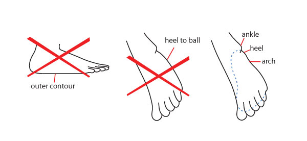
This is the barely marked one outside the foot. It shows as a slight indentation from the heel, both below and outside the foot. 

The lateral longitudinal arch

This arch means that the outer contour is not a flat line (except in flat feet), and similarly the line from heel to ball is not a smooth curve but marks the arch.

Mistakes not to make in drawing the outer side of the foot

The Medial Longitudinal Arch:

This is the large one inside the foot. It’s a very noticeable indentation. The part of the sole that’s behind the arch (under the red curve in the diagram) would be lost in shadow when the foot is on the ground, so we'd still see the arch, but since we usually see feet from above and not from the ground level, we see it really emphasized:

The medial longitudinal arch

The Transverse Arch:

This arch shapes the top of the foot.

The transverse arch

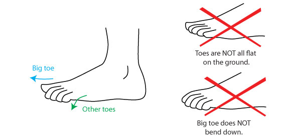
The toes:

Note the direction of the toes: while the big toe is parallel to the ground and points straight ahead, the other four bend towards the ground, and point down.

The toes

Drawing the foot

A simple way to draw feet is to begin by drawing the sole of the foot. No toes, no arches, just the basic shape. It’s shaped like a long egg, flattened on one side (below left).

The advantage of this is that this flat shape is simple enough to be drawn in perspective and under different angles. This part of the foot doesn't bend in any appreciable amount, so this flat shape doesn't need to bend either, saving us a level a complexity. Anatomical accuracy is not a requirement at this point, we’re giving ourselves a guideline to build on.

Drawing the foot step 1

If you have trouble with the perspective, draw the basic shape, on a sheet of paper and place that paper under the angle you need. It's also a useful observation exercise, to become familiar with how this shape changes under various angles.

The next step is to make a small adjustment to the shape, cutting off a corner to get closer to the foot’s natural shape. If you’re comfortable doing so, you can start directly with this step:

Drawing the foot step 2

Now to give it dimension. As you can see, it’s a flattened, curved pyramid, with the apex closest to the heel: the circle is the section of where the leg joins with the foot and forms the ankle. The dashed lines are to help you see the contour. Only the black outline is needed for the drawing.

Drawing the foot step 3

Finally, add the toes. Adding the toes separately means you can draw their movement independently from the basic shape, which as mentioned above bends almost not at all. If needed, sketch a guideline to define the general shape of the toes (see shapes further down) before drawing them individually. They are pressed together so, from almost all angles, they overlap. Note the position of the little toe: its base is positioned between 1/4 and 1/3 of the total foot length (here the lines divide the foot in 4, so it's 1/4th).

Drawing the foot step 4

Finalize by carving out the arches and adding the ankle bone and Achilles’ tendon.

As an alternative to the above method, you can also draw the foot as a wedge, and then add the toes and carve out the final form:Alternative method to draw the foot

Additional Details

Here are more advanced details, small things that make the foot look right. You'll notice that some are the same as in the hand.

Toes:

  1. The toes look longer on top of the foot than they do underneath it.
  2. The toenails start halfway up the top joint. As toe joints are so short, toenails are wider than they are long.
  3. Note also how much larger the big toe is, twice the size of the second toe, so that its first joint is within the foot and can barely move.
Details of the toes

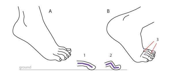
How the toes look when the foot is bent depends on how much weight is on them:

Foot A below is relaxed. Even though the toes bend a little, there is no real weight on them. In this situation they preserve their gentle curve to the floor (1).
In foot B, most of the weight is on the toes (note that this is only possible when pressing against a surface, this can't happen in a foot in mid-air). The pressure makes the second joint stick out, as shown in (2). Bend lines appear in the other joints (3) and the big toe goes even straighter and it is completely flattened against the ground.

Toes in bent feet

When not pressed against a surface, the range of mobility of the toes is limited to the 2 extremes of curled vs. splayed (with, literally, wiggling room in-between.)

  1. The first joint can completely hide under the foot...
  2. ... except for the big toe, which is stuck at around 90º.
  3. Hyperextending (splaying) the toes makes them point in different directions.
  4. Tendons appear, as well as space between the toes.
  5. Note that the 4 smaller toes remain curved down, they can never curve up.
Curled and splayed toes

Profile Views:

  1. There’s always a bump here that’s more or less pronounced.
  2. The ankle is higher on the inside.
  3. At least 2 toes show behind the big toe, depending on angle of view.
  4. Only a ground-level angle of view hides the small toes completely.
  5. The outer line of the foot travels up as the foot turns out.
  6. The inner line of the foot shows a proper arch, and then reverses into another, smaller arch (the padding line) near the toe.
  7. Again, the inner line travels up as the foot turns in. Note that the line of the arch disappears very quickly because there's no real angle there, while the padding line remains visible.
  8. At some point the joint of the gig toe starts protruding, creating a bump on the upper side of the foot.
  9. These tendon lines may or may not show. Tension makes them pop out, and they can be permanently visible in male or elderly feet, but they will look out of place on female or young feet. You have to judge for yourself whether they serve your purpose or not.
Deatils of the foot in profile

Front View:

A shows the foot seen frontally when it’s perfectly level, such as from ground level.
From this angle the toes look like peas in a pod, and you can simply draw them as balls before connecting them to the foot. Usually however, our frontal view of feet (when they are on the ground) is from a higher point of view, as in B.

  1. What looks like a “6th toe” is the padding outside the foot.
  2. The big toe looks oval rather than round.
  3. The big toe and second toe are usually separated by a space.
  4. In a frontal view that reveals the underside, the ball of each toe shows clearly.
  5. The padding line is horizontal from this angle, NOT parallel to the sides of the foot.
  6. When the toes are lifted, the padding of the forefoot is visible underneath them.
  7. The inner line of the padding may appear, cutting the foot in two by running towards the ankle.
Details of the foot seen frontally

Where the Foot Joins the Leg:

  1. Roughly speaking, the front side of the leg falls vertically into the foot.
  2. The back of the leg slopes in, but the heel protrudes out again.
  3. This is a transition plane between leg and foot – there is no sharp angle. Look for it in all the diagrams above.
  4. Note that the inward slope of the back and outer sides of the leg is connected to the calf muscle. The less muscular the calf, the straighter this line; in extreme cases of muscle depletion it becomes quite vertical because it then follows the bone. Inversely, excess fat will cause both lines to bulge in a sausage effect.
  5. Seen from the front, the inner side of the leg is vertical while the outer side slopes in.
  6. The ankle bones jut out both inside and outside, but higher on the inside.
  7. On the outside, the ankle bone appears tucked behind this line.
  8. The Achilles tendon runs up from the heel into the leg, creating an open drop shape.
  9. The thinnest part of the leg, both from the side and from the front, is a little above the ankle bone.
Details of the ankle

Considering the line of the tibia, which is the straight line running down from the knee, a relaxed foot (A) forms an angle with this line, while a fully extended foot (B) causes this line to run down all the way to the toes. Some people can point the foot until it bends even further than the line (C), but this isn’t common. Note the skin folds above the heel!

The line of the tibia

Diversity

No less than hands, feet are quite individual and have their own small range of shapes. Unlike hands, they can be permanently affected by non-genetic factors, namely the wearing of shoes. Note that in a given person, hands and feet work rather like a set. If someone has big hands, they'll have big feet as well; thick fingers are reflected in thick toes, and so on.

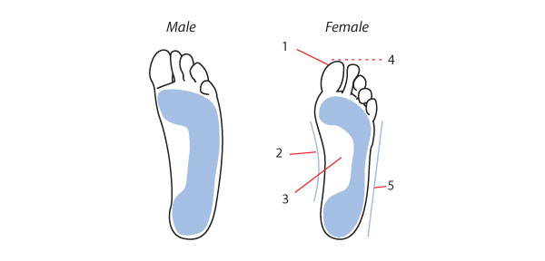
Male and Female Feet

Female feet are not a smaller version of male ones, but have a slightly different structure. In a female foot:

  1. The big toe is shallower (not so prominent)
  2. This inside line is more curved.
  3. The arch is higher.
  4. The foot is smaller for a given body height.
  5. This outside length is shorter.
Male and female feet

Arch Types

These show most in the foot’s imprint. A normal foot shows, in print, a pronounced inner arch and slight outer arch. In flat feet (aka low arch or pronator) there are no arches, all of the foot sole touches the ground. In a high arch foot (aka supinator), only a narrow band connects the heel and the ball of the foot. Flat and high arch feet can cause aches in the muscles and back (note however that infants commonly have flat feet, the arches developing in early childhood).

Different arch types

Foot Shapes

The overall shape of the foot is created by the arrangement of the toes in two ways:

Which toe is longest:

  • Egyptian foot: The big toe is longest.
  • Greek foot: The second toe is longest.
  • Square foot: Toes have even lengths.

Contrast between the widest part of the foot and its "tip"

  • Wide foot: Less contrast between the widest part of the foot and its tip.
  • Narrow or Tapering foot: More contrast between the widest part of the foot and its tip (due to the last 2 toes receding too much).
Foot shapes

Shoes vs. Barefoot

It makes a big difference to the shape of the foot whether one has been made to wear shoes from childhood or not. In cultures where closed shoes are worn most of the time (such as in Western cultures), the feet are narrower and the toes squeezed together. The big toe tends to point inward and the little toe can be permanently curled up under its neighbor.

In parts of the world where people go barefoot or wear thongs (which is probably the majority of the world population!), the foot shows its natural form: broader and flatter, the toes splayed for a better hold on the ground. The big toe points straight, even slightly out, and there is space between the toes.  As they are not squeezed, they are rounder and broader. This is shown a bit exaggerated below.

Shoes vs barefoot shapes

Practice Time

  • Summertime makes it easier to catch bare feet, in sandals or on the beach! Observe people's feet, both for details (volumes, how lines show and change, etc) and for diversity.
  • Draw feet (others' or your own) in various positions using the basic "pyramid" form before adding the toes.
Exercise sketches

How to Draw Animals: Cows and Other Bovines

$
0
0
Final product image
What You'll Be Creating

Although cows may not seem like the most graceful animals, they're a great material to study. In this tutorial I'll show you everything you need to know about anatomy of cow, but also American bison, cape buffalo and yak. You'll learn about the structure of their body, characteristic features, and how to draw details to make your drawn animal look like a real bovine, not a horse or horned dog.

You can learn them all one by one, or just pick your favorite. Ready to try?

Draw the Cow

Let's start with the cow. Just like with dogs, humans created many breeds of cattle for their needs, so there are cows of various shapes and sizes. We're going to focus on the most classic shape, but feel free to modify it to create your own breed.

Skeleton

The skeleton of the cow is going to be our base for the other species. There are a few features worth remembering:

  • Although the body can be similar to a horse's at first, the legs and neck are shorter;
  • The skull is big and long;
  • The chest is very wide;
  • There's a hump over the shoulder created by the spine;
  • The hooves are cloven, just like the deer's.
cow skeleton
The skeleton of a cow

We can simplify it to such a basic pose. However, we need to learn much more to create a believable cow's body.

cow body simplified
Simplified skeleton

Muscles

Cows are usually short-haired, so the muscles may stand out strongly under the skin. Drawing them will prevent you from creating a flat body. What's important, there's a loose skin under the cow's throat and neck, making it look wider than it really is. It's especially good-looking on a strong bull.

cow muscles anatomy
Use the arrows to memorize the muscles better
cow muscles
Muscles of a cow

Body Features

  1. Bow males and females can have horns, depending on the breed. Their shape is very various too;
  2. Ears are long and wide;
  3. The shoulder hump doesn't need to be very distinctive, but it's good to stress it for a strong bull;
  4. The tail is long and tufted, used to drive off the flies;
  5. The chest hump is crucial for a cow look;
  6. The belly is rounded.
how to draw cow
The features of a cow's body

Silhouette

The body can be easily divided into simple chunks that will help you create a neat silhouette.

draw a simple cow
Follow the arrows to draw a proper silhouette for a cow

Head

We're going to learn about the head later, for now just keep in mind cows are a good template for every bovine.

cow head
A cow's head

Draw the American Bison

The American bison is a great base for some creature from hell, a blood-thirsty mount. Just look at this hump!

Skeleton

It's important to understand the bison's skeletal structure in order to truly plan their pose. Without it you could get under impression bisons have huge shoulders, while they're actually very cow-like. Anatomically, the characteristic hump helps create force needed for managing the heavy head of theirs.

american bison skeleton
The skeleton of an American bison

Body Features

  1. The "real" head is hidden under fur, what makes it look bigger than in reality;
  2. Both sexes have horns, they're quite short, and also more slender and slightly twisted at females;
  3. The hump is much less pronounced at females;
  4. The tail is short and tufted;
  5. There's a distinctive "beard" under the mouth;
  6. The thick mane covers the front of the body;
  7. The "pantaloons" look like a continuation of the mane.

When it comes to colors, bison's fur is dark brown, with the front and lower part being darker.

how to draw bison
The features of an American bison's body

Silhouette

When drawing the silhouette, it's the most important to stress the big front and inconspicuous back.

bison body
Follow the arrows to draw a proper silhouette for a bison

Head

  1. The mane needs to be added to make the head look bigger;
  2. The muzzle may be a little bit shorter than at the cows';
  3. The ears are small, furry and not very distinctive.
bison head
A bison's head is a cow's head hidden under fur

Draw the Cape Buffalo

Cape buffalos are very fierce animals, as dangerous to humans as lions, even though they may not look like this. Let's see how to draw one!

Skeleton

Again, we've got a typical cow skeleton, with the main difference being the tail structure and thick, overlapping ribs.

cape buffalo skeleton
The skeleton of a cape buffalo

Body Features

  1. Both sexes have big and thick horns;
  2. The hump is not very distinctive;
  3. Hips are well visible under the skin;
  4. The tail is long and tufted;
  5. The tummy is rounded.

The body's color is dark chocolate or black.

how to draw cape buffalo
The features of a cape buffalo's body

Silhouette

Just like with the skeleton, the silhouette is very cow-like. Pay attention to hip area.

cape buffalo body
Follow the arrows to create a proper silhouette for a cape buffalo

Head

  1. Horns are rooted into the forehead, covering it;
  2. Ears are very wide and placed behind the horns, with two distinctive "fringes";
  3. Eyes have an angry look.
cape buffalo head
Cape buffalo looks like an angry cow with fluffy ears and huge horns

Draw the Yak

Fluffy yaks are not very popular animals, but can you imagine a better mount for a frozen land?

Skeleton

The cow resemblance is still very apparent here. Pay attention to the hump and short tail.

yak skeleton
The skeleton of a yak

Body Features

  1. The head is covered with fur, but not as strongly as at the bisons;
  2. Both sexes have long slender and twisted horns;
  3. The hump is well pronounced and it slides across the neck;
  4. The tail, though short, is covered with so long hair that it looks horse-like;
  5. Legs look very short under the fur;
  6. Whole body is covered with thick fur, but at the lower parts of the body especially long strands of hair are visible.

The fur is usually dark, brown or black. Domesticated yaks are sometimes bred selectively for white fur.

how to draw yak
The features of a yak's body

Silhouette

The silhouette is gentle, leveled by the fur.

yak silhouette
Follow the arrows to create a proper silhouette for a yak

Head

  1. The ears are small;
  2. The forehead is covered with a curly fringe.
Add long horns and thick fringe to a cow's head

Bovine details

Head

We'll learn how to draw a cow's head in every position, and then, using the tips from above, you can modify it to create the other species too.

Step 1

How to draw cow head 1
Make the head out of three circles

Step 2

How to draw cow head 2
Add the nose

Step 3

How to draw cow head 3
Define the eye area

Step 4

How to draw cow head 4
Define the eye's ridges

Step 5

How to draw cow head 5
Add the eye between the ridges

Step 6

How to draw cow head 6
Define the place for horns

Step 7

How to draw cow head 7
Add the ears

Step 8

How to draw cow head 8
Draw the outlines

Hooves

Hooves of every bovine are cloven, with four "fingers".

Step 1

how to draw cow hooves 1
Start with defined "ankle" and and fingers

Step 2

how to draw cow hooves 2
Define the top of the hooves

Step 3

how to draw cow hooves 3
Add domes to them

Step 4

how to draw cow hooves 4
Use the guide lines to outline the hooves

Horns

To draw horns correctly you need to know a bit of perspective rules. Most horns will have a circular cross-section, and these circles will shrink to ellipses when turning away from you.

horns perspective
Horns change their appearance drastically when rotating

The easiest way to simulate this phenomenon when dealing with more complicated, twisted horns, is to divide them into cylinders and cones.

how to draw horns in perspective
1 - bison, 2 - cape buffalo, 3 - yak

Eyes

Eyes of every bovine are big and round, but they may look smaller at the more fluffy species or breeds. They're mostly dark, with horizontal pupils and long eyelashes. Some of white of the eyeball can be visible, especially when the eyes are wide open.

cow eyes
Draw the eyes round and dark

Ears

The ears are wide and usually rounded, with distinctive depressions. This "three-valleys-look" is the most visible at cape buffalos.

cow ears
Draw the ears with three depressions

Mouth

Mouth is very important for a full cow-look. The lips should be thick and flagging, and the nose holes big and ready to be opened wider when needed.

cow mouth
Draw the nose as a part of the mouth

The End!

Now you know how to draw a cow, an American bison, a cape buffalo and a yak - and you can use their features for your imagined creatures too. If you liked this tutorial, check my others as well - we've got plenty of animal tutorials like this!


The A to Z of Pixelmator

$
0
0

Pixelmator is an easy-to-use, fast, and powerful image editing app for the Mac. It is packed with useful tools, some of which you might be familiar with and some you might have never used. This A-Z list breaks down these tools with a link to a Pixelmator tutorial here on Tuts+ or a description of what each tool can do.

A

Add Layer Mask

About Pixelmator: Shows a dialog window with your current Pixelmator version.

Actual Size (Command-Option-F): Zooms the document on the screen to display it in its actual size. 

Add Layer Mask: Adds a layer mask to the currently selected layer in the layers palette.

Add to iPhoto: Lets you quickly export the current document as a new image to your iPhoto library.

B

Brushes

Blending modes: Pixelmator has different blending modes to tweak how layers, tools and effects interact with other layers. 

Blur: A section in the effects browser with effects and filters for different kinds of blurring. 

Blur Tool: A tool for blurring areas of an image by painting over them.

Bring Forward (Command-]): Sends the currently selected layer one step further to the foreground and one position further to the top of the layers palette.

Bring to Front (Command-Option-]): Sends a selected layer directly to the foreground and on top of all other layers.

Brushes collections: Clicking the gear icon in the Brushes Palette lets you choose from different collections with brushes. You can even create your own collections.

Brushes Palette (Command-4): The Brushes palette in Pixelmator is used to select, create, edit and manage brushes

Brush Tool (B): This tool works like a conventional paint-brush and draws soft strokes. 

Bump Tool: This is one of the liquifying tools in Pixelmator. It moves pixels away from the centre of the brush area as you click or drag on the image. This effect is useful when you want to simulate a bloated effect.

Burn Tool: This tool darkens image areas by painting over them.

C

Curves

Canvas Size (Command-Option-C): The Canvas Size command allows you to adjust the entire editable area of an image. Increasing the editable area adds more space; decreasing the area crops the image.

Clipping mask (Command-Option-G):Turning a layer into a clipping mask lets you use the objects on the underlying layer as a mask.

Clone Stamp Tool: This tool paints with a sampled part of an image. 

Color Palette (Command-Shift-C): Lets you choose colors in Pixelmator or the currently selected tool. 

Color Adjustments: A section in the effects browser with effects and filters for adjusting colors.

Color Balance (Command-B): Brings up the Color Balance effect.

Color Depth: Lets you choose between 8-bits per channel image editing and 16-bits per channel image editing. 

Color Profile (Command-Shift-K): Lets you choose different color profiles for your image or remove a color profile.

Column Marque Tool: Creates a rectangular column shaped selection based on the height of the document and a predefined width.

Convert into Pixels:  Converts a Type- or a Shape layer into a rasterised layer.

Convert into Shape: Lets you convert a Type layer into a Shape layer for further vector-based editing.

Crop Tool (C): Use the Crop Tool to remove or hide portions of an image to create, focus or straighten your images.

Custom Shape Tool: Consists of several standard defined shapes that we can easily add to our document. It also lets you access the Shapes Palette.

Curves (Command-K): Brings up the Curves Adjustment effect.

D

Dodge Tool

D: Shortcut key that resets the foreground and background color to their default black and white colors. 

Delete Layer: Deletes the currently selected layer

Deselect All (Command-D): Hides all current selections

Distortion Effects: A section in the Effects Browser containing distortion filters and effects.

Dodge Tool: A tool to lighten areas in an image by painting over them.

Duplicate: When choosing Duplicate from the file menu, the currently selected document is duplicated into a new document. Choosing duplicate from the edit menu the currently selected layer in the layers palette will be duplicated.

Duplicate Layer: Duplicates the currently selected layer in the layers palette.

E

Effects Browser

Effects Browser (Command-3): The Effects Palette contains all the effects and filters that can be used in Pixelmator.

Ellipse Shape: One of the standard vector shapes in Pixelmator to create ellipses and circles.

Elliptical Marquee Tool: Use this tool when you want to make an elliptical selection. Hold the Shift key while selecting to make a circular selection.

Email: Lets you share your current document in a new email message. 

Enable Layer Mask: Enables a disabled layer mask.

Eraser Tool (E): Lets you paint over areas of your image in order to erase them.

Export: Pixelmator opens and saves all documents as Pixelmator documents by default. Use the export function to export your work to another image format.

Export for Web (Command-Shift-E): Exports images to image formats that are used on the web. Using Export for web lets you set several parameters to optimise the exported images for use on the web and make them quicker to download.

Eyedropper Tool (I): Used for sampling colors from an image.

F

File Information

Facebook: Share your Pixelmator creations with your friends and family on Facebook.

Favorite Effects: A section in the Effects Browser where you can store your favorite or most used effects.

File Info: Shows a sheet displaying technical information about the current document and lets you add and remove keywords. 

Fill (Command-Option-F): Fills the currently selected layer or the current selection with a color. It is also possible to adjust the blending mode and the opacity of the fill.

Flickr: Upload your creations directly to your Flickr account from the Share menu.

Flip Horizontal: Flips the currently selected layer or the current selection horizontally.

Flip Vertical: Flips the currently selected layer of the current selection vertically.

Fonts Palette (Command-T): Brings up the OS X fonts palette. 

Freeform Pen Tool: This tool enables you to draw vector shapes by clicking and dragging on the canvas or by using a drawing tablet.

Full Screen (Command-Control-F): Enter Full Screen lets you bring Pixelmator in Full Screen mode.

G

Gradients Palette

Generator effects: A section in the Effects Browser containing effects for generating clouds, sunbeams, star shine, and halos.

Gradient Palette (Command-5): The Gradient palette in Pixelmator is used to select, create, edit and manage gradients.

Gradient Tool (G): The Gradient Tool lets you apply the gradients from the Gradients Palette.

Grid (Command-Option-’): Overlays a grid over the current document. The settings of the grid can be changed in the Pixelmator Preferences. 

Group Layers (Command-G): Pixelmator lets you group layers in order to get a better overview of all the layers in your document.

Guides: Lets you add help lines to your document in order to position objects more precisely.

H

Hue and Saturation

Halftone: A section in the effects browser containing effects and filters that create halftone effects.

Hand Tool (H): Pan an image that is larger than the document window by clicking and dragging with the Hand Tool.

Help: When accessing the Pixelmator Help from the Help menu you will be guided to Pixelmator's help webpage with always up to date help information.

Hue/Saturation (Command-U): Brings up the Hue/Saturation Adjustment effect.

I

Image Size

Image Size (Command-Option-I): Use the Image Size dialog in Pixelmator to change the print dimensions and the resolution of an image.

Import: Opens the OS X import dialog where you can import images directly from devices like cameras and scanners.

Info Bar: The Info bar shows color values beneath a pointer and, depending on the tool in use, offers other useful information such as coordinates, selection dimensions, position change, starting position coordinates, angle, color profile, image dimensions and zoom level. 

Invert Selection: Inverts the current selection. What was selected before will now be unselected and parts of a layer that were unselected will become selected.

Invert Colors (Command-I): Shortcut to quickly invert the colors in a layer or inside a selection.

L

Linking Layers

Lasso (L): Used to quickly create freehand selections. 

Last Filter (Command-Shift-F): Applies the last used filter again.

Layers Palette (Command-2): This palette shows all available layers in a document and lets you reorganise, create, remove, merge, group, and choose blending modes for layers.

Levels (Command-Option-L): Brings up the Levels Adjustments effect.

Line Shape: One of the standard shapes that comes with Pixelmator. The Line Shape lets you quickly add a straight vector line to your document. 

Link Layers (Command-Shift-L): Links the contents of two or more layers together so when one object gets moved the other objects on other linked layers will move along. 

Load Selection: Creates a selection from the objects on a layer.

Lock Layer: Locks a layer and prevents it from being edited.

M

Move Tool

Magic Eraser Tool: This tool lets you erase similar colored areas.

Magic Wand Tool (W): Use this tool to select similarly coloured areas.

Merge All layers: Merges all the layers in a document into one layer.

Merge Layers (Command-E): Merges two or more selected layers together into one layer.

Messages: Lets you quickly share a document via the OS X Messages app.

Move To: Lets you move the current document to another folder on your hard drive or to iCloud, a network drive or any other drive.

Move Tool (V): Used to move layers and selections.

N

New from Clipboard

New (Command-N): Creates a new Pixelmator document

New from Clipboard: This option is only available by ctrl+clicking on the Pixelmator icon in the dock. It will copy the contents of the clipboard into a new Pixelmator document. 

New Layer (Command-Shift-N): Adds a new layer to document

O

Open: Lets you open any existing document or image.

Open Recent: Lets you choose and re-open any recently opened documents.

Order Prints: An easy and quick way to order prints of your documents straight from Pixelmator.

Other: A section in the effects browser with a variety of filters and effects not fitting in any of the other effect-categories. 

P

Pixelmator Preferences

Page Setup (Command-Shift-P): Used to change the paper size, orientation and scaling, before printing a document. 

Paint Bucket (N): This tool can be used to fill similar colored areas.

Paint Selection Tool: Makes selections by painting areas of your image. Similar collared areas near the brush tip will be selected automatically.

Pen Tool: This tool enables you to draw vector shapes by clicking on various points on the canvas. Straight lines will be drawn between these points. Straight lines can then be turned into curved lines by entering editing mode.

Pencil Tool: Used to paint hard-edged strokes.

Photo Browser (Command-6): The Photo Browser is used for quickly browsing, previewing and searching images from your iPhoto and Aperture library, Photo Booth, or your Pictures folder. It is also possible to add other folders with images to the Photo Browser.

Pinch Tool: One of the liquify tools. Use the Pinch Tool to squeeze pixels together.

Pixel Tool (P): A tool especially for those who want to create Pixel-Art. Lets you draw images on pixel level.

Polygonal Lasso Tool: Use this tool to make straight-edges manual selections

Polygonal Shape: One of the standard shapes Pixelmator ships with. Adds a polygonal vector shape to your document. This is a smart shape where the amount of points can be adjusted with a slider.

Preferences (Command-,): Opens the Pixelmator preferences where you can change some of the settings in Pixelmator.

Preserve Transparency: When activated, existing transparent areas on a layer will not be affected by any edits such as using the paintbrush.

Print (Command-P): Used for printing your document on your home or office printer.

Q

Quick Mask Mode

Quick Mask Mode (Q): A Quick Mask lets you edit or create a selection. It appears as a red-colored overlay that can be edited using any of the tools, effects and filters, available.

Quit Pixelmator (Command-Q): Closes Pixelmator. Depending on your OS X version and setup, documents currently opened will get autosaved and will open again automatically when you launch Pixelmator again.

R

Refine Selection

Rectangular Marquee Tool (M): Use this tool to quickly create rectangular selections. Hold the Shift key while selecting to make a square selection.

Rectangular Shape: One of the standard shapes that comes with Pixelmator. The Rectangular Shape lets you quickly add a rectangular vector shape to a document. 

Red Eye Tool (R): Use this tool to remove red eyes from a photo either automatically or manually.

Refine Selection (Command-Option-R): Used to Smooth, Feather, and Resize the current selection.

Repair Tool: Used to quickly remove imperfections and other distractions from an image.

Remove Mask: Removes the layer mask from the currently selected layer. 

Reveal Canvas: Enlarges the canvas to also include objects that were (partially) placed outside of the canvas borders.

Revert To: Lets you browse and revert to previous versions of your document.

Rotate Canvas: Lets you rotate or flip the canvas.

Rounded Rectangular Shape: One of the standard shapes that comes with Pixelmator. The Rounded Rectangular Shape lets you quickly add a rectangular vector shape to a document where you can adjust the radius of the rounded corners.

Row Marquee: Create a rectangular row shaped selection based on the width of the document and a predefined height. 

Rulers (Command-R): The Ruler bars can be used for measuring and placing guides.

S

Save (Command-S): Saves the current document.

Select All (Command-A): Selects all of the layer. 

Select Color: Lets you choose a color and then selects that color from the image or within an existing selection. The threshold for selecting colors can be adjusted by a slider. 

Select Linked Layers: To quickly select all layers that are linked.

Send Backward (Command-[): Sends a layer further to the background and moves a layer one position down on the layers palette.

Send to Back (Command-Option-[): Sends a layer all the way to the background and moves the layer to the bottom of the layers palette.

Shapes Palette: A palette containing the different vector shapes in Pixelmator. Used to select, organise, import and export shapes. 

Sharpen: A section in the effects browser containing a variety of sharpening effects and filters.

Sharpen Tool (O): Use this tool to paint over areas of an image in order to sharpen those areas.

Slice Tool (K): Divide an image into sections with the slice tool to export each section as a separate image.

Smudge Tool: A tool used for smearing out the colors of an image.

Soft Proof with Profile: To view how the image colors might look when you print them or view them on a different display. Choose the printer-color profile or the display profile in order to soft proof.

Special Characters: Opens the OS X special characters dialog.

Spelling: Gives access to OS X’s spelling and grammar tools.

Sponge Tool: The Sponge Tool either desaturates or saturates the area you paint over.

Star Shape: One of the standard shapes Pixelmator ships with. Adds a star vector shape to your document. This is a smart shape where the amount of points can be adjusted with a slider.

Start Dictation: Lets you dictate words and sentences for use in Pixelmator.

Stroke (Command-Shift-O): Used to create a border around a selection or a layer.

Styles Palette (Command-7): Apply different styles such as, gradients, strokes, shadows and reflections to a layer. 

Stylize: A section in the effects browser containing a variety of stylising effects, such as Pixelate, Noise, Crystalize, Fog, Gloom.

T

Tile: A section in the Effects Browser with a variety of tile like effects and filters, like the Kaleidoscope and Hexagon effect.

Tool Options (Command-Option-T): Shows the Tool Options Bar at the top of the document window. In the Tool Options bar you can change the settings for the currently selected tool.

Tools Palette (Command-1): Used to select the tools available in Pixelmator. The Tools Palette is customisable from the Pixelmator Preferences.

Transform (Command-F): Used to transform, rotate and flip selections, layers and objects in various ways.

Trim Canvas: Crops the canvas by trimming surrounding transparent pixels, or background pixels of a solid color.

Twirl: One of the liquify tools in Pixelmator. Use the Twirl tool to twist pixels around in an image.

Twitter: Share your creations directly with your Twitter followers.

Type Tool (T): Use the Type Tool to add text to an image.

U

Ungroup Layers

Undo (Command-Z): Undo the last action. The amount of Undos you can perform in Pixelmator is only limited to the amount of memory your Mac has installed.

Ungroup Layers: Ungroups a group of layers.

Unlink Layers: Unlinks any linked layers.

Unlock Layer: Unlocks a locked layer and makes it editable again.

W

Warp Tool

Warp Tool: One of the liquify tools in Pixelmator. Use the Warp tool to push pixels in any direction.

X

X: Shortcut key that swaps the foreground and background color.

Z

Zoom In (Command-+): Zooms in on the document

Zoom Out (Command--): Zooms out from the document

Zoom to Fit (Command-0): Zooms the document in or out to make it fit inside the document window

Zoom Tool (Z): For zooming in and out of the document.

Now You Know Your ABCs...

The above list gives a taste of what Pixelmator has to offer for creating awesome graphics. Now it's time to put its power to use and make your own great graphics with it. You can learn more about Pixelmator by following the Pixelmator tutorials here on Tuts+, and let us know if you need help with anything about using Pixelmator.

Create 5 High-Impact Typography Effects in Adobe InDesign

$
0
0
Final product image
What You'll Be Creating

InDesign is the best Adobe tool for creating traditional and expertly crafted typography. Designers often are quick to jump over to Illustrator or Photoshop if they want to create more unique and contemporary text effects. However, with a little know-how you can create cutting-edge, creative text effects without ever having to leave InDesign.

This tutorial shows you how to create five striking typographic effects using tools and tricks available to you in InDesign. You can follow these tutorials individually, then tweak the steps to make your own unique styles.

Page Setup

For all of the effects below, we’ll be using an A4 layout. But feel free to skip this step if you’ll  be incorporating a particular text effect into a document you've already created.

To create a new A4 layout, Open InDesign and select File > New Document. In the New Document window set the Intent to Print and set the No. of Pages to 5. Deselect Facing Pages. Under Page Size, select ‘A4’ and set the Orientation to Landscape. Leave the Margins at their default value and set the Bleed to 0 mm all the way round. 

New Document window

Click OK, and your document's ready to use.

new document

1. Create a Text-Inside-Text Effect

Final typography effect

Step 1

For this effect you will need to use two Fonts. 

The first Font will form the enclosing text, and needs to be heavy enough to contain a body of text. Molotis a great choice as it’s also an Upper Case style, giving the typography added impact. 

The second Font will fill the characters of the first Font. It doesn’t need to have a particular style or weight, but try to select a typeface that fits with the look of your design. In this case, I’ve gone for the distressed-looking Alpha Echo, or why not try the grungier Destroy?

Step 2

Select the Type Tool (T) and drag to create a text frame 252 mm in Width and 62 mm in Height. Position this centrally on Page 1 of the document.

Whichever word you want to fill with text, create text frames for each individual character (see below).

Type ‘I’ and, from the Character Formatting Controls panel along the top of the screen, set the Font to Molot Regular, Size to 250 pt, Orientation to Align Left (if you choose Align Center, this has a tendency to unhelpfully Anchor the frame once converted to outlines). Maintain the default [Black] text Fill.

Select the text frame and Edit > Copy and Edit > Paste. Change the character to ‘N’ and manouver the frame to the right of the first character. 

text frame for each character

Pull down a Guide from the top Ruler (View > Show Rulers) to create a baseline for the characters to sit on. You can also pull out horizontal Guides from the left-hand Ruler to create guidelines for equal spacing between characters.

Repeat the above process for the other characters. In this case, ‘S’, ‘I’, ‘D’, and ‘E’ to form the word ‘INSIDE’.

Type full word

Step 3

Select the first character’s text frame and go to Type > Create Outlines. Repeat for each text frame. Each character is converted to a vector outline.

Create outlines

Step 4

Select all the outlined characters by dragging your mouse across the page.

Open the Swatches Panel (Window > Color > Swatches) and set the Fill to [None]. Deselect the characters by clicking once outside of the page.

Swatches panel

Step 5

Select the Type Tool (T) and hover over the first character in the word (here,‘I’). You will see the icon change from a type icon with straight brackets to a type icon with curved brackets.

Click once and the vector shape will be transformed into a text frame. Switch to the Selection Tool (V, Escape) and select the first character, here ‘I’. A small white square has appeared at the bottom-right of the shape. Click once on the square and click again in the next character (here, ‘N’) to connect the two characters with text threads. 

Go to View > Extras > Show Text Threads to view how the characters are connected. Repeat the process above until all the characters are connected to one another.

Threading text

Step 6

Select the Type Tool (T). In the Character Formatting Controls panel, set the Font to Alpha Echo Regular, Size to 8 pt, Leading to 8pt, Orientation to Justifiy with Last Line Aligned Left.

Click once inside the first character and go to Type > Fill with Placeholder Text. You can also insert your own text to create an artistic effect with extra meaning.

Fill with placeholder text

Switch to Preview View by tapping ‘W’ to view the effect and adjust Sizing, Hyphenation, Tracking etc until you are happy with the result.

Preview View

Step 7

You can create more contrast for your typography by setting light-colored text against a darker background.

Select the Rectangle Tool (M) and drag to extend across the whole of the page. Set the Stroke to [None] and the Fill to C=100, M=90, Y=22, K=72 (or another dark, contrasting Swatch of your own choice). Right-Click (PC) or Ctrl-Click (Mac) and Arrange > Send to Back.

Highlight all the text inside the outlined characters and set the text Color to [Paper]

And you're done! This sort of typography effect best suits a large-scale setting, perhaps as part of a poster or banner.

typography final result

2. Create a Block-Color Text Effect

This is a simple yet high-impact text effect to introduce some visual interest and pops of colour in an otherwise solid block of text.

Final typography - block color

Step 1

On Page 2 of your InDesign document, select the Type Tool (T) and drag to create a text frame around 194 mm in Width and 57 mm in Height.

Type a phrase about 4 sentences in length and set the Type to All Caps (found next to the Font Size drop-down menu in the Character Formatting Controls panel running along the top of the screen). Set the Orientation to Justify all Lines and Uncheck Hyphenate in the Paragraph Formatting Controls panel.

Center the text frame on the page.

Minion pro text frame

Step 2

Select a Font with a bit of personality - depending on your choice of colors, this effect can have different impacts. Here, I’ve going for a fun, craftsy feel, and will choose a Font called CabinSketch to evoke this.

Step 3

Apply CabinSketch Bold to your block of text. Pull out different sections of text and play around with the Size and Leading, creating a larger chunk of text in the middle of the block. Here, the Font Size varies from 17 pt up to 50 pt.

CabinSketch text frame

Step 4

Pull out a vertical Guide from the left-hand Ruler to around 64 mm. Pull out a second vertical Guide to around 185 mm, and drag a third Guide to around 230 mm. These will mark out sections where you can apply different colors.

Guides to mark color

Step 5

Create four new CMYK Swatches (Window > Swatches, then click the New Swatch icon). In this example I’ve gone for four complementary ice cream-style shades. 

orange swatch
pink swatch
blue swatch
green swatch

Step 6 

Highlight individual parts of the text within the guidelines and apply color in vertical blocks. Don’t worry if individual characters fall across guidelines; slightly imperfect application of color will give a jaunty, folk-like look.

applying color in blocks

Finished! This is a great effect to brighten up informal items like cards and invitations. It also looks great with a Letterpress printing technique.

finished typography with block color

3. Create a Vintage-Style Effect using the Type on a Path Tool

Step 1

Go to Page 3 of your InDesign document. Use the Type Tool (T) to create a new text frame, but move this to the side of the page, in the Pasteboard. Stick with Normal View (tap ‘W’) so it can still be seen.

Choose any paragraph of text you would like to apply the effect to. Type, or Copy and Paste, this text into the text frame. For now, maintain the default Font, here Minion Pro, set the Size to 40 pt and the Orientation to Align Center.

Step 2

On the page itself, select the Line Tool (\) and, while holding down Shift, drag to create a horizontal Line 113 mm in Length. Position this centrally on the page at Y position 50 mm.

Step 3

Select the Type on a Path Tool (Shift + T; found in the Tools Panel, in the drop-down menu from the Type Tool icon). Hover the cursor over the far-left of the Line until the icon changes to reveal a ‘+’ symbol. Click once to transform the Line into a Path for text.

Highlight and Copy the first line of the paragraph of text using the Type Tool (T), then switch back to the Type on a Path Tool (Shift + T) and Paste the text onto the new Path you have created. 

Step 4

Switch back to the Selection Tool (V, Escape) and change the Stroke Color of the Line to [None].

Repeat the above steps for the next few lines of the text paragraph, situating each line on its own Path. You can set the original text paragraph directly behind the Paths to help line up the text and create even Leading.

Step 5

Now you can start to create some different effects. You are no longer bound by the arrangement rules of text within a text frame, but can move different paths into organic and quirky positions to create a sense of movement in your text block.

Why not try using the Ellipse Tool (L) to create a long oval with a Stroke and Fill of [None], which you can then divide in two halves using the Scissors Tool (C). Position the lower half at the bottom of the paragraph and use the Type on a Path Tool (Shift + T), as before, to add the final line of text.

Move the top half of the oval to the top of the paragraph and reset the top line of text along this new curved Path. Go to Object > Paths > Reverse Path to flip the text to run along the top of the curve.

Step 6

Create new paths and move individual words or phrases onto them, altering the Font Size, to create new arrangements of sentences like in the example below.

Change the Font, Sizing and Style (Regular, Bold or Italic)of various phrases and words to create a desired effect, creating new Paths if you need to. Here I used Garamond and Fournier MT to give an old-fashioned, letterpress-style appearance to the text. 

Pull the Paths closer together, even allowing some of the letters to overlap a little, to give a more solid look to the text.

Step 7

Introduce color by going to the Swatches Panel (Window > Swatches) and creating new CMYK Swatches (click the New Swatch icon). Select a base color (here, I went for a deep red, C=0, M=92, Y=90, K=47) to apply to the bulk of the text, bringing out a couple of words and phrases in accents of pale brown, yellow, blue, pink and black.

Step 8

Place your typography against a contrasting background to highlight the colors of the text.

Use the Rectangle Tool (M) to create a frame that extends across the whole page. Set the Fill to C=2, M=48, Y=86, K=10 with a Tint of 10%. With the frame selected Right-Click (PC) or Ctrl-Click (Mac) and Arrange > Send to Back. 

Then go to Object > Effects > Gradient Feather and set the Type to Radial. Reverse the Gradient so the pale tone starts from the center of the page.

Your typography’s looking awesome, very vintage! This sort of effect would look great on promotional materials, such as posters or brochures, which need to catch the eye. It would also be great for inclusion as part of a print version of a quirky book.


4. Enhance Text with a Dramatic Drop Cap

Final Drop Cap effect

A Drop Cap is a very simple but incredibly effective typography technique for giving emphasis to an introductory paragraph. You can incorporate the steps here into your own document, perhaps a book chapter or magazine article. For now, we’ll stick with our A4 layout.

Step 1

Go to Page 4 of the A4 document. Use the Type Tool (T) to drag a text frame 115 mm in Height and 140 mm in Width. Center this on the page, using Guides dragged from the Rulers if needed.

Set up the text frame

Step 2

For a dramatic Drop Cap to stand out, you will need to contrast a striking, stylised typeface (for the Drop Cap) against a classic, bookish typeface. 

For the main text here, I’m using Fournier MT.Garamond or Baskerville would also be good choices.

For the Drop Cap, I’ve selected a calligraphic typeface, Chantelli Antiqua, to give a historical flourish. After all, Drop Caps were originally used in Medieval manuscripts.

Step 3

Return to the text frame and click once in the frame with the Type Tool (T). Set the Font to Fournier MT Regular, Size to 12 pt, Leading to 15 pt, Justify with Last Line Aligned Left, and allow the text to hyphenate. Paste in your own chosen text or, for now, go to Type > Fill with Placeholder Text.

Insert placeholder text

Step 4

Highlight the first letter of the paragraph. Go to the Character Formatting Controls panel, running along the top of the screen, and set the Drop Cap Number of Lines to 10.

Set the Drop Cap

Step 5

Change the Font of the first letter to Chantelli Antiqua

Change Font of Drop Cap

Introduce a new Swatch in the Swatches Panel (Window > Color > Swatches) for added contrast and impact.  Here I set the Color of the Drop Cap to C=80 M=40 Y=50 K= 10

Change Swatch of Drop Cap

Step 6

To give an extra professional touch to the paragraph, highlight the first 4 or 5 words of the paragraph (excluding the Drop Cap) and select the All Caps icon from the Character Formatting Controls panel.

Select the text frame with the Selection Tool (V, Escape) and go to Window > Type & Tables > Story to open the Story panel. Click in the Optical Margin Alignment check-box. The text will subtly shift position, and look more pleasant to the eye.

Optical Margin Alignment

Step 7

Good typography is all about the details. You will notice that the line of text sitting just below the Drop Cap character is sitting a little close to the bottom of the Drop Cap. 

Highlight the Drop Cap and go up again to the Character Formatting Controls panel. Locate the Baseline Shift menu and set the value to 9 pt. The Drop Cap will shift upwards, creating more space between it and the text of the paragraph.

Baseline Shift

And you’re done! This is a super simple technique for adding a professional touch to more formal documents, such as books, magazines and brochures.

Final Drop Cap typography effect


5. Add a Surreal Twist to Your Typography

This is a cool, contemporary effect that’s more decorative than functional, but is really easy to create.

final surreal twist typography

Step 1

Navigate to Page 5 of the A4 document. Select the Line Tool (\) and drag across the page from the top left down to the bottom right. Don’t stretch it right to the corners of the page, the angle should only be gentle. 

line tool

Edit > Copy and Edit > Paste this Line and Right-Click (PC) or Ctrl-Click (Mac) > Transform > Rotate 90 degrees CW. Position this second Line crossing the center of the first Line, extending from the bottom left of the page to the top right. Extend the edges of the Line so they reach to the edges of the page.

guides using line tool

Step 2

In the Layers Panel (Window > Layers) double-click the ‘Layer 1’ default name and rename this ‘Guides’. Lock this Layer in the Layers Panel.

guides layer

Click the Create New Layer icon and rename this second Layer ‘Typography’. 

Typography layer

Step 3

Remaining on the ‘Typography’ Layer, use the Type Tool (T) to introduce a new text frame about 215 mm in Width and 20 mm in Height. Type a single line of text, here ‘Surreal Typography’ and set the Font to Gill Sans Regular (we’ll be using Gill Sans throughout), Size to 75 pt and Tracking to 20

Switch to the Free Transform Tool (E) and hover over one of the corners of the text frame until a rotate icon appears. Rotate the frame and align against one of the Lines you created in Step 2.

First text frame rotated

Step 4

Using the Lines as Guides for positioning the text, repeatedly create new text frames and adjust their position on the page. Vary the Weight (SemiBold, Regular, Light etc) and Font Size to create contrast and difference. 

You can flip the orientation of some text frames for a mirrored effect by Right-Click (PC) or Ctrl-Click (Mac) > Transform > Flip Horizontal.

Flipped text frame

Continue to create new text frames, inserting different text as you go. Switch the visibility of the ‘Guides’ Layer off and on as you go to view the final effect.

Text frames rotated and positioned
Normal View
Preview View

Step 5

Once you’re happy with the arrangement of your text frames, you can drop in some color. Highlight individual phrases or words and set new CMYK Swatches for these from the Swatches Panel (Window > Color > Swatches). Be sparing with your application of color for a professional look. Here I've used just three complementary colors.

Final typography effect - surreal effect

Awesome! That’s great work. This typography effect is mostly just for fun, so why not print it on a decorative poster or card to show off your new typography skills?

Conclusion

The typography tips in this tutorial have been put together to show you how versatile, creative and fun typography can be in InDesign. In your next design project, try to use a special typography effect in InDesign to add a touch of creative professionalism to your work.

Have any more InDesign typography tips of your own? Mention them in the Comments below!

Packaging Design in InDesign: Create A Grunge-Effect CD Cover

$
0
0
Final product image
What You'll Be Creating

Packaging design can be an intimidating subject for new designers. Visualising how something may appear and function as a 3D object can be difficult when creating flat templates, particularly in absence of any industrial-scale printing equipment at home. A smaller product, like a fold-out card CD sleeve, is a great place to start experimenting with packaging design. InDesign is the perfect software to use, as you can easily set and monitor measurements throughout the design process.

In this tutorial we’ll be creating a basic CD Sleeve template in Adobe InDesign and using a bit of Illustrator too, incorporating some funky vector artwork from Yulia Sokolova as we go. The finished sleeve can even be printed and finished at home if you have access to an A3 printer, some card, a craft knife and glue. The template for the sleeve is designed to fit on a single A3 page, but you can create mock-ups using 2 A4 sheets stapled or glued together to get an impression of the product before you send it to print. I did just that, and it still works a treat!

When designing a 3D product using a flat, 2D template you have to always keep in mind how the product will look from different angles. Will the back of the sleeve look as good as the front? Will there be details on the sides, so it can be recognised when stacked with other CDs? What way will text be read once the packaging is folded and glued? Will the inside of the sleeve, once opened, have any extra color or artwork? Keep these questions in mind, and you can’t go wrong!

1. Create a New Document in InDesign

Step 1

Open InDesign and select File > New Document. In the New Document window set the Intent to Print and set the No. of Pages to 2. Deselect Facing Pages

Under Page Size select‘A3’ and set the Orientation to Landscape.

Leave the Margins at their default value and set the Bleed to 0 mm all the way round. Click OK

Page 1 of the document will be the Outside surface of the Sleeve, and Page 2 the Inside.

2. Define Layers for the Template and Artwork

Step 1

It’s important to keep the CD Sleeve template and the Sleeve artwork separate. This allows you to easily make edits to the artwork without mistakenly moving any of the template guides. 

Open the Layers Panel by going to Window > Layers. Double-click on the default ‘Layer 1’ name and rename this Layer ‘Notes’. For now, Lock this Layer by clicking in the blank box to the left of the Layer name.

Step 2

Click on the Create New Layer icon at the bottom-right of the Panel and Double-click on the default ‘Layer 2’ name. Rename this Layer ‘Template’. As before, Lock this Layer. 

Step 3

Repeat the process inStep 2 to create two more Layers above the ‘Notes’ and ‘Template’ Layers. Name these ‘Artwork’ and ‘Text’. 

Lock these two new Layers and return to and Unlock the ‘Notes’ Layer.

For ease of reference, drop in a sub-title in the top left-hand corner on each page using the Type Tool (T). Type ‘Outside of Sleeve’ on Page 1, and Edit > Copy > Paste in Place the note onto Page 2, renaming it ‘Inside of Sleeve’.

3. Measure Your Template

It can be a challenge making a packaging template from scratch. Always look at other examples of the sort of packaging you’re trying to create, and open them out flat if you can. Get your ruler out and make notes of key measurements. Sometimes the simplest template designs work the best—I found a couple of chart-topping albums used a packaging template similar to the one we’ll create here. You want to allow the CD or other product to fit comfortably into your packaging design without damaging the product by making it too much of a tight squeeze or alternatively allowing the product to move about too much inside the packaging.

In this example, we’re accommodating for a standard CD, with a 120 mm diameter. You should allow enough breathing space for the CD to be inserted easily into the sleeve, and you may want extra room to insert a small brochure or leaflet in there as well. In the template we’ll create here, we’ll allow for an extra 3 mm on all sides of the CD to allow it to be easily inserted and retrieved.

Step 1

Navigate to Page 1 of your document. Lock the ‘Notes’ Layer in the Layers Panel and Unlock the ‘Template’ Layer. Go to View > Rulers if the Rulers are not already visible. 

Drag a vertical Guide from the left-hand Ruler to 120 mm. Drag a second vertical Guide to 246 mm.

Drag a horizontal Guide down from the top Ruler to 86 mm. Drag a second horizontal Guide down to 212 mm.

This marks out a neat 126 mm by 126 mm square between the Guides, which will form the central part of the Sleeve. Drag your mouse across the Page to select all four Guides and Edit > Copy; navigate to Page 2 and Edit > Paste in Place

Step 2

We can add small folded edges to the sleeve to give the CD extra space inside and also allow a small space for inserting some text, as you would on the spine of a CD cover.

Return to Page 1. Drag a Guide from the left-hand Ruler to 250 mm. Drag a second vertical Guide to 116 mm. Drag a horizontal Guide from the top Ruler to 82 mm, and then another horizontal Guide to 216 mm.

4. Create your Template

Now the basic guidelines are set up you can start to build your template. Fold lines will be marked out with a dashed line, and Cut lines marked with a solid line.

Step 1

Remaining on the ‘Template’ Layer, use the Rectangle Tool (M) to create a square 126 mm in diameter (hold down Shift to create a perfect square). Set the Stroke to [Black], Type to Dashed and Weight to 0.5 mm. You can set these values in the top control panel, or in the Stroke Panel (Window > Stroke).

Position this frame in the center of the Guides.

Step 2

Back to the Guides! Drag a vertical Guide from the left-hand Ruler to 376 mm. This takes into account the 4mm fold, plus another 126 mm to create the complete fold-over of the CD sleeve.

Use the Line Tool (\) and hold Shift to create a perfect horizontal Line 130 mm in Length extending from the top right-hand corner of the dashed square to the new Guide. Set the Color of the Stroke to C=0, M=100, Y=0, K=0 to distinguish this line from the dashed fold lines. Set the Weight to 0.35 mm.

Select the line created in Step 2, above, and Edit > Copy. Paste in position below, with the left-hand edge resting against the bottom right-hand corner of the dashed square.

Select this second Line and go to Edit > Copy > Paste. With the Line selected, Double-click (PC) or Ctrl-Click (Mac) and Transform > Rotate 90 degrees CW. Reduce the Length to 126 mm and connect each end of the Line to the other two solid lines to form a second square shape.

Step 3

Select the Ellipse Tool (L). Hold Shift and drag to create a circle 23 mm in diameter. Set the Stroke Color to C=0, M=100, Y=0, K=0, as before, and the Weight to 0.35 mm. Position the circle centrally along the right-hand solid line, on the 376 mm Guide

Step 4

Use the Scissors Tool (C) to snip once on the top and bottom of the circle where the circle meets the straight line. Delete the right-hand section of the circle.

Use the Scissors Tool (C) to snip once on the vertical line at the top and once on the bottom where the edges of the half-circle meet the straight line. Delete the vertical line left within the circle.

Step 5

Use the Line Tool (\) to create a vertical line 25 mm in Length. Set the Color to C=0, M=100, Y=0, K=0, as before, and the Weight to 0.6 mm. Position this at X position 313 mm and Y position 136 mm.

Step 6

Introduce a new Guide from the left-hand Ruler at 53 mm

Drag to select the right-hand cut lines, minus the short line introduced in Step 6, and Edit > Copy and Edit > Paste in Place. Double-click (PC) or Ctrl-Click (Mac) and Transform > Flip Horizontal.

Move to the Free Transform Tool (E) to keep all the lines together and manoeuvre into position to the left of the dashed square. Rest the left-hand edge against the 53 mm Guide.

Adjust the Length of the top and bottom straight lines to 67 mm to meet the top-left and bottom-left edges of the dashed square.

Step 7

Introduce some flaps for glueing the sleeve together. We are going to set the Height of these to 16 mm, which leaves plenty of room for glue and creates a strong, secure sleeve.

Pull a horizontal Guide down from the top Ruler to 66 mm. Use the Line Tool (\), holding Shift, to create a horizontal Line 114 mm in Length. Set the Weight and Stroke Color to the same values for cut lines as in previous Steps. 

Position the line along the 66 mm Guide and center it above the dashed square. Then use the Line Tool (\) to connect the edges of the new line to the corners of the dashed square.

Optionally, by selecting two lines at a time and going to Object > Paths > Join, you can create more easily manageable and seamless groups of lines.

Step 8

Select the group of three lines created above in Step 8, and Edit > Copy > Paste. Double-click (PC) or Ctrl-Click (Mac) and Transform > Flip Vertical. Position this in the opposite position, on the lower section of the template.

Step 9

Navigate back to the left-hand side of the template. Select the half-circle and Double-click (PC) or Ctrl-Click (Mac) and Transform > Flip Horizontal. Position this to the far left-hand side of the template.

Step 10

As a final step to create the template, use the Line Tool (\) to introduce Fold Lines running along the Guides lying just outside the dashed square on all sides. Hold down Shift while creating them, and set the Color to [Black], Type to Dashed and Weight to 0.5 mm.

Step 11

Navigate to Page 2 by scrolling down or clicking the Page 2 icon in the Pages Panel (Window > Pages).

In an earlier step we copied and pasted the Guides from Page 1 onto Page 2. You can maintain these as they are and Edit > Copy > Paste in Place the whole template from Page 1 to Page 2 if you’re planning to send the Sleeve to an outside printer. 

However, if you want to print the Sleeve at home and plan to print the artwork as a double-sided single sheet you will need to flip the template into the relevant position. Remaining on Page 2, drag a vertical Guide from the left-hand Ruler to 53 mm. You can also delete the two central vertical Guides which you pasted over at an earlier stage. Keep the horizontal guides as they are.

Return to Page 1 and select the whole template by dragging your mouse across the page. Go to Edit > Copy, navigate to Page 2, and Edit > Paste in Place. Double-click (PC) or Ctrl-Click (Mac) and Transform > Flip Horizontal; then rest the left edge of the template against the 53 mm guideline.

5. Print a Mock-up of the Template at Home

Before you proceed with adding any artwork or text to your template, be sure to print a mock-up copy of the template on your printer at home. This can be as haphazard as you like, using one double-sided A3 sheet or two or more A4 sheets stapled or glued together. Aesthetics don't matter at this stage, but the question of whether your template measures up and fastens together does!

This also helps you to visualise where artwork and text should feature on the final design. Here’s an example I put together at home using an A4 printer and a whole bunch of staples!

6. Add your Grunge Artwork to the Sleeve

Once your happy that your template measures up, you can start to add an artistic design to the sleeve. In this tutorial, we’ll be using artwork for the front of the CD Sleeve created by Yulia Sokolova. Check the tutorial first, or create your own design in Illustrator, then come back here to put it to work in your CD cover design.

Step 1

Open the vector artwork in Illustrator. Ensure that any template lines (Cut lines, Fold lines etc) are not visible by switching off the visibility of relevant Layers.

Go to File > Save As and name the file ‘Artwork for Front’. Select Illustrator EPS (eps) from the drop-down menu. In the EPS Options pop-up window, select [High Resolution] from the Transparency Preset drop-down menu. Click OK.

Step 2

Return to InDesign and the Template File. Go to the Layers Panel (Window > Layers) and Lock the ‘Template’ Layer. Unlock the ‘Artwork’ Layer.

Navigate to Page 1 of the document. Go to File > Place and select the vector EPS file. Click Open. The file will be placed at Actual Size

You may need to adjust the size of the image a little (Double-click inside the frame to directly select the artwork and hold Shift while dragging to maintain the proportions), to allow the artwork to flow right up to the edges of the template. 

In the Layers Panel, grab the ‘Template’ Layer and manoeuvre this above the ‘Artwork’ Layer so that the Cut and Fold Lines are visible. Don’t worry if any artwork goes over the edges of the Cut Lines, as this will be discarded after printing and cutting.  

7. Add Color to your Sleeve

Taking inspiration from the vector design, use a simple Blue colour palette across the inside of the CD Sleeve.

Step 1

Remaining on Page 1, select the Eyedropper Tool (I) from the Tools Panel and hover over the image of the elephant. Click once to pick up a blue RGB swatch from the image. In the Tools Panel,Double-click the swatch in the ‘Stroke’ hollow square icon close to the bottom of the panel to open the Color Picker window.

Click once in the C, M, Y or K value boxes and select Add CMYK Swatch. Click OK.

Step 2

Navigate to Page 2 of the document and drag your mouse over to select all the outside Cut Lines, but not the Fold Lines. Go to Edit > Copy.

Return to Illustrator and go to File > New Document. Go to Edit > Paste

Release any Clipping Masks (Double-click (PC) or Ctrl-Click (Mac) > Release Clipping Mask) so that only the Lines remain. Select all the lines and Double-click (PC) or Ctrl-Click (Mac) > Join. With the newly-joined Shape selected go to Edit > Copy.

Return to InDesign and Page 2 of the Document. Edit > Paste to drop the shape into the ‘Artwork’ Layer. Manoeuvre the shape into position behind the template.

In the top control panel, alter the Stroke Color to [None] and the Fill Color to your new blue swatch. In this example, C=93, M=58, Y=18, K=2.

8. Introduce Text to your Design

Step 1

Here we’re going to select two Fonts for use on the CD Sleeve. Both Fonts should enhance the grungy, modern feel of the vector artwork. I’ve chosen the clean and graphic Tracks Type and the grungier Destroy.

Step 2

Navigate to Page 1 of the InDesign document. Lock the ‘Artwork’ Layer and Unlock the ‘Text’ Layer.

Select the Type Tool (T) and drag to create a text frame about 9 mm in Height and 110 mm in Width. Position this below the elephant image, within the dashed square, allowing a narrow margin of 3.5 mm between the edge of the text frame and the Fold Lines.

Type ‘Album Name’ and set the Font to Tracks Type Regular. In the Character Formatting Controls panel, running along the top of the screen, set the Size to 30 pt,Tracking to 30, Color to a new Swatch, C= 71, M=0, Y=7, K=0 (Window > Swatches > New Swatch, with a CMYK Color Mode), and Orientation to Align Left.

Step 3

Use the Type Tool (T) again to create a second text frame about 30 mm in Width and 15 mm in Height. Type ‘Artist Name’ and set the Font to Destroy Regular. Set the Size to 22 pt, Leading to 30 pt, Tracking to 30, Orientation to Align Left, and Color to a dark blue shade to mimic the shadows in the elephant's trunk, in this example C=100, M=87, Y=33, K=23

Position this frame to the bottom left of the elephant's head, just above the Album Name.

Step 4

Introduce a third text frame on Page 1 using the Type Tool (T) 29 mm in Height and 50 mm in Width. Position this on the right-hand section of the template at the bottom left corner, next to the Fold Lines as indicated. 

Here you can list the track names on the CD. Set the Font to Tracks Type Regular, Size to 10 pt, Leading to 12 pt, Tracking to 30, Orientation to Align Left and the Color to alternate blue swatches, C= 71, M=0, Y=7, K=0 and C=93, M=58, Y=18, K=2. 

Step 5

You can also introduce text along the spine of the sleeve, in the position as indicated below. With the text frame selected Double-click (PC) or Ctrl-Click (Mac) > Transform > Rotate 90 degrees CW. 

Set the Font Size to 7 pt, Tracking 30 and Align Center, and use both Destroy and Tracks Type, as well as two different Color Swatches, to distinguish between the Artist Name and Album Name.

Add a Drop Shadow, as in Step 3, but adjust the Opacity to 100% for extra impact and legibility.

Step 6

Your CD Sleeve design is now finished—great work! Before printing, move the ‘Template’ Layer to the back of the artwork to minimise the visibility of Fold and Cut Lines in the final printed product.

You can extend the Length of the Fold Lines beyond the edges of the Cut Lines, i.e. outside the main template, to be able to view where the card should be folded without the dashed lines appearing on the final artwork.

You can now choose to either print at home on A3 card above a 350 gsm Weight or Export to PDF (File > Export, selecting Adobe PDF (Print)) for sending to a professional printer. 

If the latter, be sure to check with the printer in advance regarding their requirements for the layering of Cut and Fold Lines in the PDF file, and how they should be colored and weighted on your artwork.

All Done

Awesome work! Your CD Sleeve design is finished and ready for printing. It's looking great!

I hope this tutorial has inspired you to try creating some packaging designs of your own using InDesign. Simple, origami-inspired shapes are a great place to start. Why not try designing a folding box for displaying beer bottles or perfume? Or how about a simple cover for a passport or special notebook? Share your ideas with theTuts+community in the comments below!

How to Create Summer Road Trip Illustration in Adobe Illustrator

$
0
0
Final product image
What You'll Be Creating

Like traveling, and designing classic cartoon-style artwork in InDesign? Then you'll love this tutorial.

In this tutorial, you will learn how to create a fun summer road trip cartoon-style illustration. You will draw a sketch using the Pencil Tool (N) and then outline it with the Pen Tool (P). Once you're done, you’ll want to go on your own road trip!

1. Outlining the Sketch

Step 1

We will start by creating a new document that is 600 px in both width and high. First, we need to outline the sketch. Double-click on the Pencil Tool (N) and let's adjust the options. In the new dialogue window, under the Tolerances section, make Fidelity4 px and Smoothness around 30 - 40%. Then look at the Stroke panel. Set Weight1 px and check Round Cap button.

Now let's start sketching a car.

outlining the car 1

Step 2

Add car mirrors, car lights and a few lines in front for the grill.

outlining the car 2

Step 3

Add seats and the back parts of the car.

outlining the car 3

Step 4

Then sketch a lady, waving "hello".

sketching the lady 1

Step 5

Draw her necklace, earring, and arms, and add the wheel.

sketching the lady 2

Step 6

Take the Eraser Tool (Shift-E) and erase the unnecessary lines.

erasing the unnecessary lines

Step 7

Last but not least, sketch in few suitcases, boxes, and a camera.

sketching the suitcases boxes and camera

Step 8

Draw the details of suitcases and camera.

adding the details of suitcases boxes camera

2. Applying Colors

Step 1

Lock the layer with sketch and create a new layer under the previous one. To place the new layer under the previous layer, you can simply press the Create New Layer button on the Layers menu and drag it under the existing layer. Reduce the Transparency of the layer with sketch (while it is opened). Now, we will color our sketch using the Pen Tool (P). Apply gray and dark gray color for the inside of the car, dark red for the car mirrors and brown for tires.

applying the color for the car 1

Step 2

Continue applying dark red and light brown colors for the car.

applying the color for the car 2

Step 3

Find Skintones (Swatches > Skintones) and apply it to the skin of the lady. Give her blond hair with red lips, red earrings and necklace. Then make her top, teeth, and headband white.

coloring the lady

Step 4

Apply colors for the suitcases and camera. As you can see, I used different shades of pink, gray and light brown colors. To create the strap of the camera use the Pencil Tool (N).

coloring the suitcases boxes and camera

Step 5

Using the Pen Tool (P) draw approximately the same shapes for two boxes as on the image below. I used the same color as the previously applied for them, but with MultiplyTransparency and reduced Opacity.

making a shadow for the boxes

Step 6

Then cut out the unnessecary parts using the Intersect button on Pathfinder panel. This should create the following result:

cutting a shadow for the boxes

Step 7

Draw the shapes of the highlight and shadow. For the highlight, use the same color as you previously applied for this object, but with Screen Transparency. For the shadow, I gave Multiply Transparency, sometimes with different variations of Opacity.

adding a shadow and highlight for the suitcases boxes camera and car

Step 8

To create bouncy and shiny hair, draw in highlight using the same color as the hair and then applying Screen Transparency with 50% Opacity. For the shadow on her hair, apply Multiply Transparency with 50% Opacity.

adding a shadow and highlight for the hair of  the lady

Step 9

Your result should look like this:

result of the previous step

3. Creating the Background

Step 1

Take a sky blue fill color and create a big square and send it to the backwards (Control-X, Control-B).

adding the background

Step 2

With the Pen Tool (P), draw a rounded triangle with the same fill color. Then apply the Multiply Transparency for it.

adding the shape of the background

Step 3

Go to the layer with sketch and delete it (by simply dragging it to the trash button). Now look at your final result!

final result

Conclusion

You’ve made it! Congratulations! I hope you will be able to use these techniques in working with Pencil Tool and the Pen Tool for your future works; try making your own designs, and share them with us in the comments below.

Never stop drawing.

We're Hiring Design & Illustration Course Instructors for Tuts+

$
0
0

If you have an overflowing design or illustration portfolio, and a craving to share your knowledge, then we have an opportunity for you. How would you like to work with a dynamic team of instructors, whose mission is to educate a large, creative audience?  

We are growing our design and illustration courses here on Tuts+, expanding our graphic design teaching, reaching into hand lettering, carving out illustration, stretching forward with drawing, and more. We could use your help with developing these courses.

What Are We Looking For?  

We’re looking for instructors that have a deep understanding of their topic and experience teaching it. If you’ve produced a course online, written a book on the subject you want to teach, or you’ve taught a course through a university, then we’d like to chat with you. Also, if you have a rocking portfolio of work or have mastered a must share design or illustration technique, then reach out to us. If this is your first foray into teaching through online videos, we’re happy to guide you through the course development process. 

Browse our current archive of design and illustration courses.

Our design and illustration courses teach students through assignments and projects. Many of our courses blend the teaching of long standing, solid, craft-based techniques with practical software implementation. Students will take the concepts you teach and learn how to apply them directly into their work, boosting their knowledge, and the quality of their output. Here are some of the topics we’re recruiting for: 

  • Graphic Design
  • Branding
  • Illustration
  • Illustrative Design
  • Typography
  • Lettering
  • Calligraphy
  • Drawing
  • Digital Painting

These are just a few of the top-level topics we’re producing courses on. We're looking to cover the full spectrum from beginner to advanced on these subjects and their related sub-topics. Each of these subjects are endlessly deep and filled with engaging potential courses waiting to be taught. What course would you like to add?

Here’s How to Apply

Take a look at our existing archive of design and illustration courses, and brainstorm an exciting course idea, then reach out to us, and let us know what you’d like to teach. 

Our courses are structured as a series of lessons, which are roughly 90 minutes of video per course, and are made available to our Tuts+ members. We have a detailed Tuts+ Instructor Guide that outlines the process of working with us. Review this material first, then send your course idea over to us. 

Jump to our Instructor Application Form to apply now. 

Use this form to outline your strengths, link to your portfolio, provide a concise background on your experience, and to send a compelling course idea our way.  

We'll Get Back to You Promptly  

We appreciate those of you that contact us, as well as the course ideas you propose. We'll be reaching out to promising candidates as quickly as possible.   


Check Out the Cutting-Edge Inkscape Features Coming Soon

$
0
0

Today, we're going to do something a little different. Let's take a look at the upcoming Inkscape 0.91 (that's currently in development) and explore some of the best new features that will make our vector lives that much better.

If you'd like to follow along, I'm going to be using Inkscape 0.91 pre 1.0 which you can grab right here. Keep in mind that these are unstable releases at the moment, so you may run into an issue or two.

If you'd like to learn more about this free vector software, check out my course, Introduction to Inkscape, which is ideal for beginners. 


1. The Measurement Tool

Step 1

First up, we have an entirely new main tool! It's called the Measurement tool, it's very straightforward, and it looks a little something like this:

inkscape measurement tool

Step 2

You simple click and drag to get various measurements of your document. You can see below that it creates clever midpoints between objects as you drag over them. Neat stuff!

measuring objects in inkscape

2. Import Clip Art

Step 1

One of my favorite new features is File > Import Clip Art. I nice dialog box pops up with a simple search bar.

import clip art

Step 2

I typed down the most random thing I could thing of, and to my pleasant surprise, I was given a nice list of great clip art! Now, this isn't magic (though it seems like it) but it's actually coming from the openclipart.org library.

open clip art import

Step 3

I went ahead and selected my trash can of choice and it was immediately placed into my document. How cool is this?

trash can clip art

Step 4

Since the Open Clip Art Library is completely public domain and this clip art is full vector, we can do something like this!

trash can smelly clip art

Step 5

Even though this is an amazing new feature, Inkscape has always been able to import an impressive amount of file types! If you want to learn about these, I go over Importing Other File Types in my Introduction to Inkscape Course.

3. The Symbol Library

Step 1

Another excellent addition is the Object > Symbols menu. You'll be able to find a decent amount of popular symbols that can be dragged and dropped onto your document.

symbols menu inkscape

Step 2

I've added a few cool looking map symbols below, and now you can see they appear under the Current Document menu.

food symbols

Step 3

There are also symbols such as Word Balloons and AIGA Symbols.

word balloons

4. Trace Pixel Art

Step 1

Here's another pretty neat feature that you can find at Path > Trace Pixel Art. I imported a pixel heart that I had laying around for this example, but you can use any sort of pixel art for this.

trace pixel art

Step 2

I selected my heart and ran it on the standard settings with Output: Voronoi diagram. I ended up with a very neat looking design that converted each pixel into interesting shapes.

pixel art trace voronoi

Step 3

And here's the trace with Output: Convert to B-spline curves. This created a normal looking trace where each collection of colors became it's own path/shape.

pixel art trace splines

Step 4

This Trace Pixel Art feature is actually pretty similar to the Trace Bitmap feature in the current version of Inkscape. You can learn Trace Bitmap like a pro in the Trace Bitmap Lesson in my Advanced Techniques in Inkscape Course.

5. Extensive Typography

If this seems a little advanced, you can certainly check out the lesson on the basics of Text and Font in my Introduction to Inkscape Course.

Step 1

Inkscape 0.91 is making great improvements in the text and typography area. If you head up to Extensions > Typography > 1 - Setup Typography Canvas, you'll get a dialog box with the main typography settings.

typography canvas menu

Step 2

The cool part about this extension is that it completely transforms your document to be typography friendly.

typography guides inkscape

Step 3

I made my document size wider than is should be so I could show off how these guides work. Which, by the way, you can go ahead and drag the guides if you need to fine tune.

text on typography guides

Step 4

After you get your guides in place, the goal here is to go back to Extensions > Typography > 2 - Add Glyph Layer for each letter/symbol you design. And ultimately, you'll be able to Extensions > Typography > Convert Glyph Layers to SVG Font. How amazing is this?

typography glyph a

6. Other Cool Improvements

Step 1

Standard dialog boxes, such as Export Bitmap (Export PNG Image in 0.91 pre1) are now dockable so you don't have to have menu boxes flying around everywhere.

export bitmap docked

Step 2

Under File > Document Properties, there's now an option to enable/disable antialiasing! In case you don't know, antialiasing will make the edges of your objects and drawings appear smoother (less jagged).

Also note that this doesn't change the way your artwork is published - just how it appears when you're in Inkscape.

inkscape use antialiasing

Step 3

Also, be sure to check out the other new Extensions, such as Export, Gcodetools, and Stylesheet.

inkscape new extensions 091

Step 4

Since there are so many extensions, it can be pretty overwhelming. If you'd like, you can take a look at this comprehensive overview of Useful Extensions in my Advanced Techniques in Inkscape Course.

That Finishes Things Up!

As you can see, Inkscape 0.91 is looking to be an absolutely incredible piece of open-source software. We went over improvements such as anti-aliasing, an entirely new Measurement tool, and an ambitious setup for advanced typography. Are you excited now, or what? Thanks for reading!

Create Sticker-like Music Icons in Adobe Illustrator

$
0
0
Final product image
What You'll Be Creating

It's time to update the look of your desktop icon set starting with the icons for your music player or MP3s. With this sticker-style icon tutorial, you'll learn how to combine gradient shapes, effects in the Appearance panel, and offset shapes in order to quickly render circles into the start of a great icon set in Adobe Illustrator CC 2014.

1. Set Up the Icon's Shape

Step 1

Create a New Document and use the Ellipse Tool (L) to draw a circle within the Artboard. The size that you choose determines the overall icon size. Select your circle and go to Object > Path > Offset Path in order to create a smaller circle inside the first circle. Offset by -0.2 inches or several pixels (whatever created a nice border between both circles).

Step 2

Select the new circle and choose a dark gray for the fill color. Keep the outer circle white. 

Step 3

Copy (Control-C) and Paste (Control-V) the gray circle for the main sticker shape. In order to make the icon sticker-like, part of the inner circle needs to look like it has begun to peel. Draw a rectangle using the Rectangle Tool (M) and rotate it 45° so that it's angled diagonally in the lower right of the circle. Overlap the two slightly.

Select both shapes and use the Shape Builder Tool (Shift-M) to select each shape and the intersecting shape so you're left with three separate parts.

Step 4

Delete the rectangle half. Select and Rotate the bottom right part of the circle so that it's facing inward (and its edge lines up with the circle's edge. Your peeled sticker shape is ready to be rendered.

2. Rendering the Peeling Sticker

Step 1

Choose a color theme for your sticker. In this case, it's a creamy orange. The peeled sticker portion should be lighter than the rest of the sticker. Select and Offset the main sticker shape by a few pixels so there's a slight border around the sticker object. Make sure the border shape is a darker color than the main circle.

Step 2

Apply a Linear Gradient using the Gradient Tool (G) to the peeled sticker shape with a -32.6° so it's parallel to the sticker's edge. In the Gradient panel, add three colors: medium orange a, medium orange b, and dark orange (the same dark orange as the outline from the previous step). Note that the second color seen in the gradient below was the light orange applied in the previous step as well.

Step 3

Apply a Drop Shadow to the peeled sticker shape by going to Effect > Stylize > Drop Shadow with the following attributes:

  • Mode: Overlay
  • Opacity: 62%
  • X Offset: 0.03 in
  • Y Offset: 0.01 in
  • Blur: 0.07
  • Color: #000000

Step 4

Select the outer white circle and apply a Drop Shadow with the following attributes:

  • Mode: Multiply
  • Opacity: 56%
  • X Offset: 0.12 in
  • Y Offset: 0.1 in
  • Blur: 0.07
  • Color: #282828

Step 5

Use the Pen Tool (P) to draw a curved line on either end of the left side of the sticker. Set the fill color to null and the stroke to light orange. In the Stroke panel set the stroke width to 1pt.

3. Making the CD

Step 1

Select the dark gray circle and Offset its path by -0.2 inches, or the same amount you offset the first circle in Section 1, Step 1. In the Appearance panel, set the fill color to light gray (#d0c7be). Add a new fill with a Linear Gradient at an -122.3° angle. Check out the colors added below (the idea is gray with a slight rainbow). Reduce the Opacity to 60%, or so. Apply a Drop Shadow effect to the circle with the following attributes:

  • Mode: Overlay
  • Opacity: 42%
  • X Offset: 0.02 in
  • Y Offset: 0.01 in
  • Blur: 0.06
  • Color: #000000

Step 2

Select the CD shape and Offset the circle by -5-10px, or so. Repeat, select both of the new circles, and hit Minus Front in the Pathfinder panel. Apply the same Linear Gradient from the previous step. Change the Blend Mode to Multiply and Opacity to 73% in the Transparency panel.

Step 3

Copy and Paste the CD shape. Delete extra fill colors and effects in the Appearance panel. Apply a Linear Gradient of alternating gray at 0% Opacity and white at 100% Opacity on a 50.4° angle. Set the Blend Mode to Overlay. Place the circle beneath the orange sticker and above the CD in the Layers panel.

Step 4

In the Appearance panel, add another fill to the dark gray circle of #282828 at 100% to 0% Opacity at a -37° angle.

Step 5

Select the main orange sticker shape and add another fill above the first in the Appearance panel. Apply a Linear Gradient that goes from dark orange (#b9362d) to medium medium orange (#ffbaa4) at a 137.8° angle.

4. Drawing the Music Note

Step 1

The music note is fairly simple. Follow the breakdown below:

  1. Draw an ellipse using the Ellipse Tool to form the note heads. Copy and Paste it for the second ellipse. 
  2. Use the Rectangle Tool to draw a long, narrow rectangle. Copy and Paste it so you have two stems. 
  3. In order to make the beams, Paste the rectangle again, Rotate it 90°, and line it up between the two stems. You'll have to shorten the  beam shape so it fits between the two stems.
  4. Copy and Paste the first beam to create the second. Put the shapes together in order to form the music note.
  5. Group (Control-G) the music note components together and Rotate it to the right 45°, or so.

Step 2

Unite the music note shapes in the Pathfinder panel. Copy and Paste the note, change the fill color to the same light orange from Section 2, Step 5. Change the Blend Mode to Overlay and offset it slightly from the main music note (see below for placement). Group both music notes together.

Step 3

Copy and Paste the main sticker shape. Select the copied shape and the music note group and Make a Clipping Mask (Control-7). Place the clipping mask group beneath the peeled sticker shape in the Layers panel.

Great Job, You're Done!

Export your icon as a transparent GIF or PNG file (and don't forget to size it accordingly). Now that you've finished your music icon, what other desktop and mobile icons can you make? What about color variations? Show us in the comments!

Keen on icon tutorials? Check out these below:

10 Tricks From 3D Modeling That You Can Use in Digital Painting

$
0
0
Final product image
What You'll Be Creating

The biggest problem with digital painting is that it's seen as quite a spontaneous activity—you don't think, you just get an idea and try to present it with all the resources available. When the outcome is far from your expectations, you just consider yourself talentless and lose heart. Such a vision of the creation process is a serious obstacle in your artistic education—all you know is that you can't paint, but there's no tutorial for this! This applies to "talented" artists too. They feel they're good, they want to be better, but they just don't know what's wrong with their art. However, the problem is very simple—it's all about seeing the creation process as a whole.

As long as you run on autopilot, you can't control the outcome. You need to trust it will bring you where you want to, but you can't be sure—because autopilot is only as experienced as you! At the same time, you're not able to tell what your autopilot does wrong, because you only see the outcome. An unsuccessful painting is like a broken car—it's not the whole car that's broken, it's probably only one part, maybe easy to fix. But if you don't know a thing about its mechanics, you'll say the whole car sucks. When you see painting as a whole, you're unable to learn—you don't even know there's something to learn! But others are better than you, so it must be about talent, painting software, graphic tablet, years of doodling, brush pack...

Photoshop favors autopilot in painting because it's so intuitive—all you need to do to start painting is to create a new file and grab a digital brush. Everything is being left to you. You can start with a line art, or you can just go and paint everything from scratch. If the outcome looks OK, you stop painting, if it doesn't, you change things until it does.

Process like this is nearly impossible in 3D modeling software like 3DS Max or Blender. These programs stop your autopilot and force you to portion the process into individual parts because they're built like this—you can't create a whole piece with one tool. Usually, you can't even "build a stick man" without skimming through at least one tutorial. Why don't we learn from 3D modeling workflow to improve the creation process and make it prone to artistic upgrades?

In this article I'll show you ten steps you can include in your process to make it more orderly and neat. Most importantly, they will let you leave autopilot behind and take it all in your hands!

1. Set the Camera

In a 3D scene everything is visible at the same time, and you can freely observe it from every angle. The final picture, however, is seen through the camera—and the position of the camera isn't random. The artist needs to place it in a way to present the scene it the most effective way. The camera defines perspective—the point of view and all the consequences of it.

Setting the perspective should be your first step. Probably you shuddered a little after reading this, since perspective is a buzzword for most of the artists—I say "perspective", you think "math!". You can relax, perspective isn't about that. When you paint a scene, it's a picture seen by a virtual observer. The position of their eyes makes the scene. A fly is very small when the observer is far away and huge when the observer nearly touches it with their eyes. Depending on their position the top or bottom of a table may be visible. A 3D block may become a cylinder or even a pyramid—it's the observer that makes a 2D shape of a 3D form only by moving! What they see comes to existence, what they don't—doesn't exist. The picture is the scene seen through their eyes—without them there would be nothing. You're not painting a dragon—you're painting a dragon as seen by someone's eyes!

perspective in painting
Oh my, that's one huge monster-leg!
perspective in painting 2
...or maybe not so much

When you paint on autopilot, you ignore the observer. Even if you heard about something like this, you may simply assume that all the people looking at the picture are the observers. Wrong—they're observers of the picture, but not of the scene. To start using perspective as a camera, avoid architectural tutorials and focus on the purpose of the perspective.

2. Don't Base on a Single Reference

When you want to model a realistic animal in 3D, one reference, even the most beautiful, just won't do it. You need every side of the animal, preferably top, front and profile views, but some others may be required to reveal details. After it's modeled, the artist knows everything about the animal's body and, if skilled in drawing too, would be able to draw it in every pose now—without any reference!

In 2D painting you can manage with a single reference. You want to create a running lion, so you Google "lion running" and there it is, the perfect shape you need to re-create! And if you want to manage without a reference and try a tutorial about drawing a lion, you'll most likely end up with a single pose too. Indeed, you'll be able to draw it without a reference now, but it's only this one pose. "I can draw a running lion/lion in profile view/sitting lion" isn't the same as "I can draw lions".

You need to break out from thinking with outlines. Outlines don't exist, they can be sketched over an object, but they're not a constant attribute of the object. Before you draw another masterpiece, make studies of the object first. Find various references of the lion, sketch them as translated to simplified forms and search for common features. Observe how they change in perspective and try to understand what the object needs it all for. This way not only you'll be able to create your own pose for this particular work, but also all the works in the future!

painting without references
Your studies don't need to be neat nor time-consuming. However, make sure you know how to draw something before you start working on a serious art!

3. Start With Simple Blocks

When you're starting with a 3D model, you need to find a simple block most similar to the idea in your head and then shape it. There's no way to start in any other way. When you start with something simple and add details gradually, you have control over the scene all the time. In autopilot painting it's usually much more chaotic. You have the idea in your head and try to paint all the details at the same time. If you do it, you're on the best way to lose the real meaning—the main idea—of the picture. If you put a lot of effort into a painting and it still looks wrong, this may be the reason.

There are two aspects of "simple blocks":

The Base for Details—the Topic

If someone says "human", what do you see in your mind? Color of the eyes, the width of cheekbones, single hairs, or rather a creature with two legs, two arms and a head? Every object has a set of features that are crucial to it, and then a set of optional ones. Start with the crucial features and save the details for later. Warning: if after defining the simple shape you're not happy with it, don't cheat yourself with "it's going to look better when I add colors, and all these details, and cool lighting". It's the base that makes the first impression—all the details are just a nice addition and they never make the picture alone. A boring pose and wrong proportions are all what people see, even when the artist had spent two hours drawing all the scales one by one. Don't waste your time—prepare a good base before diving into details.

painting base
The topic is "flying dragon". The actual shape of the wings, head, scales or claws has no power here.

Composition and the Real Meaning

When you start right from the details, the scene becomes a set of them, not a whole. It's OK when you're painting a character, but when there's more, you need to create some kind of link between the objects.

Good speed paintings look so astonishing because they contain the essence of the scene without any redundant elements. You don't really look at them like a normal, detailed painting - you rather feel them, receive their meaning without searching for information by observing all the details.

There are layers of meaning in every painting. The most important one is light and shadow—it's crucial for revealing form. Everything else is just a nice addition, a cherry on the top. However, almost every aspiring artist goes straight for colors and details, desperately trying to distract viewer's attention from the mistakes at the very base of the picture. Sadly, a tasteless cake covered with cherries won't impress anyone.

Start with something simple and go slowly further. Details should be the very last thing you're adding, and only when everything else looks good. A good method to constrain yourself is to start with a huge brush and make it a bit smaller with every step.

how to speed paint
Try to capture the main topic and add the details when it's already settled

4. See the Object Outside of Its Environment

In the beginning there was only a form. It's independent from the vision, it can be felt with touch and hearing. In 3D, form is revealed by ambient occlusion—a method of showing which areas are easily touched by ambient light and which aren't. 

Before you get into all these complicated color properties, stop to think over the form itself. If you've got line art, use it to paint crevices - the areas where light has difficult access too. This is what you need—not outlines of line art, but the form. When you paint in ambient occlusion, don't think about light at all. It can be water, or dye, or deadly laser trying and failing to reach the crevices.

Ambient occlusion in painting isn't "a trick to make a picture look like a 3D render"—its main goal is to define form without touching any aspect of vision (except perspective). "3D-render-feel" may be a side effect of it, but actually it's about the very base of painting. When you want to picture your idea, all the complicated aspects of painting may kill it! Slow down, leave it all for later and create the form only. In this stage you may not really know what you're trying to paint, so save yourself confusion and focus on the base.

ambient occlusion painting
Ambient occlusion isn't about look, but about form

There's one more thing to it. Traditional sculptors often use ambient occlusion in their works even though in theory it should occur naturally. However, using dark pigment in the crevices makes the sculpture independent from good light—it will not look flat even with the most adverse light. We can take a lesson from it!

5. Know What's Outside of the Scene

It's a characteristic for a good book that the world doesn't seem to be created just for the story—we can believe it could be just as alive even without the characters we're reading about. It's the same with every scene you're painting. When using autopilot we tend to start with the character, and the background is then adjusted to it. That's not what makes a believable piece. If you want to picture the character only, that's OK, but it won't work with scenes.

In 3D, the area captured by the camera is just a part of the scene. There may be trees around casting shadows into the scene, there may be a secondary light source hidden somewhere outside the frame. They all make the scene complete—the world doesn't end outside the frame!

painting open frame
1 - visible scene; 2 - invisible, but existing environment

Beside the obvious benefit of credibility, there's another thing to it. Everything in the world around influences the scene. Children tend to draw the sun in the corner of their pictures because they can't grasp the idea of the world outside the frame. You can make the scene flooded with light without putting the light source within the frame, and it's the same with all the objects reflecting the light. If you're painting a cave scene, blue light can indicate a hole in one of the walls or even the entrance just in the position of the observer! Everything that affects the character within the frame can be moved outside without losing its power.

6. Set the Lighting

Proper lighting is crucial in 3D modeling. A 3D artist automatically learns that without light there's no form or color, while most of aspiring artists are unfamiliar with this basic knowledge. It's because it's not required in painting—you just take a color and it exists, no matter whether there is or isn't any light source. That's also the main reason why painting, especially digital, is so hard to learn. The mere action of moving your stylus pen on the tablet (or clicking and dragging with a mouse) has nothing to do with a huge amount of theory hidden behind realistic world. The first mistake made by many beginners is to look for "how to paint digitally" tutorials instead of something more like "how do we see".

If you're not terrified yet, I'll tell you one shocking thing: with every color you put on the picture, you include information about light source. Every single blob of color says something about the light source it was made by! When you have no idea how it works, you'll most likely mix dozens of light sources before even considering the main one!

Now, relax. This is what you probably have been doing until now, but you're reading this article to change it, right? First, separate the lighting from the colors. Just imagine there are no colors, everything is white when fully illuminated and black when obscured. Take your picture painted with ambient occlusion and adjust it to lighting by painting over it with the shades of gray. Avoid white and black—they're too powerful and made for higher things.

One more thing: experiment with lighting. Now, when you don't need to think about color, you can calmly judge which direction will be the most beneficial for your composition, and how many light sources are needed to make the best of it. Keep in mind the previous advice about the world outside of the scene—your light source can be very far away, or in the place of the observer. It can be everywhere, casting shadows of objects that the camera can't see and thus introducing them partly to the scene. You can create a forest without painting a single tree!

painting lighting frame
Including the shadows of objects from outside of the scene will create an illusion of an open world

7. Create Maps 

The previous part was an introduction to the most important issue of realistic 3D modeling—texture mapping. If you read my articles about light and shadow, and color fundamentals, you know how many factors there's involved into the illusion of color and form. When painting on autopilot, you're taking an attempt to mix light, shadow, diffuse reflection, specular reflection, subsurface scattering, material, texture, ambient occlusion, emission of light, and more, all at the same time, while playing with luminosity, brightness, hue,and saturation for the best effect. And still you wonder why painting is so hard?

Again, my job is not to scare you and discourage you from painting. On the contrary, I want to show you the way to learn it without relying on your talent or lack thereof! Talent is a nice conception only if you possess it—otherwise, you're doomed forever. Stop dreaming about talent because it's just like a dream about big lottery win—no matter what you do, you can't affect it. Believing in talent closes all the doors and is an excuse—sorry for harsh words—for your own laziness. Painting can be learned, and once you portion it into simpler chunks, it becomes clear what you need to learn exactly. Suddenly "I can't draw because I lack talent" turns into more realistic "I can't draw [yet] because it's very hard to learn".

Back to mapping. All the things that build a look of an object can be separated for our convenience, and that's what 3D programs do. You can just take a brush and paint over the object, but it hardly ever will give you a decent effect. Instead, 3D artists use multiple maps, all put one on each other. They don't cover, but rather complement each other. In Photoshop it can be simulated by using separate layer for every map and playing with Blending Modes. You can create as many maps as you want to, basing on real 3D maps or on your own ideas. I'll show you a basic set you can use in Photoshop. This is not the only way to do it and you should not treat it like this. Rather, it's recommended to find your own —I'm just showing you the direction (the file is available to download, so you can play with it).

Ambient Occlusion

This is the map we've already talked about. When you start with a line art, dark lines may indicate both crevices and prominence. They're very subjective and they have nothing to do with painting. Ambient occlusion, however, lets you define forms without running to outlines—and just like line art, it's still independent from lighting and other complicated things. Also, it makes a proper clipping mask for other maps.

ambient occlusion photoshop painting blending
Ambient occlusion map doesn't require any special Blending Mode

Lighting

Set the light source and illuminate the scene as if by default it was all 50% gray. This is just illumination of the forms—forget completely about colors at this point!

 lighting photoshop painting blending
Use Multiply mode for shadows and Soft Light/Screen mode for lights, or just paint over AO map in Normal mode

Luminance

As we've learned in my article about color shading, luminance (also called luminosity) is a relative brightness of colors. For example, 100% bright blue is perceived as darker than 50% bright green. Therefore, putting color map right on the lighting map would result in unsaturated, washed-out colors. 

Luminance map should take saturation, not brightness of color into account. Saturated colors will be darker than unsaturated ones. So, there are two things you need to think about when planning the luminance map:

  • how dark the color is (follow the article to learn more about it);
  • how saturated the color is.
luminance photoshop painting blending
Paint the luminance in Normal mode...
 luminance photoshop painting blending 2
...then switch to Multiply mode

Diffuse Reflection

The color of light source affects greatly the final colors of the objects. In traditional painting it all needs to be calculated, but in Photoshop all we need are Blending Modes.

Typical setting is orange-yellow light source (like sun) one one side and blue (sky) on the other. Let's start with the sun. Select a color for it and paint solidly the areas that sun will reach.

 lighting photoshop painting blending
Don't worry about shading at this point, it's more like all or nothing

Now you can use Screen mode to reveal the shading. Play with Opacity to meet your needs.

lighting photoshop painting blending
Screen mode with low Opacity work pretty well here

The other side is not going to be strongly illuminated, but the sky will give it a blue shade. Back diffuse reflection, as I call it, isn't back-light or common reflected light—use it to color the shadows.

lighting photoshop painting blending
Solid blue should do the trick
lighting photoshop painting blending
Color mode will reveal the shading

If you want to make the contrast stronger, you may add another layers of diffuse reflection, this time applying soft shading.

lighting photoshop painting blending
Don't use solid color here!
lighting photoshop painting blending
Overlay and Color Dodge both work very well here

Flat Colors

This is what we've got now—lighting, luminance, and diffuse reflection maps. Let's add colors to it, right under the diffuse reflection maps.

lighting photoshop painting blending
The scene is ready for coloring

Paint the colors solidly again. It's nice to forget about shading, isn't it?

 flat colors photoshop painting blending 2
The essence of flat colors!
 flat colors photoshop painting blending
Would you guess that Color mode will be the best for it? However, sometimes Multiply mode will fit better to darken the colors

The illustration below shows how important it is to use multiple maps when using Blending Modes.

color photoshop painting blending
1 - color map without luminance map; 2 - color map, luminance map, but without diffuse reflection map; 3 - luminance, color and diffuse reflection maps

Specular Reflection

Specular reflection is definitely overused in digital painting—it's just too easy and too effective. One simple dot of white and a whole material appears glossy! However, specularity is more than this white dot (the reflection of light source). Specular surfaces reflect everything depending on their properties. I've made the bigger cube 100% specular, while the other one is 100% matte.

specular reflection photoshop painting blending
Specular surfaces are mirrors, usually not as perfect as one above

To create a something not as specular use Multiply mode and lower the Opacity.

specular reflection photoshop painting blending
Multiply mode uses subtractive color mixing rules

To make the object shiny and rough at the same time, blur the reflection with a messy brush.

specular reflection photoshop painting blending
Conceal the sharp borders to achieve a softer reflection
specular reflection photoshop painting blending
Now the reflection isn't so sharp

The situation below is about red specular layer. If your object has a transparent, glossy layer (like water), you can use Screen or even Normal mode with low Opacity.

specular reflection photoshop painting blending
You can use Screen or Normal mode here.

What about reflected light? It's specular reflection too! Think about it.

8. Take Atmosphere and Depth of Field Into Consideration

3D scene has depth from definition, but after rendering it becomes a classic 2D picture. However, you can still notice a lot of depth—it still looks 3D in some mysterious way. How is it achieved, and can you use this trick in painting?

Aerial Perspective

Air is invisible to us, so we tend to ignore it. In 3D programs, however, it's an important factor changing the look of the scene. The features of the atmosphere change the properties of light, and thus colors on the scene. Using aerial perspective is a great way to create depth in your 2D picture. You can read more about it in my article about shading with color.

aerial perspective painting
1—A may be as big as B, but it's distant and therefore looks smaller; 2—small A is closer to us than distant, big B

Depth of Field

To make it simple—there are two main kinds of depth of field, shallow and deep. Shallow focus means that one area is rendered sharply, when everything outside it is blurry. Deep focus is about rendering everything as sharply as possible. All right, that's theory, but what does it have to do with distance and depth?

The depth of field (DOF) is an area in your field of vision. Everything captured within it is going to be sharp and detailed. Short DOF gives you the shallow focus and long DOF—deep focus. Shallow depth of field indicates that at least one of the objects is close to your eyes—that's why pictures of big objects taken with shallow focus simulated look like models.

depth of field painting shallow focus
1—shallow focus on distant A; 2—shallow focus on close B. Green area shows DOF
depth of field painting deep focus
Both distant A and close B are rendered sharply—they both fit into deep DOF (green rectangle)

To remember it better, lay on the ground with one of your cheek touching the floor (a desktop is OK too, if you've got enough space). Close the eye that's higher. Look at the area right before you with the other eye and then slide focus a bit further. You should see DOF sliding with your eyes! (and if you wear strong glasses, you may notice the moment where DOF refuses to slide anymore).

This is a trick used extensively in art and movies. In 3D programs it's very easy to simulate it, but as a 2D artist you need to take care of it yourself.

 9. Use Modifiers

Modifiers in 3D modeling are kind of changers that affect the object non-destructively, which means you can modify or remove the change at any time without affecting the previous state. In digital painting we often use filters and adjust the image with Photoshop tools, but if something goes wrong and we're not careful, we may lose our previous outcome. That's where adjustment layers, smart filters,and layer masks come to play.

I commit this sin too—I quickly press Control - M to play a bit with contrast, because "It's just for a moment, I'll see if it looks OK and then remove it...". It's a bad habit, and it's really better to make the change with a modifier. This way you'll be able to quickly compare the difference even the next day, when you get some distance to the picture and your judgment is clearer. Also, the mere chance to adjust the value of the modifier instead of constant undo's is a big benefit here. 

photoshop non destructive smart filter adjustement
Maybe your autopilot doesn't have options like these, but it doesn't mean you shouldn't use them in Photoshop!

Using layer mask instead of Eraser Tool may be a great improvement for your workflow too. You may be sure about the change at the moment, and regret it a minute later, so instead of keeping 500 history states, use non-destructive methods wherever possible. It's not like you pay for them or something!

10. Set Up the Rendering

In 3D modeling this is very important part. It defines the quality and realism of the final picture. In painting the rendering is what we do from the start, so we can call the set-up of this the first phase, the creation of a new document.

Is there any more overlooked phase of a creation process? It's like taking a sheet of paper—what can go wrong? Actually, a lot of things. If the resolution is too small, you won't be able to include small details (they may be the size of a single pixel). If it's too large, your computer may start to "choke" and the strokes will be lagged. The proportion of the sides will affect the placement of power points (check out golden ratio to learn more about this topic) and thus the desired composition. Of course, you can resize the image later, but every scaling brings a drop in quality of what you've already painted. 

photoshop file dimensions
All right, now let's work on the eye...

Sometimes you don't know what actually you want to paint and autopilot is necessary to start. However, when you see the main topic starts to reveal, take steering in your hands and plan the rest. See what kind of composition your sketch suggests and crop the image for perfect proportions.

Conclusion

Does it mean you should treat Photoshop as a 3D program? Not in the least! The point is you should take the driver seat and take real control over the creation process, just like you would in Blender, 3ds Max, or Maya. It may look very awkward on the beginning, so rigid and strict, but it's just like learning how to walk—your autopilot will learn from you and after some time you'll be able to use it again!

There's one more lesson to take from this—become a 3D artist for a while. Great artists like Stjepan "Nebezial" Šejić or Landy "Jiyu-Kaze" Andria don't hide they've learned a lot while playing with 3D modeling. Painting is based on reality, and every 3D software is kind of reality-simulating machine. They're not perfect, of course, but they've already sliced reality into easy-to-swallow chunks—would you prefer doing it all yourself once again?

Blender is free and also non-intuitive, so you won't be able to use your creative autopilot there. And there's a whole lot of tutorials about it! I'm deeply convinced that one full, textured model made by you from scratch (basing on tutorials, of course) will change your perspective on painting forever. In this article I showed you what I've learned during my short adventure with Blender. Who knows what you will learn?

photoshop wip painting ambient occlusion layer

How to Sketch the Human Body with Charcoal

$
0
0
Final product image
What You'll Be Creating

For centuries, artists have sketched the human body with charcoal. While it can seem intimidating, it's actually quite a forgiving, and fun, medium to work with. In this tutorial, you'll learn the basics of using charcoal and create a beautiful sketch. While the end result will depend on your drawing skills, you'll learn how to properly use charcoal to push value and block out the human form.

What You'll Need

Charcoal sketching supplies
  • Drawing Paper or Newsprint
  • Drawing board (optional)
  • Masking tape
  • Charcoal stick
  • Kneaded eraser
  • Chamois
  • The photograph you'll use as a reference

1. Practice

Step 1

Before we start on our big sheet of paper, let's practice on a piece of scrap. There are two ways to hold your charcoal stick. The first is like a pencil.

Holding charcoal stick to use the end

Step 2

Make a series of lines to see how sharp and dark a line the end of the charcoal stick can make.

LInes made by end of charcoal stick

Step 3

The second way to hold your charcoal stick is on its side.

Holding charcoal stick to use the side

Step 4

Practice making lines with the side of the charcoal. Notice how different it is from the end of the charcoal. You'll use the side of the charcoal to fill in large areas.

Line made by side of charcoal

Step 5

The chamois is going to be your best friend. Take your chamois and rub over an area that you drew lines in earlier. Notice how it softens your lines and blends the side rubbing marks. If your chamois is like mine, it already holds a lot of charcoal dust, which means it will evenly tone your ground.

Holding the chamois

Step 6

The last tool to practice with is your kneaded eraser. These erasers are ideal for charcoal because you can knead them into any shape you need. As it gets darker, you can knead the eraser over and over to turn it back to its beautiful light grey. Where the charcoal goes, I have no idea.

Holding the kneaded eraser

2. Prepare Your Paper

Step 1

Tape your drawing to a drawing board or a table so that it doesn't move around on you as you're scribbling hurriedly with your charcoal stick.

Step 2

Get some wet paper towels ready so that you can clean your hands as needed. You might also want to put a drop cloth or piece of paper under your art board as charcoal dust will drop off the paper as you work.

3. Draw the Basic Shape

Step 1

Now it's time to start on your drawing! Looking at your photograph for reference, draw in the major directional lines for the limbs using the side of the charcoal. Start to feel not only the angle they lie on but also their length. These directional lines will serve as a sort of skeleton on which to build your body.

Drawing in directional lines for your charcoal sketch

Step 2

Now that you have the directional lines, you can start to feel our where the joints and large shapes of the body are going to be. You can draw in the joints such as the shoulders and elbows with circles. 

Drawing in joints in your charcoal sketch

Step 3

Go in with the edge and side of the charcoal to begin to define the outside shape of the body.

Defining the edges of your charcoal sketch

4. Darken the Shadows

Step 1

Now that we have the basic shape of our body defined, we can go in with the side of the charcoal and put in the bigger shadow areas.

Darkening the shadows of your charcoal sketch

Step 2

After the large shadow areas are in, you can go in and carefully put in the smaller shadow areas with the side of the charcoal. If need be, you can snap your charcoal stick in half to get a smaller piece.

Adding in darker shadows to your charcoal sketch

5. Use the Chamois

Step 1

Take a deep breath and then wipe your chamois evenly across your entire drawing. This allows you to evenly tone the background of the image. It also teaches you not to get too attached to the lines you're putting down. Don't worry, the chamois won't entirely erase what you'd done so far.

6. Pull Out the Highlights

Step 1

Now that everything is evenly toned, you can take your kneaded eraser and pull out the highlights. You can squint at your photo reference to see where the whitest whites in your drawing will be.

Pull out the highlights

7. Go Back Into Your Shadows

Step 1

Using the side of your charcoal, go back into your drawing and darken the shadows. You can also darken the background of the piece. One good tip when drawing in black and white is to put your lightest areas next to your darkest to make your piece pop. That's what I'm darkening the left side of my piece to make the left shoulder pop.

Darken in the background of your charcoal sketch

Step 2

To make your deepest shadows as dark as they can get, go in with your chamois. Wrap the chamois around your finger and rub the charcoal into the paper. Then go back over the top with more charcoal.

Darkening the deepest shadows of your charcoal sketch

8. Chamois, Charcoal, Repeat

Step 1

Use your chamois and charcoal in conjunction as many times as you need to get your piece to the final state where the darks are deep and the lights really pop. Squint your eyes to see if you have a nice range of value in your drawing.

You've Created a Masterpiece!

Charcoal is a medium that has been used by countless artists to sketch out their ideas. While it can intimidate some, it's actually a quite forgiving medium with a chamois and kneaded eraser. Now you're ready to sketch away and fill your walls with charcoal drawings!


Quick Tip: How to Publish Artwork Directly from Adobe CC to Behance

$
0
0
Final product image
What You'll Be Creating

It's quite easy to take advantage of Adobe CC's integration with the portfolio sharing website Behance. Follow along with the steps below to get started with sharing vector works directly from Illustrator or Photoshop into your Behance account.

1. Set up Your Account

Step 1

You'll need to make sure that you have a Creative Cloud membership, firstly, since the integration is a part of Adobe CC and not earlier versions. Secondly, log into your account on Behance.net. In the upper right corner, click on your profile picture and hit Linked Accounts. Make sure your Behance profile and linked to your Adobe CC account.

Link Adobe and Behance Accounts

Step 2

If you need to change your Behance account to match your Adobe CC ID, you can easily do so by changing the accounts linked to your profile (this is useful in case you're like me and had a Behance profile prior to getting an Adobe CC subscription).

Change the Adobe CC account linked with Behance

2. Share Your File

Step 1

Open your .AI file in Adobe Illustrator CC (or Adobe Photoshop CC). Make sure you're logged in to Creative Cloud (you can check under Help to see what account your machine is signed in under). Go to  File > Share on Behance... to open up the sharing dialogue. If you're not connected to the internet, by the way, you will not be able to upload your work to the site. 

Share on Behance

Step 2

a dialogue box will pop up and connect to your Behance account. Start by giving your artwork or project some sort of title in 55 characters or less. The way Behance is connected allows you to share artwork into your profile's WIP (Work in Progress) folder. For finished projects, you'll have to upload them directly through the website.

Give Your Work a Title

Step 3

Next up is to tag your work with artwork relevant tags separated by commas. If you've shared your work online in any way, this is likely quite familiar to you. If not, however, tags will help users search through the website and land on your artwork in the search results.

How vague or specific your tags are up to you. You want to make sure your work stands out in searches, but also that yours won't be missed if something as simple as "vector" or "illustration" are used.

If you've done this before, there'll be a yellow star to the right of the tag box that allows you to choose from previously used tags or those you've used often.

Post tags on your artwork

Step 4

Finally, write out a description, some sort of comments, to get the process going of describing what your artwork or project in progress entails. This is a great place to discuss your process, future of the project, and ultimate goals. Unlike the title box, you won't have a character limit for the comments on your artwork.

Post comments to your design

Step 5

When satisfied with your title, tags, and comments, hit Continue and your work will be uploaded onto your profile. You'll be given a link to the work itself to check it out and share on other social networks.

Artwork Posted to Behance

3. Posting Revisions

Step 1

When you're ready to post revisions to your WIP, you'll follow the same process as Section 2 of this tutorial, but make sure to select Revision and choose the project you're revising in the drop-down menu.

Make revisions to your artwork

Step 2

You'll find your new work in your Behance profile under the WIP folder. It not only shows your artwork most recently posted, but there are multiple versions depending on how many revisions you've submitted. To the right of the artwork are your comments as well we those from followers. 

Conclusion

At this time, the select few Adobe CC programs that can publish directly to behance (Photoshop CC, Illustrator CC, Lightroom CC, and InDesign CC) can only do Works in ProgressProjects need to be uploaded directly on the website where you'll find you have the ability to customize your project's presentation in the same manner you would a blog post.

For more on working with Behance, check out these tutorials in dealing with fully customizing your Behance portfolio and getting the most from the site:

Create Unique Rust and Distress Effects in Adobe Photoshop

$
0
0
Final product image
What You'll Be Creating

This tutorial is an excerpt from a larger set of instruction found in the Tuts+ course Advanced Photo Manipulation: Movie Poster Effects.

This tutorial will deal with one aspect of that larger project, creating custom rust and distress effects. Because when you are stomping around a city in your giant robot suit beating up enormous alien creatures. You can expect to take a few hits. Your mechsuit isn't going to be pristine!  

This tutorial falls under the umbrella of photo manipulation, so we will use photos as our reference to create the custom wear and tear on our metal giant. So download the source Photoshop file and project photos, and follow along as we add grime, grunge, rust and scratches to our massive metal man.

Tutorial Assets

This tutorial uses photos provided by the author and freely available for your own private use. In the sidebar, look for the Download Attachments link, then save the zip file to your system extract the source RustEffects-Starter.psd file along with six texture photos we will be using along the way.

Rusted scratched worn metal textures

1. Use Custom Textures from Photographs

Step 1

Open the RustEffects-starter.psd file. Notice that the file contains only three layers: a background, an accessories layer, and a layer for a very clean metal robot. This figure was constructed using various parts of photographs from metal objects. The assembly looks good, but it lacks realism due to the almost sterile appearance of the metal pieces. By adding in rust, scratches, grime, etc. The figure will appear more believable.

screenshot of starting file with an undamaged giant robot

Step 2

Open the texture file DSC_0195.jpg  and use the Polygonal Lasso Tool (L) to create a very rough selection around the metal area to include plenty of the rust and other damage. Then go to Edit > Copy.

Selecting a region of damaged metal to use as a texture

Step 3

Return to the main project file and go to Edit > Paste to deposit the copied texture onto a new layer. Make sure the texture layer is above the Base Robot layer. 

New texture layer for the rust texture

Step 4

Duplicate the texture layer with Layer > New > Layer Via Copy (Control-J) and reposition the copy below the original. Then hide the original texture layer by clicking the eyeball icon next to the thumbnail in the Layers panel. Change the Blend Mode of the duplicate layer to allow the texture to blend with the pixels behind it. The texture and background will determine which mode to use. In this case, Overlay is a good choice.

Setting teh texture blending mode to Overlay

Step 5

Transform the texture layer with Edit > Free Transform (Control-T) to roughly fit over one of the chest plates of the robot. It doesn't need to be an exact fit, but the scale of the texture should be small enough to portray the large scale of the robot.

Scaling the texture layer to fit the robot

Step 6

Before committing the transformation, right-click the texture and choose Warp from the context menu. Use the warp handles to shape the texture into a curve that matches the topography of the metal piece. When you are satisfied with the shape commit the transform by pressing Enter or clicking the checkmark icon in the options bar.

Warping the texture to match the metal curves

Step 7

Clip the texture layer to the robot layer by holding down the Alt key while clicking the line between the layers. When done correctly the texture layer's thumbnail will indent and a small down pointing arrow icon will appear next to it. This clipping ensures the texture is only visible over the robot pixels, and not the background.

Clipping the texture to the robot layer

Step 8

Use the Eraser (E) to further refine where the texture appears. Use a soft edged brush tip on the eraser to lightly remove obvious seams and areas where the texture shouldn't be visible over other metal pieces.

Erase unwnated areas of the texture

Step 9

Continue the same process of texturing different elements of the robot. Create duplicates of the original layer as many times as needed, using different portions of the texture. Copy in additional texture areas from the other stock photos so there is a good variety to the overall appearance. In our project we used nearly two dozen texture layers. It can be tedious work, but the final effect is worthwhile

Over 20 texture layers to provide a well textured effect

Step 10

Use the texture shots of small mechanical elements to help add scale and realism to the robot figure. The tighter the detail, the larger the robot will appear.

2. Create Custom Scratch Brushes

Layering in textures is an excellent tool for adding wear and details to a surface. Adding in rust and scratch effects take the overall piece to another level. This section of the tutorial details how to create custom rust and scratch brushes from the texture photos and use them to add realistic damage to the metal of our hero robot.

Step 1

Open the file DSC_0195.JPG and make a rough selection of the scratches near the top of the file. Copy the selection with Edit > Copy (Control-C)

Selecting scratch damage from the texture photo

Step 2

Create a new document with File > New (Control-N) Photoshop automatically fills in the size of the new file with the dimensions of the copied pixels. Click OK in the New dialogue box. Then paste into the new file with Edit > Paste (Control-V).

New file dialogue box autofills the correct pixel dimensions
Copied scratches pasted into the new file

Step 3

remove the color information with Image > Adjustments > Desaturate (Shift-Control-U). Then open the Levels adjustment with Image > Adjustments > Levels (Control-L). Pull both outside adjustment handles in towards the center to create intense contrast in the texture. The goal is to get the scratches as a bright white against the darker pixels.

Using Levels to increase the contrast in the Scratches texture

Step 4

Photoshop's brush tips define black areas as positive, and the texture here has them as negative so go to Image > Adjustments > Invert (Control-I) to change the textures so the scratches are black and the metal is light grey.

Inverted texture

Step 5

Use the Eraser (E) with a soft edges brush tip to remove the hard edges and make a more feathered transition.

Use the Eraser to soften the edges

Step 6

Go to Select > Color Range and choose the Shadows option from the Select menu. Adjust the Fuzziness and Range sliders until the preview show a good selection of the scratch areas. In our example, we used 38% and 54 respectively. Hit OK to generate the selection.

Use Color Range to isolate the scratches

Step 7 

Copy the select to a new layer with Layer > New > Layer Via Copy (Control-J) then the original layer can be deleted.

A good clean file to create a custom scratch brush

Step 8

Make any further touch-ups with the Eraser Tool ?( to remove and remaining hard edges. Then define a new brush tip by going to Edit > Define Brush Preset and giving the new brush a name.

Step 9

Return to the main project file. Create a new layer on top of the rest of the texture layers for the scratches. Clip the scratch layer in with the rest. Use the Brush Tool (B) and select the newly created, custom scratch brush. Select a bright gray color and reduce the brush size as needed. Create the scratch effect by single clicks, don't drag the brush as you would a normal brush, this technique works more like a stamp.

Adding scrath effects with the new custom brush

Step 10

Continue adding scratch effects using a variety of color and sizing of the brush. Right-click to get the Brush Context menu to make use of the rotation widget so all the scratches are not going the same direction.

Adjust the brush rotation with the right click menu

3. Create Custom Rust Effects

Adding custom rust into the composition uses a very similar process as adding the scratches. Use a source texture photo to create a custom brush, then apply directly to the robot!

Step 1

Open the file DSC_0782.JPG  and notice the delicious rust coloring and texture along the metal. Especially on the right side.

Source texture photo for rust

Step 2

The screws along the right are interrupting the texture and need to be removed. Use the Elliptical Marquee Tool (M) to create a selection around each screw and go to Edit > Fill. Choose Content Aware from the Fill menu and hit OK to let Photoshop fill in the selection with non-screw texture!

Use Content Aware Fill to remove the screws

Step 3

Use the Select > Color Range again. Change the Select option to Sampled Colors and sample some of the reddish rust area from the photo. The Fuzziness slider will control how sharp the selection edge ends up. When satisfied with the selection, hit OK.

Use Color Range to select the rust

Step 4

Go to Layer > New > Layer Via Copy (Control-J) to copy the rust selection to a new layer. Hide the background layer and use the Eraser (E) to remove any hard edges from the rust texture.

Copy to a new layer and touch up with the eraser

Step 5

Create the rust brush by going to Edit > Define Brush Preset.

Define the Rust Brush

Step 6

Return to the project file and add a new layer for the rust texture. Remember to clip the layer in with the others. Use the new rust brush to add subtle rust effects to the robot. Enhance the effect by using a rusty-red colors and adjusting the layer's Blend Mode. In our example we used #c69d5c and Color Burn.

Adding in the rust texture

Step 7

The texturing process frequently has a tendency to make the subject darker than intended. This is simply a result of laying so many pixels together, especially when they are primarily dark hued. 

Correct this issue by adding a Curves Adjustment Layer and clipping it to the top of the texture layers. Add two control points to the center area of the curve and pull them upwards slightly to brighten up the robot.

A brighter textured robot

Awesome Work, You're Done!

Congratulations! You've completed the texturing of the giant, battle weary robot using custom textures, scratch brushes, and rust effects! Hopefully this project helps you realize just how versatile and powerful custom texturing can be when creating realistic photo manipulation projects.

Custom Textured Robot Finished

Want More?

Did you find this tutorial helpful? Want to learn more tricks and techniques for Photo Manipulation? Keep in mind that this tutorial is just a small portion of the overall project of creating this entire movie posterin theAdvanced Photo Manipulation: Movie Poster Effectscourse.

The 18-video course contains 2.8 hours of detailed, step by step instruction and walks you through the entire process. Starting at sketching and shooting photos, assembling the scenes, adding effects, and finally title treatments. 

Movie Poster course promotional shot

Let us know in the comments section if you found this tutorial helpful, or ran into any problems following it. We'd love to see you final project and hope you can apply these techniques to your own work. Cheers!

Create a Candy Gumball Machine Illustration in Adobe Illustrator

$
0
0
Final product image
What You'll Be Creating

The look and simplicity of a gumball machine is ubiquitous in design. It's no doubt you've grown up around them at stores, restaurants, or shopping malls. While globe-like machines tend to be the most iconic, we're going to focus on the box-like design that's often seen to house more than just gumballs. Fire up Adobe Illustrator CC and let's get to it!

1. Set up the Machine Base

Step 1

Create a New Document. Mine has dimensions of 6.67" x 7.75", though anything in that ballpark should be ample space for your design. Let's start with the base of the gumball machine:

  1. Use the Rectangle Tool (M) to draw a rectangle that covers 2/3 of the width of the artboard. Pull the Live Corners inward slightly to round out the corners of the rectangle. If you're not using Illustrator CC, use the Rounded Rectangle Tool with some trial and error to get the radius you want.
  2. With the Direct Selection Tool (A), move the anchor points of the lower left corner so the space between the two of them is elongated to the right.
  3. Move the path on the left side of the rounded rectangle so its angled inward, toward the right.
  4. Finally, bring the corner anchor points upward a bit so the curve kicks up at the end (see top left corner of the trapezoid).

Step 2

  1. Draw a vertical rectangle with the Rectangle Tool overlapping half of the trapezoid. 
  2. Select both shapes and hit Minus Front in the Pathfinder panel. Expand the shape under Object.
  3. Copy (Control-C) and Paste (Control-V) the newly cut shape and Reflect it over a Vertical AxisAlign the two shapes and Unite them in Pathfinder.
  4. Change the Fill color to bright Red.

2. Render the Base

Step 1

This gumball machine needs a bright and shiny (very shiny) base in which to hold coins and such (though in the case of this illustration, all gumballs are free as I have declined to draw a coin slot).

Three gradient shapes were drawn below with the Pen Tool (P). The first and largest of the shapes covers the lower right side of the machine's base. Once drawn with the Pen Tool, use the Gradient Tool (G) in order to apply Linear Gradient that goes from Dark Red to Red. Concentrate the darker color of the gradient in the lower right corner. Do so in the Gradient panel.

Carefully draw two shapes on either side of the base shape to cast shadows on either side of the gumball machine.

Step 2

The third and final shadow shape on the red portion of the gumball base is curved around the lower left side of the machine's base and contains a Linear gradient going from Dark Red at 100% Opacity to Red at 0% Opacity. Concentrate the darker color toward the bottom of the machine base.

Step 3

The majority of the gumball machine's shapes will have additional line art placed over them. Let's begin doing so now:

  1. Copy and Paste the trapezoid drawn in Section 1, Step 2 and set the Fill color to Null and the stroke color to Black. In the Stroke panel, set both Cap and Corner to Rounded and the stroke's Weight to 2pt.
  2. With the Pen Tool, draw a long, rectangular-like shape on the top of the machine base that curves up at the sides. This shape will hold the glass container that holds the gumballs. Draw a second shape underneath the first (selected below) that curves slightly in the middle.
  3. Finally, draw a curved rectangular shape at the bottom of the gumball machine. I found it easiest to trace the bottom edge and sides of the trapezoid before drawing the top curve of the shape. Adjust  any curves with the Direct Selection Tool.

Step 4

Select all four shapes drawn in the previous shape, Group (Control-G) them together, and set the Blending Mode to Soft Light in the Transparency panel. Copy and Paste the group, set the Blending Mode to NormalStroke color to Null, and Fill color to Black. Place the new group underneath its counterpart in the Layers panel.

3. Render Shiny Black Metal

Step 1

Select the bottom black shape with the Direct Selection Tool and apply a Linear Gradient going from Black to Dark Gray to Black to Dark Gray to Black (see below). Draw two rectangles on the top black shapes with Linear Gradients going from Light Gray at 0% Opacity to 100% Opacity to 0% Opacity.

Step 2

Let's focus on the top of the machine base. Copy and Paste the two black shapes and apply the same black and dark gray gradient from the previous step. Reduce their Opacity to 46% in the Transparency panel.

Step 3

This step calls for five rectangles in total drawn with the Rectangle Tool. Two on each black shape (see below) that goes from Light Gray at 0% Opacity to 100% Opacity to 0% Opacity. Note how the gradients are at their lightest and brightest along the same space on either side of the design.

Draw one thin, horizontal rectangle at the top of the second black shape (last image below) that contains a Linear Gradient that goes from Gray at 0% Opacity to White at 100% Opacity to Gray (0%) to White (100%) to Gray (0%).

Group together the shapes drawn in this step and place them underneath the stroked lines from Section 2, Step 3.

Step 4

Draw two more thin horizontal rectangle underneath the one drawn last in the previous step and place them as seen below. For the gradient highlight on the red base (final image below), use the Light Gray at 0% Opacity to 100% Opacity to 0% Opacity gradient with its overall Opacity reduced to 40%, or so, in the Transparency panel.

Step 5

For the bottom of the gumball machine base, apply the same gradients from the previous three steps resulting in four additional gradient rectangles (see the progression below).

Step 6

The final step to rendering the gumball machine base are a few shiny highlights onto the red portion of the design. Draw two vertical rectangles (thin ones) on the left side of the machine base. Apply Linear Gradients to each going from White at 100% Opacity to 0% Opacity at a 90° angle. Reduce the Opacity of the second gradient shape to 40% in the Transparency panel.

Draw two additional rectangles, side by side, to complete the highlights on the base. Both shapes have a Linear Gradient going from White at 0% Opacity to 100% Opacity to 0% Opacity.

Step 7

This isn't so much of a step as it is a progress point of what we've accomplished in this section. Compare the two designs to your own. Perhaps you've got just enough shiny gradient rectangle shapes, or wish to add more. Group everything together when your gumball machine base is complete.

4. The Glass Container

Step 1

Draw a Rounded Rectangle and place it behind the machine base group in the Layers panel. Set the Fill color to White.

Using the Pen Tool, draw two shadow shapes that follow the side edges of the white box and angle inward at the bottom. Set the Linear Gradient to black at 100% Opacity to 0% Opacity and a 90° angle. 

Copy and Paste the white box, set the Fill color to Null and the Stroke color to Black. In the Stroke panel, set the weight to 2pt and Cap and Corner to Rounded. Set the Blending Mode to Soft Light in the Transparency panel.

Step 2

For the top of the glass container, we'll need to create two base shapes and then render them.

  1. Use the Pen Tool to draw a rectangle whose sides are angled inwards. Set the fill color to Black. Alternatively, you can use the Rectangle Tool and angle the anchor points to match the image below.
  2. For the front piece, use the Pen Tool to start at the lower left corner of the black rectangle with a straight line down and a slightly curved corner to the right.
  3. I find it easiest to hold down Shift in order to draw a straight horizontal line to the right.
  4. End the shape in the center of the glass case. The right corners of the shape are both 90° angles. Close the shape at the origin anchor point on the left side.
  5. CopyPaste and reflect the pasted shape over a Vertical AxisAlign the shapes together and Unite them in the Pathfinder panel.

Step 3

The process to render the top of the glass case is pretty much the same as what was done in Section 3 of this tutorial. 

  1. Set the Fill color of the front piece to a Linear Gradient that goes from Black to Dark Gray to Black to Dark Gray to Black
  2. Copy and Paste both shapes and set the Fill color to Null and the Stroke color to BlackWeight to 2ptCap to RoundedCorner to Rounded, and the Blending Mode to Soft Light.
  3. Draw a thin, horizontal rectangle along the top edge of the front shape. Set the Gradient to White at 0% to 100% to 0% Opacity in the Gradient panel.
  4. Draw two rectangles over the Dark Gray portions of the front shape with the same White to White gradient done in the previous step.
  5. Draw two small, thin rectangles near the top edge with the same gradient again in order to really make the highlights pop. Group together all of the gumball machine lid components.

Step 4

Draw a thin, horizontal rectangle near the bottom of the "glass" container in the design. Set the Fill color to black and the Opacity to 23% in the Transparency panel. Group together the shadow gradient shapes. 

Step 5

Any designs inside the machine that aren't the gumballs themselves are optional, as your glass case might obscure this construct entirely. If it will be shown, however, follow the steps below.

  1. Draw a long, vertical rectangle in the center of the glass case with a Linear Gradient that goes from Dark Gray to Medium Gray to Dark Gray.
  2. Beneath this shape, draw two identical Dark Gray ellipses using the Ellipse Tool (L).
  3. Draw a rectangle between them so their edges are flush with the rectangle's sides.
  4. Either Unite the three shapes in the Pathfinder panel, or use the Shape Builder Tool (Shift-M) to Merge the shapes.
  5. Place the new flattened cylinder shape beneath the long rectangle pole in the Layers panel.

Step 6

In order to render the cylinder, follow the steps below:

  • Apple a Linear Gradient that goes from Dark Gray to Medium Gray to Dark Gray.
  • Draw a Light Gray ellipse and align it to the top of the cylinder.
  • Apply a Light Gray to Medium Gray Linear Gradient to the ellipse.
  • Copy and Paste the cylinder and the ellipse, set the Fill color to Null and the Stroke color to Black. In the Stroke panel, set the Cap and corner to Rounded, and the Weight to 2ptGroup together the cylinder components and place them beneath the vertical rectangle in the Layers panel.

Step 7

Once again, this isn't so much of a step as it is a progress shot of where we are so far. I added two transparent ellipses beneath the base of the glass case.

5. Create the Gumballs

Step 1

We'll start with the bright red "gumball" at the top of the machine. This will be the basic method for every gumball color in the design.

  1. Draw a Red circle with the Ellipse Tool.
  2. Copy and Paste the circle twice and overlap the two copied shapes as seen below.
  3. Hit Minus Front in the Pathfinder panel.
  4. Align it to the bottom right of the red circle. Apply a Linear Gradient that goes from Dark red to Red with the darker color concentrated at the bottom right.

Step 2

  1. Paste the circle again over the red circle. Set the Fill color to Null and the Stroke color to Black. In the Stroke panel, set the Weight to 0.5pt.
  2. Paste a circle again. This time the Stroke Weight will be 2pts and the Blending Mode will be Soft Light.
  3. Draw a smaller circle in the center of the red gumball with a Linear Gradient that goes from Red at 100% to 0% Opacity.
  4. Draw two small white circles in the upper left of the gumball. Group the gumball components together. Place the gumball at the top of the machine.

Step 3

In order to create multiple colors, I found it easiest to Copy and Paste multiple gumballs and change the Red and Dark Red of the original gumball by going to Edit > Edit Colors> Recolor Artwork. This allows you to change two colors in each gumball without having to bother with each individual gradient.

Step 4

I decided on seven colors in total for my gumballs. How many colors you choose is entirely up to you. Copy and Paste the gumballs around the glass case in order to fill it up. Make sure there are a few levels of gumballs piled within it in order to add depth. Once satisfied with placement, Group the gumballs together.

Use the Pen Tool in order to draw highlight shapes across the glass case with a Linear Gradient that goes from Cream or White at 0% to 100%.

6. Draw the Candy Tray

Step 1

The stylized tray and coin mechanism are fairly simple in design.

  1. Draw a rounded rectangle in Dark Gray.
  2. Apply the same Gray and Black Linear Gradient as used in Section 3 of this tutorial.
  3. Draw a smaller, more severely rounded rectangle in Black in the upper half of the first rounded rectangle.

Step 2

  1. Draw a rectangle over the smaller rounded rectangle.
  2. Use the Shape Builder Tool to select the lower half of the rounded rectangle. Delete the rest of the overlapping rectangle.
  3. Apply a Linear Gradient going from Black to Gray to Black to Gray to Black again.
  4. Copy and Paste all three shapes and change the Fill color to Null, Stroke to 2pt Weight, Black, and Rounded Corners and Caps. Set the Blend Mode to Soft Light in the Transparency panel.

Step 3

  1. Draw a thin, horizontal rectangle with a Linear Gradient that goes from White at 0% to 100% to 0% to 100% to 0% Opacity.
  2. Repeat on the tray itself.
  3. Draw a thin vertical rectangle with a Linear Gradient that goes from White at 0% to 100% to 0%.
  4. Draw a small Gray rectangle set at 50% Opacity in the Transparency panel.
  5. Use the Pen Tool to draw a curving shape on the bottom of the gumball tray. Set the Fill color to Black and Opacity to 50%.

Step 4

For the turning mechanism, you'll be repeating the same rendering steps as used throughout this section.

  1. Draw a rounded rectangle whose width matches the gumball tray.
  2. Apply the same shiny metallic black Linear Gradient used previously. Copy and Paste the rounded rectangle, set the Fill color to Null and Stroke to Black, 2pt Weight, Rounded Corners and Caps, and Blend Mode to Soft Light.
  3. Draw a small black rounded rectangle in the center of the other shape.
  4. Draw a second, even smaller rounded rectangle with the shiny metallic black gradient applied.
  5. Draw thin rectangles with highlight gradients along the top edge of the turning mechanism.
  6. I've drawn five highlight gradient shapes in total, mostly on the top and left side of each shape, similar to what has been done on the other metallic black components of the gumball machine design.

7. Finish the Design

Step 1

Group together your gumball machine components. I chose a bright, mustard yellow for my background color. Draw a large rectangle over the artboard and place it behind the gumball machine in order to create the background.

Draw a smaller rounded rectangle of the same color and place it above the white rectangle drawn in Section 4, Step 1 in order to make the glass case look transparent.

Step 2

Copy and Paste the gumball machine without the inner components, Expand all shapes under Object, and Unite them in the Pathfinder panel. Set the Fill color to Null and Stroke to 2-4pt WeightCap to RoundedCorner to Rounded, and Blending Mode to Soft LightAlign it with the gumball machine.

Great Work, You're Done!

It was a long process, but your gumball machine is ready for business! What colors did you use? Imagine a whole fleet of candy-colored vending machines. Show us your version of this design in the comments below!


Back to School Special: 30 Easy Adobe Photoshop Tutorials

$
0
0

With summer quickly drawing to a close, what better way to celebrate the new school year than with a little back to school lesson? Today we're bringing you a selection of incredible Adobe Photoshop tutorials to inspire the budding designer within you.

Back to the Basics: Learn Basic

Learning the basics of Adobe Photoshop is fundamental to your learning process. Even seasoned professionals could use a refresher every one in awhile. Enjoy these easy tips and tricks to help you have a better understanding of the essentials.

Recent Tutorials for Beginners

Learning a new skill is a mixture of excitement and challenge. Tackle these fun beginner and intermediate tutorials to transition easily to more complex designs.

Courses on Tuts+ Premium

Tuts+ Premium Members have access to a wide variety of courses to select from to satisfy all their Adobe Photoshop needs. From beginner, to intermediate and advanced courses, these lessons are designed by incredible instructors who have done all the research and hard work for you. Just sit back and take in the new knowledge to come!

Conclusion

The wonders of Photoshop are limitless! We hope this article shed some light on some amazing Photoshop techniques perfect for beginners and beyond. If you find yourself utilizing any of these techniques, feel free to let us know your experience in the comments! 

Lifelong Education is for Everyone

$
0
0

No matter who you are, today is the day to learn something new.

Have you found yourself spinning your wheels with a sense of frustration or lack of passion for what you are doing? If you're reading this, you have the power to forge a path for yourself.

Are you tired of feeling like you can never catch up, or like the work you produce is less-than-spectacular? If you're reading this, you have the opportunity to get ahead and start producing excellently.

Are you stuck in your career? Searching for a hobby? Maybe you're simply bored? Today, I hope to challenge and inspire you to dive headfirst into the world of education, and to not look back for the rest of your life.

Why We Are Happiest When We Are Learning

Learning is a basic function of the human mind. When we are born, we immediately begin learning. Even the most simple functions of our everyday lives were at once entirely foreign, but because of the way our minds are structured, we have an ingrained ability to capture information and use it in unique ways.

Illustration by Jacob Zinman-Jeanes

As we get older, our surroundings stabilize; we slow our rate of learning, and shift into functional mode. Traditional popular culture propagates the unfortunate message that we should only pursue 18 to 22 years of intentional learning.

Here's a question you might not have asked yourself before today: Why did we choose the age of 22 to stop formalized learning?

Perhaps at one point, this was the minimum number of years before a person was physically and mentally mature, and had acquired enough domain specific knowledge to be useful to the workforce. Or maybe this is the age at which the rate of learning slowed because of a lack of resources, and so people determined that their time was better spent practicing their trade. Or maybe it's just the number that seemed appropriate at the time.

But today, things have changed.

Today, the word "school" doesn't have to appear in the same sentence as "education". Education is no longer necessarily confined to the traditional model of sitting in a classroom twice a week. Here are five ways that the landscape of education has changed, and why it's the perfect time to become a lifelong learner.

References

1. Because of the Internet, Education Isn't Just About a Degree Anymore

Eric Schmidt said in 2010 that: 

"every two days now we create as much information as we did from the dawn of civilization up until 2003".

This is an incredible amount of information, and that was four years ago! Access to the Internet and mobile devices is growing every day, so that rate has almost certainly increased. The most amazing part, however, is that nearly all of us have relatively unlimited access to the majority of this information on the open web.

Illustration by Jacob Zinman-Jeanes

This massive amount of information means that education is no longer guarded by textbooks and classrooms; knowledge is shared on almost any subject you can imagine, often for free or for a very low price. Degrees and university programs no longer hold the monopoly on learning.

What this means for you is that you can learn about anything you wantany time you wantanywhere you want. All it takes is commitment! No application required.

This change has caused a shift in the way the world views education. The freedom of knowledge has made the value of experience higher, and the value of a degree lower. 

Note: we are not saying traditional university education isn't worthwhile. We are simply saying that education doesn't amount to simply receiving a diploma; for the first time in history, the most important part of your education is about what you learn and how you use it!

2. Self-guided Education is for Everyone

If you've read this far, perhaps you're already convinced that you want to become a lifelong learner, but you don't want to start your own path until after you finish your college or high school degree. Or maybe you're already pursuing formalized education after work to seek a promotion or job-specific skills. Or maybe you think you're too young or too old to begin learning.

For everyone I've discussed in this paragraph, self-guided, lifelong learning is for you! If you're young, you're never too young to pursue the things you are interested in.

Far too often, people don't pursue self-guided education for a number of unfortunate circumstances. Older individuals often feel as though education is something that is only meant for people pursuing career interests; this couldn't be further from the truth! Becoming a lifelong learner isn't about making money; it's about interacting and gaining knowledge about activities you love to do and subjects you love to discuss. This is why you can adopt self guided learning if you're already in school; it's something that you can do at your own pace, in your free time. Young students too often get burnt out on education because the subject matter they are going through in a formalized classroom isn't interesting to them. But self-guided learning has a major advantage over institutional learning:

"You pick what to learn."

This may be a controversial statement, but it ultimately is what makes lifelong learning such an enjoyable practice to adopt. If you want to become an expert guitar player and you're 12 years old, guess what? You're in luck. There are a ton of online resources for you to take advantage of, for free, right now! Or maybe you want to learn programming and build an iPhone app or design your first website; there's a load of content out there on that, as well. Of course, you're already reading about this on Tuts+ Web Design - be sure to take a look around here for plenty of amazing learning resources.

It's not just broad skills or hobbies either; you can also learn more much more abstract and opinionated subjects, such as what it means to be "manly" or how to become an incredible parent.

And then there's also traditional academia that has come to the web. Did you finish your degree, but wish you had taken that extra humanities course? Or maybe you want a more formalized approach to learning online. Did you know that you can sit in on in hundreds of online courses from some of the best schools in the world online, for free? Take a look at the institutions that partner with Coursera, as well as the ones that partner with edX.

There's even a course for learning how to learn. Hopefully by now you realize that there's something out there for everyone.

3. Lifelong Learning Doesn't Come With a Syllabus

If you think you don't have time, think again. Learning online can happen anywhere. Do you have a smartphone? You have everything you need to watch or read educational content.

Want to skip a chapter? Or maybe take a year long sabbatical and write a book? Perhaps you want to attend class only at six in the morning on Tuesdays, or switch to an entirely different class right in the middle of the course.

When you are guiding your own learning experience, all of these things are 100% completely acceptable. You are the author of your education. This is incredibly empowering! It gives you the opportunity to make decisions about how your brain will grow.

Illustration by Jacob Zinman-Jeanes

4. Lifelong Learners Are Also More Likely to Become Lifelong Teachers

A good teacher knows their subject inside and out. When you adopt lifelong learning, you have access to become a part of the educational space that you might never have thought possible. Have you ever wanted to be known as an expert on any given subject? What better way to become an expert than by becoming the educator?

Sharing your knowledge with the world not only identifies you as an authority on a given subject, but it also often turns into career opportunities in a particular field that may never have been available had you not cultivated your knowledge of that field.

5. Education is Essential to Earning Power

While degrees are still shown to have an effect on a person's salary especially when starting out their career, a commitment to lifelong learning can provide you with trade skills that could be leveraged into a promotion or side income beyond your base job.

Whether you're looking for a hobby to make extra income, or to become the rockstar JavaScript developer at work, every path starts with learning. Self-guided education and a commitment to lifelong learning are the most potent career shifters at your disposal, and now is the best time to start.

Conclusion

Whether you've been wondering what you can do with your freetime to better your life, or you simply want to gain more earning power, lifelong learning and pursuit of knowledge is an endeavour that is always worth pursuing. Challenge yourself to learn something new every day, even if it is as simple of a commitment as watching a 5 minute video here on Tuts+. You'll be surprised at how many doors start opening because of your new path.

How to Design a Weathered Illustrative Logo Set in Adobe Illustrator

$
0
0
Final product image
What You'll Be Creating

In this tutorial, I'll show you a potential process for approaching a simple illustrative logo design project. We'll go through the steps you can take to develop ideas, refine your logo work, and experiment with different looks for a logo.

I'll give you a few tips along the way about some techniques you can take advantage of in Adobe Illustrator with a Wacom tablet, creating great hand-drawn looking illustrations with pressure sensitive brushes.

1. Sketching

Sketching out a bunch of rough concepts lets you hash out a variety of ideas for a logo, and explore a few visual directions.

A lot of designers will grab a notebook and draw ideas by hand, but a fantastic way to enhance the speed of your work is to sketch directly into Adobe Illustrator with a tablet. Your sketches will be vector-ready, you can drop them right into your final document as a reference, and, with lots of pressure sensitivity, there's no detail lost.

Set Up Your Sketching Document

I recommend starting out with an A4 size artboard in Adobe Illustrator, so that you can easily print out your roughs if you need to show them to a client.

If you select the Artboard Tool (Shift-O), after you've created your document, you can hold Alt and drag on the first artboard to duplicate it. This way, you'll have a bit more space to work with, and you can print out each artboard as its own page.

How to duplicate an artboard in Adobe Illustrator
Select the Artboard Tool (Shift-O) and hold Alt to drag and duplicate your artboard

Using Pressure Sensitive Brushes for Sketches

I've set up a single pressure sensitive brush for sketching, just so I have a bit of control over the weight of my lines. I use the Blob Brush Tool (Shift-B) for this sort of sketch work in Illustrator.

You can create a new brush by opening the Brushes panel (Window>Brushes) and clicking the New Brush icon.

How to create a new brush in Adobe Illustrator

Select Calligraphic Brush in the dialogue that appears.

The Adobe Illustrator New Brush Panel

To give the brush pressure sensitivity, we have to select Pressure from the dropdown next to the Size slider.

How to set a brush to have pressure sensitivity in Adobe Illustrator

Then, define the amount of variation to the size of the brush. For sketches, I find it's better to have less variation, to simulate more closely using a pen or pencil.

Set your brushs variation level
A new Adobe Illustrator brush in action GIF

Here's how my document looks after sketching out some ideas with the tablet using the Blob Brush Tool (Shift-B), and the pressure sensitive brush:

Sketching out logo designs in Adobe Illustrator with a Wacom tablet

2. Refining Sketches and Exploring a Concept

After you've sketched out a bunch of ideas, it's time to refine and explore a particular concept.

In this instance, I've gone with an idea built around illustrations of baked goods. Depending on the product, the packaging would have a different illustration.

Taking the initial sketches, I roughed out the type and settled on a layout.

Rough drafts of my logo design project

3. Illustrating the Logos

Now, we'll illustrate the logos. Adobe Illustrator, just like Photoshop, allows you to assign different brush parameters to different tablet input types.

Set Up a Brush

We'll need a thicker brush to draw out the complete logos. Create a new Calligraphic Brush using the same steps from the previous section, this time setting the size to 30pt and the pressure variation to 12pt.

New Calligraphic Brush in Adobe Illustrator

Draw the Icons

I've kept the illustration style loose and rough. For each illustrative logo I use the Blob Brush Tool (Shift-B) to create the basic shape. Then, I flip my tablet pen over and use the Eraser Tool (Shift-E), or the Knife Tool to refine the shape and carve out details.

You can watch this video to see how I've used the tablet with pressure sensitive brushes to draw the icons:

Drawing a logo icon with Adobe Illustrator and Wacom Tablet

After drawing each icon, I've added a roughen effect to give edges some character. You'll find the Roughen effect under Effect > Distort& Transform > Roughen. The settings I've used are:

  • Size: 2pt, Absolute
  • Detail: 12/in
  • Points: Smooth
Using Adobe Illustrators Roughen Effect to Add Details

After roughening, this is how the illustrations look:

Roughened and ready logo designs

4. Different Color Treatments and Layouts

Once you've created the base assets for your logo work, you can experiment with different color treatments and layouts.

Since everything we've done so far is vector, it's trivial to modify colors and adjust positioning.

Creating different color treatments and layouts for a logo design project

Conclusion

When your design brief calls for visuals that feel handcrafted and homely, you don't need to sacrifice vector versatility for texture and grunge. You can use tools that already exist in Illustrator and the power of a tablet to give life and character to your work.

How to Use Web Fonts With Adobe Muse

$
0
0

In this tutorial I will show you how to use web fonts in your Adobe Muse projects. We'll cover font options offered within the web font catalogue, including Google Web Fonts and fonts hosted yourself.

We'll also look at how Adobe Muse handles type which can't be rendered with web fonts, so let's get started!

Watch Screencast

Download the video or subscribe to Tuts+ Web Design on Youtube.

More Adobe Muse

For a more detailed look at Adobe Muse take a look at my free course Designing and Publishing Websites With Adobe Muse.

Get Under the Hood with Vector Wire Frames: All About Outline Mode

$
0
0
Final product image
What You'll Be Creating

Typically, when working in Adobe Illustrator, artwork is created and edited in Preview Mode (Control-Y), where full color, gradients, effects, and more are not only in full view but are repeatedly rendered every time changes or additions are made. The alternative to Preview Mode is a handy method of viewing artwork known as Outline Mode (Control-Y), previously called Artwork Mode. It's essentially a path-only, wire frame view of vector work.

Digital Snowflake Outlines
How to Create a Digital Doodled Snowflake in Adobe Illustrator by Mary Winkler

It can look like a crazy jumbled mess of lines, depending on the style of vector work you create, or be a beautiful alternative to the colorful lines seen within a final, exported image. Regardless of what your wire frames look like, I find them to be wonderfully interesting. Let's take some time to break down most everything we can about wire frames within vector graphics.

How to View Outlines

This part is fairly simple. When working with a document in Adobe Illustrator, hit Control-Y to toggle the default Preview Mode to Outline Mode. You'll be treated with that path-only view, seeing past the design you may have created with a variety of shapes, effects, gradients, or meshes. Interestingly, this mode can be saved, but not easily exported.

Create the Enchanting Maleficent Portrait in Adobe Illustrator by Yulia Sokolova

Often, users must use a screenshot as their means of sharing wire frame views of artwork, or download a plug-in for the program that allows for exporting the file in Outline Mode as a PNG, JPG, or other file format.

How are Wire Frames Useful?

When working with a gradient or effect-heavy vector design, each change made takes time and virtual memory to render again and again. To minimize the time it takes for simple changes that may not need to be seen in Preview Mode (moving layers or objects, for example), making such edits in Outline Mode is surely the way to go.

Advanced vector design
Advanced Vector Portraits Course by Sharon Milne

Wire frames are useful for understanding how much of your design is pure vector versus being rendered or even rasterized. Knowing what's “under the hood”, so to speak, of your vector work allows for complete control (as well as knowing how a document will print or look at other resolutions; if it's scalable, it'll be versatile). Additionally, users can see what components are stroked paths (perhaps a pattern or scatter brush), which paths are closed or left open, and if there are extraneous anchor points or bits of paths.

Wire Frames in Action: Objects, Gradients, and Meshes

Let's take a gander at a no-frills design created without gradients or effects. Note the simplicity of the artwork the wire frame. Even while working in Preview Mode, you know exactly what the underlying structure of the vector artwork is.

Simple basic shapes in action
How to Draw Little Red Riding Hood with Basic Shapes in Adobe Illustrator by Nataliya Dolotko

In the case of gradient-laden artwork, it resembles simple, flat vector when viewed in Outline Mode. While any edits or additions won't inform the user of the color, gradient type, gradient angle, levels of opacity, etc., it can allow the user to focus on what the shape of each object actually is (similar to working with a simple sketch) versus the lighting, depth, or modeling that gradients can create.

Clean shapes with gradients
Mastering Sketch Design in Illustrator Course by Mary Winkler

Gradient meshes, however are a different story. While many colors and various attributes can be applied to the mesh, the lines that define the object shape (and then some) are easily seen in Outline Mode.

Reindeer Gradient Mesh
How to Create a Realistic Reindeer with Gradient Mesh in Adobe Illustrator by Monika Zagrobelna

In this case, I find it educational, as mesh objects often look like raster paintings versus vector graphics. Not only can seeing the outline help a user sort out objects within their document, but easily seeing each mesh's paths make reproducing the look of an illustration or technique that much easier.

Gradient Mesh in Action
How to Create Vector Clouds with the Gradient Mesh Tool by Cheryl Graham

Wire Frames in Action: Brushes, Effects, and Clipping Masks

Brushes in Illustrator are highly customizable tools allowing the user to apply patterns, stamp-like designs, or rendered brush effects to stroked paths. As such, the look of the outlines for brush-heavy designs will often be a single path or be comprised of a few paths, hiding the complexity of the final design.

Rope Text Design
Use a Pattern Brush to Create a Rope Text Effect in Illustrator by Andrei Marius

Working in this manner (with brushes) allows the user to have smaller file sizes (within reason, as some pattern brushes can be RAM-intense) or to quickly alter to movement of a brush’s path without it being a series of individual objects that have to be altered.

Drop shadows in action
Create a Mosaic, BBC Inspired, Text Art Effect in Adobe Illustrator by Andrei Marius

In the case of effects (such as Drop Shadow or various Warp effects), the outline of the shape that it has been applied to will be all that shows in Outline Mode. Now, it’s quite true that if you have other objects within your design they will show up too. 

Take for instance this kiwi design. It shows up as a single ellipse versus the complex design that it really is. Everything within the design is set up as a stroke, fill, or effect within the Appearance panel (a rather powerful panel in case you’re unfamiliar).

Kiwi One Shape Design
Create a Sliced Kiwi Fruit With Only One Shape in Adobe Illustrator by Sharon Milne

Another design with a similar idea (low object count, high complexity within the design) is this avocado vector piece. The outline shows the basic avocado shape, but other aspects of the design are applied in the Appearance panel. Both of these tutorial pieces show the versatility of Illustrator when it comes to creating vector designs and how their wire frames can differ greatly from the exported or printed product.

Avocado One Shape Design
Create an Avocado With Only One Shape in Adobe Illustrator by Diana Toma

Finally, we're on to the most deceptive style of vector artwork: clipping masks. When you view the artwork in Preview Mode, the lines, background, or frame of such work seem very clean and organized. When viewing in Outline Mode, however, it’s the complete opposite. 

Clipping Masks in Action
How to Create a Stylized Shoes and Clutch Fashion Illustration in Illustrator by Svetlana Makarova

Textures show up, or shapes piled on top of each other, or a whole world of design that is hidden by the mask (“clipped” if you will). The difference shown in the wire frame versus final artwork not only gives a user full control over their work, but also can show students or curious artists(or whomever you may be) more insight into the process of design and illustration.

Conclusion

Create a Punk Queen of Hearts, With a Sleeve Tattoo in Illustrator by Yulia Sokolova

Now that we've toggled our viewing modes and checked out various vector types from clean-cut objects to meshes and clipping masks, you should have a good idea how useful, beautiful, and downright informative looking at a vector’s wire frame can be. As such, we're interested in seeing your wire frames as well. Head on over to the community project Melody Nieves has set up and let’s deconstruct vector art and show off your work.

Viewing all 8983 articles
Browse latest View live