Photoshop is great tool for graphics design, especially digital graphics that only are displayed on screens, in addition to its namesake tasks of tweaking photographs. But that's not all it's good for. With proper knowledge and thinking, one can use Photoshop to create stunning print designs as well.
This tutorial will take you through the basic steps of creating the eye-catching flyer seen above that can be printed right away in print-shop-ready CMYK colors directly from Photoshop. You can follow this tutorial to make this exact flyer, or tweak the steps with the content and colors you want to get the flyer style you'd like using the same methods.
Tutorial Assets
This tutorial uses royalty-free images from Envato, along with some custom made vector icons that I have created in Illustrator specifically for this project. You'll find each of them, along with a completed PSD file you can use to compare with your work, in the download on this tutorial's sidebar.
This tutorial also uses the Proxima Nova Font Family, which comes with a Typekit or an Adobe Creative Cloud subscription. You can sync that font to your computer and use it with this tutorial, or use another similar typeface of your own.
Setup Document With Guides
Step 1
First, set up a document with the correct size and settings for print. Create a new document in Photoshop, and set its dimensions to 216x154 mm. These dimensions represent A5 paper size with 3 mm bleed added to each edge. Since we are going to create artwork for print, set Color Mode to CMYK and Resolution to 300 Pixels/Inch.
Step 2
Create new guides that will represent the bleed area. Illustrator and InDesign have this function built-in, but in Photoshop, we have to create it ourselves. Use the Move Tool (V) and the Shift keyto create a horizontal guide by dragging the cursor from the top ruler. Make sure that the guide is located 3 mm on the Y-axis.
Step 3
Repeat the same process to create guides along each edge of the document. Make sure that each guide is inset 3 mm from its corresponding edge.
Creating the Background
Step 1
Press Shift-Cmd-N to create a new Layer. Fill it with White as the Foreground Color (Alt-Backspace). Make sure that you have the CMYK Sliders turned on so you're using print colors.
Step 2
Create a new Gradient Overlay. In the Layer Style Panel, edit the Gradient. Set the white slider Location to 30%. Change the color of the black slider to Pale Yellow (C=9 M=6 Y=14 K=0).
Add a gradient overlay from the fxbutton in the layer pane......then customize your gradient......with the colors you want for the document
Step 3
Use the Rectangle Tool (U) to create a new rectangle. Set its size to 216 mm by 56 mm.
Step 4
Align the rectangle to the left top corner of the document. Fill it with Dark Brown (C=49 M=74 Y=80 K=70).
Step 5
Use the Pen Tool (P) to add a new anchor point at the lower edge of the rectangle.
Step 6
With the Direct Selection Tool (A), play around with the anchor handles to create a nice Bezier curve.
Step 7
Follow the same steps to adjust the rectangle into the shape shown below.
Step 8
Go to File > Place Embedded..., then select the people-1.jpg image from the Resource Pack.
Step 9
Use the Move Tool (V) to move the photo around the document. Place it in the upper top corner as shown below.
Step 10
Create a new rectangle with the Rectangle Tool (U). Set its size to 216 mm by 100 mm.
Step 11
Use the Direct Selection Tool (A) to place the rectangle directly above the photo in the upper left corner.
Step 12
In the Rectangle Tool Panel options, select Mask. This will create a vector mask applied to the layer with the photo.
Step 13
Add a new anchor point to the mask with the Pen Tool (P). Create a curvy Bezier curve with the Direct Selection Tool (A).
Step 14
Using the same tools, the Pen Tool and the Direct Selection Tool, try to adjust the mask into the shape shown below. Notice the position of the anchor points and the simplicity of the shape. The less anchor points you use, the smoother the final mask will appear.
Step 15
Go to Filter > Blur > Gaussian Blur. Set the Radius to 6.
Step 16
Select the Smart Filters mask. Use the Gradient Tool (G) to fade the mask from left to right.
Set the gradient direction as left to right to blur out the image towards the right
Step 17
Create a new Layer Mask. Use the Brush Tool (B) to fade stairs on the photo. Use some basic instinct and creativity.
Step 18
Create a new Brightness/Contrast Adjustment Layer by clicking the sun icon in the Adjustments pane. Set Brightness to 40 and Contrast to 10.
Step 19
Right click on the Adjustment Layer and select Create Clipping Mask. This will apply the new brightness settings only to the photo below.
Step 20
Create a new Solid Color. Set Color Fill to Brown (C=30 M=80 Y=100 K=30).
Step 21
Click on the vector mask from the photo layer. Hold the Alt key and drag the mask over the brown Color Fill. This action will duplicate the selected mask.
Step 22
Use the Direct Selection Tool (A) and drag the top right anchor point to the upper right corner.
Step 23
Use the Brush Tool (B) to reveal some areas of the photo beneath the brown fill. Set the Layer Opacity to 75%.
Step 24
Draw a new rectangle with the Rectangle Tool (U).
Step 25
Fill the rectangle with Light Brown Color (C=10 M=65 Y=100 K=0).
Step 26
Place the layer with the light brown rectangle beneath the dark brown rectangle.
Step 27
Use the Pen Tool (P) with the Direct Selection Tool (A) to adjust the rectangle into a curved shape as shown below.
Adding Text and Logo
Step 1
Create a new Ellipse (U). Set its dimensions to 248 px by 248 px. Fill it with Brown Color (C=30 M=80 Y=100 K=30).
Step 2
Add the Drop Shadow effect. Set Opacity to 14%, Distance to 5 px, and Size to 15 px.
Add a drop shadow to the layer from the fx button in the layer paneTweak your drop shadow with these settings
Step 3
Create a new Ellipse (U). Set its dimensions to 400 px by 400 px. Fill it with Dark Blue Color (C=100 M=80 Y=45 K=50).
Step 4
Use the same Drop Shadow effect and apply it to the ellipse. You can either recreate create the shadow, or right-click and select Copy Layer Style and then paste the layer style on the other ellipse. Put the layer with the dark blue ellipse beneath the one with the brown ellipse.
Step 5
Add text with the Type Tool (T). This tutorial uses the Proxima Nova family. The Top Title Size is 17 pt. Add the rest of the text, with each one in a separate layer. Use the Move Tool (V) to place each line accordingly, as outlined in the image shown below.
Step 6
Repeat the same process to add new text. Set the size of the first line to 31 pt.
Step 7
Create a new title using the Type Tool (T). Set the font to Proxima Nova Light and the size to 18 pt.
Step 8
Add the subtitle, again, using the Type Tool (T). Set the Size to 36 pt. Adjust Character Tracking to -10.
Step 9
Select both text layers. Hold down the Alt key and drag the text to duplicate both lines below.
Step 10
Again, use the Type Tool (T) to rewrite the text according to the image shown below. Position the text with the Move Tool (V).
Step 11
Go to File > Place Embedded and place the vector logo acme-travel-logo.ai into the document.
Step 12
Scale down the vector logo and position it at the upper right corner.
Step 13
Add the Drop Shadow effect. In the Layer Style Panel, set Opacity to 11%, Distance to 3 px, and Size to 16 px.
Adding Bottom Photographs
Step 1
Create a new Rectangle (U). Set its size to 60 px by 28 px.
Step 2
Select the rectangle shape with the Direct Selection Tool (A). In the align panel, set Horizontal Centers.
Step 3
Go to File > Place Embedded and place the people-11.jpg photo from the Resource Pack.
Step 4
Scale down the image and place it directly in the rectangle.
Step 5
Activate the Rectangle Tool (U), and in the options panel, click Mask. This action will create a vector mask from the rectangle and apply it to the photo.
Step 6
With photo layer still selected, hold Alt-Shift and drag the photo to duplicate it.
Step 7
Go to File > Place Embedded. Select the city-5.jpg photo from Resource Pack and add it to the document.
Step 8
Scale down the image and place it above the duplicated photo with the girl.
Step 9
Grab the mask from the duplicated photo with the girl and place it into the new image, thendelete the people-11-copy layer.
Step 10
Repeat Steps 7 to 9 to add the map screenshot into the document, this time placing the map picture.
Step 11
Select the map-screenshot layer and add Stroke from the effects button in the layer pane.
Step 12
Set Stroke Size to 2 px. Adjust Position to Inside and set Color to Brown (C=30 M=80 Y=100 K=30).
Adding Bottom Text
Step 1
Use the Type Tool (T) to create a new instance of text. Set its size to 11 pt and its Color to Light Brown (C=10 M=65 Y=100 K=0).
Step 2
Add more lines. Set Size to 9 pt, adjust Leading to 13 pt, and change Color to Gray (K=90).
Step 3
Follow the same process to create a new block of text. Place them beneath the photo with the girl and the map screenshot.
Step 4
Go to File > Place Embedded... Select icons.ai to import the icons into the document. A new contextual window will appear. Select the Calendar Icon and click OK.
Step 5
Scale down the icon and place it new to the first line with time information.
Step 6
Repeat the same process to import the rest of the icons and place them accordingly next to each line.
Step 7
Use the Type Tool (T) to add new text. Place it over the map screenshot. Set Size to 13 pt, adjust Leading to 11 pt, and change Color to Light Brown (C=10 M=65 Y=100 K=0).
Step 8
Follow the same process to add new lines of text for the address. Set Size to 9 pt and change Color to Gray (K=90).
Step 9
Go to File > Place Embedded..., select icons.ai again and import the Globe Vector Icon into the document.
Step 10
Scale down the icon and place it next to the web address.
Step 11
Activate the Pen Tool (P) and create a vector shape that will represent direction on the map.
Step 12
In the Options Panel, set Stroke to Dashed and Color to Light Brown (C=10 M=65 Y=100 K=0).Adjust Stroke Width to 1,5 pt.
Step 13
Go to Stroke Options > More Options..., and set Caps to Round and adjust Dashed Line: Dash to 3 and Gap to 3.
Step 14
Create a new Ellipse (U). Set Color to Brown (C=30 M=80 Y=100 K=30).
Step 15
Activate the Pen Tool (P). Hold the Alt key and click on the bottom anchor point. This will convert the anchor point from smooth to corner.
Step 16
With the Direct Selection Tool (A), move the converted anchor point down below.
Step 17
Add the Drop Shadow effect to the pin. Use the settings shown below to make it subtle.
Step 18
Again, create a new Ellipse (U) and Fill Color with White. Place the ellipse into the center of the pin. And that's the final touch to our flyer design.
Conclusion
Congratulations! If you've followed the tutorial up to this point, you should have a nice design of a promotional flyer completed.
Remember: every time you design images for digital print, you have to think in CMYK colors in order to achieve the best looking results. Don't forget to add bleed to the canvas (at least 3 mm from each edge). If you are unsure about some advanced technical parameters, it is always good to consult directly with the printing company to avoid mistakes or troubles.
In the next tutorial in this series, we will take a look at how to impose this flyer into InDesign and prepare a print quality PDF. In the mean time, if you have any questions about creating a print design in Photoshop, leave a comment below and we'd be glad to help you out.
It's summertime—the time to hit the beach or take a sail. What better time to decorate with a nautical pattern that'll repeat perfectly?
In this tutorial, you will learn to create marine life wallpaper in a vintage style, using Adobe Illustrator. You will use the Pencil Tool to draw different elements, and learn to make the wallpaper seamless. You can follow these steps precisely to make the nautical pattern pictured above, or you can use the steps this tutorials shows to make a pattern with any objects you'd like that repeats perfectly.
1. Creating the Marine Life elements
Step 1
Press Control-N button to create a new document at size 600 px in the width and height. Select the Pencil Tool (N) and on the Stroke panel, select Round Cap. Then adjust the Pencil Tool (N) options: double-click on it on the Tools panel (Window > Tools) and in the new dialogue window, make Tolerances Fidelity 3 pixels and Smoothness 40%. Check Fill New Pencil Strokes and then press Okay.
Let's draw a seagull as in the image below. To close the path, you need to hold the Alt button as you finish the path. For the feather decoration on the wing, make the pencil stroke slightly thicker and for the legs, very thick.
Step 2
Select the wing and legs, and expand them (Object > Expand). Also you need to expant the beak.
Step 3
Now remove the strokes and add the fill colors as in the image below.
Step 4
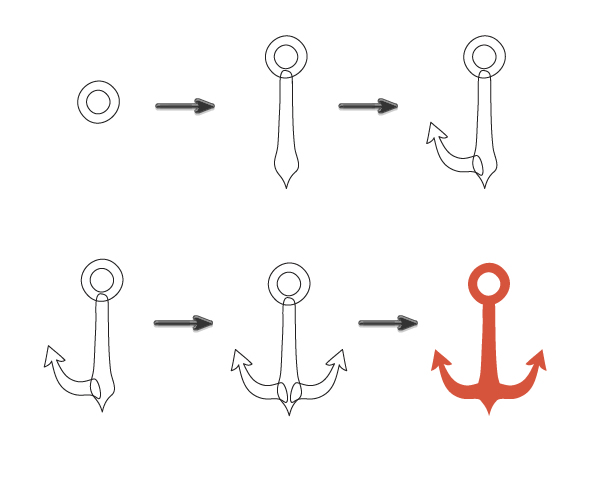
Let's draw another element—the anchor. Using the Pencil Tool (N), draw two circles. While keeping them selected, on the Pathfinder panel, press Exclude button. Then draw bottom part. Now, draw the left arrow. Don't forget to hold the Alt button when as you finish the path. Make sure that the left part of the anchor (arrow) is selected and right-click your mouse. Select Transform > Reflect. Check Vertical axis of reflection and Angle 90 degrees, then press Okay. Shift the right arrow to the right. Select the whole anchor, delete the stroke and make the fill color orange (R=214 G=84 B=59). Keep the whole anchor selected, and on the Pathfinder panel press the Unite button.
Step 5
Now, let’s draw the lifesaver buoy. Draw two circles again and press the Exclude button on the Pathfinder panel. Make the fill color R=232 G=229 B=209. Then make very thick stroke on the Stroke panel (stroke color R=178 G=31 B=41) and draw stripes using the Pencil Tool (N) as in the image below. When you are finished, select red stripes and expand them (Object > Expand).
Now, make one more copy of light gray circle (Control-C) and send it to the front (Control-X, Control-F). You now have two copies of light gray circles. Keep the upper copy selected and while holding the Shift key, select the red stripes. Then press the Crop button on the Pathfinder panel.
Step 6
Let’s draw the helm—the steering wheel. Using the Pencil Tool (N), draw the helm with thick strokes. Be sure to select the Round Cap button on the Stroke panel. When you are finished, select the whole thing and expand it (Object > Expand). Set the fill color to R=188 G=166 B=109.
Step 7
We now have all the elements we need to create the seamless wallpaper! As you can see in the image below, I added one more anchor with the same fill color as a body of the seagull. To easily use the same fill color, you first need to select the new anchor, then take the Eyedropper Tool (I) and click on the body of seagull.
2. Creating the Background
Step 1
Let’s draw a large square by using the Rectangle Tool (M). Click on your artboard and in the new dialogue window, make the following rectangle options: Width600 px and Height 600 px. Set the fill color to R=61 G=66 B=73. Send this square to the back (Control-X, Control-B). Randomly scatter all elements (seagull, two anchors, helm, lifesaver buoy) all over the square.
3. Creating a Seamless Pattern
Step 1
Pick the Selection Tool (V) and select all the marine life elements, without the background. Group them together (right-click > Group). Press the Enter key and Move window should pop up. Enter in Horizontal Position 600 px, Vertical Position 0 px, Distance 600 px and set the Angle b 0 degrees. Now, press the Copy button.
Step 2
Select all the elements inside the artboard again and press the Enter key. In the Move window, make Horizontal Position -600 px, Vertical Position 0 px, Distance 600 px and Angle 0 degrees. Press the Copy button.
Step 3
Select all the elements inside the artboard once again and press the Enter key. In the Move window, make Horizontal Position 0 px, Vertical Position 600 px, Distance 600 px and the Angle 90 degrees. Press the Copy button.
Step 4
Select all the elements inside the artboard for the last time and press the Enter key. In the Move window, make Horizontal Position 0 px, Vertical Position -600 px, Distance 600 px and the Angle -90 degrees. Press the Copy button.
Step 5
Now, you need to ungroup everything. Select all the elements (Control-A) and ungroup them (right-click > Ungroup). You need to delete all the marine life elements that do not cross the background.
Important point—if you want to move, for example the seagull on the top of the wallpaper, you need to select the corresponding seagull on the bottom of the wallpaper at the same time. Or you need to move the helm from the left side of the wallpaper, you need to move the same corresponding helm from the right side of the wallpaper.
Your result should look like the image below:
4. Cropping the wallpaper
Step 1
Group all the marine life elements without the background. For this, you can select everything (Control-A) and while holding down the Shift key, then uncheck the background. Now that you have selected just seagulls, anchors, helms and lifesaver buoys, group them together (right-click > Group). Make another copy of the background (Control-C, Control-F) and send it to the front (Control-X, Control-F). Keeping the new copy of the background selected, hold down the Shift key and select the grouped marine life elements. Go to Pathfinder panel and press the Crop button.
And last but not least: keep the cropped wallpaper selected, and go to Object > Path > Clean up, then Okay. You need this to delete the paths without the fill and stroke.
Step 2
You should now have something like the image below:
Step 3
You did it! Now your summer vintage marine life wallpaper is done! You can drag the whole pattern to the Swatches panel and use it for printing, set as
a background, fill the shapes that you created in AI, and more.
Conclusion
Congrats, you got your seamless pattern created, and it looks beautiful! Now, go find a unique way to put it to use, or make another seamless pattern using other elements you've made.
I really enjoy portraiture. When it's done well, it is very satisfying and tells a lot about the person in the photo. However, there is always a little element that is a constant problem for me: fly-away hair, frizzies, or whatever you call them. They're the strands of hair that stick out from the person's head and make your photo look a little messy. Especially with corporate or fashion photographs, they're practically unacceptable and must go.
I'll be showing you three techniques that will give you options when tackling those pesky follicles while keeping the final result natural-looking. As with any retouching, it's a balancing act of taste vs need while keeping it realistic. If you go too far, then you'll end up with "helmet hair" which often looks fake.
Retouching an image is supposed to be done well and subtle enough that the viewer doesn't notice it. A lot of that comes from producing the shot properly in the first place, but the rest comes from good technique and application. So, having your subject well-groomed or using a hair stylist can be really helpful in reducing the amount of time and effort needed to fix hair's errant ways. For the rest, use these three techniques.
Technique #1: Clone Stamp Tool
Clone Stamp is the Captain Obvious choice for removing heretical hair in Adobe Photoshop. Simply sample the clean area and then brush over the hair and make it go away. However, if you've used this tool before, you'll notice that it has short-comings.
Its main strength is also its main weakness: it copies exactly what you sampled, pixel-by-pixel. This can be a problem with textured backgrounds or variations in color or luminosity. However, with evenly-lit and evenly-colored backgrounds, the Clone Stamp is awesome.
Even though I used a very small brush size, re-sampled repeatedly and closely, and used the Lighten blend mode, the Clone Stamp Tool couldn't handle the gradient.
You can further refine your cloning and reduce problematic color/luminosity variations by using different Blend Modes for the brush. I use only three different modes:
Normal
Darken
Lighten
The Normal mode works most of the time, but sometimes it's too exacting and can be a problem with backgrounds that have a slight texture. Using the other two modes can make my changes literally hair-thin.
I use the Darken blend mode to retouch lighter hair that's against a darker background. I use the Lighten blend mode to retouch darker hair against a lighter background. The effect stops once the hair reaches the same luminosity and color value as the sampled area. It will leave the areas that already match untouched, so your corrections are only a couple pixels wide even if your brush size is many times larger.
Technique #2: Healing Brush Tool
The Healing Brush is a more refined version of the Clone Stamp tool. It copies the color, luminosity, and texture from the sampled area over to the target area. It then applies some math and very seamlessly blends the two into something that looks natural.
The Healing Brush is great for removing blemishes, pimples, unwanted facial or body hair, sensor dust, etc. It works better than the cloning technique mainly because it isn't an exact copy, but smoothly blends the target and sample areas with the target's surroundings.
Use this tool for backgrounds that are a little more complex or textured -- wherever the Clone Stamp is failing. You can also use it to clean up mistakes the Clone Stamp has made while preserving the texture. I use it for hair that crosses the face or is on clothing so that I can be rid of it without losing the complexities of the skin or fabric.
Again, you can utilize the Blend Modes to further refine your retouching.
Unfortunately, the blending prowess of the Healing Brush is also a shortcoming. It doesn't do well when your target area is too close a hard line, such as the edge of someone's head. You'll get a blurred bleed and it looks messed up. In this case, the Clone Stamp tool may be better suited, adjust the brush's hardness to match the transition.
You can see what happens when the Healing Brush can do when it gets close to a high-contrast edge. This can happen even if your brush is tiny.
Brush Settings
So, now you know two tools that zap away errant hair and when to use them, but we'll go over some common settings I use that get the job done. Through experiment and experience, I've figured that these tend to produce the best and controllable results.
I use a Wacom tablet for maximum control and flexibility, but this will work with a mouse, too. If you don't own a Wacom and you're doing retouching, then buy a pen tablet. They start at about $80 (USD) and last a long time. Mine is six years old.
Clone Stamp
I usually keep the default shape settings, a circle, and use it at 100% Opacity. I vary the brush's hardness, but rarely go over 80%. In fact, I use this brush at 0%, 20%, 50%, and 80% increments as I've found it covers most of my needs. Of course there are times that I'll use a different hardness setting, but that is case-by-case. And with the pen tablet, I can vary that further with pen pressure.
Like I mentioned earlier, I utilize different Blend Modes when I need to. Appropriately matching these different settings to your situation will result very good cloning and a faster workflow.
Healing Brush
A lot of people would tell you to use this brush with a soft edge. I'm going to tell you to do the opposite. Keep it at 100% Hardness all the time. Additionally, change your brush's shape (Roundness) to a narrow ellipse between 20 and 30%. I also angle it and change the direction, depending on my needs.
You can change the angle to adapt to each situation.
What these settings do is help the Healing Brush work better by forcing it to re-sample more often and more randomly than a soft-edged circle. Since the Healing Brush automatically applies blending, you really don't need a soft brush. The results have been very natural as well as a greatly reduced risk of that edge blurring I mentioned earlier.
Finally, keep your brush size only slightly larger than the area you wish to correct, especially with fly-away hair close to the edge of someone's head or if the background changes color or luminosity too greatly.
Technique #3: Surface Blur
While this technique is mainly independent of the other two, it does incorporate the others for maximum efficacy. It is a really quick way to remove nearly all that fly-away hair with a single filter effect with some basic masking. Aside from the processing bottleneck, it is faster than going over each hair with either the Clone Stamp or Healing Brush.
Unlike Gaussian Blur or the other blurs, Surface Blur doesn't blend the edges beyond it's threshold setting. Surface Blur considers something an "edge" when there is a significant change in color and/or contrast. So, things like skin, clothing, and other fine details will be smoothed, but not the edge of someone's face -- or the main mass of hair.
Surface Blur is a great way to clean up a hair edge when you have a gradient background -- where the Clone Stamp would struggle. It will do a nice job maintaining gradual tonal changes while keeping hard edges well-defined. Give it a go when you have an image with a graduated background.
Let's get into the steps for using Surface Blur to clean up hair in your images.
Here is our sample head. Lots of little stray hair and the Surface Blur technique will do a lot of the work for us. (ISO 200, f/8, 1/160sec, flash comp +1.3)
Step 1: Create a New Layer
Drag the layer onto the "Create New Layer" icon (Cmd+J or Ctrl+J) so that you don't affect any previous retouching you've done. You can convert this new layer into a Smart Object (Layer > Smart Objects > Convert to Smart Object) to be able to change your settings without having to reapply the filter from scratch. Converting to a Smart Object is optional.
Step 2: Apply the Surface Blur
Go to Filter > Blur > Surface Blur in order apply it. You'll see a preview of the effect at its current settings.
The Surface Blur filter has two sliders, Radius and Threshold. The
Radius determines the amount/strength of blurring. The Threshold determines the tolerances of what the filter considers to be an "edge."
Going too low with the Radius will give you a halo and going too high
with the Threshold will make you lose your edges.You'll need to adjust the sliders so that the fly-away hair disappears due to the blurring, but the main body of hair and hard edges remain quite sharp. This will take some experimenting and will vary from image to image. However, I've found that a Radius of 40 pixels and Threshold of 20 pixels gives me great results.
As you can see, a lot of the stray hair is gone while the main body of hair is intact.
Once you've gotten the settings pretty close, apply it and evaluate the results. A lot of the isolated hair should be gone or mostly gone.
After applying Surface Blur, the hairline has been cleaned-up significantly. The stragglers can easily be handled with the Clone Stamp Tool. (230% zoom)
Step 3: Clone Stamp Clean-up
There are times when the Surface Blur gets the job done, but often you'll need to tackle the few that got away. With a soft-edge brush, Clone Stamp those escapees by sampling very close to the target area to avoid noticeable color variations. I keep my brush no higher than 50% hardness.
Sampling very close to my target area, I got rid whatever the initial Surface Blur missed. However, I made sure to try to keep it natural-looking. (230% zoom)
Try not to make the hairline too clean because then it will look unnatural. You can do a second round of Surface Blur at lower settings if it could use a little more general refinement.
Step 4: Create a Layer Mask
Now it's time apply the effect only to the outer hairline. Create a Layer Mask on your layer with the Surface Blur by clicking the "Create Layer Mask" icon. Invert the color of the mask from white (visible) to black (invisible) with Cmd+I (Mac) or Ctrl+I (PC). This will hide the effect.
Create a Layer Mask and then invert (Cmd+I or Ctrl+I) it to hide the effect.
Now, with a hard-edged brush (about 80%) reveal the effect by painting on the mask with white. Limit the revealing by only brushing over the hair that need to go away. You don't need to be very precise because the Surface Blur should maintain the edging of the main body of hair.
This is what the mask should look like. (100% zoom)
Step 5: Add Noise
Surface Blur usually removes all the noise (grain) in an image. This lack of texture can ruin the effect by being too smooth. We'll need to add noise in a dosage that matches the rest of the image.
I zoomed in to 330% to show in more detail the differences between that retouched and un-retouched areas. This is difference is visible at 100% and will be more obvious with high-ISO photographs or under-exposed images that have been brightened.
Make sure you're working the image of the Surface Blur layer and not the mask by clicking on the thumbnail of the layer. Go to Filter > Noise > Add Noise.
Make sure the layer's image thumbnail, not the layer mask, is highlighted. Otherwise, you'll be adding noise to the layer mask.
In the Add Noise dialogue box, turn on the Gaussian and Monochrome settings. Adjust the slider until the noise pattern and density closely matches the rest of the image. While not entirely necessary, this small detail does an excellent job hiding the retouching you've done.
For this image, I applied 3% Noise. It's not perfect, but is the closest match. At 330% zoom it's really good and when we zoom-out to 100% you won't notice it.
Conclusion
Before retouching After retouching
When you have a great portrait, sometimes fly-away hair can really be a pain. While cloning and healing are great, they do have limitations. Using them in conjunction with the Surface Blur technique can not only improve your retouching results, but also cut-down on the time and tediousness of either technique alone.
With practice, you'll be able to evaluate an image and quickly decide which of these techniques will be most effective in removing fly-away hair.
About two months ago, I'd written a tutorial about drawing badgers (and some other animals of their family). This time we're going to use tips from it to create a cute scene with a badger-mama and her baby.
We'll start from scratch and you'll be able to learn a lot of useful tricks to create a quick illustration. Then you can use the final sketch to bring it into vector with Sharon Milne. Find a bit of paper, grab a pencil and let's get started!
1. Sketch the Base
Step 1
Let's draw the ground first. It's very important to define perspective for the picture, even when it has nothing to do with architecture or right angles. Just draw simple lines as if they were laying flat on the ground.
Step 2
Use quick gesture lines to create a general shape of the badgers. All you need to do is to define the position of spine, head and back. Such a fast sketch helps avoid stiffness of figures and it lets you to sketch the idea before going into anatomy and other complicated things. Notice how I defined the volume of the bodies.
Step 3
When the general shape is done, you should do a pose check. Sometimes the gesture looks great, but it may be anatomically impossible. Of course, you can bend the rules, but try not to go too far away from them.
Step 4
Use the base we've created to sketch the outline. Don't pay too much attention to it, just sketch what you see in this messy shape.
Start with a ball where in the widest part of skull. Use its lines to define the halves, and so the direction the badgers are looking.
Step 2
Draw the muzzle. The female has a long, slim mouth, while her baby has a cute, short muzzle.
Step 3
Draw a ball at the end of the muzzle to define the exact placement of the mouth.
Step 4
Sketch a big nose and lips.
Step 5
Find the place for eyes. Placing them low gives the baby a cute look.
Step 6
Use the guide lines to sketch the outlines of the head.
3. Add Details to the Head
Now we're ending the sketch phase and starting the real drawing. If you're drawing traditionally, it's the best to redraw the defined lines subtly on a new sheet of paper, leaving all these messy guides-of-guides behind.
Step 1
Draw the noses. Badgers have them very big!
Step 2
Shade the noses. Keep the noseholes the darkest and leave a bit of the nose clear to create shine.
Step 3
Sketch the ears. The baby is going to have them laying flat, since it's pretending to be angry.
Step 4
Add a lot of fur to the ears.
Step 5
Draw the eyes. The mommy is going to have them closed, and the baby wide open, with wrinkles of anger!
Step 6
Shade the eyes to create some depth.
Step 7
Finally, we can draw the contours of the heads. Don't forget about placing the stripes!
Step 8
Shade the heads. Black stripes will make your animals resemble badgers, no matter how much you spoiled the anatomy.
4. Draw the Rest of the Body
Step 1
Draw the paws with long claws. Fortunately for us, they're mostly covered with the body and we just need to draw the fingertips, without bothering about the anatomy.
Step 2
Shade the paws. The claws are gray and the feet are black.
Step 3
Draw the fur around the body.
Step 4
Shade the fur. With simple lines you can make it look darker than the head (the head is white and the rest of the body is gray).
Step 5
Draw a simple shadow using our perspective lines.
Congratulations!
You've just drawn a cute illustration in a simple and effective way. You can leave it as it is, or use it for a vector illustration. Good luck and see you next time!
Community Project Showcase: Creative Selfies Part Two
When we asked you to show us your creative selfies, we were blown away by the incredible talent of our readers. From vectors to digital paintings, portraits to abstract art, you've all shown us that your talent is truly limitless! Today we're bringing you part two of this project, showcasing the incredible entries we received from you.
Creative Selfies by You!
Here are the next 15 selfies by our readers. Show some love to these talented artists in the comments, and enjoy!
Bahia Khalid
Greetings! I'm Bahia Khalid, someone who's seriously obsessed with the pen tool in Adobe Illustrator. I
do lots of girly vector artwork as my passion. I was a Graphic Design student for 5 years with an additional 6 years of working experience
in the creative world. I enjoy doing vector art and my current passion
would be GUI designs. Here's a selfie of me, running + posing within 15 seconds of a self timer in my office's meeting room. If you'd like to check out more of my artwork, here's the link: https://www.behance.net/3ahia.
Badreddine BIADA
Here's my selfie. I hope you guys like it. I made it on illustrator. I'm a sophomore Graphic Design student, in GAU, North of Cyprus. Unfortunately, I don't have a website, so here's my e-mail: badreddinebiada@about.me.
Mario McMeans
Hey guys! My name is Mario, you can call me friend. I reside in
Houston, but I'm from Germany. I'm a 10 year Graphic Designer hoping to
one day own my own advertising agency—baby steps, I guess. I love
reading books, traveling, cooking, and I really love storytelling. I
LOOOOVE what I'm seeing from all of you guys. I'm down for any
collaborations, inspirations, or dance-offerations. See more of my work at http://welcome2hueston.com/.
Arjun Lama
Everybody calls me Arjun and Graphic Design is my
hobby. I'm from Nepal and currently work in a manufacturing company for
handcrafted goods. This was done based on an online tutorial, and I just added my own flavor.
BobbyLee Wargula
So this was my first real attempt at AI and a selfie. I am a student at Full Sail online and I plan on getting better with AI.
Barrie Phelan
Hello everyone! I'm Barrie, a designer living in London, UK. This is my selfie painted with Photoshop and Wacom.
My name is Keeley, I am 17 and like to mess around with Photoshop and Fireworks, and have done some professional work for friends and family. I
am very creative, I love to paint and am studying Graphic Design at
college in September after having done a year in Forensic Science. Here
is my selfie. I do not have an online portfolio to view yet, but
hopefully will when I start my course. Wish me luck!
Mark Bailey
Hey Everyone! My name is Mark Bailey and I am a web and graphic designer
in Greensboro, North Carolina. I run a design firm called Yellow Dogg
Designs. My piece is a vector artwork created in Adobe Illustrator. You can find more of my work at: http://yellowdoggdesigns.com and https://www.behance.net/ydd.
Hayden Nininger
I'm a design student just at my normal everyday local high school. I
love design, and I hope to make a career out of it. I would love some
work in the field as soon as I can.
Calvin
WOW!!! I'm wading into complete awesomeness here. I'm a dabbler from Austin, Texas. I'm a big fan of roto-style techniques
ScreenPrinter
Hi everyone , I'm a self-taught artist and love doing this as a hobby. For this work I used my phone with the App Setchbook to
draw. Hope you guy like it!
Rahul Kumar
Hi fellow creators! My name is Rahul Kumar. I'm a graphics designer and
illustrator who loves making vector artworks, reading comic books,
listening to music and roaming around, seeing new places. This self
portrait of sorts was made by putting together pictograms over my avatar
pic. The pictograms depict some of the things that inspire me or have
been a part of my life and creative process for a while now. You can take a closer look at this selfie (along with my other artworks) on my Bechance page:https://www.behance.net/horizonred.
Jack Loughran
Hi there! I'm Jack, a freelance photographer and designer from Wicklow,
Ireland. I've been an avid designer for a few good years but didn't
start weaving my own photography into my work until quite recently. I'm
currently revamping my main site but you can follow me at https://www.facebook.com/jackloughrandesign. Cheers!
Franck Beaume
Hi there! My name's Franck Beaume. I was born in France, a
long long time ago, and now I'm living near Montreal (Canada), I am
self-taught in design but I've always had a lot of interest in the graphic
arts. I've done a few freelance jobs but generally I create just for my own
pleasure. In my personal works I enjoy mixing different media (pictures,
illustrations, vectors). I love photography, cinema, alternative
music, reading, advertising, sports, creative contests and... sleeping! It's really a pleasure to share my work here with this great community. You can follow my work on my Behance portfolio: https://www.behance.net/fbeaume
Hey, where's my entry?
Don't worry! Last month we extended the deadline and received even more entries. So, we decided to spread the showcase into three parts. If you don't see your feature now, stay tuned in August when we'll be showcasing part three.
And be sure to stick around for more community projects where we invite you to take on new and exciting design challenges!
Get Inspired
Couldn't get enough of our selfie project? Want to learn more about portrait design and illustration? Check out these great tutorials for tips and inspiration:
Most blocks of text are set within conventional rectangular borders. But, what about those times when you want to place text within an irregular boundary? Or, what if you want to divide the copy in your text box into columns? I’ll show you how to do both of these things, as well as a few extras, using Adobe Illustrator’s Area Type Tool.
Inserting Text Into A Shape
Let’s
say you want to insert text into a circle. The first thing you need to do is make a circle!
If you aren’t a big fan of circles, go ahead and make a triangle, a star or a
polygon using one of the shape tools or the Pen Tool. Any closed shape will
work.
Select
the Area Type Tool (found in the drop-down menu of the Type Tool). Click
anywhere on the path of the shape. A blinking cursor will appear which means
the shape is ready to accept text. Type or paste your text into the shape and
watch it conform to the boundaries of that shape.
Too Much Text?
Sometimes
there is too much text for an area. If you see a small box with a plus symbol
(+) at the bottom of the bounding area, you’ve entered too much text. You have
three options. Decrease the point size of the text. Increase the size of the
bounding area. Create an overflow area for the extra text.
Creating An Overflow Area
To
create an overflow area, click on the plus symbol (+) with the Selection Tool
(V). Now, click on another spot on the page. A new text shape, identical to the
shape of the first text boundary, will appear and will contain the overflow
text.
Let’s
say you want your overflow text to go into a different shape. First, create a
new shape. Next, click on the plus symbol (+) with the Selection Tool (V).
Then, click on the border of your new shape. The overflow text will appear in the new shape you created.
Additional Area Type Options
The
area type tool has many handy options that a lot of people either don’t know
about or don’t use. To see the available options go to Type > Area Type
Options or double click on the Area Type Tool in the tool bar. The Area Type
Options box will appear. Here, you will be able to specify the number of
columns or rows and their width, gutter width, text flow direction, and more.
Let’s
start from the top and work our way down. Select the Type Tool (T) and drag a
box. It doesn’t have to be a certain size as that can be specified in the Width
and Height fields in the Area Type Options dialog box.
Next,
enter the number of rows you wish to have in the Number field and specify their
height in the Span field. To specify the amount of space you wish to have
between rows, enter a number in the Gutter field.
In
the Columns section, enter the number of columns you desire, their span (width)
and gutter width.
Checking the Fixed box ensures that even if you resize the type area, the height
of your rows and the width of your columns will remain the same. If you leave
the Fixed box unchecked, the width of your rows and columns will automatically resize
to fit the resized type area.
After you have made your specifications, click OK. Then, either type or paste
text into the text area and watch it magically form rows and columns! If you
don’t like what you see, simply change the choices you made in the Area Type
Options dialog box and the text will readjust.
Inset Spacing
Under the Offset heading, there is an option titled Inset Spacing. The value
you type in this field will add space between the text and the bounding box,
should you want a bit of breathing room between the border and your text.
First Baseline
By default, text in an area object starts at the top. If you want the first
line of your text to start either above or below the top of the bounding box, First
Baseline gives you several options for doing just that. After you have chosen an option, enter
a value in the Min field for your baseline offset.
The available options are as
follows:
Ascent - The height of the “d”
character falls below the top of the type object.
Cap Height - The tops of uppercase
letters touch the top of the type object.
Leading - Uses the text’s leading
value as the distance between the baseline of the first line of text and the
top of the type object.
x Height - The height of the “x”
character falls below the top of the type object.
Em Box Height - The top of the em
box in Asian fonts touches the top of the type object. This option is available
regardless of the Show Asian Options preference.
Fixed - Specifies the distance
between the baseline of the first line of text and the top of the type object
in the Min box.
Legacy - Uses the first baseline
default used in Adobe Illustrator 10 or earlier
Text Flow Options
Here, you can control whether the
text flows horizontally from column to column or vertically from row to row.
Simply click on the text flow direction you prefer.
Conclusion
Now that you understand area type and the options the Area Type Tool offers, try it out in your next graphic design project!
One of the more powerful features that came with the new Photoshop CC is the addition of the Path and Spin Blur filters. This quick tip will explain how to use those filters in order to achieve interesting effects quickly and easily.
Let's get started.
Tutorial Assets
The following assets were used during the production of this tutorial:
The Path Blur is used to add blur along a path. Let's take a look at how to use it.
1. Adjusting the Path
Step 1
Open the Golden Dawn Bridge - Exclusive HDR Stock image. When working with Filters in Photoshop, it is always a good idea to convert the image's layer into a Smart Object. This way, you'll be able to add a non-destructive filter that can be re-edited any time later on, as well as have a smart filter mask, which can help control the area that the filter affects.
To do so, select the layer, then right click it and choose Convert to Smart Object.
Step 2
Go to Filter > Blur Gallery > Path Blur. This will open the Blur Gallery window, and a path with two end points will be automatically created. The path determines the direction of the blur, which is left to right by default.
There are also a couple of settings under the Blur Tool and Motion Blur Effects panels to the right side, which you can use to tweak the effect
Step 3
Press and hold the Command key, then click and drag the path to place it on the bridge, and release all.
Step 4
Click each end point to select it, then drag it to place it along one end of the bridge. This will change the direction of the blur.
Step 5
The point in the middle can be also clicked and dragged to adjust the shape of the path, which will adjust the shape of the motion as well.
2. Adjusting the Blur Shape
Step 1
Check the Edit Blur Shapes box. You will notice that a red arrow will appear at each end point of the path. The Speed value is a global one that affects all the paths you have. The End Point Speed values, however, can be adjusted independently, giving you more control over the final result.
Step 2
Click the left end point, and change its End Point Speed to 0.
Step 3
Click the right end point, and change its End Point Speed to 100. You can then click and drag the red arrow's mid point to change the blur shape, or click and drag the arrow's head point to change the End Point Speed until you like the result you get.
3. Adding Another Path
Step 1
The blur in the image is now controlled by one path only. But you can add some more paths to get a more interesting result. In this case, we want to add a path to decrease the blurring over the front part of the bridge.
To add a new path, click where you want the path to start. Drag and click to add more points, until you reach the end of the path you want to create.
Step 2
As long as you're still clicking and dragging, the path will be continuously modified. To end the path, place the mouse cursor inside the end point until you get the cursor's shape below, then click once. Alternatively, you can press the Esc key.
Step 3
Shape the path as you like, then change the End Point Speed values accordingly. In this tutorial, the Speed is set to 38, the bottom End Point Speed is set to 16, and the top End Point Speed is set to 4.
Step 4
You should end up with a nice final result.
The Spin Blur
The Spin Blur is used to create circular or elliptical blurs.
4. Adjusting the Ellipse
Step 1
Open the Gillian's Wonderland Pier Ferris Wheel image, and convert its layer into a Smart Object.
Step 2
Go to Filter > Blur Gallery > Spin Blur. This will open the Blur Gallery window, and a default ellipse will be automatically created.
Step 3
You can click and drag the ellipse's borders to resize it, as well as click and drag its handles to reshape and rotate it.
Step 4
If you click inside the ellipse, you can drag it to move it around. The blur ring in the center can be used to adjust the blur amount, or the Blur Angle, which can be adjusted using the slider under the Blur Tool panel as well.
Step 5
Move and reshape the ellipse until it covers the ferris wheel in the image. We will make some modifications later on, but try to make it as close to the wheel's shape as possible.
Use the fade handles to change the fade range, or the distance between the blurred and un-blurred areas. This results in a smoother transition.
Step 6
The feather handles can not be moved independently, but their center can. So if the ellipse's mid point is off-center, you can press and hold the Option key, then click and drag the pin in the middle to move the rotation point. Do so to place the middle pin over the wheel's center.
Step 7
Choose a Blur Angle you like, Here, the value used is 6.
Step 8
You can also play around with the Motion Blur Effects' values to get more realistic results. The Strobe Strength here is set to 0, but if you start increasing its value, you can get different results. It's always great to try different combinations of values to see how they work, so feel free to play around with them until you get a result you like. Click OK when done.
5. Using the Smart Filter Mask to Remove Unwanted Areas
Step 1
As you can see, especially if you zoom in, there are areas around the wheel that are affected by the blur, when in fact they shouldn't be. Here's where the Smart Object comes in handy, as we'll be using the Smart Filter to remove the blur from those areas.
Click the Smart Filter, pick the Brush Tool, and set the Foreground color to Black. Use a soft round brush tip, with the Size you need depending on the area you want to hide, and start painting over that area. If you set the Foreground color to White, you can paint back in any area you removed by mistake.
Step 2
Take your time to erase all the unwanted areas. This should leave only the ferris wheel affected by the blur.
Using Both Filters
Both the Path and Spin Blur filters can be used together. In this example, we will apply the Spin Blur to the car wheel, and the Path Blur to the surrounding parts. That will emphasize the motion effect and make it more believable.
6. Creating Copies and Isolating the Wheel
Step 1
Open the SLR wheel image, convert to Smart Object, and duplicate the resulting layer so that you have a copy.
Step 2
Use the Elliptical Marquee Tool to create a selection around the wheel. If needed, you can adjust the selection by going to Select > Transform Selection.
Step 3
Go to Select > Modify > Feather, and type in 15. This will help blend in both layers seamlessly instead of creating harsh lines.
Step 4
Make sure that the copy layer is selected, then click the Add layer mask icon down the Layers panel. This way, only the wheel will be affected by any filters applied to the layer.
7. Applying the Spin Blur to the Wheel
Step 1
Click the copy layer's thumbnail, then go to Filter > Blur Gallery > Spin Blur. Reposition the ellipse on top of the wheel (and its center over the wheel's center as well), then change the settings as you like, The Blur Angle is set to 15, the Strobe Strength to 15, the Strobe Flashes to 2, and the Strobe Flash Duration to 3.
Step 2
The Spin Blur won't cause any problems, since it only affects the wheel. But the mask comes to use next, as it will prevent the Path Blur from affecting the wheel.
8. Applying the Path Blur
Step 1
Select the original (bottom) layer, then go to Filter > Blur Gallery > Path Blur. Reposition the path so that it is parallel to the ground in the original image. Also, un-check the Center Blur box. This will result in a more fluid and directional blur.
Change the left End Point Speed to 146.
Step 2
Change the right End Point Speed to 74, play around with the rest of the settings if you like, then click OK.
Step 3
There you have it! Super simple and quick. The feathering of the selection blends both layers nicely, and the Path Blur has absolutely no effect over the Spin Blur. So it's just a matter of playing around with the settings, and making use of the different types of masks and Smart Filters.
Congratulations! You're done.
This tutorial discussed the two new Photoshop's Blur Gallery filters, which are the Path Blur and the Spin Blur. Each filter was demonstrated in an example, along with some tips and tricks on how to use it in order to achieve nice effects easily and quickly.
The tutorial also explained the use of Smart Filters and masks to further enhance the outcome, and control the areas that the filters affect. Finally, both filters were used together for the same image, in order to achieve a more realistic and smooth result.
Hope you found the tutorial helpful, Please feel free to tell us what you think about the new filters, and share with us what you create using them.
Ever wanted to turn an app interface PSD into a fully animated demo for your clients or site? Turns out, you can use Photoshop for that, too.
In this tutorial, we will design a simple news iPhone app, and then animate it for client presentation and export it as a GIF file. You'll learn everything you need to go from idea to animated demo, all inside any recent version of Photoshop.
Tutorial Assets
We've used Photoshop CC in this tutorial, but CS5 or 6 would work as well to follow along. You will also need the following stock photo to complete this tutorial. Please download them before you begin, or substitute with a similar picture and adjust the steps accordingly:
First, we will start designing the app's interface. Make a new file (Control-N) with canvas size 640 px by 1136 px, then click OK.
If instead you already have an app interface designed, you can open it in Photoshop and then jump to the Tap section of this tutorial.
Step 2
Click View > New Guide to make new guide, which will help us in placing GUI elements accurately. Set it to Vertical with position 15 px.
Step 3
Add another vertical guide at each side of the canvas with 15 px distance between each guide.
Step 4
Draw another guide, this time horizontally at 40 px, 128 px, and 220 px.
Step 5
Add a status bar on the upper most section of your canvas. If you need detailed directions on that, check out the status bar section of our earlier tutorial How to Design an iOS 7 Email App in Photoshop.
Then, make a new layer and then select second section and then fill it a gray color, #2c3137.
Step 6
Add the app's title text on the top part of the interface.
Step 7
Add a logo to the title. I just drew some simple rectangles for the logo, but if you have an existing app icon, you can just import it into a new layer.
Step 8
Draw a magnifier icon using a combination of two circle shapes and a rounded rectangle, using the same color as the app logo. Place it on the right side of the app.
Step 9
On the other side, draw four rounded rectangles for the option icon.
Step 10
Make a new layer with a rectangle section that fits under the titlebar. Fill the next section with a gray color, just as the previous section.
Step 11
Add a layer mask onto the layer, and then add a black to white gradient until the bottom is faded.
Step 12
Add a menu using the Type Tool, containing the news categories. Set the first menu—in this case, the All option—to be bold, to indicate that the category is active. Duplicate it (Control-J) and then set other menu—in this case, Sport—to be bold, once again to indicate which category is selected.
Now, from the Layers panel, set the Sport menu Opacity to 0% to hide it, as we want the All category to be bold first.
Step 13
Add a thin arrow for menu navigation, made of rounded rectangles.
Step 14
Add another arrow onto the other side.
Step 15
Fill the rest of the interface with the gray color. Make sure to put this background underneath all the GUI elements.
Step 16
Draw a light gray rectangle for the individual news section background.
Step 17
Apply Stroke, Inner Glow, and Outer Glow to add more contrast to the news area. Double click the layer and then use the following settings from the screenshots below:
Step 18
Draw a white rounded rectangle on the top part of the previous shape. We will put news image here.
Step 19
Apply Inner Glow into the white shape with the following settings:
Step 20
Select a photo from the Tuts+ Stock Photo set you previously downloaded, or any other photos you'd like to use, and place it covering the white rounded rectangle shape.
Step 21
Hit Control-Alt-G to convert selected photo layer into a Clipping Mask. The photo will automatically go inside layer behind it. And, here's what you see:A perfectly placed photo on top of the individual news area.
Step 22
Add text for the news content. Make sure to add contrast to the news text for a better reading experience by varying font type, color, and size.
Step 23
Let's add icons into the news element design. Draw two small rounded rectangles without Fill and 1 pt white stroke.
Step 24
Double click the layer and then add layer style Color Overlay. Use #708196 for its color.
Step 25
Repeat previous process, but this time uses a combination of a rounded rectangle and a rectangle.
Step 26
Add a small circle shape. Now, we have a tag icon. Sweet!
So far, this is our app design at 100% magnification.
Step 27
Add other individual news articles into the app by duplicating the news element layers, customizing them appropriately.
Step 28
Add bigger news area. This will be shown when an individual news is selected.
Step 29
Put all the individual news elements and big news stories in separate layer groups. You want to assure every layer is carefully placed into a layer group according to its element.
For example, you want each layer that made the first individual news section placed together in a layer group, and the elements for full-screen news articles in other groups. This will help you to work easier while making the animation.
For now, we will not use this big news section. So, set its Opacity to 0%.
2. Tap Indicator
Step 1
We now need to design the tap indicator. Make a new layer group and name it tap. Next, draw a white circle shape. Set its Opacity to 50%.
Step 2
Duplicate the circle shape by pressing Control-J. Make it larger, set stroke to 3 pt with a white color, and remove the Fill color.
Step 3
Add another circle shape, this time thinner. Set its stroke size to 2 pt.
Hide all the layers inside tap layer group we have just made, as you won't want the taps to show up when the UI is first loaded, but instead will only display them when the animation is fixing to transition to a selected element.
3. Scroll App
Step 1
Now, we're finally ready to start building our UI animation. Open the Timeline panel and then make a new frame.
Step 2
Make another new frame.
Step 3
Now it's time to reveal the tap layer group. When showing a scrolling scene, hide the two stroked circles, and we are going to use this condition to indicate scroll gesture. It will appear more as a continuous stroke, whereas the outer stroked circles give a ripple appearance more consistent with a single tap to select an item.
Step 4
Change the duration to 1 second for first frame and 0.2 seconds for second frame.
Step 5
Add another frame.
Step 6
Activate the Tap layer group and all the news grid layers. Use Move Tool to move them up in your list of layers.
Step 7
To automatically make a smooth animation between current and previous frame, click Tween from Timeline panel menu.
Step 8
Set the tween to 5 for the added frame.
Now, we have an animation of the news grid moving upward on each frame.
Step 9
If you think that the animation is too fast, you can make it slower by selecting all the frames and setting the duration to 0.2 seconds.
Test the animation by clicking the play icon in the Timeline panel. Don't forget to set the animation to Forever; this way the animation is looped.
Step 10
Our current animation contains the news grid moving upward. In next frame, we need to put it back to previous condition so it will continue seamlessly with the first frame. To do this, copy the second frame and then paste it at the last position by choosing Paste After Selection in the dialogue box.
Step 11
Apply the Tween command again to make a new animation between last and next-to-last frames.
Add a new frame and hide the tap indicator.
So far, this is the animation we get, which gives us a basic scrolling UI.
4. Tap Link
Step 1
Now it's time to animate the selection of a link in the menu. First, make a new frame. In this frame, set the Opacity text menu with the selected bold variant of All from the menu set to 0% and Sport'sselected variant's transparency set to 100%.
Step 2
Activate the Tap layer group and reveal all its layers. Change frame duration to 0.2 seconds.
Step 3
Make a new frame with a duration of 0.1 seconds. This time hides the thinnest stroked circle.
Step 4
Add another frame and hide next stroked circle.
Step 5
Add a new frame and hide the tap layer group.
Step 6
Make a new frame and then set the Opacity of every news story in the grid without the sport tag to 0%.
Step 7
Still in this frame, drag the individual sports news stories upward in the grid, filling empty spaces above them.
Step 8
Tween between current frame and the previous. For faster animation, set added frames to 3.
Step 9
Set duration in the last frame to 2 seconds.
For this tap, this is the animation we have.
6. Tap News
Step 1
Next, we are going to select one of the news articles and reveal it in full screen. First, make new frame with duration 0.2 seconds and then reveal all layers inside the Tap layer group.
Step 2
Add new frame and then set its duration to 0.1 seconds. Hide thinnest circle stroke.
Step 3
Add another frame and then hide next stroked circle.
Step 4
Add another frame with duration 0.1 seconds. Hide the Tap layer group, and make a new frame. Reveal the big news section we made earlier in Section 1 Step 28 by setting its Opacity to 100%. Hide the small news grid by setting its Opacity to 0%.
Step 5
Add tween animation between the current frame and the previous ones.
This is what we have for this animation.
7. Convert Layers Animation to Frames
Step 1
From Timeline panel, click Flatten Frames Into Layers.
Each frame will be converted into a flat layer. If you have 33 frames, you will also get 33 flat layers: layer Frame 1 taken from content of frame 1, layer Frame 2 taken from frame 2, and so on.
Step 2
Select all frame layers in Layers panel.
Step 3
Drag the layers onto the iPhone photo that you downloaded previously.
Step 4
In Timeline panel, select Create Frame Animation and then click New Frame button.
Step 5
Make sure all layers are still selected. Hit Control-T to perform a transformation. Hold Control and then drag each corner and place them onto the screen corner.
Step 6
Make a new frame for each layer. Put layer Frame 1 in the first frame, layer Frame 2 in second frame, layer Frame 3 in third frame, and so on. You also want to match the duration for each of the frame. Make sure to set the loop to Forever, so the animation will keep on looping.
Look at picture below for an example. Layer Frame 23 is revealed on frame 23. Layer Frame 25 is revealed on frame 25, and so on. Continue this for each frame.
Step 7
It's time to export the result as animated GIF file. Select Save for Web in the File menu, and select GIF as file type. Play around with available settings to get the optimum file size. Test the animation result by clicking on the play button. Make sure to set its Looping Options to Forever.
And that's it: you've designed a demo app UI, animated it, and put the animation inside an iPhone picture to make the animation look like it's running on a real device.
Conclusion
I hope you found this tutorial helpful. You can tweak the steps included to work with any type of app you'd like to demo, and can use a different device image to showcase, say, a tablet app or website. You can also try other types of multi-touch interaction in the final presentation, such as tilt-scrolling or pinch-to-zoom, if you modify the animations.
If you make your own app demo animations using this tutorial, we'd love to see them in the comments below!
One of the many updated features Adobe unveiled with Adobe Illustrator CC 2014 was the inclusion of Live Shapes. Like Live Corners before them, Live Shapes brings greater control over closed path objects, speeding up workflow. Put your memory to the test with this simple shapes tutorial making use of this fantastic new feature.
1. Basic Diskette Shapes
Step 1
Start with the Rectangle Tool (M) and draw an "almost square" (slightly longer than it is wide).
In the Transform panel, and with the rectangle Selected, unlink the Live Corners. Set three of the four corners as Rounded with a Radius of 0.05 inches. The upper right corner should be set to Chamfer with a Radius of 0.15 inches.
Step 2
The shutter of the diskette (the sliding door bit) is created with three rectangles. The largest of the three has all four corners rounded at the same radius (this is the outer rectangle). In the final piece, the fill color will be set to black,the stroke to gray, and the Stroke Weight to 1-2pts.
The middle one (seen as a line in the first image) has only the right corners rounded to match the largest rectangle.
The smallest rectangle is rounded on all four sides but is narrow and vertical rather than horizontal like the other two. Set the fill color to black and the stroke to null.
2. Diskette Details
Step 1
The left side of this disk design has another rectangle with mismatched corners. the two left corners are Rounded at 0.09 inches whereas the two right corners are at a 90° angle.
Step 2
With the Rectangle Tool, draw a small filled-in square in the lower corners of the disk. For the disk's label, draw a rectangle whose lower corners are 90° angles and upper corners are Rounded at 0.05 inches.
Step 3
Set the fill color of the main rectangle shape to black (or whatever you're using as your disk's overall color) and make sure other shapes that need to stand out have light stroke colors (see below).
3. Build the Walkman Shapes
Step 1
Start with a horizontal rectangle, drawn once again with the Rectangle Tool. Round the corners out in the Transform panel, or by pulling the Live Corners with the Direct Selection Tool (A) inward slightly.
Step 2
For the beveled portions of the plastic device, draw a narrow, horizontal rectangle in the lower half of the main rectangle shape. Round the corners slightly. Draw another thin, horizontal rectangle that has the same width as the main rectangle shape.
Step 3
Round the two lower corners of the narrow rectangle in the Transform panel. Bring them in as far as possible so they align with the other rectangle's corners. In this case, the Radii topped out at 0.23 inches, which aligned perfectly.
4. A Window Inside
Step 1
The beveled area that holds the window that looks into the Walkman starts with another rectangle, this time covering the top half (or so) of the base rectangle (see below for placement). The bottom two corners will remain at a 90° Angle. Use the Direct Selection Tool in order to Select and pull each corner inward as far as it can go, resulting in the window's rounded, yet flat shape.
Step 2
For the window itself, start with a rectangle, Round the corners to 0.1 inches or so, and use the Direct Selection Tool to carefully pull the top corner Anchor Points inward so the top corners are at an angle that mimics the outer bevel from the previous step.
I pulled the top Live Corners as far as they could go, which led to moving the anchor points manually. The images below show the difference between manipulating the top two corners' Live Corners versus having moved the anchor points themselves afterwards.
5. Reel to Reel
Step 1
The reels inside are a series of ellipses. Draw them using the Ellipse Tool (L), stacking them on top of each other and Aligning their centers.
Alternatively, you can draw one ellipse and Offset (go to Object > Path > Offset Path) the path of that ellipse by -4 pixels one time, and by -2 pixels three times following in order to get the stack of 5ellipses. Either way you do it, Group(Control-G) together your ellipses and make sure there's two sets on either end of the Walkman's window.
Step 2
Select the window and window bevel shapes and hit Minus Front in the Pathfinder panel. Place the stacked ellipses from the previous step beneath the window in the Layers panel. Draw another rounded rectangle between the two ellipse stacks, beneath the window shape.
6. Final Details
Step 1
Now that we've got most of the shapes for the Walkman completed, I've changed the fill and stroke colors to my final choices. Most of the shapes have been filled in with black, stroke colors set to gray, and the Stroke Widths, set in the Stroke panel, are 1-2pts. All stroke Corners and Caps are Rounded.
Step 2
There are a series of buttons on the top edge of the walkman. Each is the same height (when not pressed), but vary in width. Draw rectangles across the top in varying sizes and one on the right edge.
Step 3
I found it easiest to Copy(Control-C) and Paste(Control-V) the rectangles across and shorten or lengthen their width accordingly, that way their height was uniform. Round the top two corners of each rectangle in the Transform panel.
Step 4
Finally, there are two triangles that appear on the front of the Walkman. Use the Polygon Tool to a small, 3-sided figure of 0.12 inches (or more, or less depending on the size of your artwork and document). Use the Selection Tool (V) to pull the shape upward, causing it to become more narrow. Rotate it to the left. Copy and Paste the triangle and Rotate it all the way to the right. Place both on the front of the music player.
Well Done, You're Through!
With Live Shapes, changing the corners and general shape of rectangles and squares is easier than before. No longer does drawing an accurate representation of an early 90's era Gameboy require carefully positioning anchor points and manipulating handles. What else can you quickly create with basic shapes around your desk, bag, or home? Show us in the comments below!
The most important meal of the day is Adobe Illustrator. I'm pretty sure breakfast comes second. As such, we're going to combine the two and pay homage to the cereal boxes of our childhood with this cartoony box design.
1. Start With a Sketch
Step 1
It's important to figure out your central character and layout within your sketch. I like sketching within Adobe Illustrator CC itself (though you can import a sketch as well). Using the Paintbrush Tool (B) with Fidelity set to Smooth in the Paintbrush Tool Options panel and a default Calligraphic brush selected, I've drawn out an excited cartoon character and blocked in the cereal's name above him.
Since this is a cereal box, don't forget to showcase the cereal bowl. In this case, we'll be drawing (mostly) O-shaped cereal bits with the character jumping out of (or presenting) the bowl (which has been filled to the brim). Group (Control-G) together your sketch lines and lock the group in the Layers panel, as you'll be tracing these when creating your final design.
2. Form the Head
Step 1
Building up every bit of anatomy isn't necessary in this design.
Start with the face by tracing your sketch with the Pen Tool (P).
The face comprises half of the head and one ear. You can draw portions of it (head, jaw, and ear) separately and Unite in the Pathfinder panel.
Either set the stroke color to dark brown in order to create an outline, or Copy (Control-C) and Paste (Control-V) your face shape, set the fill and stroke color to dark brown, Stroke Weight to 2 pts, and Align it behind the original face.
Draw a small D-like shape for the other ear, in a darker flesh-tone (relative to whatever flesh-tone you've chosen) and place it behind the other head shapes. For more info on various skin-tones, check out this quick tip from yours truly.
Step 2
Having figured out the hair during the sketch stage, I can now just trace it with the Pen Tool. Think of hair as being in sections: bangs (fringe), sides, and back. If you want your hair design to be a bit more fluid, use the Pencil Tool (N) to draw it quickly and round out any edges by manipulating Live Corners.
Using the same dark flesh-tone used for the ear, draw a shape that mimics the edges of the hair. This will serve to cast a shadow from the hair onto the face. Place the shape beneath the hair in the Layers panel.
Don't forget a C-shape for the inside of the left ear.
Step 3
The face is mostly built from simple shapes combined to form a really, really excited face.
Draw two overlapping circles using the Ellipse Tool (L). If you set the fill color to null and the stroke to the same dark brown being used for outlines, you can then alter the width of the circles on the outer edges with the Width Tool (Shift-W). The mouth, drawn with the Pen Tool, is like a sideways jelly bean.
The nose is like an upside-down question mark, or half-circle with a little leg on it.
For the tongue, I chose a light pink and drew a shape that takes up the lower half of the mouth.
The teeth are curved shapes which follow the contour of the mouth.
Copy and Paste the circles created for the eyes and fill them with a light blue. Make sure the left eye overlaps the right.
Step 4
Continuing with the eyes:
Draw white circles that overlap the light blue ones from the previous step. If you select the light blue circle and its overlapping white counterpart, you can use the Shape Builder Tool (Shift-M) to separate the non-intersecting portion of the white circle (by selecting it), Deselect, and Delete.
Use the Width Tool to increase the width of the eye's stroke. In this case, I Pasted the outline circle from the previous step and placed it over the white and light blue shapes forming the right eye.
The mouth needs an outline too. Copy and Paste the base mouth shape (that sideways jelly bean) and set the stroke to 1pt weight.
So that the nose doesn't appear transparent, draw a half circle and place it beneath the nose line, but above the eyes in the Layers panel.
Thicken up the outline of the left eye too and draw two small circles for the eyes' pupils.
Using the Paintbrush Tool, I drew two small eyebrows and Expanded them under Object.
Step 5
When you're satisfied with your cartoon guy's head, Group everything together. To add a thicker outline around the entire thing (while retaining the one drawn previously, which helps define where the head ends and barely seen ear on the right begins), Copy, Paste, and Unite the copied head in Pathfinder. Set the fill and stroke color to dark brown and the stroke weight to 2-3pts, depending on what you prefer. Align the head and its silhouette and Group them together.
3. Let's Add a Body
Step 1
Once again, the shape of the body was figured out during the sketch stage.
The body's sections are as follows: two hands, two arms, a neck, a shirt, and the insides of the shirt. I found it easiest, for me, to Copy, Paste, and Reflect the left arm (over a Vertical Axis) to get the right arm. I scaled and rotated it as well in order to fit with the sketch.
Using the technique from the previous section, give the neck and arms a 2ptweight outline.
Using the same dark skin-tone as used in the shadows on the face, draw shadow shapes for the palms of the hands, on the neck, and upper arms (where shadows from the sleeves are being cast).
Step 2
Use the Pen Tool to draw lines on the shirt denoting sleeve cuffs, stitching, and a collar. Group everything together and once again, Copy, Paste, Unite in the Pathfinder panel, apply a thick stroke weight to the shape, and Align behind the main character. Group all of this together and we'll move on to create the rest of the box design.
4. Drawing Three-Dimensional Cereal
Step 1
Draw a circle within a large circle using the Ellipse Tool. With both selected, hit Minus Front in the Pathfinder panel. Select your flat donut shape and go to Effect > 3D> Extrude & Bevel.... Play with the rotation, or enter in the following details to get the same 3D shape below:
X Axis: 3°
Y axis: 6°
Z axis: -2°
Extrude Depth: 34 pt
Surface: Plastic Shading
Step 2
With the 3D donut shape selected, go to Object> Expand Appearance. Use the Direct Selection Tool (A) to select the face of the cereal shape and set the fill color to a light tan. Select everything but the face of the object and set the fill color to a darker tan. Follow the steps from Section 3, Step 2 to give the cereal shape a thick outline. Group these shapes together. You'll be using this process of drawing a flat image, extruding it, changing the fill colors, and giving it an outline for the other cereal pieces later in this tutorial.
Step 3
Copy and Paste several of the "Vector O's". Rotate them around as you see fit, or even create new 3D versions of them for extra variety in each cereal object's perspective. Select a group of them and in the Pattern Options panel, create a new pattern. Choose Hex by Column or whatever will give you the most coverage. Save your pattern and move on to the next step.
Step 4
Draw a large ellipse that will serve as the top of the bowl. Set the fill color to a light cream (this will serve as our milk).
Copy andPaste that ellipse and apply your new pattern to it (please ignore the lack marshmallow shape, as that's coming up shortly).
Paste cereal shapes around the bowl in order to cover any pattern edges and to make the cereal bowl look like it's filled to the brim with delicious "Vector O's". Use the Pen Tool to draw shallow bowl. Only the sides and top edge will show in the final design, so how precise in the bowl's perspective you are is your call entirely.
5. Marshmallow Shapes!
Step 1
The previous section mentioned some of the Illustrator-themed marshmallow shapes we're adding to the bowl of cereal. Let's get working on them. Let's start with a Pen Tool-inspired marshmallow. Draw one-half of the design, seen below, with the Pen Tool itself. Copy and Paste the object and Reflect it over a Vertical Axis. Using the steps from Section 4, Step 1, create a 3D version of the pen tool and change the shadow colors to dark teal. Draw a circle in the center of the shape and Group together. Give it a thick outline just like the cereal O's.
Step 2
For the next marshmallow shape, we'll be creating a yellow pencil. Use the Rectangle Tool(M) to draw a narrow rectangle. Round the corners by selecting it with the Direct Selection Tool and pulling the Live Corners inward. Cut the shape in half (or more) by drawing a rectangle over it and hitting Minus Front in the Pathfinder panel.
Step 3
Use the PolygonTool to draw a simple triangle.
Align and Scale it so its base is the same width as the rest of the pencil shape.
Using the Pathfinder panel again, cut off the tip of the triangle.
From here, you can draw some narrow stripes on the pencil and proceed to creating a 3D object as done with the other cereal shapes.
Step 4
The other marshmallow shapes get a quick overview, since it's more of the same in creating them.
Note how different values in rotating over different axes will give you different perspectives for your marshmallows.
The third shape is a paintbrush. I draw it based off of the Paintbrush Tool icon with the Pencil Tool.
The final marshmallow is the Selection Tool rendered in green. It's made of a rectangle and a large, indented triangle.
Step 5
Scatter your marshmallows and "Vector O's" around the design, making sure to put some near and on the character's hand as though he's popping out of the bowl and throwing them around. Group all of this together. You'll notice, too, the pen icon used for the blue marshmallow was also added to his shirt. Clearly, this guy loves vector art.
6. Sticker and Background
Step 1
Let's draw that cute sticker located in the lower right side of the composition.
Draw a circle with the Ellipse Tool and fill it with a dark yellow color. Go to Effect > Distort & Transform > Zig & Zag... Adjust the effect to your liking. The larger the size, the deeper the points will plunge into the center of the circle. And the more ridges per segment, the more points you'll have around your circle.
Create an outline for your sticker shape and make sure the corners are rounded out either through manipulating Live Corners or choosing RoundedCaps and Corners in the Stroke panel.
To make it shiny, draw a circle with a Linear Gradient going from light yellow at 100% to 0%Opacity and angled from the top left. Delete any non-intersecting portions of the circle from your sticker shape using the Shape Builder Tool.
Finally, use a comic-style font like Arch Rival or Toontime for your text layers.
Step 2
The background is fairly simple. Draw a large rectangle over the artboard in "teal" using the Rectangle Tool. With the Pen Tool, draw long shapes radiating outwards from the center (or so) of the design. Unite them in the Pathfinder panel and apply a Radial gradient to the Compound Shape going from light blue in the center and teal at the edges. Most of your design will cover the more opaque portions of the shape in the center.
7. The Logo
Step 1
Using another comic-like font, I wrote out out cereal's name. This font is called Helsinki. I recommend using something that is childlike and either rounded or looks hand-drawn. Extrude & Bevel, just like the marshmallow shapes were before.
Step 2
The steps to creating the logo are pretty simple:
Expand your 3D text in Object and Ungroup so you can move each letter up, down, or rotate it to your liking.
Change the letters' faces to light blue and their shadow colors to teal.
Scale some of the letters up, like the C and the O, and some of them down, like the E.
Group the text together once satisfied with the placement and create an outline by Copying, Pasting, and Uniting the copied group in the Pathfinder panel. Set the stroke weight at 3-5pts and Align it behind the first logo group. Note how the text curves a bit, ready for the box design.
Step 3
Put it all together! I decided the character should overlap the logo a bit and the additional text of "with marshmallow tools" was set in Arch Rival again. I also added two extra outlines to the character, bowl, and cereal bits flying around in order to set them apart from the background further.
At this point, with the main design completed, you can call this project well done. Or, you can continue on to create a digital cereal box mock-up.
8. The Side Panel
Step 1
Before we bother with mocking up the design, we need to create the side panel of the cereal box. I've decided to go to the trouble of creating the full nutrition facts. Use the RectangleTool to draw a narrow rectangle filled with white and the stroke color set to black and a 2pt weight. For the lines, I used the Line Segment Tool to draw each line, making sure the width of the lines matched the width of the initial rectangle. Check out a real cereal box (or other foodstuff) in order to match the FDA's guidelines for nutrition facts. Unless you're going the route of just making it all up, then take whatever artistic liberties you want.
Step 2
The font used for "Nutrition Facts" is Franklin Gothic. For the rest of the label, I used Liberation Sans, as I prefer it over Arial or Helvetica. Make sure that you're aligning your text so that the vitamins and major nutritional components line up while their values and percentages line up on the other side.
Step 3
Like the front of the cereal box, the side panel is also teal (though without the radiating gradient shapes). Copy and Paste the logo and Scale it down so it fits within the rectangle. Paste your nutrition facts and assorted instances of the marshmallow designs too.
Step 4
You'll need to open up Adobe Photoshop CC for the completion of the rest of this tutorial. You'll also need this great cereal box mock-up on Graphic River created by Zeisla. There's an instructional .PDF with the download file.
Open up the file labeled 3.PSD in Photoshop. You'll notice the top layer is titled "Box (Your Image Here)". Right-click this layer and hit Edit Contents. Paste your front box design and make sure it fills the entire document. Hit save and go back to 3.PSD. You'll notice your design is now on the previously blank box. Repeat this step with the second layer labeled "Box Side (Your Image Here)" for your previously created side panel (you can also assemble your side panel contents onto the file directly).
Great Job, You're Done!
Throw some marshmallows in the air, you're done! Then pick them up again, I doubt you want ants. For more fun with packaging design and cartooning, check out these fantastic tutorials:
"I know the anatomy isn't correct here, but it's my style", "This drawing lacks style", "I love your style!" We use the word style a lot without actually grasping its meaning. Like "love" or "art", we know it by heart, but it's not so easy to define.
In this article I'll make an attempt to analyze the concept of style: What is it? Can it be judged? Are all styles equally good? Can style mask lack of talent? What makes the style realistic? What's wrong about copying someone's style? And, most importantly, how can one develop their own style?
The answers to all these questions lay in the concept of drawing itself. If you've never tried to understand what drawing is, the conclusions may be very surprising to you!
Style? What Style? I Can't Even Draw!
Or can you? Ladies and gentleman, I'm pleased to present you the ultimate tutorial about how to draw!
Step 1
Grab something that makes marks when pushed.
Step 2
Push the thing onto a material (something solid like paper, wood, dirt etc).
1—pushing
Step 3
Shift the thing with the strength needed to leave a mark.
1—pushing, 2—shifting
Sounds absurd? But that's actually what drawing is! There's nothing about beauty or realism in its basic definition. That being said, everyone can draw—even blind!
That's a drawing!
However, this fully objective definition of drawing has been fused with something more vague—style. It's often even more commonly associated with one particular style: realism. Somehow the value of a drawing has been associated with how realistic it is. When a kid hears he's got talent for drawing, it's not because his lines are neat, or he manages to finish the picture without using eraser—it's only because people can recognize things he's drawing!
Maybe It's Talent—Maybe It's Determination
When someone says "I can't draw" in most cases they're not talking about their inability to hold a pencil, lack of time or some kind of ban—what they really mean is "I don't know how to depict reality on a sheet of paper". If they realized it, their problem would turn out to be easy to solve—if you don't know how to do something, find someone who knows it and learn from them! But person saying "I can't draw" doesn't really use this construction in the same way as in "I can't swim/speak Chinese/play chess [yet]". They signal a hopeless inability—"some people can draw, but I can't". Where does this despair come from?
As we've said, there are two definitions of drawing: creating marks on a material and creating marks resembling something real. Confusion of these two meanings may be fatal for an aspiring artist. You know how easy drawing is (smudging a pencil on a paper), but at the same time you can't do it (drawing a dragon). How else could you explain it if not by a magical skill some people possess?
A basic drawing and a drawing with style added
You've just taken the first step to understand the whole fuss about word "talent". A talented person isn't "born with an unlearnable skill learned by default". Talent is a predisposition of some kind, not as defined as you may think, and not limited to art only.
Let's make an example. Piloting a plane is easy, right? You only need to sit down, move the controls and push some buttons from time to time... No, actually, nobody will say that. We all can guess there's a vast knowledge that needs to be gained in order to control a plane. A talented pilot isn't born with that knowledge—however, he may be born with something smaller, like good reflex or cold blood. These little features can help him in many professions, and if he becomes a pilot, they will serve him well.
Talent in "practical" professions is more commonly associated with learned skills. Even when you say that a pilot or driver has a talent, you only treat it as a cherry on the top, something that makes them stand out between other good pilots and drivers. But for artistic professions... well, it's a different situation. "Your works are awesome, you're so talented!" say people to every good artist, implying that talent is actually obligatory to draw well. And if you can't draw well, it must be because you weren't gifted with a talent—so you're doomed as an artist. That's a good reason to fall in despair, isn't it?
A—driver, B—artist; 1—bad, 2- good, 3—talented
Let's say it once again—there's no such thing as "talent for drawing". Just like in the pilot example, you can be born (or raised!) with small, general features like patience, sensitivity, curiosity, perfectionism or stubbornness. There may be more, and there's one thing linking them—they're not specific, designed for one particular skill, but rather they influence various areas of life. You can use them to become a great artist—but you don't need to. You may become a programmer, or a watchmaker, and never touch a pencil at all.
I believe that most of these features can be used in art in one way or other. What's crucial is that you need to realize drawing must be actively learned—this is not magic, this is skill as hard as learning how to control a plane. I'm serious! You need to gain basic knowledge not only from design, but also fields like medicine, architecture, math, and physics. But once we've understood what drawing actually is, let's go to this part of it you possibly can't do yet—creating realism.
Realism
Basically, realism is a style of creating something that our mind will identify as "real" or "close to real". We can easily tell a sculpture is realistic, but what about 2D sheet of paper with some smudges on it? How can it resemble something real? I described this in the article about light and shadow, but here I'd like to elaborate this topic.
Our brain creates the reality we perceive out of series of still, 2D pictures created every fraction of second. Depth is made by comparing two snapshots taken at same moment, but in slightly different position (that's not the only way to create depth, though, as even with one eye we can manage pretty good). Therefore, a drawing can be considered as a "brain snapshot" taken out to be seen by everyone, beyond the moment and place it was taken.
There are several problems coming from this:
Although all the snapshots are saved in our brain, our consciousness isn't fast enough to process them like this. Just like we don't see an individual frame in a movie, we can't notice a single snapshot—we only see the motion made by changes between them.
The reality we see is made of so many different snapshots that it constantly changes. One twitch of the head and you realize how large something would be if you came closer (even though it's seen as small at the moment). Perspective is such an integral part of our reality that we can't imagine a world without it—even though our perspective doesn't exist outside of our brain!
It's impossible to draw reality—one snapshot doesn't make it. Hence, every drawing or painting is some kind of compromise and a simulation of reality—usually a few snapshots are merged into one to make the scene complete.
You can't move your eyes within a single snapshot. You can't look at something that's out of focus—it gets in focus as soon as you lay your eyes on it, changing whole scene. Therefore, a drawing is a frozen snapshot from someone else's brain—when observing it, you're not the original observer!
There are many levels of realism. Our brain is well adapted to see patterns, so we can see things that aren't really there, like a face on Mars or signs made by tea leaves. That's why it's relatively easy to achieve the basic level of realism without learning too much—our minds are forgiving. One of signs of "talent for drawing" can be an ability to create these patterns very effectively—but it's not a skill, it's just a guesswork. If you pushed some buttons randomly and made a machine work, it doesn't mean you can operate it!
The difference between talent for creating patterns and a real skill is easy to spot—if you develop strong attachment to every pretty drawing of yours and you're afraid you'd never draw it again if you lost it, that's the result of talent. Skill doesn't use luck as a base!
The lines on the left were completely random!
The levels of realism are created by various elements our brain is looking for something to recognize. Some of them are more important than others, and they can differ among people.
Outlines
Lines are the meaning of drawing. However, they're not the same as outlines—an outline is a line meant to be seen individually, defining some "inside" and "outside". We're very good at seeing outlines, even though they don't exist in the world in the form of lines. They're fully arbitrary—every artist may use a different number of outlines for the same object.
This is the first moment where style appears. If something is arbitrary, everyone can create their own version of it—and none of them will be more or less correct per se. We need to add another standard to judge it by, and that's what we usually do—we use labels like "realistic" (resembling something real very closely), "cartoon" (thrifty lines, symbolic shapes), or "manga" (characteristic Japanese style).
If the difference between realism and cartoon is so great, why doesn't every non-realistic style look "correct" and pleasant to eyes?
Every Style Derives From Distortion of Realism
If you want to draw a cat, you can't create something totally new and say it's a cat (unless you're a surrealist—but even then your intention should be not to draw a cat). You need to take all the cat-specific things and modify them to create a new version of the animal. And you need to know the rules to break them. If you've never drawn a cat before, and never studied its anatomy and proportions, don't expect your drawing will look correct—even if you're aiming for cartoon look. It's like if you wanted to build an enhanced car—if you can't build the original one in the first place, there's no way you do it.
Every Style is Based on Rules
Everything needs to have a purpose—it's not like you only need to shift the elements randomly. That's why beginners usually have problems with redrawing their character—the first drawing was a result of guesswork, and even if it looks good, the artist has no idea why!
When your "style" isn't based on any rules, it's not really a style. Style must be describable—and if yours doesn't have any rules, how would you describe it? "The style of X is characterized by... the fact it was drawn by X". It doesn't make much more sense than "a characteristic feature of a car Y is that it looks like car Y". "Spontaneous", "random," or "crazy" aren't really good descriptions of a style either. There must be some definition—a recipe that you can use again and again—even if you're the only person that knows it fully.
Rules make the style repeatable; that's the very base of it. One picture doesn't make a style, there must be more of it. This brings us right to the next issue:
Style is Intentional
You may think "you said every style derives from realism, but what
about abstract art?".
First, art isn't equal to style. It's far more broad concept and we're not talking about it here. What's important for style is it can be described on a many levels of detail. A sample "tree" can look like this: drawing > black and white > manga > [put detailed rules here]. It's the same with abstract art: painting > colorful > abstract > [put detailed rules here].
Second, it may sound controversial, but I think
abstraction derives from realism too—it's the negation of it. To
create something abstract, you need to know what is not abstract.
If you want to paint a dark picture, you need to know what colors you
need to avoid—you need to know what isn't dark. A cat that doesn't
look like cat because you haven't learned how to draw one isn't
"abstract art"—it's just a mistake. When the final picture is totally different than the one in your head, and you pretend it was your intention, you're only cheating yourself.
Maybe I'm going out of my
competence here—the definition of art is so elusive that someone may
call a stain made by pigments thrown at a wall an art (just because it's
so random and unintentional). Still, I wouldn't call fortuity a style— and even if I were to, the definition of this style would be
"drawing/painting that wasn't the intention of an artist". Would you
like to share your style with a 2-year-old?
This is mom, dad and Buddy. Maybe you can't recognize them, but it's my style
Golden Ratio is the Measure of Beauty
This is a big topic, but definitely worth studying. Basically, there's a proportion that will make your elements look good—and conversely, they'll look bad when out of this proportion. Our brain is somehow set for it—you can't change it. There's a pure math behind every flower and leaf, and the same math should be applied to anything you create for your mind to accept it as true, even when it's not realistic
Of course, there can and should be small deviations (perfect beauty is boring, little defects can be very appealing), but the main "body" of your object should follow this rule at least roughly. So even when you resize a head to create a cartoon shape, there are sizes that will look good and ones that won't—the ability to see them without measuring can be another sign of "talent", but it comes with practice too.
The proportion between A and B is the same as between A+B and A
Adaptation
There's one thing that can save your style, no matter how crazy and far from realism it is. It's called adaptation—when you look at something odd frequently, it becomes normal to you (but not to others). So if you'd shown your art to the same friends for a long time, they may actually start to understand it. Being appreciated by them may lead you to a false assumption you've got a style, but it's only misunderstood by others. Don't lock yourself in your comfort zone, but instead listen to opinions of people outside of your fan circle. That's the only way to develop as an artist.
There's another side of adaptation, too. We tend to consider only things we're familiar with as "normal". That's why even a correctly drawn, but less known dinosaur may be seen as anatomically incorrect, and cat anatomy applied to a lemur may go unnoticed. Funny fact: neither four legs, nor ears placed at the top of the head are more justified than three legs and ears on the butt—they only happen to be seen frequently in our world and thus perceived as natural.
Long striped tail? Checked! Dark mask on the head? Checked! Goggled eyes? Checked! Slim body? Checked! All right—that' must be a lemur
Light and Shadow
The first purpose of vision was to sense light and shadow. We're still very sensitive to it, and we don't need any outlines to see shapes when light and shadow are present. This can be another stage of drawing (shading with lines), or the first stage of painting.
We noticed there are a few elements that can submit to "talent for drawing", like patience, perfectionism, ability to create patterns and to recognize golden ratio. Talent for painting (and shading in general) is much more rare. Its base would be "an eye for observation". The idea of world made of outlines is so fixed in our mind that it's very hard to actually see shapes made by light and shadows. You need to make a real effort to visualize the world as it really is—covered with patches of light and shadow. And even then an attempt of painting this way may cause a brain-muscle-ache (that's how it felt for me, anyway). However, this effort is worth making—a messy art made of light and shadow looks far more realistic to our eyes than a complex, refined masterpiece consisting of outlines only.
Light and shadow, and the form they create, are as open for style as outlines. The size and shape of brush strokes alone give you a chance to create a countless number of totally different interpretations of a scene. When you add your own interpretation of light and shadow placement, you don't need to be afraid of not being recognizable. Read more about light and shadow here—and wonder how you can use these rules to create your own style!
Color
Color is a great enhancement of vision, bringing a whole lot of new information to the scene. Now, besides of value, we get hue, saturation and luminosity. The more elements building the picture, the more possibilities of creating a distinctive style. Thinking with value only was a pain itself—now add three new aspects to this!
You can be realistic—but you don't need to. I often see artists that get good at drawing realistically (outlines) and then go straight for the most realistic colors possible—everything just as it works in our world. It's not necessary—more, it brings you closer to boring photorealism! And the problem with photorealism (we'll talk more about it later) is it's a style that looks identical, no matter who used it. If you want your style to be distinctive, to be truly yours, experiment with the rules. You need to learn them, of course, study the nature and the objects around you, but then modify what you learned. Create your own rules!
Cheers to all by Apofiss—the style of this artist is a great example of playing with reality
Details
It may be surprising, but details aren't that important for a realistic painting, nor even drawing. Since we don't really see the brain-snapshots, and a picture is just a simulation of a perceived scene, we may take various actions to create it. Painting everything as it might have looked during a fraction of second only deprives you of actual meaning of the situation. The meaning is spread over several, or maybe even dozens of snapshots. And if you want to draw a picture, not to create a movie or animation, you need to use some tricks.
That may be another part of talent, the ability to convert motion into motionless scene, while keeping the feeling of it. Sticking to details from the start can unintentionally prevent you from reaching this goal. When we see a scene, the first thing we notice is some intangible sensation—we see motion, fight, light shining on a sword, the red of blood—not single hairs on the warrior's beard or masterly adornments of his armor.
There are only patches of dark and light colors in this "picture". What you see here is created mostly by you!
There a lot of space for style here, between shapeless blobs of shadow and a fully detailed scene. There are countless ways to achieve the "feeling", and when you sacrifice details, you may very easily find a personal style of yours. There's only one way to draw details realistically—and an infinite number of ways to create only a sensation of them.
Photorealism
What's the difference between realism and photorealism? So far we were discussing brain-snapshots. What if someone takes a snapshot with a real camera? Photos have become something completely normal for us. We treat them as a real representation of reality, not realizing a camera doesn't work exactly as our eyes and brain. We're so accustomed to photos that sometimes they appear more realistic to us than reality itself!
Photorealism isn't a higher form of realism. It's only about creating things so precisely that they can be confused with a photography. But, let's say it once again, a photo isn't the same as brain-snapshot—a camera doesn't catch all the illusions and isn't as accurate as we tend to think. How many times have you tried to take a photo of something, but it didn't look as amazing as what you saw with bare eyes (moon, sunset)? With a bit of photographic knowledge you can can fix it, but now it can be tempting to go even further and create an enhanced reality—something better than perceived with bare eyes! And I'm not talking about photomanipulation—a camera itself can be set to "see" the world in many ways. And when you add your own lights, not encountered in nature, you get an appealing, but non-realistic effect. Learning from photos may not bring you any closer to realism then!
1—realism, 2—photorealism
You can say "but photos are so realistic that it's actually the same". Wrong—you only think they are realistic. Take a photo and then look at the scene with bare eyes—the difference can be striking. There are technical differences, like lens flare (it doesn't occur in our eyes this way), or the form of out-of-focus area (we see with two eyes, so this area isn't only blurred, it's also made of two shifted images), but also more elusive ones—camera catches only what there is, but our brain can make so much more of reality. You won't take a photo of a scene seen through eyes full of tears, or eyes of a frightened person running through a dark forest in the night. We don't only see, we also feel—and photos ignore the latter.
One more thing: I said before that it's impossible to draw reality. At
the same time, camera attempts to take a perfect snapshot of reality. It
doesn't make photos more real than what we see—they're actually too objective and stripped of very important part of our reality. Just like going to a restaurant isn't only a journey to an expensive location to satiate hunger, reality isn't only a set of visual signals.
The terrain below the sky isn't that dark in reality, and the colors may not be so vivid
Of course, that doesn't mean photorealism is wrong. I just want to confront the belief that a realistic artist should get as close as possible to photo-quality. These are two different styles, and none of them is "better" or "higher". It's also important to observe the world with bare eyes and not rely on photos only. I know they're easier to obtain, but sometimes grabbing a leaf and creating the subsurface scattering effect by yourself will teach you much, much more. By learning from both reality and photo-reality you can create a completely new, unique style.
Drawing From Imagination
What about things that don't really
exist? Is it possible to draw them realistically, or in any style
deriving from realism? Yes, but you need to draw them in a form they'd
take in our world if they were real. You may say "but I want to
use a non-realistic style, for example a dragon with legs thin like
matches and with a huge round head". All right, but notice what you just
said: "legs", "head". These are things from our world, with certain
form they take here. This is a starting point for your creations. You
need to know what head is to draw it, even if you want to create some
new kind of head.
By the way, I'd like to clarify one matter:
why can't you draw something realistically, even though you know how it
looks? You can imagine a horse very clearly in your mind, but then on
the paper it looks totally wrong. Isn't that, again, lack of talent?
No,
it's rather a confusion of two different processes again—
identification and creation. Let's take a good look at them with a
simple pseudo-code:
Identification
if (legs="long, thin, hoofed"
    AND
    body="big, strong"
    AND
    head="oblong"
    AND
    tail="long, hairy)
then
    animal=horse
When you see an animal with a set of features
that in your mind are saved as horse-like, you recognize it as a horse.
Simple as that. You don't need to know every single feature of a horse
to recognize it—just a few of them and you know what you see. The same
happens when you visualize a horse in your mind—you don't see the
features you don't know, and your mind cleverly conceals the lack of
them.
Creation
if (animal=horse)
then
    legs=x
        if (x="hoofed")
        then
            hoof_width=?
            hoof_height=?
            hoof_roundness=?
    leg_length=?
    leg_width=?
    leg_height=?
    body_length=?
    body_width=?
    body_height=?
    head_length=?
    head_width=?
    head_height=?
            ...
The situation is totally different when you want to create a
horse yourself. Suddenly you need to know all these variables, and more!
You start to draw a hoof and suddenly you realize you don't know what
it looks like—even though you can recognize it when you see one.
That's why multiple-choice tests are usually easier!
1—identification, 2—creation
All the problems with creation come from poor database of information about reality in our head. Too often we only think we know what something looks like, but when it comes to details, they just aren't there. When you read a book, you don't see every blade of grass under the character's feet, actually, sometimes you don't even know how his face looks like (until you see him in a movie and compare your elusive idea with reality). You're under impression your vision of the book's world is complete, but if someone painted it and showed to you, it would be full of gaps. If you want to create your own style, start with learning about realism—build a database of everything you see.
Style and Judgment
Commenter: "I think these legs shouldn't be so long, the animal is so muscular that it looks as if it were to fall down in any moment".
Artist: "I like drawing it this way, it's my style, you can't judge it!"
Commenter: "I love it! These flimsy legs are so cute!"
Artist: "Thank you!"
Don't you see something odd here? Judgment isn't only about negative opinions or positive opinions—it's about both. At the very moment you post your picture online (or present it in any other way for people to see), you set it up for judgment. When you do it, but expect only positive opinions, it's like this situation:
Artist (cooks a dish and puts it on the table): Here you go!
Guest 1: Mm, it tastes nice!
Artist: Thank you! And what do you think about it, Guest 2?
Guest 2: Honestly, I don't like it, it's too salty
Artist: But it's my personal recipe! You can't tell if you like it or not!
Illogical? Yes, but when you post your picture to hear praises only, you don't really think logically. Everyone can judge you, you can't deprive them of this right. The thing is their judgment doesn't change anything about the object.
Imagine you have a rock that you love, maybe a reminder of some
important event in your life. You post a million of photos of this rock
on your social profile and when friends start to grumble, you answer
aggressively: "but it's my rock! You can't judge it, you don't
know how important it is for me!". All right, they don't and will never
know—so why do you post these photos? If it's a rock/style only you can understand, why do you post it for others
to see? Don't you actually want them to judge it, but only positively?
You can't force it into their minds. If you want your style to be
accepted and seen as true, make it understandable (use the tips from
previous paragraphs). If you don't—well, why post it then?
Style, as everything, can be judged. When a person says she doesn't like the style of Lion King, it doesn't mean she's wrong, because so many other people love it—it's just an opinion! The excuse "it's my style, you can't judge it!" is actually desperate entreaty "don't say it's wrong don't say it's wrong".
To answer the question raised in the introduction, objectively there's no "better" or "worse" style, until you add another standard. A style isn't "ugly", it's "not realistic enough for me". However, there may be more or less developed styles, so beware not to use "style" as a shield from critique.
Copying a Style
I guess most of the artists start this way, right after leaving
childish-scribbles phase. They feel comfortable with a pencil (they're
"good at drawing" in the most basic meaning), but at the same time their progress isn't as fast as they wish.
So instead of learning from others, they start to copy them wholly.
Suddenly their pictures look perfect, and everyone loves them too. It
usually starts with tracing a picture, then copying it with your eyes, and finally learning the rules of the style to create own characters and get a bit of independence. Is it really that wrong? Let's find out:
Pros:
You're getting comfortable with a pencil and flow of lines;
You're practicing eye-hand coordination;
Subconsciously, you're learning about golden ratio;
You're learning how to have fun with drawing;
You're drawing without pressure to be better, because you're already good;
You're learning how it feels to be praised because of your skills.
Cons:
You feel you're good at drawing and you don't need to learn anything else, because you're already praised—so you stop your artistic development;
Your creativity may be hurt;
You treat artistic stylization as something normal and true, something real;
Unlike the original artist, you ignore all the rules that led to creation of the style, so you'll never make the best of it;
The style becomes a part of you and you can't get rid of it even when you try to develop your own style (that's a serious threat!);
You're not able to judge your art objectively, you—and others—see it only in terms of how close it is to the original;
You're building a comfort zone that's very hard to leave;
You're getting addicted to the praises and you're afraid of trying something new, because it may not be as good.
What about manga? Isn't drawing manga "copying a style"? Not exactly. Manga (or "the style of Japanese comics") is rather a set of similar styles. Just like "Disney style" it may give you guidelines, a whole lot of helpful hints about proportions, but there's still space for developing something on your own. It's a different situation than focusing on one particular style (of certain comics/animation), but it still limits you to the rules created by someone else.
If the previous paragraph sounded encouraging to you, here's some bad news: every good manga artist with a personal style is a good artist in general too. You can be sure they've got a lot of experience in realistic drawing, and they just chose to use manga as a base for their style. If you've got no choice but drawing in someone else's style, can you really draw? Until you understand what the style was based on (realism), you'll never
be able to modify it freely. You just won't know how to change
something without breaking it all!
Conclusion
Drawing is more complicated thing that we tend to think. So simple in its basics and so unimaginably hard when it comes to dragons and warriors. I think most of the problems of a beginner come from misunderstanding of their hobby—it's not about putting lines on the paper according to some mysterious processes in our mind. When you understand how many aspects drawing has, it becomes obvious that every single one of them can be modified to create a new style. And since all styles derive from realism, start with understanding it—observe, stay alert, make reality the only style you copy.
Watch other artists—search for traces of realism in their art, see what they changed, decide how you can use this knowledge. You're not developing as an artist only when holding a pencil—everytime you make an effort to actively see and understand something, your experience bar is growing!
Observe, wonder, ask questions—and then do what you want with lines, colors and light to present your observations to others.
In the following steps you will learn how to create a colorful propeller pinwheel illustration in Adobe Illustrator.
For starters you will learn how to setup a simple grid and how to create the first propeller using basic tools and effects. Moving on you will learn how to add color and shading for these shapes using basic blending and vector shape building techniques along with the Appearance panel. Using a simple Transform effects and a bunch of new colors you will learn how to multiply and recolor the new propellers.
Finally, you will learn how to create a colorful and subtly textured bacgkround.
1. Create a New Document and Set Up a Grid
Hit Control-N to create a new document. Select Pixels from the Units drop-down menu, enter 600 in the width box and 750 in the height box then click on the Advanced button. Select RGB, Screen (72ppi) and make sure that the Align New Objects to Pixel Grid box is unchecked before you click OK.
Enable the Grid (View > Show Grid) and the Snap to Grid (View > Snap to Grid). For starters you will need a grid every 5px, so simply go to Edit > Preferences > Guides > Grid, enter 5 in the Gridline every box and 1 in the Subdivisions box. Try not to get discouraged by all that grid, it will ease your work and keep in mind that you can easily enable or disable it using the Control-" keyboard shortcut.
You should also open the Info panel (Window > Info) for a live preview with the size and position of your shapes. Do not forget to set the unit of measurement to pixels from Edit > Preferences > Units > General. All these options will significantly increase your work speed.
2. Create the Two Main Shapes
Step 1
Pick the Rectangle Tool (M) and focus on your Toolbar. Remove the color from the stroke then select the fill and set its color at R=255 G=167 B=0. Move to your artboard and simply create a 135 x 55px rectangle, the Snap to Grid should ease your work. Focus on the top side of this orange rectangle and pick the Direct Selection Tool (A). Select the right anchor point and simply drag it 55px to the left.
Make sure that your moved anchor point stays selected, move to the control panel and simply enter 24px in that Corners box. This feature is only available for CC users. The best solution to replace this effect would be the Round Any Corner that can found in this article: 20 Free and Useful Adobe Illustrator Scripts. Save it to your hard drive, return to Illustrator and grab the Direct Selection Tool (A). Select that anchor point and go to File > Scripts > Other Script. Open the Round Any Corner Script, enter a 24px radius and click OK. The end result might look a bit different.
Step 2
Keep focusing on the top side of your orange shape and make sure that the Direct Selection Tool (A) is still active. Select the left anchor point, return to the control panel and set the Corner Radius at 30px. Using the Selection Tool (V), select your entire shape and go to Effect > Warp > Arc Lower. Enter the properties shown in the following image, click OK and go to Object > Expand Appearance.
Step 3
Make sure that your orange shape is still selected and go to Effect > Warp > Arc Lower. Enter the properties shown in the following image, click OK and go to Object > Expand Appearance. Focus on the bottom side of the resulting shape and switch to the Direct Selection Tool (A). Select the right anchor point, move to the control panel and set the Corner Radius at 3px. In the end your orange shape should look like in the third image.
Step 4
Set the fill color at R=255 G=194 B=53, pick the Rectangle Tool (M), create a 70 x 55px shape and place it as shown in the first image. Make sure that this yellow rectangle stays selected, switch to the Delete Anchor Point Tool (-) and simply click on the bottom, right anchor point to remove it. This should turn your yellow rectangle into a triangle as shown in the second image.
Step 5
Make sure that your yellow triangle is selected and go to Effect > Warp > Arch. Enter the properties shown in the following image, click OK and go to Effect > Warp > Arc Lower. Enter the attributes shown below, click OK and go to Object > Expand Appearance.
Step 6
Focus on the top side of your yellow shape and pick the Direct Selection Tool (A). Select the left anchor point, focus on the control panel and set the Corner Radius at 10px.
Step 7
Disable the Snap to Grid (View > Snap to Grid), enable the Smart Guides (Control-U) and focus on the top, right anchor point of your yellow shape. Using the Pen Tool (P), create a simple path roughly as shown in the first image. Reselect your orange shape and make a copy in front (Control-C > Control-F). Select this copy along with the shape made in the beginning of the step, open the Pathfinder panel (Window > Pathfinder) and click the Intersect button. Once you're done, disable the Smart Guides (Control-U).
Step 8
Select your yellow shape and simply hit Shift-Control- ] to bring it to front. Reselect this shape along with the tiny path made in the previous step and click the Unite button from the Pathfinder panel.
Step 9
Make sure that your yellow shape is selected and make a copy in front (Control-C > Control-F). Select this copy along with your orange shape and click the Minus Front button from the Pathfinder panel.
3. Add Color and Subtle Highlights
Step 1
Go to Edit > Preferences > General and make sure that the Keyboard Increment is set at 1px. Reselect your orange shape and make two copies in front (Control-C > Control-F > Control-F). Select the top copy and move it 1px down and 1px to the right using the arrow buttons from your keyboard. Reselect both copies made in this step and click the Minus Front button from the Pathfinder panel. Select the resulting shape and focus on the Appearance panel. Set the fill color at black (R=0 G=0 B=0) then simply click on that "Opacity" piece of text to open the Transparency fly-out panel. Lower the Opacity to 25% and change the Blending Mode to Soft Light.
Step 2
Reselect your orange shape and make another two copies in front (Control-C > Control-F > Control-F). Select the top copy and move it 3px down and 5px to the right. Reselect both copies made in this step and click the Minus Front button from the Pathfinder panel. Fill the resulting shape with black, lower its Opacity to 10% and change the Blending Mode to Soft Light.
Step 3
Reselect your orange shape and make a copy in front (Control-C > Control-F). Select this copy and go to Object > Transform > Rotate. Set the Angle at 5 degrees and click the Copy button. Make sure that the newly created shape is selected and move it 5px down and 5px to the right. Reselect both shapes made in this step and click the Minus Front button from the Pathfinder panel. Fill the resulting shape with black, lower its Opacity to 5% and change the Blending Mode to Soft Light.
Step 4
Reselect your orange shape and go to Object > Path > Offset Path. Enter a -1px Offset and click OK. Make sure that the newly created shape is selected and make a copy in front (Control-C > Control-F). Select this copy and move it 1px up. Reselect both shapes made in this step and click the Minus Front button from the Pathfinder panel. Fill the resulting shape with the linear gradient shown in the following image and lower its Opacity to 70%. Keep in mind that the yellow zero from the Gradient image stands for Opacity percentage which simply means that you need to select that gradient slider, focus on the Opacity box (from the Gradient panel) and set it at 0%.
Step 5
Reselect your orange shape, focus on the Appearance panel and add a second fill using the Add New Fill button. Select this new fill and simply add the linear gradient shown in the first image. Don't forget that the yellow zero from the Gradient image stands for Opacity percentage while the blue "50" stands for Location percentage.
Make sure that your orange shape is still selected and add a third fill using that same Add New Fill button. Select the new fill, lower its Opacity to 30% and add the linear gradient shown in the second image.
Step 6
Move to the yellow shape, select it and make two copies in front (Control-C > Control-F > Control-F). Select the top copy and move it 1px up and 1px to the left. Reselect both copies made in this step and click the Minus Front button from the Pathfinder panel. Make sure that the resulting shape is selected, change its Blending Mode to Soft Light and add the linear gradient shown in the following image.
Step 7
Move to the yellow shape, select it and make two copies in front (Control-C > Control-F > Control-F). Select the top copy and move it 2px to the right. Reselect both copies made in this step and click the Minus Front button from the Pathfinder panel. Make sure that the resulting shape is selected, lower its Opacity to 50%, change the Blending Mode to Soft Light and add the linear gradient shown in the following image.
Step 8
Make sure that your yellow shape is still selected and replace the existing fill color with the linear gradient shown in the following image. Once you're done, select all the shapes made so far and simply hit Control-G to Group them.
4. Multiply and Recolor Your Propeller
Step 1
Select your group and go to Effect > Distort & Transform > Transform. Enter the properties shown in the following image (don't forget to check the bottom, left reference point), click OK then go to Object > Expand Appearance. Make sure that the resulting group of shapes is selected and simply hit Shift-Control-G to Ungroup it. Focus on the Layers panel and you will find four separate groups, one for each propeller.
Step 2
Focus on the group of shapes that make up the bottom, right propeller and simply replace the colors used for the main shapes with the ones shown in the following image.
Step 3
Focus on the group of shapes that make up the bottom, left propeller and simply replace the colors used for the main shapes with the ones shown in the following image.
Step 4
Focus on the group of shapes that make up the top, left propeller and simply replace the colors used for the main shapes with the ones shown in the following image.
Step 5
Select the group of shapes that make up the remaining yellow propeller, make a copy in front (Control-C > Control-F) and bring it to front (Shift-Control-[ ). Select the group of shapes that make up your blue propeller, make a copy in front (Control-C > Control-F), select it and click the Unite button from the Pathfinder panel. Fill the resulting shape with a flat white (R=255 G=255 B=255) and bring it to front (Shift-Control-] ).
Step 6
Reselect your white shape along with the copy of that yellow propeller, open the Transparency panel (Window > Transparency) and simply click the Make Mask button.
Step 7
Reselect all the shapes made so far and go to Object > Transform > Rotate. Enter a -45 degrees Angle then click OK.
5. Create the Stick
Step 1
Enable the Snap to Grid (View > Snap to Grid). Pick a simple brown for the fill color, grab the Rectangle Tool (M), create a 10 x 200px shape and place it as shown in the following image. Make sure that this new rectangle stays selected and go to Effect > Stylize > Rounded Corners. Enter a 2px Radius, click OK and go to Effect > Warp > Arc Lower. Enter the properties shown in the following image, click OK and go to Object > Expand Appearance.
Step 2
Make sure that your brown shape is still selected, replace the existing fill color with the linear gradient shown in the following image then simply hit Shift-Control-[ to send it to back.
Step 3
Make sure that the shape that your stick shape stays selected, focus on the Appearance panel and add a second fill using that same Add New Fill button. Select the new fill, lower its Opacity to 70%, change the Blending Mode to Soft Light, add the linear gradient shown in the following image then go to Effect > Path > Offset Path. Enter a -1px Offset and click OK.
Step 4
Make sure that the shape that your stick shape stays selected, focus on the Appearance panel and add a third fill. Make it black, lower its Opacity to 6%, change the Blending Mode to Multiply and go to Effect > Path > Offset Path. Enter a -1px Offset, click OK and go to Effect > Artistic > Film Grain. Enter the properties shown in the following image and click OK.
6. Create the Pin
Step 1
Using the Ellipse Tool (L), create a 10px circle, place it as shown in the following image and fill it with the radial gradient shown below.
Step 2
Disable the Snap to Grid (View > Snap to Grid). Make sure that your 10px circle is still selected and make two copies in front (Control-C > Control-F > Control-F). Select the top copy and move it 1px up using the up arrow button from your keyboard. Reselect both copies made in this step and click the Minus Front button from the Pathfinder panel. Fill the resulting shape with black and lower its Opacity to 20%.
Enable the Snap to Grid (View > Snap to Grid) then go to Edit > Preferences > Guides & Grid and enter 1 in the Gridline every box. Using the Ellipse Tool (L), create a 4 x 2px shape and place it as shown in the third image. Fill this tiny shape with white, lower its Opacity to 70% and change the Blending Mode to Soft Light.
Step 3
Disable the Grid (View > Hide Grid) and the Snap to Grid (View > Snap to Grid). Reselect your 10px circle along with the two, little shapes used to highlight it and Group them (Control-G).
Make sure that this new group stays selected, focus on the Appearance panel and simply add a new stroke using the Add New Stroke button. Make it 1px wide and set the color at R=35 G=31 B=32 then lower its Opacity to 10% and change the Blending Mode to Multiply. Keep focusing on this stroke, make sure that it's still selected, go to Effect > Pathfinder > Add then go to Effect > Path > Offset Path. Enter a 0.5px Offset and click OK.
Now, select the entire group (simply click on that "Group" piece of text from the top of the Appearance panel) and go to Effect > Stylize > Drop Shadow. Enter the properties shown in the left window (in the following image), click OK then add the other two Drop Shadow effects shown in the following image.
Step 4
Reselect all the shapes made so far and simply Group them (Control-G).
7. Create the Background and Add Some Subtle Shading
Step 1
Pick the Rectangle Tool (M) and simply click on your artboard to open the Rectangle window. Enter 610 in the Width box and 760 in the Height box then click the OK button. Make sure that the resulting shape stays selected, send it to back (Shift-Control-[ ) and set the fill color at R=254 G=211 B=170.
Next, you will need to center it, so open the Align panel (Window > Align). Set the aligning to Artboard (open the fly out menu and go to Show Options if you can't see the Align To section as shown in the following image), make sure that your shape is selected then simply click the Horizontal Align Center and Vertical Align Center buttons. In the end your rectangle should cover the entire artboard as shown in the following image.
Step 2
Make sure that your background shape is still selected, focus on the Appearance panel and add a second fill using that same Add New Fill button. Select the new fill and simply add the radial gradient shown in the following image.
Step 3
Make sure that your background shape stays selected, focus on the Appearance panel and add a third fill. You will need a built-in pattern for this new fill, so go to the Swatches panel, open the fly-out menu and go to Open Swatch Library > Patterns > Decorative > Decorative Legacy. A new window with a set of built-in patterns should open. Make sure that the fill added in this step is still selected, add the "Weave Color" pattern, lower its Opacity to 20%, change the Blending Mode to Soft Light and go to Effect > Artistic > Film Grain. Enter the properties shown below and click OK.
Step 4
Reselect the group of shapes that make up your propeller pinwheel and go to Effect > Stylize > Drop Shadow. Enter the properties shown in the top, left window (in the following image), click OK then add the other five Drop Shadow effects shown below.
Congratulations! You're Done!
Here is how it should look. I hope you've enjoyed this tutorial and can apply these techniques in your future projects.
Feel free to try a different set of colors for your propellers.
Ever wanted to make your own stylish CD cover? In this tutorial, we’ll go through a process of creation of a stylish CD cover, with simple yet modern styled graphics.
We will use the popular low-polygonal
style, and give our cover a unique grungy look with the help of Adobe
Illustrator artistic brushes. Together, these elements will help our CD cover have a modern look and stand out among the crowd of other albums.
Let’s start!
1. Create a
Low-Polygonal Base for the Elephant’s Head
Step 1
For this
tutorial, I’ve used one of my old pictures (which you can download directly below by right-clicking on the image) that I File > Place on the Artboard as a reference. Lock the layer with your reference
image and create a New Layer above the locked one.
Step 2
I make the
reference image a bit brighter, and started drawing small triangles above it using
the Pen Tool (P).
Step 3
Continue
covering the reference image with triangles of various sizes. You don’t have to
be very precise here. Don’t waste your time trying to make the triangles match,
because later we’ll do an easy trick in a few clicks.
Step 4
If your
image is more or less symmetrical, try using the Reflect Tool (O) to mirror some repeating parts to the other side
of your image. Here, for example, I select a group of triangles around the
eye-area and reflect it over the vertical axis. Use the Copy button to make a reflected copy of the selected area.
Continue
rendering your image. Make the triangles larger to emphasize the large pieces,
such as the wide upper part of the elephant’s trunk. Use smaller triangles to
highlight the minor details such as eyes and tusks.
Step 5
Finish up
with the elephant’s trunk by covering it with a set of varying triangles.
Step 6
Move on to
the ears by putting some triangles over the left ear. Make the sides of the triangles longer to indicate that the shapes here are more extended and protruded.
When you
are finished with one of the ears, use the Reflect
Tool (O) again to copy the reflected objects to the other side
of our image. Edit some triangles by changing their size and position if they
are off the area.
Step 7
The base
for our low-poly illustration is ready! I’ve changed the Stroke Color of the triangles to bright red, to see them more clearly.
Step 8
Now the fun
part! Find a group of triangles which you need to merge, so that they would fit
nicely to each other. Select the corners of these triangles by dragging the Direct Selection Tool (A) over the
anchor points or by using the Lasso Tool
(Q). Focus on the Align Panel
(Window > Align) and choose the
Align to Selection option. Finally, click on the middle positions in Align Anchor Points and Distribute Anchor Points fields in order to combine the triangle corners.
Step 9
Move on to
the next group of corners which you need to combine.
Step 10
If it
happens so that your triangle don’t combine, like in the example below, just go
ahead and add an additional triangle by dividing the big one into two separate shapes, and align the anchor points in the same way.
Edit the shapes on the elephant’s face.
2. Color the Elephant Using the Live Paint
Bucket
Step 1
When all the triangles are aligned nicely to
each other, select everything and go to Object> Live Paint > Make.
Step 2
Use the Eyedropper
Tool (I) to pick the color from the reference image and then fill the shape
with the selected color, using the Live Paint
Bucket (K). Use the Alt key to
switch between these two tools, thus speeding up your work.
Step 3
Here is how the fully colored image looks at this stage. Some
triangles are made much darker than the others to emphasize the shadows and to
make our illustration more dimensional. The brightest shapes mark the
highlights on the most protruded and bulged shapes.
Step 4
Remove your reference image and set the Stroke
Color to None after you’ve
finished coloring all the shapes. Fill in the blank missing parts if there are any.
You
may notice that some of the triangle’s sides do not match. This may happen
while using the Pen Tool (P), if you
accidently click and drag, thus making a rounded smooth corner instead of a sharp corner. Don’t hesitate and edit the anchor points with the Convert Anchor Point Tool (Shift-C) by clicking on the anchor points in order to convert them to sharp
corner.
Step 5
As long as you are satisfied with the result, select
several random shapes with Direct
Selection Tool (A) and change their color to lighter and darker gray in
order to make our image more intricate and stylish.
3. Design the Front Part of Your CD Cover
Step 1
Create a New
Layer below the layer with the elephant’s head. Place the completed head over the blank CD-cover template. Keep the elephant’s head on a
separate layer, so that you are able to add new objects behind it.
Step 2
Let’s create a nice grungy background. We don't want it to be too distracting, but at the same time still want it to highlight the main object, making the cover look trendy and minimalistic. Stick to gray monochromatic
tones, so that the elephant’s head will remain the only bright and eye-catching object of our
composition.
We’ll use some default Adobe Illustrator
brushes, which you can find in the Brush
Libraries Menu > Artistic > Artistic Watercolor and other from the
same section. See the list of the brushes which I’ve used on the screenshot
below.
Select some watercolor brushes to your liking
and make several strokes with the Paintbrush
Tool (B) in different directions.
Step 3
If some of the lines are off your drawing area,
you can always hide the unneeded parts by duplicating the basic cover shape,
placing it above the brush strokes and making a Clipping Mask.
Step 4
Continue filling up the background by using
various ink splash and splatter brushes, varying their darkness.
Step 5
Move from the center of the cover to the edges,
adding smaller details and filling up blank spaces.
Step 6
I added a thick charcoal stroke at the bottom of
the cover, assuming it as a good spot for some text.
Step 7
Add more details by using other brushes from
the list. Choose lighter shades of gray in order to make the overall composition airy and light.
Step 8
Create a New
Layer above the layer containing the elephant’s head. Make a few strokes
with artistic brushes and switch the Blending
Mode to Color Burn to
add a nice touch of blue to our elephant.
Use the Clipping
Mask again to hide the unneeded parts.
Step 8
Inspired by Indian and military facial
warpaint, I decided to add a big stroke across the elephant’s eyes. Object > Expand Appearance,
converting your stroke into a separate object, and switch it to Multiply Mode, lowering the Opacity down to 20%.
Step 9
The last but not the least thing to do here is
to add a gentle shadow under the elephant’s head in order to make it more
dimensional and to separate it from the background. Go to Effect > Stylize > Drop Shadow and play with the settings to your liking. You can find my settings on the screenshot below.
Fantastic Job!
Congratulations, you’ve just completed
designing the front part of our CD cover! I hope it was a useful experience for
you. Good luck with making your own unique CD cover design!
Readers may recognize today's interviewee, Brazilian artist Carol Rossetti, as the creator of those fantastic, hand-drawn illustration depicting women, empowering messages of inclusion and little celebrations of identity. I had the pleasure of getting to know more about Carol's artwork, current series of illustrations, and a bit about her day-to-day life below.
Enjoy!
Thanks so much for the interview. Let's start at the beginning: What got you into illustration?
I've loved drawing since I learned how to grab a pencil. I think most kids love drawing; the only difference is that I never stopped practicing! So I decided to take graphic design in college, and now I work with illustration and graphic design and I really love it.
Photo of Carol Rossetti.
Who or what are your main sources of inspiration?
Inspirations comes from everywhere, and I must say I've always had many sources. I must say that people really inspire me, much more than nature, animals or whatever. It might sound cliché, but I really believe that the human being is a never-ending source of inspiration and surprises. I find it natural that people close to me tend to be great inspirations. My parents, grandmother, friends, my husband... I really think people are very interesting.
A part of Rossettis Women series featuring the karate practicing Babi.
But, of course, there are famous people that can inspire me any day. When I was a teenager, I could barely describe how J. K. Rowling, Natsuki Takaya, and Belle & Sebastian were important to me. Their works were like my best imaginary friends, and they contributed a lot to what I am today. Nowadays, Amanda Palmer, Neil Gaiman, Phillip Pullman, Will Eisner, Dave McKean and First Aid Kit are great inspirations. It's important to find references beyond our area. So, even though I'm an illustrator, I feel most inspired by writers and musicians as well.
Did you study art or are you self taught?
Pen and ink illustration created in homage to the "Quem Tem Medo" book series entitled "Quem Tem Medo de Escuro".
I studied graphic design, and I had some drawing classes in college. I also took some courses, but never really got to finish them. I believe a lot in practice when we talk about any creative field. I think we need to constantly exercise our brains to create, and make up new things, and think of something new. It's important to exercise these abilities; it's like a muscle. Sometimes we get rusty.
What is your creative process like?
Another piece of Rossettis "Women" series translated into English and featuring Mariana.
That depends. I may have an idea and just draw it out of the blue. I like to use pictures of people on the internet to practice poses and human anatomy. When I want to make an illustration about something I'm not very familiar with, I need to do good research, and listen to what people who have lived their situation have to say. None of my illustrations are made based on personal assumptions. I listened to people who have been through each of those situations, so I would do something true and respectful. This is very important to me.
What programs and tools do you use in creating your work? Anything you're especially fond of that you'd like to recommend to readers?
I do everything manually; all my drawings are handmade. Nowadays, I've been using kraft paper, but I like drawing on any kind of paper.
A Spanish language version of Rossetti's "Women" series featuring the story of Maira.
I think it's important to experiment with new things, new techniques, new materials. It's a way to avoid being stuck on a single thing. When we get too comfortable doing something, it's time to move on and discover new things. I mean, we sure have our favorite things and there's no problem with that. But I believe it's very important to keep discovering the world, because it's big, it's wide, and it's worth seeing more and trying new things. Anyway, I do it manually, and then I scan it, add my signature using photoshop, and that's it!
How many years have you worked as an illustrator/designer?
Well, it's been three years since I graduated. Of course I already did something during college, but mostly, my career began in 2010, both as a graphic designer and illustrator.
What's your typical workday like? How about your work space? Can you give us an insight into how and where you work?
Rossetti's work in progress, shared via her Facebook page.
I work at home and have to be very organized to do everything on time. I usually wake up around 7:30 am, have some breakfast, and start working. I work on a glass table, where I can illustrate, or use the computer. I work the whole day long, making stops to rest my eyes sometimes when I feel the necessity.
Rossetti in her home office.
It's great to be my own boss in that I can suddenly stop at a random time to watch some series or take a walk. We can't do this at an agency or company. And I think it's something really important when we work in a creative field. Sometimes we need to rest our eyes, think about something else, stretch our legs, or take a nap. It is more productive at the end of the day.
Rossetti's bookshelves, filled with inspiration.
There's something I'm very different from most of my colleagues: I do sleep eight hours a day and I don't go to bed too late (I usually sleep around 23:30 - 00:00). If I sleep less than 7 hours, I'll have this sort of hangover feeling the next day.
Your 'Women' series delivers such a powerful, inclusive message of acceptance and agency for all women. Is the name of the series "Women"? Are any of the women's' stories inspired by experiences of those you know personally, or those you've observed through society?
A piece based on Rossetti's friend, Whitney, covering the topic of body acceptance.
This is still a problem: I've got no name yet. I'm trying to find a good one with my translators, but that's hard. Anyway, yes, most of my stories were based on people I know—but I always change the name and the appearance.
A piece featuring Rossetti's friend, Aline, covering the topic of sexuality and identity.
Well, not always. Whitney and Aline are really like that! But there were also some that I based on things I read on the internet, of people who lived through it. And nowadays I also get a lot of suggestions.
Since the series has gone viral, being posted daily across social networks, do you plan on expanding the series further than previously planned? Will it include prints or even a book?
I hope so! I'd really love to publish one. Now I have an agent helping me with that. But what I'm very sure of is that soon I'll have an online shop working, where I'll sell mostly prints and postcards!
What are your plans for future work?
Graphic design project of Café com Chocolate as featured on their website.
I'm not sure. I've got many personal projects and still run a graphic design studio called Café com Chocolate with three colleagues that graduated with me. So there's really a lot on my hands right now.
Do you prefer to take on illustration or graphic design projects?
Oh, I love them both! There's room for everybody!
What words of advice do you have for emerging illustrators or artists who wish to engage in design as you have?
This is hard. I guess it would be to always experiment new things, and never get stuck in a single thing. I mean, I didn't like colored pencils until three months ago, and look what happened when I decided to give it a try!
A STEM industry-related addition to her "Women" series.
Conclusion
Many thanks to Carol for taking the time out of her schedule for the interview. You can check out more of her work at the links below:
Last year we created a game sprite design, created a walk cycle, and coded a side-scroller using said sprite (links found at the end of this tutorial). This year, I wanted to up the ante and create a pixel art version of Kandi from scratch from a new view.
Follow along, as in this tutorial I'll show you how to extend those skills to make a pixel art game sprite of your very own.
1. Making the Head
Step 1
Much like the last tutorial I did on this character, which established her design, I'm starting with a quick sketch to nail down her features and keep me on track when creating the pixel art version. I drew this in Adobe Photoshop CC 2014, though you can use whatever drawing program (or pencil and paper combination) you prefer. Let's set up our document for the sprite.
Create a New Document in Adobe Photoshop (layers are used often for this tutorial, so although you can use something like MS Paint, I do suggest a program with layer capabilities). The final document size for the sprite I've made is approx. 58 x 150 pixels. Use the Pencil Tool (B) at 1 pixel and Zoom (Z) in to 3200% or so. Additionally, create an extra preview window by going to Window > Arrange > New Window... Doing so allows you to keep an eye on what your artwork looks like at 100% rather than zooming in and out repeatedly.
Step 2
I've drawn the face with 5 pixels down, 2 pixels down, 2 on diagonal, 2 pixels across, and 4 pixels across. Repeat this on the other side. I've filled in the top line of the head with a dark pink. The face will be outlined with a darker pink than those present in these images (see the next step).
The top of the eyes are a very dark blue (almost black but not quite) at 3 pixels across with 1 diagonally on the outside, and 2 down on the inside.
The nose is 2 pixels across in the center of the face. The top lip of the mouth is 4 pixels across with the bottom lip at 2 pixels right below it. All of the colors were sourced from the original sprite design.
Step 3
Having changed the outlining color to a dark magenta, I've started to fill in the face and give the eyes more shape. Initially, they are very round. This will be altered a bit later, but for now it gives you a good idea of the structure of the face and where shadows and highlights will be placed.
2. Creating the Hair
Step 1
With the face filled in, let's work on getting the hair together. Kandi has gummi worm-like hair, separated into large rope-like chunks. The bottom corners are slightly rounded and the pieces taper at the top. alternating the number of pixels from 4 to 3 to 2 and back to 4 again gives us a curves diagonal line.
I find it easiest to create a new layer for each lock of hair, for the time being, so I can easily draw their outlines and delete unnecessary pixels. Fill in each lock with a lighter color than its outline, alternating through hot pink, orange, yellow, and lime green.
I changed the shape of the eyes on the bottom corners since the source deign has more of a cat-eye shape to the lash line (meaning it kicks up in a point).
Step 2
A heart is fairly simple. 2 pixels on either side of 1 pixel. Round out the top by going 2 pixels down diagonally from the top row. Complete the heart with 5 pixels forming a V-shape. Fill this heart in with hot pink and a light cream color.
I placed the heart on the top of the head and added small rounded shapes above and around it, showing the top of her ponytail.
Her hair at this point consists of 4large locks to create her bangs (or fringe), 3 smaller locks for the top of her ponytail, and 2 longer locks on either side of her head.
Step 3
Two things to work on in this step: Highlight the face and add one long lock that isn't tied up in the ponytail. Note the shadow on the long lock is the same color, for now, as the outline and becomes lighter near the bottom of the face.
For the shadow added to the face, use the dark pink from Section 1, Step 2. Line the side of the face with this color and place one pixel in each corner of the lower half of the face. Use a lighter skin tone (what you choose depends on the skintone you've chosen for your sprite design) to add highlights to the sprite's cheeks.
Step 4
Draw a lock on the other side of the head. I decided to make this shape unique to the lock on the left side. Use the dark magenta set at 50% Opacity in order to further shade the portions of the locks closest to the eyes and overhang of the sprite's bangs.
Additionally, use dark blues and purples set at 30-50 Opacity in order to shade the pixels nearest to the center of the ponytail and edges of hair closest to the face. Note the shadow right above the eyes as well as around the heart in the hair.
Additionally, use the outline color of the pink lock to stagger pixels and softly dither shadow shapes into the bottom of the piece of hair and on the long locks on the side of the face. If you'd like to work with a more limited palette, this option allows you to do so and still create shaded areas. It's similar to cross-hatching in drawing with pencil or ink, or using halftone for printing.
3. Drawing the Body
Step 1
The body will mostly be grayed-purples, again a color established in the original vector design published previously. The neck is short (and her shirt is turtleneck-like), so start with two pixels on either side of the chin with a long line of pixels going across between the hair, below the chin.
Since the hair obscures part of the shoulders, drawing them on a layer below the hair tends to work out best so they aren't too small or wide of the character. Refer to your (or my) initial sketch for the character's overall pose as you make your way down the arm and start forming the chest, waist, and hips.
The sprite's shirt has a sweetheart neckline (heart-like on the top, above the chest), which I've lined up with the center of her face. From there, the shirt kicks out on either side, comes together to form a small waist, and curves outward into thick hips. Since the character is a simple, straight-on view, the left side of her body's outline will be mirrored for the right side.
Step 2
For now, we'll be working on the arms, body, and legs more than the hands. Pixels on either side of her arms are longer around the shoulder and bicep area and become simple 2 x 2diagonal lines for the forearms. The same thing happens from the waist until the hips.
For the leg, I've tapered both sides to meet at the knee, which is rounded rather than pointed. the inside of the leg from the inner thigh to the ankle is a slightly curved (though mostly straight) diagonal line while the outer thigh and calf are more dramatically curved.
The kicked out section in the lower portion of the calf is a part of the sprite's shoe design. The feed are small and rounded, pointing inward in this design in order to show greater detail in the armor and shoes of the sprite.
Once satisfied with the left leg, use the Rectangular Marquee Tool(M) or Lasso Tool (L) to Select, Copy (Control-C), and Paste (Control-V) it. To reflect the leg, go to Edit > Transform > Flip Horizontally and move it in line with the right hip using the Move Tool (V).
4. Coloring the Torso
Step 1
The sprite has a V-shaped, large belt above her hips. The top of the belt is formed by two diagonal lines, 1 pixel for each line, that meet at 2 pixels across. About 9 pixels down, the center of the bottom of the belt also meets at 2 pixels across. Move outward going up each row in the following pattern: 1 pixel, 1 pixel, 2 pixels, 2 pixels, and 3 pixels. This should reach the side of the hips.
I chose a bright teal for the fill color of the belt. Choose a darker teal for the outline and a few pixels in the corners of where the body outline meets the belt design. Choose a medium teal to shade the sides and a few lines toward the middle of the belt.
Step 2
The same color from the top lip has been used to outline the sprite's shirt, and the previous outline color is used for the top of the turtleneck. Both shoulders are bare, so use the same colors from the face. A lighter lilac has been used to start on the highlights in the bodice of the shirt.
Step 3
I chose to shade and highlight the bodice in this way, in large chunks of color, in order to create designs on the bodice and allude to the material being armor-like versus being just a shirt.
For the sleeve on the arm, keep the same outline color used previously and fill in with the same lilac tone from the shirt's bodice. Shade around the elbow and to indicate ribbing n the upper portion of the sleeve (on the shoulder). Use a darker purple for the outline on the inside of the arm. For the highlights, place a few pixels on the outside of the arm as well as in the middle of the ribbing on the top of the sleeve.
5. Coloring the Legs
Step 1
Fill in the legs with the same colors for shadows and highlights as used on the sleeves. Note the staggering of pixels on the top of the thighs where the belt meets the hips.I also added darker pixels on the outline of the sprite's groin.
Step 2
Place your shadow color around the inner edge of the legs and the upper portion of the knees. Since the character is wearing armor-like clothes, the knees are outlined (in a mechanical, robot-like design).
Step 3
It's about time we added a hand. Refer back to Section 1, Step 1 to the sketch of my sprite design for her hand position. They're turned in slightly, so some of the top of the hand shows along with two fingers and a thumb.
I started with a box-like shape that tapers at the end in her peach skintone, outlined it with dark magenta, and drew a diagonal band in teal for her fingerless gloves. Shade the outer edge of the glove with dark teal and use some medium teal to give some variation to the material (as done to the belt in Section 4, Step 1).
For the hand itself, use the same colors from the face, getting lighter at the end of the hand. The fingers meet in a point, showing the length differences of the index, middle, and ring fingers. The thumb is on the inner edge and is half the size of the hand (extending only a bit past the palm).
Copy and Paste the left arm and hand, Flip Horizontally and place in line with the right shoulder.
Step 4
Getting back to the legs, shade them in the same manner you did the arms: focus shadows on either side of the thighs in order to give them a rounded appearance and place highlights in a line near the center, next to the dark shadow. Doing so makes the legs look shiny and metallic. Feel free to push this further with brighter hotspots within the lines of highlights. Repeat on the other thigh.
Step 5
Continue with lines of shadow and highlight on the calves. Keep in mind the curve of the thighs and calves when drawing the lines. Optionally, stagger pixels in order to create a more delicately shaded area.
Use dark magenta in order to outline the shortened gaiter-like cuff on the sprite's ankle and fill in with the same magenta used on the hair. for highlights, use hotpink (again, from the sprite's hair).
Add a darker line of shadow along the outside edge of the food and a block of shadow color on the top of the foot, close to the edge of the gaiters.
5. Final Touches
Step 1
I lightened up the inner portion of her eyes as well as added grey into the whites so they're less stark. Additionally, I drew mint green locks behind her head and filled in the space between the long pink locks and her neck (seen in the final image).
Step 2
In the original design, Kandi has cut-out hearts on the sides of her highs. Having drawn hearts in Section 2, Step 2 repeat for half, a quarter, and one eighth of a heart along the side of her thigh. Alternatively, create a new layer, draw three hearts, and delete the pixels that are not inside the thigh. Shade with dark pink and fill with her skintone. Repeat on the other side.
Step 3
I drew a line on the top of her foot in order to be a bit more like the knee (sectioned off like robot parts) as well as drew a small box (2 x 2) in the corner of her calf. Delete extraneous pixels outside of the body's outline.
Great Job, You're Done!
Save your document as a transparent GIF or PNG in order to preserve the fidelity of its pixels and edges. If you're keen to enlarge it, make sure Nearest Neighbor is selected in the Resample drop-down menu before resizing. This preserves your pixels in their entirety and avoids blurring your hard work.
We're excited to announce that Tuts+ is currently looking for a copy editor to join our team. If you've got a love for language and written word, excellent communication skills, and a passion for teaching, this might be the job for you!
What Does the Role Involve?
This role centres around ensuring all published Tuts+ tutorial content is of a consistently high standard, with each piece meeting our style and grammar guidelines and being structured to best educate its intended audience.
You’ll be tasked with taking completed draft tutorials and polishing them into a shining beacon of grammatical excellence, ready for publication. We’re looking for exquisite spelling, perfect punctuation, an impressive grasp of sentence structure and the innate ability to massage complex ideas into simple learnings.
You'll be responsible for knowing our style guidelines inside out, updating them as required, and ensuring our content meets them at all times.
We’re looking for someone who has:
Excellent writing and editing skills, with a love of language.
Fastidious attention to detail.
Excellent communication skills. The ability to professionally interact with both an editorial team, and individual authors or instructors.
A clear understanding of the editorial workflow and experience working with editors.
High level of initiative, independence and self-management.
You'll be paid a competitive rate as a contractor.
We provide access to most of the web services you need to use, though you’ll need to have access to your own software (e.g. Photoshop).
Interested?
If you're interested in joining the team, we'd love to hear from you. You should first read the full job advertisement at Tuts+ Jobs, then follow the link in the advertisement to apply.
We'll be closing applications on Friday 15th August, but the sooner you can get in touch, the better!
Need a seaworthy pattern for your summer designs? A patterns with anchors and life preservers might just do the trick.
In this tutorial, we’ll be designing a simple and stylish nautical geometrical seamless pattern, creating the perfect pattern for a light touch of summer. Armed with the Pattern Tool, basic shapes in Adobe Illustrator, and a
very handy free script, you'll be able to make great geometric patterns using any design you want in no time.
1. Create a
Simple Anchor Using Basic Shapes
Step 1
To start, create a New Document of 600x600px size. Take the Ellipse Tool (L) and
make an even circle by holding the Shift
key. Use the Convert Anchor Point Tool
(Shift-C) to move the anchor handles in the bottom of our circle. Set them
perpendicular to their initial position, so that we get a sharp corner at the
bottom of our shape.
Here is how
our shape looks now.
Step 2
Copy the shape and Paste it in Front(Control-C > Control-F). Move the
created copy up a bit. We will need only the bottom part of these two crossing
shapes, so use the Shape Builder Tool
(Shift-M) to delete the upper part that we do not need. Hover the cursor
over the unneeded part: you’ll notice this part becomes grey, then just click while holding the Alt key to delete this part.
Step 3
Delete the
big middle part of our shape in the same way. Now we have only the bottom part
left—just what we needed. Fill this shape with black color.
Step 4
Take the Rectangle Tool (M) to create a narrow
rectangle shape running up from our anchor’s bottom part. Select two lower
anchor points with the Direct Selection
tool (A) and move them to the opposite sides from each other in order to
make the rectangle wider at the bottom.
Step 5
Now make a smaller rectangle and put it across the middle part. Add a small even
circle on top of our anchor.
Step 6
Keep the
circle selected and go to Object >
Path > Offset Path. Set the offset value to -15px or adjust this value to the size of your anchor, according to
the screenshot below. Use the Shape
Builder tool (Shift-M) again to cut out the smaller circle, thus creating a
nice ring.
Step 7
Make a
triangle by using the Polygon Tool and
setting the Sides value to 3. Go to Effect > Warp > Arc and set the Bend value to 20%, Vertical in order to make our triangle slightly curved.
Step 8
Place the
curved shape over the left part of our anchor to create a fluke.
Modify it
slightly by adding the anchor point in the middle of the base and moving it up a
bit. Convert it to sharp corner by clicking the point with the Convert Anchor Point Tool (Shift-C).
Step 9
Use the Reflect Tool (O) to reflect out fluke
over the vertical axis and place the copy on the other side of our anchor.
Step 10
Make the
bottom part of the anchor a bit wider and more massive and Unite the shapes in Pathfinder
Panel.
Step 11
Select the
anchor point in the bottom of the middle part and use the Convert selected anchor points to smooth option in the control
panel above in order to make a smooth curve, as shown on the screenshot.
Step 12
Make the
handles shorter with Convert Anchor
Point Tool (Shift-C) to straighten the center shape and use the Guides to make
both sides of our anchor symmetrical.
Our anchor
is ready! We can move to the next part and create a stylish pattern!
2. Design a Simple Anchor Pattern using the Pattern Tool
Step 1
Select our
anchor and go to Object > Pattern> Make. After entering the Pattern
Mode, you will find the Pattern
Options window, where you can change the Name of your pattern and play with other options. Here I’ve set the
Width and the Height of the Tile to 600px (which is equal to the size of
our Artboard) and left other options as default. You can still change the
position and size of your objects, recolor them, add new shapes and do whatever
you like to improve the overall composition. I’ve added one more anchor,
turned it upside down and placed a
couple of circles to make the pattern more fanciful.
Step 2
Return to
normal mode and use the Scale Tool (S)
to reduce the pattern’s scale smaller by half. Don’t forget to uncheck all
other boxes except the Transform Pattern
box in the Scale options window.
Step 3
Go to Object > Expand after you are
satisfied with the size and overall look of your pattern, thus turning it into
a set of separate objects. Don’t worry, you can still find and edit your
pattern in the Swatches Panel.
Step 4
Select the
expanded pattern and click it with right mouse button to Release Clipping Mask.
Select all the black shapes and turn them into Compound Path by hitting the Control-8
keys combination or finding this option in Object> Compound Path > Make.
Step 5
Create a
square white background of a size of our Artboard and Send it to Back(Shift-Control-[ ). Now select both the
black compound path and the background and use the Minus Front function in Pathfinder
to cut out the anchors.
Here is how
our pattern looks now: the pink part has anchor-shaped holes, under which the
background is clearly seen. I’ve applied random contrast colors to show the
effect of Minus Front function.
3. Render a
Stylish Geometrical Texture with Pathfinder and Scripts
Step 1
Let’s move
on and create a geometrical background for our pattern. Firstly, create a
straight vertical line with the Line
Segment Tool (\) and align it with the left side of our Artboard. Keeping
the line selected, press the Enter key to open the Move options window. Set the Horizontal
Position value to 20 px and Vertical– to 0 px, leaving all other options as default. Hit the Copy button in order to duplicate your
line.
Step 2
Press Control-D keys combination several
times to make more copies of the line, covering the whole Artboard.
Step 3
When you
have enough lines, select them and use the Rotate
tool (O) to rotate the lines to 90
degrees and press the Copy
button, thus creating a set of horizontal lines.
Step 4
Create
another line and this time rotate it to 45
degrees with the Rotate Tool (O)
or by holding the Shift button and
rotating the line manually with the Selection
tool (V). Place it at the top left corner of your Artboard. Be sure that
your line is long enough to cross the whole Artboard. Better make it as long as
possible, because later you can delete the unneeded parts.
Use the Move option again to move the line 20 px by vertical axis and Copy your line.
Duplicate
the line multiple times by pressing Control-D.
Step 5
Select all
the lines and Divide them in Pathfinder.
Step 6
Delete the
parts outside the Artboard. Now we have a nice grid, consisting of separate
triangles.
Go ahead
and set the Fill color of these
shapes to a bright blue color and the Stroke
color to none.
Step 7
Now we need
to apply a vivid color effect to our geometrical pattern. We could set the color of every triangle manually, but that would be very time-consuming. Luckily, we
have an opportunity to use a great free script by John Wundes,
called “Vary Hues / Randomize Colors”, which you can find here, in John’s Scripts. Check out this article if you’re not sure how to install and launch the
script in a right way. All in all, using scripts is pretty easy and
saves a lot of time.
To start
with, Ungroup the shapes.
Find the Vary Hues script by opening Other Script menu with Control-F12 combination and execute the
script. Firstly, we need to vary the Fill colors. Follow the instructions on
the pop-up window and enter a number from 1 to 100. The bigger the number, the
more variations you get. Set the value to 25
and hit the OK button.
Step 8
Secondly,
we need to vary the Opacity of our
shapes. The result already looks quite intricate, however, let’s try it out.
Enter two numbers, for example, 5 and 60, separated by comma. These numbers represent the opacity range.
Step 9
Our pattern
became more transparent.
Now we can put a nice background under it. Add a square of a size of our Artboard and fill
it with a vivid radial gradient from bright blue in the center to darker blue
on the edges, making our pattern sparkling and bright.
Step 10
Place the
anchor seamless pattern that we’ve created earlier over the geometrical
texture.
Now you can
drag the whole pattern to your Swatches Panel and apply it to any shape of any size!
Great job!
Your Geometrical Seamless Pattern with Anchors is finished!
We’ve
managed to design a pattern using a trendy geometrical background and still
preserving a nice nautical look and simple neat shapes. You can create your own similar pattern with other objects and colors if you like. Have fun experimenting!
From
Space Invaders to Super Mario, pixel art is well known within the
game industry of yore. It's quite likely that you grew up seeing
a great deal of the art form through gaming consoles or PCs without a
great deal of investigation into the process of creating it. If, however, you were anything like me as a child, simply
guiding Link through Hyrule was not enough: you wanted to create the
artwork he swung his sword in, too.
As
pixel art in game design, illustration, and other media has made
quite a comeback in recent years (likely due to nostalgia and an
appreciation of a beautiful, if sometimes tedious, style of artwork),
it's a great time to ask the question: “What's the deal with pixel
art?”
What Qualifies as Pixel Art?
Video game style pixel sprites.
Considering
that everything you are viewing on your monitor, tablet, or phone is
comprised of many, many pixels, the often asked question is “how is
this not pixel art?” It's art, it's made of pixels, so surely all
digital art is pixel art. While technically correct, when talking
about “pixel art”, we're focused on a specific style of artwork
most often employed within the gaming industry. Pixel art is a
raster-based digital work that is created on a pixel-by-pixel level.
Typically very small, the art form is similar to mosaics or
cross-stitch in that it focuses on small pieces placed individually
to create a larger piece of art.
Many
image editing programs can be used to generate pixel art, so long as
the program allows artwork to be drawn on a one pixel by one pixel
scale. As such, the popularity of artists using MS Paint arose due to
its being readily available to Windows users. In the case of other
image editing programs, tools outside of hard-edged pencils and
erasers are typically discouraged. A hallmark of pixel art tends to
be the artist's ability to render complex designs and scenes without
the use tools like Dodge, Burn, or shape tools.
What Techniques are Used?
Pixel art house showing dithering techniques in the cloud, window, and use of tool-assisted gradient backgrounds.
Often,
the color palette within pixel art is limited. In previous years (we're talking a couple decades at this point), the limit in color
count was due to the limits of game consoles or display on a computer
monitor. As such, a technique known as dithering was employed.Dithering is the staggering of two colors in order to blend them
together without having to involve extra colors. The pattern an
artist uses, either style of staggering pixels or density of
dithering, contributes to how well the colors blend. It's similar in
style to the artistic technique of stippling.
Another
technique used is anti-aliasing. This allows a an object or game
sprite to blend easily into the background or another object.
Depending on the overall look an artist is striving to achieve, anti-aliasing
may not be used at all. Often, anti-aliasing takes the form of
pre-rendered backgrounds and leads to painterly work which allows a
game sprite to stand out from the background and be easily seen by
the player.
Both
techniques can either be done by hand or with the help of tools
within a program like Adobe Photoshop. When saving pixel art in
either the GIF or PNG format (both of which are the best formats due
to the addition of JPEG artifacts often ruining pixel art quality),
Photoshop allows for color limiting options, dithering, and hard or
anti-aliased edges. The same goes for how an image is re-sized within
the program, allowing users to enlarge pixel art without losing its
hard edges.
What Does 8-bit Mean Anyway?
An example of an 8-bit, or 256 color palette: the Mac default palette.
It's
terrible trendy for pixel art inspired designs to be called 8-bit
whether they are truly 8-bit or not. Within pixel art, 8-bit is in
reference to the color. An 8-bit console, like the Nintendo
Entertainment System, was able to display up to 256 colors . Each
color was based on a set of integers, 8 being the highest number of
integers that could be stored at the time by that machine. So the
color profile that was used held 3 bits (or bytes of data) of red, 3
bits of green, and 2 bits of blue, creating 256 colors that were
displayable. Additional limits were placed on video games depending
on how much information was stored and accessed on a game cartridge.
While a console could display a multitude of colors and animations,
limits set allowed the games to render quickly during game play and
process faster.
In
the early 1990's, consoles like Super Nintendo and Sega Genesis were
16-bit, upping the color display count to a whopping 65,536. This
allows for smoother gradients and more complex artwork to be created
and animated within video games. By the time consoles and computers
displayed 32-bit graphics (think Playstation One), 3-D rendered work
was already taking hold and artists rendering pixels were now
rendering polygons. Additionally,
game consoles were able to render said graphics at a higher speed
than their predecessors thanks to advances in technology over the
years.
What
is Isometric Pixel Art?
Let's
say you're playing a side-scrolling video game like Contra (well
known as an arcade game in the late 1980's and on the Famicon/NES
console). You'll notice that the artwork is in profile and no
vanishing point exists. There's no perspective going on at all in
games like this. The same goes for Super Mario games throughout the
80's and 90's. Additionally, games like The Legend of Zelda: A Link to the Past
showed a top-down view (showing the top or the top and one side),
where the player was able to peer into buildings from above. This
showed an added dimension to the graphics being displayed, as well as
characters within the game, but the overall look was still very flat
in comparison to 3-D rendered games produced later.
A simple isometric block showing construction lines on the left and being colored-in on the right.
When
someone refers to pixel art being “isometric”, they're talking
about a type of parallel projection that takes on a 3/4-like view
more accurately referred to as “dimetric projection”. It's not
quite 3-D, but no longer as flat as the aforementioned perspective
styles seen in other pixel art. A well known example of isometric
perspective in gaming would be the 1982 classic “Q*Bert”. While
the character of Q*Bert himself is flat, the levels on which he hops
show the top and two sides of each box. Such a view made the played
move Q*Bert in a mostly diagonal fashion.
Creating
isometric or dimetric pixel art is far more complicated than a side
or top-down view. Often artists work on a grid in order to keep their
vertical, horizontal, and diagonal lines from straying into the wrong
perspective and their angles at the correct degree for the scene.
It's quite similar to working with perspective in technical drawing
and takes a fair bit of planning, measuring, and understanding of
shapes, space, and how they coordinate in order to form accurate
objects, sprites, and environments. Once 3-D graphics became more
prevalent, the isometric pixel art style gave way to perspective
projection, which is easier for an artist working within a 3-D space
to create, as it's the type of space we exist within as well as
what's most often taught and used within multiple disciplines of art.
What
About Non-gaming Uses of Pixel Art?
Animated pixel dolls.
While
the most prevalent use of pixel art has been in video games, it's an
art form unto its own all the same. Pixel artists known as “dollers”
(as in, those who make dolls) use the style and techniques from 8-bit
and 16-bit video games in order to create base bodies, hair,
clothing, and environment for digital doll-like avatars.
Pixel art style website layout circa 2006.
Many
websites from the late 1990's into the mid-Millenium were filled with
animated GIFs, avatars, and layouts rendered entirely in pixel art.
This was most prevalent in South Korea where the popularity of
websites like iBravo and Sayclub had users purchasing components for
their profiles or to interact with other users. Additionally,
doll-makers were created from the artwork on websites like these (and
those like them worldwide) whereupon users would dress up base bodies
in pre-made clothing and accessories to display within their profiles
on websites like Myspace.
Animated avatar showcasing emotion.
Emoticons
and kaoani (a Japanese term derived from “kao” meaning “face”,
and “ani” meaning “animated”) were all initially rendered in
a pixel format. In the case of both, they were often animated
allowing users on early social media, message boards, and within
instant messengers to display qualities such as mood, activities, or
various wordless communications. Animated buddy icons became
extremely popular for users of AOL Instant Messenger some fifteen
years ago.
Computer
icons throughout the 90's were pixel art pieces. Your mouse cursor,
unchanged for decades, is still a simple pixel art graphic.
Interestingly, most of these uses of pixel art have been replaced by
vector graphics (or the popularity of them has) within the past
decade. Doll-makers, website avatars, full website layouts, and more
are all vector graphics (presented as raster-images) likely due to
the need for multiple display sizes within each device (computer,
tablet, phone, etc).
Nostalgia
as an Art Form
Leaving
aside the practical uses of pixel art, artists nostalgic for the
style of work within video games from their younger years create
illustrations and pieces of design for art's sake. Some pieces are
enlarged, retaining the fidelity of each pixel edge, rendering the
piece mosaic-like, whereas other artwork is created on the
small-scale over a large picture plane rendering the work something
akin to “Where's Wally?” (Waldo for my fellow North Americans). In
either case (or any other creation based on the style), it's a part
of the growing movement to capture the past in the form of art. By
creating pieces of work reminiscent of media of the past, our
interaction with it is involved within sharing memories we've had
with similar styles within video games, internet browsers, and early
social media.
Alternatively,
artists may just really enjoy the look and feel of pixel art versus
having some higher agenda for engaging with the art form. In any
case, its popularity has been on the rise appearing in art galleries,
on clothing and other accessories, and right back in various gaming
platforms.
Care to dive into pixel art yourself? Why not check out these wonderfully relevant tutorials and take some pixels for a spin:
Setting up templates for your book projects is a great time saver that allows you to use the same document again and again. This tutorial will walk you through the basics of setting up a book template in InDesign including the cover, spine and inside pages. Once you master the techniques, you should be able to apply them to any size book including eBooks and paperback novels.
After you have the template set up, be sure to check out my complete course on Book Layout in InDesign.
The Outside Book Covers
It's a good habit to build the outside covers in a separate InDesign file than the inside pages. Not only are the covers printed differently, there is also the matter of creating the spine for the book. You don't have to build the spine into the inside pages, but you will for the outside covers. This is much easier to do in separate files.
Step 1
First up, you need to determine what size you want the book to be folded. For standard novels, that is 6x9 inches and what we will use throughout this tutorial. Once you know the book size you can determine the size you need for your InDesign document by doubling the width. This accommodates the front and back cover and is the size of the book unfolded.
Step 2
Next, you need to know your book's final page count and paper stock. This is super important for calculating the spine's width. Once you know the page count and paper stock, you can apply a simple formula and figure out the spine width.
Take the number of pages in your book and divide that figure by your text paper’s PPI (Pages Per Inch). Where do you get the PPI? It depends on what kind of paper you’re using and you can get this from your printer.
Let’s say your book has 150 pages and you are printing it on an offset press using a standard 60# paper that has a PPI of 300. Then the width of your book’s spine will be 150 ÷ 300 or half an inch. That’s for a paperback. For a hard cover book, you have to add the thickness of the boards used on for the covers. The best way to get this formatted accurately is to have your printer provide you with a template, but you are now equipped to calculate a basic spine setup.
Step 3
Start by opening any version of InDesign and navigating to File > New > New Document.We are going to create a standard 6x9 inch paperback that has 150 pages. Make sure Intent is set to Print, Number of Pages is set to 1 and Facing Pages is unchecked. Next, set the Width to 12 in and the Height to 9 in. Remember you want to double the width to accommodate both covers on one page.
This set up gets you the front and back cover, but we haven't figured in the spine width. For that, you'll need to change the Width to 12.5 in. This uses the half an inch spine width we calculated as an example in Step 2.
Columns and margins can remain the default settings and finally make sure you build in a bleed for your covers of .125 in on all 4 sides. Then press OK to create your new document.
Step 4
Perfect. Now we have our blank outside covers document. Next, let's draw out some guides for the spine.
Activate the ruler by pressing CMD+R/CTRL+R. Then on the left side ruler Click and Drag a guide and drop it anywhere on the page. There are several ways to calculate where to place your guides, but the easiest is to work from the center of your document. With the guide selected, go to the top just beneath the menu bar and change X: to 6.25 in. This places a guide in the center of your document. The right side is for the front cover and the left side is for the back cover.
Now draw out 2 more guides and place one on the left and one on the right side of the center guide. Make sure the left guide is selected and change X: to 6 in. This is one quarter of an inch to the left of the center guide. Next, select the right guide and change X: to 6.5 in. This is one quarter of an inch to the right of the center guide. Together, that creates the half an inch spine we calculated. Click and delete the center guide.
Sweet! Your book cover template is ready for designing. Be sure to Save (CTRL+S/CMD+S) your document as 6x9_BookCoverTemplate or something similar so you can use it as a base for future book covers.
The Inside Pages
Next up it's time to create a new document and set up the inside pages for your book. Start by opening any version of InDesign and navigating to File >New > New Document. This time setNumber of Pages to 150 and make sure Facing Pages is checked. Next, set the Width to 6 inc and the Height to 9 in. You do not need to accommodate the spine for the inside pages and you'll be working on each page individually in this file. This means you calculate the inside page size based on the folded size of your book.
Columns and margins can remain the default settings and make sure you build in a bleed for your inside pages of .125 in on all 4 sides. While your inside pages may not utilize a bleed, it's a good idea to plug it in at the beginning just in case. Text novels won't have a bleed on the inside, but picture books and education eBooks might. It depends on the content, so it never hurts to include bleeds at the beginning. Click OK to create your new document.
Be sure to Save (CTRL+S/CMD+S) your document as 6x9_BookInsidePagesTemplate or something similar so you can use it as a base for future books.You're inside pages are now ready for content! Before you dive in, there's one more setting you should know about.
Setting Start Page #
The printed page numbering of most books doesn't start on the first page of the book. There is usually a few pages of content prior to the actual first page. You can set this at the beginning under New Document if you know what page you'd like to start on. Otherwise, you can set it from the Pages Palette.
Step 1
Make sure the pages palette is open (Windows > Pages) and click on the arrow at the very top right. Then click on Numbering & Section Options. There is a lot of power in this option menu. You can set your first page, number your first pages as roman numerals, etc.
Step 2
By default, Automatic Page Numbering is selected. This means that Page 1 starts on Page 1 of the InDesign document. If you want to start Page 1 on say Page 5, make sure Page 5 is selected in the Pages Palette, select Start Section at the top of the Number & Section Options windowand thenselect Start Page Number at: and enter 1. Bypass the warning, we'll address that next. This will create a new section for your book. You'll see Pages 1-4 at the beginning remain the same, but Page 5 is now Page 1.
You probably don't want to keep the first pages as 1-4 anymore. Instead, click Page 1 and hold down Shift and click Page 2, 3 and 4 to select them all. Then, go back to Numbering and Section Options and change Style under Page Numbering to the last option i, ii, iii, iv... Click OK.
Pages 1-4 should show roman numerals instead of numbers. Why go through all of this? When you start to create master pages, you can fine tune your printed page numbering at the bottom of each page automatically. When you place a text box and set it to show the Current Page Number, it will show the corresponding number you see in the Pages Palette. If you want to go even further, you could set a master page for the first four pages that don't show any page number. Then create a new master page and start showing the page numbering on Page 5 onward.There's a lot of opportunity here. This is just a preview of what is possible with Numbering and Section Options for books.
Conclusion
Now that you have your book template setup, it's time to start filling it with content and design! Be sure to check out my complete course on Book Layout in InDesign. You'll learn how to design the entire book cover to cover including Master Pages, Chapters, Table of Contents and more.