We’re looking for graphic designers to teach video-based courses at Tuts+. Get paid a competitive rate to share your knowledge and experience with Tuts+ students. If you’re a logo designer, and have a compelling workflow to teach, then reach out to us. We’re also looking for graphic design professionals and illustration topic experts.
Teach a Tuts+ Graphic Design Course
Our graphic design courses teach students through hands-on projects—blending solid creative techniques with innovative digital workflows. You’ll teach students design concepts and skills that they will apply directly into their work—boosting their practical knowledge and the quality of their creative output.
Tuts+ courses provide students with in-depth video training on a specific topic. Here’s how the process works:
Create 90+ minutes of video-based teaching
Present with screencasts and slides
Organize your course into chapters and bite-size lessons
Teach skills comprehensively from start to finish
Get paid a competitive rate for producing your course
Here are just a few of the topics we’re recruiting instructors to teach:
Logo Design and Branding
Typography and Graphic Design
Software and Creative Workflows
Innovative Digital Techniques
Illustrative Graphic Design Styles
We’re interested in your design and illustration course ideas, so whether your skill set falls within the list above or just outside it, let us know. Our editorial team will work with you every step of the way, from your initial course idea through to publication.
Use this form to register your interest in this role. Outline your strengths, link to your portfolio, and send a compelling course idea our way.
Applications close on November 21st, but the sooner you can get your application in, the better! We'll be reaching out to promising candidates as quickly as possible.
You don't have to use 3D software just to create a simple three-dimensional icon. Photoshop can do that too using some simple tricks with gradient color, highlight, and shadow. Here, we are going to use these tricks to draw a map icon. Let's get started!
1. Drawing a Map
Step 1
To draw the paper, start by simply drawing its points using the PenTool.
You need to click the first point to close the shape and create a perfect paper shape. Make sure to keep the paper shape matching its perspective.
Step 2
Open Google Maps and then capture one of its maps. Place it on top of the canvas.
Step 3
We folded the paper three times, and we want to place a piece of the map on each paper segment. So duplicate the map three times by hitting Control-J three times. Hit Control-T to perform a transformation.
Step 4
Hold Control and then drag each corner independently until we have the map matching the paper perspective.
Step 5
Hide the map. Control-click the paper to make a new selection marquee based on the paper's shape.
Step 6
Activate the LassoTool. Hold Alt to subtract the previous selection. Click a few times to remove the second and third segments of the paper from selection.
Make sure the map layer is revealed.
Step 7
Add a Layer mask into the layer by clicking on the Add layer mask icon.
Step 8
Keep repeating the steps—that is transforming the map, selecting a segment of the paper, and then adding the layer mask—to the next paper segment.
Step 9
When you have the paper covered with map, select the map layer and click Control-Alt-G to convert it into a Clipping Mask. Do this to each map layer. Every pixel you paint inside these maps will be contained inside the paper.
Step 10
We are now going to add a border to the paper. Remember that we put the paper in perspective. The basic principle is the closer the stroke, the bigger it is for us. Control-click the paper layer to make a new selection based on its shape. Activate the LassoTool and then set its mode to Subtract from the Option Bar. Click inside the selection.
Step 11
Make a new layer and then fill the selection with white.
Step 12
Make a new layer and convert it to a Clipping Mask. Activate the BrushTool with low Opacity, 5%. Paint black on the paper's edge.
Step 13
Control-click the paper shape to make a new selection based on its shape. Click Edit > Stroke. Set its Color to Black with Size 1 px and Location: Inside.
Step 14
Reduce the stroke layer Opacity to 10%.
Step 15
Control-click the first part of the map paper. Make a new layer on top and then paint black on its right side. Reduce its layer Opacity to 30% and set its Blending Mode to Overlay.
Step 16
Repeat this process on the next part of the paper.
2. Map Shadow
Step 1
Using the LassoTool, make a new polygonal selection behind the paper. Fill it with a linear gradient from black to transparent black.
Step 2
Soften it by applying a Gaussian Blur filter. This is going to be used as the paper's shadow on the floor.
Step 3
Reduce its layer Opacity to 10% to keep the shadow subtle.
Step 4
Make another polygonal selection behind the last part of the paper. Fill the selection with black.
Step 5
Soften it using a Gaussian Blur filter.
Step 6
Add a layer mask into the layer. Set the foreground color to black. Paint the unneeded part of the shadow using the Brush Tool to hide it.
Step 7
Let's keep adding another shadow to make it appear more realistic. Create a new selection using the LassoTool and paint black inside it.
Step 8
Remove the selection using the shortcut Control-D and then apply Gaussian Blur (Filter > Blur > Gaussian Blur) to soften the shadow.
Step 9
Reduce the shadow's Opacity to 30% to keep it subtle.
Step 10
We still need to add more shadow behind the paper. Add a new layer above the shadow and then paint it black using a low OpacityBrushTool.
Step 11
As you can see below, some of the shadow is leaking outside the paper. It's easy to fix this.
Step 12
Just activate the Eraser Tool and then delete those unneeded pixels.
Step 13
Reduce the layer shadow's Opacity to 20%.
2. Drawing a Map Icon
Step 1
Start by drawing a circle shape. Activate the Elliptical ShapeTool. For its color, I select pink (#d27eee). Feel free to choose any other color you like. Shift-click-drag to create a new circular shape.
Step 2
Duplicate the circular shape by selecting it using the Path SelectionTool, and then hit Control-C, Control-V. Hit Control-T to perform a transformation and then drag its corner inward to make it smaller.
Step 3
To get a doughnut shape, make sure you set its path mode to Subtract Front Shape.
Step 4
Activate the Direct SelectionTool. This tool allows you to select the shape point individually. Select the lowest point and then move it down vertically by hitting the Down Arrow key a few times. You may also find a warning from Photoshop informing you that you will turn the shape into a regular shape. If you do, just confirm it.
Step 5
Activate the Convert Point Tool and then click the point.
Step 6
So far, this is the icon we have.
Step 7
Double-click the shape layer and then apply the layer style Inner Shadow and Gradient Overlay with the following settings.
Step 8
Duplicate the shape by clicking Control-J. Hit Control-T and then pull its top handle downward to make it shorter.
Step 9
Double-click the shape on the rear part of the icon. Apply this setting to its Gradient Overlay and deactivate its Inner Shadow.
Step 10
This is the result we have. The inner side of the icon is now darker. We still need to manually fix its shadow and highlight to make it appear more realistic.
Step 11
Control-click the rear side shape to make a new selection based on its shape. Click Edit > Stroke. Set its Width to 1 px and select #faedff for its color. I chose a bright pink color because the icon color is pink. You may want to choose a different color depending on your icon.
Step 12
Click Filter > Blur > Gaussian Blur with a small radius to soften the stroke line. Now, we have a very soft stroke line on the shape's edge. This will become the shape's highlight.
Step 13
Add another stroke line to the icon's front face. Control-click the shape and then apply the Stroke command.
Step 14
Soften the stroke line by applying a Gaussian Blur filter.
Step 15
Add a layer mask to the layer. Hit D then Control-Delete to fill the layer mask with black. The thin highlight line will be hidden. Activate the BrushTool and then paint white to reveal some of the highlight line.
Step 16
Use the Lasso Tool to manually make a selection on the lower part of the icon.
Step 17
Make a new layer. Fill the selection with black and then apply Gaussian Blur.
Step 18
Reduce its Opacity to 20%.
Step 19
Make a new layer and then paint black on the lower part of the icon and some parts of its edges.
Step 20
Reduce its layer Opacity.
4. Creating the Icon's Shadow on the Map
Step 1
Let's start drawing the icon's shadow. We will perform lots of manual drawing here. Activate the BrushTool and then paint black right on the place where the tip of the icon touches the map.
Step 2
Control-click the front face of the icon. Right-click and then select Transform Selection.
Step 3
Hold Control and then drag the transformation handle until the selection lies on the map. Make sure it matches the map's perspective.
Step 4
Make a new layer and then fill it with #652b78. Soften this shadow by adding a Gaussian Blur filter.
Step 5
Add a layer mask to the shadow and then fill it with black. Paint with white to reveal some of the shadow.
5. Background
Step 1
Make a new layer for the background. Fill it with a subtle gradient from gray to a darker gray.
Step 2
Add a Solid Color adjustment layer with a blue color and then reduce its Opacity.
Conclusion
I hope you learned some new techniques from this tutorial. As you can see here, drawing a three-dimensional object from a simple shape in Photoshop is quite easy. Just make sure you add proper lighting, with subtle highlights and shadows.
Autumn
beauty is all around us. Let's display this magic of nature through our
artwork. In this tutorial, you will learn how to create perfectly shaped
leaves, berries, and chestnuts. As usual—you guessed it—we will use
just simple shapes and a few useful tricks.
1. Creating the Chestnut Leaf
Step 1
Open Adobe Illustrator and create a new document (Control-N). First, we
are going to create the stalk. Set the fill color at R=132 G=98 B=3, and then
take the Polygon Tool and click on your art board. Make it 3 Sides with any Radius. You will get a triangle, which you will need to make very
narrow and long.
Now, go to Effect > Warp > Arc Lower. In the new
dialogue window, enter the following: Style Arc Lower Horizontal, Bend
-50%, Distortion Horizontal 0%, Vertical 0%. Press OK. Go to Object >
Expand Appearance.
So, now you have the stalk. We will use the same stalk with a different fill color for all the leaves. Make one more copy of this shape and keep it for later. I will let you know when you need it!
Step 2
We'll
create the leaf now. Start with the Ellipse Tool (L) and set the fill
color at R=215 G=195 B=0. Keeping the ellipse selected, take the Convert
Anchor Point Tool (Shift-C) and click on the bottom anchor point to
make it sharp.
Then select the Direct Selection Tool (A) and slide the
left and right anchor points up. Using the Direct Selection Tool (A)
again while holding the Alt key, move the handles of the top anchor
point of the ellipse down to make it sharp. Look at the image below to
see what it should look like!
Step 3
Remember the stalk you created in the first step? I asked you to keep it for later—now it's time! Holding the Alt key, drag the stalk across to use it for the chestnut leaf. Be sure to leave a copy of the stalk to use on other leaves. Place one of the copies of the stalk over the leaf you created in
the previous step (Control-X, Control-F). Copy-paste the stalk a few
times to make several of them. Then arrange them as shown below to
create the veins of the leaf.
Step 4
Copy-paste
the leaf to create another one, and make the stalk smaller. Select
the whole new leaf and rotate it to the left while holding the Shift
key. You will see that the leaf is rotated by 45 degrees.
Copy-paste
this leaf, make it smaller, and rotate it to the left by 45 degrees while
holding the Shift key. Repeat this last part once again.
Step 5
Select
the three leaves from the left side, right-click the mouse and select Transform > Reflect. This will bring up the Reflect dialogue window,
where you should enter AxisVertical, Angle 90 degrees, and press Copy.
Move the three new leaves to the right. Group the chestnut leaves
(right-click > Group).
2. Creating the Berries
Step 1
Set
the fill color at R=193, G=5, B=45, choose the Ellipse Tool (L), and draw a
circle while holding the Shift key. Keep it selected, and hold the Alt
key (to make a copy); now shift this circle diagonally. Then select the
first circle and make a copy in the front (Control-C, Control-F).
Keeping this new copy selected, hold the Shift key, and select the
circle you moved diagonally. Go to the Pathfinder panel and press the Minus
Front button. Color the new shape in R=178, G=2, B=40.
Step 2
Using
the Ellipse Tool (L), create a new ellipse, rotate it a little to the
right and place it as shown. Set its color to R=214 G=7 B=46. Then take
the Direct Selection Tool (A) and move the right anchor point inside, as in the image below, to show the volume of the berry.
Step 3
Let's
create a sepal (the base of the berry) from a brown oval (R=85 G=25 B=0). You will need to get
sharp corners with the help of the Convert Anchor Point Tool (Shift-C).
Click on the top and bottom anchor points. Keep the ellipse selected and
take the Rotate Tool (R). Click the Enter key on your keyboard to bring up the dialogue box. Enter 90 degrees and press Copy.
Step 4
Place the sepal where it should be.
Step 5
Make three kinds of the berry. Play with it!
Step 6
Create one more copy of the stalk and use it to create a branch for the berries (remember to leave another copy of the stalk for further leaves). Give the branch a fill color R=85 G=25 B=0 and place the berries on it. Group the
berries (right-click > Group).
3. Creating the Maple Leaf
Step 1
Create an ellipse with sharp corners and fill color R=239 G=65 B=53.
Step 2
Create
two more copies and place them on the left side of the first ellipse.
Select these two copies, right-click the mouse and select Transform >
Reflect. In the new dialogue window, enter Axis Vertical, Angle 90
degrees, and press Copy. Move the two new ellipses to the right.
Step 3
Use a copy of the stalk and change the fill color to R=181
G=18 B=27. Create a copy of the leaf, make it smaller, and rotate it to the left while holding the Shift key.
Step 4
Repeat the process until you fill up the left side.
Step 5
Select
the leaves from the left side, right-click the mouse, and select Transform > Reflect. Make a Vertical reflection and move the new copies
to the right.
Step 6
Draw a circle on the middle of the leaf.
Step 7
Select
all blades (sharp red ellipses) and the circle from the previous step
together. Use the Unite button in the Pathfinder panel to make a solid shape.
After that, use the Direct Selection Tool (A) to achieve the result you
want. Group the maple leaf together (right-click > Group).
4. Creating the Branch With Pink Leaves
Step 1
Set
the fill color to R=209 G=18 B=66. Create the sharp corners of the leaf. Then
go to Effect > Distort & Transform > Roughen and set the
slider to 3 px in Size, check Absolute, move the Detail slider to 10 in, and
check Points Smooth. Press OK. Then expand the leaf (Object >
Expand Appearance).
Step 2
Use a copy of the stalk, and set the fill color at R=130 G=0 B=36. In this case, it's a branch. Place the branch over
the leaf that we just created. Create one more leaf (Copy-Paste) and
make the stalk smaller. Rotate the new leaf to the left and place it
on the left side of the branch. Holding the Shift and Alt keys
together, move the new leaf down. Then keep pressing Control-D
until you fill up the left side of the branch.
Step 3
Select
all leaves from the left side and make a reflection to the right side
(right-click > Transform > Reflect). Move the new copies
to the right side of the branch. Group the whole branch.
5. Creating an Acorn
Step 1
To create an acorn, start with two ovals (R=205 G=178 B=47).
Step 2
The next
part needs a brown oval (fill color R=121 G=68 B=0). Using the Direct
Selection Tool (A), move the left and right anchor points down.
Step 3
Draw
a tiny rectangle using the Rectangle Tool (M). Then go to Effect >
Warp > Arc. In the new window, adjust the options: StyleArc Vertical,
Bend -35%, Distortion Horizontal 0% and Vertical -30%. OK. It's a
stem to the acorn. Expand it (Object > Expand).
Step 4
Put all the parts together. To show the volume, create two lighter ovals on the acorn.
Step 5
Create two acorns. Play with the colors. Then group the acorns.
6. Creating the Yellow Leaf
Step 1
Сompose the copy of the stalk and veins as in the image below. Change the fill color to R=117 G=63 B=0.
Step 2
Draw a yellow circle. Hit the Convert Anchor Point Tool (Shift-C) and click on
the top anchor point. Then go to Effect > Warp > Arc. Adjust the
options: Style Arc Horizontal, Bend 0%, Distortion Horizontal 0% and
Vertical 30%. Click OK.
Step 3
Now
go to Effect > Distort & Transform > Roughen. Make the OptionsSize
3 px, check Absolute, Detail 10 in, Points Smooth, and click OK. Group the
leaf.
7. Creating the Three Light Green Leaves
Step 1
Create
an oval (R=215 G=195 B=0), and then move the left and right anchor points
down. Make the top anchor point sharp. Go to Effect > Distort &
Transform > Zig Zag and enter in the new dialogue window Options Size
1 px, check Absolute, Ridges per segment 25 and Points Corner. Your
options can be different than mine—just try to find what suits you the
best.
Step 2
Create three leaves following the image below. Make two leaves darker and put them behind (Control-X, Control-B) the lighter one. Group the leaves.
8. Creating the Chestnuts
Step 1
Draw a brown ellipse (R=85 G=25 B=0). Using the Direct Selection Tool (A),
move the handles of the ellipse to distort the shape a little. Draw
another ellipse (R=218 G=199 B=146) which overlaps the brown shape. Make
a copy of the brown shape in front (Control-C, Control-F), and while
keeping it selected, hold down the Shift key and select the light brown
shape. On the Pathfinder panel, press the Intersect button. Draw over the
chestnut a distorted ellipse with a lighter color to show the volume.
Step 2
Try to create more chestnuts by yourself simply by distorting the ellipses.
Step 3
Place them together and group.
9. Creating the Oak Leaf
Step 1
Using
the last copy of the stalk, create the stalk and veins of the
oak leaf. Draw an oval on the top of the leaf (fill color R=205 G=178
B=47) and add three more on the left side of the leaf. Make a vertical
reflection of the left-side ovals to the right side. Draw one more oval
on the bottom.
Step 2
Select
the blade (all the ovals without veins and stalk) of the oak leaf,
and on the Pathfinder panel press the Unite button. Make the bottom of the
leaf sharp using the Convert Anchor Point Tool (Shift-C). Group the
leaf.
10. Creating the Background
Step 1
Draw
a square with a fill color of R=247 G=245 B=178 and a width and height of 600 px. Then draw nine darker (R=239 G=238 B=128) circles where
you will place the leaves, berries, and chestnuts.
Step 2
Place the plants on the yellow circles.
Conclusion
I
hope you've enjoyed this tutorial as much as I did! You can also use
these autumn icons to create a seamless wallpaper, seasonal greetings
cards, and so on. Enjoy!
Recently I was asked to design a T-shirt for the Legnica Fantasy Association, which my sister belongs to. Since it's a non-profit project, I decided to share my creative process with you. I'll show you how to create the idea, how to refine it in Adobe Photoshop, and how to create a two-color, ready-to-print vector out of it.
1. Form the Idea
Step 1
Sometimes the idea will come to you from nowhere, but most of the time you'll need to help it along. The easiest way to create something new is to find inspiration that's somehow linked to what you want to do.
And what do we want to do here? A kind of super-stylized logo for a Fantasy Association "Gladius". Members of Gladius meet up to talk about fantasy or sci-fi books, and play tabletop games like board games, card games, and, of course, role-playing games. This is what we need to include in our design.
So, the first step is to find images associated with this topic. Look at them and try to find something that links them all. How can they meet together in a one place? This step is the most important of them all, so take your time.
Step 2
We need to prepare the proportions of our designs. In the case of a T-shirt, the center of attention is the center of the shirt—you can try other compositions, but the middle-point will be the most successful one. It's because people look at a shirt, not really at the image—and the faster they get the message, the better. So, use a cross as your guide lines for a clear message.
Step 3
Sketch the idea/ideas very loosely, and see if it survives outside of your mind. Don't pay attention to the details, just create a big, solid form. If it's readable without details, you can be sure the primary message will be delivered.
Hint: if you look at your rough design and think "there's something I don't like about it, but it will look better when I add this or that", delete the file and start again. A building with weak foundations will certainly look better with curtains and plants on windowsills, but it will not work better.
2. Refine the Sketch
You can create the whole design traditionally, but it may take you more
time. There's going to be lot of reshaping things, and it's certainly
easier to do on layers. I will explain how to do it in Photoshop, but you can use other software for it.
Step 1
Place your sketch in a new file, lower its Opacity, and lock the layer. We'll need a new layer for every step.
First, I want to take care of the unicorns. One of them will be a normal magic animal, while the other one will be a skeleton—this way it will not get too sweet. So, we need to start with a horse body. You can use my tutorial about horses as a reference.
The pose defines the space used by the unicorn and the rhythm of its body, so pay good attention to it before adding the details.
Step 2
Use the pose as a base for the skeleton.
Step 3
Duplicate(Control-J) the skeleton and flip it horizontally (Edit > Transform > Flip Horizontal). Move the copied skeleton to the place of the other unicorn.
Step 4
Now we can easily use the skeleton as a base for the body of the other unicorn. First sketch the body without any details.
Step 5
When the body is established, we can add more details, like muscles...
...head...
...and decorations.
Step 6
I decided to place a scroll-like shield in the middle, where I'll put the name of the association. Draw just half of it.
Step 7
Just as we did with the skeletons, duplicate the half of the scroll and flip the copy horizontally, then place it in its spot. Then you can Merge (Control-E) the halves.
Step 8
To emphasize the middle, I added a fantasy sword along the vertical line of the cross.
Step 9
To make the image fuller and its secondary message richer, I added two dice and an open book.
Step 10
I placed a long sash under the crest to include the full name of the association.
Step 11
To make the caption a part of the picture, I've added similar sashes on the sides of the crest.
Step 12
Time for the name, in the end. In my case the name was a part of the secondary message—the shirt is going to be more decorative than informative.
Before we go to vector, we can use Photoshop's tools for a freer design. Illustrator holds you accountable for every line you draw, so let's not use it for the design of the shading.
Step 1
If you want to use a black T-shirt, add a new layer with a black background. Then duplicate the sketch and Invert (Control-I) its colors. Lower its Opacity to a very small value.
Step 2
Take a hard Brush or a Pencil and paint over the illuminated areas with gray. You don't need to be too precise about it. Remember to keep the contours unpainted.
Step 3
Use the same brush in white to paint another layer of light, this time only in the heavily illuminated areas. Use it as an opportunity to create important contours.
Step 4
Use the same trick for the other elements, keeping a proper balance between what you paint and what you leave.
4. Prepare the Vector File in Adobe Illustrator
Let's move to Illustrator!
Step 1
Create a New File. While the size of a vector file doesn't matter most of the time, here we need to pay attention to it. Why? We're going to use the smallest unit possible (1 point) for thin lines, and there's a risk they'll become smaller when being resized. Therefore, it's better to choose the final dimensions now, or make them a bit smaller than expected.
Step 2
Place the sketch in the file. Scale it and, if needed, crop the Artboard (Shift-O) to its proportions.
Step 3
Use the Eyedropper Tool (I) to pick both colors you used and save them as Swatches.
Step 4
Double-click the layer with the sketch to open the Layer Options window. Select Template.
Step 5
Add a New Layer below the sketch and draw a big black Rectangle (M) to make the background.
Now we're ready to start building!
5. Vectorize the Idea
Why did I say building? Because, as I said before, Illustrator holds us accountable for every dot and line. For the final picture we need to get rid of the chaos element and do everything according to plan.
Step 1
Create a New Layer, and lock the others. Paint the white highlights once again, this time doing it in a clean way, with the Pen Tool (P) or the Pencil Tool (N). Keep all the paths closed and avoid thin, sharp elements.
When you're done with this step, the overall message of your design should be revealed even when the sketch is hidden.
Step 2
Do the same with darker highlights on a separate layer.
Step 3
Now we'll want to blend both highlights without adding any more colors. Let's use simple parallel hatching for it. If we do it properly, the lines should appear to be blending from a distance.
Fortunately, we don't need to draw the lines one by one. It's Illustrator, after all! Draw a 1 pt horizontal line with the Line Segment Tool (\). Use the color of the second highlight for it.
Step 4
Select the line and move it with Object > Transform > Move. First make a Copy under it, then above it.
Step 5
Make the outer lines 0.5 pt wide.
Step 6
Select all the lines and Object > Expand. Then Unite them with Pathfinder.
Step 7
Drag the lines into Swatches panel. Then recolor them to white and drag once again. We've just created two hatching patterns!
Step 8
Blend gray parts to the background by drawing the pattern with the Pencil Tool (N) on a New Layer.
Step 9
Go to Object > Transform > Rotate to rotate the hatching. Select -45 degrees and tick Transform Patterns only.
Step 10
Do the same to blend the white parts.
6. Clean It Up
Step 1
We want the hatching to become a part of the highlights, so that every color has its own layer. Converting patterns to shapes is a bit tricky, so be careful here:
Select the pattern.
Object > Expand.
Object > Ungroup.
Use Divide from the Pathfinder panel.
Object > Path > Clean Up.
Use Unite from the Pathfinder panel.
Now the hatching is ready for you to Unite it with the rest of its color. Do the same with the other one.
Step 2
Let's put the full name of the association on the sash. Use the Pen Tool (P) to draw curves for the text.
Step 3
Use the Type Tool (T) to convert the paths to a text area.
If your font looks too thin, you can add another stroke to it in the Appearance panel.
Step 6
We don't need editable text, but rather clean paths.
Select the caption.
Type > Outline Stroke.
Object > Expand Appearance.
Object > Path > Outline Stroke.
Use Unite from the Pathfinder panel.
Step 7
Select both the caption and the white highlights, and use Minus Front from Pathfinder when holding Alt. This way you'll subtract the shape of the letters from the white.
Step 8
Once again take a look at colors. They're often printed darker than on the screen, so keep it in mind. Also, sometimes it's good to create an imbalance of C, M and Y for a tinted gray.
Step 9
For the last time check if everything's OK. I needed to move the sash a bit to center it.
Step 10
Prepare the file for printing. Depending on the printer, you may need an AI, EPS, or even PNG file (pay attention to the colors in the latter!). You can also create a mock-up of your design to imagine how it's going to look.
We're Ready to Print!
Now you know how to design and create a beautiful T-Shirt in two colors, without gradients. You can also use this technique to create clean illustrations and tattoo designs.
Quite recently a close friend of mine and former co-worker of Alex Tornberg's sent me a link to his portfolio. Deeply impressed, I was pleased as punch when Alex was game for an interview. Meet Alex Tornberg, a Swedish concept artist, who has created conceptual designs and storyboard for companies such as Electronic Arts, Mattel, Funcom and more. We get down to what inspires him, how he works, and what it takes to wear multiple hats within the industry: concept artist, asset creator, and even art director.
Thank you, Alex, for taking the time to do this interview. Let's start at the beginning: What got you into concept art?
My pleasure! Concept art wasn't really something I grew up wanting to do; I didn't really know about until I was about 20. As I grew up I wanted to be a car designer and then later a comic book artist. In my late teens I got into 3D modelling and thinking about a career in game development or film. Through that I found the online CG community. Especially a forum site called Sijun where a lot of young concept artists were sharing their work.
This really opened my eyes and from then on I pursued a career as a concept artist. Later a new forum called Conceptart.org popped up, this was around 2002–2003, and that would have a huge influence on my development. It was there I learnt how to build the type of portfolio art directors at game studios wanted to see.
Alex Tornberg himself.
Who or what are your main sources of inspiration?
My main source of inspiration comes from movies. As a kid I tried to copy the style of comic book artists like John Byrne, Mike Zeck, Alan Davis and Marc Silvestri; from them I learned a lot about drawing. I also had a period where artists from the turn of the century influenced me a lot; mostly Anders Zorn, Ilya Repin and John Singer Sargent. I think that’s quite clear if you look at some of my character work from Age of Conan: Rise of the Godslayer, for example.
But what’s always been my biggest inspiration is cinematography. Classics like Apocalypse Now, Blade Runner, Alien, Barry Lyndon, John Milius’ Conan the Barbarian, etc. have been big inspirations for me. The production design, costume design, and lighting of films is what inspires me the most.
Are you formally trained? If so, where'd you go, what degree did you achieve, and what was the experience like? If not, how did you work up your portfolio for professional work?
No, I’m self taught. There really weren't any good art schools in Sweden when I grew up. There're a lot of great design schools but there wasn’t really anything focusing on honing your art skills and teaching you how to paint and draw realistic art back then. I studied Information Design for three years at a University though, but I never graduated. I think I learned some useful skills that're important for a Concept Artist there, though. It's more like "how to present your designs in an informative way", and so on; nothing really about drawing and painting.
What is your creative process like?
My work flow can vary quite a lot depending on what I’m working on. All jobs start with finding the mood and tone of the work by finding suitable references and possible textures I want to use. For most jobs, I will start with a bunch for quick dirty thumbnail sketches. Then I, or the art director, will pick one or a couple that I will work a bit more on. When the basic layout and design is there I will start creating the actual painting.
Setting the mood and gathering resources.
Here and there I will have to do a second round of reference and texture hunting here if I feel something is missing from what I gathered earlier. Sometimes there might be something that needs to be created in 3D software; this is when I do that as well, or if I need to, take photos of something.
Sketching and blocking out the design.
It’s just important to get all that done before you start painting. It will slow you down a lot if you realize you’re missing some important reference or don’t know how something should look when you’re doing the actual painting. When painting, I usually start with the basic shapes, then add details and color as I go. How this is done is very different depending on the subject matter.
Painting, noodling details, and final tweaks.
What programs and tools do you use in creating your work? Anything you're especially fond of that you'd like to recommend to readers?
Adobe Photoshop and a Wacom Cintiq are my main tools, but I’ve used other software over the years as well, like ArtRage and Corel Painter. ZBrush is another favorite, but I seldom have the chance to use it. I use SketchUp to set up quick scenes with tricky perspectives. I’ve used both Autodesk 3ds Max and Maya when working for different game studios, but I don’t consider myself a good 3D artist. I want to learn Modo as I don’t enjoy using either Maya or Max, and Modo has left me with a good first impression with its reasonable price tag.
I have a Samsung Galaxy Note 10.1 with Sketchbook Pro that I use for quick thumbnail sketching. It’s nice not to have to sit at the desk all the time and I can save the sketches in Dropbox or Google Drive so I can access them directly on my work computer. And I always carry a Moleskine sketchbook and some pencils with me; not that I sketch in it very often, but you never know when you need it.
Character concept painting process.
For how long have you worked professionally?
It’s been my only source of income since 2005. So it’s almost 10 years now. I did some smaller jobs and other illustration related work, such as Technical Illustration, for industrial giant ABB as early as 2001, but I usually count 2005 as the year I went pro.
What's your typical workday like? What's the "day-in-the-life" of a freelance concept artist?
I usually start the day around 9 am by going through my e-mails and deal with any business related stuff that needs taking care of. After that I try and do some quick warm up sketches to get going and then I try and get as much work as I can done before lunchtime. After lunch I usually go for a walk to clear my head and get some air. Then I get back to work and sit glued in front of the Cintiq until about 6 pm, then it’s family time. If I have a lot of work I will usually go back to work some time around 9-10 pm and work for as many hours extra I need, but preferably not later than 1 am (though sometimes it can’t be avoided).
How about your work space? Can you give us an insight into how and where you work?
I have an office in our apartment. It makes it easier when I have jobs that require me to pull long shifts. It’s quite large and bright, with good space for all my reference books, comics and geeky toys. It’s in a good location in Stockholm and just a couple of subway stops away from all my local clients.
Alex's workspace.
When working with companies like EA or Stardoll, did you work in-house? What was the experience like at such different companies?
Yes, most of my career I have worked in-house. I spent five years employed at the Oslo-based game developer Funcom, working mostly on the game Age of Conan and its expansions. After that, my wife and I felt like moving back to Sweden and Stockholm. I felt a bit disillusioned by the AAA games industry and wanted to try out new things.
I ended up at Stardoll, which probably isn’t one the high points in my career. I did some backgrounds for the dress up game, but most of my time there I was part of a team that was supposed to take the company into the future with new products for new platforms. This didn’t really work out and most of the games we tried to do on ended up in the trashcan. I was never really happy working there, but I made a lot of good friends.
After a bit more than 1.5 years I had had enough and moved on. I got an offer from an old friend to come over to Electronic Arts and work as a art director for a small team. Sadly the game we worked on got canceled even before it got revealed, so I can’t even talk about what it was. The team was disbanded and merged into different departments within EA. I left and started my freelance career.
Do you have a preference between in-house and remote work?
It’s hard to say what I prefer. It’s really nice to work in-house as you get the chance to be a bigger part of the project. You can have a bigger influence on a multimillion dollar project that way. You also have a nice steady paycheck; senior concept artists actually have decent salaries. So you can have a pretty good life that way.
The downside is that you never know if you’ll have a job if the project runs out money, misses some milestone, or sells poorly after it’s released. Chances are you’ll probably end up becoming a work vagabond, having to move between different cities and countries for work. Which can be great for a time, as you’re still young and don’t have a lot of baggage. It gets harder the day you have a family.
So how does freelancing compare?
With freelancing, you can pretty much decide where you want to be located. Of course it helps if you’re located in a city where you can have a client base, but you don’t need to do that. You also might be getting jobs where you have to go away and work onsite for some months, but it’s never so long that you have to move. You also get a lot more time to do your own work and you decide what type of work you want to do. Working in-house you never know what type of project you’ll end up doing next. You decide what to do with your time. If you don’t like a client, you don’t have work with them again.
The downside is that you can’t be sure when you’ll be getting jobs and if the jobs are the type of jobs you want to do, and if you’ll be able to pay rent. It can also become a very lonely job as it can go months between actually meeting anybody.
At the point where I’m now in my life I’d say I prefer freelancing. I’ve been lucky and have never really had to worry about not getting enough work so far. I also recommend any potential freelancer to save money so you won’t have to worry about not working for some months here and there.
Do you enjoy working with a team of artist and designers? Or is your preference for solo work (possibly touching base with others) to bring a project to completion?
I don’t know if a concept artist ever really does real solo work. Most of the time you’re just a part of the production chain. It’s really great and very inspiring to work within a team of concept artists. There’s no better way to develop yourself as an artist. Most of the time when you’re working within a game studio the concept artists will be sitting in a room or in a corner together and really not having to deal too much with anybody else than the art directors.
Sure they’ll be giving pointers about their designs to various 3D artists and maybe they have to work together with a level designer at times, but they are usually quite isolated from the rest of the development team. They will also have a quite different schedule than the rest of the team as their workload will be heavier towards the beginning of the project and ease off towards the end when the rest of the team will be crunching.
Working as a freelance concept artist is sort of teamwork as well, most of the time visualizing some other person's idea. I’ll have daily contact with at least an art director or VFX Supervisor. Some jobs you get more freedom with, but there’s always some sort of feedback. Illustration work is a bit more solo work, but I haven’t done any for some years now. I guess what I’m trying to say is that I like both working within a team or sitting by myself, as long as the job is fun.
Let's talk about matte painting. What is your process for sourcing reference for a matte painting and how much of the content of a finished piece is stock imagery/photograph/generated versus a full painted portion?
In a matte painting it’s probably somewhere around 30–40% of the work that is actual painting. It’s a hard kind of painting though. It almost has to look more realistic than real life, so there’s a lot of painting with a 1 pixel brush on images that are usually very high in resolution. Most of the time you get a lot of HD photography and 3D renders from your client. Then you have to blend all of this together, paint everything that’s missing, make the lighting in the scene work all over, and add details that make it look real. You also have to mind your layers so the Compositor that’s going to take over after you’re done can add all of the life and movement the image needs to make it feel real. So you have to plan your work very well before starting.
You've also worked on TV commercials. How did you get involved with each company that you worked with?
TV commercials are pretty much like small movies. A lot of the VFX studios that work on the big movies also work on commercials. For some of them it’s even their bread and butter. So once you’ve established a relation with a VFX studio, there’s quite a big chance that the job they call on you to do is for a TV commercial. I mostly work on more visual commercials that needs quite a lot of visual development and concept art, but sometimes I get called upon to do a matte painting or a storyboard.
Concept work for a TV commercial.
Working as an art director, what do you find to be the most challenging? Do you enjoy taking on a leadership role, or would it be your preference to work within the design team rather than as a manager?
I guess the office politics and dealing with upper management is the most challenging part of being an art director. I don’t mind the leadership role but it’s not something I’ve ever really striven for. I like working with the team and inspiring other artists, but it can be a bit hard when they’re not achieving what you expect from them.
Can you break down the role of an art director for me?
The role of the art director can vary quite a lot from game studio to game studio depending on how many artists are working within the team and what team set up there is. In bigger teams, the art director won’t have any managing duties as there is usually a bunch of specific lead artists doing that and producers and/or development directors keeping each department running. Then the role is mostly setting the style for the game overseeing that everything keeps in line with that, which is done through a lot of review meetings and late nights.
But in a smaller team the art director might have the role of lead artist as well, and then you have to plan the workload and tasks for the art team for each milestone. That ends up being a real time sink and takes a lot of creativity away from the job. There’s, of course, a lot less art to review then. In a big team, the whole art team will probably consist of anything between 50 and 100 artists, a small team might only have about 5 to 10 artists.
What words of advice do you have for aspiring entertainment artists and concept artists?
You have to work really hard. You have to be among the best to be able to get the jobs that you want. During your formative years it has to be your only passion, so no time for other hobbies. Once you’re working in the industry it can be quite good to do other things from time to time though. You will always have to learn and keep up to date with trends in the industry and the latest software; your work will get old fast otherwise. It’s never going to be a 9 to 5 job.
Your work will be criticized all the time and you seldom get any praise. Everyone is expecting you to be good. So I advise you to leave those big artist egos at home, or else your career will be short.
Many thanks to Alex for taking the time to share his work, experience, and influences. Getting a peek at how concept artists work within entertainment art is quite a treat considering how terribly busy they tend to be and how often projects are under wraps until they're published. Quite a bit of useful information and inspiration for consumers, enthusiasts, and artists aspiring to be a part of the industry.
For more of Alex's work (especially if you want to dive into the details of his concept art in a larger format), check out the links below:
I had a bouquet of yellow roses on the table and decided to draw it. Without a clear picture in mind I usually experiment a lot with colors, gradients, and transparency. In this tutorial I am going to highlight a few tricks that I use when drawing with Adobe Illustrator.
1. Create a Sketch
Step 1
First I take a couple pictures of the bouquet with my
smart phone and sketch the flowers that I like. I draw a sketch using the Pencil
Tool (N) with a fine Stroke Weight of around 0.1 pt. This
thickness is convenient because you see the lines, but they don't get too thick
no matter how much you zoom in, and they don’t distract you.
Step 2
I decide on the dimensions of the picture and outline the
composition. I leave the contours of the
flowers grouped separately though, because I will need them later, unlike the
other lines of the drawing.
2. Background and Highlight
Step 1
When you decide on the background, it’s better to take
the color two shades darker than you want. In Illustrator it’s much easier to
set accents by using bright/light colors than by adding shadows. Otherwise the
picture would lack depth and clear colors.
Step 2
To outline the shapes with color, I normally use Radial Gradients. They can be a
combination of several colors, but always with a transparent edge (Opacity:
0%). At the center I used Opacity: 50–60%. Because of the transparent edge color it will blend gradually into
the background. In Illustrator it’s much more convenient to use radial gradient
than the built-in Photoshop effects (Effect > Photoshop Effects > Blur)
Step 3
Using yellow gradients I emphasized the roses. The
rose in the middle is the brightest one, so I made its center darker, because that’s
where the most contrasting shadows and brightly lit petals will be. Gradient > Opacity: 58%,Transparency > Hard Light.
Step 4
I emphasized the objects I created during step 2, grouped and shifted them a little, and put them on the top of the orange
gradient. Because of this shifting I unexpectedly got a more intense color that works well.
3. Drawing the Rose
Step 1
I put the photo of the flower next to my drawing and began drawing
shadows using a cold blue color and experimenting in the mode Transparency > Hard Light. This way the blue will only add light shades/nuances.
Step 2
I applied a light yellow gradient over the flower,
saved the settings, and began drawing details of the petals, giving them the
texture of soft petals.
Step 3
I’m experimenting with colors again. When you don’t
have a clear picture in mind and you’re trying this and that, don't forget Transparency > Saturation. It’s one of the
most interesting ways of playing with color and can produce unexpected effects.
Step 4
In order to separate the rose from the background, to make the light
around it different from the color of petals, I used gradients again. Using the Eraser Tool I cut a hole in the form of a rose. I applied a gradient in the mode Transparency > Normal—this mode is
perfect when you need to smooth out the transitions between colors and make them less contrasting.
4. Some Background Decorations
Step 1
I decided to make the lower part brighter, leaving the
left upper corner the darkest part of the picture. For lightening I used a gradient, again a radial one (Gradient > Radial). Why not a linear gradient?
Even in this case, when only a small part of the gradient is left in the
picture, the line is round, not straight. A linear gradient with a straight line of
this size would draw too much attention.
Step 2
I created an object (Transparency > Hard Light, Opacity: 20%), which produces
an impression of a thin layer of glass. In order to liven it up and to create fantastic
flora, I cut out twigs in it using the Eraser Tool.
Step 3
Using half-transparent objects
(Opacity: <50%) of violet and lemon colors I marked the light and the dark
parts of the rose.
Step 4
One of my favorite tricks is creating luminous sparks. Set the gradient to radial
(Gradient > Radial), and set the sliders to the center, so that there is a
large transparent edge. This way, there will be a clear, bright sphere at the center.
This is how I make sparks.
Now you can draw triangles and other simple forms, which will have sparks at
the centre.
Step 5
For drawing the ice petals I used
a cold color palette gradient. I drew the contour, leaving the veins of the leaves out.
5. Decorative Art Brush
Step 1
You can create a brush for adding some decoration. I
created a brush which looks like beads; I made several sets in different
colors. Decorative brushes like this give a picture a creative touch.
Step 2
To create a beads brush like
this, first draw several circles of various sizes and align them. Don’t draw
too many if you are going to use this brush a lot. The more elements there are
in a brush, the more difficult it will be for your computer to calculate it,
the quicker your file will get overloaded, and the more likely it is that your computer will slow down and
hang.
Group the objects and drag them with
your mouse to the brushes. A panel will appear, and you
should click Art Brush. Then in the next
panel/menu you can leave everything unchanged. Your brush is ready.
6. Finishing Touches
Step 1
I marked all the created objects, except
for the background, grouped them, and selected them. Then using the Eraser Tool I cut the illustration in pieces, erasing some fragments. This is another interesting trick that I discovered once and have been using since. I
use it in difficult moments or when I want to give my picture an interesting touch or an unusual effect. Try adjusting the opacity slider, trying out different modes, or playing with
shifting to different sides.
Step 2
Here's another interesting trick I
discovered once and have been using ever since. You can use parts of a picture
to create a fantastical filling-up effect. You should switch off the contour and switch
on the filling (color), then just delete the unnecessary parts.
Step 3
I made the rose more transparent, and drew the orange reflected light from
the main rose. Now the ice rose silhouette is ready, and it’s not overladen
with details.
Step 4
I selected the gradient I created
earlier to lighten the composition, and partly erased it with the Eraser Tool. There is now a feeling of
lively clutter in
the blue background.
Step 5
If the color is too homogeneous,
you’d better liven it up with a couple of strong accents of another color. I
took the lively orange of the rose and used it to emphasize the dark rose stems.
Step 6
Using bright colors I emphasized the edges. It’s better to draw highlights at the end, because they adorn a picture a lot, but if you draw them at
the beginning they can distract from your work.
Conclusion
In this tutorial I showed you some tricks to experiment with colors in Illustrator. I hope this helps you find new inspirations and color combinations while you are drawing, and that it enables you to make your drawings more diverse. My goal is always to bring more fun to the process of drawing illustrations, to escape perceived boundaries, and to try to inspire others to do the same.
Over 100 volunteers have translated over 300 tutorials and articles into over 25 languages for the Tuts+ Translation Project. That's remarkable, and I feel that this response from our community alone proves that the project is a worthwhile initiative. However, as a data analyst, it's my job to put my feelings to one side and explore how it's doing using numbers and graphs.
Where in the World Are Our Readers?
To start digging into the data, Ian Yates and I put together an interactive map showing the geographic profile of visitors to each translated post.
Click on a translation, and the countries change colour. The darker green a country is, the more visitors the post got from there compared to other countries. The map also shows this information for all translated posts on aggregate.
We can see that different languages of post attract different geographical profiles of readers. This might not be surprising, but it's a very important result: it shows that the translations are reaching different areas of the world, not just people living in English-speaking countries that would prefer to read posts in a different language.
Where on the Web Do They Come From?
I'm also interested in how people are getting to the translated posts. We can categorise visits into two main paths: those that come from inside Tuts+, and those that come from outside Tuts+.
Pageviews for all translated posts, split up by source.
In this graph, the yellow line represents all pageviews across all translated posts that the reader got to by clicking through from the English version of the post. (This is the only way we would realistically expect readers to navigate to translated posts from within Tuts+, as we don't yet have language-specific index pages.) The grey line represents all pageviews across all translated posts that the reader got to from an external source: a link on another site, a tweet, a Google search, a bookmark, or similar.
It's clear that far more people get to the translations from outside Tuts+ than from inside. This might indicate an issue with visibility (that is, many visitors might not be aware that so many posts have been translated into their languages), or it might simply be the case that people that prefer reading in languages other than English don't tend to visit Tuts+ (yet).
Let's break this down further, and see which external sources bring people to the translated posts.
Pageviews for all translated posts, split up into specific external sources.
June's spike in social media traffic is due to Ian publishing translations for a post that he already knew was very popular, and then promoting it heavily on Facebook and Twitter; it obviously spread! August's drop in social media traffic is due to Ian deciding to stop promoting translated posts on Twitter and Facebook after followers complained that these posts weren't relevant; this is a fair criticism, of course, but it's a pity that we don't have a better solution, as obviously a lot of people did find the translations relevant.
It's very reassuring to see that search traffic is steadily increasing. If people only found translations through the site or through our active promotion, and never organically through search, that would be a bad sign.
Search traffic for all translated posts vs. number of translated posts published over time.
Here, the red line again represents total search traffic to translations, and the grey bars represent the number of translations on the site. We can see that there's an almost linear relationship between the number of translations we publish and the search traffic we get. It would be great to see more of an upward curve in that red line, but even just seeing the existing trend continue would be a good result, as there are plenty of tutorials left to translate.
What Languages Are They Reading?
It's also useful to break down the traffic landing on the translations by the language of the translations:
Pageviews landing on translated posts, split up by language of the post.
Spanish translations are in front by quite a margin, but I believe a lot of this is simply because we've published far more translations in Spanish than in almost any other language:
Number of translated posts in each language.
We can see that there are about half as many French translations as Spanish ones, and they get about half as much of the traffic; there are roughly half as many German and Russian translations as French ones, and again they get about half as much of the traffic. But this pattern doesn't hold for all of the languages: Portuguese and Indonesian are obvious exceptions.
We can chalk this up, at least partly, to the fact that there are fewer Portuguese speakers than Spanish speakers, and fewer Indonesian speakers than French or Russian speakers. The selection of posts that have been translated may also be a factor. But in at least one country's case, there's more to it than that...
We Aren't Reaching China
If you've explored the interactive map, you may have noticed that clicking "Bulgarian" makes Bulgaria light up bright, "Hungarian" makes Hungary light up bright, "Swedish" makes Sweden light up bright, and so on, usually with a few other countries lighting up dimmer as well. Click on "Chinese (Traditional)" or "Chinese (Simplified)", however, and China does light up, but only dimly—no more than any other country on the map.
Pageviews for all Chinese posts, split up into specific external sources.
That's another graph showing the number of people coming directly to the translations from external sources, using the same scale as the "Pageviews for all translated posts, split up into specific external sources" graph, but this time it's filtered to show only the Chinese translations.
The total traffic is low (hence the whitespace), yes, but the main point is that almost all of the traffic to our Chinese translations came from social media—and almost none from search—so when we stopped promoting translations on Twitter and Facebook, it became very unlikely that anyone would find the Chinese translations on their own.
In Conclusion
Our tagline is "Teaching skills to millions worldwide", and the Tuts+ Translation Project is helping us do that. The results we've seen so far might not be surprising, but they are promising and reassuring.
Having said that, this analysis has revealed several areas for improvement: making our existing visitors aware that we offer tutorials and articles in different languages; keeping regular readers updated on new tutorials and articles written in their preferred languages; and making headway in countries like China where we don't yet have a foothold.
It seems as if it's no easy task to create an interlocking geometric pattern that can be easily set as a pattern within Adobe Illustrator or Photoshop. In this tutorial, we'll break down the shapes of a houndstooth pattern so that they fit into a simple, repeating pattern that's easy to create, apply, and edit.
1. Create the Shapes in Illustrator
Step 1
Create a New Document of 500 px by 500 px. If you need a larger or smaller pattern, fear not: you can resize it as needed. Use the Rectangular Grid Tool to draw a 500 px by 500 px grid of 9 Horizontal and 9 VerticalDividers. Lock the grid in the Layers panel.
Step 2
Using the Rectangle Tool (M), draw a 250 px by 250 px square and place it in the top left quadrant of your artboard.
Step 3
In the bottom left quadrant, use the Pen Tool (P) to draw a diagonal line starting at the fourth vertical line from the left and ending at the third horizontal line from the bottom of the grid. Bring the line down to the bottom corner of the grid and back up and to the right, diagonally, to the center of the line grid. Finally, close the shape with a horizontal line at the origin anchor point.
Step 4
Using the Pen Tool, draw a triangle in the bottom right corner of the lower left quadrant of the line grid. It should be three squares down and three squares across.
2. Create the Vector Pattern
Step 1
Copy (Control-C) and Paste(Control-V) the diagonal strip and triangle shape. Rotate them 180° using the Rotate Tool (R) and place the two shapes in the top right quadrant. Group (Control-G) all black shapes together. Draw a 500px by 500 px square over the artboard. Make sure it's aligned perfectly.
Step 2
Delete or hide the line grid. Select the black and white design elements. In the Pattern Options panel, hit Make Pattern. Make sure Tile Type is set to Grid and hit Done at the top of the document to save your pattern in the Swatches panel.
Step 3
Apply your newly made pattern swatch to a rectangle within your artboard. If you need to resize or edit the pattern in any way, double-click on the swatch in the Swatches panel to edit it in the Pattern Options panel.
3. Creating the Pattern Shapes as a Bitmap
Step 1
The steps in creating a houndstooth pattern as a bitmap are quite similar to the vector format of Adobe Illustrator. In the case you're using Adobe Photoshop only, I'll review all of the steps below.
Create a New Document of 500px by 500px. Go to View > New Guide Layout and create a Guide Layout of 10 Columns and 10 Rows (no width, height, or gutter values).
Step 2
With the Rectangle Tool (U), create a 250 px by 250 px square. Make sure the tool is creating a Shape and not a Path. Use the Move Tool (V) to place the square in the top left corner of the layout grid.
Step 3
Two shapes are to be drawn in the bottom left quadrant of the layout grid. Firstly, set the Pen Tool (P)'s Tool Mode to Shape in the Options Bar.
Secondly, draw a diagonal line starting at the fourth vertical line from the left and ending at the third horizontal line from the bottom of the grid. Bring the line down to the bottom corner of the grid and back up and to the right, diagonally, to the center of the layout grid. Finally, close the shape with a horizontal line at the origin anchor point.
Thirdly, draw a triangle in the bottom right corner of the lower left quadrant of the layout grid. It should be three squares down and three squares across.
Step 4
Copy, Paste, and Rotate the diagonal strip shape and triangle so it fits perfectly in the top right quadrant. Go to Edit > Define Pattern and give your new pattern a name. Change the size of your pattern file under Image > Image Size as needed. Use the Paint Bucket Tool (G) to fill in a new document or selected area with your new pattern.
Fantastic Job, You're Done!
Well done you! By looking at the pieces of an interlocking geometric pattern, like houndstooth patterns, you've learned how to create both a vector and a bitmap version of the seamless pattern.
What fantastic color variations can you create with these simple geometric shapes? Using the grid method, what other interlocking designs can you create? Share with us in the comment section below!
In this tutorial you will learn how to create a multicolored splashed
text effect in Adobe Illustrator. In the beginning you will manipulate the text
a little and once ready, you will add some dimension to it with the help of the
Bas Relief effect.
Next, you will create the multicolored splashes using the
Appearance panel and by playing with two built-in Scatter Brushes and their
settings.
Towards the end of the tutorial you will add highlights and shading
to the text and also to the splashes, and that’s it! Sounds easy? Let’s find
out.
1. Start a New Project
Open Illustrator and go to File > New to open a blank document. Type
a name for your file and set up the dimensions, and then select Pixels as Units andRGB as Color Mode. Next, go to Edit > Preferences > General and set theKeyboard Increment to 1 px and while there, go to Units & Display
Performance to make sure that the Units are as in the following image. I
usually work with these settings, and they will help you throughout the drawing
process.
2. Type and Prepare the Text
Step 1
Grab the Type Tool (T) and type Paint me on
your artboard. The font that I've used is LeckerliOne, Regular, size of 117 pt
and is created by Gesine Todt. SelectExpand from the Object menu.
Step 2
Next, take the Direct Selection Tool (A) and drag a selection over the
top half of the letter “t” as shown below. This allows you to select all the
points in that area and move them upwards in a single movement. After this, the
letter “t” should be about the same size as the letter “i”.
Step 3
Use the Direct Selection Tool (A) again to drag a selection over the
letter “t” as shown in the following image. Move the selected points towards
the letter “m”.
Step 4
Now, select all the letters and press Add in the Pathfinder panel to unite them into a single shape.
3. Add Dimension to the Text
Step 1
Select the compound path that you created in the previous step and
set the fill color to black. Next, go to Effect > Sketch and apply the Bas
Relief effect. Reduce the Opacity to 40% for a less dramatic look. I will name
this the “bas relief shape”.
Apply these settings for the Bas Relief effect and set the Light to Top.
Step 2
Copy and Paste in Back (Control-B) the “bas relief shape” and remove all
existing appearances by pressing the Clear Appearance icon at the bottom of theAppearance panel.
Use the color indicated as the fill color, and then go to Effect> Stylize > Drop Shadow and apply this effect four times. I will name this
the “shadow shape”.
These are the settings for the four Drop Shadow effects:
Step 3
If you zoom in on the letters, you will notice they have pixelated edges. To
fix this problem, you will use a mask. Copy and Paste in Front (Control-F) the
“bas relief shape” and remove all existing appearances. Now, select this new
copy along with the “bas relief shape” and go to Object > Clipping Mask >
Make (Control-7).
You can name the resulting group “Bas Relief” if you want, and
at this point in the Layers panel you should have this group and the “shadow
shape” under it.
Step 4
Copy and Paste in Front (Control-F) the “shadow shape”, and then bring it in
front of everything by going to Object > Arrange > Bring to Front(Shift-Control-]). Remove all existing appearances, select white as the fill
color, and set the Blending Mode to Soft Light. As a result, your text will be
whiter, and we want this because the multicolored splashes will stand out more. I
will name this the “white shape”.
4. Create the Multicolored Splashes
Step 1
Grab the Pencil Tool (N) and draw a path over the letters as in the next
image. Try to follow the shape of the letters as accurately as possible because
you want most of the splashes to be on the letters, not around them on the
background. If needed, you can make additional adjustments with the Direct
Selection Tool (A).
Stroke this path with the Ink Splats ScatterBrush that you can find inBrush Libraries Menu > Artistic > Artistic_Ink. Since the Colorization
Method is set to Tints, by changing the stroke color to light blue, your
splashes will turn light blue as well.
Keep the Stroke weight at 1 pt,but go to the Appearance panel and double-click on the brush stroke to open theStroke Options window and change the settings. I've only changed the settings
for Size and Spacing and left the others as they were.
Step 2
With the path still selected, choose Add New Stroke from the fly-out
menu of the Appearance panel. As a result you will get a second Stroke
attribute above the first. Change the color to red and use the Ink Splats
Scatter Brush again. Open the Stroke Options window and change the settings as shown.
We want bigger splashes at the beginning and smaller splashes later.
Step 3
With the path still selected, add the third Stroke attribute above the
others. Set the color to orange and this time use the Ink Spatter 1 Scatter
Brush from the library. Open the Stroke Options window and change only the
settings for Size and Spacing as shown.
Step 4
Add a new Stroke attribute and use the color indicated. Select the Ink
Splats Scatter Brush again, and then change the settings. Obviously, you won’t get a
result identical to mine, but it should be pretty similar.
Step 5
Add a new Stroke attribute, set the color to green, and use the Ink
Splats Scatter Brush again. Use smaller values for Size in order to get smaller
splashes.
Step 6
Add another Stroke attribute above the others and set the color to
brown. This time use the Ink Spatter 1 Scatter Brush and change the settings
for Size and Spacing in the Stroke Options window. You want to get really small
brown splashes this time.
Step 7
Add the last Stroke attribute and set the color to purple. Use theInk Spatter 1 Scatter Brush again, with the settings shown below. The purple splashes
should be pretty small as well.
Step 8
It’s time to mask the splashes around the letters, but before you
continue, make a copy of the stroked path for later use. Now, Copy and Paste in
Front (Control-F) the “white shape” and remove all existing appearances.
Bring
this copy in front of everything by going to Object > Arrange > Bring to
Front (Shift-Control-]). Select the newly made shape along with the stroked
path and go to Object > Clipping Mask > Make (Control-7).
Step 9
Next, we will add more splashes around the text, on the background, because at this point the text looks quite strange. Select the copy of the
stroked path that you made earlier and move it in a new layer under the
text. Select Expand Appearance in order to turn the strokes into fills.
At this
point, in the Layers panel you should have a group that contains seven other groups (each Stroke attribute will turn into a group of splashes). In each of
these groups you will find the path that you have used (stroke-none, fill-none). Therefore open each group, scroll to the end of it and delete them. It’s
important to delete all seven paths before you continue.
When you are done, select the big group of splashes and Ungroup
(Shift‑Control‑G) two or three times until you are able to select individual
splashes or smaller groups of splashes.
Step 10
Start to delete some of the splashes from around the text because at
this point it is much too crowded. In the next image you can see the areas that
I've cleaned up, so you can follow my example or create your own unique
design.
The important thing here is to keep the bigger splashes located right
at the edge of the text (indicated by the arrows), otherwise the overall look is
going to be weird. You are free to delete a large part of the splashes that are
further from the text.
5. Add Highlights/Shading to the Text
Step 1
First, create a new layer above the one with the text. Grab the Pen Tool
(P) or the Pencil Tool (N) and draw a path over the left side of the letters “P”, “a”, “n”, “t”,
“m”, and “e”, as in the next image (1).
Stroke these six
paths with a brush from the Set of Multi-Use Blend
Brushes called Black Angled Art Brush, which we created a while ago.
Increase the Stroke weight to 2 pt (2) and set all of them to Blending Mode
Overlay and 75% Opacity (3).
Step 2
Next, draw the paths shown in the following image over the letters (1).
Stroke these paths with the White Angled Art Brush from the Set of Multi-Use Blend Brushes, which is just the
white version of the previously used brush. Set the Stroke weight to 1–1.5 pt
depending on the letter (2), and then set all of them to Blending Mode Overlay (3).
Step 3
Here is a before and after image. At the beginning the text looked pretty
flat, but after the highlights/shading the text looks shiny and more defined.
6. Add Dimension to the Outer Splashes
Step 1
Before you continue, lock the layer with the text and the layer with the
highlights/shading. Now select all the splashes around the letters and Copyand Paste in Front (Control-F) all of them (1). Keeping them selected, fill all the
copies with a radial gradient from white to black (2) and set them to Blending
Mode Color Dodge and 50% Opacity (3).
Step 2
Select all the splashes around the text again, and Copy and Paste in
Front (Control-F) all of them. Keeping them selected, press Add in the Pathfinder
panel to unite them into a single shape. Remove any existing
appearances of the newly created compound path, and select white as the fill
color.
Step 3
With the white compound path from the previous step still selected, go
to Effect > Stylize and apply the Drop Shadow effect twice. After that,
reduce the Opacity to 0% but only for the white Fill attribute, otherwise we
won't be able to see the color of the splashes. We are interested in only the
shadow. Set the shape to Blending Mode Color Burn.
These are the settings for the two Drop Shadow effects. Notice that the
first one uses the color black and the other one uses white.
Step 4
In the last step let's add even more shine to the outer splashes. Grab
the Pen Tool (P) or the Pencil Tool (N) and draw a few small paths over the
bigger splashes (1).
Stroke these paths with the White Blend Art Brush, size of100 x 3 px, from the Set of Multi-Use Blend Brushes.
Set the Stroke weight at 1–2 pt depending on the size of the splashes, and reduce the Opacity to 40-75% depending how shiny you want them to be (2). And
with this you've just finished!
Congratulations! You're Done
I hope you learned something new from this tutorial. If you decide to
create this splashed text effect, please share it with us. It would be lovely
to see other color combinations, or maybe a unique design.
I recently sat down for an interview with the Creative Lead at one of China’s new-wave design firms.
Design Matters
I have a friend from the Czech Republic who told me a great story about going shopping after the country won independence from the USSR. Through the entirety of her childhood, there had only ever been one brand of yogurt in the supermarket. Then the country opened up, and one day she went to the grocery store, and there were two choices. What was the difference? She spent ages reading every word on both yogurt labels looking for some way to tell which one was better, and she said that most of her friends and family were equally baffled. They’d stand in the store for hours checking the nutrition information, reading packaging, comparing product weight... I think of that story every time I see evidence of Chinese consumption habits changing.
I don’t mean to paint a picture of China as some post-Soviet curiosity: it’s not. Major Chinese cities are as modern as anywhere, and the Chinese consumer is well past standing in a store poking yogurt. But I do mean to call attention to the phases that consumer societies go through as they navigate the process of choice in a market that is first devoid of it, then full of it, then saturated with it. At some point in that process, design starts to really, really matter as a differentiating factor, and as it starts to matter, companies start to value it and be increasingly willing to pay for it. In China today, it feels like we’re cresting the apex of that phase, and design companies here are starting to get a very similar vibe to design firms in, say, Europe (retaining local design characteristics, naturally).
It’s an amazing evolution to watch, and G’Day is right on the forefront of that new horizon. G’Day is a design shop based in Shenzhen, a mainland port city right across the water from Hong Kong and one of China’s epicenters of trade and industry. Early last year (2013), G’Day was selected as one of Creative Bloq’s most inspiring Chinese design firms. I got in touch with JS Chen (陈佳生), G’Day’s Creative Principal and Design Team Lead, to chat about some of their past projects and get his take on the Shenzhen industry.
JS Chen (陈佳生)
Not only is Chen just a flat-out nice guy whose outlook on Shenzhen’s design industry will convince you that the rigors of the job are similar no matter where you are, but also what’s expressed here is emblematic of what is happening across every major city in China, as the country moves from a primarily industrial economy to a tertiary-sector economy.
Interview
So tell us a little bit G’day: how it got started and all that stuff.
I been into design since early on, and I’m super lucky that it’s now my full-time job. I’m intensely passionate about it, and that passion drives me to be better. We got kicked off in 2010, and we’ve got five people right now: three designers, one developer and a project manager. Our philosophy is that we design to identify problems. Once we do, we try to table new and creative thinking that gives rise to rational solutions to those problems, and ideally the final product results in an actual behavioral change.
Thanks for the thumbs-up! Yes, Xingqiyi (STAR KIWI) is a shop selling fruit-based desserts. STAR KIWI was founded in 2005 and became famous for their fruit and cake. Originally, they were your standard brick-and-mortar store, but as the product line continued to expand and branch out, the old branding wasn’t adaptable to the direction of brand development. The new brand incorporates [as visual elements] the updated products themselves, combined with a “light dining” look-and-feel. We got this project through a personal recommendation from someone who also felt how deeply essential it was for this brand to have a more systematic approach and clearer brand definition.
Fruit and kitchens have a lovely relationship, really. You’ll find an amazing array of interesting tools in any kitchen where cakes are made, and fruit also comes in such a wonderful variety of fun shapes. When you array these things together, the consumer can experience the merriment and joy inherent in the process of creating these desserts, and at the same time they get an immediate blast of freshness, amusement and overall tastiness.
And how about the “Shenzhen” city work?
That was made for the CitID project, where designers from different cities all over the world were invited to create a unique city symbol based on their own experience living in that place. I was one of the designers invited to participate, and I took Shenzhen’s seaside themes, trees, boats, architecture, and put them in a simple collage of symbols that conveys our local atmosphere of diversity, youth and dynamism.
In my personal experience in Beijing, I’ve noticed that recently people have begun to place more value on good design than they did three or five years ago. What is your experience with the industry in Shenzhen? Do you find that more clients are willing to invest in design?
Shenzhen has always been both a forgiving city and a city that dares to innovate, but recently the value placed on design has really started escalating. Companies are becoming more aware that their development strategies and the quality of their brands are closely related. In the past, businesses only placed value on the product itself, but with the development of the internet and the ease with which consumers share products, the inherent qualities that may make a product competitive take less of a focus, and you can only really penetrate a consumer’s experience via design - that’s the pathway to more profits.
Are you selective about the clients that you take on, and if so, what is your selection process? Are there certain kinds of projects you won’t take?
I don’t like to choose based on the project, actually I enjoy coming in contact with a wider range of project types, and unusual projects give us a little taste of something challenging. Instead, we prefer to choose our clients based on whether or not we can work well with the people. We thirst for great cooperative relationships: the other party needs to respect and have some basic understanding for the design process, and we need to have some confidence in each other. We do really enjoy taking public service projects, which allow us to both help those in need and to get our name out there.
You’ve done work for both international and Chinese clients. What are the major differences you've found doing work for both Chinese and Western companies?
We typically find that we have a smoother process flow when we deal with international clients. Projects with local Chinese firms tend to require more patience.
What is your opinion on the current status of the web design industry in Shenzhen? Are there many talented designers or just a few, do you think?
Of course, web design is now a very hot topic and web design contributes to the development of web commerce, but I think that our familiarity with the ins and outs of web design over here isn’t quite up to snuff, and that limits our ability to express ourselves through that medium. A lot of time and effort is needed to really dig into, for example, responsive debugging, coming up with innovative design concepts, [approaching] product photography [online], understanding user experience, etc. But that said, there are a lot of talented web designers in Shenzhen, many whose work I love.
Sounds solid!
Thanks for taking the time to do this interview - every time I do these I feel like I finally have some time to understand myself a bit, hah.
In this tutorial you will learn how to create a detailed MacBook illustration in iDraw.
For starters you will learn how to set up a grid and how to create the shape that will make up the screen frame. We'll continue with the screen and you'll learn how to easily add an image inside your iDraw document.
Moving on, you will learn how to create the metallic side of your MacBook using basic blending and vector shape building techniques, several gradients, and a bunch of effects. Finally, you will learn how to add a subtle highlight for the screen.
1. Create a New Document and Set Up a Grid
For this tutorial we'll create a new 600 x 600 pixel document. Choose File > New (Command-N) to bring up the New Document pane. Select the Grid document style, set the document units to pixels, and set the document dimensions to 600 pixels wide by 600 pixels high.
Next, we'll set up the document grid. Switch to the Grid pane in the Properties pane. If the Properties pane is not currently visible, you can click on the orange ruler icon above the Layers pane to show and hide the pane. Change the grid X Spacing and Y Spacing to 5 px, set the Subdivisions to 0 px, and enable Snap to Grid (Command-Shift-').
2. Create the Screen and the Frame
Step 1
Focus on the Toolbar and you will notice that by default the fill color is set to white, while the stroke color is set to black. Click on the fill color well and replace the existing color with R=10 G=10 B=10. Next, click on the stroke color well and drag the Alpha slider to 0%, which will simply make the stroke invisible. Grab the Rounded Rectangle Tool (Shift-M), focus on your Titlebar and drag the Corner Radius slider to 10 pt. Move to your canvas and create a 370 x 255 px shape.
Step 2
Make sure that your rounded rectangle stays selected and focus on the Effects section from the Appearance pane. If the Appearance pane is not currently visible, you can click on the blue icon above the Layers pane to show and hide the pane. Simply check the little box that stands for the existing Stroke to activate it. Drag the Width slider to 2 pt, select Outside from the Position drop-down menu, and click the color box that stands for your Stroke. Set the color code to R=130 G=132 B=134 and make sure that the Alpha slider is set to 100%.
Step 3
Make sure that your rounded rectangle stays selected, keep focusing on the Effects section from the Appearance pane, and add a second Stroke using the plus button located in the bottom left corner of your pane. Focus on this new Stroke, drag the Width slider to 1 pt, and select Outside from the Position drop-down menu. Then click on its color box and set the color code to R=40 G=40 B=40. Make sure that your rounded rectangle is still selected and make a copy in front (Command-C > Shift-Command-V). You'll need it in the final step.
Step 4
Return to your Toolbar, make sure that the Stroke is invisible, and set the Fill color to R=0 G=152 B=245. Grab the Rectangle Tool (M), create a 340 x 215 px shape and place it exactly as shown in the following image.
Step 5
For this step you will have to download the Yosemite sunset image. Make sure that your blue rectangle is still selected and focus on the Effects section from the Appearance pane. Keep your eyes on the existing Fill, select Image from the Type drop-down menu, and add the Yosemite image.
Step 6
Now, it's pretty clear that your image doesn't cover the entire rectangle where it lies. This little issue can be solved pretty quickly. Make sure that your rectangle is selected and return to the Effects section from the Appearance pane. Focus on the existing Fill, drag the Scale slider to 113%, and things should look like in the second image.
Step 7
Make sure that your image is still selected, focus on the Effects section from the Appearance pane, and activate the existing Stroke. Set the Width to 1 pt, select Inside from the Position drop-down menu, and then click the color box that stands for your Stroke. Drag the Alpha slider to 15% and set the color to black (R=0 G=0 B=0).
3. Create the First Metallic Side
Step 1
Using the Rectangle Tool (M), create a 480 x 10 px shape and place it as shown in the following image. Select this new rectangle and focus on the Effects section from the Appearance pane.
First, make sure that the existing Stroke is invisible, and then focus on the Fill. Select Linear Gradient from the Type drop-down menu, set the Angle to 0 degrees, and then move to the gradient sliders. Select the left one and set its color to R=170 G=171 B=172, and then select the right one and set its color to R=184 G=185 B=186.
Now click on the gradient bar and you will get a new gradient slider. Select it, set the color to R=240 G=241 B=242, and drag it to the left until the Location tooltip shows 1%. Add another three sliders for this gradient, using the color and location attributes shown in the following image.
Step 2
Make sure that your newest rectangle is still selected, focus on the Effects section from the Appearance pane, and add a second Fill using that same plus button located in the bottom left corner of your pane. Focus on this new Fill, and select Soft Light from the Blend drop-down menu. Then click the color box that stands for your new Fill and make it black.
Step 3
Make sure that your newest rectangle is still selected, focus on the Effects section from the Appearance pane, and activate the existing Inner Shadow effect. Enter 1 in the Y box and 0 in the other two boxes, select Soft Light from the Blend Mode drop-down menu, and then click the color box that stands for this effect. Set the color to white (R=255 G=255 B=255) and drag the Alpha slider to 60%.
Step 4
Grab the Rounded Rectangle Tool (Shift-M), focus on your Toolbar, and make sure that the Corner Radius is still set to 10 pt. Move to your canvas, create a 70 x 10 px shape, and place it exactly as shown in the following image.
Select this new shape and focus on the Effects section from the Appearance pane. First, make sure that the existing Stroke is not visible, and then focus on the Fill. Select Linear Gradient from the Type drop-down menu, set the Angle to 0 degrees, and then move to the gradient sliders.
Select the left one and set its color to R=240 G=241 B=242. Then select the right one and se its color to R=130 G=131 B=132.
Keep focusing on the gradient bar, add another two sliders for this gradient, and then use the color and location attributes shown in the following image.
Step 5
Using the Rectangle Tool (M), create a 90 x 15 px shape and place it as shown in the first image (do not bother to change its color attributes). Select this new rectangle, along with the rounded rectangle made in the previous step. Focus on the Path Tools section from the Properties pane and click the Subtract button. In the end things should look like in the third image.
4. Create the Second Metallic Side and Add Subtle Shading
Step 1
Focus on your Toolbar, make sure that the Stroke is invisible, and add a random blue for the Fill. Using the Ellipse Tool (L), create a 40 x 10 px shape and place it exactly as shown in the first image.
Get back to your Toolbar and replace the existing Fill color with a simple black. Using the Rectangle Tool (M), create a 20 x 5 px shape and place it as shown in the second image.
Reselect both shapes made in this step, focus on the Path Tools section from the Properties pane, and click the Intersect button. In the end your blue shape should look like in the third image.
Step 2
Make sure that your blue shape is still selected and duplicate it (Command-C > Command-V). Select this copy, drag it to the right, and place it exactly as shown in the first image. Then go to Modify > Rotate and Transform > Flip Horizontal.
Step 3
Return to your Toolbar, make sure that the Stroke is still invisible, and then add a simple yellow for the Fill. Using the Rectangle Tool (M), create a 440 x 5 px shape and place it as shown in the first image. Select this new rectangle along with both blue shapes, focus on the Path Tools section from the Properties pane, and click the Union button. In the end your blue shape should look like in the third image.
Step 4
Make sure that your blue shape is selected and make a copy in front (Command-C > Shift-Command-V). Select this copy, drag it 5px down, and then flip it vertically using Modify > Rotate and Transform > Flip Vertical.
Step 5
Make sure that your flipped, blue shape stays selected, and move to the Effects section from the Appearance pane. First, drag the Opacity slider to 25%. Move to the existing Fill, select Linear Gradient from the Type drop-down menu, and set the Angle to 90 degrees. Then move to the gradient sliders. Select the left one and set its color to black, and then select the right one and add the same color, but drag the Alpha slider to 0%.
Step 6
Focus on your Toolbar, make sure that the Stroke is invisible, and then set the Fill color to black. Using the Rounded Rectangle Tool (Shift-M), create a 450 x 5 px shape and place it as shown in the first image.
Make sure that this new rounded rectangle stays selected, and focus on the Effects section from the Appearance pane. Simply disable the Fill and activate the existing Drop Shadow effect, entering the attributes shown in the following image. Finally, make sure that this shape is still selected and hit Shift-Command-[ to send it to the back.
Step 7
Reselect your blue shape and focus on the Effects section from the Appearance pane. Select the existing Fill and simply replace the existing color with the linear gradient shown in the following image.
Step 8
Make sure that the shape edited in the previous step is still selected, and focus on the Effects section from the Appearance pane. Activate the existing Inner Shadow effect and enter the attributes shown in the following image.
5. Add a Subtle Highlight
Step 1
Return to your Toolbar, make sure that the Stroke is invisible, and then add a simple blue for the Fill. Using the Rectangle Tool (M), create a 250 x 255px shape and place it as shown in the first image. Switch to the Path Selection Tool (A) and focus on the top side of this new rectangle. Select the left anchor point and simply drag it 150 px to the right. In the end your blue shape should look like in the second image.
Step 2
Reselect your blue shape along with the copy of that dark, rounded rectangle, focus on the Path Tools section from the Properties pane, and click the Intersect button. Make sure that the resulting shape stays selected and focus on the Effects section from the Appearance pane.
First, drag the Opacity slider to 20% and disable the existing Strokes. Next, select the Fill and replace the existing color with the linear gradient shown in the following image. Finally, go to the Layers pane, make sure that the shape made in this step is still selected, and drag it below the shapes that make up the metallic side of your Macbook.
Congratulations! You're Done!
Here is how it should look. I hope you've enjoyed this tutorial and can apply these techniques in your future projects.
Prezi is a new and marvelous approach to the visualization of information, with over 30 million users across the globe. Our new eBook, Prezi HOTSHOT, will teach you all you need to know about this powerful presentation tool.
What You'll Learn
Prezi is used all over the world for business presentations, pitches, and TED talks. It's based on mind mapping, and uses an infinite canvas.
This book will walk you through ten different and exciting projects to help you get the most out of Prezi. You'll learn how professionals build their prezis, as well as the way they think during the presentation process. The book will give you a lot of practical details and tips for other tools as well.
Start Learning With a Yearly Subscription
Subscribe to Tuts+ for access to our library of hundreds of eBooks. With a Yearly subscription, you can download up to five eBooks per month, while the Yearly Pro subscription gives you unlimited access.
In this tutorial you'll get a proper introduction to the features of the Text Tool and Text Properties docker in CorelDRAW, through the creation of a label design for food products. Get to know how to alter horizontal type, type and edit on a curved path, and type within various shapes. I'll also give you an overview of the various options to further edit text. Fire up CorelDRAW and let's get baking!
1. The Text Tool
Step 1
This is the easiest function of the Text Tool (F8): typing on a horizontal line or within a rectangular box. Open a New Document and let's take it for a spin. Grab the Text Tool from the Toolbox, drag out a rectangle, and type out the word "Bakery". I opted for the script font Pacifico.
In the Text Properties (Control-T) docker, set the size of the font to something large, like 72 pt. You'll also see a lot of options for fills, outlines, highlights, and various style settings. For now, we're going with default settings.
Step 2
Select your text and either in the Property Bar or the Text Properties docker, set the paragraph alignment to Center. Repeat the previous step with a small sans-serif font to give your imaginary bakery a date of establishment. I chose the font Bebas for this step.
Step 3
While we're playing with tools in CorelDRAW, take the Basic Shapes Tool for a spin. You'll find it under the Polygon Tool in the Toolbox. I chose to draw a small heart in the center of my date of establishment. At this point you're free to select text objects and perfect shapes in the Object Manager and Convert to Curves (Control-Q).
2. Typing on a Path
Step 1
Group (Control-G) together the text you've drawn so far. Use the Ellipse Tool (F7) to draw a large circle around your text art. Draw a smaller circle within the first and Align the text group and two circles in the Align and Distribute docker to the Horizontal Center.
Set the Outline of the larger circle to 8 pt (or something with a similar thickness in appearance depending on the size of your image) and the smaller circle to 2 pt.
Step 2
Draw a third, even smaller circle in the center of your design. I set the Outline color to magenta so it's more easily seen. Keep the circle selected and use the Text Tool to select the circle's path.
Type out a phrase befitting a bakery, such as "Fresh Bread Baked Daily" or "Best Donuts in Town!" With the Pick Tool, you'll find that you can Rotate the text around the path, Scale the text to smaller and larger paths of the same shape, or Move the path in any direction.
Rotate the text along the path to the right so it's centered, and Scale it as needed so it fits into the negative space at the top of the label design.
Step 3
Change the font to Bebas once again (the same one we used for the date). Then Rotate and Move your text and make sure to Convert to Curves when you're satisfied with its placement and size. If you'd rather wait until the end of your design to Convert to Curves, feel free to do so.
3. Typing Within an Object
Step 1
Once again, draw a circle using the Ellipse Tool. In the PropertiesBar, select Pie for the shape option. Set the Starting and End Angles to 0.0° and 180°. Rotate, Scale, and Move your half circle with the Pick Tool into the lower half of the label design.
Step 2
Grab the Text Tool once more and, with the half circle object selected, select within the object itself. Begin typing out whatever you want your bakery item's ingredients to be. In the Text Properties docker, set the paragraph option to Justify, make the word "Ingredients" bold, and make sure that word is several points larger than the rest of the list.
Quite happily, you'll find that your type conforms perfectly to the object's boundaries. So long as you haven't hit Convert to Curves, you can easily change the shape, position, and orientation of the half-circle text "box" to your liking.
Additionally, select your text and hit Caps > All Caps in the Text Properties docker (it's below the fill options), and never worry about using Caps Lock again (in this program, anyway).
Great Work, You're Done!
You've done an excellent job getting to know the Text Tool and some of its features. Change the colors of your design elements in the Object Properties docker, or, if you didn't Convert to Curves, you can alter your text in a variety of ways (applying various fills, outlines, highlights, and styles).
If you enjoyed this tutorial, want to brush up on your CorelDRAW knowledge, or are completely new to the program, check out some of these other tutorials aimed at breaking down the tools and their functions:
In this tutorial you'll learn to make an isometric pixel art car. Have your character ready; it's going for a ride.
We'll be creating a relatively generic sedan. It won't be too flashy, which is ideal for recycling many times over on the same illustration (useful if you're making a city scene!). But even though it'll be generic, it wouldn't hurt to see some reference images; maybe there are simple design elements from actual car models that you can incorporate into your car graphic.
Make sure you have already gone through the isometric pixel art character tutorial; it covers necessary basics for the illustration style, and we'll use the character created in that lesson as a sort of yardstick for the car.
1. Volumes
We'll start with the main shapes of the car, mostly rectangles at first and then some more interesting shapes.
Step 1
We'll be making a pretty average size car. So it should be wider than two of our characters, of course, as at least two should be able to sit side by side in it, and the length should be around twice the width. So let's make a rectangle to represent the footprint.
Step 2
The corners will not be straight and pointy, so let's round them up a bit.
Step 3
Select and copy the rounded rectangle and then fill it with black.
Lower the opacity on this layer to 20%.
Tip: you can change the opacity percentage by pressing numbers on your keyboard while the move tool is active. Pressing 2 equals 20% opacity.
Step 4
Once you have lowered the filled rectangle's opacity, paste the original rectangle right over it, leave it in a new layer, and move it up 4 px. We got the car's shadow done already; remember to update it if at any point you change the dimensions of the car.
Step 5
Now duplicate the car body's bottom line and place the copy 10 px higher (remember you can do this by selecting it, then pressing Alt-Shift-Up Arrow) or adjust this height as you see fit; keep your character around on another layer so you can check size against it whenever you want.
Step 6
Let's join those two rectangles and remove the background lines till we get this sort of flying brick!
Step 7
We'll give the car a rear bumper that projects out a little bit by selecting the top two corners and moving them down a pixel (and across two)
Step 8
Now add a rectangle to where you'd want the windows and windshields to start projecting up.
Step 9
Draw a diagonal line (1:1) from the leftmost corner of this new rectangle, and duplicate it so that two parallel diagonals project out of the brick shape. These lines will meet at the top with a new 2:1 line, which will be the car's roof.
The roof shouldn't be a lot higher than the previous top line (and should preferably be an even number of pixels higher, if you like being obsessive with detail).
Step 10
Now on the frontmost corner of the new rectangle we'll need another pair of lines to define the windshield. They won't be diagonals like the first lines, however, because windshields almost always get narrower as they go up, so they'll be 1:2 lines.
Step 11
Let's join these windshield lines to get the complete outlines for the front windshield. Delete the leftover pixels inside these outlines.
Step 12
Now we need another 2:1 line for the top outlines of the windows.
Let's get rid of those cluttering pixels:
And make a nice line to join the top and bottom window outlines at the back of the car; I chose to make them with rounded corners:
Step 13
Finish the top of the car by adding a rear outline (with a rounded corner) and one vertical line on the window to separate the front and back.
2. Tires
Now we arrive at a pretty new element: a circle.
It's relatively easy to turn a front view flat element into the isometric view by setting a vertical skew to 26.5˚.
Doing that would result in this:
First, you have the front view circle; then, you have it with the 26.5˚ skew; and finally you polish off the jagged bits.
But we'll do our tires in a different way to have more control over the aesthetics and less jaggedness, and end up with very round looking tires.
Step 1
Let's use the character to set a few heights. The bottom line here is the floor level, the middle line is the car body's bottom line, and the top line will be the top of the tire. Next to people, tires usually go up to about mid-thigh level, so these will be a little big but they'll work alright.
Step 2
Now let's add two vertical lines to have a square. Delete the rest of the pixels (it's fine to keep the bits of the middle line to make placement easier later on).
This square will be the boundaries of our circle. It's OK if it looks a little taller than it is wide. The two vertical lines here are 7 px apart.
Step 3
Here in red is the circle I'll be using; it maintains mostly straight lines so it will look quite clean but still round enough.
In black is the finished circle, with the pixels from the guide square already erased.
Step 4
Time to add the tires to our car. Here's my placement suggestion.
But feel free to try slightly different places.
It's useful to move these elements around with the arrow keys while on a different layer, to find where you think they'll look best. Once they're on the sweet spot, you can merge down.
3. Details & Color
We've got most of the main lines finished already, so it's time to start filling in all the blank areas with details and color!
Step 1
Let's finish up the tires. The tire rubber should be thicker, so add an extra row of pixels all around the inside of the circle like this:
No need to do it on both tires; we'll work on one until done and then copy it.
Step 2
Fill the inner blank circle with grey or whichever color you might like for rims.
Here there's already a bit of detail work in darker grey added to the rim. We're working on such small detail that it's important to keep checking how it looks when zoomed out; if it doesn't "read" cleanly then you should simplify.
Step 3
Usually antialiasing is to be avoided in isometric pixel art, but I think at such a tiny scale exceptions can be made. In this case, the antialiasing helps significantly to make the pixels in the middle of the rim look like a concentric circle. That's about as much detail as we can add to such a small element.
Step 4
To finish the tire I added an extra pixel of antialiasing to make the rim look less jagged, and I also added a couple of pixels as highlight for the tire rubber:
The tire is done, so now it can be applied to the other circle:
Step 5
To do the windows, you could try adding highlights and reflections or try showing more details of the interior. There may be many ways to approach them. The style I use I think manages to achieve the window effect without much work.
Fill the window areas with a dark aquamarine or blue color.
Should be lighter than the outline color but not by that much.
Step 6
Now add some lighter detail with a brighter shade of the aquamarine/blue, as if the light only manages to hit whatever is up close to the glass (the dashboard, the wheel and the door edges) leaving the rest in obscurity. No need to worry about so much detail here.
It's meant to look like tinted windows.
Step 7
Let's add the car color!
Here's a pretty bold choice:
Add a darker shade in the lower area. 15% less brightness should work alright.
Step 8
We'll only use the front part of the line that goes through the middle of the car. Select it and copy it many times below it; we'll make the headlights, grill and other details with these pixels.
But the line on the side we won't really need, so remove that.
Step 9
Fill the pixels between these new lines with white or some light color that will stand for the headlights.
Step 10
Now we add the grill, cutting through the middle of the big white area we just made. The grill will be a dark grey, just a bit lighter than the outline color.
The leftmost headlight is only a pixel wide because it's implied that it goes around the corner of the car, which is pretty correct, geometrically.
Step 11
Now the bottom line will make the fog lights and the license plate. Go ahead and remove the unnecessary black and white pixels.
Step 12
To finish those details we'll lower contrast on the lines around the white pixels, making them a dark shade of the car color, but quite a bit brighter than the usual outline color.
Step 13
Now that most of the "face" of the car is finished, it's a good chance to smooth out some of the corners, as we get closer to the final look.
Here I've smoothed out the corner over the leftmost headlight and the rightmost corner over the trunk, as well as the bottom rear bumper corner. I think these changes make the car look a touch sportier.
Step 14
Add highlights where you think necessary (reference images might help).
I think highlights right next to the edges help to convey a metallic look, so I applied them to most of the edges.
Step 15
And here I'm adding a new lighter shade on some select areas that I want to pop out a bit more.
Remember that you can make a shade lighter by reducing its saturation. Useful in case you're already at 100% brightness but the shade isn't still light enough.
A big highlight area over the hood I think helps bring out the volume of the car and make it look metallic.
The last highlights needed would go on the edge of the roof and around the windows
Step 16
Now let's add a couple of little car door handles. They'll simply be two lighter pixels right over two darker pixels.
Similarly, you can add door bumpers:
Step 17
Optional minor detail: lower the contrast for the rear roof line:
Step 18
Let's add some rear view mirrors!
They'll be like this:
With one of them looking wide and the other thin as it's being seen edge on.
Find them a nice spot and place them.
Remove any unnecessary pixels and clean up unnecessary high contrast.
Step 19
And that's pretty much it for your car!
How does it look right next to your character? Would you prefer to make it wider, longer or smaller? These changes aren't hard to do. But I think this size is fine.
4. Variations
It's very easy to make different color versions of your car! You can go to Image > Adjustments > Hue/Saturation… to easily find other colors you might like. Apply the changes only to the proper car areas, and edit the colors individually if necessary.
Soon, you'll have a fleet, ready to populate the streets of a pixel art city.
Your Vehicle Is Done!
I hope you're happy with your car(s)!
It wouldn't be too difficult to turn that sedan into an SUV or a compact car. Add some racing stripes or other accessories, and your inventory could keep growing!
Check out the house tutorial if you still want more pixel art.
I hope this was helpful and not too heavy on minutiae!
It’s back! The Tuts+ annual survey for 2014 is here and we want to know what you think.
In having your say you could also win from a fantastic prize pool worth a total of more than $20,000! Plus there’s a special offer from Shopify and New Relic for everyone that completes the survey.
This is your opportunity to tell us what you like, dislike and love about Tuts+. You can also help us shape the future of your online learning by letting us know the features that would assist you with online learning.
This Cyber Monday (December 1st) we're reducing the prices of all individual Tuts+ Courses to just $3 (normally $15)! Start learning straight away.
Discover your new skills in everything from web design and code to photography and design & illustration with our step by step video courses. With expert instructors delivering easy to digest practical lessons, our 430+ courses include 1—3 hours of video, organized into chapters and bite-size lessons. You can learn it all at once or view a little each day.
Make sure you don’t miss out and leave your email here to be notified when the sale starts.
This offer is strictly limited to Cyber Monday and will not be extended.
In this part of the series we're going to learn how to draw small rodents like mice, rats, squirrels and others. First we'll learn about the general traits of rodents and then about all the features of actual species.
1. General Rodent Anatomy
Though very different, small rodents share some body features you can use to learn faster about multiple species at the same time.
Skeleton
The skeletons of mammals generally look alike, but you can find even more resemblance among species. The most characteristic features of rodents are:
Elongated, tapered skull with huge incisors
Big head
Small chest
Flexible spine
Narrow hips
Sharp, prehensile claws
Short legs
Hind feet slightly larger than front ones
Ability to sit upright
Very agile forelimbs
Don't be confused by this iconic "sitting squirrel" pose—a squirrel is built the same way as a mouse
The skeleton of every animal can be simplified to basic forms that are easy to reproduce in various poses. This is a kind of artistic skeleton—it makes a proper base for the rest of the body without engaging us with the shape of bones or other unnecessary things. To learn more about using a simplified skeleton check my tutorial about poses.
Body
Fortunately for us, a rodent's body is covered with quite loose skin that conceals the outline of the muscles. When you add fur to it, it's obvious there's no need to learn the actual musculature of these animals. Still, muscles define the shape of the body, so there are structures that you need to remember.
Head
Since rodents' skulls are very similar, their heads can be drawn in a similar way too. For now we're focusing on similarities—we'll talk about particular species later. I'm going to show you three views at the same time, so that you can see different perspectives.
Step 1
Start with a big ball for the brain case and two smaller balls for the upper jaw.
Step 2
Add a ball below the upper jaw to create the lower jaw.
Step 3
Add details like the nose, eyes and ears. The eyes are big and oval, and should be placed on the sides of the head.
Step 4
Use the guide lines we've created to finish the head.
Eyes
The eyes of small rodents are dark and oval. If you're drawing them on a small scale, feel free to make them out of black ovals with white shine dots. On a bigger scale you can add more details:
Rodents' eyes can be drawn as simple black beads
Feet
Rodents have various number of fingers among species, but their feet are rather similar. Because they're not heavily furred (or at all), the fingers and their bending is clearly visible. Most rodents have four toes on their front feet and five toes on their hind feet, with the middle ones visibly longer.
Nose
The nose of small rodents is tiny, so you'll rarely need to draw it in detail. The most important thing to remember about it is a little hump above the nose, crucial for a proper rodent look.
2. Mouse
Body Features
Slender body
Tail longer than the whole body with head
The tail is covered with "scales" and hair
Big head in comparison to the body
"Naked" feet covered with thin, light hairs
House mouse
Color
Wild mice (house mouse, field mouse) are usually gray or brown. For pet mice you can use almost any coloration you want!
Head
Pointy muzzle
Big, round, hairless ears
Big eyes in comparison to the head
3. Rat
Body Features
Stocky body
Shorter tail
The tail is covered with "scales" and hair
Head proportional to the rest of the body
"Naked" feet covered with thin, light hairs
Rat
Color
Natural colors for rats are gray, grayish brown, and black. You can also use the coloration types of mice.
Head
Rounded muzzle
Small, hairless ears
Small eyes in comparison to the head
4. Gray Squirrel
Body Features
Slender body
Curved claws
Strong hind legs
Long, bushy, but slightly flattened tail
Small head in comparison to the body
Eastern gray squirrel
Color
Gray squirrels are primarily gray, with a brown or blond tint on the head and the sides. The underside is white.
Head
Rounded muzzle
Small ears
Large eyes in comparison to the head
5. Red Squirrel
Body Features
Slender body
Curved claws
Strong hind legs
Long, bushy, but slightly flattened tail
Small head in comparison to the body
Red squirrel
Color
Coloration can vary within the species, but the coat is usually red, brown or reddish gray, with a white underside.
Head
Slightly pointed muzzle
Pointy, tufted ears
Large eyes in comparison to the head
6. Chipmunk
Body Features
Small, slender body
Head proportional to the body
Long, quite bushy tail
Chipmunk
Color
Chipmunks are mainly reddish brown, with a white underside and characteristic
stripes. To draw them correctly, start with wide black stripes and add
narrow yellow‑cream stripes inside (the inside stripes can be a less saturated version of the main coat).
Wild gerbils are typically yellowish brown with a lighter underside and white tip of the tail. Domesticated gerbils have a wide variety of coloration.
Head
Rounded muzzle
Small, hairless ears
Large eyes in comparison to the head
9. Guinea Pig
Body Features
Very stocky, round body
Very big head in comparison to the body
No visible tail (human-like tail)
Four toes on the front feet, three toes on the hind feet
Neck merged with the body
Guinea pig
Color
There's no typical coloration for a guinea pig, but you can choose from a variety of coats. For simplicity's sake, you can choose a plain color like blond or brown.
Head
Rounded muzzle
Floppy ears
Proportional eyes
10. Chinchilla
Body Features
Stocky body
Very soft, thick fur
Medium long, fluffy tail
Big head in comparison to the body
Four toes on every foot, with "thumbs" on both the front and hind legs
Chinchilla
Color
Chinchillas are traditionally dark gray, with a light underside and darker back. They can also be black, beige, or almost white.
Head
Rounded muzzle
Very big, almost hairless ears
Big eyes in comparison to the head
Very long, straight whiskers
"Sleepy" eyes
11. Practice Exercise—Draw an Illustration
Let's use all this knowledge in practice!
Step 1
The biggest problem with a planned picture is that it's very hard to get started while keeping it interesting. To avoid it, start with a simple sketch of your idea. Don't think about anatomy, just draw what you imagine.
Step 2
Use the messy sketch to build a pose-skeleton on its base. Look how easily these simple forms can be converted to 3D view!
Step 3
Add the muscle mass. Remember—muscles and the actual shape of the body may differ depending of the amount of fur on the species.
Step 4
Add the fingers. By using only two fingers as a base, you make it more clear, and the rest of them will follow their rhythm.
Step 5
Add the head following the perspective.
Step 6
Now you can sketch the picture emerging from the guide lines.
Step 7
You can leave the sketch as it is, or clean it up to create line art.
Done
You can add a whole new family to your animal drawing skills! If you enjoyed this one, make sure to check my other drawing tutorials and articles. See you next time!
Creating custom watercolor brushes is as easy as dripping ink or watercolor paint onto paper. You will have custom, ready-to-paint brushes in no time thanks to this simple tutorial. Download the attached watercolor scans and follow the steps below to create your own set of drippy, splashy, and splattered brushes.
1. Editing Scanned Images
Step 1
For starters, if you'd like to make your own watercolor or ink splashes to use in this tutorial, it's a simple process.
Grab thick watercolor paper or card stock, a soft paint brush, and a small watercolor set. Dribble, drop, splash, and smear watercolor or ink onto the paper. Wait for it to dry, and scan the paper into your computer.
If your paper is too large to fit your scanner bed, cut the paper down (as I did), since you want to make sure you can get the paper itself to be as white as possible, making your watercolor stand out.
If you'd rather use my watercolor images, download the Watercolor Scans zip file attached to this tutorial.
Open the file labeled Watercolor Scan 3 in Adobe Photoshop. Go to Image > Image Rotation > 90° Clockwise to rotate the file. Hit Auto Tone under Image.
Step 2
Use the Crop Tool (C) to isolate the paper on the left of the image. Grab the Lasso Tool (L) to select your chosen watercolor splatter, and Copy (Control-C) and Paste (Control-V) it into a New Document.
Step 3
Adjust the Levels (Control-L) so the right slider is moved a bit to the left (241) and the middle slider a bit to the right (0.74). You want the watercolor splatter to be darker and the background to be whiter.
Step 4
At this point my watercolor splatter is ready to become a custom brush.
2. Creating Custom Brushes
Step 1
Select your watercolor splash and under Edit hit Define Brush Preset. Give your new brush a name and hit OK.
Step 2
Use the Lasso Tool to select a smaller portion of the watercolor design, and define this as a brush too.
Step 3
Now, use the Brush Tool(B) to select your newly-made brushes in the Brush Presets panel and use them within a new document. Change the Foreground Color, Opacity, or Flow of the brush so each splatter looks different.
3. Using the Watercolor Brushes
Step 1
Using the other scanned pieces from the ZIP file attached to this tutorial, create other brushes from the watercolor splatter in each image. Layer instances of each brush onto each other either for more pigmented versions of the brush or to mix colors.
When used with a pressure-sensitive tablet, the brush creates a fantastic watercolor-style texture, depending on the settings used in the Brushes panel.
Step 2
Finally, a quick look at how two different shapes create different styles of brushes. The shape on the right creates a large, blocky splatter, which is great for covering large areas. Below the first image, you'll see the shape from the upper left, which is wispier than the first, and creates lighter streaks of color. It's just a tiny example of how each shape in the scanned images attached to this tutorial will change the look of your brushes as you paint with them.
Enjoy Your New Brushes!
Create a splatter background. Paint a digital watercolor piece. Create new textures from the brushes to be used in photo manipulations. The use of your new custom brushes is entirely up to you. Share your creations in the comment section below.
For more tutorials on creating custom Photoshop brushes, check out these links:
The Measure Tool is an often overlooked Adobe InDesign feature, which can be really useful for documents where you need to keep a close eye on dimensions. It can save you from making measurement errors that often show up, disastrously, only after you’ve sent something to print (or even worse, once the item has already been printed!).
The tool is particularly useful if you’re creating a single-page document which will need to be divided into sections, such as a book cover or a folding brochure, as it gives you more control over measurements on the page and can help you create even sections.
Let’s explore how to use the Measure Tool and what you can do with it.
1. Activate the Measure Tool and Info Panel
Step 1
Open InDesign.
Navigate to the Tools panel. If not open by default go to Window > Tools, or go to Reset Essentials from the Workspace drop-down menu at the top-right of your screen.
You can find the Measure Tool under the drop-down menu on the panel next to the Eyedropper Tool. Or simply hit K on the keyboard to activate the Measure Tool.
Step 2
You’ll also need to open the Info panel to get the most out of the tool. Go to Window > Info or hit F8 on the keyboard.
2. Measure Up!
Step 1
You’ll see that a small ruler symbol has now appeared next to your cursor. This shows the tool is ready for use.
In this example, I’ve set up a one-page design for a book cover. It has a back cover, spine and front cover, all on the same page of the document.
This can make it a bit tricky to judge, for example, whether the author title on the front of the cover will appear perfectly centered once printed. This is where the Measure Tool comes in handy.
To accurately measure a straight line, hold Shift while you drag your cursor from the point where you want the measurement to begin to the end point.
You’ll notice that information about the measurement has popped up in the Info panel. You can see the Distance of the line under D1, as well as the Angle of the line (this should say 0 degrees for a straight horizontal line, or 90 / -90 degrees for a straight vertical line).
Here, I dragged to create a measurement line from the right-hand edge of the spine to the edge of the first character of the author name on the front cover.
Step 2
You can move your measuring line around your document to see if your content is accurately placed on the page.
With the Measure Tool (K) still selected, hover your cursor over the line until a small + icon appears next to the cursor. This means you can click on the line and move it around. If the + sign doesn’t appear, the Measure Tool (K) will create a new line.
As you can see in this example, I moved the measuring line over to the other side of the author name on the front cover, making the line start in line with the last character in the text frame. The line oversteps the trim edge of the document by a few millimeters, so the text frame with the author name needs to be maneuvered a little to the left to make it truly centered on the front of the cover.
Step 3
You can get on with adjusting your document and using other tools. If you return to the Measure Tool (K), the last measuring line you created will be kept intact, in the same position on the page. Handy!
The Measure Tool is a super useful tool for keeping to hand while you get on with your work. It’s also a great tool for proofing a document, and can be used for a last‑minute check before you export your document and send it to print.
The Measure Tool gives you more control over measuring specific areas of your design, compared to the limited help provided by setting up Columns and Margins, or inserting simple Guides from the Rulers.
Give the Measure Tool a whirl next time you need to make your document millimeter-perfect!
When we first started drawing, there was no intention to it. There was a tool, and there was an effect of using it, but it didn't matter—the process itself was fun! Then, either you were told your pictures were beautiful and felt great because of it, or you heard someone else being told it—and felt jealous. Another value has been added to this process—the value of a finished picture.
But how is this value defined? In the modern world we often hear about some weird abstract painting being sold for millions of dollars. How can it be worth that much, when nobody wants to buy your half-realistic drawings? They're surely more beautiful than a few colorful lines on a dotted background, right? How is it possible your art is called ugly, and theirs is being praised above the moon?
To answer these questions we'll need to define art itself. This is going to be a difficult, maybe even impossible task. But how can art exist as something in our world without a definition? Even if it can, in some magic way, how can we discuss the value of art when everyone has something different in mind? It would be like a "cat vs. dog" discussion, where the anti-cat person is
really talking about a spider. So, maybe there is a definition? Let's find out!
What Is Art... for You?
There's one thing I know for sure—art is subjective. Its definition is created in one's mind and doesn't need to have anything to do with the definitions of others. However, there must be something linking them all. Otherwise, how could it even be a topic?
Let's start as objectively as possible. There's only one way to do it—go back in time, before all these various media we've got today. Let's see how art was born!
Art and Craft
Humans are unique among animals because of our ability to create things. Through the ages we've learned that various people can master various crafts and then trade the products—this way everyone could use things they couldn't have made themselves. These products were what everyone needed in their life—a house, a bed, a bowl, a candle, a horse saddle... Therefore, craftsmen fulfilled the basic needs of a growing civilization.
There's another human trait that made art—and science!—possible. We never have enough. You don't want to sleep on a cold floor—you want a bed. Your bed isn't comfortable—you want something bigger, softer. Your bed is big, with soft padding—you want something that will be easier to clean. Your bed is awesome, huge, soft, with a covering you can wash separately—but your neighbor has a bed that makes people jealous, and you want people to be jealous of you, too!
When we get what we need, we come to another level of needs. When you're starving, you don't think about the softness of your bed—you would gladly trade it for anything to eat! But when you get this dry slice of bread you were craving, you automatically start to search for another need to fulfill. You're satisfied for a mere second, and then your happiness is gone. Dry bread? I'd rather have some fried chicken!
So, imagine a prospering town with all kinds of craftsmen. The residents have everything they could need, and now they start to pay attention to the quality of the product, not just its function. And if a product functions as expected, is durable and easy to operate, another need appears—the product should be aesthetically pleasing.
When you've got everything, you want more—you reach higher, to spiritual and emotional needs. Now you can afford something that doesn't have any function except being pleasant to your eyes. This is where art is born, in its most basic, primal form. Surprisingly, a simple definition occurs here right in front of us—art is something nonfunctional that attracts us nonetheless. Something that has a value beyond its usefulness.
Of course, sometimes things will have both functional and nonfunctional value. How many times have you bought something slightly more expensive only because it was pretty? There's also one more problem with this definition—what about drawings that don't attract us?
Art and Creation
This is mainly a linguistic, or maybe a cultural problem. Drawing and art are used synonymously—you draw, so you're an artist. I believe it comes from lack of a better word; maybe it was just never needed. Look—if art should attract, and your drawing doesn't attract anyone, what is it? Is it "bad art"? But asphalt or an ordinary potato don't attract anyone either, so are they "bad art" too? Or rather... "not art"?
This is a drawing, but is it art?
It may look silly, but think about it. The main problem with learning to draw/paint is that beginners feel so inferior, so weak. Why? Because art attracts, and they can't be artists—not "good artists", but artists at all—unless their works attract someone. Until it happens, what are they? Well, here comes the limitation of the English language. The works are probably creations, and their author is a creator.
This is a good name, because it's simple, honest, and objective. Let's say a kid has sculpted a snowman out of clay. It's a creation, simple as that. When you draw a stick man, you create it—you're a creator, and it's your creation. If there's ever a program that can paint realistically without human assistance, it will be a creator too. It's fully objective and definable—in fact, there's no controversy about the word "creation".
Creation doesn't need any judgment to exist
There's only one thing that should be added here. A creator is personally involved in the creation of the work. A worker in a factory isn't a creator of a product any more than your brush is a creator of your painting. They are simply tools. How to distinguish a tool and a creator? Tools are directed by a creator, and without him or her, they wouldn't be able to do it.
Bad and Good Creators
The best thing about being creator is that you can't be bad or good unless your creations have some other function. For example, if you create boxes to store things in, you may be expected to make them strong and durable. If you don't, you're a bad box creator—but not a bad creator per se. If you create boxes that don't really work, but are supposed to attract buyers in some other way, you become an artist (again, only by this basic definition).
1—creator; 2—artist
So, what is a bad artist? It's acreator of creations that are intended to attract people despite their uselessness, but they don't. We need to distinguish it from an unsuccessful artist—someone with potential, but nobody to share their art with. If an art-wannabe creation isn't shown, there's no way to check its attracting power.
1—bad creator; 2—bad artist
Fun fact: there can be art without an artist. You're still a simple creator, even when your functional creations attract people by their design—as long as it wasn't your intention. Art can also exist without any creator (unless you're a religious person and you believe in a universal Creator), for example a sunset, a storm, or a human skull in a desert.
By the way, this definition perfectly explains why we often have an aversion to artists who "sell themselves". We're reluctant to call them artists any more, and why? Because they create art without the intention to attract—their main intention is to make money out of this attraction. So, even if they create art, they're not really artists any more. They're successful, good creators, but the art they create is only a by-product of their money making.
And why does it look so wrong to us? Are we jealous...? The way I see it is that we feel cheated and used—we get attracted to the artwork, but the creator doesn't care about what we feel, they only want our money (it doesn't mean you can't make money when being an artist, it's just a matter of balance).
Art Is in the Eye of the Beholder
We've managed to create a simple definition for art, so why do they say it can't be defined? Because our definition has something very subjective in it. "Attraction" is defined as a feeling of being drawn towards something. It's fully subjective—object X can be attractive to person A, and repulsive for person B. Humans are complicated beings, so we can even be attracted by something we fear or actually loathe. Of course, there are things that are considered attractive in a general sense. For example, beauty and attractiveness are treated as synonyms.
The object doesn't change when observed by different people, but each of them sees it differently
To make the art definition full, we need to define attraction. Let's try!
It's Art, Because It's Beautiful
While attractiveness is subjective (the adjective "attractive"
can't be used without at least an implicit subject), beauty can be easily
defined as something objective (as long as you cut the attractiveness
out of it). "Beautiful" means simply "meeting the current standards of
beauty". That being said, a computer may judge the beauty of people, but it
will not be able to say who's attractive, just as it can't say what the best color is.
Beautiful things are those "generally attractive" ones. Producers of movies, games, magazines, and ads use them to get to as many people as possible. What are the standards of beauty, in general? "Proportional", "pure", "symmetrical", "regular", and "clear" all fit here. There are also other factors, but they're more culture-dependent and they're more risky.
Beauty is easy to recognize. We're not only programmed by our genes to notice regular shapes and harmony, but also we've been taught the standards of beauty since early childhood. Even a psychopath who isn't capable of any emotions can easily tell "pretty" from "ugly". Putting "beautiful" in the definition of art makes it as objective as possible. It's one of the few ways to find a common ground with people of various personalities and interests. You may not like some famous model, but you can't deny she "meets current standards of beauty", no matter how much you despise these standards.
What's Bad About It?
First, beautiful things are known to attract "an average person". Of course, an average person doesn't exist—everyone is different. Even if most people will be generally attracted by something considered pretty, still there will be a lot of others who don't see anything attractive in it. What's more, they may even find it repulsive!
That's because there are general standards of beauty and personal standards of beauty. A person may adopt general standards and take them as their own, but it's not obligatory in any way. So, a beautiful artwork may not attract everyone, only the majority.
Second, since beauty is so widespread and seen everywhere, it becomes boring. That's why sometimes not so perfect models get more popular than ideals of beauty. When you see it all the time, beauty becomes a norm, and a norm isn't interesting in any way. It's safe, but at the same time it doesn't arouse any emotions, because you're so used to it.
Just think about all those pictures of sunsets or mountains. They're beautiful—meeting standards of beauty—but they're also cliché. Their beauty not only doesn't make them art—it actually keeps them from it.
Third, the beauty of an object, even when appealing, may lead the observer to the assumption that it was created this way just to attract him in the most simple way possible. We like to feel that we're free to choose, and a pretty artwork says to us: "I'm beautiful, so you've got no choice—you must like me." That may have a repulsive effect, working in the opposite way than intended.
It's Art, Because It's Realistic
Abstract artworks are rejected by people because of this very reason. "Wow, looks so real! I thought it was a photo!" is the reaction that the person who uses this definition expects from an artwork. Anything else deserves a simple "Meh" and can't be called art. The more realistic the creation, the more artistic it gets. It doesn't even need to be beautiful—ugly things can be realistic too.
Again, it's easy to evaluate. A good computer would easily tell you if a picture it scans is realistic or not, and even give you a percentage of realism. A common ground is obtained as well—no matter what your art definition is, you are able to tell if something is realistic.
Appreciation for realistic artwork supports an artist who probably has spent thousands of hours learning how to imitate the real world. Given that reality is unbelievably complicated, a skill to create realism is indeed something worth admiration—especially when the artist makes unreal things look real.
What's Bad About It?
An extreme version of realism, photo-realism, is based on re-drawing a photo. That's how similarity to a photography is obtained—the artist only copies all the pixels/dots and re-creates the original in a different medium. Yes, it's time consuming, but at the same time it's extremely simple to do. Not easy, but simple. It takes time and patience, but apart from that the creator needs only manual skills. There's a chance that an artist wouldn't draw anything better than you without a photo.
Painting realism is a part of artistic studies and it doesn't need to be the final goal of an artist. Creators re-create photos or nature to learn how it works and to be able to break the rules later. As a result, you may sing the praises of nothing else but a study, and ignore something that the artist put a lot more work into.
When you're in love with realistic artworks, you only see things that either are realistic, or aren't realistic enough. This way you completely give up the idea of different styles, of something that isn't realistic, but doesn't really try to be. Subconsciously, you treat artists as servants of realism, and when they don't do their "tasks" properly, they're simply bad.
It's Art, Because I Couldn't Do It Myself
We're coming to a bit more subjective ground. A person using this definition compares creations to their own abilities in this field. When they can't imagine how something could have been created, they call it art ("Impossible", "I can't believe it", "You're so talented", etc). It's not really about the time used for the creation process, but about the outstanding effect. In this definition art must have an author to compare skills to. A sunset, though beautiful, can't be called art, unless you have a God-Creator in mind.
By taking this definition you place yourself at the center of the universe. Your skills become an indicator of whether something is good or not. Let's say you despise an artwork because you "could do it yourself", but a person next to you says she couldn't. Whose opinion is more important?
Since this art definition is based on a fully personal opinion, its fans are very likely to get defensive when talking about art. It's because they make a discussion about an artwork a discussion about themselves. When they hear "It's not art" said about something they admire, their first answer is "Well, would you do it better?" For them you can't tell that something is bad unless you can do it better, so you actually need to be a professional to give any negative critique.
This approach is also the base of belief in mystical talent. If you consider yourself to be a smart person and you can't see any way you could achieve someone's skill level, there certainly must be no way—because if there was, you'd do it! So, the artist must be gifted with talent.
This definition is the reason why some people are not able to understand modern art. If they could do the same in a few minutes, how can it be art? Blind faith in this definition is therefore quite arrogant, without any space for the opinions of others.
It's Art, Because It's Hard/Time-Consuming
It's similar to the previous definition, except that maybe you could get the same result. The thing is you are not patient/determined enough, and you admire the patience/determination of someone who spent so much time and put in so much effort to achieve something. The quality of the creation isn't that important if only the huge amount of energy and work spent shines through it.
It's always good to appreciate someone's hard work. When in our bustling world someone finds time—a lot of time—to make something pretty/important to them, but otherwise useless, respect and admiration come quite naturally.
What's Bad About It?
This is where the disdain towards digital art comes from. It's too easy, it's too fast, it can't be art! "I miss the times when artists had to actually work to draw something instead of letting the computer do the job" is what a fan of this definition could say.
The huge amount of work leading into creation is not always so obvious. An artist may practice for two years, over a dozen hours every day, to learn how to create something in five minutes, but you, as a viewer, can see only those five minutes. That's all the work you can notice! It's very easy to go from here to the conclusion that it's all about talent/software/tools. Nothing worth admiration.
You never know how hard it really was
Simplification and minimalism only look simple, when in fact a lot of work must be done to get this effect. By looking only at the time spent on final rendering, you ignore something that actually meets your definition.
This definition may also come from wishful thinking that every artwork that was hard to create should be admired, no matter what the final result is. If you spent hours trying to get something right (but didn't), and as a result didn't get any praise, you may feel deeply hurt when something done in five minutes gets the admiration you wanted. You need to keep in mind that everyone doesn't create for praise and admiration, like you. Professional artists work for money, and they "produce" art for someone, never for your own pleasure. Being fast and effective is a part of their job; being admired isn't.
It's Art, Because It Amazes/Surprises Me
Sometimes it's not really about quality, beauty, or the time spent on the work (though they're welcome). You look at the artwork and think: "It's brilliant! Why didn't I think of that?" The concept itself is a powerful thing. You can learn everything else, but concept is a clear spark of creativity and it's only obvious once someone has already said it aloud. It brings admiration, but also joy—you can't believe it was that simple.
The concept is usually based on something known to a group of people. By common admiration they feel closer together, and they also feel a need to share their thoughts about it. A special bond between the artist and their admirers occurs, because they understand each other. There's also an illusion that the message was directed specially to you, because others wouldn't get it
Because the message doesn't need to be very clear, this kind of art requires a bit of thinking on the side of the viewer. It's a puzzle to solve. The satisfaction makes the experience more personal, and therefore more lasting and true.
What's Bad About It?
Concepts can't be controlled. Creative people may "produce" a lot of them, but usually only a few are really brilliant. This kind of art is almost impossible to create—it rather creates itself through the mind of a creative person. Therefore, it's hard to say who the creator really is, if even the artist can't tell where the idea came from.
But what if you don't get it? If there's some aesthetic value beside the concept, the artwork may defend itself, but what if there isn't? When something doesn't meet your standards of beauty you can still guess it is appealing to some people, but a confusing concept makes the work utterly empty.
It's Art, Because It Makes Me Feel Something
Sometimes when you look at an object/person/situation, you get a mysterious feeling. It doesn't seem to have anything to do with what you're looking at, but it's as if it has awoken something inside you. That feeling, no matter whether pleasant or crushing, for some people can be a clear indicator of looking at art.
In fact, this is the base of most of other definitions, too. The only difference is that they usually narrow the meaning to a few emotions, like delight or admiration. The one we're talking about now is far more open, and this is why abstract art is called art despite being rejected by a majority of people. This definition accepts everything as potential artwork, no matter whether it was created by someone, or was a result of some random occurrence. It's because the work isn't art—its "artness" is awoken through you and doesn't exist beyond you. It actually applies to other emotion-based definitions too, but it's never as clear as when you compare an abstract painting and a picture of a crying baby—the only thing that's linking them is you.
What's Good About It?
You can see art everywhere! You don't even need any creator—you can go to a shopping mall and it will become an art gallery for you, if you look closely. You become more open to the world, less judgmental, and you notice things that others ignore. It may also make you a better artist, because you learn about feelings and what can evoke them.
When speaking about art according to this definition, you automatically stress the fact that it comes from you. While other definitions may sound like objective truths ("It's not art, it's too ugly", "You call it art? I could do it myself"), this one will sound more subjective ("I almost cried when looking at it, it's art"). This way your opponent in discussion quickly understands that you're talking about your feelings, not about the artwork itself.
What's Bad About It?
It's as subjective as can be. If even you don't know why you feel so, how can you find a common ground with someone else? If someone isn't as sensitive as
you, you may start to despise them, when in fact they didn't do anything
wrong. Others aren't "blind" only because they don't feel what you do.
Keep in mind that your interpretation doesn't even need to be the same
as the artist's!
To use this definition fully, one needs to be quite sensitive. Otherwise it gets limited to "easier" emotions, like admiration of beauty or jealousy of amazing skills, and automatically becomes one of the narrower definitions we were talking about.
At the same time, being overly sensitive may be very exhausting and make every other art experience less special. Also, when everything can be art, what isn't? The concept itself loses its point.
It's Art, Because It's Expensive Despite Being Worthless
It may look like a joke, but some people may have no idea about art at all. When there are so many definitions and so many different things being called art, it's easy to get confused and actually give up. Such a person may admire a beautiful painting, or may be jealous of the skills of others, but they will not call it art. Art is a higher form of an object—it's art when it's useless, and people still are willing to pay big money for it. It can be beautiful and refined, but also ugly and sloppy. It doesn't matter—people vote with their wallets.
If it's not good for anything and people pay millions for it, it must be art
What's Good About It?
Can you be more objective? You see the price of something nobody could need, and if it's high, it becomes art. Simple and pure. Nobody can argue with it!
What's Bad About It?
That's a lazy approach, because you let others decide. You can't even create art, because it's not up to you. Actually, you could say art is created by the person who pays for it!
Art or Not Art, That Is the Question
Can art be discussed at all? With all these definitions, I guess not. Every discussion about an artwork sooner or later becomes a discussion about the definition—except that the disputants have no idea about it. Just look how a discussion between a "beautiful art" fan and an "exciting art" fan could look:
What They Say
What Talker Means
What Listener Hears
Astounding piece of art
It's so beautiful
It's so exciting
Are you serious? It's trash
How can you say it's exciting when it's not?
How can you say it's beautiful when it's not?
How can you not see how beautiful it is!
There's something wrong with your standards of beauty
I don't understand how you can be so blind
Dude, I've seen hundreds of pieces like it. It's nothing new
It's cliché, I don't like it
Work must be new to be called art
Since when does art need to be new to be appreciated?
You know nothing about art
I know nothing about art
Do you want me to appreciate something I've seen hundreds of times?
If the artwork is cliché, it can't be appreciated
I don't understand what art is
It doesn't stop being beautiful only because someone has drawn something similar before
Art doesn't need to be exciting and new, it only must be beautiful
Actually, it does!
You couldn't be more wrong
I really know nothing about art
You're so stupid
You don't understand a thing, it's pointless
I can't understand you, I give up
Isn't it funny? When you read the middle column only it looks absurd, as if they were talking in different languages—similar enough to think they understand each other, but not enough to actually do it. That's why art is so hard to define. We all know what it is—it's something that evokes a certain emotion—but we don't agree about the nature of this emotion.
By the way, this kind of "transcription table" is a great way to understand your opponent in a fierce discussion, when you get to the point "how can you be so stupid and not understand what I'm saying?" There's a good chance you're actually talking about two different things!
Who Decides What Art Is?
Since art is subjective, well, you do. But you need to remember it's your opinion. Any time you say "this is art", there's an implicit "for me". That's why a discussion about a certain artwork doesn't make any sense. You may talk about definition, just as we did here—what's bad and good about a certain way of thinking—but the artwork doesn't really have anything to do with it. No matter how sure you are that your opponent is wrong, they simply can't be. Let's see once again:
What They Say
What Talker Means
What Listener Hears
This is art
It's art, because it meets my definition of art
I say it's art even though it doesn't meet your definition of art
You're wrong!
It can't be art, because it doesn't meet my definition of art
It doesn't meet your definition of art
Absurd? This is what I hear every time someone say: "They call it art? I could do it myself!" Yes, you could, that's why it's not art... for you. But is it a reason why they can't call it art? Only because it doesn't meet your definition? Quite arrogant of you to think you've got the power to set an objective definition of art that everyone needs to obey!
This is why we call art hard or impossible to define. Despite our simple, basic definition from the beginning of the article, we're not able to come to full agreement about every artwork possible. We seem to know it, yet every time someone admires something that for us isn't worth it, we get a little bit mad for arguing with our definition. When big money comes into play, it also awakens a strong emotion, jealousy, making it even more personal: "It's not art, so why do they pay so much for it? Do they say my definition of art is wrong? How dare they!"
Art can arouse many positive feelings, but it may also be a seed of contempt. Any time you feel hate because "not-art" is called art, think about it once again. Why do you hate something for getting admiration it doesn't, in your opinion, deserve? Do you really consider yourself to have the power to decide what people can and can't admire? Or are you simply jealous that something unworthy gets attention, while your hard work stays unnoticed?
Anyway, it's all about you, never about the artwork. Remember, when they say "astonishing art" about something, it doesn't mean you're supposed to think the same. It's simply their opinion, so don't get defensive thinking they're trying to force something on you.
Art Without Beholders
All this time we were talking about the reactions of others. Is it possible to create art without any viewers? The simple answer is yes, as long as it meets your definition of art. But the truth is everything is art and nothing is, depending on who's looking.
It may be hard to accept. We usually stay under the illusion that the more people believe something, the truer it is. So, the more people call your work art, the more artistic it'll be. Hence the temptation to force everyone to admire your creations. You should already know it's impossible. Even if you study all the definitions and create an artwork to meet them all, it will cease to be art for you (unless your definition of art is: "a work that made people love me").
Let's come back to the conception of creation. Your intention as a creator is crucial to evaluate the value of creation. If you create to make people laugh, and they don't react, your creations are worthless—again, for you. If you create to make people laugh, but instead they admire your style and technique, your creations still remain worthless—because your intention failed.
However, if you create to be admired, but hide this intention and use "I want to make people laugh" as an excuse, and then they indeed admire you (even without laughing), that's your huge success. Finally, your creations are very valuable for you, because they got you what you wanted.
The reaction of viewers doesn't make the artwork good or bad—your intention and its success does
That's why you can be a successful artist without showing your art to anyone. If your only intention is to draw something you will like, you don't need anyone for it. "I don't care if you like it, I draw for myself" said under a published artwork is a huge lie. Why did you post it? What do you want to get by it? What is your true intention?
We've got to the point now. The value of an artwork is as hard to define objectively as art itself, because it's born inside a viewer (or the creator), and everyone creates it in a different way. Some people will love your creations, some won't—and they're all right. You may appreciate more those who meet your intention, but they have nothing to do with it. It's you who gave them power to change the value of your work!
Pain of Creation
You need to ask yourself: what do you want? Why do you create? If your love of drawing started in childhood, ignited by the praise of friends and teachers, it's likely you create to feel that amazing feeling when someone praises you. Your intention is to create artworks that will be loved and admired, that will amaze people, make them feel something, and, as a result, will increase your value in your own eyes. At the same time, you and your creations become their slaves. Every time someone doesn't react as intended, you feel bad. It doesn't matter any more if you yourself like your work—you gave away all power to the opinions of others.
Their thoughts don't affect the value of your artwork—only your thoughts about their thoughts
That's why people get disappointed and give up so easily when learning to create. When your only intention and motivation is to feel you're great, and the learning process doesn't give it to you (or even takes it away), it's very easy to lose your spirit. If you realized I'm talking about you, that's the first step towards recovery. If drawing is only a medium to make you feel you're a worthy person, your problem lies so much deeper than in your drawing skills.
I'll be honest—the feeling of worthiness is the main motivation behind almost every human action. Therefore it's nearly impossible to eradicate it completely. However, your value as an artist shouldn't be the only thing that makes you feel better about yourself. How many times have you looked at your drawing and thought: "It's terrible, I suck, I'm hopeless". You have the right to suck as an artist, there's nothing wrong with it! You don't even need to be an artist; stay a humble creator.
When someone says it's bad to be a bad artist, it doesn't mean you should automatically think the same. Stick to your opinion—why should only good artists be allowed to draw? How can you get better if you don't ever try?
Try to change your motivation, your main intention, and you'll see how drawing gets easier. For example, instead of trying to be the best, make it your goal to draw as well as some artist you admire. This way you'll become independent from the opinions of others, because no matter whether they like your works or not, only you know what "good" means. You can also focus on the drawing process, not on the result. Instead of judging everything you draw (even studies), just set your goal to "finish a drawing" and see how much easier it gets to succeed!
Conclusion
Art can't be defined, because everyone creates it in their own head. Therefore, the value of art can't be defined either. When someone says your creations aren't good enough, they're only stating their opinion, not a real, objective value. What's more, even if you think something looks ugly, it could have been the intention of the creator. For you it's bad, because it's ugly; for them it's good—for exactly the same reason!
If you think other people define the value of your art, it's only because you gave them this power. If your intention wasn't to make them admire you, the lack of admiration wouldn't touch you at all. Once you realize it, you can finally be free! Change your intention, and make admiration only a by-product of your creation. Focus on what you want to achieve and don't wait for others to tell you if you're doing well or not. When you give up on admiration, you're finally free to be bad. And you know what? I can tell you for sure that those you admire the most need it the least!
I'd love to hear your thoughts about this topic. Did you find your definition of art in my article, or do you use some other? Have you participated in some less or more formal discussion about art? How did it end? Why do you create, and what's your intention? Would you still create if nobody could ever see your art?


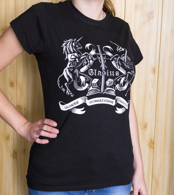


.jpg)


