This month we celebrated all things wickedly spooky here at Tuts+. And of course, Halloween wouldn't be complete without a fun community project to inspire fear in us all.
Community Project: Designers Graveyard
Feeling brave? Well today we dare you to sneak a peek into our designers graveyard, complete with 15 new gravestones from our creative and talented readers.
Enjoy these spook-tacular gravestones created by our readers! As always, show them some love in the comments section.
Rowena Aitken
My name is Rowena but feel free to call me, "Ro." I'm an Edinburgh-based, coffee-drinking, cat-bothering, illustrator who loves drawing in Adobe Photoshop. Occasionally, I get my pencil case out too! I have recently started creating tutorials for Tuts+. When I'm not illustrating or cat-bothering my time is filled with running, swimming, and reading. Follow Rowena Aitken:Twitter | Website
Jenny Le
I'm Jenny Le, a self-taught artist from Vietnam who loves drawing and photo manipulation. I was not brave enough to "bury" myself so I imagined a gravestone for an anonymous person. Follow Jenny Le:DeviantArt
Mario McMeans
My name is Mario, "The Design Nomad." I've studied under print masters and vector monks for over 10 years, but have decided to seek knowledge and the true meaning of "design-fu" on my own. My search for knowledge has taken me to the farthest reaches of the world. I do not know what will become of my journey, but I welcome the challenge. Follow Mario McMeans:Website
Nick Carbone
My name is Nick and this is the gravestone I made. I hope everyone likes it! Follow Nick Carbone:Behance
Franck Beaume
Hi there! My name is Franck! I am really happy to join this post, it's always a great pleasure to share work with Tuts+. Here is my gravestone created with Photoshop. I always try to think outside the box before finishing the inside. Follow Franck Beaume: Behance
Sandi Van Winkle
Here lies "Sassy Jones." I've used this moniker before as a fun fictional character in several Halloween-inspired illustrations and designs. I teach Graphic Design and Illustration to high school students. I also work as a Freelance Illustrator and Designer. I've worked in print and television for the last 20 years and use Tuts+ all the time with my students. There are so many great tutorials that help me to teach the tools along with the theories of good design. Thanks for allowing me to share this with you! Follow Sandi Van Winkle:Behance
Lucas Kern
Hello! I am a freshmen at RIT studying New Media, Interactive Development. I love design and Photoshop as well as video production and much more. Halloween is my favorite holiday and I really enjoyed this project! I wanted to go less gloomy, with a more cartoon-like look that popped on the screen. Overall I am happy with it but I would change the grass if I went back. Loving everyone's submissions, keep up the good work, and have a Happy Halloween!
Sam Tochelli
Here's my gravestone! I made this for a design class and decided to submit it here as well for some feedback.
Apriet S. Kenig
Here's mine for our New Media Design class project.
Philip Petronis
Also a New Media Design project submission.
Kiran Venugopalan
Hi! I am Kiran Venugopalan and I'm currently working as a Motion Graphics Animator/Designer in Mumbai India. I am new to Adobe Illustrator but I have always used Photoshop and After Effects so I took this chance to learn it and created a little scene in Illustrator. Halloween and Diwali almost always overlap when you think about festivals on a global scale. So the sparklers are the sign for Diwali, and the Jack-O-Lantern for Halloween! I hope you like it, Happy Diwali and Happy Halloween! Follow Kiran Venugopalan:DeviantArt
AaCsh Shrestha
I'm AaCsh Shrestha, a Nepal-based creative designer with an extreme love for Photoshop, Illustrator, and InDesign. Tuts+ has many a time saved me from getting viciously murdered by some evil clients!
Brian Miller
Here's my entry, I was trying to find some other items to add but work got in the way! Enjoy!
The Leading Past
Hi! I go by the pseudonym, "The Leading Past," and this is my interpretation of a monolithic-styled, tron-gothic headstone. As with most of my work, the process includes a multi-platform exchange between Illustrator and Photoshop. Follow The Leading Past:Facebook
Melody Nieves
I'm Melody! A Digital Artist and instructor here at Tuts+. You may know me from the Design & Illustration Community Projects, so feel free to reach out and let me know what you'd like to do next! Follow Melody Nieves:Twitter | DeviantArt
A Special Thank You to the Students
Here's a special thank you to the teacher and students from RIT's New Media Design class, who so graciously joined us for this challenge. I hope you all had a lot of fun and will join us in the future for more Tuts+ Community Projects. Good luck on your design journey and to all those who submitted!
Celebrate Día de los Muertos in style with this vibrant, neon calavera girl portrait created in Adobe Illustrator. Manipulate basic shapes, render areas of design with linear and radial gradients, create custom brushes, and use the Blob Brush Tool (Shift-B) to draw fine details within your design. We'll draw assorted flowers and really use that dark background to make this design POP from the page.
1. Drawing the Head and Face
Step 1
Create a New Document in Adobe Illustrator (mine measures approximately 12.5 inches square) and use the Rectangle Tool (M) to draw a large black square over the artboard. This sets up our document.
Using the Ellipse Tool (L), draw a white circle.
Drag the bottom anchor point downward with the Direct Selection Tool (A) to create a more oblong shape.
Add two anchor points midway in the lower half of the head shape's path with the Add Anchor Tool (+).
Use the Anchor Point Tool (Shift-C) to convert the newly added points to corners.
Step 2
For the basic face, we'll start with the eyes.
Draw a circle and pull out the left anchor point with the Direct Selection Tool, as was done with the face in the previous step.
Convert the right-most anchor point to a corner. Copy (Control-C) and Paste (Control-V) the left eye and Reflect it over a VerticalAxis to create the right eye.
Align the two eyes so they're level with each other. Draw a small black circle for the start of the nose.
Drag out the top anchor point of the nose circle to create a long teardrop-like shape.
Step 3
Pull the bottom anchor point of the nose upward creating a convex curve at the bottom of the nose.
For the hollows of the cheeks, use the Pen Tool (P) to draw a curve below the eye that mimics that contour of the eye socket itself. Curve outward and to the lower left so there's space created between the cheek and the mouth. Complete the shape by softly curving upward to the start of the shape and following the contour of the jaw.
To complete the nose, draw a vertical ellipse that overlaps the top of the nose cavity. Select both objects and hit Minus Front in the Pathfinder panel.
Step 4
Let's complete the basic face design by drawing the mouth.
I've started with a quick sketch of a mouth drawn with the Pencil Tool (N). If you choose to do this, Group (Control-G) together the mouth components, reduce their Opacity to 50% in the Transparency panel, and Lock the layer in the Layers panel.
Using one of the drawing tools (either the Pen Tool or the Pencil Tool), draw a curving, elongated shape that starts at the center of the mouth and widens toward the left corner of the mouth. Repeat this shape on the other side.
Draw two small pink circles with the Ellipse Tool. Unite them in the Pathfinder panel.
Pull down the lower center anchor point with the Direct Selection Tool to get the central point of a heart.
Delete the left anchor point that's between the bottom and side points and adjust the shape of the left side of the heart by manipulating the anchor point handles.
Draw a rectangle that bisects the heart shape. Use the Shape Builder Tool (Shift-M) to Merge the right half of the heart and the rectangle. Delete this newly created shape.
Copy, Paste, and Reflect the left half of the heart to form the right side and Merge the two shapes with the Shape Builder Tool.
Place the two mouth shapes above the pink heart in the Layers panel and Delete the initial sketch drawn at the start of this step.
2. Creating the Hair
Step 1
Like the mouth, I'm starting this section with some sketching. Using the Pencil Tool or the Blob Brush Tool (Shift-B), draw a curling, flowing hairstyle for your calavera girl design. I focused on creating shell-like shapes and framing the face with curls on both sides. Change your stroke color to indicate the placement of flowers within your composition as well. Group together your sketch components.
Step 2
Use the Pen Tool to trace portions of your hair design. Set the fill color to a Linear Gradient that goes from bright purple (#9933ff) to black. Adjust the angle of the gradient of each hair section with the Gradient Tool (G). Adjust the distribution of the gradient's colors within the Gradient panel.
Step 3
Within the large sections of hair, take the time to draw small or thin shapes with Linear Gradients that go from black at 100% to 0% Opacity. Group together your hair components drawn within the last two steps. Hide the hair sketch layer in the Layers panel.
Step 4
Copy, Paste, and Reflect the left hair group over a Vertical Axis for the left side of the design. Align the two groups in the Align panel.
3. Drawing in the Eyes
Step 1
Sugar skulls are heavily decorated. This project is no different. Select the shapes drawn on the cheeks and change the fill color to a Linear Gradient that goes from dark purple (#120024) to white, with the darker color at the top of the shapes. Reduce the opacity in the Transparency panel.
Select the other facial features and set them to dark purple (#120024) instead of black. Use the Pencil Tool to draw a flower-like shape around the contour of the left eye socket. Choose a bright fill color for it, like teal (#00cccc).
Step 2
The centers of the eyes will have daisies. Easily create them by using the Polygon Tool to draw a 15-sided figure. With it selected, go to Effect > Transform & Distort > Pucker & Bloat and enter 72% to create a many-petaled daisy. Expand the shape under Object and draw a small circle for its center.
Step 3
Place your daisy in the center of the eye. I chose a pink daisy with a yellow center. Let's create some dots around the eyes. Draw a curving line with the Pen Tool and set the stroke to dark purple.
With the stroke selected, go to the Brushes panel and Create a New Scatter Brush. Adjust the size and spacing variations of your new brush in the options seen below. I set the SizeMinimum at 53%, Size Maximum at 88%, and Spacing Minimum at 113%.
Apply your new brush to strokes around the eyes and you instantly have lines of little dots and circles.
Step 4
Let's add some additional (and some optional) details of the eye.
Draw eyelash shapes that start at the inner corner of the eye and kick out to the left in feather-like shapes.
Draw another line of dots with your custom scatter brush. Change its color by going to Edit > Edit Colors > Recolor Artwork.
Draw a highlight on the center of the daisy with a circle whose Linear Gradient goes from white at 100% to 0% Opacity. Set the Blend Mode to Screen or Overlay in the Transparency panel.
Copy and Paste the daisy's petals. Set its fill color to a Radial Gradient in the Gradient panel that goes from pink to white (with white in the center).
In the Transparency panel, set the Blend Mode to Overlay and place the copied petals over the main daisy.
Continue adding additional dots, highlights, outlines, and shapes with various levels of opacity to create complex, brightly colored eyes. Repeat the process on the right eye (or just Copy, Paste, and Reflect).
4. Draw Additional Facial Details
Step 1
Use the Blob Brush Tool, set to 1 pt in the tool's options, to draw little scallops along the upper and lower lip in order to form a teeth-like design. Follow the curve of the mouth and check the angles of your own teeth for reference if need be.
Step 2
Again with the Blob Brush Tool, draw five lines emanating from the top center of the hair line. To create a simple spider web, draw five lines of progressively longer scallops across the vertical and diagonal lines. Increase the size of your brush for the outer line of the web.
Step 3
Further render the skull face with shapes drawn with the Pen Tool to accentuate the contours of the temples and jawline. Set the Linear Gradient to dark purple at 100% to 0% Opacity. Create depth on the mouth by drawing one of these shadow shapes on the upper lip.
Step 4
Select the main head shape and change its fill color to a Radial Gradient that goes from white to dark purple. Adjust the radius with the Gradient Tool so that the shape of the gradient is oval and white is at the center of the face.
Draw highlight shapes that accentuate the cheek bones, chin, and nose. Vary the colors used for highlights (I chose white for skull pieces and brighter purple for the nose).
5. Creating Flowers for the Crown
Step 1
Marigolds vary in size and shape a great deal. As such, the rest of the flowers resemble them and their varied forms. Use your flowers of choice for reference, and follow along below for the general idea of flower building.
Use the drawing tool of your choice (in this case, I find the Pencil Tool to be quite versatile) to draw long petal shapes with ruffles tops. Set the fill color to a Linear Gradient that goes from pink (#ff3399) at 100% to 0%Opacity.
Angle the gradient so that the opaque color is at the ruffled end of the petal. For the flower's center, layer hastily-drawn, flower-like puff-ball shapes (see below). Group together all of your flower's components when satisfied with the overall design.
Step 2
The next marigold is drawn similarly to the center of the previous design. Layer yellow and orange fluffy, flowery, puff-ball shapes onto each other, drawn with the Pencil Tool. Vary the shapes' opacity, Blend Modes, and gradients used. I chose to use Linear Gradients of yellow to yellow or yellow to pink, all of which vary in opacity. Group the second marigold's components together.
Step 3
Let's play with another daisy just to mix things up. Follow the process from Section 3, Step 2. Apply the same radial gradient as that used on the skull in Section 4, Step 4 to the petals. Apply a Radial Gradient to the center of the flower that goes from orange to yellow. Group the daisy components together.
Step 4
I found that during this next step, while drawing, if I retained the previous flower gradient I could see my pieces easily. This marigold has many, many pieces, and is a very large, thick flower.
Draw a teardrop-like shape to begin the center of the flower.
Continue layering teardrop-like shapes of various sizes around the center point of the flower.
In total, I drew ten teardrop shapes for the center of the marigold. Group them together.
The larger petals are similar to those drawn in the first step of this section. They're ruffly at the ends, but shorter than the first marigold design. Draw them around the center of the flower.
Continue layering petal shapes. You'll likely find that you have to rearrange them quite often in the Layers panel. I found it easiest to Group sections as I went, making the organization of my Layers less of a chore.
At this point, there are over 20 large petals within my marigold design.
This is the final form of the marigold. There are over 40 petals drawn in total.
My final Linear Gradient goes from yellow-orange at 100% Opacity to pink at 0% Opacity. Adjust the gradients' angles as needed with the Gradient Tool. You may find it easiest to select large groups of petals and approximate the angle of each gradient versus doing each shape separately.
6. Arrange the Floral Headpiece
Step 1
Place the flowers at the top of the head. Vary the colors, scale, and rotation of your flowers. Play around with their placement until you have a composition that you like. Draw leaves with Linear Gradients going from bright green (#ccff00) at 100% to 0% Opacity.
Step 2
This is my flower composition so far. Note how some of the hair pieces were brought forward so that flowers could be nestled within the hair, rather than only being above or behind the hair group.
Step 3
Use the Pen Tool to draw a rectangle with a scalloped top. Copy, Paste, and Reflect the shape over a Vertical Axis. Unite the two shapes in the Pathfinder panel. Set the fill color to null and the stroke color to a Radial Gradient of white to dark purple with the stroke's Weight set to 3–5 pts.
Step 4
This is my final composition for the flower crown within my design. Let's move on to additional details in the face and drawing the character's neck and chest.
7. Completing the Character
Step 1
Zoom (Z) in on your character's face and draw swirling designs on the jaw with the Blob Brush Tool. Consider tear drops, splashes, paisley, flowers, circles, triangles, diamonds, and other designs often seen on sugar skulls. Refer to Mexican artwork if you want ideas for motifs. Repeat on the other side of the face.
Step 2
For the next, draw a rectangle with the Rectangle Tool. Set the fill color to a Linear Gradient going from dark purple to white. Convert the lower anchor points to curves with the Anchor Point Tool and angle the handles of those points inward to create a curving neck shape.
Use the Pen Tool to draw shoulders and the top portion of a chest. Unite these shapes in the Pathfinder panel. Make sure the darkest color of the gradient is beneath the head.
Step 3
The blouse of my character is a set of transparent shapes. Using the Pencil Tool, I drew layers of wispy, scalloped-edged shapes in dark purple with the Opacity set to 30–60%. Some of the shapes were drawn to denote ruffles in the shirt while others are ruffles and cuffs in the collar.
For the pink shoulders (and the cheeks of the face), draw shapes that overlap the shoulders with a Radial Gradient that goes from pink at 100% to 0% Opacity and the Blend Mode set toOverlay.
Step 4
Like the designs on the face drawn in Step 1 of this section, the details of the shirt were drawn with the Blob Brush Tool. Outline the ruffles of the shirt and the collar, create lace, and draw buttons. Set the fill color to a Linear Gradient that goes from white at 100% to 0%Opacity.
8. Framing the Design
Step 1
Group together your calavera character and lock the layer within the Layers panel. Use the Pencil Tool to sketch out one half of your frame design. Repeat the motifs from the sugar skull itself (splashes, flowers, spider webs, etc.). Reflect the left side of the frame design to create the other side. Group together your sketch.
Step 2
Now that we have our composition figured out, let's work on some of the designs within it. I chose to draw more intricately drawn marigolds. Moving away from the artboard, I referenced bouquets of marigolds and recreated their scribble-like lines with the Blob Brush Tool.
Step 3
Draw the left side of your frame design. Mine starts with marigolds, swoops down with splash and fluting designs, and ends in a spider web. I drew it in three sections and put them together on the artboard according to the sketch drawn in Step 1 of this section.
Step 4
Hide the sketch layer and place your freshly drawn frame group over the artboard. Copy, Paste, and Reflect to get the right side of the design.
Draw a small rectangle on the bottom of the artboard that has a Linear Gradient going from dark purple at 0% to 100% Opacity. Place this below the frame group so your character recedes into the background near the bottom of the composition.
Step 5
To complete your design, set the fill color of the frame design to a Linear Gradient that goes from pink to bright purple to teal (or another spectrum of colors that you used within the flower crown of your design).
Well Done, You Did It!
Perhaps on this occasion I should borrow from the intrepid explorer Dora and say, "Lo hicimos!" because we did it! We've completed our Día de los Muertos inspired calavera girl illustration. Share your version of this style of design in the comment section below. For more fantastic tutorials, check these ones out:
In this tutorial we'll play with adjustment layers and various effects in order to create a seamless grunge texture in the form of a pattern fill. Combine this tutorial with the previous grunge brush tutorial and you'll have the tools and techniques to create countless grungy creations worthy of a dystopian future themed gallery show. Enjoy!
1. Set Up Your Document
Step 1
Open a New File in Adobe Photoshop CC 2014 (note that most if not all of this tutorial will be applicable to older versions of the program) of approximately 3 inches square. The size, really, is up to you and your grunge texture needs.
Step 2
Go to Filter > Render > Clouds in order to create a quick dark and stormy rendering of clouds within your document. This will give us the perfect basis for creating an abstract texture.
2. Modify Your Image
Step 1
A lot of distortion filters can be applied at this stage, and I hope you check out what the program has to offer in terms of distorting and deconstructing your clouds. For this texture, I chose the Ripple filter found under Filter > Distort > Ripple. I set the amount to 845% with the Size set to Large.
Step 2
Let's play with the levels of our current image with an Adjustment Layer. Go to Layers > Adjustment Layer > Levels, hit OK (since the default settings are just fine), and enter 24 for the change in Levels in the Properties panel. Since it was set to Posterize, the adjustment layer will harden the edges of the previous ripple effect.
Step 3
I opted to keep playing with Adjustment Layers by altering the Brightness/Contrast of my image. I set Brightness to -18 and Contrast to 17. Additionally, in order to get the image to look grittier, I chose to Merge Visible (Shift-Control-E) layers and went to Filter > Sharpen > Sharpen More.
3. Creating a Pattern
Step 1
The easiest way I know of creating seamless patterns starts by Offsetting our design. Go to Filter > Other > Offset. The goal here is to get all four corners of the design to converge in the center of the image. It may take a bit of trial and error. For this file, I found 295 pixels both Vertically and Horizontally did the trick.
Step 2
My aim in this step is to cover up or alter the very visible edges of my design. Using brushes from the grunge brush tutorial I wrote up previously, I did my best to cover up the pattern's edges.
Either create your own brushes from the previously mentioned tutorial, or download the brush presets attached to this tutorial to play around with the brushes I created. Use the Brush Tool (B) in varying shades of gray to blot, dot, and sponge textures from the brush pack over the edges. Be careful to not cover all of your previous hard work. Alter the design further by adding a Noise or Sharpen filter.
Step 3
When satisfied with your texture (and after Offsetting it again to make sure any changes made don't result in additional edges), go to Edit > Define Pattern to save your new pattern with a unique name. Use the Paint Bucket Tool(G) to test out the pattern in a New Document (make sure it's two to three times larger than your working document so you can see how the pattern repeats).
Great Work!
You've successfully created a seamless grunge texture. Play around with other colors, filters, grunge brushes, and methods outlined in this and the grunge brush tutorial in order to create a variety of textures for use within other pieces of art.
If you enjoyed this tutorial, you may also like the following:
We all use Adobe Illustrator in different ways, to different ends. But we can all benefit from making our workflow more efficient. Here are seven ways you can automate or eliminate monotonous, repetitive tasks, so you can focus on being more creative and productive.
1. Use Workspaces for Easy Access to the Panels You Use Most
The particular arrangement and configuration of the panels in Illustrator is called a Workspace. There are several built-in Workspaces, each suited to a specific kind of work. These are simply the configurations Adobe thinks you’ll use for any given task, but you don’t have to agree. You can arrange the panels any way you like, then save the arrangement as your own personal workspace. Go to the Window menu to Workspace > New Workspace, give it a name, and click OK.
You can save your preferred panel arrangement as a custom workspace.
TIP: If you move panels around and things start to get messy, simply click “Reset ____”, and everything will go back to its neat and tidy original configuration.
2. Use Keyboard Shortcuts to Work Quickly and Reduce Strain
You should familiarize yourself with the keyboard shortcuts for all the tools you use regularly (if not all the tools). Choosing tools with the mouse slows you down and, frankly, is a rookie move. But did you know you can change the shortcuts and even create your own? Go to the Edit menu to Keyboard Shortcuts. Find the tool whose shortcut you want to change. When you click on it in the list, you’ll be able to type a new shortcut in the text field. For example, I like to use ‘E’ for the Eraser tool, to make it consistent with other Adobe applications. So I’ll just highlight the existing shortcut, and press the ‘E’ on my keyboard to change it:
Simply type a new key or key combination to change a shortcut. You can also assign a shortcut to a tool that doesn't have one. Just click in the blank space next to the tool name.
If this shortcut is already in use by another tool, you’ll get a message informing you of the conflict. From here you can jump to the conflicting tool and change its shortcut as well. So in this case, I’ll assign Shift-E, which was previously used for the EraserTool, to the Free Transform Tool.
If a shortcut is already in use, you can resolve the conflict by assigning a new shortcut to the existing tool.
You can also set shortcuts for any of the menu items. Choose Menu Commands from the drop-down menu. Now you'll see a list of every menu and sub-menu, and you can add or modify the keyboard shortcuts for these as well.
Just about any menu or sub-menu can have a shortcut.
Once you click OK, you’re prompted to save this new set of shortcuts. You can always go back to the default set, and you can save different sets for different users. TIP: You can export the keyboard shortcuts to a text file to have as a reference or study aid.
3. Use Actions to Automate Repetitive Tasks
Shortcuts are a quick way to access commands. Actions can record a sequence of those commands, then play back the steps with the click of a button (you can even assign a shortcut to play an Action!). Taking a little
time to set up Actions for repetitive tasks will save you lots of time in the long run.
You can use Actions to batch-process a whole folder full of files. There's something very satisfying about clicking a button or pressing a key and watching the computer do all the work, while you kick back and relax... I mean, work on something else. To see how Actions work, check out this Quick Tip.
An action is like a recording you play back to perform a series of commands.
4. Use Custom Views to Quickly Navigate Your Document
Let’s say you’re working on a fairly complex illustration, with lots of small detail. You keep zooming in on one part of the artboard to fine-tune the paths. Then you zoom back out to see how your changes look in the context of the overall illustration. Or maybe you want to concentrate only on one layer of the illustration so you aren’t distracted by the elements on the other layers.
Rather than manually zooming back and forth, and turning layers off and on, you can create a custom View. Zoom in on one section of your document, then go to the View menu and choose New View. Give this view a name if you like. Now zoom back out, then choose your new custom view from the View menu. You’ll be taken right back to the exact magnification as before.
If you want to zoom back to a specific spot in your illustration, you can create a custom view. You can name your custom views, and access them from the View menu.
Views also remember layer states. So if you’ve hidden some
layers in one view and shown them in another, these layer states will be preserved. This will save you
lots of time zooming and clicking eyeballs in the Layers panel.
Any layers you have turned on or off are remembered in a custom view.
5. Use Libraries to Maintain Consistency
5a. Create Custom Swatches, Brushes, Symbols and Graphic Styles
Swatches, Brushes, Symbols, and Graphic Styles are all stored in Libraries. You can set up your own libraries to ensure all your documents for a particular client are consistent. The steps for saving any kind of library are the same. Here's how to do it with Swatches:
First collect all the swatches you use in the Swatches panel. Delete any you don't use. Click the Libraries icon on the bottom of the Swatches panel and choose Save Swatches. Give the library a descriptive name and save the file anywhere you like.
To open your custom library when working with a new document, click the Libraries icon at the bottom of the Swatches panel. Any custom Libraries you've saved will be available under the User Defined sub-menu. You can also access them from the bottom of the Window menu.
TIP: To
make a swatch library appear each time you start Illustrator, selectPersistent from the swatch library’s panel menu.
5b. Use Symbol Libraries to Keep Artwork Handy
A Symbol is a vector object or artwork that can be stored inside a Symbol Library, and referred to when you need it. Every time you use a Symbol, an "instance" of that artwork is placed in your document. So rather than placing the actual object on the artboard multiple times, the Symbol links back to the original in the library. This can greatly reduce file size and lessen the time a document needs to render or save.
If you do page layout in InDesign, you're familiar with this concept. If you have an eight-page document that has the same logo on each page, you do not need eight separate copies of that image in your links folder, just one that links to each instance in the document. A cartographer, for example could create a library full of map symbols. If you work in a corporate environment, you might want to keep a library of all the different logos your company uses. For more on how Symbols work, see this Quick Tip.
Use a personal Symbol library for artwork you use often.
6. Change the Default Type and Color Styles to Match Your Branding
Do you work for a company that uses a particular font for all its documents and branding? Do you get tired of changing from Myriad Pro every time you create something new? You can change the default font by opening the Character Style panel (Window >Type > Character Styles), then double-clicking the Normal Character Style. Click Basic Character Formats in the sidebar. From here, you can change to the font you use most often, and add any other character attributes, like tracking, scale and even color. Now when you select the Type Tool and begin typing, those settings will be preserved.
Access the Character Styles panel from the Type sub-menu under the Window menu. Double-click the Normal Character Style to edit it. Change the font and other attributes of the Normal Character Style.
You can also change a document's default color swatches. So let's say you work for a client who uses a custom palette for all of their materials. You can change the default swatches to match that client's palette.
First, create a new Graphic Style. The easiest way to do this is to simply draw an object and give it a fill and stroke of the new colors. With that object selected, click the New Graphic Style button at the bottom of the Graphic Styles panel.
Create a new Graphic Style, using your custom colors.
Next, hold down the Option key (Windows: Alt) and drag the new Graphic Style on top of the Default style. This will replace the default with the new style.
Hold down the Option key (Windows: Alt) and drag the new style on top of the Default style to replace it.
Now, whenever you press the 'D' key, the default colors will be set to
the new colors. And as long as the new defaults are the active swatches, anything you draw in this document will take on the new fill and stroke colors.
Note: Default Styles follow the document. Any
custom styles you create will not be available when you open
a new document. See #7 for how to create and use a template that
contains all your customizations.
7. Create a Template for the Ultimate Custom Workflow
Swatches, Symbols and Graphic Styles all reside in Libraries, which follow the document. That is, any custom library you create in one document will not automatically open when you start a new document. The same thing is true for Views, Paragraph Styles and Character Styles.
So if you've taken the time to create libraries and customize your defaults, you should save it all in a template. Templates let
you create new documents that share these custom settings and elements.
You can have as many custom templates for as many clients or types of jobs as you wish. Things that can be saved in a template are:
Artboards
Brushes
Default Fill and Stroke
Default Font
Graphic Styles
Guides
Layers
Perspective Grid
Rulers Units
Swatches
Symbols
Type Styles (Character and Paragraph)
Views
In the example below, I have a group of business cards. My Illustrator document has custom Swatches, Type Styles, and a Symbols Library containing the logos and icons. The document also has guides and crop marks on dedicated layers.
This document will be used to create a Template. Some of the custom settings used in this document
To create a template, first customize a document to suit your needs. Include any artwork you want to appear in new documents you'll create from this template. Artwork can be stored in a Symbols Library and/or in the work area. Delete any existing Swatches, Styles (both Graphic and Type), Brushes or Symbols you don’t want to keep. Remember to include the magnification level, rulers, guides, grids, and Views. You can even set options in the Document Setup dialog box and the Print Options dialog box.
When you're ready, choose Save as Template from the File menu.
The template file format is .ait, and by default, will be saved into the Templates folder inside your Illustrator folder.
Templates are saved in a special AIT file format By default, templates are saved into the main Templates folder.
When you open a new file from your template, an Untitled document will be created, which contains all of the custom settings in the Template. Once you start using templates, you'll realize just how much time you used to spend on unnecessarily tedious tasks!
When a new document is created from a Template, it is a brand new, untitled document which contains all the custom settings in its template. You can then save it as a regular Illustrator file.
Conclusion
It might initially take some time to change your settings, learn keyboard shortcuts and create actions. And there are times when you'd rather do something the old familiar way, even if it takes longer. But if you take some time up front to make your workflow more efficient, it will pay off in the long run. You'll soon see that getting rid of daily annoyances will free up your creativity and leave you with a more pleasurable Illustrator experience.
You may be starting to feel a panic rising as you contemplate finding suitable gifts for friends and family this upcoming holiday season. Why not use your creative talents and create your own wall calendar to give away as a present, or just to keep for your own home or office?
In this tutorial you’ll learn how to create a uniform grid for laying out a single-sheet A2 calendar, as well as using Tables in Adobe InDesign to design simple, easy-to-edit layouts for each month of the year. You can apply the retro-themed colors and styles suggested in this tutorial, or use the calendar as a template for applying your own colour palettes and font styles.
1. Create an A2 InDesign Document for Print
Step 1
Open InDesign. In the welcome window select New Document, or go to File > New > Document. Set the Intent to Print, No. of Pages to 1 and uncheck Facing Pages.
From the Page Size drop‑down menu select Custom... and type 'A2 Calendar' into the text box at the top of the window that appears. Set the Width to 420 mm and the Height to 594 mm. Click Add and then OK. This creates a new Custom Page Size.
Step 2
Back in the New Document window, set the Top Margin to 48 mm, Bottom to 30 mm, and both the Left and Right Margins to 25 mm. We won’t have any colour bleeding over the trim edge of the calendar in this example, but just in case you want to apply any all-over colour to the design later, set the Bleed to 5 mm on all sides.
We want to create a grid structure for our calendar, to allow the months to sit evenly spaced on the page. Creating columns is the easiest and most foolproof way to do this. So set the No. of Columns to 4, with a Gutter value (the space between the columns) of 20 mm.
Click OK to create your new document.
2. Create a Dieline
When printed, your calendar will also need to have a hole cut towards the top to allow it to be pinned or nailed to a wall.
Step 1
Open the Layers panel (Window > Layers) and double-click on the default Layer 1 to open the Layer Options window. Rename the layer Die Line and click OK.
Step 2
Navigate to the top of the page, and pull a guide down from the top ruler (View > Show Rulers) to Y position 12 mm.
Select the Ellipse Tool (L) from the Tools panel (Window > Tools, if not shown by default) and, holding down Shift, click and drag to create a perfect circle. From the top control panel, adjust the diameter of the shape to 9 mm.
Position the circle centrally on the page, the top edge just touching the guide you created.
It’s best to set the dieline in a strong color, so I’ve set the Stroke Color of the line to 100% Magenta, C=0 M=100 Y=0 K=0, using the Swatches panel(Window > Color > Swatches) and selecting the default swatch available.
Double-click on the swatch name in the Swatches panel to open the Swatch Options window. Here, you can redefine the color as a Spot Color from the drop‑down menu. This tells InDesign that the color of the line is unique, and not simply a blend of the normal printing inks. Click OK.
You also want to set the dieline to Overprint. Do this by first selecting the circle shape, then navigating to Window > Output > Attributes and checking the box which says Overprint Stroke in the Attributes panel.You can then minimise or close the panel.
We also need the dieline to be reasonably thick, so set the Weight of the Stroke to 1 mm.
When you export the calendar for print (see Section 7, below) you will check certain settings to ensure the dieline layer is exported properly.
3. Choose a Typeface and Color Palette
Step 1
For now, you can lock the Die Line layer, by clicking in the blank space to the left of the layer’s name in the Layers panel. Click the Create New Layer icon at the bottom right of the panel, or select New Layer... from the drop‑down menu accessible from the top-right of the panel.
Double-click the new layer and rename it Calendar Artwork. Click OK.
Grab the Calendar Artwork layer in the Layers panel and move it to sit below the Die Line layer.
Step 2
I’ve decided to go for a retro-inspired, colorful, mimimal calendar design, which will look stylish in a kitchen or home office.
To complement the design, I’ve used Quicksand, a lovely, free sans serif font with a mid-century feel.
Step 3
Our calendar’s going to be filled with color, giving a different look to each of the 12 months.
Open the Swatches panel(Window > Color > Swatches) and select New Color Swatch from the drop‑down menu.
To mimic the color scheme used in the calendar here, add the following 12 CMYK swatches by adjusting the percentage of Cyan, Magenta, Yellow and Black accordingly:
C=45 M=0 Y=26 K=0
C=22 M=26 Y=100 K=0
C=2 M=30 Y=17 K=0
C=0 M=0 Y=0 K=79
C=3 M=52 Y=78 K=0
C=34 M=47 Y=63 K=8
C=0 M=76 Y=32 K=0
C=0 M=85 Y=68 K=0
C=43 M=0 Y=8 K=0
C=43 M=0 Y=45 K=0
C=22 M=26 Y=57 K=0
C=0 M=41 Y=50 K=13
You can save these as a Swatch Library for future use, if desired, by highlighting the swatches in the Swatches panel and selecting Save Swatches from the panel’s drop‑down menu.
4. Create a Grid for the Calendar
We already have half of our grid set up, by creating four columns earlier, in the New Document window. We can now divide up the grid further to create uniform sections for the title and months on the calendar.
Step 1
Remaining on the Calendar Artwork layer, pull horizontal guides down from the top ruler to the following Y positions: 156 mm, 181 mm, 290 mm, 315 mm, 422 mm, and 447 mm.
Step 2
Navigate to the top left of the page. This is where we’ll place the title of the calendar and a small ‘Notes’ section.
Select the Type Tool (T) and drag to create a text frame that fits snugly within the first two columns, towards the top of the page.
Type ‘2015 (paragraph break) Calendar’. Set all the text to All Caps from the Character Formatting Controls panel running along the top of the screen, and set the Font to Quicksand.
Highlight ‘2015’ alone and set the Font Weight to Light, Size to 159 pt, and Font Color to a yellow-green, C=22 M=26 Y=100 K=0.
Highlight ‘Calendar’, keep the Weight as Regular, set the Size to 95 pt, Leading to 114 pt, and the Font Color to a muted grey swatch, C=0 M=0 Y=0 K=79.
Step 3
Select the Line Tool (\) from the Tools panel and, holding Shift, drag the mouse from left to right to create a horizontal line 175 mm in Length.
Open the Stroke panel (Window > Stroke) and set the Weight to 13 mm and Type to Right Slant Hash. Set the Stroke Color to the same yellow-green as before, C=22 M=26 Y=100 K=0.
Position this line just below the text frame, resting on the guide that sits at Y position 156 mm.
Step 4
You may have counted up the sections formed by the grid and sussed out that there are 14 free sections remaining on the grid. That’s no problem—that gives us two sections to fill with something extra. You could drop in a photo or illustration, or, as I’ve done here, create a useful ‘Notes’ section where you can write down important upcoming events or even a to-do list.
Select the Type Tool (T) and drag to create a text frame 175 mm in Width and 110 mm in Height. Position this below the line you created in Step 3, above, resting comfortably in the grid section, straddling the first two columns.
Type ‘Notes:' into the frame, setting the Font to Quicksand Bold, Size 28 pt, All Caps and Font Color to C=0 M=0 Y=0 K=79.
With the text frame selected, go to Object > Text Frame Options and set the Inset Spacing to 6 mm. Click OK.
Then hop up to Object > Corner Options and set the Size to 6 mm and Shape to Rounded. Click OK.
Go to the Stroke panel (Window > Stroke) and set the Weight of the Stroke to 7 mm and Type to Left Slant Hash.
5. Use the Table Function to Create a Dates Grid
This is what we’ll be creating. A simple layout with a text frame and colored shape at the top, a table for the dates below that, and a formatted line at the base of the design.
You will need an accurate 2015 calendar to copy the dates from. I placed a basic calendar image lifted from the Internet into the Pasteboard, and used this as reference for the dates.
Step 1
Select the Type Tool (T) and create a text frame, Width 77.5 mm, and position it centrally in the first (far left-hand) column on the page, below the ‘Notes’ section, with the top edge of the frame resting on the guide.
Type ‘January’, set the Orientation to Align Center (from the Character Formatting Controls panel, at top), Font to Quicksand Bold, Size 40 pt and Font Color to C=45 M=0 Y=26 K=0, a minty blue.
Step 2
Select the Rectangle Tool (M) and drag to create a shape 77.5 mm in Width and 19 mm in Height, setting the Stroke Color to [None] and the Fill to C=45 M=0 Y=26 K=0.
Position this at Y position 332.5 mm, just below the ‘January’ text frame.
Step 3
To create a table, you first need to create a frame for it to sit in. So select the Type Tool (T) and drag to create a text frame 77.5 mm in Width and 62 mm in Height. Position this frame just below the mint-green rectangle.
With your cursor sitting in the text frame go to Table > Insert Table.
In the Insert Table window, set the number of Body Rows to 6, Columns to 7 (for the seven days of the week), Header Rows to 1 and Footer Rows to 0. Maintain the Table Style as [Basic Table]. Click OK.
Step 4
Type M, T, W, T, F, S and S into the top row of the table. You can highlight the whole row using the Type Tool cursor to format the text.
Realign the text to Align Center, set the Font to Quicksand Bold, Size to 21 pt and Font Color to C=45 M=0 Y=26 K=0.
Step 5
Using a basic 2015 calendar as reference, type the dates for the month into the relevent cells of the table. Highlight the rows with the type cursor and set the Font to Quicksand Regular, Size 17 pt, Align Center and Font Color to C=0 M=0 Y=0 K=79.
Step 6
To get rid of the visible grid around the table, highlight the cells (you may need to highlight the Header Row and Body Rows separately) and go to Table > Table Options > Table Setup. Under the Table Border options, select [None] as Color. Click OK.
To remove the visible lines dividing the columns and rows, highlight the cells and go to Table > Cell Options > Stroke and Fills. Set the Weight to 0 mm and Type to None. Click OK.
Step 7
Select the Line Tool (\) and, holding Shift, drag from left to right to create a line 77.5 mm in Length. From the Stroke panel (Window > Stroke) set the Weight to 6 mm, Type to Right Slant Hash and, from the top control panel set the Stroke Color to C=0 M=0 Y=0 K=79.
6. Build the Months for Your Calendar
Step 1
Your first month is finished, great work! Drag your cursor over to select the text frame, colored rectangle, dates table and hashed line; and right-click (Windows) or Control-click (Mac OS) > Group for convenience.
Select the grouped elements and Edit > Copy and Edit > Paste. Repeat ten more times to create a template for each month. Arrange them on the page using the grid structure you created earlier.
Step 2
Now all you need to do is edit the names of the months and the dates accordingly. Apply a different swatch, from the set we created earlier, to the title, rectangle shape and day letters of each month, giving each a unique look.
7. Export your Calendar for Print
You’ve finished your calendar—well done, it’s looking great!
Now, all you need to do is export it to PDF, to make it ready to send to print. Before you send your calendar to print, you should get in touch with your chosen printer and ask if they have any recommendations for how you should provide the final artwork for print. They should also be able to advise you on paper/card weights and finishes, and what would be a better value choice if you’re on a tight budget.
Step 1
Go to File > Export and select Adobe PDF (Print) from the drop‑down menu. Name the PDF file and click Save.
Step 2
From the Adobe PDF Preset drop‑down menu at the top of the window, select [PDF/X-1a:2001].
Navigate to the Marks and Bleeds options from the left-hand menu in the window. Under Marks, check All Printer’s Marks, and under Bleed and Slug check Use Document Bleed Settings. Click Export.
Congratulations, Your Calendar is Ready for Printing!
It will make a fantastic gift for friends and family.
Using textures often adds nice detailing to effects, and gives depth to flat designs. This tutorial will show you how to create a simple metal text effect using layer styles. Then, it will show you how to make that text look more interesting by adding a simple texture overlay to it. Let's get started!
Tutorial Assets
The following assets were used during the production of this tutorial.
Create a new 1024 x 1024 px document in Adobe Photoshop. Set the Foreground color to #7d7d7d and the Background color to #434343. Pick the Gradient Tool, choose the Foreground to Background gradient fill, and click the Radial Gradient icon.
Then, click and drag from the center of the document to one of the corners to create the background gradient, and duplicate the Background layer.
Step 2
Double-click the Background copy layer to apply a Pattern Overlay effect using the following values:
Blend Mode: Multiply
Opacity: 100%
Pattern: paper_2
Step 3
This will add a subtle pattern to the background.
Step 4
Duplicate the Background copy layer, then right click the copy, and choose Rasterize Layer Style. If you're working with versions earlier than CS6, group the copy layer then merge the group.
Change the rasterized layer's Blend Mode to Overlay. This will intensify the pattern and darken up the background.
2. Creating the Text
Step 1
Create the text in All Caps using the font spinweradC Bold, the color #454646, the font Size300 pt, and if you're creating more than one line of text, change the Leading value to 250.
Step 2
Duplicate the text layer, and then change its Fill value to 0.
Step 3
Double-click the original text layer to apply a simple Drop Shadow effect using the values below:
Distance: 35
Size: 50
Step 4
This will apply the shadow to the bottom text layer.
3. Styling the Text
Double-click the copy text layer to apply the following layer style.
Step 1
Add a Bevel and Emboss with these settings:
Size: 10
Uncheck the Use Global Light box
Angle: -169
Altitude: 64
Check the Anti-aliased box
Highlight Mode: Vivid Light
Step 2
For the Contour, just check the Anti-aliased box.
Step 3
Add a Texture using the 3 px tile Pattern.
Step 4
Add a Stroke with these settings:
Size: 1
Fill Type: Gradient
Style: Reflected
Angle: 45
Use the Chrome Bar 135 gradient
Step 5
Add an Inner Glow with these settings:
Blend Mode: Overlay
Noise: 100%
Color: #f6f6f6
Size: 10
Step 6
Add a Gradient Overlay with these settings:
Blend Mode: Soft Light
Opacity: 35%
Style: Reflected
Angle: 45
Check the Reverse box
Use the stove pipe 10 gradient
Step 7
Add a Drop Shadow with these settings:
Opacity: 62%
Distance: 8
Size: 8
Step 8
This will style the main text. The text looks a bit flat though, and lacks some interesting details. So we're going to use a texture to fix that.
4. Adding the Texture
Step 1
Place the NYC Stock image on top of all layers, then go to Filter > Blur > Gaussian Blur, and change the Radius to 1.5.
Step 2
Change the texture layer's Blend Mode to Overlay, and lower its Opacity to 20%, or any other value you like, depending on how subtle or strong you want the effect to be. You can also resize the texture and move it around now that you can see the text behind it until you like the result you get.
Step 3
Command/Control-Click a text layer's thumbnail to create a selection.
Step 4
Click the Add layer mask icon at the bottom of the Layers panel to get rid of the extra texture outside the text.
The cool thing about using a layer mask instead of deleting is that you can reapply it to any other text you create without the need to work on the texture all over again.
5. Adding the Flares
Step 1
Set the Foreground color to #ebebeb, pick the Brush Tool, and open the Brush panel (Window > Brush).
Choose a soft round 35 px brush tip, and change its Roundness value to 30%.
Step 2
Create a new layer on top of all layers, call it Flares, and change its Blend Mode to Vivid Light. Then add some flares over a couple of the horizontal text edges.
Step 3
To add more flares with different Angle values all over the text, you can change the brush tip's Angle value by clicking and dragging the arrow in the preview box next to the Angle value in the Brush panel, or by simply typing in a value manually in the Angle field.
6. Adjusting the Lighting and the Coloring of the Final Result
Step 1
Click the Create new fill or adjustment layer icon at the bottom of the Layers panel and choose Levels.
Step 2
Change the Highlights value to 245 to brighten up the effect a little bit.
Step 3
Click the Create new fill or adjustment layer icon again and choose Gradient Map.
Step 4
Choose the gradient below from the CSP True Sky Gradients.grd file, then change the Gradient Map layer's Blend Mode to Vivid Light, and its Opacity to 30%. This will enhance the coloring of the final result.
Congratulations! You're Done
In this tutorial, we created and styled some text using a couple of different layer effects to achieve the metal look.
Then we used a stock image texture to add some detailing to the metal text, and to make it look less flat and more interesting. After that, we modified a simple brush to add a couple of flares over the text edges.
Finally, we added some adjustment layers to enhance the lighting and the coloring of the final result.
Please feel free to leave your comments, suggestions, and outcomes below.
At this point, after practicing the concepts in Letterforms at Their Core, you're ready to start moving on to bigger and better things!
This tutorial will help you understand the various kinds of typography that exist all around us, such as the typography you see in books, billboards, store signage and everything else in between. You'll gain a great amount of knowledge to help you decipher typography characteristics and what their usage is in this day and age.
Additionally, since this is a beginner class focused around
lettering and typography, I will be using some terms you may not know.
Here is a list of terms you may want to read up on just in case you're not sure what they
are:
One last thing to note about this tutorial before we get too much further: this tutorial is about drawing letterforms, and it includes a lot of info about "why" we do certain things when it comes to typography. This tutorial is more of a guide to provide you with the basics and the understanding, while still allowing you to grow and practice on your own. If I provided you with the exact dimensions of little details and provided every little bit of information, I feel you wouldn't learn and grow as much on your own. Lettering is all about practice and persistence.
With that said... Ready? Let's get started!
1. Preparing the Tools You Will Need
Luckily, not many tools are needed this time around, since we're basically just going to be drawing. Here is a very small list to help you begin:
Pencil (whatever your favorite pencil may be—no specific brand is needed)
8.5" x 11" paper (no specific brand is needed—standard copy/printer paper works great)
Let's go ahead and print this PDF out (or preview on whatever viewing device you please) for our reference throughout this entire tutorial. We're going to view these faces as we grasp and understand each style of typography.
Why are we using HEAO? Well, those four letters are the perfect combination of vertical, horizontal, diagonal, and curved strokes. Those four basic strokes make up every single letterform imaginable. So focusing on those basics will give you a great start to help you draw the remaining 22 letters in the alphabet.
Here is the list of typefaces we will be studying. These are some standard faces that nearly every computer already has preloaded onto it (except Old London—you might have to download that elsewhere if you'd like it for future reference, but don't worry, it's free!)
Helvetica (sans-serif)
Times New Roman (serif)
Rockwell (slab-serif)
Snell Roundhand (script)
Rosewood (decorative)
Old London (blackletter)
Courier (monospace)
Step 2
We're going to set up a "guide" or template to use throughout this tutorial. This page will contain the cap-height and baseline your letters will rest on throughout this tutorial.
All you need is a blank piece of 8.5" by 11" paper. Begin by measuring out 3" from the bottom right-hand corner and making a mark. Do the same on the opposite side of the paper and connect the dots!
Step 3
Now that we just created the baseline, let's form our cap-height. From the baseline you just created, measure out 2" and make another mark in the bottom right-hand corner. Then, do the same on the bottom left-hand side. Connect those dots and you've got yourself a finished guide page that we'll be using the rest of this tutorial.
2. Drawing Sans-Serif Letterforms
Step 1
Gather all your materials to draw letterforms. That will include paper, pencil, eraser and pencil sharpener (if needed). Let's begin by drawing and understanding the structure of sans-serif letterforms.
With your "reference sheet" in front of you, study the weight, contrast, negative space, and every little detail about the letterforms. Study exactly how that letterform is composed.
Have your guide page in front of you with a blank piece of paper on top. We're going to use the guide page to allow our letterforms to fit within the 2" space we created with the cap-height and baseline.
Step 2
It may sound silly, but what makes an H look great? What makes the H look proper? Well, the answer is, consistent vertical strokes (the same weight) as well as a slightly thinner horizontal stroke to connect the vertical strokes.
If you've been studying typography for a while, you'll notice the little details such as a .5 millimeter difference in weight on the horizontal crossbar. Why is the crossbar nearly a hairline smaller than the vertical strokes? Because the H needs to feel balanced and not overweighted where the strokes meet. With the tiny hairline difference, the H becomes more pleasant to the eye and not an eyesore when being read at small sizes. Those little details are not only necessary for type design but lettering as well.
Keeping all that in mind, draw two vertical strokes with the same width and a crossbar with a hairline difference. The width of the H is up to you if you'd like to explore—but for this tutorial, we'll make it similar to our reference sheet.
Step 3
Next, let's tackle the letter E. Just as you did with the H, study its characteristics. Pay attention to the little details! If you look close enough, you can notice the middle crossbar is shorter than the top and bottom crossbars. Why is that? The middle crossbar is just a tad shorter to help balance and evenly distribute weight across the entire letterform. It essentially helps open up the negative space within the E so it doesn't feel so heavy. Additionally, just like the H, the crossbars are a hairline thiner to aid the overall weight as well. Keep these things in mind when drawing connecting horizontal strokes and vertical strokes!
So, draw one vertical stroke and three horizontal strokes to form the E. Make sure that middle crossbar is a bit shorter in width too!
Step 4
Now that our E is complete, let's move on to the A. Again, study how the A is composed. What makes it feel balanced? What happens if the crossbar is raised? You can test that out in your own drawing, but I think you'll find it looks rather odd, doesn't it? The crossbar is optically centered so the negative space within the counterform is equal to the negative space just below the crossbar.
How do you know what angle to draw the vertical strokes? Well, you don't really know, because that's all dependent on the width of the letterform. If you want a really thin A, your angles will be incredibly steep. On the other hand, if you want a wide A, your angles will be more moderate.
Draw two angled strokes that meet in the middle. Then, add that crossbar and it's good to go! Use the below gif to understand how I've formed the A with each stroke.
Step 5
Alright, we've made it pretty far! Let's finish off this sans-serif combination with the letter O. Let's study the reference sheet once more and understand just how that O was created and balanced. You can see that the north and south (vertical) points of the O are ever so slightly thinner in weight than the east and west (horizontal) points. Why does the counterform of the O taper like that? That tapering is yet another balancing act to make the weight easier on the eyes when read within a word or sentence.
If you read through the Letterforms at Their Core tutorial, you know the curves of the O extend above and below the baseline and cap-height.
Step 6
That's a lot of information in a short amount of time. There's tons of practice involved with making your strokes the proper angle and your curves nice and smooth—don't fret, it all comes in time! Just keep practicing! Repeat Steps 1 to 5 if you think you need the practice. If you're not satisfied with the way your letterforms are looking, remove your paper from the guide page and begin again!
3. Drawing Serif Letterforms
Before we begin, I want you to study these letterforms for a bit longer. What makes a serif letterform different from a sans-serif? Well, a serif typeface has serifs! Whereas a sans-serif has no serif. Hence, the word "sans", which means without in French.
Additionally, there is contrast in these letterforms. Some strokes are thin while others are thicker. Why is that? If you think back to how these letterforms were first created, the thicks and thins are implied by the direction and angle of the pen or chisel. For example, if you're pulling your pen downward towards yourself, generally the pen will release more ink since pressure is being applied. On the other hand, if you're dragging the pen left to right or downward to upward, the stroke will be thinner, since the pressure isn't being applied.
A serif is the finishing stroke of the letterform which generally projects outward of the stroke. So, to simply things, just think of drawing sans-serif letterforms, but then adding serifs afterwards. You'll see what I mean by the process below.
Step 1
Begin by studying the weights of the strokes in the H. Let's draw a sans-serif H to start off.
Using that previous "sans-serif" H, let's now add the serifs. They don't extend too far from the stroke so keep them about a quarter inch or less. It's all up to you! The key is to make sure your serifs are consistent and similar across the entire letterform, as in the image below. And the last thing to notice, the crossbar is much thinner in weight, so be sure to translate that in your drawing as well.
Step 2
Let's move on to the E. Again, begin by drawing a sans-serif E (except keeping in mind the weights of the crossbars are much lighter), then adding the serifs afterward. The only difference with the E is that the serifs don't extend left and right like the serifs on the H. Instead, the serifs extend downward and upward on the various crossbars.
Step 3
Unlike the sans-serif A, this serif A has more of a pointed apex rather than flat (it is technically flat towards the top, but so tiny it's almost not noticeable! That flat apex makes all the difference though). Again, start by drawing a sans-serif A but making sure the left stroke is thin and the right stroke is thick. Once you have that done, add on the serifs towards the bottom of the angled strokes and it's complete.
Step 4
Getting the curves of the O is probably still pretty difficult. It all just takes repetition and practice, so keep at it! Pay attention to the weight, width and contrast of this letterform. Unlike the sans-serif O, this letterform has much less weight on the north and south curves (that weight is created by the pressure of the pen when drawing an O).
And with that, you've got a finished serifed HEAO!
4. Drawing Slab-Serif Letterforms
Slab-serif letterforms are pretty explanatory. Essentially, just think of a sans-serif typeface with "slabs" on either end of the strokes rather than the thin tapering serifs like the previous serif letterforms we just did.
The only thing to remember with slab serif faces is that the slabs are generally the exact same weight as the crossbars (which means they're about a hairline thinner than the vertical strokes).
Step 1
Beginning with the H, let's start by drawing another sans-serif H. Next, just add those slabs to the tops and bottoms of the vertical strokes. Pay attention to the weight—it may just be a hairline, but it makes all the difference!
Step 2
Move on to the E whenever you're ready. Just as you did before, start with the sans-serif and add some slab-serifs! Just notice there is no slab on the middle crossbar of the E. There's no slab because if one did exist, it would consume all the negative space within the letterform and feel way too heavy.
Step 3
Alright, you've got this A. No explanation needed really! It's nearly identical to the sans-serif A. The only difference? That's right, slab-serifs. Add 'em on and you're good to go!
Step 4
Now, anything with a curve generally doesn't have a slab attached to it, unless it's a curve such as a P, R, B, etc., that connect to a vertical stroke. Anyway, for this O, decide on a good width (obviously try to match our reference sheet—unless you're trying something unique and different!) and begin drawing (almost) a perfect circle. Simple as that!
Here's our completed Slab-Serif HEAO!
5. Drawing Script Letterforms
Let me throw out a little disclaimer before we get into this section. Script lettering is another subject in itself. I'll be writing a separate class for script letterforms for you to truly grasp the dos and don'ts of script. We're going to focus on a few minor details of script, based on the typeface Snell Roundhand, to give a little intro into script lettering.
Things to note while practicing: script lettering was generally done with some sort of calligraphy tool like a fountain dip pen, oblique pen, etc. That is something to remember when trying to understand the thicks and thins and other characteristics. Additionally, with a script style of lettering it's usually only the first letter within the word that's capitalized, not the entire word. I've only kept the HEAO capitalized to remain consistent with the other styles of typography we're learning.
Keep that all in mind when practicing the below steps. Let's get started!
Step 1
Beginning with the H, and all the other letterforms for that matter, we're going to keep a constant angle of about 45 degrees. Let's start by drawing the nice fluid 45-degree left-hand stroke of the H and do the same with the right-hand stroke. As I said above, the thicks and thins are determined by the pen. When a pen is pulled down, more ink is released, causing the thicker stokes. Knowing that, for this H, pay attention to the thin weights near the top and bottom of the stroke, and notice how it begins to get heavier in the middle.
Add that crossbar and teardrop terminals and this H is complete! (Note: the additional "swash" stroke on the left-hand stroke of the H is optional. More details and info about the "extras" will be covered in another tutorial)
Step 2
If you take a look at this script E, you'll notice it's rather odd looking. Definitely a unique letterform. And the best part about it is that it's formed in one single stroke of the pen.
To form this E, begin a bit below the cap-height, curve upwards toward the top-right and bring it around counterclockwise and downward toward the about the center of your 2" space on your guide page. Once that's complete, curve outward and down towards the bottom left and circle around to the top right while still keeping that curve below the crossbar-line. This gif will help you understand the process a bit more.
Step 3
If you compare the right-hand stroke of the H and the right-hand stroke of the A, they're exactly the same! (other than minor weight differences where the stroke begins).
With that said, begin with the right-hand side of the A (that's just my preference)and essentially draw what you've already done with your H. Next, finish it off by drawing the thin stroke at that same 45-degree angle. You have the option to add the teardrop terminal or leave it off entirely.
Add that crossbar and it's good to go!
Step 4
The script O should feel pretty similar to drawing a serif O. The only difference here is the 45-degree angle and varying weights.
With that in mind, begin the O just a tad below the cap-height and maintain the thick strokes on the left and lower-left-hand side as well as the right and upper-right-hand side of the O.
The exit stroke where it extends outside of the O is another optional stroke. I'll teach you more about flourishing, swashes, etc., in a later tutorial.
Here's our completed script HEAO!
6. Drawing Decorative Letterforms
What makes a decorative letterform decorative? Essentially, it's just the extra bells and whistles that are added to the face to give it an extra appeal. For example, in the Rosewood typeface we're dealing with on the reference sheet, the drop shadow, diamond shape, and divided color make this "decorative". If all those extra things weren't included, this would just be a normal slab-serif typeface.
So, as far as teaching you this style goes, there's not much I can teach since it's totally up to you how you want to embellish your type. A great website to see tons of decorative styles would be Typefight.
Step 1
Let's begin by using our slab-serif letterforms once again. The only difference with these letterforms is the width of the overall letterforms and the brackets within the slab-serifs. So, draw out each letterform, H, E, A, and O. You've done it multiple times now so it should be easier this time around!
Step 2
Now that you've got your basic letterforms drawn, it's time to embellish. To do so, we're going to use the same direction shade that Rosewood uses, but let's change it up a bit and make a small drop shade rather than a large drop shadow. So, essentially draw an extra line around each letterform on the right and bottom sides.
Step 3
Instead of copying the exact style of Rosewood, let's fill in the letterforms with a light pencil shade to make them a light grey value.
To finish it off, let's give our type some "spurs". Essentially, let's add a small triangle on whichever side of the letterform you please. I drew mine on the left.
Step 4
To add even more, let's add the circle with two pointed triangles on the north and south of the circle. Repeat that across all the remaining letterforms and I think we can call it a day.
As I said before, this entire process is totally up to you! You have creative freedom to embellish your typography however you'd like.
7. Drawing Black-Letter Letterforms
Black-letter forms are another beast to tackle in a separate class, but I'm still going to provide some basics to get you started in the right direction!
To understand how they're formed, you need a bit of history. Black-letter is also referred to as Gothic Script because it's a form of calligraphy. It was used very widely in Europe for nearly any kind of document/book since everything was written by hand until the invention of printing by Johannes Gutenberg.
There are a wide variety of styles of black-letter forms. The capitals you will be practicing are of a more "modern" approach to the black-letter characters formed in the early 12th to 17th centuries.
Obviously, by the look of these characters, you can tell they're pretty complex, with lots of vertical, angled, and curved strokes. To understand how they're formed, you need to know what tools were used too. A simple broad-edged nib that produces a straight line of ink is the utensil of choice. If you'd like, you can purchase the Pilot Parallel Pen for practice. But, since this class is about drawing letterforms, let's begin drawing rather than writing.
Step 1
Beginning on the H, let's form the first left-hand vertical stroke. Draw that stroke, keeping in mind the thin weight towards the top and bottom and the thicker weight in the middle. It starts thin and gradually gets thicker because of the weight implied by the broad-edged nib and maintaining the 45-degree angle.
Next, let's form the bottom horizontal stroke. It should now look almost like an "L".
Continue further and add the second vertical stroke that eventually connects into the base of the horizontal stroke you just created.
Lastly, add that curve to finish off this H. Additional extra strokes that extend off the letterform are optional, but I included the process in the gif for your reference.
Begin by forming a half circle (the bowl of the E). Next, let's add the vertical stroke that's just a tad to the left of the center. Watch the weight as it connects into the bowl.
Next, add the "crossbar" or the horizontal stroke of the E towards the top. It'll connect to the vertical stroke you just created. Watch the weight again. Make sure it doesn't get too heavy at the top.
Lastly, let's form the last horizontal stroke that sits just above the center of the E. Let's first draw that thin vertical stroke down the center of the E. Then, connect the second horizontal crossbar directly to that thin vertical stroke we created. The finished letterform will look something like this.
Step 3
Moving onward with the A, let's start with the right-hand vertical stroke. Pay attention to the weight once again, as it gets thinner to thicker from top to bottom.
Next, add the 45-degree angle stroke to complete the structure of the A. Then, add that crossbar.
Now here is where you have the choice to add all your embellishments. I say we add the curved stroke from the top of the A to the crossbar.
Step 4
With the O, this should be relatively simple as well if you've mastered your curves from the previous class. The only difference is the flat start of the stroke on the left-hand side of the O.
So, begin by drawing the first left-hand curve, and next, add the right-hand curve to complete the circle. Keep in mind the top-left needs to be flat instead of round like the rest of the letterform.
Lastly, let's add the one left-hand vertical stroke on the inside of the O. Again, you have the choice to draw the extra thinner lines. It's up to you what you do with these letterforms!
To really understand the forms and structures these specific letterforms take, it's best to write them with a broad-edged nib and understand your thicks and thins that are created by the angle and direction of the pen. Gothic script (black-letter) is an art form in itself. I highly recommend practicing that before beginning to draw the forms because it'll help your eyes and hand compose the letterforms on paper without writing the forms.
Here's the completed black-letter HEAO!
8. Drawing Monospace Letterforms
To be honest, I've never drawn monospace lettering for a client. It's not as appealing as the rest of styles you're now capable of, but it's still something to add to the knowledge base! You either have never seen this style of typography or barely at all. The reason is that monospaced fonts were used with the first computers and their terminals. Those computers had very limited graphical capabilities so a fixed width (monospace) typeface was needed.
Usually, every letterform within a typeface has different widths. For example, a "W" is much wider than a "J". But with monospace letterforms, those widths would be the same.
With that said, certainly pay attention to the overall widths of your monospaced letterforms. Make sure they're all equal!
Step 1
With these letterforms, they're pretty similar to the slab-serif face we created earlier. Only difference? That's right, rounded slabs, as well as consistent width of every letterform.
Draw those vertical strokes, add a crossbar, throw on the slab-serifs, and you're good to go!
Step 2
Same as the above, prepare this E by drawing a vertical stroke and attaching three crossbars just as we've done many times above. Lastly, add the rounded-slab-serifs and it's complete.
Pay attention to consistent weight, as if this was the very first exercise you completed during this tutorial.
Step 3
Again, same process as before. The only difference with this A is that a small exit stroke has been added to the top-left. Other than that, follow the same processes we've already practiced. It consists of two diagonal strokes, a horizontal stroke (for the crossbar) and the rounded slabs.
Step 4
Let's finish this O and we'll be done! Extend the curves just slightly above and below the guidelines of your "guide page" you have underneath. Draw those curves and make sure the width is the same as your previous letterforms.
Now, you've got yourself a completed monospaced HEAO!
Conclusion
Practice, practice, practice. Some of those first initial drawings might not look how you want them to, and that's OK! I started in the exact same place. Just like anything in life, it all takes practice and patience. Give it time and effort, and you'll be great.
If you need any help or have questions regarding the material
above, feel free to comment. Good luck!
In earlier versions of Smart Objects, we embedded image data into the PSD file. Now, Adobe has upgraded Smart Objects in Photoshop CC 2014 so we can also link them to external files. In this tutorial, we will use new features from the latest Linked Smart Objects to design a flexible brochure. We will use Photoshop as our main tool and Illustrator to design its logo.
Tutorial Assets
We are going to use some royalty-free images. You'll find them inside the completed PSD files. You can use it to compare with your final work. We are also going to use the free font Alef from Google Fonts.
In the process, we will use Adobe Bridge to browse asset images. Remember to update your Adobe Photoshop, because we are going to use the latest features from version CC 2014.
1. Preparing the Canvas
Step 1
First, we will start by making a new file (Control-N) for our brochure. Select the preset International Paper with size A5.
The default setting uses 300 pixels/inch for its resolution. It means that every 1 inch × 1 inch square contains 300 pixels. This is the ideal setting for printing. However, since this is just a simple tutorial, we may want to lower the resolution a bit. Set it to 150 pixels/inch. Lower resolution means fewer pixels. Fewer pixels mean faster processing time for Photoshop.
Here's the canvas we have.
Step 2
Hit Control-R to reveal the rulers on the top and left side of the canvas. These rulers will help us to identify the cursor's position and to place design elements accurately. Right-click the ruler and then select Millimeters to change its unit.
Step 3
Activate the Marquee Tool. Make a new rectangular selection measuring 11 mm × 11 mm on the top-left corner of the canvas. To make a perfect rectangular selection, drag the cursor while holding the Shift key.
Step 4
Click and drag the ruler onto the selection edge to make a new guide right at 11 mm horizontally and 11 mm vertically.
Step 5
Do the same in the lower right corner of the canvas. Draw a 11 mm × 11 mm rectangle in the lower right corner and create new guides around it.
2. Add a Background
Step 1
Open the stock photo available inside the source files. This photo was provided by deathtothestockphoto. Click File > Save As and then save this as a PSD file. Select Photoshop in the Save as Type option. We save this in a PSD format (not JPG) for easier modification in the future.
Step 2
Drag the PSD file onto the canvas we have created in Photoshop. We drag to place the file in the canvas. Remember that we don't intend to copy the image and then paste it, but we intend to link the file in the canvas. We can call this canvas a container file.
You can also use the menu, File > Place Linked. In the next dialog box, select the file you want to insert.
Step 3
After the image file is placed inside the canvas, you will see a bounding box. You can resize the image file dimensions by dragging its handles around. No need to worry about making a mistake while transforming it. Since the image file is saved as a Smart Object, you can always redo or apply another transformation without destroying the image quality.
To resize while maintaining the image aspect ratio, drag the handles while holding down the Shift key.
Step 4
Hit the Enter key to confirm the transformation process. If you're still not satisfied with the result, apply another transformation by hitting Control-T. Now, take a look at the Layers panel. The background layer that we added previously has a small icon in the lower right corner. This icon indicates that the layer is linked to another file.
3. Add Content
Step 1
Let's add a footer into our design. Open the logo file available with this tutorial. The logo file comes from deathtothestockphoto. It is an EPS file, so you should open it in Adobe Illustrator to retain its vector capabilities. Select one of the logos. Copy it by hitting Control-C.
Step 2
Make a new file in Adobe Illustrator (Control-N).
Step 3
Hit Control-V to paste the logo.
Step 4
Save the logo file in the same folder as our brochure.
Step 5
Let's go back to our brochure PSD file. Place the vector logo into the canvas using the menu File > Place Linked. In the next dialog box, select the file. Open it as a Smart Object with Crop To Bounding Box selected.
Step 6
Change the size of the vector logo. Place it in the bottom right corner of the canvas.
Step 7
Activate the Type Tool and then click and drag to make a new text box. Fill it with two or three short paragraphs, followed by the company website address in large text. For the font type, use Alef from Google Fonts.
Step 8
Add another text box on top of the canvas. Use the same font for consistency. Set its font size to be bigger, since this is the brochure's main title.
4. Edit the Linked Smart Object
Step 1
For now, we have two Smart Objects, in the logo and the background. We are also aware that the Smart Object layer is linked to the original file. Let's try to modify them and see what happens.
First, change the background content. Activate the Smart Object background. Open the Properties panel. Click Edit Contents. You can also directly double-click the layer to edit its content.
You may find this dialog box. Photoshop will request you to save the file in the same area. Just click OK.
Step 2
The background layer will be opened as a separate PSD file. The next thing that we are going to do with the background is to edit a portion of the photo to add more contrast in the text. Take a look at the following image. The black text is very close to the window.
In the background layer file, select some parts of the background and then hit Control-J to duplicate it.
Step 3
Hit Shift-Up Arrow to move it upwards.
Step 4
Select the lower part of the image using the Marquee Tool.
Step 5
Hit Control-T and then change its size until we have a cleaner table surface.
Step 6
Erase unneeded areas using the Eraser Tool with a soft, big brush.
Step 7
We're done editing the background layer file. Save and then close it. The brochure's background is automatically updated.
Step 8
Let's try another way to edit the background layer. Close the brochure file. We know that the background layer is linked to a PSD file. So, why don't we edit the PSD file directly? In Adobe Bridge, double-click the background PSD file to open it in Photoshop.
Step 9
Grab another image from deathtothestockphoto—you will find it with the source files of this tutorial. Paste it to our PSD file. Save the PSD.
Step 10
Let's open the brochure file in Photoshop and see what happens next.
Step 11
In the Layers panel, you will find an exclamation mark icon inside the background Smart Object layer. This icon warns us that there's a problem with the layer. In Properties panel, you will also find a similar exclamation mark icon.
Step 12
We know that the content of the linked file is already updated. We can instruct Photoshop to update the data layer by clicking Layer > Smart Object > Update Modified Content.
Take a look at the canvas. The background is automatically updated.
Step 13
Click the Edit Contents button to edit the file.
Step 14
Perform a transformation (Control-T) into the new image.
Save the background file. Return to the brochure file and then update the background smart layer.
Step 15
To add contrast in the footer, add a simple rectangle at the bottom. Use the same color as the color of the logo.
So far, here's the design we have.
If you want to, you can still edit the background and maybe move the image a bit.
5. Different Color Scheme
Step 1
We have changed the background image. Now, let's change the color scheme. In this version, the color of the logo and the text will be inverted. First, we want to add a simple rectangle for the text background. Use the Shape Tool with the Shape option selected in the Option Bar. Set the Fill to #231f20.
Click and drag to draw a simple rectangle in the bottom of the canvas.
Step 2
Change the text color to white.
Step 3
We also want to edit the vector logo and change its color.
We can do this by activating the vector logo Smart Object in the Layers panel. From the Properties panel, click the Edit Contents button.
We can also browse for files associated with the logo vector and then open them in Photoshop.
Right-click the brochure file and then select Show Linked Files.
Adobe Bridge will show you a list of files that linked to the container file. As you can see below, there are two files that are linked to this PSD, background and logo. Double-click the logo file to edit it using the appropriate program, in this case Adobe Illustrator.
Step 4
Select all the background shapes.
Change their color to black. Do this again to all of the shapes behind the text.
Invert the text color to white. Save and then close the vector file.
Step 5
Let's return to our brochure file. We now have an inverted logo that matches our current color scheme.
6. Organizing the Files
Step 1
By linking files, instead of embedding files, we use several connected files in our design project. Of course, we don't want one of them missing. Therefore, we need to organize them carefully. Make sure you put all of them in one folder. As you can see below, they are all placed in a folder named brochure package.
You should also understand how Photoshop handles all related files. From the official help site, Photoshop will first search the files in the last absolute position. If Photoshop failed, it will search again in the same folder as the container file.
Step 2
Let's see what happens if one of the linked files is missing. Remember that currently we have two files linked to the main PSD file.
What if we accidentally remove the logo from the place of origin, which is in the same folder as the file container?
Step 3
Right-click the main PSD file and then select Show Linked Files. A warning message appears, and reminds us that there are files missing.
If we open the container file in Photoshop, a dialog box will pop up and tell us about the missing files.
Click the Choose button to try searching for the missing file. Once you have found it, select it and then click the Place button.
A check mark icon indicates that the missing linked files have been found.
You can choose to ignore the warning dialog box. If you do so, inside the Layers panel and Properties panel, you will find a question mark icon tells you about the loss of the associated file.
Click the Edit Contents button or double-click the layer and then try to find the missing file manually.
So, make sure to always put the container file and associated files in the same folder. Another advantage of using the related file is a smaller file size. As you can see on the status bar, the container file size is 14.43 MB.
Step 4
You can always use the earlier method with Smart Objects, which is to embed the files. Embedding means you place the image data directly in the container file.
You can embed all Smart Objects by clicking Layer > Smart Objects > Embed All Linked.
You won't see a link icon in the layer's thumbnail or the Properties panel. Instead, you will see a regular old Smart Object icon.
You will also notice the difference in the file size between the Embedded and the Linked Smart Objects. Because embedded means you place all the image information in one container file, you will get a very big file size. In this case, Embedded Smart Objects generate 70 MB while Linked Smart Objects generate 14 MB.
7. Linking One File to Several Design Files
Step 1
In this tutorial, we have linked two files, PSD (Photoshop) and AI (Illustrator), to a brochure file. Actually, you can also link those files to another file for a multiple design project, for example linking the vector logo to a business card file.
Step 2
This way, we can simply edit the vector logo, and the result will automatically be updated in both container files, brochure and business card. In this case, we change the text logo from a to s.
The vector logo in the brochure is automatically updated too.
Conclusion
From this lengthy tutorial, we can see that the new Linked Smart Objects in Adobe Photoshop offer us more freedom to work non-destructively. This new feature will be very helpful for those who work as a team. For example, one can focus on the layout, the other on the logo, and the other can focus on photo manipulation for the image background. I hope you can find new tricks to use this new feature. If you succeed, let me know in the comments area.
If you want to take your Photoshop photo manipulation skills to the next level, our new course is ideal for you. In Fluid Photo Manipulation: Transform, Warp, and Liquify, you'll get 18 in-depth videos exploring Adobe Photoshop's powerful tools for stretching and distorting photos.
What You'll Learn
This course explores the Transformation, Warp, and Liquify tools within Adobe Photoshop. Tuts+ instructor Kirk Nelson will explain the features at a beginner level, and then take you through them in more depth. You'll also get a chance to work on some practice exercises to reinforce everything you've learned.
Finally, you'll apply your new skills to the main course project of developing a photo caricature.
By the end of this course, you'll have a greater understanding of the powerful photo manipulation tools within Adobe Photoshop, and will be able to use them in a whole range of creative projects.
Watch the Introduction
Start Learning With a 14 Day Free Trial
You can take our new course straight away with a completely free 14 day trial of a Tuts+ subscription. Start your free 14 day trial today, to access this course and hundreds of others.
In this tutorial we will go through the process of creating of a simple, flat chicken logotype, which can be used by food industry companies, farm communities, in organic products design, or elsewhere. We’ll use simple shapes and create custom brushes in Adobe Illustrator to make the process of drawing fun and easy. Let’s start!
1. Start
From Scratch
Step 1
According
to the logotype design theory, we should always start our work with preliminary
sketches, which are very helpful in creating an effective image, building
composition, and finding a unique idea. Make as many sketches as you can and
then choose the most suitable one. This
preliminary step usually takes even more time than creating a logo itself, so
pay enough attention to your sketches.
In this
tutorial, you can use my sketch for creating a complete image. Go ahead and
save the screenshot below to your hard drive and then File > Place it in a New
Document in Adobe Illustrator.
Step 2
Start by
creating an even circle with the Ellipse
Tool (L). We won’t pay too much attention to the colors in this step, focusing more on the shapes and forms of our future logotype.
Put your sketch on top and
switch its Blending Mode to Multiply or reduce its Opacity in the Transparency Panel to make the shapes visible under the semi-transparent sketch. Add another
circle, forming the shapes depicted on your sketch.
Step 3
Use the Minus Front function in Pathfinder to cut out the inner circle,
forming a crescent shape for the chicken’s body.
Step 4
Create two
more circles above the body shape and use the Minus Front function again, forming the chicken’s wing.
Step 5
Copy the wing shape and Place it in Back (Control-C> Control-B). Rotate the lower copy a bit and make it darker, forming the second wing.
2. Add
Details to Your Logo
Step 1
Let’s add a
beak to our chicken. Copy the basic body shape and switch its color to red.
Enlarge the shape and rotate it a bit, putting the upper tip of the crescent in the place where the beak should be, according to our sketch.
Take the Shape Builder Tool (Shift-M) and delete
the unneeded red part on the right side of the chicken’s body by clicking it with the left mouse button while holding down
the Alt key. Add the lower part of the beak, making it slightly darker.
Step 2
Let’s add
more details to our chicken, making the shapes swirled and intricate. First of
all, add a big circle above the chicken with no fill and a thin stroke, as
shown in the screenshot below. Select both the created circle and the basic
body shape and use the Divide
function in Pathfinder to split the
shape apart. Change the color of the created shape to lighter grey.
Step 3
Add another
circle and cut off its upper part as we did before, forming a darker shape.
Step 4
Form a
smaller shape out of a circle under the chicken’s wing, making a gentle shadow.
Step 5
Finish up with
the thinnest and lightest line, and check out the overall appearance of our
chicken.
3. Create Simple
Custom Brushes
Adobe Illustrator brushes are great for creating minor details and smooth shapes. Let's make some of our own brushes to simplify the drawing of feathers and some elements of the background of our logo.
Step 1
Form a
circle with the Ellipse Tool (L) and
drag its lower anchor point down, making a sharp angle by clicking it with the Convert Anchor Point Tool (Shift-C). Drag
the created object to the Brushes Panel,
creating a new Art Brush with
default settings.
Make a few strokes, and if you notice that your strokes don’t look very good, try rotating
the shape by 90 degrees before
turning it into the Art Brush.
Step 2
Use the
created brush to make feathers for the tail and crest. Object > Expand the created shapes, turning them into separate objects, which are easy to recolor.
Step 3
Let’s add a shape and turn it into another simple Art Brush. Create a horizontally
extruded ellipse with the Ellipse Tool
(L) and turn its side anchor points to sharp angles by clicking them with
the Convert Anchor Point Tool (Shift-C).
Step 4
Drag the
created shape to the Brushes Panel
and make an Art Brush. Set
the Colorization Method to Hue Shift in order to be able to change
the Stroke Color of your brush. Make
a couple of smooth strokes, depicting a green meadow under our chicken.
Step 5
Object > Expand the grass shapes and add a yellow circle for
the sun, placing it behind all other objects with the Shift-Control-[ key combination.
Step 6
Add a smaller
circle inside our sun and cut off the unneeded piece in the lower part of the
picture with the Shape Builder Tool
(Shift-M).
Step 7
Let’s
enliven our image by painting it with bright, fresh colors. Start by applying a blue color to our chicken, moving from the lightest shades of blue on the right to the darkest blue on the left part of the character.
You can see my palette in the screenshot below, so copy the color codes or just use the Eyedropper Tool
(I) to pick the colors directly from the screenshot.
Step 8
If we take
a look at the structure and geometry of the main element of our composition, we'll notice a nice combination of concentric circles, which make the lines of
the image look smooth and flowing.
4. Form a
Gentle Background and Apply a Greyscale Color Scheme
Step 1
Let’s add a
neutral background to make the composition look complete. Create an even
square with the Rectangle Tool (M) of
a 600 x 600 px size and fill it with a
gentle radial gradient from light beige in the center to darker beige at the
edges.
Step 2
We need to
add some texture in order to emphasize the smoothness of the logo elements over
the background. Copy the background
rectangle and Paste it in Front (Control-C > Control-F).
Open your Swatches Panel and click
on the Swatch Libraries Menu. Go to Patterns > Basic Graphics > Basic
Graphics_Textures and find a checkered texture called “Diamond”. Apply the diamond texture to the created rectangle and
set its Blending Mode to Multiply, reducing the Opacity to 20%.
Step 3
Logotypes
are usually used not only in their colored version, represented on a company's web
site or business card, but also in a black and white version, which is used in
documents and other elements of corporate identity.
Let’s
simplify our chicken by reducing the amount of details on its body, leaving only the basic body shape, a highlight on the edge, and a couple of shadows on the beak and under the wing. Use the lightest
shades of grey for the chicken's silhouette and the darkest for the background elements (the
grass and the sun).
As you may notice, I’ve added a lighter grey outline
behind the objects in order to separate them from the background. If you want to
add a similar outline, select all the elements, Group them (Control-G), Copy, and Paste in Back (Control-C > Control-B). Fill the created copy
with a lighter grey color, make it a bit larger, and move it down by pressing the down arrow key a few times.
Step 4
Try placing
the same greyscale version of our logotype on a dark background and see what it
looks like. The elements are still visible and contrasting. I’ve changed the color
of the outline to darker grey to show our logo up over the dark
background.
Here is how the greyscale version looks on a simple document mock-up.
Congratulations!
You’ve Just Finished Creating a Flat Chicken Logotype!
Great job!
We’ve managed to design a simple and stylish logotype with flowing lines and
smooth shapes. I hope you discovered some useful tips and tricks in this
tutorial, which will help you to create new fancy logotypes. Good luck!
Adobe InDesign is a standard piece of publishing software, and is commonly used by professional typesetters to design the inside pages of books. If you’re creating your own self-published book, or simply want to know a little more about the typesetting process, this quick and simple tutorial will teach you the basics for typesetting a print book.
In this tutorial we’ll create the inside pages for a short, eight-page section of a book, the much-loved classic Moby Dick byHerman Melville. You will learn how to create Masters with page numbers and running headers, thread text throughout the book, choose appropriate sizing and fonts, and apply Styles to the text.
1. Set Up a New Print Document in InDesign
Step 1
Open InDesign. In the welcome window select New Document, or go to File > New > Document. Set the Intent to Print, No. of Pages to 8 and keep Facing Pages checked.
From the Page Size drop-down menu select Custom... and type B-Format Paperback into the text box at the top of the window that appears. This is a standard trade size used in the publishing industry.
Set the Width to 130 mm and the Height to 198 mm (this equates to 5.12 in by 7.8 in). Click Add and then OK. You’ve created a new Custom Page Size, and you can reuse this page size for future InDesign projects.
Step 2
Back in the New Document window, "break" the chain icon to the right of the Margin values, and set the Top Margin to 14 mm, Bottom Margin to 16 mm, Inside Margin to 15 mm and Outside Margin to 13 mm.
We’ll use the margins to guide the positioning of text frames in the document. You’ll notice that the Inside Margin is wider than the Outside. This allows a couple of extra millimeters to be sucked into the binding, where the fold of the page may not allow you to see the text very well.
Set the Bleed on all sides, except the Inside, to 3 mm. Set the Inside Bleed to 0 mm. Even if you don’t have color or images crossing the edge of the page (the trim), which is likely for a standard typeset book, most professional printers would probably prefer you to include a bleed in your final artwork.
Click OK. This is how your document will look:
2. Set Up Your First Master
The key to making the typesetting process quick and simple is to focus on creating well laid-out Masters. These will do most of the work for you once you start placing text into your book.
Step 1
In the Pages panel (Window > Pages), you’ll notice at the top there is a default A‑Master spread that has been automatically inserted by InDesign. This will be the Master for most of the pages in our book. These will be body text pages, i.e. standard pages with text content, running headers, and page numbers.
First of all, let’s rename the Master. Click on the A-Master spread icon in the Pages panel, and Control-Click (Mac OS) or Right-Click (Windows) to open a menu of options. Select Master Optionsfor “A-Master” to open the Options window. Under Name, rename it as Master - Body Text and click OK.
Double-click the A-Master page icon in the panel to bring up the Master on screen.
Step 2
The first thing to realise is that each page of the Master has margins that are not centered on the page. When we place a text frame between the margins it will not be centered on the page, but slightly skewed to the left or right side, depending on which side of the spread you’re looking at.
A useful thing to do is to mark where the center-point of the text frame will be. Then you will always know where to place elements on the page that you want to appear centered once printed.
Drag a horizontal Guide from the left-hand Ruler (View > Show Rulers) to 196 mm, so it sits on the right page of the spread. Then drag a second Guide to 64 mm, so it sits on the left page.
Step 3
Now we can start to introduce elements onto the Master, like page numbers and running headers. Remember, anything you place onto A-Master-Body Text will appear on all pages which have that Master applied to them. You can see which Master is applied to a page by looking at the prefix, or letter, assigned to each page in the Pages panel.
Remaining on A-Master-Body Text, navigate down to the bottom of the left-hand page. Select the Type Tool (T) from the Tools panel (Window > Tools) and drag to create a small text frame about 26 mm in Width and 4 mm in Height.
Position this frame centrally on the guide, resting the top of the text frame on the bottom margin.
Step 4
Now we need to think about what font(s) we want to use for our typesetting. It’s a good idea to have two fonts handy.
One should be a legible, classic typeface which works well at small sizes, and you can use for the main body of your typesetting. Here I chose to use Adobe Caslon Pro, which you can purchase if not already supplied with your InDesign software.
Other suitable fonts to try are Adobe Garamond or ITC New Baskerville Std for classic typography, or Helevetica for a more modern look.
You can also choose a typeface which is more decorative or showy, to allow titles and headers to stand out. Here, I used the glyphs available in Davys, which has lots of quirky, vintage-style characters. This will suit a classic novel like Moby Dick very well.
Step 5
Returning to the text frame we created in Step 3, above, select the Type Tool (T) and click once into the frame. Go to Type > Insert Special Character > Markers > Current Page Number to insert a page marker into the frame. This will appear as an A character.
Set the Font to Adobe Caslon Pro Regular, Size 9 pt, and adjust the Orientation of the text to Align Center from the Character Formatting Controls panel running along the top of your screen. Keep the Font Color as [Black]. We’ll be working in [Black] all the way through the tutorial if not otherwise stated.
Open the Glyphs panel (Window > Type & Tables > Glyphs) and insert a decorative glyph from the Davys character set on either side of the page number. Allow a space between the glyph and the page number on either side.
Select the text frame with the Selection Tool (V, Escape) and Edit > Copy and Edit > Paste. Manoeuvre this second frame onto the right page, centering it on the guide.
Step 6
Return to the left-hand page of the Master spread, and navigate to the top of the page.
Use the Type Tool (T) to create a text frame 102 mm in Width and 2.5 mm in Height. Position this between the outside and inside margins, resting the bottom of the text frame on the top margin.
Type Name of Book, in this example Moby Dick, and set the Font to Adobe Caslon Pro Semibold, Size 7 pt, Orientation to Align Center, and click the All Caps icon in the Character Formatting Controls panel.
Step 7
Select the Line Tool (\) and, holding down Shift, drag from left to right to create a horizontal line 37 mm in Length. Set the Stroke Color to [Black].
Open the Stroke Panel (Window > Stroke); set the Weight to 0.35 mm and Type to Thin - Thick. Set the Start and End values to Bar. Position this line centrally under the text frame you created in the previous step, as shown below.
Step 8
Drag your mouse across the top of the left page to select both the text frame (the running header) and the line below it. Edit > Copy and Edit > Paste and manoeuvre these into a mirrored position on the right page.
Adjust the text of this copied text frame to read Chapter Name, here Chapter One.
You now have page numbers and running headers ready to be applied to the pages in your book.
Step 9
Your Master is almost finished. We need just one more element: the text frames for the text of the book.
Remaining on A-Master-Body Text, select the Type Tool (T) and drag to create a text frame 102 mm in Width and 149.5 mm in Height. Position this at Y position 23 mm on the left-hand page, between the outside and inside margins.
Select the text frame and Edit > Copy, Edit > Paste. Move this second frame into an identical position on the right page.
Hover your cursor over the bottom-right corner of the text frame on the left page. You’ll notice a small white box. Click once on the box and click again in the text frame on the right-hand page to thread the two text frames together.
When you drop text onto pages in your document, InDesign will note the fact that the text frames are connected across the spread, allowing your text to flow continuously throughout the chapter.
3. Set Up Your Second Master
We also need to create a Master which can be applied to the page at the start of a chapter. It will be slightly different to the first Master; text will start lower down the page and there will be a prominent chapter title.
Step 1
Return to the Pages panel (Window > Pages) and navigate to the top-right corner of the panel. Click to access the drop-down menu and select New Master.
In the New Master window, retain the prefix as B, and rename the Master as Master - Start of Chapter. Click OK.
Double-click, for now, on the page icon for A-Master-Body Text in the Pages panel to bring up your first Master spread on screen. Drag your mouse over the whole of the left page to select the left-hand running header, text frame, and the left-hand page number. Hold Shift and drag over the lower half of the right page of the spread to select the right-hand page number as well. Go to Edit > Copy.
Double-click on the page icon next to B-Master-Start of Chapter to bring the Master up on screen. Go to Edit > Paste in Place. The page number markers will automatically adjust to a B prefix.
Step 2
In most books, a chapter will always start on a right-hand page. Often this is the case even if the previous page, the left page, is blank. This allows the reader to easily locate the beginning of a chapter when they are flicking through the book. So this Master will have a standard "body text" structure on the left page, and a different layout on the right page, where the chapter will begin.
Navigate over to the right page of B-Master-Start of Chapter and drag a Guide from the top ruler down to 78.4 mm. This will mark the start of the chapter text.
Select the Type Tool (T) and drag to create a text frame that fits neatly between the inside and outside margins. The top edge of the frame should sit on the guide, and the bottom edge should meet at the same point as the text frame on the left page. InDesign will flash up a temporary guideline when it meets at the same point.
Step 3
With the Type Tool (T) still selected, drag to create another text frame, 102 mm in Width and 5 mm in Height. Position this above the guide on the right page at Y position 58 mm.
Type Name of Chapter, set the Font to Adobe Caslon Pro Regular, Size 16 pt, and Align Center.
Step 4
Create a third text frame, 102 mm in Width and 7.5 mm in Height, and position above the text frame you just created. Click your cursor into the text frame and set the Font to Davys, Size 23 pt and Align Center.
Open the Glyphs panel (Window > Type & Tables > Glyphs) and select a character from the Davys glyph set. Here, I selected a vintage-style moon glyph. Double-click the glyph in the panel to insert it.
Your second Master is done, great work! Now you can start to place the text onto your pages.
4. Insert the Text for Your Book
Step 1
Click and drag the right-hand page of the B-Master-Start of Chapter in the Pages panel and drop onto the Page 1 icon to apply the Master to the page. If not already applied by default, apply the A-Master-Body Text to the remaining pages by selecting Apply Master to Pages from the Pages panel drop-down menu and typing 2–8 in the To Pages box.
Double-click Page 1 in the Pages panel to bring up the page on screen. Select the Type Tool (T) and drag to create a text frame that matches the dimensions of the text frame on the B-Master. You can see dotted lines on the page that mark out the edges.
Click your cursor into the text frame and, from the Character Formatting Controls panel at the top of the screen, set the Font to Adobe Caslon Pro Regular, Size 10 pt, Leading 13 pt and Align Left.
You can also choose whether you want the text to be hyphenated (i.e. line-break across multiple lines) or not, by checking or unchecking the Hyphenate box from the Paragraph Formatting Controls panel, also at the top of the screen.
Step 2
You can then File > Place your text into the book, by selecting a Word document. Or if you’re working with shorter separate pieces of text, such as short chapters or individual short stories, I sometimes find it easier to simply Copy and Paste the text from the source, whether that’s a Word document or online.
In this example, I copied and pasted some Moby Dick chapters from the Project Gutenberg website. Edit > Paste your text into the text frame on Page 1.
The frame fills with text, and a small red + symbol appears at the bottom-right corner of the frame, indicating the text is overflowing the frame. Click once on the + symbol and then navigate down to Page 2 of the document. Click once into the text frame on Page 2 (you don’t need to create a new text frame for this page) and InDesign automatically flows the text into the frame provided for you by the Master. And then, even more helpfully, InDesign recognises you have connected the frames on the Master, and continues to flow the text through all the pages until the end of the text.
Step 3
Return to Page 1 of your document. Place your cursor in the first paragraph and set the Drop Cap Number of Lines to 2 to create a drop cap at the beginning of the chapter.
To save this as a Style you can reuse for other chapters, open the Paragraph Styles panel (Window > Styles > Paragraph Styles) and select the Create New Style icon at the bottom right of the panel. Rename the style, by double-clicking on the default name, as something like Opening Paragraph of Chapter.
And You’re Done!
You've typeset your first chapter, great work!
All you need to do now is add further pages to your document and repeat the process described in this tutorial for the remaining chapters. You can reuse your Master pages over and over, which will make typesetting the rest of the book quick and simple.
Before you send your book to print (File > Export, selecting Adobe PDF (Print) from the drop-down menu), be sure to proofread the document for any spelling errors or odd line breaks. This is a final essential tip for typesetting any InDesign book.
Coffee rings are a special type of grunge effect that tends to turn accidents into elements. The fluid nature of the effect makes it difficult to reproduce digitally in a realistic manner. Fortunately, they are really easy to create practically, almost unavoidable even! Follow along as I demonstrate how to create, capture, digitize and use your very own Coffee Ring brushes!
1. The Practical Effect
To generate coffee rings, one technique might be to just swap out your coaster for a slip of paper on your desk. But I prefer a more controlled and intentional approach.
Step 1
Gather the materials for creating the practical effect. Use a heavyweight cardstock or other type of paper that is sturdy enough to withstand the spilled coffee without wrinkling. A small brush or sponge is helpful for controlling the liquid. Then the critical element is a mug of coffee: the darker the roast, the better.
Step 2
Place the mug of coffee on one of the sheets of paper and use the brush to gently apply some of the coffee to the rim. This is a much more controlled method than trying to spill it out of the mug.
Step 3
Move the mug and create more rings using various amounts of the coffee to control the thickness of the rings.
Step 4
Consider different patterns of the rings: make some overlap, create some with only partial rings, some with splashes, some without. They are quick and easy to create, so don't feel limited to the classic, single light ring. Add some variety!
Step 5
Allow the paper to air dry. Don't use a heat source or blow dryer, as that will move the liquid around and disrupt the natural patterns. You can speed up the process by carefully dipping the corner of a paper towel into the pooled liquid. The towel will absorb the excess fluid without spreading it further onto the paper.
2. Going Digital
Once the coffee rings have dried, it's time to digitize them! A good quality flatbed scanner is the best option for this.
Step 1
If the cardstock you chose doesn't fit flat onto your scanner surface, trim out the individual rings and scan the smaller pieces. Otherwise the uneven surface will introduce lighting anomalies in your scans. Scan the rings at a minimum of 600 dpi to generate nice, high quality images.
Step 2
Open up the scan image in Photoshop. Use the Polygonal Lasso Tool (L) to select an area around one of the rings.
Step 3
Go to Layer > New > Layer Via Copy (Control-J) to copy the coffee ring to a new layer. Then go to Image > Adjustments > Desaturate (Control-Shift-U). Photoshop only uses grey scale information to create a brush, so it's best if you view it without any color information.
Step 4
Go to Image > Adjustments > Levels (Control-L) to open the Levels adjustment. Slide the left-hand (white) slider handle towards the right to meet the edge of the histogram. Then slide the right-hand (black) slider towards the left just a touch to maximize the white areas. This should dramatically increase the contrast of the coffee ring.
Step 5
Hide the Background layer by clicking on the eye icon in the Layers panel to toggle the visibility. Then look for any stray marks around the coffee ring that may have been captured unintentionally. Use the BrushTool (B) with white paint to remove them.
Step 6
You will need to have an active selection to define the brush, so Control-Click on the layer thumbnail to create the selection. Then go to Edit > Define Brush Preset and give your coffee ring brush a name.
Step 7
If your BrushTool was still active, it would switch to be the newly defined brush. If not, you can still find it by opening the Brush Presets panel with Window > Brush Presets. The newly defined brush will be at the very bottom of the list.
Step 8
The brush is just like any other brush in Photoshop in that you can control the size, opacity, angle, blend mode, color, etc. It can be used as a tip for any of the brush-based tools like Dodge, Burn, Clone Stamp, Blur, etc. Keep in mind that custom brushes like these are not intended to be used in brush strokes. They are more like stamps, so use single clicks to apply them.
3. Use My Custom Brushes
I fully encourage you to develop your own set of custom brushes, and use them in your own digital projects. Realizing that practical effects are possible as a digital tool helps to expand your imagination of what's possible in your digital designs. To help you along the way, I've included a set of custom coffee ring brushes free for you to use! They range from bold to subtle and are all clean, high-resolution brushes.
Step 1
Look for the Download Attachment link next to this tutorial and download the CoffeeRings.abr file to your computer. Then open the Brush Presets panel and look for the panel menu located at the top right of the window. Choose Load Brushes and select the file you just downloaded.
Step 2
Scroll down to the bottom of your list of brush presets to find your new set of deliciously high-resolution Coffee Ring brushes!
Then go forth and boldly leave coffee rings everywhere you go, without worry of offending your hosts! Have you created your own brush set? Used them in a digital design? Show me in the comments below—I'd love to see them!
We all use Adobe Illustrator in different ways, to different ends. But we can all benefit from making our workflow more efficient. Here are seven ways you can automate or eliminate monotonous, repetitive tasks, so you can focus on being more creative and productive.
1. Use Workspaces for Easy Access to the Panels You Use Most
The particular arrangement and configuration of the panels in Illustrator is called a Workspace. There are several built-in Workspaces, each suited to a specific kind of work. These are simply the configurations Adobe thinks you’ll use for any given task, but you don’t have to agree. You can arrange the panels any way you like, then save the arrangement as your own personal workspace. Go to the Window menu to Workspace > New Workspace, give it a name, and click OK.
You can save your preferred panel arrangement as a custom workspace.
TIP: If you move panels around and things start to get messy, simply click “Reset ____”, and everything will go back to its neat and tidy original configuration.
2. Use Keyboard Shortcuts to Work Quickly and Reduce Strain
You should familiarize yourself with the keyboard shortcuts for all the tools you use regularly (if not all the tools). Choosing tools with the mouse slows you down and, frankly, is a rookie move. But did you know you can change the shortcuts and even create your own? Go to the Edit menu to Keyboard Shortcuts. Find the tool whose shortcut you want to change. When you click on it in the list, you’ll be able to type a new shortcut in the text field. For example, I like to use ‘E’ for the Eraser tool, to make it consistent with other Adobe applications. So I’ll just highlight the existing shortcut, and press the ‘E’ on my keyboard to change it:
Simply type a new key or key combination to change a shortcut. You can also assign a shortcut to a tool that doesn't have one. Just click in the blank space next to the tool name.
If this shortcut is already in use by another tool, you’ll get a message informing you of the conflict. From here you can jump to the conflicting tool and change its shortcut as well. So in this case, I’ll assign Shift-E, which was previously used for the EraserTool, to the Free Transform Tool.
If a shortcut is already in use, you can resolve the conflict by assigning a new shortcut to the existing tool.
You can also set shortcuts for any of the menu items. Choose Menu Commands from the drop-down menu. Now you'll see a list of every menu and sub-menu, and you can add or modify the keyboard shortcuts for these as well.
Just about any menu or sub-menu can have a shortcut.
Once you click OK, you’re prompted to save this new set of shortcuts. You can always go back to the default set, and you can save different sets for different users. TIP: You can export the keyboard shortcuts to a text file to have as a reference or study aid.
3. Use Actions to Automate Repetitive Tasks
Shortcuts are a quick way to access commands. Actions can record a sequence of those commands, then play back the steps with the click of a button (you can even assign a shortcut to play an Action!). Taking a little
time to set up Actions for repetitive tasks will save you lots of time in the long run.
You can use Actions to batch-process a whole folder full of files. There's something very satisfying about clicking a button or pressing a key and watching the computer do all the work, while you kick back and relax... I mean, work on something else. To see how Actions work, check out this Quick Tip.
An action is like a recording you play back to perform a series of commands.
4. Use Custom Views to Quickly Navigate Your Document
Let’s say you’re working on a fairly complex illustration, with lots of small detail. You keep zooming in on one part of the artboard to fine-tune the paths. Then you zoom back out to see how your changes look in the context of the overall illustration. Or maybe you want to concentrate only on one layer of the illustration so you aren’t distracted by the elements on the other layers.
Rather than manually zooming back and forth, and turning layers off and on, you can create a custom View. Zoom in on one section of your document, then go to the View menu and choose New View. Give this view a name if you like. Now zoom back out, then choose your new custom view from the View menu. You’ll be taken right back to the exact magnification as before.
If you want to zoom back to a specific spot in your illustration, you can create a custom view. You can name your custom views, and access them from the View menu.
Views also remember layer states. So if you’ve hidden some
layers in one view and shown them in another, these layer states will be preserved. This will save you
lots of time zooming and clicking eyeballs in the Layers panel.
Any layers you have turned on or off are remembered in a custom view.
5. Use Libraries to Maintain Consistency
5a. Create Custom Swatches, Brushes, Symbols and Graphic Styles
Swatches, Brushes, Symbols, and Graphic Styles are all stored in Libraries. You can set up your own libraries to ensure all your documents for a particular client are consistent. The steps for saving any kind of library are the same. Here's how to do it with Swatches:
First collect all the swatches you use in the Swatches panel. Delete any you don't use. Click the Libraries icon on the bottom of the Swatches panel and choose Save Swatches. Give the library a descriptive name and save the file anywhere you like.
To open your custom library when working with a new document, click the Libraries icon at the bottom of the Swatches panel. Any custom Libraries you've saved will be available under the User Defined sub-menu. You can also access them from the bottom of the Window menu.
TIP: To
make a swatch library appear each time you start Illustrator, selectPersistent from the swatch library’s panel menu.
5b. Use Symbol Libraries to Keep Artwork Handy
A Symbol is a vector object or artwork that can be stored inside a Symbol Library, and referred to when you need it. Every time you use a Symbol, an "instance" of that artwork is placed in your document. So rather than placing the actual object on the artboard multiple times, the Symbol links back to the original in the library. This can greatly reduce file size and lessen the time a document needs to render or save.
If you do page layout in InDesign, you're familiar with this concept. If you have an eight-page document that has the same logo on each page, you do not need eight separate copies of that image in your links folder, just one that links to each instance in the document. A cartographer, for example could create a library full of map symbols. If you work in a corporate environment, you might want to keep a library of all the different logos your company uses. For more on how Symbols work, see this Quick Tip.
Use a personal Symbol library for artwork you use often.
6. Change the Default Type and Color Styles to Match Your Branding
Do you work for a company that uses a particular font for all its documents and branding? Do you get tired of changing from Myriad Pro every time you create something new? You can change the default font by opening the Character Style panel (Window >Type > Character Styles), then double-clicking the Normal Character Style. Click Basic Character Formats in the sidebar. From here, you can change to the font you use most often, and add any other character attributes, like tracking, scale and even color. Now when you select the Type Tool and begin typing, those settings will be preserved.
Access the Character Styles panel from the Type sub-menu under the Window menu. Double-click the Normal Character Style to edit it. Change the font and other attributes of the Normal Character Style.
You can also change a document's default color swatches. So let's say you work for a client who uses a custom palette for all of their materials. You can change the default swatches to match that client's palette.
First, create a new Graphic Style. The easiest way to do this is to simply draw an object and give it a fill and stroke of the new colors. With that object selected, click the New Graphic Style button at the bottom of the Graphic Styles panel.
Create a new Graphic Style, using your custom colors.
Next, hold down the Option key (Windows: Alt) and drag the new Graphic Style on top of the Default style. This will replace the default with the new style.
Hold down the Option key (Windows: Alt) and drag the new style on top of the Default style to replace it.
Now, whenever you press the 'D' key, the default colors will be set to
the new colors. And as long as the new defaults are the active swatches, anything you draw in this document will take on the new fill and stroke colors.
Note: Default Styles follow the document. Any
custom styles you create will not be available when you open
a new document. See #7 for how to create and use a template that
contains all your customizations.
7. Create a Template for the Ultimate Custom Workflow
Swatches, Symbols and Graphic Styles all reside in Libraries, which follow the document. That is, any custom library you create in one document will not automatically open when you start a new document. The same thing is true for Views, Paragraph Styles and Character Styles.
So if you've taken the time to create libraries and customize your defaults, you should save it all in a template. Templates let
you create new documents that share these custom settings and elements.
You can have as many custom templates for as many clients or types of jobs as you wish. Things that can be saved in a template are:
Artboards
Brushes
Default Fill and Stroke
Default Font
Graphic Styles
Guides
Layers
Perspective Grid
Rulers Units
Swatches
Symbols
Type Styles (Character and Paragraph)
Views
In the example below, I have a group of business cards. My Illustrator document has custom Swatches, Type Styles, and a Symbols Library containing the logos and icons. The document also has guides and crop marks on dedicated layers.
This document will be used to create a Template. Some of the custom settings used in this document
To create a template, first customize a document to suit your needs. Include any artwork you want to appear in new documents you'll create from this template. Artwork can be stored in a Symbols Library and/or in the work area. Delete any existing Swatches, Styles (both Graphic and Type), Brushes or Symbols you don’t want to keep. Remember to include the magnification level, rulers, guides, grids, and Views. You can even set options in the Document Setup dialog box and the Print Options dialog box.
When you're ready, choose Save as Template from the File menu.
The template file format is .ait, and by default, will be saved into the Templates folder inside your Illustrator folder.
Templates are saved in a special AIT file format By default, templates are saved into the main Templates folder.
When you open a new file from your template, an Untitled document will be created, which contains all of the custom settings in the Template. Once you start using templates, you'll realize just how much time you used to spend on unnecessarily tedious tasks!
When a new document is created from a Template, it is a brand new, untitled document which contains all the custom settings in its template. You can then save it as a regular Illustrator file.
Conclusion
It might initially take some time to change your settings, learn keyboard shortcuts and create actions. And there are times when you'd rather do something the old familiar way, even if it takes longer. But if you take some time up front to make your workflow more efficient, it will pay off in the long run. You'll soon see that getting rid of daily annoyances will free up your creativity and leave you with a more pleasurable Illustrator experience.
Inspired by your enthusiasm and support for Envato meetups over the years, and our desire to solve the one grumble about them (“Why can’t one be held in my town?”), we’re excited to announce the Envato Global meetup program, something everyone in the community can get involved in.
Envato Meetups are self-organized events for members of the Envato community. Whether you’re a learner on Tuts+, an author on Envato Market, or a client on Envato Studio, get together—talk shop, trade war stories, make new friends and see the faces behind the avatars. They can be casual, coffee-shop get togethers or epic full-day events—it’s up to you.
Read the instructions below, then let us know if you’re keen to become an Envato meetup host. We’re only taking expressions of interest at this stage to determine demand.
The Tuts+/Envato London Meetup, 2014. See more photos on Flickr.
How Would It Work?
Sign Up to Host or Attend a Meetup
If you have a passion for the community, a bunch of creativity, and oodles of energy, sign-up to host an Envato meetup in your area. If one already exists simply pop along and get involved.
Promote The Meetup
As host of your meetup it will be your responsibility to get word out, don’t worry though, we will help by tweeting about it from @envato.
Get Sweet Merch
Request a merchandise kit, we will send every new meetup group a bag of goodies (laptop stickers, badges, nametags) in time for your first meetup. If your meetup continues to prosper we will keep the goodies coming with new and interesting stuff.
Tell Us Your Story
Tell us about it, send a story about your meetup as well as some photos of the attendees, and we’ll do our best to share across the Envato network.
Envato's San Francisco Meetup, 2013. More images on Flickr.
Smart Objects are one of the most powerful and versatile features in Photoshop. Using a vector illustration as a Smart Object gives you even more flexibility. The Smart Object is edited non-destructively, so even though you'll be creating a distressed, weathered effect, the nice, clean vectors will remain preserved in the original.
My new course on Tuts+, Getting Started with Smart Objects, ventures in depth into using Smart Objects. This tutorial is simply a taster of the potential you can achieve.
1. Place the Smart Object
Step 1
I'm starting with a badge I created in Illustrator. This graphic contains vector objects, plus live type. The word "smart" has a Warp effect applied to it. The benefit of using a Vector Smart Object is that the objects, text and any effects are all preserved, and the graphic can be scaled to any size without loss of quality.
Step 2
There are a couple of different ways to place a vector graphic as a Smart Object in Photoshop. You can go to the File menu in Photoshop and choose Place. Any artwork you choose with be automatically placed as a Smart Object. Or you can simply copy the vector artwork in Illustrator, then paste it into your Photoshop document. When you paste, you'll have the option to paste as a Smart Object:
Choose Smart Object when pasting from Illustrator.
Step 3
Depending on the size of your vector and the resolution of your base image in Photoshop, you may have to transform the Smart Object to fit it to your photo. Use the bounding box to scale the Smart Object, then press Return or Enter to commit to the transformation.
The bounding box on a Smart Object has filled square handles. Scale the object then press Return or Enter to commit.
Step 4
You'll now see the Vector Smart Object in the Layers panel.
A Smart Object has a special thumbnail in the Layers panel.
2. Decay the Image
Step 1
With the Vector Smart Object layer selected, click the fx icon at the bottom of the Layers panel and choose Blending Options.
Step 2
In the Blend If section, move the Underlying Layer slider to the right. This will allow some of the darker parts of the texture in the Background layer to show through the Smart Object layer.
Step 3
To fine-tune the effect, hold down the Option (Windows: Alt) key to split the slider. Moving the right side of the slider will allow more medium-value areas to show through.
Hold the Option (Windows: Alt) key to split the slider
Step 4
Keep making adjustments until you are satisfied with the amount of "decay" in the image. Your image should look something like the example below. You can always open the Blending Options again and make adjustments.
3. Add Dimension
Step 1
Duplicate the Background layer by dragging its thumbnail to the New Layer icon in the Layers panel. You can also press Command-J (Windows: Control-J).
Step 2
With the background copy layer selected, go to Image > Adjustments > Threshold.
Step 3
Move the slider until you see some solid areas of black. Each image will be different, but we'll be using these blacks for shadows in the final image, so keep that in mind.
Step 4
Hide the Smart Object layer. With the Threshold (Background copy) layer selected, go to Select > Color Range. Choose Shadows from the drop-down menu. A small preview of your selection is shown. Depending on your particular image, you may not be able to see it very well, but the white areas in the thumbnail will be selected.
Step 5
Create a new layer above the Threshold (Background copy) layer. You can hide or delete the Background copy layer, but keep the selection active. Optional: Name the new layer "Shadows". Go to Edit > Fill. Fill the selection with any color.
The fill color does not matter, as it will be hidden in the final image.
Step 6
Deselect, then apply a Blur filter to the Shadow layer to soften it. The Blur More filter is probably enough.
Step 7
With the Shadows layer selected, click the fx icon and choose Inner Shadow. Adjust the light source to match the light in your photo. Choose a fairly small Distance and Size.
Step 8
With the Shadows layer still selected, change the Fill to 0% in the Layers panel. This will hide the colored fill, but the Inner Shadow effect will remain visible.
Step 9
Drag the Shadows layer above the Vector Smart Object layer.
Step 10
We want the shadows to fall on the vector graphic only. Otherwise, they'll look too heavy on the rest of the image. Select the Shadows layer in the Layers panel, click the flyout menu and choose Create Clipping Mask.
4. Edit the Smart Object
Step 1
Now that the effect is complete, you can edit the Vector Smart Object for a different look. Double-click its thumbnail in the Layers panel. A message will appear. This is simply reminding you to save the Smart Object after editing it. You can turn this message off if you prefer not to see it again.
Step 2
The Vector Smart Object will open as a new .AI file in Illustrator. Notice its name—this is a copy of the original Illustrator file. Any changes you make here will not affect the original Illustrator file—it is simply a link back to the Smart Object in the Photoshop file. Once you save and close the Vector Smart Object file, return to Photoshop to see your changes updated in the PSD.
Editing the Vector Smart Object opens a special file inside Illustrator.When you return to Photoshop after saving the Vector Smart Object, the changes are updated in the Photoshop document.
Step 3
The Vector Smart Object can be edited infinitely, without loss of quality. Experiment with different color schemes and type styles.
Congratulations, You're Done!
Once you memorize these steps, you can turn any vector illustration into a realistic, weathered mural using versatile Vector Smart Objects. For more details, see my Tuts+ course, Getting Started with Smart Objects.
So that this course can be enjoyed by everyone, including those without previous knowledge of Arabic, an introduction to the script and to the basics of that alphabet is necessary before we start working with calligraphy proper. This is why this first lesson is unusually lecture-like. However, even Arabic speakers may find here something they didn't know before, as we don't necessarily learn much about the script itself in school or daily life.
What I aim to teach in this new series of lessons is not the traditional flowing scripts that the words "Arabic calligraphy" evoke. As beautiful as they are, they are very formal, and it takes a long and repetitive apprenticeship to learn to draw them properly, and even longer to be able to express oneself with them ("Make patient imitation your habit", said Ibn al-Bawwâb, one of the great names of the art).
Only a handful of people in the world, today, do this at all; most practitioners are content with using what they learned as they learned it, while large numbers of calligraphy students, I have observed, lose interest long before they have put in enough practice to make anything of it.
This is not a criticism of this traditional approach: it is very beautiful, and it suits many—but not all. For those who want to use Arabic calligraphy (which I'll refer to as khatt) in creative ways, I have put this course together, a web adaptation of the one I teach in London.
The course content is entirely original, as I have crystallized it from my own practice, the basis of which I acquired from a non-traditional master who taught no theory at all but put me to work for many years until this material was second nature. It may not, therefore, intersect with any official courses taught by calligraphers with an official license (ijâza).
The aim of the series is not to teach you how to faithfully imitate forms, but to give you an understanding of the letters and how they are put together, so that you can then create with them and make them your own, as I have done. To this end, we will be working with the Kufic script.
Kufic vs. Rounded Scripts: A History
Arabic calligraphic scripts can be divided into two great families: the so-called rectilinear scripts (Kufic), and the cursive or round scripts. Although Kufic is too often presented as if it were a single, specific script among the rest, that is a mistake, and it can be only be reduced to a formula in an artificial way. To clarify this, I will briefly describe the respective history of these two families and explain their fundamental differences. (Note that all the names by which we designate the scripts are applied in retrospect. Period sources used them more fluidly if at all.)
Birth of the Rectilinear Scripts
In pre-Islamic days, writing was known to the peoples of the Arabian peninsula, and a rudimentary Arabic script was in use. It was rudimentary because they had little use for it, being a culture with a strong oral tradition, and the earliest texts that have come to us show all the awkwardness of a system that hasn't yet found its legs.
Samples of early Arabic texts right up to the birth of Islam
Then, almost overnight, they found themselves in the possession of something that needed to be preserved not only word for word, but down to the pauses between the words. That was the Qur'an, and it required a worthy transcription, with Arabic acquiring a special status, being seen as the language God chose for His revelation. The letters of the alphabet were now magical beings since they were capable of holding and preserving the divine Word.
So the early scribes gave the script a makeover: Kufic was the first Arabic script to be made consciously beautiful. These were still days when those in charge of reciting the Qur'an knew it by heart, so the practical aspect of legibility was of secondary concern: much more important was the sheer beauty of the text, its balance, harmony, and the feeling of wonder it inspired.
Abbasid dynasty Qur'an (8th or 9th c.)
This was an exciting time for calligraphy, when no rules yet existed and calligraphers played in a field of endless possibilities. The system that crystallized was coherent, but not pinned down to forms: Kufic is an essential system, where form can be constantly reinvented.
Thus we see versions of it that are adapted to the medium of ink on vellum, and others suitable for stone, mosaic or even brickwork (the world's first "pixel" fonts!), all recognizable as Kufic, but no two really identical. One variant, variously called Eastern Kufic or Broken Cursive, is slender with dynamic contrasts and diagonals, as if influenced by round styles but without losing Kufic traits. The one Kufic style that can really be pinned down is Square Kufic, and that because it's the most minimal possible form of Arabic script.
The Blue Qur'an, early Kufic script (c. 900 AD) Square and other geometric Kufic, from the Topkapi Scroll (Iran, Safavid dynasty, 15th c.) "Eastern" Kufic, 11th c. Ornamental Kufic on a bowl from Nishapur (10th c.)
For 300 years, only Kufic was beautiful and monumental enough to write the Qur'an, and in the Maghrib (which means "sunset" or "West" in Arabic, i.e North Africa, the lands West of Egypt) it never lost its status but evolved a very particular cursive form, equally open to variation: the Maghribi script.
Qur'an from North Africa in Maghribi script (13th c.)
Rise of the Round Scripts
On the other hand, in the Mashriq ("sunrise" or "East", the Levant and Middle East), where the capitals of the Muslim world were always situated, vast amounts of administrative work meant a multitude of professional scribes, and that inevitably led to the rise of cursive or round scripts, quicker to write and more adapted to the smaller scale of letters and official documents.
Eventually attempts were made to elevate a round script to the status of Kufic, to make it worthy of sacred texts, particularly because paper appeared on the scene, and as a surface had properties quite different from vellum.
This was likely a gradual evolution, but folklore attributes to one man, Ibn Muqlah, a revolutionary invention, turning him into the legendary father of classical Islamic calligraphy. He is said to have invented a system of proportions so that all the letters are based on the height of the Alif, which itself is drawn in relation to the thickness of the pen used.
This created consistency and harmony in the script, and, just as the invention of glass blowing changed the course of glassmaking, this put calligraphy on a new track—no comparable advances have been made since (stop and think about this: this means khatt has not significantly evolved since the 10th century).
The Six Styles (Aqlam el-Sitta) of the classical tradition of Islamic calligraphy were created and perfected by Ibn Muqlah and his successors Ibn el-Bawwâb and Yaqût. They are the Naskh (basis for most Arabic fonts), Thuluth, Muhaqqaq, Rayhani, Riqa' and Tawqi' scripts.
Line in Thuluth script (13th c.) Qur'an in Naskh script (early 20th c.) Muhaqqaq script, Mamluk dynasty (14th c.)Qur'an in Tawqi' script (14th c.)
This was the last contribution of that part of the world. After the fall of the Abbasids in 1258, the cultural and power centre of the Islamic world moved from Baghdad to Persia, where the Persian scripts were developed: Ta'liq, Nasta'liq (still the official script of Persian and Urdu), and Shikasteh. In 1517, it was the Ottomans' turn to inherit the Islamic world, and Turkish developments gave us the superstructured Diwani, and Ruq'a, on which today's handwriting across the Arab world is based. Other lesser scripts arose as far as Indonesia, but had no bearing on the history of khatt as a whole.
The round scripts are called in Arabic al-khatt al-mansûb, which is "the script that conforms, that is regulated". That is the main difference with Kufic: the round scripts are formal. There are very specific rules to write each letter and connect them together, rules to be practiced till the hand follows them automatically.
This is to great effect, but at the expense of creative freedom. Indeed it was the mark of a great calligrapher that his work looked as if no human hand had been involved in it, let alone his own personality. This is why round scripts are simpler to teach (literally a no-brainer), but more demanding to master.
Kufic, in contrast, is tricky to teach and demands much participation and subtlety from the student, but as it is an approach rather than a visual formula, each student's work is then uniquely their own. As my teacher put it: "The return to Kufic is the return to the moment of first creation."
The Alphabet
You don't have to speak Arabic to work with khatt, and in fact this script is used for a number of languages including Persian and Urdu. But you do need a certain intimacy with the letters, so in this first tutorial, before starting to learn calligraphy or "beautiful writing", we need to learn writing itself.
The Arabic and Latin alphabets originate in the same, Phoenician alphabet. They therefore have similarities (by and large the letters match, for instance), but they are also very different in other respects. Here are the features to be aware of, that a Western user may find most challenging:
Arabic is written from right to left.
There are 28 letters, but many of them are differentiated by dots, so there are in fact only 18 letterforms (morphemes) for the 28 sounds (phonemes). That's a lot less to learn when we look at the letters in detail.
There are no vowels; vowel sounds are indicated by a system of diacritics I will detail in a later lesson. This is entirely optional! Most of the time we don't indicate these sounds at all. In khatt, they can be added for extra ornamental effect, or ignored altogether.
Hyphenation does not exist. A word has to end on the same line it begins.
Letters have no capital forms. Instead, their form changes depending on their position in the word (initial, medial, final, or isolated). This sounds more complicated than it actually is, because few letters change dramatically. Several only really have one form. The real point to pay attention to is whether they connect or not (see next point).
In Latin scripts (for instance in English), letters are connected in handwriting or calligraphy, and disconnected when they are printed. In Arabic, it depends on the letters. All letters can connect on the right, but some letters won't connect on the left. A poetic tradition says these are angelic letters, because they are attached to their origin (God) but detached from what follows (the world). When I speak of non-connecting letters, I refer to those that don't connect on the left.
Here are the letters, arranged to group similar shapes together, in a sequence known as the graphic sequence (used in modern dictionaries). This chart shows the letters' isolated form only, and how groups of letters share the same letterform. It also gives you their names, which are useful to know, and the sounds they correspond to, which is not so important for our purposes.
(Note: the pronunciation of some letters, such as jîm ج , can vary considerably across the Arab world. As we are only working with the written letter, this is of small consequence for our purposes.)
This next chart shows you the 18 letterforms only, in their final, medial and initial forms, and the non-connecting letters, marked with red crosses. The forms in black are the ones that are actually different, and the greyed-out ones are there just to give a complete picture.
If you look at them closely you'll notice they are not different forms of those letters at all, just a preview of how they look with a connection on the right, so it's safe to ignore them. But the black ones actually change altogether, and we're going to look at this "letter anatomy" closely in our next lesson.
Here's one last chart showing the original and more meaningful numeric sequence. Back in the day, as was the case for many alphabets, Arabic had no separate symbols for numbers (1234...): each letter had a numerical value and could be used to indicate a number. The numeric sequence reflects that order. It is known as abjad hawaz, a way of vocalizing (starting from the right!) and remembering it: Abjad Hawwaz Ḥuṭṭi Kalamon Sa'afaṣ Qarashat Thakhadh Ḍaẓhagh.
These "words" do not mean anything, but in esoteric symbolism, they are the names of eight angels supporting the divine Throne that
surrounds all the worlds. This gives you a feel of the cosmic importance imparted on the alphabet, said here to surround and support the known universe.
Exercises
Today's exercises aim to simply make you familiar with these two basic behaviours of the letters in a word: how they change form and how they connect (Arabic speakers may skip them). So with no concerns about aesthetics, grab any paper and pen to practice the below. The answers for these two exercises are in the source file attached to this lesson: download and unzip (after you're done!).
1. Here is a list of words written with detached letters in their isolated form. Using the alphabet charts for reference, rewrite the words properly connected, with the letters in the correct form for their position (they are in the correct order).
2. Pushing it a notch: transcribe the following into Arabic. Remember the letters need to be rearranged from right to left.
3. I would also recommend an image search of "Kufi calligraphy" to familiarize your eye with its various forms. If you can recognize some of the letters above in the results that come up, kudos, but if not, it's OK. We're going to look at them really closely in our next lesson.
Graphic designers use typography in hugely diverse ways, and the results can be incredible. Typography alone can instantly lend a mood to a print design, whether it is paired with images or not.
However, the abundance of typefaces now available to designers can be overwhelming. You might have no idea where to start! Serif or Sans Serif? Gothic or Modern? Handwritten or Industrial?
In this tutorial, we suggest some starting points for choosing fonts and creating suitable typography styles, depending on the InDesign publication you’re producing. What would be appropriate for a novel, a travel brochure, a fashion magazine, a wedding invitation, or food or drinks packaging?
Open your InDesign document and get ready to experiment...
Have any more typography tips you’d like to share? Please include them in the comments!
1. Typesetting a Novel
Whatever the genre of your novel, it’s always a good idea to go for a classic typeface that makes reading pain-free, and works across different weights and sizes.
Prioritise Legibility
Try setting a paragraph of the book in different typefaces—it quickly becomes clear that quirky fonts that looked great on a flyer or poster become an eyesore in large chunks of text.
For timeless legibility, why not try Garamond? Adobe Garamond Pro is a popular and refined version of the 16th Century typeface.
Choose a Versatile Typeface
Throughout the novel, there will probably be dialogue, quotes, and emphasised words or sentences. You should look for a font with the versatility to cope with all of these, something that looks just as good in bold and italic. Semi-Bold and Bold-Italic weights would be a bonus.
Why not try Baskerville? ITC New Baskerville Std is a 1930s interpretation of the typeface and gives a high-contrast appearance to printed text. So it ticks both the legibility and versatility boxes!
This book is set in Baskerville and has a timeless, literary aesthetic:
Consider a Dramatic Drop Cap, or an All Caps Title
If the typeface looks good both small-size (10-12 pt) and much larger, as in the examples below, you can start typesetting your book with confidence.
Fournier is a beautiful, elegant typeface with an old-world feel. It looks great when you apply a Drop Cap to it (Character Formatting Controls panel > Drop Cap One or More Characters and Drop Cap Number of Lines) which can add a dramatic flourish to a page in your book.
Want a More Modern Look?
Still stick with a classic-inspired serif typeface, but find one with a bit of added personality. Electra is a great choice. Created in 1935, it’s light and elegant with a strong 20th Century feel.
2. Designing a Travel Brochure
Brochures, flyers and catalogues are usually trying to sell the reader a commercial product or an idea. The typography you use will be a hugely important factor in whether the customer chooses to buy a product, or chooses to throw the brochure in the trash! Choose a typeface with clear legibility that fits with the brand of the product. Is it formal or informal? Is it aiming at a young audience or an older demographic?
Go With a Fun, Accessible Sans Serif
To play it safe, you don’t want to alienate the reader by using a typeface that might be seen as stuffy or that makes the product look too expensive. Coolvetica gives a playful, exciting look to any text. Set the Font Color to [Paper] to contrast against a vibrant photo, like this one from PhotoDune.
Remember the Context
A subtle reference to the travel destination in the typography looks thoughtful and is immersive for the reader.
Try Banksia to give a nature-inspired, African safari feel. Contrast against a photo with soft, muted, earthy tones like this picture of elephants crossing a savannah.
Or try Quicksand for a clean, oriental-inspired aesthetic. Set the Font to Quicksand Light, increase the Tracking to 120 and Rotate (Control-Click [Mac OS] or Right-Click [Windows] > Transform > Rotate 90 degrees Anti-Clockwise) the text frame for a dramatic look.
Remember, keep your typography elegant and simple. If referencing a place in the typeface keep it subtle, not obvious (no Papyrus please!).
3. Creating a Fashion Magazine
Magazines are a great place to showcase more creative typography. Fashion magazines come in all sorts of design styles, from more formal, high-end glossies to quirky, on-the-pulse independents. If you’re creating a fashion magazine of your own, you need to think first about your readership (who will buy and read your magazine?) and what typography would fit best with their demographic and interests. Once you’ve established that, you need to find a font that can be applied with consistency throughout articles, and works well across contents pages, article titles and body text.
Use an Elegant Serif Typeface for a High-Fashion Style
Try Bodoni. This typeface will give a timeless look to your InDesign layout, but you can easily add modern flair by applying bold colorto titles and quotes.
Experiment With Creative Typography
As long as you keep the font and styles (Window > Styles > Paragraph Styles / Character Styles) for your body text consistent throughout your magazine layouts, you can experiment with more creative typography in your title pages, to give each article an individual look and feel. For this spread, I used an atmospheric, ethereal Day of the Dead-inspired photo.
In the example below, I set the Font of the header to Blackout, varying between the 2 AM and Midnight weights, and varying the Size of each line of text from 110 pt to 160 pt.
The individual characters 'S' and 'T', which cross onto the dark background, I changed to [Paper].
I then used the Eyedropper Tool (I) from the Tools Panel (Window > Tools) to lift a color from the roses on the woman’s headdress before converting the RGB Swatch to a CMYK Swatch by double-clicking on the colored square at the bottom of the Tools panel.
I then set the Font Color of the last line of the header and the first Drop Cap letter of the body text to this new swatch, C=28 M=90 Y=92 K=27.
This typography gives a young, punky look to the layout. There are thousands of typefaces, many of them free to download, which you can use to give different, themed looks to each magazine feature.
Be as Bold as You Like!
Why not give Cluthchee a try, for example, to give a retro, disco-era look to your magazine typography? Set separate words in contrasting colors to complement your chosen images.
4. Designing a Wedding Invitation
Wedding invitations need to appease two different audiences—the couple getting married, and the invitees (who could be of all ages)—so no pressure! Invitations are very personal, but they also often need to meet traditional standards, as the event is formal and special. Here are some tips to get started on choosing appropriate typography whatever the style of the event.
Choose a Handwritten Typeface for a Personal Touch
A wedding invitation can be the ideal context for experimenting with beautiful, handwritten typography. Look for a formal appearance to the typeface, rather than anything too jaunty or scruffy.
Redressed is a lovely hand-drawn style which references 1950s typefaces.
Traditional Calligraphy Can be Beautiful and High-Impact
For a bolder, more calligraphic look, try Carrington. This style would also look great on letterpress-printed cards to bring out its high-contrast, traditional character.
Here, I reduced the Size of the ampersand, and navigated up to the Character Formatting Controls panel to increase the Baseline Shift of the character, to let it sit more snugly between the two names.
Look for Heavily Ornate Fonts With an Italic Slant
These are best suited to formal wedding events, but have the benefit of looking appropriate for almost all fancy events.
One of my favorites is Mutlu, which has swirls of ink that create a joined-up effect when you place words close together.
To imitate this example, type ‘Name (paragraph break) Name’ and set the Font to Mutlu Ornamental, Size 42 pt and Leading 68 pt. Highlight the second name and adjust the Orientation of the text to Align Right from the Character Formatting Controls panel.
Type ‘&’ into a second text frame and set the Font to Mutlu Ornamental, Size 90 pt. Change the Font Color to a contrasting CMYK Swatch of your choice (here I used C=0 M=29 Y=0 K=0), and manoeuvre the text frame so that the ampersand sits comfortably between the two names.
5. Creating a Label for Food or Drinks Packaging
Clever use of typography on food or drinks packaging can ensure a consumer browsing the supermarket shelves takes that product home, whether they can see what’s inside the packaging or not!
If you’re creating simple labels for drinks bottles, jam jars or anything else food-based, follow these tips to make your typography choice stand out and increase the appeal of the product.
Embrace the Organic Movement
It’s not only the food that’s become organic, designs have caught onto the nature- and body-friendly trend too. Pick a hand-drawn, playful font like Playful Like a Sista and choose a calming color palette of slate greys, khaki greens and sky blues to give the packaging a homely, friendly appearance.
To recreate this example, I created a New Document for Print in InDesign, 636 mm in Width and 264 mm in Height. I then created a polygon shape using the Polygon Tool, giving the shape rounded corners (Object > Corner Options). Over the top of this I laid over a text frame with type set in Playful Like a Sista, including adding two star symbols from the Glyphs Panel (Window > Type & Tables > Glyphs) in the same typeface on either side of the brand name.
Below, this I created a second text frame using the Type Tool (T) and inserted a few sentences of text also set in Playful Like a Sista. I then set each line in a different pastel color to make the text stand out.
Tip: You could also team the typography with quirky, naive illustrations for an extra homespun touch.
Know Your Market
Food and drinks products aim at all sorts of demographics—different age groups, genders, lifestyle preferences and spending budgets.
The typography choices you make for your packaging labels should reflect the consumer demographic you want to target. You might want to make a product seem aspirational, or make it look more expensive to target a demographic who would be more likely to spend more money on a product. Wine and other alcoholic drinks packaging labels are prime examples of this.
If you’ve been briefed to design a label for a wine bottle, you might want to adopt some of these typographic tips to give your InDesign label an aspirational appearance.
You don’t need to be limited to traditional fonts to create an expensive-looking design. Choosing something more cool and modern can work just as well.
To recreate the label design shown here, create a New InDesign Document 524 mm in Width and 270 mm in Height.
Introduce a black frame using the Rectangle Tool (M) 147 mm in Width and 245 mm in Height. Set the Weight to 12 mm and Type to Thick-Thick from the Stroke Panel (Window > Stroke). Set the Stroke Color to [Black].
Create a New Layer in the Layers panel (Window > Layers) and create a second frame using the Rectangle Tool (M) with the same dimensions as the first frame. Set the Weight to 13 mm and Type to Thick-Thin. Change the Stroke Color to a new CMYK swatch, C=18 M=0 Y=7 K=5. This creates a simple Art Deco-style frame.
Create another Layer, and introduce two text frames, setting the text to Raconteur. Type the product name in the first frame and insert a few decorative glyphs from the Glyphs Panel (Window > Type & Tables > Glyphs) into the second text frame, below the product name.
You can build up the typography on the label by creating additional text frames above and below the product name, and setting some of the type to Bickham Script Std to add a more ornate flourish.
Finally, use the Polygon Tool to draw a flat polygon shape, setting the Fill to [Paper]. Sit this in a Layer in front of the art deco frame but behind the text, to give a framing effect to the product name.
And you’re done! An expensive-looking label with no images needed. Just let the typography do the talking!
Conclusion
Well-judged typography choices can elevate your print projects, and have the capacity to instantly give a mood or theme to your InDesign document. Appropriate font and style choices can transform your text from dull to spectacular in hardly any time at all!
With these tips in mind, start confidently experimenting with the huge choice of typefaces available to you, and look at how playing with color, weights and sizes can really make a difference to your designs.
If you have any of your own typography projects you'd like to share with the Tuts+ community, please comment below.
One of the most important aspects of a successful video game is the environment. The background is what sets the stage for the player, and knowing how to create great-looking backgrounds will improve your value as a designer.
In our new course, The Fundamentals of Background Art for Video Games, you'll learn some basic game design concepts, and then put it all into practice by designing two tileable game backgrounds using Adobe Illustrator.
What You'll Learn
Tuts+ instructor Gary Simon will take you through the basics of environment design and tiling backgrounds, as well as exploring the differences between vector and non-vector approaches.
Then he'll show you how to use Adobe Illustrator to create two scrolling backgrounds for video games: one with a jungle design, and another with a haunted house image.
By the end of this course you’ll have created two different video game backgrounds, and will have learned some crucial skills to take your design work to the next level.
Watch the Introduction
Start Learning With a 14 Day Free Trial
You can take our new Design & Illustration course straight away with a completely free 14 day trial of a Tuts+ subscription. Start your free 14 day trial today, to access this course and hundreds of others.
In this tutorial, you will draw your own script font (or work off an existing one) and render it into a completed shiny, golden design. Create dimension in the design by doubling up on the text's line art, set up thinly stroked paths on one side, and use golden gradients to create gilded lettering fit to print.
The following tutorial assumes you are familiar with the Pen Tool (P), Pencil Tool (N), and Gradient Tool (G), and stresses technique and style over exact replication. Let's fire up Adobe Illustrator and get on with it!
1. Drawing the Letters
Step 1
We'll start with the most descriptive word in the final design: golden.
Using the Pencil Tool (N) with the stroke set to 1 pt Weight in the Stroke panel, I drew a large, loopy letter "G". If it makes you feel more comfortable, you can base your script letters on a preexisting font and simply trace the letter forms.
For the "OL" of "Golden", I want to make sure the letters loop into each other as though created with a single golden wire. Draw two-thirds of an ellipse, starting at the bottom.
In the last third of the "O", loop down to the left and back up to the right.
Then complete the "L" by creating another half loop shape.
Step 2
Not all of my letters are joined together. The "D" simply overlaps the other letters, while the "E" and "N" connect.
Step 3
We're going to focus on the word "Gold" for most of the rendering section of this tutorial. Group (Control-G) together your single line of text. Copy (Control-C) and Paste (Control-V) the text so that the copied group is offset from the first.
Group together both sets of text and lock the group in the Layers panel. I found it easiest to use the Pen Tool (P) to trace the ribbon-like shapes formed by doubling up the line art I drew for my text. Alternatively, you could choose a loopy script font that you like, and skip this entire section.
Whatever you choose to do, set the fill color to #ddbb4f because it is a wonderful soft gold color that sets the stage for our final design perfectly.
Doubling up the line art of letters gives the design dimension and weight.
2. Rendering the G
Step 1
If you opted to skip the previous section and used a ready-made font, make sure to Expand your text under Object before continuing.
Let's start with the top loop. Using the Pen Tool, draw a shape that overlaps the underside of the loop and accentuates the ribbon-like quality of the text (see below). Select your letter and the newly drawn shape. Use the Shape Builder Tool (Shift-M) to select the non-intersecting portion of the newly drawn object. Deselect and Delete this extraneous component.
Use the Gradient Tool (G) to apply a Linear Gradient to this shape consisting of the following colors, from left to right:
#e3b76c
#412927
#c3ae3b
#f0eb87
#d29255
In the Gradient panel, set the angle to 83°, or so. Alternatively, you can adjust the gradient's angle with the Gradient Tool itself.
Step 2
The next shape begins at the top of the "G" and ends before the second loop in the letter begins. Use the Shape Builder Tool, as in the previous step, to fit a new object perfectly to the contour of the letter. The Linear Gradient applied has nine colors; here they are from left to right:
#653d3b
#eeb570
#f9e99c
#f5e283
#ce9440
#f1e67c
#fffcb3
#e0bd61
#cd8f52
Angle the gradient so that it's parallel to the middle of the shape (a bit off from being parallel with the artboard itself).
For small highlight shapes, use the Shape Builder Tool once more to follow the letter's contour and apply a Linear Gradient going from #fffbbb at 100% to 0%Opacity. Place highlights like these right above darker colors in the golden gradient.
Step 3
Continue using the gradients from the previous two steps to create shadow and highlight shapes on the letter G.
Note how lighter colors don't appear in portions of the letters that are overlapped by others.
The gradient shape being drawn here will accentuate the shine of the text. Make sure you manipulate the handles of the anchor points enough for the curve of the top of the highlight shape.
Once more (and something you'll do often in this tutorial), use the Shape Builder Tool to delete extraneous portions of shapes from the main text group.
The gradient of this highlight shape goes from #f1a46b at 100% to 0% Opacity. Use the same gradient from the previous step on all three shapes that now make up the lower loop of the "G".
Step 4
Use the Pen Tool to trace the outer edge of the letter. Set the fill color to null and the stroke to a Linear Gradient with the following colors:
#f2e182
#fcf4d4
#f7e79f
#f2e182
Increase the Weight of the stroke to 2–3 pts (or whatever thickness works for your lettering) and Expand the strokes under Object. This will be the process for the edge on every letter.
Step 5
To complete the "G" I made some of the following small changes:
Make sure the strokes that line the edges of your lettering don't extend past the rest of the letter shape. Use the Shape Builder Tool to trim them down.
I drew a small rectangle on the bottom of the "G"'s tail (it was done at the end of the top loop too) to give the letter more dimension and make it look as if it's been made out of a flat golden wire.
Again, the edge was trimmed here so the weight of the path didn't extend past the shape of the letter itself.
Group together your "G" components when satisfied with your design.
3. Putting the Gold in Golden
Step 1
Moving on to the next letter, let's check out the subtler gradient used for each section of the looping "O". As before, I used the Shape Builder Tool to draw a shape that follows the contour of the letter and accentuates its ever-changing planes.
The Linear Gradient used on the top of the "O" contains the following colors:
#672e25
#d2a142
#fcf4d4
#d2a142
#884729
The three shapes drawn for the undersides of the loops of the "O" contain the gradient seen in the image below:
#672e25
#d2a142
#d2a142
#884729
Step 2
Continue on to the "L". Note how the first and largest shape connects completely with the second loop of the "O". Use the same gradient from the previous step, with the colors repeating so that there are two areas of highlights.
Four shapes complete the letter "L" at this point in the design. There's more to do on both the "O" and the "L", but I found it easier to break everything down into sections rather than rendering each letter separately and to completion.
Step 3
Next up we have the letter "D".
I started with a singular shape for the entire letter, using the same gradient as on the "G".
After adjusting the gradient in the Gradient panel (spreading the colors out and adjusting the angle), I drew two shapes to define the twists and curves within the letter. For this I used the same gradient as we used for the undersides of the loops of the "O".
Finally, I repeated the process we used on the "G"to create the edges on the letters "OLD". There are four expanded paths in total.
4. Adding Letters
Step 1
As you've got most of the technique that I've used here, the following sections will concern themselves with showing alternate methods, streamlining the process, or creating different letter forms.
For starters, I had initially only created the word "gold" rather than the entire phrase seen in the final piece. As such, adding into the design was crucial to fill up space. When adding letters, use parallel lines along the top and bottom of each letter in order to make sure they're at the same angle as the ones that came before.
This also helps you visualize what the ribbon-like ends, curves, and angles of the letters are before you've filled in these spaces.
Step 2
Let's focus on the process of the "E", as it appears three times in the final design.
Using the same gradients as I used on the "D" for highlighted areas and shadows, I've created three shapes on the left side of the "E". Make sure the angles of the gradients are perpendicular to the edges of their objects.
Replicate the technique used throughout Section 3 (drawing gradient shapes to highlight, shade in, and drawing paths to create edges). Note how the edge path in the center of the "E" had to be cut into two pieces for the curve to be just right. Do not be afraid to draw edges in steps if it's a particularly difficult curve.
Concentrate darker colors within your gradient in the bottom side of curving shapes and especially if another letter or shape overlaps them (note the darker color behind the stem of the "N").
Step 3
This is the completed version of my word "Golden". Almost all of the highlights received additional gradient shapes like those we used to create shadow and highlight shapes on the letter "G". Using additional shades of brown, orange, and creamy yellow keeps the tone of this gold from being too cold.
5. Rendering Letters Without a Base Shape
Step 1
An alternative method in rendering gold text is to draw each gradient shape with the Pen Tool, without using the Shape Builder Tool method outlined in this tutorial.
Start with your basic lettering. In this case, it's the rest of the final design, "We Are".
Copy, Paste, and place the copied text to the right of the original text. Use the Pen Tool to draw horizontal lines between open edges on the top and bottom of the design. Group together your components for each word and Lock them in the Layers panel.
Starting with the "W", trace the end of the first curve. Use the same gradient as we initially used for the "G".
Draw in the next part of the first curve in the "W". Use the same gradient as we used for the "D". Make sure the angle of the gradient is parallel with the horizontal ends and edges of the letters (note the end of the curl).
Step 2
Continuing on with the letter "W", I've already added the next curve and the corresponding edge shape.
The second diagonal of the letter is a large, curving shape.
The shape beneath the second diagonal (the end of the first diagonal) uses the same gradient as for the undersides of the loops of the "O". Angle the gradient so the darker portion is in the upper left of the shape (this was -51.7° for my piece).
Trace the edge of both of these shapes. I found it easiest if the edge was a singular path.
Step 3
Let's look closely at the meeting point of the first and second diagonal of the "W". I used the Direct Selection Tool (A) to adjust the anchor points of the overlapping shape so it didn't kick out past the path of the yellow edge.
Then, using the Pen Tool, I drew a simple rectangle that served as an end point for the two diagonals. This allows the shape of the letters to look as if they were bent by pliers in order to get that severe bend.
Adjust the anchor points of your shapes so that they connect to the rectangle at the end of your letter.
Step 4
The third diagonal overlaps the second at the top, and the fourth diagonal overlaps the third at the bottom. The letter is constantly loops through itself. Once again, the bottom of the fourth diagonal has another rectangle allowing the sharp curve in the design seem more plausible.
6. Handling Other Letter Shapes
Step 1
Two more instances of the letter "E" appear in my design. I found it easiest to just Copy, Paste, and Scale the letter as needed throughout the rest of the design. If your "E" connects with your "N", you'll have to carefully delete anchor points and extraneous components.
Step 2
The "A" has a lot of overlapping shapes.
As with previous letters, start with the curving tail on the left.
Adjust the angles of the Linear Gradients used in the stem and its curving tail.
Make sure the gradient used on the tail is brighter than what's nearest it in the stem of the "A", since that part of the design is curving outward.
The second stem overlaps the first at the top, but it's overlapped by the curling bar of the "A".
Note how the curling bar was separated into two shapes so it has dimension in its design. Five shapes in total make up the "A" at this point.
Step 3
The edge of the bar of the "A" was drawn in one shape, but after I expanded the path, I drew two small gradient shapes on either side of the overlapping bar that go from #5e322a at 100% to 0% Opacity in order to separate the sections and add a shadow. I also drew a small shape filled with #874e2e to break up the end of the bar with the shape below it.
Creating the illusion of an overlapping shape.
Step 4
Finally, the letter "R" is broken down into three shapes (see below). Note the light yellow edges appearing on both side of the letter since they're curving in toward the center of the letter.
Step 5
Finally, create some simple sparkles by drawing small white circles with the Ellipse Tool (L) and applying a Pucker effect (Effect > Distort & Transform > Pucker & Bloat). I slid the slider to -93%, but the amount will vary depending on the size of your circle and the shape you want to create. Expand the new shape under Object, and Rotate or overlap sparkles as needed. Place them around your shiny gold text.
Great Job, You're Done!
Give yourself a gold star! You've completed the tutorial and are ready to take on the world with shiny, golden text. I hope the techniques outlined above inspire you to create banners, posters, and more with glorious golden letter forms that glisten off the page.
In the following tutorial you will learn how to create a detailed Tetris game interface in iDraw. For starters you will learn how to set up a grid and how to create the main shape using basic tools and vector shape building techniques. Next, you will learn how to add shading and highlights for your main shape using only the Effects pane.
Moving on, you will learn how to create a dark grid using the Create Rectangular Grid plugin. Taking full advantage of the Snap to Grid feature and using basic tools and blending techniques, you will learn how to create the Tetris piece fragments.
Finally, you will learn how to easily create all your Tetris pieces.
1. Create a New Document and Set Up a Grid
For this tutorial we'll create a new 600 x 600 pixel document. Choose File > New (Command-N) to bring up the New Document pane. Select the Grid document style, set the document units to pixels, and set the document dimensions to 600 pixels wide by 600 pixels high.
Next, we'll set up the document grid. Switch to the Grid pane in the Properties pane. If the Properties pane is not currently visible, you can click on the orange ruler icon above the Layers pane to show and hide the pane. Change the grid X Spacing and Y Spacing to 5 px, set the Subdivisions to 0 px, and enable Snap to Grid (Command-Shift-').
2. Create the Main Frame
Step 1
Focus on the Toolbar and you will notice that by default the fill color is set to white and the stroke color is set to black. Simply click on the stroke color well and drag the Alpha slider to 0%, which will make the stroke invisible. Pick the Rounded Rectangle Tool (M), focus on your Titlebar and drag the Corner Radius slider to 5 pt. Move to your canvas and create a 240 x 340 px shape. Using the grid and the Snap to Grid feature will make your work easier.
Make sure that your shape stays selected and focus on the Effects section from the Appearance pane. If the Appearance pane is not currently visible, you can click on the blue icon above the Layers pane to show and hide the pane. Focus on the Fill and select Linear Gradient from the Type drop-down menu. Set the angle to 90 degrees and then move to the gradient sliders. Select the left one and set its color to R=44 G=44 B=54. Then select the right one and set its color to R=65 G=65 B=74. Simply click on the gradient bar and you will get a new gradient slider. Select it, set the color to R=54 G=54 B=65, and drag it to the left until the Location tooltip shows 25%.
Step 2
Return to your Toolbar, click again on that fill color, and replace the existing color with a simple white. Grab the Rectangle Tool (M), focus on your canvas, create a 220 x 300 px shape and place it as shown in the following image.
Step 3
Using the Move Tool (V), select both shapes made so far, focus on the Path Tools section from the Properties pane, and click the Subtract button. The resulting shape should look like in the second image. Move to the Layers pane, open the existing layer and you will find your shape. Simply double-click on its name and rename it "frame".
Step 4
Make sure that your "frame" shape stays selected, focus on the Effect section from the Appearance pane, and check the little box that stands for the existing Stroke to activate it. Drag the Width slider to 1pt, select Inside from the Position drop-down menu and Soft Light from the Blend drop-down menu, and then click the color box that stands for your Stroke. Drag the Alpha slider to 30% and set the color code to white (R=255 G=255 B=255).
Step 5
Make sure that your "frame" shape stays selected, keep focusing on the Effect section from the Appearance pane and add a second Stroke using the plus button located in the bottom left corner of your pane. Select this new Stroke and enter the attributes shown in the following image.
Step 6
Make sure that your "frame" shape stays selected, keep focusing on the Effect section from the Appearance pane and add a third Stroke using that same plus button. Select this new Stroke and enter the attributes shown in the following image.
Step 7
Make sure that your "frame" shape stays selected, keep focusing on the Effect section from the Appearance pane, and activate the existing Inner Shadow effect. Enter 1 in the Y box and 0 in the other two boxes, select Soft Light front the Blend drop-down menu, and then click the color box that stands for your Inner Shadow effect. Drag the Alpha slider to 25% and set the color to white. Finally, drag this effect right above the bottom Stroke.
Step 8
Make sure that your "frame" shape stays selected, keep focusing on the Effect section from the Appearance pane and add a second Inner Shadow using that same plus button. Select this new effect and enter the attributes shown in the following image.
Step 9
Make sure that your "frame" shape stays selected, keep focusing on the Effect section from the Appearance pane and add a third Inner Shadow. Select this new effect and enter the attributes shown in the following image.
Step 10
Make sure that your "frame" shape stays selected, keep focusing on the Effect section from the Appearance pane and add a fourth Inner Shadow. Select this new effect and enter the attributes shown in the following image.
3. Create the Grid
Step 1
Return to your Toolbar, make sure that the Stroke is invisible, and set the Fill color to R=54 G=54 B=65. Grab the Rectangle Tool (M), create a 220 x 300 px shape, and place it exactly as shown in the following image.
Step 2
Make sure that your rectangle is still selected, focus on the Effect section from the Appearance pane, activate the existing Stroke, and enter the attributes shown in the following image.
Step 3
Make sure that your rectangle is still selected, focus on the Effect section from the Appearance pane, and activate the existing Inner Glow effect. Drag the Size slider to 5 pt, select Soft Light from the Blend Mode drop-down menu, and then click the color box that stands for this effect. Drag the Alpha slider to 20% and set the color code to black (R=0 G=0 B=0). Finally, drag this Inner Glow effect between the existing Fill and Stroke.
Step 4
For this step you will need the Create Rectangular Grid plugin that can be downloaded from the iDraw website. Return to iDraw and go to File > Plugin > Manage Plug-ins. Drag your Create Rectangular Grid plugin inside the newly opened folder and then close it.
Get back to your iDraw file and this time go to File > Plugin > Create Rectangular Grid. Enter 29 in the Horizontal Lines box and 21 in the Vertical Lines box, set the Width to 220 px and the Height to 300 px, and then click the OK button. Make sure that this new group of paths stays selected and focus on the Effect section from the Appearance pane. Click the color box that stands for the existing Fill and simply drag the Alpha slider to 0%.
Step 5
Make sure that your group of horizontal and vertical paths is still selected and keep focusing on the Effect section from the Appearance pane. Select the existing Stroke, drag the Width slider to 2 pt, and things should look like this:
Step 6
Take a closer look at a corner of your group of paths and you'll notice a tiny gap. We'll solve it in this step. Make sure that your entire group of horizontal and vertical paths is selected and simply hit Shift-Command-G to Ungroup it. Now, focus on the Layers pane, select the four paths that make up the outer edges of your grid, and go to Modify > Connect Endpoints. Take a new look at that corner and the gap should be gone.
Step 7
Focus on the Layers pane and reselect all the paths that make up your black grid. Move to the Path Tools section from the Properties pane, and click the Outline Stroke button and then the Union button. Make sure that the resulting shape stays selected and go to the Effects section from the Appearance pane. Focus on the Fill and replace the existing color with R=44 G=44 B=49. Finally, you should go to the Layers pane and rename the shape made in this step "grid".
Step 8
Make sure that your "grid" shape stays selected and focus on the Effects section from the Appearance pane. Activate the existing Drop Shadow effect and enter the attributes shown in the following image.
4. Create the Separator
Step 1
Focus on your Toolbar, make sure that the Stroke is invisible then set the Fill color to R=59 G=59 B=70. Using the Rectangle Tool (M), create a 220 x 10 px shape and place it as shown in the following image. Move to the Layers pane and simply rename the rectangle made in this step "separatorShadow".
Step 2
Make sure that your "separatorShadow" shape stays selected, focus on the Effect section from the Appearance pane and activate the existing Outer Glow effect. Drag the Size slider to 10 pt, select Soft Light from the Blend Mode drop-down menu, and then click the color box that stands for this new effect. Drag the Alpha slider to 30% and set the color to black.
Step 3
Using the Rectangle Tool (M), create a 240 x 10 px shape and place it as shown in the following image. Move to the Layers pane and simply rename this new rectangle "separator". Make sure that it stays selected and focus on the Effect section from the Appearance pane. Focus on the existing Fill, select Linear Gradient from the Type drop-down menu, and set the Angle to 0 degrees. Then move to the gradient sliders and enter the attributes shown in the following image. Remember that you can easily add a new gradient slider by clicking on the gradient bar.
Step 4
Make sure that your "separator" shape stays selected and focus on the Effect section from the Appearance pane. Activate the existing Inner Shadow effect and enter the attributes shown in the following image.
Step 5
Make sure that your "separator" shape stays selected, keep focusing on the Effect section from the Appearance pane and add a second Inner Shadow using that same plus button. Select this new effect and enter the attributes shown in the following image.
5. Create the First Fragment of a Piece
Step 1
For the rest of the steps you will need a grid every 1 px, which simply means that you need to return to the Grid section from the Properties pane and enter 1 px in both Spacing boxes. Focus on your Toolbar, make sure that the Stroke is invisible, and set the Fill color to R=0 G=124 B=215. Using the Rectangle Tool (M), create an 8 px square and place it exactly as shown in the following image.
Step 2
Make sure that your blue square stays selected and focus on the Effects section from the Appearance pane. Activate the existing Drop Shadow effect and enter the attributes shown here.
Step 3
Make sure that your blue square is still selected, keep focusing on the Effects section from the Appearance pane, and add a second Drop Shadow. Select this new effect and enter the following attributes.
Step 4
Get back to your Toolbar, make sure that the Stroke is invisible, and then set the Fill color to black. Using the Rectangle Tool (M), create a 1 x 8 px shape and place it as shown in the first image. Switch to the Path Selection Tool (A) and focus on the right side of this new rectangle. Select the top anchor point and drag it 1 px down, then select the bottom anchor point and drag it 1 px up. This should turn your rectangle into a trapezoid as shown in the second image.
Step 5
Make sure that your black trapezoid is selected and make a copy in front (Command-C, Command-Shift-V). Select this copy and go to Modify > Rotate > Flip Horizontal. Make sure your copy is still selected and drag to the right as shown in the first image.
Now, select both trapezoids and grab the Rotate Tool (R). Focus on your Toolbar, set the Angle to 90 degrees, and click the Copy button. In the end things should look like in the third image.
Step 6
Keep focusing on your black trapezoids. Select the left one and focus on the Effect section from the Appearance pane. Drag the Opacity slider to 70% and select Soft Light from the Blend drop-down menu.
Keep focusing on the Effect section from the Appearance pane and select your right trapezoid. Drag the Opacity slider to 50% and select Soft Light from the Blend drop-down menu. Next, select the bottom trapezoid and change its Blend to Soft Light.
Finally, select your top trapezoid and focus on that same Effects section from the Appearance pane. Replace the existing Fill color with white, and then drag the Opacity slider to 50% and change the Blend to Soft Light.
Step 7
Focus on your Toolbar, make sure that the Stroke is invisible, and then set the Fill color to white. Using the Rectangle Tool (M), create a 6 x 3 px shape and place it as shown in the first image. Switch to the Path Selection Tool (A) and focus on the bottom side of this new rectangle. Select the left anchor point and simply hit the Delete button from your keyboard to remove it. Then select the right anchor point and drag it 3 px to the left. In the end your white rectangle should turn into a triangle as shown in the second image.
Step 8
Focus on your Toolbar, make sure that the Stroke is invisible, and then set the Fill color to black. Using the Rectangle Tool (M), create a second 6 x 3 px shape and place it as shown in the first image. Switch to the Path Selection Tool (A) and focus on the top side of this new rectangle. Select the left anchor point and remove it. Then select the right anchor point and drag it 3 px to the left. In the end things should look like in the second image. Select both triangles and grab the Rotate Tool (R). Go to your Titlebar, enter a 90 degrees angle, and then click that Copy button.
Step 9
Keep focusing on your triangle shapes. Select the left one, replace the existing Fill color with black then lower its Opacity to 30% and change the Blend Mode to Soft Light. Select the right triangle, lower its Opacity to 30% and change the Blend Mode to Soft Light. Select your top triangle, drag the Opacity slider to 30% and change the Blend Mode to Soft Light. Finally, select the bottom triangle, lower its Opacity to 80% and change the Blend Mode to Soft Light.
Step 10
Using the Rectangle Tool (M), create a 2 px square and place it as shown in the first image. Make sure that this tiny new shape stays selected, and focus on the Effects section from the Appearance pane. Drag the Opacity slider to 20%, select Overlay from the Blend drop-down menu. Then focus on the Fill color and make sure that it's set to white.
Step 11
Reselect your blue rectangle along with the rest of the shapes used to highlight it and simply hit Command-G to Group them. Move to the Layers pane and rename your new group "blue".
6. Build Your Seven Pieces
Step 1
Make sure that your "blue" group is still selected and duplicate it (Command-C, Command-V). Select the new group, drag it up, and place it as shown in the first image. Focus on the Layers pane, rename your group copy "orange" and then open it. Select the blue square that lies inside your "orange" group and move to the Effect section from the Appearance pane. Focus on the Fill and simply replace the existing color with R=204 G=78 B=26. Now, create another five group copies, spread them as shown in the following image, and replace the blue with the colors shown in the following image. Don't forget to rename your new groups.
Step 2
Multiply your "blue" group (Command-C, Command-V) and spread the copies as shown in the first image. Once you're done, select all your "blue" groups and Group them (Command-G). Move to the Layers pane and rename this new group "BLUE". This will be your first piece. Naming and grouping these shapes will make it a lot easier for you to select, move, or multiply them later.
Step 3
Focus on the rest of the groups and use them to create the other six pieces as shown in the following image. Don't forget to Group and name them when you're done.
Step 4
Now that you've got all your pieces, multiply and spread them roughly as shown in the following image.
7. Add Some Text
Step 1
Grab the Text Tool (T), click on your canvas, and then move to the Text section from the Appearance pane. Select the DIN Condensed font, make it Bold, and set the size to 10 pt. Add the piece of text shown in the first image, make sure that it's placed as shown below, and then move to the Effect section from the Appearance pane. Set the Text color to R=145 G=145 B=145 and activate the existing Drop Shadow effect. Then enter the attributes shown in the following image.
Step 2
Reselect the Text Tool (T) and add a second piece of text. Use the same text attributes, add the piece of text shown in the first image, make sure that it's placed as shown below, and then move to the Effect section from the Appearance pane. Set the Text color to R=255 G=200 B=0 and activate the existing Drop Shadow effect. Enter the attributes shown in the following image.
Congratulations! You're Done!
Here is how it should look. I hope you've enjoyed this tutorial and can apply these techniques in your future projects.


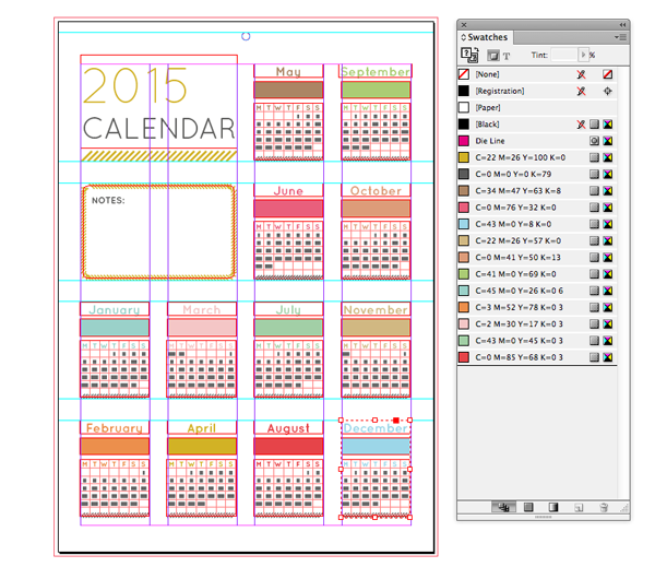


.png)