2014 has been a very busy year for the Design & Illustration section of Tuts+ and here's why:
We've successfully merged into one unified site to provide all content within the Tuts+ family in one glorious site! This helped give you all your design content within one wonderful section... Design & Illustration.
We've been reaching out to more of our community by translating our most popular tutorials into a variety of languages, such as Portuguese, German, Arabic, Russian and Spanish.
And there's so much more to mention, but the main thing is, we provide all this written tutorial content for free!
The Top 40 Design & Illustration Posts of 2014
So apart from all of these highlights of 2014, what exactly were the top tutorials posted in the Design & Illustration section? Well in no particular order, it's my pleasure to share with you our top 40 tutorials.
As always, if there's something you want to learn, no matter how simple, complex or niche it is within the Design & Illustration world, drop us a comment and we'll be sure to consider it.
If you're interested in seeing if your skills and educational content can make the cut for the Top 40 posts of 2015, then why not get in touch!
I'd like to take this opportunity to wish you all the best for 2015, from Team Awesome (the ever-so-talented Design & Illustration Instructor Team) and myself. We hope you join us in 2015 for more inspirational and original content!
Many web app designs can be transitioned into desktop or mobile app designs with just a few modifications. OS X Application UI Design in Adobe Photoshop will show you how experienced graphic designers can create web app designs that they can move over into the realm of OS app designs.
What You'll Learn
You will be producing a music app design for the Mac OS X operating system. Tuts+ instructor Lawrence Turton will take you through the full process, starting from scratch with the logo design, wireframe, UI and OS design integration, and finally topping it off with annotations.
Here's a free preview of some of the lessons from this course:
Designing the Logo
Logos create a precedent for the app design itself, and first impressions matter to the client and to the user of the app. It’s important to spend some time perfecting the logo of an application, even at the beginning stages of the logo design.
Designing a Wireframe
Wireframes for the most part are optional in the design process. However, the best practice for designing any app, whether web or OS, is to wireframe first. This is a good rule to have, especially when working in a team or agency. So let’s begin designing our wireframe from scratch.
Wireframing the Sidebar and Adding Shadows
The next part of the wireframe will consist of the sidebar containing a nice cover flow effect of music albums. It may look a tricky effect to create, but in reality it’s quite simple, and with the addition of layer styles you can save a lot of time. This lesson has a unique view on the wireframe process because typically you just want to keep it flat, but sometimes adding shadows can be very tasteful.
Start Learning for Just $15
You can take our new course straight away by subscribing to Tuts+. For just $15 a month, you get access to this course and hundreds of others, with new ones added every week.
While describing the Alif, I mentioned briefly that it was the module and archetype for the whole alphabet. This is not mere symbolism, but an indication of our starting point when creating a composition in Kufic, be it a word, a sentence, or the whole alphabet. Because we are not using a formal script where all the decisions (heights, proportions, spacing) have already been made, we have to make these decisions ourselves, and we are free to keep them constant throughout our work, or reinvent them every time (which I tend to do). Today we are going to learn how to set the essential rules of our script, and it all begins with the Alif.
Proportions
At this stage we are working with the bare structural skeleton of the letters, over a grid where each square is 1 unit. In this mode, the Alif is a rectangle, and our first step is to define its proportions. For instance:
Let's go with the last one, at the very right. Its width is 1 and its height 6. This is our "alif-height" (to derive a term from Western typography) and it is the maximum height for our script. Remember only Lâm and Tâ' can reach the same height. Its width is also the line width for all our vertical and horizontal lines (for the moment). Note also that the Alif stands on the baseline (satr al-kitâba), which we must always bear in mind.
Next we must set a secondary height, which we'll call the bâ-height. This is the height for toothed and notched letters (such as ب ج س ر). There is no rule as to how high it can go, save that it must be lesser than the alif-height; however, it needs to be harmonized with the heights of the other letters, and these depend on spacing as we'll see next. So for now, let us tentatively settle on a height of 4. We may revise it later—design is seldom a linear process, but a back-and-forth movement between variables until we're happy with the result.
When it comes to boxed letters (such as ص ط), we have to work with two horizontals and the space between them. In the simple grid we're using, that's a height of 3 units, no more and no less, because in boxes that space can stretch horizontally but not vertically.
We can see already that if we keep our bâ-height as we set it earlier, it is not on the same level as the boxes. We can either bring down the bâ-height, or accept the difference in level. The next type of letter may help us decide.
Looped letters offer a certain flexibility, as they can stretch in height (but not horizontally). Some of them (ق ف) involve three horizontals and two spaces, and therefore a height of 5 or more. We can, however, forgo the "neck" of these letters and keep them close to the baseline as the other looped letters need to be (و م), bringing their height down to 3 or more.
Knowing this, we can go three ways:
Possibility 1: Constrain all the non-ascending letters to the same height, which must be whatever height best fits the least flexible letters (in this case, the boxed letters):
Alif-height plus one level.
Such an arrangement has a static quality, and can be seen as severe, but it also defines neat rectangular spaces between two Alifs, which can receive ornamentation in the form of arabesque or more writing, perhaps in a smaller and contrasting style. It is also useful when we want to fill an area evenly with writing, as a more jagged arrangement leaves empty spaces that are difficult to fill.
Possibility 2: If more liveliness and contrast are desired, loops can be lifted off the baseline while boxes and toothed letters are made the same height. We then have three levels: the high of the Alifs, the low of most letters, and the occasional break of looped letters, a very musical result even before we shape and refine the letters themselves.
Alif-height plus two levels.
This can be observed in the historical example below, an early Kufic manuscript. The baseline is in black and the green lines show, respectively, the level of boxed and toothed letters, and the level of looped letters (except for Mîm which, as we have seen, cannot be lifted; instead it is pushed lower on the baseline).
Other combinations are possible. For instance, Eastern Kufic, below, keeps the boxes low but has loops and teeth on a level.
Below is an inscription that straddles possibilities 1 and 2. The limited space resulted
in the alif-height being the same as the height of some looped and toothed
letters (indicated by the edge of the box in which the inscription is
carved). Notice, however, how everything else carefully matches a single other level (blue line). The end result has the robustness of a strict two-levels, but the up-and-down movement of the letters also gives it life.
Possibility 3: This is actually what not to do! A visual cacophony where every letter type has its own height, and no trace of consistency or harmony are left. Unless that's exactly the effect you're after, make sure not to fall into this error.
Too many levels!
It is to avoid jarring inconsistencies, of this kind and others, that we shape the script as a whole, rather than designing the letters separately one by one.
There is one remaining level to set, which is that of the descenders (tails), below the baseline. As there is just the one, it is a simpler decision. The historical examples below show how descenders are all level, whether they are the very close type of early styles, or the wide open round bowls of later Kufic.
The tails of Wâw و and Râ' ر are not true descenders, and this gives them a
freedom of their own (somewhat like the relative freedom of behaviour that children enjoy). Sometimes, as in the first two examples above,
they sit on the baseline; more rarely, in condensed compositions, they
share the level of descenders; often they are anywhere between the
baseline and descender level, but never lower, and usually much less
substantial—see the short, hairline tails of و and ر in the third example above.
Spacing
There are three spacings to consider: the space between two letters (to simplify discussion, we'll call it letterspace), the space within a letter (innerspace, for instance between the teeth of س, or inside the loop of ف), and the space between two words (wordspace). The simplest treatment is to have them all equal. Let us start with this and see how it looks.
There are a few problems with this even spacing, which I'll point out one by one and offer solutions for.
1. What Are These Four Teeth Supposed to Be?
If you speak and read Arabic, you may have recognized the word as بساط الريح ("flying carpet"), but what if you are not fluent, or the word is more ambiguous (as it would normally be when diacritics are not used), or we only see this grouping out of context? Drawn this way, these letters can't be made out. It could be سبا just as easily as بسا, or any permutation of يبتنا.
Clearly, then, we have to make it clear that the first tooth stands alone and is followed by the three teeth of one Sîn. A Sîn can be made distinct by treating its shape as a unit, and I'll refer you to our earlier lesson Anatomy of the Letterforms for fine examples of this. At the level of pure spacing, however, the solution is to reduce the innerspace so that it reads as a unit separate from the next:
This is not done arbitrarily, as we want to keep all proportions in our script related to each other. In this case, the Sîn's innerspace is half the letterspace, and this removes the ambiguity around that letter: clearly the three teeth are together, and separate from the previous and following letters.
2. Words Too Close Together
We can tell that Tâ' ط is the last letter of a word by the fact it is not connecting to the Alif which follows it, but they are problematically close together. The problem is not the spacing itself, but the fact that there is no contrast between letterspacing and wordspacing, and therefore no visual clue announcing where one ends and the other begins.
To solve this, should we push the second word away, or pull the Tâ' closer to the rest of the first word? Here's how they would each look:
For the word بساط, the first solution is noticeably tighter. In the second one, the difference between the words has been established well enough, but the Tâ' looks too distant from the other letters. Reducing that letterspace by half, as on top, has improved the word's inner adhesion and that alone resolves our problem. In the same breath, we have discovered that when two letters are not connected, their letterspace appears wider than that between two connecting letters, and may need to be reduced (matching it to the innerspace helps preserve consistency).
Which brings us to our third problem:
3. The Alif Looks Disconnected From the Lâm
This is the same issue we had with the Tâ', accentuated by the tall nature of both letters. Alif-Lâm, the most recurring pair of letters in the Arabic language, always gain from being placed closer together than the default letterspace, and this goes for Alif-shaped letters even when they do connect, such as two Lâms in a row لل, or Tâ' followed by Lâm or Alif طل طا.
Once we adjust the Alif-Lâm spacing—and while we're at it, also the letterspace between Râ' and Yâ', which is another instance of non-connected letters—this is how the whole looks:
The spacing is thus: Letterspace = 1 unit Innerspace = 1/2 unit Wordspace = 1.5 unit
Is this the only correct way to space these two words? No! For instance, keeping the same relationships, we can multiply all the spaces by two for a more airy feel:
Bear in mind also that we've been working with very bare, square letters. Were the letter shapes more curved, or ornate, or triangular as in Eastern Kufic, we would find different spacing relationships that look better. Having done this work on a couple of words, though, we have a system that we can then apply throughout a project, only keeping an eye on other special letter pairings that may arise.
I will take this one more (optional) step further, as there is one last
thing that bothers me now that we've set all the spaces: the innerspace
of the Tâ' looks too big now that the innerspace is 1/2 unit. The same goes for the space between the baseline and the returning tail of the Hâ'. So I'm going to go ahead and adjust these heights, demonstrating the back-and-forth process I mentioned before. I could also decide to lower the bâ-height to the same level, or on the contrary raise it one more unit to make the contrast stronger... There are many decisions based on personal preferences or the nature of the project which can come into play here, until one is fully satisfied. I'm going to stop at the Tâ' adjustment, though, and call this finished:
Creativity Within the Grid
Once all the decisions in proportions and spacing are made, you have the basis of a system, a grid, which you can apply to achieve consistency and harmony. Does it mean you must follow it unwaveringly? Again no!
First you put down the text according to the rules, as this step is a much-needed foundation for a project, and then you use your eyes and sensibility to make adjustments. Historical texts are riddled with creative improvisations that bend the grid and make the whole that much more pleasing to the eye, without ever breaking it. Here are a few examples of pairs of letters where the shape and/or height of one has been altered to create a more elegant ligature:
Exercise
Below is a sentence in a dreadful shape: سلامة الانسان في حفظ اللسان ("A man's safety is in holding his tongue", Lebanese proverb.)
Working on gridded paper (you can print out the attached Basic-grid.pdf) and following the steps in this lesson, redraw them with adjusted proportions and spacing. There is no single correct way of writing each of them, so you may want to try different possibilities for them. Remember to look out for:
too many levels
inconsistent innerspace
stretching the space in a box or a loop in the wrong direction
Adding shattered glass to a design is a great way to introduce drama and interest. The visual depiction of broken glass is very evocative and full of energy and conflict. Creating it is full of technical challenges. Illustrating it is difficult and time consuming, but photographing it well is no easy task! In this Quick Tip, we will give you a great technique for safely generating shattered glass brushes in Adobe Photoshop.
1. Create the Practical Effect
Before we begin, I know what you are thinking. "How hard can this be? Just bust some glass and take a picture of it!" But this project can actually be a lot more difficult than it looks. The very nature of shattered glass makes it a challenge to work with. It is sharp and can cut. There's no way to break it in a slow and controlled manner. It must be shattered violently, and the shards have a tendency to fly all over the place in a hugely uncooperative, and dangerous, manner.
Once the safety issue is dealt with, the next challenges are backgrounds and reflections. Either one can drastically increase editing time during the brush creation, so it's best to eliminate them on the practical side. Yet figuring out a setup that doesn't show any background or reflection in dozens of shards of tiny glass is no simple matter.
Fortunately for you, this tutorial walks you through how to conquer both those challenges and end up with some clean, crisp shattered glass brushes!
Step 1
The materials you will need are fairly simple and common. You will need:
Several small panes of glass. I got mine from cheap picture frames on sale at my local department store.
Some sturdy card stock.
Spray adhesive. Look for a can that gives a fine mist and dries invisibly.
Clear plastic bags large enough to hold the glass panes.
A hammer!
Step 2
I suggest doing this project outside on an overcast day. The heavy cloud cover will give a soft ambient light and make it easier to keep the reflections clear. The key to controlling the shards of glass and stopping them from flying away is to glue them to the card stock. Start by spraying the adhesive on the card stock. Use a very fine mist—you don't want the drops to be visible through the glass. The glue doesn't need to hold the glass securely, it just needs to help keep it from sliding around.
Step 3
Allow the adhesive a minute to dry, and then gently press the glass pane onto the card stock. Be careful not to smear fingerprints all over it!
Step 4
If necessary, trim the card stock down so that the paper and the glass together can fit inside one of the plastic bags.
Step 5
Break the glass with a quick strike of the hammer to the center of the glass pane. The adhesive holds the shards in place and the plastic bag prevents them from flying around.
Step 6
Carefully slide the card stock out of the bag without disrupting any of the glass pieces. Keep the card flat and begin to photograph the broken glass. Shoot from a slight angle and watch that your own reflection doesn't appear on the glass surface.
Step 7
Carefully move some of the glass shards and shoot more photos of assorted pieces of glass, always being aware of your reflection!
Step 8
Repeat the process as many times as you'd like, or until you run out of panes of glass!
2. Process the Photos
Now we turn the corner into the digital world, and adapt our shattered glass shots to work as custom brushes in Photoshop.
Step 1
Open one of the shattered glass shots and use the Crop Tool (C) to crop the image in close to the edges of the glass.
Step 2
Photoshop brushes ignore color information, so it's best if we see the image as Photoshop does, in grayscale. Add a Black & White Adjustment Layer and find the preset that generates the best contrast for your shot. For this image, that was the High Contrast Red Filter.
Step 3
Add a Curves Adjustment Layer and squeeze the curve horizontally to meet the histogram edges, which greatly increases the contrast of the image. Then create a steep arc upwards. The goal is to get the parts between the cracks solid white, and the cracks as dark as possible without creating distortion.
Step 4
Add a New Layer to the top and use a soft edged Brush (B) with foreground color set to white. Paint completely around the edges and gently fade the radiating cracks as they approach the edges.
Step 5
Go to Edit > Define Brush Preset and give the new brush a name. Continue this same process for the rest of your shattered glass photos until you've built up a library of custom shattered glass brushes.
3. Use Our Brushes
While I fully encourage you to follow along and create your own custom shattered glass brushes, I realize that not everybody has the time or opportunity to break glass just for photos. So I've provided an assortment of broken glass brushes free for you to use!
Step 1
Download the attached file for this tutorial, ShatteredGlassBrushes.abr. Then go to Edit > Presets > Preset Manager. In the Brushes section, use the Load button to navigate to the downloaded file.
This will add 12 new shattered glass brushes to your Brush Presets.
Step 2
Go be amazing! Now use your smashing new brushes to produce some digital artwork with actual glass effects that you didn't have before.
Want More?
Can't get enough custom creative
brushes in Photoshop? Check out my previous tutorials on creating custom brushes for Coffee Rings, Smoke Tendrils, or Water Drops. Hungry to learn more about how to use custom
brushes in photo manipulation projects? Check out my profile of courses and tutorials here at Tuts+ and find all that, and much more!
Creating
your own library of digital resources pulled from real-world practical
effects is a skill that will pay off exponentially in the future.
Instead of searching stock sites for interesting textures, try creating
some for yourself! I'd love to see them in the comments below.
In this tutorial, you will learn how to design a nice simple compass icon in Adobe Photoshop, using tools such as the Pen Tool, Rounded Rectangle Tool, and Rectangle Tool. You will also learn how to combine basic shapes to create a more complex shape. Finally, you'll see how to add a long shadow to the icon. Let's get started.
Tutorial Assets
You will need the following free assets to follow this tutorial.
Make a new file in Photoshop (File > New). Set its size to 500 pixels × 500 pixels.
Step 2
Click the Add Adjustment Layer icon in the lower part of the Layers panel. Select Solid Color.
Step 3
Select light red (#db687b) for the color.
Step 4
Double-click the Solid Color layer and then activate Pattern Overlay. Use the free pixel pattern from PSDfreemium. Set its mode to Multiply with low Opacity, 20%.
Step 5
Change its layer name to background. I suggest renaming each layer to help you recognize the layer's function.
2. Designing the Base
Step 1
First, we want to build the icon's base. Set the foreground color to #3ab2cb. Activate the Rounded Rectangle Tool, and set its Radius to 30 px. Shift-click and drag to draw a rounded rectangle.
Step 2
Double-click the shape and activate Gradient Overlay. Select white to black gradient. Reduce Opacity with Blend Mode Overlay.
Step 3
Make a new layer and place it above the icon base. Control-click the base layer to make a new selection based on its shape. Right-click and select Stroke. In the Stroke dialog box, select a darker blue color (#1d6b80) with Width 2 px.
Step 4
Add a layer mask to the stroke layer, and fill it with black. Paint its lower half with white to reveal the stroke.
Step 5
Repeat the previous shape, and add another stroke line on a new layer. This time, use a lighter blue color with Width 1 px.
Step 6
Add a layer mask and then fill it with black to hide the stroke. Paint the upper part to reveal some of the stroke line. The combination of light stroke on top and dark stroke on the bottom will add a 3D effect to the base.
3. Drawing the Shape
Step 1
Draw a circular shape and then add a smaller circular shape inside it with path mode Subtract Front Shape. We should now have a ring shape. For its color, set it to white (#e4ffff).
Step 2
Add a triangle path on the upper part of the ring shape. Set its mode to Combine Shapes.
Step 3
Add another triangle on its lower part.
Step 4
Duplicate the two triangles. Rotate them 90°.
We now have a triangle pointing in four directions.
Step 5
Repeat the process. This time add smaller triangles. Rotate them 45°.
Step 6
Double-click the layer shape and then add Gradient Overlay and Drop Shadow. See the following screenshot for its settings.
Step 7
Add a smaller ring shape on top of the previous shape. Set its color to #eaeded.
Step 8
Add a half triangle shape covering half of the point in the compass shape.
Continue adding another half triangle covering the other points. This shape will create the illusion that the compass shape is extruded, not flat.
Step 9
Double-click the shape and choose Gradient Overlay.
For the gradient, set its Style to Linear with color transition from gray (#d7d7d7) to white (#ffffff).
Step 10
Add a new layer, and make sure it is placed above all the other layers. Control-click the previous shape we just made. We will have a new selection based on its shape. Right-click and select Stroke. Set Width to 1 px, Location: Inside, with color #eeefef.
This will give you a thin stroke line along the shape.
Step 11
Add a layer mask to the layer shape and fill it with black. Paint some parts of the stroke line with white to reveal them.
Step 12
Let's make the shape appear realistic by adding shadow underneath it. Add a new layer and place it under the compass shape. Control-click the compass shape layer to make a new selection based on its shape. Click Edit > Fill. Set Content to Black and then click OK to fill the selection with black.
Step 13
Remove the selection using Control-D. Click Filter > Blur > Motion Blur. Set its Angle to -45°.
Step 14
Soften the shadow using a Gaussian Blur filter. Click Filter > Blur > Gaussian Blur.
Step 15
For now, this is not the shadow we want. To fix this, add a layer mask to the layer and then paint the unneeded shadow on the upper left side of the shadow. We only need shadow on the right side of the shape. See the image below for reference. Make sure you also reduce its layer Opacity to make the shadow subtle.
Step 16
Let's add an arrow on the center of the compass shape. Start by adding a rectangle and then apply a transformation (Control-T). First, rotate it 45°. Second, squeeze its corner until we have an arrow shape. Third, rotate it again.
Step 17
Double-click the arrow shape and then apply Inner Glow, Gradient Overlay, and Drop Shadow with the following settings.
Step 18
We want the arrow color to be half white and half red. To do this, simply duplicate the shape (Control-J) and then remove its Layer Styles. Set it to Clipping Mask. Click its bottom point with the Pen Tool to delete it.
Step 19
Add a small circle on the center of the arrow. Double-click it and then apply Inner Glow, Gradient Overlay, and Drop Shadow.
4. Add Shadow
Step 1
Add a new layer and place it between the compass shape and its arrow. Draw a polygonal selection as seen below using the Polygonal Tool and then fill it with black. Reduce the layer's Opacity to 20%. Control-click the icon base and add a layer mask. Now, the shadow can only be seen on the icon's base.
Step 2
To enhance the illusion that the compass shape is extruded, we want to add more shadow on it. Make a new layer between the compass shape and its arrow. Paint black on the arrow shadow that touches the compass shape.
Step 3
Add another layer and then another subtle shadow behind the arrow. Activate the Brush Tool with 0% Hardness and set its Opacity to 5%. Paint shadow behind the arrow.
Step 4
Add a new layer. This time add highlight to the icon. Paint white on the icon's corner. Reduce its layer Opacity.
Repeat this step, painting highlight on other parts of the icon until it doesn't appear too flat.
Step 5
Now, let's add shadow to the icon's base. Make a new layer underneath the base layer. Control-click the base layer, and fill the selection with black.
Step 6
Hit Control-D to remove the selection. Soften the shadow by applying Gaussian Blur.
Step 7
You can duplicate the shadow by clicking Control-J if you are not satisfied with the result and want darker shadow. If you find it too dark, you can tone it down by reducing its Opacity.
Final Result
And this is our final result. I hope you enjoy the tutorial and now understand the technique of creating a flat icon with a long shadow.
Everyone is in for such a treat today as I interview Shane Koehler, nature illustrator extraordinaire. His work, mostly watercolor-based, explores nature's inspirational beauty and strength, inviting viewers to experience his view of the world around us. Read on to learn all about the self-taught painter and his environmental messages through his artwork.
Hey Shane! Thank you so much for the interview. Let's start at the beginning: What got you into fine arts?
My family has always fostered
creative thinking, and as kids, my two sisters and I were always coloring, which turned into following the drawing lessons from the PBS art show "Imagination
Station". In school we were encouraged to enter art shows and to practice as
much as we could.
Who or what are your main sources of inspiration?
Honestly my greatest inspiration has
always been my older sister and her natural artistic abilities and sense about
art. Through observing her I began to understand how to think more as an
artist. More recently, my twin sister’s background in sustainable design has helped me think as a designer and has led to better compositions within my paintings.
My over-arching inspiration is nature, and I strive to inspire and educate about
conservation and the importance of nature in every art piece that I make.
Are you formally trained? If not, how did you work up your portfolio for professional work?
My knowledge and ability to make
professional art work is primarily self-taught through practice and mindful
observation. I have read many books and followed teachers on TV and in school, as well as other professional artists. With each project I spend lots of time researching
and collecting reference images and material.
Each morning I attempt to wake up
with or before the sun, around 4:00 am, for morning into noon light. This feels
like a natural productive time for me and is the best lighting to work with. I
am still in the early stages of my professional portfolio but I have mapped out
a progression of art shows and series of work that is inspired by the many
different facets of the natural sciences. For example, I would like to show different
series highlighting ecosystems like coral reefs, tropical rain forest, desert
life, etc., and the interconnection of all life on Earth.
What is your creative process like?
Currently I draw inspiration from a
mix of modern day artists who work with simple commercial style forms and
colors. My goal is to sell online and continue to sell to various shops in
order to create an income that will fuel my fine art aspirations.
My process
includes sketching out thumbnail ideas and arranging compositions to form images
that are both instantly appealing and quick to make. By making the “quick
affordable” art I can free myself up to focus on the more intricate and time
consuming fine art that will best educate and inspire others.
What media do you use in your work? Is it all traditional media, or do you work digitally as well?
In the last few years I have decided
to hone my skills and to focus on watercolors. The best way to learn anything
is by hands-on practice, and I am trying various techniques to develop a unique
style. The process of using different watercolor paper with typical
watercolor paints is considered traditional, but the way I use thick opaque
amounts and sometimes mixed with acrylic is not traditional. I’m interested in
learning this versatile medium on paper first and developing a unique style
with true vibrant colors, and then branching into wood and other mixed mediums.
For how long have you worked professionally? Is your work as an artist your day job?
I have been making and selling
artwork since I was in high school, but I feel my true professional career
started about two years ago when I decided to make my first official series of
work which included smaller, brightly colored, loose abstracts with tighter sea
horses interlaced. I then showed them in
a Downtown Portland gallery for an event called First Thursday held each
month.
Since that time, a Portland store
called Bud and Finn has carried them, and they have inspired a larger show in progress
titled REEF. At this time, working as an artist is a part-time job until it
becomes full-time, but at least I am getting to make art during the week and
some is better than none.
What's your typical workday like? What's the typical "day-in-the-life" of a fine artist?
Rather than filling my time with
commissioned projects, I’m more focused on my own artwork and creating the
images that I feel will best inspire a positive change in others and the world.
I try to have one commission per month, which I usually obtain through friends
and word of mouth. The process is like most and involves setting up a clear
dialog and contract with a client, and then setting a schedule and updating the
client along the way until it's finished.
How about your work space? Can you give us an insight into how and where you work?
One
day I aspire to have the studio of my dreams, which involves lots of natural
sunlight and a fair amount of space to set up large paintings. For now I have a
cozy studio apartment, which is perfect for my current work. Just enough room to
accommodate my 24”x36” and 20”x20” new body of work. I’ve worked at
making my space a sanctuary where I can easily zone into my nature subjects and
be inspired by the prints and originals of other artists I admire.
Your focus in art seems to be environmental/nature based. Tell us about the message you're sending with your work.
The focus of my nature-based art
work is to show true representations of scientific concepts while including
artistic and fun elements. I can achieve this by creatively placing different
wildlife together both in composition and theme. A recent series called "Native" shows this well by encompassing wildlife from Sanibel Island in Florida, where
I did conservation work, and grouping the native species together based on
similar coloration.
A new large scale
work that I am in the process of making will showcase entire ecosystems. Plants
and animals will surround the portrait of a keystone species, which are the
species that are critical in maintaining the relationships of an ecosystem.
By representing wildlife and making
the artwork fun, I hope to inspire positive thinking and therefore positive
change in human behavior on all levels that support conservation and
preservation of our natural resources.
What has your role as an environmental educator been? Where do you hope to take it?
Since college I have taught as an
environmental educator for state and national parks, as well as conservation-based non-profits. With volunteers, I have led community-based art projects
like murals and painted benches that depict and educate about themes in
wildlife like metamorphosis, plant identification, and bird ecology.
The
experiences I have had as an environmental educator are now aiding me in
developing artwork that speaks for itself and educates to different viewers at
different times. It is this extensive reach that art has that drives me to
continue on a path to use art as the catalyst for education and a call to
action.
Does Portland play a part in the focus of your work?
Portland is an extremely special
place where creativity, free thinking and uniqueness are celebrated. In my
experience so far, the people of Portland are very receptive to my
environmentally-focused art work. Like most cities there is a disconnect
between wildlife and human life, but Portland is surrounded by mountains and
lots of plants and animals. Each day in and around Portland is a constant
reminder of how important wildlife is for the health and survival of our
species both physically and spiritually, and that importance is what I try to
convey in my artwork.
What are your goals as an artist?
My goals as an artist include making
a livelihood and creating images that are strong, impactful and deeply felt by
others. Overall to enrich the lives of viewers and in doing so enrich my own.
The series titled "Native" is a culmination of the wildlife I experienced
while working for a conservation organization on Sanibel Island in SW Florida.
By grouping realistic representations of the island's native flora and fauna
together by similar coloration, it gives the viewer and understanding of what
the species look like and is a fun visual way to see and think about wildlife.
I like to place marine life with land-based life to surprise viewers and allow
for the idea of interconnection within all species and habitats.
The theme of
making series based on ROYGBIV colors is also a way for me to provide color
therapy to the world, which can relax or stimulate emotions, and paired with other
messages can potentially give rise to positive changes in our thinking and
actions towards the environment.
What words of advice do you have for aspiring artists?
If
you are passionate about making art and truly compelled to have a career in the
arts industry, it is important to be realistic with your strengths, where you
need improvement, and how much time projects and things really take you to complete.
Then research what professionals at your level make and charge accordingly—do
not sell yourself short. Last, know your potential audience, always be true to
yourself, and produce the art that represents you the most.
Many thanks to Shane Koehler for taking the time to answer my numerous questions about his work and experience as a fine artist in Portland, Oregon. You can check out more of Shane's artwork at the links below:
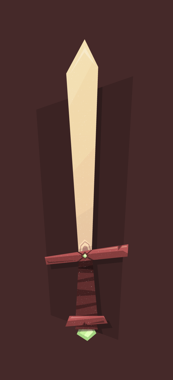
In this tutorial I’m going to show you how to create your own cartoon-like Elemental Sword that might come in handy in future projects.
The tutorial will mostly rely on the use of the Pen Tool and some other easy functions that Adobe Illustrator has to offer. So let’s get started!
1. Setting Up Our Document
Open up Adobe Illustrator, and create a new document either by using the Control‑N shortcut or by going to File > New.
Once the pop-up window appears, set up your document as follows:
Number of Artboards: 1 (as we will only create one illustration)
Width: 640 px
Height: 1400 px
Units: pixels (as we will be creating for the digital medium)
And from the Advanced tab:
Color Mode: RGB (digital screens)
Raster Effects: Screen (72 ppi)
Align New Objects to Pixel Grid: checked (as we want
everything to look pixel crisp)
Quick tip: raster
effects control the way drop shadows,
textures and other effects display
on different media. If you start creating for digital but at the end of the
project you decide you want to print the design on paper, you will
need to make sure that the Raster Effects are set to a minimum 300 ppi value.
The quickest way to do so is to go to Effect > Document
Raster Effects Settings and from the Resolutionsection change it to 300.
2. Layering Our Document
As with any
detail-oriented illustration, I really like to layer the parts that make
it up, so that I can easily access and edit the sections I need.
Assuming you have some basic knowledge on how
layers work, go ahead and create eightlayers and name them as follows:
background
sketch
shadow
sword handle
blade
hand guard
gradient overlay
texture
You might have noticed that some of the labeled
layers seem to be inversed from a logical perspective (the blade and hand guard), but that’s only because we will need the blade
to be positioned under the hand guard
layer.
3. Sketching Out Some Rough Lines
Once we have our
document set up and layered properly, it’s time to start drawing some rough
lines that will help us build up the actual illustration. If you have a tablet
or you’re really skilled with the mouse, you can start drawing straight into
Illustrator using the Blob Brush Tool (Shift-B). On the other hand, if you prefer using the traditional pen and paper
combination, you can easily scan and import the sketch into Illustrator afterwards.
It’s all up to you.
In my case, I
will go fully digital, and start laying the outline of the sword straight onto
the sketch layer.
Before we begin, I would like to point out that
your lines (both the sketched and the traced ones) don’t need to be perfect. As
you can see, the illustration follows a more cartoony style, with lines that
break the natural, realistic form factor, and by doing so create something that
looks as if it came out of a children’s book.
4. Defining Our Basic Shapes
Step 1
Once we’re finished with the sketching part,
it’s time to define the three base shapes
that will compose our sword. We will do so starting with the handle, so go to
the sword handle layer and start tracing with thePen Tool (P), using the
sketch as a guide.
Quick tip: Make sure
the shapes overlap by securing the anchor points go just a few pixels towards
the inner portion of the nearest shape, so that no unwanted white spaces might
appear.
Use the Arrangefunction (right-click > Arrange)to position the
shapes under or on top of one another, so that each form can be clearly viewed.
As you can see,
we will color the main form using a dark brown tone (#633B3B), and the bottom segment using a slightly lighter one (#875050). For the gem stone, we will
use #A6E0A6for the outer section
and #C6F4C6for the inner one.
Now it’s a good time to check if our anchor
points are properly snapped to the pixel grid so that our design will look
pixel crisp. First we need to switch to Pixel
Preview (View > Pixel Preview)and
make sure that Snap to Pixel is on.
Where you
encounter anchors that did not snap to the grid, just grab the Direct Selection Tool (A) and force-snap them by simply clicking and dragging them. I recommend either repeating
the process as you go along or leaving it for the end as a retouching stage.
Step 2
Once you’re done
with the lower part of the illustration, move up to the hand guard and do the same simple tracing of the sketched outline
as before. For colors, we will use the lighter brown (#875050) on the main shape, and the darker tone (#633B3B) for the middle portion
holding the green stone.
Use #9BD19Bfor the stone’s background form and #E1FFE1
for the inner, lighter section.
Step 3
Finish up the basic sword by tracing the blade
and coloring it #EFD5D5.
Once you’ve finished working on the simple
shapes, you can hide the sketch layer, as our illustration is slowly taking form.
5. Adding Small Details to the Sword's Handle
At this stage of
our process we will work on each layer at a time and refine the look of our
illustration using simple forms created with the Pen Tool.
Step 1
The first thing we need to do is add a grip to our handle. Grab the Pen Tool (P) and create five rectangles at different angles and
sizes, and color them using #452929.
Group them (Control-G) and then create a clipping mask by copying (Control-C) and pasting (Control-F) the handle section on top of
them. With both the group and handle selected, right-click > Make Clipping Mask.
Next, select both the grip and the handle and
send them back so that the delimiter can show through.
Step 2
Using my image as a reference model, draw two shapes and color the underneath one using #633B3Band the one on top using #452929.
As with the grip, copy and place the shape underneath and create a clipping
mask so that the crack won’t go all the way out.
Step 3
Grab the Pen
Tool (P), set the fill color to white (#FFFFFF), and then draw a shape that has the bottom margin almost parallel with the
direction of the bottom handle delimiter. You can go as angular as you want to
with the lines, but always make sure they go all the way outside the shape
underneath. We want them to be that way so that the clipping mask can give them
the shape of the object underneath, instead of trying to accomplish the same
thing using the Pen Tool (P).
As you can see, we now need to mask the newly
created shape and make some little adjustments to its opacity and blending
mode. First let’s mask it so that it will fit the segment underneath it. Simply
copy (Control-C) and paste (Control-F) the brown delimiter on top
of the white object and then, with both of them selected, right-click > Make Clipping Mask.
Using the Direct
Selection Tool (A), select the white object and then using the Transparency panel, set its Blending Mode to Overlay and its Opacity to40%.
Draw another object, using the same color settings
as before, and position it towards the top-left side of the handle delimiter.
Now it’s time to add a little shine to the gem
stone. Use the same technique as above, but this time create a diagonal at a
different angle, as shown below.
Step 4
We’re almost done with the handle layer; all we need to add are the shadows. Grab the Pen Tool (P) and start drawing a new
shape, coloring it black (#000000). Change its Blending Mode to Multiply and its Opacity to 40%.
Copy the shadow (Control-C) and then double-click on one of the rectangles forming
the grip to enter Isolation Mode.
Once in isolation, simply paste (Control-F) the shadow on top of the
rest of the objects. By doing so, you will eliminate the need for a secondary
clipping mask.
We will create similar shadows for the lower
sections of the handle, so that in the end you will have something similar to
this.
I’ve selected
the objects so that you’ll notice that they each use different clipping masks formed by the objects that are underneath them.
As with the highlights, we will add a secondary
shadow segment that will add to the cartoon-like effect. Select the Pen Tool (P) and create a short
segment, color it #5E3838, and position it towards the lower right side of
the handle delimiter.
Since we’re done with this layer, we’ll move up
to the next one and repeat many of the actions we applied above.
6. Adding Details to the Sword's Hand Guard
Step 1
The first thing
we will be creating on this layer is the string that keeps the smaller gem in place. Starting from the outer
region of the sword’s guard, draw two diagonal objects with different widths, and
color them using a darker brown value of #4D2E2E.
As you can see, the objects need to be masked so
that they don’t go outside of the guard’s surface. Simply copy the object
underneath on top, and right-click > Make
Clipping Mask.
Once the clipping
is made, the string will be positioned on top of the gem. To correct this,
simply select the gem, and then right-click > Arrange > Bring to Front.
Step 2
Draw a simple pair of triangles and color them
using #804C4Cas the base color, and #6E4242 for the triangle on
top. With both of the objects selected, use Control‑G to group them, and then copy them into the clipping mask used on the string, so
that the edges that protrude outside get masked.
Step 3
In order to add some pop to the guard, we will create a somewhat choppy
highlight that will go across almost half of its surface. We will use the same Blending Mode(Overlay) and Opacity value
(40%) as we did before. The only key difference will be in the fact that
the wood chip and the string will need to be positioned on
top of the highlight rectangle as follows.
We also need to add a highlight to the gem itself. Try to vary the lines by creating a diagonal that opposes the one
created for the bottom gem. Set the Blending Mode to Overlay and lower theOpacity to about 60%.
Make sure you mask the highlight by copying the
darker piece of the gem on top and creating a small clipping mask.
Step 4
To finish up
this part of the illustration, we will add a short piece of shadow on the
bottom-left side of the sword’s guard.
Using the Pen
Tool (P),draw a long, pointy object, and color it using #5E3838.
7. Adding Details to the Sword's Blade
Step 1
To create the shoulder of the blade, we need to
draw a rectangle that has a pointy top anchor, and color it in a lighter shade (#F7DFDF),as it would normally be closer to the eye, and any actual sun light.
As you can see, due to the fact that the blade is positioned on a layer
which sits underneath the guard’s layer, the bottom section of the shoulder will end up being hidden. Even so, we still
need to create a clipping mask so that the shape won’t go outside of the blade.
Next, try to add a center section and a ring, color
them using #C4A5A5, and make sure
they are inside the same clipping maskwe
created for the shoulder.
Step 2
As with the gem stones, the blade’s highlights will be angled slightly
more, each section overlaying and emphasising the one underneath.
The first highlight should start at just about
the middle of the blade and go slightly outside it.
Copy the newly created object into the same clipping maskas the shoulder, and make
sure to change the Blending Mode to Overlay and lower the Opacity to 14%.
Create a second highlight, this time at an even
stronger angle. Set the same Blending Mode and Opacity, and then copy
it on top of the first one.
The last highlight we need to add is right
towards the top of the blade. Try and draw an arched segment, then change its Blending Mode to Overlay and lower the Opacity to 30%. Make sure the new object is
on top of everything else and then copy it next to the rest of the highlights.
Step 3
The first shadow we’ll add will be about a quarter of the way up from the blade’s
base. It will follow almost the same angle as the highlight above it, but we
will need to color it using a darker tint than the one of the blade (#E8CFCF).
The second and last shadow will go above just about half of the shoulder segment,
and will use black (#000000) as the color, with the Blending Mode set on Multiply and theOpacity lowered to 10%.
At this point, the illustration is almost done, so all we need to do now is add a background, some texture, and a few other little
things to make it shine.
8. Color Adjusting
You might wonder why the color scheme used until now is almost completely
different from the one of the final image. Well that’s due to the gradient that
I have overlayed on the final design as a way to enhance some of the colors.
Step 1
First, we need to copy the base forms of the
sword (the ones we created at the beginning: the blade, the guard and the
handle) and paste them onto the gradient
overlay layer.
With all of the objects selected (Control-A) use Pathfinder’s Unite function to create one single shape.
Step 2
Next, select the newly created shape and turn it
into a Linear gradient with the
following values:
Angle: -90
Left Gradient Slider color:#FCEE21 / Location: 0% / Opacity: 100%
Right Gradient Slider color:#F15A24 / Location: 100% / Opacity: 100%
Step 3
Now, all we need to do is change the Blending Mode to Color Burn and lower the Opacity to 22%, and we should have an
interesting shift in colors.
9. Adding Texture
To add more details to the illustration, simply
copy the attached texture file (you can find the download link in the sidebar), put it onto the texture layer, and change its color to white (#FFFFFF). Also, make sure to
vertically and centrally align it using the Align panel.
Quick tip:always check how the alignment is made by looking at the Align To dropdown. If, for example, you
want to align elements to one another, use the Align to Selection option, and if you want to align to the actual
artboard, well I think you get the idea.
10. Adding a Background
We will be drawing two different shapes for the background. I found that using a rectangle with similar angles and distortions to the sword
would create a more interesting feeling to the illustration.
Step 1
So, using the Pen Tool (P),draw a shape that seems to open up more
towards the top side. Color it using #3B2323 and make sure to place it on the background
layer.
Step 2
Because leaving the rest of the surrounding space white might give it an unfinished look, we'll grab the Rectangle Tool (M) and create a full document width and height shape (640 x 1400px) color it using #452929, and then send it to the back of the Artboard (right-click > Arrange > Send to Back).
11. Adding a Background Shadow
To finish up our illustration, we will create an inner shadow confined to the boundaries of the smaller background segment. To do so, simply duplicate
the shape from the gradient overlay
layer to the shadow layer and
change its color to #2E1C1C. Move it
a few pixels towards the lower right corner of the artboard and then, using the background shape as a mask, hide any
parts that go outside of it.
That’s It!
You should now have a cool illustration that you
can use however you like, and most importantly learned some useful stuff along
the way.
The
gnarl style of fractal is a beautiful and fun fractal, and perhaps
one of the trickiest to create. Don't be dismayed, however, because
we'll walk through the process in this tutorial step by step to
produce the beautiful fractal you see above using the Apophysis software program. You'll then possess the
tools to create amazing gnarl fractals on your own. From the
dizzyingly detailed to the soft and smooth-as-satin, you can make them
all!
1.
Setting the Stage
Step
1
Open
Apophysis and check that you have the waves2 plugin. This plugin will
be essential to our approach to the gnarl fractal style. You can
check for the presence of waves2 by opening the Editor,
clicking the Variations tab, and typing “waves” into the
search box. Alternatively, you can simply scroll through the list and
look for it. In some newer versions of Apophysis this plugin is
included, and in others you will need to install it yourself. If waves2
is present, then skip to step 3.
Step
2
If
you're missing the waves2 plugin, you will need to download and
install it. Close Apophysis as you cannot install a new plugin with
the program open. The waves2.dll file needs to be copied into the Plugins folder inside your Apophysis program directory. Once
you've copied this file over, open Apophysis.
Step
3
Open
the Editor and click the New Flame button to create a
blank slate from which to start.
2.
Creating the Base
Step
1
For
Transform 1, leave Linear set to 1 and add in the value of 1
to radial_blur. Switch to the Variables tab and change
the radial_blur_angle to 1 as well. After you have explored
the tutorial as a whole, you may wish to come back to this step and
adjust the radial_blur_angle as this can provide you with some very
unique results.
Finally,
set the Weight of Transform 1 to 0.125. This transform has a
lower weight because we're using it as a blurred base. It simply
needs to be present but does not need much emphasis to be placed on
it. The higher weights will be applied to transforms that affect the
overall shape and structure of the fractal.
Step
2
Create
a new transform by clicking the New Transform button in the
toolbar. Change the weight of this transform to 10, much higher than
the setting of Transform 1.
Finally, remove the linear variation by setting it equal to 0 and add
the waves2 variation by setting its value equal to 1.
As
mentioned above, this transform has a higher weight assigned to it
because it will control the actual structure of the fractal. By
modifying this weight value you can adjust how crisp or blurry your
fractal will appear. The more weight you apply to this transform, the
“cleaner” your fractal will appear; the lower
the weight, the more blurred and “dusty”.
Step
3
Now
we need to make some adjustments to the waves2
variation. Switch to the Variables tab in the Editor.
Adjust the values as follows:
waves2_freqx: 2
waves2_freqy: 2
waves2_freqz: 0
waves2_scalex: 0.05
waves2_scaley: 0.2
waves2_scalez: 0
Each
of these settings can be modified in the future, but for now, stick
with these until you get used to how the variation affects the
overall fractal.
At
this point, you still will not see any pixels plotted on your
viewport or the main window. In our next few steps we will finally
start to see the fractal taking shape.
3. Building the Basic Gnarl Shape
Step
1
Open
the Triangle tab in the Editor. Make certain thatTransform 2 is selected.
Click
the rotate 90 degrees counter-clockwise button to rotate the transform. At this point, depending on the current
gradient, you may already be seeing some shape in your viewport.
Change
the value of the move units to 2. This is the middle text box that is
located between the up/down and left/right arrows. Move the transform
to the right by 2 units and then down 2 units.
Step
2
This
step is very tricky and yet quite fun at the same time. In the Editor
window, click on the Yellow X (Transform 2's triangle). Move
this node around. The idea is to stick close to the corners of the
unit grid. Watch the viewport window as you move X around and
find a shape you like.
Step
3
Now
the real exploration begins! At any point in time, feel free to
modify the X and Y points by values between 0.001 and 0.01 on theTriangle tab. Do so independently to find some amazing
combinations.
Step
4
Open
the Variables tab. Start to explore different options with the
scale variables. Try setting waves2_freqy to something between
0.1 and 1.
Modifywaves2_freqx as well. Try using negative numbers to see how
they impact the fractal.
Change
the scale values for x and y as well. See what happens when these two
values are equal and when they are very different.
4. Adding Texture
At
this point we have created a basic gnarl. You could simply stop here
and render the fractal. However, let's take things a few steps
further. First, we will add some texture to the fractal. This is
another opportunity for you to get very creative in your use of the
different variations within Apophysis. Next we will work on coloring
the gnarl and then finally, we'll add in a final transform and render
the fractal.
Step
1
Add
a new transform by clicking the New Transform button at the
top of the editor. This will be Transform 3. Remove the Linear
variation from this transform by setting the value to 0 in theVariations tab.
Step
2
Add
different amounts of variations to this transform. Feel free to add
multiple variations and see the effect it has on the gnarl. Don't
forget about negative numbers!
Here
are the variations I finally decided upon.
horseshoe : 0.283
hyperbolic: 0.52
unpolar: 0.461
5. Coloring the Fractal
Step
1
To
begin coloring the fractal, we need to select a gradient. Open theAdjustment window and switch to the Gradients tab. I've
chosen gradient 403. Feel free to pick this one, or find one
of your own to experiment.
Step
2
Close
the Adjustment window and return to the Editor. Select
Transform 2. Switch to the Colors tab. Change the Color
Speed to a value between 0.9 and 0.975.
Finally,
drag the Transform Color slider slowly and watch the fractal
really come to life! Once you've explored the coloring, decide upon a
setting you like and continue on below or go back and choose a new
gradient and use the Transform Color slider again until you
find something that makes you happy.
6. Final Transform
In
the editor, click the button that looks like a triangle with the
letters FX beside it. This will enable the Final Transform.
Remove Linear by changing its value in the Variations tab to0. Experiment with adding different variations, including negatives
and multiple variations, until you find a structure that makes you
happy.
7. Final Steps and Rendering the Fractal
All
that is left now is to crop the fractal so that it is pleasing in
appearance, modify any rendering settings, and render the fractal.
Step
1
Close
the Editor as we are finished manipulating the actual fractal.
In the main window of Apophysis use the move,zoom,
and rotate tools to focus on an aesthetically pleasing area of
the fractal you created. There is a nice tool called Show
Guidelines that allows you to use the rule of thirds and the
golden ratio in positioning your fractal.
Step
2
Open
the Adjustment window and select the Rendering tab.
Change the Brightness setting to be slightly higher than what
you would expect; a setting of 5 usually works well.
Step
3
To
render the fractal, open the Render window by clicking the
purple gear in the main Apophysis window. Use a high value for your
render Density. I normally use 10,000. A higher Filter Radius of 1.0
will normally yield very good results. As for Oversample, you can
simply use 1 but do not go higher than 3. This option renders your
fractal larger and then scales it down before it is saved to the hard
drive to prevent or limit anti aliasing. Click Start and let
the computer crunch the numbers.
Great Work! You've Done It
Congratulations! You've completed your first gnarl-style fractal. Now that you have the basics under your belt, start exploring all the different options. You can begin by seeing what happens when Transform 2 is rotated. Use very small degrees, 1 or 0.5 at first because the changes will be huge even at such small numbers. Position Transform 2 in an entirely different area of the grid. Use different variables for waves2 or try different texture variations. The different options are sure to keep you busy for many hours to come!
Whichever software programme you’re using, and whether you’re designing for print or online, typography will no doubt play a large part in the eventual success (or failure!) of your design.
A timely drop cap or an extra bit of tracking can elevate your designs to new levels, in the same way that a poor choice of font or illegible sizing can ruin an otherwise perfectly good layout.
Typography can be technically tricky to perfect, and the jargon used by professional designers can be baffling. So for your peace of mind whenever your boss or client asks you to apply a 14 pt leading, a touch of kerning between the ‘a’ and the ‘b’, or alter the baseline shift, you can refer to this handy A to Z list of typography terms and tips rather than panic googling each definition.
We’ve also included some of our favorite tried and tested typefaces to help you get your typography perfect every time.
Tips for achieving the effects described are tailored especially for users of Adobe InDesign, which is the software program best optimised for handling typography.
A
Adobe Pro Fonts: Adobe has developed Pro versions of some classic typefaces, which are optimised to work best within Adobe software. The fonts closely reference the original typefaces, but are designed to help you achieve a ‘pro’ look in your finished design. Some of my favorites to use are:
Alignment: You can set the Alignment of text from the Character Formatting Controls or Paragraph Formatting Controls panels. This will flush the text in a text frame to Align Left, Align Right, Align Center, Align Towards Spine or Align Away From Spine. You can also choose to Justify the text (see J, below).
All Caps: Setting text in all caps, i.e. all capital letters, can give display typography (see D, below) more impact and give titles and headings more authority. It's also a great technique for improving the legibility of text. In InDesign, you can click the All Caps icon in the Character Formatting Controls panel.
Alley: This refers to the vertical space between two columns of type. Sometimes, alley is also referred to as gutter, although gutter has a slightly different definition (see G, below).
Ampersand: The typographic symbol ‘&’ for representing the word ‘and’. An ampersand can become a dramatic typographic feature, like the vintage-style typographic effect you can learn how to create in this tutorial on high-impact typography effects.
Aperture: The little gap which would otherwise mean a letter would be fully enclosed. See also Counter, in C, below. If you look at the letter 'n', for example, the aperture can be seen at the bottom of the letter, sitting on the Baseline (see B, below).
Ascender: This is used to describe the vertical part of a letter which extends above the character's x height (see X, below). For example, the top of the letter 'h' is made up of an ascender.
B
Baseline: The invisible line on which characters sit. Go to View > Grids & Guides > Show Baseline Grid to view the baseline in InDesign.
Baseline Grid: This grid is defined by the leading of text, and can help you judge where lines of text should sit correctly on the page. You can view the grid in InDesign by going to View > Grids & Guides > Show Baseline Grid.
Bold: You can set type in a bold weight, which increases the thickness of each line of a character to create a darker, heavier appearance. Perfect for display headings, as well as bringing out key words in a piece of text.
Book: Picking a suitable font for typesetting the interior pages of a book can be a daunting task. This is not the place to be experimental—the chosen font needs to be legible and attractive when printed at small scale and when set within dozens of lines of text on the page. Classic fonts like Garamond, Electra and Caslon are fail‑safe choices, and have a serious, literary look.
Bowl: Describes the curved stroke that helps to enclose the Counter of a letter (see C, below). The letter 'a' has a bowl that allows the letter to have the enclosed space that sits at the bottom of the letter, resting on the baseline.
Bullets: To visually separate a list in a body of text, you can apply a Bulleted List or a Numbered List. To apply bullets to text in InDesign, first highlight the text, then go to Type > Bulleted & Numbered Lists > Apply Bullets.
C
Calligraphy: The art of creating lettering with a brush or pen in one stroke, creating a very beautiful, artistic appearance to lettering. Calligraphy is popular in contemporary typographic practice for event invitations, logo design, certificates and maps. Learn how to master calligraphy.
Case: Case defines whether a letter is set in Upper Case, as capitals (also see All Caps, in A, above), or set in Lower Case, as small letters. In InDesign you can adjust case from the Character Formatting Controls panel or by going to Type > Change Case.
Character: Refers to a single letter or symbol, which may either stand alone or be the building block of a word, a sentence or phrase, and eventually a paragraph.
Character Formatting Controls panel: This InDesign panel runs along the top of the screen and contains almost all of the editing options for typography. Other editing windows are accessible from the Window > Type & Tables option.
Color: You can adjust the color of type to improve legibility, alter the mood of the type, or create contrast against an image or colored element. Black type on white (‘Paper’) is the classic color for most traditional publications, like books and newspapers, which creates high contrast without the need for color printing. But designers continue to experiment with applying a whole spectrum of colors to type.
Columns: Used to break up large bodies of text, columns are vertical sections of text content, divided by alleys (see A, above) or gutters (see G, below).
Comic Sans: Often reviled by designers and non-designers alike, Comic Sans was designed by Vincent Connare for Microsoft in 1994. Modelled on the hand-drawn styles used in American comic books, it has a juvenile, jaunty look. Whether you like it or detest it, you have to respect Comic Sans for becoming one of the most widely used fonts worldwide ever.
Composer: You can access InDesign’s composer features by opening the Paragraph panel (Window > Type & Tables > Paragraph) and clicking on the drop-down menu accessible at the top-right corner of the panel. Adobe Paragraph Composer is the default selected option, and adjusts the line breaks in text responsively as you type more lines of text. Adobe Single-Line Composer does a similar job, but responds pragmatically to each line as you go, breaking the text where it feels it appropriate and not revisiting its choice. Adobe World-Ready Paragraph Composer is really useful when composing text in different languages. Setting Arabic text, for example, using the World-Ready Composer joins up individual characters to make it legible, and breaks words across lines only where appropriate.
Counter: This term is used to describe a fully or partially enclosed space formed by the shape of a letter. 'O' has a fully enclosed counter, whereas 'u' has a partially enclosed one, due to the small Aperture at the top of the letter (see A, above).
Crossbar: This word is used to describe a horizontal stroke that makes up part of a letter. For example, the horizontal line joining the two Stems (see S, below) to form a capital 'H' is called a crossbar.
Cursive: A word used to describe joined-up, script-like fonts, usually intended to mimic handwriting or calligraphy. See the Cursive typeface as a nice example.
D
Descender: Some letters have a downward stroke that extends past the baseline. This is known as a descender. For example, both the letters 'y' and 'p' have descenders. This is more common for letters set in lower case, depending on the font you are using.
Diagonal Stroke: Some letters are made up of diagonal strokes (as opposed to vertical or horizontal strokes). A capital 'A' uses two diagonal strokes to make up the triangle shape of the letter.
Display Typography: Setting type for display purposes, as opposed to larger bodies of smaller text which will involve typesetting (see T, below), can be more artistic, and can be combined with images and negative space (see N, below) for added impact. Increased size (see S, below) and/or use of color (see C, above) can transform type into something that is adapted for display.
Drop Cap: A drop cap is a superb effect for adding drama and impact to the beginning of a piece of text. It increases the size of either the first, or first few, character(s) of the first line of a paragraph, extending its height across a defined number of lines. You can apply a Drop Cap in InDesign from the Character Formatting Controls panel (see C, above). Learn how to Enhance Text With a Dramatic Drop Cap.
E
Ear: Term used to describe the small stroke that extends out from the top-right of a letter 'g'. This is more common with serif typefaces.
Experimental Typography: A more artistic and offbeat approach to designing and setting type, experimental typography is associated with the Dada art movement from the early 20th Century. The American graphic designer David Carson is often linked with experimental typography, as he developed and used unconventional typographic methods, mainly in his role as Art Director for Ray Gun magazine.
Eye: Similar to a Counter (see C, above), an eye refers specifically to the enclosed space in a lower-case letter 'e'.
F
Family: A font family describes the base definition for a font, before additional styles or weights are applied to it. A font family can also be described as a typeface (see T, below). A few well-known font families are:
Times
Calibri
Garamond
Families become very important when working in CSS. Defining the font family should be the first criterion you enter for fonts, to ensure text is displayed in the correct family. In this CSS example, two font families are defined in a particular order which ensures text is displayed in the secondary font if the first preferred font is not available on the reader’s computer:
Font: If we’re going to get picky, a font is actually different from a typeface (see T, below). A font defines the selection of a typeface (e.g. Garamond) with weight and size variables applied to it, e.g. Italicized Garamond set at 16 pt. But nowadays, the two terms, font and typeface, have become more interchangeable, particularly with the growth of digital typography. What you need to know is that ‘fonts’ (or ‘typefaces’) come in all sorts of variations, and can be free, paid-for, or included with editions of your software programme.
G
Garamond: A very elegant and legible typeface, Garamond traces its origins back to some of the typefaces developed by punchcutters in the 15th and 16th centuries. Adobe has released a Pro version of the font (see A, above) which translates superbly to use in design software programmes, like InDesign.
Gill Sans: Designed by Eric Gill in 1926, this classic sans serif has stood the test of time, and still looks relevant today. It’s probably best known for its use across British railway signage and publicity materials, as well as being the choice of typeface to front Penguin’s classic, minimalist book covers.
Glyphs: More broadly known as symbols, glyphs are the individual characters that make up a typeface. In InDesign you can go to Window > Type & Tables > Glyphs to open the Glyphs panel. Double-click on a glyph to enter it into your selected text frame.
Gutter: Gutter defines the blank space between two pages of a spread, from the right side of the column on the left-hand page, across the binding, to the left side of the column on the right-hand page. Depending on the binding technique of the document after printing, the gutter may have to be increased or decreased in size to ensure text doesn't disappear into the binding.
H
Hairline: This is used to describe the very thin parts of a serif letter. Notice that the 'a' or 's', when set in something like Garamond, will have thinner sections towards the top and bottom of the letter.
Handwritten Typefaces: A growing number of typefaces out there mimic the erratic, informal style of natural handwriting. Some are really fantastic, but there are also loads that are probably not worth a look! Some of my favorites are Yellowtail, for a more polished, retro take on hand-drawn styles; Hemingway, which is a simple, bouncy handwritten design; and LSTK Bembo, for an old-school look.
Helvetica: Probably best known as the font used on signage for the New York City Subway, Helvetica, invented by Swiss designer Max Miedinger in 1957, also has the privilege of being one of the 20th Century’s most popular typefaces. An elegant and modern sans serif, Helvetica is an example of the International Typographic Style (see I, below).
Horizontal Scale: You can adjust the horizontal scale of type in InDesign, which stretches the character to give a warped effect. Adjust this from the Character Formatting Controls panel.
Hyphenate: It’s really up to you whether you choose to hyphenate text, i.e. break words across lines, in a paragraph. It can be a space-saver, and can also give large blocks of text a more uniform, square appearance. On the other hand, poorly hyphenated words can be off-putting for the reader, and make text less readable. You can switch hyphenation on or off from the Paragraph Formatting Controls panel in InDesign.
I
Indent: An indent can be applied to the first line of a paragraph, the last line, or to a whole paragraph. It simply pushes a defined line or lines inwards from the edge of the text frame, and is a common way of visually breaking up large blocks of text without the need for paragraph breaks.
International Typographic Style: Also known as the Swiss Style, the International Typographic Style is a design style that was developed in the 1950s in Switzerland. The style is marked by the use of sans serif typefaces like Helvetica (see H, above) and Akzidenz Grotesque.
Italic: A weight setting, text can be italicized to give the letters a slanted appearance. Suitable for pulling out quotes, dialogue or for simply giving emphasis to certain words or phrases, italicized text can also give an elegant, feminine appearance to headings and other display typography (see D, above).
J
Justify: You can set the alignment (see A, above) of text to Justify, which stretches the line of text across to fill the width of the whole text frame. This can be a really effective way of neatening the appearance of text and getting rid of any ragged lines. In InDesign you can set the text to Justify with Last Line Aligned Left, Justify with Last Line Aligned Center or Justify All Lines from the Character Formatting Controls or Paragraph Formatting Controls panels.
K
Kerning: Defines the process of adjusting the space between individual characters. In InDesign, kerning can be applied directly from the Character Formatting Controls panel. Carefully applied kerning can improve the visual evenness of a word, but it can also reduce legibility if too much kerning is applied... so use with caution!
L
Language: All text is set in a particular language, and the typography may need to adjust to adapt to the language the text is set in. For example, some languges, e.g. Arabic, need to be flushed right to be read from right to left, and some languages may employ a wide variety of diacritics, or symbols, which may need to be inserted using the InDesign Glyphs panel (Window > Type & Tables > Glyphs).
Leading: Specifies the spacing between lines of text. Increasing the leading of text can make text more legible and appear cleaner. You can adjust leading from the Character Formatting Controls panel in InDesign.
Legibility (see also Size, in S, below): The ‘quality of being decipherable and recognisable’; quoted by Water Tracey in Letters of Credit (1986, pp. 30–31). Font choice, Size, Weight and Color can have a huge impact on whether type can be judged to be legible (which is linked to perception of the text) and readable (which is defined by the comprehension of the text).
Letterpress: Letterpress printing uses relief printing, transferring ink from a press to create an impression on the paper. Letterpress is a traditional technique for printing type, but is enjoying a modern-day resurgence, due to the high quality printing it produces.
Ligature: When two or more letters are joined together to form a single glyph this is called a ligature. The effect can also be imitated by increasing the Kerning between letters (see K, above).
Link: This describes a stroke that connects the top and bottom Bowls (see B, above) of a lower-case serif 'g'.
Linotype: Linotype printing was the industry standard for printing text in newspapers, magazines, posters and brochures from the 19th Century to the mid‑20th Century. The linotype machine created an entire line of type at once, which gave it the name 'line-o'-type'. Letterpress printing (see above) was also widely used, alongside linotype. Digital printing and offset lithography printing slowly replaced linotype printing from the 1960s onwards.
Lower-case: This describes the smaller version of letters, as opposed to setting text in capitals (or All Caps, in InDesign; see A, above).
M
Minion: Designed by Robert Slimbach for Adobe in 1990, Minion is a digital font inspired by Renaissance type styles. You’ll notice that the default font in InDesign is set to Minion Pro.
N
Negative Space: An important concept to understand when creating typography for display (see D, above), negative space is the empty or blank space that surrounds an object, character, word, or phrase. Giving your display headings sufficient breathing space can transform your designs, and make them much easier on the eye. Crowded layouts which don’t use adequate negative space tend to appear overwhelming and unattractive.
Newspaper Typography: Newspapers adopt a unique typographic style, using typefaces and layout styles which are usually more conservative and serious than the type styles adopted by other print and online media. Times New Roman is a classic, traditional newspaper typeface, while newer typefaces like Gulliver and Times Classic give a fresher take on the traditional type style for broadsheets.
O
OpenType: A registered trademark of Microsoft, OpenType is a font format which allows type to be scaled in a flexible, expressive way, and is a great choice when designing typographic layouts on digital software. The TrueType font format is the predecessor of OpenType.
Optical Margin Alignment (see also Story, in S, below): This is a neat trick that allows you to align characters in a paragraph so they appear visually lined up rather than actually technically lined up. This tricks the eye into thinking the text looks more visually appealing. You can find Optical Margin Alignment hidden away in the Story panel; simply go to Window > Type & Tables > Story and tick the box.
P
Paragraph Formatting Controls panel: This InDesign panel runs along the top of the screen, accessible by clicking the ¶ icon at the top-left corner of the screen, and contains almost all of the editing options for adjusting bodies of text.
Point: The smallest unit by which Font Size, Leading and Baseline Shift are measured. Point (abbreviated to pt) is a division of the larger pica unit.
Printing Revolution: Johannes Gutenberg’s invention of the mechanical printing press triggered the Printing Revolution in Europe, where ideas could be printed and circulated en masse for the first time. This led to the world’s first printed book using moveable type, the Gutenberg Bible, which was produced in Germany in the 1450s.
Q
Quotation Mark: Part of a set of typographic symbols or glyphs, quotation marks can be tricky to deal with. They can appear to push letters further into a text frame, misaligning those letters with the lines of text below them. To avoid this, you can instruct InDesign to turn on Optical Margin Alignment (see O, above).
R
Roman: Roman can refer to the ‘Regular’ weight of a typeface. It can also refer to the Roman type style, which has its origins in Greek letterforms. Roman type styles usually appeared as monumental capitals, which went on to form the basis of Western serif typefaces.
S
Sans Serif: A term used to describe a typeface which lacks protruding serifs at the end points of the lines that make up a character. Sans serif typefaces often look more modern and less conservative than serif typefaces.
Semantic Typography: These are 'type pictures'—cleverly arranged letters or words that visually create an image of what the word is describing. Korean designer Ji Lee is a contemporary pioneer of semantic typography.
Serif: The term used to describe the small protruding elements at the end points of the lines that make up the character within a typeface, sometimes referred to as 'feet'. A serif font tends to look more traditional, and sometimes more ornate, than its sans serif counterparts.
Shoulder: This term describes a curved stroke that emerges from the Stem of a letterform (see below). For example, lower-case 'h' has a shoulder that connects it from the left-hand vertical stem to the right-hand vertical stem.
Size: The size of type can be extremely important, defining its legibility, readability and visual impact for the viewer. In Adobe software, font size is measured in points (see P, above). In InDesign you can edit size directly from the Character Formatting Controls panel or from the Character panel (Window > Type & Tables > Character).
Skew (False Italic): From the Character Formatting Controls panel in InDesign you can apply a skew, or false italic, to type by adjusting the degree of the skewed angle. This will only mimic the appearance of italicized fonts, and should not normally be used as a substitute for a true italic font.
Slab Serif: A sort of serif typeface characterized by thick slab-like characters. Slab serifs are great for headlines and poster art. Patua One is a lovely example of a slab serif, and is free to download.
Small Caps: You can set capital (or All Caps; see A, above) letters in small caps, at the reduced x-height (see X, below) while maintaining the same form of capital letters.
Spine: The curved central part of a lower-case or capital 'S'.
Spur: A miniscule 'foot' that appears at the end of a curved serif stroke. For example, capital 'G' has a small spur at the bottom-right of the letter.
Stem: A term used to describe a vertical stroke that makes up a letter. For example, the letter 'l' is made up of a single stem.
Story (see also Optical Margin Alignment, in O, above): The Story panel is an InDesign feature from which you can choose to set text to optically align to the margin (Window > Type & Tables > Story).
Style: In InDesign you can define Styles for characters and/or paragraphs, which allows you to save typographic formatting and apply it again with ease to other parts of your document. To access the Character Styles and Paragraph Styles panels, go to Window > Style. Learn more about creating and applying styles in InDesign.
Subscript: This reduces the size of specified characters and pushes them below the baseline. You can set this from the Character Formatting Controls panel in InDesign.
Superscript: Like subscript, except that this pushes specified characters above the top of the line of the text. Useful for defining dates, e.g. 15th June, and some mathematical concepts, you can adjust superscript from the Character Formatting Controls panel in InDesign.
Symbols: Term used to define individual characters that make up a given typeface (see also Glyphs, in G, above).
T
Tail: The descending stroke of a letter. In serif and italic typefaces the tail is often decorative or ornate. See for example, the letter 'R' set in Garamond Italic.
Terminal: This is used to describe the end of a stroke on a serif letter that doesn't have a Serif (see S, above). You can see this at the top of a lower-case 'f', where the end of the top stroke usually doesn't have a serif, or 'foot'.
Tracking: Defines the increase or decrease of space between a group of characters. You can adjust this in InDesign from the Character Formatting Controls panel or the Character panel (Window > Type & Tables > Character).
Typeface: A typeface is technically a group of fonts which share common design characteristics (see also Font and Font Family, in F, above).
Typekit: Adobe’s new typeface selection feature, pictured above, for CC 2014. Check out how to get the most out of Typekit.
Typesetting: The practice of composing bodies of text, either manually or digitally.
U
Underline: Type can be underlined to give emphasis and to also distinguish headings from body text. You can set an underline in InDesign from the Character Formatting Controls panel.
Univers: Also based on Akzidenz-Grotesk, just like Helvetica, Univers is a classic sans serif without any stylization. It’s streamlined and simple, making it an elegant and non-intrusive font choice for your design projects.
Uppercase: Also known as capital letters, you can set text in uppercase to give it more prominence and impact. The first letters of a sentence or word are usually set in uppercase. See also All Caps, in A, above, for setting text in uppercase manually in InDesign.
V
Vintage: There are thousands of vintage-inspired fonts available to download, with new ones being designed all the time. Choose from styles that mimic Art Deco type, for example, or the ever-popular rustic hipster styles that continue to dominate the popular face of graphic design. Try Vincent for a nice take on the style.
Vertical Scale: You can adjust the horizontal scale of type in InDesign, which stretches the character upwards to give a warped effect. Adjust this from the Character Formatting Controls panel in InDesign.
W
Weight: The thickness of the lines that form a single character, in relation to the character’s height. Some terms for a character’s weight may include, but aren’t limited to:
Regular / Normal / Roman
Bold
Heavy
Black
Italic
Bold-Italic
Medium
Light
Weight can also refer to the attribution of normal or strong weights in CSS.
X
x-height: The x-height describes the height of the main section of a letter, word or group of words. The bottom of the x-height sits on the baseline. Ascenders (see A, above) and Descenders (see D, above) extend beyond the x-height of a letter.
Xenophone: a playful font which you can download free. This font typifies the trend for naïve, childlike, hand-drawn fonts which lend an impression of optimism and fun when adopted on commercial products. Love Ya Like a Sista, as used in this tutorial on how to design typography layouts for packaging, is another example of this type style.
Z
Ziamimi: One of my favorite new typefaces available to download at the moment, Ziamimi is a beautiful display font. It references Art-Nouveau styles, tapping into the trend for vintage typography (see V, above), and will look fantastic on posters, logos or book covers.
Using multiple layer styles can help achieve a more detailed and 3D-looking effect. This tutorial will show you how to use layer styles, filters, textures, brushes, and adjustment layers to create a shiny, clean plastic text effect in Adobe Photoshop. Let's get started!
Tutorial Assets
The following assets were used during the production of this tutorial.
In order to load the contours used, go to Edit > Presets > Preset Manager, and choose Contours from the Preset Type drop‑down menu. Then click the little arrow to the right of the Preset Type drop‑down menu, and click Contours near the bottom of the pop-up menu.
When the dialog box appears after that, just click Append, and you’ll get the contours.
You'll also need to load a default Photoshop gradient set. So go to Edit > Presets > Preset Manager, and choose Gradients from the Preset Type drop‑down menu. Then click the little arrow to the right of the Preset Type drop‑down menu, and click Color Harmonies 1 at the top of the pop-up menu. When the dialog box appears after that, click Append.
1. Creating the Background
Step 1
Create a new 900 x 675px document. Set the Foreground color to #2c353c and the Background color to #191919. Pick the Gradient Tool, choose the Foreground to Background gradient fill, and click the Linear Gradient icon.
Then, click and drag from the bottom left corner of the document to the top right corner to create the background gradient.
Step 2
Place the texture 31 image on top of the Background layer, rename its layer to Background Texture, change its Blend Mode to Multiply, and go to Image > Adjustments > Desaturate.
2. Creating the Text Layers
Step 1
Create the text in All Caps using the font Intrepid ExtraBold. The color is #e5eaec, the Size is 230 pt, the Kerning is set to Optical, and the Tracking value is set to 100.
Step 2
Duplicate the text layer four times. Then, change the last three copy layers' Fill value to 0.
3. Creating the Stroke Layers
Step 1
Double-click the original text layer to apply a Stroke effect using the following settings:
Size: 10
Color: #7e7e7e
Step 2
This will apply an outer stroke to the original text layer.
Step 3
Duplicate the original text layer, rename the copy layer to Stroke 1, right-click it and choose Rasterize Layer Style, and then change its Fill value to 0.
For versions older than CS6, you'll need to group the copy layer (Layer > Group Layers), rename the group to Stroke 1, and then go to Layer > Merge Group and change the Fill value to 0.
Duplicate the Stroke 1 layer, rename the copy to Stroke 2, and drag it below the original text layer.
4. Styling the Main Stroke Layer
Double-click the original text layer again to apply some more effects.
Step 1
Add a Bevel and Emboss with these settings:
Style: Stroke Emboss
Gloss Contour: Cone - Asymmetrical
Check the Anti-aliased box
Highlight Mode: Vivid Light
Opacity: 100%
Step 2
Add a Contour with these settings:
Contour: Half Round
Check the Anti-aliased box
Step 3
This will style the first layer of the stroke.
5. Styling the Top Layer of the Stroke
Double-click the Stroke 1 layer to apply the following layer style:
Step 1
Add a Bevel and Emboss with these settings:
Size: 2
Check the Anti-aliased box
Shadow Mode - Color: #676767
Step 2
Add a Contour with these settings:
Contour: Cone - Inverted
Check the Anti-aliased box
Step 3
Add a Gradient Overlay with these settings:
Blend Mode: Soft Light
Opacity: 51%
Style: Reflected
Use the stove pipe 150 gradient fill
Step 4
This will style the second layer of the stroke.
6. Adding the Drop Shadow
Step 1
Double-click the Stroke 2 layer to apply a Drop Shadow effect using the following settings:
Distance: 15
Size: 7
Step 2
This will add the shadow to the bottom layer of the stroke.
7. Styling the First Copy Text Layer
Double-click the first copy text layer to apply the following layer style:
Step 1
Add a Stroke with these settings:
Size: 1
Fill Type: Gradient
Style: Reflected
Angle: 90
Use the steel pipe 60 gradient fill
Step 2
Add an Inner Shadow with these settings:
Blend Mode: Normal
Color: #2c6c99
Opacity: 100%
Distance: 0
Size: 18
Step 3
Add a Drop Shadow with these settings:
Distance: 17
Size: 9
Step 4
This will style the first layer of the text with the inner color. You can use any other color you like by changing the Inner Shadow's Color value.
8. Styling the Second Copy Text Layer
Double-click the second copy text layer to apply the following layer style:
Step 1
Add a Bevel and Emboss with these settings:
Depth: 297
Size: 35
Uncheck the Use Global Light box
Angle: 108
Altitude: 42
Check the Anti-aliased box
Highlight Mode: Vivid Light
Opacity: 64%
Shadow Mode - Opacity: 0%
Click the Gloss Contour: icon to create the contour used below. What you need to do is click along the line you already have to add points. Then, for each point you add, you can enter its Input and Output values, and check the Corner box.
The values used for the two points are:
Point - Input - Output
Upper Point - 71 - 72
Lower Point - 42 - 34
Step 2
Add a Contour with these settings:
Contour: Cove - Deep
Check the Anti-aliased box
Step 3
Add a Stroke with these settings:
Size: 1
Fill Type: Gradient
Angle: 90
Use the stove pipe 155b gradient fill
Step 4
This will add the first layer of shine/gloss to the effect.
9. Styling the Third Copy Text Layer
Double-click the third copy text layer to apply the following layer style:
Step 1
Add a Bevel and Emboss with these settings:
Size: 21
Uncheck the Use Global Light box
Angle: 53
Altitude: 64
Check the Anti-aliased box
Highlight Mode: Vivid Light
Shadow Mode - Opacity: 24%
Step 2
For the Contour, just check the Anti-aliased box.
Step 3
This will add another layer of gloss.
10. Styling the Fourth Copy Text Layer
Double-click the fourth copy text layer to apply the following layer style:
Step 1
Add a Bevel and Emboss with these settings:
Size: 21
Uncheck the Use Global Light box
Angle: 108
Altitude: 74
Check the Anti-aliased box
Highlight Mode: Vivid Light
Shadow Mode - Opacity: 0%
Step 2
Add a Contour with these settings:
Contour: Log
Check the Anti-aliased box
Step 3
This will add the last layer of gloss.
11. Creating the Text Texture
Step 1
Set the Foreground and Background colors to Black and White, create a new layer on top of all layers, call it Text Texture, and go to Filter > Render > Clouds.
Step 2
Go to Filter > Filter Gallery > Brush Strokes > Accented Edges, then change the Edge Width to 2, the Edge Brightness to 38, and the Smoothness to 5.
Step 3
This will create a simple texture.
Step 4
Change the Text Texture layer's Blend Mode to Soft Light.
Step 5
Command-click a text layer's thumbnail to create a selection.
Step 6
With the Text Texture layer still selected, click the Add layer mask icon at the bottom of the Layers panel to create a mask.
12. Changing the Texture's Color
Step 1
Click the Create new fill or adjustment layer icon at the bottom of the Layers panel and choose Hue/Saturation.
Step 2
Click the Clip to layer icon, check the Colorize box, and change the Hue value to 200.
Step 3
Change the adjustment layer's Blend Mode to Soft Light.
13. Adding the Water Splash Brush to the Background
Step 1
Pick the Brush Tool, and choose one of the Water Splash Brushes brush tips. Set the Foreground color to #e8ecef, create a new layer on top of the Background Texture layer and call it Splash, and then resize the brush tip to a size you like and click to add it behind the text.
Step 2
Double-click the Splash layer to apply the following layer style:
Add a Bevel and Emboss with these settings:
Gloss Contour: Ring
Check the Anti-aliased box
Highlight Mode: Vivid Light
Step 3
Add a Contour with these settings:
Contour: Half Round
Check the Anti-aliased box
Step 4
Change the Splash layer's Blend Mode to Vivid Light and its Fill value to 35%.
14. Adding the Sparkles and Adjusting the Coloring
Step 1
Create a new layer on top of all layers, call it Sparkles, and change its Blend Mode to Vivid Light. Pick one of the Stars and Flares Brush Set brushes, decrease its Size, and add a couple of sparkles at the edges of some of the letters. You can control the tip's Angle as well under the Brush Tip Shape tab in the Brush panel (Window > Brush).
Step 2
Click the Create new fill or adjustment layer icon at the bottom of the Layers panel and choose Gradient Map.
Step 3
Use the Orange, Blue, Magenta, Yellow gradient fill, and then change the adjustment layer's Blend Mode to Multiply and its Opacity to 3%. The effect is very subtle, but it helps enhance the coloring of the final result.
Congratulations! You're Done
In this tutorial, we created a simple backround using a linear gradient and a texture. Then we created the text, and duplicated its layer to apply different layer styles.
We added a stroke to some layers, and applied the layer styles using different effects and values in order to create layers of shine and gloss that have a 3D appearance.
Once all the text layers were styled, we used simple filters to create a basic texture that makes the effect a bit more dynamic.
Finally, we added a splash brush to the background and styled it, as well as some sparkles to the edges of some of the letters, and a gradient overlay adjustment layer to enhance a coloring of the final result.
Please feel free to leave your comments, suggestions, and outcomes below.
What is "Hamsa"? You most probably have seen the Hamsa hand, without really knowing what it's called or the meaning behind it. The word Hamsa means "5" and is a powerful number that represents defense, power and fortune. It's illustrated in the popular hand-shaped symbol, with
three extended fingers and a curved thumb and pinky finger. The symbol is believed, in the Jewish and Middle Eastern communities, to protect one from
the "evil eye": an "envious stare" that casts bad luck, misfortune or evil on the person at whom it is directed.
The Hamsa is called in different religions "Hand of Mariam", "Fatima's Hand", "Khamsa", or "Hamesh". It is also a powerful talisman for good luck and one of the
most popular amulets in the world used for protection. You would generally see it hung in homes and offices, on key-chains, inside cars, in baby carriages, or worn as jewellery, to ward off bad luck and bring happiness to its owners.
Because the hand protects against the evil eye, you will notice that some designs have an eye illustrated in the palm of the design. Other symbols that can appear on the Hamsa are fish, which are thought to be immune to the evil eye; they are regarded to be shielded from the evil-eye stare because they live underwater, and are therefore a
symbol of good luck. You will also see plenty of decorative motifs, florals, patterns, spirals, and organic forms.
In this tutorial, we will be illustrating our very own Hamsa protection symbol to showcase on T-shirts, using Adobe Illustrator CC to trace the artwork. Let's start!
1. Sketch & Set Up
Step 1
We will begin by sketching out our Hamsa. I took a regular blue ballpoint pen and an A4 paper and sketched half the hand symbol with:
a fish with surrounding bubbles (for good luck)
a decorative eye (to banish evil)
organic shapes, flowers, seaweed and some lace patterns for decoration
Scan the illustration. Open Adobe Photoshop (any version will do fine), and File > Place your scan file.
Select the "Scan" layer, and drag it to the Create a New Layer icon to create a duplicate layer. We need to mirror our duplicate layer to create a symmetrical design, so Image > Image Rotation > Flip Canvas Horizontal and set the layer transparency from the Layers panel to Multiply. Move the layer to align with the rest of the artwork. Use the Eraser Tool (E) to remove the excess marks.
Once you are satisfied, File > Save As, name your file Hamsa_Sketch, and save it in JPEG format with default settings.
Then move on to Illustrator CC, and create a new file: File > New (Command-N).
Name it Hamsa_Design; Size is A4, Orientation is Portrait,
and click OK.
Next place in the Hamsa_sketch.jpg, with
the new Place shortcut (Command-Shift-P). Click onto the upper left corner to center your image on the artboard. Open the Layers panel, Window > Layers.
In the Layers panel,
name your scan layer Sketch.For layer options, double-click the layer or click
on the sub-menu of the Layers panel, and
select Options for 'Sketch'. Check
the Dim Images to: 20%, check Lock and OK.
Then on top of the Sketchlayer, Create New Layer, and name it Hamsa Design.
File > Save (Command-S), and save your illustrator file as Hamsa_Design.
2. Basic Trace & Art Brushes
Step 1
Let's start tracing the main Hamsa hand shape, with a black Stroke, and Fill to None.
Select the Rounded Rectangle Tool, which you can find under Rectangle Tool(M) in the Tools panel. Don't worry about the corner radius while you click and drag, because you can change it using a simple shortcut: press the Up Arrow (for rounder) or Down Arrow (for edgy corners). When you get the right radius for your corners, release the key.
Then select the Scissors Tool (C) to split the path at the anchor
points. To find the Scissors Tool (C), click and hold the EraserTool (E) to see the drop-down menu. With the Scissors Tool (C) click on the bottom anchor points of the rounded rectangle to cut off the bottom half, and then Delete the arc.
Now we will repeat similar steps to trace the index finger. Select the Rounded Rectangle Tool, and draw in the index finger, but this time use the Scissors Tool to cut the base arc up to the top arc anchor. Delete the excess.
With the shape selected, take the Pen Tool (P)and click +to add a point to the existing path. Click the end of the path and continue tracing the left part of the Hamsa. We only need to draw half because we will mirror the rest.
Now select the shape, so that we can mirror it. Take the Reflect Tool (O) and set the center reference point at the end of the path; Option-Shift-Drag and release when the line segment is properly mirrored into position. (This shortcut not only clones, but also snaps the object at 45°angles.)
If you notice that the middle finger shape is a tad disconnected to the right mirrored shape, just select it and scale it up a bit or expand it till it connects to the mirrored path.
Select both path endpoints with the Direct Selection Tool (A) and then connect the paths using Object > Path > Join (Command-J).
Now both ends will be one path. Also select the middle finger path, and then Object > Path > Offset Path, which will make the Offset Path Options panel appear. Set it at: Offset: 0.07 cm, Joins: Round and Miter Limit: 4, and click OK.
You can now select and delete the middle paths segments, since we no longer need them.Then open the Pathfinder window, Window > Pathfinder. Select the new offset shapes, and in the the Pathfinderpanel, click Shape Modes: Unite, to create a compound
shape.
Once again Offset the shape (Object > Path > Offset Path), with the previous settings, and voilà, we have completed the main Hamsa hand shape. Now we move on to the more intricate parts.
Step 2
Next we will trace all the ellipse shapes on the left side of our design. We will mirror it later to complete the entire hand design. So take the Ellipse Tool (L), and trace in the bubble-like forms, for the fish. Shift-drag to constrain the ellipse, to form perfect circles. Then to create the impression of a bubble, draw a circle within the ellipse, and from the Pathfinder panel, Shape Modes: Minus Front, so we create a void inside the bubble.
For the fish's decorative "scale dots", make your Fill black and set Stroke to None, and with the Ellipse Tool (L), Shift-drag to constrain the ellipse to make your perfect small circles. Group (G) the three dots together, and then to copy, hold down the Alt key and drag. Repeat. For the smaller bits, you can just scale them down, holding the Shift key to constrain the proportions. And for the excess dots beyond the fish, just select them with the Direct Selection Tool (A) and delete.
For any arcs in the designs, draw using the Ellipse Tool (L) and then use the Scissors Tool (C) to cut them to the right size. Don't worry about making everything perfect. Our aim is to create a sense of life in the Hamsa, and not to make it a perfect symmetrical shape with a robotic look. Let it breathe with non-symmetrical elements.
Step 3
When you are done with your non-organic elements, move on to creating art brushes. Select the Pen Tool (P) and draw in shapes that might resemble the line of work that was sketched. Here are some sample shapes I created for my artbrushes.
Open Window > Brushes, so we can save our art brush samples.Drag and drop each shape into the Brushes panel. A New Brushdialog box will pop up. SelectArt Brush, and OK. Then an Art Brush Options dialog
box will appear. Select Stretch to Fit
Stroke Length, with a Rotation Width, and click OK. The first brush is created. Now repeat for the other brush shapes, until they are all placed into our Brushes panel.
Select the brush shapes and hide them in case we need them later. Object > Hide > Selection (Command-3). Now we can trace the rest of the artwork.Open the Stroke panel, and just have the Stroke Weight set at 1 pt for now. Select the Paintbrush Tool (B) and any one of the brushes we uploaded into the Brushes panel, and start tracing the artwork on your design. It's a trial and error process—you need to test out which ones work out best on the design.
Step 4
The next step is to fill in the black to create a bold appearance to the Hamsa. So select the shapes you want in black fill, and swap Fill/Stroke using the Shift-X shortcut. Then take the Pen Tool (P) and trace with Stroke to None and black Fill any elements you wish to fill in black.
A good tip after this stage would be to convert the Stroke Weight for the brushes, to add a "pop" to the artwork. Delete the Sketch layerto help you see better. Tweak, scale, add and delete shapes, and alter the art brushes as you go along, until the hamsa looks harmonious in pattern. I like to Group (Command-G) elements of the same appearance together, in case I need to alter them back and forth.
Better looking! Now let's mirror the artwork. Select All (Command-A) and with the Selection Tool (V) deselect the elements we don't wish to reflect. Then select the Reflect Tool (O) and set the center reference point at the
middle of the Hamsa. Use the shortcut Option-Shift-Drag to snap to 45°angles, and release when the artwork is properly aligned.
Move around any elements that might be misplaced and make sure everything is aligned properly. Once you are done, Select All (Command-A) and Object > Expand Appearance. The expansion will turn all your brush strokes into filled shapes, so we can resize the illustration to any size without losing quality.
For the black strokes, select the strokes and Object > Expand. In the Expand dialogue box, be sure Stroke is checked. Click OK.
Expand all strokes—this eliminates mishaps that can occur with scaling and color
changes.
Lock the Hamsa Design layer.
3. Color & Print
Step 1
Adding color is the next step, but we have to keep in mind that we need to prepare the file for print, so we need to divide our colors. This is the process of taking the artwork and splitting the colors to facilitate the individual
printing plates in the printing process. It's important to choose a low number
of colors when printing, to keep in mind
printing costs. I chose five colors.
The most popular method of printing is screen printing. Like most printing methods, screen printing prints one color at a
time. However the printing itself gets expensive the more
colors you use, so keep it to a maximum of five colors. I recommend using Adobe Color CC when choosing your colors.
At this stage, it's best to create color swatches
of a specific CMYK value so that specific color can be applied
quickly, again and again. So convert your swatches to spot colors prior to
submitting a file for print. If you aren't doing the screen printing yourself, it's best to let the actual screen printer handle the separations, but it helps to divide the colors either way.
Step 2
To convert swatches into spot colors, open Window > Swatches. Select each color, and drag the fill into the Swatches panel. Double-click the swatch color to open the Swatch Options dialogue box.
Select Spot Color from the Color Type drop-down menu, and click OK.
Step 3
Create four new layers below your Hamsa Design. Name each layer according to your choice of colors: Dark Blue, Ocean Blue, Light Blue, Green, and White. Then here's the tricky part: use a combination of the Paintbrush Tool (B) to fill in the color and the Pen Tool (P) for larger areas. Fill in the colors within their respective layer. And use the Pathfinder panel to minus out shapes.
Then for each layer repeat the following steps. First make sure all layers are locked except for the one you need. Select All (Command-A). Then from the Pathfinder panel choose Shape Modes: Unite to keep the colors joined. To give you an idea of how your separations will look like, take a look at this snapshot.
Step 4
We are almost done. Select All (Command-A) andconvert the fill of all the black elements to your "Dark Blue" spot color. As you may have noticed, we didn't unite the elements in the Hamsa Design layer. This is because we will color some of these elements with some of our spot colors. So select the elements you wish to color and and from the Layers panel, click on the little colored box icon that Indicates Selected Art to drag them to the color's respective layer. Here's a before and after snapshot.
Then when you are done, Lock all the layers except Dark Blue. Select All (Command-A). Unlock the Hamsa Design layer, and from the Layers panel, click on the little colored box icon that Indicates Selected Art, and move them onto the Hamsa Design layer. Delete the Dark Blue layer and rename Hamsa Design as Dark Blue Outline. That's it!
Congratulations! We Are Ready to Print
You can create a mock-up of your design to imagine how it's going to look.
You have created a cost-effective, print-ready version of your Hamsa artwork, and have now learned the process of layering your colors for print, creating art brushes, manipulating artwork with strokes, and using the handy Reflect Tool and Adobe Color CC. You've also learned some elementary shortcuts to help you speed up the workflow. In any case, don't hesitate to contact your local screen printer to ask how
to set up your file for their printers.
The Hamsa is a lovely gesture to design for a family member or close friend to wish them good luck in what they do. A Hamsa T-shirt would be an
ideal gift for friends and family, to bring them happiness, luck, health, and good fortune!
Thanks for trying out this tutorial. I encourage you to leave any comments or criticisms, and post your version of the work. Good luck!
Our new design course, Mastering Perspective in Adobe Photoshop, will help you to learn, practice, and apply the lessons of setting scenes in perspective using Adobe Photoshop.
What You'll Learn
Tuts+ instructor Kirk Nelson will take you through three different types of perspective scenes: one, two, and three-point perspective. You will learn how to recognize each type of perspective system, and develop scenes of your own to match.
The chapters follow along with that breakdown and use the general rhythm of Learn, Practice, Apply. So each chapter will contain its own project of setting up a scene in perspective and compositing a new element into the scene to match.
By the end of this course you’ll be comfortable working in one, two, and three-point perspective to create beautiful, realistic scenes.
Watch the Introduction
Start Learning for Just $15
You can take our new course straight away by subscribing to Tuts+. For just $15 a month, you get access to this course and hundreds of others, with new ones added every week.
In this tutorial you'll use the Blob Brush Tool in Adobe Illustrator to create small portions of designs that are copied, pasted, and rotated to form complete, ornate frames. By combining connecting elements with flourishes, basic shapes, vine and floral elements and more, you'll have vector pieces ready for all of your elegant design needs.
1. Creating the Frame Components
Step 1
I find this tutorial is best when working with a graphic tablet (since it's all hand drawn, versus creating shapes with shape tools). Create a New Document of 800 pixels square or so (this is up to you, by the way).
Using the Blob Brush Tool (Shift-B), hit Enter to access the tool's options. Set the size of the brush to 3 pt or so, making sure Pressure is enabled. Set the Fidelity to the fourth tick mark to the right (almost Smooth, but not quite).
Finally, make sure Keep Selected is unchecked and Merge Only with Selection is checked. This way, anything you draw will be easily edited (unless you want everything to merge together from the get-go).
Step 2
Now that we have our tool ready, let's start our frame design. I like to start with a central shape and a flourish or swirl on one side. In this case, I drew a heart, a smaller heart inside it, and a flourish on the left side. Diamonds, ovals, and floral shapes work really well for this step too.
Step 3
Hold down the Alt key and use the Selection Tool (V) to drag the flourish to the right. You'll find you've instantly copied and pasted that particular shape. Right-click and go to Transform > Reflect to flip the shape over a Vertical Axis. Place the flipped copy on the right side of the heart (see below).
Step 4
Consider the shape your're making as a corner of a polygon. Swirls and flourishes should weave into the center of your design as well as being something that can connect to the next "corner" of the final shape. I find that little flower-like or crown-like shapes at the top work well, along with arcs connecting swirls to the central heart.
Step 5
Finally, extend some shapes to the lower center portion of your design. I chose hard‑edged V-shapes and additional, smaller swirls on either side. If you really dig symmetrical designs, Copy, Paste, and Reflect design elements. Group (Control-G) together all of your design elements, and now let's create the rest of the frame.
2. Rotating the Design Components
Step 1
Copy and Paste your design group. Use the Rotate Tool (R) to rotate the copied group 45°. Place the newly rotated group to the left of the original copy.
Step 2
Copy, Paste, and Rotate your design components and arrange them in a circular or octagonal shape. Use the Align panel to make sure that the top and bottom center shapes align to their vertical centers.
Step 3
The size, spacing, and overall shape your design creates depends on its placement as well as the elements you created. In this case, my design consists of long, horizontal shapes with built-up points in the center of each side. Because I rotated each element 45°, I have an eight-sided figure. Group your components together once you're finished with their placement. Your first elegant frame has been completed.
3. An Alternate Frame Style
Step 1
An alternate design style rotates each component by 90° so that there are only four corners of the design. I found it easiest to Copy, Paste, and Rotate the first copy -90°.
Step 2
Then, I Copied and Pasted both components and Rotated the group 180° so they were more likely to align perfectly. While this can sometimes create a very square or boxy frame style, if you add elements in a new group between the initial frame design, you can round out the "corners" of the frame. Additionally, you can add elements to the center or sides, and keep layering frame components to increase its complexity.
Great Job, You're Done!
Note how some of the pieces below have four, six, and eight sides respectively and range from simple to complex in the amount of elements added to the frame design. What other components not explored in this tutorial can you add to create original, ornate frames? Share your various hand-drawn frame designs in the comment section below.
Some time ago we were learning how to create a model sheet for a werewolf warrior character. We created three views of the character and described visually every aspect of its look. This may not be enough for a 3D artist to picture the character as we intended, however—they need to get the colors from us, too. Colors are a big part of the design, and they can tell a lot about the character, so it's our task to prepare a good color scheme that others will be using as a reference.
In this tutorial I'll show you how to color the previously prepared line art in a clean way, using Adobe Photoshop. We'll talk about lighting, color usage and blending, going beyond the purpose of a normal piece of concept art.
1. From Line Art to the Base
Step 1
Last time, during the process of the design, we created this line art to summarize all the concepts about the character. We can now use it to picture the color scheme. A colored character in an interesting pose placed next to the model sheet will help the 3D artist to see it more fully. Usually a colored character is presented before accepting the design, and then it's very important to show it as attractively as possible.
If you haven't followed the last tutorial, and you're here just to learn about coloring, use this step to prepare a sketch of your character.
Step 2
Our line art wasn't too clean—its task was to sell the idea only. Clean line art is a great help when it comes to the simple type of shading we're going to use. Experienced artists are able to use little inaccuracies to their advantage, but if you don't feel too confident about your skills, I suggest you clean up the lines to avoid a guessing game in the next phase. You may also need to redefine some areas, since last time our intention was to draw it quickly, but not 100% accurately.
Step 3
Place the line art in a New File (Control-N) of the biggest resolution you can handle. Set its Opacity to 20% by typing the number or hitting 2 when the Move Tool(V) is active.
Step 4
Create a New Layer (Control-Alt-Shift-N). Choose a hard brush (100% hardness). You can use one of yours, but if you want to use the same as me, do the following:
Go to Window > Tool Presets.
Take the Brush Tool (B).
Open the menu in the right upper corner.
Select DP Presets.
Select DP Comic Inker from the list.
Choose a very intensive color and paint an outline of the wolf-man. Avoid any gaps!
Step 5
Use the Magic Wand Tool (W) to select the outside area of the character.
Step 6
Hit Control-Shift-I to inverse the selection.
Step 7
Create a New Layer and fill the selection using the Paint Bucket Tool(G). Select the two layers (the outline and the fill) by holding Control when clicking them, and Merge(Control-E) them.
Step 8
Drag the silhouette under the line art layer. Name it clipping mask.
Step 9
To neutralize the vibrancy of the color we've used, use Control-U and lower its Saturation.
Step 10
Click the line art layer and either right-click it to select Create Clipping Mask, or use the shortcut Control-Alt-G.
The clipping mask is used to restrain the drawing area to the silhouette we have drawn. test it—create a New Layer between these two and try to paint something on it.
A—unclipped layer; B—clipped layer
2. Define the Form
Step 1
Although it's not very obvious, an object doesn't look 3D unless it's properly illuminated. At the same time it's impossible to paint proper lighting without knowing anything about the 3D form of the object. Therefore, we need to convert the character to simpler, hard-edged forms.
Lower the Opacity of the line art and create a New Layer. Use your favorite sketching brush to draw the sides of every part of the body. It's a very important exercise—experienced artists do it in their minds, and that's your goal, too. Take your time and do it carefully—it's a base for everything! It may look hard, but use this method: imagine you're sticking stiff sheets of cardboard to a 3D figure.
If you need help with understanding perspective, check out these two tutorials:
Create a New Layer under the mesh. Pick the sides that are perpendicular (or close) to your light source. Paint them with white.
Step 3
Use light gray (for example, 85% brightness) to paint other well illuminated areas.
Step 4
Use 65% bright gray to bring the light to other moderately illuminated areas.
Step 5
Create a New Layer under the previous one and fill it (G) with 30% bright gray. This is our shadow.
Step 6
Use 40% gray to paint the areas that seem too dark and contrasting near their bright neighbors.
If you hide the line art for a moment and squint your eyes, you should see a pretty well defined form!
Step 7
Turn off the mesh layer. Merge (Control-E) all the lighting layers. Now you can soften the edges between them by using one of these methods:
CS5 and higher: use the Mixer Brush Tool with its default settings
CS4 and lower: use the Smudge Tool or the Blur Tool
Don't use too big strokes. Make the edges softer, but still visible—otherwise you'll lose the form.
Step 8
Merge the lighting with the line art. Now use the same blending tool to blur the lines slightly, leaving their darkness, but concealing their sharpness.
Step 9
Use 20% bright gray to get into the smallest crevices. Blur only one side of these lines. This way you'll achieve "line art without line art". Name the layer lighting.
3. Colors
Step 1
Create a New Layer and use the Ellipse Tool (U) in Shape mode to draw a circle. You can easily change the color of the shape by double-clicking its layer. Choose a color for every part, duplicating (Control-J) the circles. By placing the color circles next to each other, you'll have a chance to see how they "work" together. Notice I used shades of blue and its complementary color, orange—sometimes such a combination looks really appealing to eyes.
Main color of the fur
Underside of the body
Nose, claws, other dark elements of the body
Eyes
Teeth
Leather 1
Fur of the tails on the belt
Leather 2
Stones
Rope
Step 2
Change the Blending Mode of the lighting layer to Multiply, then create a new one under it. Multiply mode "multiplies" its darkness by the color inside it, making it darker. The white areas don't change anything, giving us the original color as a result. Therefore, this mode is great for painting shadows.
Fill the layer with the most widespread color (here, the main fur).
Step 3
The other "layer of color" is the underside—paint it using a typical round brush with Transfer checked in its Settings, or some other brush you like to use for painting.
Step 4
Paint the details.
Step 5
Do the same with the outfit.
Step 6
There's one problem with this method—apart from the lighting we used and the brightness of color it has produced, colors also have their relative brightness, luminance. For example, green can be brighter than the brightest blue. In our case, we may want to brighten the underside fur, the tails by the belt, the teeth and the eyes.
To do this, create a New Layer above the lighting. Set its Blending Mode to Overlay and paint on it using bright gray—the brighter, the higher the luminance of the color you paint over.
4. Details
Our design is complete at the moment, and there's no necessity to go any further. The colors are clear, so we could just adjust the contrast and that would be all. However, sometimes you may want to polish the picture, for example for promotional purposes. Let's see what else can be done to make the picture more attractive.
Step 1
Create a New File and paint a single cluster of hair. It should be dark on the tip and bright on the base. Go to Edit > Define Brush Preset.
Step 2
Open the Brush window (F5) and set the settings as shown below:
Step 3
Save the brush and come back to the main file. Create a New Layer and use the brush to paint the fur:
Use the Eyedropper Tool(I) to pick the color of the area.
Change its Brightness slightly. Optionally, you can slide the Hue slider in the direction of warm hues, too.
Paint the fur on the area you picked the color from.
Move to another area and go back to point 1.
If you get lazy and use too big an area, you'll flatten the lighting and wreck everything you've worked on. Make sure to pick the color as often as possible!
Use this technique to paint all the fur.
Step 4
We can create a texture for leather, too. Create a New File and draw a chaotic pattern like the one below. Go to Edit > Define Brush Preset.
Step 5
Change the settings of the brush:
Step 6
Create a New Layer in the main file and paint the texture on leather elements. Don't pay attention to the edges.
Step 7
Use the Eraser Tool (E) to clean up the edges.
Step 8
To check the contrast as objectively as possible, we can use Levels. Open the Adjustments window by finding it in the Window tab, then select Levels. Move the sliders so that the "hill" between them is balanced.
Step 9
Create a New Layer and paint the shine in the eyes.
Step 10
On the other side of the eyes, add a vibrant light.
Step 11
Use a hard brush to draw "wet dots" on shiny materials.
Step 12
That's all! Combine your picture with the model sheet. It's ready to be sent to the client!
We're Done!
I hope you liked what we did today, and that you'll use your new skills to paint amazing things, both for your clients and your own pleasure. If there's something else you'd like to learn about digital painting, let me know in the comments section!
In this tutorial, we'll get to know the Extrude Tool and manipulate shapes in a 3-D format. We'll learn how to apply gradients to each section, use the tool's features, and use the Interactive Fill Tool and the Drop Shadow Tool in conjunction with the Extrude Tool in order to create rendered designs with a sense of depth.
1. Using the Extrude Tool
Step 1
Let's start with simple, flat shapes. I used the Text Tool (F8) with the font Lot to write out "A", "B", and "C". Make sure you've hit Convert to Curves (Control-Q) in the Property Bar so your letters become objects you can easily manipulate.
If you wrote out your letters in one line, you can right-click on them after converting to curves and hit Break Curve Apart.
Change each object's colors in the Object Properties docker. I chose magenta, yellow, and cyan for my fill colors.
Step 2
We're going to focus most of this quick tutorial on the triangle, or the letter "A". Select your shape and use the Extrude Tool, found in the Toolbox under the Blend Tool, to drag your shape out to the left to create a 3D object. You can adjust your shape with the tool itself, or adjust its settings individually in the Property Bar.
Step 3
Once satisfied with your object's new shape, with the Extrude Tool still in use, select the Extrusion Color option in the Property Bar. From here you can determine what color each extruded plane will be.
2. Rendering the Extruded Shape
Step 1
The third option of Extrusion Color is a gradient option, allowing you to choose which two colors will appear in your Linear Gradient on the extruded plane. I chose magenta and dark magenta.
Step 2
For greater rendering control, right-click the extruded object and hit Break Extrude Group Apart (Control-K). This will allow you to apply various properties to each component of the extruded object. In the case of this triangle, it was broken apart into two objects.
Step 3
Select each component of your 3D shape and in the Object Properties docker you can apply more complex gradients and other properties. For additional fun with gradients in CorelDRAW, check out How to Create and Use Gradients in CorelDRAW.
Make sure your object components are Grouped (Control-G) together before you continue on to the next letter.
3. Rendering the Other Letters
Step 1
Let's move on to the letter "B"! I've decided to start with the Extrude Tool, using the same method as for the triangle, and then alter the shape for an additional twist.
Drag out your object's 3D plane with the Extrude Tool.
In the Property Bar, hit the Extrude Rotation option. Rotate the red number 3 in the option box in order to change your 3D object's angle.
Set your extruded object's color properties either in the Extrusion Color options or in the Objects Properties docker after having hit Break Extrude Group Apart.
Step 2
Finally, we've got our Pac-Man-esque letter "C".
Choose your letter and color for the final object (in the event you'd rather not create the same final image as the one in this tutorial).
Use the Extrude Tool to drag out the object's backside to the lower right.
Hit Break Extrude Group Apart and after setting the Fountain Fill colors in the Object Properties docker, use the Interactive Fill Tool (G) to adjust the gradient's angle and placement on each of the object's components.
Select the "A" group and use the Drop Shadow Tool to drag out and place a drop shadow behind the object. Adjust the Shadow Feathering, Drop Shadow Opacity, and other options in the Property Bar.
Step 2
When satisfied with the drop shadow applied to the "A" group, hit the plus sign in the Properties Bar next to the Presets drop-down menu. This will allow you to save and reuse the drop shadow on other objects.
Once your shadow preset has been saved, select the other objects in turn and select your shadow from the Presets drop-down menu. The same angle, strength, and properties of the first drop shadow will be automatically applied to your other objects.
Great Job, You're Done!
See the image below for how far our simple little flat shapes have come in this quick tutorial. Share your results in the comment section below. Apply such extrusion effects and rendering techniques to an entire alphabet of letters, or create a whole poster design filled with three-dimensional text.
For more fantastic CorelDRAW tutorials, check out these below:
Before we dive too deep into the tutorial, I want to provide you with some information to help you understand not only brush-lettering construction, but also its origin and some other details. Also, this tutorial relies heavily on previous learned techniques in my Script-Lettering tutorial. Just about every technique explained in that previous class will be used throughout this tutorial.
To begin, there are a wide variety of ways one can create some brush-lettering. It all depends on the style, tools used, letterforms being created, etc. The word "Brush-lettering" is fairly broad and that literally means, "lettering created with a brush". With that said, Roman Capitals, other serif letterforms, and even sans-serif letterform can all be formed with a brush. So, technically, they can all be considered brush-lettering.
Brush-lettering dates back centuries to when the Romans and Greeks were forming their letterforms. But, back then, I'm sure it was just called "writing" or "handwriting" and not necessarily brush-lettering.
Brush letterforms (specifically brush script) became widely popular in the 1800s and early 1900s when sign-painting was needed for nearly all advertising needs, storefronts, etc. It was widely used because of its speed and functionality. Why was brush script so fast compared to other letterforms? Generally (depending on the sign-painter), the lowercase and uppercase brush script could be written in one to four strokes of the brush. Serif, sans serif, slab serif, etc., all required a couple of extra strokes to form just one letter.
That same construction is still used to this day because the tradition was passed down through apprenticeships. What's really cool is that all sign-painters have their own quirks and techniques to make their brush script. That means that nearly every brush-script letterform looks completely unique (if painted/drawn by hand that is).
Now, back to this tutorial—we won't be focusing on forming letterforms with a paintbrush since that requires many years of practice (and a master to apprentice with) to perfect. Additionally, we have the ability to create brush-letterforms without the need of a brush!
So instead of paintbrushes, we will be using brush-pens, which will create the same effect and construction as a regular brush. These modern-day tools help speed up the time it would generally take to create a brush-script letterform. Since we're using a pen, there's no need to get out paints, paint thinner, dixie cups, etc.
Have any other questions regarding brush-script or brush-letterforms in general? Feel free to leave a comment below. Now, let's get started!
1. Preparing the Tools You Will Need
Tracing paper OR Marker paper (either will be fine since they're transparent and will allow you to trace your lettering)
Tombow Brush Pen OR Copic Marker (both allow you to create brush lettering)
Optional: If you do indeed want to do this tutorial with a paintbrush, I highly recommend a Mack 6 Lettering Quill and some Tempera paint.
We're going to refine our lettering, so lots of tracing paper is necessary. Since we'll just be drawing letterforms, grab your favorite pencil, eraser, sharpener, etc. Anything you need to help you draw.
Download the attached PDF for your viewing pleasure. My advice is to print it out (you have the option to trace basic brush-strokes later on) to have it in front of you while completing this tutorial.
2. Practicing Basic Strokes
Before we begin creating any letters, we need to understand the construction of brush-letterforms. In this section, you will learn about proper angles, speed, proportion, stroke endings, and much more.
As for how to hold/use the pen, I can't exactly say there is a "right" and "wrong" way of holding the brush-pen, because honestly, it's all up to you to determine just how you like it. Whether you're left- or right-handed, the process below will work for anyone. I'm left-handed so I just work right to left to prevent smearing. Through trial and error, as well as practice, you'll find what works best for you.
Alright, let's get to it!
Step 1
Using the downloadable PDF I provided and your Tombow Brush-Pen or Copic Marker, let's begin by tracing over the thick brush strokes. These strokes will help form every single one of your letterforms. They're generally going to be the downward strokes (when you bring the brush-pen downward and apply pressure).
Notice with the thick strokes that towards the bottom of the stroke, the weight tapers and gets slightly thinner. Why is that? That tapering allows the connections of your letterforms not to get too heavy when joined with another stroke.
Step 2
If you're feeling comfortable with your thick strokes, let's move on to drawing the thin strokes. These thin strokes are the upward strokes of letterforms(when you bring the brush-pen upward and apply very little pressure).
Let's now practice by tracing the thin strokes over and over until you get a good grasp on angle and speed. The weight on your thin strokes can taper ever so slightly depending on your letterforms. When you begin forming letters, just pay attention to the heavy/thicker area and begin to distribute the color (the combination of both positive and negative space) if it gets too heavy.
Try drawing from top to bottom as well as bottom to top for an extra challenge. Maintain the same consistency, spacing, and weight throughout.
Step 3
Moving forward, the next continuous stroke you'll draw is the oval shape. Begin at the top or the bottom, whichever you prefer. Start by tracing the guide page provided, and then try some on your own to really nail down the muscle movements your hand and arm make.
This stroke can be a bit tricky, since your brush should never leave the page—it's one continuous stroke. Essentially, it's just a matter of determining when and how much pressure to apply to form your thicks and thins.
Step 4
The last practice stroke we will be completing is essentially a lowercase "n". This basic letterform combines the knowledge you just learned about thick and thin strokes. The only difference here is that you have to be aware of the stroke connections.
Recall when I mentioned the tapering of the thick strokes—this is essential when connecting strokes to maintain an even weight. Additionally, notice where the exit stroke of the first "n" is connecting to the following "n" next in line. If you look closely, you'll see that the exit stroke is connecting fairly high and very smoothly with the vertical stroke of the following "n". Use this knowledge from here on out with all your letterforms. Make sure your connections are smooth and begin near the entry stroke of the letterform next in line.
3. Roundhand Brush Script
Alright guys, after you've practiced enough of your basic strokes, I think you'll be ready to apply those techniques to a finished brush-script piece. We're first going to create a roundhand brush-script, then move onward to a more angular brush script. The wonderful thing about learning both types is that you'll be able to see just how easy it is to make minor edits to the slope, angle, speed, etc., of your lettering to make it appear more unique and give it variety. Let's now begin some basic roundhand brush-script.
Step 1
Just as we did in the previous Script-Lettering tutorial, we're going to write down a bunch of phrases/quotes that we might choose to draw. I recommend something that resonates or has meaning to you because it then becomes more personal and enjoyable to draw. I am going to select the words, "New York City", because in a short while, I'll be moving there—it seems fitting for me to draw this at this time. But, for you, select something that means something to you. Have fun with it!
Step 2
Now that we have our phrase selected, let's move onward to conceptualizing some lockups for that type. Using a pencil and paper, quickly sketch out as many ideas as you can to somehow fit the words together nicely. Maybe you could use an alternating baseline, flourishes, etc.—anything and everything you can think of to form a nice composition.
Remember: sketch small and fast—this way you save time and create a wide variety of options without taking into consideration how all the letterforms look. Later on we will finesse the letterforms to appear exactly how you want them. For now, we're just worried about composition and forming the "skeleton" of our lettering.
Step 3
After conceptualizing some type lockups, select one of them that you think is working best to move forward with. Next, use a copy machine or scanner and enlarge that piece of lettering so you can fine-tune the details. For the lettering I selected below, I scanned it into the computer and enlarged it enough to fit on a 8.5" x 11" piece of printer paper.
The enlarged piece of lettering you just created is considered the "skeleton" or the framework for what's to come. We will be using this as a guide when we begin using the Tombow Brush-Pen.
Step 4
Now that your skeleton (framework) is good to go, let's throw a piece of tracing paper on top and get to work. Begin by redrawing your lettering with your brush-pen. Pay attention to angle, letter-spacing, overall color, stroke endings, etc.
Step 5
Next, we will begin to refine, refine, refine until perfection. At this point,take your previous lettering and place another piece of tracing paper on top. Try to fix things that might be bothering you.For me, I'm trying to develop an alternating baseline with the letterforms as well as fix some kerning issues. I'm looking to make this piece more lively and give it some flow.
Step 6
Continuing further,keep tracing and retracing your letters until you reach a solid foundation. Fix your kerning issues and angles (so they're all uniform and consistent), and make sure your connections are smooth and high-waisted. Keep drawing the phrase over and over until it's ready to move onto the next stage: pencil.
Step 7
We've now reached the point where we can take our brush-drawn lettering and begin redrawing the lettering with pencil to perfect connections, stroke endings, and any other problem areas. As you can see with the below photo, I'm still working out some kerning issues from the previous step.
Step 8
We've reached the end! I've fixed a lot of the minor problem areas and finessed the lettering to my liking. Begin to fill in your finished piece of lettering with pencil so you can truly see the positive and negative space. If need be, begin to trace your lettering once or twice more until it reaches its final stage.
From the process .gif below, you can see that lettering sure is a long and lengthy process to really perfect. These things take time!
4. Angular Brush Script
Let's now begin the same basic process/concepts, but instead of rounding our connections, we're going to make them very flat and angular. For this piece of lettering, you may either utilize the same phrase as before, or choose a new one. But I'll be using "New York City" again so you can see just how easy it is to create an entirely different piece of lettering while utilizing exactly the same tools.
Let's get started!
Step 1
Beginning in exactly the same way as before, quickly sketch out various ways to draw your phrase. When you draw your letterforms very quickly, sometimes unique characteristics with your letters can occur, things you wouldn't normally draw when you're slowly thinking about what you're drawing. Jot down as many lockups as possible before selecting a final to progress further with.
Again, don't worry about what it looks like—we'll make it look more polished and complete through the process.
Step 2
After conceptualizing type lockups, select one of them that you think is working best to move forward with. Next, use a copy machine or scanner and enlarge that piece of lettering so you can fine-tune the details. For the lettering I selected below, I scanned it into the computer and enlarged it enough to fit on a 8.5" x 11" piece of printer paper.
Let's now use this skeleton and complete the same process as we did with the roundhand brush-script.
Step 3
Just as you did before, get out your Tombow Brush Pun or Copic Marker and begin tracing your skeleton. This time, pay attention to the connections and angles of the joints of your letterforms. We're going to be making them harsher and flatter this time around.
Step 4
Moving onward, take your Step 3 lettering and begin tracing on top of it to correct any mistakes you have made. This time, I'm fixing the angles, slope, connecting points, and stroke endings to be flatter and more drastic.
Step 5
I believe we're nearing the point where we can continue further with pencil. Trace and retrace your brush-lettering until you're happy with where it's heading. If the composition, spacing, color, etc., are looking good, let's begin redrawing with pencil!
Step 6
At this point, you should have an early rough pencil sketch with filled in letterforms to see how the color is working throughout. You know the drill—keep redrawing your phrase to perfect the problem areas. As you can see in the below sketch, I'm fixing kerning issues, alternating my baseline again, and correcting some stroke endings/angles.
We're almost there! Keep on redrawing. It'll be worth the patience and persistence, I promise!
Step 7
This is it! Begin to redraw your lettering more precisely and cleanlybecause you're coming in for the home stretch.
Alright guys, there we have it—a finished piece of lettering. After many edits, I think I've achieved an even color, nice composition, and consistent angles and stroke weights.
But I think I'm going to take it one step further to make it a bit more "custom" in the next step.
Step 8
Taking the lettering you just finished, you can do as I've done below and remove a bit of weight from the entry and exit strokes of your letters. I've made minor "cuts" into the lettering to remove a bit of weight and lighten the load on these rather heavy brush-strokes.
Seeing the whole process from start to finish is always cool. I've provided a .gif for your viewing pleasure. You should now be able to see the start and finish of your lettering project—always a treat to see the progress you've made!
But wait, the lettering in the "What You'll Be Creating" photo is white on black? True! If you're wanting to do the same with your lettering, all I did was invert the colors in Photoshop. If you're inverting a white piece of paper with black lettering, it'll make your lettering white and paper black!
Conclusion
Brush-script sure is a challenge! It took me a good while to grasp the ins and outs. Don't get discouraged if you're lettering isn't turning out the way you want it to. After a good amount of practice, you'll be well on your way to creating some jaw-dropping custom brush-script lettering. If you have any questions at all, feel free to post below and I'll be able to help you out. Good luck!
Open up the pages of any high-end magazine and you can find some really outstanding design work. The interior layouts of fashion titles can be particularly awe-inspiring. Designers are becoming more experimental with typography, irregular grids and unusual image choices to create magazine layouts that look as gorgeous as the covers.
In this tutorial you’ll learn how to design your own three-spread layout for a magazine feature using Adobe InDesign. We’ll look at how to prepare a grid, work with Masters to create visual uniformity across the pages, and how to select colors, images and typefaces to create a professional-standard design.
We’ll take you through the process gradually, step by step, so this tutorial is suitable for beginners to InDesign.
Let’s get started!
1. Create Your Magazine Document and Grid
Step 1
Open InDesign and select New Document from the Welcome window or go to File > New > Document.
In the New Document window, keep Intent as Print. Set the No. of Pages to 6. Keep Facing Pages checked.
From the Page Size drop-down menu select Custom... to open the Custom Page Size window. We’re going to be using the same dimensions as we did for this Magazine Cover tutorial, which uses a standard US magazine page size. This is 8 3/8 inches by 10 7/8 inches, though we’ll be working in millimeters throughout.
Type ‘US Magazine’ into the text box at the top of the window and set the Width to 213 mm and the Height to 276.5 mm (this equates to 8 3/8 in by 10 7/8 in). Click Add and then OK.
Step 2
Back in the New Document window, set the Top, Bottom and Inside Margins to 10 mm. Click the chain icon to the right of the margin values to break the chain. Type 6 mm into the Outside Margin value box. This is so that we allow a bit more space on the inside edge of the page, to accommodate for binding.
You should also include a Bleed of 3 mm on all sides except the Inside, where it won’t be needed. Set the Inside Bleed to 0 mm.
Click OK.
Step 3
You will notice that the first page of your document begins on a right-hand single page. However, we want to create the layout for three two-page spreads. If you’re creating a whole magazine in one document, you can simply treat Page 1 as the first page of your whole magazine, e.g. a page for contents or perhaps for an advertisement.
For now, though, we want to be able to shuffle Page 2 of the document upwards, so that it sits next to Page 1, forming a full spread.
Open the Pages panel (Window > Pages) and then open the panel’s drop-down menu, accessible from the top-right corner of the panel. Click once on Allow Document Pages to Shuffle to uncheck the option.
Back in the Pages panel, you can now grab individual pages and move them around more freely, connecting them to other pages without the restraints of the normal shuffle mode.
Grab the Page 2 page icon and connect it to the right-hand side of Page 1. Repeat with the process with the other pages until you have a set of three two-page spreads, as shown.
Step 4
Even though experimenting with typography is encouraged for dynamic, exciting magazine layouts, you should always set up some sort of grid to allow text to appear consistent across the spreads of your magazine. This will give the layouts a professional, clean look.
Let’s create a simple grid on the Master spread, as this will then be applied automatically to all the pages in your document.
Return to the Pages panel and double-click on one of the A-Master page icons to bring up the Master on screen.
If the rulers are not shown by default go to View > Show Rulers. Drag a Guide down from the top ruler to 37 mm, allowing it to sit on the left-hand page. Drag a second guide down to 254 mm.
From the left-hand ruler, drag a vertical guide out to 13 mm and then drag a second out to 195 mm.
These guides will form the top, bottom and outer edges of your columns of text.
Let’s mark out the center point of the document. The center point will actually be slightly off center, as the outside margin is narrower than the inside margin. But this is absolutely fine; all your content will appear centered once printed and bound.
Go to Layout > Margins & Columns and set the Number of Columns to 2 and the Gutter to 0 mm. Click OK.
Drag out another vertical guide from the left-hand ruler to 94 mm and drag a second to 115 mm.
Finally, drag your mouse over the whole of the left page to select all the guides and go to Edit > Copy, Edit > Paste. Manoeuvre this pasted set of guides into a mirrored position on the right page of the Master spread.
2. Customize the Master(s)
You should place any content you will want to show up on every page of your document on a Master page. So things like running headers and page numbers should be placed here, to make creating the rest of your layouts fuss-free.
Step 1
Select the Zoom Tool (Z) from the Tools panel and click and drag over the bottom left-hand corner of the left page of the Master spread.
Using the Type Tool (T) create a small text frame, positioning it just below the bottom margin. Place your cursor in the text frame and go to Type > Insert Special Character > Markers > Current Page Number.
Highlight the ‘A’ character and adjust the Font, from the Character Formatting Controls panel running along the top of the screen, to Adobe Garamond Pro, Semibold Italic, and Size to 10 pt.
Select the text frame using the Selection Tool (V, Escape) and Edit > Copy, Edit > Paste. Manoeuvre the pasted frame to the bottom-right corner of the right page of the Master and adjust the alignment of the text to Align Right.
Step 2
You can also add running headers to the Master spread.
Use the Type Tool (T) to create two text frames, one at the top left-hand corner of the left page for the ‘Name of Magazine’. Set the Font as before to Adobe Garamond Pro, Size 10 pt. Set the weight to Semibold.
Position the other text frame centrally at the top of the left page, typing in the ‘Issue No.’, and setting the Font to Adobe Garamond Pro, Semibold Italic, and Size 10 pt. Set the text to Align Center.
Create a third text frame, positioning it at the top-right corner of the right-hand page of the Master. This is the perfect place to put in the name of your article. Here, it’s ‘days of denim dreaming’. Set the Font to Adobe Garamond Pro, Semibold Italic, and Size 10 pt. Set the text to Align Right.
We’re going to build up the magazine layout using just three colours: [Black], [Paper] and a new grey-blue swatch. Open the Swatches panel (Window > Color > Swatches) and click on the New Swatch icon. Add a new CMYK Swatch, C=56 M=41 Y=37 K=20.
Set the article title in this new swatch.
Step 3
Some of the pages in your magazine layout might include dark images or background colors, and dark text will disappear against these. Let's solve that right now.
Return to the Pages panel and hold Shift and select both pages of the A-Master. Drag them down to the Create New Page icon at the bottom of the panel. A second Master spread, a B-Master, will be created.
Ensure the B-Master is brought up on screen, then drag your mouse across the whole of the spread, selecting all the text frames. Adjust the Font Color of all the text on the spread to [Paper]. Delete the ‘Issue No.’ text frame.
Step 4
To ensure that the text on your Master pages will be brought to the front of your design, you can sit the content of the Masters on the same layer as the main text of your layouts.
Open the Layers panel (Window > Layers) and double-click the default Layer 1name. Rename the layer as Typography and click OK.
3. Introduce Borders on Your Layouts
To give your magazine that extra professional look, you should introduce borders around the pages. This helps to frame your content, making it look really elegant.
Step 1
Remaining in the Layers panel, first Lock the Typography layer. Then click the New Layer icon at the bottom of the panel. Rename the layer as Border.
Grab the Border layer and move it to sit below the Typography layer.
Step 2
Remaining on the Border layer, bring up the first spread, Pages 1–2, of your document on screen.
Select the Rectangle Tool (M) and drag to create a frame that extends across the whole of Page 1, resting the edges on the trim edge of the document.
Set the Fill Color to [None] and Stroke to [Black], and increase the Weight of the Stroke to 4 mm.
Select the frame and Edit > Copy and Edit > Paste. Position the pasted frame in a mirrored position on Page 2.
Step 3
Drag your mouse across the whole of the spread to select both of the black frames and Edit > Copy.
Navigate down to Pages 3–4, and Edit > Paste in Place. Alter the Stroke Color to [Paper].
Repeat again for Pages 5–6, setting the Stroke Color to [Paper].
4. Get Playful with Color and Images
Now we can get started with the fun stuff!
Step 1
Return to the Layers panel and Lock the Border layer. Create a new layer, renaming it Image.
Grab the new layer and move it to sit below the Border layer.
Step 2
You want to select an image that will look strong and dramatic when placed across an entire page. For this fashion feature, I’ve chosen an image of a stylish woman wearing jeans.
The original image is in full color. But for added edge, I post-edited the photo in Adobe Photoshop. To imitate the look of the image here, where only the jeans are pulled out in color, use the Lasso Tool (L) to select the area of the jeans only. Copy and Paste the selection, so it stands apart on a separate layer.
Apply a Channel Mixer Adjustment Layer in Monochrome to the original photo only, keeping the jeans pulled out in color.
Step 3
Return to InDesign and bring up Page 2 of the document on screen.
Select the Rectangle Frame Tool (F) and drag to create a frame that extends across the whole of the page.
Go to File > Place and select your chosen image. Click Open. Arrange the image in the frame until you are happy with the scale.
Step 4
Select the Rectangle Tool (M) and drag to create a frame 216 mm in Width and 110 mm in Height. Place this at the bottom of Page 1 in the position shown.
Step 5
Navigate down to Page 3 of your document. As before, create an image frame the Width and Height of the page, extending to the Bleed, and File > Place. Select the same image as before.
Double-click inside the frame to select the image directly and Control-Click (Mac OS) or Right-Click (Windows) > Transform > Flip Horizontal. This time enlarge the scale of the image, and focus on the lower half of the photo, bringing the jeans and shoes into the frame. Leave a decent space to the right of the image to allow some space for text.
Step 6
Select the Rectangle Tool (M) and drag to create a frame that extends from the top to the bottom of Page 4. Rest the right edge on the far right bleed, and extend the Width until it meets at the center point of Page 4.
You’ll notice that the article title at the top right corner of Page 4 is now no longer visible and the page number doesn’t look very clear, now it’s set against a dark background. To solve this, simply go the Pages panel and drag the right-hand page icon of the B-Master, dropping it onto the Page 4 page icon in the panel.
While you’re there, you can also apply the B-Master to Page 5 of the document.
Step 7
Select the grey frame you’ve just created and Edit > Copy. Navigate further down to Page 5 of the document and Edit > Paste. Move the pasted frame to the left side of the page, as shown.
Step 8
Use the Rectangle Frame Tool (F) to create a new large image frame. Position it centrally on the Pages 5–6 spread.
As I did with the first image earlier, I then used Photoshop to pull out one of the pairs of jeans in color, with the rest of the stack set in monochrome.
Step 9
The white border’s cutting through the center of the image, which doesn’t look great. So, return to the Layers panel and Unlock the Border layer. Pull back the inside edges of each border to the center of the page, so you still have a white border around the colored background on the left-hand page.
Great work! This is how your magazine feature looks at the moment:
Now all we need to do is add some text!
5. Typography for Your Magazine Layouts
Step 1
Go to the Layers panel and Lock the Image layer. Unlock the Typography layer.
Step 2
We’ve already used Adobe Garamond Pro for the running headers and page numbers, so we can continue to use this for the main text of the article. However, you can introduce one, or even two, more typeface(s) to use for a more exciting title, and to use across the document for quotes and other decorative text elements.
Futura Std is a clean, minimal font which will give an extra stylish, modern edge to a fashion magazine layout. But any sans serif with an optional condensed weight would be a good pick too.
To add a fun touch, you can also install Sail, which has a more playful feel.
Navigate to Page 1 of your document and use the Type Tool (T) to create a text frame 214 mm in Width and 94 mm in Height. Type ‘Days of (paragraph break) Denim’ and set the Font to Futura Std Light Condensed, and the text to All Caps.
Highlight ‘Days of’ alone and set the Size to 122 pt. Increase the Tracking, from the Character Formatting Controls panel at the top of the screen, to 230.
Highlight ‘Denim’ alone and increase the Size to 135 pt, Leading to 160 pt and Tracking to 430. Set the text to Align Right and alter the Font Color to the grey‑blue swatch, C=56 M=41 Y=37 K=20.
Position the text frame just above the center of the page, as shown.
Step 3
Introduce a second smaller text frame (about 75 mm in Width) on Page 1, positioning it centrally towards the bottom of the page. Here you can type in a short summary of the article, setting the Font to Futura Std Light Condensed, Size 14 pt, All Caps, Font Color to [Paper] and text alignment to Justified (All Lines).
Set the ‘Name’ of the article’s author below the summary, in Adobe Garamond Pro.
Step 4
Create a third text frame on Page 1, about 170 mm in Width. Position it centrally on the page, at the top of the grey frame.
Type ‘Dreaming’ and set the Font to Sail, Size 112 pt, and Font Colour to [Paper]. With the Selection Tool (V, Escape) active, hover your cursor over the bottom right corner of the frame and rotate it upwards a little to give the text a slight slant.
Step 5
Navigate down to the second spread of the document, focussing on Page 3.
Use the Type Tool (T) to create a square text frame, and position it between the guides marking out the right-hand half of the page. Rest the top edge of the frame on the top horizontal guide, as shown below.
Type an introductory sub-title of four five-character words. Here, I’ve gone for ‘Basic Smart Rough Chic?’, positioning each word on a new line.
Set the Font to Futura Std Light Condensed, Size 50 pt, Leading 70 pt, All Caps and Justify All Lines. Increase the Tracking to 600 and highlight individual parts of the text, setting them in a different color, C=56 M=41 Y=37 K=20.
Step 6
Pull out a guide from the left-hand ruler to the center of the text frame, and the center of the column section.
Select the Type Tool (T) and create a new text frame, 37.5 mm in Width and 115.5 mm in Height. Align the left edge of this new text frame with the left edge of the sub-title text frame, and rest the bottom edge against the bottom horizontal guide.
You can start to feed in the text of your article into this text frame. If you don’t have any text yet, you can go to Type > Fill with Placeholder Text. Set the Font to Adobe Garamond Pro, Size 11 pt.
You can also pull out the first letter of the article in a Drop Cap, using the options available in the Character Formatting Controls panel. Set the Drop Cap Number of Lines to 3, and adjust the Font of the first character to Futura Std Medium Condensed and the Color to C=56 M=41 Y=37 K=20.
Step 7
Create another text frame at the same dimensions as the tall text frame you just created. Position to the right of the first frame, resting against the guide on the far right, as shown.
Click on the white box at the bottom right corner of the first frame, before clicking in the second frame, allowing the text to flow into it.
Continue to create new text frames at the same dimensions, positioning them in pairs on the opposite page of the spread, using the guides to help you. Repeat the process above, threading the text into the frames as you go. Adjust the color of some of the text to [Paper] if you need to contrast it against the dark background.
Continue onto the next spread, Pages 5–6, positioning the text frames around the image of the stacked jeans as shown.
Step 8
Return to Page 4 of the document, on the second spread. You can add in some pulled-out quotations to give a bit more depth to the design.
Use the Type Tool (T) to create a text frame the width of two columns, just like the sub-heading text frame. Type in a quote and set the Font to Futura Std light Condensed, Size 15 pt, Font Color to C=56 M=41 Y=37 K=20 and Justify All Lines. Set the Tracking to 300.
Open the Story panel (Window > Type & Tables > Story) and check the Optical Margin Alignment checkbox to shift the quotation marks to sit outside the text frame, giving a more even appearance to the text.
Position the first quotation text frame below the two left-hand columns on Page 4. Copy and Paste the text frame, adjusting the text content, three more times, placing them on Pages 4, 5 and 6 as shown.
Step 9
Your layouts are almost finished, and they're looking awesome!
You can add a final decorative touch to give your layouts that extra pro touch. Create a square text frame and position it below the left-hand quotation on Page 4 of your document. Type ‘D’ (for ‘denim’) and set the Font to Sail, Size 200 pt, Color C=56 M=41 Y=37 K=20. Rotate the text frame slightly to give it a slightly jaunty angle.
With the text frame selected, go to Object > Effects > Transparency and reduce the Opacity to 30%.
Edit > Copy and Edit > Paste the text frame, adjusting the Font Color to [Paper]. Position this second frame at the top right corner of Page 4.
Copy and Paste both of the ‘D’ text frames onto the final spread of the magazine, positioning them as shown.
Step 10
Before you go to export your layouts for print, just take a quick detour back to the second spread of your document. You might notice that the right shoe in the photo is edging into the left-hand column of text, which isn’t ideal.
To quickly sort this out, select the Ellipse Tool (L) from the Tools panel and drag to create a small irregular ellipse that sits just over the bottom part of the shoe.
Adjust the Stroke Color to [None]. Go to Window > Text Wrap and set the wrap to Wrap Around Object Shape, at an Offset of 5 mm.
6. Export Your Magazine for Print
Your layouts are finished—super work! They look fantastic.
When you’re ready to send your designs off to print, simply follow the steps below.
Step 1
Go to File > Export... to open the Export window. Select Adobe PDF (Print) from the Format drop-down menu. Name the file and click Save.
In the Export Adobe PDF window select Press Quality from the Adobe PDF Preset drop-down menu.
Keep Pages checked, not Spreads, unless otherwise specified by your printer.
Step 2
Under the Marks and Bleeds section, click to select All Printer’s Marks under the Marks menu and click to select Use Document Bleed Settings under the Bleed and Slug menu. Click Export.
Well done!You now have your magazine layouts ready to be sent to the printers.
In this tutorial, we have learned how to design professional-standard layouts for a fashion magazine feature. The lessons we’ve covered here, such as setting up suitable Master pages, creating a simple grid, and experimenting with stylish typography, would also apply really well to any other kind of magazine you’re designing. Great work!
Today let’s attack the wonderful topic of game background
creating! While there are a multitude of game types and platforms, a good, immersive setting that creates just the right atmosphere is a very important part of any game. Let’s dive right into it!
1. First, a Wild Sketch Appeared!
Before anything else, as a general rule you must have a basic
concept of what you’d like to obtain. A vision. Allow yourself some time to
flesh the idea out, testing out different shapes, colors, light sources and focus
points. Don’t rush—make sure that deep in your heart you feel that sketch is the one.
Once you've got that part down, the rest is a piece of cake.
Here is the sketch we are going to start from today:
2. Laying Down the Basics
Step 1
Create a document sized 1024 by 768, RGB Color and Transparent Background, and fill it with #21291b. Then, set your foreground color to #4c5116. Take the Radial Gradient
Tool (G), set it to Color to Transparent mode, and drag from center-right
outwards as pictured below:
Step 2
Next, set your foreground color to #f1b007 and your
background color to #ffdab6, and again drag from the same point outwards.
Switch your foreground and background colors using the X key and repeat the
process, each time dragging less than the previous. Now you should have
something like the picture below:
3. Foliage Base
Create a new layer, name it “Foliage”, and set your
foreground color to #444e0f, with your background one as #222c14. Take theBrush Tool (B), and select the “Foliage 1” brush from the brush set provided (you can download them by clicking Download Attachment in the sidebar of this tutorial).
On your “Foliage” layer, drag around to create a bunch of
soft, far-away leaves. Don’t be afraid to change the size of your brush
constantly or rotate it around its own axis—that gives us diversity!
When you feel you are done with the first layer of leaves
(lighter in color), press X to switch your background and foreground colors
and repeat the step to create darker leaves closer to us in perspective. Again,
rotate and change the size of your brush—nature is filled with diversity, and
this is what we're trying to emulate here.
4. Foliage Detail
This was just a foundation. Now let’s do the real deal!
Step 1
Let’s start by creating a leaf. Take the Pen Tool (P), set it to Shape Layers mode, and then draw the
shape of a leaf using a medium green color of your choice.
Step 2
Create a new layer above the base leaf shape layer. Right-click on it and choose Create Clipping Mask. Using the Eyedropper Tool (I),
sample various light and dark shades from the background already created, and
with a hand, round brush with Pressure Sensitivity on, paint a few details on this new layer, until
you have a similar result to the one below:
Step 3
Now let’s add even more detail to this leaf, by smoothing
out the colors—you can use the Smudge Brush set on soft round for this—and
adding more shading detail. Notice the direction where the ambient light is
coming from?
As our leaf is a bit curved, and not straight and flat like a
sheet of steel, and our light source is coming from a 0 degrees back angle,
that bent portion will create a soft, light shadow at the crease. And of
course, a highlight area on the opposite side of the crease.
Step 4
Moving on with our leaf, let’s take a hard, round
brush with Pressure Sensitivity on, and draw the leaf’s veins. You can use a darker green for this.
Step 5
Add a few lighter colored strokes
around the veins to create the illusion of depth, and use the Dodge Tool (O)set to a round, soft brush with Pressure Sensitivity on and mode Highlights to
brush lightly and enhance the highlights that are already there.
Step 6
Next, for the finishing touches,
let us add some reflective color to the leaf. Since our leaf has a waxy
texture, it reflects secondary colors in the ambient light just as well as primary
ones. Therefore, take a soft, round Brush Tool (B) and set its Mode to Linear
Dodge, its Opacity to 50% and its Flow to 10%. Then brush lightly on the leaf
using #00aeef for shadows and #f65b0e for highlight areas.
Optionally, to add more
personality to your leaf, you can take a 2px hard round brush with Pressure Sensitivity on, and brush a few
delicate veins around the leaf.
The end result should be similar
to the leaf below:
5. Foreground Bushes
Using the same technique that we created the first
leaf with, go ahead and draw a few more leaf shapes. After you have a few
done, simply duplicate, rotate, resize and flip them to obtain an entire small
bush! To obtain the darker leaves that
help us with the impression of depth, simply paint over some of the leaves in
your “bush” with a soft, round, 50% Flow and 50% Opacity Brush (B) set on a
darker green.
6. Adding More Depth
Step 1
Next we need to add even more
depth to our background. To do that, take the Brush (B) named “Background Bush”
and choose a darker green color as the foreground color.
Create a new layer and move
it between your “Background” layer and
your “Basic Foliage” layer. Name it “Background Bush 1”. With the brush you
just selected, brush lightly around the edges of the light source. LowerOpacity as needed—I lowered mine to 50%—until your image is similar to the
one below:
Step 2
Then, create a new layer again and place
it above your “Background Bush 1” layer and name it “Background Bush 2”. Taking
a darker green color, brush again lightly, until your result is similar to the one
below:
7. Vines Bases
Step 1
Create a new layer and place it
between your "Foliage" and "Leaves" ones, and
name it "Vines".
Step 2
Set your Foreground color to #444e0f and select the Brush Tool (B). Make it a 7‑8 px, hard round brush, and
drag to create a couple of vine bases. Then change your brush size to a 4, and
setting your foreground color to #918429, draw thinner, more distant vines on
your “Vines” layer.
Feel free to vary the size of
your brush as you see fit.
In the end, you should have
something like below:
8. Fleshing Out the Vines
Step 1
Now, to give the vines a more
appealing look, create a new layer above them and Clip Mask it to the “Vines”
layer by right-clicking on it and selecting Create Clipping Mask.
Then set your foreground color to#d3a60d and your Background one to #29330b. Taking a soft, round brush
with Pressure Sensitivity turned on, brush lightly with your lighter
(highlights) and darker (shadow) colors to create a 3D look.
Step 2
When you are finished with that,
you can merge the main “Vines” layer with its clipping mask (or not, it’s your
choice), and double-click on your “Vines” to assign it the following layer style:
9. Summary
Alright, here is what we’ve done
so far:
And here is how the layers
palette looks:
10. Adding Magic
To give the setting a magic feel,
let’s add some glowbugs.
To do that, create a new layer
above every other one, name it “Glowbugs”, and simply take a soft, round Brush (B)
with NO pressure sensitivity on and brush around a few random dots using a
vibrant green such as #7dad3c.
After that, switch your
foreground color to white (#ffffff) and your Brush (B) to a smaller size and
higher hardness (try around 70% Hardness), and zoom it to create a speck of light in the middle of each glowbug.
11. More Magic
Step 1
Create a new layer above
everything else and name it “Dangling Strings”. Set your foreground color to #ffa800 and select the Brush Tool (B). Set
it to a small (2 px), hard, round brush, with pen pressure turned on. Then draw
several strands of gold thread hanging
down from the top of the canvas, like this:
Step 2
Once that is done, give your ”Dangling
Strings” layer the following layer style:
Step 3
Then, create a new layer above
the “Dangling Strings” one, and name it “Dangling Lights”. Take a hard, roundBrush (B) and set your foreground color to #ffffff. Then brush around small
specks of magic dust, like below:
Step 4
Once you have that down, give the
“Dangling Lights” layer the following layer style:
Which should leave you with some
nice magic light strings similar to these:
12. Mushroom Base
Create a new layer, and sketch out a
random ‘shroom shape so you have a guide. Once that is down, make yet another
new layer, name it “Mushroom Dark Base” and move it between the“Vines” and the
“Basic Foliage” ones. Then create a new
layer yet again, name it “Mushroom Light Base” and move it under the dark base
one. Set your foreground color to #4c3f05 and your background one to #ea5501.
We will create a mushroom type
that has magic, glowing spores—therefore all the light source and glow will
come from beneath the cap. So use the dark, desaturated green to paint the cap
and foot, and the bright orange for the undercap and frills areas.
13. Mushroom Shading: The Base
Now that we have our two base
color layers, it’s time to start shading them.
Start with the cap. Make a new layer, place it above
the“Mushroom Dark Base”, and right-click on it and choose Create Clipping Mask.
Set your foreground color to #a19014
and your background one to #2a2901. Grab the Gradient Tool (G) and set it to a
radial gradient, color to transparent mode.
Drag gently on the right side to
create a highlight, then press X to switch your foreground and background
colors and repeat the gentle dragging on the opposite side, to make a shadow.
After that, take the Brush
Tool (B) set to a hard, round, pressure sensitivity brush. Press X to switch
swatches again, and with the lighter color brush gently on the edge of the
shadowy side, to create the 3D impression.
Repeat the process for the
mushroom’s foot.
14. Mushroom Shading: The Highlights
Step 1
Next, create a new layer and
clip-mask it to the “Mushroom Dark Base” one. This new layer should be above
the gradients layer we just made in the previous step. Using the same brush from before,
pick the #2a2901 color and brush around the base of the cap.
Step 2
Having done that, repeat the
process, only this time using #ffdeb3 as your working color and making the outline
thinner and a few pixels above the edge of the cap’s bottom.
Step 3
Next, take the Eraser Tool (E), set
it to a soft, round brush, make sure its pressure sensitivity is turned on, and
adjust the size as needed to erase a few spots here and there in the bright
outline we just made.
Set the layer to Color Dodge mode
and lower its Opacity to 80 and its Fill to 90, and you should have something
similar to this:
15. Mushroom Shading: The Details
Step 1
Next, let’s make some holes in
the mushroom!
Make a new layer, clip-mask it to
the“Mushroom Dark Base”, and make sure it’s above all the other clip masks it has
right now.
Set your foreground color to a
dark green, such as #554806. Using the Brush Tool (B), paint a few dots and ovals on the cap. Set
the layer to Multiply and lower its Fill to around 60%.
Step 2
To give the holes a less flat
look, create a new clipping mask layer above the dots one and set your foreground
color to a lighter green such as #5e4b0d.
Then brush lightly around the
edges, further away from our main light source. Set this layer to Linear Dodge
and lower its Fill to 60%.
16. Mushroom
Shading: The Style
Step 1
We'll add texture in this step, to
bring our ‘shroom out of the smooth, boring realm!
First let’s start with a layer
style.
Select your “Mushroom Dark Base”
layer and double-click on it to open up the Layer Styles dialog window. There,
give it the following settings:
Step 2
Next, take a soft, round brush of
around 60 px, and set your foreground color to #3a3801.
Open up the Brush Settings panel (F5)
and give your brush these settings:
Step 3
Then on a new clipping mask layer
set on top of all the other clipping masks we have for “Mushroom Dark Base”, paint a few strokes to create a grainy texture as you see in the images above,
to the left of the Brush Palette.
Set this layer to Multiply and
lower its fill to 20% to 30% depending on need and taste.
You can use Filter > Sharpen on
this layer if you wish, to enhance the graininess.
Next, set your foreground color
to #5e4b0d and create a new clipping
mask layer and drag it on top of the clipping masks stack. Control-click (Command-click on
Mac) on the dark grain layer’s thumbnail in the layers palette to obtain
its selection, and then on the new layer we just made, use the Bucket Tool (G) to fill
the selection.
Set the layer to Color Dodge and
lower its Fill to about 30%, and then use the arrow keys to move it 1 px to the right
and 1 to the top.
17. Mushroom
Shading: The Glow
Now let's wrap up the cap with a few
finishing touches that make a lot of difference.
Step 1
Create a new clipping mask layer
and move on top of the stack. Set your foreground color to #e3b13b and using
the Brush Tool (B) set to a soft, round brush, paint around the two outer edges.
Paint more on the side the light source is coming from and less on the shadowy
side, to create the ambient light. Set the layer to Color Dodge andlower the fillto your liking.
Step 2
Now for the final touch to the
cap, let’s give it bumps. Make a new layer but do not clip mask it like the
previous ones. Name it “Blobs”. Set your foreground color to #e25501 and take a
hard, round brush. Draw several blobs here and there on the cap—make sure the
blobs are thick enough, or else the bead effect won’t be visible.
Step 3
Then give that layer the
following layer style (color is #FAA800):
Which should leave you with this:
18. Mushroom
Shading: Wrapping Up the Cap
Step 1
Next, add some glow and magic
dust around the blobs.
Add the glow by making a new
layer and moving it under your “Blobs” layer. Paint on it using a soft, roundBrush (B) to create a halo around the blobs.
Step 2
Set the layer to Color Dodge and
lower its Fill to around 55%.
Next, take the same brush and set
its blending mode to Dissolve. Make a new layer, and call it “Fairy Dust”. Set it
to Color Dodge and lower its Fill to 80%, and brush lightly on top of the
blobs, so that you end up with something similar to this:
The ‘shroom cap is ready!
Congratulations!
19. Mushroom
Shading: The Magic
Step 1
Time to shade the undercap and
frills now! We’ll be coming back to the foot of the ‘shroom in a bit, don’t worry.
We’ll be working with two main
colors: #f1a033 as foreground and #852900 as background. Also, we will use a
hard, round brush with Pressure Sensitivity turned on.
Go to your “Mushroom Light Base”
layer, and make a new layer on top of it. Clip-mask the new layer to the “Mushroom
Light Base” one by right-clicking on it and choosing Create Clipping Mask.
Using the brush, paint the
creases on the undercap and frills. You can switch your foreground and
background swatches by pressing X. Aim for something like this:
Step 2
Now create a new clipping mask
layer, drag it on top of the stack and set it to Color Dodge mode, with 60%
Fill. Take the same brush as before but set it to Dissolve mode. Brush lightly
around to create a dusty texture, like so:
Step 3
To enhance the magic glow, you
can optionally take a soft, round Brush (B), set the working color to #f1a033, and make a new layer which you won’t clip-mask. Set it to Color Dodge and lower Fill to around 60%, and then brush
lightly over the mushroom undercap for an effect like this:
20. Mushroom
Shading: The Brushing
Moving back to the mushroom’s
foot now, set your foreground color to #ec6501 and your background one to #323402.
Select a hard, round brush and open up the Brushes panel (F5) to give it these
settings:
Brush around to obtain a result
similar to the one you can see to the left of the Brushes panel in the pictures
above.
Next, create a new clipping mask
layer and set it to Color Dodge withFill lowered to 40%. Grab the Brush
Tool (B) again, set it to a soft, round brush and Dissolve mode, and brush around
as before, to create a magic dust texture.
The mushroom is finished! Now you
can make more using the same technique—feel free to try other shapes and
experiment with color combinations! Or you can simply duplicate this and move
it around.
21. Lighting and Sunshine
Time for some sun!
Step 1
Create a new layer on top of all
the others. Name it “Burst”, set it to Color Dodge and lower its Fill to around30%. Take the Brush Tool (B) and set it to the Burst brush. Adjust the size as
needed.
Set the foreground color to #ffd066
and using the Burst brush, paint a single lightburst in the center of our light
source area, to obtain the effect of sun rays.
Step 2
Once that is done, make a new
layer once again, name it “Bokeh”, and move it on top of any other layers you have.
Set it to Color Dodge mode and lower Fill to 50%.
Take the Brush Tool (B) and set it
to the Bokeh brush. Paint around to your liking, but don’t overdo it. Something
like this:
22. The
Berries
The whole thing is too green
right now, and we need a splash of color. Let’s do that by adding more
plants to it—this time some berries of sorts!
Step 1
We’ll be using a hard, round
brush with Pressure Sensitivity on for this. Create a new layer and move it
between your Vines and your Mushroom layers. Set your foreground color to #ee6602 and make a
large, roundish blob, like the one below:
Step 2
Then set your foreground color to #532000 and your background one to #fbf857. Using the darker color, paint a hole in the berry, and then paint highlights with the brighter
yellow.
Step 3
Next, double-click on the berry
layer to enter its blending options, where you can give it this glowing layer
style—color is #FAA800:
Step 4
Finally, on a new layer placed
above the berry one, add a thin, curved stem to the said berry so that it’s not
just hanging there in mid-air.
Paint more berries
here and there, or simply duplicate the one just made.
23. Background
Moss: Base
Step 1
Create a new layer, and move it right
under your“Berries” one.
Set your foreground color to #333408
and your background one to #414e09. Grab the Brush Tool (B), set it to the “Background
Moss 1” shape, and brush lightly around the bottom third
of the canvas with the darker green color.
Step 2
Then switch your colors by pressing X and brush a few details with the lighter green. Feel free to vary the size of
your brush in the process.
24. Background
Moss: Shading
Step 1
Create a new clipping mask layer
for the“Background Moss” one by making a new layer above “Background Moss” and then right-clicking it and choosingCreate Clipping Mask.
Take a dark green (#202607) and theBrush Tool (B) set to the“Background Moss 2” shape, and brush some dark moss
around.
Then switch your working color to#494c0b, make a new layer and clip-mask it to “Background Moss” as well, and
paint a few lighter moss strands. To emphasize the 3D effect, grab the Dodge
Tool set to a soft, round brush with Highlights, 35% Exposureand no Protect
Tones, and dodge the tips of the lighter-colored moss to achieve an effect
similar to the one below:
Step 2
Finally, for a good transition to
the light in the background, make a third clipping mask layer assigned to the “Background
Moss” and set your foreground color to #ffdd6a. Using the Gradient Tool (G) set to color to transparent, radial gradient,
drag lightly to blend the top leaves into the light, like this:
25. Background
Moss: Middle Grass
Step 1
Next, set your foreground color
to #353a0b and create a new layer above your Berries.
Take the Brush Tool(B) and set it
to the “Middle Grass” shape, and brush around, like so:
Step 2
Then double-click on it to give
it the following layer style:
26. Background
Moss: Detail Grass
Step 1
New layer again, name it “Detail
Grass”, and place it right above the “Middle Grass” one. Set your foreground
color to #3a3d0e and grab the Brush Tool (B) again, choosing the Detail Grass brush shape. Brush to obtain this:
Step 2
Then give your layer the
following style—color is #FAA800:
For the following final effect:
27. Water
Time for a watery end! Bet you
have been waiting for this, right?
Alright. Now we could paint this
by hand, but that would mean several hours spent and a not so sharp effect. So
create a new layer on top of every other layer that you have in your Layers
Palette. Go to Image > Apply Image. It will create a flattened version of
your canvas. Name this layer “Water”. Go to Edit > Transform > Flip
Vertical.
Now, make sure you saved your
work. Close your Photoshop and go to the Redfield Plugins website.
Look for and download the “RedfieldPlugins.exe
9 filters package”. Install this,
and restart Photoshop. You should have a new plugin in your Filters, named
“Redfield”.
Open up your work file again, and on your “Water” layer, go to Filter > Redfield > Water Ripples. Choose the “Sunset” preset.
Then confirm the filter, and resize the layer vertically to about one third of
the canvas size. Then go to Layer > Layer Mask > Reveal All and using theGradient Tool (G) set to color to transparent, linear gradient, drag from top to
bottom lightly to fade out the top edge of the water, which should give you the
following result:
28. First Distance Fog
Step 1
All nice and shiny, but if you
look closely, our new water has a gray, ugly ending at the top. Therefore let’s
fix that by creating two new layers. Name the first one “Fog 1” and the second
one “Fog 2”. Like so:
Step 2
Select “Fog 1” as your working
layer. Then set your foreground color to #fe9962 and use a soft, round brush, to paint
around until you get something like this:
Step 3
Set the first fog to Color Dodge, and lower its Fill to about 65% to get a result similar to this:
29. Second Distance Fog
Step 1
Moving on to the “Fog 2” layer,
set your foreground color to #fed861 and take the same soft, round Brush Tool (B) from before, painting around to obtain a similar shape to this:
Step 2
Then, set your layer to Color
Dodge and lower its Fill to around 44%, which should leave you with the
following result:
Step
Into the Light
Here we are. At the end of a
pretty long and might I say epic journey!
Of course, there is much, so much
more that can be added to the picture still, and you are free to be as creative
as you wish—give it animals, give it fairies, give it insects, give it a sleeping cat with thick glasses on… whatever you
dream of. This is just a base for you to build on further.
I sincerely hope you enjoyed the
journey, and if you try this out and wish to share your result and/or hit bumps
along the way, feel free to drop a comment below about it.
Our latest course, Illustrating Personality in Character Design, will teach you what makes or breaks a good illustrated character, and how to go about crafting the appearance and personality of such a character in practice.
Tuts+ instructor Ioana Sopov will break down the art and science of character design into the basic principles such as function, form and personality, and show you how they come together in the creation of a successful character.
You will learn how the use of simple shapes and lines can illustrate who your character is, how to choose the right attributes for your character in relation to its purpose, and how to imbue it with something that all great characters have: a life of its own.
You can take our new course straight away by subscribing to Tuts+. For just $15 a month, you get access to this course and hundreds of others, with new ones added every week.
Inspired by recent events in space
exploration and discoveries, we’ll go through an exciting process and create
trendy flat-style space icons with long shadow effects in Adobe Photoshop, using simple shapes and
path operations. Let’s dig in!
1. Make a Space Rocket Icon
Here is the palette sample that we'll be applying to our shapes. I selected faded colors to create a retro effect, which makes a nice combination with flat-style images. You can save this palette to your computer, open it in Photoshop, and pick the color directly from it with the Eyedropper Tool (I) or in the Fill panel for the basic shapes.
Step 1
First of all, let’s create the base.
Our icons are going to be round, so choose the Ellipse Tool (U) from the basic shapes in the Tools panel. Click on your Artboard to call out the pop-up options menu and set the Width and Height of your icon base to 512x512 px. Now we have an even circle. Let’s fill it with
dark blue color, reminiscent of deep space. Still with the Ellipse Tool (U) selected, find the control panel above and click the Fill
button. There you can select one of the default swatch colors or set your own
color if you click on the multi-colored square icon in the pop-up Fill menu.
Step 2
Now we need to create the rocket base.
Start by placing a squashed white ellipse in the middle of your icon. Take the Direct Selection Tool (A) and click on
the edge of the created ellipse to make its path and anchor points visible. Switch to
the Convert Point Tool (you can find
it in the same menu as the Pen Tool (P))
and click on the upper anchor point to make it a sharp angle.
Step 3
Keeping the rocket base selected, go toPath Operations in the shape control panel above, and select Intersect Shape
Areas. Then take the Rectangle Tool (U)
and draw a rectangle, overlapping most of the rocket, but leaving a small
piece at the bottom. As a result of this operation, everything outside the
boundaries of the rectangle will become invisible. This way we cut off the
bottom part of the rocket.
Step 4
Let’s make one half of our rocket slightly
shadowed. Firstly, turn on the Smart
Guides in View > Show > Smart
Guides; they will help you to place your shapes in the proper positions.
Continue by making a rectangle of a light-grey color and put it above the
rocket, covering its right side.
Step 5
Now we need to hide those parts of the
rectangle outside the rocket base. This might seem a little tricky at first,
but you just need to do the following actions in the right order.
First of all, hold down
the Control key and click on the rocket layer
in your Layers panel. Once you do
that, you’ll see the marching ants selection along the boundaries of your
rocket. Now, all you have to do is to select the grey rectangle layer and click the Add a mask icon in the bottom panel
of the Layers panel. This way you create
a mask, linked to your layer, which hides all the unneeded parts outside the
selection.
Step 6
Take the Ellipse Tool (U) and add an even circle, forming the illuminator of
our rocket. Let’s also create the inner part of it, the glass itself. Press Control-J to duplicate
the illuminator layer. Now press Control-T
to transform the shape. Head to the control panel above and reduce the Width and Height of the circle to 70%.
Fill the inner part of the illuminator with a pale greyish-blue color, preserving the retro style of our color palette, and add
an injector at the bottom of our rocket with the Rounded Rectangle Tool (U).
Step 7
Let’s add the fins to our rocket, making it
more detailed. Start by forming an even circle of a faded-red color and drag
its bottom anchor point down with the Direct
Selection Tool (A), extruding the shape. Then click it with the Convert Point Tool, making it sharp.
Step 8
Press Control-T, rotate the fin slightly, and place it behind the rocket. Then press Control-J to duplicate
the fin and go to Edit >
Transform Path > Flip Horizontal. Hold down the Shift key to move the mirrored shape along the horizontal axis to the
other side of the rocket.
Step 9
Add the third fin in the front part of our
rocket and squash it with Free Transform
(Control-T).
Step 10
Now we need to apply a trendy long-shadow
effect to our icon. Start forming a shadow by creating a black rectangle and
lowering its Opacity down to 50% in the Layers panel for more convenience. Rotate the rectangle by 45 degrees in Free Transform mode (Control-T).
Expand the rectangle to cover the rocket,
as shown in the screenshot below.
Step 11
Move on and place the rectangle behind the
rocket. Now we need to remove those parts of the rectangle which are outside
the left half of our rocket. Grab the Add
Anchor Point Tool (in the same menu as the Pen Tool (P)), and add a couple of anchor points to the black
rectangle. Place one of them at the point where the rectangle touches the
bottom tip of the left fin, and the second one at the intersection point of
the rectangle and the right half of our rocket.
Now we can move the remaining
anchor points with the Direct Selection
Tool (A), hiding them behind the rocket.
Step 12
Here is another easy way to hide the
unneeded parts of the shadow, which are outside the icon base. Select the
shadow shape layer and, holding down the Alt
key, move the mouse cursor over the icon base layer. Once you see the
cursor change to a tiny square with an arrow, click the layer, thus creating aClipping Mask.
Select the shadow,
switch to the Rectangle Tool (U), and
change the fill color of our shadow to a linear gradient from black to white.
Switch the Blending Mode of the
shadow to Multiply in the top part
of the Layers panel, so that the
shadow blends nicely with the icon base.
Step 13
Let’s add a few minor details to our
rocket, making it more whimsical. Take the Ellipse
Tool (U) and place a red ellipse over the top part of the rocket. Select
both the created ellipse and the basic rocket part and, while the Ellipse Tool (U) is selected, right-click to call out
the context menu. Use the Unite Shapes at
Overlap function to hide the unneeded parts, forming a rocket tip. Finally,
add a simple highlight to the glass of the rocket, using a lighter blue color.
Finish up with the rocket by spreading some
pale yellow stars over the circled base, adding depth to our space
icon.
2. Render a Flat Striped Planet Icon
As we're now acquainted with some
simple Photoshop functions and basic shape operations, we can speed up the
process, as we’ll be using similar techniques. Let’s move on to our next
icon: a planet with an asteroid belt.
Step 1
Start by making an even circle of a
pale yellow color for the base of the planet. Move on and create a group of
narrow stripes above the planet with the Rectangle
Tool (U), varying their width and color. You can group the stripes (select them and press Control-G) and rotate the stripes group a bit, to add some dynamics to our planet.
Step 2
Now we need to get rid of the unneeded
parts. Select the planet base; take the Ellipse
Tool (U) and right-click
on our icon. Choose Make Selection in the
context menu and click OK in the Make Selection pop-up window, leaving
the options as default.
When you get the marching ants
selection on the planet, select the stripes group and click the Add a mask icon in the bottom part of
the Layers panel, hiding the
unneeded parts inside the mask.
Step 3
Let’s add some dimension to our planet by
putting a simple shadow on its right side. Duplicate the basic planet shape and
put this layer on top of the other layers, moving the shape up and to the left. Select
both circled shapes and use the Subtract
Front Shape function. Switch the Blend Mode of the created shape to Screen
and set the Opacity to 40%, making the planet lighter and thus
creating a shadow at its right edge.
Step 4
Let’s add the asteroid ring around the
planet. Make a squashed ellipse and enable the Subtract Font Shape pathoperation. Then make another ellipse of a
smaller size above the first one, thus forming a hole.
We need to delete the part of the ring
overlapping the planet, making it hidden behind the basic planet shape. Start by
adding an ellipse, covering the top of the planet and a part of the ring,
which we want to hide (the red stroke shape in the screenshot). Select both
the created ellipse and the basic planet shape and Unite Shapes at Overlap, creating a “cap” on top of the planet.
Step 5
Right-clickon thered
stroke shape and Make Selection.
Then go to Select > Inverse.
Keeping the selection, click the ring layer
and Add a mask to hide the unwanted
part of it.
Step 6
Add a flat shadow to the icon using the
same technique as in the rocket icon.
Finally, speckle the stars around the
planet.
3. Create a Radio Telescope With Antenna
Step 1
Start by making a black circle. The color doesn’t
matter, as we won’t need the circle itself. Put a red rectangle above the
circle, covering half of it. Make
Selection of the circle shape and put the rectangle into a mask, hiding the
unneeded parts outside the circle. Now we can delete the black circle, leaving only the red part.
Fill the bottom part of the created shape
with a darker red color, making the radio telescope base more detailed.
Step 2
Let’s add an antenna to our radio
telescope. Firstly, put a squashed elliptical shape over the right side of the
basic telescope shape, forming its inner part and adding dimension. Move on and
form a triangle from a 3-sided
polygon with the help of the Polygon
Tool (U),and fill it with lighter grey color. Extend the shape, making the antenna thinner, and put a small
circle on its tip.
Step 3
Rotate the telescope slightly so that it looks up, tracking space signals. Add
another grey triangle for the foundation. Cut out the smaller triangle inside of it
with the Subtract Front Shape
function.
Step 4
Finish up with the radio telescope by
forming a long shadow and adding a group of stars to our icon.
4. Make a Funny UFO Icon
Step 1
Start forming the upper part of the UFO by creating
an even circle. We need to delete the bottom of the circle by creating an
ellipse above and choosing Unite Shapesat Overlap.
Step 2
Add a reflection to the glass part and add a flying saucer part, consisting of two red ellipses one above the
other, with a narrow grey footing.
Step 3
Make the UFO more detailed by adding a
light circle in the bottom and a few yellow bulbs on the saucer part.
Finish forming the icon by adding a shadow
and a group of stars.
5. Render a Tripod Telescope Icon
Step 1
A telescope consists mostly of an extruded
tube, so let’s start by forming a narrow rectangle for the base of our
telescope. Duplicate the shape (Control-J)and squash the upper layer with Free
Transform (Control-T). Fill the bottom part of the telescope with darker
red color, forming a gentle shadow.
Step 2
Add a front part of the tube and form a
lens by adding a squashed greyish-blue ellipse. Make its upper and lower anchor
points sharp by clicking them with the Convert
Point Tool.
Place the lens behind the tube by clicking Control-Shift-[ and add simple reflections of lighter blue.
Step 3
Form the eyepiece of our telescope by
combining two narrow grey rectangles. Pick the Rounded Rectangle Tool and add thin tripod legs, supporting the
telescope.
Rotate the legs and add small bridging
details in a darker grey color.
Step 4
Rotate the body of our telescope so that it
looks upwards, at the stars. Finish up by adding a long shadow and a group of
stars.
6. Draw the Crescent Moon & Clouds Icon
Step 1
Start forming a crescent moon by making
an even circle of yellow color, and then add a smaller circle above, placing it
in the upper right side of the basic moon shape. Use the Subtract Front Shape function to cut out a part of the moon,
forming the crescent.
Step 2
Let’s start rendering a cloud from a blue circle. Add another circle of a smaller size and a couple more, making the
cloud fluffy. If the circles are on the different layers, select all of them
and Unite Shapes in the context
menu.
Step 3
Let’s cut off the lower part of the cloud
by adding a narrow rectangle and using the Subtract
Front Shape function to hide the bottom part, which is covered by the
rectangle.
Step 4
Place another cloud behind the moon, making
it slightly smaller to add some depth to our icon. Render a long shadow for every
object of the icon and speckle the stars around the moon.
7. Add a Deep Space Background
Now that we have all the icons finished, let’s
add a darker greyish-blue background layer behind them and put some lighter
ellipses here and there for the stars, varying their size and position.
Finally, place a few stripes with the Rounded
Rectangle Tool at the edges of the Artboard, making the layout more
stylish.
Houston, We Have No Problems!
Great job, guys! We’ve just finished making
a set of trendy flat-style space icons with long shadows in Adobe Photoshop. I
hope these path operations with simple shapes will help you in your
future projects. Good luck!