In this tutorial you’ll learn to design a sign-in form, inspired by the aesthetic lessons from Google’s Material Design. We’ll cover some good practices to increase your form completion rates and methods for staying consistent in your designs. To start, download the Archive.zip. Install the Roboto fonts and open the start file.sketch.
Let’s begin by creating our art-board. To do this press A then choose the iPhone Portrait 640x1136px preset. Let’s name it login.
1. The Header
Next, we have to design the header. Our header contain the iPhone status bar and a navigation bar. First, for the status bar, draw a rectangle using R, name it status bar, then apply these properties:
X : 0
Y : 0
Width : 640
Height : 40
Uncheck the borders, and fill the rectangle with the color you want. You might choose to go with the main color of your brand or application–I choose this blue:
H : 200, S : 100, B : 80
Let’s do the same for the navigation bar. Press R, draw your rectangle, name it navigation bar then use these properties to position and scale it:
X : 0
Y : 40
Width : 640
Height : 96
Finally fill it with the same color you chose before :
Note: We’re designing with retina displays in mind here. For that reason our nav bar is 96px high: twice the height of the actual intended height of 48px. 48px is three times the font-size height that I have chosen to use (16px) allowing me to center my icons and stay consistent with the content at the same time.
Back Button
We have almost completed the header. Now we have to add the title of the page and the back button.
Let’s start with the back button. Go to Insert > Symbols > back icon then apply these properties:
X : 30
Y : 72
Width : 18
Height : 32
You should end up with something like this:
To be sure that the back icon is vertically centred you can select the icon and the navigation bar then click on the Align Vertically icon (top right in the illustration below):
You can use this functionality to position any layer relative to another. Now, add the back label. Type T then write “Back”. Go to the text properties and enter:
Typeface : Roboto
Weight : Regular
Color : white
Font-size : 24
Alignment : Left
Width : auto
Line : 24
Then position on the art-board using:
X : 70
Y : 76
The Title
And finally: the title. Type T then write “Login”. Go to the text properties and enter:
Typeface : Roboto
Weight : Medium
Color : white
Font-size : 32
Alignment : Center
Width : auto
Line : 32
Then the following coordinates for positioning:
X : 280
Y : 72
Let’s put all our layers in a folder together by selecting all the objects and clicking on the Group button. Name it “header” and you’re done!
2. The Form
Let’s continue with the form. This is a login form, the end goal being to get the user to login or signup. To offer encouragement we’ll keep the inputs to a minimum and present the user with some motivational language.
Type T then enter the catchphrase of your choice. Be sure to be concise, for me it’ll be You will get some amazing things, then edit the text properties to be:
Typeface : Roboto
Weight : Medium
Color : white
Font-size : 48
Alignment : Center
Width : auto
Line : 64
Now let’s place it. We want to apply whitespace to make it readable so I chose to put a 80px margin around the text. To do so edit the following parameters :
X : 80
Y : 216
Width : 480
Inputs
We have our catchphrase, now let’s add the core of our page: the inputs. Our inputs will demonstrate two states: empty and filled. Let’s start with the filled one : Press R and draw a rectangle, name it “input” and apply the following:
X : 80
Y : 412
Width : 480
Height : 96
Change the gray background to a white one in the Fills section, uncheck the borders and add a shadow with these properties:
H0 S0 B90 A100
X : 0
Y : 2
Blur : 0
Spread : 0
You should get something like this:
Note: To simplify the tutorial I’m giving you the exact distance for each layer. They each have a 80px margin. If you want to check the margin between your current layer and the others hold alt and drag your mouse over the other layers.
Now we’ll add a label for the input. Hit T then type “username” in uppercase, giving the text the following properties:
Typeface : Roboto
Weight : Medium
Color : H200, S100, B80
Font-size : 20
Alignment : Left
Width : auto
Line : 20
X : 80
Y : 431
Now for the content of the input. Hit T then type your name, giving the text properties these values:
Typeface : Roboto
Weight : Regular
Color : H0, S0, B0
Font-size : 28
Alignment : Left
Width : auto
Line : 28
X : 80
Y : 461
Then, select the two layers, align them to the left and add a 10px margin between them.
Validation
There is one last step to complete this filled input. Some kind of validation would help our users understand if they’ve filled in the details correctly, or they need to try again.
Let’s add this checkmark by clicking in Insert > Symbols > check icon then place it at
X : 510
Y : 450
Select the input layer, the input content and the check icon folder, then group them and call the new folder input filled.
Let’s now add the empty input. Select the input filled folder, right-click it and press duplicate. Rename the folder input. Then move it down by 98px. Delete all the layers inside this folder except the one called input. Type T then write “Password” and add the following properties:
Typeface : Roboto
Weight : Regular
Color : H0, S0, B60
Font-size : 28
Alignment : Left
Width : auto
Line : 28
Then align your text layer vertically and to the left of the input layer like so :
Password Link
Now we’ll add a “forgot password” link. Click on Insert > Symbols > help icon and place it at:
X : 499
Y : 543
Move the help icon folder and text layer to the input folder and you’re done with the inputs!
3. Buttons
To make this form usable we have to add the login button and sign up link. To do so press R, drag a rectangle and name your layer button login with the following property values, including some border radius:
X : 80
Y : 646
Width : 480
Height : 96
Radius : 8
Fills : H200, S100, B80
Borders : unchecked
Now let’s add the text. Hit T then write “Login” with these properties:
X : 110
Y : 676
Typeface : Roboto
Weight : Light
Color : White
Size : 32
Line : 32
Finally we’ll add our icon by clicking Insert > Symbols > right icon then positioning it like so:
X : 517
Y : 682
Group your last three layers and name it Button login. You should get something like this:
Sign Up Link
Now let’s add our “sign up” link. To do so hit T and enter “No account? Sign up”. Give this text the following properties:
X : 80
Y : 784
Typeface : Roboto
Weight : Regular
Size : 28
Line : 28
Finally we want to make the link itself stand out from the rest of the text. To do so select your text layer and change the color to: H0 S0 B60. Select only the "Sign up" part of the text string and apply your main color (in my case H200, S100, B80).
Congratulations!
Congratulations we are done with the login form! You now have everything you need to design a simple login page for your application, inspired by Material Design aesthetics.
As an extra challenge, why not help your users by adding some social login features? Download the final file to check (as a bonus) the sign up, lost password and congratulations modals.
Thank you for reading the tutorial. Don’t hesitate to ask any questions in the comments below.
An overwhelming response to our 2014 survey created a small backlog in selecting the lucky prize winners. We've spent the past few weeks slowly making our way through each survey response, and we're excited to finally announce the winners!
Firstly we'd like to thank you for taking the time to tell us what you think, both the good and the bad. Your feedback will help us shape the future of Tuts+ and your online learning journey.
We've been inspired by your stories and we're overwhelmed with your desire to create better lives via self-directed online learning.
Over the coming months we'll be featuring interviews with some of the prize winners to give you the opportunity to meet some of your Tuts+ community. We will also be sharing some of the results of the survey. Please note, full names have not been shared below in order to protect the privacy of the winners. Each prize winner will also be contacted directly.
The Prize Winners
Grand Prize Winner: Catherine, South Africa
Lifetime membership to MadeFreshly Pro Plan (RRP $420/year)
Runscope team account for up to 25 team members and 500,000 requests per month (RRP $2,148)
If you love Illustrator as much as I do, this tutorial is perfect for you, as it will
teach you how to create an awesome little stamp in honor of the little buddy
that made everything vector possible.
As you might have guessed, the process will be
based mainly on simple shapes and a little touch of Pathfinder, so everything should be really straightforward.
1. Setting Up Our Document
Assuming you’re already inside Adobe Illustrator,
create a new document with the following settings:
Number of Artboards: 1
Width: 800 px
Height: 600 px
Units: Pixels
And from the Advanced tab:
Color Mode: RGB
Raster Effects: Screen
Align New Objects to Pixel Grid: checked
2. Layering Our Document
Even though our illustration will be fairly simple, we’re still going to layer it so that we
can work our way up without having to worry about accidentally moving parts
around.
So, head up to the Layers panel and create three layers and name them as follows:
background
stamp
interface
Quick tip: as we will be working on one layer at a time, I
usually recommend locking the layers that are not currently being used, so that
you can focus on the one you are working on. To do so, simply click on the
empty box near the View icon of the Layers panel. Once you’ve locked a layer, a
little lock icon will appear, letting you know that the layer is currently unavailable.
3. Creating a Color Palette
Now that our
document is set up and layered properly, it’s time to create the color palette
that we will be using during our design process.
Step 1
First, make sure
you’re on the background layer, and then create a little square (just a few
pixels above the Artboard) using the Rectangle
Tool (M), coloring it using #E8E3E3. Duplicate the form by selecting it and
then dragging to the right while holding down Alt. Color the duplicate using #474040.
As you can see, at this point we have a very
light color, and a very dark one, so we need to fill in that gap.
Instead of going through our Color
Picker and trying out different colors, we’re going to make use of the Blend function. With both of the
rectangles selected, go to Object >
Blend> Blend Options.
Step 2
Once the Blend
Options popup window appears, make sure to change the spacing to Specified Steps and modify the value on
the right to 7.
Step 3
Because we will be using the Eyedropper Tool (I) to apply colors
directly to the objects (instead of entering the hex values), we need to number
the squares from left to right so that we know which values to use.
#F7F2F2
#E1DCDC
#CBC5C5
#B5AFAF
#9F9999
#898383
#736D6D
#5D5656
#474040
Even though we
have a palette of nine colors, we won’t actually use all of them, as I wanted
you to have a little room to create a darker or lighter overall interface,
so where you find that a darker value might suit your need, simply try that and
see how it looks.
Quick tip: as you might have noticed, the color blend you’ve just created is linked
in a straight line, so you can’t really click on one of the squares without
selecting all of them. You can change this by clicking on the blend, and then
expanding it (Object > Expand).
4. Creating the Stamp Shape
Step 1
Now that we have
our colors, it’s time to start using them. The first thing we need to create is
a background to hold our design. Using the Rectangle
Tool (M),create a 800 x 600 px shape
and color it using the value from square number five.
To do so, simply
grab the Eyedropper Tool (I) click
on the color, and then hold down Alt and click on the background to apply the hue to it.
Next we need to make sure that our background is
both vertically and horizontally aligned to our Artboard. This is where the Align panelcomes in help. With the
object selected, use the Horizontal
Align Center and Vertical Align
Center functions to position it right in the middle.
Quick tip: if
you’ve noticed that the align functions don’t work, it might be due to the fact
that you have Align To set up to Align to Selection, instead of Align to Artboard.
Once you’ve aligned the background, it’s time to
lock the layer and move on up to the stamp one, where we will actually start
working on the shape of our little illustration.
Step 2
As I said in the
beginning, the entire artwork will be constructed using basic shapes. To
create the stamp, we will need a rectangle, a couple of circles, and that’s about it.
First, grab the Rectangle Tool (M) and create a 230 x 280 px shape, which we will color using square number two. As
with the background, use the Align panel
to center it both vertically and horizontally.
Step 3
Next we need to select the Ellipse Tool (L) and create a 30
x 30 px shape. Because we have multiple cutouts on each side of the stamp
(four on the top and bottom, and five on the left and right) we have to duplicate
the initial circle and distance the objects at 20 px from one another, making sure that each side of the stamp’s
base shape goes exactly through the center of the circles.
Step 4
As soon as you have everything set in place,
simply select both the main rectangle and the circles and use the Minus Front function in Pathfinder to create the cutouts.
You should now have something like this.
Step 5
Next we need to add the thicker outline to give
the illustration some weight. Simply duplicate the previously created shape (Control-C > Control-F), and then
use the Offset Path function (Effect > Path > Offset Path).
Step 6
Once the popup box appears, change the values
as follows:
Offset: 8 px
Joins: Miter
Miter limit: 4 px
Step 7
As soon as the offset is made, expand the form (Object > Expand), change its color
to the value of square number nine, and then make sure to position it under the
lighter shape using the Arrange function
(Arrange > Send to Back).
At this point our illustration should look
something like this.
Step 8
Next, let’s add some soft highlights towards the
top section of the stamp. Duplicate the grey object (Control-F), and paste it in place (Control-C). Because we need to subtract one object from its duplicate,
we need to make sure to create two copies. Once you have them, simply move the
top one about 4 px down, select both it and the one underneath, and then use Pathfinder’s Minus Front function.
Step 9
Color the resulting group of objects using the
value from square number one.
5. Adding Bars and Buttons
We will now move to our third and last layer to
start adding the minimal interface that will complete our illustration.
Step 1
As we’ve laid out our stamp’s basic shape, we
will now focus on creating the center piece, the interface. Make sure you have
the first two layers locked, and then, using the Rectangle Tool (M), create a 160
x 210 px object and vertically and horizontally align it to the Artboard using the Align panel. Change its color using the value from square number
three.
Step 2
Next, duplicate the previously created object,
change its color to the value from square number nine, and then flip its fill
with its stroke (Shift-X). Adjust
the StrokeWeight to a thicker value of 8 px, and then make sure to expand
the shape (Object > Expand).
You might have
noticed that the lighter shape goes about 4 px under the outline, but that’s
simply to make sure that no gaps between the two are formed.
Step 3
Now that we have
the interface’s background and the outline to frame it from the rest of the
stamp, we need to create the top bar and left sidebar.
Using our by now beloved Rectangle Tool (M), create a 152
x 22 px object, and position it just underneath the top section of our
frame.
Change its color
to something darker (square number four) to distinguish it from the rest of the
elements.
Step 4
For the sidebar, first create an 18 x 180 px rectangle, and left align it
to the previously created shape, making sure that the two touch towards
the top. Then, create another smaller 18
x 92 px rectangle, color it using the value from square number five, and
then bottom and left align it to the larger shape.
Step 5
We now need to add some delimitations to the two
sections of the interface. To do so, we will first create a 152 x 4 px shape, color it using square
number nine, and position it just under the bottom side of our top bar.
Step 6
For the sidebar, we need to create a 4 x 177px object, using the same color as
before, and make sure to position it on the bottom right side of our left
interface panel.
Step 7
As you can see we need just one more horizontal
separator, so using the Rectangle Tool
(M), create a smaller 18 x 4 px segment
which we need to position just above the darker bottom section of our left
sidebar.
Step 8
Once we’ve separated the two sections of our
interface, we need to add the top right corner buttons. Using the Ellipse Tool create a 10 x 10 px circle, flip its fill with
its stroke, and then change the weight to 4 px.
Step 9
Expand and then
duplicate the button so that in the end you have three. Next, horizontally
align them at 2 px from one another, making sure to position them on the top
bar section, at about 6 px from the right side.
Quick Tip: you can use the Pixel Preview (View > Pixel Preview or Alt-Control-Y) in order to get a
better view of the pixel grid. Please take note that I am using a custom Grid with Gridlines every 1 px, and one subdivision. You can adjust
your version of Illustrator to these values by going to Edit> Preferences > Guides and Grids.
Step 10
Now let’s add some buttons to the sidebar. Using
the Rounded Rectangle Tool draw a 10 x 10 px shape, with a corner radius
of 1 px. Use the same process of flipping the fill with a 4 px stroke, expand the shape, color it using square number nine, and position it on
the sidebar at about 16 px from its top section. Create a duplicate and
position that at about 8 px from the original shape.
Step 11
Once we have our
buttons, it’s time to add another set of soft highlights and a subtle shadow.
For the highlights, create two 152 x 2 px rectangles, color them using
square number two, and position them as follows.
Step 12
Make sure the second highlight is positioned
under the sidebar delimiter, by right-clicking on the object and using the Arrange > Send to Back function.
Step 13
There’s just one more highlight we need to add,
under the frame holding the interface itself. Compared to the previous two we created, this one will be a little thicker, having a width of 168 px and a height of 4 px, and it will also have a brighter
shade as it will be using the color from square number one.
Step 14
For the shadow, simply create a 18 x 2 px rectangle using the Rectangle Tool (M), color it using
square number six, and then position it exactly at the bottom of the sidebar’s horizontal
delimiter.
As you can see our illustration is almost done,
all we need to add now being the central circle with its four anchor points.
6. Adding the Circle
Step 1
Using the Ellipse
Tool (L) create a 100 x 100px circle,
position it in the center of the empty spaced rectangle that we have on the lower
right corner of our interface, and make sure to use square number nine to color
it.
Step 2
Again, we have to repeat the same process of inverting
the fill with the stroke (Shift-X),
and changing the weight of the last to 8 px.
Quick tip: You could expand
the shape right now, or you could first make use of its anchor points to
position the next elements, and expand it once you’ve finished creating them.
It’s all up to you.
Step 3
Now, in order to create the circle’s illustrated square anchor points, we need to draw a 14 x 14 px shape, color its fill using square number three, but
enter a manual hex value (#474040—square number nine) for its stroke. You
might wonder why we need both a fill and a stroke for these elements. Well, the
answer is to cover up some portions of the circle, so that we won’t have to
cut out of it.
Step 4
Once we’ve created our first anchor, simply
duplicate it until you have a total of three copies, and then position the other two
on the left and right side so that they align with the width of the circle.
Step 5
For the bottom anchor, which has the two
handles, we first need to copy the top object we just created, move it
down, make sure to swap the fill with its stroke, and finally remove the
stroke completely.
Step 6
Next, create a 90 x 6 px rectangle, and center-align it both vertically and horizontally to
the bottom square. Using the Ellipse
Tool (L),create a set of two 12 x
12 px objects, and position each one at the end of the bar we just created.
Step 7
Once we’ve created our bottom anchor with the
two handles, the only thing we need to add to our illustration is a slight
reflection. To do so, grab the Rectangle
Tool (M) and create a 160 x 24 px shape. Color it using square number one, and using the Transform function, rotate it at a 30° angle (right-click > Transform > Rotate).
Step 8
After you have rotated the object, lower its Opacity to about 50% and change its Blending
Mode to Soft Light.
Step 9
To position the reflection, use the Transform panel to input the following
coordinates:
X: 444 px
Y: 286 px
Step 10
As you can see, the reflection is actually going
outside our stamp, so that means we need to create a Clipping Mask to show just a specific part of it. To do that,
simply copy the interface’s background (Control-C), paste it on top (Control-F)
and with both it and our reflection selected, right-click > Make Clipping Mask.
You've Got It Licked!
You should now have a cool stamp that you can
digitally use, or even print (if you don’t mind some little color shifts due to
the RGB to CMYK conversion) so that you can give it to one of your designer buddies.
The beginning of a new year is a good time to step back and look at the bigger picture. Tuts+'s parent company Envato just put together a roundup of what happened in 2014, and here are some of the highlights.
Around the World in 80 Days
In 2014, Envato sent two staff members, Josh and Naysan, around the world in 80 days. They took with them a video camera, a tripod, and a few small suitcases. They were charged with one goal: to tell the stories of Envato's global community.
Their journey started in Skopje, Macedonia with Unipen, a young couple and experienced design team specializing in logo design services on Envato Studio. Here's their story.
You can view more videos from the Envato Stories series on YouTube.
New Milestones
The company hit some major milestones in 2014:
The total amount paid out to Envato's global community of over 4 million members reached $224 million.
Thirty of the most successful authors on Envato Market have now generated over $1 million each in sales.
Over 20,000 freelance jobs have been completed on Envato Studio since its launch in 2013.
In 2014, Tuts+ published free tutorials totalling more than 4 million words, and more than 450 hours of video courses.
In September, ThemeForest became one of the Top 100 most popular websites in the world, according to Alexa.
ThemeForest's highest selling WordPress theme, Avada, has sold over 100,000 copies.
Customers had access to over 6.4 million quality-reviewed items across Envato Market, from plugins to stock music, video files, and much more. They purchased one of these items every six seconds.
Community Feedback
Community is a key part of Envato's success. The recent Tuts+ annual survey produced a stunning 5,250 responses, and gave us a much clearer picture of the community we serve.
Muhammad learned to code with help from Tuts+
Here are some quotes from Tuts+ users about what the site means to them.
I began as a truck driver with a wife and 3 kids working for a small lumber company, I began getting up at 4:30am every morning and studying online about web design. 4 years later, I make 5 times what I did before and work at a university.
—Derrick Koon
"I was on the verge of losing my house and had no faith left in myself or my skills. But soon I discovered that by catching up on my field and refining techniques there's a whole world of opportunities for those who bet on knowledge & dedication."
—Maria Mania
"I have a disability which has increasingly limited my ability to travel, write or even sit comfortably. With Tuts+ I can learn new skills in my own time without travelling etc. and maintain my skills and ability to work. There is immense pleasure that comes from being useful and working."
—Steve Robillard
"Most of my life I was a poor musician. After making it to Hollywood for American Idol in 2011 and getting cut, I locked myself in a room for 8 hours a day and taught myself to code on Tuts+. Three years later, I'm a Senior Developer at WebMD."
—Patrick Hoydar
We'll have more survey feedback for you in upcoming posts. For more inspiring quotes and stories, and for more details about any of the things I've mentioned here, see the full presentation, Envato in 2014.
Example of branding design project courtesy of Laurén Magda created for the Detroit-based band, TART.
Design and illustration jobs vary
widely across disciplines. Today, we’re going to take a look at
what the role of an in-house graphic designer entails. I sought out
and questioned a sampling of designers who work in advertising,
manufacturing, graphic design agencies and more, to see what their
daily work life consists of, how they got the job, and what sort of work
they produce.
So very often I
find it hard to get that peek behind the curtain, or I find that many
graphic designers who are active on social media are freelancers.
Getting this behind-the-scenes look from several designers is quite a
treat, and I hope you find their answers and information informative.
Consider this your guide on the role of an in-house graphic designer.
What do in-house graphic designers do?
They design; next
question! OK, so it’s not exactly that simple (though that is many
a graphic designer’s initial answer). Let’s break down the roles
commonly found within an in-house position:
Pre-press files for print:
Whether a company is sending content to be printed out or they
handle the print process internally, designers need to make sure
their artwork, designs, layouts, or whatever content they were
tasked with is print-ready. Often this may be a designer’s main
duty, depending on their rank within a department.
Create concepts for clients:
As an example, let’s say a design firm is hired to create logos
for a client. The designer would meet with the design team, client,
and/or art director to get details on the job at hand. From there,
they put together logo concepts to be shown to the client or put
together in a presentation. No client is shown a single concept or
design. They are shown multiple pieces from which to choose, and
usually those are edited or expanded upon further.
Asset design for the company:
When working for a company’s art department, graphic designers are
the ones creating print advertisements, posters, labels, brochures,
catalogs, logos, etc. If a company has an internal design team, it is
their responsibility to create their brand, marketing materials, and stock art used within the company (unless they outsource or use
websites like GraphicRiver, Shutterstock, etc).
And more… There will
always be more that an in-house designer’s role entails. Since the
company is paying designers hourly rates or a salary, they’ve
already made a commitment to your time, so whatever design (and
related) roles can be filled when advantageous to the company, they
will be.
"My daily responsibilities really vary day-to-day, but I mainly pre-press files for print, design marketing materials and create custom decals for hospitals and other medical affiliated companies." - Laurén Magda, of BodyPartChart, of Fathead.
What sort of companies
do graphic designers work for?
I found the graphic
designer role was split into a couple of categories:
Within a design or marketing
agency:This also goes for advertising agencies.
Basically, any company that is sought for design, branding, or
creative content in some manner. Usually designers will work
together on a team. It’s pretty advantageous to be working not
only with other creatives, but in an environment where the role of
the company itself is to create creative content.
Within a company’s art
department:For some this role is also on a team. For
others they are alone or with one other person, creating whatever
content, design, branding, etc., a company may need. The company
itself doesn't focus on creative content.
As an example of the roles of artists within a company that isn't focused on art, such as a brewery
like New Holland Brewing Company of Holland, Michigan, a small art team of
two people is assembled to create all of their labels, menus, marketing materials, and more. The designers’ co-workers will have a range
of positions, and while it can be fantastic to work with people from
a variety of departments, the camaraderie found within a large art
department or an art-focused business isn't there. Instead, there’s camaraderie found within the company’s focus and goals
itself (in this case brewing delicious beer).
New Holland Brewing's Mad Hatter Ale. Packaging designed by Anna Lisa Schneider.
"Typically I come in and design assets for events, such as posters, handouts, menus, and product educational materials. I also work on advertisements for both print and web." - Anna Lisa Schneider of New Holland Brewing Company.
What training do
designers have and how long do they stay in that position?
Let’s take this in two parts.
Firstly, it really depends on the artist, their portfolio, and the
requirements a company is looking for within a résumé. My sample
size of designers was small, but most had had some form of formal education
within the art field.
Not all, however, obtained a degree or stayed
within their degree’s discipline. While a degree in graphic design
is a great addition to your résumé, it is not the be-all end-all
for working in-house. From interview to interview, a variety of
circumstances led to each artist’s position, and the main component
that got them where they are today was displaying their skills within
their portfolio.
Additionally, when asked how they found their job,
the answers ranged from seeing an advertisement on websites like
Indeed.com to networking with other employees within the company.
Heroes of the City poster from Ruta Ett, courtesy of Sara Berntsson.
"I’ve studied Comics and Sequential art at Gävle University College in Sweden, and 3D graphics for games at the vocational school playground Squad in Falun, Sweden. While none of these have been directly related to my current work, they’ve still been essential to get me to where I am today." - Sara Berntsson of Ruta Ett in Sweden.
Secondly, how long a designer stays
within his or her position depends on the company and the artist’s
preferences.
In the case of small companies, such as the children’s
entertainment company Ruta Ett, located in Sweden, the design team is
small and designers’ tasks can vary outside of their position
title. They’re already wearing multiple hats, so there isn’t as much
of a ladder as you would find within a much larger company where the
team consists of junior designers, senior designers, and creative
directors. Most everyone I interviewed about their position has held
the job for one to three years, having had a job or two before their current
one with another company (often smaller or of a similar size).
An additional note to the position
itself and acquiring jobs is the role of the intern. Not all
companies take them on, but they’re most often design students in
their final year or fresh graduates breaking into the industry and
looking for job experience to put on their résumé. Adrian Co, a
graphic designer working within an advertising agency, notes that
interns often work on real projects within a company
alongside full-time graphic designers, and are often critiqued as one
would be in a classroom setting, so they’re not only experiencing
the job but also still actively learning.
An ad for the Isuzu Auto Show created by Adrian Co and his team.
"They usually are studying Advertising or Graphic Design. [...] We screen their work and critique them so they could learn something." - Adrian Co, a graphic designer at an advertising agency, on the role of interns.
What media do designers use?
Most designers will find themselves
using Adobe Creative Suite, Corel Graphics Suite, or similar digital applications. Many designers work with vector programs (most often Adobe
Illustrator) since it’s the most versatile for print, web, and
broadcast media.
Whether working for a company like Stardoll creating assets for virtual dolls, as
Anneli Olander-Berglund was, or
designing web content for a small, unnamed company in Michigan as
Jane Foster does, vector tends to be the format of choice. That's because a
designer who is on the company’s time 40 hours a week wouldn't
have to redo the work for each format the company or client needs.
Additionally, graphic tablets are a
key tool for designers. Traditional media for many graphic designers,
unless specified by a company or a client, is often limited to the
sketch and conceptual stage of a project, if used at all.
Star Doll Level Complete screen designed by Anneli Olander Berglund during her time with the company.
"I did introduce traditional media to my old workplace and it was very well received at the offices abroad and outside clients, however there was always a struggle against the company's fear of moving away too much in the "style" they had branded themselves with that was basically all vector." - Anneli Olander Berglund, formerly of Stardoll.
Conclusion
The role of an in-house graphic designer varies. Working in advertising, mobile games, marketing, and various product design, graphic designers are an important asset to many a company's success. An invaluable asset, the graphic designer that works within a company, versus freelance, will have steady, reliable work either at an hourly rate or on salary. Alternatively, they may find a larger volume of work in a smaller time frame than could be expected for a freelancer, who can define or negotiate their own work time frame.
Regardless of the pros and cons of positions, graphic designers come in all varieties, making the career path as unique as those who follow it. Understanding some of the common job roles, requirements for positions, applications used and more may allow you the tools necessary to start or even continue along this and related commercial design paths for a long-lasting career.
Many thanks to the designers interviewed for this article. You can check out some of their portfolios in the links below:
The items we are going to create in this tutorial are well known and recognized by everyone who loves movies as much as I do! Let’s go through an exciting process and challenge ourselves by composing a shiny and glamorous cinema poster.
1. Make the 3D Glasses From Basic Shapes
Step 1
Start by making a rectangle with the help
of the Rectangle Tool (M),and fill
it with a simple linear gradient from grey to lighter grey. Take the Rounded Rectangle Tool and add another
shape above the first one, forming the glass. Fill the shape with a linear
gradient from dark blue to lighter blue.
Step 2
Let’s cut off the corner of the glasses’
rim, creating a place for the nose bridge. Make an even circle with the Ellipse Tool (L) and put it above the
bottom left corner of the rim. Select both shapes and use the Minus Front function of the Pathfinder panel.
Step 3
Double-click on the Reflect Tool (O)
to call out the pop-up options menu and reflect the created shapes over the Vertical Axis. Click the Copy button, creating the second
half of the glasses. Switch the gradient colors of the right half to shades
of red, as on the classic 3D glasses.
Step 4
Let’s add some simple arms to our
glasses.
First of all, create a rectangle and put a
smaller rounded rectangle above it (check out the screenshot below to see the proper position). Further on, click Minus
Front in the Pathfinder panel in
order to cut out the ear form. Select one of the lower anchor points with the Direct Selection Tool (A) and drag it
to the right a bit to make the shape more flowing. Finally, select your shape and go to Effect > Stylize > Round Corners and set the Corner Radius to 1–2 px to make the forms smooth.
Step 5
Now we need to make the arms of the glasses fit the perspective. Let’s transform the shape a bit by
applying Object > Envelope Distort> Make with Mesh and setting both the Rows and Columns values
to 1.
Step 6
Attach the arm to the right side of the
glasses and bend it using the anchor handles, as shown in the image below.
Step 7
Add the second arm on the other side of the glasses. Select both
parts of the rim and Unite them in Pathfinder to make a single shape.
Step 8
Let’s make the glasses more three-dimensional by
adding some highlights and shadows. Copy
the basic glasses shape and Place itin Fronttwice(Control-C >
Control-F). Move the upper copy down a bit and use the Minus Front function of Pathfinder
to cut off the unneeded pieces. Fill the remaining stripe with white color.
Add a gentle shadow to the nose bridge part
of the glasses as well.
Step 9
Let’s add some simple reflections to make
the glasses polished and shiny. Draw a few narrow stripes with the Rectangle Tool (M) and turn them into aCompound Path (Control-8), thus combining
the stripes into one single shape. Rotate the stripes to a 45 degrees angle and put them over the glasses. Cut off the
unneeded parts and fill the shapes with dark blue and dark red, switching the Blending Mode to Screen in the Transparency
panel.
You can add a couple of reflections on the
top part of the glasses as well.
2. Render a Striped Popcorn Bucket
Step 1
Start by making the basic bucket shape from
a rectangle again, but this time make its bottom part narrower by moving the lower anchor points closer to each other.
Go to Object> Path > Add Anchor Points to create an additional anchor point in
the middle of the bottom part of our bucket. Select the created lower anchor
point and make it smooth with the Convert
Anchor Point Tool (Shift-C). Move it down a bit, making the shape slightly arched.
Step 2
Use the Rounded Rectangle Tool to create the upper edge of the bucket.
Duplicate the base of the bucket and drag the copy up. Cut off the unneeded
parts with the Minus Front function in Pathfinder, forming a shiny golden stripe in the bottom of our bucket.
Step 3
Duplicate the basic part once again and
switch its color to a linear gradient from red to white. Set the Blending Mode to Multiply, thus creating a gentle shadow.
Step 4
Let’s add the recognizable part of most popcorn
buckets—the vertical stripes! Make a set of narrow stripes with the Rectangle Tool (M) and turn them into aCompound Path (Control-8) as we did
previously. Go to Effect > Warp >
Arc and set the Horizontal Bend
value to 8%.
Step 5
Duplicate the basic bucket shape and
rearrange the objects, putting the copy above the stripes (Control-Shift-]). Select both the stripes and the bucket copy and Make Clipping Mask. Put another basic
bucket shape on top and fill it with a three-colored linear gradient
(orange-black-red), switching to Screen
Blending Mode to make our object vivid and bright.
Step 6
We don't want to watch movies with an empty bucket, do we? Let's fill it up with crunchy popcorn!
Make a simple circle with the Ellipse
Tool (L). Now take the Warp Tool
(Shift-R) and start deforming the circle, making bumps and dents. Add a smaller shape above for the inner part of the popcorn.
If your shape contains too many anchor
points after transformation, you can easily fix it with the Smooth Tool.
Step 7
Fill the popcorn shape with linear gradient
from light yellow in the middle to beige on the edges. Take the Pencil Tool (N) and draw a few squashed
shapes above, filling them with linear gradients from light yellow to black.
Switch the Blending Mode to Screen in order to form the highlights.
Add a few shadows in Multiply Blending
Mode as well.
Step 8
Add a darker brown shape for the middle of
our popcorn. Finally, make multiple copies and put the pieces of popcorn in the bucket, rotating
them and varying their size.
3. Create a Simple Film Reel From a Circle
Step 1
Start by making a circle and filling it with
linear gradient of various shades of grey, imitating a metal surface. Create
a smaller circle above the metal one. Align it with the center of
the basic metal shape and move it closer to the upper edge. Take the Rotate Tool (R), hold down the Alt key, and click in the middle of the
basic shape. Once you do that, you’ll have the pop-up Rotate options window revealed. Set the Angle value to 360/5 and
click the Copy button. Press Control-D several more
times to add five circles, forming a film bobbin.
Step 2
Cut out the circles, creating perforated
holes. Make a copy of the bobbin in the back (Control-C > Control-B) and increase its size a little. Fill the
copy with linear gradient from white on top to dark grey at the bottom,
adding dimension to the object.
Step 3
Create a smaller circle and place it behind
the metal shape so that it is visible through the holes. Fill the shape with a
dark brown linear gradient and add a group of concentric circles, thus forming
a reeled film tape inside the bobbin.
Add a shadow in Multiply Blending Mode to separate the reel from the upper
metal part, thus adding depth to our details.
Move on and add more glossiness to the
object by rendering the reflections on its surface in Screen Blending Mode.
4. Make a Film Clapper
Step 1
Start by forming a shape with the Rounded Rectangle Tool and filling it
with a dark linear gradient. Then grab the Rectangle
Tool (M) and add a narrow light stripe on top of the basic shape.
Step 2
The clapper usually has a set of skewed
stripes on its edges. Let’s add those too. Form a stripe, select its upper
anchor points with the Direct Selection
Tool (A), and move them to the right. Otherwise, you can use the Shear Tool for the same purpose. Hold
down both Alt and Shift keys and drag the shape to the
right, thus creating a copy.
Press Control-D to repeat the last action, creating more stripes, and hide the unnecessary
parts inside the Clipping Mask to
make the shapes neat.
Step 3
Use the Ellipse Tool (L) to create a squashed shape above the upper part of
the clapper. Cut it and fill with linear gradient from black to greyish-blue.
Switch to Screen Blending Mode,
creating an overtone on a glossy surface.
Step 4
Select the striped part and use the Reflect Tool (O) to flip it over the Horizontal Axis, creating the second
half of the clapper.
Step 5
We need to make the shape more smooth by
rounding the upper right corner of the clapper. The built-in Round Corners effect won’t help us this time as it rounds all the
corners, while we need to transform only one of them. For this purpose, we’ll use
the Round Any Corner script for
Adobe Illustrator by Hiroyuki Sato, which you can download from Tuts+.
Select the corner you want to smoothen and run the script (press Control-F12 and select it in your folder), setting the Radius value to 7. Now you’ve got a nice rounded shape!
Step 6
Let’s add the fastening detail to the
halves of our clapper. Firstly, make a triangle shape with the help of the Polygon Tool and then split it into two
parts, by drawing a line across the center of the triangle and Dividing it in Pathfinder. Finally, make
all the corners slightly rounded.
Step 7
Create a simple screw by forming a circle
and putting a tiny highlight on top of it.
Group
(Control-G) both parts of the screw and add two
more copies to the fastening detail.
Finally, put the created detail in the
proper place, connecting the parts of our clapper, and add a few finishing touches.
Let’s put all the created items together,
making up a simple composition.
5. Render a Dimensional Film Tape
Step 1
In this part of the tutorial we’ll create a
realistic-looking film tape to enliven our composition.
Start by making a black
stripe for the base of the tape. Add two tiny squares in both upper corners of
the stripe. Go to Object > Blend >
Make and then open the Blend Options
in the same menu. Set the Spacing toSpecified Steps, value equals 20. Object > Expand the blend group
and place its copy in the bottom part of the black stripe.
Step 2
Add a group of white squares, depicting
blank film frames on the tape. Further on, select the created film tape and
drag it to the Symbols panel (Window > Symbols), thus creating a
new Movie Clip symbol (leave
all options in the pop-up Symbol Options window as default).
Step 3
Now we’re going to render the actual shape
of the film tape. Take the Pencil Tool
(N) and draw a smooth S-shaped line. Keeping the line selected, go
to Effect > 3D > Extrude &
Bevel. Check the Preview box and
move the cube around to position the tape properly. You can see my Extrude & Bevel Options in the
screenshot below. Keep the Options
window opened for a while—we have some more things to tweak here.
Step 4
Now let’s apply the tape texture that we created earlier. Click the Map Art
button in the 3D Extrude & Bevel
Options window. Here you need to switch the Surfaces and choose our film tape from the Symbols menu, applying it to each surface, which is visible. Press
the Scale to Fit button to adjust the
tape to the proper size automatically.
If the tape
symbol is not long enough to cover the entire surface, create a new longer tape and
place it in the Symbols panel as
well.
As you may notice, you need to cover only
the light areas in the Map Art window, whereas the grey ones remain invisible to the viewer.
Step 5
Prefect! If you are happy with the
result and not going to edit anything, go to Object> Expand Appearance. Now we can start coloring it. Select the black
shape on the front surface of the tape and fill it with linear gradient of
dark blue shades, creating a glossy look.
Step 6
Apply a darker linear gradient to the film
frames, making them glossy as well.
Here is how the colored tape looks now.
Step 7
Let's cut out those small white pieces in the
upper and lower parts of the tape. Combine the squares into a Compound Path (Control-8) and use the Minus Front function in Pathfinder panel to create the holes.
Step 8
Now we need to place the back part of the
tape behind the film reel bobbin. For this purpose, we need to divide the upper
part of the tape. Let’s take the Knife
tool (you can find it in the same menu as the Eraser Tool). Select the shape, which you need to cut and draw a
line across it. Voila! You have two separate shapes. Group the back parts and Send them to Back (Control-Shift-[).
Step 9
Create a similar film tape on the other
side of the poster, next to the popcorn bucket, to balance the composition.
If you want to add a bit more realism, you
can duplicate the film frames and then cut out the holes of the same size,
lowering the Opacity of the frames
down to 90% to make them
semi-transparent. You can check my Winter Candle Lantern Tutorial for a more descriptive method of making
semi-transparent surfaces.
Here is how the overall composition should
look at this stage:
6. Add a Glamorous Sparkling Background
Step 1
To make our image glossier, let’s create the effect of a mirror surface under the items. To start with, make a reflected
copy of the 3D glasses and copy it once more, so that we have two copies one
above the other (Control-C >
Control-F). Select the upper copy and Unite
it in Pathfinder panel, thus turning
it into a single shape. Fill the created shape with linear gradient from black
in the bottom to white at the top.
Step 2
Select both copies that we’ve created and
click the Make Mask button in the Transparency panel to create an Opacity Mask. As you can see, the black part of the
shape became transparent, turning the shape into a gentle reflection of our 3D
glasses.
Create the reflections for the other items using the same technique.
Looks glossy enough! Let’s move on and
enliven the background.
Step 3
Create a square covering our Artboard and
fill it with a vivid radial gradient from light lilac in the middle to darker
violet at the edge. Squash the gradient a bit and move its center point closer
to the top of our image, darkening the bottom part.
Step 4
Make a few minor changes to add more
brightness and vividness to our picture. Switch the Blending Mode of the glasses to Color and put a gentle shadow in Multiply Blending Mode under each item.
Step 5
Add more depth to the background, by
placing a group of circles behind our objects. Fill them with radial gradient from black to bright lilac and switch to Screen Blending Mode, creating
a blurred bokeh effect. You can also add a finishing touch by scattering a few sparkles here and there for a more glamorous look.
And Cut! Your Cinema Poster Is Finished!
Congratulations, you’ve done a great job on
creating a glamorous, detailed poster with movie items! I hope you’ve learned some
new tips and trick to use in your future projects. Let the inspiration guide
you!
Duplicating an element with a transformation is one of the easiest and fastest ways of creating 3D objects in Photoshop. This tutorial will guide you through creating a 3D text using that method, and then styling the different layers you get to create a metallic, retro-looking text effect. Let's get started!
Tutorial Assets
The following assets were used during the production of this tutorial.
In order to load the contours used, go to Edit > Presets > Preset Manager, and choose Contours from the Preset Type drop-down menu. Then click the little arrow to the right of the Preset Type drop down menu, and click Contours near the bottom of the pop-up menu. When the dialog box appears after that, just click Append, and you’ll get the contours.
1. Creating the Background
Step 1
Create a new 900 x 675 px document. Set the Foreground color to #252927 and the Background color to #0d0e0e. Pick the Gradient Tool, choose the Foreground to Background gradient fill, and click the Radial Gradient icon.
Then click and drag from the center of the document to one of the corners to create the background gradient, and duplicate the Background layer.
Step 2
Double-click the Background copy layer to apply the following layer style.
Add a Color Overlay with these settings:
Color: #1c1f26
Blend Mode: Color
Step 3
Add a Gradient Overlay with these settings:
Blend Mode: Overlay
Style: Reflected
Angle: 45
Check the Reverse box
Use the Silver 20ss gradient fill
Step 4
Add a Pattern Overlay with these settings:
Blend Mode: Soft Light
Pattern: webtreats_grey_leather.jpg
Scale: 50%
This will apply a simple leather texture to the background.
2. Creating the Text and the Smart Objects
Step 1
Create the text using the font Nexa Rust Script. The Size is 245 pt and the color is #f4f4f4.
Step 2
Duplicate the text layer and drag the copy layer below the original.
Step 3
Enter the Free Transform Mode by going to Edit > Free Transform (Command-T). Tap the Right Arrow Key once, then tap the Down Arrow Key once as well, to move the copy text one pixel to the right and one pixel downwards. Then hit the Return key to accept the changes.
Step 4
Change the copy text color to #4e4e4e. Press the Command-Option-Shift-T (Control-Alt-Shift-T for Windows) keys 17 times to duplicate the layer with the transformation to create the 3D extrusion.
Step 5
Select all the copy text layers, and go to Filter > Convert for Smart Filters. Rename the smart object's layer to add copy 1 after the text you have.
Duplicate the smart object's layer twice, rename the copy layers to add copy 2 and copy 3, and then change the copy 3 layer's Fill value to 0.
3. Styling the Original Text Layer
Double-click the original text layer to apply the following layer style.
Step 1
Add a Bevel and Emboss with these settings:
Style: Outer Bevel
Size: 3
Uncheck the Use Global Light box
Angle: 77
Altitude: 42
Check the Anti-aliased box
Highlight Mode: Linear Light
Shadow Mode - Opacity: 50%
Step 2
Add a Contour with these settings:
Contour: Gaussian
Check the Anti-aliased box
Step 3
Add a Stroke with these settings:
Size: 1
Fill Type: Gradient
Angle: -135
Use the aluminum 150e gradient fill
Step 4
Add an Inner Glow with these settings:
Blend Mode: Color Burn
Noise: 10%
Color: #8c8c8c
Source: Center
Size: 18
Step 5
Add a Gradient Overlay with these settings:
Style: Reflected
Angle: 45
Scale: 150%
Use the aluminum 150e gradient fill
Step 6
This will style the original text layer. What we're going to do next is try to use other gradient fills and layer effects that match this one and style the 3D part of the text.
4. Styling the First Layer of the 3D Extrusion
Double-click the copy 2 smart object layer to apply the following layer style:
Step 1
Add an Inner Shadow with these settings:
Color: #424242
Uncheck the Use Global Light box
Angle: -42
Distance: 57
Size: 16
Step 2
Add a Gradient Overlay with these settings:
Style: Reflected
Angle: 45
Scale: 150%
Use the dark chrome gradient fill
Click the Gradient box to modify the gradient fill.
Step 3
Click the Color Stop of the light color near the end of the right side of the gradient bar, and then click the Delete button to remove that stop, as we don't need its light color there.
Step 4
Add a Drop Shadow with these settings:
Opacity: 60%
Distance: 10
Size: 10
This will style the first layer of the 3D extrusion, adding the metallic-looking gradient.
5. Styling the Second Layer of the 3D Extrusion
Double-click the copy 3 smart object layer to apply the following layer style:
Step 1
Add a Bevel and Emboss with these settings:
Size: 0
Check the Anti-aliased box
Highlight Mode: Vivid Light
Shadow Mode - Opacity: 65%
Step 2
Add a Contour with these settings:
Contour: Cone
Check the Anti-aliased box
Step 3
Add an Inner Glow with these settings:
Blend Mode: Vivid Light
Noise: 10%
Color: #c5c5c5
Technique: Precise
Source: Center
Size: 46
Step 4
Add a Satin effect with these settings:
Blend Mode: Color Burn
Color: #717171
Distance: 7
Size: 18
Contour: Shallow Slope - Valley
This will intensify and enhance the 3D part of the text.
6. Creating the Shadow
Step 1
Select the copy 1 smart object layer, and go to Filter > Blur > Motion Blur. Change the Angle to 55 and the Distance to 100.
Step 2
Change the copy 1 layer's Blend Mode to Color Burn and its Opacity to 25%.
Step 3
Use the Move Tool to move the shadow so that it's extending from the top of the text downwards.
7. Adding Vignette
Step 1
Click the Create new fill or adjustment layer icon at the bottom of the Layers panel and choose Gradient.
Step 2
Use a Transparent to Color gradient fill with the colors #ebebeb to the left and #282828 to the right. Then change the Style to Radial and the Scale to 300.
Step 3
Finally, change the adjustment layer's Blend Mode to Multiply.
Congratulations! You're Done
In this tutorial, we created a simple leather background, and applied some layer effects to it. Then, we created a piece of text, duplicated it, transformed the copy, and made a couple of other copies of it along with the transformation, which created the 3D extrusion.
We converted the 3D extrusion layers to a Smart Object, duplicated it, and styled it along with the original text layer.
Then we used many layer effects and gradient fills to achieve the retro, metallic look. We created the shadow using the Motion Blur filter, and modified its layer's Blend Mode and position.
Finally, we used a Gradient adjustment layer to add vignetting to the final result.
Please feel free to leave your comments, suggestions, and outcomes below.
In this tutorial we'll use simple shapes and create cut-outs and gradients to generate depth and dimension within a widescreen-friendly desktop wallpaper. Drop Shadows and offset objects join our gray and white gradients to finish this design off in spectacular style. Use the techniques in this tutorial to create a whole set of cut-out wallpaper designs, and don't forget to share them with us in the comment section below this tutorial.
1. Setting Up the Design
Step 1
First things first, draw a rectangle with the Rectangle Tool (M) over your artboard. Choose a bright color that will pop through your cut-out design. I chose teal (#33cccc) since it's not only my favorite color, but also fantastic for the raindrops in my design.
My final design will measure 1920 px by 1080 px in order to fit the resolution of my desktop. The tutorial, however, will mostly focus on the left side of the design.
Step 2
The basic teardrop is a simple shape drawn from a circle.
Start with a circle drawn with the Ellipse Tool (L).
Use the Direct Selection Tool (A) to pull the top anchor point upward, creating an egg-like shape.
Convert the top anchor point from a curve to a sharp point with the Anchor Point Tool (Shift-C).
Adjust the handles of the side anchor points as needed in order to round out the raindrop shape.
2. Cut Out the Raindrops
Step 1
Lock the teal rectangle in the Layers panel. Draw another rectangle, of the same size, over the artboard. Apply a Linear Gradient with the Gradient Tool (G). In the Gradient panel, add the following instances of gray: #dadada, #f8f8f8, #dadada, and #bebebe.
Finally, Copy (Control-C) and Paste (Control-V) the raindrop shape and scatter the pasted copies around the left side of your artboard.
Step 2
Select all of your raindrop objects and Unite them in the Pathfinder panel. Select both the gray gradient rectangle and the united teardrops and hit Minus Front in the Pathfinder panel.
Step 3
Paste the raindrop shape again. Use the Selection Tool (V) to scale the shape inward so it's narrow, but just as long as it was before. Repeat on each cut-out raindrop. Unite the narrow raindrop objects in the Pathfinder panel.
Step 4
Unite the narrow raindrops with the gradient rectangle, making sure the newly compound shape retains the rectangle's gradient. Go to Effect > Stylize > Drop Shadow and apply the following attributes to the gradient rectangle:
Mode: Multiply
Opacity: 50%
X Offset: -2 px
Y Offset: 0 px
Blur: 5 px
Color:#000000
3. Rendering the Raindrops
Step 1
Paste the narrow raindrops onto each raindrop section.
Once again, use the Selection Tool to squish them inward a little bit further so they're narrower than before.
Apply the same gray Linear Gradient used on the rectangle.
Repeat for each raindrop.
Step 2
Paste an assortment of raindrop shapes in a variety of sizes around the left side of the artboard.
Set the fill color of these raindrop shapes to white.
Paste a second set, slightly offset from the first set down and to the left. Apply the same gray Linear Gradient used throughout this tutorial to each raindrop.
Apply a Drop Shadow effect with the following attributes to each of the gradient raindrops:
Mode: Multiply
Opacity: 50%
X Offset: -5 px
Y Offset: 4 px
Blur: 5 px
Color: Black
Step 3
Finally, let's trim the design to the artboard.
Group (Control-G) everything (background rectangle, gradient rectangle, and all of the raindrops) together.
Use the Rectangle Tool to draw a rectangle over the artboard. Select the rectangle and the design group and Make a Clipping Mask (Control-7).
Great Job, You're Done!
Share your wallpaper designs in the comment section below. Show off other geometric designs, color combinations, or applications of the technique outlined above. As a bonus, download the wallpapers I created from the download button to the right of this tutorial.
In this beginner tutorial, you'll learn techniques for creating forever scalable pixel art in Adobe Illustrator. With the use of the Rectangular Grid Tool and the Live Paint Bucket Tool, we'll create simple, cute little pixel art icons, and then I'll show you how to bust them out of the grid, creating lossless icons, pixel art patterns, and more.
1. Setting Up Your Document
Step 1
Open up Adobe Illustrator CC 2014 (this tutorial is quite usable with other versions of Adobe Illustrator, but this is what all of my screenshots come from), and create a New Document. I like working in a square, 800 px by 800 px document. You can use a smaller or larger file if your needs call for that.
Step 2
From the Toolbar, grab the Rectangular Grid Tool (found under the Line Segment Tool (/). Double-Click the tool to bring up its options. Enter in your document's size for the Width and Height. Enter 30 for both the Horizontal and Vertical Dividers.
Step 3
Make sure your rectangular grid lines up with your Artboard. Select your grid and set the Stroke color to black, or whatever color you like best so that you can easily see the grid.
2. Drawing the Notebook's Outline
Step 1
Select your grid and grab the Live Paint Bucket Tool (K) (in the Toolbar under the Shape Builder Tool (Shift-M)).
Click on the grid to make a Live Paintgroup.
Deselect and start filling in a couple of the grid spaces, using brown (#801800) as your fill color.
Step 2
You can either click one grid space at a time, or click and drag along your grid to fill in multiple spaces in one go. Regardless of your method, fill in a rectangle outline of 15 pixels across and 18 pixels down.
Step 3
Using the Live Paint Selection Tool (Shift-M), select the brown box in the lower left corner of the brown rectangle and Delete it. Then, using the Live Paint Bucket Tool, fill in three diagonal boxes in the lower right corner.
Step 4
For the notebook's spirals, start two grid spaces to the left and fill in two boxes up, one box diagonally up, and two boxes down. Skip one column and repeat twice.
Then, use the Live Paint Selection Tool to delete the space from the brown rectangle outline so your notebook spirals have four white spaces from the top to the bottom (see below).
Fill in three spaces below the notebook outline that connect diagonally to finish the spiral outlines.
3. Filling in and Extracting the Notebook
Step 1
Change your fill color to blue (#4dc6e1) and fill in the notebook, starting with the right edge and bottom edge. Fill in spaces beneath each spiral shape and then, five rows from the top of the notebook, fill in a horizontal line (see below).
Step 2
Fill in two more horizontal lines, each with two rows between them. Then, using light blue (#b6f9ff) as your fill color, fill in large spaces at once, rather than just a column or row).
Step 3
Fill in the rest of the notebook page (except for a single white column on the left side). With gray (#b1b1b1), fill in the four spaces in each spiral.
Step 4
Once finished with your pixel art design, Select the grid, Right-Click, and hit Ungroup. Then, go to Object > Live Paint > Expand to turn your Live Paint Group into objects. Hit Divide in the Pathfinder panel so your filled-in spaces will be separate from the grid. Finally, use the Magic Wand Tool to select the stroked grid and Delete it. We'll go over this process again for the other icons on this tutorial.
4. Creating a Simple Pencil
Step 1
Use the Rectangular Line Grid Tool to create another grid for your vector pixel art. Once again, use the Live Paint Bucket Tool to start filling in spaces with brown.
Fill in four diagonal spaces going to the upper right and then three diagonal spaces going to the lower right to create the pencil's point. The rest of the pencil's top is four spaces down on either side of the point and nine spaces across.
Step 2
The sides of the pencil are 19 spaces down and the bottom is seven spaces across. Don't forget to fill in the top three rows for the pencil's lead and two rows of seven spaces near the bottom for the metal bit of the eraser.
Step 3
We need two colors for each section of the pencil: the wood, the yellow body, the metal bit, and the eraser. The darker color fills in two full columns on either side of the lighter color, which fills in three columns. The colors are as follows:
Wood: Tan (#eeb55c) and Light Tan (#f8dd92)
Yellow Body: Yellow (#fbc423) and Light Yellow (#ffef42)
Metal Bit: Gray (#b1b1b1) and Light Gray (#d8d8d8)
Eraser: Pink (#f8a8a0) and Light Pink (#f8d8d0)
Step 4
Finally, let's repeat the process of extracting your vector pixel design from the rectangular grid. Select the grid, Right-Click, and hit Ungroup. Then, go to Object > Live Paint > Expand to turn your Live Paint Group into objects. Hit Divide in the Pathfinder panel so your filled-in spaces will be separate from the grid. Finally, use the Magic Wand Tool to select the stroked grid and Delete it.
5. Creating a Small Set of Markers
Step 1
This design is similar to the pencil, so I'll go over the outline rather quickly. Set up your line grid in the same fashion as the notebook and pencil.
The tip is chiseled and starts with filling in two spaces to the right and one down diagonally.
The tip is four spaces high, four spaces across, and has three on the diagonal.
Fill in two spaces on either side of the marker tip. Then fill in eight spaces across for the top of the marker body.
Complete the top half of the marker with sides that are seven spaces down on either side. The bottom and the stripe near the top are eight spaces across each.
Finally, the body of the marker is 21 spaces down on either side and eight spaces across on the bottom. There are three rows of brown across in the body of the marker (see below).
Step 2
Like the pencil, the colors of the marker are separated into columns.
Start with bright green (#b7e835) in the center two columns. I decided that green should be filled into four of the seven sections.
Fill in the two columns on the right side of each of the four green sections with medium green (#9dc107).
The left side of the green sections are filled in with dark green (#768d12).
The other three sections are filled in with three shades of gray: dark (#b1b1b1), light (#ffffff), and medium (#d8d8d8).
Step 3
For the third and final time in this tutorial, let's review the steps of extracting vector-based pixel art from a rectangular grid:
Select the grid, Right-Click, and hit Ungroup.
Go to Object > Live Paint > Expand.
Hit Divide in the Pathfinder panel. Finally, use the Magic Wand Tool to delete the grid.
6. Changing Colors for Alternate Designs
Step 1
One way of easily changing colors is to Copy (Control-C) and Paste (Control-V) the grid design before you extract your vector-based pixel art icon from the rectangular grid. Then you can easily refill Live Paint spaces.
Step 2
Alternatively, Select your design, go to Edit > Edit Colors > Recolor Artwork,and change the hues of your selected object. I find this to be the quickest way of changing an object's colors.
Please note the artwork has been superimposed onto the Recolor Artwork panel in order to demonstrate its use.
Step 3
Create as many variations of your little pixel art icons as you see fit. Make sure each design's squares are Grouped (Control-G) together. Below, you can see the Preview (Control-Y) mode versus the Outline mode, showing all of your scalable vector squares that make up each design.
Great Job, You're Done!
Now that you've got the technique down, you can create icon sets, printable seamless patterns with the Pattern Optionspanel, mobile game assets, and more. While pure pixel art this is not, the principle of working on a small scale is the same, with the advantage of resizing the artwork in a lossless format. Share your vector-based pixel art creations with us in the comment section below!
On a global scale, ramen is internationally known as a delicious dish that is quick, easy, and very cheap to make. In today's tutorial, you'll learn how to illustrate a bowl of ramen, turning it from your everyday budget friendly meal into a surrealistic digital painting. I'll be using Adobe Photoshop CS6 and a pen tablet to achieve this, focusing on watercolor-like textures and the Ambient Occlusion painting technique. Let's get started!
Tutorial Assets
The following assets were used in the production of this tutorial:
I love Korean dramas. And after a binge marathon of the popular show, "Let's Eat", I had a huge list of new foods I wanted to try. It was also one of the first times I saw people enjoying ramen way beyond the traditional just-boil-it-in-a-pot method.
See, at the core of your basic ramen is noodles, seasoning, and a delicious broth. The dish originates from Japan and can come with a variety of toppings, some you'll even get to know today. So during the brainstorming process I made sure to thoroughly research ramen, scanning dozens of food blogs and Pinterest posts for inspiration.
Adding the Surrealistic Touch
Since painting ideas usually come to me in words, I make lots of graphs to flesh out the scene in my head. These bits of word association help me stay organized by mentally keeping track of all the little details and unique components I'd like to achieve. I fill the graph with as many concise explanations as possible then move on to constructing my faux recipe.
Back to the Recipe
Today's recipe is similar to a miso ramen dish, served with hard boiled eggs, scallions, and narutomaki, a beautiful fish paste cake featuring a salmon spiral middle. You see, whenever you're building a food illustration it's important to get familiar with the ingredients, not only for their history and significance to the dish but for their aesthetic qualities as well.
1. Thumbnail Sketches
I start by sketching several thumbnails in Photoshop. My main mission here is to make sure that both the ingredients and the koi fish are clearly visible to the viewers.
After eight thumbnails, I set my eyes on these two.
At first I thought an interesting angle would work, but later I ran into problems during the painting process. When this first attempt didn't work out so well, I came back to my thumbnails and settled on the right one for my final sketch.
2. The Line Art: Bowl and Chopsticks
Step 1
Next, create a New Document in Photoshop with the following settings:
Image Size set to 3000 x 2400 pixels
Resolution set 300 dpi
Step 2
To avoid problems with perspective, simply trace the bowl and chopsticks from a Photodune reference.Rotate the original reference with the Free Transform Tool (Control-T) for a unique trace. With the Ellipse Tool (U) selected, trace two circles to represent the edge of the bowl and its center. Set the Fill to No Color and the Stroke to black with a size of 3 pt.
Step 3
To keep this sketch clean we'll use the Pen Tool (P) for the chopsticks. First, set the Brush Tool (B) to a size of 3 pixels and 100% Hardness. Next, trace one of the chopsticks and right-click to set the Stroke to Brush.
Step 4
Right-click to duplicate the chopstick layer. With the duplicated layer selected, go to Edit > Transform > Flip Horizontal and adjust into place.
3. The Line Art: Draw the Ingredients
Step 1
Now it's time to Draw the ingredients. Set your Brush Tool (B) to the following settings:
Brush Color set to Black
Size set to 6 pixels
Hardness set to 100%
Transfer with Opacity Jitter Control set to Pen Pressure
Draw each ingredient, paying special attention to how they're positioned in the bowl.
Step 2
Below is the completed line art. Adjust both the Opacity of the bowl
and the chopsticks to match the color of the sketched ingredients. Once
you're finished, make sure to Merge the completed sketch layers together.
4. Create the Grayscale Base
Step 1
Painting in grayscale is a favorite technique amongst digital artists to help establish the lighting scenario more quickly. Create a New Layer(Control-Shift-N) underneath the sketch layer. Use a Hard Round Brush to paint a solid gray color as the base for our grayscale painting.
Step 2
Lock Transparent Pixels. Locking the transparency will allow you to paint without having to worry about going pass the edges of your grayscale base. Duplicate this layer, setting the duplicate to Multiply. Next, set to the DefaultForeground and BackgroundColors of black and white to begin Erasing the extra gray that was applied from the duplicate.
5. Ambient Occlusion: The Bowl
Step 1
Ambient Occlusion is a shading technique we most often see in 3D renderings. In digital painting, however, it allows us to set up the lighting by concentrating on painting shadows in the creases, cracks, and intersections of details. To start using this technique, select the Elliptical Marquee Tool (M) and draw a circle. Right-click and select Transform Selection to adjust the circle so that it fits the center of the bowl perfectly.
Step 2
Since we want to paint the outside of the bowl first we have to inverse the selection. Right-click and select Inverse. Set your Brush Tool (B) to the color black with a Hardness of 0%, bringing down the brush's Opacity to 20%. Begin painting shadows on the bowl by running a large brush along the edge of the selection. The selection will keep the brush from bleeding into the center of the bowl, so use long, fluid strokes to complete your shading.
Erase any parts of the shading that might overlap the ingredients.
Step 3
Reverse the selectionto paint the shadow for the broth. Right-click and select Inverse. Just like in our previous step, we want to paint large, fluid strokes of shadow towards the edge of the selection. Pick and choose which ingredients should look submerged in the broth,and Erase any that shouldn't be overlapped. The finished bowl should look like this.
6. Ambient Occlusion: The Chopsticks
Step 1
Let's continue this technique with the chopsticks. Use the Pen Tool (P) to trace just one of them. Right-click to Make a Selection and begin painting shadow so that the center is left illuminated.
Step 2
Duplicate this layer. Go to Edit > Transform > Flip Horizontal so that you have a shadow that perfectly reflects the first chopstick. Rotate into place using the Free Transform Tool (Control-T).
7. Ambient Occlusion: Painting the Ingredients
Step 1
Starting to get the hang of this technique yet?
Now it's time to move on to the food! Just like in our previous steps, we're going to make a selection on each ingredient to paint in more shadows. The only difference this time is that I'll be using the Polygonal Lasso Tool (L) to make the selections. First, I shade the eggs.
Step 2
Next, I move on to the other ingredients including the narutomaki, scallions, and any remaining broth.
Step 3
I also begin shading the surreal elements like the flowers, lily pads, and koi fish.
8. Ambient Occlusion: Freehand the Noodles
Step 1
You might have noticed that I haven't covered the noodles yet. This is because we're going to use this step to further the impact of the overall technique, only this time we'll Freehand the rest of the shading. Still using the Brush Tool (B), lightly shade the sides of the noodles in order to achieve an instantly realistic effect.
Step 2
Continue shading the noodles until you're finished with them all.
9. Final Shading Details in Grayscale
Step 1
Shading with the Ambient Occlusion technique is a pretty tedious process, but I urge you to push these steps as far as you can before moving onto color. Toggle the Visibility of the original Sketch Layer on and off to see how far along you've come with your shading. Once you're able to see your painting pop out without the sketch, you know you're done.
Step 2
Let's not forget the shadows underneath the chopsticks! Use the Lasso Tool (L) to make selections around both chopsticks and Fill them with the color black.
Free Transform (Control-T) to Warp the shadow so that it bends along the bowl. Bring down the Opacity to 20% and go to Filter > Blur > Gaussian Blur, setting the radius to 17 pixels.
Step 3
The last step in our grayscale painting is to add a background. Use the Gradient Tool (G), setting it to Foreground to Transparent for the gradient blend. Bring down the Opacity to 20% and drag your marker in the directions where the shadows would hit.
Remember the base we created in the beginning? Duplicate the base layer and go to Image > Adjustments > Hue/Saturation. Set the Lightness to -100 and position it according to the overall lighting scenario. Bring down the Opacity of the layer to 55% and lightly Erase the edges for a more natural look.
Bring down the Opacity of the original sketch layer to 30% in order to prep it for color. The final grayscale painting will look something like this:
10. Adding Color: The Ingredients
Step 1
Finally, let's color this painting! On a New Layer (Control-Shift-N) begin painting solid colors for all your ingredients with the Brush Tool (B) set to100% Hardness.
Step 2
Set the LayerBlend Mode to Linear Burn. Feel free to keep all the solid colors on one layer or to separate them for each detail.
11. Adding Color: Ramen Bowl & Background
Step 1
Next, follow the same steps as before to color the ramen bowl and background. I opted for neutral tones against a bright pop of orange, but feel free to experiment with the color choices here.
Step 2
For better contrast against the bowl, Erase the color off any details you don't want affected by the bowl's color.
Once you've painted in all your colors, set the layer to Linear Burn.
12. Adding Color: The Broth
Step 1
We need to take special care in painting the broth because it is far more complex in texture and color than the other elements in this painting. Use the Elliptical Marquee Tool (M) to create a circle for the broth and Fill this circle with a deep tan color.
Step 2
Set the Blend Mode to Linear Burn and begin erasing away the broth. Pay special attention to details that are submerged in broth versus details that aren't.
Vary the Opacity on your Eraser Tool (E) to gradually take away broth that is overlapping the ramen noodles. Experiment with what works best for the painting
13. Adding Texture to the Broth
The broth to this delicious meal wouldn't be complete without a little texture! To mimic the oily quality of ramen broth, we're going to use the Watercolor Textures found in Mary Winkler's recent Watercolor Brush Tutorial.
Create a New Layer (Control-Shift-N) above the Broth Layer, and right-click to set it as a Clipping Mask. Using the two textures above, paint a dark gray texture all over the broth, erasing any excess with the Eraser Tool (E). When you're finished, set the layer to Divide.
14. Adding More Light With Blend Modes
The beauty of working so hard on the grayscale portion of this painting is that once we apply the initial colors, we won't need to develop the colors too much further. However, it's always interesting to experiment and see what other tweaks you can bring to the table, especially with Blend Modes.
In this case, I decided to Fill a New Layer with a bright baby blue color. I Erased the middle where the bowl sits, set the Blend Mode to Divide, and brought down the Opacity to 70%. Not only does this change make the background pop, but it also allows the chopsticks to be affected by color from their environment.
15. Using Adjustment Layers
Step 1
Adjustment Layers play an essential role in correcting your overall color scheme. First up, Color Balance. Go to Layer >New Adjustment Layer > Color Balance. Adjust only the Highlights by moving the sliders over to the Blue and Cyan colors. Since I only want this to affect the bowl's highlights, I select the Layer Mask Thumbnail and paint blackall along the background.
Step 2
Next I create a New Adjustment Layer for Selective Color. I adjust thecolors under the Reds, Blues, Yellows, Greens, and Whites in order to tone down the intense orange colors.
Step 3
My last New Adjustment Layer is for Color Balance, making sure to move the slider over to the Blue side under Midtones.
16. Cleaning Things Up
It's at this stage of the painting when I know that, for the most part, I'm settling on this particular color scheme. With all the previous adjustments made, I can now focus on cleaning up the details. To do this I use a Hard Round Brush (B) to paint over any outlines created by the sketch.
Line art flattens paintings, so any time you paint over the line art you add greater realism into your piece. Try to keep the Opacity of your brush in the 50–100% range for the best effect with this step.
17.More Blend Mode Adjustments
Step 1
Currently the handles of the chopsticks seem too muted for such a vibrant overall color scheme. To change their color, I create a New Layer (Control-Shift-N) and begin painting a solid blue on top of each handle. Afterwards, I set the layer to Color.
Step 2
Next, I Fill another New Layer with a light green color and set it to Divide. Now all the colors really work well together!
Step 3
Since I'm still working with Blend Modes, I decided to add texture to the background for a more uniform look. Using the Watercolor Brushes from earlier, I paint a dark gray texture on top of the background and set the layer to Overlay.
18. Adding in Highlights
Step 1
Although this painting already has great shading and color, now we need the highlights! Use a Hard Round Brush (B) to begin painting highlights on each component of our meal—yes, literally. Personally, I like to select colors in the painting with the Eyedropper Tool (E),then use the slider on the Color Picker to choose the highlight color I need.
Step 2
Continue painting in the highlights until you're happy with the result. Sometimes a crisp white line is all the highlight you need. Be sure to Zoom in and out of your painting often to understand what the viewer sees in order to paint accordingly.
19. Finishing Details: Shiny Broth
I couldn't wait to get to this last step! Not because it's the final stage of the painting but because the painting really transforms once you add shine to the broth. Use a Hard Round Brush (B) to begin painting white squiggly lines to represent the shine and places where food breaks the broth's surface.
Create strokes that follow the natural direction of your ramen, and paint dots scattered about for a more realistic effect. It's really that simple! As always, use the Eraser Tool (E) to soften any edges.
All Done! Let's Eat!
I really hope you've enjoyed creating and learning more about this tasty meal today. The journey of a great digital painting can seem like a long and tedious one, but I assure you that combining smart techniques proves to save much time and energy in the long run. Now reward yourself with a great bowl of ramen! Yum!
In this tutorial you will learn how to make a detailed seamless pattern without using a graphic tablet. Arm yourself with your paper sketchbook and a pen or an ink liner to create a set of elements for your seamless pattern. Then we’ll go through the process of turning our image into vector shapes, coloring them in Adobe Illustrator, and combining them into a colorful and whimsical pattern. Let’s get started!
1. Turn Your Doodle Into Vector With the Image
Trace Function
Step 1
To start with, you need a doodle with a set
of elements, which we’ll combine into a pattern. You can use my image below, or
create your own with a pen or ink or whatever medium you prefer. If you've created your own, scan
it carefully or take a photo, increasing the contrast and brightness in order
to make the lines darker and the background clean and white. In this
tutorial we’ll stick to a tea party topic and use such elements as teacups, teapots, muffins, berries, and all sorts of sweet things.
Step 2
As soon as you prepare your sketch, head toAdobe Illustrator, create a New File
with 600 x 600px size, and File > Place your sketch onto the
Artboard. You will see the Image control panel above, containing some
information about the placed image along with the Image Trace button. Go ahead and click it to vectorize your image.
You can choose the Preset of tracing. These presets help to achieve a better result
depending on the type of picture: whether it is a complex illustration, a
colorful photo, or a simple piece of line art. Let’s select the Shades of Gray style for our doodle.
Step 3
Click the Image Trace panel icon, which you can find in the same control
panel next to the Presets, to reveal
the Image Trace options window. Let’s
change the Mode to Black and White and set the Threshold value to 150, leaving all other options as default. This way we are making
the lines thicker and smoother.
Step 4
If you are happy with the result, go
on and press the Expand button,
turning the traced image into separate vector objects.
Step 5
Right-click and Ungroup the objects. You can select the white piece of
background by clicking with the Direct
Selection Tool (A) on a blank space somewhere between the objects, and delete it.
2. Prepare Your Traced Image for Coloring
Step 1
Let’s take the Rectangle Tool (M) and add a yellow square of 600 x 600 px size and Send it to Back (Control-Shift-[), placing
it behind all other objects.This way we can detach the objects from a white Artboard to see them more
clearly.
Step 2
As you'll notice, every object now consists
of separate white shapes on a black background.
We need to modify the items, but first
let’s group each of them. Now you can just select the parts of the grouped object
with the Direct Selection Tool (A)
and change their Fill color to your
liking. However, let’s try another technique.
Step 3
We need to turn the object into a compound path (Object > Compound Path > Make).This way we turn our group of
elements into a single object with a black outline.
Step 4
Turn other objects into compound paths as well. You can do this
more quickly by just selecting an object, right-clicking it, and applying Make Compound Path from the context menu.
After you turn the object into a compound path, the white shapes disappear
as well.
Step 5
Some unneeded shapes may appear after
you've made compound paths, for example the black shapes shown in the
screenshot below. Let’s get rid of them by taking the Eraser Tool (Shift-E) and erasing the part connecting the
unneeded shape with the outline. Once you've divided these pieces, select the
black shape with the Direct Selection
Tool (A) and delete it.
3. Use Live Paint to Color the Items
Step 1
Let’s enliven our objects by adding color!
Select the shape and go to Object >
Live Paint > Make.
Step 2
We’re going to use this yummy palette for
our pattern. You can pick the colors directly from here with the Eyedropper Tool (I).
Step 3
Select the object, pick the color, and use
the Live Paint Bucket Tool (K) to
apply colors. Move the mouse cursor over the shape you want to fill, and
click when the red outline appears, thus applying a new color. You can recolor
the outline of the object as well as filling its inner parts.
Use darker and lighter shades to make the
objects more intricate and vary the color of the outline to add softness. Let's also change the background color of our future pattern from yellow to beige to make it more vintage.
Step 4
Move to the next object—the cupcake—and
make it look tasty and attractive. Use white for the outline to increase the
brightness.
Fill other objects with colors from our
palette as well.
Here is what we have at this step—all our
doodles are turned into scalable vector objects and colored.
4. Combine Your Objects Into a Seamless
Pattern
Step 1
Let’s start forming the pattern by placing
the teacup in the top left corner of our Artboard.
To make the pattern seamless, we need to
duplicate the objects, which cross the sides of the Artboard and
move them at the equal distance, according to the width and height of the
background. Let’s see how it works in the example below.
Select the cup and press the Enter key to call out the pop-up Move options window. Set the HorizontalPosition to 600 px (which
equals the width of our background and Artboard) and click the Copy button to duplicate the cup and
move it to the top right corner of the Artboard.
Select the first cup again, press Enter, and this time set the Vertical Position to 600 px, moving the cup copy to the
bottom left corner. Repeat these actions once again with the lower cup to create another copy in the bottom right. All in all there should be four cups, crossing all four sides of
the Artboard.
Step 2
Put a teapot in the center of the canvas
and rotate it slightly. You don’t need to duplicate and move it, as it doesn’t
cross any boundaries.
Step 3
Add more objects, crossing the sides of the
Artboard, and create the appropriate copies.
Step 4
Add smaller details like leaves and berries,
making copies and varying their size in order to fill the blank spaces among the main objects of the composition.
Step 5
Take the outlines of our teapot and a
branch of berries and put them between the background and other objects, filling
the outline with white color and lowering the Opacity to 50%.
This way we add more depth to the pattern, making it more spacious.
Step 6
Now that we are satisfied with the position of the objects, let’s find out how to turn our pattern into a swatch and apply it to various shapes. First of all, we need to set the boundaries of our pattern. In order to do this, copy the square background and place it under all other objects by pressing Control-Shift-[. Set the Fill and Stroke color of this square to none, creating an invisible empty frame. Now the unneeded elements outside the frame will remain invisible when you turn it into a swatch.
Step 7
Select everything (Control-A) and drag the objects to the Swatches panel (Window >
Swatches).
Now we can create any shape—for example a
rectangle with the Rectangle Tool (M)—and apply our pattern by clicking it in the Swatches panel. Use the Scale
Tool (S) to change the scale of your pattern, and don’t forget to tick the Transform Pattern checkbox and uncheck the
other Options boxes.
Tada! Our Tea Party Seamless Pattern Is
Done!
Congratulations, you did a great job,
turning your hand-drawn doodles into an elegant, whimsical pattern! You can change
the colors and rearrange the objects to your liking, giving the artwork a new
look. I hope you’ve discovered some useful new tips and tricks, and that you'll be back for
more. Good luck!
You’ll notice that most book covers will fit into a particular design template—a look or style that defines what genre of fiction they belong to. These design elements, shared in common with other books of the genre, send out a visual message to a potential customer, allowing them to assess instantly what the book will be about, and whether it’s the book of choice for them.
In this tutorial, we’ll be designing a cover for a historical fiction title. This is a fantastic genre for cover design; ornate borders and typefaces merge with vintage-look images and moody, romantic colors to create a nostalgic, mystical atmosphere.
We’ll explore how you can create a genre-appropriate design using typefaces, tools and tips available to you in Adobe InDesign. Let’s create a cover Philippa Gregory would be proud of!
1. Set Up the Layout of Your Cover in Adobe InDesign
In this tutorial, we’ll be creating a cover for a paperback (softcover) book, with B-format dimensions (5.06 x 7.81 inches [198 x 130mm]) and a 16 mm spine. These are the same dimensions as used for this Winter Thriller book cover tutorial.
Note: You can adjust the width of the spine to suit your own purposes by using the Page Tool (Shift-P) to adjust the width of the document later.
Step 1
Open InDesign and select New Document from the Welcome window, or go to File > New > Document.
In the New Document window set the Intent to Print, No. of Pages to 1,and uncheck Facing Pages. From the Page Size drop-down menu select Custom... to open the Custom Page Size window.
Set the Width to 130 mm and Height to 198 mm. Type 'B-Format Paperback’ into the Name text box and click Add, and then OK.
Step 2
Back in the New Document window, set the Margins to 5 mm on all sides, and set the Bleed to 3 mm on all sides. Click OK.
This page is the correct size for the front of your cover only. Though we will want to submit a whole cover to the printer, complete with spine and back cover, it’s a really good idea to design your front cover only at first. This allows you to judge better how the cover will look from a reader’s perspective, when the book is on display in the bookshop.
We’ll use the Page Tool (Shift-P) later in the tutorial to include the spine and back cover on the document. But for now, let’s work on the front cover alone as it is.
From the left-hand Ruler drag a vertical guide out to 65 mm. This marks the center point of the front cover, which is helpful for when you start to place elements on the page.
2. Create a Magical Backdrop for Your Cover
Before we add any typography to the cover, we want to set up a background which will frame the text and create a beautiful foundation for the cover.
Step 1
Open the Layers Panel (Window > Layers) and double-click the default Layer 1 to open the Layer Options window. Rename the layer as Image and click OK. Lock the layer for now.
Click the Create New Layer icon at the bottom right of the panel to create a second layer. Double-click to rename the layer as Background Color.
Grab the Background Color layer and drag it downwards to sit below the Image layer.
Step 2
Remaining on the Background Color layer, select the Rectangle Tool (M) from the Tools panel and drag to create a rectangle that extends from the edge of the top bleed to just over halfway down the page. Extend the right edge of the shape to the edge of the right bleed, and extend the left edge to the trim edge on the left side of the page.
From the Character Formatting Controls panel running along the top of the screen, set the Stroke Color of the shape to [None] and the Fill to [Black].
With the shape selected, go to Object > Effects > Gradient Feather. Adjust the Angle of the gradient to -90 degrees and shift the Gradient Stops into roughly the position shown below. Click OK.
Step 3
Return to the Layers panel and Lock the Background Color layer. Unlock the Image layer you also created earlier.
Select the Rectangle Frame Tool (F) and drag to create a frame the same width as, but about half the height of, the black rectangle. We’ll place a suitable image in this frame. Look for something with a strong silhouette and a long, landscape shape.
An image of a mysterious ancient castle should do the trick. I’ve gone for this image, opening it first in Photoshop for a bit of basic editing.
I applied a Channel Mixer Adjustment Layer to the image, setting it to Monochrome to drain the photo of color. I then resaved the image.
Returning to InDesign, go to File > Place, and select the saved image. Click Open.
Arrange the image in the frame, positioning the top half of the image towards the top of the frame.
Step 4
With the image frame selected, go to Object > Effects > Gradient Feather. Adjust the Angle of the gradient to 90 degrees and shift the Gradient Stops into the position shown below. Click OK.
Step 5
Select the Rectangle Frame Tool (F) and drag to create a frame that extends across the whole page, up to the bleed on the top, bottom and right edges, and up to the trim edge on the left side of the page.
Go to File > Place and select a second image. This image of a beautiful constellation of stars will work really well for giving depth to the cover design. Click Open.
Select the Fill Frame Proportionally icon from the top control panel to arrange the image nicely in the frame.
Drag your mouse across the top of the page to select both the background black rectangle and the new image frame, and right-click (Windows) or Control-click (Mac OS) > Arrange > Send to Back. The image of the castle will be brought to the front.
With the frame selected, go to Object > Effects > Transparency and set the Mode to Soft Light. Reduce the Opacity to 60%.
Remaining in the Effects window, navigate down to Gradient Feather from the menu on the left. Set the Angle of the gradient to -90 degrees and manoeuvre the gradient stops into position along the far right quarter of the scale. Click OK.
Step 6
Open the Swatches panel (Window > Color > Swatches) and click the New Swatch icon at the bottom of the panel. Create a new blue CMYK Swatch, C=64 M=4 Y=11 K=0 and click OK.
Select the Rectangle Tool (M) and create a rectangle shape that stretches across the whole page, up to the trim edge on the left-hand side. Set the Fill Color to your new swatch, C=64 M=4 Y=11 K=0.
With the shape selected, go to Object > Effects > Transparency and set the Mode to Multiply.
Step 7
Remaining still on the Image layer, select the Rectangle Tool (M) and create a frame that sits snugly on the margin, which is 5 mm from the edge of the page.
Return to the Swatches panel and create a second new swatch, a paler blue, C=31 M=9 Y=11 K=0.
Selecting your new rectangular shape, set the Fill Color to [None] and the Stroke Color to the pale blue, C=31 M=9 Y=11 K=0. From the top control panel, set the Stroke Weight to 1 mm, maintaining the Type as Solid.
Go to Object > Corner Options and set the Size to 1 mm on all corners of the border and Shape to Inverse Rounded. Click OK.
Finally, with the border still selected, go to Object > Effects > Transparency and set the Mode to Soft Light, which will give the border a subtle gradient effect.
3. Introduce Ornate Details
This book cover should transport the viewer to another time, so it’s a great idea to introduce some elements to the design which would not have looked out of place a couple of centuries back.
Look for wrought iron details or gothic-style decorative elements which you can pull into Illustrator and trace or recolor. Here I created a simple wrought-iron-inspired flourish in Illustrator; try this for a similar look.
I set the Stroke in an artistic brush, Charcoal - Feather, and the color in C=31 M=9 Y=11 K=0, as we used in InDesign earlier. I then saved the image as an Illustrator EPS file, with a transparent background, before returning to InDesign.
Step 1
Return to the Layers panel (Window > Layers) and create a new, third layer. Rename this as Ornate Detail, and allow it to sit above the Image layer. Lock the Image layer.
Select the Rectangle Frame Tool (F) and drag to create a small frame about 90 mm in Width. Position this centrally, towards the top of the page, resting the top edge of the frame on the border/margin.
Go to File > Place and select the transparent background image, and click Open.
With the frame selected, go to Object > Effects > Transparency and set the Mode to Soft Light.
Hop down to Gradient Feather and check the box, setting the Angle to 90 degrees and moving the Gradient Stops to the far right of the slider.
You may need to Unlock the Background Color layer and extend the Height of the black rectangle upwards, to make more of the ornate detail visible on the page. Lock the layer again once you’re finished.
Step 2
Select the image frame containing the ornate detail and Edit > Copy, Edit > Paste. Then, with the pasted frame selected, right-click (Windows) or Control-click (Mac OS) > Transform > Flip Vertical and position this second image frame centrally at the bottom of the page.
4. Typography With a Historical Twist
We can now look at adding text to the front cover, and styling the text to give it a historical look.
Step 1
The first step is to pick some suitable fonts. A good tip is to go for two fonts—one of which is more traditional and plain, and a second which has a more decorative, unique look, which you can set the title of the book in.
For the traditional font, try something like Adobe Caslon Pro, Adobe Garamond Pro, or Baskerville. Here, I’ve chosen to use Adobe Caslon Pro.
For the decorative font, look for a typeface that embodies the dominant design style(s) of the era the story is set in. I’m imagining a Late Medieval or Tudor-period setting for this book, so I want to pick a typeface that looks appropriate for the period.
Almendra is a really lovely font, which you can download free. It references ancient calligraphic styles, but has quite a clean, modern look which will give the cover some contemporary appeal. Henry Morgan Handis a simpler, more elegant typeface, which we can also find some use for.
Historical manuscripts are often extremely ornate, using flowers and other natural decorative elements to make the designs particularly beautiful. Download the symbol font IM Fell Flowers 2, which has lots of beautiful decorative elements, which might also be useful when designing the cover.
Step 2
Return to the Layers panel and create a new layer, above the Ornate Detail layer. Rename it as Typography. Lock the Ornate Detail layer.
Select the Type Tool (T) from the Tools panel and drag to create a text frame 120 mm in Width and 7 mm in Height. Type ‘Author Name’, set the Font to Adobe Caslon Pro Regular, Size 20 pt, All Caps, and set the Font Color to the pale blue swatch, C=31 M=9 Y=11 K=0.
Adjust the orientation of the text to Align Center. Increase the Tracking to 340.
Position the text frame centrally, towards the top of the page. If you have a pointed decorative element like the one I’ve got here, insert a few more spaces between the forename and last name of the author.
Step 3
Insert a second text frame using the Type Tool (T), and position it below the author name. This is a great place to type in a tagline, or brief summary of the story. Set the Font to Adobe Caslon Pro, Size 12 pt, Leading 17 pt and set the Font Color to the pale blue swatch, C=31 M=9 Y=11 K=0, as before. Adjust the orientation of the text to Align Center.
Pull out any key phrases or words in the text in Bold.
Step 4
Move to the bottom of the page, and insert a third text frame, setting the Width to 53 mm and positioning the frame on the right side of the page, framing the image of the castle.
Here, you can insert a quote or short summary of the book. Set the Font to Adobe Caslon Pro, Size 9.5 pt, Leading 12 pt and set the Font Color to the pale blue swatch, C=31 M=9 Y=11 K=0, as before. Adjust the orientation of the text to Align Right.
If you’re inserting quotation marks, open the Story panel (Window > Type & Tables > Story) and check the Optical Margin Alignment box, which will make the quote visually neater.
Step 5
Navigate upwards to the center of the page.
Select the Type Tool (T) and drag to create a frame that extends across the page. Type ‘Star’. Set the Font to Almendra SC Bold, Size 110 pt and set the Font Color to the pale blue, as before, C=31 M=9 Y=11 K=0.
Create another separate text frame of similar dimensions, and type ‘Queen’. Set the Font to Almendra SC Regular, Size 110 pt and set the Font Color to a new CMYK Swatch (add it from the Swatches panel), C=16 M=15 Y=12 K=0.
Position this frame just below the ‘Queen’ frame, allowing the two frames to overlap. Shift the ‘Star’ frame a little to the right until the‘R’ lines up with the ‘N’. Select the ‘Star’ text frame and right-click (Windows) or Control-click (Mac OS) > Arrange > Bring to Front.
Step 6
Select the ‘Star’ text frame and go to Object > Effects > Outer Glow. Select Screen from the Mode drop-down menu and reduce the Opacity to 60%. Keep the Technique as Softer and set the Size to 3 mm. Set both Noise and Spread to 12%. Click OK.
Step 7
Create another text smaller text frame, typing ‘the’, and setting the Font to Henry Morgan Hand Regular, Size 70 pt, Align Center and the Font Color to C=16 M=15 Y=12 K=0. Position the frame to the left of ‘Star’.
Edit > Copy and Edit > Paste the text frame, adjusting the type to read ‘a novel’ and reducing the Size to 58 pt. Position the frame below ‘Queen', allowing the ‘l’ of ‘novel’ to touch the serif of the ‘N’.
Open the Glyphs panel (Window > Type & Tables > Glyphs) and place your cursor in the text frame, in front of ‘a novel’. From the Character Formatting Controls panel, select IM Fell Flowers 2 from the drop-down font menu. The font’s glyphs will appear in the Glyphs panel.
Select a small star/flower symbol and double-click it to insert it in the text frame. Reduce the Size of the glyph to 21 pt and increase the Baseline Shift to 4 pt. Edit > Copy and Edit > Paste the glyph into the same text frame, but this time to the right of ‘novel’ to frame the text.
Step 8
As a final touch for the title, create another text frame and position this over the ‘Q’ of ‘Queen’. Insert a star/flower glyph from the IM Fell Flowers 2 set (Window > Type & Tables > Glyphs), setting the Size to 50 pt and the color to the pale blue, C=31 M=9 Y=11 K=0.
The front of your book cover is finished—great work! Now is the time to make any minor adjustments to the layout, until you’re happy with the outcome. Once you’re happy, you can start putting together the rest of the cover.
5. Expand the Width of Your Cover
Step 1
It might be a good idea to duplicate Page 1 of your document in order to keep a copy of the front cover alone.
To do this go to the Pages panel (Window > Pages) and click and drag the Page 1 icon down to the bottom of the panel, dropping it onto the Create New Page icon to make a copy of the page.
Double-click Page 2 of the document to bring it up on screen.
Select the Page Tool (Shift-P) from the Tools panel and click once on Page 2 of the document to select it. Now, navigate up to the left-hand side of the top control panel and adjust the Width of the page to 276 mm. This will allow for a back cover at the same width as the front cover (130 mm), plus a 16 mm-width spine.
Unlock all the layers in the Layers panel. Shuffle the content along to the right until it meets the bleed edge on the right-hand side.
Step 2
From the left-hand ruler, pull out a vertical guide to 130 mm, to mark the left edge of the spine. Pull out a second guide to 65 mm, marking out the center point of the back cover.
You can also pull out guides to 138 mm and 125 mm, to mark out the center point of the spine, and the right-hand margin of the back cover.
6. Design the Spine
Step 1
Return to the Layers panel and Unlock the bottom layer, Background Color.
Drag your mouse across the right side of the page to select the black rectangle. Go to Edit > Copy and Edit > Paste. Reduce the Width of the shape to fit the dimensions of the spine (16 mm), and position centrally on the page.
Lock the Background Color layer and Unlock the Image layer. Drag your mouse across the top section of the page to select the starry image and the pale blue frame. Holding down Shift, deselect the border. Go to Edit > Copy and Edit > Paste. Reduce the Width of both the elements to 16 mm and position on the spine.
Lock the Image layer and Unlock the Typography layer.
Step 2
Select the ‘Author Name’ text frame on the front cover and Edit > Copy, Edit > Paste. Reduce the Font Size to 12 pt and adjust the orientation to Align Left. Select the frame and right-click (Windows) or Control-click (Mac OS) > Transform > Rotate 90 degrees CW.
Position the text frame centrally on the spine, towards the top of the page, as shown.
Step 3
Edit > Copy and Edit > Paste the text frame you’ve just created to create a second rotated text frame. Adjust the text to read ‘The Star Queen’ and set the Font to Henry Morgan Hand Regular, Size 35 pt and reduce the Tracking to 20. Set ‘The’ and ‘Queen’ in the beige swatch, C=16 M=15 Y=12 K=0.
You can also place another text frame with a small glyph from the IM Fell Flowers 2 set, over the ‘Q’, to mimic the front cover.
As a final touch, place a single glyph in IM Fell Flowers 2 towards the bottom of the spine.
7. Design the Back of the Cover
Step 1
Lock the Typography layer and Unlock the Background Color and Image layers. Drag your mouse across the top half of the front cover to select the black rectangle, starry image, pale blue rectangle and border. Go to Edit > Copy and Edit > Paste.
Move them over to the left-hand side of the page. Ensure the border sits neatly on the left, top and bottom margin.
Extend the left edges of all elements, except the border, to meet the edge of the bleed on the left.
Pull the right-hand edges of the elements a little to the left until they meet the left edge of the spine.
Step 2
Lock the Background Color and Image layers and Unlock the Typography layer. Create three new text frames using the Type Tool (T) and position them in a scattered layout across the back cover.
You can insert the blurb of the book, as well as critic’s quotes and an author biography, in these text frames. Set the Font in Adobe Caslon Pro Regular, and vary the Size from 11 pt to 10 pt. Set the text frame on the right side of the back cover to Align Right.
Step 3
You can also introduce a barcode to the cover. Create a white frame using the Rectangle Frame Tool (F) and File > Place a generated barcode image. Ensure the barcode image is large enough to be scanned with ease, and don’t crop the code too closely around the edges in case any of the code’s data becomes illegible.
I also created a second frame just below the barcode, set in C=31 M=9 Y=11 K=0. This is a suitable place to insert pricing for the book using the Type Tool (T).
8. Export Your Book Cover for Print
Fantastic work—your cover artwork is finished, and it looks awesome!
Now all that’s left to do is to export the artwork to PDF, ready for printing.
Step 1
Go to File > Export... to open the Export window. Select Adobe PDF (Print) from the Format drop-down menu. Name the file and click Save.
In the Export Adobe PDF window select Press Quality from the Adobe PDF Preset drop-down menu. In the Pages section, under Range, type 2, if you’ve kept a copy of only your front cover on Page 1.
Step 2
Under the Marks and Bleeds section, click to select All Printer’s Marks under the Marks menu and click to select Use Document Bleed Settings under the Bleed and Slug menu. Click Export.
Congratulations! You now have your book cover ready to be sent to the printers. You can choose to print your cover on coated or uncoated paper stock, both of which have their own unique look and tactile feel. Get in touch with your printer before you send the artwork to print, to receive samples and get their recommendations for paper stock and weight.
In this tutorial, you have learned how to design an atmospheric, mystical cover, which would be suitable for the Historical Fiction genre. The traits of cover design for this genre include atmospheric, nostalgic images, hazy gradients, ornate or vintage-style details, and ornate, period-appropriate typography. Why not try creating your own version of a historical fiction cover, keeping these style traits in mind?
This is how it begins. You see a mighty dragon in your mind, its
frightening head, shiny scales, marvelous wings, a long tail with a row
of spikes... It's so real you can almost touch it!
You grab a pencil, or
a graphics tablet pen, you feel the creative energy coming through your
fingers, and... nothing looks right. It just doesn't. And you would
understand it if you were generally bad at drawing, but no, you can draw
realistic things as long as you use a reference, right? Your lines are
clean, you can control a pencil, you get the proportions right—but only
when there's something you can look at in reality.
Drawing from imagination seems to be a higher skill than simply re-creating reality. After all, this is a real
creation—you're bringing to life something no one's ever seen before! All
these amazing creatures and fantastic stories in your mind are only waiting for
you to set them free. You want to observe them as they're being born on
a sheet of paper, to see them come true, for everyone to admire them as you
do. Why is it so hard? How to get a proper connection between the image in your mind and the lines created by your hand?
How Do You Draw?
This is the question you need to answer first. Drawing isn't as simple as you think—it's made of many different aspects
(that's how different styles can be created even though there's only
one reality). Therefore, the method you use for drawing from a reference
may be (and probably is) completely different than the method you use for
drawing from imagination. If so, no wonder why one of them is easy for
you, and the other one seems impossible, even though they're both
called "drawing".
The same effect can be reached using different methods. For example, you can get a realistic picture of a horse by:
taking a photo of a real horse
sculpting a realistic horse and taking a photo of it in appropriate lighting
using blobs of pigments to create a painting of a horse
using points of light to create a digital painting of a horse
All
these methods, if used properly, will give you the same realistic
picture of a horse. It's the same with your drawings—even though a
reference-based drawing and an imagination-based drawing are both drawn
with the same lines, the same hand, and the same mind, they are created
in a different way. In other words, there are two different processes
going on in your mind when re-creating and creating.
Drawing From a Reference: Copying
Take a reference, try to draw, and observe how you do it. How does it work? What are you actually
doing, except "drawing"? Observe the processes in your mind, analyze
them. What questions do you seem to ask yourself about the reference, and how do you answer them?
The most popular way of using a reference
is to copy the lines. In order to do it properly one needs to master
copying of proportions—seeing the distance and re-creating it in a
different scale. It's relatively easy to practice and it gives fast
results, along with an impression you are good at drawing.
However, it
makes you only good at copying lines and proportions.
If you have a good memory, you can even memorize the lines and draw the
same object without a reference later, but it still has nothing to do
with skills you need for drawing from imagination. Not to mention how
many lines there are to remember and how easy it is to forget them!
The reference (1) is visually converted to lines (2), and then the lines are copied (3) Such
a precise set of lines is very prone to misrepresentation—with time it
literally falls to pieces in your memory and you need to fill the gaps
with your guesses
Drawing From Imagination: Seeing
Now try to draw something from imagination. What questions appear here? What do you do to answer them?
A
typical process of drawing from imagination looks like this: you see
the image of something in your mind, you can feel it, and you proceed to
draw it. The idea in your head is kind of elusive—you don't see it as
clearly as a real picture, but there's a very strong feeling that if you
only take a pencil, it will automatically fill the gaps in your vision.
But then it doesn't, and you feel hopeless.
The idea in your head can't be converted to lines like a typical reference
That's
why drawing from imagination can't be created the same way as drawing
from a reference. You can't copy the lines and proportions of something you
can't see yet—it's only after you've drawn it that you can see whether
it is what you wanted or not. But... why? Why do you have such a strong
feeling you can see it in your mind, when you actually don't?
Images of Imagination
Imagination is a feature of your mind that lets you mix elements of reality to create new versions of it. Creativity
represents your skill in this matter. The more creative you are, the
more original structures you can create out of the same old things.
Imagination makes it possible to create a new reality out of chunks of the original one
We
are all creative to some extent, but some of us are better than others
in this regard. What's interesting is that most children are very creative,
because they can't fathom the concept of the absurd. They just create ideas without judging them and eliminating the craziest ones. As we get
older, we learn more and our creativity often suffers for it, because
we are so afraid of failing and making ourselves look ridiculous.
A bonus hint: if
you want to train your creativity, find a partner and ask each other hard questions that you're not allowed to answer with "I don't know."
The crazier the questions and answers, the better!
Being creative is enough to create things in imagination, but not enough to bring them out. You need to know
the elements of reality you've used to create this new vision in order
to picture them.
It doesn't matter that you want to draw a dragon, and
dragons don't exist—because what does
exist is a concept of the dragon (e.g. in Western culture: a big,
scaled reptile with wings), live creatures, claws, the jaws of carnivorous
animals, the construction of legs required for effective locomotion, the
construction of wings required for their function, and so on. This is a
huge amount of information you may think you possess—but do you?
Memory
We
can tell there are two kinds of memories: passive and active. Passive
memory is kind of read-only—you use it to recognize something. For
example, object 1 is saved in passive memory with features A, B, and C, so when you see an object with features A, B, and C, it's labeled as object 1.
It doesn't take much effort to store something in passive memory and it stays there for a long time, but at the same time you don't have direct access to it—you need to see the object it's linked to to use it. Without the object, the information simply doesn't exist for you.
Passive
memory gathers all the information around you, without being asked for
it. It's very detailed, but not directly accessible. You can only get the
information from the outside, and then it's a matter of a simple
equation (Do any of the objects stored in the memory have features A,
B, and C?).
Active memory is something more. It contains a copy of
information you've once received and consciously decided to keep. When
you make an effort to memorize something, you actually sculpt a
copy of it. However, that sculpture melts with
time, so you need to come back to it sometimes and fix it, making it
harder every time. This is the mechanism of remembering and repetition.
Passive Memory
Let's
take a closer look at the processes of remembering. Passive memory is
fully subconscious—you look at an object (1) and then its features are
saved in your memory (2). You are not even aware of this! In this way
you "remember" the haircuts and faces of all your friends without
thinking about it.
Passive remembering
Passive
memory makes you feel a sense of familiarity when seeing an object
that's already been saved—it's because your subconsciousness checks if
it's already in the database, in case it should be saved. That's why a
child is fascinated with everything it sees (its passive memory is
almost empty), and an adult doesn't even notice these things. When we
see something we've never seen before, it draws our attention, so that
it can be saved properly in passive memory. Then it's not interesting
anymore.
Passive recalling
Passive memory, though "lazy", is very useful and fast. It makes you
recognize all the things around you without using the conscious mind. You
just look at something, your eyes bring the information to the brain,
and suddenly you know what you're looking at—without being aware there
was a short moment you didn't. You have no idea you had any question,
because it's already answered!
Can you dig to information stored in a passive memory without using this
whole comparison-mechanism? Yes, but only subconsciously. Think about
your dreams—in some of them, especially the lucid ones, you can see an incredible amount of details, and they're mostly true. All the dream
world is based on your passive memories, though they may be mixed.
That's also why you can recall something after a time of not thinking about it—your subconscious tries to answer the question even if you consciously decided to give up.
Active Memory
Active memory is more complicated than that. It requires your conscious effort to remember something. It works every time you try to memorize a name or a number; when you decide to remember something.
Active remembering
That
effort is worth it—active memory lets you re-create something from your
mind using the same "recipe" you created when remembering it.
Active recalling
Active memory, as the name implies, requires your consciousness, thus
it's slower. You are aware of both the question and the answer (or lack
thereof). You need to make an effort to bring the information back from
your mind.
Let's say your friend has a new haircut. Your passive memory
says something's not right (something doesn't fit the template). Now you
need to recall what your friend looked like before, using your active
memory. If you've never asked this question before, chances are you
don't have a copy of this information saved in your head—only a template
made by your subconscious, inaccessible for your conscious mind. So,
passive memory tells you you know it, but at the same time you can't tell what you know.
I Don't Know What I Know
Now, both passive and active memory are actually the same. It's the processes of remembering and recalling that differentiate them.
Let's
imagine that memories can be stored in a container of a live membrane. It
doesn't have any openings, so if you want to place a memory inside, you
need to pierce through it. If you do it unconsciously, it comes in very
easily. However, you can't consciously bring the memory back through the
"unconscious" opening. The only thing that can use this channel is a
short piece of information: "yes" or "no", as an answer to the question "is
information X stored inside?" This is our passive memory.
It's easy to store the memory unconsciously—you don't even need to think about it! "What is X?", you ask. "You know what it is", passive memory replies. And you have no choice but to believe it!
If
you want to save some information consciously, it'll take more time and effort. Every piece of it must pierce its own opening, but if you manage
to do it, you'll also be able to bring them back. This is our active
memory.
You need to be aware of the process of remembering to remember the information consciously. If it's easy, it's not working! Now you can retrieve the information in the form you put it there
The
problem is that every opening heals with time, making it harder to bring any
information back. Because "yes" or "no" are so small, they can make it
through for a very long time after the act of remembering. Conscious
openings heal at the same rate, but they become too small for their
information very fast, making it impossible to bring them back. The only
way to make the openings unhealed is to retrieve the memories just
before the opening gets too small. The more often you do it, the slower
the opening heals!
The
more time has passed since the moment of remembering, the smaller bit
of stored information is able to make it through the channel, until you
get nothing but the feeling it is there
Of
course, this is only one of many ways to simplify the processes going on
in our mind. Human memory has not yet been fully understood, and it's
surely much more complicated than what I'm explaining. Still, the
metaphor of passive and active memory is all we need to understand and
solve the problems with drawing from imagination.
Imagination = Mix of Memories
Now
we know why sometimes, when we are so sure we know what something looks
like, we can't draw it at all. But there's more to it.
It's not
very likely the creature you have in mind has a visual form. Our
memories are very complex—for example, when I say "keys", you can
automatically see the shape of a key, but also feel the taste/smell of
iron, hear the sound of keys bound together, feel the cold of metal in
your hand, or the weight of a bunch of keys, depending on which of your
senses is the most sensitive.
Once again take a good look at the
creature in your mind. Do you really see it? Or maybe do you feel the
massive weight of its body, the warmth of its breath, the sound of the tail
sliding on the pebbles?
Maybe you can feel that weird feeling we don't
usually call a sense, the feeling of motion, when the claws are open and
ready to tear, or even the vibration in its throat when it's growling?
All this information makes you sure that the image of the creature is
complete, while the visual information—the one you need to draw
something—is actually very poor. How does it work? When you can feel the
claws, you don't need to see them, because they're part of the image
anyway. However, you can't draw a feeling!
How to check if the image you seem to see is complete and ready to be brought to reality?
Test Your Imagination
There's
an easy way. Treat all the elements of the image as if they were part
of active memory, and then you'll learn if they really are. How? Simply
ask yourself about them and answer with words, not with a sketch. The
more detailed the information, the more chance you will get it right
when drawing.
There's a trap waiting for you. Most likely you'll easily answer these questions:
How many legs does it have?
How big are its eyes?
How long is its tail?
How long are its legs?
What is its color?
What is its pattern?
Is it small or big?
Is it male or female?
Is it muscular or skinny?
What kind of feet does it have: claws, hooves, paws?
The
problem is all these answers are still questions! What does "muscular" mean? What do "big" and "small" mean? What is the difference
between "claws" and "paws", between "male" and "female"? More, what are
"legs", "tail", "eyes"...? All these definitions are stored in your
passive memory, so you get this deceptive feeling of knowing them, but
it doesn't mean you will be able to access them actively when drawing!
Which of them is this "paw" you're talking about? Hint: they're not identical!
That's
why there's such a strong temptation to draw the creature instead of
answering the questions with words. You think: "I can't describe it, but
if you only let me sketch it..." Your passive memory needs something
to compare, so it tells you to provide it, and then it will be able to
answer your question: "Do you want to know what X is? Show me something
and I'll tell you if it is X". So you start drawing the claws
optimistically, and you get the answer: "Nope, these aren't claws". Now
it's obvious why it makes you feel so bad!
You can use another trick to test your knowledge. If you think you know what a proper wing looks like, you should also be able to describe a wing that's doesn't look proper.
Chances are you don't really know anything about wings, and all you
have is that elusive feeling of this structure in your mind.
Sculpt Your Memories
Now
we know what kind of process lies at the base of our problems. How to
overcome it? What can we do to easily draw from imagination? Well, the
answer is simple: we need to replace passive memory with active memory.
I'll give you a little advice that will help you reach this goal.
Focus on One Medium
First,
don't make the learning process more complicated than it needs to be. Focus
on one tool, one technique. If you struggle with drawing from
imagination, don't combine it with your other problems like shading or
blending. It's better to fight one enemy instead of a whole army!
Use a
simple pencil, not even a graphic tablet—because even a tablet may be a
source of other problems. Also, if you're actually good at shading,
coloring and other things like this, you may be tempted to use these
skills to hide the one that's not so developed. It will not help you
develop it either!
It's hard to tell what's wrong when there are so many things that can be wrong!
This is linked to another piece of advice:
Find Your Unskills
"I
can't draw" is the most dangerous thing an aspiring artist can say.
Drawing has many aspects, and I'm sure you are able to master at least a
few of them, like holding a pencil or pressing it to the paper. If
you're good
at copying (I don't mean tracing), you can feel very optimistic about
your drawing skills. Problems with drawing from imagination are
perfectly normal in this situation!
You probably feel frustrated about
it because you treat two types of drawing as the same thing, so you
can't comprehend why one of them is easy for you, and one comes out
terribly wrong. At the very moment you divide these two skills—drawing
as a manual skill and understanding the object as a mental skill—you can
relax and focus on learning the other one without this annoying feeling
that there's something wrong with you.
Go on, draw something
from imagination. Did something appear on the paper? Great, you've drawn
it! Now, take a look at it. What is wrong with it? I mean, what exactly.
"It looks like a mess" is not the answer. "The legs look wrong" is much
better. You can't learn how to "un-mess" a drawing as a whole, but you
can learn what the "right" legs look like. Now, it's much easier to solve the problem "I can't draw a leg from imagination" than "I can't
draw from imagination at all".
It's easier to go step by step, instead of trying to grasp a whole concept at a time. Also, small successes will keep you going!
There are probably a lot of "unskills" you'll need to work on, but don't let it
discourage you. Make a list and take them step by step, working
individually on each one.
Observe, Ask, Answer
I'll
repeat it once again to be absolutely clear: if you can draw from a
reference, but not from imagination, it's not drawing you have problems
with. When you want to write down your phone number, but you forget it,
it's not that you "can't write it", because you can—you just don't have
it placed well in your active memory.
So it's not: "I can't draw a
horse from imagination", it's: "I don't remember what a horse looks like." To draw something from imagination, you only need to memorize it, as you would with anything else you'd like to remember.
However,
live creatures are much more complex than a word or a number. To draw
them properly, you can't memorize a picture—they look different in every
perspective, and they're not only about look; they also have a special
way of moving and behavior that influences the final picture.
It all
needs to be learned, and apparently you can't use your copy-lines
technique to do it. Theoretically, an animal you want to memorize could
be converted to a form of lines and memorized this way, but it would be
unbelievably hard. There's another method:
At this level you should be able to draw any blocks you want from imagination,
giving them the intended look. It may seem boring, but remember—you can't
be good at drawing fantastic creatures, if you can't draw a simple
cylinder. Take as much time as needed to get it right—otherwise it would
be like trying to draw a picture made of thousand lines without knowing
how to draw only one! Above all, don't lie to yourself. Not even the
best tutorial will help you if you do.
First try to understand the rules making the forms... ...then use/modify them to draw the blocks quickly and effortlessly, without carefully measuring every line
Step 2
Learn
how to build more complicated figures using the simple blocks you've
mastered before. These structures don't need to resemble anything real, so
just have fun with them. This is the time to make sure you feel
completely comfortable using them, and that you can build any structure
from imagination.
Again, if you can't imagine and draw
block-based structures, how could you possibly imagine and draw
extremely complicated live beings? Don't fool yourself, it will take you
nowhere! I know you're eager to go further to the next steps, but
believe me—this is what has stopped you for such a long time. Stay here, be patient, and don't get frustrated if it takes longer than you
expected—after all, it's 80% of what you need to draw from imagination.
If you manage to learn it, you will not say "I can't draw" anymore!
If
it requires a significant effort, come back to the previous step.
Continue when you're ready to build anything you imagine in a form of
blocks easily
Step 3
Now, time to
observe. Focus on one topic at a time. If you want to draw horses from
imagination, go see a live horse, find a realistic model of it, or just
use a big set of photos with different perspectives of the same horse.
Observe it carefully and imagine you're stuffing its whole body with all
the simple forms you've practiced before. Answer every question you
could ask about it. Learn the horse, pay attention to every
detail, understand what makes it a horse. Measure with your eyes,
understand the proportions, and imagine what the horse would look like if
they changed.
Step 4
Make a kind of a reference sheet, with every side of the body shown as a
structure of simplified forms. Note all the observations and
measurements, every little detail you think is important. What's
crucial, don't simply draw a horse using the one you're looking at as a
reference. Your job is to describe it in detail, including all the
information you need to re-create every perspective you wish, not to
learn a single one you can observe at the moment.
Describe the
look, the movement, the behavior, and sketch a few characteristic poses. If
you ever think, "It's obvious, I'll remember it," note it anyway—it
may be obvious now, but later you may struggle to remember it. This
reference sheet is a letter to your future self, sitting at a desk and
trying to draw a horse without looking at it. Do yourself a favor and answer all the questions your future self may have.
Imagine you're trying to describe the subject to someone who has never seen or heard of it before
What's
important, our brain doesn't like simple answers, like "red", "long",
"sharp". It's much better when they're compound, linked to something we
already know. Instead of asking (and answering) "what teeth does the
horse have?" ask "what does the horse eat?". Try to write your answers
in this form: "they have [feature X], because [function Y]." Our memory
is a web of linked information, and it works best when used this
way!
Step 5
On the next day after sketching the
reference sheet, redraw it, cleaning it up. Make sure everything is
obvious, even for someone who doesn't have your fresh memory of
observing a horse. Draw a horse using the reference sheet and check if
everything you need is there. If not, find the information somewhere
else and update the sheet.
Get yourself a portfolio or a
briefcase, or whatever you like storing papers in, and put the reference
sheet in there. Congratulations, you've just finished the first phase!
Step 6
Give
yourself two or three days of a break, but no more. Try drawing a horse
using the information from the reference sheet, but without
actually opening it. It may be very hard, but you'll see you already
remember some of it. When you're done, get the reference sheet and fix
the mistakes, paying special attention to them and noting in your mind why
you made them. Once again check if there is any question left unanswered, and update the reference sheet if necessary.
Step 7
Repeat
the previous step from time to time. Start with short intervals, and then
give yourself longer breaks. Every time you will make fewer mistakes, and
one day you won't need the reference sheet anymore, because your active
memory of a horse will be fully sculpted! Do the same with every
object/animal you want to master. As your portfolio gets filled, so will
your active memory!
Notice that it would be very hard and
time-consuming to create a
perfect, complete reference sheet—for example, you'd need to learn the
bones, tendons, muscles, and veins of the horse to draw it realistically
from imagination. Fortunately, as long as you don't go
for hyper-realism (which nobody expects from drawings from imagination),
there's no need for it. On the contrary, the simplifications you make
while analyzing the
subject will create your own style!
Practice (Or You Lose It)
Now,
your brain hates wasting space and energy for information you don't
need, and apparently you don't need something you don't use. You can be
great at drawing a horse from imagination now, but stop using your
active memory of it for a while, maybe a month, maybe a year, and it's
gone. Fortunately, if you followed the learning process properly, you should
be able to easily refresh it with the reference sheet. Still, keep in
mind that you can't learn "how to draw from imagination" once and for
all—constant practice is essential!
Conclusion
There's a surprising conclusion arising from this article—you always
draw from a reference, be it a reference in the form of a photo or a
memory.
Now you see that the romantic vision of a talented artist drawing
amazing creatures from imagination is untrue—that artist must have had
their share of drawing from a reference before reaching the level you're
observing them at now.
So it's not that you can't draw something from
imagination—you just don't have a reference for it saved in your mind.
And this is actually good news for you—no matter how talented (or not)
you are, you can learn your way to free, creative drawing. It takes
time, it takes effort, but the prize is worth it!
If you've been following this series of tutorials, you may already have a neighborhood block with (slightly) different houses and cars. Let's continue to grow our city, but this time vertically; we'll be making a building multiple stories high.
1. Dimensions
As usual, we'll use our character as a sort of yardstick to find a reasonable height for each floor. Dimensions don't need to be completely realistic; it's better for buildings to be slightly smaller so that characters still get to stand out on the canvas.
Step 1
Place your character next to a surface line and, to be mindful of the texture we'll add later on, make many copies of this line with regular spacing in between so you have a wall of lines that stops at the desired height for one floor. As with the wooden textured house, I have left three blank pixels between each line.
Step 2
We've got the height for our first floor, so now let's define the length—it may be a bit more or less than the length of the house. We'll mostly base it on the rows of windows, the door, and other architectural elements we might want to add.
The windows will be a bit narrow, and the space for the door we'll leave wider and taller than the door we made for the house, because the door frame will be a bit wider.
Here I added the main widths and maximum heights for these details in other contrasting colors. These are mere guidelines, so it doesn't really matter what colors you use, but it's better to separate them enough from the colors of elements that will be kept in the final version.
Step 3
For the side I decided to add only one window to go for a more unexpected, asymmetrical look. I think it helps the end result because otherwise it's just a grid of windows, and if you've seen one you've seen them all, so it's nice to let the texture breathe on an area.
Step 4
Now that we have the main lines for each floor, we just copy it as many times as we want. Go for a cartoony height if you want, or just a few floors. Here I've done four floors, because that looks nice and normal for a brick and mortar type of building.
Step 5
Let's finish our main building shape by adding the vertical edge lines and rooftop lines.
Looking nice enough!
We could have created a more complex shape like L or H or T or what-have-you, but we'll be able to make this very basic shape look nice and compelling with the texture and the rest of the details we'll add. And anyway, for the type of building we're doing, this shape is quite normal.
2. Texture
Let's add our brick texture. We won't be going the easy way for the texture, but the result will be, in my opinion, worth it!
Step 1
To work on our texture and later add it to the building, it's best to get the door and window guidelines out of the way. Select them with the Magic Wand Tool (Contiguous unchecked,) paste them in the same place but in another layer, and make that layer invisible for now.
Here I filled the holes left by those elements, although that's not necessary.
Step 2
We'll be making a texture with "hand-picked" colored bricks to have something that looks random or, in a way, organic. Ideally it shouldn't look so repetitive so our tile shouldn't be so small… but if it's too big then making the texture will get tedious. The size I landed on allows for 12 bricks horizontally and 24 vertically.
Let's start the tile in a new layer with a bunch of "horizontal" lines. To be precise these are 25 lines with a width of 134 px.
Step 3
Let's add some vertical lines to define some bricks' edges. They should align and alternate, one row on and one row off.
And for the off rows we add the same lines but a few pixels off to the side. Here they are off by 3px:
Then simply select those two first columns and repeat all across the pattern, keeping the spacing regular.
We already have a basic brick texture, but now let's work on the custom brick coloring!
Step 4
Let's fill all the bricks with some random color for now; vivid but not blinding!
Shortcut to do this: fill the entire area with the Bucket Tool, with the Contiguous setting checked off. Then with the Magic Wand Tool, with the Contiguous setting checked on, select all the color that's outside of the bricks and Delete.
Also make the dark brick edge lines a similar color to the brick one to lower contrast.
Step 5
Now start adding some other color randomly placed across the whole texture. We'll have three different brick colors, so to keep it even, if we have 12 bricks per row, there should be four bricks of each color.
So here I went through adding four green bricks per row, hoping to keep things random and sort of evenly spread, trying to avoid areas that stand out.
Step 6
Repeat the same process with a new color… for now the colors are high in contrast to help in making the pattern.
Step 7
Once that is finished we can tile our pattern a few times (but keep an original tile separate) and analyse the result. The edges should match precisely.
Most likely some areas will stand out, especially the ones that were on the edges. Any areas where a particular color dominates or a pattern repeats too much causes the tiling to be more conspicuous, when what we want is seamless.
But you can go in and move some colors around, fill some here and there (but mostly in the middle section), stand back a bit and squint, and if it looks a bit more averaged out then the pattern will be more successful.
Step 8
If you edited the pattern, you'll want to remove the extra areas you got from tiling it. You can do this by making a selection in the shape of the original pattern, moving that selection over the big pattern, copying the improved area, and deleting the rest.
Here's the almost finished pattern… only missing the final colors.
Step 9
Brick can be quite a few different colors. I've chosen a slightly saturated and slightly light orange. Apply your preferred color to one of the brick colors (Contiguous checked off for the Bucket Tool.)
And then make a darker shade for the brick lines; this should be the darkest shade.
And then two more shades, one lighter and one darker for the remaining bricks:
What I have here is:
Brick color #1: 94% brightness
Brick color #2: 90% brightness
Brick color #3: 85% brightness
Lines color: 78% brightness
Step 10
Copy the pattern and flip it horizontally to make the right hand side, which I typically shade darker. Colors can be updated manually (selecting and filling with the bucket tool) or simply by lowering brightness by selecting it and using the Image > Adjustments > Brightness/Contrast slider.
Step 11
Now let's bring the textures together—but remember to keep the original tiles somewhere safe for any future use!
Tile them enough to cover the building completely and make them meet at the corner. Try to make them meet nicely; if there's a long brick on one side of the corner, we should only see its short side on the other side of the corner. Like this:
We could also color the corner bricks to make them all match… but maybe we don't need to be that finicky!
Step 12
As usual we add a highlight to all peak corners. Make a new, brighter shade and apply it to the corner, leaving the brick lines untouched (or make that lighter as well, just don't erase them with the new color).
You can make these edits to one or two bricks and then Alt-nudge or Copy/Paste on and on until you cover the whole length.
Step 13
Now we place the texture over the building.
To make the placement easier, you can lower the opacity for the texture's layer and then place it so that the brick lines match the bunch of lines we had on the building.
Then remove the bits of the pattern that we won't need.
The vertical residue should be easy enough to remove with the Marquee Tool but the other areas could be trickier. If you click with the Magic Wand Tool outside of the pattern, you'll have a negative selection of the pattern's shape, and you can then move this negative selection over the residues you want to remove and simply press Delete.
Bring the layer's Opacity back to 100% and merge down with the building's layer.
And you're done applying the texture!
3. Details
So now we sort of have a big brick-textured-brick. We have to work in the rest of the details.
Step 1
Let's make our windows layer visible again.
And finish defining the size for our windows. You can make a selection of the blank space around the windows with the Magic Wand Tool and move it up a bit and delete. Try many different lengths and see which you prefer… just don't apply the length change to the door.
Step 2
After defining these sizes, take one window guideline aside to turn it into a final window.
Start by removing the placeholder colors and completing the rectangle shape.
Step 3
We'll add a small window ledge. After trying a few different versions, I ended up preferring this style, with a darker grey shade running through the middle of the ledge, but you could try a single solid color if you want.
This grey actually has a bit of color saturation. For consistency, we'll be applying these colors to all concrete/cement/plaster material details we're about to add, so plain grey could possibly be too boring after so much repetition.
Step 4
Now let's add depth to our windows. We should see the ledge go a bit far back into the window, and we'll need a vertical line from the topmost ledge corner to the top window edge.
Step 5
Now let's fill this bit of corner wall with, not just color, but brick texture. Since this bit we're adding is facing right, we need the brick shades from the darker pattern, but there's no need to have the varying brick colors for this bit; one single brick color (the middle brightness one, logically) will do. We of course need to keep the brick lines and have the corner highlight.
Also, let's make a new darker brick shade and apply it to the borders of the ledge that will be in contact with the brick pattern.
Step 6
Now we add the window. We can use the same window frame color we used on the house, and we should use the same window color and same border effects for consistency.
Step 7
Finally let's add an extra detail of window frame to make the windows more interesting. And adjust the contrast of the corners where surfaces meet.
Step 8
One window is done but we'll need two more types of windows: the wider ones (to which I added extra vertical lines to make them less boring) and the windows that face right, where some colors needed adjustments, as that's the side I typically keep darker.
Notice the ledge is darker when it's facing right, and so is the window frame. Meanwhile the bit of brick wall on that right facing window is lighter, because that surface is facing left.
Step 9
Once you have all windows it's only a matter of placing them right over the guidelines.
Step 10
Now's time to work on the door. We can simply reuse the door we made for the house.
Step 11
But we'll change its color.
Remember that you can easily try multiple colors with the Hue slider (Image > Adjustments > Hue/Saturation/Brightness…) to find a color that goes well with the rest.
Step 12
Here I applied to the door frame a style that matches the window ledges; it has the same colors and the same dark line in between, making it seem as if the same materials and finishes are applied throughout the building. As though there was an architect behind it all… which there kind of was!
Step 13
Now let's push the door back a bit, giving depth to the entrance.
To do this you can select everything and then subtract the door from the selection (for example, holding down Alt while selecting the door with the Lasso Tool), and then move the whole selection over a couple of pixels to the side and one down.
Of course you then have to fill in some spaces to get this result. And to finish the door off you could adjust the colors of the corners where surfaces meet. I usually don't leave those black.
Step 14
Let's add a ledge to the roof. It will be quite similar to the window ledges but a bit thicker, and it can be darker because it will have a different angle.
You can start it with some parallel grey and darker grey lines.
Step 15
As usual, make the right side darker and bring in the corner highlight.
Step 16
And now trim off the corners on the sides. You will have seen ledges like this in real life or reference images; they look a bit like steps, and that's why I made these corners like this.
Step 17
The top surface is now higher and a bit wider. Add the top lines to finish it off and fill with the light concrete/cement/plaster color.
Step 18
Now let's add some inner borders to the ledge.
And fill this big rectangle with our main roof color.
I went with a very dark grey. Something that implies it could be a tarred or gravelled surface, which seems to be common for these kinds of buildings.
Step 19
Finally I added a subtle texture to further convey the roof possibly being tarred or gravelled, or at least not perfectly smooth.
Step 20
Now we're going to add a small base to the building, with a few steps leading up to the entrance.
Let's start with one step, outlined here, about as narrow as it can be. The extra lines inside of the step we'll later use for making a small hand rail.
Step 21
The subsequent steps are just a repetition of the prior one, laid in front of it but moved two pixels down.
Step 22
Add the usual concrete/cement/plaster colors to fill the steps.
Here I already added the inside corner between the steps and the rest of the base.
Step 23
And here's the base applied to the whole width of the building (with a softened color where the base meets the brick texture.)
Step 24
This will be the shape of the small hand rail. It's basically a wall, but has the complexity of conforming to the steps and having a different angle for its surface. Do this in a new layer.
Step 25
Final colors applied to the rail.
Step 26
We'll need another rail on the other side of the steps. Let's copy the first one.
And make a few easy adjustments to it.
Step 27
You can merge all these elements if you want. And to finish them, you might want to soften the bottom corner lines, where the vertical surfaces will meet the floor.
Step 28
We're close to finished. Let's just add a few elements to the roof.
Roofs in isometric art end up using quite a bit of canvas space, so generally I would add a terrace so that it doesn't feel so much like a waste of the illustration's space. But terraces aren't so common that every building would have one, so let's instead just add some utility elements or anything that can be found on a random rooftop.
Maybe part of an air conditioning unit…
Which would just be a box...
With some vent lines or anything to suggest it's a machine.
Step 29
We can also add a few chimney exhausts.
To achieve the metallic look, I generally use bluish greys for the dark shades and yellowish greys for the light ones. Here I finished coloring and then duplicated the exhaust.
Step 30
Finally I'm adding a random element, in this case pigeons. I think it adds a fun little touch—of course, it wouldn't be such a great touch if in a larger scene every single rooftop had pigeons. So it'd be best to keep these elements "random". There are other options that could be on rooftops: stuck basketballs, a tanning girl or guy, paper planes, an eagle's nest, potted plants, etc.
Here are the pigeons' outlines.
And here they're colored.
And that's it. For real this time. That was the final detail!
Building Complete!
Congratulations! You finished the apartment building and can now house just so many pixel citizens!
I hope this tutorial was useful! Feel free to ask any questions or leave a comment below.
Pet portraits are are great way to add a creative flair to a snapshot of your beloved fur-covered companion. Crafting a hand-painted portrait may seem intimidating and the type of project only an accomplished artist should attempt. But Photoshop's smudge brush makes the process so easy that even a beginner can achieve stunning results. In this tutorial I will walk you through the process of touching up a photo to be fit for a pet portrait, and then show you how to use transform it into a hand-painted masterpiece. It's easy and it's fun!
Just transforming any photo into a painted portrait will often produce merely mediocre results. This is because photos frequently contain the natural chaos of the real world, whereas painted imagery usually depicts an idealized version of reality.
This separation between realism and idealism is subtle but important. Paintings are intentional—each stroke of paint is placed for a reason. Photos capture how the world truly appears, whether it is picturesque or not.
The best results from any photo to painting process must take this into account. Then the starting photo almost always requires a bit of editing before beginning the painting process.
Step 1
Begin by using the Download Attachment link to retrieve the starter image, animals-3.jpg. Open the file in Photoshop and notice that there are a number of things about it that don't fit an idealized, painted version of this puppy. The straps hanging down into frame, and even the chair leg draw attention away from the focus.
Step 2.
Use the Polygonal Lasso Tool (L) to create a rough selection around the chair leg. Then go to Edit > Fill and set the Contents to Content-Aware.
Hit OK and Photoshop fills in the selected pixels with new pixels derived from the background to remove the chair from the image!
Use the same process to remove the straps from the top of the photo as well. When finished, be sure to cancel any selection with Select > Deselect (Control -D).
Step 3
Use the Spot Healing Brush Tool (J) to remove smaller blemishes and spots that could be distracting if smudged. In the case of our photo, there are a few spots on the nose that can be cleaned up.
Step 4
Add a new layer called Eye Black and use the Brush Tool (B) to softly darken the outsides of the eyeballs. It may appear disconcerting now, but the final result will be worth it.
Step 5
Use the Pen Tool (P) to draw out a crescent shape for one iris. Use a soft brown color for the fill (#c07c3e). The shape ultimately will be softened in the smudging process, so don't be overly worried about getting the shape perfectly correct.
Step 6
We will use a combination of Layer Styles to give the iris shape a more natural appearance. Double-click the Eye Shape layer and add the following style settings.
Add a Inner Shadow style with these settings:
Use Global Light is unchecked
Angle: -79
Size: 10 pixels
Add an Inner Glow style with these settings:
Opacity: 53%
Source: Center
Choke: 15%
Size: 8 pixels
Add a Pattern Overlay style with these settings:
Blend Mode: Luminosity
Opacity: 48%
Pattern: Streaks
Scale: 65%
Then finally add a Drop Shadow layer style with these settings:
Blend Mode: Screen
Color:#d79356
Uncheck Use Global Light
Angle: -119
Distance: 4 pixels
Size: 4 pixels
The final result should be an iris that looks considerably more lifelike.
Step 7
Use the Move Tool (V) and hold down the Alt key to drag a copy of the iris shape to other eye.
Step 8
Paintings usually contain more saturated colors than photos. Go to Layer > New Adjustment Layer > Vibrance. Set the Vibrance to +88 to give the photo deeper color saturation.
Step 9
The nose could use some additional pink hue. Go to Layer > New Adjustment Layer > Hue/Saturation. Check the Colorize box and use these settings:
Hue: 359
Saturation: 33
Lightness: -13
Step 10
Click on the mask thumbnail for the Hue/Saturation adjustment layer to target it. Then go to Edit > Fill and choose Black for the Content to fill the mask with black and hide the colorization effect.
Step 11
Grab the Brush Tool (B) and double-click the Foreground Color Chip. Set the color to White. Right-click to get the Context Brush Panel. Select the Soft Round brush preset, and set the brush Size to 40 px and the Hardness to 50%.
Now use the brush to paint the colorization effect back onto the dog's nose. Be sure you are still targeting the Hue/Saturation adjustment layer's Layer Mask. The reduce the Opacity of the adjustment layer to 68%.
Step 12
Now let's enhance the blue color of the carpet. Add another Hue/Saturation adjustment layer. Change the Color Channel drop-down menu to Blues and make the following settings:
Hue: -29
Saturation: +60
Lightness: +21
Step 13
Select all the layers by going to Select > All Layers (Alt-Control-A) and convert them all into a smart object by going to Layer > Smart Objects > Convert to Smart Objects. Rename the layer to Pet Portrait Retouch.
Step 14
The smudging process works best if the finer details are removed from the image first. Go to Filter > Blur > Smart Blur and use these settings.
Radius: 2.0
Threshold: 50.0
Quality: High
Step 15
Go to Filter > Liquify and use the Bloat Tool. Size the brush to be just slightly larger than the dog's eye and just click a few times to gently increase the size of the eyeball. Do this for both eyes.
Step 16
The nose looks slightly lopsided at the moment. While still in the Liquify window, use the Forward Warp Tool (W) to adjust the nose shape and make the crease of the nose more vertical.
2. Smudge Basics
Now that photo is touched up and ready to be transformed into a painting, we need to setup the Smudge Tool to properly smudge the pixels. There's an interesting quirk about the smudge brush in that it tends to ignore low transparency settings on layers. Some see this as a bug, but we will exploit it as a feature to assist in creating the painting effect.
Step 1
Reduce the photo layer Opacity to 15%. This should make it barely visible. Then add a new layer over the photo named Basic Smudge.
Step 2
Select the Smudge Tool. If you don't see it, hold down the mouse button on the Blur Tool until you get the tool flyout, and select the Smudge Tool from there. In the Options Bar, open the Brush Selection flyout and click on the gear icon near the top right. Select the M Brushes from the list.
When prompted, choose to Append the brushes to your list or brush presets.
Step 3
In the Brush Preset panel, scroll down to near the bottom of the list where the new brushes were added. Select the Soft Oil Pastel brush and set the Size to 36px. Then in the Brush panel, engage the Shape Dynamics and make the following settings.
Size Jitter Control: Pen Pressure (if you are using a pressure sensitive graphics tablet; otherwise ignore this setting)
Angle Jitter Control: Initial Direction
Engage the Transfer propertyand make the following settings.
Strength Jitter Control: Pen Pressure (if you are using a pressure sensitive graphics tablet; otherwise ignore this setting)
Step 4
Here's the real magic of this technique. Using the Smudge Tool with the Sample All Layers option engaged means that the tool will pull the pixel information from the underlying layer, even though that layer is nearly invisible. The tool disregards the opacity setting and "sees" it as fully opaque.
So brushing along the image will produce smudge brush strokes that pull the pixel colors from the photo, without actually painting on the photo!
So follow along the natural flow of the fur to capture the main features of the dog. Be attentive to the natural contours and don't brush against them.
Step 5
Add a new layer called Background Smudge just over the photo layer. This will be the layer for painting all the non-focal areas of the painting.
The only difference in painting the background area is the brush size. It should be considerably larger to produce paint strokes that contain less detail. I suggest a Size somewhere between 200px and 250px.
Step 6
Continue the smudge painting for the background elements. Along the edges of the main brush strokes, be careful to brush in towards the edge, not away, or you can inadvertently smudge the original strokes out further.
3. Detailed Smudge Work
Now that the basic smudge painting is done, it's time to turn attention to the finer details. This is what really helps make the piece look like a painting and not a simple filter job. Some of the features, like the nose and eyes, could use quite a bit of attention to refine the details.
Step 1
Hide the Basic Smudge and Background Smudge layers. Add a new layer above them called Smudge Details. Set the photo layer's Opacity up to 75%. Set the Smudge Tool'sStrength to 75% and reduce the Size to around 20 pixels. Then carefully trace over the finer details of the nose to create a sharper smudged version of it.
Step 2
Turn off the Sample All Layers option and engage the Finger Painting option. This feature deposits paint onto the canvas first, and then smudges that paint. Set the paint color to Black, reduce the brush Size to 10 pixels and tighten up the dark areas around the irises. Change the color to a light orange #a86f2d and add a bright area to the iris shape near the bottom left.
Step 3
Turn off the Finger Painting option and engage the Sample All Layers option. Reduce the brush Size down to 5pixels and use short strokes radiating out from the pupil to create a bit of texture in the iris area.
Step 4
Use the Finger Painting option again to add some white spots of specular reflection opposite the bright area of the iris. These small gleams give the impression that the eyes are wet and alive.
Be sure to complete both eyes using the same techniques. Be attentive to the light direction so the eyes appear to be lit by the same light source.
Step 5.
To give the fur a more realistic fur texture, let's create our own brush just for that purpose. Go to File > New and create a document that has a Width of 100 px and a Height of 100 px at 300 dpi.
Use the Soft Round brush preset with a Size of 5 pixels to create several small spots in a tight, but random pattern.
Go to Edit > Define Brush Preset and name the brush Fur Brush. This brush preset will now be available at the bottom of your Brush Preset library. The brush file can be closed without saving.
Step 6
Go back to the main project file and the Smudge Tool. Use the newly created Fur Brush for the tip. Reduce the Size to around 25 pixels. Set the Strength to 75%. Engage the Sample All Layers check box. Turn Off the Finger Painting option. Add a new layer for Fur Smudge, and gently stroke out across the transition areas to create the impression of fine tufts of fur.
While smudging the fur, you will likely find that the brush tip needs to be rotated to get a better angle. The easiest way to do this is to right-click to open the Context Brush paneland use the Rotation Widget.
Step 7
Next create a new layer for Single Strands. Use the Soft Round brush tip with a Size of 4 pixels, disable the Sample All Layers option, and engage the Finger Painting option. Set the Strength to 95% and the paint color to a light grey #dfdbd8. With very swift, smooth strokes, draw out individual strands for the whiskers, eyebrow hair, and even a few pieces of ear hair.
4. Finishing Touches
The primary painting stage is complete at this point. You are almost done! The only thing left is a handful of finishing effects. These are not required, but they do add a final level of polish to an already great piece!
Step 1
Add a new layer named White just over the photo layer. Use the Edit > Fill command to fill it with white.
Step 2
Add another new layer to the top of the layer stack called Edge Smudge. Use the Soft Oil Paint brush tip again with Size set to 150 pixels, and the Sample All Layers option engaged. Be sure to turn off the Finger Painting option. Proceed to smudge around the transition between the painted area and the white background.
The result should be a surrounding edge that looks much softer and more painterly.
Step 3
Create a merged layer by holding down the Alt key while going to Layer > Merge Visible. Rename the resulting layer Merge. Set the Blending Mode to Soft Light to pop the colors, and reduce the Opacity to 50% to pull the effect down a bit.
Step 4
Add a new layer named Canvas above the Merged layer. Use the Edit > Fill command again, but select 50% Grey from the Content menu. Then change the layer's Blending Mode to Overlay and the grey fill becomes completely invisible.
Step 5
Go to Filter > Filter Gallery and open the Texture folder. Select the Texturizer filter and use the following settings:
Texture: Canvas
Scaling: 132%
Relief: 4
Light: Top
This provides a subtle canvas texture to the painting, which enhances the illusion of the piece being an actual painting, and not a filtered photo.
Step 6
The canvas should have an off-white color to be more realistic. Double-click on the Canvas layer to open the Layer Style dialogue box. Add a Color Overlay style with the following settings.
Blend Mode: Multiply
Color:#fff9e8
and here's the final effect!
Want More?
Think this project was a lot of fun and eager to learn about other techniques for creative photo painting in Photoshop? This project is just one of several covered in the Creative Photo Effects course here at Tuts+. Check out the full course to learn about the Oil Paint filter, the Mixer Brush Tool, and even how to create your very own custom Painting panel!
As a final treat, here's a time lapse video of this Pet Portrait Project, for your enjoyment!
Every day here at Tuts+ we publish fantastic tutorials in the Design & Illustration section, written by a variety of artists. And every day readers like you take the time not only to comment on these tutorials, but also to recreate the designs and techniques being taught and to share them with the rest of the community. Check out an assortment of tutorial results below created by you, our readers!
Vector Tutorial Results
The first set of pieces were taken from the comment sections of vector tutorials, ranging from illustrations to icons to text treatments. Check out the results below!
How to Create a Winter Candle Lantern in Adobe Illustrator
"Thank you for sharing Mary :) It was very simple to follow, and exactly what I was looking to do in a lazy Saturday afternoon. Now that I have the basis I will draw a lot of beautiful frames for beautiful words."
How to Create a Cartoon-Like Elemental Sword in Adobe Illustrator
"Hi Asher! I must say you are really good at this! I tried your tut and it was a real hard one for me, at the same time very much fun. It took me 9 days to finish."
Create a Propeller Pinwheel Illustration in Adobe Illustrator
This next set of tutorial results was taken from the comment sections of various Adobe Photoshop tutorials published here on Tuts+,and range from text effects to patterns and more! Check out the results below.
How to Create a Clean, Glossy Plastic Text Effect in Adobe Photoshop
The final set of results are taken from assorted design tutorials that don't fit in the two previous categories, such as print design, fractals, and more. Check out the pieces users created below!
Design a Victorian Halloween Poster in Adobe InDesign
"Thanks for the tutorial, this is the first InDesign tutorial I've tried and it was really well explained and I had fun following it. Great result!"
Fractal Art: Create a Tile Fractal in Apophysis
User beattitudes66 took the the Apophysis program for a spin to create this fantastic tile fractal with a tutorial created by Stan Ragets. They added:
"Long time Apo fan - thanks for the great tut not nearly enough of well written ones around. Had fun with this one and have lots of renders as a result. This is one of many."
How to Draw Animals: Elephants, Their Species and Anatomy
"Thanks Monika! I'm painting an elephant on my wall and this was really helpful!"...Thank you so much, I also used your tuts on color and shading to help as well. You're really helping me improve!"
"Thank you for this tutorial, I created my own 1920's pin-up girl based on your process!"
How to be Involved in the Next Showcase
Have you created a piece based on one of our tutorials here in the Design & Illustration section of Tuts+? We're keen for you to share your results with us! Check out the general guidelines below to join in with our community:
Your artwork should be similar in some way to the tutorial that you followed or that inspired it. The aim of these showcases are to share what readers have created after following the tutorial.
Comment on the tutorial you used, attaching an image of your result. We're keen on all levels of ability: from beginner to advanced!
Include a comment about your result, yourself, or your process. We like knowing about you and what you're sharing.
Share the tutorial when you share that artwork elsewhere on the web. If you've posted your piece on sites like Facebook, Tumblr or Behance, link back to the tutorial so that other users know your source and can join in on the fun.
Many thanks to the users highlighted above who shared their results with the Tuts+ community. I look forward to checking out your brilliant versions of our tutorials in the near future, and welcome users new and old to participate in upcoming showcases.
In our new calligraphy course, you’ll be learning the Roundhand Script, which is the easiest calligraphic font to start on because it’s the one that most resembles print.
If you’ve never tried calligraphy before, or didn’t even know they still sold ink in jars, don’t panic. This course will show you that calligraphy can be far from intimidating if you break things down into basic strokes.
After you work your way through all 20 video lessons, you’ll have the skills to write in the Roundhand Script, and you’ll be ready to make elegant invitations, book plates, fancy envelopes, and more.
What You'll Learn
Full-time illustrator and author Megan Eckman will teach you calligraphy using a simple, no-frills approach.
You’ll start the course by learning the basic strokes that make up every letter in the Roundhand Script lower and uppercase alphabet. You'll be able to follow along with every stroke and practice until you've mastered the technique. When you're ready, you’ll use your new skills to make a mock invitation.
Here's a free preview of some of the lessons from this course, so that you can see exactly what's involved.
Practice the Downward Stroke
In the early lessons, you practice the basic strokes. This video focuses on the downward strokes that make up many letters of the alphabet. If you want to follow along, you can download the practice sheet from the sidebar of this article.
Practice the Downward Stroke Letters (Lowercase)
After you've mastered the strokes, you'll learn each individual letter. To make things easier, Megan has split the lowercase alphabet into three groups based on their strokes. You’ll start by learning the downward stroke letters, such as ‘l’ and ‘h’.
Practice the Wavy Downward Stroke Letters (Uppercase)
After you've learned all the lowercase letters, you'll move on to the uppercase alphabet, again split into three groups based on their strokes. This video teaches the wavy downward stroke letters, such as ‘A’ and ‘M’.
Start Learning for Just $15
You can take the full calligraphy course straight away by subscribing to Tuts+. For just $15 a month, you get access to this course and hundreds of others, with new ones added every week.
Scots around the world will be celebrating the birthday of the Scottish poet Robert Burns tomorrow. But how much do you really know about Robert Burns? Create a quirky thistle infographic in this simple tutorial for beginners to Adobe InDesign, and fill it with facts about The Bard!
In this tutorial we’ll look at how easy it is to create simple graphics from scratch using the tools available in InDesign. We’ll explore how you can create a high-impact infographic with a single strong idea, and how well-chosen fonts, textures and colors can give your design a professional finish. Don’t limit the lessons here to celebrating Burns Night alone—you can apply these lessons to all sorts of infographic designs.
1. Create a Thistle Illustration in Adobe InDesign
You can easily create simple graphics in InDesign, in a similar way to the process in Illustrator, using the shape and drawing tools available in the Tools panel.
Step 1
Open InDesign and go to File > New > Document. Set up a new 1-page Portrait-orientation A4 document for Print.
We will create a custom page size for the final infographic artwork, but for now, we just want a drawing board to work on.
No need for custom Margins or a Bleed, so just click OK.
Step 2
Open the Swatches panel (Window > Color > Swatches) and select New Color Swatch from the panel’s drop-down menu, accessible from the top right of the panel.
Create a new CMYK swatch, with the values C=45 M=18 Y=100 K=3, a light grassy green. Click OK.
Repeat the process to create three more swatches with the following CMYK values:
C=61 M=37 Y=88 K=26
C=90 M=100 Y=17 K=5
C=55 M=85 Y=0 K=0
Step 3
First up, we need to create the head of the thistle.
From the Tools panel, select the Polygon Tool from the Tools panel. You can find this by clicking down on the Rectangle Tool (M) to access a short drop-down menu.
Holding down Shift, drag to create a polygon shape about 70 mm in diameter. Position centrally on the page. Set the Fill Color to C=45 M=18 Y=100 K=3, the lighter green, and the Stroke Color to C=61 M=37 Y=88 K=26, the darker green swatch.
Go to Object > Effects > Transparency to open the Effects window. Reduce the Opacity of the polygon to 50% and click OK.
Open the Stroke panel (Window > Stroke) and set the Weight of the polygon’s stroke to 7 mm. Set the Type to Straight Hash.
Step 4
Select the Polygon shape and Edit > Copy, Edit > Paste, positioning the pasted shape over the top of the first.
Hover over a corner of the shape and rotate it slightly so that the points of the polygon poke across the straight edge of each side of the polygon below.
With the pasted shape selected, go to Object > Effects > Transparency and increase the Opacity to 80%.
From the left-hand menu click on Drop Shadow to apply a drop shadow to the shape. Reduce the Blending Opacity to 24%, and set the Distance to 1 mm and the Angle to 135 degrees. Reduce the Size of the shadow to 1 mm.
Click OK.
Step 5
Create a third polygon shape, holding Shift while you drag, about 70 mm in diameter as before.
Set the Fill Color to the paler purple, C=55 M=85 Y=0 K=0, and the Stroke Color to the darker purple swatch, C=90 M=100 Y=17 K=5.
From the Stroke panel, set the Weight of the stroke to 3 mm and the Type to Right Slant Hash.
Step 6
We’re going to cut the polygon to create two triangular sections.
From the Tools panel, select the Scissors Tool (C). Cut the stroke of the polygon at the points highlighted in red in the image below. Hover over the top left-hand corner of the polygon and snip once, and then snip once on the opposite side to create a separate top section. Select the top section and hit the Delete key.
Snip the bottom point of the polygon, to create two separate facing triangles.
Select the left-hand triangle and go to Edit > Copy, Edit > Paste. Swap the swatches for the Fill and Stroke, setting the Stroke to C=55 M=85 Y=0 K=0 and the Fill to C=90 M=100 Y=17 K=5.
Rotate the pasted triangle slightly clockwise and position as shown.
Select the shape and Edit > Copy, Edit > Paste. Then right-click (Windows) or Control-click (Mac OS) > Transform > Flip Horizontal. Position the triangle in a mirrored position.
Step 7
Drag your mouse over the four purple triangles to select them and right-click (Windows) or Control-click (Mac OS) > Group. Position the group of shapes above the pair of green polygons, rotating a little to the left to give the thistle head an angled position.
Step 8
To build up your thistle, we can create some leaves for the plant.
Select the Pen Tool (P) from the Tools panel. Click once in a blank area of the page and drag downwards, with a right-leaning angle. Release the mouse and then click to the right of the first point, dragging it down at a similar angle. This creates an S-curve. Use the Direct Selection Tool (A) to easily adjust the curve if needed.
Create a second curved line in the same way, positioning above the first line, with the edges positioned close together.
Select both lines and go to Object > Paths > Join to create an enclosed leaf shape.
Set the Fill of the Shape to the paler green shade, C=45 M=18 Y=100 K=3, and the Stroke to C=61 M=37 Y=88 K=26. From the Stroke panel (Window > Stroke), adjust the Weight of the stroke to 5 mm and the Type to Straight Hash.
You now have a thistle head and a leaf element, both of which you can incorporate into your infographic artwork. Save your work, naming it as ‘Thistle Illustration’.
2. Set Up Your Infographic Page
Step 1
Keeping your illustration artwork open, go to File > New > Document to open the new document window.
Set the Intent to Print, and keep the No. of Pages to just 1. Uncheck Facing Pages. Under Page Size select Custom... from the drop-down menu. Name the Custom Size as Infographic and set the Width to 325 mm and Height to 840 mm. Click Add and OK.
Step 2
Back in the New Document window set the Margins to 8 mm and the Bleed on all sides to 5 mm.
Click OK.
3. Set Up a Sequence of Layers and Give the Design Some Texture
To keep your infographic diagram organized and easily editable, you should set up a sequence of layers and lock them as you build up the design.
Step 1
Navigate to the Layers panel (Window > Layers) and double-click on the default Layer 1 name. Rename the layer as Texture Background and click OK.
Create three further layers, from the Create New Layer button at the bottom right of the panel. Color Background, then Artwork, then Typography.
Lock the Typography, Artwork and Color Background layers and click on Texture Background to activate it.
Step 2
Select the Rectangle Frame Tool (F) and drag to create a frame that stretches across the whole page, up to the edges of the bleed on all sides.
To give the infographic a subtle background texture, and make it appear more tactile, you can place a plain image of a papery background. Here I’ve chosen to use this image from PhotoDune.
Go to File > Place, select your chosen textured image, and click Open. Arrange the image in the frame by double-clicking to select it directly and using Shift to resize.
With the image frame selected, go to Object > Effects > Transparency. Set the Mode to Soft Light and reduce the Opacity to 10%. Check the Preview box at the bottom left of the window to see your edits in action. When you’re happy, click OK.
Return to the Layers panel and Lock the Texture Background layer.
Step 3
Unlock the Color Background layer.
Select the Rectangle Tool (M) and create a rectangle shape that extends across the whole of the page, up to the edges of the bleed, as we did in the previous step.
Set the Fill to a new CMYK Swatch (add from the Swatches panel), C=10 M=6 Y=8 K=0, a very pale grey.
With the grey rectangle selected go to Object > Effects > Transparency. Set the Mode to Multiply to bring through the paper texture on the layer below, and reduce the Opacity to 75%.
From the left-hand menu, click on Directional Feather. Increase the Feather Widths on all sides to 20 mm. Set the Noise to 20% and Choke to 25%. Click OK.
4. Grow Your Thistle!
Step 1
Lock the Color Background layer and Unlock the next layer up, Artwork.
Drag a Guide out from the left-hand ruler (View > Show Rulers, if not shown by default) to the center-point of the page, at 162.5 mm.
Select the Ellipse Tool (L) and, holding Shift, drag to create a small circle about 20 mm in diameter. Set the Fill to [None] and the Stroke to C=61 M=37 Y=88 K=26. Position this circle towards the bottom of the page, around the center guide, though it doesn’t need to be perfectly central.
Now select the Pen Tool (P) and click three times, moving up the page, to create a three-point curved line. This will form the stalk of the thistle. You can use the Direct Selection Tool (A) to adjust the curve of the anchor points if you need to.
Position the bottom point of the line so that it sits on the top edge of the green circle.
Step 2
Hop back over to your ‘Thistle Illustration’ document. Drag your mouse over the head of the thistle to select all the shapes and Edit > Copy.
Return to the infographic document and Edit > Copy. Edit > Paste the graphic and position at the top of the stalk.
Step 3
Copy the leaf illustration from the ‘Thistle Illustration’ document and Paste onto the infographic document.
You can resize the leaf and position it along the stalk, allowing a little gap between the stalk and the edge of the leaf.
Copy and Paste the leaf, varying the size and position (holding Shift while you resize to maintain the proportions), and flipping the leaves that sit along the left edge of the plant (simply right-click (Windows) or Control-click (Mac OS) > Transform > Flip Horizontal). You can also vary the Fill Color between the light green and dark green shades.
Eventually, you should aim to have ten leaves running along the stalk. Evenly space them, so you’ll have room to insert a text caption above each leaf.
5. Caption Your Infographic
We can now start to think about inserting text captions on our infographic. Each leaf will have a fact about Burns Night placed near it.
Step 1
Remaining on the Artwork layer, zoom in to the top right corner of the thistle illustration.
Select the Line Tool (\) and, holding down Shift, drag downwards to create a short line about 25 mm in Length. From the Stroke panel (Window > Stroke) set the Weight to 1 mm and the End of the line to Circle. Change the Cap to a Round Cap to soften the end point of the line.
Set the Stroke Color, from the top control panel, to C=55 M=85 Y=0 K=0.
Select the line and Edit > Copy, Edit > Paste. Position over to the opposite side of the thistle illustration, above the top leaf on the left-hand side.
Select the Line Tool (\) again and, this time, while holding Shift, drag from left to right to create a new horizontal line. Connect the end of your new line to the top of the pasted line. Drag your mouse over the two lines to select them, and go to Object > Paths > Join. Adjust the Join, from the Stroke panel, to a softer Round Join.
Change the Stroke Color to [Black].
You now have two sorts of annotation lines, which you can Copy and Paste repeatedly, positioning one line above each leaf, as shown. Vary the Stroke Color of the lines to the different purple, green and black shades as you move down the thistle.
If needed, you can also flip, rotate or add further lines to the annotation lines; though you can always do this once you’ve inserted the text captions.
Step 2
Lock the Artwork layer and Unlock the Typography layer.
We need to select two fonts to use across the infographic. One font should be used for All Caps titles and subheadings, and the other font should be a legible, classic italic.
Here I’ve chosen to use Josefin Sans for the headings and Alegreya for the body text, both of which are free to download.
Navigate to the top of the infographic, and create a wide text frame using the Type Tool (T). Type ‘Burns Night 2015 (paragraph break) Awesome Burns Night Facts!’. Set all the text to Align Center.
Highlight the first line alone and set the Font to Josefin Sans Bold, All Caps, Size 35 pt and increase the Tracking to 300.
Highlight the second line of the title and set the Font to Alegraya Italic, Size 26 pt, Leading 41 pt and set the Tracking to 50.
Select the Line Tool (\) and drag from left to right to create a short horizontal line, and position as shown below. Set the Weight of the stroke to 0.5 mm, and the End to CircleSolid. Adjust the Stroke Color to C=55 M=85 Y=0 K=0.
You can also add a slight gradient to the line by going to Object > Effects > Gradient Feather.
Edit > Copy and Edit > Paste the line, and then right-click (Windows) or Control-click (Mac OS) > Transform > Flip Horizontal, positioning the pasted line in a mirrored position to the right of the subheading.
Navigate to the top right of the thistle illustration. Select the Type Tool (T) and drag to create a text frame about 95 mm in Width. Paste in your first Burns Night fact!
Highlight all the text and set the Font to Alegraya Italic, Size 20 pt, Leading 25 pt, and Align Center.
For each fact you should select the most important word or phrase in the text and highlight it. Set the Font to Josefin Sans Bold, All Caps and Size 30 pt. Match the color of the text to the color of the annotation line.
Simply Edit > Copy and Edit > Paste the text frame, positioning each at the end of an annotation line on the infographic. Adjust the text content, All Caps phrase and text color as you go.
Your infographic artwork is finished! Great work!
Step 4
Now all you need to do is decide how you’re going to export your infographic (for print or online).
If you want to export the design, ready to send to a printer, go to File > Export, selecting Adobe PDF (Print) from the drop-down menu in the Export window.
From the General export options select Press Quality from the Adobe PDF Preset drop-down menu.
Under the Marks and Bleeds options (accessible from the left-hand menu list) check All Printer’s Marks under Marks, and then check Use Document Bleed Settings in the Bleed and Slug section. Click Export.
To prepare the infographic as a digital file, you can either prepare it as an Adobe PDF (Interactive) file, by selecting this option from the Export window (File > Export), or select instead JPEG or PNG, selecting the appropriate quality and sizing options to suit your purposes.
What Have We Learned?
Congratulations! Your Burns Night infographic is complete. There are lessons we covered here which you can easily apply to other infographic and print design projects. Make a note of these tips and tricks to make your own infographic designs appear more polished and professional:
Consider applying a slightly textured background to give your design an on-trend look.
Keep your font choices simple and modern—always prioritise legibility of the text over anything else.
Create simple graphics using the tools, shapes and stroke textures available to you in InDesign. No need to hop over to Illustrator or Photoshop!
Stick to one clear, strong idea for your infographic, rather than using lots of complicated concepts and ideas, to get your point across instantly and effectively
As Burns Night draws in, I feel that the world needs to be educated about the rare and quite delicious creature that is the Haggis (Haggis Haggis in Latin).
Here is a photograph of a raw, plucked Haggis ready to be cooked for the Burns Supper.
Tutorial Assets
The following assets were used in the creation of this tutorial.
For this illustration we will be setting up the artwork for print. We want to have an A3 size print, so in the New Document Dialogue (File > New or Control-N) we set:
Width to 297 mm
Height to 420 mm
Resolution to 350 dpi (the standard Dots Per Inch for print)
The Color Mode is set to CMYK as we will be printing this document. However, if your artwork is not for print then set the Color Mode to RGB. Note that for this piece I have set the resolution to 350 dpi. This is because I may like to use the elements on a slightly larger print. It's always beneficial to work slightly larger than you require, as artwork scales better going from large to small than from small to large.
2. Artwork Brief
Here's a little history about the Haggis.
"Elusive and intelligent, this ground-dwelling marsupial has never been successfully bred in captivity. They lay eggs in burrows in the mountains once every three years, and occasionally if the females are unable to find a mate it has been known for them to try and hatch golf balls on the fairways. The Haggis is sized somewhere between a domesticated cat and a guinea pig.
There are two varieties of Haggis: Lefties and Righties. This refers to the Haggis's legs, which are shorter on one side than the other. This is of great benefit when navigating round hills, as it keeps their body upright (Haggis are very susceptible to motion sickness). Lefties navigate hills anti-clockwise, while Righties navigate clockwise. Although it's theoretically possible for Lefties and Righties to interbreed, it is physically impossible due to the leg situation. This is another reason why domestication of the haggis has proved incredibly difficult.
Haggis Haggis shares a common ancestor with the modern day Platypus Ornithorhynchus anatinus.
Approximately 110 million years ago, the Haggis and Platypus's ancestor the Steropodon Galmani (also known colloquially to Palaeontologists as the Haggipus) roamed central Pangea. This creature lived alongside crocodiles, dinosaurs and early avians. It is thought that there were some mutations in the offspring of the ancestor that meant early Haggis lost the ability to swim, and grew medium but dense coats much like a guinea pig.
They found themselves migrating to the Northern Hemisphere, while Platypus found themselves isolated in Australia as Pangea broke apart.
The Haggipus was an extremely cranky creature, a trait which has been lost in modern Haggis, who actually enjoy a good ear scratch from humans and have been known to "boop" the legs of hunters hiding in the heather for larger game. It is mostly this friendliness that has made the Haggis reasonably easy to catch and ultimately has led to numbers dropping in the wild. The Address to the Haggis first began as Haggis hunters felt terrible about catching and killing the "wee timorous beastie", which was so friendly yet so very, very delicious.
Haggis have few natural enemies, but they are plagued by "midgies", also known as mosquitoes, which drive them mental in August. In the glen of Loch Ness it is virtually impossible to find any evidence of Haggis, as it is believed that the Lock Ness Monster (Nessie) picked off the furry creatures as they came to the water's edge for a drink.
Haggis love heather buds and blaeberries (blueberries), and if they live near farms or crofts they have been known to nibble on neeps (turnips) and tatties (potatoes). Haggis have a beak much like a zebra finch to crop the occasional thick heather branches.
As a tribute to the Haggis, the Burns Supper serves some of the food that Haggis enjoy themselves (well, the ones humans can eat—neeps and tatties). The flavour of Haggis is an acquired taste, which is emphasised by a "wee dram"—a measure of whisky.
The pelt of the Haggis has been used for centuries to make yarn for the creation of tapestries, and occasionally the threads make their way into some tartans. Notably the purple fur is the most prized. The wearing of the sporran symbolised the great sacrifice this late January treat has made."
We need to make all this wonderful information into an easy-to-view graphic, so we will pick out some key features:
Ancestor: Steropodon Galmani (Haggipus)
Appearance and Anatomy: legs on one side shorter than the other, dense purple and green fur, short but high beak for eating blueberries and heather like a zebra finch
Enemies: midgies and Nessie
Relative Size: between cat and guinea pig
Poison: shortbread
Food: blueberries, heather, neeps and tatties
We have all the information we need to start planning out our infographic! As this tutorial is about infographics, I won't be going too in-depth into my illustration process. Next comes the fun part, roughing out the elements!
3. Rough Out the Elements
For this tutorial I will be using the basic Photoshop Hard Brush with pressure sensitivity. The Brush panel can be quickly accessed by pressing F5 on your keyboard.
Step 1: Family Tree
On a New Layer (Control-Shift-N),sketch out the two members ofthe family tree—Steropodon Galmani (Haggipus) and the Platypus. Keep each element on a separate layer, as it will make moving them around easier. If you accidentally draw them on the same layer, which can happen, you can Lasso (L) the desired area. Then Cut (C), create a New Layer (Control-Shift-N), and press Control-Shift-V to paste it into the same place.
Step 2: Appearance and Anatomy
We need a way to show appearance and anatomy. Rather than create a complex painting of Leftie and Rightie Haggis on a hill, we can simplify the form, as all we really want to show are the legs. Without too much fuss, this simple illustration shows how the Haggis navigate the steep slopes with their amazing leg adaptation. These guys are the stick men of the Haggis kingdom!
Step 3: Predators
Most creatures in the wild are preyed upon, so we need to show the Haggis's enemies—the infamous Scottish Midgies, and Nessie of course! This is purely an artist's representation of Nessie, as no one actually know what she really looks like (she's sneaky!). Midgies are very similar to mosquitoes or other small biting flies across the world. Note that they are not to scale with Nessie in this illustration. Midgies are pretty much just flying dots, so let's draw them like that. Remember to keep Nessie and the Midgies on different layers!
Step 4: Relative Size
How big is a Haggis? This is useful to allow the reader to imagine how big the Haggis is by comparing the creature to more well-known animals. In this case I have chosen a domestic cat and a guinea pig, as Scottish explorers who visited the Andes thought that they were Haggis. They're not—guinea pigs make better pets.
As a descendant of a Great Haggis Trapper, I know that Haggis are rarely larger than a domestic cat. For the sake of demonstration, here we have a cat, a guinea pig, and a shape to symbolise the Haggis. I haven't decided what pose I want our beastie in yet!
Step 5: Poison
Shortbread is poisonous to Haggis as the combination of flour and butter, not to mention the crumbly nature of the foodstuff, can give the Haggis terrible wind. Haggis are unable to fart, so too much consumption causes them to explode.
Shortbread can come in a variety of shapes, so I decided to keep it simple with a simple finger of shortbread and an internationally recognised symbol for poison—the skull and crossbones. Make sure your viewer can relate to what you put in your infographic.
Step 6: Food
Haggis loveblueberries but their season is short and Haggis are greedy. Most of their diet consists of heather, and if they can they'll happily feast on neeps (turnips) and tatties (potatoes). It's a bit dull having the individual food elements in a line or set out as below, so in the graphic I shall arrange the foodstuffs into a pleasing array fit for any starving Haggis!
4. Rearrange Elements for the Infographic
Now that we have our main elements, we can arrange them in our infographic. As we have all these pieces in the same document, it's easy to select the layers you want, and while the MoveTool is selectedyou can rearrange pieces easily. Elements can be transformed by pressing Control-T to Transform or by going to Image > Image Rotation and using the presets there.
Luckily for me I have had the opportunity to study Haggis in the wild and I had some sketches readily available that I could drop into the document.
In my first layout it missed some key information regarding the leg types of the haggis. The predators also needed greater prominence, so I made them larger at the base of the poster. As each piece is on its own layer, they are easy to move around by using the MoveTool (V), and can be scaled by pressing Control-T to Transform.
5. Colour Palette
When it comes to infographics, you want to keep your colour choices limited. Here I am sticking to purple, green, and orange. To keep the illustrations from being flat, I add in some variations.
Now here comes the really fun part: painting the elements!
6. Painting the Food
Step 1
On individual layers, paint in the flat colours of the foodstuffs. Quickly create a New Layer by pressing Control-Shift-N.
Step 2
Using the lighter purple from the palette, paint in highlights to the potatoes. Next, in Photoshop's colour palette, add some more white to the light purple and paint in the base of the turnips. For the tops of the turnips, use the darkest purple in the palette. Add highlights to the leaves and stalk of the turnips. Keep the details simple so the viewer isn't distracted.
Step 3
On the blueberries layer, paint over the lighter blue to make the berries look round.
Step 4
In Photoshop's colour picker, select a blue with more white for a highlight, and then paint this over.
Step 5
On a New Layer (Control-Shift-N) above the heather stalks, with the brush set to 60% flow and opacity, manually dot in the heather flowers. The pressure change will create a variety in the purples for realism.
Step 6
Continue dotting flowers over the stalks. This is time-consuming, but I find it creates a nicer effect than creating a scatter brush—plus you have more control.
Step 7
On a New Layer (Control-Shift-N) behind the heather flowers, continue the dotting process with the darkest green for some leaves.
Step 8
To make the heather look more lush, Copy (C) and Paste (V) the flowers layer. Then, pressing Control-T to transform, scale the flowers down approximately 33%.
Step 9
Reduce the opacity of the scaled flowers layer by sliding the Layer Opacity in the Layers panel to approximately 50%.
Here we have our finished Haggis Food Element.
7. Painting the Guinea Pig and the Cat
Step 1
Take the lighter orange and paint in the base shapes of the animals as before. The orange will contrast nicely with the purple Haggis that will be between them.
Step 2
Add in shadow and darker areas with the dark orange.
Step 3
Create a brown/orange in the Photoshop colour palette and quickly draw over some defining lines for stripes, paws and face. Remember to keep it loose! Here we have our finished cat illustration!
Step 4
Rough in some markings for the guinea pig and shadows under its ear.
Step 5
Taking the same brown from the cat, draw in the feet, ear edge, eye, mouth, and some spots.
Step 6
Use the Smudge tool to soften the edge of the creature. This tool can be found in the toolbar and it looks like a pointed finger.
Step 7
Draw in some random stray furs and whiskers. Here we have our finished guinea pig illustration!
8. Painting the Members of the Family Tree
Step 1
Paint in the base flat colours as before.
Step 2
Rough in the lighter colours. Looking at the Haggipus I think it looks a bit reptilian; am I misremembering its colour? Concerned by this, I check my dusty, well-thumbed copy of The Haggis Trapper's Almanac and lo it states that the Haggipus was primarily purple, with a lighter lower half and orange cheeks. Luckily in Photoshop this is a quick fix.
Step 3
To quickly change the colour of the Haggipus, I create a New Layer (Control-Shift-N) which I set to Color. I right-click on this layer and set it to Clipping Mask. I then paint over the entire Haggipus with a dark purple. Next I merge the Color layer with the green base and begin painting in the fur using light and dark purples. On the platypus I rough in some fur, blending in the lighter and darker areas with some detail to the feet and tail.
9. Painting Nessie and Midgies
Step 1
Paint in the base colours.
Step 2
Rough in the highlights on the body and begin to blend with a stippling motion with the brush by pressing Alt to colour pick as you paint.
Step 3
Continue blending the green all over the piece and add in some of the bright green. On the back fins draw in a centre line with the dark green, and add a few dots to imply texture.
Step 4
Take the blue and add in some waves to give the illusion that Nessie is in the water. Take an almost black and draw in a facial expression.
Step 5
Add a light purple highlight to the midgies and draw in doodled wings and legs with the black. Here we have our finished Predators!
10. Painting the Haggis
Step 1
Rough in the base colours. The Haggis has dark purple feet (to hide dirt), a light purple body, a green bill, orange cheek patches, and a purple mating feather called the "Lady Feather" if the creature happens to be male. This attracts the ladies!
Step 2
Use the darker purple to paint in shadows under the chin and around the legs and belly. Mix a very pale purple to imply some dense fur, and paint this where the light would naturally catch. Emphasise the cheeks by brightening the orange with yellow, and reflect this on the "Lady Feather".
That's our beastie, isn't he handsome?
11. Mountain Illustration
Here's our simple illustration to show how the Lefties and Righties navigate the slopes. Blend in purples to the mountain in a similar way to Nessie's scales, and highlight the snow-capped peak. The Stick Haggis are just simple representations in the dark blue. Their purpose is just to show their legs (haha) so there's no need for lots of detail!
12. Headings and Annotation
I decided to keep the heading quite simple. Using the Horizontal Type Tool (T) I selected the font Futura Handwritten in a dark purple, and then typed "The Haggis: A Simple Guide".
Step 1
To get the text centralised with the Horizontal Type Tool (T) selected, click on center text in the toolbar and change "The Haggis:" to 98 pt. Then press Enter to move "A Simple Guide" onto the next line. Next, highlight these words with the Horizontal Type Tool (T) and change the size to 50 pt. In this case the Leading (space between the words horizontally) is spaced to 70 pt. Depending on fonts and taste, this can be amended by changing the point size.
Step 2
Repeat this process for the Latin names, facts, and labels. Make the headings large and dark blue to draw attention.
Step 3
The mountain illustration needs some annotation, so I draw in some curved arrows to show the direction of movement.
13. Finishing Touches
Step 1
To improve the composition I moved the elements around to make sure no elements were too close to each other. I have grouped the elements (text and illustrations) into individual folders so that they can be easily moved around the canvas with the MoveTool(V).
Step 2
To give focus to the piece, I add in orange arrows to link text to illustrations or to draw attention to certain areas.
Step 3
Double-click on your arrow layer to bring up Layer Styles.
Using Layer Styles I use a Drop Shadow set to Multiply, with the blue as the shadow colour. This makes the arrows really stand out against the white background.
If you wish to use the same settings on another layer, simply right-click on the layer with the Layer Styles, and select Copy Layer Style. Then on your desired layer, right-click again and select Paste Layer Style. If, for example, you have arrows on individual layers, this saves you making a note of all the settings and manually entering them for every layer.
The Finished Infographic!
You will notice that in the final version I omitted the fur and body types in favour of a fact to break up the infographic. The most important thing is that there is not too much information on one piece. A good mix is roughly 2/3 illustration to 1/3 text.
Conclusion
I hope you've enjoyed this tutorial on how to create a Haggis infographic and learned something along the way too! It may make you think next time you tuck into a Burns Supper! Sláinte!
Australians celebrate their official national day each January 26th. There really is no better way to honor Australia Day than by hosting a BBQ event, and creating a super flyer to advertise the occasion.
We’ll be using Adobe InDesign for this tutorial, hopping briefly over to Adobe Illustrator to edit vector images for the design. In the tutorial you’ll learn how to create a fun, colorful grid and apply typography and transparency effects to make the design as dynamic and eye-catching as possible.
So throw another shrimp on the barbie and get ready to party, Australia-style!
1. Create a Grid for the Flyer Design
Step 1
Open InDesign and select New Document from the Welcome window or go to File > New > Document.
In the New Document window, keep the Intent as Print. If you won’t be printing the flyer but distributing it digitally instead, you should still set up the document for print. You can always export it as an Interactive PDF later.
Set the Number of Pages to 2, for the front and reverse of the flyer, and uncheck Facing Pages.
From the Page Size drop-down menu select A5, which equates to a Width of 148 mm and Height of 210 mm.
Step 2
Under Columns, set the Number to 4 and the Gutter to 2.
Finally, set the Bleed on all sides to 3 mm. You only need to do this if you’re intending to send your flyer to print.
Click OK. Open the Pages panel (Window > Pages) to be able to flick more easily between pages 1 and 2 of your document.
Step 3
The four columns you’ve just created have set up a vertical grid on the flyer. We want to break up the document horizontally (lengthways) as well.
Double-click on the A-Master page icon in the Pages panel to bring up the Master on screen. Anything you place here will appear on all pages of your document, which have the A-Master applied to them by default.
Let’s divide the page up into six equal rows. The full height of the page is 210 mm, so each section will be 35 mm in Height. Start by dragging a guide out from the top ruler (View > Show Rulers) to the halfway point, at 105 mm.
Drag a second guide down to 35 mm, and a third to 70 mm.
Drag a fourth below the halfway point to 140 mm and a fifth to 175 mm.
2. Set Up a Series of Layers
Step 1
Return to Page 1 of the document by double-clicking the Page 1 icon in the Pages panel.
Open the Layers panel (Window > Layers), which should be found, by default, next to Pages in the same panel.
Double-click the default Layer 1 title and rename the layer as Background.
Click OK to return to the Layers panel.
Step 2
Click the Create New Layer icon at the bottom right of the panel to create a second new layer, that sits above Background. Double-click to rename the layer as Colored Shapes. Click OK.
Repeat this process to create a further three layers, Border, Strokes, and Typography, until you have five layers in total, in the order shown below.
3. Give Your Flyer a Beach Background
Step 1
Lock the Colored Shapes, Border, Strokes and Typography layers and click on the Background layer to activate it.
Select the Rectangle Frame Tool (F) from the Tools panel and drag to create a frame that extends across the whole page, up to the edges of the bleed. Go to File > Place and select a full-color photo.
I’ve picked this image of Tamarama Beach in Sydney, which will work really well as the image has more height than width. A long panorama photo may not work so well, as the flyer design is portrait orientation, so look for images which have similar proportions to your document.
Select the photo, and click Open. Click the Fill Frame Proportionally icon from the controls panel running along the top of the screen.
Step 2
Once you’re happy with the arrangement of the image, select the image frame with the Selection Tool (V, Escape) and go to Edit > Copy. Navigate down to Page 2 of the document and go to Edit > Paste in Place to create an identical background on the reverse side of the flyer.
Return to Page 1 of your document (the front of the flyer) and Lock the Background layer from the Layers panel.
4. Add Some Sunny Color!
Step 1
Unlock the Colored Shapes layer in the Layers panel.
This is the look we want to achieve—groups of colored squares and rectangles which have a subtle 3D look and a transparency.
First, we need to set up a palette of colors. I’ve used similar colors to the Australia Day logo, which uses a colorful array of blue, green, red and yellow.
Open the Swatches panel (Window > Color > Swatches) and add the following CMYK swatches using the New Color Swatch option from the panel’s drop-down menu. Click Add, and then OK, for each new swatch.
C=3 M=16 Y=93 K=0
C=61 M=6 Y=95 K=0
C=50 M=13 Y=4 K=0
C=4 M=97 Y=89 K=1
Step 2
Select the Rectangle Tool (M) from the Tools panel and drag to create a small square, about 36 mm in diameter. Place this in the fifth row down the grid, to the far left side of the page.
Set the Stroke to [None] and the Fill to C=3 M=16 Y=93 K=0.
With the square selected, go to Object > Effects > Transparency to open the Effects window. Set the Transparency Mode to Multiply and the Opacity to 90%.
From the left-hand menu, select Satin to open the options for applying a Satin effect to the shape. Set the Mode to Multiply, reduce the Opacity to 40%, and adjust the Angle to 120 degrees. Adjust the Distance to 3 mm and Size to 4 mm. Check the Preview box at the bottom left of the window to view your changes, before clicking OK.
Step 3
Select the shape and Edit > Copy, Edit > Paste. Double the Width and Height of the shape, positioning it within the two columns to the far right of the page, within the third and fourth rows down.
Step 4
Edit > Copy and Edit > Paste more shapes, adjusting the Fill Color to the red, blue or green CMYK swatches and extending or reducing the Width or Height of each shape.
Ensure that the shapes always fit snugly within the grid, extending to the edge of the guides or column gutters. They don’t have to be completely exact, as the border and strokes which we’ll add later will hide any slightly imperfect edges.
Leave some gaps, with no color applied, allowing the ocean and blue sky to peek through.
5. Apply a White Border and Grid
Step 1
Return to the Layers panel and Lock the Colored Shapes layer. Unlock the Border layer. Remain on Page 1 of your document.
Select the Rectangle Tool (M) and drag to create a frame that extends across the whole page, and sits along the trim edge.
Set the Fill to [None] and the Stroke to [Paper], from the top control panel. Increase the Stroke Weight to 4 mm. InDesign will automatically align the stroke centrally along the edge of the shape, so only 2 mm of the stroke color will appear on the printed flyer. The extra 2 mm extending into the bleed will help get rid of any imperfect edges once the flyer is trimmed.
Lock the Border layer in the Layers panel and Unlock the Strokes layer.
Step 2
Select the Line Tool (\) from the Tools panel and, holding Shift, drag to create a line that extends from the right side of the page, running along the bottom of the second row of the grid, concealing the edges of any colored shapes. Set the Stroke Color to [Paper] and the Weight to 1 mm.
Now build up the strokes across the whole of the page, laying them over any edges of colored shapes. You can choose to either Edit > Copy, Edit > Paste the original line and rotate for vertical lines (Control-Click [Mac OS] or Right-Click [Windows] > Transform > Rotate 90 Degrees), or select the Line Tool (\) and hold Shift to create each new line.
Set lines around the edges of colored shapes, but don’t cross them through the middle of colored shapes. You want to create a random grid, with some large and small square sections mixed in with narrow rectangular sections.
Once you’re finished, this is how it should look:
Return to the Layers panel and Lock the Strokes layer.
6. Bring Your Flyer to Life With Typography
Step 1
Unlock the top layer, Typography.
Fonts with a nod to retro, Americana styles look fun, fresh and mouth-watering. For the flyer here I’ve used the free-to-download font, HamburgerHeaven.
I’ve also downloaded Ainslie Regular, which is a modern typeface inspired by Australian design, so perfect for an Australia Day flyer!
Select the Type Tool (T) from the Tools panel and drag to create a text frame about 70 mm in Width and 43 mm in Height.
Type ‘BBQ’ and, from the Character Formatting Controls panel running along the top of your screen, set the Font to HamburgerHeaven, Size 126 pt, Align Center and increase the Tracking to 50. Adjust the Font Color to [Paper].
Position this text frame towards the bottom of the larger colored square.
Step 2
Select the text frame with the Selection Tool (V, Escape) and go to Object > Effects > Drop Shadow to open the Effects window. Set the Blending Mode to Soft Light and reduce the Opacity to 48%. Set the Distance to 4 mm and the Angle to 118 degrees. Under Options, set the Size to 2 mm, Spread to 0% and Noise to 22%. Click OK.
This has applied a very subtle drop-shadow to the text, to give it a slightly lifted effect.
Step 3
Create a second text frame using the Type Tool (T), placing it, allowing a small margin, within one of the colored squares.
Type ‘Live music (paragraph break) dancing (paragraph break) fantastic food (paragraph break) and drink’ and set the Font to Ainslie Regular, Font Color to [Paper] and Justify All Lines.
Vary the Size, Leading and Tracking of each line of text until it fits snugly within the square.
Step 4
Repeat the same process across the flyer, dropping in text frames within the squares and rectangles, and inserting details about the date, location, time and features of the event. Set the Font of all text in Ainslie Regular, and the Font Color in [Paper]. You can pull out a reference to ‘Australia Day’ in yellow, C=3 M=16 Y=93 K=0.
Vary the Size,Leading and Alignment of text to suit its position on the flyer.
Step 5
To make your flyer more dynamic, you can also drop in some simple silhouettes. A bouncing kangaroo or BBQ tongs might work well. Some of the images from this set of vectors from GraphicRiverwould work really well.
Here I edited a little vector of a BBQ in Adobe Illustrator. I set the Color of the vector to White, before going to Edit > Copy.
Returning to InDesign, you can simply Edit > Paste the vector directly into your document.
Resize your white silhouettes so that they fit within one of the unoccupied colored squares.
Step 6
As a final step for preparing your flyer artwork, return to the Layers panel and Lock the Typography layer. Unlock the Strokes, Border and Colored Shapes layers.
Sweep your mouse across the whole of Page 1 to select all the white elements on those layers. Go to Edit > Copy.
Navigate down to Page 2 and go to Edit > Paste in Place.
7. Export Your Flyer for Print
You’ve finished your flyer artwork—awesome work, it’s looking great! Now let's export it for print.
Step 1
If you’re sending your flyer to a printers, remain in InDesign and go to File > Export... to open the Export window. Select Adobe PDF (Print) from the Format drop-down menu. Name the file and click Save.
Note: If you’re distributing your flyer online or by email, you should select Adobe PDF (Interactive) from the drop-down menu and select size and quality options that will best suit your chosen distribution method.
In the Export Adobe PDF window, select Press Quality from the Adobe PDF Preset drop-down menu.
Step 2
Under the Marks and Bleeds section, accessible from the left-hand menu in the window, select All Printer’s Marks under the Marks menu, and select Use Document Bleed Settings under the Bleed and Slug menu. Click Export.
Congratulations! You now have your flyer ready to be sent to the printers.
What Have We Learned?
In this tutorial, we've learned how to create a fun, colorful flyer for an Australia Day BBQ event. Of course, the lessons covered here can be transferred to any other print project you might be tackling in InDesign. We've covered how to:
Set up a grid in InDesign, creating a dynamic layout with an underlying order.
Layer images and color, to create an easy-to-edit, organized document.
Apply effects, such as transparencies, drop shadows and satin effects, to text and shapes to give a 3D look to the design.
Incorporate vector elements and select fonts, to give the design a contemporary, fresh look.
Export a flyer for print or for digital circulation.


.png)


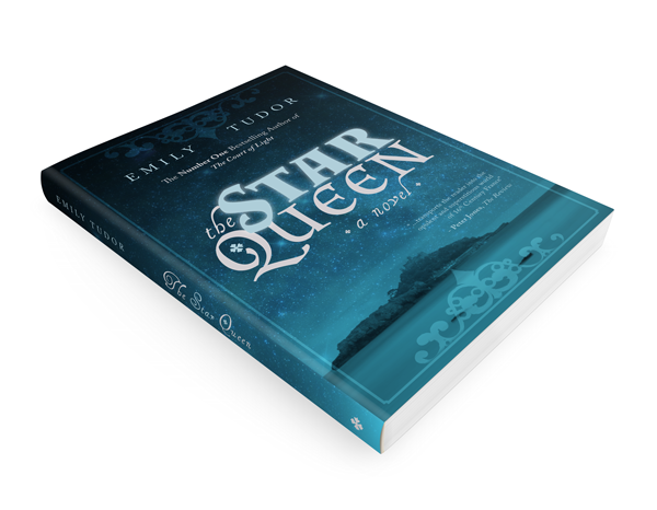


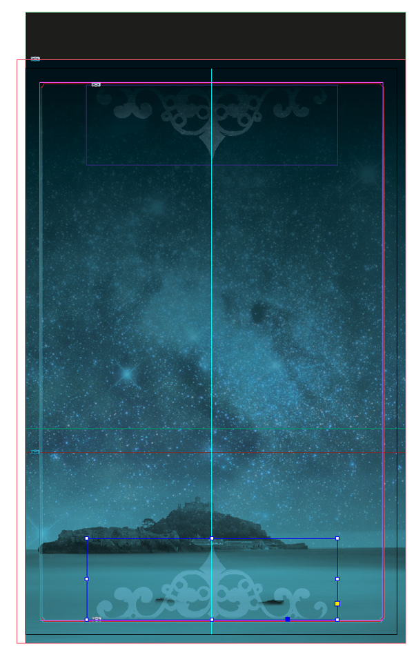


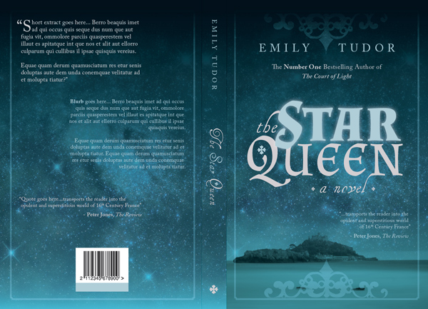


.jpg)


