Quantcast
Channel: Envato Tuts+ Design & Illustration
Viewing all 8958 articles
Browse latest View live

How to Create Flat Weather Icons in Adobe Photoshop

$
0
0
Final product image
What You'll Be Creating

April showers bring May flowers! It is traditionally known that April is quite a rainy period, when the weather changes unexpectedly from the sun shining in a clear sky to raining cats and dogs. However, any weather has its own beauty, so let’s get inspired and prepare for springtime with this fun tutorial! We’ll be working in Adobe Photoshop to create a set of April weather flat icons, using basic shapes and texturing with artistic brushes. 

Adobe Photoshop has plenty of great tools and tricks for creating icons in a fast and convenient way. You can use the following techniques to create not only a weather icon set, but also any other kind of flat icons, like travel or camping icons, nature flat icons and others.

Let's begin!

1. Create a Colorful Rainbow Icon

Step 1

We'll start by making the outer red stripe of our rainbow. Take the Ellipse Tool (U) and make a 450 x 450 px circle. Head to the Properties panel (Window > Properties) and from here we can change the size of the shape, its position colors and other settings.

Set the thickness of the Stroke to 3 pt, Fill color to None, and let’s adjust the Stroke color. Click the Stroke icon to open the options window with color swatches, and either select one of the swatches or click the colorful icon in the top-right corner to open the Solid Color window and select the color more precisely.

make red circle with ellipse tool

Step 2

Let’s add another ring. Select the red circle in the Layers panel and press Control-J to make a copy of the layer. Press Control-T to transform the shape and make a copy a bit smaller, placing it inside the red circle. Switch the Stroke color to orange in the Properties panel.

make orange circle

Step 3

Make another copy (Control-J) to add a third circle of a smaller size, switching the Stroke color to yellow.

make yellow circle

Step 4

Continue adding circles, filling them with rainbow colors. You can add all seven colors or fewer, as we don’t need to make our rainbow super-realistic and detailed, because our icon will be quite small. Even if you add only three or four rings of different colors, it will still resemble a rainbow.

When you’re happy with the result, select all the rings using the Move Tool (V) and unite them into a Group (Control-G).Head to the Layers panel and Duplicate the group by either pressing Control-J or by dragging and dropping it over the Create aNew Layer icon in the bottom of the panel. This way we make a “backup” copy in case we decide to change some details of our rainbow during the work.

Select the first group and go to Layer > Merge Group, uniting all the separate rings into one rasterized layer.

Duplicate the rainbow and merge group

Step 5

Now let’s take the Rectangular Marquee Tool (M), select the bottom half of the rainbow circle and delete it.

delete the bottom of the rainbow

Step 6

Let’s create a couple of puffy clouds at the tips of our rainbow. Take the Ellipse Tool (U) and make a small blue circle at the bottom-left corner of the rainbow. Add a few more circles, varying the size. Group (Control-G) the elements of the cloud and duplicate (Control-J) the cloud. Attach the copy to the opposite side of the rainbow.

make clouds with ellipse tool

Step 7

If you wish to change something, you can always use our “backup” copy and adjust the appearance of the rainbow to your liking. In my case, I’ve decided to reduce the number of stripes, this way making them thicker.

edit the rainbow

Step 8

Now let’s create the base of our icon. Let’s make the icon round by creating a 545 x 545 px circle with the Ellipse Tool (U). Use the Properties panel to set the Fill color to grass-green and the Stroke color to none.

create the circle icon base

Step 9

Let’s add a trendy long shadow effect to our icon. Make a 350 x 350 px green square with the Rectangle Tool (U) and rotate it 45 degrees with the Move Tool (V). Head to the Layers panel and set the Blending Mode to Multiply to make the square darker. If it looks too dark, try lowering the Opacity a bit.

make a long shadow with rectangle tool

Step 10

Adjust the size and the position of the rectangle to make it fit the sides of the rainbow as shown in the screenshot below. Place the rectangle beneath the rainbow either by dragging it down manually in the Layers panel or by pressing Control-[ several times.

make a long shadow 2

Step 11

Now we need to cut off the part of the rectangle outside the circle base of the icon. Select the circle and take the Pen Tool (P), click the circle with the right mouse button, and Make Selection. Leave the Make Selection options in the pop-up window as default and go to Select> Inverse.

Now we can select the shadow layer in the Layers panel and delete the unwanted piece outside the circle.

Step 12

Let's use the Eraser Tool (E) to erase the unneeded pieces of the shadow inside the icon as well.

Make the base of the icon and the shadow a bit lighter, and voila! Our flat rainbow icon is ready! Let’s move to the next one.

flat rainbow icon is ready

2. Create a Spring Sun Icon

Step 1

This time we’ll make a sun icon. Start by making the base of the sun from a 260 x 260 px yellow rectangle.

make a circle sun base with ellipse tool

Step 2

Now let’s add some stylized sunbeams. Switch to the Polygon Tool (U) and set the number of Sides to 3 in the control panel on top. Make an orange triangle and place it on top of the sun. Select both the circle and the triangle and click Align horizontal centers in the upper control panel to make the shapes perfectly centered.

We can also use the Guides to mark the center of the sun. To do this, press Control-R to make the Rulers visible, click on the upper ruler and drag the horizontal Guide down onto the Artboard. Do the same for the vertical guide, making the lines cross.

Now let’s add more beams around the sun. It might seem tricky, but it is the easiest way to create repeating shapes with transformation.

Select our triangle and press Alt-Control-T for Free Transform Path mode. Find the pivot point in the center of the triangle and drag it down, placing it at the center of the yellow sun circle. You will notice that a copy of the triangle layer was created automatically in the Layers panel(this works only when you use the Alt-Control-T keys for transformation). Rotate the triangle 45 degrees by holding Shift, and apply the transformation.

Now press Shift-Control-Alt-T several times to create six more copies around the sun.

Great! The sunbeams are ready.

create triangle sunbeams with transformation

Step 3

We don’t need the Guides any longer, so we can turn them off in View > Clear Guides.

clear the guides

Step 4

Let’s copy the circle base of our first icon and switch its Fill color to sky-blue. Add a semi-transparent long shadow beneath the sun.

create the icon base and long shadow

Step 5

Let’s erase that part of the shadow around the yellow sun circle. For this purpose, take the Elliptical Marquee Tool (M) and make a selection around the yellow circle. Go to Select > Transform Selection and modify the selection to make it fit the space between the yellow circle and the sunbeams.

Apply the transformation and select our shadow layer in the Layers panel.Delete the part of the shadow around the sun.

delete the shadow around the sun

Done! Our sun icon is ready! Let’s move on.

 sun icon is ready

3. Draw a Rainy Cloud Icon

Step 1

Start forming our cloud from a 200 x 200 px blue circle, using the Ellipse Tool (U). Add smaller circles on both sides, making a fluffy cloud.

make a cloud from circles with ellipse tool

Step 2

Select all the circles and go to Layer > Merge Shapes. Head to the Layers panel, click the merged cloud layer with the right mouse button and Rasterize Layer to make it editable.

Now we can use the Rectangular Marquee Tool (M) to select the lower part of the cloud and delete, making the bottom of the cloud flat.

delete the bottom part of the cloud

Step 3

Now let’s shape the raindrops. Use the Ellipse Tool (U) to make a 35 x 35 px blue circle. Take the Convert Point Tool (you can find it in the same drop-down menu as the Pen Tool (P)) and select the top anchor point of the circle. Single-click the anchor point to make a sharp corner. Finally, drag the point up, shaping a raindrop.

make a rain drop with ellipse tool and convert point tool

Step 4

Press Control-J several times to make more copies of the drops and spread them beneath the cloud, depicting the rain.

add more rain drops under the cloud

Step 5

Add a yellow circle base to our icon and form a long shadow. Our rainy cloud icon is done! We’ve got only one icon left!

Add a yellow circle base to our icon and form a long shadow

4. Make an Umbrella Icon

Step 1

Let’s start forming our umbrella from a 430 x 430 px circle of turquoise color. Rasterize the layer in the Layers panel and delete the lower half of the circle, using the Rectangular Marquee Tool (M).

form the arc of the umbrella from the ellipse

Step 2

Use the Ellipse Tool (U) to form a row of circles in the bottom part of the turquoise shape. Adjust the size of the circles group to make them fit the umbrella. Finally, select all the circles and unite them into a single shape in Layer > Merge Shapes.

add a group of circles in the bottom of the arc

Step 3

Switch to the Pen Tool (P) and right-click the circles to Make Selection. Select the turquoise shape layer in the Layers panel and delete the selected area to form the pointed bottom part of the umbrella. 

Now that we don't need the orange circles anymore, we can delete this layer as well.

make selection and delete the circles

Step 4

Let’s create the stick of the umbrella with a wooden crook handle. Take the Rounded Rectangle Tool (U) and make a shape with no Fill and a thick 4 pt orange Stroke, as shown in the image below.

Right-click in the Layers panel and Rasterize Layer to make the handle editable.

add a crook handle with rounded rectangle tool

Step 5

Take the Rectangular Marquee Tool (M) and delete the upper piece of the handle, leaving only the short tips above the turquoise shape. Then select and delete the left half of the shape, forming a crook handle. 

Keeping the handle layer selected, press Shift-Control-[ to place it beneath the turquoise umbrella shape.

add a crook handle 2

Step 6

Finish up with the umbrella icon by making a pink circle base and adding a gentle flat shadow.

Finish up with the umbrella icon

Wonderful! Our flat April weather icon set is ready. 

However, this is not the end of this tutorial. You can stop at this step if you like this clean and minimalistic look of the icons. Otherwise, if you want to make them a bit more detailed and textured, let’s proceed and see how we can adjust the icons, using some of Adobe Photoshop's artistic brushes.

clean flat set of April weather icons is ready

5. Apply Grungy Textures Using Brushes

Step 1

Let’s start with our sun icon. Head to the Layers panel and select the yellow circle base of the sun. Hold Alt and click Create a new layer. In the pop-up window, check the box saying Use Previous Layer to Create Clipping Mask

In this way we bind our new layer to the selected sun layer (you will see a tiny arrow next to the new layer). What it does is allow you to draw only inside the boundaries of the yellow sun.

add a linked layer to the sun base layer

Step 2

Now let’s pick a nice textured brush to create a grungy effect. You can use one of your favorites or some of the default Adobe Photoshop brushes. You can also find plenty of textured artistic brushes on Envato Market and try them out to create a new fancy look.

Take the Brush Tool (B) and right-click to open the list of brushes (or go to Window > Brushes). Click the tiny cog icon in the top-right corner of the pop-up menu and select M Brushes from the list below. Either Append the brushes to your existing list or Replace them.

append textured brushes

Step 3

Find the Dry Brush 1 #2 in the list and select it. If you don’t have such brush set in your version of the program, try opening other default sets, such as Dry Media Brushes or others to find a similar grungy brush.

select a grungy dry brush

Step 4

Select a lighter-yellow color in the Color panel and use our linked layer to draw above the sun, adding a gentle, grungy texture. Use a darker orange color to add a subtle shadow in the bottom part of the sun.

Merge the sunbeams into a single shape and add a linked layer to make them textured as well.

Step 5

Let’s move to the rainbow icon and make it textured as well. Created a few linked layers for the rainbow arc and for each cloud and use the same technique with the artistic brush.

make the rainbow icon textured

Step 6

Continue using the brushes to apply grungy textures to every icon.

make all the icons textured

Step 7

Create a New Layer above the Background layer and draw subtle textured shadows of light-yellow color beneath each icon.

add shadows beneath the icons

Wonderful! Our April Weather Icons Are Ready!

Great job! We’ve learned to draw flat weather icons using basic shapes and applying simple textures, with the help of the default brushes of Adobe Photoshop to make our icons look more detailed and creative.

You can use these techniques to expand our set, creating more icons, or make a new set of a different theme.

Good luck!

april weather flat textured icons in adobe photoshop is ready

Solarized Like Zayn: The Digital Sabattier Effect for Surreal Black and White Portraits

$
0
0
Final product image
What You'll Be Creating

We're big fans of the pictures of Man Ray and Edward Weston, so when we saw the solarization effect that they used so well in turn up in Pillowtalk, the latest music video from Zayn (formerly of One Direction), we decided to try and recreate it digitally.

In this tutorial you'll learn how to do it too. Later this month we'll show you how to recreate some of the other special effects from this trippy ride:

The inspired solarisation effect is at the 12 second mark of this video.

What is Solarisation?

Solarisation is the result of overexposure of a negative while it’s in the camera, and it creates a unique black and white effect. Over the years, solarization has been recreated in a controlled way in the darkroom, which is called the Sabattier technique or Sabattier effect. Rather than the negative being overexposed in camera, a film image is briefly exposed to white light during the development process. Both solarisation and the Sabattier effect result in the distinctive, partial inversion of the image.

The Sabattier effect has been used by fine art and portrait photographers like Man Ray and Edward Weston to create incredibly interesting images. It’s surreal, but at the same time, the subject is still identifiable. It’s particularly effective with portraits, which is what I’ll use as an example in this tutorial. 

But First, the Awesome Power of Curves

The actual process of the Sabattier effect is simple to do digitally, but to do it properly you need to understand how a Curves adjustment works. For most photographers, Curves are just a way of adjusting brightness or contrast; in fact, they’re a lot more powerful than that.

The key to grasping Curves is to understand what the controls represent. The Curves tool is a graph. On the X-axis you have the Input level and on the Y-axis you have the Output level. Each axis has values that range between 0 and 255. There are actually four separate Curves: RGB, Red, Green, and Blue. For this tutorial I’m just going to focus on the RGB curve, but the other three can be tweaked in the same ways for different effects. 

The slope of the line on the graph that you adjust to modify brightness or contrast controls how the Input and Output levels are mapped to each other. When it is at a 45 degree slope (the default) the Input and Output levels are the same: 0 Input maps to 0 Output and 255 Input maps to 255 Output. When you adjust the brightness of the image by raising a point on the Curve, it changes how the Input values are mapped onto the Output values. 

curves example
A simple Curve layer that brightens an image.

In the example above, I’ve added a point at Input 148 and dragged it up to map the Output to 184. This means that any pixels with a luminosity value of 148 before the Curves layer is applied will now have a luminosity value of 184. The surrounding values will similarly be modified so that the Input coordinate of the slope is mapped to the Output coordinate of the slope.

A Sabattier Tone Curve

While most of the time you want to make reasonably subtle adjustments with Curves, to recreate something extreme like the Sabattier effect you need to use a more complex curve. One of the key hallmarks of solarisation is that the brightest highlights stay bright while the darkest shadows also turn bright. This means we’re going to need to use an unconventional curve to get the effect we want. Let’s look at how.

How to Solarise a Portrait

Finish Your Regular Edit

Solarising is a pretty heavy effect. Trying to do regular retouching after you’ve applied it makes life a lot harder. Thus, the first step in applying the Sabattier effect to an image is to finish your regular edit first. 

start image
The image I'm using. Model: Zarima McDermott.

If you want to remove any distractions, dodge and burn your subject, or do anything else, do it now.

Convert the Image to Black and White

While there’s nothing stopping you from leaving the image in colour, it results in a very offbeat and often ugly effect. To recreate the elegance of the Zayn video you need to convert the image you’re using to black and white.

bw image
The image converted to black and white.

There’s no special consideration for how you do it. Lightroom, Photoshop, or whatever you prefer; any conversion that works for the image will do.

Add a Curves Layer

As I mentioned above, the key to the Sabattier effect is a Curves Adjustment layer. Add one now. 

A solarisation Curve is often described as U-shaped but it’s a little more complicated than that and depends on the image. You want to brighten the Shadows, darken the Midtones, and do very little to the Highlights. Just slapping a U-curve over the top and calling it a day won’t give you a very accurate effect. 

Where the Shadows, Midtones and Highlights fall is determined by the image itself. Look at the histogram and work out where they are. In the image I’m using, the Midtones are actually quite dark so the U-shape is skewed towards the left.

solarisation curve
The curve I'm applying.

Start by dragging the black point all the way to the top of the Curve. This maps 0 to 255. Next, click somewhere in the middle of the Curve and drag it down towards 0; this will allow you to see how the effect is being applied.

Tweaking the Midtone point is the most involved step of the process. You need to play around with different positions and numbers of points until you get an effect you like. I ended up using four points to control how the effect was applied to the Midtones.

One thing to avoid is clipping your Curve. If you’re not careful, the Midtone point will map a range of values to 0 which rarely looks good.

Finishing the Image

With the Sabattier effect applied, the image is largely done. The only thing left to do is tidy up any distractions it’s introduced. For example, if you’ve a dust spot on your sensor, the process will often highlight its edges.

final image
The final image.

You can also use another Curves layer to tweak the overall brightness or contrast of the image. 

What Does (and Doesn’t) Work

Solarisation is an interesting effect that works best on certain subjects. Isolated portraits against white backgrounds are one of the most effective subjects. If the background is too busy, the effect can be disorienting rather than elegant.

a bad solarisation
The background makes this image too cluttered. 

Fine art nudes are also a great opportunity to use the Sabattier effect. By keeping the Midtones relatively stable, the skin still maintains a natural appearance. 

art nude solarised
The Sabattier effect really works here. Image: Nude isolated on white. Wisky_Studio/Photo Dune.

With all that said, there’s no firm rules about what subjects won’t work with the Sabattier effect. I’d intended to use the landscape below to demonstrate a subject the Sabattier effect doesn’t typically work for, however, I think the result is really interesting. The effect on the mountains isn’t ideal but the sky and moon look stunning. With some tweaking I think this could be a very strong example.

mountains solarised
This wasn't meant to work!

Wrapping Up

As a photographer, you are looking for inspiration in the world around you and that hopefully includes other peoples' work. If you spot an effect you like, try to break down how you could recreate it. Mimicking the Sabattier effect only requires a single, if complex, Curves layer. Many effects are even simpler to work out! Stay tuned for more.

If there’re any cool effects you’ve seen in pop culture that you’d like me to try and break down, please share them in the comments below. We’d also love to see your own images with the Sabattier effect applied.

How to Use Adobe Fuse

$
0
0
Make Magic with Adobe Fuse

What Is Adobe Fuse?

Adobe Fuse an impressive little program that provides a fun way to develop unique human characters to add to your designs in Photoshop

Fuse is an available app for current members of Adobe Creative Cloud. It is listed as a limited-time "preview" application. The software provides the means to easily create and import actual 3D characters into Photoshop. The characters can then interact with the other 3D elements in Photoshop and have poses or pre-recorded animations applied to them. 

Fuse Splash Screen

The fine folks at Mixamo are responsible for the creation of Fuse, and their other product line hosts several other applications designed for more intensive work in 3D character development. 

An agreement between Mixamo and Adobe is what brought about the inclusion of Fuse in the Creative Cloud lineup. Characters that are created with Fuse can be brought into Photoshop CC, or they can be uploaded to Mixamo's 3D character library.

Fuse is not a robust 3D content creator like Maya or 3D Studio Max. But it doesn't have the learning curve those programs require either. While Fuse is somewhat limited in what it can create, it is a fun application that is highly intuitive, surprisingly powerful, and very easy to use. 

How Does It Work?

The workflow of Fuse is wonderfully straightforward and, even with a wide array of options, the process is never confusing. The interface is neatly laid out so that it is always quite obvious what the current step is doing and where to go next. Let's take a closer look.

1. Assembly

Step 1

The first step upon launching Fuse is to select the head of the character. There's a host of available cranium types to choose from. If you don't see one that perfectly matches your character, just choose the one that fits the closest. Most of the head and facial features are adjustable later on.

Select a head to begin with

Step 2

After you've chosen a head, the program will automatically offer up a library of torsos to mount the head on. Again, seek out a good starting point as the details are fully adjustable later on. 

Choose a torso next

Step 3

The arms and legs are added in the same way. Select one from the library and the program automatically adds the limb to the model and blends the skin and muscles in perfectly. The model is fully 3D, and the toolbar on the left contains tools to move and spin the model so you can examine your creation from any angle.

Add limbs

Step 4

After the model is fully assembled, switch to the Customize tab. The properties panel reveals several folders, one for each body region and several settings for that specific body part. 

While the folders are laid out in a very logical fashion, a faster way to select the exact body part to edit is to use the Select Tool—it's the white arrow in the toolbar on the left. Then click and drag on a body part to adjust the size and/or relative location of that part. The option menus automatically update as a result.

Adjust individual body part details

2. Clothing

Once the character's body is built and adjusted, the next major element is clothing. The wardrobe options are even more varied than the body parts!

Step 1

The outfits tend to revolve around the selection of the top. It's the first element Fuse prompts for a selection. Most of the options tend to be built with either a male or female frame in mind. But there are also a handful of unisex clothes available too. In any case, whichever article of clothing is selected, it automatically sizes itself to fit the frame of your character.

Select a top

Step 2

If you thought putting an outfit together in real life was a challenge, wait until you start trying to pair a set of bottoms and footwear with the top of your character. Fortunately, trying on a pair of skinny jeans just involves the click of a button here! Likewise, all the footwear comes in matching pairs, and you don't ever need to search for that one missing shoe.

Add bottoms and shoes to the outfit

Step 3

There's a good variety of hairstyles to choose form—don't get distracted by the hair color, because that can be changed later on. Be more concerned with the style and length as these are fairly rigid settings.

Select a hair style

Step 4

The Hats accessory is particularly impressive because there's built-in collision detection with the hairstyle. This ensures that there are no locks of hair poking through the surface of the hat. (Plus your digital character will never get hat hair!)

Trying on hats

Expert Tip: There's no obvious interface option to remove a hat once it has been added. To do this, simply select it in the preview window and press the Delete key!

Step 5

The available accessories extend to eyewear, beards, gloves, masks, and moustaches! Obviously you don't need to include all of these with every character, but it's nice to know that the options are there.

Add other accessories

How Much Customization Is There?

At this point, Fuse looks little more than a very sophisticated dress-up program. Some video games even offer this level of control to players to create characters for their game. 

Is this all there is? Certainly not! Fuse has much more to offer. Let's take a look at some of the deeper customization options that are available.

Step 1

One of the most common critiques of CG characters is their lack of facial expressions. To be honest, the resting dead-eyed pose of a new character can be a bit creepy. But once a bit of personality is added to the facial expression, it goes a long way to making the character more likeable. 

When you switch back to the Customize tab, the Face folder contains several sliders to adjust the mood of the character. These adjustments alter certain facial regions to form that expression. They can even be blended together. 

Create a custom facial expression

Step 2

While the expressions sliders are excellent, there might be times that you want finer control over certain features, like mouth position. In that case, there's an Extras folder within the Face folder that contains even more adjustments for finer control.

Step 3

Head over to the Texture tab and then select one of the articles of clothing to behold the plethora of options for customizing the textures! Not only is there a library of different materials and textures available at the bottom of the screen, but each surface has its own set of properties that can be adjusted as well. 

For example, the t-shirt's color can be set to white, but you also have control over the number and frequency of creases, and even the predominant direction of the creases.

Texture customization

Step 4

Select an area of the model where skin is showing to see the dizzying number of attributes available to customize the skin and face. Skin Color is so much more than just a color picker—there are controls for Age, Hue Variation, Beauty Marks and more! Dig further and you will find specific controls for makeup, facial hair, and even the length of eyelashes. 

But it doesn't stop there. If you want to really go deeper, browse through the controls for the eyes. If you so desire, the pupil can be set to Feline shape! Or you can even adjust the size and color of the Veins seen in the whites of the eyes. 

Skin controls

Step 5

The customization options we've gone over so far will probably cover 99% of any custom character needs you might have. But there's one more customization function to take a look at. This one is only for the truly brave and should be used sparingly! 

Fuse actually includes a sculpt-like ability for the base character form. The tool at the bottom of the toolbar is the Modify Geometry Directly tool. This tool allows you to change the actual polygons of the model by pushing and pulling at them with a brush that tracks along the surface. While this option can be helpful, it is difficult to master and can easily ruin a good model.

Modify geometry directly

So, Now What?

At this point you may have spent more time studying the specific attributes of your character's face than you have your own reflection. Your custom character is done! 

So now what? How do we get this character into Photoshop? Well, the standard means of saving the file in Fuse and then importing or opening it in Photoshopwon't work. You have to do something else instead.

Step 1

Hit the big Save to CC Libraries button at the top right of the interface. Fuse prompts for a filename and selection of a folder within your CC Library.

Save the character to Adobe Creative Cloud

Step 2

Launch Photoshop and create a new document. Then open the Libraries panel with Windows > Libraries. Point the library to the folder containing your Fuse character. Right-click on the character and choose Use in Document. Photoshop adds the character to the scene as a 3D element.

Import into Photoshop

Step 3

Switch to the 3D workspace and use the 3D panel to manipulate the 3D properties of the scene. The character is truly a 3D element so you can adjust the camera view, lighting, shadows and even the properties of the materials like Shine, Reflectivity, etc.

Adjust the 3D scene elements

Step 4

In the 3D panel, select the skeleton (it has a small bone icon next to it) and the Properties panel updates with a long list (123 available pages!) of available poses and animations that can be applied to the skeleton. Simply click on one and Photoshop applies it to your character.

Select a pose or animation

Step 5

In order to see the animation, open the Timeline panel through Windows > Timeline. Then press the Play button to see your character come to life!

Use the Timeline to play the animation

Seeing your custom character in action is truly a sight to behold! Welcome to your new digital addiction!

So How Useful Is It?

If you are anything like me, your creative wheels are already spinning with ideas for how to incorporate custom characters into your new designs. And the possibilities really are limited only by your imagination. 

Simply having a 3D character available in Photoshop is a huge resource. The first thing I did was to work one into a photo composite with some fun visual effects. Having the character as a 3D object meant that setting up some interesting lighting was remarkably easy.

visual effects along with the character

But even if you don't care for using a character in a composite, another option is to use them as a visual reference for creating digital characters in interesting positions and poses.

consider making digital comics the easy way

What's Missing?

As impressive as Adobe Fuse is, there are a few features I found myself wishing for. At the time of this article, the application is in its first release, so it's possible that these items have been implemented after the fact. (At least I really hope so!)

  • Custom Poses. This is the biggest drawback of the current software. There is no way to create a custom pose for your character. The choices are restricted to choosing from preset poses or scrubbing through countless character animations in hopes of finding a movement that strikes just the right position. There are creative workarounds to this issue (like compositing various poses together to get the one you want) but that shouldn't be necessary.
  • Custom Decals/Textures. The texture variations are excellent. Yet there's no way to apply a custom file to a texture. Applications for this would be things like adding a graphic to a shirt, or a custom tattoo to the skin of the character. Through certain tricks, these are possible to apply with the 3D tools in Photoshop, but these are options that should be available during the character creation stage.
  • Render Quality. This is a tough one. It is very difficult to get a character out of the uncanny valley and away from that "video game" appearance. The characters created by Fuse don't come close to looking realistic. I admit it is likely impossible to achieve CG character realism in a consumer-grade graphics package. So the offense is forgivable, but that doesn't make it go away.
  • Compatibility With Mixamo Characters. The other option for saving a character is to Save to Mixamo. This uploads the character to the online database of 3D characters available on Mixamo's site. The interesting thing about this workflow is that the characters on Mixamo's site cannot then be downloaded into Fuse. The workflow is only one-way.

Final Verdict?

Adobe Fuse is taking Photoshop into places it has never ventured before. That's a very good thing! While the software has room to grow, there's a lot of very impressive capabilities that should whet the creative appetite of any digital artist. The fact that it is a "preview" feature means that it might go away at any time, so now is the time to grab it while it is still available!

Master the Pen Tool in Your Coffee Break

$
0
0

Struggling with the Pen Tool? Our new Coffee Break Course, How to Use the Pen Tool in Adobe Illustrator, gives detailed video instructions to help you master one of Illustrator's trickiest but most useful tools.

Envato Tuts+ instructor Simona Pfreundner will show you exactly how to get to grips with the Pen Tool, so you can become more confident and hopefully more productive in your design work.

Watch the introduction below to find out more.

You can take our new Coffee Break Course straight away with a free 10-day trial of our monthly subscription. If you decide to continue, it costs just $15 a month, and you’ll get access to hundreds of courses, with new ones added every week.

Still want to go further with Adobe Illustrator? Check out the selection of more than a thousand Illustrator add-ons on Envato Market. You'll discover a ton of creative styles, brushes, actions, and more.

How to Design a Bollywood-Inspired Poster to Celebrate Hindu New Year

$
0
0
Final product image
What You'll Be Creating

Hindus welcome in the new year at the beginning of spring. Although different regions in India celebrate the event on slightly different dates, in 2016 this will fall around 8 April.

To celebrate this exciting event in the Hindu calendar, learn how to design this colorful poster. Inspired by the vibrant style of vintage Bollywood posters, and featuring an Indian classical dancer, it will be perfect for displaying or sharing with friends, family or neighbours on the big day.

You’ll need access to Adobe InDesign, Adobe Photoshop, and Adobe Illustrator for this tutorial.

If you’re looking for the perfect poster for Hindu New Year or another event, make sure to check out the huge range of stylish flyers and posters over on Envato Market.

Ready to get designing? Great! Let’s go...

1. What You’ll Need 

We’ll be creating the poster layout in Adobe InDesign, but we’ll also be doing some image editing in Adobe Photoshop and importing vectorised type from Adobe Illustrator.

You’ll also need to download the following images and font files:

Once you have your images downloaded and your fonts installed, we can get started putting the poster layout together.

2. Set Up the Poster in InDesign

Step 1

Open up Adobe InDesign and go to File > New > Document.

Set the Intent to Print, Pages to 1 and deselect Facing Pages. From the Page Size menu, choose A3.

Set the Margins to 10 mm and add a Bleed of 5 mm on all sides. Click OK.

new document window
new document

Step 2

Expand the Layers panel (Window > Layers) and double-click on the default Layer 1 name to open the Layer Options window. Rename the layer Paper Background and click OK.

new layer

Click on the Create New Layer button at the bottom of the panel. Rename this layer Color.

Create a further three new layers in the following order: Typography Behind, Dancer and Typography in Front.

new layer

Lock all the layers except the bottom layer, Paper Background.

layers panel

3. Build Up Vintage Texture and Color

Step 1

Take the Rectangle Frame Tool (F) and drag onto the page, creating a frame that extends to the edge of the bleed on all sides. 

Go to File > Place and choose your paper texture photo. Click Open. Arrange the image in the frame using the Fill Frame Proportionally button on the top Controls panel. 

paper image

Step 2

Expand the Swatches panel (Window > Color > Swatches) and create a new CMYK Process swatch. Rename it Vintage Cream, and set the levels to C=5 M=7 Y=15 K=0.

vintage cream swatch

Select the Rectangle Tool (M) and drag onto the page to create a shape that’s the same size and in the same position as the one below.

Set the Fill to Cream. Then head up to Object > Effects > Transparency and reduce the Opacity to 90%. 

transparency

Click on Gradient Feather in the left-hand menu, and add a Radial Gradient, dragging the dark stop to the right to make it tighter. Click OK.

gradient feather
gradient effect

Step 3

Return to the Layers panel and lock the Paper Background layer. Unlock the next layer up, Color.

layers panel

Create a new CMYK Process swatch, C=0 M=85 Y=88 K=0, and name it Red

red swatch

Create a second new CMYK Process swatch, C=94 M=97 Y=0 K=0, and name it Blue.

swatch blue

Step 4

Take the Pen Tool (P) and use it to create a rough rectangular shape across the top two-thirds of the page, using the margins as a rough guide for sizing it. Don’t worry about making the line perfectly straight—a bit of an odd angle will add to the vintage effect.

pen tool

Click around until you complete the shape and then set the Fill of your new shape to Red.

red shape

Repeat the process again, creating a smaller rectangle at the bottom of the page, and setting the Fill to your new Blue swatch. Don’t worry about the two shapes overlapping a little. 

blue shape

Then go to Object > Effects > Transparency and set the Mode to Multiply. Click OK.

transparency effect
final shape

4. Create a Vintage Dancer

There are three parts to giving this original photo a distinctively vintage style. First we need to edit the photo in Photoshop to give the photo a newspaper-print texture and cut away the background of the image. Then we’ll add a colored border to the dancer in Illustrator. Finally, we’ll repeat the image in InDesign to give the effect of movement.

Step 1

Save your InDesign document and minimize the window for now. Open up the photo of the classical dancer in Adobe Photoshop.

Duplicate the Background layer, and then place the photo of the paper texture we downloaded earlier between the two background layers.

duplicate layer

Go to Image > Adjustments > Desaturate to remove the color from the image.

destaurate

Step 2

Adjust the Blending Mode of the top layer (the copy of the dancer photo) to Multiply.

blending mode multiply

Go to Image > Adjustments > Brightness/Contrast. Reduce the Brightness to -5 and increase the Contrast to around 55. Click OK.

brightness and contrast

Step 3

Go to Filter > Filter Gallery. Choose Film Grain under the options for Artistic filters, and set the Grain to 8, Highlight to 1 and Intensity to 4. Click OK.

filter gallery

To make your photo look as if it’s been printed on old newspaper, go to Filter > Pixelate > Color Halftone, and set the Radius to 8, and set the Channels roughly to the following values: 108, 162, 90 and 45. Click OK.

color halftone
image so far

Now reduce the Opacity of the top layer to 30%.

opacity reduced

Step 4

Duplicate the bottom background layer and place this pasted colored photo above the paper layer, and below the top layer.

duplicate layer

Desaturate this layer of color (Image > Adjustments > Desaturate).

destaurated image

Then set the Blending Mode of this layer to Multiply.

multiply mode

Save this image as a PSD file, naming it ‘Dancer_with Background’, and create a duplicate of the file so you can work on this further while keeping a copy of the original. Rename this duplicate file ‘Dancer_without Background’

Step 5

Open the ‘Dancer_without Background’ file in a new Photoshop window. Now we’re ready to cut out the background from our photo.

You might find it easier to work with the color Background layer visible, as it’s a bit easier to see the details of the edge of the dancer. Switch off the visibility of the layers above for now.

Take the Lasso Tool (L) and trace roughly around the top half of the dancer’s silhouette until you’ve cordoned off the top half of the photo. 

lasso tool

Click on the Refine Edge button at the top of the workspace. Adjust the settings to make the line tighter to the silhouette. Use the Smart Radius function, and increase the Shift Edge slider if needed. Increase Smooth a little too. When you’re happy, click OK.

refine edge

Delete the selected area from every layer of the Photoshop file.

selected edge

Step 6

Repeat the process, using the Lasso Tool (L) and Refine Edge function, until the whole of the dancer’s silhouette has been cut out, and the excess background deleted on every layer.

refine edge
cut out silhouette

Don’t forget to cut out the area inside her arched leg and arm too!

gap in arm
gap in arm

As a final touch to your photo, add a Levels Adjustment, and increase the level of black in the photo, to make the image appear a little bolder.

levels adjustment

Go to File and Save your PSD image.

Step 7

Leave Photoshop, and open up Adobe Illustrator

Create a new document, then File > Place your ‘Dancer_without Background’ PSD file on the artboard.

Create a new layer and sit this below the photo layer. Fill this layer with a Black rectangle.

Create a second new layer, rename it Border, and sit it above the photo layer. Lock the layers containing the photo and black rectangle below.

Take the Pen Tool (P) and set the Stroke Color to White. Draw roughly around the perimeter of the dancer. You can do this with a mouse, but it might be a little easier to do with a drawing tablet if you have one.

pen tool
pen tool
tracing border
traced border

Step 8

Work your way around the whole silhouette, and remember to trace the inside of the arm and leg separately too.

silhouette traced

Select both this and the outside edge, and Right-Click (Windows) or Control-Click (Mac) > Make Compound Path. Set the shape with a WhiteFill.

compound path
finished border

From the top Controls panel, set the Weight of the Stroke to 3 pt, and then from the Brush Definition section, go to Brush Libraries > Artistic > Calligraphic. Choose Tapered Stroke from the selection.

brush stroke

Switch off the visibility of the bottom, black layer.

Then go to File > Save As and save the image with the white border and photo on top as an Illustrator EPS file, with a transparent background. Name the file ‘Dancer with White Border.eps’.

Step 9

Duplicate the Border layer and switch off the visibility of the original white layer. 

Select the border on the duplicated layer and then add a new CMYK swatch to the selection of colors in the Swatches panel (Window > Swatches). Call it Mustard and set the values to C=2 M=9 Y=83 K=0. Set the Stroke and Fill of the shape to Mustard.

mustard border

Now File > Save As and save the image with the yellow border and photo on top as an Illustrator EPS file, with a transparent background. Name the file ‘Dancer with Yellow Border.eps’.

Step 10

Leave Illustrator and head back to your InDesign document. Lock the Color layer and unlock the Dancer layer above.

Take the Rectangle Frame Tool (F) and drag onto the page to create an image frame. Go to File > Place and choose ‘Dancer with White Border.eps’. Click Open

Scale and position in the frame until the dancer’s arm just touches the left-hand margin, her foot rests on the bottom of the page, and her back foot is just invisible off the right side of the page.

positioned image on poster

Step 11

Edit > Copy, Edit > Paste the image frame, and position slightly to the left of the first image. Relink the image (File > Place) with the ‘Dancer with Yellow Border.eps’ image.

Go to Object > Effects > Transparency and reduce the Opacity to 80%.

transparency effect

Then Right-Click (Windows) or Control-Click (Mac) > Arrange > Send to Back.

send to back

Select both images and Right-Click (Windows) or Control-Click (Mac) > Group.

Step 12

Copy and Paste the grouped pair, and position these again further to the left of the originals. Reduce the transparency Opacity of the pasted group to 60%.

transparency effect

Paste again twice and reposition further to the left to create an overall ‘blurred’ effect. Reduce the Opacity of the final group to 15%, to create a gradual fading effect.

transparency effect
final image effect

5. Time for Type!

Step 1

It’s time to get creative with typography on your poster. If you haven’t already, download and install the following fonts:

Step 2

In your InDesign document, lock the Dancer layer and unlock the Typography Behind layer below.

Go to the Swatches panel and create a new CMYK Process swatch. Name it Mustard and set the values to C=2 M=9 Y=83 K=0

mustard swatch

Step 3

Take the Type Tool (T) and drag onto the top-left of the page to create a new text frame. Type ‘happy’ and set the Font to Ananda Namaste, Size 150 pt, and set the Font Color to Mustard.

mustard text

Select the text frame and go to Object > Effects > Drop Shadow. Next to the Mode option, click on the shadow’s color. Adjust the Color to Swatches and choose Red from the selection. Click OK

red color

Adjust the Distance of the drop shadow to 5 mm, Size to 1 mm and Spread to 100%. Click OK.

This will give the text a letterpress-style, vintage effect.

drop shadow

Step 4

Create a trio of text frames, typing one word into each—’hindu’, ‘new’, and ‘year’

Set the Font to Ananda Namaste, Size 90 pt. Pull out ‘hindu’ in Blue and the remaining words in Vintage Cream.

ananda font

Step 5

Lock the Typography Behind layer and unlock the top layer, Typography in Front.

Create a new text frame, type in ‘2016’ and set the Font to Chivo Bold, Size 140 pt and Tracking 100. Set the Font Color to Vintage Cream. Add a Red drop shadow to the text as we did in Step 3, above.

chivo font

Step 6

To add a final touch to our poster, let’s add in the Hindi equivalent of ‘Happy New Year’. The phrase in Hindi is:

नए साल की शुभकामनाए

If you’re using an English-language version of InDesign, it’s much more straightforward to import the Hindi text as a vector graphic, which you can edit and scale as you would any other vector image.

To do this, open up Microsoft Word (Windows) or Pages (Mac) and Copy and Paste the Hindi text above into a new document. 

Set the Font to MS Windows, or another Hindi-compatible font, and then split the text into three sections, with a paragraph break between each. Enlarge the size of the text so it’s nice and big. 

pages document

Export the document as a PDF file

pdf document

Step 7

Open up the PDF in Adobe Illustrator. Illustrator will read the PDF file as outlines text, creating a vectorised version of the Hindi phrase. 

vector text

Select each line of text separately (this will make them easier to edit in InDesign), and go to Edit > Copy.

selected vector text

Step 8

Return to your InDesign document, and Edit > Paste each line of text onto the poster. Position them on the left side of the poster, against the left edge of the red background shape. 

pasted vector

Set the first two lines of text with a Vintage Cream Fill.

For the larger, bottom line, set the Fill to Mustard, and then go to Object > Effects > Drop Shadow and add a Red drop shadow. Position this lower line along the edge where the blue and red rectangles meet.

drop shadow
final typography

6. Export Your Finished Poster

Great work—your typography is looking awesome, and your Bollywood-inspired poster is finished!

final poster

All that’s left to do now is export your artwork ready for printing or sharing online. 

Go to File > Export, and choose Adobe PDF (Print), in Press Quality, for professional printing. 

press quality

Make sure to include your Bleed when you export too by going to the Marks and Bleeds menu and selecting Use Document Bleed Settings.

marks and bleeds

For a digital-compatible format, go to File > Export and choose Adobe PDF (Interactive) under Format instead.

Happy New Year! 

In this tutorial we’ve looked at a huge range of skills for creating striking vintage-style poster designs. You can recreate that vintage Bollywood look in future projects by using some of these tricks and techniques:

  • Use papery background textures to give the poster an aged, vintage look.
  • Stick with bright, primary colors to recreate a 1960s color palette.
  • Desaturate and age your selected photos in Photoshop.
  • Cut away the background of images and create a white or colored border around the photo to give it a collage-like feel.
  • Repeat photos and use transparency effects to give the graphics a creative, unusual look that wouldn’t have looked out of place in 1960s poster design.
  • Use colored drop shadows to add vintage charm to typography.

Fantastic work! I hope you have fun with giving your posters a cool, vintage look and injecting color and energy into your designs to pay tribute to Bollywood styles.

If you’re still looking for the perfect poster for an upcoming event, make sure to check out the flyer and poster templates available on Envato Market.

exported pdf

International Artist Feature: Indonesia

$
0
0

For this article in the international artist series, we turn to Indonesia, featuring five illustrators and designers who create fantastic work, from illustration to graphic design and more! I asked each artist how their country and culture inspired their work, and they delivered fantastic answers. Enjoy!

Rahadil Hermana

Rahadil is a fantastic illustrator based in Malang, Indonesia, whose work is bold and often aimed at bands and various brands, having been inspired by punk rock and various cultural influences. You can check out his portfolio for more work, or the small selection of his pieces below!

Aku Aku

"I was born and raised in Indonesia, where the diversity of traditions and cultures form a unique characteristic in this country. All sorts of inspiration emerges in my work, apart from the country itself, and become the best aspect at every part of my work.
Aku Aku
Aku Aku

Greatness Asmat - Mbipokumbu

"Bali is one of the most famous islands in Indonesia. Not only does it have great natural scenery, but Bali is also famous for their unique, pure arts. 
Greatness Asmat - Mbipokumbu

Barong Sae

"Starting from their famous mythological characters, Barong, I began working with cultural themes for the first time. Also, with a little influence from all kinds of punk music that I listen to often, I try to create artwork influenced from my culture that's different than usual.
Barong Sae
Barong Sae

Artworks Vol. 01

"Other cultural influences are from Borneo, an island nicknamed the "Black Pearl", and Papua. That's where my interest with this theme is getting bigger. And not just stopping at my country's culture, but a mix of countries such as China, Japan, India, Mexico, and Egypt too."
Artworks Vol 01
Artworks Vol. 01

Lenny Wen

Lenny is an illustrator based in Jakarta, Indonesia, whose work takes on a fun, expressive, painterly style. You can see everything from character design to story illustrations in Lenny's portfolio as well as below in a small selection of work!

Hope

"I grew up and living in Jakarta (Indonesia's capital). This city has remarkable diversity. This diversity is shown a bit in my work. I like to draw characters from variety cultural backgrounds.
Hope
Hope

New Adventure

New Adventure
New Adventure

Character Design

"I also think that an Indonesian sense of humor has also influenced my work. Sometimes I like to put in humor into my sketches or work."
Character Design
Character Design

Cold for the Summer

Cold for the Summer
Cold for the Summer

Junissa Bianda

Junissa is a fantastic artist based in Jakarta, Indonesia. Still a student, Junissa creates beautiful character designs, telling stories of rainy days, ballet, and children. You can check out more of her work in her ever-growing portfolio or in the small selection of pieces below!

Abby and Mr. Sticky

"Indonesia has influenced my work through the stories and characters I pick for my projects. My country has a vast range of folktales and legends that I'd love to introduce to people.
Abby and Mr Sticky
Abby and Mr. Sticky

Rainy Days

"I would say that having that much variety of culture in my country makes it easier to gain more inspiration, as well as it opens up the boundaries.
Rainy Days
Rainy Days

Love at the Circus

"Most of the folktales in Indonesia are meant for children, so as you can see my works are mostly targeted to children as the audience."
love at the circus
love at the circus

Gouache Works

Gouache Works
Gouache Works

Devina Puspitasari

Devina is an illustrator based in Surabaya, Indonesia, whose vibrant work is fun and often filled with humor. From silly vegetables to fantastic children's illustration, you'll find more work in Devina's portfolio as well as a small selection of pieces below!

Baby Milestone Animal Series

"In Indonesia, every place has its own unique culture. I haven't explored it all, but for now, Balinese and Javanese are my favorite (maybe because I live there).
Baby Milestone Animal Series

Family for Dinner

Family for Dinner
Family for Dinner

Mr. Mustache - Indonesian Culture

"I really love Indonesian culture or characters. That's why I want to put it in my illustration with my own style. Indonesian cultures are very rich and I hope my country will be known all over the world over my illustration. I'm still in the process of exploring my country because there are so many cultures in it."
Mr Mustache - Indonesian Culture
Mr. Mustache - Indonesian Culture

Mr. Mustache - Christmas Edition

Mr Mustache - Christmas Edition
Mr. Mustache - Christmas Edition

Kathrin Honesta

Kathrin is a freelance illustrator and graphic designer from Jakarta, Indonesia, whose work is colorful and wonderfully textured. Each piece tells a story, which you can check out below or in full at her portfolio.

Illustrations of 2015

"A culture is a very important essence of a country. It takes centuries to shape it to what it is today. If you ask me about how I'd like my culture and country to influence me, I guess the work is more on my side. I have to be more observant, curious & open-minded to be able to understand more, therefore to be inspired & influenced.
Illustrations of 2015

People of Malaysia

People of Malaysia
People of Malaysia

The Undaunted Dandelion - Personal Branding

"Indonesia has a very rich culture. We have a lot of indigenous tribes and every tribe has their own custom & traditions. Just to name a few, we have Batik culture, Betawi culture, Wayang, and Barong.
The Undaunted Dandelion - Personal Branding

The Moon Girl

"One day, I would love to create a piece of work that relates to Indonesia; a work that Indonesians can have an ownership of. A work that can contribute something to Indonesian culture—even a little bit."
The Moon Girl
The Moon Girl

Many thanks to the artists and designers above who took time to discuss their country and culture's influence on their work. You can follow their portfolios at the following links:

Photoshop in 60 Seconds: How to Use Adjustment Layers

$
0
0
Sweet Family Image
Family

Welcome to our Photoshop in 60 Seconds series, in which you can learn a Photoshop skill, feature, or technique in just a minute!

Adjustment Layers

The hallmark of non-destructive editing, Adjustment Layers really do have all the power of Image Adjustments mixed with the convenience and benefits of Photoshop layers. Want to see how they work? It only takes a minute!

A Bit More Detail

Learn more about Adobe Photoshop on Envato Tuts+:

60 Seconds?!

This is part of a series of quick video tutorials on Envato Tuts+ in which we introduce a range of subjects, all in 60 seconds—just enough to whet your appetite. Let us know in the comments what you thought of this video and what else you’d like to see explained in 60 seconds!

How to Animate a Character Throwing a Ball

$
0
0
Final product image
What You'll Be Creating

In this tutorial I will be showing you how to animate a character throwing a ball! This is a fun thing to animate because it really gets the character moving. As you learn and grow as an animator, it's fun to animate a character interacting with a prop (such as a ball in this case). 

Everyone's animation might be slightly different. Is your character a lefty or a righty? It's your special animation, so make it yours! Let's go!

1. Thumbnail Out the Action

Step 1

When animating an action, I like to sketch my poses down to get it right. Sometimes I'll actually act out the action and sketch it down as I go along. Be careful throwing a ball in the house! You can pantomime the ball-throwing action if necessary without having to break any vases in the process.

Sketch your action out

Step 2

I like to take my thumbnails and line them up and see how my actual thumbnail sketches animate. Looks good, but will definitely need some sweetening. Let's move on to animating our main poses.

Preview thumbnails

2. Let's Animate!

What I love about thumbnails is that they are made to be changed. If you do a set of thumbnails and the animation more or less works, that's great, and you can change details and tweak here and there. 

In this case, I started off with what appeared to be a baseball, but I decide to make the ball bigger. All the animation books have characters throwing baseballs, so let's think outside the (batter's) box and have a big rubber ball. I'm envisioning a big, fun rubber ball such as one you'd see in a school yard. 

Lets have a rubber ball

Step 1

Let's add a floor line so we can keep track of where the feet are so that the character looks grounded.

add floor line

Step 2

I'm animating straight ahead for this one instead of doing four or five poses and in-betweening them as I do in a lot of my tutorials. I am working from my thumbnails, using them as reference but improving as I go along. Let's do drawing 1. We have our character holding the ball. This is our start pose.

Drawing 01

Step 3

Now for drawing 2. Go ahead and act out the motion of throwing a ball. What do you notice? It's barely noticeable, but you'll see in just about every case you lean forward slightly before bringing your arm back to throw the ball. In animation, this is known as an anticipation pose.

Drawing 02

Here's drawing 2 superimposed on drawing 1 so you can see how the character's body shifted forward.

Compare drawing 01 and 02

Step 4

For drawing 3, the arm starts to come back. The character is planning on really lobbing that ball! As the arm goes back, the right foot (the foot closest to the left of the screen) leaves the ground.

Drawing 03

Step 5

Let's start on drawing 4. That arm is going way back—see how the foot goes higher up, left arm coming forward for balance as his right arm brings the ball back.

Drawing 04

Step 6

For drawing 5, I deviated from my thumbnails a little and added a drawing where the arm goes further back. Let's bring that arm way back! Aim for the fences! That leg is way up now!

Drawing 05

See drawing 5 in comparison to drawing 4. Look at how far back the character's arm is!

Compare drawing 04 and 05

Step 7

For drawing 6, let's start to bring that arm and body forward. The head swivels on the neck a little as the body comes forward, and the character's head drags a little. This helps to give the character some flexibility and life. The right leg is coming down now.

Drawing 06

Step 8

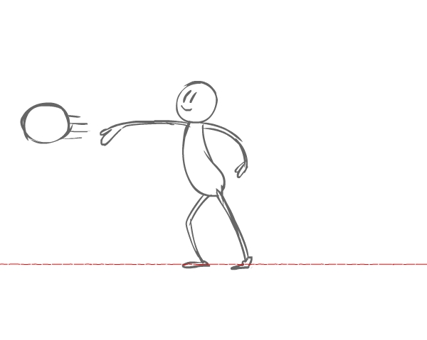
Let's do drawing 7. Here is where the character should let the ball fly. Both feet are planted as the body comes forward.

Drawing 07

Step 9

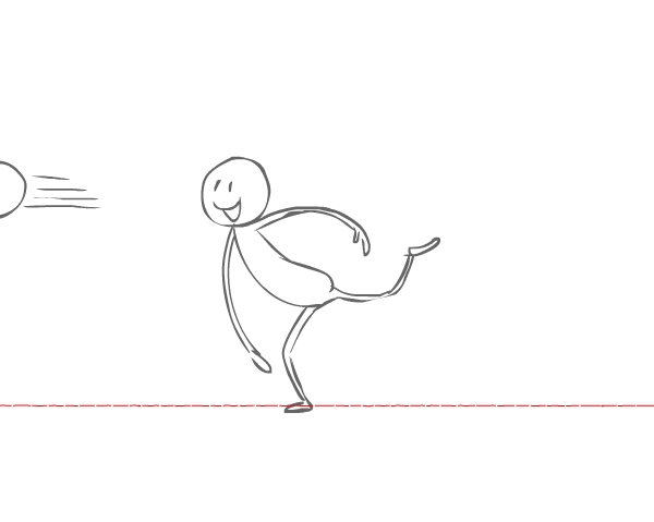
For drawing 8, as the ball flies off the screen, the character's body is carried forward from the momentum of the force of throwing the ball. Now the character's left leg leaves the ground.

Drawing 08

See how far forward the character's body bends from the momentum.

Compare drawing 07 and 08

Step 10

Momentum continues to carry the character's body forward in drawing 9. The character swivels on the leg that is planted on the ground, and the back leg continues to come up.

Drawing 09

Step 11

And now, for drawing 10, let's have the character start to straighten up. The character's left leg goes lower to return to the ground as the body straightens up.

Drawing 10

Step 12

For drawing 11, the character should almost be back to a normal standing pose. The character's left foot is almost back on the ground but not planted yet.

Drawing 11

Step 13

And now we have the final pose, in which the character is back to a normal standing pose. This is our end pose. Good job! Let's see how it looks!

Drawing 12

That looks great! That ball is really being lobbed! Good job!

Preview animation

3. Add Some Color

Step 1

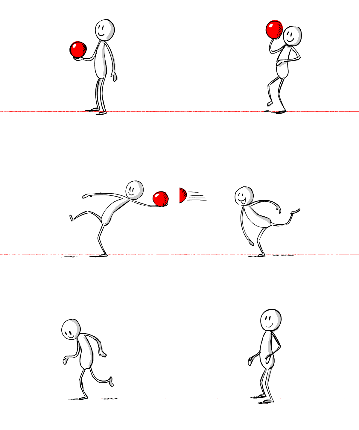
I had so much fun animating this, so I thought the ball deserved to be a big red rubber ball. Let's add some color accents and color the ball! 

Remember, it's your special animation, and you can make the ball any color you want! For this first drawing I colored the ball bright red and gave it a highlight, and I gave the character light grey shadow accents.

Color drawing 01

Step 2

Let's color drawing 2.

Color drawing 02

Step 3

Keep going! Drawing 3 is looking great! That's a nice bright ball!

Color drawing 03

Step 4

Keep going! Color the rest of the drawings! 

Color drawing 04
Color drawing 05
Color drawing 06
Color drawing 07
Color drawing 08
Color drawing 09
Color drawing 10
Color drawing 11
Color drawing 12

Congrats! That Looks Great!

Animation is fun and even interactive if you roll up your sleeves and act it out and sketch it out! It helps you to figure out how an action will work, plus it's fun! 

Whether you're animating a character throwing a ball, jumping over a stream or swinging a bat, the sky's the limit to what you can animate! Keep animating!

Preview finished animation

How to Create a Geometric, Kaleidoscopic Design in Adobe Illustrator

$
0
0
Final product image
What You'll Be Creating

I’ve always been amused by the designs on playing cards. They seem simple at first, but when you look closely you realize the image is a combination of smaller mirrored portions of the design. This mirroring is creating a kaleidoscopic effect, which keeps our eyes and mind busy and entertained. 

In this tutorial, I will show you how to use these simple effects in order to create an impressive multi-functional design.

1. Create a New Print Document

This design can work on any rectangular working area, but let’s try to do it on a traditional landscape-oriented poster template. Set the new document profile to Web and set the Width at 800 px and Height at 1100 px.

Create a new print document

2. Sketch Some Simple Shapes

Try to create some simple geometric shapes. Do them on the side next to the artboard. I did the four playing cards symbols (spade, heart, club, and diamond). I also made a few others such as cloud, raindrop, thunderbolt, ghost, rainbow, etc.

Sketch some simple shapes

3. Trace Your Sketched Shapes

Step 1

We will need to rasterize the sketches. Select the group of sketched objects and go to Object > Rasterize. A dialog box will appear. From the Resolution menu, chooseMedium (150 ppi).

Rasterize

Step 2

Drop the opacity to 40% and lock (Control-2) the traced image. Using the Pen Tool (P), start tracing the shapes you made

Trace the shapes

When using the Pen Tool, try not to add many anchor points. This way your lines will be smooth and you can create shapes with sharp edges, which are great for our task.

Trace the shapes

Step 3

Let’s use some basic tools so we can make some more geometrically accurate shapes.

Using the Ellipse Tool (L), draw two circles over the cloud sketch. Arrange them so that they cover the upper part of the cloud. 

Open the Pathfinder panel (Shift-Control-F9). Select both of the circles and use the Unite command.

Using the Ellipse Tool draw two circles over the cloud sketch

Step 4

After you merge the two circles, draw a rectangle using the Rectangle Tool (M) and place it on the lower half of the merged circles. Select the two shapes and use the Minus Front command from the Pathfinder panel.

draw a Rectangle using the Rectangle Tool

The final shape should look like this.

The final shape should look like this

Step 5

Moving on to the raindrop shape, it can be easily made by combining two different shapes: a rectangle and a circle. Use Pathfinder’s Unite command to merge these two shapes into one raindrop.

Merge these two shapes into one raindrop

Step 6

The same goes for this shape. Combine a circle and, using the Pen Tool, draw a “tail” shape which you can later merge with the circle, using Pathfinder’s Unite command.

Merge these two shapes into one raindrop

Step 7

The next object is a pixelated ghost. Start by drawing a rectangle for the body. Use the Rectangle Tool (M) and add two smaller rectangles for the hands. I did them in red so that readers of this tutorial won’t get confused. Use Pathfinder’s Unite command to merge them into one object.

Use the Rectangle Tool

Step 8

Add two long, portrait positioned rectangles in the lower half of the body. Use Pathfinder’s Minus Front command to cut out their shape of the body. This way, we will get three extensions as legs of the pixel ghost.

Use the Pathfinders Minus Front command

Step 9

Ultimately, draw two squares and position them as the ghost’s eyes.

 Draw two squared rectangles as the ghosts eyes

Our ghost should look like this.

Our ghost should look like this

Step 10

Moving on to the next object: rainbow-like lines.

Using the Ellipse Tool (L), make three concentric circles. Select the Direct Selection Tool (A) and select the bottom half of the three circles. Press Delete.

Using the Ellipse Tool make 3 concentric circles

Step 11

You should get rainbow-like lines. Give them stroke thicknesses of different values, starting from the inner one. Make the next stroke thickness value twice as big as the previous one. So for example, if the inner one's thickness is 5 pt, the middle one should be 10 pt and the outer one 20 pt.

Stroke thickness of different values starting from the inner one

Step 12

Select them all and go to Object > Expand. In theExpand window, check only the Stroke option. After the lines are expanded, swap the fill and the stroke (Shift-X).

Swap the fill and the stroke

Step 13

Let’s do another one. Select the Ellipse Tool (L) and click anywhere on the artboard. In the dialog box, enter 170 px for both Width andHeight values.

Select the Ellipse Tool

Step 14

Select the Direct Selection Tool (A) and select the left half of the circle. Press Delete. You will get a semicircle.

Create a half circle

Step 15

Make the stroke weight 55 pt.

Make the stroke weight 55pt

Step 16

Select the semicircle and go to Object > Expand. In the Expand dialog box, check only theStroke option. Swap the fill for stroke (Shift-X).

Swap the fill for stroke

Step 17

Select the object and go to Object > Path > Offset Path. A dialog box will appear. Make the Offset value -23 px. Leave the other options as they are. A new half circle will appear inside, only a smaller and thinner one. We are done with this one.

Use the Offset path command

Step 18

The rest of the shapes I did are quite simple and they require combining the Rectangle Tool and the Ellipse Tool, and of course, the inevitable use of the Pathfinder command. 

Finish the rest of the shapes

4. Build the Design's Structure

Step 1

Now let’s go back to the artboard. Make sure your Rulers are visible (Control-R) and the guides are also visible (Control-;). Draw a vertical guide in the middle of the artboard, and another horizontal one, also in the middle point of the artboard. They should intersect right at the artboard's middle point. Our working area will be only the upper left quarter.

Draw horizontal and vertical guides

Step 2

Do another sketch which will build the structure of the design. You can make a circle in the middle of the artboard which we will use as a face, and a few curved lines in the upper left quarter.

Do another sketch

We will again need to rasterize the sketches. Select the group of sketched objects and go to Object > Rasterize. From the dialog box, choose Medium Resolution (150 ppi). Drop the Opacity to 40% and Lock (Control-2) the traced image.

Step 3

To get geometrically correct lines, we will use the Rounded Rectangle Tool, which is located in the same spot as the Ellipse and Rectangle Tool. Click on the working area and a dialog box will appear. Enter the following values: Weight: 400 px,Height 550 px, Corner Radius: 84 px.  

Use the Rounded Rectangle Tool

Step 4

Select the Direct Selection Tool (A) and select the top and right part of the rounded rectangle, including the edges (I marked that part in red). Press Delete.

Select the Direct Selection Tool A

Step 5

Position this line over the sketch. Now let's move on with the other similar lines.

Position this line over the sketch

Step 6

Use the same process to create few more curved lines. Position them over the sketch.

Position the lines over the sketch

Step 7

For the final line with a spiral ending, select the Spiral Tool, which you can find next to theLine Segment Tool. Click on the artboard and in the dialog box enter the following values: Radius: 40 px, Decay: 80%, Segments: 10 and choose the second style.

Create a spiral

Step 8

Keep the spiral selected. Find and double-click the Rotate Tool (R). In the dialog box, enter-90o for the angle value. Click OK. The spiral will rotate 90 degrees clockwise.

Rotate the spiral

Step 9

Select the Direct Selection Tool (A) and select the last anchor point on the outside of the spiral and press Delete. This way, we will make the spiral shorter for one segment. Use the Pen Tool (P) to draw a straight vertical line from the end point of the spiral.  

Connect the spiral with a line

Step 10

Place the spiraled line at the top of the sketch. Select all the lines we just created and give them Stroke Weight of 7 px. This way they will look the same and we will achieve a feel of unity.

Place the spiraled line at the top of the sketch

Step 11

For the central face object of the image, we will need a simple circle. Select the Ellipse Tool (L) and click on the artboard. In the dialog box, enter 270 px for both values, Width and Height

Use the Ellipse Tool

Step 12

Using the previously used technique, we will create the eyes and the mouth by cutting circle shapes in half and adjusting their stroke sizes. You can give the eyes a stroke value of 20 pt and the mouth 10 pt.

Once you are done, you can unlock the sketch layer (Alt-Control-2) and delete it.

Add eyes and mouth

5. Arrange the Composition

Step 1

Now, start arranging the shapes in the upper left quarter of the artboard, which we already defined. Try to make a sort of a border by multiplying the objects you are using. 

It’s very important to add some objects over the guidelines, where the guideline will pass exactly over the half of the object and will split it into two equal, symmetrical parts. You can clearly see how I made that with the circles and the Xs over the horizontal guide, or the circles and the diamond shapes over the vertical guideline. These shapes will be very crucial over the next few steps.

Compose the design

Step 2

Keep filling the gaps between the objects. It’s like building a design using toy bricks—I always find this game of juxtaposition fun and challenging.

Keep filling the gaps

Step 3

And finally, if you notice small gaps in the composition, try to fill them with a few more objects.

Keep filling the gaps

6. Add Colors

Step 1

Try to use few colors. If you want to use more colors, I suggest using shades of those few colors. For example, I chose shades of blue and red. I usually make the palette accessible by making little circle shapes colored in my palette of choice. I also label them so I can easily find the one I need. I place them next to the artboard.

Select color palete

Step 2

Start applying the colors. We can start with the dark red and move towards the bright one. Select any object and with theEyedropper Tool (E) click on the circle with dark red color.

Repeat the eyedropper color selection step for all the other shapes, using all the shades of red and blue. Color the eyes and the mouth of the face in the center in white color.

Follow this animated gif

Step 3

The design should look like this. I spotted an empty space below the spade object. So we can add some small objects, let’s say circles, to fill this gap.

Fill the gaps

Add four different colored circles in that area. 

Add four different colored circles

I believe this quarter of the artboard is done. Let’s multiply it on the rest of the artboard.

7. Reflect the Design

Step 1

Select the whole design without the smiley circle in the middle and Group it (Control-G). Copy it (Control-C) and paste it. Then, selected the pasted group and go toObject > Transform > Reflect. In the dialog box, check the Vertical Axis option and click OK.

Multiply the group

Step 2

Place the pasted group in a way where both groups overlap—in this case it's the circle and diamond shapes.

You should get a symmetrical composition, and if we did it right, it should match flawlessly in the middle. You can check that by zooming in on the overlapped groups.

Mind the symmetry

Step 3

Now, copy the two groups we made and paste them. Again, go to Object > Transform > Reflect. In the dialog box, this time check theHorizontal Axis option and click OK. Align the two new groups where the shapes meet and overlap. Try to position them as accurately as possible, to get this awesome kaleidoscope effect.

Multiply the two goups

Step 4

Just to shake things up, we can replace the corner spade shapes with the rest of the playing card signs—heart, club and diamond. This will break the perfect symmetry, but it won’t disturb the balance in the design.

Add few new shapes

Step 5

I suggest that all designs or illustrations should have some space around them, to give them some breathing space. To do this, simply select the whole design and double-click the Scale Tool (S), and in the dialog box check theUniform option and enter 90 as its value. Also make sure that the Scale Strokes and Effects option is checked. Click OK. You can see the notable difference with the free space around the whole design.

Scale the design down for 10

Step 6

Finally, as a last touch, we can add a dark background. We used quite bright colors, so they will even look better with a dark background. 

Select the Rectangle Tool (M) and click anywhere on the working area. In the dialog box, enter the same Width and Height values as our artboard has: 800 px for Width and 1100 for Height. Click OK.

Create a background

Step 7

Select the new rectangle and choose black as its fill color. Right-click on it and selectArrange > Send to Back. 

Awesome Work, You're Now Done!

We are done! It might be confusing at first, but we simply worked hard on only one quarter of the design, and then we easily mirrored it three times. This way you can create fun designs for posters, greeting cards, invitations, gift wrap, and more. 

You might want to use a product template if you want to make a preview of your poster. I am sure you will find many fun purposes for this tutorial.

End result

How to Create a Fiery, Molten Text Effect in Adobe Photoshop

$
0
0
Final product image
What You'll Be Creating

This tutorial will show you a very quick and easy way of creating a bright, vivid, fiery text effect using a couple of layer styles and a texture. 

This text effect was inspired by the many Layer Styles available on Envato Market.

Let's get started!

Tutorial Assets

The following assets were used during the production of this tutorial:

1. Create the Background Gradient

Step 1

Create a new 980 x 980px document and duplicate the Background layer.

Duplicate the Background Layer

Step 2

Double-click the Background copy layer to apply a Gradient Overlay effect using the following settings:

  • Check the Dither box.
  • Style: Radial.
  • Click the Gradient box to create the gradient fill using the colors #3b1a0b to the left and #170b03 to the right.
Gradient Overlay

This will create the gradient background.

Gradient Background

2. Create the Text Layers

Step 1

Create the text in All Caps using the font Chivo Black. The Size is 200 pt, the Tracking value is 25, and the Color is #cb2141.

Create the Text

Step 2

Duplicate the text layer and change the copy's Fill value to 0.

Duplicate the Text Layer

3. Style the Original Text Layer

Double-click the original text layer to apply the following layer style:

Step 1

Add a Bevel and Emboss with these settings:

  • Size: 13
  • Uncheck the Use Global Light box
  • Angle: 162
  • Altitude: 42
  • Gloss Contour: Cove - Deep
  • Check the Anti-aliased box
  • Highlight Mode: Vivid Light
  • Color: #c0bcac
  • Shadow Mode - Color: #474747
Bevel and Emboss

Step 2

Add a Contour with these settings:

  • Contour: Half Round
  • Check the Anti-aliased box.
Contour

Step 3

Add a Texture with these settings:

  • Pattern: Darth Stripe
Texture

Step 4

Add an Inner Shadow with these settings:

  • Blend Mode: Linear Burn
  • Color: #745a32
  • Distance: 0
  • Size: 10
Inner Shadow

Step 5

Add an Inner Glow with these settings:

  • Blend Mode: Normal
  • Opacity: 100%
  • Color: Choose the gradient fill below
  • Technique: Precise
  • Source: Center
  • Size: 250
Inner Glow

Step 6

Add a Satin effect with these settings:

  • Blend Mode: Vivid Light
  • Color: #fffdf7
  • Opacity: 75%
  • Angle: 7
  • Distance: 29
  • Size: 35
  • Contour: Cone
  • Check the Anti-aliased box
Satin

Step 7

Add an Outer Glow with these settings:

  • Color: #b73f1b
  • Size: 7
Outer Glow

Step 8

Add a Drop Shadow with these settings:

  • Color: #292525
  • Opacity: 100%
  • Distance: 7
  • Size: 10
Drop Shadow

This will style the original text layer.

Styled Text Layer 1

4. Style the Copy Text Layer

Double-click the copy text layer to apply the following layer style:

Step 1

Add a Bevel and Emboss with these settings:

  • Size: 20
  • Uncheck the Use Global Light box
  • Angle: 150
  • Altitude: 35
  • Gloss Contour: Cone - Inverted
  • Check the Anti-aliased box
  • Highlight Mode: Linear Dodge (Add)
  • Color: #c0bcac
  • Opacity: 60%
  • Shadow Mode: Linear Light
  • Color: #b09b86
  • Opacity: 75%
Bevel and Emboss

Step 2

Add a Contour with these settings:

  • Contour: Cone
  • Check the Anti-aliased box
  • Range: 100%
Contour

Step 3

Add a Texture with these settings:

  • Pattern: Brushed Alum Dark
Texture

This will style the copy text layer.

Styled Text Layer 2

5. Add the Bokeh Background

Step 1

Place the Shining Bright Bokeh image below both text layers, resize it as needed, and change its layer's Blend Mode to Color Dodge.

Add the Background Texture

Step 2

Depending on your text and the size of the bokeh texture you like, you might have some empty areas left.

So Command-click the bokeh texture layer's thumbnail to create a selection, and then go to Edit > Copy Merged.

After that, go to File > New to create a new document with the copied part's dimensions, and go to Edit > Paste to get the final image.

Copy and Paste the Final Result

Congratulations! You're Done

In this tutorial, we created a simple gradient background, then styled two text layers with different layer effects, and finally used a bokeh texture to create a quick and easy glowing, fiery text effect.

Please feel free to leave your comments, suggestions, and outcomes below.

Final Result

Illustrator in 60 Seconds: How to Use the Stroke Panel

$
0
0

Welcome to our Illustrator in 60 Seconds series, in which you can learn an Illustrator skill, feature, or technique in just a minute!

The Stroke Panel

Strokes can easily increase the value of your compositions when used properly.

The problem is that usually people that are just starting to use Illustrator can have a hard time grasping the Stroke panel and all its different options.

If that's the case, buckle in since in the following 60-second video I'll show you all that you need to know in order to master your Strokes.

A Bit More Detail

Learn more about Adobe Illustrator on Envato Tuts+:

60 Seconds?!

This is part of a series of quick video tutorials on Envato Tuts+ in which we introduce a range of subjects, all in 60 seconds—just enough to whet your appetite. Let us know in the comments what you thought of this video and what else you'd like to see explained in 60 seconds!

New Course: How to Create Monster Art in Adobe Photoshop

$
0
0
Final product image
What You'll Be Creating

Do you want to improve your digital painting techniques, while creating a painting of a scarily believable monster? In our new course, How to Create Monster Art in Adobe Photoshop, you will do just that. 

What You’ll Learn

Digital artist Robert Marzullo will explain the proper use of photo reference to give your illustrations a dynamic and appealing look. You will learn ways to build up your painting and edit it with a non-destructive approach.

The course will cover lots of the powerful tools in Photoshop that allow you to manipulate your work to create a variety of effects. By the end of this course you will have a much greater knowledge of Photoshop’s many features for creating dynamic digital monster art.

Watch the Introduction

Start Learning With a Free Trial

You can take our new course straight away with a free 10-day trial of our monthly subscription. If you decide to continue, it costs just $15 a month, and you’ll get access to hundreds of courses, with new ones added every week.

And if you need more inspiration, check out the huge collection of monster art on Envato Market.

How to Create a Fabulous Mirror-Ball-Inspired Text Effect in Adobe Photoshop

$
0
0
Final product image
What You'll Be Creating

This tutorial will show you how to create a simple bump texture, and use Photoshop's 3D tools and settings, with a couple of textures and adjustment layers, to create a mirror-ball-inspired text effect. 

This tutorial was inspired by the many Layer Styles available on Envato Market.

Let's get started!

Tutorial Assets

The following assets were used during the production of this tutorial:

1. Create the Bump Pattern

Step 1

Create a new 35 x 35px, white background document.

Pick the Rectangular Marquee Tool, and click the Add to selection icon in the Options bar.

What you need to do next is create a 1 px wide selection at the document's edges. You can zoom in to make things easier.

Create a Frame Selection

Step 2

Fill the selection with the color #020202, and press Command-D to deselect.

Fill and Deselect

Step 3

Next, you'll need to repeat that process to create three more selections going inwards, and fill them with the colors #373737, #bababa, and #f7f7f7, to get the result below.

Create the Inner Selections

Step 4

Once you're done, go to Edit > Define Pattern, type in Bump, and click OK.

Define Pattern

Step 5

Create a new 980 x 980px document, pick the Paint Bucket Tool, choose the Pattern fill in the Options bar, pick the Bump pattern, and fill the document with it.

Save the document under the name Bump Texture, and close it.

Create the Bump Texture

2. Create the Background

Step 1

Create a new 1000 x 1000 px document, and duplicate the Background layer.

Create the Document

Step 2

Double-click the Background copy layer to apply a Gradient Overlay effect with the default settings.

Use the colors #03010c to the left and #240333 to the right to create the gradient fill.

Gradient Overlay

This will apply a simple linear gradient to the background.

Background Gradient

3. Create the Text Shape

Step 1

Create the text using the font Doughnut Monster G. The Color is #ececec, and the Size is 150 pt.

Create the Text

Step 2

Go to Type > Convert to Shape.

Convert to Shape

4. Create the 3D Layer

Step 1

Go to 3D > New 3D Extrusion from Selected Path.

Convert to a 3D Layer

Step 2

To access the 3D mesh settings and properties, you’ll need to open two panels: The 3D panel, and the Properties panel (both found under the Window menu).

The 3D panel has all the components of the 3D scene, and when you click the name of any of those, you’ll be able to access its settings in the Properties panel. So make sure to always select the tab of the element you want to modify in the 3D panel before you change its settings in the Properties panel.

The 3D Panels

Step 3

If you select the Move Tool, you’ll find a set of 3D Modes for it to the right of the Options bar.

When you choose one of those, you can then click and drag to perform changes (on the selected element in the 3D panel).

Use those modes to change the Current View into an angle you like.

Move Tool Modes

5. Edit the Mesh and Cap Settings

Step 1

Select the 3D mesh tab in the 3D panel, and then, in the Properties panel, change the Texture Mapping to Tile, and the Extrusion Depth to 50.

Mesh Settings

Step 2

Click the Cap icon at the top of the Properties panel, and then change the Bevel Width to 2%, the Contour to Half Round, and the Inflate Strength to 10%.

Cap Settings

6. Modify the Material Settings

Step 1

Select all the material tabs in the 3D panel, and change their values in the Properties panel as follows:

  • Specular: 135, 135, 135
  • Shine: 100
  • Reflection: 100
  • Roughness: 10
  • Bump: 20
  • Refraction: 1.3
Material Settings

Step 2

Select the Front Inflation Material tab, and then click the Bump folder icon and choose Load Texture, and load the Bump Texture you created in Step 1.

Load the Bump Texture

Step 3

Click the Bump texture icon and choose Edit UV Properties.

Edit UV Properties

Step 4

Adjust the Tile values so that the texture looks perfectly scaled on the text.

Tile Settings

You should get something similar to this.

Edited Bump Texture

Step 5

Select the rest of the material tabs, click the Bump folder icon, and choose the Bump Texture from the list.

Apply the Bump Texture to the Rest of the Materials

Step 6

You might need to adjust the UV Properties for the Extrusion Material after applying the texture.

Extrusion UV Properties

7. Modify the Lighting

Step 1

Select the Infinite Light 1 tab, and change the Intensity to 20% and the Shadow Softness to 30%.

Infinite Light Settings

Step 2

Select the Environment tab, click the IBL texture icon, and choose Replace Texture.

Environment IBL Texture

Step 3

Load the Cheering crowd at concert image, and change the Intensity to 30%.

Environment Light Settings

Step 4

You can use the Move Tool to move the Environment light's texture around until you get a result you like.

Move the Environment Light Texture

8. Add the Background

Step 1

Place the 10637-NMQKXB.jpg image in the abstract disco lights background Free Vector folder on top of the Background copy layer, and resize it as you like to fit within the document.

Change the layer's Blend Mode to Linear Dodge (Add) and its Opacity to 50%.

Add the Background Texture

Step 2

Go to Filter > Blur > Gaussian Blur, and change the Radius to 2.7.

Gaussian Blur

9. Render the Scene

Step 1

Go to 3D > Render to render the scene. The rendering might take a while, but you can stop it any time by pressing the Esc key.

Render the Scene

Step 2

Click the Create new fill or adjustment layer icon at the bottom of the Layers panel and choose Levels.

Levels Adjustment Layer

Step 3

Click the Clip to layer icon, and change the Shadows value to 45 and the Highlights value to 225.

You can use any other values you think look best for your result.

Levels Values

10. Add the Flares

Step 1

Pick the Brush Tool, choose one of the Stars and Flares Brush Set brush tips, change its Size to something around 100 px, and then open the Brush panel (Window > Brush).

Under the Shape Dynamics tab, change the Size Jitter to 50%, and the Angle Jitter to 100%.

This will help you get different sizes and angles for the flares each time you click to add one.

Brush Tip Settings

Step 2

Create a new layer on top of all layers, call it Flares, and change its Blend Mode to Vivid light.

Change the Foreground Color to #eaeaea, and start clicking on top of the bright areas of the text to add the flares.

Add the Flares

11. Adjust the Lighting and Crop the Final Result

Step 1

Click the Create new fill or adjustment layer icon and choose Gradient Map.

Gradient Map Adjustment Layer

Step 2

Choose the gradient fill below, check the Dither box, and change the layer's Blend Mode to Color and its Opacity to 5%.

The difference this makes is very subtle, but you can change the gradient fill and/or the Opacity value to get different outcomes.

Gradient Map Settings

Step 3

Finally, save the final result as an image, and then open the image and use the Crop Tool to crop it to the size you like.

Crop the Final Image

Congratulations! You're Done

In this tutorial, we created a simple squares pattern and used it in a texture. Then we created the text and converted it into a 3D layer.

After that, we modified the 3D mesh, material, and lighting settings, added the background, and rendered the scene. Finally, we added the flares and a couple of adjustment layers to finish off the final result.

Please feel free to leave your comments, suggestions, and outcomes below.

Final Result

10 Top Tips for Designing Awesome Packaging and Labels

$
0
0
Final product image
What You'll Be Creating

Designing packaging can seem daunting at first glance, but it needn’t be—some of the most effective designs are based on surprisingly simple templates.

Whether you’re looking for tips for creating cosmetics packaging, food cartons, bottle labels or origami-inspired boxes, you’ll be sure to find something here to inspire you.

Packaging takes 2D designs and transforms them into printed, tactile 3D creations—it’s an incredibly effective way of bringing a strong branded look to a product, or helping the consumer to commit to purchasing. In this article we’ll take a look at ten pro tips for giving your packaging a stylish, eye-catching look, as well as technical tips for choosing templates, software and print finishes.

Looking for the perfect packaging template? Take the time to browse the huge range of creative templates over on Envato Market.

1. Origami Styles Aren’t Only for the Brave

Sometimes you encounter packaging that’s so pretty it simply takes your breath away. Folded, origami-inspired designs look incredible and transform packaging into a work of art. 

Many origami-inspired designs are surprisingly simple at their core, and are based on thoughtfully laid-out templates. With so many creative packaging templates at your fingertips through sites like Envato Market, these complex-looking designs are no longer out of reach.

bath salts packaging
Bath Salts Packaging Template

The quirky packaging for these bath salts is tactile, portable and looks fantastic embellished with slices of citrus fruit. 

bath salts packaging
Bath Salts Packaging Template

If you’re brave enough to try creating your own origami designs from scratch, try experimenting with rough mock-ups on low-grade paper before you commit to the computer—it will help you to visualise how a 2D layout will translate to a 3D product.

bath salts packaging
Bath Salts Packaging Template

Origami styles are not always the most practical or stackable of packaging designs, so they tend to suit display packaging best.

2. Simplify Packaging With Easy-Peasy Labels

At one end of the packaging spectrum is origami-style beauties, and at the other the refreshing simplicity of an easy-to-produce label. 

soap wrap label
Soap Wrap Label Template

Labels can be attached to bottles, or wrapped loosely around tissue-wrapped items. They’re super-simple to design (no tricky folds to accommodate) and cheap to print, which is great if you’re on a tight budget.

This isn’t to say that labels lack impact—a well-designed label can bring a lovely hand-done look to packaging, as with these rustic soap wrap labels

soap wrap label
Soap Wrap Label Template

Labels are the perfect choice for independent shops and other small businesses looking to produce branded packaging quickly and cheaply, and they really can add to the charm of the product. Labels and simple stickers are also really practical—they’re easy to edit and can be resized quickly to suit various products. 

soap wrap label
Soap Wrap Label Template

3. Let Your Typography Sell the Product

Typography is such a transformative element in graphic design—choose a classic serif and create an aspirational product, or go for a pared-back sans serif instead and you’re pitching a product that’s suddenly cool and trendy.

Packaging for wine and beer bottles provide some great examples of the power of typography to sell a product to a particular market. 

champagne label
Champagne Label Template

You’ll notice that most champagne labels use traditional serif typefaces or heavily-tracked headers which communicate luxury and high-end quality. 

champagne label
Champagne Label Template

A lot of beer bottles feature informal sans serif or grunge typefaces, to emphasise the laid-back, relaxing nature of their products. Wine bottles can vary—an expensive wine might feature a classic serif to help justify the price tag, or a new wine on the block might use a modern slab type, as on this modern label template, to appeal to younger, fashion-conscious consumers.

vino label
Wine Label Template

When you design your packaging, try experimenting with a number of different type styles in your initial designs. Show the different designs to a market sample or friends/family—which type styles appealed to particular demographics? Does age, disposable income or lifestyle choice sway particular groups towards one typeface or another? 

Once you’ve done your experiment, you’ll feel better prepared to use the type style that appeals best to your target market.

4. Use a Natural Color Palette

The days of bold, brash packaging have come to an end. To be relevant in the modern market, you need to tone it down. 

natural soap packaging
Natural Soap Packaging Template

Nature-inspired, tonal colors have a calming effect, and tap into the general trend for commercial products that are more eco- and ethic-conscious. 

Try using tints of brighter colors to give a wash effect to packaging, or team colored elements with natural brown paper or card, as in this packaging design for natural soaps.

natural soap packaging
Natural Soap Packaging Template

Even if your products aren’t 100% organic or don’t come fresh from the farmer’s market, you can still give a touch of wholesomeness to your packaging with a pared-back color palette.

natural soap packaging
Natural Soap Packaging Template

5. Combine Photography With Minimal Styles

Packaging trends come and go, and one thing that is always in flux is the sort of graphics that feel appropriate. At the moment, illustrated graphics or simple typographic designs seem to be the most popular graphic media. 

Photography may not be commonplace on packaging at the moment, but that’s not to say that it can’t look stylish and relevant if designed in the right way. 

box packaging
Box Packaging Template

To keep photography on packaging looking slick and modern, stick to striking, graphic images, and consider using black-and-white photography. Teamed with colorful typography, this can look really eye-catching and on-trend.

Or take inspiration from these minimal templates for cosmetic products and team color photography with simple, sans serif type in a matching color. 

tube packaging
Tube Packaging Template

Adding solid-color graphics set behind the white text keeps the design looking ultra-modern and app-like.

tube packaging
Tube Packaging Template

6. Go Arty!

Sure, a label might be small, but that doesn’t mean it can’t pack a punch. Labels are the perfect place to get really creative, and they're the stuff of dreams of many a graphic designer.

Many brands are exploring ways to make their products look unique, and some produce special-edition products to increase desirability amongst their loyal customers.

vino labels
Wine Label Template

As a result, collaborations with artists are becoming more common in the packaging design world. Particularly for wine bottles, cosmetics and clothing, labels with an artistic touch help to define products as unique, aspirational and special.

vinho labels
Wine Label Template

If you don’t have Damien Hirst on speed-dial, you’ll have to put on your artistic hat. Painterly finishes, unusual type styles, and hand-drawn illustrations look incredible on packaging and will help your design to stand out from the crowd. 

vinho labels
Wine Label Template

If you’re not a deft hand with a paintbrush, don’t fret—digital and vector art is equally desirable on modern packaging right now.

vino labels
Wine Label Template

7. Go Masculine With Black and White...

Although it’s true that more retailers are pitching their products at a unisex market, there’s still a clear visual divide in products that are aimed at specifically men or women. 

For products aimed at men, such as shaving products and men’s toiletries, there’s still a strict design code as to what sort of colors and type styles will convert to sales.

Though I wouldn’t condone the traditional blue for boys, pink for girls (that’s just lazy), you can add a masculine or unisex touch to your packaging designs with a strong, graphic black and white color combination. This modern packaging template does just that, and is visually very strong while communicating a masculine vibe. 

masculine packaging
Masculine Packaging Template

Team your black-and-white designs with square sans-serif type for a modern take on traditional masculine packaging styles.

masculine packaging
Masculine Packaging Template

8. ...or Add a Feminine Touch With Pattern

A ‘feminine’ design doesn’t mean your product will only appeal to women—in fact, adding a feminine element to your packaging only means that you will bring particular qualities to the design, which often have broad market appeal, including elegance and beauty.

Adding a patterned design to your packaging is a fantastic way to bring a beautiful quality to your designs. Mid-century wallpaper-style designs add retro appeal to all sorts of products, or why not try an ornate, William Morris-inspired pattern, as in the packaging template below?

soap packaging
Soap Packaging Template

Patterned packaging is not only beautiful, but also a great way to create a uniform series of packaging designs. 

soap packaging pattern
Soap Packaging Template

These soaps may have different scents, but they are brought together into the same category or brand by simply switching up the color of the pattern, not by changing the design of the pattern itself. 

soap packaging
Soap Packaging Template

Pattern is also surprisingly simple to design, thanks to its repetitive elements. Work on creating a single ‘unit’ of pattern, and then copy this repeatedly to create a whole sheet of pattern that can be pasted onto a packaging template easily.

9. Think About the Full Packaging Range

Your packaging designs don’t stop at just the box. Once a product is opened, you should consider how the style of the packaging can be extended to internal wrapping, labels, and sub-containers. 

Designing a box for a clothes retailer? Once the customer opens up that box, how will the clothing inside be presented? Can you create a branded sticker to place on colored tissue paper? Can you design a stylish clothes tag to place on the garment inside?

This complete packaging range for tea bags is a great example of how to adapt packaging design to a range of purposes—a unified style, using colors, pattern and a strong logo, is extended across the main box to the tea bag packaging and label inside. 

retro tea template
Retro Tea Packaging Template

Keep in mind that packaging is not only for display purposes—to encourage a customer to repurchase, the whole experience of opening and engaging with the product needs to be as pleasurable as possible. A full range of packaging designs will help you to achieve this.

retro tea template
Retro Tea Packaging Template

10. Turn Your Packaging Into a Walking Ad

Think about where you see packaging—on display in shop windows or on supermarket shelves are the obvious places. But you can think about extending your packaging ambitions even further and turn your designs into a mobile advertisement for the product or company.

Creating branded shopping bags is a great way of extending your advertising past the single customer interaction and bringing your brand to a much wider audience.

social media bag
Social Media Shopping Bag Template

If your business is setting up shop at a conference or expo, this is a particularly effective way of advertising your stall around the convention hall. These modern branded bags are eye-catching and stylish, and certain to be both practical and a visual talking point for stall visitors. 

social media bag
Social Media Shopping Bag Template

If your budget won’t stretch to custom printed bags, why not design a simple sticker or stamp in the brand’s style that can be applied to a plain paper bag or canvas tote? 

You’re Ready to Start Designing Awesome Packaging!

In this article, we’ve looked at ten tips for designing amazing packaging and labels. The next time you’re looking to tackle a packaging project, keep these ten useful tips in mind:

  1. Origami-style packaging doesn’t have to be complicated—with the help of templates and mock-ups, it’s surprisingly simple to create folded designs that look striking and decorative.
  2. Try out labels for a simple yet effective packaging design—wrapped around, tied to or stuck to boxes and bottles, labels can give a lovely hand-done look to your product.
  3. Let typography sell the product—switch up the style of your typefaces to transform the personality of your packaging and pitch it at particular consumers.
  4. Use a natural color palette—stay on trend with subtle tints and washed-out tones.
  5. Team photography with minimal design styles—keep photos looking modern and relevant by pairing them with ultra-modern sans serif type styles and tech-inspired graphics and colors.
  6. Go arty! Bring an artistic, unique touch to labels with hand-drawn or vectorized illustrations and logos.
  7. Add a masculine edge to packaging with a strong black-and-white color combination...
  8. ...or bring feminine flair with pattern, for a look that’s elegant and beautiful.
  9. Think about the full packaging range—extend your designs to stickers, labels and internal packaging for a truly immersive consumer experience.
  10. Turn your packaging into a walking ad­—design custom shopping bags or add logos to totes for an easy way to advertise your business’s presence on the high street or at a convention.

Have any more top tips for designing your own packaging? We’d love to hear about them in the comments below.

If you’re still on the hunt for that elusive perfect label or box template, you’re in luck! You can find a whole range of great-value packaging templates on Envato Market.

How to Create a Set of Apple Product Icons Using Adobe Illustrator

$
0
0
Final product image
What You'll Be Creating

It’s been a long time since we last did a quick tip on icons, so I thought that it would be nice to make one about some Apple products, and see how easy it is to create them using Adobe Illustrator.

We’ll be creating four different products: an iPod, an iMac, a Mighty Mouse and a Wacom Tablet, which isn’t actually made by Apple but it is part of their Photography & Creativity line of accessories.

You can always expand the pack by adding your own icons, for which you can find inspiration by taking a look at Envato Market, where you can find tons of good icon packs with great themes.

1. Adjust Illustrator’s Settings

As always, start out by tweaking and adjusting some of Illustrator’s settings, in order to make sure that you have a strong foundation to work with. Usually the things that I tinker with are the Grid and the Units.

Now, I won’t go into detail since we already have two articles that talk about these settings, so what I am going to do is show you the values that I usually go with.

Step 1 

First, make sure you have Illustrator open, and then go to Edit > Preferences > Guides & Grid and set the Gridline every option to 1 px and the Subdivisions to 1.

adjusting the grid settings

Quick tip: You can read more about the reason behind these settings by checking out one of my previous tutorials that thoroughly talks about Illustrator’s Grid System, which I promise will make things a lot clearer.

Step 2

Once you’ve adjusted the Grid, we can then move on to the Units tab, and set your General and Stroke Units to Pixels since we’re aiming to create a batch of pixel perfect icons.

adjusting the units settings

Quick tip: You can learn more about the process by reading my piece on how to adjust Illustrator for a pixel-perfect workflow.

2. Set Up a New Document

Assuming we’ve managed to fine-tune Illustrator to our liking, we can start working on our little project, and we will do so by setting up a new document.

Go to File > New or use the Control-N keyboard shortcut, and create a new project with the following settings:

  • Number of Artboards: 1
  • Width: 800 px
  • Height: 600 px
  • Units: Pixels 

And from the Advanced tab:

  • Color Mode: RGB
  • Raster Effects: Screen (72 ppi)
  • Align New Objects to Pixel Grid: checked
setting up a new document

3. Layer the Document

Whenever I start a new project, I always take a couple of moments and try to figure out how I can layer each asset, so that I can easily access and edit it if I need to later on. This way I can focus on just one item at a time, since I’ll usually lock all the other layers, and work on the present one until I feel I’m happy with the results.

Sure, everybody has a different workflow, but for the present tutorial I’m just going to share with you some of my default steps and let you figure out if they work for you.

That being said, let’s open up the Layers panel, and create five different layers, one for our reference grids, and four for our icons.

Usually I like to name them using simple keywords or descriptions that help me easily identify them.

  1. Layer 1: reference grids
  2. Layer 2: ipod
  3. Layer 3: imac
  4. Layer 4: mighty mouse
  5. Layer 5: tablet
layering the document

4. Create the Reference Grids

A Reference Grid, or Base Grid, is a precisely delimited surface that is constructed and used in order to guide you through the process of creating your icons.

The size of the Base Grid reflects the overall size of your final asset, which usually follows one of the already adopted values that can stretch anywhere from 8 x 8 px all the way to 512 x 512 px or even higher.

In our case, we’re going to be creating the icons using a 96 x 96 px square as a reference surface, and add an all-around 12 px inner padding to it using four little red squares.

As you can see, I’ve created a Base Grid for each icon, and positioned them about 60 px from one another.

creating the reference grids

5. Achieve Consistency Through Style

Before we start creating the actual icons, I want to take a couple of seconds and talk to you about consistency and how it can be achieved.

With every project, your icons have to fall within the same visual language, which means that they have to adhere to the same style. Now, style can easily be defined by the type and amount of details that you put into your work. From the weight of your stroke to the roundness of your corners, you can quickly make an iconyour icon, since no two lines are identical, and that’s the beauty of it.

Now, the thing is that all these style elements are linked to the basic building blocks or shapes that make up your assets. You should always try to break your design apart into small pieces, and figure out how you can come up with something visually appealing by playing with their appearance.

icon basic anatomy

Whether it’s the exaggeration of a feature or a reinterpretation of a line, it doesn’t really matter, since as long as you find that special something and apply it throughout your work, you will always create something that is not only consistent, but also personal and therefore unique.

Now, in our case, the style of our project is actually fairly common, which makes consistency easy to achieve.

keeping things consistent

We will be creating each icon using 4 px thick Stroke lines, giving each shape a nice 6 px Corner Radius. When it comes to details, we will be adding some different highlights and a couple of shadows here and there to give the icons a little pop.

6. Creating the iPod

Let’s begin by creating the iPod, since all the other icons are going to follow a pretty identical pattern, which is pretty easy to replicate once you get the hang of it.

Step 1

Make sure that you’re on the correct layer, and then zoom in on the first Reference Grid in order to have a better view of your drawing space.

Select the Rounded Rectangle Tooland create a 54 x 68 px shape with a 6 px Corner Radius, color it using yellow (#eac363), and then position it towards the center of its Grid.

creating the main shape for the ipod icon

Step 2

Since each icon has a hard outline, we will have to create a copy of the shape that we’ve just created (Control-C) and paste it in front (Control-F) so that we can then adjust it.

With the duplicate in place, flip its fill with its stroke using the Shift-X keyboard shortcut, and then change the color to a dark grey (#303338), making sure to set the Stroke’s Weight to 4 px.

adding an outline to the ipod icon

Step 3

Using the Rounded Rectangle Tool, add a 42 x 24 px shape (#303338) with a 2 px Corner Radius and position it towards the top of the icon, leaving a gap of 4 px on its left, top and right side.

adding the screen to the ipod icon

Step 4

Once we’re done adding the screen, we can move on and work on the iconic scroll dial.

First, grab the Ellipse Tool (L) and create a 24 x 24 px circle, which we will color using a slightly darker shade of yellow (#c69d4b).

Then give it a nice 4 px outline as we did with the iPod’s main body, and position the two in the center of the empty bottom section of the icon.

adding the scroll dial to the ipod

Step 5

Finish off the icon by adding an 8 x 8 px circle (#303338) in the center of the dial.

At this point it would be a good idea to select all of its composing elements and group them (Control-G) so that things won’t get misplaced by accident.

ipod icon finished

7. Create the iMac Icon

Once we’ve finished working on the first icon, we can lock its layer, and move on to the second one, which is the all-worshipped iMac.

Step 1

Using the Rounded Rectangle Tool, create a 68 x 52 px shape, giving it the same 6 px Corner Radius to keep things consistent. Color the shape using #eac363 and then position it towards the top section of the Grid, leaving a gap of 2 px for the outline.

adding the main shape for the imacs screen section

Step 2

Create a copy of the previously created shape (Control-C > Control-F), and adjust it by removing its bottom round corners, changing its color to #303338, and then shortening its Height to just 40 px.

adding the screen section to the imac

Step 3

Give the iMac’s upper section a 4 px outline (#303338), and then add a small 4 x 4 px circle (#303338) where you would normally find the Apple logo.

adding the pretend logo to the imac icon

Step 4

Grab the Pen Tool (P) and draw the middle section of the icon that connects the display to the bottom stand, making sure that the shape’s Height is exactly 10 px.

Color it using a slightly darker shade of yellow (#c69d4b) and then give it an outline.

adding the middle section of the stand to the imac icon

Step 5

Finish off the icon by adding the bottom section of the stand, and then group all the shapes together so they’ll act as a whole.

imac icon finished

8. Creating the Mighty Mouse Icon

This one is by far the easiest icon you’ll ever make, since it only requires you to create three things: a fill shape, an outline, and that little scroll ball.

Step 1

Position yourself onto the fourth layer, and then using the Rounded Rectangle create a 40 x 68 px shape with a 20 px Corner Radius. Color the shape using #eac363 and then give it a nice 4 px outline, making sure to center the two to the third Reference Grid.

creating the main shapes for the mighty mouse icon

Step 2

Using the Ellipse Tool (L), create a 6 x 6 px circle and position it towards the top.

As always, don’t forget to select all of the mouse’s shapes and group them using the Control-G keyboard shortcut.

mighty mouse icon finished

9. Create the Wacom Tablet Icon

At this point you probably already know the drill. Check your layers, zoom in on the last Reference Grid, and let’s finish off the pack by creating the last icon.

Step 1

First, grab the Rounded Rectangle Tool and create a 56 x 68 px shape with a 6 px Corner Radius. Set its color to #eac363 and then adjust its top corners by lowering their Roundness to 4 px.

Then give the shape the usual 4 px outline, and position the two towards the bottom side of the drawable section of the Reference Grid.

creating the main shapes for the tablet icon

Quick tip: Yeah I know, I’m kind of breaking that consistencyrule with the Corner Radius, but sometimes little changes like this will actually add more appeal to your shapes.

Step 2

Create a copy of the yellow shape (Control-C > Control-F), and adjust it by removing its bottom corners and shortening its Height to12 px, coloring it using #c69d4b.

adding the top darker section to the tablet icon

Step 3

Add a 4 px thick line towards the bottom section of the previously created shape, in order to delimit the two different sections of the tablet.

adding the horizontal delimiter to the tablet icon

Step 4

Using the Rectangle Tool (M), create a 52 x 28 px shape (#303338) and position it in the center of the larger section from underneath the delimiter line that we just created.

adding the drawing surface to the tablet icon

Step 5

Finish off the icon by adding the remaining details, like the little cord, and the two circle buttons. Then select all the icon’s shapes and group them using the Control-G keyboard shortcut.

tablet icon finished

10. Add the Finishing Touches

At this point we’re pretty much done with the main building blocks of the icons, which means we can now move on to the last stage, that of adding details—remember those highlights and shadows that I was talking about towards the beginning.

Now I’ll only be showing you the process for the first icon, since I want you to use what you’ve learned in this little tutorial and finish off the rest of the assets by yourself.

Step 1

Go back to the second layer, the one that houses the iPod, and let’s start by adding the all-around highlight.

Quick tip: As you might remember, I had you group all the icon’s shapes together, so we will have to enter Isolation Mode in order to add the finishing touches. To do so, either double click on the group itself, or right click > Isolate Selected Group.

using isolation mode to add details to the icons

Once in Isolation Mode, create a copy of the outline (Control-C > Control-B) and change its Stroke Color to white (#FFFFFF), making sure to align the Stroketowards the inside.

Quick tip: Now since the yellow fill shape will end up covering the highlight, you will have to select it, then right click> Arrange > Send to Back to position it under.

adding the all-around highlight to the ipod icon

Step 2

With the Stroke still selected, lower its Opacity level to60%,setting its Blending Mode toSoft Light.

adjusting the blend mode settings for the all-around highlight

Step 3

Next, add two diagonal highlights with different width values, using the same Blending Mode (Soft Light)but a slightly lower Opacitylevel (40%).

adding the diagonal highlights to the ipod icon

Quick tip: You can easily create the highlight shapes, by drawing them using the Pen Tool (P) and holding down on the Shift key in order to get those perfect45° angles.

Step 4

Create that cute star-shaped highlight, by drawing it using the Pen Tool (P) and then lowering its Opacity to 40% while leaving its Blending Mode set to Normal.

Then simply position it somewhere along the screen, towards its bottom right corner.

adding the star-like highlight to the ipod icon

Step 5

Finish the detailing process for the iPod icon by adding an inner shadow to the scroll wheel. Follow the same process used for the all-around highlight, but make sure to set the shape's color to black (#000000) and its Opacity to 30%.

Once you've added the shadow, you can exit Isolation Mode by pressing the Escape key.

As soon as you’re done with the first icon, move on to the next one, following the same workflow and adding details where you feel they would be needed. Take your time and make sure that you get a consistent and overall balanced amount of detail to each of the remaining icons.

ipod icon with all details added

It’s a Wrap!

There you have it: an easy and fairly quick tutorial on how to create some cute-looking icons using the most basic tools that Illustrator has to offer.

I really hope that you’ve found most of the information displayed here useful, and learned something new during the process.

all icons finished

Adobe Photoshop Actions, Explained in 60 Seconds

$
0
0

Actions are an tool in Adobe Photoshop for automating repetitive steps and adding consistency to your workflow. With a single click of a button you can add multiple layers, transform your image, or do anything else you normally do within Photoshop.

For example, I've created an action that adds three separate sharpening layers and a text layer with my watermark. I use it to finish every portrait I edit.

To create an action, open the actions panel and press the record button. Work through the steps you want to turn into an action and when you're done press stop. To perform the action, select it from the list and press play.

Woman in carnival mask

More Detail

Learn more about Photoshop actions on Envato Tuts+:

Envato Tuts+ Community Challenge: Created by You, April Edition

$
0
0

Welcome to our monthly feature of fantastic tutorial results created by you, the Envato Tuts+ community! Every day, visitors like you take the time not only to read our tutorials but also to try them out. This is an assortment of those comment submissions found throughout the Design & Illustration section. 

Check out this set of results and join in for the next roundup, published next month!

Vector Tutorial Results

The first set of pieces were taken from the comment sections of vector tutorials in an assortment of vector drawing programs. Check out the results below!

Create a Skating Girl With Basic Shapes in Adobe Illustrator

Nguyễn Thu Huyền shared their result from a skating girl illustration tutorial by . They also added:

"I really enjoy this tut!! Thanks so much!"
Nguyn Thu Huyn shared their result from a skating girl illustration tutorial by Nataliya Dolotko

How to Vector Three Wise Teddy Bears Without the Pen Tool in Illustrator

User @gi commented with their own pitch-perfect rendition of a cute teddy bear illustration tutorial by . They added:

"Thank you, Mary, for this long, hard 'homework' and for your time to share it."
User gi commented with their own pitch-perfect rendition of a cute teddy bear illustration tutorial by Mary Winkler

Quick Tip: How to Create a Paper Style Alphabet using Illustrator 3D

User tdme shared their personalized result from a paper style vector tutorial by .

User tdme shared their personalized result from a paper style vector tutorial by Iaroslav Lazunov

How to Create a Detailed Vector Case Icon

Maria commented with her updated version of a detailed vector case icon thanks to a tutorial from . She added:

"Needed to change the blur radius and stroke things, but otherwise great!"
Maria commented with her updated version of a detailed vector case icon thanks to a tutorial from Ali

Create a Super Happy Octopus Character

Nat shared their fantastic result from an octopus character tutorial by .

Nat shared their fantastic result from a octopus character tutorial by Ryan Putnam

Create a Fun Cartoon Character Face in Adobe Illustrator

Yousef Sheikh Khalil shared their take on a silly cartoon face illustration tutorial by .

Yousef Sheikh Khalil shared their take on a silly cartoon face illustration tutorial by Andrei Marius

Create a Burning, Vector Match Using Gradient Meshes

User tdme commented with their version of a burning match vector thanks to a tutorial by .

User tdme commented with their version of a burning match vector thanks to a tutorial by Iaroslav Lazunov

Quick Tip: How to Create a Cartoon Rocketship with Inkscape

Elielson Anjos shared a fun version of a cartoon rocket ship illustration from a tutorial by .

Elielson Anjos shared a fun version of a cartoon rocket ship illustration from a tutorial by Chris Hildenbrand

How to Create a Self-Portrait in a Geometric Style

Daniel Gao commented with his own geometric self-portrait based on the tutorial by . He added:

"Amazing tut; here is my try."
Daniel Gao commented with his own geometric self-portrait based on the tutorial by Beto Garza

Adobe Photoshop Tutorial Results

This next set of tutorial results was taken from the comment sections of various Adobe Photoshop tutorials published here on Envato Tuts+, and the contributions range from text effects to patterns and more! Check out the results below!

Create a Cute Twitter Bird Icon in Photoshop

User chanchala verma commented with their version of a cute twitter bird icon from a tutorial by .

User chanchala verma commented with their version of a cute twitter bird icon from a tutorial by Alberto Kaiser Sosa

Photo Effects Week: Create a Fantasy Miniature World in Photoshop

Eugen Dortmann commented with their own take on a realistic fantasy world illustration thanks to a tutorial by .

Eugen Dortmann commented with their own take on a realistic fantasy world illustration thanks to a tutorial by Mirko Santangelo

Create a Powerful Human Disintegration Effect in Photoshop

Franck Beaume commented with this fantastic take on a disintegration effect from a tutorial by , adding:

"Here is my photo manipulation. Not a 'copy cat' but freely inspired by this great tutorial. Hope you'll like it!"
Franck Beaume commented with their fantastic take on a disintegration effect from a tutorial by Karim Fakhoury

How to Design an iPhone Music Player App Interface With Photoshop CS6

Somanna KK shared their result from an iPhone music player app design tutorial by .

Somanna KK shared their result from an iPhone music player app design tutorial by Vlade Dimovski

Turn an Ordinary Photo Into an Avatar Style Portrait in Photoshop

User Toricart shared their version of an Avatar-styled photo manipulation thanks to a tutorial by .

User Toricart shared their version of an Avatar-styled photo manipulation thanks to a tutorial by Carolina Creciente

Create a Stitched Denim Text Effect in Photoshop

Abdul Saboor shared their personalized result from a denim text effect tutorial by .

Abdul Saboor shared their personalized result from a denim text effect tutorial by Rose

How to Create a Flaming Photo Manipulation

User PeymanTDR commented with their result from a flaming photo manipulation tutorial by .

User PeymanTDR commented with their result from a flaming photo manipulation tutorial by Jayan Saputra

Create a Diablo III Inspired Text Effect in Photoshop

Сергей Рудь commented with their own version of a Diablo III-inspired text effect thanks to a tutorial by .

  commented with their own version of a Diablo III-inspired text effect thanks to a tutorial by Tony Aube

Design Results

The final set of results are taken from assorted design tutorials that don't fit in the two previous categories, such as print design, drawing, and more. Check out the pieces users created below!

How to Draw Animals: Dogs and Wolves, and Their Anatomy

User felisvulpes shared their inspired take on a wolf and dog anatomy drawing tutorial from . They added:

"I know this tutorial is mainly for realistic dogs rather than cartoon ones, but it was a big help on anatomy, since I'm usually a feline artist. Overall, this is a really amazing and easy-to-follow tutorial and it was very helpful! Thank you!"
User felisvulpes shared their inspired take on a wolf and dog anatomy drawing tutorial from Monika Zagrobelna

Cartoon Fundamentals: How to Draw a Cartoon Face Correctly

User George commented with his result from a cartoon face drawing tutorial by .

User George commented with his result from a cartoon face drawing tutorial by Carlos Gomes Cabral

How to Create a Typography Poster Design in Adobe InDesign

Witek Szwarcman commented with their version of a St. Patrick's Day-themed typographic poster design thanks to a tutorial by .

Witek Szwarcman commented with their version of a St Patricks Day-themed typographic poster design thanks to a tutorial by Grace Fussell

How to Be Involved in the Next Showcase

Have you created a piece based on one of our tutorials here in the Design & Illustration section of Envato Tuts+? We're keen for you to share your results with us! Check out the general guidelines below to join in with our community:

  • Your artwork should be similar in some way to the tutorial that you followed or that inspired it. The aim of these showcases is to share what readers have created after following the tutorial.
  • Comment on the tutorial you used, attaching an image of your result. We're keen on all levels of ability: from beginner to advanced!
  • Include a comment about your result, yourself, or your process. We like knowing about you and what you're sharing.
  • Share the tutorial when you share that artwork elsewhere on the web. If you've posted your piece on sites like Facebook, Tumblr or Behance, link back to the tutorial so that other users know your source and can join in on the fun.

Many thanks to the users highlighted above who shared their results with the Envato Tuts+ community. I look forward to checking out your brilliant versions of our tutorials in the near future, and welcome users new and old to participate in upcoming showcases.

How to Prepare a Cool 3D Card for Post-Print Effects

$
0
0
Final product image
What You'll Be Creating

In this tutorial you’ll learn how to create a laser-cut pop up card, perfect for showcasing retail offers or adapting for events. We’ll break down into simple steps some of the essential techniques for preparing your artwork for post-print processes, including laser-cutting and accommodating for folds.

Suitable for beginner-to-intermediate users of Adobe Illustrator and Adobe InDesign, this tutorial will show you how simple it can be to create a 2D design that’s perfectly prepared for a 3D transformation. 

unfolded card
final card

Ready to go? Great, let’s get started!

1. Prepare the Dieline for your Card

Step 1

We need to keep in mind that the dimensions of the card once printed and folded will be 5 inches by 7 inches (127 mm by 177.8 mm), a standard greetings card size. The card will be double-folded, which will ensure that the card is mail-friendly.

To start, we’ll be using Adobe Illustrator. Open it up and go to File > New to create a new document. 

Set the Width of the artboard to 10 in and the Height to 14 in. Click OK to create your new artboard. 

new document
new artboard

Step 2

Expand the Swatches panel (Window > Swatches) and select New Swatch from the panel’s drop-down menu.

new swatch

Name the new swatch Crease, and choose Spot color from the Color Type menu. Set the Color Mode to RGB, and the values to R=255 G=0 B=0. Click OK

crease spot color
swatches panel

You’ll need to create Spot Color swatches both for the dieline and for scoring (for folding). Your printer can advise you on whether one spot color is sufficient for both or whether you will need to create two different colors for each. If the latter, repeat the process above, perhaps setting the RGB values to R=0 G=255 B=0.

Step 3

Ensure that the rulers are visible (View > Rulers > Show Rulers), and then click and drag a guide out from the left-hand ruler, dropping it at the center point of the artboard. Drag down a second guide, from the top ruler, dropping it at the horizontal center point.

guides

Select the Line Segment Tool (\), hold down Shift and drag across both guides to create two straight crease lines across the entire breadth of the artboard. Set the Stroke Weight of the lines to 0.25 pt, and set the Stroke Color to your Crease spot color.

line segment tool

2. Create Your Pop-Up Artwork

Step 1

Remaining on your Illustrator artboard, go to File > Place

Now you can choose an image which you’d like to ‘pop up’ on your card. Make sure that the image has a distinctive, simple outline and doesn’t have any white elements towards the edge of the image (or a white outline). If this isn’t the case, you may need to adjust your image in Adobe Photoshop before continuing to the next step.

placed image

Step 2

Go to Window > Image Trace to open up the Image Trace panel. 

Select the image, and Trace with the Preset set to Shades of Gray. 

image trace
tracing

Go to Object > Image Trace > Expand. Then select and Delete the white background of the traced image. 

Step 3

Go to Window > Pathfinder. Drag across the image to select all its elements, and then choose Unite from the Shape Modes selection in the Pathfinder panel. 

pathfinder

Swap the colors of your Fill and Stroke, and increase the Stroke Weight to 0.25 pt. The Fill Color for the inside of your image should now be set to [None]. 

Step 4

Center this shape horizontally onto the pasteboard, and then center vertically on the bottom half of the document, as shown below. 

centered shape

Step 5

Change the Stroke Color of the shape to your Crease swatch. Using the Direct Selection Tool (A), delete the points on the dieline of the shape where the paper will remain intact, as shown below.

This will keep the pop-up portion connected to the card.

pathfinder

Step 6

Replace the deleted line with a new line in the Crease spot color. This will allow this part of the image to pop up and away from the sheet. 

replaced lines

Step 7

Draw another dieline using the Arc Tool, creating a perfect rounded arc above the image, connecting to the top of the dieline. 

This will help the gift box shape pop up more easily, and it will also show a glimpse of the artwork on the inside of the card when folded.

curved dieline

File > Save As your dieline artwork as an Illustrator (AI) file.

3. Set Up the Design of Your Card

Step 1

Minimize Illustrator for now, and open up Adobe InDesign.

Go to File > New > Document. 

Set the Number of Pages to 2, deselect Facing Pages, and set the Width to 10 in and the Height to 14 in. 

Add a Margin width of 0.125 in, and add a Bleed of 0.125 in around all edges of the page. Click OK to create the new document.

new document window

Step 2

Expand the Layers panel (Window > Layers) and click on the Create New Layer button at the bottom of the panel. 

Double-click the new layer and rename it Dieline. Click on the Dieline layer to make it active.

dieline layer

Step 3

Go to File > Place. Navigate to your dieline AI image and click Open to drop it onto the Dieline layer at its original scale.

Ensure the image is centered perfectly on the page. 

centered dieline

Then select the image and Edit > Copy. 

Scroll down to Page 2 of your InDesign document, and go to File > Paste in Place. 

Step 4

Then, with your Reference Point set to the center, Right-Click (Windows) or Control-Click (Mac OS) > Transform > Flip Horizontal. Ensure the flipped image is perfectly centered on the page—this will form the reverse side of the card design.

Return to the Layers panel and Lock the Dieline layer. This will allow you to see where the dieline is on top of your card artwork without the risk of moving it about.

dieline layer locked

Step 5

Make sure that Layer 1 is selected and active. Scroll back up to Page 1 of your document. 

Now you can design the inside of your card! Try to visualize how the card will be folded once printed—the top half of the page’s content should be reversed (Right-Click (Windows) or Control-Click (Mac OS) > Transform > Flip Vertical), to ensure that it all looks the right way up once folded.

When placing the image for the pop-up portion of the card, try your best to line up the edge of the image as closely as possible to your dieline above.

design on page

4. Export Your Card for Professional Printing

Fantastic work! Your card artwork is complete, and it's looking great. 

final artwork

All that’s left for you to do is to export it ready for sending to a professional printer...

Step 1

Go to File > Export, and choose Adobe PDF (Print) from the Format menu. 

Give the file a clear, distinctive name, like ‘Card Artwork_FINAL FOR PRINT’. Click Save.

In the Export Adobe PDF window that opens, choose [PDF/X-1a:2001] from the Adobe PDF Preset drop-down menu at the top.

export pdf

Step 2

Click on the Marks and Bleeds option on the left-hand side of the panel.

Under the Bleed and Slug section, check Use Document Bleed Settings (this will include your 0.125 in bleed in the exported document). Then click Export.

bleed

You’ll end up with a press-ready PDF file, which is set up for laser-cutting and folding. Awesome work!

A Note on Printing

Because of the double fold and the pop-up feature on this card, using a text weight stock is recommended, i.e. 100# text. Stock that is too thick will not fold down as well or pop up as easily. 

unfolded card
final card

For this printed piece, I chose a metallic stock to highlight the glitter and shine in the images used in the design.

metallic glitter

Conclusion

In this tutorial you’ve picked up some really useful skills for preparing digital artwork for post-print processes. You now know how to:

  • Create spot color swatches for creating dielines in Adobe Illustrator
  • Set up dieline vectors for laser-cutting and scoring
  • Prepare a card template complete with a quirky 3D pop-up feature
  • Place your dieline into Adobe InDesign and build a card design onto the document
  • Set your dieline to overprint prior to exporting
  • Export your finished artwork as a high-quality press-ready PDF file, ready to be sent to a professional printer.

Superb work today—feel free to share your own card designs in the comments below!

This tutorial has been brought to you compliments of Smartpress.com. Find out how Smartpress.com can be your partner in all your digital printing projects. Select a product and get an instant quote today.

final card

Advanced Color Theory: What Is Color Management, and Should Designers Know About It?

$
0
0

A designer sits beside me, looking at the palette in their vector artwork software. "There's something missing... I'm sure there's another color I just can't seem to reproduce...." 

No, I fire back immediately and smugly explain: "Everyone remembers from school how eyes work—the cones in your eyes detect red, green and blue light, and colors are just mixtures of these. You've got red, green and blue on the screen and you can mix them for lighter colors, and that's it, all the colors." 

A moment later I realised I was wrong. It's a bit more complex than that, and this article explains why.

In this article, we'll look at color models, how color can be broken down into component parts and described. Then we will move on to look at color spaces, the more precise cousin of color models, defining exactly what color we're describing. Here we'll see why there certainly are colors you can't reproduce in your software. Finally, we will look at color management, the process that should ensure you're seeing the right colors through your design workflow.

1. How Can We Describe a Color?

What Is a Color Model?

So if you're from a print background, you may already be laughing at my simplistic computer-centric red, green and blue view of the world—everyone knows colors are really made by mixing cyan, magenta, yellow and black. But both are equally valid—they're simply different color models, methods to break down colors into their components to abstract and numerically represent a color.

I assume most designers should be familiar with RGB and CMYK color models. If you are, feel free to skip ahead to halfway through section one for the more obscure but still useful HSB and Lab color models.

What Is the RGB Color Model?

Our first example will be the RGB color model. This model, sometimes described as the additive color model, describes how colored light combines to make colors. Imagine you're in a dark room with dimmable red, green and blue lamps, and by adjusting the brightness of each you can illuminate the room with any color you wish by mixing their light. If all the lamps are off, you get black—it's dark! If you mix red and green equally, the room would appear yellow, and then as you turn on the blue lamp, the room will become white.

Why red, green and blue? You may remember from science lessons in school a spectrum of light, described as frequencies, ranging from reds through the colors of the rainbow into blues and purples. From a scientific point of view, light can be a mixture of any of those monochromes, light of a single frequency. 

However, we have light-sensing cells called cones in the retina of our eyes to detect the amount of light in the red, green and blue areas of the spectrum. Because of this, "true" monochromatic yellow light, which lies between red and green on the spectrum, is indistinguishable from a mixture of monochromatic red and green light. 

From a design point of view, since we can't perceive the difference, it simply does not matter, and so we can abstract any color we can see as a mixture of red, green and blue.

Spectrum of Monochromatic colors
Spectrum of monochromatic colors

Due to this fact, many devices, such as monitors, TVs, and color-changing LEDs, reproduce light with red, green and blue emitting light sources. Similarly, light-capturing devices, such as cameras or scanners, mimic the human eye with sensors of these three colors.

In the digital world, Red, Green and Blue components are often described as numbers between 0 and 255. Why 255? You can blame programmers for this—it's due to them being stored as "8-bit" values, which can store 256 different values. You can blame them even more if you have to deal with websites and hexadecimal encoded numbers such as #FF4E3A!

Red Green  Blue Additive Color Model
The Red, Green and Blue Additive Model of color

What Is the CMYK Color Model?

So why describe colors in any other way? Well, the print world is a good example. We don't want to describe the light emitted from our print media; we want to describe the pigment colors in the ink to put on a piece of paper to get light emitted of that color. Surely that's just red, green and blue again? If you've printed or painted before, you'll know that's not the case.

Our primary colors in the print world are Cyan, Magenta and Yellow pigments, and by adding two of these on a white piece of paper, we get Red, Green or Blue. Adding the third, we tend to get a muddy brown, but by adding a fourth black pigment, we can mix to get most colors. This color model adds colors to get darker shades, so is sometimes referred to as the subtractive model, but more commonly as the CMYK color model. Typically you'll see the proportion of each pigment represented digitally as a number between 0 and 100.

Cyan Magenta Yellow and Black color system
Subtractive mixing of Cyan, Magenta and Yellow can produce most colors, and the addition of black (right) can produce a lot more.

For a nice visual explanation of the RGB and CMYK color models, try the linked video from Kirk Nelson.

What Is the HSB/HSV/HSL Color Model?

But there are other color models out there. If you fire up the color picker in Adobe Photoshop CC, or head across to colorizer.org, you'll also see the HSB color model

This model represents color as a combination of Hue, Saturation and Brightness, matching how many people tend to think of colors. 

Saturation dictates how vivid the resulting color is: a 100% saturated color would be vivid and bold, 50% saturated color a more subtle pastel, and an unsaturated color would be a greyscale. 

Brightness (sometimes instead called Value and hence the HSV color model instead) can be thought of as the amount of black in the color, 0% lightness being fully black, 100% being either white or a color depending on our saturation. 

Finally, Hue dictates which monochrome color we're talking about, meaning color as we'd mean it in a rainbow: red, yellow, green, purple, etc. Hue is described as a number between 0 and 360, essentially an angle around a color wheel. 

Whilst it has its place, I've always found it unsettling that if saturation is 0%, hue can be any value and still mean the same color (a greyscale), and worse, if Brightness is 0%, neither Hue nor Saturation matter a bit, with any values all meaning black. 

The related HSL color model shares a definition for Hue, but adds the concept of Lightness, having white and black at its extents, with vivid colors in the middle, and a subtly different but broadly similar saturation.

HSB and HSV color models

What Is the Lab Color Model?

The final color model offered by Photoshop's color picker is the Lab color model, which is a bit less intuitive but more closely approximates how the human visual system works. 

"But wait", I hear you cry, "You just told us human eyes sense red, green and blue!" That is true, it's called the Trichromatic model of vision, and whilst it does describe how the individual cones in the eye work, it doesn't accurately describe the visual system as a whole. 

It turns out that system is better described by the Opponent model of vision, which suggests the visual system is connected to detect differences between cones rather than the actual values they sense. The system looks at differences in Greenness vs. Redness, Blueness vs. Yellowness and Light vs. Dark.

Mimicking this Lab's a & b dimension describes color-opponency, the a dimension describing red/green, and the b dimension describing blue/yellow. The third dimension, L for Lightness,is similar to HSL's definition, but with two main differences. Whereas the other models are based on intensity of light, Lab is instead based on human perception of this intensity. The result of this is that a doubling of lightness actually appears to be a doubling; the same can't be said for the earlier systems. 

Separating the human perception of lightness from color leaves the a & b dimensions as measures of chromaticity, brightness independent of color. This is important, as some colors appear brighter or darker, despite being at the same intensity. For instance, we see a fully saturated yellow as a lot brighter than a fully saturated blue. All of these changes result in a perceptually uniform color model.

Regarding ranges, L is measured from 0 (dark) to 100 (light), a from -120 (red) to +120 (green), and b from +120 (yellow) to -120 (blue).

LAB Color Model
The Lab color model - Kirk Nelson

As this can be hard to grasp from text, I'd recommend a quick visit to another of Kirk Nelson's quick videos below.

Bringing perception into things certainly helps human vision researchers, but does it help designers? 

Well, it's the perceptual uniformity that's really a boon. For instance, the brightness independence of the chromaticity dimensions can certainly be useful. You can, for instance, tweak the curves in these dimensions to add a bit more blueness without changing the perceived brightness of an image.

Are There Other Color Models?

Can we break down color in other ways? Certainly! Keeping Lab's perceptually independent description of Lightness, what if we broke the chromaticity into Hue and Saturation like HSV? We'd have the Munsell system, although it calls saturation "Chroma" and Lightness "Value" and tends to be used for soil research, rather than design!

The link I gave earlier, colorizer.org, is a fantastic way to understand these systems, offering sliders for all the different dimensions of the different systems. You'll see some more color models such as YPbPr and XYZ. These again are more specialist models, less useful to the designer, but handy for video codec developers to squeeze a bit more content into our bandwidth. 

Moving away from the digital, systems such as Pantone could be described as color systems, being a standardised way to abstract colors, allowing two remote designers with the same swatch to know they're thinking of the same Cerulean or Hot Pink!

If we move away from human eyes, looking at animal perception of color, infrared cameras or even satellite data, suddenly we have sensitivities at frequencies other than red, green and blue. We then move into the area of false color images to make unseeable colors understandable.

False color imagery from NASA
False color imagery NASA

2. How Can We Accurately Describe a Color?

Coming back to day-to-day design, it is when we move between these color models that why I was wrong becomes most evident. Perhaps you've gone through the pain of perfecting a piece of media to exactly the right shades of color you want, only to print it and find all the colors reproduced subtly differently.

If a document calls for 100% Red or 100% Cyan, what is that a proportion of? Given no other clue, it will be 100% of what a device can give, a fully bright red pixel or a full covering of Cyan ink. There are two main issues with this: the capabilities of devices differ, so fully red will appear different between monitors, and secondly, how do we move between color models whilst accurately representing colors?

To do this properly, we require Color Management. I'll describe this fully in section 3, but first we need to understand color spaces, color models' more precise sibling.

What Is a Color Space?

Color spaces precisely specify a mapping from the description of a color to how it should be reproduced. These color spaces specify exactly how the components' colors should be represented, precisely how a mixture of these primaries should appear, and at what real-world brightness any given value should shine from a screen.

The notion of a color space works for any color model. Pantone, which I mentioned earlier, is actually better described as a Color Space as it describes precise colors. There are common color spaces for RGB and CYMK, but first we'll look at Lab to learn a few more concepts.

CIE Lab and XYZ Color Spaces

Exactly what the L, a & b dimensions of a Lab color model measure depends on which Lab color space they are referring to. The initial Lab color space came from Richard S. Hunter in 1948, but the International Commission on Illumination (CIE) gradually improved the exact definitions for the Lab values for better approximation of human perception in the CIE 1976, CIE 1994 and CIE 2000 color space definitions. Technically, the CIE dimensions should be referred to as L*, a* and b* as they are defined differently to the Hunter 1948 dimensions, but I've followed Photoshop's Lab usage.

Each of these systems is based on and defined in XYZ values from the earlier CIE1931 XYZ color space. Unless you're interested in the human visual system, the details of these are immaterial, except for the fact that X & Y are measures of chromaticity again, and we can ignore lightness to map all the colors on an XY scale of chromaticity; we term this a chromaticity diagram. In the chromaticity diagram shown below, the arching curve shape is the range of colors human vision can see (chromaticities, really, as we have no lightness). Where this diagram really comes in useful is for comparing the ranges of different color spaces.

Chromaticity Diagram showing CIE 1931 xy color space
Chromaticity Diagram showing range of Human Vision within CIE 1931 xy color space

What Is a Color Gamut?

The range of a color space is described as its gamut. You may find color space and color gamut used somewhat interchangeably, but the best way to understand the difference is to look back at the CIE 1931 Chromaticity diagram above. The colored area is the color space of human vision, and the thick line noting the extents is the color gamut of human vision.

sRGB Color Space

Color gamuts are useful when we come to describe color spaces. Let's take a look at sRGB to demonstrate this. If you're feeling brave, you can take a look at the sRGB color space specification. The sRGB color space can be thought of as a default color space for the RGB model. Almost all capture and display devices working in the RGB color model support sRGB as a minimum.

Take a look at the Chromaticity diagram below—the triangle shows the gamut of sRGB in comparison to Human Vision (CIE1931). As you can see, a lot of the areas inside the gamut of Human Vision are outside the gamut of the sRGB color space. Essentially, these are colors that we can see but that cannot be represented within the sRGB color space, and such colors are referred to as Out of Gamut for the sRGB color space. The fact that so much of human vision is outside the sRGB color space explains why it is a minimum, and tends to be considered a narrow gamut color space.

Chromaticity Diagram showing CIE 1931 xy color space and sRGB color space
Chromaticity Diagram showing sRGB color space compared to Human Vision (CIE 1931)

Have you spotted the artistic licence I've taken with the chromaticity diagrams? If your monitor is only displaying sRGB, why aren't all the colors in the sRGB triangle? And how can you see colors outside it? 

In reality, the colors along the arching edge of the diagram are the pure monochromatic colors; the three corners of the sRGB triangle will be the best green, blue and red a monitor can reproduce. I've just stretched the range of colors over the range of human vision to better illustrator the range.

Adobe & ProPhoto RGB Color Spaces

What if we want a color outside the sRGB color space but still in the RGB model? We need a wider gamut RGB color space.

There are many, but we'll look at two major ones. Firstly there's the Adobe RGB color space, introduced in 1998, which, as you can see below, allows a better representation of greens over sRGB. 

Secondly, Kodak's ProPhoto RGB, otherwise known as ROMM RGB, offers a vast color space. In fact there are spaces inside the ProPhoto RGB color gamut that are out of gamut for CIE 1931, suggesting that deeply saturated blues and greens in this color space represent colors the human eye can't actually see!

Adobe  ProPhoto RGB Color Spaces

ICC Profiles

Okay, so which RGB color space does my camera/monitor/scanner use? Likely none of them! Whilst they may be close to a standard color space, each model of a device will have its own color space. 

Due to this fact, the International Color Consortium came up with the ICC profile, a way of defining and sharing device-specific color spaces. Such a space may be available from the manufacturer, or you can generate it yourself as described in section 3.

CMYK Color Spaces

Moving away from the RGB color model, we'll look at CMYK color spaces. This is a lot more complex due to requiring information not just about the inks, but also the paper and other details of printing. Take a look at this guide to see the range of profiles available. We'll just take the American Web Coated SWOP color space.

The irregular hexagonal space is the gamut for SWOP, and I've also thrown in the triangular gamut of sRGB again so we can compare them. We've got some out of gamut colors for each color space in relation to the other, so the implication is we can't trivially move between CMYK and RGB—we need Color Management.

CMYK Color Spaces

3. What Is Color Management?

So know you (hopefully) understand color spaces, but how do you actually use them? By using a color managed workflow.

Color Management is a chain of systems to manage color through the workflow of a piece of media. It includes:

  • the management of color spaces in media files
  • the conversion between color spaces
  • the characterization and calibration of devices to accurately display (or capture) in a color space

Characterization/Calibration of Devices

So the first step will be ensuring we are seeing color properly on our device. As we've already touched on, devices will have their own color space, referred to as an ICC profile. This profile may be available from the manufacturer, but to be really accurate it's best to generate it yourself, as devices can differ due to manufacturing tolerances and environmental conditions.

Characterisation is the process of measuring a device's capabilities. It is achieved by Colorimetry, measuring the appearance of colors as perceived by people, with a Colorimeter

A step further is to take this characterisation and tweak the device's reproduction for a more true representation of color; this is termed Calibration. Typically, display colorimeters will come with software to calibrate a display, and then do a final characterisation to generate an ICC profile. 

I've linked a few tutorials below on this. Jordan Merrick's runs through the process for both techniques on a Mac display, Daniel Sone's shows the use of another inexpensive colorimeter for calibration, and Jeffery Opp's shows the process of characterisation for a camera.

Managing Your Color Spaces

We now understand what a color space is, but how do we choose the right one for a document? Typically we will be limited to a subset by the device we're using, and the desired final media or capture device, in terms of photography and scanning, will dictate the color model in use. So do we simply use the color space with the largest gamut available? That often is the best approach, and we certainly don't want to restrict ourselves unnecessarily, but there are some pitfalls to be mindful of.

Firstly be mindful of the final color space in your process, print or screen. By all means use a wide gamut for capture and in intermediary documents, as it'll give you more data to work with, but aim to end up with colors within the gamut of the final color space. At the very least, find out what that color space is and convert to it yourself as the final step. This will allow you to see if clipping to the color space will result in any odd colors.

A second potential pitfall is that when represented digitally, we are putting a number to the dimensions of color model, and each of these numbers has bit depth, essentially the number of subdivisions of intensity for each primary color. 

Typically this will be 8 or 16 bit, representing 256 and 65536 possible values for Red, Green and Blue. So obviously we want higher bit depth to represent more colors, but sometimes we will be limited to lower bit depths (perhaps for size of resulting file). 

In this case, a larger gamut spaces the subdivisions further apart, meaning the wasted saturated colors are actually wasting useful bits of data, at worst resulting in banding. So if you have a limited bit depth, chose your color space to match what you're trying to represent in a document.

Conversion Between Color Spaces

Thankfully, the Color Management toolchain deals with the mathematical part of moving between color spaces for us. The real interaction the designer has with this is selection of the mapping to deal with the change in gamut and distribution of colors between color spaces; this is termed the Render Intent.

Relative colorimetric intent aims to accurately map colors which can be represented in both color spaces, and represent out of gamut colors as the nearest color available. Assuming most of the colors in the document are in the shared space of both gamuts, this tends to appear most similar to the human eye, which is very handy for photography. The big disadvantage is that any colors outside the target gamut are "clipped" to the nearest color, and hence information is lost.

Perceptual intent conversion instead squashes all the colors in the source color space to fit into the resulting color space. This changes how all the colors look, but no information is lost. Nothing is lost, but big changes in color and brightness can occur.

One notion I've glossed over until now is the white point in a color space, which describes the location of the purest white available; this differs from color space to color space. Relative colorimetric intent tries to maintain the white point across the mapping, distorting colors to do so, but absolute colormetric intent does not do this. This can change the overall white balance of an image so is not good for photography, but is very useful in packaging and branding as it accurately reproduces exact colors.

Saturation intent can be useful moving to a bigger gamut, as it maintains relative saturation. This will make photography look too vivid, but is useful for packaging and infographics.

That Sounds Like Hard Work—Should I Bother at All?

The answer depends on what you design. If you work with printed end results, simply yes. If your entire workflow is digital, perhaps for the web, you can likely just stick to sRGB, but I'd argue you should at least know about these topics. Whether you should calibrate is a contentious issue, as described in Thomas Cannon's discussion Is Color Calibration Necessary in Web Design?.

If you capture images from the real world (scanner and cameras) or put images in the real world (printers), you really should know this stuff, and I'd recommend you read further for how your particular devices and software deal with color spaces and color management.

Either way, just be aware that yes, there likely are colors that aren't in your palette in your digital artwork tool of choice. And don't even mention metallic inks, as that's a whole other kettle of fish!

20 Restaurant Menu Templates With Creative Designs

$
0
0

Restaurants that invest considerable thought in their menus do better than those that don’t. Menu designs are vital in convincing customers to buy specific items. They also get them to return to try those that they didn’t have a chance to try the first time around. Selecting the right menu templates can make a big difference to a restaurant’s sales.

Menu design isn’t just something you throw together! It’s based on strategically arranging items so the dishes you want to sell more of (or are already big sellers) are prominently displayed.

You’ll want to plan ahead for your menu before you go to print. For example, consider eye-scanning patterns of your diners while downplaying (or not showing altogether) dollar signs on the menu. 

The right menu design is critical. It's the difference between confused customers and sporadic sales, versus customers ordering the dishes you prominently display.

Envato Market has you covered for all the restaurant menu template design choices you could want for your small restaurant. 

Restaurant Menu Templates
Best Restaurant Menu Templates, available for sale on Envato Market (GraphicRiver).

At the same time, print designers and marketers looking to get more small-restaurant clients have a huge assortment of menu templates from which to choose as well. Browse through the inspiring designs below.

Creative Restaurant Menu Templates

Here are twenty restaurant menu templates with beautiful designs and pro features. They pack in a number of print-ready, flexible design options. 

1. Food Menu Template Bundle

This modern, clean and visually appealing menu template is good for restaurants of all shapes and cuisines. Its minimalist, column-friendly design makes it easy for your diners to quickly and easily pick out the selections from your menu offerings. 

Use this for small restaurants of all types, from steak houses and bars to cafes and diners. It features fully-layered and organized files that take the hassle out of menu layout, so you can rest easy that you’re showcasing your best dishes to your customers.

Food Menu Bundle

2. Blackboard Restaurant Menu Design

This sharp, modern and sleek menu design is perfect for multipurpose restaurant use. It features a minimalist, black-and-white layout and pleasing tracking between letters, so the type is readable and legible to your diners. 

Easily highlight your small restaurant’s most sumptuous dishes with its clean layout and thoughtful design. With Photoshop PSD files included and changeable images for greater customizability, this template is letter size for added convenience.

Blackboard Restaurant Menu Design

3. Cafe Menu Flyer + Business Card

Featuring a soothing color scheme that’s easy on the eyes and color contrast to make important menu items stand out with clarity, this flyer is a steal, as far as menu templates go. 

Whether it’s the chunked arrangement of content or its unique typeface, this menu design is suitable for small restaurant operators of cafes, steakhouses and even fast food eateries. Its graphic files come in both letter and A4 size for extra marketing flexibility.

Cafe Menu Flyer Template

4. Trifold Menu Template With Business Card

If full menu customization is what you’re after, then this template can’t be beat. It features complete control over its color palette, objects, images, text and content, making it easy for you to showcase your top-selling menu items! 

Print-ready and fully layered, this multipurpose menu template is good for whatever small restaurant type you’re operating. It comes with JPG image and Photoshop PSD graphic files.

Trifold Menu Template With Business Card

5. Lore Beer Pub Menu Design

With a simple, yet attention-grabbing restaurant menu design, this offering showcases your small restaurant’s dishes in an easy-to-read format. This makes it ideal for people of all ages, including young children, the elderly and everyone in between. 

The stark color contrast is enough to push your best-selling items to the forefront, allowing hungry diners to pick them with ease. The template is perfect for a restaurant, pub, bar or café.

Lore Beer Pub Menu Design

6. Asphalt Food Menu Flyer Template

Small restaurant owners are always on the hunt for menu designs that are simple and attractive—conveying info clearly and persuasively. This food menu template has appeal to restaurant owners of all types, as it features a multipurpose creative design. If you’re looking to sell more of your signature dishes than ever before, this template is a great choice, as it showcases your biggest sellers front and center.

Asphalt Food Menu Flyer Template

7. American Burger Menu

Clean design, big fonts and an attractive presentation are all at home in this restaurant menu design. Make your most mouth-watering dishes easy to spot by hungry diners with the template’s clear-cut, easy-to-read typefaces and excellent color choices.

Don’t let the name fool you: It can swiftly be transformed into a menu for restaurants, cafes and steakhouses. Print-ready, this menu is compatible with Adobe CS4 or greater.

American Burger Menu

8. Fruit Juice Menu Flyer / Magazine Ad

Bursting with a multitude of colors and vibrancy, this fantastic menu template offers complete customizability. Have a restaurant for which you want to design a menu? 

This is a great choice because it comes in letter and A4 sizes; features editable text; and images that you can swap in and out. In short, it’s a restaurant menu design that’ll help you sell more dishes and encourage greater word-of-mouth attention.

Fruit Juice Menu Flyer  Magazine Ad

9. Sailor Restaurant Package

This crisp and presentable menu template comes with a neutral, solid-colored background and black fonts to help you make your signature dishes pop right off the page. With included Photoshop PSD graphic files, this design organizes your small restaurant’s offerings into well-ordered rows and columns for quick comprehension. A minimum of Adobe CS6 is required for editing.

Sailor Restaurant Template Package

10. Café Menu and Restaurant Template

This interesting take on menu templates features solid-colored, neutral backgrounds and loud, bold colors displaying your food graphics and images. The result is a clean, well-organized menu design that enables your small restaurant to showcase its best dishes to hungry customers whenever they’re in your eatery. The text is customizable, so you can adjust it to fit whatever restaurant you’re running.  It comes with Photoshop PSD and Vector EPS graphic files.

Caf Menu and Restaurant Template

11. Clean Restaurant Menu

A versatile restaurant menu design, this template is perfect for any small restaurant serving burgers, vegetarian, sushi and everything in between! With a clean, crisp and vibrant design, it’s perfect for drawing the eyes of your diners to the most sumptuous dishes on your menu. Large-size and bold fonts help diners’ reading experience. All told, you get a menu template that’s print-ready and offers five, unique layouts from which to choose.

Clean Restaurant Menu

12. Restaurant Menu Template

Hook your diners’ attention and appetites with this well-designed and neat restaurant menu design. Good for creating buzz and encouraging your diners to spread positive word of mouth, this template is great for multi-purpose use. 

Whether you’re a bar, restaurant, grill or a catering company, you’ll succeed at highlighting your signature dishes and making your diners’ mouths water with this user-friendly template. It features Photoshop PSD graphic files and full-customization with easily editable text and images.

Restaurant Menu Template

13. Doodle Cafe Menu + Business Card

The copious amount of white space in the design of this menu makes it very helpful in directing your diners’ eyes to the mouth-watering menu items your small restaurant offers. 

This template features 3D elements like shading, which is a useful, graphic-design element that makes the images of your food seem to pop right out to your diners. There’s also a business card template bundled together as a bonus.

Doodle Cafe Menu  Business Card

14. Bundle Minimal Food Menu

Minimalism is in full force with this restaurant menu template. Your diners will enjoy a Spartan design that’s broken up with bits of color splashes and images to highlight the ingredients used in your dishes. 

Typography-wise, this template features clean, big and easy-to-read fonts in the headlines that help diners make their selections. InDesign INDD and Photoshop PSD graphic files are included, and complementary business cards are part of this template bundle as well!

Bundle Minimal Food Menu

15. Food Menu Package 5

Small restaurant owners will love this package of menu templates that promises full customizability. You can easily and quickly change the logo, text and images to gain complete control over your menu design and messaging. 

The menu’s layout—with its card-based sections—is perfect for showing off the signature dishes at your establishment. This clean, modern template is suitable for all sorts of restaurants: cafes, diners, steakhouses and more!

Food Menu Template Package 5

16. Restaurant Menu Flyer

Create drama and atmosphere for your diners with this menu template that features contrasting light and dark dynamics. This modern and attractive layout offers alternating black and gray solid backgrounds that provide a stable backdrop on which to showcase your small restaurant’s dishes. 

With big headlines and a dual-column design, this menu makes it a cinch to highlight dishes you want to sell more of. It comes in A4 size and is print-ready. You can readily add your restaurants custom information and get this menu printed quickly!

Restaurant Menu Flyer

17. Food Menu Pack

If your small restaurant has a significant number of dishes to display, then this restaurant menu design is ideal for your purpose. Featuring a trifold and bi-mold menu layout, this pack comes with Photoshop PSD graphic files included. 

Its evenly spaced page elements and large, readable titles and headings ensure that your patrons will quickly spot what they want to order on your menu. Full customization ensures you’re in control of your menu messaging.

Food Menu Template Pack

18. Minimalist Menu

Minimalism is the overarching theme on this restaurant menu template, which means a super-simple and elegant approach to design and information presentation. With beautiful and copious padding and white space, it focuses your diners’ eyes on your signature dishes and menu choices. 

The clean, intelligent spacing ensures that people will spot what they want to order in a cinch. Multipurpose design means usage for restaurants, cafes, fast food places, and more!

Minimalist Menu Template

19. Food & Restaurant Menu Chalkboard Template

Huge, beautiful images are at the core of this lovely menu template. Draw the eyes of your diners to your most popular dishes and impress them at the same time with the high-quality images you can sprinkle throughout this template. 

Whether you have a small restaurant, burger joint, sushi place or café to operate, this template will showcase your food in a favorable way! Full customization is ensured, as you can change both text and images at will.

Restaurant Menu Chalkboard Template

20. Vintage Food Menu Pack

This menu template pack comes with both bi-fold and trifold menu layouts and business card templates as a bonus. Featuring a black-and-gray design, this menu is a study in minimalism and aesthetics. 

Effectively using contrast to make reading easier and more powerful, its typeface is large enough to make an impression with your diners. Text, colors and fonts are all at your disposal with full customizability!

Vintage Food Menu Pack

Optimize Your Menu for Best Results

Without ready-to-use menu templates, you'd have to design the layout yourself, which can be challenging. How do you arrange your items? Should you opt for simplicity or grandeur?

A restaurant menu template with a creative design gives you a professional starting point to work from. Here are a few menu-design tips to ensure you drive more sales with your menu:

  • Put the most important items of your menu where diners are sure to look first, which is in the top-left corner of the menu, much like reading a book. 
  • Organize your menu into sensible and related sections, such as appetizers starting at the top left and main courses where your main dishes belong. 
  • Only use the most high-resolution images when displaying food photos on your menu to create an impression of high-quality food and ingredients. 
  • Remove those dollar signs from your menu, as studies show that customers spend more without dollar signs in front of prices.

Customize your menu and optimize it for sales and customer experience. 

Get a Creative Menu Template Today!

Our restaurant menu templates on Envato Market boast a tremendous selection of cost-effective and high-quality choices that your small restaurant needs to successfully sell its food to your hungry customers. 

Take a look at our creative selection of designs and buy a template today to increase sales at your restaurant. And if you're a print designer or marketer, one of these templates may be just the right fit for your next small-restaurant client project. 

Viewing all 8958 articles
Browse latest View live