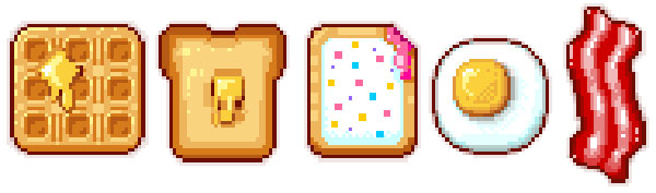
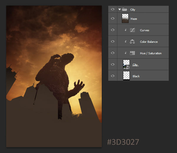
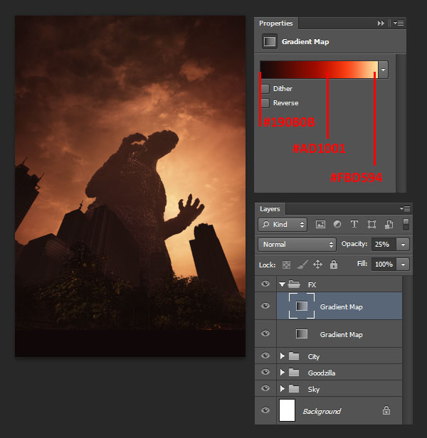
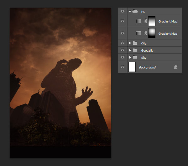
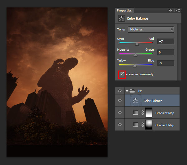
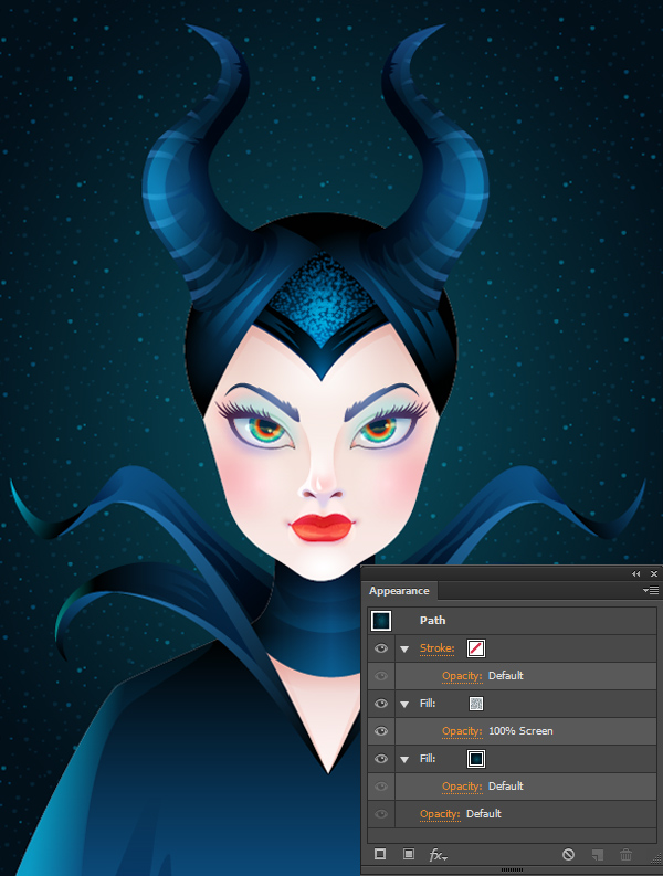
Start your day off great with some breakfast themed pixel art! Drawn in Adobe Photoshop, these sweet creations serve as desktop icons, avatars, or game icons. Learn the basics of shape creation, anti-aliasing, and choosing colors.
1. Toast It!
Step 1
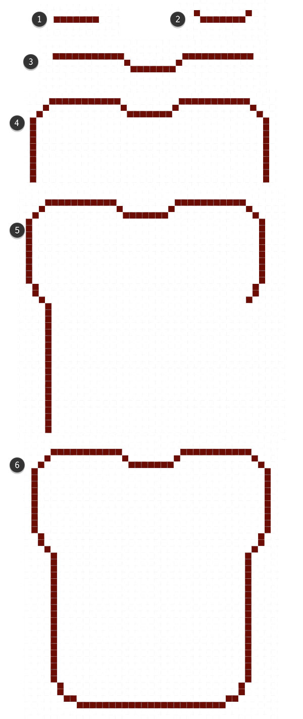
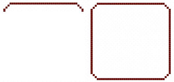
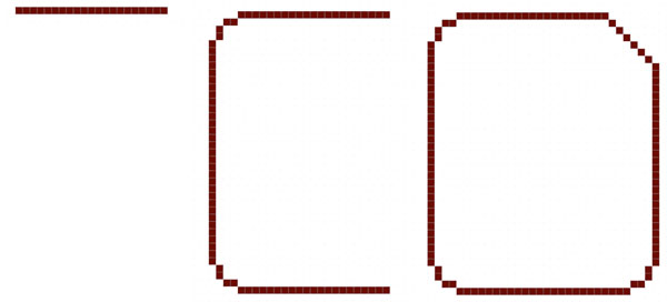
We'll start off simple and slow, with the basic outline of the toast shape. Create a New Document in Adobe Photoshop. I tend to work up pixel art designs in a 200 x 200 space, with the background set to Transparent. Use the Pencil Tool (B) set at 1 pixel and start drawing the following:
Seven pixels across.
One up on either side, diagonally.
11 pixels, on either side, form the rest of the top edge. Round out the corners with two diagonal pixels on each side. Ten down on each side before we get into the base of the bread shape.
Two down, one diagonally, and 20 down on either side.
Two down and two across in order to round out the bottom.
Fill in the rest of the space with 23 across.
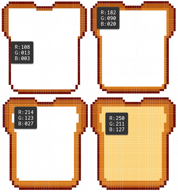
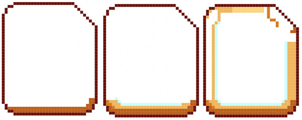
Step 2
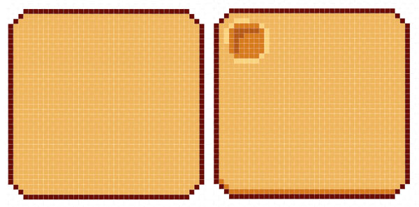
There's four colors used in the bread's basic design:
Dark Brown for the outlines: R: 108 G: 013 B: 003.
Medium Brown for the outside of the crust: R: 182 G: 090 B: 020.
Brown for rest of the crust: R: 214 G: 123 B: 027.
Tan for the inside of the bread: R: 250 G: 211 B: 127.
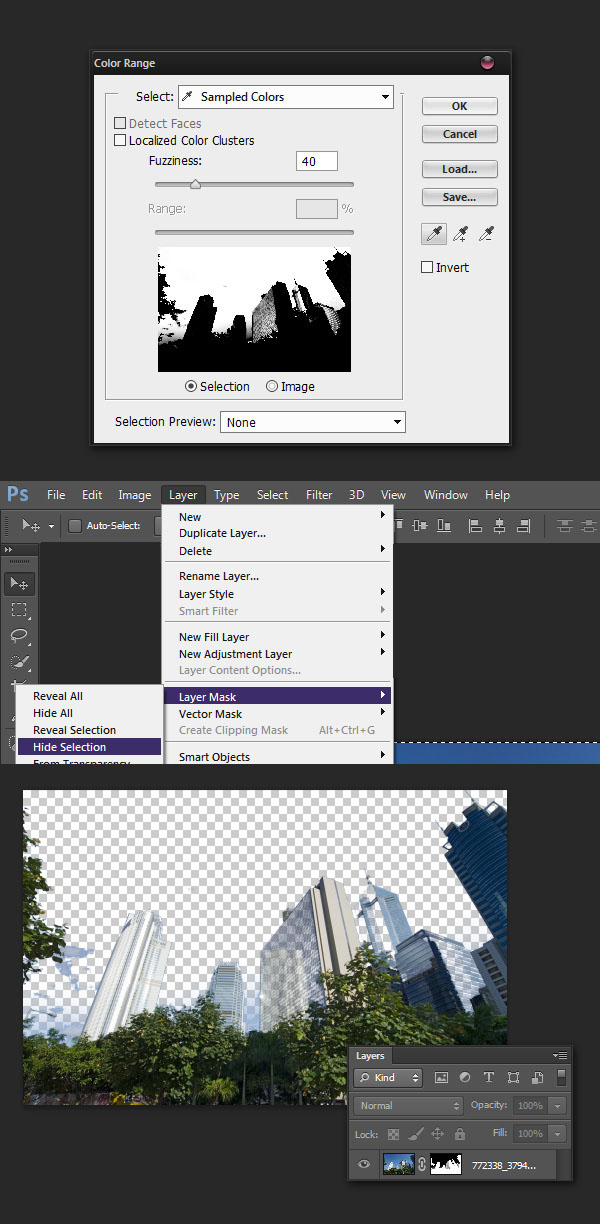
Place the Medium Brown around the edges of the toast. Brown will further fill in the crust's boundaries. At this point, use the Paint Bucket Tool (G) to fill in the bread piece with Tan.
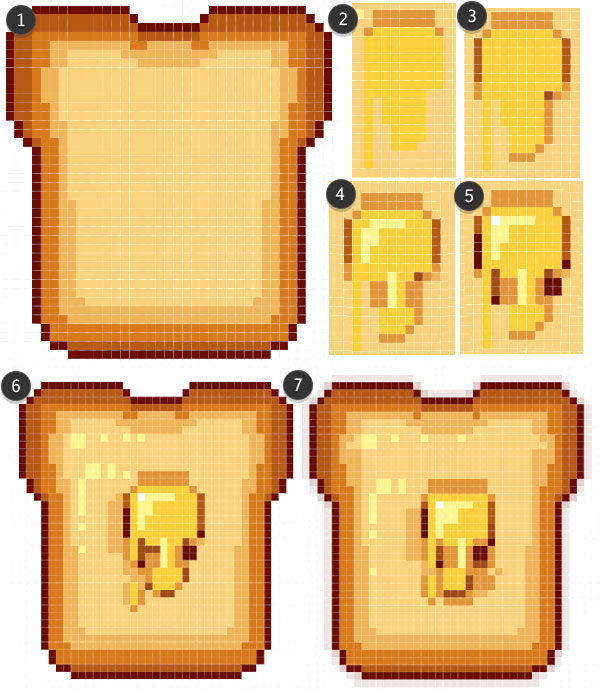
Step 3
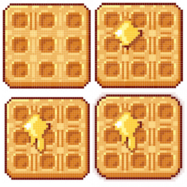
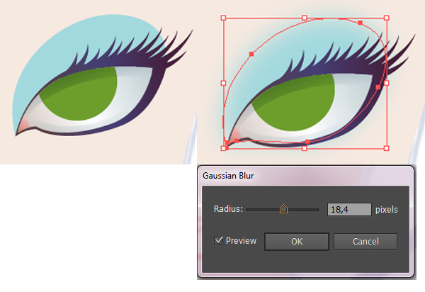
This bread just won't be complete without a melting butter pat. Make a New Layer, in the Layers panel, before drawing your butter.
Use a bright, buttercup Yellow to draw the melted butter's shape with the Pencil Tool.
Unlike the toast, its edges are to be defined with the browns used in the last step.
Notice how the darkest colors are added around the corners and vertical edges.
Place the butter in the center of the toast.
White and light cream are used for highlights on the butter and bread.
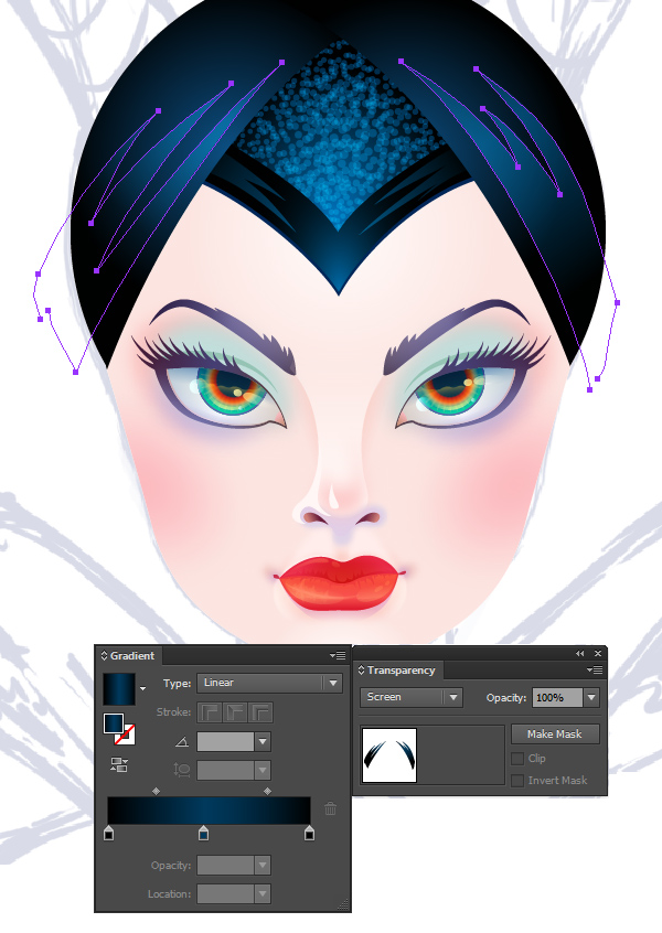
Select Dark Brown for your pencil color, and reduce the opacity to 30-50%. Outline the toast, with darker colors placed in the corners of the pixel shape, in order to soften up the stark edge.
2. I'm Makin' Waffles!
Step 1
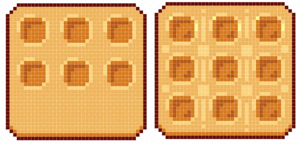
The waffle's shape is fairly simple: A rounded square. Initially, I chose to keep the corners at two diagonal pixels so the waffle kept a very square shape. Later, I changed it to two horizontal, one diagonal, and two vertical pixels for the corners.
Step 2
For the waffle's fill color, I chose R: 241 G: 180 B: 99. The shadow colors are Brown and Medium Brown from Section 1, Step 2. In the Layers panel, make a New Layer and draw small six by six squares, with the corner pixel deleted, in order to form the waffle pattern.
Step 3
I find it easiest, in a design like this, to Copy (Control-C) and Paste (Control-V) the square shapes in a grid around the waffle base. Use Tan to highlight around the pattern, and Medium Brown to indicate depth.
Step 4
The butter pat drawing method and anti-aliasing the outer edge of the waffle are the same as those done to the toast in Section 1, Step 3.
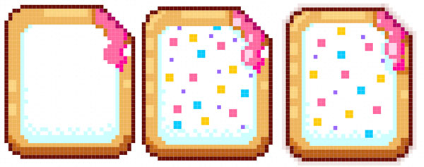
3. Toast This Pastry
The toaster pastry design is fairly simple as well: a rounded rectangle (note the two down, two across corners) with the upper right corner made up of six diagonal pixels that will form a "bite" out of the pastry.
Step 2
Much like the toast design, this toaster pastry will start with the outer edges in Brown and Tan. I began outlining to the "bite" in Brown as well in order to make sure the area is defined as well as create a shadow area for the soon to be dripping "jelly" filling.
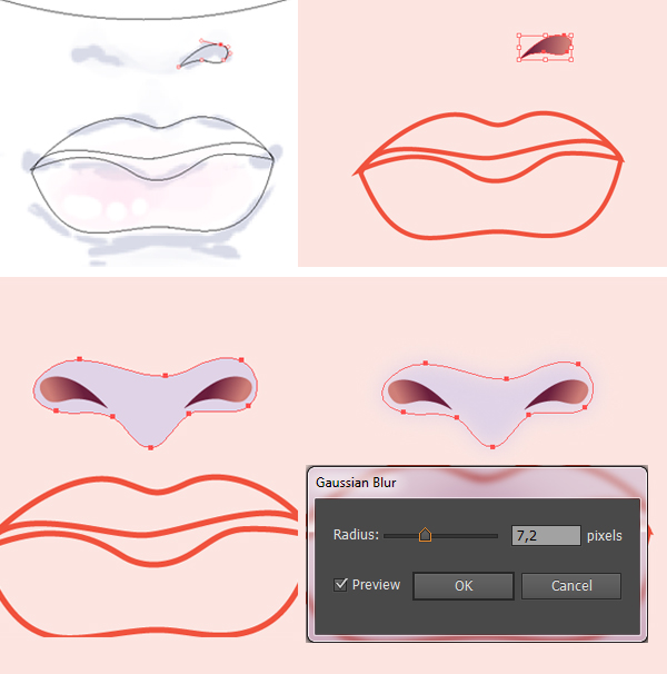
Step 3
The frosting is white, so the shadows on the frosting are a very light blue. Note how some of the lines are "dithered". Dithering, in pixel art, is a technique of creating a pattern (noise-like) in order to shade or highlight an area without increasing the color count.
The sprinkles are just four by four boxes of color or single pixels scattered around. Don't forget to fill in the entire frosting area with white in case you save the graphic as a transparent file later.
The "jelly" filling is bright pink, with dark pink and hot pink accents.Don't forget to outline your pastry in dark brown at 30-50%Opacity in order to let the corners blend more easily.
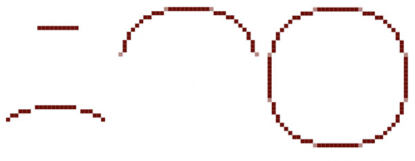
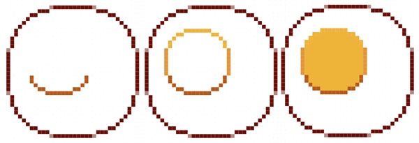
4. Eggs, Sunnyside Up!
Step 1
The egg icon shape is a compromise between a proper fried egg (which would be all over the place) and a perfect circle (which seems too artificial, even for these little pixel designs). The pixel count is as follows:
Ten pixels across.
Skip a pixel, and place three on either side on the next line down.
Two pixels diagonally from the last three, and one more diagonally.
At this point, you'll be repeating what has already been done. First, though, place four pixels at 50% Opacity in the missing corners (see below). Complete the circle.
Step 2
Let's start easy with the yolk, as there's a lot that goes into rendering the egg compared to the other icons drawn thus far. Three colors make up the yolk design.
Medium Brown on the bottom half: R: 182 G: 090 B: 020.
Yellow Ochre on the sides: R: 255 G: 150 B: 57.
Yellow for the rest: R: 251 G: 208 B: 59.
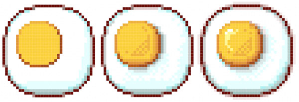
Step 3
The images below may seem more complicated than they really are. I used the same light blue from the toaster pastry in Section 3, but varied its opacity while shading and dithering. The same goes for Dark Brown, which ranges in Opacity from 20%-50% and is layered over White or Blue (on the bottom of the egg). I continued lightening up the egg with Yellow, cream, and white.
The anti-aliasing around the outer edges of the egg are done in three steps: corners are 50% Opacity, a couple pixels next to each corner is 30% Opacity, and the rest is 10-20% Opacity.
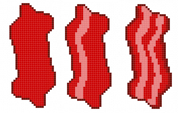
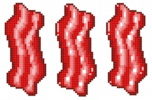
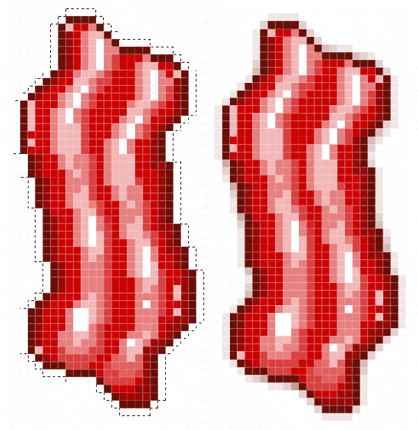
5. Fry Up Some Bacon
Step 1
I opted for a thick, short cut of bacon, rather than something more realistic. While this icon is thinner and taller than the other icons as it is, I didn't want to make that disparity more extreme when they are gathered together.
Use the Pencil Tool to draw four pixels, then three down and to the right on the diagonal, and four pixels again.
The left corner is abrupt at six pixels down, four diagonal to the left, seven pixels down, three down, and finally, four down.
The right side is three to the right, one on the diagonal,six down, two on the diagonal to the left, four down, and eight down to the right.
Copy and Paste this top section, go to Edit > Transform > Flip Vertical to flip it around, and connect it to the top half. Merge Down (Control-E) the copied layer into the original layer and let's get to rendering the bacon icon.
Step 2
Use the Paint Bucket Tool to fill in the bacon with Brick Red (R:204 G:0 B:0). Draw wiggley stripes with white at 50% Opacity. Shade the edges of the bacon with Dark Brown at 50% Opacity.
Step 3
Add highlights to the stripes with White at 30%, 20%, and 100% Opacity. For little shiny bits to the bacon, add a few pixels around the edges at 80% Opacity.
Step 4
For an easier way to add an outline, use the Magic Wand Tool (W) to select outside of the bacon icon. Go to Select > Modify > Contract and enter 1 pixel. Invert the Selection (Shift-Control-I). Create a New Layer below the bacon layer, in the Layers panel and fill your selection with Dark Brown at 30%Opacity. Stack translucent brown pixels in the corners to soften the edges of the bacon icon. When satisfied, Merge (Control-E) selected bacon layers, in the Layers panel.
Good Morning, You're Done!
Expand on your breakfast icons with fruit, coffee, juice, and more. This set is skewed towards American breakfast foods, so if you're outside of the US, or your life has been influenced by other cultures (whether your own or others), I challenge you to make little icons of those delicious dishes. Take it all a step further and make icons of every food item in your kitchen. Happy pixeling, readers!
In the following steps you will learn how to create a crayons illustration in Adobe Illustrator.
For starters you will learn how to setup a simple grid and how to create the main shapes using basic tools and effects. Using basic blending and vector shape building techniques you will learn how to add some sleek highlights for the existing shapes.
Moving on, you will learn how to work with linear gradients and how to add a subtle texture for some of the shapes that make up your crayon.
Finally, you will learn how add the illustration background, how to add subtle shading for your crayons and how to create a bunch of pretty simple doodles.
1. Create a New Document and Set Up a Grid
Hit Control-N to create a new document. Select Pixels from the Units drop-down menu, enter 600 in the width box and 570 in the height box then click on the Advanced button. Select RGB, Screen (72ppi) and make sure that the Align New Objects to Pixel Grid box is unchecked before you click OK.
Enable the Grid (View > Show Grid) and the Snap to Grid (View > Snap to Grid). For starters you will need a grid every 5px, so simply go to Edit > Preferences > Guides > Grid, enter 5 in the Gridline every box and 1 in the Subdivisions box. Try not to get discouraged by all that grid, it will ease your work and keep in mind that you can easily enable or disable it using the Control-" keyboard shortcut. You should also open the Info panel (Window > Info) for a live preview with the size and position of your shapes. Do not forget to set the unit of measurement to pixels from Edit > Preferences > Units > General. All these options will significantly increase your work speed.
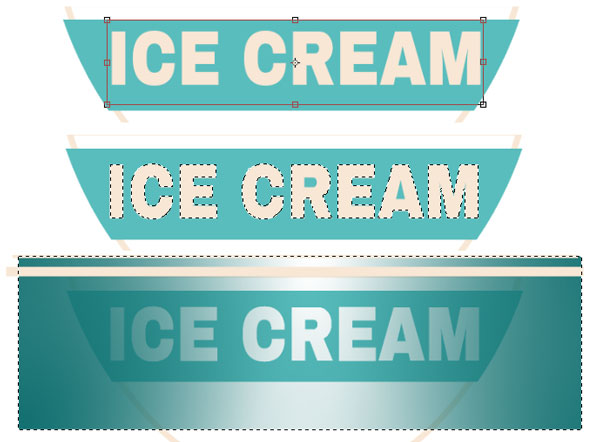
2. Create the Main Crayons Shapes
Step 1
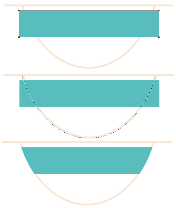
Pick the Rectangle Tool (M) and focus on your Toolbar. Remove the color from the stroke then select the fill and set its color at R=39 G=170 B=225. Move to your artboard and simply create a 15 x 130px rectangle, the Snap to Grid feature should ease your work.
Step 2
Set the fill color at R=255 G=194 B=223, make sure that the Rectangle Tool (M) is still active and create a four, 15 x 5px shapes. Place these new rectangles as shown in the following image.
Step 3
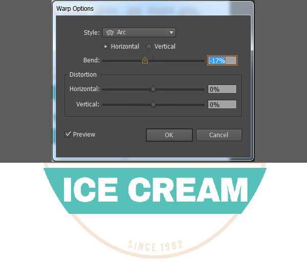
Reselect the five rectangles made so far and simply it Control-G to Group them. Make sure that your group is selected and go to Effect > Warp > Bulge. Enter the properties shown in the following image and click OK.
Step 4
Reselect your group and go to Object > Expand Appearance. Make sure that the resulting group is selected and simply hit Shift-Control-G twice to Ungroup your shapes. Focus on the Layers panel and get rid of the five, bottom, blue shapes. You will only need the main blue shapes and the four, pink ones.
Using the Direct Selection Tool (A), select the remaining blue shape, focus on the control panel and set the Corners at 1px.
Step 5
For the following steps you will need a grid every 1px, so go to Edit > Preferences > Guides & Grid and enter 1 in the Gridline every box.
Set the foreground color at R=255 G=192 B=66, pick the Rectangle Tool (M), create a 13 x 5px shape and place it as shown in the first image. Makes sure that this new shape stays selected and go to Effect > Stylize > Rounded Corners. Enter a 1px Radius, click OK and go to Effect > Warp > Arc Lower. Enter the properties shown in the following image, click OK and go to Object > Expand Appearance. Make sure that your yellow shape is still selected and simply hit Shift-Control-[ to send it to back.
Step 6
Set the foreground color at R=127 G=79 B=163, pick the Rectangle Tool (M), create a 13 x 6px shape and place it as shown in the first image. Makes sure that this new shape stays selected and go to Effect > Stylize > Rounded Corners. Enter a 0.5px Radius, click OK and go to Effect > Warp > Arc Upper. Enter the properties shown in the following image, click OK and go to Object > Expand Appearance. Make sure that your purple shape is still selected and simply hit Shift-Control-[ to send it to back.
Step 7
Set the foreground color at R=57 G=181 B=74, pick the Rectangle Tool (M), create an 11 x 15px shape and place it as shown in the first image. Focus on the top side of this green rectangle and switch to the Direct Selection Tool (A). Select the left anchor point and drag it 4px to the right then select the right anchor point and drag it 4px to the left. In the end your green rectangle should turn into a trapezoid. Reselect this shape and simply hit Shift-Control-[ to send it to back.
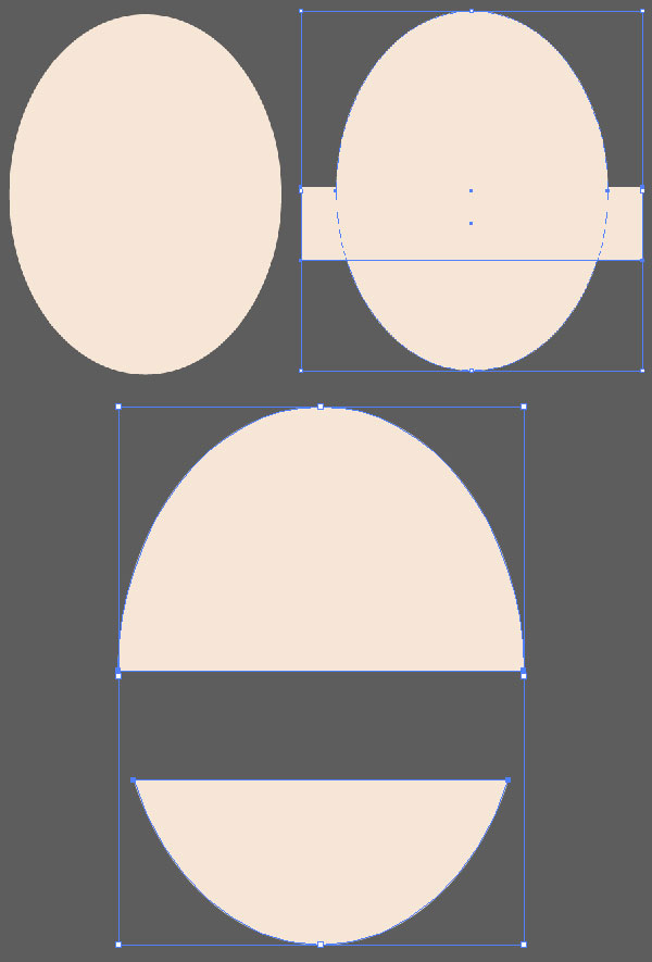
3. Add Subtle Highlights for the Main Crayons Shapes
Step 1
Disable the Grid (View > Hide Grid) and the Snap to Grid (View > Snap to Grid).
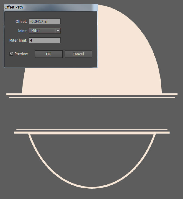
Reselect your green trapezoid and make a copy in front (Control-C > Control-F). Select the purple shape and go to Object > Path > Offset Path. Enter a 1px Offset and click OK. Select the resulting shape along with the copy made in the beginning of the step, open the Pathfinder panel (Window > Pathfinder) and click the Intersect button. Make sure that the resulting shape stays selected and focus on the Appearance panel (Window > Appearance). Replace the existing fill color with black (R=0 G=0 B=0) then simply click on that "Opacity" piece of text to open the Transparency fly-out panel. Change the Blending Mode to Soft Light and lower the Opacity to 70%.
Step 2
Go to Edit > Preferences > General and make sure that the Keyboard Increment is set at 1px.
Reselect your purple shape and make two copies in front (Control-C > Control-F > Control-F). Select the top copy and move it 1px down using the down arrow button from your keyboard. Reselect both copies made in this step and click the Minus Front button from the Pathfinder panel. Make sure that the resulting shape stays selected, set the fill color at white (R=255 G=255 B=255), lower its Opacity to 40% and change the Blending Mode to Soft Light.
Step 3
Select your purple shape and make a copy in front (Control-C > Control-F) then select the blue shape and go to Object > Path > Offset Path. Enter a 1px Offset and click OK. Select the resulting shape along with the copy made in the beginning of the step and click the Intersect button from the Pathfinder panel. Make sure that the resulting shape stays selected and focus on the Appearance panel. Replace the existing fill color with black, lower its Opacity to 70% and change the Blending Mode to Soft Light.
Step 4
Select your yellow shape and make a copy in front (Control-C > Control-F) then select the blue shape and go to Object > Path > Offset Path. Enter a 1px Offset and click OK. Select the resulting shape along with the copy made in the beginning of the step and click the Intersect button from the Pathfinder panel. Make sure that the resulting shape stays selected and focus on the Appearance panel. Replace the existing fill color with black, lower its Opacity to 70% and change the Blending Mode to Soft Light.
Step 5
Reselect your blue shape and make two copies in front (Control-C > Control-F > Control-F). Select the top copy and move it 1px up using the up arrow button from your keyboard. Reslect both copies made in this step and click the Minus Front button from the Pathfinder panel. Make sure that the resulting shape stays selected, set the fill color at white, lower its Opacity to 40% and change the Blending Mode to Soft Light.
Step 6
Reselect your blue shape and make another two copies in front (Control-C > Control-F > Control-F). Select the top copy and move it 1px down using the down arrow button from your keyboard. Reselect both copies made in this step and click the Minus Front button from the Pathfinder panel. Make sure that the resulting shape stays selected, set the fill color at white, lower its Opacity to 40% and change the Blending Mode to Soft Light.
4. Add Colors and a Subtle Texture for the Main Crayon Shapes
Step 1
Select your pink shapes, open the Gradient panel (Window > Gradient) and simply click on the gradient thumbnail to add the default black to white linear gradient. Make sure that your shapes remain selected and focus on the Gradient panel. First, set the Angle at 0 degrees.
Next, select the left gradient slider and set the color at R=80 G=80 B=80 then select the right gradient slider and add the same color. Focus on the gradient bar and simply click on it to add a new gradient slider. Make sure that this new slider is selected, set its color at R=30 G=30 B=30, focus on the Location box (from the Gradient panel) and set it at 15%. Keep in mind that the blue numbers from the Gradient image stand for Location percentage. Add a fourth sliders for this gradient then use the color and the Location attributes shown in the following image.
Step 2
Select your blue shape, make a copy in front (Control-C > Control-F) and bring it to front (Shift-Control-] ). Make sure that this fresh copy stays selected and focus on the Appearance panel.
Select the existing fill and replace the blue with black. Lower its Opacity to 5%, change the Blending Mode to Overlay then go to Effect > Path > Offset Path. Enter a -1px Offset, click OK and go to Effect > Artistic > Film Grain. Enter the attributes shown in the following image, click OK and return to the Appearance panel. Add a second fill for your shape using the Add New Fill button. Select this new fill and set the color at R=60 G=36 B=21. Lower its Opacity to 30%, change the Blending Mode to Color Burn then go to Effect > Path > Offset Path. Enter a -1px Offset, click OK and go to Effect > Sketch > Note Paper. Enter the properties shown in the following image and click OK.
Step 3
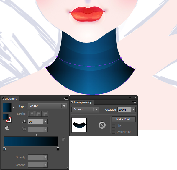
Reselect your blue shape and replace the existing fill color with the linear gradient shown in the following image. Don't forget that the blue numbers from the Gradient image stand for Location percentage.
Step 4
Reselect your yellow shape and replace the existing fill color with the linear gradient shown in the following image. You will need to save this complex gradient, so keep focusing on the Gradient panel. Click on that gradient thumbnail, simply drag it inside the Swatches panel (Window > Swatches) and your gradient will be saved.
Step 5
Reselect your purple shape and replace the existing fill color with your saved linear gradient from the Swatches panel. You need to make only one change for this gradient. Simply select the slider located at 70% and drag it at 65%.
Step 6
Reselect all the shapes made so far and duplicate them (Control-C > Control-F). Select only the copies and click the Unite button from the Pathfinder panel. Fill the resulting shape with black and focus on the Layers panel. Rename it "shadow" then simply turn off its visibility. You'll use this later.
Step 7
Enable the Grid (View > Show Grid) and make sure that the Snap to Grid remains disabled. You will use the grid as a simple reference. Select your green trapezoid and the Mesh Tool (U). Simply click on the top side of your shape and add four mesh points roughly as shown in the following image.
Step 8
Keep focusing on your mesh and pick the Direct Selection Tool (A). Select those mesh point columns one by one and add the colors shown in the following image.
Step 9
Reselect all your visible shapes and simply Group them (Control-G). Move to the Layers panel and rename this new group "main". Keep focusing on the Layers panel and turn on the visibility for your "shadow" shape.
Step 10
Reselect your "shadow" shape and send it to back (Shift-Control-[ ). Select this black shape along with your "main" group and Group them (Control-G). Focus on the Layers panel and rename this new group "crayon".
5. Create the Background of Your Illustration
Step 1
Pick the Rectangle Tool (M) and simply click on your artboard to open the Rectangle window. Enter 610 in the Width box and 580 in the Height box then click the OK button. Make sure that the resulting shape stays selected and set its color at R=255 G=250 B=240.
Next, you will need to center it, so open the Align panel (Window > Align). Set the aligning to Artboard (open the fly out menu and go to Show Options if you can't see the Align To section as shown in the following image), make sure that your shape is selected then simply click the Horizontal Align Center and Vertical Align Center buttons. In the end your rectangle should cover the entire artboard as shown in the following image.
Step 2
Make sure that your background shape is still selected, focus on the Appearance panel and add a second fill using that same Add New Fill button. Select the new fill, lower its Opacity to 50%, change the Blending Mode to Soft Light and add the radial gradient shown in the following image. Focus on the artboard and use the Gradient Tool (G) to stretch your radial gradient as shown below.
Step 3
Make sure that your background shape is still selected, focus on the Appearance panel and add a third fill. Select it, set the color at black, lower its Opacity to 2%, change the Blending Mode to Multiply and go to Effect > Artistic > Film Grain. Enter the properties shown in the following image and click OK.
Step 4
Make sure that your background shape is still selected, focus on the Appearance panel and add a fourth fill. Select it, set the color at white, lower its Opacity to 8%, change the Blending Mode to Multiply and go to Effect > Artistic > Sponge. Enter the properties shown in the following image and click OK.
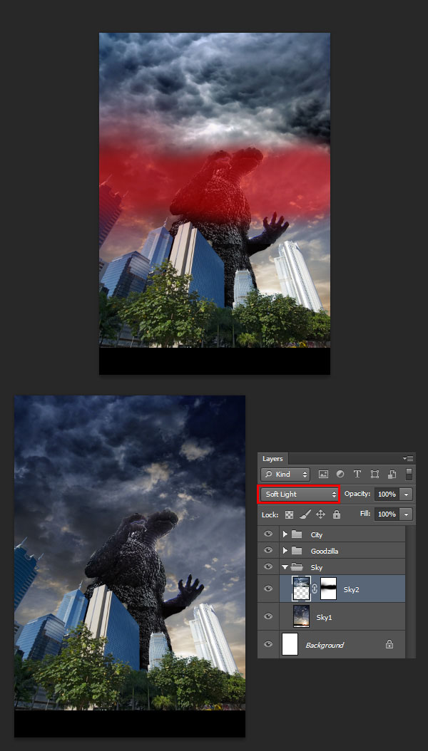
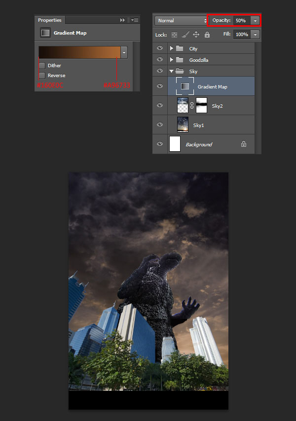
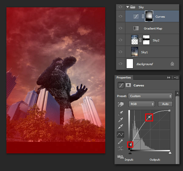
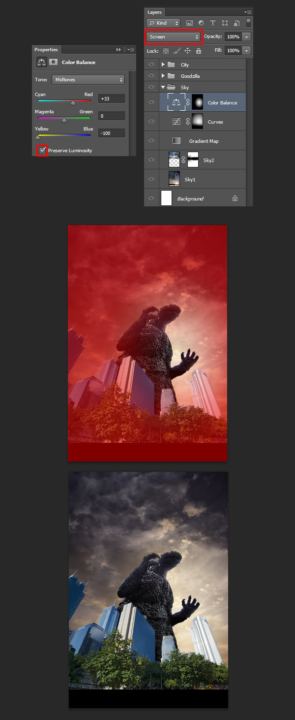
6. Multiply, Recolor and Add Subtle Shading for Your Crayons
Step 1
Bring your "crayon" group to front (Shift-Control-]) and focus on the Appearance panel. Select that "shadow" shape inside your "crayon" group and focus on the Appearance panel.
Select the existing fill and go to Effect > Path > Offset Path. Enter a -1px Offset, click OK and go to Effect > Stylize > Outer Glow. Enter the properties shown in the following image, click OK and return to the Appearance panel. Add a 1px stroke, set its color at black and click on that "Stroke" piece of text to open the Stroke fly-out panel. Simply check the Align Stroke to Outside button.
Step 2
Focus on the Layers panel, select that "main" group inside your "crayon" group and go to Effect > Stylize > Drop Shadow. Enter the properties shown in the top, left window (in the following image), click OK then add the other five Drop Shadow effects shown in the following image.
Step 3
Duplicate your "crayon" group (Control-C > Control-F), select the copy and drag it several pixels to the right as shown in the first image.
Make sure that your group copy stays selected and go to Edit > Edit Colors > Recolor Artwork. Go to the Edit section, make sure that the Recolor Artwork box and Link harmony colors button are checked, then simply drag the color handles roughly as shown in the following image. Feel free to use different colors if you don't like this yellow version. Simply play with the Brightness and the color handles, there are a lot possibilities.
Step 4
Make a second copy of your "crayon" group and make it blue.
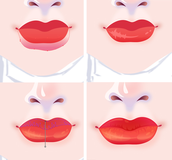
7. Create the Doodles
Step 1
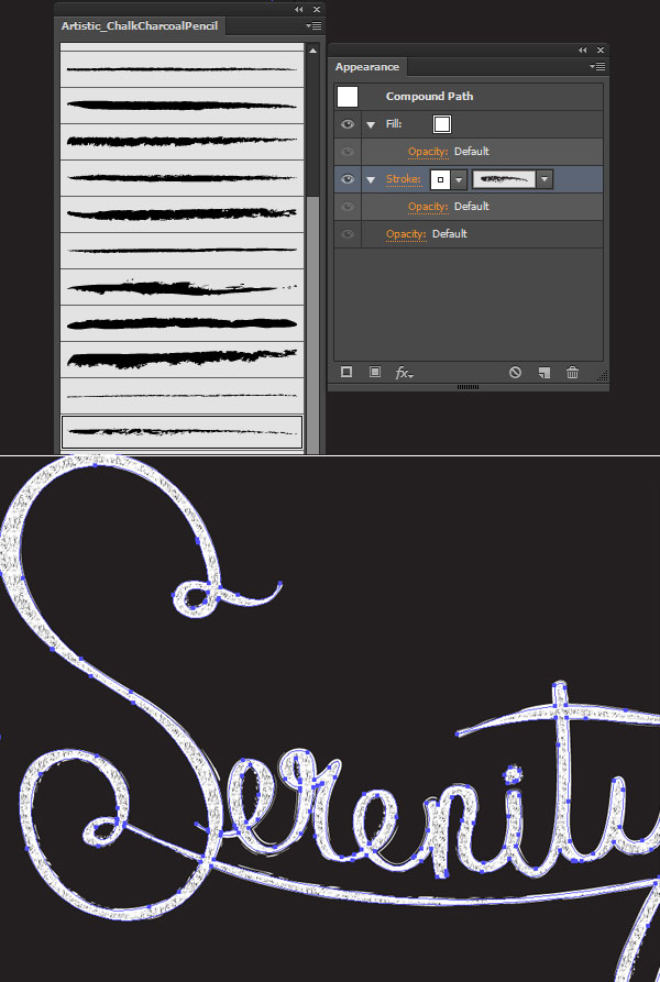
Open the Brushes panel (Window > Brushes). You will need a built-in art brush, so open the fly-out menu of the Brushes panel and go to Open Brush Library > Artistic > Artistic_ChalkCharcoalPencil. Select the "Charcoal - Feather" art brush and pick the Brush Tool (B). Set the color at R=28 G=117 B=188 then draw a simple house as shown in the following image.
Step 2
Rotate your blue crayon and place it roughly as shown in the following image.
Step 3
Make sure that the Paintbrush Tool (B) is still active and use that same "Charcoal - Feather" art brush to create the paths shown in the following. Don't forget to use the two colors show below. Once you're done add the other two crayons as shown in the second image.
Step 4
Finally, feel free to play with this effect. Recolor your crayons however you want and make your own doddles.
Congratulations! You're Done!
Here is how it should look. I hope you've enjoyed this tutorial and can apply these techniques in your future projects.
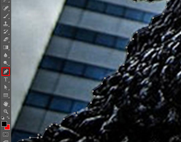
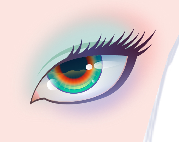
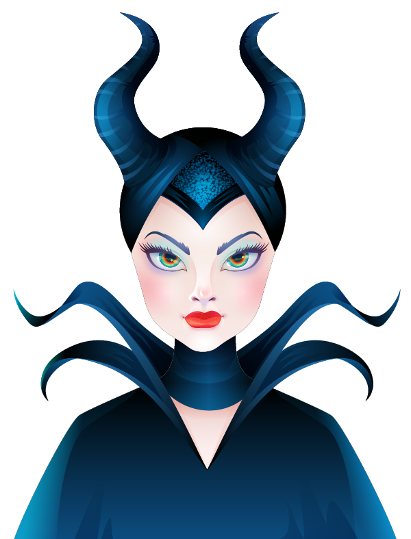
In this tutorial I'll show you how to create an animation of a running cheetah, using a simple frame editor in Adobe Photoshop.
First we'll learn how to prepare a base for every frame without a perfect reference, learning what a run cycle is, then we'll add the body using big cat anatomy, shade the cheetah with very simple and effective method, and, in the end, we'll add the spots that follow the motion of the body.
While it's a run cycle specific for a cheetah, the techniques used can be easily adapted to any other animal. This is not going to be a "draw-a-frame-then-another-frame" kind of tutorial - my goal is to show you how to keep control over whole process instead of relying on artistic intuition only.
1. Base Building
First, we need a set of poses of a running animal. If we're not familiar with its anatomy, we may want to find a reference. And here's where a problem occurs - good quality videos of a run cycle, especially in slow motion, are created for the most popular animals only. And what if we actually found a video, but it was shot in some weird perspective? (If you're not interested in it, you can skip this theoretical intro and go right to the practical part.)
You need to complete two points to create an animation without relying totally on a video:
Learn about the creature you want to draw. If you know how it's built and how it moves, you'll be able to create your very own run cycle without redrawing some video frame by frame. I've been building a base of animal tutorials that can be used for this purpose - check them out, maybe we have the animal you need!
Find one or two photos of your animal running. Trying to find all of them would be pointless, since a run cycle is just it - a cycle of repeating phases. If a paw is raised, it will need to land in some point later, if it's standing, it's going to be raised, and so on.
The second point needs a bit of explanation. Let's take a look at a run cycle's philosophy. A turning wheel is perfect for locomotion - it's turning all the time, without breaks, smoothly, taking the object with it. Animals don't have wheels, and if they wanted to use this method for moving, it would look like this:
Unfortunately (or fortunately, since it looks quite creepy), our joints don't work like this - they can't make a 360 degrees rotation. A leg can't just move forward all the time, at some point it needs to come back the same way to land in the push-spot again. This way the animal actually saves some time.
However, if legs were so long and stiff, they would actually create a back push when returning, making all this movement pointless. We need to add one more joint, so that legs could become shorter for a time of their return.
So, in other words, an animal moves its legs using a circular route, but when their joint reaches its limit, they take a shortcut.
The most important lesson to take from this are the phases that such a movement is made of. We've got a push phase (1) and a pull phase (2). Running is all about pushing - when you jump, you push the ground away from you, leaving the hit spot - and your feet - behind you. The only way to hit a spot before you is to pull the feet to front again - and that's exactly how a run cycle works.
Another thing worth mentioning is lifting of the body. During the push phase it goes up (with the power of the jump), and then, during pull phase, it goes down to get some power again.
But since legs are attached to something, they're not the only thing that moves during the cycle.
Chest and hips allow the rotation of the limb only to some extent, and
in more extreme cases they need to rotate too to help it.
Limbs are attached to the chest and hips, and chest and hips are attached to the spine. The better runner the animal is, the more flexible the spine and the more extreme angles of stretched limbs.
Image stabilization is crucial for a successful run, be it hunting or fleeing. A running animal tries to hold its head on an even level all the time - keeping it low when the chest is high and vice versa. The head doesn't retreat during run, but sometimes it may look like this when the shoulders are stretched out front, covering the neck. In birds the retreat-illusion is made by the body moving constantly and the head moving in cycles.
Perfect stabilization isn't possible, especially with a run made of big leaps, but try to keep it relatively steady - and never glue the head stiffly to the chest! When it comes to the tail, its position depends mostly on the angle of the hips.
Body moves all the time, but head is being left behind at every step
Once we've understood how it works, we can use any reference photo to start our run cycle. It's going to be our start pose, the one we need to determine the gait of the animal (how the legs move in relation to each other). It can be even as bad as this one:
It's actually a walk cycle, which doesn't make any difference - there are still phases of push and pull, they are just slower and the angles of motion are gentler. So, first we need to find a pose hidden in the photo. You can sketch it with any tool you want, it doesn't need to be very clear.
We need to adjust the pose to a flat ground. From now on, we don't need the reference anymore!
Time for analysis. Which phase is every leg in? In my case, 1 just finished its pull, 2 and 3 are in the middle of push, and 4 just finishes it. It's very easy to foresee what happens in the next frame!
1 starts pushing, 2 and 3 finish it, and 4 is in the middle of pull. With this method you can create all the frames you need!
Everything's clear? If so, let's start our animation!
Step 1
Using a reference picture, prepare a start pose. You can sketch it right on the photo, with any tool you wish - at this point neither it, nor the program you use for it is important. You may need a bit of anatomy knowledge here, but this article can also help you in most cases.
In fact, for the purpose of this tutorial, you don't need to search for any photo - I used a frame from my tutorial about cats, mixing it with a gallop of a horse (creating a rotary gallop - one with two suspension phases), and adjusted it all to a skeleton of a cheetah. In result I obtained a pose with one leg pushing and others pulling.
Step 2
It's the best to use Illustrator for this step, but if you can't, it's very easy to do it in Photoshop too (it's just a matter of convenience of using vector tools). I'll explain you the latter.
Create a New file (Control-N) and paste your start pose in there. Change its Opacity to 20% by hitting 2 on your keyboard with Move Tool (V) active.
Step 3
Draw over the sketch using vector shapes. Draw ovals with Ellipse Tool (U) and lines with Pen Tool (P). Colors aren't important, choose whatever fits you. Remember to draw whole limbs, no matter how big parts of them are visible in this position.
Why vector shapes? They don't lose quality when transformed (rotated or scaled), and they can be easily modified.
If you want to speed up the process, this model is available to download with other assets.
Step 4
Group the shapes (Control-G) to have an easy access to every part. Then group all of them into a bigger group, the first frame.
Step 5
Duplicate (Control-J) the big group. This copy is going to be the second frame. Change the Opacity of first frame to 20%.
Step 6
Modify the shapes of the second frame to create another phase of the movement. The smaller the changes between frames, the smoother and heavier the animation, and also the more work for you when it comes to painting.
Step 7
Hide the first frame and repeat the steps 5-7 until you close the cycle. When all the groups are revealed, it should look similar to this:
Step 8
Before we go any further, we need to test the animation. Go to Window > Timeline to open the animation editor, then click Create Frame Animation.
Step 9
Reveal every layer, select each individually (not all at the same time), right-click and select Convert to Smart Object.This way you'll be able to modify every group, but Photoshop will treat them as single layers. Your frames should now look like this:
Step 10
Open the menu of Timeline and select Make Frames From Layers (1). Set looping (2) to Forever and frame delay (3) to Other >0.07. You may need to remove the frames made exclusively for the background (if you have any). Select all the frames and reveal the background for them.
Hit Space to test the animation. You may need to adjust frame delay to your own frames' number.
Step 11
Observe the animation attentively. Where does it lose smoothness? Why does it happen? Maybe somewhere a hip goes down suddenly when it should go up? When you're sure what the mistake is, double-click the layer - the smart object will open in a new window. Make the changes, save and come back to the animation. The changes will be applied automatically when you save.
Pay a special attention to this step - if something's wrong with the skeleton, even the neatest details won't save it. Take your time to fix every little mistake!
2. Body Definition and Musculature
Step 1
Time to add the body! To keep the consistency between frames we need to
make it out of reusable chunks. Again, I suggest using Illustrator for
this, but it's just the matter of convenience.
Open the first frame as a Smart Object and set its Opacity to 20%. Using simplified muscle scheme from my anatomy tutorial (simplified even more for this purpose) draw parts of the body on the skeleton. Use the Pen Tool (P) in Shape mode to keep it editable. Again, group and name local parts, keeping them all in one big group. Save the file and go back to the animation without closing it.
Step 2
Double-click another frame. Keep both files in individual windows by dragging them out of the bar. Once you can see them both, click the first frame, grab the group with body shapes and drag it into the second frame - this way you'll copy and paste the group inside. Hide the layer with skeleton in the first frame and close the file.
Step 3
Set the Opacity of the skeleton to 20% and transform the shapes of the copied group to fit the pose. Sometimes all you'll need to do will be simple rotation, but sometimes you'll need to modify a shape, especially the barrow that arches during the movement. Reusing the shapes building a pose lets you keep the body consistent during the movement - classic drawing over a frame can lead to a series of mistakes in untrained hands.
Repeat steps 2-3 until you've covered all the frames. Test the animation and fix any mistakes.
Step 4
Now we're going to break the animation for a while, but don't panic - everything's under control! Open the Timeline Menu and select Delete Animation. Time for something more spontaneous than careful building the body out of vector blocks.
First, resize the file (Control-Alt-I) to something as big as possible without choking your computer. For me, 7000 x 3500 is quite reasonable, but you may need to use something smaller. The bigger, the more details you'll have access to, but it may also slow down your animation. It has nothing to do with the final resolution of the animation - it's just our working size.
Step 5
Create a new Layer (Control-Shift-Alt-N) over the first frame. Use a hard brush (100%Opacity and Flow) to paint over the body. To make it easy, paint outline only and fill (G) the inside. Use the vector shapes as a guide, but also keep in mind features characteristic for a cheetah. Again, my tutorial about big cats comes to help. Don't pay special attention to head yet - just visibly mark its position.
Repeat it for every frame. This time there's no tricks to accelerate the process - manual painting will give an individual character to every step of the movement. The only advice I can give you is not to paint frame by frame, but skip every other and come back to them later. This way if you get fatigued and the shapes you draw become careless, you'll achieve a decent mix of good and bad frames, instead of good frames gradually going bad.
If you want to test the animation at this point, save it as a new file, remove all the smart objects and create a new animation of the silhouettes.
Step 6
Drag every silhouette under its guide shapes and set its Opacity to 20%;
Select shapes layer and hit Control-Alt-G to create Clipping Mask and remove the bits crossing the outline;
Select both layers (silhouette and its shapes) and hit Control-E to merge them. From now on you won't be able to modify the vector shapes anymore, so save the file under a new name if you want to keep them.
Step 7
Hit Control-R to show the rulers, then drag the Guides out of them to set the level of the head and back. This way you'll be able to see if a frame stays properly in relation to others. Use Arrow Keys with Move Tool (V) on to make small changes to the position.
Step 8
Until now, we were focused on the body only, without bothering about head. It's important to add a proper shape to it before we create the animation back.
Create a new file and use tips from big cat tutorial to sketch a head of the cheetah. Details aren't important yet, but the overall shape is crucial. Hit Control-I to invert the colors, so that you could draw a solid background for it. Save the file for later.
Step 9
Copy and paste the head into the main file. Convert it to Smart Object and transform it (Control-T) to fit the first frame. Then copy it and repeat this for every frame. Follow the position of the head we've set before! If you don't, the head will jump among the frames. Use Guides to avoid it.
Step 10
Use the Eraser Tool (E) to remove the remains of the head-template on the shape layer. You can also fix the transition between head and neck with the Brush Tool (B), the same we used to draw the silhouette. When you're done, merge every head with its body.
Let's create the animation back just like in Step 10 of the first part. Our cheetah is pretty much alive now, but there's still a lot of work to do!
Step 11
From now on, every new layer added would break the animation. To avoid it, we'll need to clip every of them to one of the silhouettes with Control-Alt-G.
Let's use a muscle scheme from my big cat tutorial to draw muscles. We'll need to modify it to the shape of the cheetah's body, but it's a good reference anyway. The bigger problem is muscles aren't a rigid structure - they change
during the movement, and it's not only about rotation, but about actual
shape and proportion! Fortunately, there's a tool we're going to use quite extensively in this tutorial - Warp Mode or Free Transform Tool. While it will not save all of our problems, it's able to accelerate the process without sacrificing too much accuracy.
First, find a frame where a part of the body is the most similar to a stationary position, just like our muscle scheme. Create a new layer over it, clip it and draw the muscles. I used white to stress them, but it can be easily turned to black with Control-I.
Step 12
Copy the drawing and paste it above another layer. Clip it and hit Control-T to open transform box. Now, click the Warp icon in the top bar. Use the mesh to adjust muscle drawing to this particular position. Sometimes you'll need to erase some part and draw it manually, but this method works for most cases. Just refrain from stretching the arm too much - it must follow the shape under it, it can't become bigger or smaller out of the blue.
Step 13
Repeat Step 12 for every frame. If you do this properly, the muscles should follow the movement smoothly. Don't bother about clean lines, this is just a sketch.
Step 14
Repeat Steps 11-13 for the hind leg and barrow too. When you're done, merge the muscle layers for every frame to save some space on Layer list. We're going to need it! Also, if you used white lines, invert them (Control-I) to get black ones. In the next steps we're going to get rid of the shape lines, so you may need to define some of them (overlapping of the legs and so on) on the muscle layer .
3. Shading
It's time for the most exciting part - we're going to bring the cheetah to life! Here and here you can learn about the principles of shading. In this tutorial I'll just show you kind of shortcuts you can use to shade every frame very fast, when keeping all the animation consistent.
Step 1
Let's start with flat colors. Use a darker shade of the color you want - for me it's #91734d. Leave the head as it is for now, we're going treat it as a detail.
Step 2
It's common for cats to have lighter lower body. To save some time we can use a gradient to color it:
Double-click on the color layer of the first frame;
Select Gradient Overlay;
Create a gradient of the base color with 0% Opacity and a lighter, less saturated version of it with 100% Opacity;
Adjust the angle to the angle of the barrow.
To accelerate the process, save the Layer Style and use it for every frame. All you'll need to do afterwards will be to adjust the angle of the gradient.
Step 3
Change the Blend Mode of every muscle layer to Soft Light. We don't want these lines to stand out.
Step 4
Now we're going into a more artistic phase. There's no tricks that
could carry you through it without the necessity to spend some time on
every individual frame. However, the strong, consistent base we've
created should be more than enough to keep control over it.
There's
one important thing about painting an animation frame by frame - it's the whole animation that matters, not a single frame. It's better to paint
every frame loosely, but consistently, than to polish some of them, but
each in different way. One frame doesn't matter - but they all do. It's because nobody will have a chance to stare at a single frame when they're all in motion.
Create a new layer (do I need to remind you about clipping?), grab a soft Brush and paint over the lines of muscles with a darker color (for me it's #54371a). Don't bother about light direction at the moment.
Step 5
Create a new layer and paint the center of every muscle with a brighter color (like #c9a980).
Step 6
Use the base color to blend the light and dark areas. The main goal of it is to conceal the contours, leaving only a suggestion of them under the skin. The prominence of the musculature is a matter of style, so you need to choose the degree of the blending on your own.
Step 7
Repeat Step 4-6 for every frame. Again, it's good to skip the frames to keep a consistent look no matter how bored you get. Also, it's better to do one step at a time for all the frames, to keep it fast. Don't pay too much attention to one single frame - only to all of them.
When you're done, test the animation. Check if something stands out, or if there's a some kind of blinking. When you're sure it's all right, merge all the shading layers for every frame - we don't want a mess.
Step 8
What we've just done wasn't shading in a strict sense - it's kind of ambient occlusion shading, without any directional light. Let's add lights to it - it's going to be a simple one, so that we don't have to fall from exhaustion over all these frames.
Let's start with shadows. I used dark blue (#434748) and soft brush paint these areas, but the strokes were very subtle - this way, instead of painting the cheetah blue, I only gave a bluish shade to its fur. Notice how messy the shading is !
Step 9
Now, add an orange (#f5d8a0) light on the opposite. Use Soft Light as a Blend Mode to brighten the area accordingly to the color under it.
Step 10
For now the body of the cheetah looks very smooth, as if it was skin only, without any fur. It's because any texture, such as fur, disturbs the light on its surface. So that's what we need - a texture. And I'm not talking about some photo pasted with low opacity - texture is an area with disturbed light.
Create a new layer, change it's Blend Mode to Soft Light and draw single "strands of hair" (I used #fff9ca for this).
Even subtle texture makes a huge difference!
Step 11
To adjust the contrast a little bit, I created a new layer in Overlay mode and painted some more blue shadows.
Step 12
Test the animation. I like how it looks, but maybe you want to go for more fantasy look, with warm direct light and cold reflected light? No problem - take your time and polish the shading to your desire.
4. Add the Details
Step 1
It may be weird to treat the head as a detail, but since it's very detailed itself, we need to take special care of it.
Open the file with black head and pain the details now. They don't have to be very neat, especially if you're going for a small animation.
Step 2
Copy and paste the head into the first frame. Before doing anything, convert it to Smart Object to restrain the quality loss during transformations.
Scale and rotate the head to fit exactly with the black template we've attached before. You may need to paint over some fur to conceal the "seam" between it and the neck.
Step 3
To add the paws, find a frame where one of the stays in a "default" position. Paint the details on a new layer and convert it to Smart Object.
Step 4
Just like with muscles, copy and paste the layer to all the frames, adjusting the shape to every paw. Sometimes you may need to change the Opacity of a paw to fit the shading. By the way, shade the legs if needed.
Step 5
It's high time for spots! Just like with muscles, we need to find a default position for every limb, barrow and tail. Paint the spots on it, convert it to the Smart Object, copy it to a next frame and warp the shape. The Smart Object will remember the warping among the frames. Take good care of single spot's shape - they shouldn't get too distorted. Also, keep in mind you'll need to rasterize the object to erase overlapped bits.
Step 6
Now, when you're sure the animation is complete, we need to get rid of the mess. Select all the clipped layers of every frame (without the actual clipping mask) and merge them. Then Select the merged layer, right-click and select Merge Down. This way you'll merge the layers without breaking the animation.
There are three things you can do now to add a final polish to the animation. First, you can use Adjustments (select it on Window list to find the options). The options you may be interested in the most are Color Balance, Hue/Saturation, Brightness/Contrast, but feel free to experiment with others too.
The other way is Liquify filter (Shift-Control-X) and its Forward Warp Tool. With it you can slightly move some part of the body, for example close the eye of the cheetah when it's hitting the ground after big leap, or move its ears during the run (or, in my case, change the head's size that still didn't look OK). The third way is to actually paint something on the frame, like waving fur. These small changes can give more life to the animal, taking away the stiffness made by a bit automatic process of animation. They work the best when they're gradual - starting slightly on one frame, with strong effect on another frame and weakening on the next one.
Step 7
Another trick for a run cycle is a blur added on some of the parts. To do this, you can select a limb with Quick Mask (Q) (just paint over the area with a soft brush, click Q again and Control-Shift-I to invert the selection). Then use Filter > Blur > Motion Blur with the angle of movement.
Step 8
Finally, we need to save the animation as it will be presented to our viewers. First, change Image Size (Control-Alt-I) to the dimensions you need - the smaller, the lighter the file. When you're creating for Web, it's the best to keep the size under 200KB, that's not always easy with a painted animation like this. You may need to decide if you go for resolution...
...or maybe the overall quality and lack of noise.
To save the animation, click Control-Shift-Alt-S. You can experiment with these options to find the best result, but I can give you some hints:
Of course, you need to select GIF as a format to create an animation for Web;
The amount of colors should be your first choice. Start with 256 and see if the size (left lower corner) is close to the one you need. If 32 colors give you the perfect size, go for 64 and try to play with the sliders;
Dither should be your first choice for optimization. Even sliding it down to 0 doesn't make so much difference in quality, but the size will drop anyway;
This should be your last, desperate choice. You can go quite safely up to 50%, but it's very easy to lose the very foundations of quality here;
This slider doesn't only give you savings in size, it's also able to add a nice effect to your animation. However, don't go too high!
Make sure to check Preview just under the size - some browsers accelerate the speed of animation, so you may need to adjust it once again.
We're Done!
After this long, thorough tutorial you should be able to create a beautiful run cycle for any animal. While a smooth, precise animation takes a lot of time, this method of doing it guarantees you great results - unlike painting-frame-by-frame, where everything is a guessing game. I hope you had fun following the steps and that you learned a lot for your future projects!
In this article, I’m going to provide you with a general overview of some of the more popular devices from Wacom, based on first-hand experience in daily use. Beyond checking out a few of the amazing features these two devices offer, I’ll also give you some great tips to help you improve your workflow and experience using these devices.
1. The Wacom Cintiq Companion
The newly released tablet is actually a fully featured tablet-pc, which means you can run your favourite Windows software on it, as you would on any normal computer. Wacom also offers the same form-factor, only for a cheaper price, in the form of an Android OS tablet. It still features the same pressure sensitive pen and quality display, but you will be limited to using Android Apps.
Wacom Cintiq Companion running Windows8 and starting up Adobe Photoshop CC
I personally chose the first version, despite the huge price difference, for the simple need to have access to my Creative Cloud Apps, wherever I was, and also to have the ability to complete projects on the go. Previously, I was limited to either just sketching on pen and paper, or postponing the actual work until I was at my desk. I also tried carrying my laptop and Intuos3 A5 wide edition tablet, but anyone that saw one, the size is not exactly portable, especially when adding a 2.3kg laptop.
The tablet also features a number of customizable quick-keys that, together with the rocker key, and custom menus, help satisfy the need for an external keyboard, at least when it comes to shortcuts. This is the first major feature I’d like you to take a closer look at!
The Express Keys
Express & Rocker Keys
The device features 4 Expresskeys, as well as a 5 button rocker key. These are fully customizable through the Wacom Desktop Center, and if you actually take the time to set them up once, they will greatly improve your efficiency in using the device.
I recommend using the 4 main buttons for the four most often used functions in your preferred graphics program. In my case, I’ve mapped them as follows:
Going from bottom to top:
“Space” - Moving the canvas. The size of the device is quite great, but whenever you need to get up close with some detail work, you will always have to move around the canvas, and this button will help spare you from needless swishing across the screen all around your scroll bars.
“Zoom” - Similarly, this function helps prevent the need of manually having to reach for the Zoom tool in Photoshop. If the button is pressed and held while dragging your pen, and released once you reached your desired level of magnification, you are automatically reverted to your previously used tool. If, however, you simply press the button shortly, you’ll be taken into “Zoom” mode, and would need to manually swap back to your previous tool.
“Step Backward/Undo” - We all know how fond digital artists have grown of this shortcut. While using a keyboard, you might not even notice how often you actually make use of it, but once you’re left without one, you’ll start to feel slowed down by the need to go to Edit > Undo / Step Backward for every small mistake.
“Invert Foreground/Background colour” - As my workflow often implies starting with rough, freehand sketches, this feature helps me increase the speed with which I can put down lights and shadows on the canvas. I tend to use this paired with a median opacity of 40% and don’t really pay much attention to silhouette errors, as this is just for reference purposes.
When you're just trying to brainstorm concepts, it's best to keep it moving quickly. Swapping between light and dark values helps identify volumes
The Rocker Key
Equally relevant to the other express keys, the Rocker Key/Wheel provides you with an additional 5 customizable keys for your convenience. As this device is a Windows 8 based device, I strongly recommend you leave the central button mapped to your Windows key. Again, having a keyboard, you might not notice just how often you’re making use of the “Alt-Tab” combination, but once it’s missing, you’ll really appreciate having this dedicated key. Alternatively you could of course also map it to the above combination of keys instead of just the Windows Key, depending on your needs.
The remaining four keys are at your disposal, but I would suggest that you just take a day of normal usage into account before you assign any button to these. Normally they are mapped with some interesting overlay menus in various programs (Softkeys), but more often than not, you might find it easier to add your own shortcuts instead of learning a new set provided by default.
Reserve one of the keys for one of the most useful on-screen features Wacom has to offer:
“Apple Pie” (or Radial Menus as they’re actually called)
Setting up the Radial Menus
When pressing this button, you will be presented with a radial menu displaying a plethora of useful functions, which in turn can also be customized beyond your wildest dreams. One of the slices should always be reserved for a “Submenu”, in case you decide to add a few useful shortcuts to it for future use.
I use this menu for a few of the following: New File > Save As > Paste > Copy Merged > Levels/Curves/Contrast & Brightness
Things Worth Mentioning
The above functions are aimed at improving your experience with the device, but as with any new product, there are also “those features” that actually end up doing the opposite. For the Cintiq, the biggest nuisance is the multi-touch. One of the buttons was mapped to disable this functionality by default, and that for good reason!
The tablet does ignore your tactile input if the stylus is in range (about 3.5cm away from the screen), but for anyone with slightly larger hands (or any male user), this margin is easily overcome, and you end up leaving smudges on your artwork through unintended brush usage.
You’re faced with two options in this case: keep this in mind, and keep the stylus close enough to the tablet when dragging your hand across the screen, or disable this functionality. If you decide for the latter, remember that you will only be able to use the OSD keyboard with your Pen, one key at a time, instead of the multi-touch.
Enable or Disable Touch input and other features through the Wacom Desktop Center
It’s also worth noting that the device features quite a large number of “secret” shortcuts (secret if you’re like me and avoid reading manuals like the plague). The most interesting one is the ability to map shortcuts to multi-touch gestures! Of course, this functionality is dependent of having the “Multi-Touch” feature enabled.
What this means is the ability to bring up your keyboard when tapping your screen with all five fingers from your free hand for example. There is huge potential using these shortcuts, but they really do require you to take some time customizing the device. Once this is done, you will not regret the extra time spent on doing this.
2. The Wacom Inkling
Although this device received rather mixed reviews, I urge you to seriously consider the fact that it was never meant as a standalone device, but rather a complementary means of improving your workflow. That means that it is not a tool used to create a finished piece of art (it’s not excluded, but not everyone is a pen-wielding genius), but rather a nifty bit of tech that can help you get your freehand sketches into digital form, without carrying around a large tablet or a scanner.
This is what the insides of the Carrying-case/Charger looks like
Using the Inkling
The form factor is about as portable as it gets, very well built, and the carrying case doubles as a charger, pen and replacement refills holder. Inside, you have the paperclip/sensor, a USB cable for connections to your PC as well as charging the device and the pen.
The sensor/paperclip has a built in mini-computer (best way I can describe this), that effectively records every pen-stroke, including pressure sensitivity and tilt, that you do on the attached piece of paper, within direct viewing range. It has a dedicated button for turning the device on and off, as well as one for creating additional layers (same as in your favourite graphics application).
It's recommended to use a plain A4 sheet of paper, but the device also works with your favorite Sketchbook
With each time you clip the device to a new page, a new file is created in the memory. These features help ensure that no unintended overwriting of details occurs during your passionate sketch-sessions.
It is a very sturdy device and due to the small and elegant form-factor, it is really a beauty to carry around and bring out for a quick sketch in whatever café you decide enjoy your cup of coffee in!
The closed case is about the size of a TV-remote, the Inkling however looks better!
Unlike with the Cintiq, there isn’t as much customization potential here, but for that you get a device that does exactly what it’s supposed to do, nothing more, nothing less. That however doesn’t mean that it is anything short of amazing, if used properly.
Preparing for Drawing:
First and most important thing you need to remember when setting up your Inkling for a sketch is Receiver/Sensor placement. Depending on your drawing style, whether you’re left or right handed, if you often arch your hand and have the tip of your pen aimed at your chest or opposing it and so on. It is of paramount importance that you consider this aspect before you even start drawing.
Second and equally important, is pen grip. Personally I had quite a hard time adjusting to the ideal position, as my usual grip was very close to the tip of the pen. As the Emitter is located right in the tip-cone, you need to hold the pen some 2cm away from the very end.
Keep in mind that the maximum paper size supported by the Inkling is A4. That doesn’t mean that you can’t use it on bigger canvas sizes, but it requires some smart stitching work in your favorite graphics application.
Finally, before you start your actual sketch, be sure to draw a few test-lines, and check to see if the middle led on the receiver lights up when the pen touches the paper! If that’s not the case, the pen and receiver are not communicating and your Inkling will not record a single stroke.
Handy Tricks
If you connect your Receiver to the computer and start up the Inkling Manager while it’s attached to a piece of paper, you can set the desired pressure sensitivity!
Ever wanted to get that perfect handwritten look for a particular asset in one of your 2D or 3D creations? This is the perfect time to get it done. Just snap your Receiver to a sheet of paper and scribble your way to victory! All you need to do later is simply export the file in your desired format, and import it in your scene/canvas, duplicate and mirror it a few times, and it will give you that additional bit of detail and authenticity that you required.
I only wrote a few lines, but once exported to Photoshop, as an isolated object, mirroring/cloning was a breeze.
Nothing beats hand-drawn shading. From the basic crosshatch to more complex patterns, you will always feel more comfortable doing these in the classic pen & paper environment. With a bit of post-production, you can later overlay this on top of some of your digital artworks to get that hand-drawn feel in there.
Easily add crosshatch and other traditional shading techneques to your digital sketches without the need of a scanner
Signatures never looked so good. I know, I know, you can do this with any given tablet, but trust me, nothing will come close to the real thing as using an actual ballpoint pen on paper, and the Inkling captures it perfectly, without the need for you to remove the background. What that means is that you’ll be able to “sign” your artwork accurately and quickly, without the need for additional edits.
Finally, the main use I have for this device is creating Icons and Thumbnail style sketches on the go.
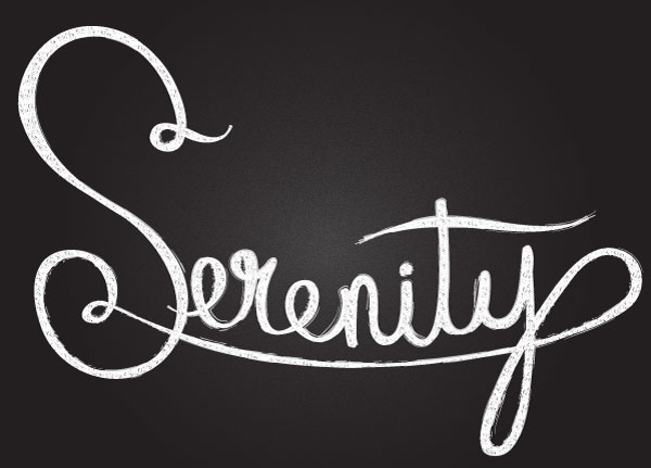
On June 18th, Adobe rolled out some updated features for their latest release of Adobe Illustrator CC 2014. Included in the update was an improved Pen Tool. Check out the quick tip below showing how to manipulate the new Pen Tool in order to create an easy chalk-like design.
1. Working with the Pen Tool
Step 1
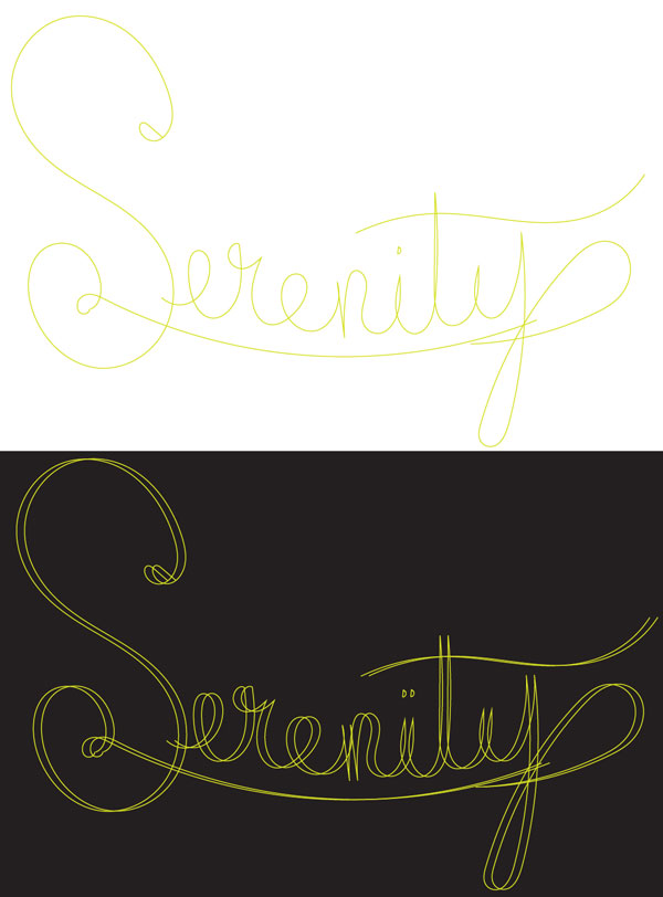
Let's start by sketching out a word or two. In this case, I used the Pencil Tool (N) to sketch out the word "Serenity". Group (Control-G) together the path components, Copy (Control-C) and, Paste (Control-V) the type in order to quickly add some dimension to the word.
Alternatively, you can sketch out your lettering outside of Adobe Illustrator CC 2014 and import it (especially if you're not using a graphics tablet).
Step 2
Lock the sketch layer in the Layers panel so your workspace is kept tidy. Use the Rectangle Tool (M) to draw a large black rectangle covering the Artboard.
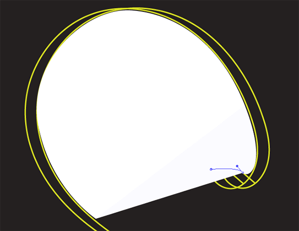
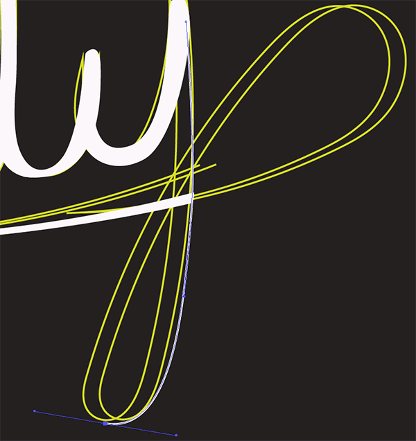
Let's start tracing our letters. Use the Pen Tool (P) to trace the outline of the first letter. I like to take a small bit at a time so I have the most control over my design. See the Pen Tool in action below. Note how the tool's path is projected from each anchor point without laying the next one down.
Previously, users had to hold down Alt in order to project the next anchor point's path and curve or straighten it. The recent update has made this possible without having to hit any keys.
Step 3
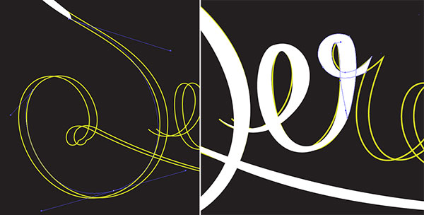
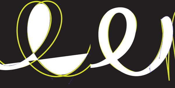
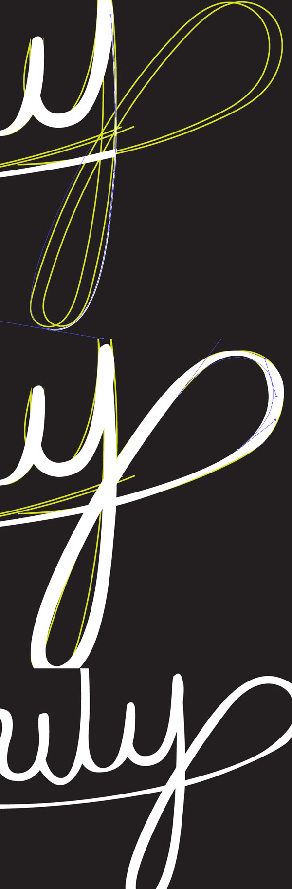
Continue working along the word. Note how parts of the letters connect or curve into each other. Zoom (Z) in to increase your control over the curve and shape of each path. Manipulate handles of anchor points before or after they're laid down (doing so before ensures a smooth curve, but sometimes you may want to continue to edit curves after shapes are filled).
Step 4
Note the process with the second "E": I traced around the letter, stopping at the top of the "N". From here, I'll smooth out any points as needed.
If anchor point handles do not appear when using the Direct Selection Tool (A), grab the Anchor Point Tool () (formerly the Convert Anchor Point Tool) to manipulate them.
Additionally, you're now able to disconnect anchor point handles from each other and manipulate each side separately.
Step 5
When connecting the tails of one letter to another, keep in mind each section's width so they flow into each other seamlessly. Once done with your lettering, Unite the shapes in the Pathfinder panel.
Below is a quick shot of how I used the Pen Tool to project the path around the "Y's" curve.
2. Apply Texture in the Appearance Panel
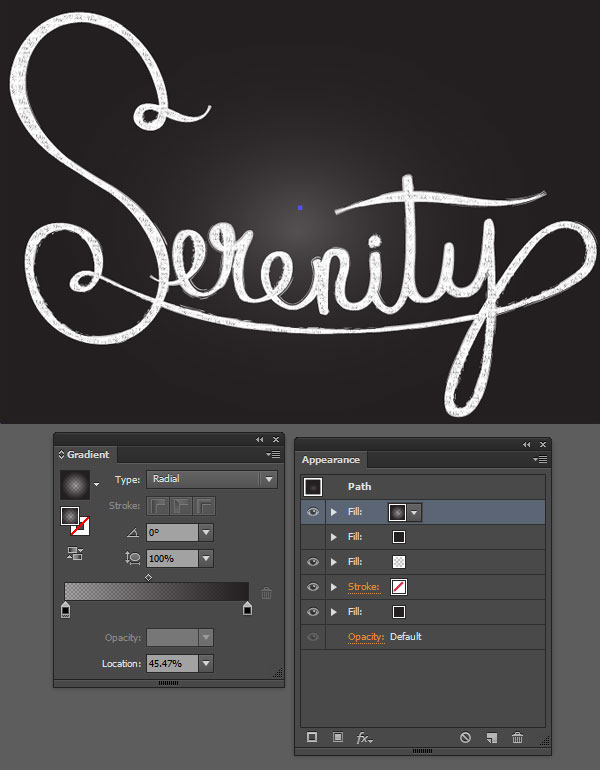
Step 1
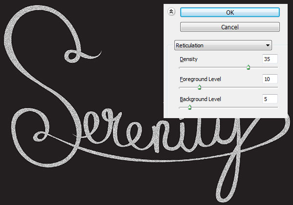
Select your lettering and go to Effect > Sketch > Reticulation and set Density to 35, Foreground Level to 10, and Background Level to 5.
Step 2
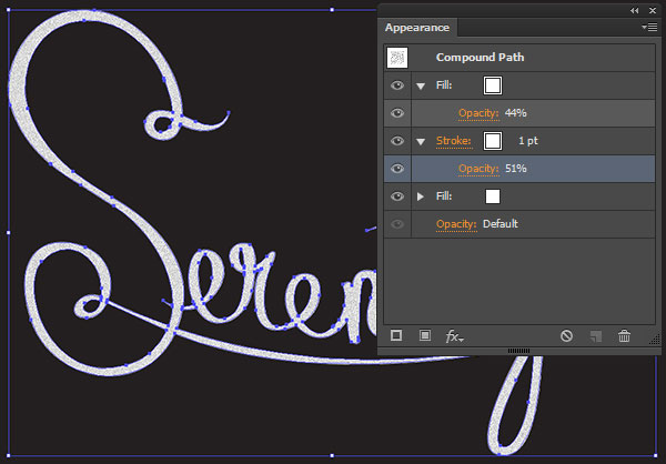
In the Appearance panel, change the Opacity of the previous step's effect to 44%. Add a New Fill and drag it underneath the effect fill (see below). Apply a 1pt stroke of white and lower the Opacity to 51%.
Step 3
A custom pattern will be applied to the white fill color (second fill in the Appearance panel). Use the Paintbrush Tool (B) with a round Calligraphic Brush of 1pt weight to sketch some small lines in a rectangular-like shape.
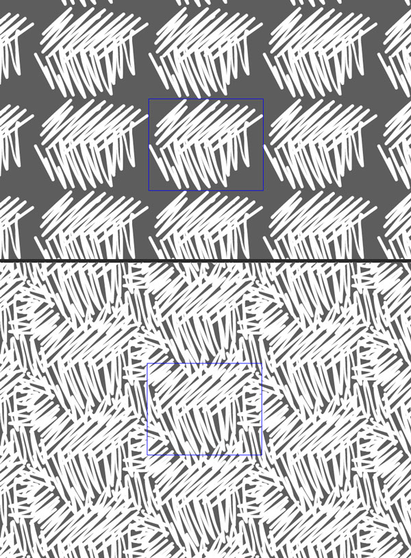
Select the scribble and Make a New Pattern in the Pattern Options panel. While in Pattern Editing Mode, use the Paintbrush Tool to scribble around the edge of the pattern's bounding box in order to fill it in a bit more and be less obvious as a pattern(see below).
Step 4
As a final touch to the lettering, change the stroke to one of the chalk-like brushes found in the Brushes panel. I chose Pencil - Feather, though any of the thinner options will work well.
3. Texture the Background
Step 1
Apply subtle Radial Gradient fill in the Appearance panel to the rectangular background. Use the Gradient Tool (G) and Gradient panel in order to manipulate the gradient's shape, colors, and opacity.
I set the gradient at black at 100% Opacity to 0% Opacity. It should be the very top fill (see below) in the Appearance panel.
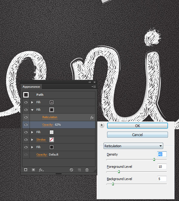
Step 2
The second fill is a Reticulation effect with the following settings:
Density: 40
Foreground Level: 10
Background Level: 5
The third fill is a small white radial gradient going from 0% to 100% Opacity. The fourth and final fill is black, established in Section 1, Step 2.
Congratulations, You've Finished!
The changes made to the Pen Tool allow mouse users more control than ever, as well as tablet users whose keyboards are inaccessible the freedom of being at a larger workstation. The technique of adding texture outlined above can be applied to all sorts of lettering designs for scalable designs that evoke that classic chalkboard style. Take the updated tools for a spin and show us your chalkboard lettering in the comments below!
Last month saw the launch of the all new Photoshop CC 2014, with lots of great new features, especially for web designers. In this tutorial, you'll learn about the following new or improved features, and learn how to get started using them:
Smart Objects
Layer Comps
Smart Guides
Typekit Integration
Font Search
Workflow Enhancements
Smart Objects
Using Smart Objects is a great way to work non-destructively. You can embed a Smart Object directly in a Photoshop file or link to a separate file and update it and reuse it in multiple projects.
You might already be familiar with Linked Smart Objects in Photoshop. Essentially, these are the same as standard Smart Objects, but are instead linked to a file. This means that your Linked Smart Objects aren't actually saved as part of the .psd, but instead externally, as a separate document.
Traditionally, Linked Smart Objects could always be converted into an Embedded Smart Object, but not the other way round. However, now, in Photoshop CC 2014, Embedded Smart Objects can be converted into Linked Smart Objects! Here's how that works:
Step 1
Right-click on the layer you want to convert, and then choose Convert to Linked.
Step 2
A new window will appear, asking you to choose the location of your new Linked Smart Object. Once you've found where you'd like the new Linked Smart Object to live, click Save.
Step 3
That's it! What was once an Embedded Smart Object, is now a Linked Smart Object. Sweet!
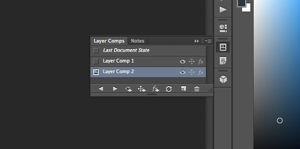
Layer Comps
Photoshop Layer Comps save specific layout details such as visibility, position, and appearance as a recallable state, meaning that you can quickly switch between different versions of the same thing.
An example of this would be a business card, with two Layer Comps. The first version could have the logo on the left, and the text on the right, whilst the second version could have the logo on the right, and the text on the left. It's a really simple concept, now made even more powerful with Photoshop CC 2014.
Adobe have vastly improved how the Layer Comps feature works, and this is especially noticeable when working on a project with many layers and Layer Comps. Now, you can apply the document's current layer position, visibility, and appearance across all selected Layer Comps.
Smart Objects With Layer Comps
Photoshop CC 2014 introduces a way in which you can combine Smart Objects with Layer Comps. For example, you might build a new Photoshop file containing many different icons, each individual icon being visible through a different Layer Comp.
You could then use that Photoshop file as a Linked Smart Object in other projects, and simply choose a specific icon by activating its corresponding Layer Comp. Effectively, it's like using one Smart Object which contains a plethora of different elements.
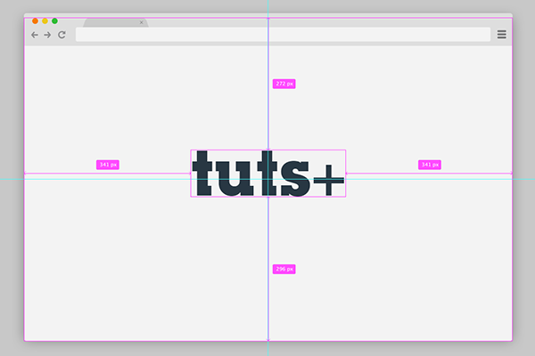
Smart Guides
As a web designer, you'll almost certainly know how important it is to line items up correctly, and with the correct amount of spacing in between different elements. Luckily, with Photoshop CC 2014, you needn't worry about these issues, nor about making complex grids using the guide tools.
With the improved Smart Guides, you can see the relative distance between different objects, allowing you to position things much more quickly and efficiently. This feature may be familiar to you if you use Sketch.
Step 1
To begin using Smart Guides, select the Move Tool, and hold down either the Control key (on Windows), or the Command key (on Mac OS X). Magenta lines will begin to appear (you can change this colour under Photoshop > Preferences > Guides, Grids & Slices) showing you the distance between the canvas and your selected layer.
Step 2
If you want to measure the distance between two different layers, you can do so by pointing your mouse over the other layer.
Step 3
Voilà - that's all! You're now using the improved Smart Guides! If you'd rather change the measurements away from the default option, enable Rulers (either the Control key or Command+R), and then right-click the ruler and choose the measurements you'd like to use.
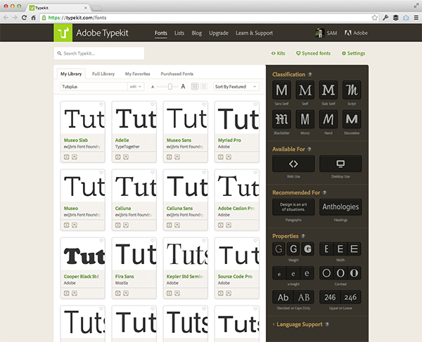
Typekit Integration
Photoshop CC 2014 offers massive new updates to the way in which the Text tool works. One of the most notable new features is the improved Typekit integration. There are two main features in this area:
Typekit Font Filtering
From the font selection dropdown, click the new, grey T icon, and you'll be shown all your synced Typekit fonts. This is a really useful way of identifying which fonts are stored locally, and which are in the cloud, on the Typekit servers.
Typekit Website Shortcut
Clicking the green T icon next to a given font will take you to the Typekit repository, in your web browser, which you'll be automatically logged into. You'll then be able to select the fonts which you'd like to use, and then sync them with your computer. Oh, and did I mention that synced fonts will appear automatically, without the need to close and re-open Photoshop?
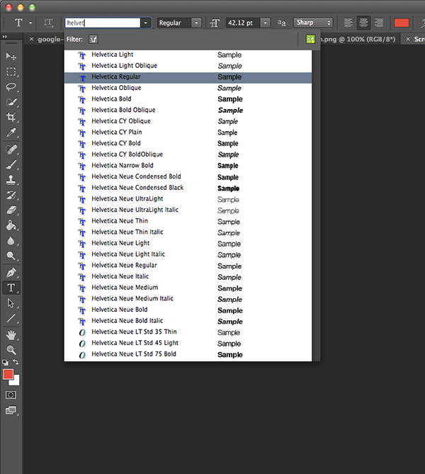
Font Search & Previews
Another useful feature of Photoshop CC 2014 is Font Search. Begin typing either a font's name, such as helvet, so that the Helvetica font families display, or something like, bold cond, so that all the Bold Condensed fonts appear.
Photoshop CC 2014 also offers a Font Preview feature, which allows you to use the up and down arrow keys on your keyboard to view different fonts, one-by-one, or by holding the shift key when doing this to skip font families and go onto the next font.
Workflow Enhancements
There are two key workflow enhancements included in Photoshop CC 2014. The first is in the Linked Smart Objects area of the software. From Adobe:
When you try to perform an operation on a linked smart object whose source file is missing, you are prompted that the smart objects must be rasterised or resolved.
The other workflow enhancement relates to the Sync Settings function - you can now specify the direction of sync, by either uploading or downloading settings from CC, as well as being able to "synchronise workspaces, keyboard shortcuts, and menu customisations". Finally, "the Sync Settings log on the Preferences > Sync Settings tab displays the files being uploaded/downloaded, their sizes, and the timestamps for the upload/download operation".
These workflow changes may be simple, but will definitely be effective, speeding up projects, and making web designers even more productive!
That’s All, Folks!
I'm sure you'll agree that the new features in Photoshop CC 2014 are really exciting, and will become a very useful part of designers’ worldwide regular workflows very shortly. You can learn more about all the changes in Photoshop CC 2014 on the Adobe website.
If you have any questions, or would like to offer your own opinion on any of these tools, please leave a comment below!
Adobe InDesign is a remarkable tool for many print and marketing design projects. It makes it extremely easy to work on publications, move design elements around, and export out for your printer. However, what happens if your project requires different sizes for each item?
Letterhead is a great example of this. When you design letterhead you have many components from the letter to envelopes and business cards. In earlier versions of InDesign you would have to create a separate file for each, but with InDesign, you can use the handy Page Tool to resize each page within one document. This keeps everything in one easy to access document and dramatically improves your workflow. Let's take a look at the process!
You'll find the Page Tool under the Direct Selection arrow in the Toolbar. When you select it, you'll notice the Properties Bar at the top changes to reveal X and Y coordinate options as well as Width and Height options. You'll also notice options very similar to the Document Window that appears when you create a new document. This is where you'll apply all your page size specs. Let's see it in action!
2. Set Up You First Document
Step 1
The first item I create in my letterhead workflow is the main letter. The size of this document is a classic A4 size. Open InDesign and select File >New Document to create your first item. Set Intent to Print and Number of Pages to 1 (we'll add more later). Deselect Facing Pages. Under Page Size select A4. Set the Bleed to .125in on all 4 sides.
Bleed Tip: Even if you don't think you'll design your letterhead with a full bleed, it's best to set it up this way from the beginning. It's easier to design with a bleed and not use it then add it in later.
Click OK.
No you have your first letterhead document ready to go. Instead of saving and adding another InDesign document to the mix, we're going to add the pages for the envelope next right in the same document.
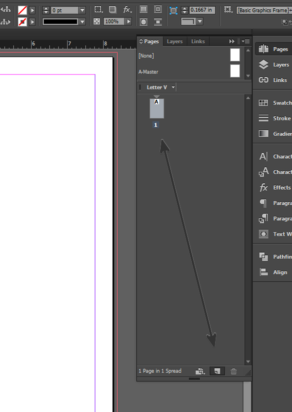
Step 2
We're only going to design the front of the envelope, so we need to add one page. Duplicate the page you just created by clicking and dragging the page from the Pages panelto the New Page icon just to the left of thetrash canicon.
Now that you have the new page, it's time to resize it with the Page Tool.
Step 3
Make sure the second page is active in the Pages panel and the Select the Page Tool. You'll notice the page is selected with new anchors around the edges. This allows you to resize by clicking and dragging any one of the anchors. We want to be more precise, however, and will use the properties at the top instead. Change the Width to 9.5 in and the Height to 4.125 in. This is the standard No. 9 envelope for letters.
You'll see the document transform to this new size. However, did it affect the letter page we created earlier? Scroll up and notice the original page remains the same A4 size we already set. Cool!
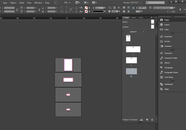
Step 4
Now repeat Step 3 for the business cards. This time you'll create two duplicate pages. One for the front and one for the back of the business card. Instead of inputting the width and height, select the Custom drop down and go to US Business Card. This will format your page to the standard 3.5 x 2 in business card size. If you have a different business card size, you can input it exactly like you did for the envelope in Step 3.
Conclusion
You end up with an InDesign document that has four different sized pages. One for the letter, one for the envelope and two for the business card. If you Zoom Out, you'll notice that the page sizes are different in the Workspace as well as the Pages Panel. This will help you see what page is what in your letterhead workflow.
There are many other uses for this handy feature in InDesign. To see more advanced techniques including how to design letterhead and save out a PDF with multiple page sizes, head on over to my Advanced Print Options Course! You'll also discover how to work with Text on a Path and Advanced Folds, and apply these techniques to two design projects.
With so many different tools, methods, and extensions within Inkscape, it can be pretty overwhelming to cover everything. Thankfully, this A to Z of Inkscape will cover the best stuff this great vector program has to offer. Most of these have links that will bring you to a quick tip or tutorial relating to that tool. So sit back and enjoy this beautifully arranged glossary of Inkscape.
A
Align and Distribute: A dialog box with plenty of actions to align both objects and paths.
B
Box Tool: A unique tool that's used to create 3D boxes by adjusting all 3 dimensions of the box.
Break Apart: A path option that can separate a collection of paths, even if they were combined.
Brush Strokes: Custom brush strokes can be easily achieved in Inkscape with the many options available.
Bucket Tool: A tool that can fill the area of a shape or paths with a color.
C
Calligraphy Tool: A drawing tool that has a ton of options to create advanced brush strokes.
Clip: An object menu that uses a selected object/path to cut a second selected object/path positioned below it.
Clone: A edit option that creates a dynamic copy of a selected object. If the original object is altered, so will the clone.
Combine: A path operation that groups the selected paths to make one entire object that inherits a single fill and stroke.
Create Tiled Clones: A very useful menu with tons of options for creating large amounts of identical, yet dynamic objects.
D
Distribute: A series of options in Align and Distribute that evenly space out multiple objects.
Dropper Tool: A tool that can find the exact color of the selected pixel or pixel area.
Duplicate: An edit option that makes an exact duplicate of your object in the same position as the original.
E
Ellipse Tool: An essential tool that creates circles, ellipses, and arcs.
Eraser Tool: A tool that can be used to delete or cut out nodes.
Export Bitmap: A file option that allows you to export your artwork as a PNG bitmap file.
Extensions: A large drop-down menu that adds convenient and interesting features to Inkscape.
F
Fill and Stroke: An essential dialog box that contains styling options such as fill color and stroke style.
Filters: A drop-down menu that has many different filters and effects to enhance your drawings.
G
Gradient Tool: A tool that allows you to edit color and positioning of gradients.
Group: An object option that conveniently groups a selection of objects or paths.
H
Handles: A visual representation of paths and bezier curves that can be dragged to manipulate the nodes that make them up.
Help: A drop-down menu that offers a good selection of help material for Inkscape.
I
Isometric Projection: A unique art style that involves a 3D art style at a particular angle.
J
Join Style: A fill and stroke option that adjusts the appearance of a joined node.
K
Kerning: A text option that adjusts the letter spacing of each specific letter of a text object.
L
Layer: A drop-down menu that contains everything you need to keep your layers organized.
Letter Spacing: A text option that adjusts the spacing of every letter in a selected text object.
M
Markers: A stroke style option that allows shapes to be assigned to start, middle, and end nodes.
Mask: An object operation that refers to the amount of color lightness in an object to set the clipped object's opacity.
N
Nodes: The basis of all vector design, but Inkscape has a few unique tricks on these.
O
Objects to Marker: An object option that allows you to use any custom object as a marker.
P
Path Effect Editor: A powerful menu that has many advanced options for altering the appearance of paths, such as tapered lines and envelopes.
Pen Tool: A vital tool that easily creates paths by clicking to create nodes. It's also used for creating bezier curves.
Pencil Tool: A tool that's used mostly to create freehand paths and nodes.
Polygon Tool: A tool that makes drawing polygons and stars a breeze.
Q
Quadrilateral Distortion: A fancy term for the useful Extensions > Modify Path > Envelope that allows the distortion of all sides of a selected path.
R
Rectangle Tool: An essential tool that creates rectangles along with the ability to have rounded corners.
Repeating Patterns: It's very easy to create large amounts of identical, yet dynamic objects, such as patterns.
S
Shadows and Glows: A filter menu options that contains a variety of shadows and glows for objects and paths.
Spiral Tool: An interesting tool that draws spirals from a surprising amount of options.
Spray Tool: A great tool that can create multiple copies or clones of an object by spraying an area.
T
Tapered Lines: A style of line that tapers in one or both directions, and Inkscape has a few ways to do them.
Tweak Tool: A fun tool that has different methods of sculpting objects and paths, including shrinking and expanding.
U
Ungroup: An object option that simply ungroups your grouped objects.
Upper Case Text: An extension that will convert all of the characters of a text object into their upper case form.
V
Visualize Path: A unique extension that offers four different options to generate drawings based on the selected paths.
W
Warping: One feature from using the Tweak tool that can warp a selected object or path just by dragging it.
X
XML Editor: Since Inkscape's SVG file is based off of XML, Edit > XML Editor is a powerful way to manually edit your file... if you know what you're doing.
Z
Zoom: A view menu that offers a few unique ways for zoom management.
That's the Inkscape A to Z
We went over a lot of tools, menus, and dialog boxes that make Inkscape the incredible free open-source vector software that it is. This should make a great guide to keep on hand to keep yourself in tune while working on your Inkscape documents. Thanks for reading!
The original Godzilla movie is probably one of the
most important and influential monster movies of all time. If you're a big fan
of cinema, you have probably already heard about the new Hollywood remake, which is
currently being promoted with some astounding artwork. In this tutorial, we
will create a fan-made movie poster, astutely named Goodzilla in Adobe Photoshop. Let's get started!
Tutorial Assets
The following assets were used during the production of this tutorial. Make sure to download them before getting started. If they are not available, please find alternatives.
The best way to start this kind of montage is to get the basic images together. First, create a new document. Make sure to give your file a name (in my case, Goodzilla), and make it 27 x 40 in, which is the most common movie poster size.
If you want the best printing quality, the resolution should be 300 pixels/inch. However, this will make your PSD file very heavy. In my case, since the image will only be viewed on screen, I chose the default resolution, which is 72 pixels/inch.
Go to File > Place Embedded and place Cloudy Hong Kong 5 on your canvas. While placing the image, use the upper Options Bar flip it horizontally and scale it down to about 60%. Press enter to confirm.
Make sure the layer was placed as a Smart Object, which should shows with a small file icon over the layer thumbnail. Enter the file by double-clicking on the Smart Object layer's thumbnail.
Now, we'll mask out the sky. To do so, go to Select > Color Range, and click on the sky to sample its color. Then go to Layer > Layer Mask > Hide Selection. You should get the following result.
Well, that was easy, but the result is far from perfect. We'll need to refine the mask. To do so, click on the layer mask to select it, and, using your favourite tool, paint back in the buildings using white, and hide the unwanted elements using black. In the following example, I've shown in red the part that was hidden along with the final result. Most of the work was done using the Polygonal Lasso Tool (L) and the Fill shortcut (Alt-Backspace). Make sure to take your time to do a good job. There is no trick there, only patience!
Once you are done, save and close the smart object. Rename it City, and place it in a group (Control-G), and name it City as well. Create a New Layer (Control-N), and fill the bottom part of the image with black. Name the layer Black.
Step 2
To create our monster, we'll use a photo of a statue taken in Japan. Place Godzilla on your canvas. Since the image is small, you will need to scale it up by 40% so it fits nicely. Don't worry if it doesn't looks realistic yet, we'll cover it up later using color adjustments and haze.
In this case, we'll need to hide the sky as well as the buildings. The best way to do so is to create a path around the statue using the Pen Tool (P).
Once you are done, go to the Paths pannel, make sure your Work Path is selected, and press the Load Path as selection icon.
With the selection active, go to your Layers panel and press the Add a mask button to hide the background. Name the layer Goodzilla.
Hide the City group. Create a new layer and name it Body. On this layer, paint in black the bottom of the monster's body. This doesn't have to be perfect since most of this area will be hidden with buildings and haze.
Create a new layer and name it Texture, and clip it on Body. Using the Clone Stamp Tool (S), use Alt to pick a textured area, and paint back some texture on the body. Once again, this doesn't have to be perfect.
Unhide the City group. You should get the following result.
Step 3
Place Sunset 1 and scale it so it fits the canvas. Name the layer Sky1.
We can make the sky more interesting by combining it with a more intense looking sky. To do so, placeSky0263 and scale it so it fits the upper part of your canvas.
Name the layer Sky2, set it to Soft Light and mask out the bottom with a soft black Brush so it blends nicely.
2. Create the Mood
Step 1
Now that we've got everything set up, we can begin adjusting colors to set the overall mood of our final image and make sure that everything blends nicely together. We'll start with the sky. Inside the Sky group, create a Gradient Map adjustment layer (Layer > New Adjustment Layers > Gradient Map) and input a gradient ranging from #160E0C to #A96733. Make sure that the layer is set 50% Opacity.
We'll also lighten up the sky. To do so, create a Curves adjustment layer and set it as shown in the example below. Also, make sure the layer has a mask,fill it with black (Edit > Fill), and use a large white soft Brush to paint back in the adjustment around the center of the image.
We can brighten up even more the center of the image by creating a Color Balance adjustment layer with the following values. Make sure the layer is set to Screen, and, once again, mask in only the center of the image.
Next, create a New Layer, and fill it using a large soft Brush and the following three colors.
Name the layer Gold and set it to Multiply and 75%Opacity.
Repeat the process with the following three colors.
And this time set it to Soft Light, 100%Opacity. I named this layer Sunset.
Finally, brighten up the sky one last time with a Curves adjustment layer
Step 2
Now that we've set up a nice atmosphere, we can work on blending the monster within. Since the monster is placed against the main light source, it should be darker. Its hue will also need to fit with the sky. To do so, groupGoodzilla, Texture and Body together, and clip a Curves and a Gradient Map adjustment layer to the group. Give those layers the following settings. I named the group Precomp.
If you look at the original Goodzilla layer, you will notice a blue highlight on the edges of the statue, which is mainly due to the strong backlight. We can specifically tweak that highlight by creating a Hue/Saturation adjustment layer targeting only the Blues.
Once you are done, you should get the following result.
Step 3
For the city, we will use three adjustment
layers. Start by creating a Hue/Saturation layer targeting both Cyans and Blues. For both of these, bring the Saturation and Lightness to -100.
Then, add a Color Balance with the following settings.
And finally, darken everything using a Curves adjustment, to give it the same backlit aspect.
Make sure to clip everything to City.
Now, the building still doesn't seems to fit the scene. That is because, in the original photo, the light source come from the opposite direction than in our scene. To correct this, double-click on the layer's thumbnail to enter the Smart Object. Create a New Layer, set it to Multiply, and paint on the following area with #2A4467.
Once you are done, Save and Close the Smart Object, and you should get the following result.
Step 4
In this step, we'll give our image a better sense of depth by adding haze. When outside, if you look at the horizon, you will notice that as things get further away from you, they tend to take up the color of the atmosphere and lose details. This is because the air is not perfectly transparent, and over great distance, it becomes visible. This effect is accentuated if there are particles in the air, such as humidity, or, in our case, dust from the destruction of the city! This means that, in our image, as things get further away from the viewpoint, they should lose detail and take up an orange hue. Doing will help conveying the sheer magnitude of the monster as well as hiding the fact that the original photo is a statue.
To do so, create a new layer, clip it to Precomp, name it Haze, and paint in with a large soft Brush and the following values.
In order to preserve some of the details, bring down the Opacity to 60%.
Repeat the process for the city, this time using a more brownish color such as #3D3027.
This time, bring the Opacity down to 25%.
Mask out some of the foreground elements, such as the trees.
Step 5
In this step, we'll continue adjusting and bringing together our image. We'll start by creating a new group named FX containing two Gradient Map. Give the first one a gradient ranging from #231812 to white, and set it to 30% Opacity.
Then, give the next Gradient Map the following settings, and set it to 25% Opacity.
Give both layers the following mask.
Then, add the following Color Balance.
Step 6
In this step, we'll finalize our backlit setup by adding a bright sun in the sky. This will also serve to create a strong focal point toward the most important part of our image, which is the monster. Start by creating a new layer and fill it with black. With a large and soft round Brush, paint a big brown #2A170A dot in the center of the canvas. Then, paint a smaller and brighter #DFB27F dot in the middle, and then, an even smaller and brighter dot in the middle #FDF2DC.
Set the layer to Linear Dodge, then scale and place it according to the example below. The Linear Dodge blending mode will allow us to get a nice flare effect.
Finally, we'll add a vignette effect in order to focus the viewer even more toward the center of the image. To do so, create a New Layer, Fill it with white and paint with a soft black Brush around the edges of the canvas. Name the layer Vignette and set it to Multiply.
3. Add Details and Refinements
Step 1
In the original poster, we get to see soldiers parachuting toward the monster. This is a nice touch since the smoke trails they leave behind create visual lines which helps focus the eye toward the center of the image. In order to achieve this effect, we'll use smoke trail from aerobatic airplanes. Let's begin by opening Red Arrows in Photoshop.
Hit Control-M to bring up the Curves adjustment window, and crunch the darker pixels of the image. Then, hit Control-U to bring up the Hue/Saturation window, target the Blues and bring the Lightness down to -100.
Then, use the Brush Tool (B) with a cloud-like brush and paint in black the clouds that are still visible.
Hit Control-I to Invert the image's color. Then, hit Control-A to create a full Selection of the canvas and then Copy (Control-C) and Paste it (Control-V) back into your main scene. Set the layer to Multiply.
In order to feel more realistic, the trails need to be darker and match the overall hue of the sky. Once again, we'll use the Curves and Hue/Saturation adjustment windows. Don't forget to check the Colorize option.
Using the Lasso Tool (L), create a selection around one of the smoke trail, Cut it (Control-X), Paste it (Control-V), and use the Free Transform mode (Control-T) to move and rotate it around.
Once you are done placing them, give all the layers the name Trail and set them to Multiply.
You can use the technique shown in the previous step to create flares at the tip of the smoke trails. If you don't want them to be to bright, set them to 70% Opacity and groupthem together.
Add yet another four layers, and paint small soldiers at the tip of the smoke trail. Once you are done, group everything together and name the group Paratroopers.
Step 2
Since this is a movie poster, we're going to add a number of textual informations, such as the movie title, the actors' names, the credits and the release date. Let's start with the actor names. Make sure you have downloaded and installed the free font Bebas Neue. Pick the Horizontal Type Tool (T) and create seven Text Layer. Fill those layers with the actors' names, set the color to #A68B76, the first name to 42 pt, and the family name to 60 pt. Once you are done, place everything in a group named Actors.
As for the movie title, I used the font Compacta ICG Bold, which is the actual font of the movie poster. If you don't have it, the font Impact can do just fine, although it is slightly less aesthetic. Once again, use the Type Tool (T) and type in the movie title, or in this case, Goodzilla. Set the font size to 250 pt and the color to #C72F13. Then, place and scale ConcreteBare0348 over your text layer, and clip it to it. Group both layer together and name the group Goodzilla. And then, place both Goodzilla and Actors together in a group named Text.
Set ConcreteBare to Multiply.
While the texture is nice, it darkened our text a little bit too much. To correct this, make sure you have your texture layer selected, hit Control-M to bring the Curves adjustment window, and bring up the curve.
As for the credits, we'll use a font named SteelTongs which has been specifically designed for this use. With the font installed, you can use the lowercase to type the small titles, and the uppercase to type the actual letters. Once you are done, set the font size to 50 pt, and the color to #69584B.
As for the date, you can use the font Compacta ICG Bold (or Impact). Set the size to 100 pt and the color to white.
Finally, we'll place in the Godzilla Sign. If you have Illustrator, I suggest you open and copy it inside this program, and Paste it as a Shape Layer to get the best quality. Otherwise, you can just place it as a regular layer.
With the layer selected, pick a dark red color #6E0F00 and hit Alt-Backspace to Fill the shape with the color. Then, set it to 70% Opacity.
To improve the contrast between the movie title and the background shape, we'll give our movie title layer a Drop Shadow. Make sure your Goodzilla layer is selected, and click on the Add a Layer Style button. Input the following settings.
Step 3
We can make our image more visually interesting by adding some smoke clouding the city. To do so, first start by opening Evening Sky 1 in Photoshop.
Hit Control-I to Invert the color, and then use the Curves adjustment to brighten up the image.
Now, use a large soft Brush to paint the lower area of the image in white.
Once you are done, bring the image into your main scene, rotate and place it according to the example below. Use the Hue/Saturation adjustment to Colorize the cloud in red. Name the layer Smoke, set it to Multiply and 70% Opacity. Notice that this layer is placed between the City and the Goodzilla group.
Duplicate (Control-J) the layer, enter the Free Transform mode (Control-T), Flip it horizontally (Edit > Transform > Flip Horizontal) and place it to the right of your canvas. You can then duplicate the layer another time and place it so it fills even more the lower right area of the image. Once you are done, Group everything together in a group named Smoke.
Step 4
The poster is almost completed! For the final touches, we'll start by adding another vignette effect. Create a New Layer, and, using the Gradient Tool, create a gradient going from black to white, and back to black.
Name the layer Vignette, set it to Multiply and place it between Text and Paratroopers.
Notice how there is a division between at the bottom of the layer, between the city and the black background. We can fix this by creating yet another New Layer, and using a large soft Brush, paint a straight line with #030101. Place the layer above Vignette, and name it Bottom Fix.
Finally, make sure to Save a copy of your file, and then go to Layer > Flatten Image.
Go to Filter > Noise > Add Noise, set the amount to 2% and make sure to check Monochromatic.
Finally, go to Image > Image Size and resize the image to 25%. Make sure to check Resample Image, and select Bicubic Sharper, to get the best result as you scale down the image.
There you go, you've completed the tutorial. Have a look at the final result!
Conclusion
In this tutorial, we covered the process in
making a Godzilla-inspired movie poster. Among others, we have seen various
techniques allowing you to create a strong mood, to convey a sense of scale and
depth, and to keep the viewer focused at the center of our image. Now, you can
use these techniques to create your own fan made movie poster!
So often we break down logotypes and graphic design projects solely in Adobe Illustrator. Today's tutorial produces one project in both Adobe Illustrator and Adobe Photoshop, highlighting the process of design while using similar methods in each program.
1. Sketch it Out
Step 1
I sketched out various logotypes, badge designs, and banners in my sketchbook. Although I made a whole set of designs, this tutorial will focus on one in particular: an oval design similar to beer bottle labels in its shape, but sweetened up for an ice cream shop.
Step 2
I decided on the oval design for this tutorial, and as such sketch out variations of it with banners, additional copy, and alternate design elements. I want the piece to give the viewer the information they need: brand and product type.
2. Ovals in Photoshop
Step 1
Let's start this tutorial in Adobe Photoshop CC (other versions can definitely be used, as most of the tools are present in multiple versions). Create a New Document that's about 6 inches by 8 inches at 300dpi.
Use the Ellipse Tool (U) to draw a large oval. Fill it with a light, creamy color (R: 248 G: 231 B:213) in the Properties panel. Right-Click the shape layer in the Layers panel, Rasterize, and use the Rectangular Marquee Tool (M) to cut out a section (see below) of the oval.
Step 2
Use the Magic Wand Tool (W) to select outside of the oval halves and Invert (Shift-Control-I) the selection. Go to Select > Modify > Contract and Contract By 15 pixels. Delete the newly contracted selection from the oval halves so you're left with two outlines.
Step 3
Draw two long rectangles on the inner edges of each oval halves with the Rectangle Tool (U). You can match the exact width of the outlines by selecting each shape layer with the Direct Selection Tool (A) and defining the height as 18px. Select your shape layers and Align them to the Center with the Move Tool (V).
3. Banners and Background
Step 1
On a new layer, draw a rectangle and set the fill color to bright teal (R: 89 G: 189 B: 189). Rasterize the layer and select outside of the bottom half of the oval (switch layers, then select the teal rectangle layer again). Delete the portions of the rectangle that exist outside of the selection.
Step 2
Using the Magic Wand Tool, select the interior of the top oval half. Contract the selection by 20 pixels, as was done in Section 2, Step 2. Create a New Layer and use the Paint Bucket Tool (G) to fill in the newly contracted area with teal.
Step 3
A quick shot of the logo at this point in the tutorial. Reduce the length of the lower cream rectangles and draw smaller ones in the center of the oval shapes. Make sure every element is centered.
Step 4
Select the teal oval half and make a New Layer in the Layers panel (for pieces like this, I tend to do one layer for each element of the design so they're easily changed later, much like a document created in Illustrator).
Use the Gradient Tool (G) to place a Radial Gradient that goes from dark teal (R: 18 G: 112 B: 112) to transparent within the selection (in the new layer).
4. Place Text
Step 1
The text in this design is fairly simple and straightforward. Write out your text with the Horizontal Type Tool (T). For "Sweet Treats", I used Bebas Neue in the same cream used for the outlining shapes. Move the bottom oval half elements upward so the text fits in the center of the design without extending past the top long rectangle.
Step 2
For the "ICE CREAM" text, I used Archivo Black, written in capital letters due to its bold, blocky look. Rasterize the text layer and select the letters (make sure there is a marquee going around the inner portions of the "R" and "A") and delete the selection from the teal banner layer. Hide the text layer in the Layers panel.
Make a New Layer above the teal banner layer and use the Gradient Tool in order to place Radial gradients on either side of the banner (concentrate dark teal on the edges). Select the teal banner (in the teal banner layer) and Delete the portions of the gradient layer that do not intersect with the teal banner (as was done in Section 3, Step 1).
Step 3
In order to add some ribbon tails on either side. Draw a dark teal rectangle with the Rectangle Tool, Rasterize the shape layer, and use the Polygonal Lasso Tool (L) to draw a triangle-shaped selection to delete from the rectangle.
Rotate the shape 45°, or so, Duplicate the layer, and go to Edit > Transform > Flip Horizontal. Merge (Control-E) the ribbon layers together and place them beneath the ICE CREAM banner layers. Select the banner and use the Eraser Tool (E) to delete the ribbons from the text selection (see final image below).
Step 4
Select the "ICE CREAM" banner layers and go to Edit > Warp. Apply an ArchBend of -33% depending on your banner's placement. Move the bent banner and lower oval half upwards in the design.
Step 5
The final text touch for this design is "SINCE 1982" (or whatever year your imaginary or rather real business was established) written in bold Myriad Pro and in cream. Place at the bottom of the second oval half in 12pt or 14pt size. Select your text with the Horizontal Text Tool and warp the text in an Arc style by -36%.
5. Draw the Ice Cream
Step 1
Use the Pen Tool (P) to draw a rectangle with the top edge curved. Hold down Alt to manipulate the handles while creating the curve. In the Paths panel, fill the shape with the same teal color used previously. Draw a thin, curved strip (see below), also with the Pen Tool and fill it in with cream. Delete the portions of the strip that extend beyond the cup shape.
Step 2
Use the Brush Tool (B) to draw a cloud-like ice cream swirl. Trace the shape with the Pen Tool on a New Layer and fill in with the same cream color used throughout the tutorial. Use the Ellipse Tool to draw a cute red cherry. Hide or Delete the drawn ice cream layer.
Step 3
Since this is on a white background, the light cream color was changed to a sweet peach. It retains the sherbet color theme but is readable against light colors. If the logo is going to be on a dark background, opt for the light cream instead.
Once finished you can Export your file or continue to design badges, banners, and logotypes for "Sweet Treats", everyone's favorite ice cream company that was made up for this tutorial. Let's move on to creating the same design in Adobe Illustrator.
6. Create the Oval and Boundaries
Step 1
Create a New Document with the same dimensions as Section 2, Step 1. Use the Ellipse Tool (L) to draw a large oval-shape and the Rectangle Tool (M) to draw a narrow rectangle that overlaps the oval. Fill both with the cream color from Section 2, Step 1. Select both shapes in hit Minus Front in the Pathfinder panel. Right-Click the compound shape and hit Release Compound Path in order to separate the
Step 2
Draw four rectangles in the space between the two oval halves. Note how the top two are longer than the bottom two and the outer two are thicker than the inner two rectangles.
Step 3
Select the top oval half and go to Object > Path > Offset Path. Input -6px for the Offset. Select both the top oval and its offset shape and hit Minus Front in the Pathfinder panel. Repeat with the bottom oval.
7. Text and Banners
Step 1
Draw a smaller oval in the top of the cream oval half. Set the fill color to the same teal used in Section 3, Step 1, and cut off the bottom portion of it using the technique from Section 6, Step 1.
With the Type Tool, write "Sweet Treats" in Bebe Neue. Adjust the size and overall shape of the type with the Selection Tool (V).
Step 2
To create the teal banner, draw a rectangle across the bottom of the oval shape. Select both shapes and use the Shape Builder Tool (Shift-M) in order to Select the outer portions of the rectangle, Deselect, and Delete them from the banner.
Step 3
With the Type Tool, write "ICE CREAM" in Archivo Black and Expand the type under Object. Unite the type in the Pathfinder panel. Select the text shape and teal banner and hit Minus Front in Pathfinder.
Write out "SINCE 1982"in Myriad Pro. To warp the text, go to Effect > Warp > Arc and Bend the text by -17%. Place this text at the bottom of the oval.
Step 4
Copy (Control-C) and Paste (Control-V) the "ICE CREAM" banner and apply a gradient fill, using the Gradient panel, that goes from dark teal (Section 3, Step 4) at 100% to 0% to 100%Opacity.
8. Background, Ice Cream, and Ribbons
Step 1
Copy and Paste the teal oval half and apply a Radial Gradient going from dark teal at 100% to 0% Opacity. Adjust the placement of the gradient with the Gradient Tool (G).
Step 2
For the sundae cup, draw an ellipse and rectangle of the same width and Unite them in the Pathfinder panel. Use the Pen Tool (P) to draw the cream-colored curved stripe across the front of the cup. Like the process in Section 5, Step 2, sketch out the ice cream shape with the Paintbrush Tool (B) and trace it with the Pen Tool. Delete any stroked sketches from the Layers panel. Use the Ellipse Tool to draw a cute little red cherry and place it behind the ice cream shape.
Step 3
For the teal banner's ribbons, draw a short rectangle with the Rectangle Tool. Use the Pen tool to draw a triangle on the left side of the rectangle. Select both and hit Minus Front in the Pathfinder panel. Rotate the shape 45° or so. Copy, Paste, and Reflect the ribbon shape over a Vertical Axis and place on either side of the teal banner within the design (make sure it's placed beneath the banner in the Layers panel).
Step 4
Select the "ICE CREAM" banner components and Group (Control-G) them together. Go to Effect > Warp > Arch and Bend it by -21%.
9. Color Variations
Step 1
Color choice is important. I made the background dark gray in this instance so the cream details are visible. Imagine that your logo is being printed in a newspaper or in a magazine, but it won't be printed in color. You'll want to make sure that you've chosen colors for that particular instance so that your brand, product, and other information are still readable.
Step 2
The second variation is simple black and white. I omitted the cherry portion of the design. All gradients were deleted (this is why I placed them on a separate layer from the initial shape), cream became white, and teal and dark teal became black.
Much like the grayscale variation, all salient information is easily read so long as it exists on a gray background. This exercise is useful not only for black and white publications, but also limited color printing in which you may only choose two or three colors.
Finally, seeing your logo design, banner, etc. in this way hammers home what portions of the design stand out the most. In this case it's the ice cream and the words "SWEET TREATS", which are the most important elements of the design since it immediately tells the viewer or consumer what the product or company is.
Well Done, You!
One basic design (created separately, so variations occurred) in two programs. While I prefer using Illustrator for all things logo and design-related, only having access to Photoshop shouldn't limit a designer when it comes to creating similar design sets and artwork. It may make for heavier files and documents, but being able to create vector-like pieces in raster form is a great way to get the most out of a program like Photoshop.
For starters you will learn how to create the color boxes using basic tools and effects, the Appearance panel and a free, monospaced font along with basic typing techniques. Next, you will learn how to save a simple graphic style, how to easily use it and how to create the numbered boxes.
Using simple tools and effects along with some basic vector shape building techniques you will learn how to create the groups of shapes that make up your arrows and how to save them as patterns. Using these pattern you will learn how to create for pattern brushes and how to easily use them.
Finally, you will learn how to create another two graphic styles that will be used as highlighters and frame for the zoomed areas.
1. Create a New Document, Set Up a Grid and Pick the Main Colors
Hit Control-N to create a new document. Select Pixels from the Units drop-down menu, enter 600 in the width and height boxes then click on the Advanced button. Select RGB, Screen (72ppi) and make sure that the Align New Objects to Pixel Grid box is unchecked before you click OK.
Enable the Grid (View > Show Grid) and the Snap to Grid (View > Snap to Grid). You will need a grid every 1px, so simply go to Edit > Preferences > Guides > Grid, enter 1 in the Gridline every box and 1 in the Subdivisions box. Try not to get discouraged by all that grid, it will ease your work and keep in mind that you can easily enable or disable it using the Control-" keyboard shortcut. You should also open the Info panel (Window > Info) for a live preview with the size and position of your shapes. Do not forget to set the unit of measurement to pixels from Edit > Preferences > Units > General. All these options will significantly increase your work speed.
Step 2
For starters you need to pick your main color. For this tutorial the main color will be R=0 G=112 B=190. If you wish to choose a different color make sure that it's one that doesn't hurt the eye and that it works on both dark and light backgrounds.
Focus on the Swatches panel (Window > Swatches), click the New Swatch button (pointed in the following image), enter the color code mentioned a few moments ago, name it "mainColor" and click OK. Next, you need to add to variations of your main color. Return to the Swatches panel and simply save the R=30 G=142 B=220 (name it "colorOne") and the R=128 G=184 B=223 (name it "colorTwo") colors.
2. Create the Color Boxes
Step 1
Pick the Rectangle Tool (M) and focus on your Toolbar. Remove the color from the stroke then set your "mainColor" for the fill. Move to your artboard and simply create a 77 x 75px rectangle, the Snap to Grid should ease your work.
Step 2
Make sure that your blue rectangle stays selected and focus on the Appearance panel (Window > Appearance). Select the stroke, add your "colorOne" color then simply click on that "Stroke" piece of text to open the Stroke fly-out panel. Make sure that the Weight is set at 1px then check the Align Stroke to Inside button.
Step 3
Reselect your blue rectangle, focus on the Appearance panel, make sure that the entire path is selected (simply click on that "Path" piece of text from the top of the Appearance panel) and go to Effect > Stylize > Rounded Corners. Enter a 5px Radius, click OK and go to Effect > Stylize > Drop Shadow. Enter the properties shown in the following image and click OK. Make sure that your blue rectangle is still selected, open the Graphic Styles panel (Window > Graphic Styles) and simply click the New Graphic Style button to save a new graphic style. Double-click on your graphic style and simply rename it "blue".
Step 4
Using the Rectangle Tool (M), create a set of rectangles as shown in the following image. Make sure that all these new shapes are selected and simply add your "blue" graphic style.
Step 5
Focus on your 77 x 75px rectangle. Pick the Type Tool (T), simply click on your artboard and add the three piece of text shown in the following image. Set the color at white and use the Inconsolata font with the size 20px.
Step 6
Make sure that the Type Tool (T) is still active and add another three pieces of text as shown in the following image. Set the same color and font attributes utilized for the existing pieces of text.
Step 7
Make sure that the Type Tool (T) is still active and add a bunch of new text as shown in the following image. The Inconsolata font is a monospaced font, which means that your characters will occupy the same amount of horizontal space. This simply means that you won't have to worry about the length of your text when you will need to change the colors codes.
Step 8
Select one of your pieces of text and simply go to Select > Same > Appearance to select the rest of the text. Make sure that it's all selected and go to Effect > Stylize > Drop Shadow. Enter the properties shown in the following image and click OK.
Step 9
Select the pieces of text and the blue rectangle that make up your top, left color box and simply hit Control-G to Group them. This will make it easier for you to select, move or duplicate your color box. Focus on the rest of the color boxes and Group them as you did with the first one.
3. Create the Numbered Boxes
Step 1
Using the Ellipse Tool (L), create a 30px circle and make sure that it stays selected. First, add the "blue" graphic style.
Next, move to the Appearance panel, select the existing Rounded Corners effect and simply click the Delete Selected Item button to get rid of it.
Step 2
Keep focusing on your blue circle, pick the Type Tool (T) and add a simple "1" as shown below. Make it white and use that same Inconsolata font with the size set at 20px then go to Effect > Stylize > Drop Shadow. Enter the properties shown in the following image and click OK. Reselect this fresh piece of text along with your blue circle and Group them (Control-G).
Step 3
Duplicate your group with the blue circle (Control-C > Control-F), select the copy and drag it several pixels to the right. Focus on the copy, select the existing piece of text and simply replace the "1" with a "2". Repeat this technique and add another eight group copies as shown in the second image. Don't forget to replace the text.
4. Create and Save a Set of Patterns
Step 1
Using the Rectangle Tool (M), create a 15 x 3px shape, fill it with your "mainColor" and go to Effect > Stylize > Rounded Corners. Enter a 1.5px Radius, click OK and go to Object > Expand Appearance. Make sure that the Rectangle Tool (M) is still active, create a 13px square and place it exactly as shown in the second image. Focus on the right side of this new shape and switch to the Direct Selection Tool (A). Select the top anchor point and drag it 5px down then select the bottom anchor point and drag it 5px up.
Step 2
Using the Rectangle Tool (M), create two, 2 x 5px shapes and place them as shown in the first image. Make sure that both shapes are selected and go to Effect > Stylize > Rounded Corners. Enter a 1px Radius, click OK and go to Object > Expand Appearance. Using the the same tool, create three, 4 x 3px shapes and place them as shown in the second image. Make sure that all three shapes are selected and go to Effect > Stylize > Rounded Corners. Enter a 1.5px Radius, click OK and go to Object > Expand Appearance.
Step 3
Make sure that all the shapes that make up your arrow are selected, open the Pathfinder panel (Window > Pathfinder) and click the Unite button.
Step 4
Disable the Snap to Grid (View > Snap to Grid) then go to Edit >
Preferences > General and make sure that the Keyboard Increment is set at 1px.
Reselect your blue arrow shape and make two copies in front (Control-C > Control-F > Control-F). Select the top copy and move it 1px down using the down arrow button from your keyboard. Reselect both copies made in this step and click the Minus Front button from the Pathfinder panel. Make sure that the resulting group of shapes is selected and simply hit Control-8 to turn it into a simple Compound Path. Select it and set "colorTwo" as the fill color.
Step 5
Reselect your arrow shape and go to Object > Path > Offset Path. Enter a 1px Offset and click OK. Select the resulting shape and replace the existing fill color with "colorOne". Make sure that the shape made in this step is selected and make a copy in back (Control-C > Control-B). Select this copy, move it 2px down and focus on the Appearance panel.
Replace the existing fill color with "mainColor" the simply click on that "Opacity" piece of text to open the Transparency fly-out panel. Simply lower the Opacity to 25% and things should look like in the second image.
Return to your artboard, reselect the shape made in the beginning of this step and make a new copy in back (Control-C > Control-B). Select this copy, move it 1px up, focus on the Appearance panel and simply remove the color from the fill.
Step 6
Reselect all the shapes that make up your arrow and Group them (Control-G). Make a copy of this new group (Control-C > Control-F), select it and drag it several pixels down as shown in the second image.
Step 7
Enable the Snap to Grid (View > Snap to Grid). Using the Rectangle Tool (M), create a 1 x 18px shape, set the fill color at red and place it as shown in the first image.
Step 8
Reselect your arrow group along with the red rectangle and pick the Shape Builder Tool (Shift-M). Holding the Alt and the Shift buttons from your keyboard drag two simple selection around the left side and the right side of your red rectangle as shown in the following image. Remove the red shape and you will end up with a group of simple rectangles as shown in the second image. Select it and simply drag it in the Swatches panel to save it as a pattern. Keep focusing on the Swatches panel, double-click on your pattern and rename it "sideTile".
Step 9
Focus on your other arrow group. Using the Rectangle Tool (M), create a 3 x 18px shape and a 20 x 18px shape and place them as shown in the second image. Make sure that both rectangles are selected, set the fill color at red and turn them into a simple Compound Path (Control-8).
Step 10
Reselect your red compound path along with the arrow group and hit the Crop button from the Pathfinder panel. Make sure that the resulting group of shapes is selected and simply hit Shift-Control-G to Ungroup it.
Step 11
Select the shapes highlighted in the first image and Group them (Control-G). Turn this new group into a pattern and name it "endTileArrow". Select the shapes highlighted in the second image and Group them (Control-G). Turn this new group into a pattern and name it "roundTile".
Step 12
Reselect the group that makes up the arrow and simply go to Object > Transform > Reflect. Check the Vertical box and click the Copy button. Select the resulting group, turn it into a new pattern and name it "startTileArrow".
Step 13
Using the Rectangle Tool (M), create a 15 x 3px shape, fill it with your "mainColor" and go to Effect > Stylize > Rounded Corners. Enter a 1.5px Radius, click OK and go to Object > Expand Appearance. Switch to the Ellipse Tool (L), create an 11px circle, place it as shown in the first image and make sure that it stays selected.
Focus on the Appearance panel, remove the color from the fill and select the stroke. Add your "mainColor", set the Weight at 3px and check the Align Stroke to Inside button from the Stroke fly-out menu. Make sure that your circle is still selected and go to Object > Path > Outline Stroke.
Step 14
Reselect the two shapes that make up your pointer and click the Unite button from the Pathfinder panel.
Step 15
Disable the Snap to Grid (View > Snap to Grid). Reselect your blue pointer shape and make two copies in front (Control-C > Control-F > Control-F). Select the top copy and move it 1px down using the down arrow button from your keyboard.
Reselect both copies made in this step and click the Minus Front button from the Pathfinder panel. Make sure that the resulting group of shapes is selected, turn it into a Compound Path (Control-8) and set "colorTwo" as the fill color.
Step 16
Reselect your pointer shape and go to Object > Path > Offset Path. Enter a 1px Offset and click OK.
Select the resulting shape and replace the existing fill color with "colorOne". Make sure that the shape made in this step is still selected and make a copy in back (Control-C > Control-B). Select this copy, move it 2px down and focus on the Appearance panel. Replace the existing fill color with "mainColor", lower its Opacity to 25% and things should look like in the second image.
Return to your artboard, reselect the shape made in the beginning of this step and make a new copy in back (Control-C > Control-B). Select this copy, move it 1px up, focus on the Appearance panel and simply remove the color from the fill.
Step 17
Reselect all the shapes that make up your pointer and Group them (Control-G). Using the Rectangle Tool (M), create a 13 x 16px shape, set the fill color at red and place it exactly as shown in the second image.
Step 18
Reselect your red rectangle along with the pointer group and hit the Crop button from the Pathfinder panel. Turn the resulting group of shapes into a pattern and name it "pointeEnd".
5. Create Three Pattern Brushes
Step 1
Open the Brushes panel (Window > Brushes), click the New Brush button, check the Pattern Brush box and click OK. Enter "arrowBrush" in the Name box then focus on to the Tile boxes. Open the Side Tile window and add your "sideTile" pattern, open the Start Tile and add your "roundTile" pattern then open the End Tile and add your "endTileArrow" pattern. Once you're done, click the OK button and you should find your new pattern brush inside the Brushes panel.
Make sure that your "arrowBrush" pattern brush is selected, pick the Paintbrush Tool (B) or the Pen Tool (P) and simply draw your path.
Step 2
Return to the Brushes panel (Window > Brushes), click the New Brush button, check the Pattern Brush box and click OK. Enter "doubleArrowBrush" in the Name box then focus on to the Tile boxes. Open the Side Tile window and add your "sideTile" pattern, open the Start Tile and add your "startTileArrow" pattern then open the End Tile and add your "endTileArrow" pattern. Once you're done, click the OK button and you should find your new pattern brush inside the Brushes panel.
Make sure that your "doubleArrowBrush" pattern brush is selected, pick the Paintbrush Tool (B) or the Pen Tool (P) and simply draw your path.
Step 3
Return to the Brushes panel (Window > Brushes), click the New Brush button, check the Pattern Brush box and click OK. Enter "pointerBrush" in the Name box then focus on to the Tile boxes. Open the Side Tile window and add your "sideTile" pattern, open the Start Tile and add your "roundEnd" pattern then open the End Tile and add your "pointerEnd" pattern. Once you're done, click the OK button and you should find your new pattern brush inside the Brushes panel.
Make sure that your "pointer" pattern brush is selected, pick the Brush Tool (B) or the Pen Tool (P) and simply draw your path.
6. Create the Highlighter
Step 1
Using the Rectangle Tool (M), create a simple square and make sure that it stays selected. Focus on the Appearance panel, remove the color from the fill and select the stroke. Add your "colorTwo", set the Weight at 3px and check the Align Stroke to Outside button from the Stroke fly-out menu.
Step 2
Make sure that your square is still selected, focus on the Appearance panel and add a second stroke using the Add New Stroke button. Select the new stroke, replace the existing color with "mainColor" and go to Effect > Distort & Transform > Transform. Focus on the Move section, drag the Vertical slider at 1px and click OK.
Step 3
Make sure that your square is still selected, focus on the Appearance panel and add another two strokes using that same Add New Stroke button. Focus on these new strokes and select the bottom one. Replace the existing color with "colorOne", decrease its Weight to 1px and check the Align Stroke to Inside button. Select the other stroke added in this step, replace the existing color with "colorOne", decrease its Weight to 1px, make sure that Align Stroke to Outside button is checked and go to Effect > Path > Offset Path. Enter a 3px Offset and click OK.
Step 4
Reselect your square, make sure that the entire path is selected (simply click on that "Path" piece of text from the top of the Appearance panel) and go to Effect > Stylize > Rounded Corners. Enter a 2px Radius, click OK and go to Effect > Stylize > Drop Shadow. Enter the properties shown in the following image and click OK. Make sure that your square is still selected, focus on the Graphic Styles panel, save a new graphic style and rename it "highlighter".
Step 5
Using the Rectangle Tool (M) or the Ellipse Tool (L), simply create a shape around the area that you wish to highlight, make sure that it stays selected and simply add your "highligter" graphic style.
7. Create the Frame for a Zoomed Area
Step 1
Using the Rectangle Tool (M), create a simple square and make sure that it stays selected. Focus on the Appearance panel, remove the color from the fill and select the stroke. Set the color at white (R=255 G=255 B=255) and the Weight at 6px, check the Align Stroke to Outside and lower its Opacity to 20% then go to Effect > Stylize > Outer Glow. Enter the properties shown in the following image and click OK.
Step 2
Make sure that your square is still selected, focus on the Appearance panel and add a second stroke using that same Add New Stroke button. Select this new stroke, lower its Opacity to 10%, make sure that the Align Stroke to Outside button is checked and go to Effect > Stylize > Drop Shadow. Enter the properties shown in the following image and click OK.
Step 3
Make sure that your square is still selected, focus on the Appearance panel and add a third stroke. Select it, set the color at black (R=0 G=0 B=0) and the Weight at 3px then lower its Opacity to 3% and check the Align Stroke to Inside button.
Step 4
Make sure that your square is still selected, focus on the Appearance panel, select the black stroke and simply duplicate it using the Duplicate Selected Item button. Select the new stroke, increase the Weight to 6px and lower its Opacity to 2%. Make sure that the stroke added in this step is still selected and duplicate it using that same Duplicate Selected Item button. Select the new stroke, increase the Weight to 9px and lower its Opacity to 1%.
Congratulations! You're Done!
Here is how it should look. I hope you've enjoyed this tutorial and can apply these techniques in your future projects.
Of all parts of the body, the hand is by many considered to be the hardest to draw. We all have stories of how, early on, we would keep our characters' hands behind their backs or in their pockets, avoiding as much as possible the task of tackling hands. Yet paradoxically, they are our most readily available reference, being in our field of vision every moment of our lives. With just one extra accessory, a small mirror, we can reference hands from all angles. The only real challenge, then, is the complexity of this remarkably articulated organ: it's almost like drawing a small figure onto a larger one, one doesn't know where to start.
In this tutorial we will deconstruct the hand's own anatomy and indeed demystify it, so that when you look at a hand for reference, you can make sense of it as a group of simple forms, easy to put together.
I use the following abbreviations for the fingers:
Th = thumb
FF = forefinger
MF = middle finger
RF = ring finger
LF = little finger
Basics of the Hand
Here’s a quick look at the bone structure of the hand (left). In blue, the eight carpal bones, in purple, the five metacarpal bones, and in pink, the 14 phalanges.
As many of these bones cannot move at all, we can simplify the basic structure of the hand: the diagram on the right is all you really need to remember.
Note that the actual base of the fingers, the joint that corresponds to the knuckles, is much lower than the apparent base formed by flaps of skin. This will be important to draw bending fingers as we will see later.
Based on the above, a simple way of sketching the hand is to start with the basic form of the palm, a flat shape (very much like a steak, but roundish, squarish, or trapezoidal) with rounded angles, then attach the fingers :
If you have a hard time drawing fingers, it’s very helpful to think of them, and draw them, as stacks of three cylinders. Cylinders are easy to draw under any angle, taking away much of the headache of drawing fingers in perspective. Observe how the bases of the cylinders are exactly the folds you need to draw when the finger bends.
This is important: The joints of the fingers are not aligned on straight lines, but fall onto concentric arches:
In addition, fingers
are not straight, but bend slightly towards the space between MF and
RF. Showing this even subtly gives life to a drawing:
Let us not forget the fingernails. There is no need to always draw them, indeed they are a degree of detail that only looks right when the hands are seen sufficiently close up, but we are not usually taught how they should look, and because of this, I for one couldn't make them look right for a long time. Here are some notes on the fingernail:
The fingernail starts halfway up the top joint of the finger.
The point where fingernail detaches from flesh varies: some people have it all the way at the edge of the finger, others have it very low (dotted line), so in their case the fingernails are wider than they are long.
Fingernails are not flat, but shaped much like roof tiles, with a curvature ranging from extreme to very slight. Observe your hand and you may find that this curvature is different for each finger – but this level of realism is unnecessary in drawing, fortunately.
Proportions
Now, taking the (apparent) length of FF as our base unit, we can roughly put down the following proportions:
The maximum opening between Th and FF opening = 1.5
The maximum opening between FF and RF = 1. The MF can be closer to either without affecting the total distance.
The maximum opening between RF and LF opening = 1
The maximum angle between Th and LF is 90º, taken from the very base of the Th’s articulation: the fully extended LF is aligned with it.
I said "roughly" because these do vary with people, sometimes a lot, but remember that deviating from the norm on paper can look wrong. If in doubt, these measurements will always look right.
Details
The basic shape is only one challenging aspect of the hand; the other may be the detailing of folds and lines. Who hasn't been frustrated by drawing a hand and not being able to get all these lines to look right? Let's look at fold lines and some measurement details:
The virtual extension of the inner line of the wrist separates the thumb from the fingers. A small tendon line may mark the junction of wrist and hand.
When fingers are close together as above, the thumb tucks a bit under the palm and is partially hidden.
The FF or RF as sometimes almost as long as the MF.
The folds that mark the knuckles are elliptical or like parenthesis, but when the hand is flat as above they are not pronounced (unless someone has protruding knuckles, which happens on much-labored hands) and can be drawn as mere dimples.
The folds of the finger joints show elliptically on the back side, but they fade when the fingers are bent. They show as parallel lines on the palm side, but they are more pronounced at the lower joint – typically you wouldn't use two lines for the upper joints.
From the back, the lines of the fingers extend down to the limit of the palm, which makes the fingers look longer from the back. From the inside, the lines are shorter because the top of the palm is padded, so the fingers look shorter on the palm side.
The lines of the fingers end in are drag lines (these short horizontal dashes) on both sides, and on both sides these drag lines all point away from the MF.
Note also, in the diagram above, how the fingernails are not drawn fully but indicated in a subtle way appropriate to the overall level of detailing (which is rather higher than necessary, for purposes of showing all the lines). The smaller the hand you're drawing, the less detail you want in it, unless you want it to look old.
I didn't mention the lines of the hand above, so let's take a look at them closely here:
The most visible lines in the palm: the so-called heart, head and life lines, are where the skin folds when the palm is cupped. Unless your style is very realistic, there's no need to draw others, it will look excessive.
Don't confuse the life line with the contour of the thumb, which becomes visible under certain angles such as the one on the right. The life line is almost concentric with the contour of the thumb, but see how much higher on the palm it originates – the (true) base of the FF, in fact.
From the side, the padding at the base of each finger appears as a series of curved, parallel bulges.
These fold lines wrap halfway around the fingers. They are accentuated as the finger bends.
There is a small bump here on the extended finger due to skin bunching up. The bump disappears when the finger bends.
Now, what do we see when the hand is extended and seen sideways?
Outside, the wrist line curves out into palm base, so the transition between the two is marked by a gentle bump.
The bottom of the hand looks flatter from the outside than it does from the inside, although the thumb base may still be visible.
From the outside, the RF’s last joint is fully exposed because the LF is set well back.
From the inside, a little or none of the MF can be visible, depending on the FF’s length.
Inside, the wrist line is covered by thumb base, so the transition is more abrupt and the bump more important.
Note also that when seen from the outside, the palms shows another, new contour line.
It starts at the wrist and, as the hand turns more, joins up with the
LF line, until it covers up the Th base:
Range of Motion
Detailed articulation implies movement, and the hands move constantly. Not just for functional uses (holding a mug, typing) but also expressively, accompanying our words or reacting to our emotions. It's therefore no surprise that drawing hands well requires understanding how the fingers move.
The Thumb and Fingers
Let's start with the thumb, which works alone. Its real base, and centre of movement, is very low on the hand, where it meets the wrist.
The natural relaxed position leaves a space between the Th and the rest of the hand.
The Th can fold in as far as touching the root of LF, but this requires much tension and quickly becomes painful.
The Th can extend as far as the width of the palm, but this also implies tension and gets painful.
The other four fingers have little sideways movement and mainly bend forward, parallel to each other. They can do this with a certain degree of autonomy, but never without some effect on the nearest fingers; try for instance to bend your MF alone, and see what happens to the rest. The Th alone is completely independent.
When the hand closes into a fist and the fingers all curl together, the whole of the hand maintains a cupped shape, as if it was placed against a large ball. It’s just that the ball (here in red) gets smaller and the curvature stronger:
When the hand is fully extended (on the right), the fingers are either straight or bend slightly backwards, depending on flexibility. Some people’s fingers can bend back 90º if pressure is applied against them.
The fully closed fist is worth a detailed look:
The 1st and 3rd fold of the fully bent finger meet, creating a cross.
The 2nd fold appears to be an extension of the line of the finger.
Part of the finger is covered by the flap of skin and the thumb, a reminder that the whole thumb structure is outermost. You can make your FF slip outside and cover the flap of skin, it's anatomically possible, but it is not a natural way to form a fist.
The MF's knuckle protrudes most and the other knuckles fall away from it, so that from the angle shown here, the parallel fingers are visible from the outer side, not from the inner side.
The 1st and 3rd fold meet and create a cross again.
The thumb bends so that its last section is foreshortened.
The skin fold here sticks out.
When the hand makes a fist, the knuckles protrude and the "parenthesis" are visible.
The Hand as a Whole
When the hand is relaxed, the fingers curl slightly – more so when the hand is pointing up and gravity forces them bent. In both cases, the FF remains straightest and the rest fall away gradually, with the LF being the most bent. From the side, The gradation in the fingers makes the outer 2 or 3 peek out between FF and Th.
LF frequently “runs away” and stands isolated from the other fingers – another way of making hands look more natural. On the other hand, the FF and MF, or MF and RF, will often pair up, “sticking” together while the other 2 remain loose. This makes the hand look more lively. RF-LF pairings also occur, when the fingers are loosely bent.
Since the fingers are not the same length, they always present a gradation. When grasping something, like the cup below, the MF (1) wraps the most visibly around the object while the LF (2) barely shows.
When holding a pen or the like, MF, RF and LF curl back towards the palm if the object is held only between Th and FF (pick up a pencil lightly and observe this). If more pressure is applied, MF participates and straightens up as it presses against the object. Full pressure results in all the fingers pointing away as shown here.
As we have seen, the hand and wrist are remarkably articulated, each finger almost having a life of its own, which is why hands tend to stump the beginning illustrator. Yet when the hand starts to make sense, we tend to fall into the opposite trap, which is to draw hands too rationally – fingers carefully taking their places, parallel lines, careful alignments. The result is stiff and simply too tame for a part of the body that can speak as expressively as the eyes. It can work for certain types of characters (such as those whose personality shows stiffness or insensitivity) but more often than not, you’ll want to draw lively, expressive hands. For this you can go one of two ways: add attitude (i.e. add drama to the gesture, resulting in a dynamic hand position that would probably never be used in real life) or add natural-ness (observe the hands of people who aren’t thinking about them to see the casualness I’m referring to). I can’t possibly show every hand position there is, but I give below examples of constrained vs. natural/dynamic hand:
*Note in this particular case – trained fighters will always hold their fingers parallel while punching (as in the forced position), otherwise they may break their knuckles.
Diversity
Hands vary individually just as much as facial features. Males's hands differ from female's, young from old, and so on. Below are some existing classifications, but they don't cover the whole range of characters a hand can have. Character is a good word because it's most useful to draw hands as if they were characters with their own personality: delicate, soft, dry, callous, uncouth and so on. (See Practice Time)
Hand Shapes
This is really about the proportion of fingers to hand:
Finger Shapes
Even fingernails are not all the same! Well, Mother Nature gives us flat or round nail bases, really, and the different ways of styling the nail are man-made.
Practice time
Observe people's hands. First, for anatomy: how the fingers look in various positions, how lines show and change, how certain details are dependent on tension, etc. Second, for diversity: how do male hands differ from female hands? How do they change with age? With body weight? Could you recognize someone by their hands?
Make quick energy sketches of hands, from any source – yours, other people's, photos. Don't worry about them having correct proportions or even looking like much, this is about capturing expression.
Draw your own hands in various positions and, using a mirror, from various angles, making sure to deconstruct them into the simplest possible forms (the equivalent of drawing a stick figure and then fleshing it out). You can also start with the energy sketch and build on that (as we have done with the full figure) before finally refining the details. In the sketches below the under-sketch is very light but in some you can just see the broad simple shapes used.
In June of 2014, Adobe released it's largest update to Photoshop since migrating to the Creative Cloud subscription model. Amidst the host of new features and updates is a very interesting new selection feature; the Focus Area Selection. The intent of this feature is to allow automated selections of elements within an image that are in focus. This is a unique method of creating a selection because other selection tools rely on contrast, edge detection or color information. This feature searches for pixels that are in focus. This idea opens up new selection possibilities that would be difficult to perform previously. Let's take a look at an example.
1. Open an Image
Grab an image, preferably one that has a shallow depth of field so there is a clear difference between the in-focus elements and the out of focus elements. You can download our image to follow along, or use one of your own.
The composition of this image would make it difficult to get a crisp selection around the central flower group with other automated tools. The Quick Selection Tool will follow along the edges of the background, and there's not enough difference in hue for the Color Range tool to work effectively. The Magnetic Lasso tool might be an option, and the Pen Tool is also reliable, but both require careful manual entry and can be fairly time consuming.
3. The New Focus Area Selection
Step 1
Instead we will use the new CC 2014 feature, Focus Area selection. Go to Select > Focus Area.
Step 2
Photoshop launches the Focus Area dialogue box and applies Auto settings for the In-Focus Range and Image Noise Level. The image also shows the result of that selection.
Step 4
The Auto settings are good, but not perfect. Adjust the In-Focus Range slider to get a better edge and clean up some of the stray selection areas. We used a setting of 2.05.
Step 5
The small brush icon on the left allow for further refinement of the selection edge. Use this Focus Area Add Tool (E) to brush over ares that should be included in the selection, like the branch along the bottom right. Then use the Focus Area Subtract Tool (E) to remove stray selection areas and small holes in the group of flowers where the background peeks through. Remember, tapping the Left ([) and Right (]) Bracket keys will adjust size of the tool's tip.
Step 6
Press the Refine Edge button to close the Focus Area box and move on to the Refine Edge settings. Use theses to further adjust the smaller details of the selection edge. We checked the Smart Radius option and set the radius to 2.3 px. Then we set the Smooth to 6 and Feather to 0.5
Step 7
Press the OK button and Photoshop returns to the regular workspace with a beautiful, tight selection around the flowers that are in focus!
4. Other Image Edits
At this point, the functionality of the new selection feature is complete and you are encouraged to continue on with this selection as you see fit. We will quickly run through the steps we took to generate our final image.
Step 1
Create a copy of the Background layer by going to Layer > Duplicate Layer. Then use the selection as a layer mask on the new layer by pressing the Add Layer Mask icon at the foot of the Layers panel.
Step 2
Add a Hue/Saturation Adjustment layer directly over the Background layer. Reduce the Saturation to -48 and increase the Lightness to 15. This will result in a brighter, duller background area that will further accentuate the focal flowers.
Step 3
Target the Background copy layer and go to Filter > Camera Raw Filter. Set the Clarity slider to +30 and the Vibrance slider to +27.
It's That Easy!
And now you are done! Look how easy it was to generate a tight, usable selection around a focal are in an image. Admittedly, this feature has some very specific applications, but it's a great addition to have for a more well rounded suite of selection options.
Background desaturation is a fairly strong choice when modifying photos, so always approach with caution. This has simply been used to demonstrate this awesome new feature!
In this tutorial we will discover how to draw a bewitching stylized portrait of Maleficent in Adobe Illustrator. We’ll be using various effects, such as Blur effect for soft shadows and overtones. Let the magic begin!
1. Trace the Sketch in
Outline Mode
Step 1
Start by creating a New Document of 600x800 px
size. File > Place your sketch
onto the canvas and click twice on
the layer containing the sketch. Check the Template
tick box in order to lock the layer automatically and to make it more
transparent (the Dim Images to
option should be checked by default).
Step 2
Switch to the Outline Mode (Control-Y) to make your sketch visible under the
shapes and lines we’ll be creating.
Grab the Ellipse Tool (L), make a circle and place it over the upper part of Maleficent's
head. Draw out the jaw with the help of the Pen Tool (P). You can actually draw only left part of the jaw and
then just use the Reflect Tool (O) to reflect it over the vertical axis and combine those two parts into
a single smooth shape by selecting them both and pressing Control-J.
Step 3
Draw out the lips. You don't have to be
super-precise at this step as you will be able to edit those shapes later, in process
of coloring.
2. Create Maleficent’s Eyes
Step 1
Create an almond-like basic eye-shape with
the help of the Pen Tool (P) or Pencil Tool (N). Add a few other details while remaining in the Outline Mode: a circle for the eyeball; a shadow from
the upper eye-lid; an inner eye-corner and a shadow from the
lower eye-lid. Don’t worry if the shapes are overlapping each other and seem to
be out of the basic shape’s boundaries. Use the copy of the basic eye-shape to place all
other objects in the Clipping Mask.
Place another shape, slightly larger than the basic eye-shape, on the
bottom and fill it with black color to form the eyeliner.
Step 2
Turn back to normal Preview Mode (Control-Y) and start applying the colors to all the shapes we've made in our previous step. Switch the
shadows from the eye-lids into Multiply Blending Mode and fill
them with a gentle linear gradient from light-grey to white.
Step 3
Let’s make a simple brush for separate eyelashes.
Create a circle and drag it’s right
anchor point farther right with the Direct
Selection Tool (A). Convert the selected anchor point to corner by clicking
it once with the Convert Anchor Point
Tool (Shift-C). Finally, squash the shape a bit.
Drag the created shape to the Brushespanel and make an Art Brush,
leave all the settings as default.
Step 4
Take the Paintbrush Tool (B) and try making a few strokes. You can make the Stroke value smaller or larger to your
convenience. Draw the eyelashes, varying their length. Object > Expand Appearance and delete the unneeded pieces with
the Eraser Tool (Shift-E). Select both the eyelashes and the eyeliner, Unite them in Pathfinder and apply a
linear gradient from dark lilac to dark blue, creating a nice glowing makeup effect.
Step 5
Draw a light-blue shape and place it under
all the other shapes (Shift-Control-[). Go
to Effects > Blur > Gaussian Blur.
Set the Radius value to approximately 18
pixels in order to create a gentle smoky-eye effect.
Step 6
Create another shape and place it under the
blue one. Fill it with a color slightly darker than the skin-tone. Apply the
same blur effect to the shape.
Step 7
Draw a blurred shape of
light-lilac color under the eye. Add some minor details: tiny highlight sparks
over the iris and a curved stroke across the upper eye-lid.
Step 8
Enter the Isolation mode inside your Clipping
mask and make the iris more realistic and bright with the help of the Appearance panel by adding new fills
and radial gradients, as shown on the screenshot (check out the Vibrant Peacocktutorial: Part 1, Step 3 and further for a more descriptive process of creation).
Step 9
Quit the isolation mode and let’s see how
the whole eye looks now.
Step 10
Copy the eye, reflect it over the vertical
axis with the Reflect Tool (O) and place it on the other part of her face,
according to our sketch.
Step 11
Draw a curved eyebrow with the Pencil Tool (N).
Add the second brow and the eyes are finished.
3. Render a Pretty Nose
Step 1
Start by forming a tiny nostril with the Pen Tool (P). Fill it with linear
gradient from darker brown to light brown in order to show the cavity. Add the
second nostril and surround the nostrils by a freehand curvy shape. Fill it with
pale lilac color and apply the Gaussian Blur
effect to create a gentle shadow under the nose tip.
Step 2
Add some more details to make the nose more
realistic! Put a pink burred spot on the tip of the nose and draw a white
highlight above it with the Pencil Tool (N).
Finally, draw a half-moon shape between the eye and the nose bridge and fill it
with linear gradient from white to light-pink. Switch it to Multiply Blending Mode in order to create a
shadow and to emphasize the sculpture of the nose. Don’t forget to put the same
shadow along the right side on the nose.
4. Create Tempting Red Lips
Step 1
Ripe red lips are one of the most
outstanding features of Maleficent’s face. Let’s do our best to make them vivid
and living! Duplicate the outlines that we’ve created for the lips earlier and
fill them with a darker skin-tone, also adding two dark spots in both
corners of the lips. Apply the Gaussian
Blur effect to these objects.
Step 2
Bring
to Front(Control-Shift-])the lips outlines, placing them above the blurred shapes. Fill the lower
lip with a gentle linear gradient from pale-rose to red and apply the darker
red color to the upper lip. Emphasize the upper lip by adding a thin curved
white line along the lip. Add another bright shape under the nose and apply Gaussian Blur effect to it, forming a ridged philtrum.
Step 3
It’s time to add more details! Make a shape,
crossing the lower part of the lower lip to darken the lip. Cut
off the unneeded part using the Shape
Builder Tool (Shift-M) and fill the shape with a light gradient from white
to dark-red, switching the Blending Modeto Multuply. Draw a wrinkled
line over the lower lip, creating a highlight. Add few more wrinkled lines on
the lips, making them sleek and shiny. Use the Screen Blending Mode for bright highlights.
Step 4
The last but not the least thing to do with
the lips is to add a blurred highlight next to the corner of the lip and the
second one on the other side of her mouth. Finally, make the lips more
dimensional by putting a light shadow under the lower lip.
Here is the Maleficent’s overall look at
this step:
Let’s move on to her skin and crown.
5. Finish Her Makeup and Sculpt Those
Crooked Horns
Step 1
As our portrait is cartoon and stylized, we
won’t be making her check-bones too sharp in order not to make the face too
skinny and to preserve the dollish look. We’ll add some tender blush instead. Draw
a circle and hide it in the Clipping
Mask, using the copy of the basic head shape. Fill it with the radial
gradient, filling the center with light-rose color and the outer part with
white color. Switch the shape to Multiply Blending Mode. Add some blush to her second cheek as well.
Step 2
Add another circle over the middle of
Maleficent’s forehead to make her head more spherical. Use the Screen Blending
Mode to spotlight the whole area.
Step 3
Let’s start rendering the headdress. As
before, switch to Outline Mode
(Control-Y) and start tracing your sketch from the middle part. Return back
to normal mode, checking the result. Apply dark-blue colors to created
shapes.
Step 4
Now we need to create a sparkling texture for some chic. Make a small white circle and drag it to
the Symbols Panel, creating a Movie Clip with default settings. Use
the Symbol Sprayer Tool (Shift-S) to
spread the circles over the hat. Make the circles larger in the middle and
smaller at the edges by editing them with Symbol
Sizer Tool, which you can find in the same drop-down menu as the Symbol Sprayer Tool (Shift-S). Click on the objects when you want to make your symbols larger; and hold the Alt key and click when you need to make them smaller.
Finally,Object > Expand Appearance of the created texture and place it in the
Clipping Mask.
Step 5
Enter the Clipping Mask and fill the circles with dark-blue color, switching them to Screen
Mode and lowering the Opacity
down to 60% so that the overlapping
parts of the circles become visible.
Step 6
Return to normal mode and add some
sharp-edged shapes on both sides of the headdress, creating the illusion of a
folding fabric. Fill them with a three-colored dark-blue gradient and switch to Screen Mode.
Step 7
Copy and Paste in Front(Control-C > Control-F) the texture
group and fill it with dark-blue radial gradient, switching to Screen Blending Mode
and thus making it brighter.
Step 8
Start drawing out one of the horns in the Outline Mode.
Step 9
Edit the colors so that the horns fit the headdress
nicely. Make the notches lighter with the help of Screen Mode and add a smooth highlight over the horn, making it
glossy.
Step 10
Copy the created horn and place its
reflected copy on the second side of the head.
Step 11
In order to separate the headdress from the face, making it more dimensional, we also need to
put a shadow under it. For this purpose, duplicate all parts of the hat and Unite them in Pathfinder, thus combining them into a single shape. Place this shape under
the headdress and move it down a bit.
Finally, fill the shape with the same color
as we have under the lower lip (use the Eyedropper
Tool (I) to pick up the color and appearance), forming a gentle
shadow.
6. Style the Dress
Step 1
Start by tracing the basic shape of the
dress and add a few parts of the neck piece. Draw the pleats separately from
each other, so that we’ll be able to color them differently.
Step 2
Form a collar consisting of three pieces
around her neck. Fill them with dark blue linear gradient. To emphasize the silk texture, duplicate each part and switch the Blending Mode to Screen.
Step 3
Color the pleats according to the headdress color palette and apply the Multiply Blending Mode to those shapes which
stand for the shadows.
Step 4
Rearrange the shapes so that some of their
parts are hidden behind the collar and the front parts are placed above the body. Fill the basic dress shape with the matching dark-blue linear gradient.
Step 5
Use the Reflect Tool (O) to copy and mirror the objects over the vertical axis, placing them on the opposite side of the body.
Step 6
Put some shadows from the collar and the
neck piece on the skin of her chest and add a few minor details to the dress:
dark folds in the bottom and bright highlights above the
shoulders.
7. Create a Mysterious Sparkling Background
Step 1
We are on our final straight and the only important thing left to be done is the background! Create a New Layer for the background and place it under all other layers.
Make a rectangle of a 600x800 px
size using the Rectangle Tool (M). Fill
the rectangle with a radial gradient from a very dark-blue on the edges to
greyish dark-blue in the middle.
Step 2
Add New
Fill in the Appearancepanel and fill it with a simple spotted texture, which you can find in the Swatch Libraries Menu > Patterns >
Basic Graphics > Basic Graphics_Textures > USGS 22 Gravel Beach. Set
the Blending Mode of this Fill to Screen.
Step 3
Select your texture in the Swatches
panel and enter the Edit Pattern Mode. Select several random spots and fill them with lighter blue color.
Step 4
Exit the Pattern Mode and notice how sparkling the background looks now.
Step 5
The dark background already emphasizes the
main object; however, we want to add more contrast to her face and to make the
character more outstanding. For this purpose, add some narrow extruded shapes along
both parts of her face and on the edges of the horns. Fill the shapes with
linear gradient from black to greyish-blue and switch to Screen Blending Mode, creating a soft highlight.
Step 6
Select all parts of Maleficent, group them
and make a copy. Place the copy above all other objects and Unite it in Pathfinder, creating a flat silhouette.
Step 7
Place the created silhouette under the
character and fill it with dark-blue color. Switch the Blending Mode to Screen,
making it visible above the background and apply the Gaussian Blur effect, turning the flat shape into a nice glowing
halo around Maleficent.
Step 8
Our character becomes more noticeable and
stands out nicely above the background. The last thing to do here is to put a
soft vignette and to darken the corners of our artwork, so that the character’s
face becomes the main object of the composition. Put a 600 x 800 px rectangle above all other objects on a separate layer
and fill it with linear gradient from white in the middle to inky-blue
on the edges. Switch it to Multiply Blending Mode to make the center of the vignette transparent.
Voila! Your Enchanting Portrait of
Maleficent is Finished!
Congratulations on finishing up this stylized Maleficent portrait! I hope you’ve found some useful techniques in
working with soft blurred shapes and textures. Keep drawing and creating new art!
If you've worked with advanced drawing in Inkscape before, you may have noticed that Inkscape starts to seriously slow down. In this quick tip, we'll go over a few ways to get your document back up to speed.
1. Adjust Some Preferences
Step 1
Good old File > Inkscape Preferences has some options to free up some processing. Select the Filters menu to open up an array of quality options for both blurs and filters. Go ahead and select what works best for your setup. This will dramatically increase your Inkscape's speed.
If you're feeling ambitious, you can even increase the number of threads (processors) to do some more of the rendering. I personally didn't notice a difference with different numbers of threads, but it might be worth a shot.
Step 2
On the left, I have the Blur set to "Best quality" and the right is set to "Lowest quality"... obviously. As you can guess, the lowest quality will give you a big speed boost while the best quality will bog you down.
Of course, these settings are for visual purposes only - your document will publish with the best quality no matter what.
2. Toggle Display Mode
Step 1
Below, we've got a couple layers of apples with some added shadows and blurs. I've already noticed Inkscape is starting to get a little slow, but I really don't want to turn down the quality of these effects.
A neat alternative to speeding Inkscape temporarily (or as you need it) is to simply hit Control + 5 to toggle the display mode. Or, you can always head up to View > Display Mode. Let's see what these look like.
Step 2
I've toggled to Display Mode: No Filters which immediately sped up Inkscape enough for me to quickly edit something without it being annoyingly slow. As you can see below, the blurs are totally gone and my shadows are just little blobs now.
Step 3
Rarely, setting Display Mode: Outline might become useful to you. It turns every path or object into a simple wire-frame situation. And of course, you can Control-5 to toggle back to your normal display mode.
3. Managing Your Zoom
Step 1
Your view is based on what you're zoomed in on, right? Let's go over a few tricks for zooming in and out of your document. Get familiar with these icons under View > Zoom. These buttons allow you to zoom in specifically on selections, drawings, page size, or page width.
Step 2
You can also find those useful zoom options by clicking the Zoom tool. The neat part about using the actual tool is that you can drag a box of what you'd like to fill your screen with, as you can see below.
Step 3
Another neat little shortcut for zooming in and out is to simply hit the + or - buttons on your keyboard. One of my personal favorites is to hold Control and use your scroll wheel for zooming.
Let's end on a fun fact: Inkscape's zoom range is 1% - 25600%.
That's All!
We went over a lot of good options for optimizing your Inkscape's performance along with a few tricks for keeping your drawing properly zoomed. Hopefully this was a quick guide to keep your Inkscape designing as fast and efficient as possible. Thanks for reading!
Snakes are one of the most-drawn animals, if not the most drawn animal. They're considered to be very simple, with no legs or special muscles that need to be defined. There's only a head (without ears!) and a long tail—what can go wrong?
So, welcome to the perfect start into the world of animal drawing: a guide to drawing snakes! I'll show you how to draw both venomous and harmless snakes, and how to draw their scales and patterns realistically. We won't focus only on one species, but rather will look at the techniques you need to draw any part of any type of snake. Aafter going through this tutorial, you should be able to draw most varieties of snakes almost effortlessly.
1. Snake Bodies
Basic Anatomy
Let's start with some basics about snakes' anatomy. We tend to see think of snakes as made mostly of a long tail, but the truth is, the majority of a snake's body is actually a long chest.
1—head, 2- chest, 3—tail
The outwardly harmless belief that a snake body is mostly made of a tail leads to entirely incorrect drawings of snakes. Even as one of the simplest animals, snake drawings still suffer from a too-cursory knowledge about their makeup. Instead of seeing them as a constantly tapered tail, it's better to imagine them as a string of beads—which confirms closer to the curved rib shape that actually makes up the snake's body. "Neck" beads are a bit narrower than "chest" ones", and then they get smaller and smaller, but not very rapidly. In contrast, if you think of a snake as just a long tail, you'll likely sharply taper its entire length.
The differences in body tapering if you draw a snake as beads instead of just a tail
The length and width of the "neck" and "chest" segments depend on the species. Some will have no neck at all, while others are so slender the chest will not be noticeable. If you're drawing a snake without focusing on the species, you can experiment here. Remember—snakes don't need to be always perfectly slender, and sometimes they look fat and clumsy!
The string of beads method makes it easier to draw snakes in motion
The "string of beads" method is very useful in creating 3D poses. If you have problems with imagining the sides, you can use cubes instead of balls.
Turning your bead snake body into a 3D drawing
You can make the 3D very easy to draw by adding more circles between those building the pose. This way you'll get a sense of volume, and the sides will be easier to define.
An upright snake body with the extra circles to give its body volume
What about snake's famous hoods, often seen in cobras? They're actually a snake's body, flattened by straightened ribs. That means the hood's width is dependent on the normal width of the body, and it can't be as wide as you may like it to be.
A snake's hood drawn proportionally to its body
Movement Types
To create a believable pose, we need to know how snakes move.
1. Serpentine movement - the classic movement of a snake. The animal use its strong body to push on terrain crimps (or just uses the terrain as a whole, if it's rough enough to create resistance).
Serpentine movement
2. Concertina movement -the movement where the snake folds and expands regularly, like a concertina or accordion. Snakes use this method when climbing or coming through narrow tunnels.
Concertina movement
3. Caterpillar movement - this movement works similarly to a vertical concertina movement. Slight horizontal concertina may occur as well during this movement.
Caterpillar movement
4. Sidewinging movement - this method is very efficient on slippery or hot surfaces (like desert). The snake pushes itself with a swaying motion of the raised coils, which makes it move somewhat sideways.
Sidewinging movement
2. How to Draw a Snake's Head
Shape
Step 1
I'm going to show you three views of the snake's head at the same time: side (1), front (2) and top (3). This way, you'll be able to easily compare them to understand this form in 3D.
Start with a flattened ball. In addition to the center line, there should also be a line placed at one third of the diameter.
Draw a line in the center and at 1/3rd diameter height of the circle
Step 2
We next need to define the jaws and cheeks. The arrows in the diagram below show you the flow of this shape.
Adding cheeks and jaws to the snake
Step 3
Add another, bigger ball behind the main one. This way, we'll elongate the skull properly.
Add an additional ball to the head.
How much larger should this second ball be? Generally, venomous snakes have more triangular heads, with a clear neck endpoint, so you'll want a much larger second ball. Nonvenomous snakes typically have narrower heads so the second ball only needs to be a bit wider.
Vary the width of the second ball depending on the type of snake
Step 4
You can now easily outline the contours.
Outline the snake head contours
Step 5
The eyes are placed close to the narrower tip of the skull.
Step 6
Now, smile! The snake's smile—or mouth, rather—should be wide and well defined. Add small nose holes appropriately as well.
Add the snake's mouth and nostrils
Step 7
With all the guide lines, you can easily sketch the rest contours. Don't forget about a small hole between the lips that lets the tongue slip out without opening the mouth!
Add the contours of the rest of the snake's head
Step 9
If you're adding a bottom view to your snake, use the top view circles to create the bottom one, and just forget about the eyes and nose.
The bottom of the snake head retains generally the same shape
Scales
If simply redrawing the scales at random doesn't satisfy you and you want to remember rules about their placement, here's a few tips. Keep in mind that not all snakes are the same, and their scales may vary as well. What I'm showing you is a general pattern, especially common for nonvenomous species.
Step 1
Let's start with the mainly vertical lines. There's one right under the eye, two on its sides, and three others near the nose. (Observe all the views to understand exactly what you're drawing, so you'll remember it more easily).
The general direction of the large head scalesThe large head scales, outlined
Step 2
Now, let's go horizontal. Draw a line from the nose to the eye, then split it into four new ones. The front of the head needs some little tweaks too.
The main horizontal scale linesThe main horizontal head scales, outlined
Step 3
Now, back of the head. Right behind it regular scale rows begin.
The direction of neck scalesNeck scales outlined
Step 4
The bottom view of the head needs a different treatment:
The standard scale outline on the bottom of a snake head
Step 5
If you don't want to learn all these arrows by heart, here's a colorful scheme for you. Once again, keep in mind that every snake is different and you can modify these shapes accordingly.
1—side, 2—front, 3—top, 4—bottom
Step 6
Venomous snakes (and some nonvenomous snakes—pythons, in particular, have them very distinctively) can have heat-sensitive pits on their heads. You can treat them as big nose-holes made of scales. You can find them somewhere next to the nose, and in a row on the upper or lower lip (not necessarily everywhere at the same time, as shown below). They let the snake see the temperature (infrared light) to spot the warm body of its prey.
Venomous snakes have also smaller, tighter scales on their heads, similar to the ones on the rest of their body. They're easier to draw, since they're often quite chaotic. You can make the head less "smooth", with high nostrils and strong brows, to define the aggressive look of the snake.
Heat-sensitive pits on snake head
Eyes
Time for some details. Generally, venomous snakes have slit pupils, while nonvenomous snakes have round pupils. Their eyes themselves are round, but can look sharper thanks to a "brow" scale. Use it for an evil look!
Nonvenomous, venomous, and brow-shaded venomous snake eyes
Snake eyes come in unbelievably great set of colors. Basically anything you can imagine will look good on your made-up species, as long as you stick to the round shape and proper pupil.
Be creative with your snake eye colors
Jaws
Snakes have the most interesting jaws construction of any animal (except perhaps for the moray eel). Let's start slowly. First, the fangs (if present) need to be curved to inside, so that the snake doesn't bite itself (snakes are not actually immune to their own venom!).
Make sure your snake's teeth are pointed inwards
Secondly, there is a bone between the upper and lower jaw, loosely connected to both of them. It gives the jaws a tremendous range of motion. Snakes with long and strongly curved fangs (like vipers) may be able to "retract" them—bend the tip of the mouth to point them straighter.
Snake jaws can open very widely to point the fangs straighter
But that's not all: each jaw is split in two (connected by an elastic ligament), and each can move independently. Now it's obvious how snakes can swallow prey much larger than their head!
Snake jaws have a wide range of flexibility
Details
Let's take a good look at a close-up of the head:
Fangs - sharp as needles, often covered with a thick gum. Only venomous snakes have those!
Venom duct - venom runs from its gland right through a hollow fang. Then it can be transferred into the prey's body during a bite. Some species are able to spit the venom through the fangs.
Glottis—a hole that's part of respiratory system. It lets the snake breath when it's swallowing, and is also able to create the hissing sound.
Tongue—it's long, slim (but not flat) and shiny. A snake use it to "lick" the air, so it's used as an additional sense. To process the "taste", the tongue must touch a special organ inside the mouth, hence the slipping in and out. The tip is forked to create two independent tips, each receiving a slightly different signal from its side (just like two eyes). The pose shown below is impossible, since the tongue slips out of its sheath only when the mouth is closed.
Cheeks—these strong muscles manage the movement of the jaws. Draw them as they deserve, thick and solid.
Each of the sections of the snake head, as described above
3. Scales and Patterns
Scales are where the simplicity of a snake ends.
Now the brave artist must be patient and draw all the scales one by one,
and then shade them the same way. No, I'm not going to show you some
magic method to avoid the work—instead, I'll show you how not to waste this
time by ending up with a flat pattern.
Scales' Structure
We already described and sketched the scale structure all around the head. Beyond that, quite regular and well-known scales occur in neat, orderly rows. The dorsal scales cover all the back and sides, while the remaining space is taken by ventral scales—wide, elongated plates covering all the belly, parallel along the body. They can be as wide as the body (covering whole belly's width) or narrower. If they're narrower, they may not be visible from the side.
1—side, 2—bottom
Of course, there is a place where the belly ends and the tail starts. It's defined by the anal plate (colloquially speaking, a snake's butt). Here things go a bit different for a venomous (left) and nonvenomous (right) species:
venomous snakes have a single anal plate, and the scales under the tail are placed just behind it
nonvenomous snakes have the anal plate slipped, and then the other scales are divided too.
1—belly, 2—anal plate, 3—undertail
Drawing the scales themselves isn't very hard, and you have probably seen the mini-tutorial in the image below. Cross some lines, them draw the scales between them—we've all been there. The problem is, this trick gives us very flat laying scales, so we need to modify it.
The default way to criss-cross lines and turn them into scales
Here's the steps you need to make your scales contour to the snake's body and appear more life-like.
Step 1
The trick is to bend the initial line a little, to an opposite direction at both halves. So, instead of drawing an oblique line, you just need to draw an elongated S (or integral symbol), and cross it with its mirrored reflection.
Draw a shallow figure S instead of a straight line......then cross it with its mirrored reflection
Step 2
The other lines need to copy the bending. Simply repeat that shallow curved line pattern along the snake's body.
Continue the curved line pattern
Step 3
If you draw the scales on the mesh now, you'll see they get smaller when closer to the edge, which gives them the receding look that a 3D snake body should have. That's all!
Your scales now will have the correct curve
However, this method becomes quite problematic when it comes to curves on the snake's body. Here's a workaround for this problem. It may look confusing at first, but try to draw it and you'll see how it works:
Draw the guides with the usual method on the straight parts
Draw a set of parallel lines between the pink line from A and blue line from B
Do the same between the blue line from A and pink line from B
If you did it correctly, the scales should now follow the curve. The tightening of lines inside the curve should now appear natural.
The steps to make the scales look correct on a curved snake
Texture
Generally, there's two distinct types of scales—smooth (1) and keeled (carinate, 2). Smooth scales are shiny (but not wet) and usually rounder than keeled ones, which have a rough look and are sharper.
Smooth and keeled scales
There's a special kind of keeled scales, raised in a way that makes them look spiky.
Smoother and spikey keeled scales
Scales aren't connected to each other, but to the skin only. Therefore, when the skin is stretched (3—when swallowing a big prey or even when moving), the scales move away from each other. Some less slender snakes may have the scales placed tightly on the head and neck (1), and down their body a bit of distance between them occurs (2).
The varying distance between scales when tight (1), somewhat spread (2), and stretched (3)
Patterns
Once you got the problem with scales sorted out, you can add colors to your snake. The variations of patterns are limitless! While most animals are dull colored for camouflage's sake, snakes proudly show their bodies to the world, announcing how dangerous they are—and that they're not worth messing with. You can finally use saturated, bright colors without going away from realism.
Here's the color patterns that work well.
Plain
This can be a base for a pattern or just a pattern on its own. Use any color you want for the whole body.
A basic plain color can work nicely
The variation of this pattern is to blend it softly with other colors. You can make the head darker, or the belly lighter, whatever you want.
Blend two or more colors softly for a nice color effect
Rings
Rings go around the body. They can be plain or multiply colored (stripes with borders).
Straight rings appear as bands
Crossbands are a variation of rings. They go around the body too, but without crossing the belly.
Crossbands include multiple colors
Speckles
These are small patches of color on individual scales.
Speckles give snakes a more camouflaged look
Stripes
They run along the length the body, straight and regularly.
Stripes run along the length of the body
Blotches
These can be very irregular, of various sizes, placed randomly across the body.
Blotches give you even more room for variation...
Almost every pattern allows a variation of contrasting borders to be added to it.
...with borders, shapes, and sizes to play with
Diamond
These are diamond-shaped blotches, placed regularly, with contrasting borders.
Snake diamonds should app have a regular size
That'sss All!
Today we've learned that snakes aren't as easy to draw as one may think. These beautiful animals, so often feared and hated by people, deserve some love! Take a break from drawing cute kittens and puppies, and draw a snake from time to time. Eating a puppy.
Through our series of interviews, we get the the chance to chat with artists from a wide range of disciplines and industries. This time, I had the pleasure of firing questions at illustrator Shane Smith. He graciously fired answers back, detailing his years working for greeting card companies, with licensed character, what it takes to lead design on your own characters, and more.
Take a stroll with us inside the studio of an in-house designer, and get to know Mr. Shane Smith and the characters he's brought to life through his illustrations.
Thanks so much
for the interview. Let's start at the beginning: What got you into
illustration?
Like a lot of artists, art is something I've done for as long as I can
remember. Apparently when I was a
toddler I would draw goldfish with a gold crayon, and sharks with a silver
one. I guess the encouragement I
received during those early steps propelled me on to a childhood full of
drawing the things I loved, especially anything animated—video games and
whatever toys were big at the time. Back
then, my friends said I should work for Disney, and I think that planted a seed
in my mind that art is something I was meant to do. I haven't made it to Disney yet, but there’s still time!
I didn't go straight into an art career after leaving school, joining the military instead, but during those years I continued to create in the little
free time I had. So when I saw the ad
for what would turn out to be my first illustration job, I felt like I was
capable of giving it a good shot as I'd basically been training my whole life
for it.
Who or what are your
main sources of inspiration?
As mentioned previously, animation has been, and continues to
be, a huge influence on my work. I would
watch Disney movies and TV shows and copy the characters until I had them
memorised. Teenage Mutant Hero Turtles
(yes, “Hero”. I’m from the UK!) were also an early obsession and I still have
sketchbooks full of Turtle drawings from when I was a little kid. The 90’s was a great time for character
brands, so I constantly had something new to copy, whether it was from a 16-bit
video game like Sonic or some random cartoon from a cereal box.
To this day I consider character design my speciality, and it’s
definitely a result of my early exposure to such a varied range of colourful, appealing little guys. As an adult I have a deeper appreciation of the work that goes into an
animated features, and have a growing collection of “Art of” books which are a
constant source of inspiration.
Now, as a parent of young children, I’m getting to see a whole new
generation of books and entertainment which are leading to too many project
ideas to keep track of! I could list specific artists who have inspired me all day, but handily
I created an influence map a little while ago which shows those who were most key in my
growth as an illustrator.
Did you study art or
are you self taught (or both)?
Growing up, I had lots of encouragement but not that much practical
advice, so I pretty much figured it all out by myself. After secondary school (like High School in
the US) I did go on to an advanced Art and Design course, but it wasn’t really
for me so I dropped out. But when I
started earning money soon after, it enabled me to invest in books and a decent
internet connection—both of which were instrumental in my progression with
digital painting and illustration in general.
Since starting as a professional, I’ve worked with many talented artists,
all of which have taught me something new (whether they knew it or not). In
recent years, I’ve also taken several courses on Schoolism.com and the CG Master
Academy which have provided a major boost to the quality of my work on each
occasion.
What is your creative
process like?
My process varies a lot depending on whether it’s a personal project or
something for my day job as an in-house illustrator in the greetings industry. I'm not really much of a sketcher; I'd much rather jump straight into a
finished illustration after a few thumbnails.
But before I put pencil to paper, or stylus to tablet, I think the
project over thoroughly, making all of the key decisions in my head whilst
gathering reference and inspiration.
All of my paintings start with quite a refined line drawing, preferably
drawn on real paper if time permits, as I feel my drawings flow much better with
traditional materials. Then I take that drawing into Photoshop and build the painting in layers
starting with the flat local colors and adding different lighting elements and
effects one by one. This kind of
methodical approach isn't for everyone, but I find it keeps my paintings
consistent and leaves me with a layered file which can easily be adjusted if
needed.
Excerpt from Shane's "'Guyver' Painting Tutorial", which can be seen in full on his deviantArt page.
Most of my illustrations are based on this technique, and if I’m looking
for a different final outcome I’ll change up my brushes and experiment with the
lighting colours and line style.
When starting a project in my day job, I have a slightly different
approach to begin with where I will create lots of preliminary sketches. Turns out people like options, and pictures
are a much more effective way to show ideas when it comes to a production
schedule.
What programs and
tools do you use in creating your work? Anything you're especially fond of that you'd like to recommend to
readers?
For preliminary sketches, I start out very loosely on an A4 layout pad
with a blue col-erase pencil, and then refine the sketch with a 0.5mm
mechanical pencil (just a cheap disposable thing from Staples). Once scanned, I bring it into Photoshop CC on the Mac where I’ll take it
to finish using a Wacom Cintiq 13HD.
When I'm out and about I have an eleven year old Wacom Graphire 3, my
first tablet, which still does the job just fine. As well as drawing, I’m also a sucker for realistic rendering, so the
instructional books by James Gurney, Imaginative Realism and Color and
Light, are invaluable for this subject.
How many years have
you worked as a professional illustrator?
I've been a professional illustrator for seven years, almost to the
day. That time has been entirely
in-house which seems like an increasingly rare situation these days.
In my case there was no special secret to getting my foot in the door. I
just saw a job ad in the local paper and went for it. Six months later, after a pretty intense
application process, I got the job and haven't looked back since!
What's your typical
workday like? How about your work space? Can you give us an insight into how
and where you work?
The only thing that stays the same day to day is where I’m working
(sometimes from home, sometimes at the office). Each day holds something different project-wise, so I'll usually eat breakfast at my desk at about eight thirty while figuring out where to
start. I'm a bit of a night owl, so this
helps me ease into the day whilst my body adjusts to being awake earlier than
it should be.
Shane's logo for his personal work.
If there are no pressing deadlines I'll doodle for a few minutes to warm
up and then crack on with the day’s tasks, stopping to attend the usual project
meetings as needed.
I usually put on some headphones and listen to something to block out
background noise. The stage of a project I am working on will determine
what’s playing:
When creating
initial concepts, or writing, I can’t listen to anything with lyrics—they're
too distracting, so I usually put on some classical movie, game soundtracks
or good old silence (the rarest of all audio distractions!).
Once the sketch
phase is complete I switch to autopilot painting mode, which is when I can put
on anything from podcasts, audiobooks, or even Netflix and I'm good to go.
I finish at about five thirty, head home (if I’m not already there) and
then spend a few hours with my family.
In the evening I'll work on personal projects, often going to bed way
too late.
My workspace is pretty standard, just a simple desk for my laptop and Cintiq. I like to keep parity between my
workspace at home and in the office, so there’s nothing too fancy in
either. When I need to work
traditionally I just replace the gadgets with a drawing board or set up an
easel and I’m all set.
I do like to have inspirational things around me as much as possible,
although with curious kids in the house it’s a challenge keeping such enticing
items out of their reach.
Working for greeting
card companies, do you stick with the illustration side of things or are you
also tasked with graphic design within projects?
The company where I work has a dedicated design team, so I don't really
get involved with that side of things unless it calls for some illustrated
elements such as a logo for a character brand I've created.
Before I got my current job I spent a lot of time creating materials for
self-promotion, including business cards, postcards, a portfolio book, mock
DVD cover and even my own website, so I do occasionally dabble in graphic
design when I need to, but it’s an entirely different beast to illustration and
I have great respect for those who can do it well.
Do you prefer to
work with licensed character brands or focus on creating new ones? What brands
have you worked with over the years?
The first two years of my illustration career were spent working on an
existing character brand (Tatty Teddy, from the Me to You greetings card brand). I've since had experience with Mr. Men and a brief stint sketching Winnie
the Pooh plush designs, but I definitely prefer creating my own.
It may sound odd to someone that hasn't done it, but when you design a
character you're not just drawing a pretty picture. You’re imagining a living, breathing entity complete with a personality, life story, and a whole new
universe to inhabit, all of which inform its final appearance. It’s this level of creativity that I enjoy
the most, and you just don't get that when working on existing characters, as in
most cases all of those decisions have already been made.
Saying that, if I’m a genuine fan of an existing character then I'd jump
at the chance to work on the property.
What brands have you created?
I was heavily involved in creating “My
Blue Nose Friends”, which is a plush based spin off range from “Me to You”,
contributing many of the initial character designs.
I've since left that company, but I think
there are nearly 140 characters in the range now, the majority of which I
created.
In my current role I’ve had two of my character-based card ranges make
it into stores:
Whittle Mill: A cute sentimental range
centred around two wooden puppets.
There’s a sweet little story to accompany them which tells of how, long
ago, a couple carved a heart into a tree which sealed their love inside it
forever. Years later a branch falls from
the tree and is carved into two puppets who, imbued with the love once sealed
in the wood, come to life to be reunited.
I see this range as a love letter to my Wife, who inspired the relationship
based illustrations as well as the verse inside—which itself was a whole new, and very
rewarding, experience to write.
It recently featured on the cover of “Greetings Today”, the number one magazine
of the UK greetings industry, which was really satisfying to see.
Noah’s Park : A range targeting young
children. Noah’s Park is based around a
group of animal characters, mainly of African origin, who live on an island zoo
in the centre of an amusement park.
The
art style is heavily inspired by CG animated kids TV, but is actually created
entirely in 2D in Photoshop.
I'm always working on new characters, so hopefully there'll be some new
additions to this list in the near future. Whittle Mill cards are available in all Clintons stores, and Noah’s Park
in Toys 'R' Us. Both are UK only at the
moment, but you never know where they might end up next!
Do you take on side work, personal projects, or freelance jobs?
Because my day job takes a lot of my time and creative energy, a
freelance project has to be something really special for me to take it on and
devote my free time to. I'd much rather
spend time on personal projects where I have total control and only my own
deadlines to meet.
Following my recent experience writing for greetings cards, I've just
started work on my first children’s book which I hope to complete early next
year. Hopefully I'll be able to get it
published, but my first priority is to create something I'm 100% happy with
that my children can read in the years to come, and if I can achieve that it'll
be enough for me.
First look at Shane's piece for "Every Day is Play".
Recently I've also done a few talks at local schools with the hope of
guiding and inspiring children to pursue an artistic career. I also have a painting included in the upcoming video game art book,
“Every Day is Play”, which I can't wait to get my hands on!
What words of
advice do you have for emerging illustrators or artists who wish to engage in
design as you have?
Keep trying. I've
had three careers since leaving full time education, two of which had nothing
to do with art. But I kept working in my
spare time and it eventually led me in the direction I wanted to go.
Your time is valuable and irreplaceable; if you're going to give it to somebody else, make sure you're well compensated
for it.
Try to learn
something new with each illustration.
You do your best work when you're
enjoying a project, so seek out the good ones or create your own and they'll
lead to more of the same.
As soon as somebody says “Your talents
are wasted here”, listen. They’re
probably right and it’s time to push yourself further and move on to the next
big thing.
Use your common sense. Sometimes it takes a dramatic step to get to
the place you want, but it doesn't always have to. If you have a family to support and bills to
pay then those responsibilities have to come before your creative ambitions. If you can quit your boring day job to start
drawing comics without risking the livelihood of anyone else then go for it,
but most people don't have that luxury and have to slowly build up to doing
what they love, which is a perfectly viable way of achieving your goals.
Sleep! People may tell you that you’re
not going to get anywhere unless you’re working all hours of the night and day,
but unless a last minute deadline needs to be met - get some sleep! If you don’t get enough your concentration
will suffer, so will your work, and eventually your health.
Don’t be afraid to ask professional
illustrators a question. We were all at
that stage once and most of us are more than happy to provide advice if needed.
Be nice and work hard! Nobody wants to work with a lazy asshole, no
matter how good they are.
Conclusion
Thanks so much, Shane, for taking the time to chat about your work, life, and inspirations. Getting a view on the workflow of in-house illustrators is such a treat, as they're stories that are often untold.
Shane's work is quite inspiring and you can check out more of it by following him around the web below:
Additionally, you can check out the company Shane works for, Gemma International, and get all the details on pre-ordering the book his work (as well as many talented artists) will be featured in soon, "Every Day is Play".
Mastering calligraphic letters is one thing, but how do you make those fancy flourishes that appear so often on wedding invitations?
In this tutorial, I'm going to show you some easy ways to make both asymmetrical and symmetrical flourishes so that you can elevate any invitation you write this year. I'll be continuing the theme from my drop cap tutorial by making a special bit of stationery for Sherlock Holmes.
What You'll Need
Scratch paper
Bristol paper
Pencil
Ballpoint pen (optional)
Pen holder
Pen tips (as many as you want)
Ink
Eraser
Ruler
1. Practicing Asymmetrical Flourishes
Step 1
Before we get started, we're going to practice some flourishes so that you know what options you have to choose from. You can use the picture below, which shows many different types of flourishes (and their start points marked in blue) as a reference. You can also find a wealth of others with a quick search online.
Step 2
On your scratch paper, use your pen and make several swooping, asymmetrical lines, using the reference sheet to help you. Try pushing the pen in the small curve of the swoop to make the width of the ink increase. Asymmetrical flourishes can be simple or elaborate. They also can start or end a letter.
Depending on how fancy your invitation will be, you might want to start words with a flourish, or you might like to end a word with a flourish that dips below the line.
Step 3
Keep practicing several different types until you have a feel for how your pen can curve. Don't worry if they don't look perfect. We're going to pencil the final flourishes in before we bring out the ink.
2. Practicing Symmetrical Flourishes
Step 1
Symmetrical flourishes are a bit trickier because they're...well...symmetrical. Thus, you'll want to measure off not only a space in which to draw the flourish, but also a midpoint or reflection point line.
Step 2
Practice drawing symmetrical flourishes, using the reference picture from the last step for inspiration. Look at a flourish and start on the left. Find an end of a line. With your pencil, trace out the path of the line till the midpoint.
Step 3
Then find another start to a line on the left side, and again follow it to the midpoint.
Step 4
You have two ways to finish the flourish. You can do it the simple way and by hand copy those lines onto the other side of the midpoint simply by following the shape of the lines on the right side of the midpoint. Or, if it's easier, use a piece of tracing paper for this step and trace your lines from the left side in ballpoint pen. Here in the image, tracing paper is used over top of the pencil.
Step 5
Flip your tracing paper over and rub the front side of your tracing paper (the side you just drew on) with your pencil. Place your tracing paper (pencil lead side down) onto your paper on the right side of the midpoint line and trace your original lines.
Step 6
Remove your tracing paper. Voila! You have a symmetrical flourish!
Step 7
Make several more symmetrical flourishes and start practicing with your pen until you have a feel for how your pen can curve. Don't worry if they don't look perfect. We're going to pencil the final flourishes in before we bring out the ink.
3. Measure Out Your Paper
Step 1
I'm making an invitation so I want to make sure it fits in an envelope. Thus I'm using paper that's 5" x 7" so it can fit in a 5.25" x 7.25" envelope.
Once you've selected your paper, measure off your margins. I'm making my margins .5".
Step 2
Look at the text you want to write out. The main focus of the invitation (Sherlock & Irene for me) will obviously be bigger and take up more room. So decide how much of your page you want it to take up. For me, inside my margins I have 6" of space so I want the main focus to be 2" tall.
4. Pencil in the Top Text
Step 1
Now that you know the space for each part of the text, it's time to measure out the line spacing. Let's start at the top. Use the margin line as the top of your text line. Then decide how tall you want your text in this area to be. I have one line to fit in here so I'm simply going to measure .25" up from the line of my main focus section.
Step 2
Draw in the mid-line for the lines of text you just created.
Step 3
Pencil in your text.
5. Pencil in the Bottom Text
Step 1
For now, we're going to skip the big letters, so move on to the bottom section of your invitation. Measure out another .25" margin below the bottom line of your main focus section. Now comes the hard part which may take some trial and error. I generally start measuring out my lines from the bottom margin line and work my way up. This time, I had .25" extra space, and I'll use that to put in an extra flourish below my main focus letters.
Step 3
Draw in the mid-line for the lines of text you just created.
Step 4
Pencil in your text.
6. Pencil in the Main Focus Text
Step 1
Finally we're to pencil in our main focus text, which in my case is Sherlock and Irene. First you want to decide how many lines of text you will need to fit in the space you set aside. I'm going to fit it all on two lines.
Step 2
Pencil in the bare bones of the letters.
7. Ink in the Small Text
Step 1
We have a lot of pencil marks on our paper now, so we're going to start inking in the small text. Start at the top of your paper and slowly work your way through the text.
8. Drawing in Flourishes
Step 1
Looking back at the symmetrical and asymmetrical flourishes we practiced at the beginning of this tutorial, decide which ones would work well for your main focus letters.
Step 2
For asymmetrical flourishes, it's much easier to simply pencil in the flourish. I always start on a scratch sheet of paper first to decide which ones will work best. For this card, I'll be using an asymmetrical flourish and a symmetrical one so you can see the difference. Since none of the starting or ending letters of Sherlock and Irene lend well to flourishes (w's, m's, and y's work great for flourishes), I'm going to fill in the space below and around the names with an asymmetrical flourish.
Step 3
I'm also going to use my ampersand as an asymmetrical flourish, based on an ampersand flourish design I found via search.
Step 4
Now I'm going to add a symmetrical flourish to the very bottom of this invitation to make it even fancier. Use the same procedure from the practice at the beginning and measure out your space and midpoint. Then pencil in your symmetrical flourish.
9. Ink the rest of the piece
Step 1
Start with the remaining words and slowly ink in the main focus part of your invitation. In order to further set off Sherlock and Irene in my piece, I'm changing nibs on my pen and using the flat-tipped nib.
Step 2
Ink in the flourishes using the techniques you learned in the practice section at the start of the tutorial.
10. Erase
Step 1
Carefully erase the pencil lines on your invitation.
You've finished your first fancy invitation.
And with that, your first fancy invitation is complete!
Flourishes on your calligraphic letters can add such a fancy touch and elevate any event you're making invitations for, whether it's a bridal shower or a moving sale. If you're making invitations for a party, you can either hand-letter them all or ink, scan, and print them out. Experiment and find what works best for your style, and have fun adding class to your hand-lettered pieces.